Your contract renewal is not a thank-you meeting. It’s a strategic milestone where clients reassess their commitment, compare alternatives, and decide whether the partnership still delivers value. Without a proper presentation—one that demonstrates growth, protects shared interests, and invites genuine collaboration—you risk losing revenue or worse: a client who leaves quietly.
Jump to
Henrik ran a financial services firm with three enterprise clients. One was due for renewal—they’d been together for five years, smooth sailing, regular invoices paid on time. When renewal month arrived, Henrik scheduled a “quick check-in call” and sent the updated contract terms. Two weeks later, the client replied: “We’re exploring other providers.” Henrik was stunned. He’d assumed loyalty. He’d skipped the presentation entirely, treating the renewal like an administrative box to tick. By the time he realised the mistake, the client had already spoken to two competitors. The relationship recovered, but he lost negotiating leverage and nearly lost the contract. Henrik learned that season what every executive who sells knows: silence kills deals. Renewal presentations aren’t optional. They’re your chance to reframe the partnership, demonstrate value that’s easy to overlook, and remind clients why they chose you.
If you’re facing renewal season unprepared
The Executive Slide System gives you a tested framework for renewal conversations that defend value, reset expectations, and position growth
Six slide templates, three complete renewal scenarios, speaker notes, and video walkthroughs. Build your presentation in an hour, deliver with confidence, protect your pipeline.
Why Renewal Presentations Fail
Renewal presentations fail for three reasons. First: they’re positioned as updates, not conversations. You arrive with your terms, your timelines, your assumptions—and the client feels transacted rather than partnered. Second: they skip the strategic narrative. You talk about features, response times, or pricing, but you never explain how the work has evolved, what you’ve learned about their business, or how the relationship has grown. Third: they ignore the client’s perspective entirely. Nobody renews because you need the revenue. Clients renew when they see a reason.
A contract renewal is a 360-degree assessment. The client is asking: Has our problem changed? Have you kept pace with our business? Could we get better terms elsewhere? Is this relationship still worth the cost? If your presentation doesn’t answer those questions deliberately and with evidence, the client will find answers from someone else.

Renew with strategy, not hope
The Executive Slide System: Six templates designed specifically for renewal conversations
- Value Summary slide (what you’ve delivered and learned)
- Growth & Evolution slide (how the relationship has matured)
- Partnership Roadmap slide (next chapter positioning)
- Investment & Terms slide (pricing reframed as value)
- Risk Mitigation slide (why switching is costly)
- Commitment & Close slide (call to action that feels collaborative)
The Three Pillars of Renewal Strategy
A renewal presentation must rest on three pillars: value delivered, partnership growth, and forward vision.
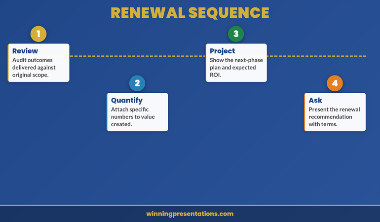
Pillar 1: Value Delivered. Before you discuss the next contract, you need to remind the client what the last one achieved. Not in abstract terms—in their terms. Did you help them reduce cost? Improve speed? Manage risk? Lower headcount? Avoid a crisis? Quantify it. Show them the value stream they’ve received. Make it visible so they cannot claim they’re unsure what they paid for. This is where your case study data lives: project timelines, cost savings realised, hours saved, risks prevented, revenue influenced. If you don’t have this data, you’re already behind. Start collecting it now.
Pillar 2: Partnership Growth. Show how the relationship has evolved. You understand their business better. Your approach is more refined. You’ve anticipated problems before they appear. You’ve brought in new expertise. You’ve expanded into new areas that compound value. This pillar is about positioning renewal not as “the same as last time” but as “a mature, deepening partnership.” It also demonstrates investment on your side—you’ve grown your team, your capabilities, or your focus to serve them better. That investment justifies the renewal.
Pillar 3: Forward Vision. Finally, the renewal isn’t just about protecting the past; it’s about building the future. What’s the next chapter? How will the partnership evolve? What opportunities exist that you couldn’t see five years ago? What threats are on the horizon that you can help them navigate? Position the renewal as the gateway to that next phase, not as a reboot of the old one. This pillar turns the renewal from a defensive conversation into an offensive one—it shifts the client from “Do I keep this?” to “What’s possible if we do?”
Structuring Your Deck for Maximum Impact
A renewal deck is not a product pitch. It’s a narrative that flows from past success into future opportunity. Here’s the structure that works:
Opening Slide: Start with a partnership statement, not a sales statement. “Five years in, and we’ve learned more about your business than we thought possible—and we want to share what that means for the road ahead.” This sets a collaborative tone immediately.
The Context Slide: Remind them of the original challenge. Why did they engage you? What was the business problem? This resets the frame—it forces them to remember why they made the choice in the first place and how far they’ve come.
Value Delivered Slides (2–3): Walk through the key achievements. Use data where you can; use testimony where you can’t. Show the cost, the risk, the headache you’ve eliminated or reduced. Don’t bury numbers; lead with them. “We’ve saved your finance team 2,000 hours annually in manual reconciliation”—that’s a headline, not a footnote.
The Partnership Growth Slide: Explicitly call out how the relationship has matured. New capabilities you’ve built. Deeper understanding you’ve gained. Proactive recommendations you’ve made. This is your moment to prove investment and differentiate from a commoditised alternative.
Forward Vision Slides (2–3): Paint the next chapter. What are the emerging priorities in their industry? How is your expertise evolving to meet them? What new opportunities could unfold if the partnership continues and deepens? This is where you move from defensive to aspirational.
Investment & Terms Slide: Present the financial terms. If there’s a price increase, justify it explicitly: inflation, enhanced capability, market rates, expanded scope. Frame it as investment in mutual growth, not revenue extraction. Never apologise for a price increase; instead, explain the value that justifies it. Quarterly client retention presentations often use this structure to reset value annually before renewal pressure builds.
The Commitment Slide: Close with a call to action that feels collaborative, not transactional. “Let’s move forward with renewed commitment to delivering even greater value.” It’s about partnership, not paperwork.
The best renewal presentations balance data with narrative. Show the numbers, but tell the story. Client story presentations use the same principle: metrics prove it happened; stories prove it matters.
Handling Pushback on Price and Terms
Price pushback is inevitable. It’s not always a sign that the client wants to leave; it’s often a sign that you haven’t made the value visible enough. Here’s how to respond:
Acknowledge it directly. “I appreciate the sensitivity around cost. Let’s talk about what you’re getting and whether it aligns with your budget.” Don’t defend the price defensively; instead, reframe it as an investment question.
Separate value from cost. “In the first three years, we delivered £X in documented value. This year’s investment is 15% of that. How does that sit with your expected return?”
Offer options, not discounts. If the client is price-sensitive, discuss scope reduction, milestone-based engagement, or phased implementation rather than simply cutting your rate. This protects margin and forces clarity about what they actually need.
Reference the switching cost. “If you move to another provider, there’s onboarding time, learning curve, and risk of disruption. What’s the true cost of that transition?” Make the switching decision emotionally and financially expensive.
Ask for their perspective. “What would make this investment feel right to you?” This opens a negotiation. You might discover that the issue isn’t really price—it’s that they don’t feel like a priority, or they’ve had a bad experience, or their business is under pressure and they’re looking for line-item cuts. Once you know the real objection, you can address it.
Don’t wing renewal conversations
The Executive Slide System includes three complete renewal scenarios with speaker notes and response frameworks
Ready-to-adapt templates for B2B services, technology partnerships, and managed service renewals. Video walkthroughs of how to handle each slide. Timing guidance so you know where to breathe and where to press.
The Psychology of Renewal Conversations
The psychology of renewal is different from the psychology of a new sale. New prospects are shopping; renewal clients are already inside the relationship. They know your weaknesses. They’ve had a bad experience, or three. They’re comparing you to what they’ve imagined they could get elsewhere. Your job isn’t to convince them to take a chance; it’s to prove that taking a chance on someone else is riskier than staying with you.
This means your tone matters enormously. You’re not pitching; you’re recommitting. You’re not selling; you’re inviting them deeper into partnership. The best renewal presentations have a tone of confidence without arrogance, of investment without desperation. You’re saying: “We believe in this partnership, we’ve proven our value, and we want to go further together. Here’s why that’s in your best interest.”
Practical psychology pointers: First, lead with gratitude. “We’ve learned more about your business in five years than in the first six months—and that learning has shaped everything we do for you.” Gratitude disarms defensiveness. Second, use specific language. Don’t say “we’ve been responsive.” Say “When you needed a solution for Q3 reforecasting in 48 hours, we delivered.” Specificity proves attention. Third, acknowledge the relationship’s reality. “We’ve had rough patches, and we’ve fixed them. That’s a relationship that works.” Acknowledging friction actually builds credibility; it shows you see them, not just the revenue.
Finally, make silence costly. Don’t present and then disappear. “I’ll send the deck over. Let’s schedule a follow-up for next Thursday to discuss questions.” That keeps momentum. Client presentation skills often overlook this: the renewal conversation doesn’t end with the deck; it ends when the contract is signed and the next partnership chapter has begun.
Frequently Asked Questions
How far in advance should you present a renewal?
Ideally, 6–8 weeks before the contract expires. This gives the client time to review, raise questions, and consider options without feeling rushed. It also gives you time to respond if they push back. Fewer than four weeks out, and you’re in a reactive conversation. More than 12 weeks, and they may forget about it until it’s urgent.
What if the client says they want to explore other options?
That’s not a rejection; that’s a signal that you haven’t made your value clear enough. Ask what they want to explore and why. “What’s important to you that you feel we’re not delivering?” Listen harder than you’ve ever listened. You may discover you need to compete on capability, price, service level, or relationship depth. Once you know, you can respond. But respond fast. “I appreciate you exploring alternatives. Let’s set up a call next week so I can address your concerns directly.” This keeps you in the game.
Should the renewal presentation always include the same stakeholders?
No. The renewal conversation should include whoever holds the renewal decision. That might be procurement (focused on cost), operations (focused on capability), finance (focused on ROI), or the executive sponsor (focused on strategy). Present to all of them, or tailor your message to each. A procurement-focused renewal deck emphasises cost of ownership. An executive-focused one emphasises strategic partnership and forward vision. Know your audience, and build your deck accordingly.
Don’t let your renewal be a formality. The contract renewal presentation is your most powerful tool for protecting revenue, deepening relationships, and reshaping how clients see you. Build it with the same care you’d build a pitch to a prospect. In fact, build it with more care. Prospects are optimistic. Renewal clients know your true value and your true flaws. A renewal won is a client secured for the next chapter.
Join The Winning Edge
Every week: executive presentation frameworks, client conversation strategies, and insights from 24 years in corporate banking. Straight to your inbox.
Download the Executive Presentation Checklist (free) to prepare for your next renewal conversation with confidence.
Cross-references from today:
- Project Kickoff Presentation — How to start client relationships strong
- Self-Compassion & Presentation Anxiety — Building confidence for high-stakes moments
- Buying Time: Q&A Techniques — Handling difficult questions in renewal conversations
Mary Beth Hazeldine is Owner & Managing Director of Winning Presentations. With 24 years of corporate banking experience at JPMorgan Chase, PwC, Royal Bank of Scotland, and Commerzbank, she advises executives across financial services, healthcare, technology, and government on structuring presentations for high-stakes funding rounds and approvals.