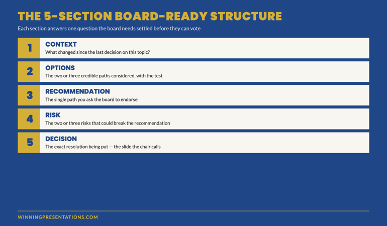
Quick answer: A crisis communication presentation to the board is decided in the first sixty seconds, not in the closing summary. The chair is reading the presenter at least as carefully as they are reading the slides, and the read they want to land is “this person knows what is happening and is in control of the response.” The structural pattern that holds in a crisis is the four-part frame: situation in one sentence, scale in one sentence, response in one paragraph, ask in one line — delivered in roughly that order, in roughly the first three minutes, before any deck of supporting material opens. The presenter who builds context first and arrives at the situation on slide nine has already lost the room. The composure required is not personal calm; it is the structural calm of a presentation built so the chair can absorb what is happening fast.
JUMP TO:
In 2007 I was asked at short notice to coach a senior risk officer at a publicly-listed financial services firm through a Sunday-evening board call. A material control failure had surfaced on the Friday. The full extent was still being scoped on the Saturday. The chair had called an emergency board meeting for the Sunday at six o’clock, and the risk officer had been told he would have ninety seconds to brief the board before the formal agenda began. He sent me a forty-one-slide deck at three on the Sunday afternoon. The deck opened with a six-slide industry context section, moved into a methodology section, arrived at the actual finding on slide twenty-two, and reached the recommendation on slide thirty-four. He had built it on the assumption that the board would want the journey. They wanted nothing of the kind. They wanted to know, in the first sentence, what had happened, in the second sentence, how bad it was, and in the third sentence, what he was doing about it. By the time the call began at six, we had cut the brief to four sentences and one supporting page. He delivered it in seventy seconds. The chair leaned in, asked two questions, and turned the meeting toward the response plan. The crisis was managed. The structural shape of the opening is what made the rest of the call possible.
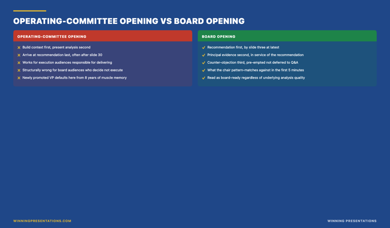
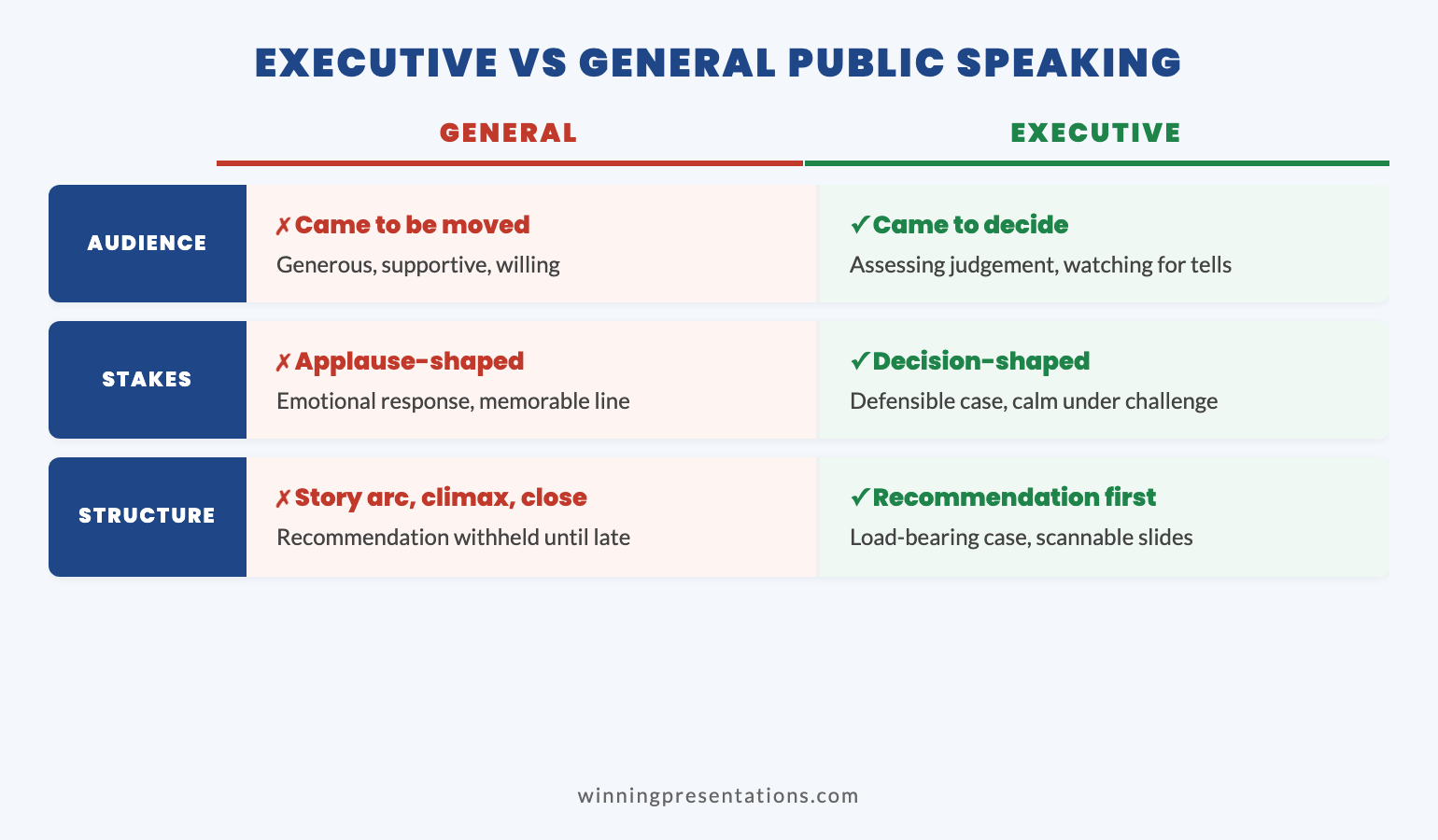
I have watched somewhere between thirty and forty senior leaders deliver crisis communication presentations to their boards across financial services, healthcare, and technology in the years since. The pattern that separates the presenters who land the brief from the ones who lose the room is not personal composure, not seniority, and not the strength of the underlying response plan. It is the structural shape of the opening. The board in a crisis is in a different posture from the board in a normal-time approval meeting. The chair is reading the presenter as the proxy for whether the wider organisation is in control of the situation, and that read is locked in by the end of the first three minutes. The presentation that arrives at the situation on slide nine is read as not-in-control regardless of what the slides themselves contain.
(This article was created with AI assistance; all stories and insights are based on 35 years of real client work.)
The two crisis presentations I want to focus on in this article were delivered approximately two years apart at two completely unrelated organisations — one a corporate banking division responding to a regulatory inspection finding, the other a healthcare board responding to a public-facing service failure. Both presenters had the same underlying composure under pressure. Both presenters had broadly similar quality of response plans. The one who landed the brief had built the opening as a four-part frame delivered in the first three minutes. The one who lost the room had built the opening as a context-led journey through the events. The room read the presenters as more different than they actually were because the structural opening signalled control in one case and uncertainty in the other. The lesson is not “stay calm in a crisis” — both presenters were calm. The lesson is that the structural shape of the first three minutes is what the board reads as control, not the presenter’s affect.
Walk into your next crisis board presentation with the structural opening rehearsed:
The Executive Buy-In Presentation System covers the four-part crisis frame, the chair-pre-read protocol, and the structural rehearsal that holds when the news is bad and the room is tense. Self-paced modules, optional live Q&A calls, lifetime access. Used most often in the days between an incident surfacing and the board call.
Why the first sixty seconds of a crisis presentation matter more than the deck
A board in a crisis meeting is doing two things at once. It is trying to absorb what has happened — the situation, the scale, the implications — and it is trying to read whether the person briefing them is themselves in control of the response. Those two reads happen simultaneously, and the second one is locked in faster than the first. Within the first sixty seconds of the brief, every director in the room has formed a working judgement about whether the presenter understands the shape of what is happening and is structurally prepared to lead the response. That judgement is very difficult to reverse once it has landed. Slides forty-five through fifty-nine of a meticulously prepared deck do not move it. The structural shape of the first three minutes is what locks it in or unlocks it.
The presenter who walks into a crisis briefing and opens with industry context is treated as someone who has not yet absorbed the magnitude of the situation. The presenter who walks in and opens with “Here is what happened, here is how big it is, here is what we are doing, here is what we need from you” is read as someone who is already several steps into the response. Neither presenter is more or less competent. The first one has used the structural opening they learned at the operating-committee level — build context, present analysis, arrive at recommendation last — and in a crisis that opening reads as the wrong shape for the room. The board does not want to be brought along through the journey of what was discovered. They want the situation on the table fast, because they have decisions to make about it, and they will be made faster if the situation is in front of them by the end of the first minute.
The corrective work for the operating-committee-trained executive walking into a first crisis presentation is not affect work. It is structural work. The opening pattern is taught and rehearsed in advance, ideally several times in the days between the incident surfacing and the board call, so it survives the live pressure of the room. The presenter who has rehearsed the four-part frame twenty times in the previous forty-eight hours will deliver it in the live meeting under pressure. The presenter who has rehearsed the forty-slide journey will reach for the journey in the live meeting because that is what they have rehearsed. Rehearsal is not optional in a crisis; what changes is what you rehearse.
The four-part frame that holds when the news is bad
The four-part frame for a crisis communication presentation to the board is straightforward enough to memorise and structured enough to hold under pressure. The four parts are: situation, scale, response, ask. Each one lives in approximately one sentence to one short paragraph, and they arrive in that order, in roughly the first three minutes of the brief, before any supporting material opens. The discipline is not in the content of the four parts; the content is what it is. The discipline is in refusing to add context, history, methodology, or explanation between any of the four parts. The board does not need the connective tissue. They need the four parts in the right order.
Part one, the situation, is the one-sentence statement of what has happened. Not what was discovered, not what the team has been working on, not what the regulator has flagged in the wider sector. What has happened, in this organisation, that the board now needs to be aware of. “At eleven on Thursday we identified a material control failure in the Eastern European trade settlement workflow that affected approximately fourteen counterparties over a six-week period.” That sentence is enough. It does not require setup. It does not require historical context about why the control existed. It states the situation in a form the board can repeat to each other after the meeting without distortion.
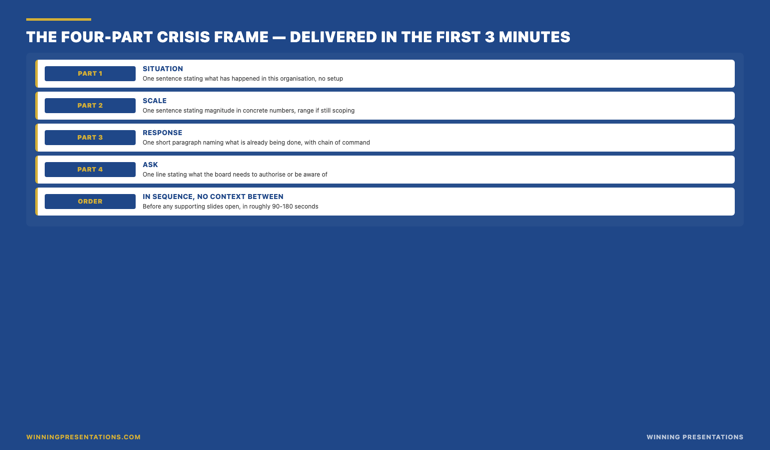
Part two, the scale, is the one-sentence statement of magnitude. Concrete numbers where they are known, an honest “we are still scoping” where they are not. Range estimates are acceptable; vague qualifiers (“material”, “significant”, “considerable”) are not. “Our initial estimate of exposure is between twelve and seventeen million pounds, depending on the resolution of three open positions, with full scoping expected by close of business on Tuesday.” The board needs the order of magnitude in the first minute. A two-million-pound issue and a two-hundred-million-pound issue are different rooms; the chair needs to know which room this is before they decide how to use the rest of the meeting.
Part three, the response, is one short paragraph describing what is already being done, by whom, with what timeline. The chain of command is stated explicitly. “The Eastern European desk has been instructed to suspend new positions until controls are re-verified. Three senior leaders — head of risk, head of operations, head of legal — have been operating an incident response team since Friday morning. External counsel was engaged Saturday afternoon. The regulator has been notified informally through their assigned supervisor; formal notification will be filed Monday morning ahead of the close of trading.” The board does not need every detail. They need to know the response is already in motion before they were called into the room, with clear ownership.
Part four, the ask, is one line stating what the board needs to authorise, approve, or be aware of in the next forty-eight hours. Crisis presentations almost always have an ask; the ask is what the meeting is for. “We are asking the board to approve the emergency communication to clients drafted by external counsel, to authorise the precautionary suspension of new business in the affected workflow until Friday next week, and to take note of the regulator notification timeline.” That sentence makes the meeting useful. Without it, the board has been informed but cannot act, and the meeting becomes a debrief rather than a decision.
The crisis presentation structure that holds when the news is bad and the chair is tense.
The Executive Buy-In Presentation System is a self-paced programme with seven modules covering stakeholder analysis, case construction, the four-part crisis frame, the chair pre-read protocol, and the structural rehearsal pattern that holds under live board pressure. Monthly cohort enrolment — join the next cohort whenever suits you. Optional live Q&A calls are fully recorded. Lifetime access to materials.
- Seven modules of self-paced course content covering crisis structure, stakeholder analysis, and presentation rehearsal
- Optional live Q&A and coaching calls, fully recorded for asynchronous viewing
- Monthly cohort enrolment — join the next available cohort
- Lifetime access to all course materials, no deadlines
What the chair is reading when you are speaking
The chair in a crisis meeting is doing a specific job that is different from their job in a normal-time meeting. In a normal-time approval meeting, the chair is the arbiter of board attention and the lever through whom the recommendation either lands or fails. In a crisis meeting, the chair is the proxy reader for the entire board’s confidence in the organisation’s response. Every other director in the room is, to a meaningful degree, watching the chair’s positioning to calibrate their own. If the chair leans in and starts asking questions about the response plan, the wider board moves into response mode with them. If the chair leans back and the questions turn to the timeline of how this was discovered and why it wasn’t caught earlier, the board has shifted into accountability mode and the meeting becomes much harder to recover.
The presenter who is reading the chair’s positioning in real time has access to information the presenter looking around the room evenly does not. The lean-in versus lean-back signal is usually visible within the first ninety seconds, and it is usually a direct response to the structural shape of the opening. The four-part frame, delivered cleanly, almost always produces lean-in. The context-led journey, even when the content is identical, more often produces lean-back. The chair is not consciously deciding which to do; they are responding to the structural signal of whether the presenter has the situation in hand. The presenter’s job during the brief is to deliver the four-part frame in a way that signals control, and then to watch the chair for the lean-in cue and angle the rest of the meeting toward the chair’s positioning. See the Executive Buy-In Masterclass overview for the structural rehearsal protocol and the broader catalogue of crisis-readiness assets at our services page.
The second thing the chair is reading is the presenter’s ownership of the response. The four-part frame above includes the chain of command in the response paragraph specifically because the chair needs to know who owns what, in plain terms, in the first three minutes. A response that names the three senior leaders running the incident team, the external counsel that was engaged, and the regulator who has been informally notified signals an organisation that has already moved into response posture before the board was even called. A response that says “we are working on this” or “the team is looking at it” signals an organisation that has not yet decided who owns the problem. The first version invites the chair to lean in and ask what the board can do to support the response. The second version invites the chair to ask who is in charge, which is the worst question to be answering in the third minute of a crisis brief.
The composure trap that destroys credible crisis presenters
The composure trap is the assumption that staying personally calm in a crisis is what signals control to the board. It is not. The board reads control from the structural shape of the brief and the explicit ownership of the response — not from the presenter’s affect. A presenter can be visibly tired, audibly tense, and quietly nervous, and still be read as in-control of the situation if the opening is structurally clean and the response paragraph names the chain of command. A presenter can be glass-smooth, perfectly polished, and visibly composed, and still be read as not-yet-in-control if the opening is context-led and the response paragraph is vague about ownership. The chair is not reading the presenter’s nervous system; they are reading the structural signals.
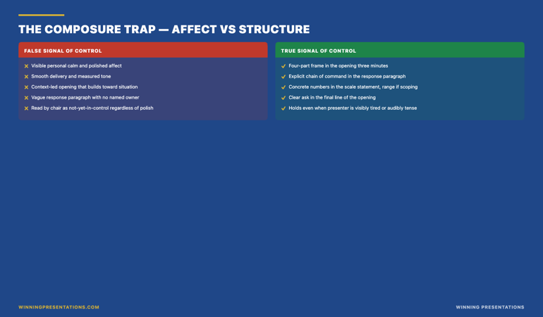
This is a relief to most senior presenters when it is named directly. The pressure to “appear calm” in a crisis is itself one of the things that destabilises presenters in the live moment, because they are trying to manage two performances at once — the actual brief and the impression of composure. The structural shape of the brief, rehearsed in advance, takes the composure performance off the table. The presenter who has rehearsed the four-part frame can deliver it shaking with adrenaline and still be read as in control, because the structure is doing the credibility work that affect cannot. The presenter who is trying to project calm without the structural rehearsal is performing on the wrong stage, and the chair can usually tell.
The practical implication for the executive preparing for a crisis board presentation is that rehearsal time should be spent on the structural opening, not on affect management. Write the four parts out as four sentences or short paragraphs. Read them aloud three times. Hand them to a senior colleague and ask them to repeat back what you said without looking. If they can repeat the situation, scale, response, and ask back to you in their own words, the structure is doing its work. If they cannot, the structure is not yet tight enough, and the chair will not be able to absorb it either. This is the test that distinguishes a four-part frame that holds from one that merely looks like one on paper.
For senior leaders who want the slide-level structures that support the four-part frame — the actual templates the response paragraph summarises — pair the Buy-In framework with the Executive Slide System (£39). It includes the twenty-six executive slide templates the four-part frame uses, ninety-three AI prompts for structuring crisis briefs, and sixteen scenario playbooks including a crisis-response scenario specifically. Most senior leaders use the slide system to build the supporting deck the four-part frame is delivered in front of, and the buy-in framework to handle the live moment in the room.
Frequently asked questions
Is the Executive Buy-In Presentation System worth £499 if I already present at board level regularly?
If you already present at board level regularly, the question is not whether you can present competently — you clearly can — but whether your current opening pattern is the one a board reads as in-control during a crisis. Most senior executives who present regularly have built their default opening at the operating-committee level, where context-first is structurally correct. In a crisis, that same opening is structurally wrong, and the chair feels the mismatch within the first ninety seconds. The Buy-In programme is most useful in the eight weeks before a known crisis-prone period or after an incident has surfaced and the next board call is being prepared. It is not a remedial programme for poor presenters; it is a structural reset for competent presenters whose default opening is the wrong shape for the room they are walking into.
What is the most common mistake senior presenters make in a crisis briefing?
The most common mistake is treating the brief as a debrief. The presenter walks the board through what was discovered, how it was discovered, what was already being done before the board was called, and what the recommendation now is. That structure is correct for a post-mortem after the crisis has resolved. It is wrong for the crisis briefing itself, because the board needs the situation in hand fast enough to make decisions in the meeting. The four-part frame — situation, scale, response, ask — flips the order. The board absorbs what is happening in the first three minutes and uses the rest of the meeting to decide how to support the response. The debrief structure leaves the board still trying to absorb the situation when the meeting ends, which is the worst possible outcome of a crisis call.
How long does it take to install the four-part frame as a default opening?
The four-part frame can be drafted in about thirty minutes once the underlying facts are clear, and rehearsed to a point where it survives live board pressure in approximately two to three rehearsal cycles spread over forty-eight hours. The structural shape is not difficult to learn. The difficult part is unlearning the context-led opening that most senior executives have spent fifteen years building as their default. The unlearning is not permanent; the executive will revert to context-led openings in non-crisis meetings, which is correct. The skill is having the four-part frame available as the alternative opening when the room is a crisis room. Most senior leaders need two or three actual board crisis presentations to feel that the four-part frame is their default for that room.
Does the four-part frame work when the news is genuinely catastrophic, not just a control failure?
Yes, and arguably it works better. When the news is genuinely catastrophic — a fatality, a major regulatory enforcement action, a loss large enough to threaten the firm — the board’s tolerance for context-first openings drops to zero. The four-part frame is structurally suited to the worst case because it puts the situation and scale on the table inside the first ninety seconds, which is where the board needs them in a genuinely catastrophic briefing. The response paragraph and the ask matter even more in that scenario, because the board is looking for the chain of command and the specific authorisation they need to give in the next twenty-four hours. The frame holds; what changes is the gravity with which it is delivered.
Should the supporting deck still be prepared if the four-part frame is delivered first?
Yes. The supporting deck exists for the board’s questions, not for the brief itself. The four-part frame is delivered without the deck open. After the ask lands, the chair will almost always either move to questions or invite the supporting material to be presented. If the chair invites the supporting material, the deck opens and is walked through with the four-part frame as the anchor. If the chair moves to questions, the deck stays closed and the presenter answers from the supporting material as questions surface. Either way, the deck is in service of the four-part frame; it does not lead the briefing.
The Winning Edge newsletter: weekly editorial covering crisis communication, board readiness, and the structural patterns senior leaders use to land high-stakes briefings. Sent every Thursday morning to senior executives who present at board level.
Walk into your next crisis board presentation with the four-part frame installed.
The Executive Buy-In Presentation System covers the four-part frame, the chair pre-read, the response-paragraph chain of command, and the structural rehearsal sequence in seven self-paced modules. £499, lifetime access, optional live Q&A calls fully recorded.
The next time you are called into a crisis briefing — not in the rehearsed comfort of a regular board meeting, but in the compressed forty-eight hours between an incident surfacing and the chair calling the room — walk in with the four-part frame written out as four sentences. Deliver them in the first three minutes. Watch the chair’s positioning on the second sentence and the fourth. Let the supporting deck stay closed until the chair invites it open. The room reads the structural shape before it reads the slides, and the four-part frame is the shape the room reads as control. For the broader catalogue of board-readiness assets that pair with the Buy-In framework, see The Complete Presenter bundle.
ABOUT THE AUTHOR
Mary Beth Hazeldine is Owner & Managing Director of Winning Presentations. She has 24 years in corporate banking at JPMorgan Chase, PwC, Royal Bank of Scotland, and Commerzbank, and 16 years coaching senior professionals across financial services, healthcare, technology, and government. She advises senior executives on the structural shape of high-stakes briefings, including board crisis communication, regulatory finding presentations, and material-event boardroom briefings.
Winning Presentations Ltd, founded in 1990, is a UK consultancy specialising in executive presentation methodology and senior leadership communication.