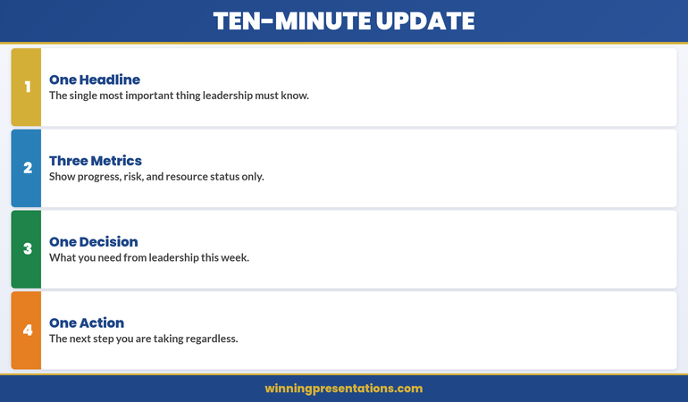
Quick Answer: The most effective year-end review presentation distils your entire year’s performance into a single, strategically structured summary slide. This slide captures three critical elements—what you achieved, why it matters in context, and what comes next—whilst supporting appendices provide evidence without overwhelming decision-makers. When executives see one powerful summary first, they engage more thoughtfully and make better decisions.
Jump To:
The Story: When More Becomes Less
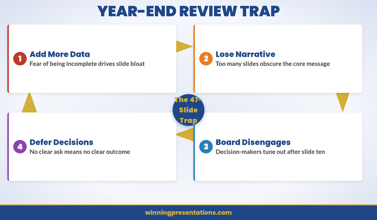
Tomás had spent three weeks assembling the perfect year-end presentation. As VP of Operations at a mid-sized logistics company, he’d meticulously documented every achievement: new warehouse efficiency metrics, cost reductions by division, team expansions, process improvements. He’d created gorgeous charts, compelling narratives, supporting evidence across 47 slides—enough material to tell the complete story of an extraordinary year.
The CEO gave him 15 minutes with the board. Two slides in, he saw the glaze. Nobody was following his narrative. They wanted the answer to one simple question: Where did we win, and what does it mean for next year?
That afternoon, Tomás redesigned everything around a single summary slide. On it: year-on-year performance against four critical metrics, a visual explanation of why those metrics shifted, and three explicit priorities for the next twelve months. He kept the 47 slides but repositioned them as evidence—appendix material that the board could explore if they wanted depth. When he presented the new structure, the CEO asked better questions. The board engaged differently. The decision happened faster.
Tomás discovered what every executive eventually learns: the slide that matters most isn’t buried in a narrative mountain. It stands alone, crystalline, at the beginning—telling the entire story in one breath.
The Executive Challenge
You have one chance to show your board or executive audience that you understand what matters. Most year-end presentations bury that message in layers of supporting detail. What if you reversed the structure—putting your most powerful insight first, then letting supporting slides provide the depth executives need to feel confident in your conclusion?
Why 47 Slides Kill Your Message
Executives rarely object to having information available. They object to being made to work too hard to find meaning. When you build a year-end review presentation as a chronological narrative—achievements one, achievements two, achievements three—you’re asking your audience to connect dots you should have already joined.
The cognitive load problem compounds over time. Each new metric, story, or data point increases the mental effort required to hold the previous points in working memory. By slide 20, your audience has forgotten what slide 5 was really saying. By slide 47, they’re exhausted.
Worse: when everything feels equally important, nothing is. Your board comes away remembering fragments rather than the coherent narrative of your performance and future direction. They can’t explain your year to their peers because you gave them 47 data points instead of one crystalline insight.
The One-Slide Revolution
Your year-end review presentation must lead with clarity. One summary slide—properly constructed—can do the work of dozens. It compresses the year’s narrative into three elements: What happened (your performance against agreed metrics), Why it happened (the context and drivers), and What’s next (your strategic priorities). Everything else supports this framework. This approach isn’t about hiding detail. It’s about respecting your audience’s cognitive capacity and your credibility.
The Anatomy of One Powerful Summary Slide
A strategic summary slide has a precise internal architecture. It’s not a default template; it’s a carefully composed argument.
Section One: Performance Against Commitment sits at the top-left. You show 3–4 metrics you committed to at the start of the year against actual results. Think year-on-year growth, cost reduction, new customer acquisition—whatever your business measures. Use colour coding: green for outperformance, amber for on-track, red only if you must. Be honest. Boards respect accountability.
Section Two: The Context Layer occupies the top-right. This is crucial and often missing. You show the external or internal factors that shaped your performance. Market conditions? A product delay? A regulatory shift? Talent acquisition challenges? Don’t make excuses; explain causation. This section is where intelligent audiences learn that you understand the forces at play—not just the outcomes.
Section Three: Forward Direction sits below. You articulate 2–3 explicit priorities for the next 12 months. These should flow logically from your performance review. If you underperformed in customer retention, your next priority might be a retention-focused initiative. This section shows that you’re not just reflecting; you’re directing.
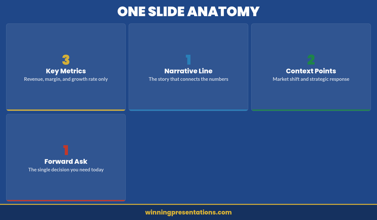
The visual hierarchy matters enormously. Your metrics and context occupy roughly 60% of the slide. Your forward direction occupies 40%. This ratio reflects reality: most of the conversation will circle back to the question, “Given where we’ve been, where should we go?”
The Narrative Architecture Behind It
Why does this structure work? Because it mirrors how executive brains actually process information about performance.
When a board member looks at your summary slide, they’re answering a sequence of questions in real time. Did we hit our targets? Your performance section answers this in seconds. If we didn’t, why not? If we did, was it luck or skill? Your context section answers this. Now that I understand where we’ve been, where should we focus next? Your forward direction section answers this.
This narrative sequence is psychologically efficient. It moves from concrete (what happened) through explanatory (why it happened) to strategic (what we do about it). Your audience doesn’t have to guess the point. The point is evident.
The supporting slides you’ll present afterward hang on this framework like ornaments on a tree. When you say, “Here’s our detailed revenue breakdown by division,” your audience already knows why they’re looking at it—it’s evidence for the performance claims you made on your summary slide.
Inline Tip: When you structure your year-end review presentation this way, you’re not just making a better deck—you’re making your audience’s decision-making process visible. Executives can see exactly what they need to understand to assess your performance and set the next year’s direction. That transparency builds confidence.
Supporting Slides and the Appendix Role
Your 47 slides haven’t disappeared. They’ve simply been repositioned.
After your summary slide, you present detailed supporting evidence organised by theme. If your summary mentioned “operational efficiency improvements,” your next section unpacks that theme: new processes, adoption metrics, cost savings by initiative. If you mentioned “talent challenges,” your next section addresses hiring, retention, and capability development. This organisation makes the connection between your summary claims and your supporting detail explicit and easy to follow.
The appendix—slides 20–47—becomes genuinely optional. A CFO might drill into detailed financial forecasts. A board member focused on risk might skip to compliance and regulatory updates. But they’re choosing to explore based on interest, not drowning in mandatory detail.
This structure also works beautifully in writing. When you send your year-end review presentation ahead of a board meeting, executives can read your summary in two minutes. Those who want evidence can explore the supporting sections. Those who want everything can review the full appendix. Everyone gets what they need.
Presenting to Different Audiences
Your board needs to see governance and strategy. Your team needs to see achievement and direction. A government regulator might need to see compliance and risk management. Can one presentation structure serve all these purposes?
Yes—if your summary slide is truly comprehensive. The metrics you choose, the context you highlight, and the priorities you set should be honest and complete enough that different audiences can extract what matters to them.
When you present to your team, you might dwell longer on the “context” section, helping people understand external pressures and industry shifts. This deepens their appreciation for organisational performance and their role in it. When you address the board, you might dwell on forward direction, using the appendix to justify why your priorities will create shareholder value.
The summary slide is the hinge. Everything else pivots around it.
Decision-Making Confidence
When executives see your year-end review presentation structured around one crystalline summary, they make better decisions. Not just because the data is different, but because they can hold the entire narrative in their minds. That clarity translates directly into confidence for better decisions, budgeting, and strategic alignment.
Common Pitfalls and How to Avoid Them
Pitfall One: Trying to Fit Too Much Onto the Summary Slide. Resist the urge to show 8 metrics instead of 4, or 5 priorities instead of 3. Constraint forces clarity. If you can’t articulate why a metric matters, it shouldn’t be on your summary slide. Move it to supporting evidence. The summary’s power lies in its discipline.
Pitfall Two: Disconnecting Your Priorities From Your Performance. If your performance review showed underperformance in customer satisfaction but your forward priorities don’t address it, you lose credibility. Executives will assume you either didn’t notice or don’t care. Every priority should feel like a logical response to something on your performance or context section.
Pitfall Three: Making the Summary Too Jargon-Dense. Your summary slide is your moment to speak clearly to non-specialists on your team or board. Avoid acronyms without definition. Avoid industry-specific terminology without translation. If a smart 16-year-old couldn’t understand your summary slide, you’ve failed the clarity test.
Pitfall Four: Presenting It as Fixed. Your summary slide is the opening move in a conversation, not the final word. Invite questions. Be prepared to zoom into detail when someone asks. The most powerful executives are those who can hold the high-level narrative and zoom into granular evidence simultaneously. Your presentation structure should support that flexibility.
Frequently Asked Questions
Should my summary slide include financial data?
Only if your department directly owns a P&L or budget line. If you do, include the headline figure and variance. If you don’t, reference the financial impact of your work indirectly: cost saved, revenue enabled, risk avoided. The summary slide is about impact, not accounting.
How detailed should my context section be?
One slide, maximum. Context exists to orient the audience, not to relitigate the year. State the strategic priority, the operating conditions that shaped your results, and move on. If context takes more than 90 seconds to deliver, you’re over-explaining.
What if my actual performance doesn’t support a confident forward look?
Be honest. A year-end review that inflates next year’s outlook destroys credibility when Q1 results arrive. Present realistic targets with clear dependencies. The board respects realism far more than optimism. If your forward look is cautious, explain why and what would need to change for the outlook to improve.
Should I include a year-end review presentation before my board meeting or after?
Before. The year-end review sets the context for next year’s strategy discussion. If the board doesn’t have a clear view of where you’ve been, they can’t meaningfully evaluate where you’re going. Present the review first, then move to strategy.
Getting this right changes how your organisation thinks about annual reviews. Instead of a retrospective checklist, your executive summary becomes a strategic document—one that shows your board not just where you’ve been, but where you’re going and why. The clarity that summary slide creates ripples outward. Your team understands priorities more clearly. Your stakeholders support your direction more confidently. Your board makes better decisions.
Start with your summary slide. Let everything else hang from it. You’ll be amazed at how much more effective your entire approach becomes.
The Winning Edge Newsletter
Join executives, board members, and presentation leaders who get a fortnightly email about structuring presentations for high-stakes moments. Plus templates, frameworks, and thinking on governance and executive communication. Subscribe to The Winning Edge.
Download the Executive Presentation Checklist to validate your year-end review structure.
Read Next: Product Recall Presentation: How to Communicate Crisis With Clarity — when stakes are highest and time is shortest, the structure of your presentation determines whether your organisation controls the narrative or the narrative controls you.
Mary Beth Hazeldine is the Owner & Managing Director of Winning Presentations. With 24 years of corporate banking experience at JPMorgan Chase, PwC, Royal Bank of Scotland, and Commerzbank, she advises executives across financial services, healthcare, technology, and government on structuring presentations for high-stakes funding rounds and approvals.