Quick answer: An H2 strategy kickoff presentation is approved or deferred in the first six slides, not the closing summary. The six-slide format senior leaders use to land a mid-year strategic reset puts the H2 decision on slide one, the changed conditions versus the January plan on slide two, the revised three-priority frame on slide three, the resource implication on slide four, the chair-facing risk-and-mitigation on slide five, and the explicit ask on slide six. The slides after six are appendix material; the live presentation lives in the first six. The senior leader who treats H2 strategy as a fresh strategic deck loses the room by slide nine because the executive committee is reading the kickoff against the January plan they already approved, not as a new proposal. The structural move that separates the H2 kickoffs that get approved from the ones deferred to Q4 is putting the variance from January on slide two and the implications of that variance — not the original strategy — in the structural centre of the deck.
JUMP TO:
In 2017 I worked with a senior leader at one of the banks where I previously held a corporate banking role, preparing him for his first H2 strategy kickoff in a newly enlarged division. He had been promoted in February, had built the January plan with his predecessor handing over, and now in late June was tasked with presenting the H2 strategic refresh to the executive committee. He spent three weeks building a twenty-eight-slide deck. The structure was crisp and the analysis was thorough — market context, competitive landscape, revised priorities, resource needs, milestones. He walked into the room expecting the discussion to be on slide eighteen onwards, where the substantive priority changes were laid out. The chair closed the deck on slide five and asked a question that nobody on the team had prepared for: “What changed between January and now that we are seeing a different shape of strategy here?” The senior leader had not put the variance from January on a slide because he had not thought of the H2 kickoff as a variance document. The room did. The kickoff was approved in principle but referred back for “a clearer reconciliation against the January plan” — which was the room saying, in polite committee language, that the structural shape of the deck was wrong.
I have now worked with around thirty senior leaders preparing H2 strategy kickoff presentations across financial services, professional services, biotech, and SaaS. The mistake is the same nearly every time. The senior leader thinks of the H2 kickoff as a fresh strategic presentation, builds the deck the way they would build a January kickoff, and walks into a room that is reading the deck against the January plan they already approved. The room is not looking at a new strategy. The room is looking at a variance report dressed up as a strategy. The senior leader who recognises this and structures the deck accordingly gets the H2 reset approved in the meeting. The senior leader who builds it as a fresh strategy gets sent back for reconciliation work, which usually means the H2 plan starts a month late and the senior leader loses a meaningful window on the strategic year.
(This article was created with AI assistance; all stories and insights are based on 35 years of real client work.)
The six-slide format I want to describe in this article is the structure I now teach every senior leader I work with before their H2 strategy kickoff. It is not a creative framework. It is a structural template that survives the live moment in the room because it answers the executive committee’s actual reading pattern: what changed, what we are doing about it, what it costs, what the risk is, what you need to approve. The kickoff that does these five things in this order on six slides gets approved. The kickoff that buries them inside a twenty-eight-slide narrative gets deferred. The pattern is reliable enough that I treat the six-slide format as the default for any H2 strategic refresh, regardless of sector.
If you would rather not rebuild the deck from scratch:
The Executive Slide System ships 26 executive templates including a strategy-refresh structure that holds up at H2 kickoff. 93 AI prompts walk you through populating each slide from your live numbers, and 16 scenario playbooks cover the executive scenarios most senior leaders meet across the year. Designed for senior presenters who do not have three weeks to rebuild a deck for every quarterly cycle.
Why an H2 strategy kickoff presentation is structurally different from a January kickoff
A January strategy kickoff is read as a forward proposal. The room is asking: is this the right shape of strategy for the year ahead, given what we know? The structural moves that work are the standard strategic-proposal moves — context, options considered, recommended approach, resource requirement, milestones. The room is calibrating against the previous year’s outcomes and the current market read. The deck can take its time arriving at the recommendation because the room has not yet committed to anything for the year ahead.
An H2 strategy kickoff presentation is read entirely differently. The room committed to the January plan six months ago. They have been watching execution against it through the Q1 and Q2 reviews. They have an opinion already about whether the plan is on track, off track, or needs adjustment. The H2 kickoff is read against that committed plan. Every slide is unconsciously compared by the executive committee to what they approved in January. When the senior leader builds the deck as a fresh strategic proposal — as if the room is hearing the strategy for the first time — the room cannot make the comparison they need to make, and the meeting stalls. The structural shape of an H2 kickoff is therefore variance-led, not strategy-led. The senior leader who understands this structural shift writes a fundamentally different deck.
The room is also under different time pressure in late June than in late January. The executive committee in January has the full year ahead and can afford a longer discussion. In late June, the same committee has six months to execute against any revised plan, the holiday window cuts effective working time materially, and the year-end pressure is already visible on the horizon. A long deck in late June reads as time-blind. The six-slide format respects the room’s time and signals that the senior leader has done the synthesis work upstream of the meeting rather than asking the room to do it during the meeting. That signal matters. Executives who chair year-on-year planning cycles see the difference between a presenter who has compressed their thinking to six slides and a presenter who has expanded it to twenty-eight, and they read the compression as evidence of clarity rather than thinness.
The six-slide format that holds together under executive scrutiny
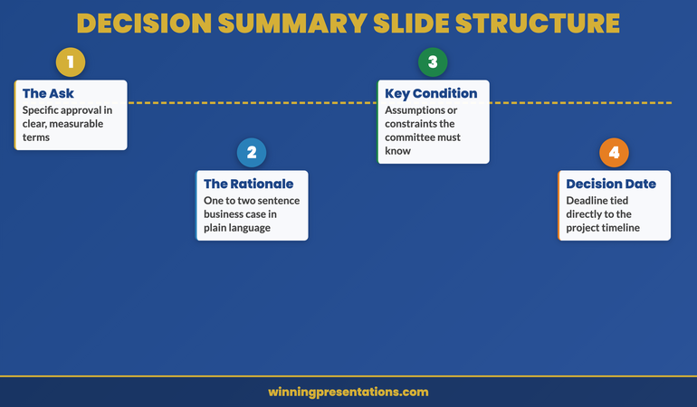
Slide one is the H2 decision being asked for, in a single sentence at the top of the slide, with one supporting line of context underneath. Not the strategy. The decision. “We are asking the committee to approve a reshaped H2 with three revised priorities and a fourteen-percent reallocation of the original H2 budget.” That is the whole top half of the slide. The bottom half is the one-line rationale: “Two of the original January priorities are tracking ahead of plan and can be deprioritised; the partnership channel that opened in May warrants a new priority slot.” The committee now knows what they are being asked to decide and why, in the first thirty seconds, which sets the structural shape of the entire meeting.
Slide two is the variance slide. This is the structural centrepiece of the H2 kickoff and the slide most senior leaders leave off the deck entirely because they did not think to include it. It shows the January plan and the H2 reshape side by side, with the deltas marked. Five priorities became three priorities. Budget allocation by priority shifted from this to that. Headcount moved from this team to that team. Milestone dates compressed in two areas and expanded in one. The whole picture fits on one slide because the committee is not reading the detail — they are reading the shape of the change. When they ask questions, they will ask about the deltas marked on this slide, which is exactly where the senior leader wants the questioning to land. The variance slide does the work of the entire “reconciliation against January plan” the chair would otherwise ask for at the end of the meeting.
Slide three is the revised priorities laid out in the same format as the January priorities. Same headings, same metric structure, same resource summary. Consistency of format matters here because the committee is comparing across slides. The senior leader who reformats the priorities for the H2 deck makes the committee work harder to do the comparison and signals, structurally, that they have moved away from the January plan unnecessarily. Keep the format identical. Change the content. The committee should be able to put the January priority slide next to the H2 priority slide and read the difference in twenty seconds without their eye having to learn a new layout.
Build the six-slide H2 kickoff from a template that already holds at executive committee level.
The Executive Slide System ships the strategy-refresh template along with 26 executive templates, 93 AI prompts for populating slides from live numbers, 16 scenario playbooks covering H2 reshape, board approval, and quarterly review scenarios, plus 7 checklists. Designed for senior presenters who do not have three weeks to rebuild a deck for every cycle. £39, instant download, lifetime access.
- 26 executive slide templates — including a strategy-refresh structure built for variance-led H2 work
- 93 AI prompts — walk you through populating each slide from your live numbers and last quarter’s data
- 16 scenario playbooks — H2 reshape, board approval, finance review, quarterly business review
- 7 checklists — including the pre-meeting variance reconciliation checklist most senior leaders skip

Why slide two is the variance slide, not the strategy slide
Slide four is the resource implication. The reshape of priorities almost always changes the resource shape — budget moves between priorities, headcount moves between teams, capital expenditure timing shifts. This slide shows the resource picture before and after the reshape, with the net impact on the overall H2 budget envelope at the bottom. The committee needs to know whether the reshape stays within the original envelope or asks for incremental resources. If incremental, the slide should say so cleanly and quantify the ask. The senior leader who buries the incremental ask inside the priorities slides loses the trust of the finance director on the committee, who will spot the buried ask in the question round and frame it as evasion. Put the resource implication on its own slide with the net number at the bottom. The committee can then make the resource decision separately from the strategic decision if they choose to, which is often what they want to do anyway.
Slide five is the chair-facing risk and mitigation slide. The committee will ask about the principal risks regardless. The senior leader who pre-empts the question by naming the two or three principal risks and the corresponding mitigations, on a single slide, removes a category of question from the meeting. Specificity matters here. Generic risks — “execution risk”, “market risk” — signal that the senior leader has not thought hard enough. Specific risks — “the partnership channel revenue assumption depends on the partner’s Q3 product launch, which is currently three weeks delayed; mitigation is the parallel direct-channel ramp that does not depend on the partner timeline” — signal that the senior leader has done the structural risk thinking. The committee reads specificity as readiness, the same way they read it in any board-level presentation. The structural framework the Executive Buy-In Masterclass teaches for executive-level case construction applies directly here.
For the deeper buy-in framework behind the six-slide format:
The Executive Buy-In Presentation System is a self-paced programme with 7 modules covering stakeholder analysis, case construction, and the presentation structures that hold up at executive committee and board level. Senior leaders preparing H2 strategy kickoffs use module four (the variance-led structure) and module six (the chair-facing risk slide) most often. Optional live Q&A calls, fully recorded. Lifetime access to materials. £499.
Slide six is the explicit ask. The committee should know, by the time slide six appears, exactly what they are being asked to approve. The slide states the ask in one sentence at the top, lists the decision options (typically: approve as presented; approve with stated modification; defer to next committee with stated reason), and includes the proposed effective date for the reshape. The senior leader who reaches slide six without a clear ask sends a structural signal to the committee that they themselves are not certain what they want from the meeting. The committee will then default to the lowest-commitment option, which is usually deferral. The clear ask on slide six is what allows the committee to make the decision in the room. The same chair I mentioned at the start of this article — the one who closed the deck on slide five in 2017 — was approving an H2 reshape from a different senior leader six months later with the same six-slide structure I am describing here, and the meeting ran twenty-two minutes start to finish. The deck did the structural work upstream so the meeting could focus on the decision.
The room pattern most H2 kickoffs miss
The executive committee in an H2 kickoff is doing three things in parallel that they do not do in a January kickoff. They are comparing the H2 reshape against the January plan they approved. They are tracking whether the senior leader has the situational awareness to acknowledge the variance directly. And they are calibrating whether the senior leader’s revised plan is realistic given the time remaining in the year. All three reads happen during the deck rather than after it. The structural moves that signal “yes” to all three reads are: putting variance on slide two, keeping format consistent with January on slide three, and quantifying the resource shift clearly on slide four. The senior leader who does these three things gets the benefit of the doubt on the rest of the deck. The senior leader who does not gets the chair closing the deck on slide five and a deferral by the end of the meeting.
The other pattern most H2 kickoffs miss is the chair-facing close. The senior leader, having reached slide six, should look at the chair when delivering the ask, when taking the first question, and when offering the close. The chair is the lever for an H2 reshape in a way that no other committee member is, because the chair is the one who frames the decision to the rest of the committee in the moments immediately after the senior leader stops presenting. The chair who has watched a clean six-slide structure and a deliberate close is significantly more likely to frame the decision favourably than the chair who has watched a sprawling twenty-eight-slide narrative and a tentative ask. None of this is about confidence. It is about the structural shape of the close, which is learnable.
Keep the template. Use it next H2 too. And the H2 after that.
Instant download. Lifetime access to the Executive Slide System — 26 templates, 93 AI prompts, 16 scenario playbooks. No subscription, no renewal. £39 once. Built for senior presenters who run multiple strategic cycles a year and want a deck that compresses cleanly each time.

Frequently asked questions
What if my executive committee expects a longer H2 kickoff deck because that has been the cultural norm?
Keep the live presentation to six slides and put the additional material behind a tab labelled “Appendix” at the back of the deck. The committee can choose to ask for the appendix material during questions; in practice they almost never do, because the six slides have answered the structural reads they were running. The cultural norm of long decks is usually a defensive habit that built up because senior leaders did not trust themselves to compress. The first senior leader at a given committee who presents a six-slide H2 kickoff successfully shifts the cultural norm for everyone who follows. The committee tends to be relieved rather than offended by the compression.
Is the variance slide on slide two appropriate if the H2 reshape is small?
Yes, and it is especially important when the reshape is small. A small reshape reads as either thoughtful pruning or insufficient analysis depending on how it is structured. The variance slide on slide two is what tells the committee which one they are looking at. If the reshape is small because the January plan is largely on track, the variance slide signals that the senior leader has done the comparison work and concluded that targeted adjustment is the right move. Without the variance slide, a small reshape looks lazy. With it, the same small reshape looks deliberate. The slide does meaningful work even when the deltas it shows are minor.
What does this look like in practice for a senior leader presenting H2 strategy to a holding board rather than an executive committee?
The structural shape is the same, but slide one and slide six become more important and slides three and four can be more compressed. A holding board is reading the H2 reshape at a higher altitude than an executive committee — they care about the decision being asked and the principal risk-and-mitigation more than they care about the detailed priority structure. Compress slides three and four into a single summary slide for a holding-board version, and expand slide five (risk and mitigation) into two slides to give the principal risks the air they need. The variance slide on slide two and the explicit ask on slide six stay structurally identical because the holding board is reading those slides exactly the way the executive committee is reading them.
How long does it take to build the six-slide format from scratch the first time?
Approximately two days of focused work for a senior leader who has the underlying H2 thinking already done. The compression work — getting the H2 decision into a single sentence on slide one, getting the variance picture onto one slide, getting the risk-and-mitigation onto one slide — is the part that takes the time. The slides themselves are simple to build. Senior leaders who start the H2 kickoff preparation by building a draft six-slide deck first, before any longer deck, almost always end up with a stronger deck than those who start with a long deck and try to compress it down. The structural shape is hard to find by reduction; it is easier to find by starting at six slides and resisting the urge to expand.
The Winning Edge — weekly newsletter
The Winning Edge is a weekly newsletter for senior professionals who present at the executive level. One short email a week on the structural moves that separate decks committees back from decks they defer. Subscribe to The Winning Edge →
For the wider library of presentation assets senior leaders draw on across an H2 cycle — slide system, storytelling primer, Q&A taxonomy, delivery references — the Complete Presenter bundle (£99) collects them in one place. See the broader catalogue of board-readiness assets at our services page.
About the author
Mary Beth Hazeldine is Owner & Managing Director of Winning Presentations Ltd. With 24 years of corporate banking experience at JPMorgan Chase, PwC, Royal Bank of Scotland, and Commerzbank, she advises executives across financial services, healthcare, technology, and government on structuring presentations for high-stakes funding rounds, board approvals, and strategic decisions.
The next time you build an H2 strategy kickoff presentation, do three things instead: put the H2 decision being asked for on slide one in a single sentence; put the variance from the January plan on slide two in the same shape the committee is mentally running; and put the explicit ask on slide six with decision options laid out. The H2 kickoff is read against the January plan whether the deck acknowledges it or not. The senior leader who structures the deck around the variance gets the reshape approved in the room. The senior leader who builds the deck as a fresh strategy gets sent back to do the variance work the deck should have shown in the first place.