Quick Answer
Verbal agreement in stakeholder meetings is not the same as committed action. Stakeholders nod to maintain harmony, defer discomfort, or avoid conflict — not because they have decided to act. A stakeholder buy-in presentation must do more than persuade: it must engineer the transition from passive acceptance to named, recorded commitment before the room disperses. The gap between nodding and voting is a structural problem, and it has a structural solution.
If your stakeholders keep agreeing but nothing moves forward, the Executive Slide System gives you structured frameworks for closing the gap between verbal assent and committed action — including scenario playbooks built for high-stakes stakeholder meetings. See what’s included →
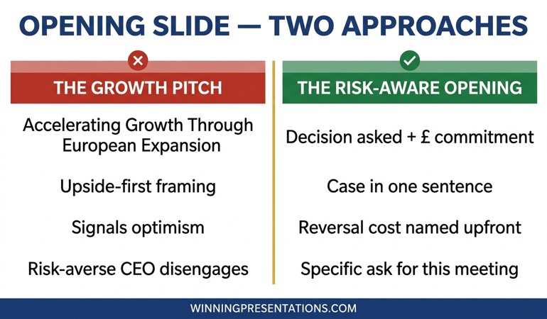
The Agreement Trap
Henrik had done everything right. Six weeks of analysis. A clear recommendation. A slide deck he had rehearsed three times. When he presented to the executive committee, every head in the room was nodding by slide four. The CFO said it looked “very compelling.” The COO said he was “broadly supportive.” The MD called it “exactly the kind of thinking we need.”
Three weeks later, nothing had moved. Henrik sent a follow-up. Then another. He got brief, friendly replies that said nothing substantive. When he finally managed to get fifteen minutes with the CFO, he was told — with apparent sincerity — that priorities had shifted and they’d revisit in Q3.
Henrik did not fail to persuade. He failed to close. There is a significant difference, and most senior executives conflate the two.
Agreement is social. In a room full of people who have worked together for years, nodding is easy. It preserves relationships. It avoids the awkwardness of public objection. It lets people leave on time. What agreement does not do — almost ever, on its own — is produce action. Action requires something more deliberate: a named decision, a recorded owner, a defined next step, and a deadline that will be checked. Henrik’s presentation created goodwill. It did not create commitment.
This is the agreement trap. You leave the room believing you have buy-in. What you actually have is a polite postponement.
Stop Leaving Meetings with Agreement That Goes Nowhere
The fear every senior executive carries into a high-stakes presentation is not that they’ll be told no. It’s that they’ll be told yes — and then watch the decision stall anyway. The Executive Slide System is designed to help you structure presentations that produce committed decisions, not just receptive audiences.
- 26 presentation templates — including stakeholder alignment and decision-forcing structures
- 93 AI prompts for drafting, stress-testing, and refining your stakeholder narrative
- 16 Scenario Playbooks — including presentations where verbal agreement has previously stalled
- 7 Checklists — covering pre-meeting alignment, commitment mechanisms, and post-meeting follow-through
The Executive Slide System — £39, instant access
Designed for executives presenting to boards, leadership teams, and senior stakeholder groups where decisions need to be made, not merely considered.
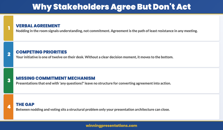
Why Stakeholders Nod but Don’t Act
Understanding why this happens is not an exercise in cynicism. It is a prerequisite for solving it.
Stakeholders — particularly senior ones — operate under three conditions that make agreement easy and commitment difficult.
First, they are managing multiple competing priorities simultaneously. A nod in your meeting does not mean your proposal has risen to the top of their list. It means they have no objection to it in principle. The moment they leave the room, they return to a world of seventeen other urgent demands. Your initiative, however compelling, now has to compete for attention that is perpetually scarce. Agreement does not create prioritisation. Only a clear, named next step — ideally one they have committed to verbally and on record — has any chance of doing that.
Second, they are conflict-averse in group settings. Public objection is costly. It creates friction, signals doubt about their colleagues’ judgement, and risks being remembered as an obstacle. Nodding, by contrast, is free. It is the path of least resistance when someone has clearly worked hard on something and the room is running short on time. This is not dishonesty — it is basic social navigation. But it means your read of the room at the end of a presentation is almost always more optimistic than the reality.
Third, they are protecting optionality. Agreement is reversible. It allows a stakeholder to engage constructively in the meeting while reserving the right to deprioritise, redirect, or quietly veto later. Commitment is harder to withdraw — which is precisely why most stakeholders avoid it unless a presentation forces the issue.
These are not weaknesses in your stakeholders. They are entirely rational behaviours. Your presentation structure needs to account for all three.
The most useful reframe is this: a presentation that ends with nodding stakeholders has not yet done its job. The job is not to generate agreement. The job is to generate a decision — and a decision requires someone to commit, on record, to a named action or next step before the meeting ends.
If your presentations consistently produce warm responses and slow follow-through, the problem is structural. It is almost certainly not the quality of your analysis, the strength of your recommendation, or the persuasiveness of your delivery. The problem is that your slides are optimised to persuade, not to close.
This is a solvable problem. Knowing how board decisions are often shaped before the meeting even begins is a useful starting point — but the presentation itself still needs to do the structural work of converting pre-meeting alignment into on-record commitment.
The Structural Gap in Most Presentations
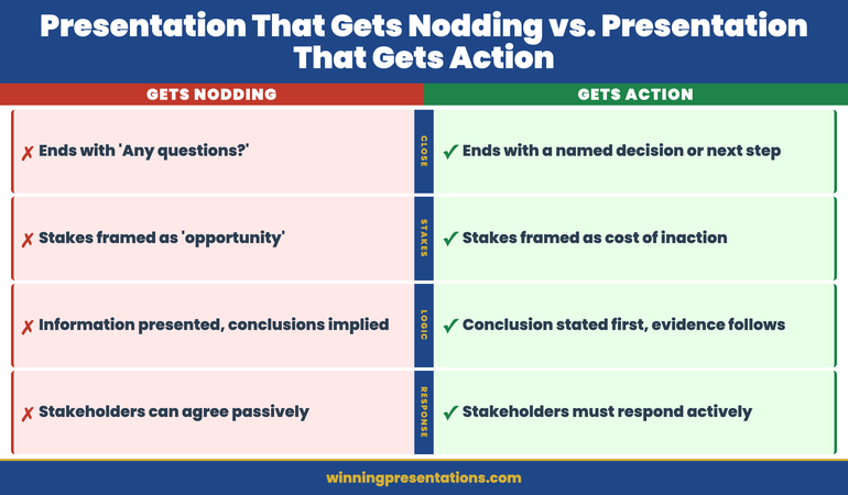
Most executive presentations are built around a logic sequence: context, analysis, recommendation, supporting evidence, summary. This is a perfectly sound structure for conveying information. It is a poor structure for producing decisions.
The gap is in what happens at the end. The majority of presentations close with a summary of the recommendation — a restatement of what has already been said. The final slide is typically a recap: three bullet points reminding the audience what they have just heard. Then the presenter says something like “happy to take any questions” and the meeting moves on.
Nothing in this sequence forces a decision. There is no moment where a stakeholder is asked to commit, named as an owner, or given a deadline. The presentation ends, the room empties, and what looked like agreement dissolves into everyone’s individual to-do list — where it will compete for attention it is unlikely to win.
Compare this to what a closing structure designed for commitment looks like. The final section of the presentation does not recap. It specifies: the decision required, the form that decision takes (approval, resource allocation, sponsorship, escalation), the owner of each next step, the timeline for each step, and — crucially — the moment in the meeting when those commitments are confirmed verbally.
This is not aggressive. It is not high-pressure. It is simply precise. You are doing the organisational work that the meeting itself will not do automatically. Meetings do not naturally produce decisions. Decisions require someone to engineer them — and that is the presenter’s responsibility, not the chair’s.
A useful diagnostic: look at your last three presentations and ask how they ended. If the final sequence was “summary → questions → thank you,” you have been presenting to inform. The shift to presenting to decide requires a structural change at the close — and sometimes earlier in the deck as well.
One of the most common underlying causes is a missing through-line — a single sentence that names the decision and why it matters now, which runs through every section of the deck. Without it, even a technically strong presentation can feel like a briefing rather than a decision-forcing exercise.
If you want stakeholders to act, every element of your presentation — from the opening framing to the final slide — needs to be in service of one thing: a specific, time-bound commitment from named individuals before they leave the room.
The Executive Slide System includes 16 Scenario Playbooks covering the specific structural challenges of stakeholder presentations — including the situations where agreement has stalled before and the deck needs to do more than persuade. See the full playbook list →
Closing the Gap Before the Room Disperses
There are four structural interventions that reliably close the gap between agreement and commitment. None of them require a harder sell. All of them require a more deliberate structure.
1. Name the decision in slide one. Not the topic, not the background, not the problem statement — the decision. “We are here to approve the restructuring of the client reporting function with an effective date of 1 September.” This does two things: it signals that the meeting has a specific output, not just a discussion; and it filters the entire subsequent presentation through the lens of decision-relevance. Stakeholders begin evaluating what they hear against a defined outcome rather than accumulating information with no clear endpoint.
2. Use the so-what ladder throughout. Every significant data point needs to connect — explicitly, not implicitly — to the recommendation. “Sales declined 12% in H1” is information. “Sales declined 12% in H1, which means our current resource model cannot sustain the Q3 target without the additional headcount in this proposal” is a decision input. Stakeholders should never have to do the interpretive work themselves. If they are asking “so what does this mean for the recommendation?” your slides are not doing their job. The so-what ladder is the most reliable technique for making this connection explicit at every step.
3. Pre-position the commitment mechanism. Before the final slide, use a transition that makes the ask explicit: “I’d like to close by confirming the decision and the owners of each next step.” This is not a surprise. It signals to stakeholders that the meeting is about to produce something concrete, and it gives them a moment to prepare rather than feeling ambushed by a request for commitment. Most people will not resist this — they resist being put on the spot without warning.
4. Close on owners and dates, not summary. The final slide is a decision record, not a recap. It lists: the decision being made, who has approved it, the next actions, the owner of each action, and the date by which each will be completed. This slide is read aloud in the meeting. Stakeholders confirm or amend. It is the difference between a meeting that ended with agreement and a meeting that ended with a decision.
This structure will feel unfamiliar the first time you use it. Presentations that end with a decision record rather than a summary feel more directive than most executives are accustomed to. That directiveness is the point. You are doing the organisational work that the room will not do spontaneously — and in high-stakes contexts, that work is your responsibility as the presenter.
For context on how to handle situations where your data is not translating into the decision you need, saying the number before the chart is a simple and underused technique that keeps stakeholders focused on the decision rather than the methodology.
The Commitment Mechanism
The single most important structural addition to any stakeholder buy-in presentation is what I call the commitment mechanism: an explicit moment, built into the agenda and the deck, where stakeholders confirm their commitment to a named next step before the meeting ends.
This is not a vote. It is not a formal approval process. It is a structured verbal confirmation — typically in the final five minutes of the meeting — that converts the nodding that has been happening throughout into something that can be followed up against.
A commitment mechanism works because it changes the social dynamic in the room. Once someone has stated aloud that they will do something — by a named date, in front of their peers — the cost of not doing it rises significantly. It is not the mechanism itself that produces action. It is the social and professional accountability that the mechanism creates.
Practically, it works as follows. The final section of your presentation includes a slide with three columns: Action, Owner, Date. You have pre-populated this slide based on what you believe the right next steps are and who should own them. You walk through it in the meeting, confirm or adjust with the room, and leave with verbal agreement on each line. You then send a summary email within twenty-four hours — not to chase, but to confirm, using the language of record-keeping rather than follow-up.
This approach also surfaces genuine objections that have been masked by social agreement. When you ask a stakeholder to confirm they will own an action by a specific date, you will sometimes discover that they have a constraint or concern they have not yet raised. That is useful information. It is far better to surface it in the room — where it can be addressed — than to discover it three weeks later in a one-line reply email.
Understanding how to use pre-read materials strategically can also reduce the gap between agreement and commitment — stakeholders who have engaged with your analysis before the meeting are better positioned to make commitments in it. Similarly, if your stakeholders haven’t read the pre-read pack, the presentation itself has to do more work — which makes the closing structure even more critical.
The commitment mechanism does not replace good analysis, a clear recommendation, or a well-structured narrative. It works in conjunction with all of those things. But it is the element most commonly missing from presentations that consistently produce agreement without action — and it is the element most directly responsible for closing the gap.
If you are consistently leaving meetings with warm feedback and slow follow-through, the diagnosis is almost always the same: your presentations are excellent at building the case and poor at closing it. The fix is structural, not rhetorical. You do not need a stronger argument. You need a better ending.
Build the Closing Structure That Converts Agreement into Commitment
- 7 Checklists — including a decision-close checklist and a commitment mechanism template you can adapt to any stakeholder meeting
- 16 Scenario Playbooks — structured guidance for presentations where verbal agreement has previously failed to convert to action
Executive Slide System — £39
Frequently Asked Questions
Why do stakeholders agree in meetings but fail to act afterwards?
Verbal agreement is often social compliance rather than genuine commitment. Stakeholders will nod to avoid conflict, maintain harmony, or defer a difficult decision. Without a clear ask, a defined next step, and personal accountability attached in the room, agreement evaporates the moment they leave. The presentation itself must engineer the transition from passive acceptance to active commitment.
How do you structure a presentation to get real stakeholder buy-in?
Structure your presentation around a single decision, not a topic. Open by naming the decision and why it matters now. Use a clear so-what ladder so every data point connects to a recommendation. Build in a commitment mechanism — a named action, owner, and deadline — before you close. Agreement without a decision on record is not buy-in; it is a polite postponement. Reading about why one number beats a dashboard will also help you understand how to reduce the cognitive load that lets stakeholders defer rather than decide.
What is the difference between stakeholder agreement and stakeholder commitment?
Agreement means a stakeholder has no objection in the moment. Commitment means they have accepted personal accountability for an outcome or a next step. Agreement is easy to give and easy to withdraw; commitment is harder to reverse. A stakeholder buy-in presentation must create commitment — not simply secure agreement — by naming owners, timelines, and consequences before the room disperses.
What should the final slide of a stakeholder presentation contain?
The final slide should function as a decision record, not a summary. It should list the decision being made, the individuals who have confirmed approval or sponsorship, the next actions required, the owner of each action, and the date by which each will be completed. This slide is read aloud in the meeting and verbally confirmed — or amended — by the relevant stakeholders before the room disperses. A summary slide does not produce decisions; a decision record does.
How do I handle stakeholders who agree in the room but raise objections later?
The commitment mechanism is specifically designed to surface hidden objections before they become post-meeting problems. When you ask a stakeholder to confirm they will own a named action by a specific date, genuine concerns that have been masked by social agreement will typically emerge. Address them in the room. Send a confirmation summary within twenty-four hours that records what was agreed. If objections still emerge after this, they become a conversation about a specific commitment that was made — which is a much more productive conversation than chasing an agreement that was never fully formed. Understanding how to present ambiguous data to executives can also reduce the objections that arise from data uncertainty.
The Winning Edge — weekly executive communication insights
Join executives across financial services, technology, healthcare, and government who receive The Winning Edge every Thursday — practical frameworks, presentation strategies, and stakeholder communication techniques you can use immediately.
If you want a quick reference before your next stakeholder presentation, the Executive Presentation Checklist covers the structural elements that most frequently get missed — including the commitment mechanism and the decision-close sequence.
Related: If your stakeholders are nodding but your data isn’t compelling them to act, read Why Your Data Slide Convinces No One — the structural problem that undermines even accurate analysis.
Before your next stakeholder presentation, add one slide to your closing sequence: the decision record. Name the decision, name the owners, name the dates. Read it aloud in the room. That single structural change will do more to close the gap between agreement and action than any amount of additional analysis or better delivery.
Mary Beth Hazeldine is Owner & Managing Director of Winning Presentations. With 24 years of corporate banking experience at JPMorgan Chase, PwC, Royal Bank of Scotland, and Commerzbank, she advises executives across financial services, healthcare, technology, and government on structuring presentations for high-stakes decisions and board approvals. She speaks German and leads a global team delivering executive presentation training across Europe, North America, and the Far East.