Category: AI Presentations

25 Feb 2026
Executive with glasses evaluating AI-generated presentation on laptop screen, chin resting on hand in critical thought, printed slide documents on desk beside him

AI Presentation Structure: AI Can Write Your Slides. It Can’t Structure Your Argument.

I watched a board ignore 22 perfect AI-written slides — because not one of them asked for a decision.

Quick Answer: AI generates content — clear sentences, reasonable data points, professional formatting. What it can’t generate is AI presentation structure: the decision architecture that determines which slide goes where, what the room needs to decide, and why the evidence is sequenced to lead them there. If you ask AI to “create a board presentation,” you’ll get 15-20 slides of competent content with no argument. The fix: build the structural skeleton first (what decision, what recommendation, what evidence in what order), then use AI to fill each section.

A client — a VP at a technology company — sent me his board presentation and asked for feedback. It was 22 slides. Beautifully written. Consistent formatting. Every slide had clear bullet points and supporting data.

He’d used ChatGPT to build it, and the output was impressive. Clean language. Professional tone. Relevant content.

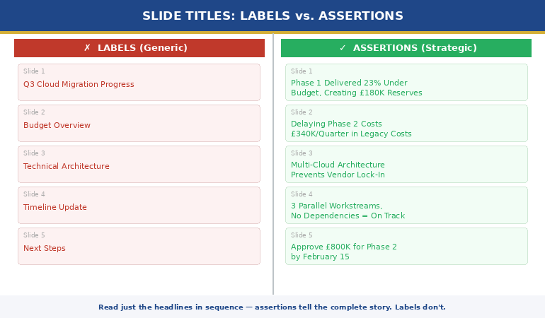
One problem: nowhere in 22 slides did it say what decision the board needed to make.

There was no recommendation. No “I’m asking for X by Y date.” No comparison of options with trade-offs. No cost of inaction. Just 22 slides of well-written information, sequenced in the order the AI had generated it — which was the order of his prompt, not the order of a decision-first argument.

I asked him: “If the board reads only slide 1, do they know what you’re asking for?” He looked at slide 1. It was a project overview. They wouldn’t know the decision until slide 19.

We restructured in 90 minutes. Same data, same AI-written content — but reorganised around a decision architecture. Recommendation on slide 2, evidence supporting it, options with trade-offs, specific ask with a deadline.

The board approved it in the first 10 minutes.

🚨 Built a presentation with AI and it feels flat? Quick check: Does slide 1 tell the room what decision you need? If the decision is on slide 15+, you have a content deck, not an argument.

→ Need the structural skeleton that makes AI output land? Get the Executive Slide System → £39

The Difference Between Content and Structure (And Why AI Only Gives You One)

Content is what your slides say. Structure is the order they say it in and why.

AI is extraordinarily good at content. Ask ChatGPT to “write a slide about Q3 revenue performance” and you’ll get a clear, professional summary with relevant data points. Ask it to “write 15 slides for a board presentation on Project Phoenix” and you’ll get 15 clear, professional slides.

What you won’t get is an argument. Because an argument requires something AI doesn’t have: knowledge of the decision-maker, the political context, the urgency, the alternatives, and the specific outcome you need from the room.

AI presentation structure fails because AI sequences content in the order it was prompted, not in the order that leads a room to a decision. It generates in narrative order (background → context → analysis → findings → recommendation) when executive communication requires decision-first order (recommendation → evidence → options → ask).

This is the fundamental gap. It’s not about better prompts, more specific instructions, or a different AI tool. It’s about the structural logic that determines what goes on slide 1, what goes on slide 5, and what the room is doing on slide 10.

For more on the difference between AI-enhanced and AI-generated presentations, see the full comparison.

Why do AI-generated presentations fail with executives?

Because executives read slides in decision mode — they’re looking for the recommendation, the risk, the cost, and the ask. AI generates slides in information mode — sequenced to inform, not to persuade. When an executive hits slide 5 and still doesn’t know what you’re asking for, they check out. The content might be better than anything you’d write manually. But without decision architecture, it’s like having a perfectly worded email with no subject line.

Why AI Presentations Fail in Executive Settings

After reviewing hundreds of AI-generated executive decks — from clients using ChatGPT, Copilot, Gamma, and others — I see the same three structural failures every time.

Failure 1: The recommendation is buried. AI typically generates in chronological or logical order: background first, analysis second, conclusions third, recommendation last. In a 20-slide deck, the recommendation lands on slide 17-20. By then, three executives have left and two more are on their phones. Executive presentations need the recommendation on slide 1 or 2 — everything after that is evidence supporting the ask.

Failure 2: No options or trade-offs. AI generates a single recommendation because that’s what it was asked for. But decision-makers need options. “I recommend A” gives the room two choices: yes or defer. “Here are three options with costed trade-offs, and I recommend A because…” gives them agency. AI doesn’t create options unless specifically prompted — and even then, it doesn’t quantify the trade-offs the way an executive audience needs.

Failure 3: No cost of inaction. The most powerful slide in any decision deck is the one that shows what happens if the room doesn’t decide. AI never generates this slide because it doesn’t understand that executive meetings exist to make decisions, and that deferral is the default outcome unless you make it expensive. The decision slide structure includes this by default — AI doesn’t.

⭐ Give AI the Structure It’s Missing — Then Let It Do What It’s Good At

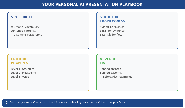
The Executive Slide System gives you 22 structural skeletons — the decision architecture AI can’t generate. Each template tells you what goes on every slide and why. Then the 51 matched AI prompts (Draft → Refine → Executive Polish) fill the structure with content that sounds like you.

Your structure-first AI toolkit:

  • 22 executive slide templates — the structural skeleton for board decks, status updates, proposals, and recommendations
  • 51 AI prompts in 3 stages: Draft (generate content), Refine (sharpen for audience), Polish (stress-test as a skeptical CEO)
  • 15 scenario playbooks — find your exact situation, follow the template + prompt sequence like a recipe
  • Decision architecture built into every template — recommendation, options, cost of inaction, specific ask

Get the Executive Slide System → £39

Built from 24 years of executive presentations — the structural logic AI doesn’t have.

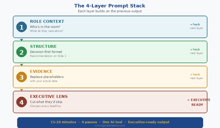
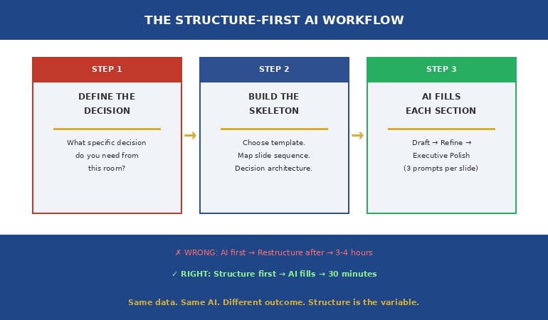
The Structure-First AI Workflow: Decision → Skeleton → AI

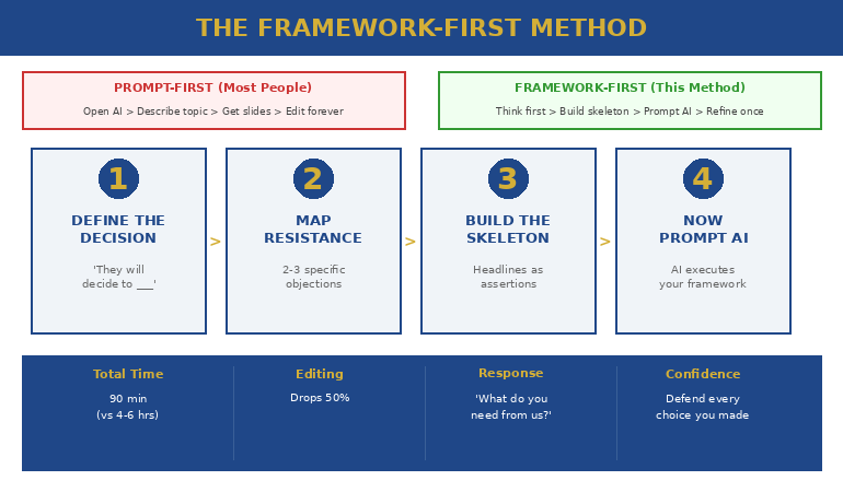
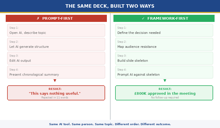
The fix is simple but counterintuitive: you need to build the structural skeleton BEFORE you open AI. Most people do the opposite — they prompt AI first, then try to restructure the output. That’s backwards.

Step 1: Define the decision. Before you write a single prompt, answer: “What specific decision do I need from this room?” Not “inform them about the project.” Not “update them on progress.” A decision: “Approve £400K additional budget by March 7.” If you can’t state the decision in one sentence, you’re not ready to build slides — with or without AI.

Step 2: Build the skeleton. Choose a template that matches your scenario. A board presentation needs a different skeleton than a project status update, which needs a different skeleton than an investment proposal. The skeleton determines what goes on each slide and in what order — recommendation first, evidence second, options third, ask last.

Step 3: Prompt AI to fill each section. Now — and only now — use AI. But not with a single prompt like “create a board presentation.” Instead, prompt section by section: “Write the executive summary for a £400K technology investment. The recommendation is to approve. The key evidence is…” When AI fills a pre-built structure, the output has the decision architecture the room needs.

This is the approach that turned my client’s 22-slide information deck into a 12-slide decision deck — same data, same AI-generated language, fundamentally different outcome.

For a library of proven prompts, see the complete guide to ChatGPT prompts for presentations.

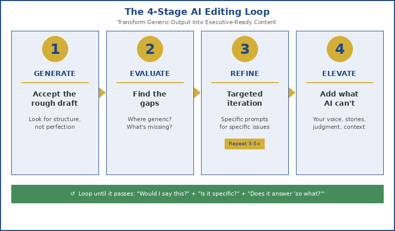
The 3-Prompt System: Draft → Refine → Executive Polish

One prompt doesn’t produce executive-quality output. Three prompts do — if they’re sequenced correctly.

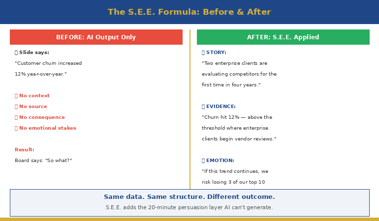
Prompt 1: Draft. Generate the content for a specific slide or section. Be specific about the scenario, the audience, and the data. “Create content for a Q3 business review for the finance committee. Include: revenue vs target, three significant wins with quantified impact, two challenges with root causes, and three priorities for next quarter.”

Prompt 2: Refine. Sharpen the output for the specific audience. “Make this more impactful for a CFO audience. Each win should quantify business impact. Challenges should include what we’re doing about them. Remove metrics that don’t connect to business outcomes.”

Prompt 3: Executive Polish. Stress-test it. “Review this through the eyes of a CEO with five other meetings today. What would they skip? What questions would they ask? Strengthen the ‘so what’ for each point. Ensure the decision is specific and time-bound.”

Each prompt layer adds something the previous one didn’t: the Draft gives you content, the Refine makes it audience-specific, and the Polish makes it decision-ready. Without the structural skeleton underneath, all three layers produce better-written information. With the skeleton, they produce an argument.

The Structure-First AI Workflow showing three steps from decision definition through structural skeleton to AI content filling

The 51 AI prompts in the Executive Slide System are pre-written in the Draft → Refine → Polish sequence for every template — so you’re not writing prompts from scratch. Open the template, run the three matched prompts, and the structural skeleton fills itself with executive-quality content. Get the Executive Slide System → £39

What AI IS Good At (Once the Structure Exists)

This isn’t an anti-AI article. AI is transformative for presentations — but only when it fills a structure rather than creating one.

Once you have the decision architecture in place, AI excels at: generating clear, professional language for each section; stress-testing your content from the audience’s perspective; finding gaps in your logic that you’ve become blind to; polishing language to be more concise and direct; and creating supporting data visualisations.

The combination of human structure + AI content is more powerful than either alone. You bring the judgement (what decision, what audience, what politics). AI brings the execution speed (clear language, consistent tone, gap identification). The structural skeleton is the interface between the two.

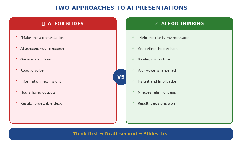
The professionals who are most effective with AI aren’t the ones writing the best prompts. They’re the ones who know what the room needs BEFORE they open ChatGPT. Structure first. AI second. That’s the workflow that gets decisions.

⭐ Stop Getting 22 Slides of Information and Zero Decisions

The Executive Slide System is the structural skeleton that makes AI output actually work in executive meetings. Each of the 22 templates includes the decision architecture — recommendation position, evidence sequence, options framing, specific ask — that AI can’t generate on its own.

Your structure-first AI deliverables:

  • 22 structural templates — recommendation-first, decision-ready, each with mapped slide sequence
  • 51 matched AI prompts — 3 per template (Draft → Refine → Executive Polish), pre-written and ready to paste
  • 15 scenario playbooks — find your exact situation, follow template + prompt sequence in under 30 minutes
  • 6 checklists — verify decision readiness, argument logic, and executive clarity before presenting

Get the Executive Slide System → £39

The structural logic from 24 years of executive banking + 51 AI prompts that fill it in minutes. Structure first. AI second. Decisions always.

The 15 scenario playbooks in the Executive Slide System tell you which template to open AND which AI prompts to run for your specific situation — so the structure-first workflow takes 30 minutes, not 3 hours. Get the Executive Slide System → £39

Is This Right For You?

✓ This is for you if:

  • You’ve used AI for presentations but the output feels flat, informational, or doesn’t get decisions
  • You want the structural logic that makes AI-generated content land with executive audiences
  • You want pre-written AI prompts matched to specific executive scenarios

✗ This is NOT for you if:

  • You don’t use AI for presentations and don’t plan to start
  • You’re looking for visual design templates (this is structural logic, not design)

⭐ 24 Years of Board-Level Decision Decks — Now a Structure AI Can’t Mess Up

Every template in the Executive Slide System was built from real executive approvals — board papers, SteerCo recommendations, ExCo investment cases. The decision architecture that got those approved is now the skeleton your AI fills.

Your AI-ready decision architecture:

  • Decision slide order that forces “what are you asking for?” onto slides 1–2 (not slide 19)
  • Options + trade-off slide formats executives actually use to decide — with costed consequences
  • Cost-of-inaction slide prompts — the missing slide in 90% of AI-generated decks
  • 51 matched AI prompts (Draft → Refine → Executive Polish) pre-written for every template

Get the Executive Slide System → £39

Built from board approvals, SteerCo recommendations, and ExCo investment cases at JPMorgan, RBS, PwC, and Commerzbank. Instant download. 30-day money-back guarantee.

Frequently Asked Questions

Can’t I just write better prompts instead of using templates?

Better prompts produce better content — but content isn’t the problem. The problem is structural logic: what goes on slide 1, what goes on slide 5, why the evidence is sequenced the way it is. No prompt, however sophisticated, gives AI the knowledge of your decision-maker, the political dynamics in the room, or the specific decision the meeting exists to make. Templates provide the structural skeleton that prompts can’t. Then prompts fill it brilliantly.

Does this work with ChatGPT, Copilot, and other AI tools?

Yes — because the structural problem is universal across all AI tools. ChatGPT, Copilot, Gamma, Claude, and every other AI presentation tool generates content in information mode. None of them generate in decision-first mode unless you provide the structure first. The templates work with any tool. The 51 AI prompts are written for ChatGPT-style interfaces but adapt to any conversational AI.

How long does the structure-first workflow take?

About 30 minutes for a complete executive deck. Five minutes to choose the right template for your scenario (the playbooks tell you which one). Five minutes to define the decision, recommendation, and key evidence points. Twenty minutes to run the three prompts per section and review the output. Compare that to 3-4 hours of prompt-iterate-restructure-prompt cycles when starting with AI alone.

What if my presentation is informational, not decision-based?

Most presentations that claim to be “informational” actually contain an implicit decision. A project status update implicitly asks “should we continue as planned?” A quarterly review implicitly asks “is this team performing?” If you genuinely need to inform without seeking a decision — a training session or a knowledge-share, for example — AI alone works fine. But for any presentation to leadership, there’s almost always a decision embedded. Find it, make it explicit, and build the structure around it.

📬 The Winning Edge — Weekly Newsletter

One executive presentation insight per week. AI workflows, structural frameworks, and the decision-first thinking that makes both work. No filler.

Subscribe Free →

Read next: AI handles slides. Q&A handles everything else. Read When You Don’t Know the Answer: 3 Responses That Save You in Q&A — the scripts for when AI can’t help.

Read next: If your next presentation involves giving sensitive feedback, read The Sandwich Feedback Trap: Why It Fails When You Critique Up (And the Mirror Structure That Works).

If your board pack goes out tomorrow morning — or your SteerCo pre-read is due by 5pm — don’t let AI decide the slide order. Build the structural skeleton first. Then let AI fill it. That’s how 22 slides of information become 12 slides that get a decision.

About the Author

Mary Beth Hazeldine is the Owner & Managing Director of Winning Presentations. With 24 years of corporate banking experience at JPMorgan Chase, PwC, Royal Bank of Scotland, and Commerzbank, she has delivered high-stakes presentations in boardrooms across three continents.

A qualified clinical hypnotherapist and NLP practitioner, Mary Beth combines executive communication expertise with evidence-based techniques for managing presentation anxiety. She has trained thousands of executives and supported presentations for high-stakes funding rounds and approvals.

Read more articles at winningpresentations.com

19 Feb 2026
Executive reviewing presentation data and charts on laptop before high-stakes Q&A session with leadership team

Copilot Agent Mode in PowerPoint: The 25-Minute Executive Deck Workflow

Last Tuesday I rebuilt a client’s 34-slide board deck in 25 minutes. Not because I’m fast — because I stopped fighting Copilot with one-shot prompts and switched to Agent Mode’s conversational workflow.

Quick answer: Copilot Agent Mode in PowerPoint works like a sharp junior colleague — it asks clarifying questions, remembers context across prompts, and makes multi-step improvements without you repeating yourself. The old model (write one detailed prompt, hope for the best, rebuild what it gets wrong) is replaced by a back-and-forth conversation where each prompt builds on the last. The result: executive-quality decks in 25 minutes instead of 3 hours. Below is the exact five-phase workflow I now use with every client deck, plus the prompting shift that makes Agent Mode dramatically more effective than standard Copilot.

The Prompt That Changed Everything

For the first six months after Microsoft launched Copilot in PowerPoint, I wrote elaborate one-shot prompts. Fifty words. A hundred words. Specifying audience, tone, slide count, layout, data points. The output was always the same: a starting point that needed 90 minutes of surgery.

Then Agent Mode rolled out and I tried something different. Instead of giving Copilot everything upfront, I typed: “I need a 10-slide board presentation on our Q4 results. Can you help me build it slide by slide? Start by asking what metrics matter most to my board.”

Copilot asked me four questions. Who’s the audience? What decisions need to happen? What’s the one thing the board needs to walk away knowing? What data do you have ready?

After I answered, it built the deck — and because it understood the context, the slides actually made sense. Not generic. Not stuffed with filler. Structured around the decision I needed. I spent 12 minutes refining instead of 90 minutes rebuilding. That was the moment I stopped writing one-shot prompts for executive decks.

📋 Every Agent Mode Prompt You Need — Organised by Scenario

The Copilot Agent Mode Prompt Playbook gives you copy-paste prompts for building executive decks from scratch (board updates, budget requests, investor pitches, strategy, transformation), rescuing existing decks (audit, condense, rewrite titles, “make it C-suite”), and generating specific slide types (data, comparison, roadmap, closing). Plus the complete 25-minute executive deck workflow and power modifiers that improve any prompt.

Get the Agent Mode Prompt Playbook — £19.99

Digital download. Copy-paste prompts by scenario. Tested extensively on client decks across banking, biotech, SaaS, and consulting.

Standard Copilot vs Agent Mode: The Real Difference

Standard Copilot in PowerPoint works like a vending machine. You insert a prompt, it returns slides. No memory. No follow-up. No context from one prompt to the next. If the output is wrong, you start over with a different prompt.

Agent Mode works like briefing a colleague. You describe what you need, it asks questions, and then it builds — remembering everything you’ve said across multiple prompts. When you say “make slide 3 more visual,” it knows what slide 3 contains, what the deck is about, and who the audience is.

PAA: What’s the difference between Copilot and Agent Mode in PowerPoint?
Standard Copilot requires you to guide each step with separate, context-free prompts — typically 5-10 per deck. Agent Mode works conversationally: it asks clarifying questions, maintains context across prompts, and allows surgical edits (“make slide 3 more visual”) without you rewriting the entire instruction. Agent Mode typically needs 1-3 prompts per deck versus 5-10 for standard mode. Agent Mode availability varies by organisation, tenant, and rollout schedule — if you don’t see it, check your M365 Copilot licence and admin settings.

This matters for executive decks because senior audiences have specific requirements that standard Copilot can’t hold in memory: the decision being requested, the politics in the room, the metrics that matter to this particular CFO. Agent Mode holds all of that context across every prompt in the conversation. For a deeper look at prompt structure fundamentals, see the complete Copilot PowerPoint prompts guide.

The 25-Minute Executive Deck Workflow (5 Phases)

This is the exact workflow I now use for every executive deck. Five phases, 25 minutes, from blank PowerPoint file to boardroom-ready output.

Phase 1: The Conversational Brief (5 minutes)

Open PowerPoint → Copilot Chat → Tools → Agent Mode. Then paste this type of opening prompt: “I need a [slide count]-slide [presentation type] for [audience]. The decision I need from this meeting is [specific outcome]. Start by asking me what you need to know.”

Agent Mode will ask 3-5 clarifying questions. Answer them honestly and specifically. This is where most of the quality comes from — not from the prompts themselves, but from the context you provide when Agent Mode asks.

Phase 2: The Build (5 minutes)

Once Agent Mode has your context, it generates the deck. Review the structure — not the content yet. The order of slides matters more than the words on them at this stage. If the flow is wrong, tell Agent Mode: “Move the financial impact section before the recommendation” or “add a risk slide between the timeline and the ask.”

Phase 3: The Audit (5 minutes)

This is where the playbook earns its money. Paste the deck audit prompt: ask Agent Mode to identify the 3 weakest slides and suggest specific improvements for clarity and impact. Then for each flagged slide, run the rewrite. Agent Mode remembers the original context, so its rewrites are targeted — not generic.

The Copilot Agent Mode Prompt Playbook includes the exact audit prompt, the “make it C-suite” rewrite, and the 8-second scan test — ready to paste for any executive deck scenario.

Get the Prompt Playbook — £19.99

Phase 4: Polish (5 minutes)

Use the 2026 canvas sequence: Auto-Rewrite → Make professional → Condense. This three-step combo tightens language, cleans formatting, and removes the padding that Copilot adds to every slide by default. Then generate speaker notes and run a consistency audit — Agent Mode checks for conflicting numbers, mismatched terminology, and tone shifts across the full deck.

Phase 5: Stress Test (5 minutes)

Ask Agent Mode to generate the three toughest questions your audience will ask — and draft response slides or talking points for each. This is the step most people skip and most people regret. A board member who finds a gap in your logic during Q&A will remember that gap, not your slides. For more on the full Copilot PowerPoint tutorial and latest features, see the complete guide.

Diagram showing the five-phase Agent Mode workflow: conversational brief five minutes, build five minutes, audit five minutes, polish five minutes, and stress test five minutes, totalling 25 minutes from blank file to boardroom-ready deck

When You Already Have a Deck (The Rescue Workflow)

Half the time, you’re not building from scratch — you’re inheriting a 40-slide monster from last quarter that needs to be presentable by Thursday. Agent Mode handles this differently from standard Copilot because it can assess the full deck before making changes.

The rescue workflow has four steps. First, run the full deck audit: Agent Mode identifies the three weakest slides and gives you a fix direction for each. Second, condense — paste the “kill the text walls” prompt that targets slides with more than 5 bullet points or more than 30 words per slide. Third, rewrite slide titles: most corporate decks use label titles (“Q3 Revenue”) instead of insight titles (“Q3 Revenue Beat Target by 11% — Here’s What Drove It”). Agent Mode rewrites every title as an insight headline. Fourth, the “make it C-suite” pass: ask Agent Mode to rewrite the entire deck for a time-poor executive using the 8-second scan test — if a slide can’t be understood in 8 seconds, it gets simplified.

If you’ve ever wondered why your Copilot slides look generic, the rescue workflow fixes it — because Agent Mode uses the context of your specific deck, not generic templates.

🔧 Build From Scratch or Rescue What You’ve Got

The Prompt Playbook covers both workflows. Build prompts for 8 scenario types (board, budget, investor, strategy, transformation, project status, sales, training). Rescue prompts for audit, condense, insight titles, executive summary, and the “make it C-suite” rewrite. Plus slide-type prompts for data slides, comparisons, roadmaps, problem/solution, and closing slides that end on the ask.

Get the Agent Mode Prompt Playbook — £19.99

Digital download (PDF). Copy-paste prompts organised by scenario. Designed for Agent Mode first, also works in standard Copilot.

Every prompt in the Playbook is structured around executive decision logic — metrics, risks, outcomes, and asks — not industry jargon. Works across banking, biotech, SaaS, consulting, and any sector where executives make decisions from slides.

Get the Prompt Playbook — £19.99

The 3 Agent Mode Mistakes Everyone Makes First

Mistake 1: Treating it like standard Copilot. If you paste a 100-word one-shot prompt into Agent Mode, you’re wasting its best feature — the ability to ask you questions. Start with a brief context sentence and let Agent Mode pull the detail out of you through its clarifying questions. The prompts it generates from conversation are better than anything you’d write upfront.

Mistake 2: Skipping the audit phase. Agent Mode builds good first drafts. Not perfect first drafts. The audit prompt (“find the 3 weakest slides and suggest specific improvements”) is what turns a good deck into one that survives a boardroom. Most people generate and present. The professionals generate, audit, and then present.

Mistake 3: Ignoring power modifiers. Short phrases appended to any prompt that dramatically change the output: “lead with the headline,” “one key message per slide,” “format for scanning not reading.” These modifiers work because Agent Mode remembers them across subsequent prompts — unlike standard Copilot, which forgets everything after each interaction.

PAA: How do I use Agent Mode in PowerPoint?
Open PowerPoint with a Microsoft 365 Copilot licence. Click the Copilot Chat button in the ribbon, then select Agent Mode from the Tools menu in the prompt box. Start with a brief description of what you need (“I need a 10-slide board presentation on Q4 results”) and let Agent Mode ask clarifying questions before it builds. Agent Mode availability varies by organisation and rollout schedule — check your M365 Copilot licence and admin settings for current feature access.

PAA: Can Copilot build a presentation from scratch?
Yes — and Agent Mode does it significantly better than standard Copilot. With standard Copilot, you write one prompt and get a full draft that usually needs heavy editing. With Agent Mode, you have a conversation first: Copilot asks what the deck is for, who the audience is, what decisions need to happen, and what data you have. The resulting deck is more targeted because Agent Mode understood the context before it started building. Most professionals find that Agent Mode decks need 10-15 minutes of refinement versus 60-90 minutes for standard Copilot output.

⚡ Stop Guessing. Start Pasting.

The Copilot Agent Mode Prompt Playbook gives you the exact prompts — organised by scenario, not alphabetically. Board deck? Page 3. Budget request? Page 5. Rescuing a 40-slide disaster? Page 12. Every prompt is built around executive decision logic and tested on real client decks across multiple industries. Plus the 25-minute workflow, power modifiers, speaker notes prompts, and Q&A stress test.

Get the Agent Mode Prompt Playbook — £19.99

Used by executives, consultants, and senior managers who present to time-poor decision makers. Digital download — start using it today.

Frequently Asked Questions

Do I need Copilot Agent Mode to use this playbook?

It’s designed for Agent Mode first — because Agent Mode asks clarifying questions and handles multi-step changes that standard Copilot can’t. But many of the prompts still improve results in standard Copilot, just with less “memory” and fewer multi-step edits. If your organisation hasn’t rolled out Agent Mode yet, you’ll still get better output from these structured prompts than from generic ones.

How is this different from the free prompts on your blog?

The blog posts teach prompt structure and individual techniques. The playbook is organised by scenario — you find your situation (board deck, budget request, deck rescue), paste the prompt, and go. It includes the complete 25-minute workflow, power modifiers, the deck audit and rescue sequence, slide-type prompts, and speaker notes and Q&A generation. It’s designed to sit next to your keyboard, not to teach you theory.

Will this work for my industry?

Yes — because the prompts are structured around executive decision logic (metrics, risks, outcomes, asks), not industry-specific jargon. I’ve tested these prompts on decks across banking, biotech, SaaS, consulting, and public sector. If your audience makes decisions from slides, these prompts are built for you.

Get monthly Copilot updates + presentation strategies

I test every new Copilot feature on real client decks before recommending it. Get what actually works, delivered monthly.

Subscribe to The Winning Edge

Related: Agent Mode can build your slides — but it can’t present them for you. If presentation anxiety is what’s really holding your career back, read Presentation Anxiety Is Ruining My Career — What Actually Fixes It.

About the Author

Mary Beth Hazeldine is the Owner & Managing Director of Winning Presentations. With 24 years across banking and consulting — including JPMorgan Chase, PwC, Royal Bank of Scotland, and Commerzbank — she has supported presentations for high-stakes funding rounds and approvals across 15+ years of executive training.

She tests every Copilot feature on real client decks before recommending it, and has trained professionals on AI-enhanced presentations across banking, biotech, SaaS, and consulting.

Book a discovery call | View services

Your next step: Open PowerPoint, go to Copilot Chat → Tools → Agent Mode, and paste this: “I need a [number]-slide [type] presentation for [audience]. The decision I need from this meeting is [outcome]. Start by asking me what you need to know.” See how different the output is when Copilot understands the context first. Then grab the full playbook to have every scenario prompt ready when the next deck is due.

16 Feb 2026
Your Data Slides Are Killing Your Presentation. Here's How AI Can Fix That.

Your Data Slides Are Killing Your Presentation. Here’s How AI Can Fix That.

The CFO had pasted an entire Excel tab — thirty-seven rows of quarterly figures — onto a single slide. Then he asked the board to “take a moment to absorb the numbers.”

Quick answer: AI data visualisation for presentations can transform unreadable spreadsheet dumps into clear, persuasive visual charts — but only when you tell it what the data means first. The process is not “paste my data and make it pretty.” It’s a three-step human-led workflow: decide the insight (what does this data prove?), choose the visual type (comparison, trend, composition, or distribution), then use AI to generate, label, and refine the chart. AI handles the visual execution. You handle the strategic thinking. The result is data slides that make a point rather than display a table.

At Commerzbank, I sat through a quarterly review where the Head of Risk presented a slide with a forty-two-cell table comparing capital adequacy ratios across eight business lines and four quarters. Every cell was filled. Every number was accurate. Nobody in the room knew what it meant.

After the meeting, the Group Treasurer said to me: “I have no idea whether we’re in trouble or not.” The data was perfect. The communication was useless.

I helped him rebuild that slide. We replaced the table with a single bar chart showing one thing: which business lines were above the threshold and which were below. Three were red. The rest were green. The next board meeting lasted half the time and produced twice the decisions. Same data. Different visual. Completely different outcome.

Why Data Tables Fail in Executive Presentations

Data tables work in reports. They fail in presentations. The reason is cognitive: a table asks the reader to perform analysis, while a chart provides the analysis already completed. When you paste a spreadsheet into a slide, you’re asking your audience to do the work you should have done before the meeting.

Senior executives are processing information from dozens of sources across dozens of meetings. They don’t have the cognitive bandwidth to scan forty-two cells, identify the relevant comparisons, and draw their own conclusions — all while you’re talking over the top of the slide. A data table in a presentation is not information. It’s a homework assignment.

The result is predictable. Executives either tune out (because the table is overwhelming), or they focus on the wrong number (because without visual hierarchy, every number looks equally important). Either way, your data fails to do its job, which is to support a specific point that drives a specific decision.

This is why data-heavy presentations often backfire with executives. The problem isn’t the data. It’s the format. And this is precisely where AI can help — not by thinking for you, but by transforming your thinking into a visual that communicates instantly.

PAA: Why do data-heavy slides fail in presentations?
Data tables require the audience to perform their own analysis — scanning cells, making comparisons, and drawing conclusions — while simultaneously listening to the presenter. Executive audiences don’t have the cognitive bandwidth for this. Charts solve the problem by pre-digesting the analysis: they show the conclusion visually so the audience can absorb the insight in seconds rather than minutes. The presenter’s job is to decide the insight first, then choose a visual format that makes that insight obvious.

Turn Data Into Decisions — Not Decoration

AI-Enhanced Presentation Mastery includes the complete data visualisation workflow: the Insight–Implication–Action framework, AI prompt sequences for chart creation, and the visual decision matrix that tells you which chart type to use for any dataset. Self-study programme — join anytime.

Join AI-Enhanced Presentation Mastery → £249

Self-study programme with live support. Join anytime — all released modules available immediately. Built from 24 years presenting financial data in corporate banking. Check course page for current pricing and session details.

The Insight-First Method (Before You Touch AI)

The biggest mistake people make with AI data visualisation is starting with the data. They paste a spreadsheet into an AI tool and ask it to “make a chart.” The result is a technically correct but strategically useless visualisation — because AI doesn’t know what point you’re trying to make.

Before you touch AI, answer one question: What does this data prove?

Not “what does this data show” — that’s a description. “What does this data prove” forces you to state a conclusion. Examples of the difference:

“This data shows Q3 revenue by region” → a description that leads to a table.
“This data proves that EMEA revenue recovered faster than expected” → an insight that leads to a chart with EMEA highlighted.

“This data shows customer satisfaction scores” → a description that leads to a grid.
“This data proves that satisfaction dropped in the two months after the platform migration” → an insight that leads to a trend line with the drop circled.

Once you have the insight, you can tell AI exactly what to visualise — and more importantly, what to emphasise. “Create a bar chart of Q3 revenue by region. Highlight EMEA in gold. Grey out all other regions. Add a horizontal line showing the forecast.” That prompt produces a useful chart because you’ve done the thinking. AI does the drawing.

This is the Insight–Implication–Action framework we teach in the course: every data slide should state the insight (what the data proves), the implication (what it means for the audience), and the action (what needs to happen next). AI can’t generate any of those three things. But once you’ve defined them, AI can create the visual that communicates them instantly.


(770×450)Insight-First Method showing three steps: decide the insight then choose the visual then use AI to create and refine

📊 Want the complete Insight–Implication–Action framework and AI prompt sequences?

AI-Enhanced Presentation Mastery includes the data storytelling module with before/after transformations and the visual decision matrix.

Join AI-Enhanced Presentation Mastery → £249

How AI Transforms Data Into Visual Clarity

Once you’ve identified the insight, AI becomes genuinely powerful. Here’s the workflow for transforming a data-heavy slide into a clear visual:

Step 1: Give AI the data AND the insight. Don’t just paste your spreadsheet. Tell AI what you want the audience to take away. “Here is our quarterly revenue data. The key insight is that EMEA recovered to 94% of target while APAC stayed at 71%. Create a horizontal bar chart that makes this comparison obvious. Use gold for EMEA and grey for APAC. Include a vertical line at the 100% target.” The more specific your instruction, the more useful the output.

Step 2: Ask AI to simplify, not add. AI’s instinct is to include everything. Your instinct should be to remove everything that doesn’t support the insight. “Remove the gridlines. Remove the exact values from bars under 50%. Make the chart title a complete sentence: ‘EMEA Revenue Recovered to 94% — APAC Still Lagging.'” The best data slides look almost empty. That’s the point — the insight should be impossible to miss.

Step 3: Use AI to generate the headline. Your slide title should state the conclusion, not describe the content. AI is excellent at rewriting “Q3 Revenue by Region” into “EMEA Recovery Outpaced Forecast — APAC Needs Intervention.” Give AI your insight and ask it to write a headline that a time-poor executive would understand without looking at the chart. If the headline alone tells the story, you’ve succeeded.

This three-step process — insight, simplify, headline — takes five minutes per slide and produces results that are dramatically more persuasive than any table, regardless of how much data that table contains.

If you want to go deeper on how to match your AI prompts to executive presentation needs, the key is always the same: tell AI what the data means before asking it to visualise the data.

PAA: How do I use AI to create charts for presentations?
Start by defining the insight your data proves — not just what it shows. Then give AI both the data and the insight in a single prompt, specifying the chart type, what to highlight, and what to remove. Ask AI to write the slide headline as a complete sentence that states the conclusion. The process takes about five minutes per slide and produces charts that communicate instantly rather than requiring the audience to decode a table.

From Spreadsheet Dump to Executive Clarity

Module 6 of AI-Enhanced Presentation Mastery covers data storytelling in depth — including the Insight–Implication–Action framework, the visual decision matrix, AI prompt sequences for chart transformation, and before/after examples from real executive presentations. Study at your own pace.

Join AI-Enhanced Presentation Mastery → £249

Self-study programme with live Q&A calls. Join anytime — all released modules available immediately. Check course page for current pricing and session details.


Before and after comparison showing spreadsheet table transformed into a clear highlighted bar chart with insight headline

The Four Chart Types That Cover 90% of Executive Data

You don’t need twenty chart types. You need four. Almost every data insight an executive needs to communicate falls into one of these categories:

1. Comparison: “How do these things stack up?” Use horizontal bar charts. Revenue by region, performance by team, budget vs actual. AI prompt: “Create a horizontal bar chart comparing [X]. Highlight the top performer in gold and the underperformer in red. Grey out the middle. Title should state who’s winning.”

2. Trend: “What’s changing over time?” Use line charts. Revenue trajectory, customer satisfaction over quarters, headcount growth. AI prompt: “Create a line chart showing [X] over [time period]. Highlight the inflection point where the trend changed. Add a brief annotation explaining what caused the change. Title should state whether the trend is positive or negative.”

3. Composition: “What’s the breakdown?” Use stacked bars or pie charts (but only for 3–5 segments — more than five and the pie becomes useless). Revenue mix, cost allocation, market share. AI prompt: “Create a stacked bar chart showing [X] breakdown. Highlight the largest segment. Title should state what dominates.”

4. Distribution: “Where does the data cluster?” Use scatter plots or histograms. Customer segments by value, project risk ratings, team performance distribution. AI prompt: “Create a scatter plot showing [X] vs [Y]. Circle the outliers. Title should state the pattern — whether it’s clustered, spread, or has notable outliers.”

When you’re unsure which chart type to use, ask yourself: “Am I comparing, tracking, breaking down, or distributing?” The answer picks the chart. Then tell AI which category and let it handle the execution. This is considerably more effective than the approach covered in data storytelling fundamentals, because AI handles the visual execution while you focus entirely on the strategic framing.

📊 The visual decision matrix and AI prompt templates for all four chart types are inside the course.

AI-Enhanced Presentation Mastery includes the complete data visualisation system — frameworks, prompts, and before/after examples.

Join AI-Enhanced Presentation Mastery → £249

What AI Cannot Do With Your Data (The Human Part)

AI is excellent at the mechanical parts of data visualisation — creating charts, formatting them, writing headlines, standardising colours. But there are four things AI cannot do, and they’re the four things that actually matter:

AI cannot decide what’s important. Your dataset might contain fifty data points. Only three of them matter to your audience. Which three? That depends on who’s in the room, what they care about, and what decision you’re asking them to make. This is strategic judgment, not data analysis. AI can’t do it.

AI cannot read the political room. Sometimes the data shows something uncomfortable — a team underperforming, a region in decline, a project over budget. How you visualise that data depends on whether you’re presenting to the team responsible (where diplomacy matters) or to the board (where directness matters). AI doesn’t know the politics. You do.

AI cannot tell you what’s missing. The most dangerous data slide is the one that’s technically accurate but strategically incomplete. If your chart shows revenue growth but doesn’t show margin erosion, it’s misleading. AI won’t flag what you’ve left out. Only someone who understands the full business context can do that.

AI cannot determine the “so what.” Every data slide needs to answer one question: “So what?” Revenue grew 12% — so what? Is that good? Compared to what? What should we do about it? The “so what” is the entire point of the slide, and it requires human judgment about context, expectations, and next steps.

The best data slides are 80% human thinking and 20% AI execution. AI makes the visual. You make the point.


Four things AI cannot do with your data: decide importance, read the room, spot what is missing, determine the so what

PAA: Can AI replace human thinking in data presentations?
No. AI is excellent at the visual execution — creating charts, formatting them, writing headlines — but it cannot determine what’s important, read political dynamics in the room, identify what data is missing, or decide the “so what” that makes a slide actionable. The most effective workflow uses AI for 20% of the work (visual execution) and human judgment for 80% (strategic framing, audience awareness, and insight selection). AI is the pen. You’re the author.

Learn the Complete System for Executive Data Slides That Drive Decisions

AI-Enhanced Presentation Mastery teaches you the human-led, AI-assisted approach to executive presentations — including the Insight–Implication–Action framework, the visual decision matrix, AI prompt sequences, and the data storytelling techniques built from 24 years presenting financial data in corporate banking and 15 years coaching executives through high-stakes decision meetings.

Join AI-Enhanced Presentation Mastery → £249

Self-study programme with live support. Join anytime — all released modules available immediately. Built from 24 years presenting financial data in corporate banking + 15 years coaching executives. Check course page for current pricing and session details.

Frequently Asked Questions

What if my audience expects to see the full data table?

Put the table in the appendix. Present the chart in the main deck. If someone asks “where are the detailed numbers?” you say “slide 22 in the appendix” and continue with your insight. This gives you the best of both worlds: visual clarity in the presentation and full data availability on request. In twenty-four years of corporate banking, I’ve found that the executives who request the detailed table almost never actually read it — they just want to know it’s there.

Which AI tools are best for data visualisation?

Any AI tool that can process text prompts and generate charts works — ChatGPT, Claude, Copilot in PowerPoint. The tool matters less than the prompt. A specific prompt (“Create a horizontal bar chart comparing Q3 revenue by region, highlight EMEA in gold”) produces dramatically better results than a vague prompt (“Make a chart from this data”) regardless of which tool you use. The Insight-First Method works with any AI platform.

How do I handle sensitive financial data with AI tools?

If your data is confidential, use anonymised or rounded figures for the AI-generated chart, then manually replace them with the real numbers in your final slide. AI needs the structure and proportions to create the right visual — it doesn’t need the exact numbers. Alternatively, use AI only for the chart template and formatting, then input your data directly. Many organisations have approved AI tools with enterprise-grade data protection for this purpose.

Does this work for non-financial data?

The Insight-First Method works for any data type: project timelines, customer satisfaction scores, employee engagement metrics, operational KPIs, marketing funnels. The principle is the same — decide the insight before you create the visual, tell AI what to emphasise, and write a headline that states the conclusion. The four chart types (comparison, trend, composition, distribution) cover 90% of any data you’ll present in a corporate setting.

📬 The Winning Edge Newsletter

Weekly strategies for executive presentations, AI-enhanced workflows, and career-critical stakeholder communication. No fluff.

Subscribe free →

🎯 Free: 10 Essential AI Prompts for Executive Presentations

Includes the data visualisation prompts for all four chart types, plus headline rewriters and the slide clarity check sequence.

Download free →

Related: Data slides are one piece of the puzzle. If you’ve been thrown into a last minute presentation and need to build a complete deck fast, the 5-slide emergency framework helps you decide which data to include and which to cut — before you start visualising anything.

Stop pasting spreadsheets into slides. Decide the insight first. Choose the right visual. Let AI handle the execution. Your audience will thank you — and your data will finally do its job.

🎯 Learn the human-led, AI-assisted approach to executive presentations.

Join AI-Enhanced Presentation Mastery → £249

About the Author

Mary Beth Hazeldine is the Owner & Managing Director of Winning Presentations. With 24 years of corporate banking experience at JPMorgan Chase, PwC, Royal Bank of Scotland, and Commerzbank, she spent two decades watching executives paste spreadsheets into slides — and helping them transform that data into visuals that actually drove decisions.

A qualified clinical hypnotherapist and NLP practitioner, Mary Beth combines executive communication expertise with modern AI-enhanced workflows to help leaders present data with clarity and conviction.

Book a discovery call | View services

15 Feb 2026
Professional at desk comparing presentation layouts on screen, actively building slides in a bright modern office with natural lighting

Teach AI Your Presentation Style (So It Stops Sounding Generic)

Quick answer: AI makes presentations faster but also makes them generic — because most people prompt AI with what they want to say, not how they say it. To teach AI your presentation style, you need three things: a style brief (your tone, sentence patterns, and vocabulary), a structure framework (your preferred message architecture), and a critique loop (prompts that make AI edit its own output against your standards). This turns AI from a content generator into a strategic co-creator that sounds like you, not like everyone else.

Presenting this week? Do this in 15 minutes:

1. Write a 200-word style brief (your tone + vocabulary + 2 sample paragraphs)
2. Pick one structure rule: AVP for persuasion slides, 132 Rule for overall flow
3. Paste both into your AI tool before your content brief
4. Generate your first draft
5. Run the critique loop: “Does this follow my structure? Remove any phrase I wouldn’t use.”

That’s the free version. The AI-Enhanced Presentation Mastery course (£249) gives you the complete system — style brief template, all four frameworks, 30+ critique prompts, and a reusable AI playbook.

A marketing director showed me two versions of the same quarterly business review.

Version A was the one she’d written herself: sharp, direct, slightly dry. Her signature move was opening every section with a one-line insight before the data. The CFO loved it because he could scan the headlines and get the story in sixty seconds.

Version B was the one she’d asked ChatGPT to create from the same data. It was technically correct. Every point was there. But it read like it had been written by a committee — smooth, cautious, with phrases like “leveraging synergies” and “driving alignment across stakeholders” that she would never use in real life.

She said: “It’s faster but it’s not mine. The CFO would read this and think someone else wrote it. Which defeats the entire purpose.”

That conversation crystallised something I’d been seeing across every executive I work with: AI doesn’t have a quality problem. It has a voice problem. And the voice problem exists because nobody teaches you how to train AI on your style — your frameworks, your vocabulary, your preferred message structure. They just teach you how to write prompts. Which is like teaching someone how to use a steering wheel without explaining where they’re driving.

Why Every AI Presentation Sounds the Same

AI language models are trained on billions of words of internet text. When you ask one to “write a slide about Q3 performance,” it draws on the average of everything it’s ever seen about quarterly performance slides. The result is competent, generic, and indistinguishable from what everyone else is getting.

This is the fundamental problem with how most people use AI for presentations. They prompt for content — “write me five bullet points about customer retention” — and get content that could have come from anyone in any company in any industry. The content is accurate. It’s also forgettable.

The professionals who actually benefit from AI do something different. They don’t ask AI to generate content. They ask AI to execute their thinking — using their frameworks, their vocabulary, their preferred structure. The AI does the heavy lifting, but the output carries their signature.

The difference shows up immediately. When you give AI a bare prompt, you get generic corporate language. When you give AI your style brief and your message framework, you get output that sounds like a faster, more productive version of you.

This is exactly the approach taught in AI-enhanced presentation creation — structure first, AI second. The structure is what makes the output yours. The AI is what makes it fast.

PAA: Why do AI-generated presentations sound so generic?
Because most people prompt AI with what to say, not how to say it. AI defaults to the statistical average of everything it’s been trained on — which means smooth, corporate, committee-style language. To get output that sounds like you, you need to provide your style brief (tone, vocabulary, sentence patterns), your preferred message architecture (frameworks like AVP or the 132 Rule), and a critique prompt that makes AI edit its own output against your standards.

Stop Getting Generic Output. Start Getting Output That Sounds Like You.

AI-Enhanced Presentation Mastery teaches you how to build AI workflows that preserve your voice, your frameworks, and your communication style. 8 modules covering structure, messaging, slide design, data storytelling, and a complete personal AI playbook you’ll reuse for every presentation.

Get AI-Enhanced Presentation Mastery → £249

Currently £249 — launch pricing ends March 1st (£399 self-study / £750 live cohort).

Self-paced modules + live support + lifetime access.

The Style Brief: Teaching AI Your Voice in 5 Minutes

A style brief is a short document — 200 words maximum — that tells AI how you communicate. Not what you want to say. How you say things.

Here’s what goes into an effective presentation style brief:

Tone descriptors. Three to five words that describe your communication style. Examples: “direct, evidence-led, slightly dry humour” or “warm, structured, practical” or “analytical, precise, minimal adjectives.” AI language models respond dramatically to tone descriptors — they shift the entire register of the output.

Vocabulary preferences. Words you use and words you don’t. If you say “stakeholders” but never say “key stakeholders,” that matters. If you write “clients” instead of “customers,” specify it. If you avoid phrases like “leverage,” “synergise,” or “circle back” — tell the AI. This alone eliminates 80% of the generic feel.

Sentence pattern. Short sentences? Long analytical sentences? A mix? Do you open sections with a question or a statement? Do you use first person or third person? AI copies these patterns surprisingly well when you provide examples.

Two sample paragraphs. The most effective style brief includes two paragraphs you’ve actually written — presentation notes, an email to your boss, a section from a report. Not “ideal” writing. Your actual writing. AI learns more from your real voice than from your aspirational voice.

Once you have your style brief, you include it at the start of every AI conversation about presentations. The difference is immediate and, frankly, startling. Output goes from “could be anyone’s” to “sounds like mine” in a single prompt.


Personal AI presentation playbook showing four components: style brief, structure frameworks, critique prompts, and never-use list

📊 Want the complete style brief template? AI-Enhanced Presentation Mastery (£249) includes the full style brief builder, sample briefs for different professional styles, and the prompt architecture that makes AI output match your voice consistently.

Structure-First AI: Why Frameworks Beat Freeform Prompts

The second reason AI presentations sound generic: people ask AI to create structure and content simultaneously. This is like asking a builder to design the house and construct it at the same time — you get something functional but unremarkable.

The professionals who get the best results from AI use a structure-first approach: they define the message architecture before AI writes a single word.

In the AI-Enhanced Presentation Mastery course, we teach three frameworks that work exceptionally well as AI instructions:

AVP (Action-Value-Proof). Every slide follows a three-part structure: what you want the audience to do (Action), why it matters to them (Value), and the evidence that supports it (Proof). When you give AI the AVP framework as an instruction — “Structure every slide using Action-Value-Proof” — the output immediately becomes more persuasive and more structured than freeform prompting.

The S.E.E. Formula (Statement-Evidence-Example). For slides that need to present data or make a case: lead with the insight statement, follow with the evidence that supports it, then provide a concrete example that makes it real. This stops AI from producing the generic “here are five data points” output and forces it to tell a story with every slide.

The 132 Rule. For overall presentation flow: one opening message (the 1), three supporting sections (the 3), two closing elements — a summary and a call to action (the 2). This gives AI a macro-structure that prevents the wandering, unfocused presentations that AI tends to produce when given open-ended briefs.

When you combine your style brief with a structure framework, AI stops guessing and starts executing. The output isn’t generic because it was never given the chance to be — you’ve constrained it with your thinking, your architecture, and your standards.

If you’re currently using ChatGPT prompts for presentations, adding structure frameworks to those prompts will transform the quality of what you get back.

PAA: How do you get better results from AI for presentations?
Provide structure before content. Instead of asking AI to “create a presentation about X,” give it your message framework (like AVP or the 132 Rule), your style brief (tone, vocabulary, sentence patterns), and the specific decision you want the audience to make. AI excels at executing within constraints — the tighter the framework, the better the output. Freeform prompts produce freeform results.

Frameworks First. AI Second. Your Voice Always.

AI-Enhanced Presentation Mastery gives you the AVP formula, S.E.E. wording framework, 132 Rule, and Insight-Implication-Action structure — then shows you exactly how to feed them to AI so every presentation sounds like you wrote it. Includes prompt packs, before/after transformations, and the complete AI workflow.

Get AI-Enhanced Presentation Mastery → £249

£249 launch pricing — ends March 1st (£399 self-study / £750 live cohort). Self-paced modules + templates + prompt packs + live support + lifetime access.

The Critique Loop: Making AI Edit Against Your Standards

Here’s what most people miss entirely: the first output AI gives you should never be the final version. AI is a first-draft machine. The magic is in the critique loop — using AI to edit its own output against your specific standards.

A critique prompt works like this. After AI generates your presentation content, you say: “Now review this output against these criteria: (1) Does every slide follow AVP structure? (2) Are there any phrases I wouldn’t use? Remove ‘leverage,’ ‘synergise,’ and ‘key stakeholders.’ (3) Is any slide trying to make more than one point? Split it. (4) Does the opening grab attention in the first sentence?”

This is essentially turning AI into your personal presentation coach — one that knows your standards because you’ve defined them explicitly.

The most effective critique prompts we’ve developed in the course follow three levels:

Level 1: Structure critique. “Does this presentation follow the 132 Rule? Is the opening message clear? Do the three middle sections support different aspects of the argument? Does the closing include both a summary and a specific call to action?”

Level 2: Messaging critique. “Review each slide against the S.E.E. formula. Does every claim have evidence? Does every evidence point have a concrete example? Flag any slide where the message is vague or abstract.”

Level 3: Voice critique. “Compare this output against my style brief. Flag any sentences that use passive voice (I use active). Remove any corporate jargon that isn’t in my vocabulary list. Shorten any sentence longer than 25 words.”

Running all three levels takes about 5 minutes. The result is output that’s been through a more rigorous editorial process than most people apply manually — and it sounds like you, not like an AI.

If you’re already using PowerPoint Copilot, layering a critique loop on top of its output is the single fastest way to improve quality.

📊 Want all three critique prompt levels? AI-Enhanced Presentation Mastery (£249) includes the complete critique prompt pack — structure, messaging, and voice — plus the Master Prompt Pack with 30+ prompts for every stage of presentation creation.

Building Your Personal AI Presentation Playbook

The goal isn’t to use AI better for one presentation. It’s to build a reusable system that makes every future presentation faster and more consistently excellent.

Your personal AI playbook is a single document — we provide the template in the course — that contains everything AI needs to produce your-quality output every time:

Your style brief (200 words — tone, vocabulary, patterns, samples).

Your preferred frameworks (AVP for persuasion slides, S.E.E. for evidence slides, Insight-Implication-Action for data slides, 132 Rule for overall structure).

Your critique prompts (three levels — structure, messaging, voice).

Your “never use” list (phrases, words, and structural patterns that aren’t your style).

Your before/after examples (two or three examples showing generic AI output transformed into your-style output — so AI can learn from the patterns).

When you start a new presentation, you paste the playbook into your AI conversation first, then give your content brief. The AI has everything it needs to produce first-draft output that’s already 80% there. The critique loop handles the final 20%.

This is the difference between using AI as a random content generator and using AI as a strategic co-creator. One saves you time. The other saves you time and makes your work better.

PAA: Can AI really match your personal presentation style?
Yes — if you train it properly. AI is exceptionally good at mimicking communication patterns when given explicit examples. The key is providing a style brief (tone, vocabulary, sentence patterns, sample paragraphs), structure frameworks (so AI doesn’t default to generic architecture), and critique prompts (so AI self-corrects against your standards). The AI Playbook approach means you set this up once and reuse it for every presentation, with improving results over time.

Building presentations this month?

The AI-Enhanced Presentation Mastery course includes the complete playbook template, the style brief builder, all four structure frameworks (AVP, S.E.E., 132 Rule, Insight-Implication-Action), and the full critique prompt pack. Start building your personal AI system this week — and notice the difference in your next deck.

⏰ Launch pricing ends March 1st. Currently £249 — planned increase after launch period (£399 self-study / £750 live cohort). Lock in launch pricing before it changes →

AI Should Sound Like You — Not Like Everyone Else

AI-Enhanced Presentation Mastery is the course that treats AI as your execution engine — not your replacement. 8 modules covering structure frameworks, messaging formulas, data storytelling, slide design, critique prompts, and the personal AI playbook that makes every future presentation faster and unmistakably yours.

Get AI-Enhanced Presentation Mastery → £249

⏰ £249 launch pricing — ends March 1st (£399 self-study / £750 live cohort). Self-paced modules + live support + templates + prompt packs + lifetime access.

Frequently Asked Questions

Do I need to be technical or know how to code to teach AI my style?

No. Everything in this approach uses plain language — the same language you’d use to brief a colleague. You write your style brief in natural English. You describe your frameworks in normal sentences. The AI does the technical translation. If you can write an email explaining how you like things done, you can build an AI playbook.

Does this work with ChatGPT, Copilot, and other AI tools?

Yes. The style brief and structure framework approach works with any AI language model — ChatGPT, Claude, Copilot, Gemini, or whatever comes next. The principles are about how you communicate with AI, not which AI you use. The course provides prompts formatted for the most popular tools, and the playbook is tool-agnostic.

How long does it take to build a personal AI playbook?

The initial playbook takes about 45 minutes to build using the course template. The style brief takes 15 minutes, the framework selection takes 10 minutes, the critique prompts take 10 minutes, and assembling your before/after examples takes 10 minutes. After that, you reuse the playbook for every presentation — updating it only when your style evolves or you discover new patterns.

What if I’m not sure what my communication style actually is?

This is more common than you’d think — and it’s one of the most valuable outcomes of the playbook-building process. Module 2 of the course includes a “style discovery” exercise where you analyse three pieces of your own writing to identify your natural patterns. Most people are surprised by how consistent their style is once they look for it. The exercise takes 20 minutes and gives you the foundation for everything else.

📬 The Winning Edge Newsletter

Weekly strategies for executive presentations, AI workflows, and career-critical communication. No fluff.

Subscribe free →

Related: Once your AI workflow is producing personalised output, you need the right slide structure to put it in. If you’re presenting pilot results, the 8-slide pilot-to-rollout structure gives you the decision deck framework. And if presenting triggers nerves despite strong preparation, the imposter syndrome pre-presentation reset addresses the nervous system patterns that override your confidence.

AI doesn’t have a quality problem. It has a voice problem. And the voice problem is yours to solve — by teaching AI your frameworks, your vocabulary, your standards, and your style.

Build the playbook. Use the critique loop. Start with your next presentation.

🎯 Want the complete system — frameworks, prompts, templates, and live support?

Get AI-Enhanced Presentation Mastery → £249 (launch pricing)

About the Author

Mary Beth Hazeldine is the Owner & Managing Director of Winning Presentations. With 24 years of corporate banking experience at JPMorgan Chase, PwC, Royal Bank of Scotland, and Commerzbank, she combines presentation psychology with AI workflow design to help professionals create faster, clearer, and more persuasive presentations.

A qualified clinical hypnotherapist and NLP practitioner, Mary Beth has spent 15 years training executives in communication strategy. AI-Enhanced Presentation Mastery is her flagship course for professionals who want to use AI as a strategic co-creator — not a replacement for their thinking.

Book a discovery call | View services

13 Feb 2026
Executive reviewing printed presentation slides with pen while comparing to AI-generated deck on screen

Your AI Presentation Has Structure. It Doesn’t Have Persuasion. Here’s the Missing Layer.

Quick answer: AI tools are excellent at organising information into clear, logical structures. What they consistently fail to produce is persuasion — the layer that makes executives act, not just nod. The S.E.E. formula (Story-Evidence-Emotion) is the human review layer that transforms AI-structured content into presentations that drive decisions. Below: exactly how it works, why AI can’t do it for you, and how to apply it to any AI-generated deck in under 20 minutes.

⚡ Presenting this week? Do this on your next deck in 7 minutes:

  • Story: Add one specific client or internal example to each major section (2 min)
  • Evidence: Add a benchmark or consequence to every data point (3 min)
  • Emotion: On your recommendation slide, answer: “What do I need them to feel?” (2 min)

Want the full system with templates for each step? Get the S.E.E. Templates + Workflow →

The Board Said “So What?” After a Deck That Took 6 Hours to Build.

A client — head of strategy at a mid-sized financial services firm — came to me after what she described as “the most embarrassing board meeting of my career.” She’d used AI to build a 22-slide strategic review. The structure was immaculate. Clear sections. Logical flow. Data on every slide. The AI had done exactly what she’d asked: organise the quarterly results into a coherent deck.

She presented for eighteen minutes. The board listened politely. Then the chairman said five words that made her stomach drop: “What do you want us to do?”

She had the data. She had the structure. She had the logic. What she didn’t have was a reason for anyone in that room to care — or act. The deck was informative. It wasn’t persuasive. And in a boardroom, informative without persuasive is just a well-organised waste of everyone’s time.

When we audited the deck together, the problem was obvious. Every slide followed the same pattern: here’s what happened, here are the numbers, here’s the next slide. No context for why the numbers mattered. No connection to what the board actually cared about. No emotional stakes. The AI had produced a report disguised as a presentation.

This is the gap that nearly every AI-generated presentation falls into. Not a structure problem. A persuasion problem. And it’s a gap that AI can’t close on its own — because making AI slides persuasive requires something AI doesn’t have: knowledge of what your specific audience fears, wants, and needs to hear before they’ll say yes.

🎯 Learn the Complete S.E.E. Framework Inside the Course

AI-Enhanced Presentation Mastery teaches you the full S.E.E. formula (Story-Evidence-Emotion) alongside AVP structure, the 132 Rule, and the Insight-Implication-Action framework for data — the complete system for turning AI output into presentations that drive executive decisions. Self-study modules releasing through April 2026, plus live Q&A sessions. Join anytime — you get all released modules immediately.

Get the S.E.E. Templates + Full Workflow →

Presale pricing: £249 — moves to £299 early bird, then £499 full price. 60-seat cap.

The Structure-Persuasion Gap: Why AI Output Feels Flat

AI is remarkably good at one thing: organising information logically. Give it data, a topic, and a prompt, and it will produce sections, headings, bullet points, and a sequence that makes rational sense. This is genuinely useful — it handles the tedious structural work that used to take hours.

But structure and persuasion are different skills. Structure answers “What information goes where?” Persuasion answers “Why should anyone care?” A well-structured deck can be completely unpersuasive. An unstructured but emotionally compelling argument can move a room. The ideal presentation has both — and AI consistently delivers only the first.

Here’s why. Persuasion requires three things AI doesn’t have access to: the specific context your audience is operating in, the emotional stakes attached to the decision, and the proof points that this particular group of people will find credible. AI can’t know that the CFO is worried about Q3 cash flow, that the board rejected a similar proposal six months ago, or that the CEO responds to client stories but switches off during spreadsheet reviews. These are human-intelligence inputs, and they’re exactly what transforms a structured deck into a persuasive one.

The reason most AI presentations fail isn’t that the AI is bad. It’s that the human skips the layer that makes AI slides persuasive, assuming structure is enough.

The S.E.E. Formula: Story, Evidence, Emotion

The S.E.E. formula is the persuasion layer you apply after AI has handled the structure. It stands for Story, Evidence, Emotion — three elements that, when woven into an AI-structured deck, transform it from a report into an argument that moves people to act.

Think of it this way: AI builds the skeleton. S.E.E. adds the muscle, the nervous system, and the heartbeat.

Each element serves a different persuasion function. Story provides context and makes your point memorable. Evidence provides credibility and makes your case defensible. Emotion creates urgency and makes your audience care enough to decide. A presentation that has all three is extremely difficult to dismiss. A presentation missing any one of them has a predictable failure mode.


Side by side comparison of AI output before and after applying the S.E.E. formula showing transformation from facts to persuasion

Layer 1: Story — The Context AI Doesn’t Know

Story in a business presentation doesn’t mean “once upon a time.” It means context — the specific situation that makes your recommendation relevant, urgent, and grounded in reality.

AI output typically starts with the general: “Market conditions have shifted.” “Customer satisfaction has declined.” “Revenue targets are at risk.” These statements are accurate but they don’t anchor to anything your audience can feel. They’re abstract. And abstract doesn’t persuade.

The S.E.E. Story layer asks you to add one specific, concrete example to each major section of your deck. Not fiction — a real situation from your organisation that illustrates the point.

For example, instead of AI’s “Customer churn has increased 12% year-over-year,” the Story layer adds: “When I spoke with three of our enterprise clients last month, two mentioned they’re evaluating competitors for the first time in four years. One said — and I’m quoting directly — ‘Your platform used to be ahead. Now it’s keeping pace.’ That’s the shift the 12% represents.”

Now the board isn’t processing a number. They’re processing a threat. The data hasn’t changed. But the context makes it matter.

This is something AI fundamentally cannot generate — because it doesn’t know which clients you spoke to, what they said, or which anecdote will land with this particular audience. It’s human intelligence applied to AI structure.

📋 The S.E.E. formula is one of six frameworks inside the course.

AI-Enhanced Presentation Mastery includes the complete system: AVP structure, 132 Rule, S.E.E. formula, data storytelling frameworks, plus AI prompt templates for each. Study at your own pace — modules releasing through April 2026.

Get All 6 Frameworks + AI Prompt Packs →

Layer 2: Evidence — Turning Data Into Proof

AI is very good at including data. It’s surprisingly bad at turning data into proof. There’s a crucial difference.

Data is a number. Proof is a number plus its implication. AI will give you “NPS declined from 72 to 61.” That’s data. Proof sounds like: “NPS declined from 72 to 61 — a drop below the threshold where enterprise clients typically begin vendor reviews, based on our last three contract cycles.”

The Evidence layer in S.E.E. asks you to do three things with every data point AI generates:

First, contextualise it. What does this number mean relative to a benchmark your audience recognises? Industry average, last quarter, a target they set, a competitor’s performance. Data without context is just a number. Data with context is a signal.

Second, source it credibly. AI often presents data without attribution. Executives discount unsourced numbers. Add where the data came from — even “based on our Q3 finance review” adds credibility. If it’s external data, name the source. If it’s your own analysis, say so.

Third, connect it to consequence. What happens if this number continues? What happens if it reverses? The consequence is what transforms data from interesting to actionable. The Insight-Implication-Action framework from the course formalises this — every data point needs an insight (what it means), an implication (why it matters), and an action (what to do about it).

This evidence layer is where AI-enhanced presentations diverge from AI-generated ones. The AI handles the organisation. You handle the meaning.

Layer 3: Emotion — The Decision Trigger

This is the layer most professionals skip, and it’s the one that matters most for executive decisions.

Executives don’t make decisions based on logic alone. Research in decision science consistently shows that emotion drives action — logic justifies it afterward. A presentation that’s logically perfect but emotionally flat produces “let me think about it.” A presentation that creates the right emotional response — urgency, opportunity, risk — produces “let’s move on this.”

The Emotion layer isn’t about manipulation. It’s about connecting your recommendation to something your audience genuinely cares about. Every executive in every meeting has emotional stakes: protecting their team, delivering on promises they’ve made, avoiding the embarrassment of backing the wrong initiative, capitalising on an opportunity before a competitor does.

AI can’t identify these emotional stakes because they’re not in any dataset. They’re in the politics, relationships, and pressures of your specific organisation. Only you know that the VP of Operations is under pressure to show efficiency gains. Only you know that the CEO mentioned supply chain risk at the last all-hands meeting. Only you know that this proposal’s biggest blocker lost a similar bet two years ago and is risk-averse as a result.

The Emotion layer asks one question for each key slide: “What does my audience feel about this — and what do I need them to feel instead?” If the current state is complacency, you need urgency. If the current state is fear, you need confidence. If the current state is scepticism, you need proof that reduces perceived risk.

This is the layer that took my client’s deck from “so what?” to a follow-up meeting where the board asked her to accelerate the initiative. Same data. Same structure. Different emotional framing.

📊 The Full Persuasion System — Not Just One Formula

AI-Enhanced Presentation Mastery teaches S.E.E. alongside five other frameworks that work together: AVP for slide structure, 132 Rule for information sequencing, Insight-Implication-Action for data storytelling, plus customised AI prompt templates that make each framework faster to apply. 8 self-study modules + 2 live Q&A sessions.

Turn AI Slides Into Executive Decisions →

Presale pricing: £249 — moves to £499 full price soon. Join anytime — get all released modules immediately.

Applying S.E.E. to Any AI Deck in 20 Minutes

Here’s the practical workflow. You’ve used AI to build your deck — structure is solid, data is in place, flow makes sense. Now apply S.E.E. in three passes:

Pass 1: Story scan (5 minutes). Review each major section. For each one, ask: “Is there a specific, concrete example from our organisation that illustrates this point?” Write one sentence per section — a client conversation, an internal metric, a project outcome, a competitor move. You’re adding the anchor that makes abstract data feel real. If you can’t find a story, the section may be filler.

Your AI workflow handled the structure. This pass handles the meaning.

Pass 2: Evidence upgrade (5–10 minutes). Review every data point. For each one, add: context (vs what benchmark?), source (where did this come from?), and consequence (what happens if this continues?). Delete any data that doesn’t have a clear implication. More data with no context is worse than less data with clear meaning. Senior leaders don’t need all the information — they need the right information, framed so the conclusion is obvious.

Pass 3: Emotion check (5 minutes). For each key decision slide — recommendations, proposals, asks — answer: “What does my audience currently feel about this topic? What do I need them to feel? What one change to this slide creates that emotional shift?” Sometimes it’s reframing the opening line. Sometimes it’s adding a consequence slide. Sometimes it’s removing a defensive caveat that signals your own uncertainty.

Total time: roughly 20 minutes on top of whatever the AI took to generate the deck. That 20 minutes is the difference between “good presentation” and “approved.”

🔍 Want the complete workflow — AI structure + S.E.E. persuasion + templates?

The course includes before/after deck transformations, S.E.E. wording templates, and AI prompt packs designed to make each pass faster. Study at your own pace.

Get the Complete AI → Executive Workflow →

How do I make AI presentations more persuasive?

Apply the S.E.E. formula after AI handles structure: add Story (specific examples from your organisation), upgrade Evidence (contextualise every data point with benchmarks and consequences), and layer in Emotion (connect your recommendation to what your audience cares about). This 20-minute review transforms AI output from informative to actionable.

Why do AI-generated presentations feel flat?

AI excels at logical organisation but lacks access to three persuasion inputs: the specific context your audience operates in, the emotional stakes attached to the decision, and the proof points this particular group will find credible. Without these, AI produces structured reports rather than persuasive arguments.

What is the S.E.E. formula for presentations?

S.E.E. stands for Story-Evidence-Emotion. Story provides concrete, real-world context that makes abstract data feel tangible. Evidence transforms raw numbers into proof by adding benchmarks, sources, and consequences. Emotion connects your recommendation to what your audience fears, wants, or needs — the trigger that turns understanding into action.

🏆 AI-Enhanced Presentation Mastery: The Complete System

S.E.E. is one framework inside a complete course that transforms how you build presentations with AI. What’s included:

  • AVP framework — Action-Value-Proof slide structure
  • 132 Rule — information sequencing for how brains process
  • S.E.E. formula — Story-Evidence-Emotion persuasion layer
  • Insight-Implication-Action — data storytelling framework
  • AI prompt templates — customised for each framework
  • Before/after deck transformations — real examples
  • 8 self-study modules — releasing through April 2026
  • 2 live Q&A sessions — April 2026
  • Lifetime access — all recordings, templates, and future updates

Designed for busy professionals who create presentations regularly and want to save hours while dramatically improving impact.

Get the Complete AI Presentation System →

Presale pricing: £249 — moves to £499 full price soon. 60-seat cap. Join anytime — get all released modules immediately.

Frequently Asked Questions

Can I use the S.E.E. formula with any AI tool?

Yes. S.E.E. is a human review layer applied after AI generates the initial structure. It works with ChatGPT, Copilot, Claude, Gemini, or any other AI tool. The formula is tool-agnostic — it addresses the persuasion gap that all AI tools share.

How is S.E.E. different from general storytelling advice?

General storytelling advice tells you to “add stories” without specifying where, what kind, or how they interact with data and emotional framing. S.E.E. is a systematic three-pass review designed specifically for AI-generated business presentations, with each layer serving a distinct persuasion function.

Do I need presentation design skills for this?

No. S.E.E. operates at the messaging and content level, not the design level. You’re changing what the slides say and how the argument is framed — not formatting or layout. The AI handles structure and design; you handle persuasion.

How long does the full AI-Enhanced Presentation Mastery course take?

The course is 8 self-study modules released between January and April 2026, designed for busy professionals. Each module takes 60–90 minutes. You study at your own pace, with 2 live Q&A sessions in April for questions and feedback. Lifetime access means you can revisit any material whenever needed.

📬 The Winning Edge Newsletter

Weekly strategies for AI-enhanced presentations, executive communication, and confident delivery. No filler.

Subscribe Free →

📥 Free: Executive Presentation Checklist

A quick-reference checklist for reviewing any executive presentation before delivery — including a simplified S.E.E. review prompt.

Download Free Checklist →

Related reading: The presentation was perfect — the Q&A lost the deal — once your deck has the persuasion layer, prepare for the decision-making conversation that follows.

Your next step: Take the last AI-generated deck you built. Run the three S.E.E. passes: Story scan (add one concrete example per section), Evidence upgrade (contextualise every data point), Emotion check (connect each recommendation to what your audience cares about). Twenty minutes. And if you want the complete system — S.E.E. plus AVP, 132 Rule, data storytelling, and AI prompt templates for each — AI-Enhanced Presentation Mastery (£249) gives you everything in one self-study programme.

About the Author

Mary Beth Hazeldine is the Owner & Managing Director of Winning Presentations. With 24 years of corporate banking experience at JPMorgan Chase, PwC, Royal Bank of Scotland, and Commerzbank, she has delivered high-stakes presentations in boardrooms across three continents.

A certified hypnotherapist and NLP practitioner, Mary Beth combines executive communication expertise with practical techniques for managing presentation nerves. She has trained senior professionals and executive audiences over many years.

Book a discovery call | View services

11 Feb 2026
Professional thinking strategically with AI interface, not just generating slides

AI Slides vs. AI Thinking: The Distinction That Changes Everything

“Make me a 10-slide presentation on Q3 results.”

That’s the prompt. And that’s the problem.

I watched a senior director spend 45 minutes “fixing” what AI had generated — adjusting layouts, rewriting headlines, deleting clip art nobody asked for. By the time he finished, he’d saved maybe 20 minutes compared to building it himself. And the result still felt… generic.

“AI presentations don’t work for executive content,” he told me afterwards. “They’re fine for internal updates, but anything important? I still have to do it myself.”

He was wrong. But not in the way he thought.

In 2026, the professionals pulling ahead aren’t the ones who’ve mastered AI slide generation. They’re the ones who’ve discovered that slides are the last thing AI should touch. The real leverage is upstream — in thinking, structure, and messaging. That’s the distinction nobody’s teaching.

Quick answer: “AI Slides” means using AI to generate visual outputs — layouts, formatting, design. “AI Thinking” means using AI as a strategic partner to clarify your message, structure your argument, and pressure-test your logic before you ever open PowerPoint. The distinction matters because AI is mediocre at slides but exceptional at thinking. Professionals who flip their workflow — thinking first, slides last — create presentations in half the time with dramatically better results.

Three years ago, I was skeptical of AI for presentations. I’d seen too many executives embarrassed by obviously AI-generated decks — the telltale signs, the generic phrasing, the “this could be about any company” feel.

Then I started experimenting with a different approach. Instead of asking AI to make slides, I asked it to help me think. To challenge my structure. To find holes in my argument. To translate my jargon into language my audience would actually understand. I was using AI as a thinking partner for presentations — not a production tool.

The presentations got better. Not because the slides looked fancier — they didn’t. But because the thinking was sharper. The message was clearer. The structure was tighter.

That’s when I realised: we’ve been using the most powerful thinking tool in history to do graphic design. It’s like using a Formula 1 engine to power a lawnmower. The real AI presentation strategy? Think first, slides last.

Why Most People Start at the Wrong End

The typical AI presentation workflow looks like this:

Step 1: Open AI tool
Step 2: “Create a presentation about [topic]”
Step 3: Review generated slides
Step 4: Fix everything that’s wrong
Step 5: Add what’s missing
Step 6: Rewrite what sounds robotic
Step 7: Wonder why this took so long

The problem isn’t the AI. The problem is the sequence.

When you ask AI to generate slides first, you’re asking it to make decisions it has no business making: What’s the core message? What does this audience care about? What’s the one thing you need them to remember? What action do you want them to take?

AI doesn’t know these things. So it guesses. And its guesses are generic because they have to be — it’s optimising for “probably relevant to most presentations about this topic” rather than “exactly right for your specific situation.”

The Upstream Problem

Great presentations aren’t great because of their slides. They’re great because of the thinking behind them.

Before you ever touch a slide, you need clarity on:

  • The decision you’re driving: What do you want your audience to do, approve, or believe?
  • The single message: If they remember one thing, what is it?
  • The structure: What sequence will move them from where they are to where you need them?
  • The proof: What evidence will make your argument undeniable?

These are thinking problems, not design problems. And this is exactly where AI excels — if you use it correctly.

🎓 AI-Enhanced Presentation Mastery

Learn to use AI as a strategic thinking partner, not just a slide generator. This self-paced programme teaches the frameworks, workflows, and prompts that transform how you create executive presentations — cutting creation time in half while dramatically improving impact.

Includes the AVP framework (Action-Value-Proof), the 132 Rule for structure, and a complete AI presentation workflow you can use immediately.

Join AI-Enhanced Presentation Mastery → £249

8 self-paced modules + 2 live coaching sessions + lifetime access. Study at your own pace.

What “AI Slides” Actually Produces

Let’s be honest about what happens when you ask AI to generate presentation slides:

The Generic Structure

AI defaults to safe, forgettable structures: Agenda → Background → Key Points → Summary → Next Steps. This structure works for everything, which means it’s optimised for nothing.

Your quarterly business review looks like every other QBR. Your investment pitch looks like every other pitch. Your strategic recommendation looks like a Wikipedia article with bullet points.

The Clip Art Problem

AI tools love adding visuals. Icons. Stock imagery. Decorative elements that fill space but add nothing. You spend half your editing time removing things nobody asked for.

The Voice Mismatch

AI-generated text has a tell. It’s slightly too formal, too hedged, too… diplomatic. “It is recommended that consideration be given to…” instead of “We should do X because Y.”

Executive audiences notice. They may not consciously identify it, but they feel it. The presentation lacks conviction. It sounds like it was written by a committee — because in a way, it was.

The Missing Insight

Most damning of all: AI-generated slides contain information, not insight. They tell you what happened, not what it means. They present data, not implications. They describe the situation, not the decision.

That’s the gap that kills executive presentations. And no amount of better prompting will fix it — because the problem isn’t the slides. It’s the thinking that should have happened first.


Comparison diagram showing AI for slides versus AI for thinking approaches

What “AI Thinking” Unlocks

Now consider a different approach. Before you generate a single slide, you use AI as a thinking partner:

Clarifying Your Message

“I need to present our Q3 results to the board. Our revenue is up 12% but margins are down. Help me identify the single message that positions this honestly while maintaining confidence in our strategy.”

AI won’t write your message for you. But it will help you find it — by asking questions, offering framings, and pressure-testing your logic.

Structuring Your Argument

“My audience is skeptical of this budget request. What objections will they have? In what sequence should I address them to build agreement before I ask for the money?”

This is strategic work. AI can help you map objections, sequence arguments, and identify proof points you might have missed.

Testing Your Logic

“Here’s my recommendation. Play devil’s advocate. What are the strongest counterarguments? Where is my reasoning weakest?”

Most presenters don’t stress-test their logic until they’re in the room, facing hostile questions. AI lets you do that work beforehand — privately, iteratively, without ego.

Translating Your Expertise

“I’m a technical expert presenting to non-technical executives. Here’s my explanation of the problem. Rewrite it so someone without engineering background understands why this matters.”

This is where AI shines — taking your expertise and making it accessible without dumbing it down.

Want the exact prompts and workflows? AI-Enhanced Presentation Mastery teaches you to use AI as a thinking partner — including the S.E.E. formula for making proof memorable.

Get the Course → £249

The Flipped Workflow

Here’s the workflow that actually works:

Phase 1: Think With AI (60% of your time)

Define the decision: What do you need your audience to do, approve, or believe?

Clarify the message: What’s the single idea that makes your case?

Map the audience: What do they already believe? What concerns will they have? What do they need to hear?

Structure the argument: What sequence moves them from skepticism to agreement?

Identify the proof: What evidence makes your case undeniable?

All of this happens before you open PowerPoint. AI helps you think through each step — challenging, refining, sharpening.

Phase 2: Draft With AI (25% of your time)

Only now do you create content — but not slides yet. You’re creating:

Headlines: One clear sentence per section that could stand alone

Key points: The 2-3 supporting facts for each headline

Transitions: How each section connects to the next

AI can help you draft these — but you’re editing and approving, not accepting wholesale.

Phase 3: Build Slides (15% of your time)

Now — finally — you build slides. But notice: the hard work is done. You know your message. You know your structure. You know your proof.

The slides are just containers for thinking you’ve already completed. They almost build themselves.

And if you want AI to help with layout at this point? Fine. But you’re giving it clear inputs, not asking it to guess.

📚 The Complete AI Presentation System

AI-Enhanced Presentation Mastery includes:

  • 8 self-paced modules on structure, messaging, and AI workflows
  • AVP Framework: Action-Value-Proof for executive-ready presentations
  • 132 Rule: The sequence your audience’s brain processes and remembers
  • Master Prompt Pack: Ready-to-use prompts for every stage of creation
  • 2 live coaching sessions for Q&A and feedback

Join AI-Enhanced Presentation Mastery → £249

Lifetime access. Study at your own pace. Join live sessions when convenient.

Frameworks That Make AI Useful

The difference between “AI Slides” and “AI Thinking” often comes down to having frameworks that guide the conversation. Here are three that transform how you work with AI:

The AVP Framework (Action-Value-Proof)

Every presentation should answer three questions in this order:

Action: What do you want the audience to do?
Value: Why should they care? What’s in it for them?
Proof: Why should they believe you?

When you structure your AI conversation around AVP, the outputs become dramatically more focused. Instead of “create a presentation about X,” you’re saying “help me articulate the specific action I’m asking for, the value proposition for this audience, and the proof points that support my case.”

The 132 Rule

Audiences process information in a specific sequence: one main message, supported by three pillars, each backed by two proof points.

This isn’t arbitrary — it’s how memory works. One thing is memorable. Three things are manageable. Two supports each point without overwhelming.

When you tell AI “structure this using the 132 Rule,” you get outputs that match how your audience’s brain actually works.

The S.E.E. Formula (Story-Evidence-Emotion)

For any proof point to land, it needs:

Story: A concrete example or scenario
Evidence: Data or facts that support the story
Emotion: Connection to what the audience cares about

Most AI-generated content has evidence without story or emotion. When you explicitly ask for S.E.E., you get proof that’s memorable and persuasive, not just accurate.

Learn these frameworks in depth. AI-Enhanced Presentation Mastery includes ready-to-use prompts that apply AVP, 132, and S.E.E. to any presentation challenge.

Get the Course → £249

The Real Difference

A colleague recently showed me two presentations on the same topic — a budget request for a new initiative.

Presentation A was AI-generated. Polished slides. Professional layouts. Comprehensive information. It took 30 minutes to create. The executive committee said “interesting” and asked to revisit it next quarter.

Presentation B was AI-enhanced. Simpler slides. Less polish. But the message was razor-sharp, the structure anticipated every objection, and the proof points were undeniable. It took 90 minutes to create. The executive committee approved it on the spot.

Presentation B wasn’t better because it had better slides. It was better because the presenter had used AI to think, not just to make.

That’s the distinction that changes everything.

🎯 Transform How You Create Presentations

AI-Enhanced Presentation Mastery teaches you to use AI as a strategic thinking partner — not just a slide generator. You’ll learn:

  • The flipped workflow that cuts creation time in half
  • Frameworks (AVP, 132 Rule, S.E.E.) that make AI outputs executive-ready
  • Prompts for every stage — from clarifying your message to stress-testing your logic
  • How to transform data into stories people actually understand

Join AI-Enhanced Presentation Mastery → £249

8 self-paced modules releasing through April 2026. Join anytime — get immediate access to all released content. Lifetime access included.

📬 PS: Weekly strategies for AI-enhanced presentations and executive communication. Subscribe to The Winning Edge — practical techniques from 24 years in corporate boardrooms.

Frequently Asked Questions

Does this mean I should never use AI to generate slides?

Not at all. AI can be helpful for initial layouts, especially for routine presentations. But for anything high-stakes — board presentations, investment pitches, strategic recommendations — the thinking work should come first. Use AI for slides last, not first.

Which AI tools work best for the “thinking” approach?

Any conversational AI works — ChatGPT, Claude, Gemini. The tool matters less than how you use it. The key is treating it as a thinking partner (asking questions, getting feedback, refining ideas) rather than a production tool (generate this output for me).

How long does the “flipped workflow” actually take?

For a typical executive presentation, the thinking phase might take 30-45 minutes. Drafting another 15-20. Slides 15-20. Total: about 60-90 minutes for a presentation that would otherwise take 3-4 hours — and the quality is dramatically higher because the thinking is sharper.

What if I’m not good at giving AI instructions?

That’s exactly what frameworks solve. When you know to ask for AVP structure or S.E.E. proof points, you don’t need to be a “prompt engineer.” The framework does the heavy lifting. AI-Enhanced Presentation Mastery includes ready-to-use prompts for every scenario.

Related: The thinking-first approach is especially powerful for recurring executive presentations. See Transformation Program Updates That Make Executives Want to Fund You for how to structure updates that build champions.

And if presentation anxiety is holding you back from presenting your AI-enhanced work confidently, read When Your Voice Cracks Mid-Sentence for recovery techniques that work.

That senior director who told me “AI presentations don’t work for executive content” was right about the symptom but wrong about the cause.

AI presentations don’t fail because AI is bad at presentations. They fail because most people use AI to skip the thinking — when thinking is exactly what AI does best.

Flip the workflow. Think first. Slides last.

Use AI as a strategic partner, not a production tool.

That’s the distinction that changes everything.

About the Author

Mary Beth Hazeldine is the Owner & Managing Director of Winning Presentations. With 24 years in corporate banking at JPMorgan Chase, PwC, Royal Bank of Scotland, and Commerzbank, she has delivered high-stakes presentations in boardrooms across three continents.

A certified hypnotherapist and NLP practitioner, Mary Beth now pioneers AI-enhanced presentation mastery — combining strategic thinking with AI efficiency. She developed the AVP framework and 3Ps methodology, refined through years of executive presentation work in high-stakes banking and consulting environments.

Book a discovery call | View services

09 Feb 2026
Iterative AI presentation editing process showing refinement from first draft to final

The AI Editing Loop: Why Your First Output Is Never the Final One

The executive showed me her AI-generated presentation with a mix of pride and confusion. “It created this in 30 seconds,” she said. “But something’s off. I can’t use this.”

She was right. The slides were structurally sound. The content was accurate. The formatting was clean. And yet the whole thing felt generic, lifeless, obviously machine-made.

Her mistake wasn’t using AI. It was stopping after the first output.

I’ve watched this pattern hundreds of times since AI presentation tools became mainstream: professionals generate a deck, feel vaguely disappointed, and either abandon AI entirely or present something mediocre because “at least it saved time.”

Both responses miss the point. AI isn’t meant to produce finished work on the first try. It’s meant to produce raw material that you shape through iteration. The magic happens in the editing loop — the systematic process of refining AI output until it sounds like you, fits your audience, and makes the point you actually need to make.

Here’s how that loop works, and why skipping it guarantees underwhelming results.

Quick answer: AI presentation tools generate competent first drafts, not finished products. The editing loop — Generate → Evaluate → Refine → Elevate — transforms generic output into executive-ready content. Most professionals skip this loop entirely, which is why most AI presentations feel obviously AI-generated. Plan for 3-5 iteration cycles on any presentation that matters.

📋 Copy/Paste: The 4-Stage Editing Loop Prompts

Stage 1 (Generate): “Create a [X]-slide presentation on [topic] for [audience]. Include [key sections].”

Stage 2 (Evaluate): “Review this output. Identify: (1) generic phrases, (2) missing context, (3) weak recommendations, (4) sections a skeptic would challenge.”

Stage 3 (Refine): “Rewrite [specific section] to include [specific data/context]. Remove hedging. State the recommendation directly.”

Stage 4 (Elevate): [Manual] Add your opening story, the objection you know they’ll raise, and adjust the tone to match how you actually speak.

Use these prompts in sequence. Repeat Stage 3 until the output passes the “would I say this?” test.

Why AI’s First Output Always Disappoints

AI generates presentations by predicting what words and structures typically follow your prompt. This statistical approach produces content that is, by definition, average. It’s the most likely output given your input — which means it’s also the most generic.

Here’s what that looks like in practice:

The structure is predictable. AI defaults to formats it’s seen most often: intro → three points → conclusion. Agenda slide → content → summary. This isn’t wrong, but it’s not differentiated either.

The language is safe. AI avoids strong positions because strong positions are statistically riskier. You get “consider implementing” instead of “do this.” You get “may provide benefits” instead of “will increase revenue.”

The specifics are missing. AI doesn’t know your company’s situation, your audience’s concerns, or what happened in last week’s meeting. It fills these gaps with generalities that signal “I don’t actually know your context.”

The voice is neutral. AI has no personality because personality requires consistent preferences, and AI doesn’t have those. Every output sounds like every other output — competent but anonymous.

None of these are flaws in the technology. They’re features of how language models work. Understanding this is the first step toward using AI effectively.

For more on why AI presentations fall flat, see my article on why AI presentations fail.

The 4-Stage Editing Loop

The editing loop transforms AI output from generic to specific, from safe to compelling, from anonymous to unmistakably yours. Here’s how it works:

The 4-stage AI editing loop diagram showing generate, evaluate, refine, elevate

Stage 1: Generate (Accept the Rough Draft)

Your first prompt produces raw material, not a finished product. Treat it accordingly.

At this stage, you’re looking for structural bones: Does the overall flow make sense? Are the main sections in a logical order? Is the scope roughly right?

Don’t evaluate language, tone, or specifics yet. That comes later. Right now, you just need something to work with.

Stage 2: Evaluate (Find the Gaps)

Now examine the output with specific questions:

  • Where is it generic when it should be specific?
  • Where does it hedge when it should assert?
  • What context is missing that your audience needs?
  • Which sections feel thin or underdeveloped?
  • What would a skeptical executive challenge?

Write down your findings. You’ll use them in the next stage.

Stage 3: Refine (Targeted Iteration)

This is where most people go wrong. They either accept the first output or start over from scratch. Neither works.

Instead, iterate on specific elements:

“The executive summary is too vague. Rewrite it to lead with our 23% cost reduction and include the three-month implementation timeline.”

“Section 2 hedges too much. Make the recommendation more direct. We ARE recommending Option B, not ‘suggesting it might be worth considering.'”

“Add context about the Q3 budget discussions. The CFO needs to see how this connects to her stated priorities.”

Each refinement prompt targets one issue. Stack them until the output matches your requirements.

Stage 4: Elevate (Add What AI Can’t)

AI can’t add your judgment, your stories, your voice. This final stage is where you inject what makes the presentation yours:

  • Your opening anecdote from the last board meeting
  • The specific objection you know the CTO will raise
  • The phrase your CEO always uses when she’s aligned
  • Your perspective on why this matters beyond the numbers

These human elements transform competent AI output into compelling communication.

🎯 Master the AI Editing Loop

AI-Enhanced Presentation Mastery teaches the complete iteration system — from first prompt to final polish. You’ll learn exactly how to evaluate AI output, which refinement prompts work for different problems, and how to inject your expertise into every slide.

  • The 4-stage editing loop with real examples
  • 50+ refinement prompts for common issues
  • Quality checkpoints that catch AI weaknesses
  • Live Q&A sessions for your specific challenges

Join AI-Enhanced Presentation Mastery →

Self-study modules you complete at your own pace, plus live Q&A calls for direct feedback.

Iteration Prompts That Actually Work

Generic refinement requests produce generic improvements. Here are specific prompts that solve specific problems:

For vague content:

“Replace [general statement] with specific data from [source]. Include the exact percentage and timeframe.”

For weak recommendations:

“Strengthen the recommendation in section X. Remove hedging language. State clearly: we recommend [specific action] because [specific reason].”

For missing context:

“Add a paragraph connecting this proposal to [recent event/discussion]. Reference the specific concern [stakeholder] raised about [topic].”

For bland openings:

“Rewrite the opening slide to start with the outcome, not the process. Lead with what the audience gains, not what we did.”

For generic slide titles:

“Replace ‘Overview’ with a title that states the key point. Replace ‘Analysis’ with what the analysis concluded. Every title should be a complete thought.”

For corporate-speak:

“Simplify the language in section X. Remove jargon. Write as if explaining to an intelligent person outside our industry.”

For a complete AI presentation workflow, see my guide on AI-Enhanced Presentation Mastery.

How to Know When You’re Done

The editing loop can continue indefinitely. At some point, you need to stop. Here’s how to know when:

The “would I say this?” test.

Read each slide aloud. If any sentence sounds like something you’d never actually say, it needs another iteration. When everything sounds like you wrote it, you’re close.

The specificity check.

Count the generic phrases: “various stakeholders,” “multiple benefits,” “significant improvement.” Each one represents a gap. When you can’t find any, you’re done with refinement.

The skeptic test.

Imagine your toughest audience member reading each slide. What would they challenge? What would make them roll their eyes? Address those points, or acknowledge them if they can’t be fully addressed.

The “so what?” filter.

After each major point, ask “so what?” If the answer isn’t obvious from the content, add it. When every slide answers its own “so what,” you’re done.

The time-value calculation.

Additional iterations have diminishing returns. If an iteration improves the presentation by less than the time it takes, stop. Good enough on time beats perfect too late.

For more on making AI slides feel less generic, see my article on why AI-generated slides look generic.

What’s in AI-Enhanced Presentation Mastery: The complete 4-stage editing loop with templates, 50+ refinement prompts organised by problem type, quality checkpoints that catch AI weaknesses, and real examples from executive presentations. Self-paced modules plus live Q&A sessions for direct feedback.

The Editing Loop in Practice

Here’s what a real iteration sequence looks like:

First prompt: “Create a 10-slide presentation recommending we expand into the German market.”

First output: Generic market overview, safe recommendation, no specifics about our company or situation.

Iteration 1: “Add specific data: our current European revenue (€4.2M), German market size (€890M), and our three main competitors there.”

Iteration 2: “Strengthen the recommendation. We ARE recommending Germany. Remove ‘might consider’ and ‘could potentially.’ State the investment required (€1.2M) and expected ROI (18 months to break-even).”

Iteration 3: “Add the risk section the CFO will ask about. Include currency exposure, regulatory requirements, and the contingency if growth is slower than projected.”

Iteration 4: “Rewrite slide titles. Replace ‘Market Analysis’ with ‘Germany: €890M Market, 3 Vulnerable Competitors.’ Replace ‘Recommendation’ with ‘Invest €1.2M, Break Even in 18 Months.'”

Final elevation (manual): Add opening anecdote about the German distributor who approached us at the trade show. Add the CEO’s quote about European expansion from the last town hall. Adjust tone to match how I actually present.

Total time: 45 minutes. Result: A presentation that sounds like me, addresses my specific situation, and anticipates my audience’s concerns. That’s the editing loop in action.

The AI-Enhanced Presentation Mastery course includes dozens of examples like this, showing the full iteration sequence from generic first draft to polished final product.

If you want the complete system — the full prompt library, the evaluation frameworks, and live feedback on your specific presentations — it’s all in one place.

Join AI-Enhanced Presentation Mastery →

Frequently Asked Questions

How many iteration cycles should I plan for?

For important presentations, plan for 3-5 cycles. Quick internal updates might need only 1-2. The stakes of the presentation should determine your iteration investment. A board presentation deserves more refinement than a weekly team update.

Won’t all this iteration defeat the time savings of using AI?

Even with 4-5 iteration cycles, you’re typically faster than creating from scratch — and the quality is higher because AI handles the structural work while you focus on refinement. The time savings come from not staring at a blank page, not from accepting mediocre output.

Can I use the same refinement prompts for every presentation?

Some prompts work universally (strengthen recommendations, add specifics, improve titles). Others are situation-specific. Build a personal library of prompts that solve problems you encounter repeatedly, then adapt them for each presentation.

What if the AI keeps giving me the same generic output despite iteration?

This usually means your refinement prompts are too vague. Instead of “make it better,” specify exactly what’s wrong and exactly what you want. “Replace the generic market size statement with our internal estimate of £4.2M addressable market in Q1” gets better results than “add more specific data.”

📧 Weekly AI presentation insights: Subscribe to The Winning Edge →

Related: AI can help you structure difficult messages — like presenting cost cuts without destroying trust. And if presentation anxiety affects your delivery regardless of how good your slides are, see why your nervous system remembers that awful presentation from 2019.

About the Author

Mary Beth Hazeldine is the Owner & Managing Director of Winning Presentations. With 24 years in corporate banking and consulting, she has guided senior professionals through thousands of high-stakes presentations — and now teaches them how to leverage AI without sacrificing quality or authenticity.

Her AI-Enhanced Presentation Mastery course on Maven combines practical AI workflows with the executive communication standards she developed over two decades of corporate experience.

07 Feb 2026
Professional man at desk with laptop focused on high-impact AI presentation tasks

AI Presentation 80/20 Rule: What Actually Moves the Needle

I spent three months mastering every AI presentation tool. Then I realized I was optimizing the wrong things.

Like most people who discover AI for presentations, I went deep. Prompt engineering courses. Every Copilot feature. Claude, ChatGPT, Gamma, Beautiful.ai — I tested them all. I built elaborate workflows with multiple tools chained together.

My presentations got faster to create. But they didn’t get better. And the executives I was presenting to couldn’t tell the difference between my AI-optimized decks and the ones I’d built the old way.

That’s when I started tracking where AI actually moved the needle — and where I was just playing with shiny tools.

The Pareto Principle applies to AI presentations just like everything else: roughly 20% of AI applications deliver 80% of the value. The rest is optimization theatre.

This guide shows you where to focus.

Quick answer: The highest-impact uses of AI in presentations are: (1) structuring your argument before you touch slides, (2) pressure-testing your logic against likely objections, and (3) transforming dense content into clear, scannable formats. The lowest-impact uses — where most people spend their time — are generating slides from scratch, finding “the perfect prompt,” and automating visual design. Focus on thinking assistance, not production assistance.

⚡ Need to use AI effectively right now?

If you only have 30 minutes to improve your presentation with AI, do these three things:

  1. Ask AI to find holes in your argument. Paste your key points and ask: “What would a skeptical CFO challenge here?”
  2. Ask AI to simplify your densest slide. Paste the content and ask: “Rewrite this so a busy executive can absorb it in 10 seconds.”
  3. Ask AI for your opening line. Describe your audience and goal, then ask: “Give me 5 opening sentences that would make this audience lean in.”

These three uses take 30 minutes total and improve your presentation more than hours of prompt engineering.

📋 Copy/Paste These 3 High-Impact Prompts:

PROMPT 1: Find holes

I need to convince [AUDIENCE] to [ACTION]. Here are my key points: [PASTE POINTS]. What would a skeptical executive challenge? What’s the weakest part of this argument?

PROMPT 2: Simplify

Here’s my densest slide: [PASTE CONTENT]. Rewrite this so a busy executive can absorb it in 10 seconds. Maximum 3 bullet points, 8 words each.

PROMPT 3: Opening options

I’m presenting to [AUDIENCE] about [TOPIC]. My goal is [OUTCOME]. Give me 5 opening sentences that would make this audience lean in. Range from conservative to bold.

The High-Impact 20% (Where AI Actually Helps)

After tracking my own AI usage — and observing how executives I train actually benefit from these tools — I’ve identified five high-impact applications. These are where AI genuinely improves outcomes, not just speeds up production.

1. Structuring your argument BEFORE slides

This is the single highest-value use of AI in presentations. Before you open PowerPoint, before you think about design, use AI to pressure-test your structure.

The prompt that works: “I need to convince [audience] to [action]. Here’s my current thinking: [your key points]. What’s the most persuasive order for these points? What’s missing? What would make a skeptic say no?”

Why it matters: Most weak presentations fail at the structure level, not the slide level. Getting your argument right first means everything downstream improves. AI is genuinely good at identifying logical gaps and suggesting better sequences.

2. Pressure-testing against objections

AI can simulate a hostile audience faster than you can anticipate objections yourself. This is where the technology excels — generating variations and edge cases.

The prompt that works: “You are a skeptical [CFO/board member/client]. Here’s the presentation I’m about to give you: [paste your structure or key points]. What questions would you ask? What would make you say no? What’s the weakest part of this argument?”

Why it matters: The questions that derail presentations are usually predictable. AI helps you find them before the room does.

3. Transforming dense content into clear formats

If you have a wall of text, a complex data set, or a technical explanation that needs to become executive-friendly, AI does this transformation well.

The prompt that works: “Here’s [technical content/data/dense text]. Transform this into [a 3-point executive summary / a comparison table / a timeline / a decision tree]. A busy executive should be able to absorb this in [10 seconds / one glance].”

Why it matters: This is genuine cognitive work that AI handles well — restructuring information for a different audience. It saves time AND improves clarity.

4. Generating opening and closing options

The first 30 seconds and last 30 seconds of a presentation carry disproportionate weight. AI can generate multiple options quickly, letting you pick and refine rather than starting from scratch.

The prompt that works: “I’m presenting to [audience] about [topic]. My goal is [specific outcome]. Give me 5 different opening lines that would make this audience want to keep listening. Range from conservative to bold.”

Why it matters: Most people default to their first idea for openings. Having options improves the final choice significantly.

5. Creating speaker notes and talking points

Once your slides are structured, AI can help you prepare what to actually say — creating natural talking points that expand on slide content without reading it verbatim.

The prompt that works: “Here’s my slide: [paste content]. Write speaker notes that: expand on the key point without repeating the slide text, include one concrete example, and transition naturally to [next topic].”

Why it matters: Good speaker notes are tedious to write. AI handles this well, and strong notes dramatically improve delivery.

For more on effective AI workflows, see my guide on AI presentation workflow.

Master the AI Techniques That Actually Matter

AI-Enhanced Presentation Mastery focuses on the high-impact 20% — the specific prompts, workflows, and techniques that improve presentation outcomes, not just production speed. Self-paced modules with live Q&A calls.

Join AI-Enhanced Presentation Mastery →

Join anytime — get instant access to all released modules.

The Low-Impact 80% (Where Most People Waste Time)

These are the AI applications that feel productive but don’t meaningfully improve your presentations. Most people spend most of their AI time here.

1. Generating slides from scratch

This is where everyone starts — and where AI consistently disappoints. “Create a presentation about Q3 results” produces generic slides that require so much editing you’d have been faster starting manually.

Why it’s low-impact: AI doesn’t know your audience, your politics, your specific situation. Generated slides are starting points at best, and often worse than templates you already have.

2. Obsessing over “the perfect prompt”

Prompt engineering has become its own hobby. People spend hours refining prompts to get slightly better outputs, when the real issue is what they’re asking AI to do in the first place.

Why it’s low-impact: A mediocre prompt for a high-value task beats a perfect prompt for a low-value task. Focus on WHAT you’re asking, not HOW you’re asking it.

3. Automating visual design

AI can suggest layouts, generate images, and format slides. But design that impresses other people rarely impresses executives. They care about clarity, not aesthetics.

Why it’s low-impact: Visual polish is the last 5% of presentation effectiveness. Getting it perfect while your argument is weak is optimization theatre.

4. Building elaborate multi-tool workflows

Using ChatGPT for structure, then Claude for refinement, then Copilot for formatting, then Midjourney for images… these workflows are intellectually satisfying but time-consuming.

Why it’s low-impact: The productivity gains from tool-chaining rarely exceed the time spent building and maintaining the workflow. Simple beats complex.

5. Generating content you should be thinking through

AI can write your executive summary, your recommendation, your conclusion. But if you’re outsourcing the thinking, you’re outsourcing the value.

Why it’s low-impact: The presentations that get approvals contain thinking that couldn’t have come from a generic AI. Your judgment, your context, your insight — that’s what matters.

For more on avoiding generic AI output, see my guide on why AI-generated slides look generic.

The AI Presentation Matrix

Here’s how to think about where AI fits in your presentation workflow:

The AI Presentation 80/20 Matrix showing high-impact versus low-impact AI use cases

High Impact + Low Time Investment (DO FIRST)

  • Structure pressure-testing
  • Objection anticipation
  • Opening/closing generation
  • Content simplification

High Impact + High Time Investment (DO SELECTIVELY)

  • Speaker notes for complex presentations
  • Data visualization suggestions
  • Audience-specific customization

Low Impact + Low Time Investment (SKIP OR AUTOMATE)

  • Basic formatting
  • Spell/grammar checking
  • Simple template application

Low Impact + High Time Investment (AVOID)

  • Full slide generation
  • Complex prompt optimization
  • Multi-tool workflows
  • AI-generated visuals for executive audiences

For a complete AI presentation approach, see my guide on how to make a presentation with AI.

The Focused Workflow

Here’s the AI workflow I now use — and teach — that focuses only on high-impact applications:

Step 1: Clarify before you create (15 minutes)

Before touching any tool, answer these questions (use AI to help if needed):

  • What decision am I asking for?
  • What does this audience already believe?
  • What would make them say no?
  • What’s the one thing they must remember?

Step 2: Structure with AI assistance (20 minutes)

Use AI to pressure-test your argument structure. Share your key points. Ask for logical gaps. Ask for better sequencing. Ask what a skeptic would challenge.

Output: A clear outline with your argument in the right order.

Step 3: Build slides manually (your normal process)

Yes, manually. Your existing process for creating slides is probably fine. The structure work you did in Step 2 is what matters. Don’t let AI slow you down with generated slides you’ll need to heavily edit anyway.

Step 4: AI refinement on specific elements (15 minutes)

Use AI surgically:

  • Simplify your densest slide
  • Generate 5 opening options
  • Create speaker notes for your 3 most complex slides
  • Anticipate questions for your Q&A

Step 5: Human review (always)

Every AI output gets human review. Check for: accuracy, tone match, context appropriateness, anything that sounds generic or could have come from anyone.

Total AI time: ~50 minutes, focused entirely on high-impact applications.

Learn the Focused AI Approach

AI-Enhanced Presentation Mastery teaches you exactly where AI helps and where it doesn’t — with specific prompts, real examples, and the workflow that senior professionals actually use. No fluff, no tool obsession, just results.

Join AI-Enhanced Presentation Mastery →

Self-paced learning with live Q&A calls. Join anytime.

Frequently Asked Questions

Isn’t using AI for slides the whole point?

It’s the obvious application, but not the valuable one. AI-generated slides require so much human editing that the time savings are minimal. The real value is using AI for thinking assistance — pressure-testing arguments, anticipating objections, simplifying complex content. These improve your presentation regardless of how you build the slides.

What about Copilot in PowerPoint — isn’t that high-impact?

Copilot is useful for specific tasks: reformatting existing content, suggesting layouts, generating speaker notes. It’s not useful for creating presentations from scratch. Think of it as an assistant for production tasks, not a replacement for thinking. Use it selectively, not comprehensively.

How do I know if I’m wasting time on low-impact AI use?

Ask yourself: “Is this helping me think more clearly, or just produce faster?” If you’re spending time refining prompts, chaining tools, or generating content you’ll heavily edit anyway, you’re in the low-impact zone. If AI is helping you see gaps in your logic or simplify your message, you’re in the high-impact zone.

Should I use multiple AI tools or just one?

One tool, used well, beats three tools used superficially. Pick the AI you’re most comfortable with (ChatGPT, Claude, Copilot) and learn to use it effectively for the high-impact applications. Tool-switching creates friction that usually exceeds any capability gains.

Your Next Step

The 80/20 rule works for AI presentations just like everything else. Most of the value comes from a small number of applications — and most of the time waste comes from chasing the wrong optimizations.

Focus on structure, objection-testing, and content transformation. Skip the elaborate workflows and slide generation. Use AI as a thinking partner, not a production tool.

That’s where the needle actually moves.

Ready to master AI presentations the right way?

Join AI-Enhanced Presentation Mastery →

📧 Get the Winning Edge Newsletter

Weekly insights on AI-enhanced presentations, executive communication, and high-stakes delivery — practical techniques you can use immediately.

Subscribe free →

Related reading: One of the highest-stakes presentations you might face is a restructuring announcement. Read Restructuring Announcement Presentation: What HR Won’t Tell You for the structure that preserves trust when delivering difficult news — an example where human judgment matters more than AI assistance.

About the Author

Mary Beth Hazeldine is the Owner & Managing Director of Winning Presentations. With 24 years of corporate banking experience at JPMorgan Chase, PwC, Royal Bank of Scotland, and Commerzbank, she has seen firsthand which presentation approaches actually influence executive decisions — and which are optimization theatre.

She now teaches senior professionals how to use AI tools strategically, focusing on the applications that improve outcomes rather than just production speed.

05 Feb 2026
Executive woman reviewing AI-generated presentation output on laptop in corporate office

Prompt Layering: The Technique That Makes AI Output Executive-Ready

I asked ChatGPT to write an executive summary for a £3 million infrastructure proposal. It gave me something that read like a university essay.

Same tool. Same data. But the output was unusable in any boardroom I’ve ever sat in.

The problem wasn’t AI. It was how I was prompting it — one instruction, one shot, hope for the best. Most professionals do exactly this, and most get exactly this result: technically correct, strategically useless.

Then I discovered prompt layering. Not a single clever instruction, but a sequence of four prompts that build on each other — each one refining the output until it reads like something a senior leader actually wrote.

That single shift changed how I teach AI presentation prompts to executives. And it’s the technique that separates “AI-assisted” slides from “AI-generated” ones.

Quick answer: Prompt layering is a technique where you build AI presentation output through four sequential prompts — Role, Context, Task, Constraints — instead of cramming everything into one instruction. Each layer refines the previous output, producing executive-quality slides that sound like you wrote them. Senior leaders who use this approach report cutting revision time from hours to minutes while getting output their audience actually respects.

🎯 Presenting tomorrow? Copy these 4 prompts in order:

Prompt 1 (Role): “You are a senior strategy consultant who has written executive presentations for FTSE 100 boards. Your writing is concise, direct, and recommendation-led.”

Prompt 2 (Context): “I’m presenting to [AUDIENCE] about [TOPIC]. They care about [KEY CONCERN]. The decision I need is [SPECIFIC ASK]. Here’s my background data: [PASTE DATA].”

Prompt 3 (Task): “Create a [NUMBER]-slide executive presentation. Lead with the recommendation. Each slide should have one main message as the title. No bullet points longer than 8 words.”

Prompt 4 (Constraints): “Rewrite the output using these rules: no jargon, no passive voice, every slide answers ‘so what?’, and the entire deck could be understood by reading only the slide titles.”

Fill in the brackets. Run them in sequence (not all at once). Each prompt builds on the last.

A client — VP of Operations at a logistics company — showed me his “AI presentation workflow.” He’d type a paragraph-long prompt, get a full deck back, then spend three hours rewriting every slide.

“It’s faster than starting from scratch,” he said. He was right. But only barely.

I showed him the layering technique. Same AI tool, same topic, but four prompts instead of one. The first set the voice. The second loaded the context. The third defined the structure. The fourth applied the constraints.

His next board presentation took 40 minutes to build. Not 40 minutes of editing AI output — 40 minutes total, from blank screen to finished deck. His exact words afterwards: “It actually sounds like me now.”

That’s what prompt layering does. It doesn’t make AI smarter. It gives AI enough information to produce something you’d actually present.

Why Single-Prompt AI Fails at Executive Level

The standard approach to AI presentations looks like this: write one detailed prompt, hit enter, get a deck. Every tutorial teaches it. Every professional tries it. And almost everyone gets the same result — slides that are technically complete but strategically empty.

Here’s why. When you give AI one prompt, you’re asking it to simultaneously figure out your voice, understand your audience, structure your argument, and apply formatting constraints. That’s four cognitive tasks compressed into one instruction. Even experienced professionals can’t do all four at once. AI certainly can’t.

The output reveals the problem. Slide titles become generic (“Overview,” “Key Findings,” “Next Steps”). Content reads like a report, not a presentation. The recommendation — if there is one — gets buried on slide 9 instead of leading on slide 1.

I’ve seen this pattern across hundreds of executive presentations. The executives who get the worst AI output are often the ones who write the longest, most detailed single prompts. More instructions in one shot doesn’t mean better output. It means more confusion.

Prompt layering solves this by separating those four tasks into four sequential prompts. Each one does one job. And each one builds on the output of the last.

The 4-Layer Prompt Stacking Technique

The technique works because it mirrors how senior leaders actually think through a presentation — not all at once, but in layers. Role first. Context second. Structure third. Polish fourth.


The 4-layer prompt stacking technique showing Role then Context then Task then Constraints for executive-ready AI presentation output

Layer 1: Role (Set the Voice)

Before you ask AI to create anything, tell it who it is. This isn’t a gimmick. Role-setting changes the vocabulary, sentence length, and level of assumption in every output that follows.

Weak role: “You are a helpful assistant.”

Strong role: “You are a senior strategy consultant who has written board-level presentations for FTSE 100 companies. Your writing style is direct, recommendation-led, and assumes the reader is time-poor and sceptical.”

The difference in output is immediate. With the strong role, AI stops explaining basics, drops the hedging language, and leads with conclusions instead of background.

Layer 2: Context (Load the Intelligence)

This is where most professionals fail. They give AI the topic but not the situation. A board presentation about Q3 performance is completely different depending on whether results exceeded targets or missed them by 15%.

The context layer includes: who you’re presenting to, what they care about, what decision you need, what resistance you expect, and the raw data or talking points they need to see.

Paste your data here. Meeting notes, spreadsheet summaries, previous feedback — give AI the same briefing you’d give a junior analyst preparing your slides.

Layer 3: Task (Define the Structure)

Now — and only now — do you tell AI what to build. The task layer specifies slide count, format requirements, what goes on each slide, and how the argument flows.

Because AI already has the voice (Layer 1) and the intelligence (Layer 2), the structural output is dramatically better. Slide titles become specific. Content maps to what your audience actually needs to decide. Recommendations lead rather than follow.

Layer 4: Constraints (Apply the Polish)

The final layer is a rewrite instruction. You take the output from Layer 3 and run it through quality filters: no jargon, no passive voice, every slide answers “so what?”, slide titles tell the full story when read in sequence.

This layer is where generic becomes executive. It’s the equivalent of a senior partner reviewing a junior associate’s slides and saying “tighter, sharper, more direct.”

Four prompts. Four minutes. Output that used to require three hours of manual rewriting.


The Complete AI Presentation System

Prompt layering is one module inside AI-Enhanced Presentation Mastery — the self-study programme that teaches the full executive AI workflow. Modules release weekly. Live Q&A calls included. Join anytime and get everything released so far.

Join AI-Enhanced Presentation Mastery (See Dates & Pricing) →

Self-study modules + live Q&A calls. All sessions recorded.
The course is live now, with new modules releasing through April 2026. Join today and get instant access to everything released so far — plus every module as it drops.

Before and After: Real Executive Output

Theory is useful. Seeing the difference is convincing. Here’s what prompt layering actually produces compared to the standard single-prompt approach — using the same AI tool, same topic, same data.

Scenario: Q3 Board Update (Results Below Target)

Single prompt output — Slide 1 title: “Q3 2025 Performance Overview and Key Metrics Summary”

Layered prompt output — Slide 1 title: “Q3 Revenue Missed Target by 8%. Here’s the Recovery Plan.”

The first tells the board they’re about to see data. The second tells them exactly what happened and what you’re doing about it. One wastes their first 30 seconds. The other earns their attention immediately.

Scenario: Budget Request Presentation

Single prompt output — Closing slide: “Summary and Recommendations for Consideration”

Layered prompt output — Closing slide: “Approve £450K Q1 Investment. Payback by Month 9. Here’s Why Delay Costs More.”

The difference isn’t AI capability. It’s prompt architecture. The layered approach forces AI to write like a decision-maker rather than a report-generator.

The 3 Layering Mistakes That Ruin Executive Output

Prompt layering isn’t foolproof. I’ve watched senior professionals adopt the technique and still get mediocre output because of three specific errors.

Mistake 1: Combining Layers

The temptation is efficiency — why send four prompts when you can send two? Because combining layers defeats the purpose. When you merge Role and Context into one prompt, AI gives equal weight to voice and data. The voice gets diluted. The context gets summarised instead of absorbed.

Four separate prompts. Every time. The two minutes you “save” by combining costs you twenty minutes in rewrites.

Mistake 2: Skipping the Constraints Layer

Layers 1-3 produce good output. Layer 4 produces executive output. The constraints prompt is what removes jargon, tightens language, forces the “so what?” test, and ensures slide titles tell a complete story. Skipping it is like submitting a first draft to the board.

Mistake 3: Restarting Instead of Building

If Layer 3 output isn’t right, the instinct is to start over with a new prompt. Don’t. Instead, add a corrective instruction that builds on what’s already there: “Keep the structure but make the recommendation on slide 1 instead of slide 8.” AI retains context from previous layers. Starting over throws that context away.

Going deeper: The complete layering protocol — including audience-specific role templates and the editing loop that catches what Layer 4 misses — is covered in the AI-Enhanced Presentation Mastery programme. Join anytime — get instant access to all modules released so far, plus new ones dropping through April 2026.

When to Use Prompt Layering (And When Not To)

Prompt layering is the right technique for any presentation where the audience is senior, the stakes are real, and “good enough” isn’t good enough. Board updates. Budget requests. Client pitches. Investor decks. Steering committee presentations.

For internal team updates, training materials, or quick status slides, a single well-written prompt is perfectly fine. The 4-layer technique adds four minutes to your process. That investment pays off when the audience is a CFO. It’s overkill when the audience is your own team.

The decision framework I use: if the presentation could affect a decision, a budget, or your reputation, layer your prompts. If it’s informational, don’t.

Also worth noting: prompt layering fits inside a broader AI presentation workflow that includes research, structure, and rehearsal phases. The prompts are one part of a larger system.

And if the presentation you’re preparing also involves getting the format right for a CEO audience, the role layer becomes especially critical — the voice you set in Layer 1 needs to match the expectations of the room.

People Also Ask

What are the best AI prompts for executive presentations?

The best AI prompts for executive presentations use a layered approach — setting role, loading context, defining structure, then applying constraints in four separate prompts. This produces recommendation-led, jargon-free output that mirrors how senior leaders actually communicate. Single-prompt approaches consistently produce generic, report-style slides.

How do you make AI-generated slides look professional?

Professional AI slides come from professional prompting. The constraints layer — applied after structure is set — forces AI to remove jargon, eliminate passive voice, and ensure every slide answers “so what?” Most professionals skip this step and spend hours manually fixing what one additional prompt would solve.

Can AI replace presentation designers for executives?

AI replaces the content creation and structuring work, not the visual design. Executive AI workflows focus on argument architecture, slide messaging, and narrative flow — the strategic work that determines whether a presentation succeeds or fails. Visual polish is a separate step.


Learn the Full Executive AI Workflow

Prompt layering is one technique inside a complete system. AI-Enhanced Presentation Mastery covers the full workflow — from research to rehearsal — in self-study modules with live Q&A support. The programme is already in progress. Join anytime and access everything released so far, plus all future modules.

Join AI-Enhanced Presentation Mastery (See Dates & Pricing) →

Self-study. Weekly modules. Live Q&A calls recorded. Study at your own pace.
Join anytime — get instant access to all modules released so far, plus new ones dropping through April 2026

Frequently Asked Questions

Does prompt layering work with any AI tool or just ChatGPT?

The 4-layer technique works with any large language model — ChatGPT, Claude, Gemini, Copilot. The principle is universal: separating role, context, task, and constraints into sequential prompts produces better output regardless of which tool you use. The specific prompt wording may vary slightly between tools, but the layering structure remains the same.

How long does prompt layering add to my workflow?

Approximately four minutes for the prompting phase. Most professionals report saving 60-90 minutes on the back end because the output requires far less manual rewriting. The net time saving is significant — particularly for board presentations and budget requests where revision cycles typically consume hours.

I’ve tried detailed prompts before and the output was still generic. How is this different?

Detailed single prompts overload the AI with competing instructions. Layering separates each instruction type so AI can focus fully on one task at a time. The key difference is sequence: you’re building output in stages rather than asking for everything simultaneously. The constraints layer alone — applied to already-structured content — typically transforms generic output into something presentation-ready.

Can I use prompt layering for presentations I need to give tomorrow?

Yes. The four-prompt sequence takes under five minutes. The copy-paste prompts at the top of this article are designed for exactly that scenario. Fill in the brackets, run them in order, and you’ll have a structured draft in minutes. For high-stakes presentations, allow an additional 15-20 minutes for your own review and refinement.

📬 The Winning Edge Newsletter

Weekly AI presentation techniques, executive communication strategies, and frameworks for senior professionals. No fluff. Practical every time.

Subscribe free →

Quick win: Start with my free prompt pack — 10 tested prompts for executive presentations, including a role-setting template you can use immediately.

Get the Free Prompt Pack →

Related today: If the presentation you’re building needs the format your CEO actually wants, the role layer in prompt layering is where you set that expectation. And if nerves are the bigger issue, here’s what to do when you freeze mid-presentation.

Your Next Step

Open your AI tool. Don’t type a prompt yet.

Instead, write the role first. Who should this AI be when it writes for you? A senior strategy consultant? A CFO who’s reviewed a thousand budget presentations? A board secretary who knows what directors actually read?

Set that role. Then load your context. Then define the task. Then constrain the output.

Four prompts. Four minutes. Executive-quality output that sounds like you — not like a machine.

If you want the complete system — role templates for every audience type, the editing loop, the workflow senior leaders actually use, and the refinement protocol that catches what the constraints layer misses — explore AI-Enhanced Presentation Mastery.

Stop writing one prompt and hoping. Start layering — and watch your AI output become something you’d actually present.

About the Author

Mary Beth Hazeldine is the Owner & Managing Director of Winning Presentations. With 24 years of corporate banking experience at JPMorgan Chase, PwC, Royal Bank of Scotland, and Commerzbank, she has created hundreds of executive presentations — first manually, now with AI assistance.

A qualified clinical hypnotherapist and NLP practitioner, Mary Beth combines executive communication expertise with evidence-based techniques. She has helped senior professionals and teams create presentations that secure funding, approvals, and high-stakes decisions across three continents.

Book a discovery call | View services

03 Feb 2026
Executive mapping presentation framework on glass whiteboard with structured diagrams before using AI tools

Framework First: The Order That Makes AI Presentations Compelling

Quick answer: Most professionals open ChatGPT or Copilot and start prompting before they’ve decided what the presentation needs to achieve. The result is polished slides with no strategic backbone. Reverse the order — framework first, AI second — and the output transforms from generic to compelling in the same amount of time.

⏰ Presenting in less than 24 hours?

Do these four things right now — 12 minutes total:

1. Write one sentence: “By the end, my audience will decide to ___.” (2 min)
2. List the 3 objections standing between them and that decision. (3 min)
3. Write 6–9 slide headlines as assertions, not labels. (5 min)
4. Prompt AI slide-by-slide against your skeleton. (2 min to start)

That sequence alone will produce a sharper deck than three hours of open-ended prompting. Read on for the full method — or if you want the complete system with templates:

🎓 AI-Enhanced Presentation Mastery — The self-study programme that teaches the complete framework-first workflow, with templates for every step. Explore the programme → £249

The CFO rejected it in 11 words: “This is a lot of slides that say nothing useful.”

My client Marcus had spent three hours with ChatGPT the night before. He’d prompted carefully. The slides looked professional — clean typography, consistent formatting, relevant data points. Every slide had a heading, a supporting visual, and a transition that made logical sense.

The problem wasn’t the slides. The problem was that Marcus had opened AI before opening his brain.

He’d typed “Create a presentation about our Q3 cloud migration progress” and let the tool structure his thinking for him. What came out was a chronological summary of everything that had happened — technically accurate, strategically empty. No recommendation. No decision point. No clear reason for the CFO to care.

I’ve watched this pattern repeat across senior teams throughout my 24 years in corporate banking. The professionals who produce genuinely compelling AI presentations aren’t better at prompting. They’re better at something that happens before the first prompt: they build the framework first.

That single shift in order — framework before AI, not AI before framework — is the difference between presentations that get polite nods and presentations that get decisions.

🎓 Master the Framework-First System

AI-Enhanced Presentation Mastery teaches the complete framework-first workflow — from strategic thinking to AI execution. Self-study with live Q&A calls.

Explore AI-Enhanced Presentation Mastery → £249

The programme is live now — January and February modules are already available, with new modules releasing through April. Join any time and start with the full library so far.

Why Most AI Presentations Are Built Backwards

Here’s the workflow most professionals follow when they need a presentation:

Open ChatGPT or Copilot. Describe the topic. Let AI generate the structure. Edit the output. Present it.

It feels efficient. It is efficient — at producing mediocre work.

The problem is that AI is optimised to generate plausible content, not strategic content. When you say “Create a presentation about our cloud migration,” the tool doesn’t know that your CFO cares about cost overruns but not technical architecture. It doesn’t know that the VP of Engineering is already a supporter while the Head of Procurement is a sceptic. It doesn’t know that the real decision being made is whether to approve another £800K for Phase 2.

Without that context, AI does what AI does well: it creates something that looks like a presentation. Chronological structure. Balanced coverage of all topics. Professional formatting. And absolutely no strategic backbone.

I saw this constantly during my years at JPMorgan Chase and PwC. The decks that got approvals weren’t the ones with the most data or the cleanest slides. They were the ones where you could feel the strategic thinking underneath — the ones where every slide existed for a reason, and that reason pointed toward a specific decision.

AI can’t generate that strategic thinking. But it can execute brilliantly once you’ve done the thinking yourself.

The Framework-First Method (4 Steps)

The structure-before-prompting approach reverses the standard AI workflow. Instead of prompting first and structuring later, you build the decision architecture before touching any AI tool.

Step 1: Define the Decision (Not the Topic)

Most people describe their presentation by topic: “It’s about Q3 results.” Framework-first starts with the decision: “I need the board to approve £800K for Phase 2 of cloud migration.”

That single sentence changes everything. Now every slide either supports that decision or it doesn’t belong in the deck.

Write one sentence: “By the end of this presentation, my audience will decide to ___________.” If you can’t complete that sentence, you’re not ready to open AI.

Step 2: Map the Audience Resistance

Before building slides, identify the two or three objections that stand between your audience and the decision you need. Not theoretical objections — the specific concerns this group of people will have.

Marcus’s CFO had one concern: cost. The VP of Engineering had a different concern: timeline risk. The Head of Procurement worried about vendor lock-in. Three people, three different resistance points, all sitting in the same meeting.

A generic AI prompt produces one presentation for all three. This approach produces one presentation that addresses each resistance point in sequence, building toward the decision.

Step 3: Build the Slide Skeleton

Not full slides — just the architecture. Write the headline for each slide as a complete assertion, not a label. “Q3 Migration Progress” is a label. “Phase 1 Delivered 23% Under Budget, Creating £180K in Reserves for Phase 2” is an assertion.

Your skeleton might be six slides. It might be twelve. The number doesn’t matter. What matters is that each slide headline tells the complete story if you read them in sequence — no body content needed.

This is the strategic thinking that AI cannot do for you. And it’s the thinking that separates presentations executives act on from presentations executives forget.


Slide skeleton example showing assertion-based headlines versus generic label-based slide titles

🎓 AI-Enhanced Presentation Mastery — The self-study programme walks through this skeleton-building process with real executive examples across finance, operations, and strategy contexts. See the full curriculum → £249

Step 4: Now Prompt AI (With the Framework)

This is where AI becomes genuinely powerful. You’re no longer asking it to think — you’re asking it to execute. Instead of “Create a cloud migration presentation,” your prompt becomes:

“I need supporting content for a 9-slide executive presentation. The decision: approve £800K for Phase 2. Slide 3 headline: ‘Phase 1 Delivered 23% Under Budget, Creating £180K in Reserves for Phase 2.’ Generate 3 data points and one visual recommendation that support this assertion.”

The output from this prompt is categorically different from the output of a topic-based prompt. It’s specific. It’s strategic. It supports the decision architecture you’ve already built.

Executive mapping presentation framework on glass whiteboard with structured diagrams before using AI tools

What Changes When You Lead With Structure

The before-and-after is striking. I’ve watched executives switch from prompt-first to structure-first and produce dramatically better output in less total time.

Here’s what shifts:

Editing time drops by half. When AI executes against a clear framework, the output requires refinement rather than restructuring. You’re adjusting language, not rethinking strategy. Most executives I work with report cutting their total deck-building time from four to six hours down to 90 minutes — not because the AI is faster, but because they’re not rebuilding the structure three times.

Audience response changes. Presentations built in this order generate questions about next steps rather than clarifying questions about intent. That’s the signal that your strategic thinking landed. When the first question after your presentation is “So what do you need from us to move forward?” — you’ve built it in the right order.

Confidence increases. This is the part nobody talks about. When you know every slide exists for a strategic reason, you present differently. You’re not narrating slides — you’re building an argument. That comes through in your voice, your posture, and especially in how you handle questions. If the structure of your deck reflects genuine strategic thinking rather than AI-generated organisation, you can defend every choice because you made every choice.

📐 The Complete Framework-First Workflow

AI-Enhanced Presentation Mastery includes the full decision-architecture method, audience resistance mapping templates, and slide skeleton builders — plus how to prompt any AI tool to execute against your framework.

Explore AI-Enhanced Presentation Mastery → £249

Modules cover decision framing, audience mapping, skeleton building, and AI execution for every presentation type.

3 Frameworks That Work With Any AI Tool

You don’t need a new framework for every presentation. Most executive presentations fall into one of three structural patterns, and each one gives AI a clear execution brief.

The Recommendation Framework

Use when: You need a decision. Budget approvals, strategy pivots, vendor selections.

Structure: Recommendation → Evidence → Risks Addressed → Ask. Four to eight slides maximum. The recommendation appears on slide one, not slide twenty. This structure works because executives scan for the conclusion first — give it to them, then prove it.

AI execution: Prompt AI to generate supporting evidence for each assertion in your skeleton. The framework tells AI what to prove, not what to explore.

The Progress Framework

Use when: You’re reporting on work in progress. QBRs, project updates, migration reviews.

Structure: Where We Said We’d Be → Where We Are → What Changed → What We Need Next. Resist the chronological pull. AI will default to “what happened in order” — your framework forces it to highlight the gaps between plan and reality, which is what the audience actually cares about.

AI execution: Prompt AI to generate variance analysis and impact statements rather than activity summaries. The framework prevents AI from producing a timeline when what you need is a gap analysis.

The Problem-Solution Framework

Use when: You’re proposing something new. Process changes, team restructures, new initiatives.

Structure: Cost of the Current Problem → Root Cause → Proposed Solution → Expected Impact → Resources Needed. The key is quantifying the cost of inaction before presenting the cost of action. When the audience sees that doing nothing costs £2M annually, the £400K solution looks different.

AI execution: Prompt AI to quantify impact in the audience’s currency — time, revenue, risk, headcount. Your framework tells AI which currency matters to this specific audience.

Each of these frameworks transforms how AI generates content. Instead of producing generic slides about a topic, AI produces specific content that supports a strategic argument. The full AI presentation workflow covers how to integrate these frameworks into your existing tools.

🎓 AI-Enhanced Presentation Mastery — Includes ready-to-use templates for all three frameworks with worked examples from real executive contexts. Explore the programme → £249


Side-by-side comparison of prompt-first versus framework-first AI presentation results

Real Example: The Same Deck Built Both Ways

Let me show you what this looks like in practice. Same presenter, same topic, same AI tool, same meeting. Different order.

Prompt-First Version (What Marcus Built)

Marcus opened ChatGPT and typed: “Create a 12-slide presentation on our Q3 cloud migration progress for the executive team.”

What AI produced: a chronological summary. Slide 1: Title. Slide 2: Agenda. Slide 3: Q3 Objectives. Slide 4: What We Completed. Slide 5: Technical Architecture Update. Slides 6-9: Detailed progress by workstream. Slide 10: Challenges. Slide 11: Next Steps. Slide 12: Questions.

Every slide was accurate. None of them built toward a decision. The CFO sat through twelve slides waiting for the point, then rejected it in 11 words.

Framework-First Version (What We Built Together)

We started with the decision sentence: “I need the board to approve £800K for Phase 2 of cloud migration.”

We mapped three resistance points: cost (CFO), timeline risk (VP Engineering), vendor lock-in (Head of Procurement).

We wrote the skeleton — nine slide headlines, each an assertion:

1. Phase 2 Requires £800K — Here’s Why It Pays for Itself in 14 Months
2. Phase 1 Delivered 23% Under Budget, Creating £180K in Reserves
3. Delaying Phase 2 Costs £340K/Quarter in Legacy Maintenance
4. Timeline Risk Is Contained: 3 Parallel Workstreams, No Dependencies
5. Vendor Flexibility Built In: Multi-Cloud Architecture Prevents Lock-In
6. Cost Comparison: Phase 2 vs. Extending Phase 1 Support
7. Resource Ask: Same Team, Extended Timeline
8. Risk Mitigation: Phase Gates at 30/60/90 Days
9. Decision Required: Approve Phase 2 by February 15

Then we prompted AI — slide by slide — to generate supporting content for each assertion. The output was specific, strategic, and directly addressed each stakeholder’s concerns.

The board approved the budget in the meeting. No follow-up required.

Same AI tool. Same person. Different order. Completely different outcome.

🧠 Stop Prompting First. Start Thinking First.

AI-Enhanced Presentation Mastery is a self-study programme that gives you the complete framework-first system: decision architecture, audience resistance mapping, slide skeleton templates, and AI execution prompts for every executive presentation type. Study at your own pace, with live Q&A calls when you need direct feedback.

Explore AI-Enhanced Presentation Mastery → £249

Self-study modules + decision-architecture templates + live Q&A. Built for executives who use AI but want better results.

Does the framework-first method work with ChatGPT and Copilot?

Yes — framework-first is tool-agnostic. Whether you use ChatGPT, Copilot, Claude, or Gemini, the principle is identical: do the strategic thinking before the first prompt. The framework becomes the brief that any AI tool executes against. The difference is in the quality of your input, not the brand of your AI.

How long does it take to build a framework before using AI?

Typically 15 to 25 minutes for the decision sentence, resistance mapping, and slide skeleton. That investment saves two to four hours of restructuring and editing on the back end. Most executives find the total deck-building time drops from four to six hours to under 90 minutes once the framework-first habit is established.

What if I don’t know what decision I need from my audience?

That’s the most valuable signal the framework-first method gives you. If you can’t write the decision sentence, you’re not ready to build the presentation — regardless of whether you’re using AI or not. Clarifying the decision before you start is what separates persuasive presentations from information dumps.

Frequently Asked Questions

Can I use the framework-first method for informal presentations like team updates?

Absolutely. Even a five-minute team update benefits from a decision sentence: “I need the team to prioritise workstream B this week.” The framework doesn’t have to be elaborate — even a two-slide skeleton built in three minutes produces sharper AI output than an open-ended prompt. The method scales from boardroom pitches down to Slack presentation summaries.

What if my manager just wants me to share information, not drive a decision?

Information-sharing presentations still benefit from a framework because they need a “so what.” Define what you want the audience to take away: “After this update, the team will understand that Phase 1 is on track and no escalation is needed.” That framing gives AI a clear brief and prevents the chronological data dump that makes people stop listening at slide four.

Is framework-first slower than just letting AI generate the whole thing?

In the first ten minutes, yes. In total time, no. Executives who prompt AI without a framework spend 15 minutes generating slides, then two to four hours restructuring, re-prompting, and editing. Framework-first spends 20 minutes thinking, 20 minutes prompting, and 30 minutes refining. The total is consistently shorter because you’re not rebuilding the strategic backbone after the fact.

📬 The Winning Edge Newsletter

Weekly frameworks, AI presentation strategies, and executive communication techniques — delivered in under 3 minutes.

Subscribe free →

📋 Free: 7 Presentation Frameworks

Download the framework reference sheet used in our executive training — including the Recommendation, Progress, and Problem-Solution structures covered in this article.

Download free →

Also published today:

📊 The All-Hands Meeting That Destroyed Morale (And How to Avoid It) — The structural mistakes that turn company updates into resignation triggers.

💛 What Happens When You Cry During a Presentation (I Know Because I Did) — A recovery framework for the moment emotion takes over.

Your next step: Before your next presentation, spend 15 minutes writing the decision sentence and three slide headlines as assertions. Then open your AI tool. You’ll feel the difference in the output immediately — and your audience will feel it in the room. If you want the complete system with templates and worked examples, explore AI-Enhanced Presentation Mastery.

About the Author

Mary Beth Hazeldine is the Owner & Managing Director of Winning Presentations. With 24 years of corporate banking experience at JPMorgan Chase, PwC, Royal Bank of Scotland, and Commerzbank, she has delivered high-stakes presentations in boardrooms across three continents.

A qualified clinical hypnotherapist and NLP practitioner, Mary Beth combines executive communication expertise with evidence-based techniques for managing presentation anxiety. She has trained thousands of executives and supported presentations in high-stakes funding rounds and approvals.