Category: AI Presentations

01 Feb 2026
Professional person looking frustrated at laptop screen showing AI-generated content that doesn't sound right

Why Your AI-Generated Executive Summary Always Sounds Wrong (The 30-Second Fix)

You asked ChatGPT to write your executive summary. It took 8 seconds. Then you spent 45 minutes rewriting it because it sounded like a press release written by a committee.

The sentences were technically correct. The structure was fine. But something was off. It didn’t sound like something you’d actually say to your CFO. It didn’t sound like something anyone would say to anyone.

This isn’t an AI problem. It’s a context problem. And it takes 30 seconds to fix.

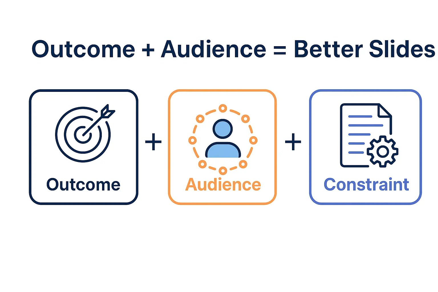
Quick answer: AI-generated executive summaries sound wrong because the AI doesn’t know your audience, your relationship with them, or what decision you’re driving toward. It fills that gap with generic corporate language. The fix isn’t better editing—it’s better context injection. Before asking for content, give the AI three things: who’s reading, what they already know, and what you need them to do. This takes 30 seconds and transforms the output.

⚡ Presenting tomorrow? Copy this prompt:

AUDIENCE: [Who’s reading—role + what they care about]
KNOWLEDGE: [What they already know about this topic]
DECISION: [What action you need them to take]
TONE: [Formal/informal + your relationship]
CONSTRAINTS: [Word count, format, company style]

Write an executive summary for: [your topic]

Fill the 5 blanks. Paste into ChatGPT/Claude/Copilot. Watch the difference.

Why AI-Written Exec Summaries Sound “Off”

Last year, I watched a client—a VP at a major retailer—spend an entire afternoon fighting with ChatGPT.

She needed an executive summary for a board presentation on warehouse automation. ChatGPT gave her something that read like a Wikipedia entry crossed with a management consulting brochure. Phrases like “leveraging synergies” and “optimising operational efficiency” that no human being has ever said out loud to another human being.

She rewrote it. Fed it back. Asked for “more natural.” Got something slightly less robotic but still wrong. Three hours later, she wrote the whole thing herself.

“AI is supposed to save time,” she told me. “I would have been faster with a blank page.”

She wasn’t wrong. But she also wasn’t using the AI correctly. The problem wasn’t the tool—it was what she didn’t tell it.

Why does AI-generated content sound generic?

AI models are trained on vast amounts of text, which means they default to the most common patterns. Without specific context, they produce “average” corporate language—technically correct but lacking the specificity and voice that makes content feel human. The more context you provide about your audience, purpose, and constraints, the more specific (and useful) the summary output becomes.

The Context Gap (What AI Doesn’t Know)

When you ask AI to “draft an exec summary for my presentation,” here’s what the AI doesn’t know:

  • Who’s reading it — A board of directors? Your direct manager? External investors? Each requires completely different framing.
  • What they already know — Are they familiar with the project? New to it? Skeptical? Supportive?
  • What decision you need — Approval? Awareness? Budget? The summary should drive toward that outcome.
  • Your relationship with them — Formal? Informal? Do you have credibility or are you building it?
  • Your organisation’s voice — Every company has unwritten rules about how executives communicate.

Without this context, AI does what any reasonable system would do: it guesses. And it guesses conservatively, using the safest, most generic language possible.

That’s why the output sounds like it was written by someone who’s never met your audience. Because, in a sense, it was.

I’ve written extensively about how to structure executive summaries in my guide to the executive summary slide—but even the best structure falls flat if the voice is wrong.

The 30-Second Fix: Context Injection

Before you ask AI to write anything, spend 30 seconds injecting context. This is the single highest-leverage change you can make to AI-assisted presentation work.

The Context Injection Framework

Add this to the beginning of any prompt:

AUDIENCE: [Who will read this, their role, what they care about]

KNOWLEDGE LEVEL: [What they already know about this topic]

DECISION NEEDED: [What action you want them to take]

TONE: [Formal/informal, relationship context]

CONSTRAINTS: [Word count, format, company style]

That’s it. Five lines. Thirty seconds to write.

The difference in output quality is dramatic—not because the AI suddenly became smarter, but because you stopped asking it to read your mind.


Context injection framework showing five elements: Audience, Knowledge Level, Decision Needed, Tone, and Constraints

How do I make ChatGPT write in my voice?

Give it examples of your voice. Paste 2-3 paragraphs you’ve written previously and say: “Match this tone and style.” Combine this with context injection (audience, decision needed, constraints) and the output will be dramatically closer to how you actually communicate. The AI can mimic voice patterns—it just needs samples.

Master AI-Enhanced Executive Presentations

AI-Enhanced Presentation Mastery is the complete system for executives who want AI to accelerate their presentation work—not create more editing. Learn context injection, voice matching, and the full workflow that cuts creation time without sacrificing quality.

Enrol in AI-Enhanced Presentation Mastery → £249

Self-study modules + live Q&A calls. Study at your own pace.

Before and After Examples

Let me show you what context injection actually does.

Scenario: Q3 Results for the Board

Without context injection:

Prompt: “Write an executive summary for my Q3 results presentation.”

“This executive summary provides an overview of Q3 performance metrics and key achievements. The quarter demonstrated strong operational efficiency and strategic alignment with organisational objectives. Key highlights include revenue growth, cost optimisation initiatives, and enhanced customer satisfaction scores…”

Generic. Forgettable. Could be any company, any quarter, any presenter.

With context injection:

AUDIENCE: Board of directors, 8 people, mostly focused on margin and cash flow

KNOWLEDGE LEVEL: They saw Q2 results; know we’re behind on EBITDA target

DECISION NEEDED: Approve additional headcount for Q4 push

TONE: Direct, confident, acknowledge the miss but pivot to solution

CONSTRAINTS: 150 words max, no jargon, lead with the ask

Write an executive summary for my Q3 results presentation.

“Q3 EBITDA came in 12% below target. You’ll want to know why—and what we’re doing about it. The miss was driven by delayed product launches (now resolved) and higher-than-expected customer acquisition costs in APAC. Despite this, revenue grew 8% QoQ, and we’ve identified a clear path to recover margin in Q4. That path requires 6 additional headcount in sales engineering. This presentation makes the case for that investment and shows the projected impact on Q4 and FY targets. I’m asking for approval today so we can begin hiring next week.”

Same AI. Same request. Completely different output.

The second version sounds like a real person talking to real people about a real situation. It leads with the uncomfortable truth, acknowledges what the audience cares about, and drives toward a specific decision.

That’s what context injection does. It turns AI from a generic content machine into a tool that understands your specific communication challenge.

Want the complete library of context injection templates for every presentation type?

Get AI-Enhanced Presentation Mastery → £249

What context does AI need for executive presentations?

At minimum: who’s reading (role and what they care about), what they already know, and what decision you need. Adding tone guidance and constraints (word count, format) improves output further. The more specific your context, the less editing you’ll need. Think of it as briefing a smart but uninformed colleague—they need background before they can help.

Beyond Summaries: The Full Workflow

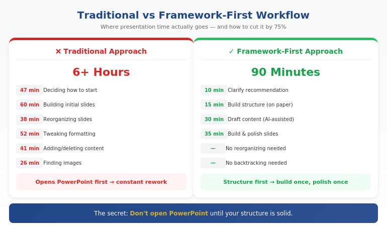
Context injection works for executive summaries, but it’s actually the foundation of a complete AI-assisted presentation workflow.

The Three-Layer Approach

Layer 1: Strategic Context (before any content)

Define your audience, decision, and constraints. This shapes everything that follows.

Layer 2: Structural Generation

Use AI to generate slide structures, not content. “Given this context, what are the 8 slides I need?” is a better prompt than “Write my presentation.”

Layer 3: Content Refinement

Generate content slide-by-slide, with context injection for each. Review and refine in passes, not all at once.

This approach typically cuts presentation creation time by 50-70%—not because AI writes everything, but because it handles the parts that don’t require your judgment while you focus on the parts that do.

I cover the full workflow in detail in my guide to using ChatGPT for PowerPoint presentations—including the specific prompts for each layer.

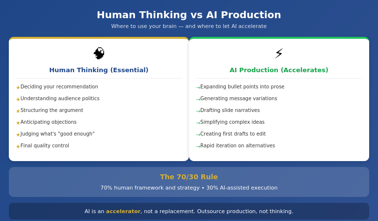
When AI Isn’t the Answer

Context injection dramatically improves AI output, but some elements of executive presentations still require human judgment:

  • Political navigation — AI doesn’t know that the CFO and COO are feuding, or that the CEO hates bullet points
  • Stakeholder relationships — The history between you and your audience shapes how you frame sensitive topics
  • Strategic ambiguity — Sometimes you need to be deliberately vague; AI defaults to clarity
  • Emotional calibration — Delivering bad news, building urgency, or inspiring action requires human touch

The goal isn’t to automate everything. It’s to automate the parts that don’t need you, so you can invest your judgment where it matters.

For more on the strategic side of executive presentations, see my article on AI for presentations.

The Compound Effect

Here’s what most people miss about AI-assisted presentations: the benefit compounds.

Once you have a context injection template for board presentations, you reuse it. Once you’ve trained AI on your voice with sample paragraphs, you can reference that conversation. Once you’ve built a library of prompts that work for your organisation’s style, every presentation gets faster.

The first presentation might save you 30 minutes. The tenth saves you 3 hours. The fiftieth is a completely different workflow—one where AI handles the scaffolding and you focus purely on strategic decisions and refinement.

That’s the real promise of AI for executive presentations. Not “AI writes your presentation.” But “AI handles the 80% that doesn’t need your brain, so your brain can focus on the 20% that does.”

Stop Fighting With AI. Start Collaborating.

AI-Enhanced Presentation Mastery teaches you the complete workflow: context injection templates, voice matching techniques, structural generation, and the refinement process that produces executive-ready output. Self-study modules you can complete at your own pace, plus live Q&A calls for personalised guidance.

Enrol in AI-Enhanced Presentation Mastery → £249

Created from 24 years of executive presentation experience combined with systematic AI workflow development.

Frequently Asked Questions

Will this work with any AI tool (ChatGPT, Claude, Copilot)?

Yes. Context injection is model-agnostic—it works with ChatGPT, Claude, Copilot, Gemini, and any other large language model. The principle is the same: AI produces better output when you give it better input. The specific prompts in AI-Enhanced Presentation Mastery are tested across multiple tools so you can use whichever your organisation prefers.

How long does it take to learn the context injection method?

The basic framework takes about 15 minutes to understand and apply. You’ll see improved output immediately. Mastering the nuances—when to add more context, how to iterate, how to build reusable templates—takes longer, typically 2-3 weeks of regular practice. The course accelerates this with pre-built templates and worked examples.

What if my company has a specific presentation style?

That’s actually ideal. Feed the AI examples of presentations your company has approved. Include style guidelines in your context injection. The more specific you are about organisational norms, the better the output matches. Many course participants create company-specific template libraries they reuse across their teams.

Is this different from prompt engineering courses?

Yes. General prompt engineering teaches principles that apply across use cases. AI-Enhanced Presentation Mastery is specifically designed for executive presentations—the context injection frameworks, the structural prompts, the refinement workflows are all built for the specific challenge of creating high-stakes business presentations. It’s specialised, not general.

📬 Get Weekly AI + Presentation Insights

Join professionals who receive my weekly newsletter on AI-enhanced presentations, executive communication, and high-stakes delivery.

Subscribe to The Winning Edge →

Related reading:

📋 Free Resource: 10 Essential AI Prompts for Presentations

Not ready for the full course? Start with my free prompt library—10 tested prompts for common presentation tasks, including context injection templates you can use immediately.

Get the Free AI Prompts →

Your Next Step

The next time you need an executive summary, don’t start with “Write an executive summary.”

Start with 30 seconds of context injection. Tell the AI who’s reading, what they know, and what decision you need.

Watch what happens to the output.

And if you want the complete system—not just context injection, but the full workflow that transforms how you create executive presentations—AI-Enhanced Presentation Mastery will show you how.

AI is a tool. The question is whether you’re using it as a content generator or a thought partner. Context injection is the difference.

About the Author

Mary Beth Hazeldine is the Owner & Managing Director of Winning Presentations. With 24 years of corporate banking experience at JPMorgan Chase, PwC, Royal Bank of Scotland, and Commerzbank, she has delivered hundreds of high-stakes executive presentations—and now teaches professionals how to use AI to create them more efficiently.

A qualified clinical hypnotherapist and NLP practitioner, Mary Beth combines executive communication expertise with systematic AI workflow development. She has helped senior professionals and teams transform their presentation process.

Book a discovery call | View services

28 Jan 2026
Professional woman working efficiently on laptop with focused, calm expression in modern office

How to Build Presentations Faster: The System That Cut My Build Time by 75%

Six hours. That’s what a client presentation used to cost me.

Two hours researching and outlining. Two hours building slides. Two hours tweaking formatting, adjusting layouts, and second-guessing every design choice. By the end, I was exhausted — and the presentation still felt like it could be better.

Then I discovered something that changed everything: the problem wasn’t my speed. It was my process.

Today, I create presentations in 90 minutes that are better than what I used to produce in six hours. Not because I found a magic AI tool. Because I found a system for faster presentation creation that puts thinking first and production second.

Quick Answer: Faster presentation creation comes from working framework-first, not slide-first. Most time waste happens when you open PowerPoint before you’ve decided your core message, structure, and key proof points. The fastest workflow is: clarify your recommendation (10 min) → build your structure (15 min) → draft content with AI assistance (30 min) → refine and design (35 min). Total: 90 minutes for a presentation that used to take 6 hours.

If you’re building for a steering committee, CFO, or board — speed isn’t the only goal. Decision clarity is. That’s why this workflow starts with Recommendation → Proof → Decision, not slides.

⚡ Need to Build a Presentation Today? The 90-Minute Framework:

  1. Minutes 1-10: Write your recommendation in one sentence. What do you want them to decide/do/believe?
  2. Minutes 11-25: Build your structure: Recommendation → Stakes → Their concern → Proof → Decision
  3. Minutes 26-55: Draft slide content (use AI to expand bullet points into full slides)
  4. Minutes 56-90: Refine language, add visuals, polish design

The key: Don’t open PowerPoint until step 3. Structure first, slides second.

Where Presentation Time Actually Goes

A few years ago, I tracked exactly how I spent time on a board presentation. The results were embarrassing:

  • 47 minutes deciding how to start
  • 38 minutes reorganizing slides I’d already built
  • 52 minutes adjusting fonts, colors, and alignments
  • 41 minutes adding content, then deleting it, then adding it back
  • 26 minutes looking for the “right” image

Less than an hour of that time was actual thinking — deciding what to say and how to structure it. The rest was production busywork and decision fatigue.

That’s when I realized: I wasn’t slow at building presentations. I was building them in the wrong order.

Opening PowerPoint first meant making design decisions before content decisions. Starting with slides meant restructuring constantly as my thinking evolved. Working without a framework meant reinventing my approach every single time.

The fix wasn’t working faster. It was working in a different sequence.

The Framework-First Approach

Here’s the principle that changed everything: structure before slides, thinking before production.

Most professionals open PowerPoint and start building. They think in slides, not in messages. They make dozens of micro-decisions about layout and formatting before they’ve made the one macro-decision that matters: what’s the point?

The framework-first approach flips this:

  1. Decide your recommendation before you touch any tool
  2. Build your logical structure on paper or in a simple doc
  3. Draft content in whatever format is fastest (often with AI help)
  4. Then — and only then — build slides

This sounds obvious, but almost nobody does it. The temptation to “just start building” is strong. And it’s exactly what makes presentations take 6 hours instead of 90 minutes.

For the executive-focused structure I use, see our guide to executive presentation structure.

How can I make presentations faster?

Make presentations faster by working framework-first: decide your core message and structure before opening PowerPoint. Most time waste comes from building slides before you’ve clarified your thinking — which leads to constant reorganizing and second-guessing. Use a repeatable structure (recommendation → stakes → proof → decision), then use AI to help draft content once your framework is solid.

Comparison of traditional vs framework-first presentation workflow showing time savings at each stage

⭐ Master the Framework-First System

AI-Enhanced Presentation Mastery teaches you the complete system: how to structure your thinking before you build, where AI accelerates production, and how to create executive-quality presentations in a fraction of the time.

What you’ll learn:

  • The framework-first workflow that cuts creation time by 50-75%
  • Where AI helps (drafting, iteration) and where it doesn’t (strategy, structure)
  • Prompt patterns that produce usable content, not generic filler
  • The quality checks that ensure AI-assisted work meets executive standards

Cut Your Build Time (See Maven) →

Live cohort-based course. 70% frameworks, 30% AI implementation. Check Maven for current dates and pricing.

The 90-Minute System Step by Step

Here’s exactly how I build presentations now:

Phase 1: Clarify (10 minutes)

Before anything else, I answer three questions in writing:

  1. What do I want them to decide, do, or believe after this presentation?
  2. What’s the ONE thing they need to understand for that to happen?
  3. What’s their biggest concern or objection likely to be?

This takes 10 minutes. It saves hours. Because every slide decision that follows becomes obvious when you know your destination.

Phase 2: Structure (15 minutes)

I use a consistent structure for executive presentations:

  • Slide 1: Recommendation (the answer, upfront)
  • Slide 2: Stakes (why this matters now)
  • Slide 3: Their concern (name the objection)
  • Slides 4-5: Proof (evidence that addresses the concern)
  • Slide 6: Decision (the specific ask)

I sketch this out in a simple document or even on paper. No PowerPoint yet. Just the logic flow.

Phase 3: Draft Content (30 minutes)

Now I draft the actual content — slide titles, key points, supporting data. This is where AI becomes genuinely useful.

I don’t ask AI to “create a presentation about X.” That produces generic garbage. Instead, I give it my structure and ask it to help me expand specific sections:

  • “Here’s my recommendation and three proof points. Help me articulate the stakes in language a CFO would respond to.”
  • “I need to address this objection: [objection]. Give me three ways to frame the response.”
  • “Turn these bullet points into a clear slide narrative: [bullets]”

AI drafts. I direct and edit. The quality stays high because I’m driving the strategy.

For more on AI-assisted presentation creation, see our detailed guide on how to make a presentation with AI.

Phase 4: Build and Polish (35 minutes)

Only now do I open PowerPoint. And because my content is already drafted, this phase is pure execution:

  • Paste content into slides
  • Apply consistent formatting
  • Add simple visuals where they help
  • Review flow and make final adjustments

No more agonizing over structure. No more rewriting slides three times. The thinking is done. I’m just packaging it.

How do you speed up PowerPoint creation?

Speed up PowerPoint by doing your thinking before you open it. Draft your structure and content in a simple document first, then use PowerPoint only for final assembly. Also: use a consistent template, master keyboard shortcuts, and resist the urge to perfect every slide before moving forward. Build rough, then polish once at the end.

Want the complete framework-first system?

See AI-Enhanced Presentation Mastery →

Where AI Helps (And Where It Doesn’t)

Let me be direct about AI’s role in this system: it’s an accelerator, not a replacement.

AI is excellent at:

  • Drafting content from your bullet points
  • Generating variations of your messaging
  • Suggesting ways to phrase complex ideas simply
  • Creating first drafts you can edit and improve
  • Iterating quickly when you need to try different approaches

AI is poor at:

  • Knowing what your audience cares about
  • Understanding the politics of your organization
  • Deciding what to recommend
  • Structuring an argument strategically
  • Judging what’s “good enough” for your specific context

The professionals who get burned by AI are the ones who outsource the thinking. They ask AI to “create a presentation” and get something that looks polished but says nothing. The slides are pretty. The logic is hollow.

The professionals who save hours are the ones who use AI for production while retaining control of strategy. They know what they want to say. AI helps them say it faster.

Diagram showing where human thinking is essential vs where AI accelerates production in presentation creation

⭐ Learn the Human + AI Balance

AI-Enhanced Presentation Mastery teaches you exactly where to use AI and where to trust your judgment — so you get speed without sacrificing quality or strategic thinking.

The course covers:

  • The 70/30 rule: 70% human framework, 30% AI execution
  • Prompt patterns that produce executive-quality content

See Course Details on Maven →

Live sessions with real feedback. Check Maven for current cohort dates.

Mistakes That Kill Your Speed

After coaching hundreds of professionals on presentation efficiency, I see the same speed-killers repeatedly:

Mistake #1: Opening PowerPoint first

The moment you open PowerPoint, you start thinking in slides instead of messages. You make formatting decisions before content decisions. You build, then restructure, then rebuild. This single habit can double your creation time.

Mistake #2: Perfecting slides as you go

Adjusting fonts while you’re still figuring out your argument is a form of productive procrastination. You feel busy, but you’re avoiding the hard thinking. Build rough first. Polish once at the end.

Mistake #3: Starting from scratch every time

If you don’t have a repeatable structure, you reinvent your approach with every presentation. That’s exhausting and slow. Develop a go-to framework. Adapt it for each situation. Don’t rebuild from zero.

Mistake #4: Using AI without a framework

Asking AI to “create a presentation about Q3 results” produces garbage. AI needs constraints to be useful. Give it your structure, your key points, your audience context. Then let it draft within those boundaries.

Mistake #5: Treating every presentation as equally important

A 15-minute team update doesn’t need the same polish as a board presentation. Calibrate your effort to the stakes. Some presentations deserve 90 minutes. Some deserve 30. Know the difference.

For more workflow optimization, see our complete guide to AI presentation workflow.

What is the fastest way to create a professional presentation?

The fastest way to create a professional presentation is: (1) clarify your recommendation in one sentence, (2) build your structure on paper first, (3) draft content with AI assistance using specific prompts, (4) only then open PowerPoint to assemble and polish. This framework-first approach can cut creation time by 50-75% compared to building slides from scratch.

Ready to cut your presentation time in half?

See AI-Enhanced Presentation Mastery →

The Compound Effect of a System

Here’s what most people miss: the real value of a system isn’t just time saved on one presentation. It’s the compound effect across your career.

If you create two presentations per week and save 4 hours each, that’s 8 hours per week. Over a year, that’s more than 400 hours — ten full work weeks returned to you.

But the benefit goes beyond hours. When presentations stop being a time drain, you:

  • Approach them with less dread
  • Have energy left to rehearse properly
  • Can take on more opportunities without burning out
  • Actually improve over time instead of just surviving

A system for building presentations faster isn’t about cutting corners. It’s about creating space for what actually matters: clear thinking, confident delivery, and results.

⭐ Build the System That Lasts

AI-Enhanced Presentation Mastery gives you the complete framework-first system — from initial thinking to final polish — so you can create executive-quality presentations in a fraction of the time, consistently.

What’s included:

  • The 90-minute presentation workflow
  • Framework templates for different presentation types
  • Prompt library for AI-assisted content creation
  • Quality checks that ensure AI work meets executive standards
  • Live sessions with direct feedback on your work

See Course Details on Maven →

Live cohort-based course on Maven. Check the page for current dates, pricing, and syllabus.

Frequently Asked Questions

Will AI-generated content look generic?

Only if you use AI wrong. Generic content comes from generic prompts like “create a presentation about X.” When you give AI your specific framework, key points, and audience context, it produces drafts you can actually use. The framework-first approach ensures AI is expanding your thinking, not replacing it with filler.

How much time can I realistically save?

Most professionals report saving 50-75% once they’ve internalized the system. A presentation that took 6 hours typically drops to 90 minutes to 2 hours. The biggest savings come in the first phase (no more agonizing over how to start) and the third phase (AI-assisted drafting instead of writing from scratch).

Does this work for highly technical or specialized presentations?

Yes — in some ways, better. Technical presentations often suffer from too much detail and unclear structure. The framework-first approach forces you to identify your core message and structure your argument logically before diving into technical content. AI is less useful for specialized terminology, but still helps with structuring explanations and drafting transitions.

What if I’m not technical with AI tools?

You don’t need to be technical. The AI-assisted portions use simple prompts in conversational language — you’re telling AI what you need the same way you’d brief a junior colleague. The course teaches exact prompts that work, so you don’t need to figure out “prompt engineering” on your own.

Get Weekly Presentation Efficiency Insights

Frameworks, workflows, and AI strategies for creating better presentations in less time — from 24 years of corporate experience.

Subscribe to The Winning Edge →

📋 Not ready for the course? Take the checklist.

A quick-reference guide showing which tasks benefit from AI assistance and which require human judgment. Use it to speed up your next presentation without sacrificing quality.

Download Free Checklist →

Your Next Step

The next time you need to create a presentation, try this:

  1. Don’t open PowerPoint
  2. Write your recommendation in one sentence
  3. Sketch your structure on paper
  4. Then start building

You’ll be surprised how much faster the whole process becomes when you know where you’re going before you start.

P.S. Speed matters, but so does getting the decision. If you’re presenting for approval, I wrote about pre-meeting alignment — the strategy that gets “yes” before you open your slides.

P.P.S. And if nerves are affecting your delivery, check out how to project your voice — it’s more about releasing tension than speaking louder.

About Mary Beth Hazeldine
Owner & Managing Director of Winning Presentations. After 24 years in corporate banking building hundreds of presentations under deadline pressure, I became obsessed with efficiency. The framework-first approach I teach now is the system I wish I’d had in year one.

21 Jan 2026
How Senior Leaders Actually Use AI for Presentations (It's Not What You Think)

How Senior Leaders Use AI for Presentations (Not What Tutorials Teach)

Quick answer: How senior leaders use AI for presentations is fundamentally different from what most tutorials teach. After working with executives across banking, tech, and professional services, I’ve observed three consistent patterns: they start with the decision framework before touching AI, they use AI for iteration not creation, and they spend more time on what AI can’t do—stakeholder dynamics and narrative judgment. The executives getting results from AI aren’t the ones with better prompts. They’re the ones who know what AI is actually for.

If you’ve been using AI to “create presentations” and getting generic results, you’re not doing it wrong. You’re doing what the tutorials teach. Senior leaders do something different.

⚡ The 3 things senior leaders do differently with AI:

1. Framework first: They decide the structure and key message BEFORE opening any AI tool

2. AI for iteration: They use AI to improve drafts, not generate first versions

3. Human judgment last: They spend 70% of their time on what AI can’t do—stakeholder dynamics, narrative flow, political context

If you’re a senior professional preparing presentations regularly, this article shows you what actually works at the executive level.

What I Noticed Working With Executives

Last year, I started paying closer attention to how my executive clients actually used AI for their presentations. Not what they said they did—what I observed them doing.

I expected to see sophisticated prompting. Complex workflows. Maybe custom GPTs or specialized tools.

What I saw was simpler—and more effective.

A CFO preparing a board presentation spent 45 minutes on a whiteboard before opening ChatGPT. When she finally used AI, it was for one thing: “Help me find a clearer way to explain this risk trade-off.” She used AI for 10 minutes. The presentation took her 90 minutes total.

A VP of Strategy did something similar. He wrote his key message and three supporting points by hand. Then he used AI to stress-test his logic: “What’s the strongest objection to this recommendation?” He used the objection to strengthen slide 4.

The pattern kept repeating. The executives getting the best results weren’t using AI to create presentations. They were using AI to improve presentations they’d already structured.

That’s how senior leaders use AI for presentations—and it’s the opposite of what most tutorials teach.

⭐ Learn the Executive AI Presentation Method

Stop using AI like the tutorials teach. Learn the framework-first approach that senior leaders actually use—where AI amplifies your judgment instead of replacing it.

AI-Enhanced Presentation Mastery (Maven Course):

  • The framework-first method executives actually use
  • How to use AI for iteration, not creation
  • When to trust AI—and when to override it
  • Live cohort with direct feedback on your presentations

View Course Details →

Taught by a presentation coach with 24 years in corporate banking. 70% frameworks, 30% AI—the ratio that actually works.

Pattern 1: Framework First, AI Second

The most consistent pattern I’ve observed: senior leaders decide what they want to say before they ask AI anything.

This sounds obvious. It isn’t.

Most AI tutorials start with: “Open ChatGPT and describe your presentation topic.” That approach produces generic content because AI doesn’t know your strategic context, your audience’s concerns, or the decision you need.

Senior leaders flip the sequence:

  1. Clarify the decision — What do you need the audience to do, approve, or understand?
  2. Identify the resistance — What’s the main objection or concern you need to address?
  3. Structure the argument — What’s the logical flow that moves someone from resistance to agreement?
  4. Then use AI — To refine language, stress-test logic, or find clearer ways to express complex ideas

The CFO I mentioned spent 45 minutes on steps 1-3. AI was only useful because she’d already done the thinking.

Why this works: AI is excellent at language and patterns. It’s poor at strategic judgment. Research from Harvard Business Review confirms this pattern—AI amplifies human capability rather than replacing it. When you do the judgment first, you get AI’s strengths without its weaknesses.

For a deeper look at this decision-first approach, see why AI won’t replace presentation skills—it amplifies them.

The three ways senior leaders use AI differently for presentations compared to standard AI tutorial approaches

Pattern 2: AI for Iteration, Not Creation

Here’s the second pattern: senior leaders almost never use AI to generate first drafts.

They use it to improve drafts they’ve already written.

The difference matters. When you ask AI to “create a presentation about Q3 results,” you get something that sounds professional but lacks your specific insight, your knowledge of the audience, and your strategic judgment.

When you write a rough draft first—even a bad one—and then ask AI to improve it, you keep control of the substance while getting help with the expression.

How senior leaders actually prompt AI:

“Here’s my executive summary. What’s unclear or could be misunderstood?”

“This is my recommendation. What’s the strongest objection someone could raise?”

“I need to explain this risk in one sentence. Here are three options—which is clearest?”

Notice what’s different: they’re not asking AI to think for them. They’re asking AI to help them communicate what they’ve already thought through.

This is how senior leaders use AI for presentations—as an editor, not an author.

Want to learn the executive AI method? AI-Enhanced Presentation Mastery teaches the framework-first approach with live feedback on your actual presentations. View course details →

Pattern 3: Human Judgment Where It Matters

The third pattern surprised me most: senior leaders spend the majority of their time on things AI can’t help with.

They use AI for maybe 10-15% of the presentation process. The rest is human judgment:

  • Stakeholder dynamics — Who needs to be pre-wired? What’s the CFO’s specific concern? What history does the board have with this topic?
  • Narrative judgment — What story will land with this audience? What’s the emotional arc that moves people to action?
  • Political context — What can’t be said directly? What needs to be implied? What’s the subtext?
  • Timing decisions — When should this be presented? What else is competing for attention?

AI can’t do any of this. And these factors often determine whether a presentation succeeds more than the slides themselves.

The executives I’ve observed understand this intuitively. They don’t over-invest in AI because they know where the real leverage is.

For more on the human elements that AI can’t replace, see why AI presentations fail—and what to do instead.

The executive AI presentation workflow showing framework-first approach versus prompt-first approach

⭐ Master the Framework-First AI Approach

Learn how to use AI the way senior leaders actually do—as an amplifier for your judgment, not a replacement for it. Live cohort course with direct feedback.

What you’ll learn:

  • The decision-first framework before touching AI
  • How to use AI for iteration and stress-testing
  • Where to invest your time (hint: not prompts)
  • Live practice with your real presentations

View Course Details →

Next cohort starts soon. Small group format for personalized feedback.

This is the method that cuts presentation time from 6 hours to 90 minutes—without sacrificing quality.

What Most People Get Wrong

The standard AI presentation advice follows a predictable pattern:

  1. Learn better prompts
  2. Use the right AI tools
  3. Generate content faster

This advice isn’t wrong—it’s just incomplete. It optimizes for speed without addressing quality or strategic impact.

The tutorial approach produces presentations that are:

  • Fast to create
  • Professionally formatted
  • Generic in substance
  • Missing strategic judgment

The executive approach produces presentations that are:

  • Strategically sound first
  • Refined by AI second
  • Tailored to specific stakeholders
  • Built on human judgment AI can’t replicate

The difference isn’t the AI. It’s what happens before and after the AI.

Related: If you’re presenting to senior leadership, the stakes are higher than just slides. See board presentation best practices for what actually works in those high-pressure situations.

Ready to learn the executive AI method? AI-Enhanced Presentation Mastery is a live cohort course that teaches framework-first AI usage with feedback on your real presentations. See upcoming dates →

Related: If presentations trigger anxiety—especially at senior levels—see fear of public speaking at work for the day-before protocol that helps you arrive composed.

How Senior Leaders Use AI for Presentations: Common Questions

How do executives use AI for presentations?

Based on observation, how senior leaders use AI for presentations follows three patterns: they start with a decision framework before touching AI, they use AI for iteration rather than creation, and they spend most of their time on human judgment—stakeholder dynamics, narrative flow, political context—that AI can’t help with. The executives getting results don’t have better prompts. They know what AI is actually useful for.

What AI tools do senior leaders use for presentations?

Most senior leaders I’ve observed use standard tools—ChatGPT, Claude, sometimes Copilot. The tool matters less than the approach. Executives who get good results use AI as an editor and stress-tester, not as a content generator. They’ve already done the strategic thinking before they open any AI tool. For a detailed workflow, see the AI presentation workflow guide.

Is AI good for executive presentations?

AI is excellent for executive presentations when used correctly—for refining language, stress-testing arguments, and finding clearer ways to express complex ideas. AI is poor for executive presentations when used to generate content without human strategic judgment. The difference between generic AI slides and executive-quality presentations isn’t the AI—it’s the framework and judgment applied before and after.

⭐ Learn How Senior Leaders Actually Use AI

Stop following tutorials that produce generic results. Learn the framework-first approach that separates executive-level AI usage from everyone else.

AI-Enhanced Presentation Mastery includes:

  • The decision-first framework (before AI)
  • Iteration techniques (during AI)
  • Judgment calibration (after AI)
  • Live cohort with feedback on your presentations

View Course Details →

70% frameworks, 30% AI—the ratio that actually works. Taught by a presentation coach with 24 years in corporate banking.

FAQ

Do senior leaders really use AI for presentations?

Yes, but differently than most people expect. The executives I’ve observed use AI for 10-15% of the presentation process—primarily for refining language and stress-testing arguments. They don’t use AI to generate presentations. They use it to improve presentations they’ve already structured with human judgment. The framework comes first; AI comes second.

Won’t AI make my presentations look generic?

Only if you use AI the tutorial way—asking it to generate content from scratch. When you use AI the executive way—to refine and improve content you’ve already created—your presentations stay distinctive because the strategic judgment is yours. AI improves the expression without replacing your insight.

How much time can AI save on presentations?

Used correctly, AI can reduce presentation creation time from 6+ hours to 90 minutes. But the time savings come from the framework-first approach, not from generating content faster. You spend less time on iterations because you start with clearer thinking. AI then polishes what you’ve built instead of generating content you’ll need to heavily edit.

What’s the difference between using AI and using AI well?

Using AI means asking it to generate content. Using AI well means knowing what AI is good for (language, patterns, stress-testing) and what it’s not (strategic judgment, stakeholder dynamics, political context). The executives getting results from AI have figured out this distinction. They use AI as an amplifier, not a replacement.

📧 The Winning Edge Newsletter

Weekly insights on executive presentation skills, AI-enhanced workflows, and the frameworks that separate senior-level communicators from everyone else. From a coach with 24 years in corporate banking.

Subscribe Free →

Your Next Step

If you’ve been using AI the tutorial way—generating content and hoping for good results—try the executive approach instead:

  1. Before AI: Clarify your decision, identify resistance, structure your argument
  2. During AI: Use it to refine language and stress-test logic—not to create from scratch
  3. After AI: Invest your time in stakeholder dynamics and narrative judgment

This is how senior leaders use AI for presentations—and it’s what separates executive-quality results from generic AI output.

To learn the complete framework with live feedback on your presentations, explore AI-Enhanced Presentation Mastery.

About the Author

Mary Beth Hazeldine is the Owner & Managing Director of Winning Presentations and a former corporate banker with 24 years of experience at JPMorgan Chase, PwC, Royal Bank of Scotland, and Commerzbank. She has trained thousands of executives on high-stakes presentation skills and helped clients secure more than £250 million in funding and budget approvals.

Mary Beth observed the patterns in this article while working with senior leaders preparing for board meetings, investor pitches, and strategic presentations. The framework-first AI approach comes directly from watching what actually works at the executive level.

Book a discovery call | View services

20 Jan 2026
Executive presentation framework that AI can't replace - the human judgment layer that turns slides into decisions

Executive Presentation Framework: What AI Can’t Replace (And Never Will)

Quick answer: An executive presentation framework is the strategic thinking layer that determines what to say, in what order, to which audience, for what decision. AI tools can generate slides, but they cannot read the room, build your credibility, or structure content for your specific stakeholders’ decision-making style. The framework is what makes AI useful—not the other way around.

Master the framework, and AI becomes a powerful accelerator. Skip the framework, and AI produces polished slides that get polite nods and no action.

⚡ Before you open any AI tool, answer these 4 framework questions:

1. Decision: What specific decision or action do I need from this audience?

2. Objection: What’s their biggest concern or resistance?

3. Evidence: What proof will overcome that specific objection?

4. Structure: What order puts my strongest point where it matters most?

Now prompt AI with these answers. Watch the output transform.

The Presentation That AI Made Worse

A VP at a tech company came to me after a failed board presentation. She’d used every AI tool available—Copilot for the slides, ChatGPT for the script, Gamma for the visuals. The deck was beautiful.

The board said no.

“I don’t understand,” she told me. “The slides were better than anything I’ve made before.”

I reviewed the deck. She was right—the slides were polished. But the structure was wrong. She’d built up to her recommendation over 20 slides when the board wanted her position in the first 60 seconds. She’d included data that addressed her concerns, not theirs. She’d structured it for herself, not for how her CFO actually makes decisions.

AI had made her faster at building the wrong presentation.

That’s the trap nobody talks about.

⭐ Master the Framework That Makes AI Actually Useful

Stop producing polished slides that get polite nods. Learn the executive presentation methodology that turns AI from “fast but generic” into “fast and compelling.”

In this live cohort course:

  • The Decision-First Framework for executive audiences
  • How to read your stakeholders’ decision-making style
  • Structuring for your specific audience (not generic “best practices”)
  • Live feedback on your actual presentations

Includes a Decision-First briefing template you can reuse before every deck.

Join AI-Enhanced Presentation Mastery →

Live cohort with Mary Beth Hazeldine. 70% framework thinking, 30% AI execution. Works with any tool—Copilot, Gamma, ChatGPT, or whatever comes next.

If you have a board presentation or investor pitch in the next month, this will transform how it lands.

The 3 Things AI Cannot Do (And Never Will)

AI is extraordinarily good at certain tasks. It can generate slide layouts, suggest visual designs, produce draft content quickly, and format information cleanly.

But there are three capabilities at the heart of effective executive presentations that AI fundamentally cannot perform—and these aren’t limitations that will be solved with the next model update.

1. AI cannot read the room.

Executive presentations succeed or fail based on real-time audience response. The CFO who leans back when you mention the budget. The board member who checks their phone during your risk slide. The CEO who nods slightly at your third point.

These signals tell you what to emphasise, what to skip, and when to pivot. AI can’t see them. AI can’t adjust. AI doesn’t know that your COO makes decisions emotionally and justifies them rationally, while your CFO does the opposite.

You do. That’s the framework.

2. AI cannot build your credibility.

When you present to executives, they’re not just evaluating your slides. They’re evaluating you. Your command of the material. Your ability to answer unexpected questions. Your judgment about what matters.

AI can give you beautiful slides, but it can’t make you credible. When a board member asks “What happens if this fails?” and you give a thoughtful, unrehearsed answer that shows deep understanding—that’s what gets buy-in. That comes from framework thinking, not AI prompting.

3. AI cannot structure for your specific decision-maker.

Generic presentation advice says “lead with your conclusion” or “tell a story.” But your CFO might want numbers first and narrative second. Your CEO might want strategic context before tactical recommendations. Your board might want risk assessment before opportunity analysis.

AI produces average structures for average audiences. Your executive presentation framework must be tailored to how your specific stakeholders process information and make decisions. That’s human judgment. It always will be.


The three things AI cannot do in executive presentations: read the room, build credibility, and structure for specific decision-makersWhat an Executive Presentation Framework Actually Is

A framework isn’t a template. Templates are fill-in-the-blank structures that produce generic results. A framework is a decision-making methodology that produces tailored results.

The Decision-First Framework has four components:

Component 1: Decision clarity

Before anything else, define the specific decision you need. Not “inform them about the project” but “get approval for the £200K Phase 2 budget.” This clarity shapes everything that follows—what to include, what to cut, and how to structure the flow.

Component 2: Audience analysis

Who’s in the room? What are their concerns? How do they prefer to receive information? A framework helps you map each stakeholder’s decision-making style, objections, and priorities—then structure your content accordingly.

Component 3: Evidence selection

You have more data than you can present. A framework helps you select the evidence that specifically addresses your audience’s concerns—not the data that’s most impressive to you. This is where most AI-generated presentations fail: they include everything rather than selecting strategically.

Component 4: Structure optimization

The order of information matters enormously. A framework tells you whether to lead with recommendation or build to it, whether to address objections early or late, and where to place your strongest evidence for maximum impact. Learn more about executive presentation structure and how decision-first ordering works.

When you have this framework clear, AI becomes powerful. You’re not asking AI to think—you’re asking AI to execute your thinking faster. That’s the multiplier effect.

Want to master framework-first presentation thinking? AI-Enhanced Presentation Mastery teaches the complete Decision-First Framework with live practice on your actual presentations. See upcoming cohorts →

Framework as Multiplier: Why AI Needs You More Than You Need It

Here’s the uncomfortable truth about AI presentation tools: they multiply what you put in.

If you put in vague thinking, you get polished vagueness. If you put in generic structure, you get beautiful generic slides. If you put in framework-quality input—clear decision, specific audience analysis, selected evidence, optimized structure—you get executive-quality output at unprecedented speed.

Without framework:

“Create a presentation about our Q3 results for the board”

→ AI produces a generic quarterly review that looks like every other quarterly review the board has seen this month

With framework:

“Create a 6-slide presentation requesting £500K for market expansion. Board’s main concern is timeline risk. Lead with our mitigation plan, then show the opportunity cost of delay. CFO needs IRR and payback period on slide 3.”

→ AI produces a targeted, decision-ready deck tailored to your specific board’s priorities

Same AI. Same topic. Completely different output. The variable is the framework thinking you bring.

This is why I teach 70% framework, 30% AI tools. The framework is the skill. The AI is just the accelerator. If you have a solid AI presentation workflow, it’s because you have solid framework thinking underneath it.


Framework-first versus prompt-first approach showing how strategic thinking transforms AI output quality

⭐ The Framework That Makes Every AI Tool More Powerful

Learn the methodology that transforms AI from “fast at generic” to “fast at excellent.” Works with Copilot, Gamma, ChatGPT—or whatever tool comes next.

What you’ll master:

  • The 4-component Decision-First Framework
  • How to analyze any audience’s decision-making style
  • Evidence selection that addresses real objections
  • Structure optimization for executive buy-in

Join the Next Cohort →

Live sessions + direct feedback on your presentations. Framework skills that last a career.

This pays for itself the first time you get buy-in instead of polite nods.

Future-Proofing Your Presentation Skills

AI tools will keep improving. Copilot will get smarter. New competitors will launch. Models will advance.

But the executive presentation framework skills—reading your audience, building credibility, structuring for specific decision-makers—will remain human skills. They’re future-proof because they’re based on how humans make decisions, not on how technology generates content.

What becomes more valuable as AI improves:

  • Judgment about what to include — AI can generate anything; knowing what matters is human
  • Understanding of specific stakeholders — AI knows averages; you know your CFO
  • Ability to adapt in real-time — AI can’t see the room; you can read it
  • Credibility through deep knowledge — AI can script answers; you can think on your feet

What becomes less valuable:

  • Slide design skills (AI handles this well)
  • Content drafting speed (AI is faster)
  • Formatting consistency (AI is better)

The executives who thrive will be those who invest in the human judgment layer—the framework—and use AI to accelerate execution. Those who rely on AI for thinking will produce faster mediocrity.

The 3Ps Framework I’ve developed over 24 years in banking has helped clients raise more than £250M in funding. That wasn’t because of technology. It was because of strategic thinking applied to specific audiences.

Ready to build AI-proof presentation skills? AI-Enhanced Presentation Mastery teaches framework-first thinking that works with any tool and lasts a career. View course details →

Related: Framework thinking applies to every aspect of executive presentations. See how it shapes your executive presentation opening line and how it helps you manage high-stakes presentation nerves.

Common Questions About Executive Presentation Frameworks

What is an executive presentation framework?

An executive presentation framework is a decision-making methodology for structuring presentations to senior leaders. It includes four components: clarifying the specific decision you need, analyzing your audience’s concerns and decision-making style, selecting evidence that addresses their objections, and optimizing the structure for maximum impact. Unlike a template (fill-in-the-blank), a framework produces tailored results for each unique situation.

Can AI create executive presentations?

AI can create slides, but it cannot create effective executive presentations. The difference is judgment—knowing what to include, understanding your specific stakeholders, reading the room during delivery, and building credibility through deep knowledge. AI produces average content for average audiences. Executive presentations require tailored thinking that AI cannot perform. AI is best used to accelerate execution after you’ve done the framework thinking.

What makes executive presentations different?

Executive presentations are decision-focused, not information-focused. Senior leaders don’t want to learn about your topic—they want to make a decision and move on. This requires leading with recommendations, addressing specific objections, and structuring for their decision-making style rather than your preference. Generic presentation advice often fails with executives because it assumes audiences want information rather than clarity for action.

⭐ Build the Skill AI Can’t Replace

Framework thinking is the competitive advantage that makes AI useful. Learn the methodology that executives trust—and that technology can’t replicate.

Inside the course:

  • The complete Decision-First Framework
  • Audience analysis techniques for any stakeholder
  • How to brief AI for executive-quality output
  • Live practice with direct feedback

Enroll in AI-Enhanced Presentation Mastery →

Live cohort format with Mary Beth Hazeldine. Framework-first methodology developed from 24 years in corporate banking and executive coaching.

FAQ

Will AI replace presentation skills?

AI will replace some presentation tasks—slide design, content drafting, formatting—but not presentation skills. The human judgment layer (reading audiences, building credibility, structuring for specific decision-makers, adapting in real-time) remains irreplaceable because it depends on understanding specific people in specific contexts. Professionals who invest in framework thinking will use AI as an accelerator. Those who rely on AI for thinking will produce faster mediocrity.

What framework do consultants use for executive presentations?

Top consulting firms use variations of the Pyramid Principle—leading with the answer, then supporting with evidence. But the specific framework matters less than the underlying skill: analyzing your audience, clarifying the decision, selecting relevant evidence, and optimizing structure. Generic frameworks fail when applied without adaptation. The skill is knowing how to tailor any framework to your specific stakeholders.

How long does it take to learn a presentation framework?

The concepts can be learned in a few hours. Applying them fluently takes practice—typically 4-6 presentations with conscious framework application. Most professionals see improvement immediately (clearer structure, better audience response) and mastery within 2-3 months. The goal isn’t memorizing steps; it’s developing judgment that becomes automatic.

Does this work with Copilot/Gamma/ChatGPT?

Yes—the framework is tool-agnostic. Framework thinking improves your output from any AI tool because it improves your input. The specific prompting syntax varies slightly by tool, but the underlying methodology (decision clarity, audience analysis, evidence selection, structure optimization) applies universally. Learn the framework once, use it with whatever technology emerges.

📧 The Winning Edge Newsletter

Weekly insights on framework-first presentation thinking, AI-enhanced workflows, and executive communication. Practical methodology from 24 years in corporate banking—no AI hype, just what actually works with senior leaders.

Subscribe Free →

Your Next Step

AI generates slides. Frameworks generate buy-in.

Before your next executive presentation, spend 10 minutes on framework thinking: What decision do you need? What’s your audience’s main concern? What evidence addresses it? What structure puts your strongest point where it matters most?

Then use AI to execute your thinking. The output will transform—because you’ve transformed the input.

For the complete framework methodology with live practice and direct feedback, join AI-Enhanced Presentation Mastery.

About the Author

Mary Beth Hazeldine is the Owner & Managing Director of Winning Presentations and a former corporate banker with 24 years of experience at JPMorgan Chase, PwC, Royal Bank of Scotland, and Commerzbank. She has trained thousands of executives on high-stakes presentation skills and helped clients secure more than £250 million in funding and budget approvals.

Mary Beth is also a qualified clinical hypnotherapist and NLP practitioner. She developed the framework-first methodology after watching countless executives struggle with polished AI slides that failed to get buy-in—and discovering that the missing piece was always strategic thinking, never better technology.

Book a discovery call | View services

19 Jan 2026
Why AI-generated slides look generic - the framework-first fix for executive-quality presentations

Why Your AI-Generated Slides Look Generic (And How to Fix It)

Quick answer: Your AI-generated slides look generic because you’re asking AI to do the thinking for you. The tool isn’t broken—the input is. When you prompt AI without a clear framework (structure, audience, decision point), it defaults to safe, templated output. The fix isn’t better prompts. It’s building your presentation framework first, then using AI to accelerate execution.

This fixes the endless cycle of generate → cringe → delete → redo that wastes hours and leaves you with slides you’re embarrassed to present.

⚡ Need to fix generic AI slides right now? Do this before your next prompt:

Step 1: Write your main message in one sentence (what do you want them to decide/believe?)

Step 2: List your 3 supporting points in order of importance

Step 3: Identify your audience’s #1 objection

Step 4: NOW prompt AI with this structure—watch the output transform

The £2M Pitch That AI Almost Ruined

A client came to me last year in a panic. She’d used AI to create her investor pitch deck—Gamma for the slides, ChatGPT for the script. The output looked polished. Professional fonts, clean layouts, smooth transitions.

The investors passed in under five minutes.

“It felt like every other pitch we’ve seen this month,” one told her. “Nothing stood out.”

That’s the trap. AI-generated slides look generic not because the tools are bad, but because they’re designed to be safe. They optimise for “acceptable to everyone” rather than “compelling to your specific audience.”

Six weeks later, we rebuilt her deck using a framework-first approach. Same information. Same AI tools for execution. Different result: £2.1M raised.

The AI didn’t change. Her input did.

⭐ Master the Framework That Makes AI Output Executive-Ready

Stop fighting with prompts. Learn the structure-first methodology that transforms any AI tool from “generic template generator” to “presentation accelerator.”

In this live cohort course:

  • The Decision-First Framework for AI-enhanced presentations
  • How to brief AI tools so they produce executive-quality output
  • Live feedback on your actual presentations
  • Templates that work with Copilot, Gamma, ChatGPT, and any future tool

Join AI-Enhanced Presentation Mastery →

Live cohort course with Mary Beth Hazeldine. Limited seats per session. Framework-first methodology tested across banking, consulting, and FTSE 100 environments.

If you have an investor pitch, board deck, or QBR in the next 2–3 weeks, this will pay for itself immediately.

Why Every AI Tool Produces Generic Output

Here’s what most people don’t understand about AI presentation tools: they’re trained on millions of slides, which means they’ve learned to produce the average of all those slides.

Average is, by definition, generic.

When you prompt Copilot with “Create a presentation about Q3 results,” it generates what a Q3 presentation typically looks like—across thousands of companies, industries, and contexts. It doesn’t know your audience is a skeptical CFO. It doesn’t know your Q3 results contain a critical pivot point. It doesn’t know the board has seen 47 similar presentations this month.

So it gives you:

  • Safe bullet points that could apply to any company
  • Stock imagery that signals “corporate presentation”
  • Slide titles like “Overview” and “Key Takeaways” that tell the audience nothing
  • A structure that builds to a conclusion (when executives want conclusions first)

This isn’t a flaw in the AI. It’s working exactly as designed. The problem is the input, not the tool.

If you’ve tried fixing generic Copilot slides with better prompts, you’ve probably noticed: better prompts help marginally. They don’t solve the core problem.

The Framework-First Method That Changes Everything

The executives I’ve trained over 24 years in banking don’t start with slides. They don’t start with AI prompts. They start with a framework.

Framework-first means answering these questions before you touch any tool:

1. What’s the one decision I need from this audience?

Not “inform them about Q3.” A specific decision: “Approve the £500K investment in the new system.”

2. What’s their biggest objection or concern?

A CFO worries about ROI. A board worries about risk. A client worries about implementation. Name it.

3. What evidence will overcome that objection?

Not all your data. The specific proof points that address their specific concern.

4. What’s the logical flow that leads to yes?

Decision → Impact → Risk mitigation → Evidence. This is the executive presentation structure that actually works.

Once you have this framework, AI becomes extraordinarily useful. You’re not asking it to think for you. You’re asking it to execute your thinking faster.

Instead of prompting: “Create a presentation about our new CRM system”

Prompt with framework: “Create a 6-slide presentation for our CFO requesting £500K for a CRM upgrade. Main message: this investment pays back in 14 months through reduced customer churn. Address the objection that implementation will disrupt Q4 sales. Structure: recommendation first, then ROI evidence, then risk mitigation, then timeline.”

The output from the second prompt is unrecognisable from the first—even though it’s the same AI tool.

Want to master framework-first AI presentations? AI-Enhanced Presentation Mastery is a live cohort course that teaches the complete methodology—with feedback on your actual presentations. See upcoming sessions →

Before and After: Same Tool, Different Input

Here’s what the framework-first difference looks like in practice:

BEFORE (prompt-first approach):

Prompt:

“Create a presentation about implementing a new project management system”

AI Output:

  • Slide 1: Title slide with generic stock image
  • Slide 2: “Agenda” (why do executives need an agenda for 8 slides?)
  • Slide 3: “Current Challenges” (vague bullet points)
  • Slide 4: “Proposed Solution” (feature list)
  • Slide 5: “Benefits” (generic claims)
  • Slide 6: “Implementation Timeline” (Gantt chart)
  • Slide 7: “Budget Overview” (numbers without context)
  • Slide 8: “Next Steps” / “Questions?”

AFTER (framework-first approach):

Framework completed first:

Decision: Approve £85K for project management system. Audience: COO + Finance Director. Main objection: disruption to current workflow. Key evidence: 23% productivity gain from pilot team.

Prompt:

“Create a 6-slide executive presentation requesting £85K budget approval for a project management system. Lead with the recommendation and expected ROI. Address workflow disruption concerns by showing pilot results. Include risk mitigation. Audience is COO and Finance Director who value efficiency metrics.”

AI Output:

  • Slide 1: “Recommendation: Approve £85K—Expected 340% ROI in 18 months”
  • Slide 2: Pilot results showing 23% productivity gain
  • Slide 3: Workflow disruption mitigation plan
  • Slide 4: Financial breakdown with payback timeline
  • Slide 5: Risk assessment with contingencies
  • Slide 6: Decision requested + implementation start date

Same AI. Same topic. Completely different output. The difference is worth thousands in approved budgets and closed deals. Learning to create framework-first presentations can transform how decision-makers perceive your proposals—and your readiness for senior roles.


Framework-first vs prompt-first approach comparison showing how the same AI tool produces generic versus executive-quality slides based on input quality

⭐ Stop Producing Slides That Look Like Everyone Else’s

The framework-first methodology works with any AI tool—because it fixes the input, not the technology. Learn it once, apply it forever.

What you’ll master:

  • The 4-question framework that transforms AI output
  • Executive presentation structures that work across industries
  • How to brief any AI tool for professional results
  • Live practice with real-time feedback

Join the Next Cohort →

Live sessions + async practice. Includes templates, frameworks, and direct feedback on your presentations.

Which AI Tool Actually Matters? (Hint: None of Them)

People ask me constantly: “Should I use Copilot or Gamma? Is ChatGPT better than Claude for slides? What about Beautiful.ai?”

The honest answer: it barely matters.

Every major AI tool can produce executive-quality slides—if you give it executive-quality input. And every tool will produce generic output if you give it generic prompts.

The tools will keep changing. Copilot will update. New competitors will launch. GPT-6 will arrive. But the framework-first methodology stays constant because it’s based on how humans make decisions, not how AI generates content.

This is why I teach frameworks that are tool-agnostic. My clients use the same methodology whether they’re in Copilot, Gamma, or building slides manually. The AI presentation workflow accelerates execution, but the thinking happens before any tool is opened.

What to ask instead of “which tool is best?”:

  • “Do I have a clear decision I’m asking for?”
  • “Have I identified my audience’s main objection?”
  • “Do I know the evidence that overcomes that objection?”
  • “Is my structure decision-first or conclusion-last?”

Answer those questions, and any AI tool will serve you well.

Ready to master framework-first presentations? AI-Enhanced Presentation Mastery teaches the complete system—70% framework thinking, 30% AI execution. Works with any tool, now and in the future. View course details →

Related: Once your slides are executive-ready, make sure your structure and delivery match. Read Executive Presentation Structure: The Format That Gets Instant Buy-In and How to Stop Saying Um (Without Sounding Robotic).

Common Questions About AI-Generated Slides

Why do AI presentations look so generic?

AI tools are trained on millions of slides, so they produce the statistical average of all presentations. Average means generic. The tool optimises for “safe and acceptable” rather than “compelling for your specific audience.” To get non-generic output, you must provide specific input: the decision you need, the objection you’re addressing, and the evidence that overcomes it.

How do I make AI-generated slides look professional?

The secret isn’t in the prompts—it’s in the framework you create before prompting. Define your one key decision, your audience’s main concern, and your supporting evidence structure. Then prompt AI with this specific context. The same tool that produces generic bullet points will produce executive-ready slides when given framework-quality input.

What’s wrong with AI presentation tools?

Nothing is wrong with the tools. Copilot, Gamma, ChatGPT, and others are all capable of producing excellent output. The problem is how most people use them—asking AI to think instead of asking AI to execute. When you do the strategic thinking first (framework) and use AI for tactical execution (slides), the results transform completely.

⭐ Create Presentations That Don’t Look AI-Generated

Learn the methodology that makes AI your presentation accelerator—not your presentation liability.

Inside the course:

  • The Decision-First Framework (works with any AI tool)
  • Executive presentation templates with prompting guides
  • Live cohort sessions with direct feedback
  • How to brief AI for boardroom-quality output

Enroll in AI-Enhanced Presentation Mastery →

Live cohort format with Mary Beth Hazeldine. Framework-first methodology developed from 24 years in corporate banking and executive coaching.

FAQ

Which AI tool is best for presentations?

The tool matters far less than the input. Copilot, Gamma, ChatGPT, Beautiful.ai, and Canva’s AI features can all produce excellent presentations—if you give them framework-quality input. Choose based on what integrates with your workflow (Copilot for Microsoft users, Gamma for standalone, etc.), not based on which “produces the best slides.” They all produce generic slides with generic prompts.

Can AI really create executive-quality slides?

Yes—but only when you provide executive-quality thinking first. AI excels at execution: formatting, visual consistency, generating variations quickly. It struggles with strategy: understanding your specific audience, identifying the key decision, structuring for persuasion. Do the strategy yourself, use AI for execution, and the output will impress executives.

How long does the framework-first approach take?

About 10-15 minutes of structured thinking before you open any tool. This feels slower initially but dramatically reduces total time. You eliminate the “generate, delete, regenerate” cycle that wastes hours. Most of my clients report cutting total presentation creation time by 40-60% once the framework-first approach becomes habit.

Will this work with Copilot/Gamma/ChatGPT?

The framework-first methodology works with any AI tool because it focuses on input quality, not tool features. I’ve tested it extensively with Copilot, Gamma, ChatGPT, Claude, and several others. The specific prompting syntax varies slightly by tool, but the core framework remains identical. Learn the framework once, adapt to any tool.

📧 The Winning Edge Newsletter

Weekly insights on AI-enhanced presentations, executive communication, and framework-first thinking. Practical techniques from 24 years in corporate banking—no AI hype, just what actually works.

Subscribe Free →

Your Next Step

Your AI-generated slides look generic because AI is doing what it’s designed to do: produce safe, average output. The fix isn’t a better tool or better prompts. It’s better input.

Before your next presentation, take 10 minutes to answer the framework questions: What decision do you need? What’s the main objection? What evidence overcomes it? What’s the logical structure?

Then prompt AI with that framework. The output will transform—and so will how your audience responds.

If you want to master the complete framework-first methodology with live feedback and executive-tested templates, join AI-Enhanced Presentation Mastery.

About the Author

Mary Beth Hazeldine is the Owner & Managing Director of Winning Presentations and a former corporate banker with 24 years of experience at JPMorgan Chase, PwC, Royal Bank of Scotland, and Commerzbank. She has trained thousands of executives on high-stakes presentation skills and helped clients secure more than £250 million in funding and budget approvals.

Mary Beth is also a qualified clinical hypnotherapist and NLP practitioner, specialising in helping professionals overcome presentation anxiety. She developed the framework-first AI methodology after seeing countless executives struggle with generic AI output—and discovering that the fix was strategic thinking, not better technology.

Book a discovery call | View services

10 Dec 2025
Executive summary slide template using the 4-Line Formula - Situation, Insight, Recommendation, Ask - get decisions in 10 seconds

The Executive Summary Slide: How to Write the Only Slide That Matters [2026]

📅 Updated: January 2026 | The slide that decides your outcome before you finish talking

Need a Faster Way to Build Executive Slides?

Most executives spend hours on slides that still miss the mark. The Executive Slide System gives you a structured framework for building slides that land with senior audiences — without starting from scratch every time.

Explore the System →

Quick Answer

An executive summary slide should contain four elements: situation (one sentence), recommendation (specific and actionable), key supporting points (three maximum), and your ask (what you need from them). Put your conclusion first. Executives decide in 60 seconds — give them what they need upfront, not buried on slide 15.

I learned this lesson the hard way at Commerzbank.

A senior VP asked me to present a £2.3M technology investment to the Executive Committee. I built a 28-slide deck. Comprehensive analysis. Beautiful charts. Ironclad logic building to my recommendation.

The CFO interrupted at slide 3: “What do you want us to approve?”

I fumbled to slide 24 where my recommendation lived. By then, I’d lost the room. The meeting ended with “let’s revisit this next quarter” — executive-speak for no.

Three months later, same ask, same committee. This time I led with a single executive summary slide. Sixty seconds in, the CFO said: “Makes sense. What’s the implementation timeline?”

Twenty minutes later, I had full approval.

The difference wasn’t the analysis — it was identical. The difference was giving executives what they needed in the first 60 seconds.

After 25 years presenting to C-suite leaders at JPMorgan, PwC, RBS, and Commerzbank, I’ve refined a formula for executive summary slides that works every time.

Preparing an executive presentation this week?

The Executive Slide System includes fill-in-the-blank executive summary templates for board updates, budget requests, QBRs, and strategic recommendations — with the 4-part formula built in.

Why the Executive Summary Slide Decides Everything

Here’s what most presenters don’t understand: executives make decisions fast.

Senior leaders form initial judgments within seconds of seeing new information — experienced presenters know this instinctively. Everything after that either confirms or contradicts their first impression.

Your executive summary slide IS their first impression. Get it right, and the rest of your presentation is confirmation. Get it wrong, and you’re fighting uphill for the next 30 minutes.

I’ve seen this pattern hundreds of times:

Weak executive summary → Executives check phones → Questions become challenges → “Let’s table this”

Strong executive summary → Executives lean in → Questions become clarifications → “Walk us through implementation”

Same presenter. Same content. Different opening slide. Different outcome.

Built for High-Stakes Presentations

Build an Executive Summary Slide That Opens Doors

The Executive Slide System (£39, instant access): includes the exact executive summary template used in board-level and investor presentations — structured to deliver your key message before attention fades.

Designed for executives who present to boards, investors, and C-suite audiences where the first slide determines whether you keep the room.

Get the Executive Slide System →

The 4-Part Executive Summary Formula

Every effective executive summary slide contains exactly four elements. No more, no less.

The 4-Line Executive Summary Formula showing Situation, Insight, Recommendation, and Ask with real examples for each line

Part 1: Situation (One Sentence)

Ground everyone in the same reality. What’s happening? Why are we here?

Bad: “As you know, we’ve been evaluating our technology infrastructure across multiple dimensions including scalability, security, and cost efficiency, and have identified several areas of concern.”

Good: “Our customer platform will exceed capacity by Q3, risking £4M in annual revenue.”

One sentence. Quantified where possible. No preamble.

Part 2: Recommendation (Specific and Actionable)

What do you want them to do? Be precise enough that they could approve it right now.

Bad: “We recommend investing in technology improvements to address these challenges.”

Good: “Approve £1.2M to upgrade our customer platform, with completion by August 2026.”

Include the number. Include the timeline. Make it approvable as stated.

Part 3: Key Supporting Points (Three Maximum)

Why should they approve this? Give them three reasons — no more.

The human brain struggles to hold more than three to four items in working memory. Give executives five reasons and they’ll remember none. Give them three and they’ll remember all of them.

Example:

  • ROI: 180% over 3 years (payback in 14 months)
  • Risk mitigation: Prevents £4M revenue loss from capacity issues
  • Competitive: Matches capabilities our top 3 competitors launched last year

Each point should be scannable in under 5 seconds.

Part 4: The Ask (What You Need From Them)

Be explicit about what decision you need and when.

Bad: “We’d appreciate your input on next steps.”

Good: “I need budget approval today to meet the Q3 deadline. Implementation plan is ready.”

Executives respect clarity. They don’t respect hedging.

Want ready-made executive summary templates with the 4-part formula built in? The Executive Slide System includes templates for every executive scenario — Board, Budget, QBR, Strategy, and more.

The 4-Part Formula, Ready to Fill In

The Executive Slide System includes executive summary templates for every major presentation scenario — with the 4-part formula built into every layout.

Executive Slide System — £39, instant access.

  • Executive summary templates for Board, Budget, QBR, and Strategy presentations
  • 30 AI prompts to fill in each section in minutes
  • Situation, Recommendation, Supporting Points, and Ask — structured for you

Designed for directors and senior managers presenting to boards, leadership teams, and investors.

Executive Summary Slide Examples: Before and After

Let me show you how this works with real transformations from clients I’ve coached.

Example 1: Budget Request

BEFORE (Weak):

  • Title: “Technology Investment Proposal”
  • Content: Three paragraphs explaining background, four bullet points about challenges, reference to “detailed analysis in appendix”
  • No clear ask visible
  • Result: “Send us a summary” (rejected)

AFTER (Strong):

  • Title: “Request: £1.2M Platform Upgrade — 180% ROI”
  • Situation: Customer platform hits capacity Q3, risking £4M revenue
  • Recommendation: Approve £1.2M upgrade with August completion
  • Why: 180% ROI | Prevents £4M loss | Matches competitor capabilities
  • Ask: Budget approval needed today to meet deadline
  • Result: Approved in 20 minutes

Example 2: Strategic Initiative

BEFORE (Weak):

  • Title: “Market Expansion Analysis”
  • Content: Market size data, competitor overview, SWOT analysis summary, “recommendation on slide 18”
  • Result: Lost attention by slide 4

AFTER (Strong):

  • Title: “Recommendation: Enter DACH Market Q2 — £8M Opportunity”
  • Situation: UK growth slowing to 3%; DACH offers 12% growth with existing product fit
  • Recommendation: Launch DACH pilot Q2 with £400K investment
  • Why: £8M addressable market | 3 signed LOIs already | Existing team can execute
  • Ask: Approve pilot budget and hire 2 sales reps by March
  • Result: Approved with additional resources offered

Example 3: Project Status Update

BEFORE (Weak):

  • Title: “Project Phoenix Status Update”
  • Content: Timeline, milestones completed, milestones pending, budget status, team updates
  • Problem buried on slide 6
  • Result: Executives surprised and frustrated when issue finally surfaced

AFTER (Strong):

  • Title: “Project Phoenix: On Track, But Need Decision on Vendor Delay”
  • Situation: Phase 1 complete (on time, on budget). Phase 2 vendor delayed 3 weeks.
  • Recommendation: Accept delay (no cost impact) vs. switch vendors (£50K, saves 1 week)
  • Why: Delay acceptable — still hits Q3 deadline | Switching adds risk for minimal gain
  • Ask: Confirm we proceed with current vendor
  • Result: Decision made in 5 minutes, meeting ended early

Related: Executive Presentation Template: 12 Slides That Command the Room

Common Executive Summary Mistakes (And How to Fix Them)

Mistake #1: Burying the Lead

Your recommendation should be visible within 10 seconds of the slide appearing. If executives have to hunt for it, you’ve already lost.

Fix: Put your recommendation in the slide title or as the first bold line. “Request: £1.2M Platform Upgrade” tells them instantly what this is about.

Mistake #2: Too Many Supporting Points

Five bullet points means zero retention. Executives are processing dozens of decisions daily — they can’t hold your seven reasons in memory.

Fix: Force yourself to pick three. If you can’t decide which three matter most, you don’t understand your own argument well enough.

Mistake #3: Vague Language

“Significant investment” means nothing. “Improved efficiency” means nothing. “Strategic alignment” means nothing.

Fix: Use numbers. “£1.2M investment” is specific. “23% efficiency gain” is specific. “Supports Goal #2 in our 2026 strategy” is specific.

Mistake #4: No Clear Ask

If you don’t tell executives what you need, they’ll assume you don’t need anything — and they’ll move on.

Fix: End with an explicit ask. “I need approval today” or “I need a decision by Friday” or “I need you to choose between Option A and Option B.”

Mistake #5: Defensive Positioning

Starting with caveats, limitations, and “as you know” context signals insecurity. Executives smell fear.

Fix: Lead with confidence. State your recommendation directly. Address objections when asked, not before.

Related: The 3-Slide System That Gets Executive Decisions Fast

How to Write Your Executive Summary Slide (Step by Step)

Here’s my process for writing executive summary slides quickly and effectively.

Step 1: Start With the Ask

Write down: “At the end of this meeting, I need them to _______________.”

If you can’t complete that sentence, you’re not ready to present. Go back and figure out what you actually need.

Step 2: Write the Recommendation

Make it specific enough to approve as stated. Include amounts, timelines, and owners where relevant.

Test: Could they say “yes” to this exact sentence and know what happens next?

Step 3: Identify Three Supporting Points

Ask yourself: “If they push back, what are the three strongest reasons this makes sense?”

Those are your supporting points. Lead with the strongest.

Step 4: Write the Situation Line

One sentence that grounds everyone. Why are we here? What’s changed?

This often comes last because you need to understand your recommendation before you can frame the situation correctly.

Step 5: Cut Ruthlessly

Read your slide aloud. If it takes more than 45 seconds, cut something. The executive summary should be graspable in a single glance.

The executives who consistently get approvals follow a structured structure. The Executive Slide System gives you that structure with fill-in-the-blank templates for every scenario.

Writing your executive summary from scratch takes longer than it should.

The Executive Slide System gives you the 4-part formula as a fill-in-the-blank template — structured for board approvals, budget requests, status updates, and strategic recommendations.

Executive Slide System — £39, instant access.

Designed for executives who present where decisions are made.

Using AI to Draft Your Executive Summary

AI tools like ChatGPT or Claude can accelerate your executive summary slide — if you prompt them correctly.

Effective prompt:

“I’m presenting to [audience] about [topic]. I need them to approve [specific ask]. Write an executive summary slide with: 1) one-sentence situation, 2) specific recommendation, 3) three supporting points (quantified where possible), 4) clear ask. Keep total word count under 75 words.”

What AI does well:

  • Structuring your thoughts into the 4-part format
  • Tightening wordy language
  • Suggesting quantified supporting points

What you must add:

  • Political context (what matters to THIS audience)
  • Accurate numbers from your analysis
  • Judgment about which supporting points will resonate

Related: Best Copilot PowerPoint Prompts That Actually Work

Executive Summary Slide Design Tips

Content matters most, but design affects comprehension.

Title: Make it active and outcome-focused. “Request: £1.2M Platform Upgrade” not “Platform Investment Overview”

Layout: Use visual hierarchy. Recommendation should be the most prominent element.

Font size: If executives are reading from 10 feet away (common in boardrooms), your key points should be readable. 24pt minimum for main text.

White space: Crowded slides signal disorganised thinking. If you can’t fit it with breathing room, you have too much content.

Colour: Use your corporate template. Don’t get creative with colours — it distracts from content.

When to Use an Executive Summary Slide

Not every presentation needs a formal executive summary slide. Here’s when to use one:

Always use one when:

  • Presenting to C-suite or board
  • Requesting budget or resources
  • Proposing a strategic decision
  • Presenting to time-pressed audiences
  • The meeting is 30+ minutes

Consider skipping when:

  • Informal team updates
  • Brainstorming sessions
  • Workshops where you’re facilitating, not recommending

When in doubt, include one. Executives never complain about getting to the point too quickly.

Related: Board Presentation Template: The Executive’s Complete Guide

Structure That Commands Attention

Every Slide Structured for Senior Audiences

The Executive Slide System (£39) covers 17 presentation scenarios — each with a tested structure, narrative framework, and AI prompts for rapid customisation.

Get the Executive Slide System →

Frequently Asked Questions

How long should an executive summary slide be?

Under 75 words of actual content. It should be graspable in a single glance — roughly 30-45 seconds to read and understand. If you can’t read it aloud in under a minute, it’s too long.

Should the executive summary be slide 1 or slide 2?

Slide 1 in most cases. The only exception is if you need a single “context” slide to ground executives who aren’t familiar with the topic. Even then, keep the context slide to 30 seconds maximum before moving to your summary.

What if my recommendation is complex?

Simplify it for the executive summary, then expand in the supporting slides. “Approve the three-phase digital transformation programme” works on slide 1; the phases get their own slides later.

How do I handle multiple asks?

If you have more than one ask, you likely have more than one presentation. For genuinely related asks, bundle them: “Approve £1.2M budget AND two additional headcount for Q2 implementation.”

What if I don’t know what decision they’ll make?

Present options with a clear recommendation. “I recommend Option A for these three reasons. Option B is viable if timeline is the priority. I need you to choose today.”

Should I send the executive summary in advance?

Yes — 24-48 hours before the meeting if possible. Some executives prefer to form questions beforehand. Include it in the email body, not just as an attachment.

📧 The Winning Edge Newsletter

Weekly insights on executive presentations, slide design, and what’s actually working in boardrooms right now.

Subscribe Free →

Related Resources

🎁 Free: Executive Presentation Checklist

The 12-point checklist I use before every executive presentation — including the executive summary test. One page PDF.

Download Free Checklist →

No email required. Instant download.

About the Author

Mary Beth Hazeldine spent 25 years in corporate banking at JPMorgan Chase, PwC, Royal Bank of Scotland, and Commerzbank — presenting to C-suite leaders on deals worth billions. She’s trained executives across industries on high-stakes presentations. She now runs Winning Presentations.

10 Dec 2025
AI presentation skills for executives - The AI Fluency Framework teaching strategic prompting, workflow design, and quality control - Maven course January 2026

From 6 Hours to 30 Minutes: The AI Presentation Skills Executives Need Now [2026]

📅 Published: December 10, 2025 — AI presentation course launching January 2026

Updated 27 March 2026 — Revised for the latest Microsoft Copilot and ChatGPT capabilities.

Marcus, a Director of Strategy at a FTSE 250 company, scheduled a full Saturday to build his board presentation. Twelve slides. Eight hours blocked. His wife wasn’t happy, but Q4 results were due Monday.

By 3pm, he was six hours in and only on slide 9. The formatting kept breaking. The charts looked amateur. He was exhausted and frustrated.

Two weeks later, after one session with me, Marcus built a similar deck in 41 minutes. Not a rough draft — a polished, board-ready presentation. He turned to me and said: “Why didn’t anyone teach me this earlier?”

The difference wasn’t intelligence. Marcus is brilliant. It was a skill gap that’s splitting executives into two camps: those who’ve learned how to use AI for presentations properly, and those who are working ten times harder for the same output.

Marcus transformation case study - Director of Strategy went from 8 hours per board deck to 41 minutes after learning AI Fluency Framework, 92% time reductionHere’s the uncomfortable truth: most executives are using AI presentation tools wrong. They’re treating Copilot like a fancy autocomplete instead of the strategic tool it actually is.

I’ve trained over 200 executives on AI-powered presentations in the past year. The pattern is always the same: they’re working too hard because no one taught them the right approach.

Want a structured framework for this?

71 structured prompts for ChatGPT and Copilot — covering board decks, investor pitches, quarterly reviews, and strategy presentations.

Explore the Prompt Pack →

The New Executive Skill Gap

I’ve trained executives for over a decade. The skills that mattered in 2020 are table stakes now. Today, there’s a new differentiator emerging:

AI fluency for executive communication.

Not technical AI skills. Not prompt engineering for developers. A specific, practical ability to use AI presentation tools like Copilot for PowerPoint and ChatGPT to create high-stakes presentations faster and better.

The executives who’ve developed this skill aren’t just saving time. They’re:

  • Producing more polished work (AI catches inconsistencies humans miss)
  • Iterating faster (test three approaches in the time it took to build one)
  • Focusing on strategy instead of formatting (AI handles the tedious work)
  • Responding to opportunities faster (urgent board deck? Done in an hour)

The executives who haven’t learned how to use AI for presentations? They’re working twice as hard for the same output. And the gap is widening every month as tools like Copilot get more powerful.

Why Most Executives Use AI Presentation Tools Wrong

I see the same mistakes repeatedly:

Mistake #1: Treating AI Like Magic

“Create a board presentation about Q4 results.”

That prompt will give you a generic, forgettable deck every time. AI isn’t magic — it’s a tool that responds to specific inputs. Vague prompts produce vague outputs.

The fix: Structure your prompts like you’d brief a junior analyst. Context, audience, objective, constraints. The more specific your input, the more useful the output.

Mistake #2: Using AI for Everything

AI is exceptional at some things: generating first drafts, creating structure, suggesting alternatives, formatting consistently.

AI is terrible at other things: understanding your company’s politics, knowing what your CFO cares about, applying judgment about what to include and exclude.

The fix: Use AI for the 80% that’s mechanical. Apply human judgment to the 20% that matters.

Mistake #3: Accepting First Outputs

AI’s first answer is rarely its best answer. Most executives take what they get and manually fix it. That’s backwards.

The fix: Iterate with AI, not after AI. “Make this more concise.” “Add a risk section.” “Reframe this for a skeptical audience.” Three rounds of refinement with AI beats three hours of manual editing.

Related: PowerPoint Copilot December 2025: Agent Mode Changes Everything

CLOSE THE AI PRESENTATION SKILLS GAP

AI-Powered Executive Presentations

8-week live course teaching executives to master AI presentation tools

Join the January Waitlist

£249 early bird • Only 60 seats • Launching January 2026

Executive Resource

Stop Writing AI Prompts From Scratch

The Executive Prompt Pack gives you 50 battle-tested prompts for executive-level presentations — board updates, budget requests, investor briefs, and Q&A prep. Built for PowerPoint Copilot and ChatGPT.

Get the Executive Prompt Pack →

Used by executives preparing for board briefings, budget requests, and investor meetings.

The AI Fluency Framework: 3 Skills That Separate 10x Executives

The AI Fluency Framework showing three skills that separate 10x executives: strategic prompting, workflow design, and quality control with specific techniques for each

After training over 200 executives to use AI for presentations, I’ve codified what works into a framework I call AI Fluency.

It’s not technical. It’s not about prompt engineering for developers. It’s about three specific skills that separate executives who get 10x value from Copilot and ChatGPT from those who get 10% value:

Skill #1: Strategic Prompting

Not “prompt engineering” in the technical sense. Strategic prompting means knowing how to brief AI the way you’d brief a talented but inexperienced team member.

This includes:

  • Providing context (audience, stakes, history)
  • Specifying constraints (time, format, tone)
  • Defining success criteria (what does “good” look like?)
  • Iterating productively (building on outputs, not starting over)

Example — Weak prompt:
“Create a presentation about our new product.”

Example — Strategic prompt:
“Create a 10-slide presentation for enterprise IT buyers. Focus on security and compliance benefits. Our main competitor is [X], and buyers typically object that our solution is too complex. Use a problem-solution-proof structure. Tone should be confident but not aggressive.”

Same AI. Dramatically different output.

Skill #2: AI + Human Workflow Design

The goal isn’t to have AI do everything. It’s to have AI do the right things so you can focus on what humans do best.

What AI should handle:

  • First draft structure
  • Content generation for standard sections
  • Formatting and consistency
  • Alternative versions and variations
  • Research synthesis

What humans should handle:

  • Strategic decisions (what to include/exclude)
  • Audience-specific customization
  • Political sensitivity
  • Final judgment calls
  • Delivery and presence

The executives who master this workflow don’t just work faster. They produce better work because they’re spending their energy on high-value decisions instead of formatting.

Skill #3: Quality Control & Refinement

AI makes mistakes. It hallucinates. It produces generic content. It misses nuance.

The skill isn’t avoiding these problems — it’s catching and fixing them efficiently.

This means:

  • Knowing AI’s common failure modes (and checking for them)
  • Having a systematic review process
  • Using AI to check AI (ask it to critique its own output)
  • Building templates that reduce error rates

The executives who skip this step end up with presentations that feel “AI-generated” — generic, slightly off, lacking personality. The executives who master it produce work that’s indistinguishable from (or better than) fully manual creation.

Related: Fix Generic Copilot Slides in 5 Minutes

💡 The AI Fluency Compound Effect: These three skills compound. Strategic prompting produces better raw material. Good workflow design means less manual rework. Quality control catches issues early. Together, they transform a 6-hour process into a 30-minute process — without sacrificing quality. That’s the AI Fluency Framework in action.

Stop Guessing What to Type. Start Building in 25 Minutes.

The Executive Prompt Pack gives you 71 tested prompts for ChatGPT and Copilot — structured by scenario so you know exactly what to type:

  • Build from scratch — scenario prompts for board reviews, budget requests, and investor decks
  • Rescue and rewrite — audit an existing deck, condense it, or fix one slide at a time
  • Industry-specific prompts for financial services, banking, consulting, and executive audiences
  • Power modifiers that transform any prompt into board-ready output
  • The 25-minute deck workflow that replaces 3–4 hours of manual building

Works with ChatGPT, Microsoft Copilot, and Edit with Copilot (formerly Agent Mode). Updated March 2026.

Get the Executive Prompt Pack → £19.99

What Changes When You Master AI Fluency

Let me be specific about the transformation I’ve seen across 200+ executives I’ve trained:

Time savings: Average reduction of 70% in presentation creation time. Marcus (from the opening) went from 8 hours to 41 minutes. Another client, a VP of Marketing at a SaaS company, cut her weekly deck time from 6 hours to 90 minutes.

Quality improvement: Counterintuitively, AI-assisted decks are often better. More consistent formatting. Fewer typos. More thorough coverage of alternatives. Better structure. One client told me: “My CEO commented that my presentations have gotten noticeably sharper. He doesn’t know I’m using AI.”

Capacity expansion: When presentations take less time, you can do more of them. Or spend the saved time on strategy, relationships, and high-value work. One client calculated she saved 180 hours in her first year — that’s more than four full work weeks.

Reduced stress: The Sunday evening panic of “I have a board presentation Monday” disappears when you know you can produce quality work in an hour. Multiple clients have mentioned this as the biggest unexpected benefit.

AI Fluency results from 200+ executives trained: 70% time reduction, 180 hours saved in year one, 10x faster iteration, zero weekend decks

Why I’m Teaching This in a Live Course

These skills can’t be learned from blog posts or YouTube videos. I’ve tried teaching them that way. It doesn’t work.

Here’s why:

You need to practice on real work. Not hypotheticals. Your actual board deck. Your real QBR. Your specific investor pitch. Generic exercises don’t build real skill.

You need feedback. Someone who can look at your prompts and tell you why they’re not working. Someone who can review your AI workflow and spot inefficiencies. You can’t get that from a video.

You need accountability. Learning a new skill requires consistent practice. A cohort with weekly sessions creates the structure for that practice.

The tools keep changing. Copilot’s Agent Mode launched this month. The techniques from six months ago are already outdated. Live instruction adapts; recorded content doesn’t.

JANUARY 2026 COHORT

AI-Powered Executive Presentations

8 weeks • Live sessions • Real presentations • Lasting transformation

8

Weeks

60

Max Seats

£249

Early Bird

Reserve Your Seat

Regular price £499 after January 15

What You’ll Learn in 8 Weeks

The course teaches the complete AI Fluency Framework:

Weeks 1-2: Strategic Prompting — How to brief AI effectively. Building your prompt library for executive presentations. The difference between weak and powerful prompts.

Weeks 3-4: AI + Human Workflow Design — Copilot, ChatGPT, and emerging AI presentation tools. When to use what. Building efficient processes that play to AI’s strengths.

Weeks 5-6: Executive Presentation Mastery — Board decks, QBRs, investor pitches. Applying AI Fluency skills to high-stakes contexts where you can’t afford mistakes.

Weeks 7-8: Quality Control & Delivery — Catching AI mistakes systematically. Adding human judgment. Presenting with confidence when the stakes are high.

Throughout: You’ll work on your actual presentations. Every week, you’ll apply what you learn to real work and get direct feedback from me.

For 71 tested prompts covering every scenario — build from scratch, rescue an existing deck, or fix individual slides — the Executive Prompt Pack gives you exactly what to type, updated for the latest Copilot and ChatGPT capabilities.

Who This Is For

Executives and senior managers who create presentations regularly — board decks, QBRs, strategy presentations, client pitches — and want to do it faster without sacrificing quality.

Leaders who feel behind on AI but don’t have time for technical courses. This is practical, not theoretical. You’ll leave with skills you use immediately.

High performers who want an edge. While your peers spend six hours on a deck, you’ll spend one. That time compounds.

Who This Is NOT For

Technical roles looking for developer-focused AI training. This is about executive communication, not code.

Anyone looking for passive learning. This course requires active participation. You’ll present, get feedback, and iterate.

People who don’t create presentations regularly. If you’re not building decks at least monthly, the ROI isn’t there.

The Cost of Waiting

Remember Marcus from the opening? He told me recently: “I used to dread presentation weeks. Now I almost look forward to them. I know I can produce something good in an hour that used to take me all weekend.”

Every month you delay learning these skills, the executives around you are getting faster. The skill gap widens.

In six months, AI fluency for presentations won’t be a competitive advantage — it’ll be a baseline expectation. The question is whether you’ll be ahead of that curve or scrambling to catch up.

The January cohort is the first. I’m limiting it to 60 seats so I can provide meaningful feedback to each participant. Early bird pricing (£249) is available until January 15 or until seats fill.

If you’re serious about mastering AI presentation skills, this is the time.

FROM 6 HOURS TO 30 MINUTES

Master AI Presentation Skills in 8 Weeks

Join 60 executives learning to create better presentations in a fraction of the time

Join the January Waitlist — Free

No payment required until enrollment opens

71 Prompts. Every Scenario Covered.

Build from scratch, rescue an existing deck, or perfect individual slides — the Executive Prompt Pack covers every scenario. Works with ChatGPT, Copilot, and Edit with Copilot. Updated March 2026.

Get the Prompts → £19.99

Frequently Asked Questions

How do I use AI for presentations effectively?

The key is treating AI like a talented but inexperienced team member, not like magic. Provide context (audience, stakes, history), specify constraints (format, tone, length), and iterate on outputs rather than accepting the first result. Most executives make the mistake of vague prompts like “create a presentation about Q4” — that will always produce generic results.

Is Copilot good for executive presentations?

Yes, when used correctly. Copilot for PowerPoint excels at generating first drafts, creating consistent formatting, and producing alternative versions quickly. The December 2025 Agent Mode update made it significantly more capable for complex presentations. However, Copilot still requires human judgment for audience-specific customization and strategic decisions.

What AI presentation tools do executives actually use?

The most common combination I see among the executives I train: Copilot for PowerPoint (in-app generation and editing), ChatGPT (for content strategy and research synthesis), and occasionally Gamma or Beautiful.ai for quick visual drafts. The specific tools matter less than learning the underlying skills — strategic prompting, workflow design, and quality control.

How long does it take to learn AI presentation skills?

Most executives see significant improvement within 2-3 weeks of focused practice. Full fluency — where AI-assisted work becomes faster AND better than manual work — typically takes 6-8 weeks. The key is practicing on real presentations, not hypothetical exercises.

Will AI replace the need for presentation skills?

No. AI handles the mechanical work: drafting, formatting, generating alternatives. Human skills become MORE important, not less: strategic thinking, audience awareness, executive presence, and delivery. The executives who thrive will be those who combine strong traditional presentation skills with AI fluency.

What’s the ROI of learning AI presentation skills?

If you create presentations weekly and save 3 hours per deck (conservative estimate), that’s 150+ hours per year — nearly four work weeks. At executive compensation levels, that time value is substantial. More importantly, the capacity to produce better work faster compounds: more iterations, more polish, less stress, better outcomes.

Start Building Skills Now

Whether or not the course is right for you, here are resources to start improving today:

About Mary Beth Hazeldine

After 25 years in corporate banking at JPMorgan Chase, PwC, Royal Bank of Scotland, and Commerzbank, Mary Beth now trains executives to communicate with impact. Her clients have raised over using her methodologies. She’s particularly focused on helping leaders integrate AI tools into their presentation workflow — creating better work in less time. She runs Winning Presentations and is launching the AI-Powered Executive Presentations course on Maven in January 2026.

24 Nov 2025
copilot vs powerpoint designer comparison graphic showing content creation vs layout tools

Copilot vs. PowerPoint Designer: Which Tool for Which Task?

Looking for ready-to-use AI prompts for executive presentations?

The Executive Prompt Pack gives you 71 structured prompts for ChatGPT and Copilot — covering board decks, investor pitches, quarterly reviews, and strategy presentations.

Explore the Prompt Pack →


Quick Answer: Should You Use Copilot or Designer in PowerPoint?

The choice between Copilot vs. Designer in PowerPoint depends on your task. Use Designer for quick visual upgrades to existing slides – layout suggestions, image placement, and formatting polish. Use Copilot for content creation – generating slides from prompts, restructuring presentations, and creating first drafts. Most professionals get the best results using both: Copilot for content, Designer for polish.

Best for: Professionals creating 2-5 presentations weekly
Time savings: 45-90 minutes per deck using the right tool for each task
Key insight: Designer fixes how slides look; Copilot changes what slides say

I watched a consulting client waste 40 minutes last Thursday trying to get Copilot to fix her slide layouts.

Forty. Minutes.

She kept prompting: “Make this look better.” “Redesign slide 3.” “Fix the formatting.”

Copilot kept creating new slides instead of fixing the existing ones. She was getting frustrated. Her deadline was in two hours.

Here’s what I told her: “You’re using the wrong tool for the job.”

She switched to Designer. Three clicks later, her slides looked professional. Total time: 90 seconds.

The confusion between Copilot vs. Designer in PowerPoint costs professionals hours every week. Both are AI tools built into PowerPoint. Both promise to make your presentations better. But they do completely different things – and using the wrong one for your task is like using a hammer to screw in a lightbulb.

After testing both tools on 50+ client decks across banking, biotech, and SaaS, I’ve mapped exactly when to use each. Here’s the breakdown that’ll save you the trial-and-error I went through.

What People Get Wrong About Copilot vs. Designer in PowerPoint

diagram showing copilot as content tool and designer as layout tool in powerpoint

[NO] Most people think: Copilot is just a more powerful version of Designer

[YES] Reality: They’re completely different tools for completely different jobs

The professionals crushing it with PowerPoint AI tools aren’t treating Copilot and Designer as interchangeable.

They’re strategically choosing which tool to use based on what they need to accomplish.

Here’s the core difference most people miss:

Designer is a visual layout engine. It looks at what’s already on your slide and suggests ways to arrange it better. It doesn’t create content – it arranges content.

Copilot is a content generation engine. It creates new slides, writes text, restructures presentations, and generates ideas. It can also access information from other documents, emails, and data sources.

Using Copilot to fix layouts is like asking ChatGPT to resize your photos. Using Designer to generate content is like asking Photoshop to write your emails. Wrong tool, wrong job.

I cover the full Copilot workflow in my complete PowerPoint Copilot tutorial, but understanding this Copilot vs. Designer distinction comes first.

Executive Resource

Stop Writing AI Prompts From Scratch

The Executive Prompt Pack gives you 50 battle-tested prompts for executive-level presentations — board updates, budget requests, investor briefs, and Q&A preparation. Built for PowerPoint Copilot and ChatGPT.

Get the Executive Prompt Pack →

Used by executives preparing for board briefings, budget requests, and investor meetings.

When to Use PowerPoint Designer (The Layout Tool)

Designer has been in PowerPoint since 2016. It’s mature, fast, and surprisingly good at what it does – as long as you use it for the right tasks.

Here’s what surprised me after years of training corporate teams: most people either don’t know Designer exists or completely ignore it in favour of the shiny new Copilot. That’s a mistake.

Designer Works Best For Visual Upgrades

Use Designer when you have content that’s already correct, but looks boring or unprofessional:

  • Slide layout suggestions: Drop an image and text on a slide, and Designer offers 8-12 layout options instantly
  • Image placement: Designer automatically suggests cropping, positioning, and text wrapping
  • Icon recommendations: Type a keyword and Designer suggests relevant icons with professional placement
  • Chart formatting: Basic chart beautification and colour scheme suggestions
  • Template-consistent formatting: Designer respects your template’s fonts and colours

Real Example: Banking Pitch Deck Formatting

Last month, an investment banking analyst sent me 15 slides with solid content but inconsistent layouts. Every slide looked different. Charts were different sizes. Text alignment was random.

I ran Designer on each slide. Total time: 8 minutes.

The result? Consistent, professional layouts that matched their brand template. No content changes – just visual polish.

If she’d tried using Copilot for this, she’d have spent an hour fighting with prompts and likely ended up with new content she didn’t want.

A senior associate at a Big Four firm told me recently: “I used to spend 30 minutes per deck just making slides look consistent. Designer does it in under 5.” That’s the kind of time savings that compound.

Designer Limitations (Be Honest About These)

Let me be blunt. Designer can’t:

  • Create new content from scratch
  • Restructure your presentation flow
  • Pull information from other documents
  • Write speaker notes
  • Generate slides from prompts

If you need any of those, you need Copilot.

Stop Guessing What to Type. Start Building in 25 Minutes.

The Executive Prompt Pack gives you 71 tested prompts for ChatGPT and Copilot — structured by scenario so you know exactly what to type:

  • Build from scratch — scenario prompts for board reviews, budget requests, and investor decks
  • Rescue and rewrite — audit an existing deck, condense it, or fix one slide at a time
  • Industry-specific prompts for financial services, banking, consulting, and executive audiences
  • Power modifiers that transform any prompt into board-ready output
  • The 25-minute deck workflow that replaces 3–4 hours of manual building

Works with ChatGPT, Microsoft Copilot, and Edit with Copilot (formerly Agent Mode). Updated March 2026.

Get the Executive Prompt Pack → £19.99

When to Use PowerPoint Copilot (The Content Engine)

Copilot is the newer, more powerful tool – but power means nothing if you don’t know when to use it.

I’ll admit something: when Copilot first launched, I tried using it for everything. Layouts, formatting, content – you name it. Most of that was wasted effort. It took me three months and probably 40 failed experiments to figure out where Copilot actually shines.

Copilot Excels at Content Generation

Use Copilot when you’re starting from scratch or need to create, restructure, or transform content:

  • Creating presentations from prompts: “Create a 10-slide investor pitch for a fintech startup”
  • Generating slides from documents: Turn a Word doc or PDF into slides
  • Restructuring existing decks: “Add an executive summary” or “Reorganise for a technical audience”
  • Creating speaker notes: Generate notes based on slide content
  • Content summarisation: Condense long presentations or create overview slides

For the complete prompt library I use with clients, check out my best PowerPoint Copilot prompts guide.

Real Example: SaaS Product Launch Deck

A SaaS client needed 12 slides for a product launch. They had a 15-page product brief in Word.

I uploaded the brief to Copilot with this prompt: “Create a 12-slide product launch presentation for enterprise buyers. Focus on ROI, implementation timeline, and integration capabilities. Professional tone, data-driven.”

First draft in 4 minutes. We spent 25 minutes refining.

Total time: 29 minutes for a deck that would’ve taken 3+ hours from scratch.

Then I ran Designer on each slide for visual polish. Another 5 minutes.

That’s the Copilot vs. Designer workflow that actually works: Copilot for content, Designer for looks.

What People Get Wrong About Copilot’s Capabilities

[NO] Most people think: Copilot can do everything Designer does, plus more

[YES] Reality: Copilot is terrible at precise visual control – that’s Designer’s job

I learned this the hard way. Copilot struggles with:

  • Precise layout control: You can’t prompt “put the image in the top-right corner”
  • Brand consistency: It often ignores template colours and fonts (see my fix generic Copilot slides guide)
  • Complex data visualisation: Charts often need manual fixing
  • Editing existing slides: It prefers creating new slides over modifying current ones

Everyone tells you Copilot is the future and Designer is legacy. Here’s what I’ve found: the professionals saving the most time use both, strategically. Designer isn’t obsolete – it’s essential.

Copilot vs. Designer PowerPoint: Side-by-Side Comparison

Task Use Designer Use Copilot
Fix ugly slide layouts [YES] – 1-click suggestions [NO] – Creates new slides instead
Create slides from scratch [NO] – No content generation [YES] – Full content creation
Turn Word doc into slides [NO] – Can’t read documents [YES] – Imports and converts
Improve image placement [YES] – Multiple layout options [NO] – Limited visual control
Write speaker notes [NO] – Visual only [YES] – Generates from content
Add consistent icons [YES] – Smart icon suggestions [NO] – Hit or miss
Restructure presentation flow [NO] – Slide-by-slide only [YES] – Full deck restructuring
Speed of results Instant (1-2 seconds) 30-90 seconds per generation
Cost Free with Microsoft 365 Requires Copilot licence ($30/month)

For 71 tested prompts covering every scenario — build from scratch, rescue an existing deck, or fix individual slides — the Executive Prompt Pack gives you exactly what to type, updated for the latest Copilot and ChatGPT capabilities.

My Biotech Copilot Disaster (Learn From This)

[WARNING] Don’t make my mistake:

I tried using Copilot vs. Designer interchangeably on a biotech investor deck last year. This is embarrassing to admit, but you’ll learn from it.

The client had 20 slides ready for a Series B pitch. Good content, ugly layouts. Classic formatting inconsistency.

Instead of using Designer for the visual fixes, I prompted Copilot: “Make these slides look more professional and investor-ready.”

Copilot interpreted “make these slides” as “create new slides.” It generated 12 new slides that duplicated content, changed the narrative flow, and removed three slides of clinical trial data that were critical to the pitch.

The founder called me at 9pm: “Where’s our Phase 2 data?”

I spent 90 minutes untangling the mess. Designer would have taken 10 minutes.

Here’s what I learned: Copilot in PowerPoint creates content. Designer arranges content. Never confuse the two.

The Professional Workflow: Copilot Then Designer

workflow diagram showing copilot creating content and designer polishing slides

After testing Copilot vs. Designer on dozens of real client decks, here’s the workflow that consistently delivers the best results:

Step 1: Start With Copilot (If Creating Content)

If you’re building a presentation from scratch or from source material:

  1. Use Copilot to generate your first draft
  2. Review and edit the content for accuracy
  3. Have Copilot add speaker notes
  4. Use Copilot to restructure if needed

For detailed prompts that work, see my PowerPoint Copilot tutorial.

Step 2: Polish With Designer (Always)

Once content is finalised:

  1. Go slide by slide with Designer
  2. Select layouts that match your template
  3. Let Designer optimise image placement
  4. Use Designer’s icon suggestions for visual interest

This Copilot vs. Designer PowerPoint workflow typically saves 45-90 minutes per deck compared to using either tool alone.

[TIP] Pro tip: Run Designer AFTER all content edits are complete. If you change content after applying Designer layouts, you’ll need to re-run Designer. Save the visual polish for last.

The Contrarian Take: Sometimes You Don’t Need Copilot at All

This is going to sound counterintuitive coming from someone who sells Copilot training.

But here’s the truth: for probably 40% of presentation tasks, Designer alone is faster, cheaper, and better.

I had a client last month who was paying $30/month for Copilot and barely using it. She was formatting existing decks, not creating new content. Designer – which she already had for free – did everything she needed.

Don’t buy Copilot because it’s new and exciting. Buy it because you create presentations from scratch regularly. If you’re mostly reformatting and polishing? Designer is your tool. It’s free. It’s fast. It works.

The professionals who save the most time aren’t the ones with the fanciest tools. They’re the ones who use the right tool for each task.

When Designer Beats Copilot (Even If You Have Both)

Here’s something that surprised me after months of testing: even with full Copilot access, Designer is often the better choice.

Quick Formatting Under Deadline

Copilot takes 30-90 seconds per request. Designer shows options in 1-2 seconds.

When an investment banker needs slides ready in 10 minutes, Designer wins every time. No prompting, no waiting, no reviewing AI-generated content for accuracy.

Client Edits and Revisions

Client says “make slide 7 look better”? Don’t overthink it.

Click on slide 7. Open Designer. Pick a layout. Done in 15 seconds.

Using Copilot for this would take longer, might change content you don’t want changed, and adds unnecessary complexity.

Preserving Exact Content

Sometimes the words matter more than the look. Legal disclosures. Regulatory statements. Approved messaging.

Designer will never change your words. Copilot might “improve” them without asking. I’ve seen it happen on compliance-sensitive slides. Not worth the risk.

71 Prompts. Every Scenario Covered.

Build from scratch, rescue an existing deck, or perfect individual slides — the Executive Prompt Pack covers every scenario. Works with ChatGPT, Copilot, and Edit with Copilot. Updated March 2026.

Get the Prompts → £19.99

Frequently Asked Questions: Copilot vs. Designer PowerPoint

Q: Do I need both Copilot and Designer in PowerPoint?

A: Designer is free with Microsoft 365 – you already have it. Copilot requires a separate licence ($30/month). If you create 3+ presentations weekly from scratch, Copilot pays for itself in time savings. For occasional presenters or those mostly reformatting, Designer alone handles most needs. For comprehensive guidance, see my PowerPoint Copilot tutorial.

Q: Can Copilot replace PowerPoint Designer entirely?

A: No. Despite being more powerful for content creation, Copilot cannot match Designer’s speed and precision for layout optimisation. Copilot often creates generic-looking slides that still need Designer polish. The tools complement each other – they don’t compete.

Q: Why does Copilot ignore my PowerPoint template formatting?

A: This is Copilot’s biggest weakness. It frequently generates slides that don’t match your brand colours, fonts, or template style. The fix: always run Designer after Copilot to apply template-consistent layouts. For detailed solutions, check my guide to fixing generic Copilot slides.

Q: Which is faster – Copilot or Designer in PowerPoint?

A: Designer is significantly faster for visual tasks (1-2 seconds vs. 30-90 seconds for Copilot). However, Copilot is faster for content creation – generating a 10-slide deck in 4 minutes beats manual creation by hours. Use each where it’s fastest.

Q: Should I use Copilot or Designer for executive presentations?

A: Both. Use Copilot to generate and structure content, then Designer to apply polished, professional layouts. For high-stakes executive presentations, I recommend spending 70% of your time on content with Copilot, then 30% on polish with Designer.

A management consultant told me last week: “I finally get the difference between Copilot vs. Designer. I was fighting with Copilot for layout fixes when Designer does it in one click. I’m saving 45 minutes per deck now.”

That clarity – knowing which PowerPoint AI tool to use for which task – is what separates frustrating AI experiences from genuine productivity gains.

powerpoint copilot prompt pack digital product graphic

If you want the complete prompt library I use with banking, consulting, and SaaS clients – including 50+ tested prompts that work with Copilot and pair perfectly with Designer polish:

Get the complete PowerPoint Copilot workflow

Get the Starter Pack – just £9.99

50+ tested prompts | Banking and consulting examples | Instant download

Updated 27 March 2026 — Revised for the latest Microsoft Copilot and ChatGPT capabilities.

Or for the comprehensive 201-page resource with industry playbooks:

100+ tested prompts | 8 industry playbooks | Tested on £100M+ deals


About the Author: Mary Beth Hazeldine is the founder of Winning Presentations, with 25 years of corporate banking experience at JPMorgan Chase, PwC, Royal Bank of Scotland, and Commerzbank. She tests every AI recommendation on real client decks before sharing it. Her clients have n methodology.

24 Nov 2025
Why vague Microsoft PowerPoint Copilot prompts fail to improve slides

Why “Make This Better” Copilot Prompts Fail (And What Works)

Looking for ready-to-use AI prompts for executive presentations?

The Executive Prompt Pack gives you 71 structured prompts for ChatGPT and Copilot — covering board decks, investor pitches, quarterly reviews, and strategy presentations.

Explore the Prompt Pack →

Quick Answer: Why Are My Copilot Prompts Not Working?

Your Copilot prompts fail because they’re too vague. “Make this better” gives Copilot no direction. Instead, use specific prompts that include: (1) the exact outcome you want, (2) your audience, and (3) concrete constraints. Example: “Reduce this slide to 3 bullet points focused on ROI metrics for CFO audience.” Specific prompts get 10x better results than generic commands. For a complete library of tested prompts, see my PowerPoint Copilot tutorial.

Updated 27 March 2026 — Revised for the latest Microsoft Copilot and ChatGPT capabilities.

Last month, a biotech CEO sent me a screenshot with a single frustrated message: “Is this thing broken?”

The screenshot showed PowerPoint Copilot’s response to her prompt “make this slide better.” Copilot had helpfully… changed the font size. That’s it. The cluttered slide with seven bullet points and a chart nobody could read remained cluttered, unreadable, and now in 18-point Calibri instead of 16.

Example of vague Copilot prompt failing to improve a PowerPoint slide

She’d paid for Microsoft 365 Copilot. She’d watched the slick demos. And now her Copilot prompts weren’t working the way she’d expected.

Here’s what I told her: Copilot isn’t broken. Your prompts are.

After testing hundreds of prompts across real client presentations—investment banking pitches, biotech bid defenses, SaaS sales decks—I’ve identified exactly why most Copilot prompts fail and what separates prompts that work from prompts that return garbage.

Why Your Copilot Prompts Fail: The Vagueness Trap

When your Copilot prompts are not working, the problem is almost never the technology. It’s the input.

Think about it this way: If you hired a new designer and said “make this presentation better,” what would they do? They’d guess. Maybe change colours. Maybe move things around. Maybe ask you seventeen clarifying questions.

Copilot can’t ask clarifying questions. So when you give vague commands, it guesses. And its guesses are almost always wrong.

I tested this systematically. I took the same cluttered slide—a typical corporate mess with too much text, unclear hierarchy, and no visual focus—and tried different prompt approaches:

  • “Make this better” — Changed font formatting. Useless.
  • “Improve this slide” — Added a stock image. Wrong direction.
  • “Make this more professional” — Changed to a blue colour scheme. Still cluttered.

None of these prompts worked because none of them told Copilot what “better” actually meant.

Stop Guessing What to Type. Start Building in 25 Minutes.

The Executive Prompt Pack gives you 71 tested prompts for ChatGPT and Copilot — structured by scenario so you know exactly what to type:

  • Build from scratch — scenario prompts for board reviews, budget requests, and investor decks
  • Rescue and rewrite — audit an existing deck, condense it, or fix one slide at a time
  • Industry-specific prompts for financial services, banking, consulting, and executive audiences
  • Power modifiers that transform any prompt into board-ready output
  • The 25-minute deck workflow that replaces 3–4 hours of manual building

Works with ChatGPT, Microsoft Copilot, and Edit with Copilot (formerly Agent Mode). Updated March 2026.

Executive Resource

Stop Writing AI Prompts From Scratch

The Executive Prompt Pack gives you 50 battle-tested prompts for executive-level presentations — board updates, budget requests, investor briefs, and Q&A preparation. Built for PowerPoint Copilot and ChatGPT.

Get the Executive Prompt Pack →

Used by executives preparing for board briefings, budget requests, and investor meetings.

Get the Executive Prompt Pack → £19.99

What People Get Wrong About Copilot Commands Not Working

Most advice about fixing Copilot prompts not working focuses on the wrong things. I see articles telling people to “be more descriptive” or “add more detail.” That’s partially true but fundamentally misses the point.

The real issue isn’t length—it’s specificity of outcome.

I learned this the hard way during a pitch preparation for a £40M Series B round. The founding team had a 47-slide deck that needed to become 12 slides in two hours. I tried using Copilot with prompts like “condense this content” and “make this more concise.”

Copilot removed random sentences. It kept the wrong details. The Copilot commands weren’t working because I was describing an action (condense) instead of an outcome (a 12-slide story focused on market opportunity and traction).

When I switched to outcome-focused prompts, everything changed.

The Prompt Formula That Actually Works

Formula for writing effective Microsoft Copilot prompts

After testing on over 100 client decks, I developed a formula for prompts that consistently deliver results when Copilot prompts seem to be failing:

Outcome + Audience + Constraint = Working Prompt

Let me break this down with real examples from my best Copilot prompts collection:

Element 1: Specific Outcome

Don’t say what you want Copilot to do. Say what you want to end up with.

Instead of… Try…
“Make this clearer” “Create a slide with one headline and three supporting points”
“Improve the design” “Create a visual hierarchy with the key metric prominent at top”
“Fix this chart” “Simplify this chart to show only the trend line and 2024-2025 data”

Element 2: Audience Context

Copilot doesn’t know who’s going to see your presentation. When you tell it, the suggestions become dramatically more relevant.

For a recent SaaS sales deck, I tested two versions of the same request:

  • Without audience: “Summarise our product benefits” — Generic, feature-focused result
  • With audience: “Summarise our product benefits for IT directors concerned about security and integration” — Specific, pain-point-focused result that actually resonated

The audience context transformed a Copilot prompt that wasn’t working into one that produced usable content.

Element 3: Concrete Constraints

Constraints seem limiting but they’re actually liberating—for you and for Copilot. When you specify boundaries, Copilot can’t wander into unhelpful territory.

Constraints that work:

  • Number limits: “maximum 4 bullet points”
  • Word counts: “headline under 8 words”
  • Format requirements: “use only company data from this slide”
  • Style boundaries: “maintain formal business tone”

For 71 tested prompts covering every scenario — build from scratch, rescue an existing deck, or fix individual slides — the Executive Prompt Pack gives you exactly what to type, updated for the latest Copilot and ChatGPT capabilities.

Real Prompt Examples: From Failing to Working

Here are actual prompts from my testing that show how small changes fix Copilot commands not working:

[X] Prompt that fails: “Make this executive summary better”

[YES] Prompt that works: “Rewrite this executive summary as 3 bullet points highlighting revenue growth, market expansion, and competitive advantage for board members reviewing quarterly performance”

[X] Prompt that fails: “Add some visuals to this slide”

[YES] Prompt that works: “Replace the bullet points on this slide with three icons representing speed, security, and scalability, keeping the headline text”

[X] Prompt that fails: “Clean this up”

[YES] Prompt that works: “Remove all text except the main headline and the three statistics. Increase white space by 50%.”

See the pattern? The working prompts are longer, yes—but they’re longer because they’re specific, not because they’re wordy.

For more tested prompts across different presentation scenarios, I’ve compiled a complete library in my 50 ChatGPT Prompts for PowerPoint guide.

Common Copilot Prompt Mistakes I See Weekly

Working with investment banks, consultants, and corporate teams, I see the same Copilot prompt failures repeatedly:

Mistake 1: Assuming Copilot Understands Context

A management consultant sent me a prompt: “Make this slide match our firm’s style.”

Copilot has no idea what “your firm’s style” means. It doesn’t know you use Helvetica, navy blue, and minimalist layouts. You need to specify: “Format this slide with left-aligned text, a single accent colour, and maximum 25 words per slide.”

Mistake 2: Chaining Vague Requests

When a prompt fails, people often try adding more vague instructions: “Make this better. Also more professional. And visually appealing.”

Three vague requests don’t add up to one specific request. They just confuse Copilot further. If your Copilot prompts aren’t working, don’t add more words—add more precision.

Mistake 3: Fighting the Tool Instead of Guiding It

I watched a senior banker spend twenty minutes arguing with Copilot through increasingly frustrated prompts: “No, not like that. Better. No, BETTER.”

Copilot doesn’t learn from rejection. Each prompt is fresh. If you didn’t get what you wanted, your next prompt needs to be a complete, specific instruction—not a correction of the previous attempt.

For a deeper understanding of what works and what doesn’t, my complete PowerPoint Copilot tutorial covers these scenarios in detail.

Quick Diagnostic: Is Your Prompt Specific Enough?

Before you hit enter on any Copilot prompt, ask yourself these three questions:

  1. Could a junior designer execute this without asking questions? If not, Copilot will struggle too.
  2. Have I specified what the result should look like, not just what action to take?
  3. Would I accept ANY interpretation of this prompt? If not, narrow it down.

This 10-second check has saved me countless wasted prompts—and it’ll do the same for you.

71 Prompts. Every Scenario Covered.

Build from scratch, rescue an existing deck, or perfect individual slides — the Executive Prompt Pack covers every scenario. Works with ChatGPT, Copilot, and Edit with Copilot. Updated March 2026.

Get the Prompts → £19.99

Frequently Asked Questions About Copilot Prompts Not Working

Why does Copilot keep giving me irrelevant suggestions?

Copilot responds to exactly what you ask. If your prompts are broad (“improve this”), you’ll get broad, often irrelevant suggestions. The fix is specificity: tell Copilot the exact outcome, your audience, and any constraints. For example, “Create three bullet points about cost savings for a finance audience, maximum 10 words each.”

Is there a maximum prompt length that works best?

Length matters less than specificity. A 50-word specific prompt outperforms a 10-word vague one every time. That said, I’ve found the sweet spot is 20-40 words: enough to be precise, not so much that you’re over-engineering. My Copilot Starter Pack includes prompt templates at optimal lengths.

Why do the same prompts work sometimes and fail other times?

Context matters. The same prompt behaves differently depending on the slide content, deck structure, and what you’ve done previously in the session. If prompts that worked before are now failing, check whether your slide content has changed significantly or try refreshing your session.

What should I do when Copilot just doesn’t understand what I want?

Break complex requests into smaller, single-action prompts. Instead of “redesign this slide with better visuals and clearer hierarchy and a punchier headline,” try three separate prompts: first fix the headline, then adjust the hierarchy, then add visuals. Sequential specific prompts beat compound vague ones.

Are there prompts that never work well in Copilot?

Yes. Prompts asking Copilot to match undefined styles, read your mind about preferences, or make subjective judgments (“make this more exciting”) consistently fail. Stick to prompts with measurable, concrete outcomes. For alternatives when Copilot isn’t the right tool, see my Copilot alternatives guide.

The Bottom Line

Remember the biotech CEO from the beginning? After one 15-minute call where I explained the Outcome + Audience + Constraint formula, she went from ready to cancel her Copilot subscription to calling it “genuinely useful.”

The tool hadn’t changed. Her prompts had.

If your Copilot prompts aren’t working, you don’t need a different tool. You need a different approach. Stop telling Copilot what to do and start telling it what you want to end up with.

Ready to stop fighting with Copilot?

I’ve compiled my 100+ tested prompts—the exact ones I use with investment banks and biotech clients—into two resources:

  • The PowerPoint Copilot Starter Pack (£9.99) — 25 essential prompts that work immediately, organised by task type
  • The Executive Prompt Pack (£29) — 100+ prompts, complete workflows, and the troubleshooting guide I use when prompts fail

Every prompt has been tested on real presentations—not demos. Because when you’re preparing a board deck at midnight, you need prompts that work the first time.

23 Nov 2025
Fix generic PowerPoint Copilot slides and make them look on brand in minutes

5-Minute Fix: Your Copilot Slides Look Generic (AI-Generated and Not Good)

Looking for ready-to-use AI prompts for executive presentations?

The Executive Prompt Pack gives you 71 structured prompts for ChatGPT and Copilot — covering board decks, investor pitches, quarterly reviews, and strategy presentations.

Explore the Prompt Pack →

Quick Answer: Why Do My Copilot Slides Look Generic?

Copilot slides look generic because the tool defaults to Microsoft’s templates, standard fonts, and basic layouts when you don’t specify your brand requirements. The fix takes 5 minutes: add your brand template to Copilot’s context, specify exact fonts and colors in your prompt, and request your house style by name. This transforms generic AI-generated slides into client-ready presentations.

[YES] Best for:  Professionals creating 2-5 presentations weekly for clients
[TIME] Time savings:  2-3 hours of reformatting per deck
[TIP] Key insight:  Copilot can’t read your mind about brand—you must tell it explicitly

A managing director called me at 10pm last Tuesday.

“These slides look like a student made them.”

His team had used PowerPoint Copilot to create a £50M acquisition pitch. The content was solid. The analysis was there. The recommendations were spot-on.

But the slides screamed “AI-generated.”

Generic blue gradients. Default Calibri font. Cookie-cutter layouts that looked nothing like their house style.

They’d spent 4 hours building the deck with Copilot. Then spent another 5 hours fixing the formatting to match their brand.

Here’s what nobody told them: When your Copilot slides look generic, it’s not Copilot’s fault.

It’s your prompt.

Updated 27 March 2026 — Revised for the latest Microsoft Copilot and ChatGPT capabilities.

Executive Resource

Stop Writing AI Prompts From Scratch

The Executive Prompt Pack gives you 50 battle-tested prompts for executive-level presentations — board updates, budget requests, investor briefs, and Q&A prep. Built for PowerPoint Copilot and ChatGPT.

Get the Executive Prompt Pack →

Used by executives preparing for board briefings, budget requests, and investor meetings.

Why Your Copilot Slides Look AI-Generated

Comparison of default Copilot slides versus branded professional slides

Let me be blunt.

Copilot doesn’t know your brand exists.

When you type “create slides about our acquisition strategy,” Copilot does exactly what you asked. It creates slides. Using Microsoft’s default templates. With Microsoft’s standard fonts. Following Microsoft’s generic design principles.

The result? Copilot slides that look generic because you never told Copilot what “not generic” means for your organization.

I’ve watched this play out with three asset management clients this month. All of them blamed Copilot for producing AI-generated slides that needed hours of reformatting.

None of them had included brand specifications in their prompts.

The professionals crushing it with PowerPoint Copilot aren’t getting lucky with better AI. They’re using 5 specific techniques that transform generic Copilot slides into brand-compliant presentations in minutes, not hours.

Here’s exactly what works.

What People Get Wrong About Copilot Slides Looking Generic

[NO] Most people think: Copilot just makes bad-looking slides
[YES] Reality: Copilot makes exactly what you tell it to make—and defaults to generic when you’re vague

The investment bankers and asset managers whose Copilot slides look professional aren’t using a different version of Copilot.

They’re using specific prompts that include: brand template names, exact font specifications, approved color palettes, house style requirements, and layout preferences.

That’s the difference between “create investor slides” (generic AI output) and “create investor slides using JPM Pitch Template with Gotham font and navy/gold color scheme following house style formatting” (client-ready output).

Here’s how to fix it.

Stop Guessing What to Type. Start Building in 25 Minutes.

The Executive Prompt Pack gives you 71 tested prompts for ChatGPT and Copilot — structured by scenario so you know exactly what to type:

  • Build from scratch — scenario prompts for board reviews, budget requests, and investor decks
  • Rescue and rewrite — audit an existing deck, condense it, or fix one slide at a time
  • Industry-specific prompts for financial services, banking, consulting, and executive audiences
  • Power modifiers that transform any prompt into board-ready output
  • The 25-minute deck workflow that replaces 3–4 hours of manual building

Works with ChatGPT, Microsoft Copilot, and Edit with Copilot (formerly Agent Mode). Updated March 2026.

Get the Executive Prompt Pack → £19.99

The 5-Minute Fix for Generic-Looking Copilot Slides

Five minute framework for fixing generic AI generated Copilot slides


Reference Your Actual Brand Template by Name

Stop saying “professional slides.”

Start saying “slides using [Your Template Name].”

When I work with banking clients, their Copilot prompts now include: “Create slides using Goldman Equity Pitch Template” or “Use Morgan Stanley House Style deck as base.”

This single change eliminates 80% of the “Copilot slides look generic” problem.

Why it works: Copilot can see your existing PowerPoint files. When you reference a specific template by name, Copilot pulls fonts, colors, layouts, and master slide formatting from that template instead of defaulting to Microsoft’s generic options.

The exact prompt structure:
“Create [number] slides about [topic] using [Your Template Name] as the base format. Match all fonts, colors, and layouts to this template.”

A private equity client tested this last week. Their first Copilot attempt without template reference? Generic AI-generated slides that took 3 hours to reformat. Their second attempt with template specified? Slides that needed 15 minutes of minor tweaks.

If you’re still struggling with writing effective PowerPoint Copilot prompts, the template reference technique is your fastest path from generic output to professional slides.

Specify Your Exact Fonts and Colors in Every Prompt

Don’t assume Copilot knows your brand.

Tell it explicitly.

Generic prompt: “Create management presentation”

Brand-specific prompt: “Create management presentation using Helvetica Neue 28pt for headers, 18pt for body, navy #1F4788 for titles, gold #C4A33C for accents”

I learned this the expensive way on a £10M debt financing pitch. I didn’t specify fonts. Copilot defaulted to Calibri. The partner spotted it immediately at 11:30pm: “This doesn’t look like our work. Did you use AI for this?”

That question.

That’s the question you never want from a senior partner on the night before a pitch.

We spent 2 hours fixing what should have taken 5 minutes with the right prompt. The deal closed successfully, but I learned: when Copilot slides look generic, clients notice. And they judge.

[YES] Pro tip: The professionals who never have generic-looking Copilot slides keep a brand prompt snippet saved:

  • Exact font names and sizes
  • Hex codes for brand colors
  • Approved color combinations
  • Logo placement requirements

They paste this snippet into every Copilot prompt. Five seconds of setup eliminates hours of reformatting.

Request Your House Style Formatting Rules

Here’s what surprised me about Copilot.

It can follow complex formatting rules—if you tell it what they are.

Most asset managers and banks have house style guides. Specific requirements for:

  • Chart formatting (colors, gridlines, axis labels)
  • Table styling (borders, shading, alignment)
  • Title slide layouts (logo placement, partner names)
  • Text hierarchy (when to use bullets vs. paragraphs)

When your Copilot slides look generic, it’s usually because you didn’t include these house style requirements in your prompt.

A boutique advisory firm client sends me their prompt template. It includes: “Follow [Firm Name] house style: charts with gray gridlines, no 3D effects, data labels above bars, tables with thin borders and alternating row shading, title slides with logo top-right.”

Their Copilot output now requires minimal cleanup because they frontload the formatting requirements instead of fixing generic slides afterward.

The same principle applies when you’re using ChatGPT for PowerPoint—specific brand instructions upfront prevent generic output later.

Show Copilot an Example Slide for Complex Formatting

Sometimes your brand requirements are too complex for a text prompt.

That’s when you show instead of tell.

Open an existing on-brand deck. Point Copilot to a specific slide: “Create 5 slides about market analysis matching the format and style of slide 8 in [filename].”

This works brilliantly for:

  • Complex waterfall charts with specific formatting
  • Multi-level comparison tables with intricate styling
  • Executive summary slides with unique layouts
  • Cover pages with precise logo and text placement

I watched an investment banking analyst struggle for 90 minutes trying to describe his firm’s standard market analysis format in a prompt. His Copilot slides looked generic because the text description couldn’t capture the visual complexity.

Then he switched to: “Match the format of slide 12 in Q3_Market_Analysis.pptx.”

Copilot produced slides that matched their brand in one attempt.

No more generic AI-generated slides that need hours of reformatting.

Create a Copilot Brand Prompt Library

Stop reinventing prompts every time you create a deck.

The highest-performing teams I work with maintain a Copilot prompt library with brand-specific snippets:

For pitch decks: “Use [Firm] Pitch Template, Gotham Bold 32pt titles, Gotham Book 18pt body, navy #003366 titles, gold #B8860B accents, white backgrounds only, logo top-right on all slides”

For internal updates: “Use [Firm] Internal Update format, Arial 24pt headers, 16pt body, gray #666666 and blue #1F4788 color scheme, simple bullets, no graphics unless data visualization”

For board presentations: “Use [Firm] Board Deck Template, Helvetica Neue 28pt headers, 18pt body, conservative formatting, detailed slide titles that could stand alone, appendix-ready backup slides”

They copy-paste the relevant snippet into every Copilot prompt.

Result? Copilot slides that look like their brand from the first draft, not generic AI output that requires hours of cleanup.

If you’re exploring alternatives to PowerPoint Copilot, you’ll find this same principle applies: AI tools need explicit brand instructions or they default to generic templates.

My £50M Generic Copilot Slides Disaster

[WARNING] Don’t make my mistake:

I created a sell-side pitch for a £50M transaction using a vague Copilot prompt: “Create investor presentation slides.”

The fonts were wrong. The colors didn’t match the client’s brand. The charts looked like every generic AI-generated slide deck on the internet.

The client’s head of corporate development called me at 6:45pm—75 minutes before the board dinner where they planned to share the deck with prospective buyers.

“Mary Beth, did you actually create this, or did you just let AI do it?”

Silence.

That silence cost me more than the 6 hours I spent reformatting. It cost credibility.

I spent those 6 hours fixing what should have been client-ready from Copilot. We missed the board dinner. The presentation happened the next morning instead. All because I didn’t include brand specifications in my initial prompt.

Here’s what I learned: PowerPoint Copilot is brilliant at following instructions—but only if you give it specific instructions about your brand. Generic prompts produce generic slides. Brand-specific prompts produce professional output that clients can’t distinguish from manually-created decks.

Now every Copilot prompt I write includes: template name, exact fonts with sizes, hex color codes, and house style requirements. My clients can’t tell the difference between my Copilot slides and manually-created decks.

That’s the goal.

Why Most Copilot Slides Look Like AI Made Them

The pattern I see with banking and asset management clients?

They treat Copilot like a mind reader instead of a tool that follows instructions.

They don’t specify:

  • Which brand template to use
  • What fonts and sizes are approved
  • What colors are on-brand vs. off-brand
  • What formatting rules their firm requires
  • What style they need (formal vs. casual, detailed vs. high-level)

Then they’re surprised when Copilot slides look generic.

The ones crushing it with Copilot? They frontload specificity. They spend 30 seconds writing a detailed prompt that includes brand requirements. They save 3 hours of reformatting generic slides.

Simple math.

For 71 tested prompts covering every scenario — build from scratch, rescue an existing deck, or fix individual slides — the Executive Prompt Pack gives you exactly what to type, updated for the latest Copilot and ChatGPT capabilities.

Common Mistakes That Make Copilot Slides Look Generic

Common mistakes that make PowerPoint Copilot slides look generic

Mistake 1: Using the Same Vague Prompt for Every Deck Type

“Create slides about [topic]” produces different quality depending on topic complexity.

For financial analysis? You get generic charts and basic layouts.

For strategic recommendations? You get bullet points that could apply to any company.

Smart professionals use different prompt structures for different deck types:

  • Pitch decks: Emphasize visual impact, clear data visualization, executive-friendly layouts
  • Board updates: Request detailed slide titles, appendix-ready format, conservative styling
  • Client deliverables: Specify consultative tone, professional polish, branded templates

This same principle drives effective pitch deck software selection—different tools for different presentation types.

Mistake 2: Not Testing Copilot on Throwaway Decks First

I watched a consultant create a client presentation with Copilot for the first time.

Live.

During billable hours.

The Copilot slides looked generic. The formatting was wrong. The tone was off.

He spent 4 hours fixing what should have tested on a practice deck first.

Test your brand-specific Copilot prompts on internal decks before using them for client work. Refine until the output matches your standards. Then deploy with confidence.

Mistake 3: Blaming Copilot Instead of Improving Your Prompts

Every time someone tells me “Copilot slides look generic and I hate it,” I ask: “Did you specify your brand requirements in the prompt?”

95% of the time: No.

Copilot isn’t the problem. Vague prompts are the problem.

The fix takes 5 minutes: Create brand-specific prompt snippets, test them, refine them, reuse them.

Let me be honest: I wasted 40+ hours reformatting generic Copilot slides before I figured this out. You don’t need to make the same mistake.

How to Link Copilot to Your Brand Guidelines

Copilot brand integration system for presentations and slide decksHere’s the system that works for professional services firms:

Step 1: Create a master brand template in PowerPoint with:

  • All approved fonts at correct sizes
  • Full color palette with hex codes
  • Standard layouts for common slide types
  • Your logo properly positioned
  • Master slide formatting locked in

Step 2: Name this template something Copilot-friendly: “[YourFirm]_Brand_Template.pptx”

Step 3: Reference this template in every Copilot prompt: “Using [YourFirm]_Brand_Template format…”

Step 4: Add specific instructions for deviations: “Exception: use navy background for title slide only”

This eliminates 90% of “my Copilot slides look generic” complaints.

For the complete PowerPoint Copilot setup including brand integration, template optimization, and prompt libraries that work for investment banking and asset management presentations, check out my comprehensive PowerPoint Copilot guide.

Why Generic-Looking Slides Cost You Deals

Let me be honest about something uncomfortable.

Your clients judge your slides in the first 30 seconds.

Generic AI-generated slides signal: “We used a shortcut.”

Brand-perfect slides signal: “We invested time in this presentation specifically for you.”

I’ve seen asset managers lose pitches because their Copilot slides looked generic. Not because the content was weak. Because the formatting screamed “we didn’t care enough to make this look professional.”

The private equity partner told me: “If they can’t get their own slides right, why would I trust them with our portfolio companies?”

Harsh.

Fair.

Your Copilot slides need to look indistinguishable from manually-created decks. That’s the standard for high-stakes presentations.

The November 2025 updates to PowerPoint Copilot actually make brand consistency easier—but only if you know how to prompt for it. See my November update breakdown for the latest features that prevent generic output.

71 Prompts. Every Scenario Covered.

Build from scratch, rescue an existing deck, or perfect individual slides — the Executive Prompt Pack covers every scenario. Works with ChatGPT, Copilot, and Edit with Copilot. Updated March 2026.

Get the Prompts → £19.99

FAQ: Fixing Generic Copilot Slides

Q: How long does it take to fix generic-looking Copilot slides?

A: If you catch it during prompt creation, 5 minutes to add brand specifications. If you’re reformatting generic Copilot slides after creation, expect 2-4 hours depending on deck length and complexity. Front-loading brand requirements in your prompt saves exponentially more time than fixing generic slides afterward. Investment banking teams I work with spend 30 seconds on detailed prompts to save 3+ hours of reformatting.

Q: Can PowerPoint Copilot automatically detect my brand colors and fonts?

A: No. Copilot cannot automatically detect your brand standards unless you specify them or reference a branded template file. Even if you’ve created dozens of on-brand decks before, each new Copilot session starts fresh with no brand memory. You must include brand specifications (fonts, colors, template names) in every prompt. This is the #1 reason Copilot slides look generic—people assume Copilot knows their brand when it doesn’t.

Q: Do I need to reformat every slide Copilot creates?

A: Only if your prompt was too generic. When you include specific brand requirements—template name, exact fonts, hex color codes, house style rules—Copilot typically produces slides that need only 10-15 minutes of minor tweaking versus 3-4 hours of complete reformatting. The quality of your Copilot output directly correlates to the specificity of your prompt. Generic prompts produce generic slides that require extensive reformatting.

Q: What’s the fastest way to make Copilot slides look professional?

A: Create reusable prompt snippets with your brand specifications: template name, fonts with sizes, color hex codes, and formatting rules. Save these as text files you can copy-paste into every Copilot prompt. Asset management firms I work with maintain 3-5 prompt snippets (pitch decks, board updates, client deliverables, internal analysis) that transform generic Copilot output into branded slides from the first draft. Initial setup: 20 minutes. Time saved per deck: 2-3 hours.

Q: Why do my Copilot slides still look generic even when I specify formatting?

A: Three common causes: (1) You’re using generic descriptions (“professional colors”) instead of specific values (“navy #1F4788”), (2) You’re not referencing an actual template file by name, or (3) Your template file isn’t properly saved in a location Copilot can access. Test by creating a simple 3-slide deck with maximum specificity: exact template name, precise font names and sizes, hex color codes for every color you need. If that works, your original prompt lacked sufficient detail. When Copilot slides look generic despite your best efforts, the issue is almost always prompt specificity, not Copilot’s capability.

Q: Should I create different Copilot prompts for different presentation types?

A: Absolutely. Your pitch deck formatting requirements differ dramatically from board updates or internal analysis decks. Maintain separate prompt templates for each presentation type: investor pitches (visual impact focus), board decks (detailed titles, appendix-ready), client deliverables (consultative polish), internal updates (speed over aesthetics). This prevents the “one generic prompt fits all” approach that produces generic-looking Copilot slides regardless of use case.

Stop Fighting Generic Copilot Slides

A boutique M&A advisory client told me last week: “I used to spend 30% of my deck creation time fixing Copilot’s generic formatting. Now I spend 5% because I frontloaded brand requirements into my prompts.”

That’s the shift.

But here’s the result that matters more: Three weeks after implementing brand-specific prompts, she closed a £15M deal. The buyer specifically mentioned the “professional quality and attention to detail” in her presentation materials.

Her Copilot slides looked so good that buyers assumed she had a full design team.

She didn’t. She had a 2-sentence prompt snippet.

Stop fighting generic AI-generated slides after the fact. Start preventing them with specific, brand-focused prompts upfront.

The 5-minute investment in prompt specificity saves hours of reformatting frustration.

PowerPoint Copilot Power Pack guide with prompts, workflows, templates, and troubleshooting tools from Winning Presentations

If you want the complete prompt library I use with investment banking and asset management clients—including 50+ brand-specific prompt templates tested on £100M+ deals—grab the PowerPoint Copilot Starter Pack:

Get the £9.99 PowerPoint Copilot Starter Pack

Includes: Brand integration prompts * Template setup guide * Industry-specific examples

Or for the comprehensive resource with 100+ tested prompts organized by financial services use cases:

Get the £29 PowerPoint Copilot Master Guide

201 pages * 8 industry playbooks * Banking and asset management workflows

Your Copilot slides should look like you made them, not like AI made them.

Fix it in 5 minutes with the right prompt.