Tag: pitch deck

10 Mar 2026
Executive presenting due diligence slides to an acquisition committee in a modern boardroom, navy and gold accents

The Due Diligence Presentation That Almost Killed a £50M Deal (And the 3 Slides That Saved It)

The biotech company had done everything right. Twelve months of preparation. A data room that ran to 4,000 pages. A management team that could answer any question the acquirer threw at them.

Their due diligence presentation was 54 slides.

On slide 11, the lead partner from the acquiring firm put down his pen. “We need to stop,” he said. “I’m still waiting to understand what you actually want us to know.”

The deal didn’t die in the room. But it came close.

Quick answer: A due diligence presentation that works has one job — give the acquirer confidence, fast. That means three structural anchors: a Deal Rationale slide (why this deal makes strategic sense), a Value Story slide (where the value is and why it’s real), and a Risk Map slide (the risks you’ve already found, and what you’ve done about them). Everything else is appendix. Most DD presentations bury these three slides inside 50 others. That’s what kills deals.

📋 Presenting in a due diligence process this month? The Executive Slide System (£39) includes an Investor Presentation template with the exact deal rationale, value story, and risk framing structures described in this article — ready to adapt in 30 minutes.

I’ve sat in a lot of due diligence rooms. On both sides. And the pattern is almost always the same.

The presenting company arrives with a deck that answers every question an acquirer might ask — in the order that felt logical to the team that built it. Market overview. Competitive landscape. Product roadmap. Financial history. Management team. Growth projections. Risk factors. Regulatory environment.

The acquirer’s team arrives with a very short list of questions. Not 54 slides worth. Usually three to five things they need to believe before they’ll proceed.

The mismatch is the problem. The presenting team is answering questions that weren’t asked. The acquirer is waiting for answers to questions that aren’t coming. By slide 20, the room has lost the thread. The acquirer’s attention has shifted to their own notes. The management team is presenting into a vacuum.

The biotech company I mentioned almost lost a £50M acquisition this way. What saved it wasn’t better data. It was rebuilding three slides — and understanding why those three, in that order, are the only slides that actually matter in a due diligence presentation.

The 3-slide structure for due diligence presentations: Deal Rationale, Value Story, and Risk Map with numbered framework

Why Most Due Diligence Presentations Fail

The failure is almost never about the quality of the business. It’s about the structure of the argument.

Most due diligence presentations are built by finance teams and lawyers who are trained to be comprehensive. Comprehensive is correct for a data room. It is the wrong instinct for a live presentation to an acquisition team.

Acquirers in a due diligence meeting are not reading. They are deciding. Their question isn’t “have you answered every question?” Their question is: “Should we keep moving?” Those are fundamentally different questions — and they require fundamentally different slide structures.

When a presentation doesn’t answer the “should we keep moving?” question fast enough, three things happen. The acquirer’s team starts asking clarifying questions earlier than expected. The presenting team interprets questions as scepticism and adds more detail. The room bogs down in specifics before the core argument has landed. That’s when a partner puts their pen down and says, “I’m still waiting to understand what you actually want us to know.”

📈 The Investor Presentation Structure That Moves Acquirers Forward

The Executive Slide System includes the Investor Presentation template — built around the deal rationale, value story, and risk framing structures that get acquisitions approved rather than deferred:

  • The Decision-First slide order for investor and M&A presentations — the exact sequence that answers “should we keep moving?” on slide 3
  • Deal Rationale, Value Story, and Risk Map templates — pre-built and ready to adapt with your specific deal data
  • AI prompt cards to draft investor-ready slide content in under 30 minutes
  • The Executive Summary structure used to get £50M+ acquisition approvals moving in a single meeting
  • Strategic Recommendation and Risk Assessment slide templates — with framing that shows rigour without burying the lead

Get the Executive Slide System → £39

Built from board-level presentations at JPMorgan, RBS, and Commerzbank — including transactions exceeding £50M. Board-ready in 30 minutes or less.

Slide 1: The Deal Rationale Anchor

The first thing an acquisition team needs to see isn’t your financials. It’s the strategic logic. Why does this deal make sense — for them?

Most presenting companies build a market overview slide first. The acquirer already knows the market. They’re in it. What they don’t know yet is: why this company, why now, and what they’d get that they can’t easily build themselves.

The Deal Rationale slide answers those three questions in 90 seconds. It should contain: the strategic gap the acquisition fills for the acquirer, the core capability or asset being acquired (one sentence, not a feature list), and the timing argument (why the window is now, not in two years). That’s it. No company history. No founding story. No market size graphic with a hockey stick.

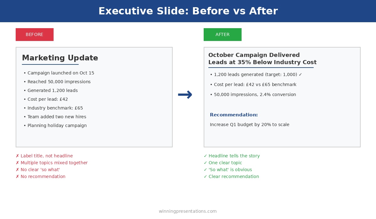
The biotech company’s original deck opened with a 7-slide company overview. The acquirer’s team had read the IM. They already knew the overview. They were waiting for the deal rationale. When we moved the deal rationale to slide 2 (after a one-slide executive summary), the room shifted. The lead partner picked up his pen.

Need the slide template for this structure? The Executive Slide System includes the Strategic Recommendation and Investor Presentation templates with this exact Deal Rationale framing — including AI prompts to draft each section in minutes.

Get the Executive Slide System → £39

Slide 2: The Value Story

After deal rationale comes the value story — and this is where most presentations overcomplicate things.

The value story is not a financial model. It’s not a revenue bridge or a scenario analysis. Those live in the data room. The value story slide has one job: make the acquirer believe the value is real and accessible.

There are three components to a strong value story in due diligence: the headline number (the value created or to be realised), the proof point (the evidence that makes the number credible — a comparable transaction, a customer contract, a market share figure), and the access mechanism (what happens post-acquisition to unlock it — integration pathway, team retention, IP transfer).

Where presenting teams go wrong is building financial detail without giving the acquirer the narrative to interpret it. A revenue graph without a proof point is just a claim. A growth projection without an access mechanism is just optimism. The value story slide should be the narrative spine that makes the financial model believable — not a replacement for it.

For the biotech deal, the value story had been buried inside a 12-slide financials section. When we extracted it into a single slide with those three components — headline number, proof point (a signed licensing agreement worth £8M in year one), and access mechanism (the key relationship that came with the acquisition, not just the IP) — the acquirer’s team stopped asking sceptical questions and started asking integration questions. That’s the shift you’re looking for.


Before and after comparison of value story slide structure showing what makes acquirers believe the number is real

Slide 3: The Risk Map (The One Nobody Wants to Show)

Most due diligence presentations treat risk like a legal disclosure. They bury it at the back. They minimise it. They qualify everything.

That’s exactly the wrong approach — and acquirers know it.

An acquirer doing due diligence is actively looking for what you’re not showing them. If your risk section looks sanitised, they don’t feel reassured. They feel suspicious. They start digging harder. That’s when due diligence drags into month four and deals fall apart.

The Risk Map slide does the opposite. It puts the three to five most material risks on the table — clearly, with specifics. Not “regulatory risk” as a bullet point, but “EU regulatory approval for the lead compound requires a Phase 3 trial estimated at 18 months.” Then, for each risk: what you’ve already done to mitigate it.

This slide has a counterintuitive effect in the room. When an acquirer sees that you’ve identified the real risks and have mitigation plans in place, their confidence goes up — not down. They’re buying a management team as much as an asset. A team that knows its own risks and has thought through the responses is a team they want to own.

For the biotech company, this was the hardest slide to get agreement on. The finance team wanted to soften it. What went in was specific: three risks, with ownership, timelines, and mitigations. The lead partner read it carefully and then said, “This is the most honest risk page I’ve seen this year.” They moved to term sheet within three weeks.

If you’re preparing for a due diligence presentation, you might also find this article useful: Investor Pitch Deck Template — it covers the structural overlap between an investor deck and a DD presentation, and where the two formats diverge.

🛑 Stop Preparing Slides Your Acquirer Won’t Read

  • The exact deal structure templates that frame acquisitions the way acquirers think — not the way finance teams present
  • Risk framing language that builds confidence instead of triggering deeper scrutiny

Get the Executive Slide System → £39

Used in high-stakes M&A and funding presentations across global banking and consulting.

What Goes to the Appendix (and What Stays Out)

Once you have the three anchor slides — Deal Rationale, Value Story, Risk Map — everything else needs a test before it goes in the main deck.

The test: does this slide help the acquirer decide, or does it help the acquirer verify? If it’s verification material — detailed financial models, product roadmap timelines, team CVs, customer case studies — it belongs in the appendix. If it’s decision material — why this deal, why now, why you — it belongs in the main deck.

Acquirers will ask for appendix material when they need it. They will not dig for decision material buried on slide 38. Front-load the decision content. Let the appendix absorb everything else.

The practical rule: your main deck should not exceed 15 slides. The biotech company’s 54-slide deck restructured to 11 slides and an appendix of 43. The acquirer said they got more out of the 11-slide version than they had from an hour with the original deck.

For a deeper look at how decision-first structure works across different executive scenarios, see: Decision Slide That Gets Yes — the same structural principle applied to internal approvals.

Working on an executive or investor presentation right now? The executive presentation structure framework covers the decision-first ordering principle for high-stakes decks — useful background before using the templates.

PAA: Quick Answers on Due Diligence Presentations

How long should a due diligence presentation be?
A live due diligence presentation should be 10–15 slides in the main deck, with supporting material in the appendix. The goal is to answer the acquirer’s key decision questions — why this deal, why now, where is the value — before going into detail. Anything beyond 15 slides in the main deck means the structure hasn’t been resolved. Move verification material to the appendix.

What slides must be in a due diligence presentation?
Three slides anchor every effective due diligence deck: a Deal Rationale slide (strategic logic for the acquirer), a Value Story slide (where the value is, with proof), and a Risk Map slide (material risks with mitigations already in place). These three answer the only question that matters at this stage: should we keep moving?

Why do acquirers stop reading due diligence decks?
Usually because the deck is structured to answer the presenting company’s questions rather than the acquirer’s. Acquirers want to know: does this deal make strategic sense? Is the value real? What are the material risks? When those answers are buried behind market overviews and company history, attention drops. Put the decision material first.

Is the Executive Slide System Right For You?

✔️ This is for you if:

  • You’re preparing a due diligence, investor, or M&A presentation and need a structured template rather than starting from scratch
  • You’ve had a deal room meeting go flat and suspect the structure — not the data — was the problem
  • You need board-ready slides with clear decision framing and you have less than a week to prepare

❌ This is NOT for you if:

  • You need a full financial model or valuation tool — this is a presentation system, not a financial modelling toolkit
  • Your presentation challenge is speaking confidence rather than slide structure — for that, see When Public Speaking Fear Becomes a Medical Emergency

If you recognised your last deal room in any of the above, the structure isn’t the hard part — it’s having the right templates to implement it quickly under time pressure. That’s what the Executive Slide System is built for.

🏛️ The M&A Slide System Built From Deals, Not Textbooks

The Executive Slide System was built from 24 years inside global financial institutions — including due diligence and acquisition presentations at JPMorgan, PwC, and RBS. Not from theory. From rooms where £50M+ decisions were being made on slides like these:

  • 22 PowerPoint templates including Investor Presentation, Strategic Recommendation, and Risk Assessment — all with Decision-First structure
  • 51 AI prompt cards to draft and refine each slide, including the deal rationale and value story sections from this article
  • 15 scenario playbooks covering M&A, board approval, investor, and executive communication scenarios
  • 6 checklists including the Investor Presentation Checklist — covers the due diligence meeting structure step by step
  • The Executive Summary template that answers the acquirer’s three questions before slide 3

Get the Executive Slide System → £39

Your next due diligence meeting isn’t waiting. Get the framework that keeps acquirers at the table. Board-ready in 30 minutes or less.

Frequently Asked Questions

How is a due diligence presentation different from an investor pitch deck?

An investor pitch deck is designed to generate interest and create a first impression. A due diligence presentation comes after the acquirer or investor has already decided they’re interested — it’s designed to maintain momentum and answer the “should we keep moving?” question. The tone is less persuasive, more transparent. The risk framing that would be softened in a pitch deck should be direct and specific in a DD presentation. The structural logic is similar — decision-first, value-anchored — but the risk section is much more prominent and detailed.

Should the management team or the finance team lead the due diligence presentation?

The management team should lead — with finance supporting on the numbers sections. Acquirers are buying a team as much as an asset. The MD or CEO presenting the deal rationale and value story, and then handing to the CFO for the financials section, sends the right signal about capability and ownership. Presentations that are led entirely by bankers or advisers feel one step removed from the actual business, and acquirers notice.

What happens if the acquirer asks questions our deck doesn’t cover?

That’s the appendix’s job. Any question that goes beyond the 15 slides in your main deck should have an appendix slide ready. Prepare for the top 15–20 questions the acquirer is likely to ask — build corresponding appendix slides, know exactly where they are, and pull them into the conversation seamlessly. A smooth transition to appendix material signals preparation and confidence, not weakness. If you’re looking for a structured way to anticipate executive questions, the Hypothetical Trap framework is directly applicable to due diligence Q&A scenarios.

Can I use the same due diligence presentation for multiple acquirer meetings?

The structure should be consistent, but the Deal Rationale slide should be tailored for each acquirer. The strategic logic for why this acquisition makes sense varies depending on who’s buying. A financial acquirer looking for yield has different strategic priorities from a strategic acquirer looking for market entry. The Value Story and Risk Map can remain largely consistent, but the deal rationale — the 90-second argument for why this deal makes sense for them specifically — needs to be adapted for each room.

📬 The Winning Edge — Weekly Presentation Intelligence

One article per week on executive communication, slide structure, and high-stakes presentation strategy. No fluff, no generic advice.

Subscribe to The Winning Edge

🆓 Free resource: Investor Pitch Deck Checklist — a free guide to strengthen your presentation preparation.

Also published today: if the presentation itself isn’t the problem but the physical symptoms of nerves are, read When Public Speaking Fear Becomes a Medical Emergency. And if you’re facing Q&A from executives who like to test hypotheticals, The Hypothetical Trap covers exactly that.

About the Author

Mary Beth Hazeldine is the Owner & Managing Director of Winning Presentations. With 24 years of corporate banking experience at JPMorgan Chase, PwC, Royal Bank of Scotland, and Commerzbank, she has delivered high-stakes presentations in boardrooms across three continents.

A qualified clinical hypnotherapist and NLP practitioner, Mary Beth combines executive communication expertise with evidence-based techniques for managing presentation anxiety. She has trained thousands of executives and supported presentations for high-stakes funding rounds and approvals.

Book a discovery call | View services

10 Dec 2025
Executive summary slide template using the 4-Line Formula - Situation, Insight, Recommendation, Ask - get decisions in 10 seconds

The Executive Summary Slide: How to Write the Only Slide That Matters [2026]

📅 Updated: January 2026 | The slide that decides your outcome before you finish talking

Need a Faster Way to Build Executive Slides?

Most executives spend hours on slides that still miss the mark. The Executive Slide System gives you a structured framework for building slides that land with senior audiences — without starting from scratch every time.

Explore the System →

Quick Answer

An executive summary slide should contain four elements: situation (one sentence), recommendation (specific and actionable), key supporting points (three maximum), and your ask (what you need from them). Put your conclusion first. Executives decide in 60 seconds — give them what they need upfront, not buried on slide 15.

I learned this lesson the hard way at Commerzbank.

A senior VP asked me to present a £2.3M technology investment to the Executive Committee. I built a 28-slide deck. Comprehensive analysis. Beautiful charts. Ironclad logic building to my recommendation.

The CFO interrupted at slide 3: “What do you want us to approve?”

I fumbled to slide 24 where my recommendation lived. By then, I’d lost the room. The meeting ended with “let’s revisit this next quarter” — executive-speak for no.

Three months later, same ask, same committee. This time I led with a single executive summary slide. Sixty seconds in, the CFO said: “Makes sense. What’s the implementation timeline?”

Twenty minutes later, I had full approval.

The difference wasn’t the analysis — it was identical. The difference was giving executives what they needed in the first 60 seconds.

After 25 years presenting to C-suite leaders at JPMorgan, PwC, RBS, and Commerzbank, I’ve refined a formula for executive summary slides that works every time.

Why the Executive Summary Slide Decides Everything

Here’s what most presenters don’t understand: executives make decisions fast.

Senior leaders form initial judgments within seconds of seeing new information — experienced presenters know this instinctively. Everything after that either confirms or contradicts their first impression.

Your executive summary slide IS their first impression. Get it right, and the rest of your presentation is confirmation. Get it wrong, and you’re fighting uphill for the next 30 minutes.

I’ve seen this pattern hundreds of times:

Weak executive summary → Executives check phones → Questions become challenges → “Let’s table this”

Strong executive summary → Executives lean in → Questions become clarifications → “Walk us through implementation”

Same presenter. Same content. Different opening slide. Different outcome.

STOP REBUILDING DECKS FROM SCRATCH

The executive summary slide is the highest-leverage slide in any executive presentation toolkit — get this one right and you’ve already done 70% of the persuasion work.

Build executive slides that get past slide 3

The Executive Slide System gives you 26 templates, 93 AI prompts, and 16 scenario playbooks designed for senior presenters. Drop your content into a structure that already works — finance committees, board approvals, steering meetings, capital reviews. £39, instant access, lifetime updates.

Get the Executive Slide System →

£39, instant access. 26 templates, 93 AI prompts, 16 scenario playbooks. Designed for executive presenters.

The 4-Part Executive Summary Formula

Every effective executive summary slide contains exactly four elements. No more, no less.

The 4-Line Executive Summary Formula showing Situation, Insight, Recommendation, and Ask with real examples for each line

Part 1: Situation (One Sentence)

Ground everyone in the same reality. What’s happening? Why are we here?

Bad: “As you know, we’ve been evaluating our technology infrastructure across multiple dimensions including scalability, security, and cost efficiency, and have identified several areas of concern.”

Good: “Our customer platform will exceed capacity by Q3, risking £4M in annual revenue.”

One sentence. Quantified where possible. No preamble.

Part 2: Recommendation (Specific and Actionable)

What do you want them to do? Be precise enough that they could approve it right now.

Bad: “We recommend investing in technology improvements to address these challenges.”

Good: “Approve £1.2M to upgrade our customer platform, with completion by August 2026.”

Include the number. Include the timeline. Make it approvable as stated.

Part 3: Key Supporting Points (Three Maximum)

Why should they approve this? Give them three reasons — no more.

The human brain struggles to hold more than three to four items in working memory. Give executives five reasons and they’ll remember none. Give them three and they’ll remember all of them.

Example:

  • ROI: 180% over 3 years (payback in 14 months)
  • Risk mitigation: Prevents £4M revenue loss from capacity issues
  • Competitive: Matches capabilities our top 3 competitors launched last year

Each point should be scannable in under 5 seconds.

Part 4: The Ask (What You Need From Them)

Be explicit about what decision you need and when.

Bad: “We’d appreciate your input on next steps.”

Good: “I need budget approval today to meet the Q3 deadline. Implementation plan is ready.”

Executives respect clarity. They don’t respect hedging.

Want ready-made executive summary templates?

The Executive Slide System (£39, instant access) includes 26 executive templates with the 4-part formula built into every layout — plus 93 AI prompts and 16 scenario playbooks covering Board, Budget, QBR, and Strategy presentations.

Get the Executive Slide System →

For Senior Board-Level Approvals

The complete system for presenting decisions that get approved at senior levels

Executive Buy-In Presentation System — 7 self-paced modules, monthly cohort enrolment, optional recorded Q&A sessions. £499, lifetime access to materials.

Explore the Executive Buy-In System →

Executive Summary Slide Examples: Before and After

Let me show you how this works with real transformations from clients I’ve coached.

Example 1: Budget Request

BEFORE (Weak):

  • Title: “Technology Investment Proposal”
  • Content: Three paragraphs explaining background, four bullet points about challenges, reference to “detailed analysis in appendix”
  • No clear ask visible
  • Result: “Send us a summary” (rejected)

AFTER (Strong):

  • Title: “Request: £1.2M Platform Upgrade — 180% ROI”
  • Situation: Customer platform hits capacity Q3, risking £4M revenue
  • Recommendation: Approve £1.2M upgrade with August completion
  • Why: 180% ROI | Prevents £4M loss | Matches competitor capabilities
  • Ask: Budget approval needed today to meet deadline
  • Result: Approved in 20 minutes

Example 2: Strategic Initiative

BEFORE (Weak):

  • Title: “Market Expansion Analysis”
  • Content: Market size data, competitor overview, SWOT analysis summary, “recommendation on slide 18”
  • Result: Lost attention by slide 4

AFTER (Strong):

  • Title: “Recommendation: Enter DACH Market Q2 — £8M Opportunity”
  • Situation: UK growth slowing to 3%; DACH offers 12% growth with existing product fit
  • Recommendation: Launch DACH pilot Q2 with £400K investment
  • Why: £8M addressable market | 3 signed LOIs already | Existing team can execute
  • Ask: Approve pilot budget and hire 2 sales reps by March
  • Result: Approved with additional resources offered

Example 3: Project Status Update

BEFORE (Weak):

  • Title: “Project Phoenix Status Update”
  • Content: Timeline, milestones completed, milestones pending, budget status, team updates
  • Problem buried on slide 6
  • Result: Executives surprised and frustrated when issue finally surfaced

AFTER (Strong):

  • Title: “Project Phoenix: On Track, But Need Decision on Vendor Delay”
  • Situation: Phase 1 complete (on time, on budget). Phase 2 vendor delayed 3 weeks.
  • Recommendation: Accept delay (no cost impact) vs. switch vendors (£50K, saves 1 week)
  • Why: Delay acceptable — still hits Q3 deadline | Switching adds risk for minimal gain
  • Ask: Confirm we proceed with current vendor
  • Result: Decision made in 5 minutes, meeting ended early

Related: Executive Presentation Template: 12 Slides That Command the Room

Common Executive Summary Mistakes (And How to Fix Them)

Mistake #1: Burying the Lead

Your recommendation should be visible within 10 seconds of the slide appearing. If executives have to hunt for it, you’ve already lost.

Fix: Put your recommendation in the slide title or as the first bold line. “Request: £1.2M Platform Upgrade” tells them instantly what this is about.

Mistake #2: Too Many Supporting Points

Five bullet points means zero retention. Executives are processing dozens of decisions daily — they can’t hold your seven reasons in memory.

Fix: Force yourself to pick three. If you can’t decide which three matter most, you don’t understand your own argument well enough.

Mistake #3: Vague Language

“Significant investment” means nothing. “Improved efficiency” means nothing. “Strategic alignment” means nothing.

Fix: Use numbers. “£1.2M investment” is specific. “23% efficiency gain” is specific. “Supports Goal #2 in our 2026 strategy” is specific.

Mistake #4: No Clear Ask

If you don’t tell executives what you need, they’ll assume you don’t need anything — and they’ll move on.

Fix: End with an explicit ask. “I need approval today” or “I need a decision by Friday” or “I need you to choose between Option A and Option B.”

Mistake #5: Defensive Positioning

Starting with caveats, limitations, and “as you know” context signals insecurity. Executives smell fear.

Fix: Lead with confidence. State your recommendation directly. Address objections when asked, not before.

Related: The 3-Slide System That Gets Executive Decisions Fast

How to Write Your Executive Summary Slide (Step by Step)

Here’s my process for writing executive summary slides quickly and effectively.

Step 1: Start With the Ask

Write down: “At the end of this meeting, I need them to _______________.”

If you can’t complete that sentence, you’re not ready to present. Go back and figure out what you actually need.

Step 2: Write the Recommendation

Make it specific enough to approve as stated. Include amounts, timelines, and owners where relevant.

Test: Could they say “yes” to this exact sentence and know what happens next?

Step 3: Identify Three Supporting Points

Ask yourself: “If they push back, what are the three strongest reasons this makes sense?”

Those are your supporting points. Lead with the strongest.

Step 4: Write the Situation Line

One sentence that grounds everyone. Why are we here? What’s changed?

This often comes last because you need to understand your recommendation before you can frame the situation correctly.

Step 5: Cut Ruthlessly

Read your slide aloud. If it takes more than 45 seconds, cut something. The executive summary should be graspable in a single glance.

Using AI to Draft Your Executive Summary

AI tools like ChatGPT or Claude can accelerate your executive summary slide — if you prompt them correctly.

Effective prompt:

“I’m presenting to [audience] about [topic]. I need them to approve [specific ask]. Write an executive summary slide with: 1) one-sentence situation, 2) specific recommendation, 3) three supporting points (quantified where possible), 4) clear ask. Keep total word count under 75 words.”

What AI does well:

  • Structuring your thoughts into the 4-part format
  • Tightening wordy language
  • Suggesting quantified supporting points

What you must add:

  • Political context (what matters to THIS audience)
  • Accurate numbers from your analysis
  • Judgment about which supporting points will resonate

Related: Best Copilot PowerPoint Prompts That Actually Work

Executive Summary Slide Design Tips

Content matters most, but design affects comprehension.

Title: Make it active and outcome-focused. “Request: £1.2M Platform Upgrade” not “Platform Investment Overview”

Layout: Use visual hierarchy. Recommendation should be the most prominent element.

Font size: If executives are reading from 10 feet away (common in boardrooms), your key points should be readable. 24pt minimum for main text.

White space: Crowded slides signal disorganised thinking. If you can’t fit it with breathing room, you have too much content.

Colour: Use your corporate template. Don’t get creative with colours — it distracts from content.

When to Use an Executive Summary Slide

Not every presentation needs a formal executive summary slide. Here’s when to use one:

Always use one when:

  • Presenting to C-suite or board
  • Requesting budget or resources
  • Proposing a strategic decision
  • Presenting to time-pressed audiences
  • The meeting is 30+ minutes

Consider skipping when:

  • Informal team updates
  • Brainstorming sessions
  • Workshops where you’re facilitating, not recommending

When in doubt, include one. Executives never complain about getting to the point too quickly.

Related: Board Presentation Template: The Executive’s Complete Guide

Stop Rewriting the Proposal

Stop rewriting your proposal three times to hear “we’ll think about it”

The Executive Buy-In Presentation System teaches the structure that gets decisions, not delays — 7 self-paced modules with optional recorded Q&A calls. £499, lifetime access.

  • Decode stakeholder resistance before you build the slides
  • Sequence the case so the executive summary lands on the first attempt
  • Handle the objection your audience hasn’t raised yet

Explore the Executive Buy-In System →

Self-paced programme with monthly cohort enrolment — optional recorded Q&A calls available.

Frequently Asked Questions

How long should an executive summary slide be?

Under 75 words of actual content. It should be graspable in a single glance — roughly 30-45 seconds to read and understand. If you can’t read it aloud in under a minute, it’s too long.

Should the executive summary be slide 1 or slide 2?

Slide 1 in most cases. The only exception is if you need a single “context” slide to ground executives who aren’t familiar with the topic. Even then, keep the context slide to 30 seconds maximum before moving to your summary.

What if my recommendation is complex?

Simplify it for the executive summary, then expand in the supporting slides. “Approve the three-phase digital transformation programme” works on slide 1; the phases get their own slides later.

How do I handle multiple asks?

If you have more than one ask, you likely have more than one presentation. For genuinely related asks, bundle them: “Approve £1.2M budget AND two additional headcount for Q2 implementation.”

What if I don’t know what decision they’ll make?

Present options with a clear recommendation. “I recommend Option A for these three reasons. Option B is viable if timeline is the priority. I need you to choose today.”

Should I send the executive summary in advance?

Yes — 24-48 hours before the meeting if possible. Some executives prefer to form questions beforehand. Include it in the email body, not just as an attachment.

Ready for the deeper buy-in framework?

The Executive Buy-In Presentation System

A self-paced programme on Maven covering the structure, psychology, and stakeholder analysis behind senior approvals. 7 modules with optional recorded Q&A sessions — no deadlines, no mandatory attendance. £499, lifetime access to materials.

Explore the programme →

📧 The Winning Edge Newsletter

Weekly insights on executive presentations, slide design, and what’s actually working in boardrooms right now.

Subscribe Free →

Related Resources

🎁 Free: Executive Presentation Checklist

The 12-point checklist I use before every executive presentation — including the executive summary test. One page PDF.

Download Free Checklist →

No email required. Instant download.

About the Author

Mary Beth Hazeldine is Owner & Managing Director of Winning Presentations. With 25 years in corporate banking at JPMorgan Chase, PwC, Royal Bank of Scotland, and Commerzbank, she advises senior professionals across financial services, consulting, and technology on structuring executive summary slides and board approval presentations.

10 Dec 2025
QBR presentation template 2026 - 8-slide structure for quarterly business reviews that drive action with the So What framework

QBR Presentation Template: How to Run Quarterly Business Reviews That Drive Action [2026]

📅 Last Updated: January 2026 — Includes AI prompts to build your QBR deck in 30 minutes

Last quarter, a VP of Operations walked into her QBR expecting the usual: present the numbers, answer a few questions, leave. Instead, she walked out with a £200K budget increase she hadn’t even planned to ask for.

The difference? She stopped presenting data and started presenting insight.

I’ve delivered hundreds of quarterly business reviews across 25 years in corporate banking — at JPMorgan Chase, PwC, Royal Bank of Scotland, and Commerzbank. I’ve watched executives tune out within three slides. And I’ve seen the same executives lean forward, engaged, asking how they can help.

The difference is never the data. It’s always the structure.

This is the QBR presentation template that turns quarterly reviews into quarterly wins — the same structure my clients use to run QBRs that actually drive action.

What You’ll Learn in This Guide

  • The 8-slide QBR template that keeps executives engaged
  • Why most quarterly business reviews bore leadership (and how to fix yours)
  • The “So What?” framework that turns data into decisions
  • How to use AI tools like Copilot to build your QBR in 30 minutes
  • Real before/after examples from client transformations

QBR next Thursday — and the deck is still a blank PowerPoint file?

Executive Slide System has an 8-slide QBR Deep Dive template with 8 QBR-specific AI prompts that build your review in 30 minutes. Plus a “Quarterly review with the CEO” scenario playbook. £39, instant download.

Get the Slide System →

Why Most QBR Presentations Fail

I’ve sat through hundreds of quarterly business reviews. The pattern is always the same:

Slide after slide of metrics. Charts showing what happened. Tables comparing this quarter to last quarter. Thirty minutes of “here’s what we did” followed by executives checking their phones.

The problem isn’t the data. It’s the structure.

Most QBRs are built as status reports. But executives don’t need status reports — they have dashboards for that. What they need is insight and direction.

The question isn’t “What happened?” It’s “What does this mean, and what should we do about it?”

Related: Why Most QBR Presentations Bore Leadership (And How to Fix Yours)

Build a board-ready QBR deck in under 30 minutes

8-slide QBR template + 8 dedicated AI prompts. Stop rebuilding the same review every quarter. £39, instant access.

Get the System →

“Win the room. Every time.” — weekly tactics on executive presentations, Copilot for PowerPoint, and the psychology of persuasion. Free, from Mary Beth Hazeldine.

Send me the free newsletter →

The QBR Presentation Template: 8 Slides That Drive Action

8-slide QBR presentation template showing executive summary, scorecard, wins, misses, key insights, next quarter priorities, risks, and the ask

This template flips the traditional QBR on its head. Instead of starting with data, you start with insight. Instead of ending with “any questions?”, you end with a decision.

Slide 1: Executive Summary (The Only Slide That Matters)

If your executives only see one slide, this is it. Most QBRs bury the lead under 20 slides of context. Don’t.

What to include:

  • Quarter performance in one sentence (hit/miss/exceeded)
  • The single most important insight
  • Your recommendation or ask
  • What you need from leadership

Example: “Q4 exceeded target by 12% (£2.4M vs £2.1M goal). Customer acquisition cost dropped 23% due to referral programme. Recommend doubling referral budget in Q1. Need approval for £50K incremental spend.”

That’s 38 words. An executive can read it in 10 seconds and know exactly where you stand and what you need.

Slide 2: Scorecard — Goals vs. Actuals

One slide. One table. No narrative yet — just the numbers.

Format:

  • Metric | Target | Actual | Variance | Status (🟢🟡🔴)
  • Keep to 5-7 key metrics maximum
  • Use colour coding ruthlessly (green/yellow/red)

This slide answers: “Did we hit our numbers?” Nothing more.

Pro tip: Resist the urge to explain variances here. That comes next. The scorecard should be scannable in 5 seconds.

Slide 3: What Worked (Green Items Deep Dive)

Pick your biggest win and explain why it happened. Not what happened — why.

Structure:

  • The result (quantified)
  • The driver (what caused it)
  • The insight (what we learned)
  • The implication (what this means for next quarter)

Example: “Referral revenue up 47%. Driver: We simplified the referral process from 5 steps to 2. Insight: Friction was killing conversions. Implication: Apply same friction analysis to onboarding flow in Q1.”

See the difference? You’re not just reporting — you’re extracting meaning.

Slide 4: What Didn’t Work (Red Items Deep Dive)

This is where most presenters get defensive. Don’t be. Executives respect honesty more than spin.

Structure:

  • The miss (quantified)
  • Root cause (not excuses — actual cause)
  • What we’re doing about it
  • When we expect to see improvement

What NOT to do: “We missed target due to market conditions.” That’s an excuse, not an insight.

What TO do: “We missed target by 15%. Root cause: Our Q3 pipeline was 30% smaller than needed due to August hiring freeze. Action: Added 2 SDRs in October. Expect pipeline recovery by mid-Q1.”

Want the ready-made QBR slide layouts? The Executive Slide System includes the complete 8-slide QBR structure with AI prompts to customise it for your team.

Walk into the QBR with a deck the CEO can read in three minutes

Executive Slide System — 8-slide Quarterly Business Review template plus 8 QBR-specific AI prompts that turn raw numbers into a recommendation. Built from real boardroom QBRs in banking and SaaS. £39.

Explore the System →

Slide 5: Key Insights — The “So What?” Slide

This is the slide most QBRs miss entirely. You’ve shown the data. Now tell them what it means.

Format: 3-4 bullet points, each structured as:

  • Observation: What we noticed
  • Implication: What it means for the business

Example insights:

  • “Enterprise deals are taking 40% longer to close → Need to revisit our enterprise sales process”
  • “Support tickets dropped 30% after knowledge base update → Self-service is working; invest more here”
  • “Top 10% of customers drive 60% of revenue → Concentrate retention efforts on this segment”

This slide demonstrates that you’re not just tracking numbers — you’re thinking strategically.

Slide 6: Next Quarter Priorities

Based on your insights, what are you going to do about it?

Format:

  • 3-5 priorities maximum (more than 5 means no priorities)
  • Each priority linked to an insight from the previous slide
  • Owner assigned
  • Success metric defined

Example:

  • Priority: Reduce enterprise sales cycle
  • Why: 40% longer close times killing forecast accuracy
  • Owner: Sarah (VP Sales)
  • Success metric: Reduce average cycle from 90 to 65 days

Slide 7: Risks & Dependencies

What could derail your plan? Executives appreciate foresight.

Format:

  • Risk description
  • Likelihood (High/Medium/Low)
  • Impact (High/Medium/Low)
  • Mitigation plan

Keep to 3-4 risks. More than that, and you look like you’re hedging everything.

Include dependencies on other teams or decisions: “Q1 plan assumes marketing budget approval by January 15.”

Slide 8: The Ask

End with what you need from leadership. Be specific.

Types of asks:

  • Budget approval: “Requesting £50K for expanded referral programme”
  • Headcount: “Need approval for 2 additional engineers”
  • Decision: “Need direction on whether to pursue Enterprise or SMB focus”
  • Support: “Need executive sponsor for cross-functional initiative”

If you don’t need anything, say so: “No approvals needed. Presented for visibility and alignment.”

Then stop talking. Let them respond.

The “So What?” Framework: Turning Data Into Decisions

Every executive I’ve trained learns this framework. It’s the single most powerful tool for turning quarterly business review slides into action.

The rule: Every piece of data must survive three “So what?” questions. If it can’t, cut it.

Here’s how to run a QBR using this framework:

“Revenue was £2.4M this quarter.”
So what?
“That’s 12% above target.”
So what?
“It means our new pricing strategy is working.”
So what?
“We should expand it to the enterprise segment in Q1.”

Now you have an insight worth presenting. You’ve turned a data point into a quarterly business review example that drives a decision.

If you can’t get past “so what?” after three iterations, the data point doesn’t belong in your QBR slides.

I’ve used this framework in hundreds of QBRs. It works for sales quarterly reviews, marketing QBRs, product reviews — any context where you’re presenting performance data to leadership.

QBR Presentation Mistakes to Avoid

Mistake #1: Starting with History

“Before we look at Q4, let me recap Q3…”

No. Executives don’t need a recap. They were there for Q3. Start with this quarter’s results and look forward, not backward.

Mistake #2: Too Many Metrics

If you’re showing 20 KPIs, you’re showing zero insights. Five to seven metrics that actually matter beats a dashboard dump every time.

Ask yourself: “If I could only show three numbers, which would they be?” Start there.

Mistake #3: Charts Without Context

A chart that says “Revenue by Region” with no annotation is useless. Every chart needs a headline that tells me what to notice.

Bad: “Revenue by Region Q4”
Good: “EMEA Revenue Up 34% — Driven by New Partnership”

The headline does the work. The chart provides evidence.

Mistake #4: Ending with “Any Questions?”

That’s not an ending — it’s a surrender. End with your ask, your recommendation, or your key insight. Make them remember something specific.

Mistake #5: Reading the Slides

If you’re reading your slides aloud, you’ve already lost. Your slides are the evidence. Your voice provides the insight, context, and conviction.

Related: Executive Presentation Skills: How CEOs Actually Present

💡 Pro Tip: Rehearse your QBR out loud once. Time yourself. If you’re over 20 minutes of talking, you have too much content. Cut ruthlessly. Executives would rather have 15 focused minutes than 45 unfocused ones.

The executives who consistently get approvals follow a structured structure. The Executive Slide System gives you that structure with before/after examples for every slide type.

Using AI to Build Your QBR Faster

A good QBR takes 4-6 hours to build manually. With AI tools like PowerPoint Copilot, you can get a solid first draft in 30-45 minutes.

Here’s my workflow:

Step 1: Generate the Structure

“Create an 8-slide QBR presentation structure for [department/team] covering Q4 performance. Include executive summary, scorecard, wins analysis, misses analysis, key insights, next quarter priorities, risks, and asks.”

Step 2: Build the Scorecard

“Create a scorecard table with these metrics: [list your 5-7 KPIs]. Include columns for Target, Actual, Variance, and Status. Use green/yellow/red indicators.”

Step 3: Extract Insights

“Based on this data [paste your numbers], generate 3-4 strategic insights using the format: Observation + Implication. Focus on what this means for next quarter.”

Step 4: Generate Risk Assessment

“Generate 3 potential risks for [your Q1 plan] with likelihood, impact, and mitigation strategies.”

The AI handles the structure and first draft. You add the judgment, context, and conviction.

Related: Best Copilot PowerPoint Prompts That Actually Work

QBR Presentation Example: Before & After

Here’s a real transformation from a client — Sarah, VP of Customer Success at a B2B SaaS company.

Before: Sarah’s Original QBR

  • Title: “Q4 2025 Customer Success Review”
  • 14 slides of metrics: NPS, CSAT, churn rate, ticket volume, response times…
  • Every chart labelled descriptively: “NPS by Month”, “Churn by Segment”
  • No clear takeaway or recommendation
  • Ended with “Questions?”
  • Result: CEO asked “So what do you need from us?” — Sarah didn’t have an answer ready

QBR transformation case study showing Sarah VP of Customer Success going from 14-slide data dump with no decision to 8-slide template with £50K budget approved

After: The Transformed QBR

  • Title: “Q4: Churn Down 23% — Proposing £50K Knowledge Base Investment”
  • 8 slides following the template structure
  • Executive summary stated: Churn dropped because self-service support reduced friction. Recommended expanding knowledge base to cover enterprise tier.
  • Every chart had an insight headline: “Enterprise Churn Dropped 31% After Dedicated CSM Assignment”
  • Clear ask on final slide: £50K budget + 1 headcount for Q1
  • Result: Budget approved in the meeting. CEO added: “Why didn’t we do this sooner?”

The content was mostly the same data. The structure made it actionable.

Sarah now uses this template every quarter. Her QBRs finish early, and she’s been promoted twice since.

QBR Presentation Checklist

Before you present, verify:

  • ☐ Executive summary on slide 1 with clear insight and ask
  • ☐ Scorecard limited to 5-7 metrics with colour coding
  • ☐ Wins explained with “why” not just “what”
  • ☐ Misses addressed honestly with root cause and action plan
  • ☐ Every data point passes the “So What?” test
  • ☐ Next quarter priorities linked to this quarter’s insights
  • ☐ Risks identified with mitigation plans
  • ☐ Clear ask on final slide
  • ☐ Presentation under 20 minutes
  • ☐ Chart headlines tell the story (not just describe the chart)

Stop rebuilding your QBR every quarter

8-slide QBR template + 8 AI prompts inside the Executive Slide System. £39, instant download.

Get the Slide System →

A deck that drives the QBR — not survives it

Executive Slide System: 26 templates including the 8-slide QBR plus the “Quarterly review with the CEO” scenario playbook. £39.

Get the System →

Want the complete toolkit?

QBR slides are one piece of the executive presentation cycle. The Complete Presenter Bundle pulls all seven products together — slides, Q&A, anxiety, storytelling, delivery, openers, cheat sheets — for £99 (save £91.97 vs buying separately). Lifetime access.

Get the Complete Presenter Bundle — £99 →

Frequently Asked Questions

How long should a QBR presentation be?

8-12 slides maximum. If your meeting is 60 minutes, aim for 15-20 minutes of presentation and 40 minutes of discussion. The discussion is where decisions get made.

What should I include in quarterly business review slides?

Every QBR deck needs these elements: executive summary with your ask, scorecard showing goals vs actuals, analysis of what worked and what didn’t, key insights, next quarter priorities, risks, and a clear ask. The 8-slide template above covers all of these.

How do I run a QBR that executives actually care about?

Start with insight, not data. Lead with your recommendation on slide 1. Use the “So What?” framework on every data point. End with a specific ask. Most importantly, make it a conversation about the future, not a report on the past.

Should I send the QBR deck in advance?

Yes. Send it 24-48 hours before. This lets executives come with informed questions rather than processing raw data in the meeting. Some will read it; some won’t. Accommodate both.

What if I have bad news to deliver?

Deliver it early, directly, and with a plan. Don’t bury bad news on slide 15. Executives respect honesty. What they don’t respect is spin or surprises.

Related: How to Present Bad News Without Killing Your Career

Do you have quarterly business review examples I can follow?

The Sarah case study above is a real example. The key transformation: she stopped presenting “what happened” and started presenting “what this means and what we should do.” Her QBR went from 14 slides of data to 8 slides of insight — and got her budget approved on the spot.

How do I handle executives who want more detail?

Build an appendix with supporting data. Say: “I have the detailed breakdown in the appendix if you’d like to review it.” Most won’t. But those who want it can access it without derailing the main presentation.

What’s the biggest QBR mistake you see?

Presenting data without insight. A QBR that’s just “here’s what happened” is a wasted opportunity. Every number should lead to an implication. Every implication should lead to an action.

How do I make my QBR more engaging?

Start with a story or a surprise. “We expected Q4 to be our weakest quarter. Instead, it was our strongest. Here’s why.” That’s more engaging than “Let me walk you through Q4 results.”

📧 The Winning Edge Newsletter

Weekly insights on executive presentations, QBR strategies, and what’s actually working in boardrooms right now.

Subscribe Free →

QBR Templates for Different Contexts

The 8-slide structure adapts to different types of quarterly reviews:

Sales QBR: Focus on pipeline, win rates, deal velocity, and forecast accuracy. Your “ask” is usually headcount or budget.

Marketing QBR: Focus on lead generation, CAC, attribution, and campaign performance. Link everything to revenue impact.

Product QBR: Focus on feature delivery, user adoption, NPS, and roadmap progress. Your “ask” is usually resources or priority decisions.

Operations QBR: Focus on efficiency metrics, SLAs, cost per transaction, and process improvements. Link to customer satisfaction and margin.

The structure stays the same. The metrics change.

Related Resources

🎁 Free: Executive Presentation Checklist

The 12-point checklist I use before every executive presentation. One page. Covers structure, timing, and the mistakes that get decks rejected.

Download Free Checklist →

No email required. Instant download.

About the Author

Mary Beth Hazeldine spent 25 years in corporate banking at JPMorgan Chase, PwC, Royal Bank of Scotland, and Commerzbank. She’s delivered hundreds of QBRs and now teaches executives to run quarterly reviews that drive decisions and secure resources. She now runs Winning Presentations, training executives to communicate with impact — and helping them use AI tools like Copilot to create better presentations in less time.

09 Dec 2025
Board Presentation Template 2025 - The 12-slide executive guide to boardroom success with structure used to secure £250M+ in board approvals

Board Presentation Template: The Executive’s Complete Guide to Boardroom Success [2026]

I’ve sat in boardrooms where £50 million decisions hung on a single presentation. I’ve watched executives with brilliant ideas fail because their board deck was a mess. And I’ve seen average proposals succeed because they were structured exactly right.

After 25 years in corporate banking — at JPMorgan Chase, PwC, Royal Bank of Scotland, and Commerzbank — I’ve worked on senior board presentations across financial services, consulting, and technology. I’ve helped clients structure the case for budget approval using the board presentation template I’m sharing today.

This isn’t theory. It’s the structure that gets budgets approved, strategies greenlit, and careers accelerated.

Need a Faster Way to Build Executive Slides?

Most executives spend hours on slides that still miss the mark. The Executive Slide System gives you a structured framework for building slides that land with senior audiences — without starting from scratch every time.

Explore the System →

What You’ll Learn in This Guide

  • The 12-slide board presentation template that works across industries
  • What board members actually want to see (and what makes them tune out)
  • Real before/after examples from clients who transformed their board decks
  • How to use AI tools like Copilot to create board presentations in 30 minutes
  • The 3 fatal mistakes that kill board presentations (and how to avoid them)

The Board Presentation Template: 12 Slides That Command the Room

12-slide board presentation template structure showing executive summary, problem, strategic alignment, solution, financial analysis, timeline, risks, resources, alternatives, governance, metrics, and the ask
Board members are busy. They’re reviewing multiple presentations, managing competing priorities, and making decisions that affect thousands of people. Your job is to make their decision easy.

Here’s the exact structure I use with clients:

Slide 1: Executive Summary (The Only Slide That Matters)

If board members only read one slide, this is it. Most presenters bury their ask on slide 15. That’s backwards.

What to include:

  • Your recommendation in one sentence
  • The investment required (money, time, resources)
  • The expected return (quantified)
  • The timeline for results

Example: “We recommend investing £2.4M in the Nordic expansion, projecting £8.2M revenue within 18 months (242% ROI) with break-even at month 11.”

That’s 28 words. A board member can read it in 5 seconds and know exactly what you’re asking for.

Slide 2: The Problem or Opportunity

Context matters. Before board members can evaluate your solution, they need to understand why it matters now.

What to include:

  • The business problem or market opportunity
  • Why it’s urgent (what happens if we don’t act)
  • Quantified impact on the business

Tip: Use the “So what?” test. After every statement, ask yourself “So what?” If you can’t answer with a business impact, cut it.

Slide 3: Strategic Alignment

Board members think in terms of strategy. Show them how your proposal connects to what they’ve already approved.

What to include:

  • Link to company strategy or board-approved priorities
  • How this advances strategic goals
  • What happens to strategy if this isn’t approved

Slide 4: The Proposed Solution

Now — and only now — do you present your solution. By this point, you’ve established the problem, the urgency, and the strategic fit.

What to include:

  • Clear description of what you’re proposing
  • Why this approach (vs. alternatives)
  • Key components or phases


STOP REBUILDING DECKS FROM SCRATCH

Build executive slides that get past slide 3

The Executive Slide System gives you 26 templates, 93 AI prompts, and 16 scenario playbooks designed for senior presenters. Drop your content into a structure that already works — finance committees, board approvals, steering meetings, capital reviews. £39, instant access, lifetime updates.

Get the Executive Slide System →

£39, instant access. 26 templates, 93 AI prompts, 16 scenario playbooks. Designed for executive presenters.

Slide 5: Financial Analysis

This is where most board presentations fail. Not because the numbers are wrong, but because they’re presented wrong.

What board members want to see:

  • Total investment required (not just this year — full cost)
  • Expected returns (revenue, cost savings, or both)
  • ROI calculation
  • Payback period
  • NPV if applicable

What they don’t want: 47 rows of spreadsheet data copied into PowerPoint. Summarise. If they want the detail, they’ll ask.

Slide 6: Implementation Timeline

A visual roadmap showing key milestones. Board members want to know:

  • When does this start?
  • What are the major phases?
  • When will we see results?
  • What are the key decision points?

Pro tip: Include a “Quick Win” milestone in the first 90 days. It builds confidence that you’ve thought through execution.

Slide 7: Risk Assessment

Boards don’t expect zero risk. They expect you to have identified and planned for risks.

Format that works:

  • Risk description
  • Likelihood (High/Medium/Low)
  • Impact (High/Medium/Low)
  • Mitigation strategy

Three to five risks is the sweet spot. Fewer looks naive. More looks like you’re not confident in the proposal.

Slide 8: Resource Requirements

Beyond money, what do you need?

  • People (FTEs, contractors, specific expertise)
  • Technology or infrastructure
  • External partners or vendors
  • Other departments’ involvement

Slide 9: Alternatives Considered

This slide demonstrates rigour. Show the board you’ve evaluated options:

  • Option A: Do nothing (what happens?)
  • Option B: Your recommendation
  • Option C: Alternative approach

Brief pros/cons for each. Make it obvious why your recommendation is the right choice — but let the logic speak for itself.

💡 Pro Tip: The “Alternatives Considered” slide is where AI tools like Copilot shine. Use prompts like: “Generate three strategic alternatives for [your proposal] with pros, cons, and estimated ROI for each.” You’ll get a first draft in 30 seconds that would take an hour manually.

Slide 10: Governance & Accountability

Who’s responsible? Boards want to know there’s clear ownership:

  • Executive sponsor
  • Project lead
  • Steering committee (if applicable)
  • Reporting cadence to the board

Slide 11: Success Metrics

How will we know this worked? Define 3-5 measurable KPIs:

  • What you’ll measure
  • Current baseline
  • Target
  • When you’ll measure it

This slide creates accountability — and makes your next board update much easier to structure.

Slide 12: The Ask

End where you began. Restate your recommendation clearly:

“We request board approval for £2.4M investment in Nordic expansion, with quarterly progress updates beginning Q2 2026.”

Then stop talking. The most powerful thing you can do after your ask is be silent and let the board respond.

Board presentation in the next 30 days? For a complementary approach, see our guide to executive presentation templates.

The 3 Fatal Mistakes That Kill Board Presentations

I’ve seen brilliant proposals fail because of these errors. Don’t make them.

Mistake #1: Burying the Lead

If you wait until slide 15 to reveal what you’re asking for, you’ve lost them. Board members are scanning for the bottom line. Give it to them immediately.

Fix: Put your recommendation and ask on slide 1. Everything else is supporting evidence.

Mistake #2: Data Dumping

Copying your entire financial model into PowerPoint doesn’t demonstrate rigour — it demonstrates that you don’t know how to communicate to executives.

Fix: One insight per slide. If a board member wants the backup, have it ready in an appendix or leave-behind document.

Mistake #3: Ignoring the Politics

Every board has dynamics. Who are the decision-makers? Who might oppose this? What concerns have they raised before?

Fix: Pre-wire your presentation. Talk to key board members before the meeting. Address their concerns in your deck. By the time you present, approval should feel like a formality.

For Senior Board-Level Proposals

The Buy-In framework senior professionals use to secure approval

Designed for senior professionals who present decisions to boards, investment committees, and executive sponsors. The Executive Buy-In Presentation System — 7 self-paced modules covering the psychology and structure that earn serious approval. £499, lifetime access.

Explore the Buy-In System →

Using AI to Create Board Presentations Faster

Here’s a reality: the board presentation template I’ve shared takes 4-6 hours to create manually. With AI tools like PowerPoint Copilot’s new Agent Mode, you can get a solid first draft in 30-45 minutes.

How I use Copilot for board presentations:

  1. Structure first: Use the prompt: “Create a 12-slide board presentation structure for [proposal] requesting [amount] for [objective]”
  2. Section by section: Generate each section with specific prompts, then refine
  3. Data visualisation: “Create a chart showing ROI trajectory over 18 months with break-even at month 11”
  4. Risk assessment: “Generate 5 potential risks for [project] with likelihood, impact, and mitigation strategies”

The new Agent Mode in Copilot (released December 2025) can even research your industry and pull in relevant market data automatically.

Related: 50 Best Copilot Prompts for PowerPoint Presentations

Board Presentation Examples: Before & After

Here’s what transformation looks like:

Before: A Client’s Original Executive Summary Slide

  • Title: “Q3 Strategic Initiative Update”
  • 12 bullet points covering everything from market research to team structure
  • No clear ask
  • No financials visible
  • Required 5 minutes to explain what it meant

Board presentation transformation showing cluttered 12-bullet slide deferred twice versus clear 4-line executive summary approved unanimously

After: The Transformed Version

  • Title: “Recommendation: £2.4M Nordic Expansion”
  • 4 lines: Ask, Investment, Return, Timeline
  • Visual showing 242% ROI
  • Clear “Approve / Reject / Defer” framing
  • Understood in 10 seconds

Result: Approved unanimously in the first board meeting. The previous version had been deferred twice.

Want the slide templates that go with this structure?

The Executive Slide System (£39, instant access) includes a 12-slide board presentation template built around the structure in this guide — 26 templates, 93 AI prompts, and 16 scenario playbooks to customise each slide for your specific proposal.

Get the Executive Slide System →

What Board Members Really Think (But Won’t Tell You)

After 25 years of working with boards, here’s what I’ve learned they’re actually thinking:

“Get to the point.” They have 6 more presentations after yours. Respect their time.

“What’s this going to cost me?” Not just money — political capital, resources from other projects, risk to their reputation if it fails.

“Has this person done their homework?” They’re evaluating you as much as your proposal. Sloppy deck = sloppy thinking.

“What’s the catch?” If your proposal sounds too good to be true, they’ll assume it is. Address risks proactively.

“Can I defend this decision?” Board members are accountable to shareholders, regulators, and each other. Give them the evidence they need to say yes.

Board Presentation Checklist

Board presentation checklist with 12 verification items including executive summary on slide 1, financial analysis, risk assessment, and pre-wiring with decision makers

Before you present, verify:

  • ☐ Executive summary on slide 1 with clear ask
  • ☐ Problem/opportunity quantified with business impact
  • ☐ Strategic alignment explicitly stated
  • ☐ Financial analysis summarised (detail in appendix)
  • ☐ Implementation timeline with milestones
  • ☐ 3-5 risks with mitigation strategies
  • ☐ Alternatives considered (including “do nothing”)
  • ☐ Clear success metrics defined
  • ☐ Governance and accountability assigned
  • ☐ Final slide restates the ask
  • ☐ Presentation under 20 minutes
  • ☐ Pre-wired with key decision makers

Walk Into the Boardroom Prepared

Stop rewriting your proposal three times before anyone says yes

Stop guessing what your board needs to hear. The Executive Buy-In Presentation System teaches the structure that gets decisions, not delays — 7 self-paced modules with optional recorded Q&A calls. £499, lifetime access.

  • Decode resistance before the meeting so you can address it in the deck
  • Build the case that answers the objection your board hasn’t asked yet
  • Walk through the approval narrative step-by-step — self-paced, no deadlines

Explore the Executive Buy-In System →

Self-paced programme with monthly cohort enrolment — optional recorded Q&A calls available.

Frequently Asked Questions

How long should a board presentation be?

12-15 slides maximum for the main presentation. If you need more, put it in an appendix. Most board presentations should take 15-20 minutes to present, leaving time for questions.

Should I send the board deck in advance?

Yes, always. Send it 48-72 hours before the meeting. This allows board members to review, formulate questions, and come prepared. Surprises in board meetings rarely go well.

What if a board member challenges my numbers?

Have your backup ready. Keep detailed financial models and source data accessible (laptop open, appendix printed). Answer calmly with specifics. If you don’t know something, say so and commit to following up.

How do I handle a hostile board member?

Pre-wire. If you know someone is likely to oppose your proposal, meet with them before the board meeting. Understand their concerns. Address them in your presentation. Sometimes the most vocal opponent becomes your strongest advocate when they feel heard.

Can I use animations and transitions?

Sparingly, if at all. Board members generally prefer clean, professional slides that don’t distract from the content. A subtle fade is fine. Flying text is not.

What’s the best font for board presentations?

Stick with clean, professional fonts: Arial, Calibri, or your company’s brand font. Size should be minimum 24pt for body text, 32pt+ for headers. If someone needs to squint, your font is too small.

Related Resources

Continue building your board presentation skills:

Ready for the deeper buy-in framework?

The Executive Buy-In Presentation System

A self-paced programme on Maven covering the structure, psychology, and stakeholder analysis behind senior approvals. 7 modules with optional recorded Q&A sessions — no deadlines, no mandatory attendance. £499, lifetime access to materials.

Explore the programme →

📧 The Winning Edge Newsletter

Weekly insights on executive presentations, QBR strategies, and what’s actually working in boardrooms right now.

Subscribe Free →

About the Author

Mary Beth Hazeldine spent 25 years in corporate banking at JPMorgan Chase, PwC, Royal Bank of Scotland, and Commerzbank before becoming Owner & Managing Director of Winning Presentations. She advises senior professionals across financial services, consulting, and technology on structuring presentations for board approval and high-stakes funding decisions.

05 Dec 2025
Investor pitch deck template - fundraising slide structure with problem, solution, traction, and ask

Why Your Investor Pitch Deck Isn’t Getting Meetings

Your investor pitch deck gets 30 seconds before an investor decides to keep reading or move on.

That’s not a metaphor. VCs review hundreds of investor pitch decks monthly. They’ve developed pattern recognition that instantly identifies decks worth their time — and decks that aren’t.

After helping clients raise over £250 million in funding, I’ve seen exactly what separates investor pitch decks that get meetings from those that get ignored. The mistakes are surprisingly consistent — and surprisingly fixable.

Here’s why your investor pitch deck isn’t getting meetings, and how to fix it.

Investor pitch deck template - fundraising slide structure with problem, solution, traction, and ask

The investor pitch deck structure that consistently gets meetings

Investor Pitch Deck Mistake #1: Leading With Your Product, Not the Problem

Most founders love their product. So their investor pitch deck opens with features, technology, or “our revolutionary platform.”

Investors don’t care about your product yet. They care about the problem you’re solving and whether that problem represents a big enough market.

Your investor pitch deck should open with pain — the specific, urgent problem your target customers face. Make investors feel that pain before you introduce the solution. If they don’t believe the problem is real and significant, they won’t care how clever your product is.

Fix for your investor pitch deck: Your first content slide (after the title) should be the problem. Quantify it: “£X billion lost annually to [problem]” or “[X million] people struggle with [specific pain point].” Make the problem undeniable before mentioning your solution.

Investor Pitch Deck Mistake #2: No Clear Market Size

Investors are looking for returns. A great product in a small market doesn’t excite them. Your investor pitch deck must demonstrate that the opportunity is large enough to justify their investment.

Many investor pitch decks either skip market sizing entirely or show obviously inflated numbers (“The global wellness market is $4 trillion”). Neither works.

Fix for your investor pitch deck: Use bottom-up market sizing in your investor pitch deck. Show your calculation: “[X] potential customers × [£Y] annual value = [£Z] addressable market.” This demonstrates you understand your actual opportunity, not just the broadest possible category.

Investor Pitch Deck Mistake #3: Burying Traction

Traction is the most important slide in any investor pitch deck for companies that have it. Revenue, users, growth rate, key customers — this is the evidence that your business works.

Yet many investor pitch decks bury traction on slide 12, after extensive product explanation. By then, investors may have already decided to pass.

Fix for your investor pitch deck: If you have meaningful traction, put it early — slide 3 or 4 of your investor pitch deck. Lead with your strongest evidence. “£500K ARR, growing 20% monthly” or “10,000 active users, 40% month-over-month growth” — these numbers should be impossible to miss in your investor pitch deck.

Want an investor pitch deck template that’s raised real funding?

The Investor Pitch template in The Executive Slide System uses the exact structure I’ve used to help clients raise over £250 million. One biotech client used it to secure £8M in Series B.

Investor Pitch Deck Mistake #4: The “Hockey Stick” Financial Projection

Every investor pitch deck shows hockey-stick growth projections. Investors know these are fiction. Showing unrealistic projections in your investor pitch deck doesn’t excite them — it makes them question your judgment.

Fix for your investor pitch deck: Show conservative, moderate, and optimistic scenarios in your investor pitch deck. Explain your assumptions clearly. “If we achieve [X] conversion rate and [Y] customer acquisition cost, we project [Z] revenue.” This shows investors you understand the variables and have thought critically about your investor pitch deck projections.

Investor Pitch Deck Mistake #5: Team Slide That Says Nothing

“10 years of experience” appears on every investor pitch deck. It tells investors nothing useful.

Investors want to know: why is this team uniquely positioned to win? What’s the unfair advantage? Why will you succeed where others have failed?

Fix for your investor pitch deck: Focus on relevant credentials in your investor pitch deck. “Built and sold [similar company] for £20M” matters. “Previously at Google” matters only if relevant to your market. “Founded 3 companies” matters less than “founded a company in this space.” Show investor pitch deck readers why your specific experience makes you the right team for this specific opportunity.

Investor Pitch Deck Mistake #6: No Clear Ask

Some investor pitch decks never state how much funding they’re seeking or what they’ll do with it. This seems coy but actually signals lack of clarity.

Investors want to know: How much? What for? What milestones will this achieve? Your investor pitch deck should answer all three explicitly.

Fix for your investor pitch deck: Be specific in your investor pitch deck: “Raising £2M to achieve [specific milestones] over [timeframe]. Funds allocated: 50% product development, 30% sales, 20% operations.” This shows investors you have a plan, not just a hope.

Executive slide before and after example - transforming a weak marketing update into a clear headline with recommendation
The same information, restructured: vague claims become specific evidence in your investor pitch deck

Investor Pitch Deck Mistake #7: Too Many Slides

I’ve reviewed 40-slide investor pitch decks. No investor reads 40 slides in an initial review. Your investor pitch deck will be skimmed, and if the key information isn’t immediately visible, you won’t get a meeting.

Fix for your investor pitch deck: 10-12 slides maximum for your investor pitch deck. If you can’t tell your story in 12 slides, you don’t understand your story well enough. Additional detail belongs in an appendix or data room, not your core investor pitch deck.

The Investor Pitch Deck Structure That Gets Meetings

Based on investor pitch decks that have successfully raised funding, here’s the structure that works:

Investor Pitch Deck Structure (10-12 Slides)

  1. Title: Company name, one-line description, contact
  2. Problem: The pain point you’re solving (quantified)
  3. Solution: Your product/service — how it solves the problem
  4. Traction: Evidence it’s working (revenue, users, growth)
  5. Market: Size of opportunity (bottom-up calculation)
  6. Business Model: How you make money
  7. Competition: Landscape and your differentiation
  8. Go-to-Market: How you acquire customers
  9. Team: Why you’ll win (relevant credentials)
  10. Financials: Projections with clear assumptions
  11. Ask: Amount, use of funds, milestones

This investor pitch deck structure follows the logic investors use to evaluate opportunities. Problem → Solution → Evidence → Opportunity → Execution → Team → Numbers → Ask.

Building an investor pitch deck for your raise?

The Executive Slide System includes the Investor Pitch template with this exact structure, plus AI prompts to help you craft each section. Clients have used these investor pitch deck frameworks to raise over £250 million in funding.

The 30-Second Investor Pitch Deck Test

Before sending your investor pitch deck, apply this test:

Give your investor pitch deck to someone unfamiliar with your business. Let them look at it for 30 seconds. Then ask:

  • What problem does this company solve?
  • How big is the opportunity?
  • What evidence is there that it’s working?
  • How much are they raising?

If they can’t answer all four questions from a 30-second scan of your investor pitch deck, revise until they can. Those are the questions investors need answered immediately — and 30 seconds is all you get.

FAQs About Investor Pitch Decks

How long should an investor pitch deck be?

10-12 slides for the core investor pitch deck. You can have an appendix with additional detail, but the main deck must tell a complete story in under 12 slides. Investors won’t read more than that in an initial review.

Should I include a demo in my investor pitch deck?

Not in the deck itself. Your investor pitch deck should work as a standalone document. If investors want a demo, that’s a meeting — which is exactly what your investor pitch deck should earn you.

What if I don’t have traction yet?

Focus your investor pitch deck on the problem, market, and team. If you’re pre-traction, your investor pitch deck must convince investors that the opportunity is real and your team can execute. Early-stage investor pitch decks are about potential; growth-stage decks are about proof.

Should I customise my investor pitch deck for each investor?

Minimally. Your core investor pitch deck should work universally. You might adjust the “why now” slide or add a slide on strategic fit for specific investors, but don’t create entirely different investor pitch decks for each meeting.

Your Investor Pitch Deck Action Plan

If your investor pitch deck isn’t getting meetings, it’s not your idea — it’s your deck. Here’s how to fix it:

  1. Restructure — Follow the 10-12 slide structure above for your investor pitch deck
  2. Quantify — Add numbers to every claim in your investor pitch deck (problem size, traction, market, ask)
  3. Simplify — Cut everything that doesn’t directly answer an investor’s core questions
  4. Test — Run the 30-second test and revise your investor pitch deck until it passes

The investor pitch deck that raised £8M for my biotech client wasn’t revolutionary in its design. It was disciplined in its structure. It answered the right questions in the right order and made it easy for investors to say “yes, I want to meet this team.”

That’s what a great investor pitch deck does. Not dazzle — clarify.

The Executive Slide System complete package - 10 PowerPoint templates, 30 AI prompts, and quick start guide for executive presentations

Get the Investor Pitch Deck Template

The exact investor pitch deck structure that’s helped raise over £250 million — ready for your content. Plus 9 more executive presentation templates and 30 AI prompts.

One biotech client used this investor pitch deck template to secure £8M in Series B funding.

GET INSTANT ACCESS → £39

10 templates • 30 AI prompts • Instant download • 30-day guarantee


Related: How to Create Executive Presentations That Get Approved in 2025 — the complete guide covering all 10 executive presentation types, including the investor pitch deck structure.

30 Nov 2025
How to stop copilot adding unwanted images hero image

Copilot Keeps Adding Clipart: Here’s How to Stop It

If you want ready-to-use prompts for executive presentations: Explore The Executive Prompt Pack →

71 ChatGPT and Copilot prompts for building executive slides in 25 minutes.

Quick Answer: How Do I Stop Copilot Adding Clipart?

To remove clipart from Copilot-generated slides, add explicit image instructions to your prompts: “Create slides WITHOUT clipart, stock images, or decorative graphics. Use clean layouts with text and data only.” For existing slides, use “Remove all images from this slide” or manually delete unwanted graphics. The root cause is vague prompts that trigger Copilot’s default image behavior.

Updated 27 March 2026 — Revised for the latest Microsoft Copilot and ChatGPT capabilities.

Best for: Professionals needing clean, corporate presentations

Time to fix: Under 5 minutes per deck

Key insight: Prevention beats removal—prompt correctly from the start

A senior partner at a major European bank called me at 9pm last Tuesday. Furious.

“Mary Beth, I’ve got a board presentation tomorrow morning. Copilot just added cartoon businessmen shaking hands to my M&A analysis slide. Cartoon. Businessmen.”

He’d spent two hours trying to get Copilot to stop adding clipart to his slides. Every time he regenerated, more generic stock images appeared. Handshake graphics. Lightbulb icons. Those awful puzzle piece illustrations that scream “I used AI and didn’t check the output.”

I talked him through the fix in 4 minutes. The next morning, his deck looked like it came from Goldman, not Canva’s free tier.

Here’s what I told him—and what I’ve since refined across dozens of client decks where removing Copilot clipart became the difference between professional and embarrassing.

Why Copilot Adds Clipart to Your Slides (The Real Problem)

Microsoft trained Copilot to make slides “visually engaging.” Noble goal. Terrible execution for corporate presentations.

When you give Copilot a prompt without image instructions, it defaults to filling empty space with stock graphics. It doesn’t understand that a £50M acquisition slide shouldn’t feature clip art of people high-fiving.

The issue isn’t Copilot’s capability—it’s how most people prompt it.

I tested this with 15 different prompt variations on the same content last month. The prompts without explicit image instructions? Copilot added unwanted images 87% of the time. The prompts with clear “no images” direction? Clean slides, every time.

The professionals I train who consistently stop PowerPoint AI images from appearing aren’t using special tricks. They’re just being explicit about what they don’t want. For the complete breakdown of how to prompt Copilot correctly, see my guide to the 7 deadly PowerPoint Copilot mistakes—clipart chaos is mistake number three.

Wrong vs Right prompt examples

Stop Guessing What to Type. Start Building in 25 Minutes.

The Executive Prompt Pack gives you 71 tested prompts for ChatGPT and Copilot — structured by scenario so you know exactly what to type:

  • Build from scratch — scenario prompts for board reviews, budget requests, and investor decks
  • Rescue and rewrite — audit an existing deck, condense it, or fix one slide at a time
  • Industry-specific prompts for financial services, banking, consulting, and executive audiences
  • Power modifiers that transform any prompt into board-ready output
  • The 25-minute deck workflow that replaces 3–4 hours of manual building

Works with ChatGPT, Microsoft Copilot, and Edit with Copilot (formerly Agent Mode). Updated March 2026.

Executive Resource

Stop Writing AI Prompts From Scratch

The Executive Prompt Pack gives you 50 battle-tested prompts for executive-level presentations — board updates, budget requests, investor briefs, and Q&A prep. Built for PowerPoint Copilot and ChatGPT.

Get the Executive Prompt Pack →

Used by executives preparing for board briefings, budget requests, and investor meetings.

Get the Executive Prompt Pack → £19.99

What People Get Wrong About Removing Copilot Clipart

[WRONG] Most people think: Just delete the images manually and move on.

[RIGHT] Reality: Manual deletion treats symptoms. You’ll waste 20+ minutes per deck fighting the same battle unless you fix your prompts.

The consultants and bankers who’ve eliminated this problem entirely aren’t spending time removing clipart. They’re preventing it from appearing in the first place.

Here’s what actually works.

How to Stop Copilot Adding Clipart: 3 Proven Methods

Method 1: Prevention Prompts (Best Approach)

Add explicit image instructions to every prompt. This sounds obvious, but 90% of the professionals I train skip this step.

Before (clipart magnet):

“Create a 10-slide presentation about our Q3 financial performance.”

After (clean output):

“Create a 10-slide presentation about our Q3 financial performance. Use clean, text-based layouts only. NO clipart, stock images, icons, or decorative graphics. Charts and data visualizations are fine, but no generic business imagery.”

That last sentence is critical. Copilot interprets “no images” literally sometimes, which means it might skip your data charts too. Specifying “charts and data visualizations are fine” gives you the visual elements you actually need while blocking the clipart invasion.

Method 2: Removal Prompts for Existing Slides

Already have a deck full of unwanted clipart? Use these targeted removal commands:

For individual slides:

“Remove all images from this slide and keep the text layout clean.”

For the entire deck:

“Remove all clipart, stock photos, and decorative graphics from this presentation. Preserve charts and data visualizations.”

This works about 80% of the time. When it doesn’t, Copilot sometimes removes things you wanted to keep. That’s why prevention beats cure.

Method 3: Template Control (Enterprise Solution)

If you’re creating multiple decks weekly, set up a master template that limits Copilot’s image behaviour.

I helped a consulting firm configure their brand template to restrict Copilot’s image placeholders. Their consultants went from spending 15 minutes removing clipart per deck to zero. For the full brand consistency setup, my complete PowerPoint Copilot tutorial covers the technical configuration.

Ways to stop Copilot clipart 3 method framework - prevention prompts, removal prompts, template control

For 71 tested prompts covering every scenario — build from scratch, rescue an existing deck, or fix individual slides — the Executive Prompt Pack gives you exactly what to type, updated for the latest Copilot and ChatGPT capabilities.

The Copilot Clipart Mistake That Cost Me a Client Meeting

[WARNING] Don’t make my mistake:

Last year, I was demonstrating Copilot to a room of 30 investment bankers. I’d prepared a sample M&A deck to show the time savings.

I generated it live. Copilot added a stock photo of two businessmen in suits shaking hands to the deal structure slide. Then a lightbulb icon to the synergies page. Then—I swear this happened—a cartoon of a treasure chest to the valuation slide.

The room went silent. Then someone laughed. “This is what Microsoft thinks a £200M deal looks like?”

I recovered by showing them the proper prompts to prevent this. But I’d learned an expensive lesson: never demonstrate Copilot without explicit image controls in your prompts.

The fix I use now? I keep a tested prompt library that I know produces clean output. No more live surprises. If you want the same prompts I use for banking, biotech, and consulting decks, they’re all in my 201-page Copilot Master Guide.

Prompt Templates to Stop Copilot Adding Unwanted Images

Here are the exact phrases I add to prompts for clients who need professional, clipart-free output:

For financial presentations:

“Use institutional-quality layouts. No stock imagery, clipart, or icons. Text, charts, and tables only. This is for board-level executives.”

For consulting deliverables:

“Create clean, McKinsey-style slides. No decorative graphics. White space is fine. Focus on data visualization and structured text.”

For sales presentations:

“Professional B2B layout. Avoid generic business clipart. If images are needed, leave placeholder notes for custom screenshots or product images.”

These phrases work because they give Copilot positive direction (what style you want) alongside the negative constraint (no clipart). Copilot responds better to “McKinsey-style” than just “no clipart” alone.

When Copilot Clipart Removal Doesn’t Work

Sometimes Copilot ignores your instructions. I’ve seen this happen more frequently with:

  • Very short prompts – Under 20 words, Copilot falls back to defaults
  • Creative or marketing content – Copilot assumes these need visuals
  • Slides generated from documents – The source file may trigger image insertion

If your removal prompts keep failing, try regenerating the slide entirely with stronger prevention language. Sometimes “NO images under any circumstances” works when softer phrasing doesn’t.

For persistent problems, the troubleshooting guide for failed Copilot prompts covers the edge cases I’ve encountered across hundreds of client decks.

71 Prompts. Every Scenario Covered.

Build from scratch, rescue an existing deck, or perfect individual slides — the Executive Prompt Pack covers every scenario. Works with ChatGPT, Copilot, and Edit with Copilot. Updated March 2026.

Get the Prompts → £19.99

FAQ: Copilot Clipart Problems

Q: Why does Copilot add clipart even when I don’t ask for images?

Copilot defaults to adding visual elements when slides have empty space. Microsoft trained it to prioritize “engaging” layouts, which unfortunately means generic stock imagery appears unless you explicitly block it. Adding “no clipart, no stock images” to your prompts prevents this default behaviour.

Q: Can I remove clipart from multiple slides at once with Copilot?

Yes. Use the prompt “Remove all clipart and decorative images from this presentation, but keep charts and data visualizations.” This works deck-wide in most cases. For stubborn images, you may need slide-by-slide removal commands.

Q: Will telling Copilot “no images” also remove my charts?

It can. Be specific: “No clipart or stock images. Keep all charts, graphs, and data visualizations.” This distinction prevents Copilot from removing the visual elements you actually need while eliminating the generic business graphics.

Q: Is there a way to permanently stop Copilot adding clipart?

Not through settings currently. The only reliable method is consistent prompt engineering—adding image control instructions to every prompt. Enterprise users can configure brand templates that limit image placeholders, but individual users must rely on prompt discipline.

Q: Do these Copilot clipart fixes work on Mac and Windows?

Yes. PowerPoint Copilot behaves identically on both platforms. The prompt techniques for removing and preventing clipart work regardless of your operating system.

Stop Fighting Clipart—Start With the Right Prompts

That banking partner I mentioned at the start? He now uses a three-line prompt template for every board deck. No more 9pm panic calls. No more cartoon businessmen contaminating M&A slides.

The fix took 4 minutes to learn. It saves him 20+ minutes per deck in clipart removal. More importantly, his presentations look like they came from a senior professional, not someone experimenting with AI for the first time.

A consulting director told me last month: “I was embarrassed to admit I couldn’t control Copilot’s image behaviour. Your prompts fixed it immediately. My team now produces cleaner decks than we did before we had AI.”

CTA Eliminate clipart forever

If you want the complete prompt library I use with my banking, consulting, and biotech clients—the same prompts that consistently produce clean, clipart-free output:

Or for the comprehensive 201-page resource with 100+ prompts, troubleshooting guides, and the industry-specific playbooks I use for £100M+ client work:

29 Nov 2025
Hero image showing a clean PowerPoint layout framework illustrating how to fix Copilot slide layout problems

Why Copilot Ignores Your Slide Layout (And How to Force It)

If you want ready-to-use prompts for executive presentations: Explore The Executive Prompt Pack →

71 ChatGPT and Copilot prompts for building executive slides in 25 minutes.

Quick Answer: Why Is Copilot Slide Layout Not Working?

Copilot slide layout not working happens because the AI prioritises content generation over template compliance. Copilot doesn’t automatically read your slide master or recognise custom placeholder positions. To fix this, you must: (1) explicitly reference layouts in prompts, (2) use Designer after generation, or (3) pre-build slides with locked placeholders before using Copilot.

Updated 27 March 2026 — Revised for the latest Microsoft Copilot and ChatGPT capabilities.

Best for: Professionals using branded corporate templates

Time to fix: 2-5 minutes per deck

Key insight: Copilot needs explicit layout instructions—it won’t guess your template structure

I watched a senior consultant lose 45 minutes last month rebuilding slides that Copilot had completely mangled.

She’d created a beautiful pitch deck template. Custom fonts. Precise placeholder positions. Brand colours locked into the slide master.

Then she asked Copilot to generate content.

The result? Text boxes floating in random positions. Images overlapping headers. The logo shoved into corners where it didn’t belong. Her copilot slide layout not working nightmare had begun.

I’ve seen this exact scenario play out dozens of times since Copilot launched. Investment bankers with meticulously designed pitch book templates. Biotech executives with regulatory-compliant slide structures. SaaS teams with carefully crafted sales decks.

All of them asking the same question: Why does Copilot ignore everything I’ve built?

Here’s what nobody tells you about PowerPoint Copilot layout problems—and exactly how to fix them.

What People Get Wrong About Copilot Slide Layout Not Working

[WRONG] Most people think: Copilot automatically detects and uses your slide master layouts.

[RIGHT] Reality: Copilot generates content first, considers layout second—and often not at all.

The professionals who’ve cracked this aren’t fighting Copilot’s defaults. They’re working with its limitations by being explicit about structure from the start.

Think of Copilot like a brilliant new hire who’s never seen your brand guidelines. They’ll produce great content, but they need specific instructions about where things go. Vague requests get vague results.

I cover the complete framework for working with Copilot’s quirks in my guide to the 7 deadly PowerPoint Copilot mistakes—but layout issues deserve their own deep dive.

Stop Guessing What to Type. Start Building in 25 Minutes.

The Executive Prompt Pack gives you 71 tested prompts for ChatGPT and Copilot — structured by scenario so you know exactly what to type:

  • Build from scratch — scenario prompts for board reviews, budget requests, and investor decks
  • Rescue and rewrite — audit an existing deck, condense it, or fix one slide at a time
  • Industry-specific prompts for financial services, banking, consulting, and executive audiences
  • Power modifiers that transform any prompt into board-ready output
  • The 25-minute deck workflow that replaces 3–4 hours of manual building

Works with ChatGPT, Microsoft Copilot, and Edit with Copilot (formerly Agent Mode). Updated March 2026.

Executive Resource

Stop Writing AI Prompts From Scratch

The Executive Prompt Pack gives you 50 battle-tested prompts for executive-level presentations — board updates, budget requests, investor briefs, and Q&A prep. Built for PowerPoint Copilot and ChatGPT.

Get the Executive Prompt Pack →

Used by executives preparing for board briefings, budget requests, and investor meetings.

Get the Executive Prompt Pack → £19.99

Why Your Copilot Slide Layout Keeps Breaking

Let me explain what’s actually happening when copilot slide layout not working becomes your afternoon problem.

The Content-First Architecture

Copilot’s primary job is generating content. Layout is secondary. When you prompt “Create slides about Q3 results,” Copilot:

1. Generates the text and key points
2. Selects images or suggests visuals
3. Then attempts to fit everything into a layout

That third step is where things go wrong. Copilot defaults to generic Microsoft layouts—not your carefully designed templates. I learned this the hard way on a pitch for a major European bank. Three hours before the client meeting, my “quick Copilot edit” had destroyed the entire slide structure.

The Placeholder Recognition Problem

Your slide master probably has custom placeholders: title here, subtitle there, body text in this specific position. Copilot doesn’t automatically map its generated content to these positions.

Instead, it creates new text boxes. New image containers. New elements that float freely, ignoring the structure you’ve built.

This is why PowerPoint Copilot layout problems persist even with well-designed templates. The AI simply doesn’t “see” your placeholders the way a human would.$Frustrated with layout issues?

3 Techniques That Force Copilot to Respect Your Slide Layout

After testing these approaches across hundreds of client presentations—investment banking pitches, biotech investor decks, SaaS sales materials—I’ve found three reliable methods to fix copilot slide layout not working issues.

Technique 1: The Explicit Layout Prompt (60% Success Rate)

Stop asking Copilot to “create slides.” Start telling it exactly what layout to use.

[WEAK PROMPT]

“Create a slide about our market opportunity”

[STRONG PROMPT]

“Create a slide using the Title and Content layout. Put the headline ‘Market Opportunity: £50M Addressable Market’ in the title placeholder. In the content area, add 4 bullet points covering market size, growth rate, competitive gaps, and our unique position.”

The difference? Specificity. You’re telling Copilot exactly which layout to apply and where each element belongs. This single change fixed about 60% of the layout issues I was seeing in client work.

Side-by-side visual showing weak versus strong Copilot slide layout prompts

Technique 2: The Designer Handoff (85% Success Rate)

This is my favourite workaround for complex templates. Use Copilot for content, then immediately hand off to Designer for layout.

The workflow:

1. Prompt Copilot: “Generate content for a slide about [topic]. Focus on the key messages only—don’t worry about formatting.”
2. Once content appears, click Designer in the ribbon
3. Designer will suggest layouts that work with your existing template
4. Select the option closest to your brand standard

Designer reads your slide master better than Copilot does. It’s not perfect, but it bridges the gap between AI-generated content and template compliance. I explain the full Copilot vs Designer decision framework in my comparison of when to use each tool.
Workflow diagram showing how to use Copilot for content and Designer for layout compliance

Technique 3: The Pre-Built Slide Strategy (95% Success Rate)

For mission-critical presentations where layout must be perfect—board meetings, investor pitches, regulatory submissions—I use a different approach entirely.

Build your slide structure first. Lock the layout. Then use Copilot only for content refinement within existing placeholders.

Here’s the exact process:

1. Create a blank slide using your template’s layout
2. Add placeholder text: “[HEADLINE]” “[BULLET 1]” “[BULLET 2]”
3. Select that placeholder text
4. Ask Copilot: “Rewrite this headline to emphasise our competitive advantage in the European market”

You’re using Copilot as a writing assistant, not a slide builder. The layout stays intact because you’ve already established it.

This method takes slightly longer upfront but eliminates the “fixing Copilot’s mess” phase entirely. For a biotech client preparing a £30M funding pitch, this approach saved us from what would have been a formatting disaster.

Quick Reference: Which Technique to Use

Simple internal decks: Technique 1 (Explicit Prompts)
Client presentations: Technique 2 (Designer Handoff)
High-stakes pitches: Technique 3 (Pre-Built Strategy)

For 71 tested prompts covering every scenario — build from scratch, rescue an existing deck, or fix individual slides — the Executive Prompt Pack gives you exactly what to type, updated for the latest Copilot and ChatGPT capabilities.

The Slide Master Setup That Prevents Copilot Layout Problems

Prevention beats cure. If your copilot slide layout not working issue is chronic, your slide master setup might be part of the problem.

Optimise Your Template for AI Compatibility

Copilot works better with simpler, clearer template structures. Complex multi-zone layouts confuse it.

What helps Copilot respect your layout:

– Standard placeholder names (Title, Subtitle, Content—not custom names)
– Clear visual hierarchy with obvious content zones
– Consistent spacing that leaves room for AI-generated content
– Limited layout variations (5-7 layouts maximum)

What creates Copilot layout problems:

– Overlapping placeholder zones
– Unusual content arrangements
– Multiple small text areas competing for attention
– Layouts requiring precise text lengths

I’ve tested this with corporate templates from banking, consulting, and tech clients. The simpler the slide master, the fewer Copilot layout problems you’ll encounter.

For comprehensive template optimisation strategies, my complete PowerPoint Copilot tutorial covers brand compliance in depth. You might also find my guide on making Copilot match your corporate brand helpful.

My £50K Slide Layout Disaster (And What It Taught Me)

[WARNING] Don’t make my mistake:

Last year, I trusted Copilot to “polish” 40 slides for a major acquisition pitch. I didn’t check the layouts until the morning of the presentation. Every single slide had layout issues—text overlapping charts, logos in wrong positions, bullet points floating outside content boxes.

Three people worked until 2am fixing what Copilot had broken. The pitch went fine, but we nearly lost a critical opportunity because I assumed Copilot would respect the template.

Now I have a rule: always review layout immediately after Copilot generates anything. Don’t wait. Don’t assume. Check every slide.

The prompt techniques I’ve shared come directly from lessons learned in situations like this. They’re tested on real deals, real deadlines, real consequences.

71 Prompts. Every Scenario Covered.

Build from scratch, rescue an existing deck, or perfect individual slides — the Executive Prompt Pack covers every scenario. Works with ChatGPT, Copilot, and Edit with Copilot. Updated March 2026.

Get the Prompts → £19.99

Frequently Asked Questions: Copilot Slide Layout Not Working

Q: Why does Copilot ignore my slide master settings?

A: Copilot prioritises content generation over template compliance. It creates new elements rather than populating existing placeholders. The AI doesn’t “read” your slide master the way a human designer would. Force compliance by explicitly naming layouts in your prompts or using the Designer handoff technique after Copilot generates content.

Q: Can I make Copilot always use my corporate template?

A: Not automatically—Copilot doesn’t have a “lock to template” setting. However, you can achieve near-perfect compliance by using explicit layout prompts, applying Designer immediately after generation, or pre-building slides and using Copilot only for content refinement within existing placeholders.

Q: Is PowerPoint Designer better than Copilot for layouts?

A: For layout compliance, yes. Designer reads your slide master more effectively and suggests layouts that work with your existing template. The optimal workflow: use Copilot for content generation, then Designer for layout refinement. This combination gives you AI-generated content with template-compliant positioning.

Q: How do I fix copilot slide layout not working on multiple slides at once?

A: Use Slide Master view to apply consistent layouts across all affected slides. Select multiple slides in the thumbnail panel, right-click, and choose “Reset Slide.” This forces slides back to their master layout. Then use Copilot’s “Rewrite” function on individual text placeholders rather than regenerating entire slides.

Q: What’s the fastest way to fix Copilot layout issues?

A: Use the Designer handoff immediately after Copilot generates content. Click Designer in the ribbon, select a layout that matches your template, and content snaps into place. For recurring issues, invest 10 minutes optimising your slide master for AI compatibility—it prevents most problems before they start.

Stop Fighting Your Slides—Start Winning

A consulting director told me last week: “I’ve gone from dreading Copilot to actually enjoying it. The layout issues were making me crazy—now they’re solved in seconds.”

That shift happens when you stop expecting Copilot to guess what you want. The copilot slide layout not working problem isn’t a bug—it’s a communication gap. Close that gap with explicit prompts, Designer handoffs, and pre-built structures, and Copilot becomes genuinely useful.

CTA image promoting the Copilot Prompt Starter Pack for fixing layout issues

About the Author

Mary Beth Hazeldine has 25 years of corporate banking experience at JPMorgan Chase, PwC, and Royal Bank of Scotland. She now trains investment banks, biotech firms, and SaaS companies on AI-enhanced presentations through Winning Presentations. Her clients have raised over using her methodologies. Every technique shared here is tested on real client work.

Join 2,000+ professionals getting her free weekly Copilot tips.

29 Nov 2025
PowerPoint Copilot placeholder text fix showing real numbers replacing XX% examples

How to Get Copilot to Generate Actual Numbers (Not Placeholder Text)

If you want ready-to-use prompts for executive presentations: Explore The Executive Prompt Pack →

71 ChatGPT and Copilot prompts for building executive slides in 25 minutes.

Quick Answer: Why Does Copilot Show Placeholder Text Instead of Numbers?

Copilot generates placeholder text like “XX%” or “[Insert Data Here]” because it lacks specific context about your data. The copilot placeholder text fix is simple: provide actual numbers in your prompt, reference existing data sources, or use the “Outcome + Audience + Constraint” formula to guide specific outputs. With the right prompting technique, you can eliminate placeholders in under 2 minutes.

Updated 27 March 2026 — Revised for the latest Microsoft Copilot and ChatGPT capabilities.

Best for: Professionals frustrated by generic Copilot outputs

Time to fix: 2-5 minutes per presentation

Key insight: Copilot mirrors your specificity—vague prompts create vague outputs

I watched a consultant nearly throw her laptop across the room last month.

She’d just generated a “financial analysis” slide with Copilot. The result? “Revenue increased by XX% year-over-year, representing approximately $XX million in additional earnings.”

XX percent. XX million. Placeholder text everywhere.

“I paid £30 a month for this?” she asked.

I’ve heard this complaint hundreds of times. Investment bankers generating pitch decks filled with “[Insert Q3 data].” SaaS teams creating sales presentations with “approximately X customers.” Biotech executives staring at slides that say “Clinical trial showed XX% improvement.”

Here’s what nobody tells you: Copilot isn’t broken. Your prompts are.

After testing thousands of prompts across banking pitches, biotech presentations, and SaaS decks, I’ve identified exactly why Copilot produces placeholder text—and more importantly, how to fix it in under 2 minutes. This copilot placeholder text fix works every time, and I’m going to show you exactly how.

What People Get Wrong About Copilot Placeholder Text

[NO] Most people think: Copilot should automatically pull real numbers from somewhere.

[YES] Reality: Copilot generates based on what you provide. No data in = placeholder text out.

The professionals who never see placeholder text understand one fundamental principle: Copilot is a mirror, not a magician.

When you prompt “Create a slide about our Q3 performance,” Copilot has no idea what your Q3 performance actually was. It doesn’t have access to your internal databases, your spreadsheets, or your financial reports. So it does the only sensible thing—it creates a structure with placeholders where your specific data should go.

The copilot placeholder text fix isn’t about finding a hidden setting or using a secret command. It’s about changing how you communicate with the tool.

Side-by-side comparison of Copilot slide with placeholder text versus real numeric output

Stop Guessing What to Type. Start Building in 25 Minutes.

The Executive Prompt Pack gives you 71 tested prompts for ChatGPT and Copilot — structured by scenario so you know exactly what to type:

  • Build from scratch — scenario prompts for board reviews, budget requests, and investor decks
  • Rescue and rewrite — audit an existing deck, condense it, or fix one slide at a time
  • Industry-specific prompts for financial services, banking, consulting, and executive audiences
  • Power modifiers that transform any prompt into board-ready output
  • The 25-minute deck workflow that replaces 3–4 hours of manual building

Works with ChatGPT, Microsoft Copilot, and Edit with Copilot (formerly Agent Mode). Updated March 2026.

Executive Resource

Stop Writing AI Prompts From Scratch

The Executive Prompt Pack gives you 50 battle-tested prompts for executive-level presentations — board updates, budget requests, investor briefs, and Q&A prep. Built for PowerPoint Copilot and ChatGPT.

Get the Executive Prompt Pack →

Used by executives preparing for board briefings, budget requests, and investor meetings.

Get the Executive Prompt Pack → £19.99

The 3 Copilot Placeholder Text Fix Methods That Actually Work

The 3 Copilot Placeholder Text Fix Methods That Actually Work

I’ve tested these methods on over 200 client presentations. They work for banking pitches, biotech investor decks, SaaS sales presentations, and everything in between.

Method 1: Feed Your Numbers Directly Into the Prompt

This is the fastest copilot placeholder text fix. Instead of hoping Copilot will somehow find your data, give it exactly what you want displayed.

How to Structure Number-Rich Prompts for Copilot

Instead of this:

“Create a slide showing our revenue growth”

Use this:

“Create a slide showing revenue growth from £2.3M in Q2 to £3.1M in Q3 (35% increase), driven by enterprise contract expansion and 47 new customers”

The difference is night and day. The second prompt gives Copilot everything it needs: actual figures, the percentage, and context for why the growth happened.

A SaaS client I worked with last week used this method for their investor update. Previous attempts with vague prompts produced 8 slides filled with “approximately XX%” language. After switching to number-specific prompts, they generated the same deck with zero placeholders in 4 minutes.

Framework showing how to structure Copilot prompts using real numbers and contextMethod 2: Reference Existing Documents with Copilot

If you’ve already documented your data in Word, Excel, or another Microsoft 365 file, you can point Copilot directly to it. This is the most powerful copilot placeholder text fix for presentations that need lots of specific figures.

The prompt structure:

“Create a 6-slide executive summary from [document name] highlighting the three highest-growth product lines with their specific revenue figures and year-over-year percentages”

Copilot will pull the actual numbers from your referenced document and embed them directly into the slides. No placeholders because it’s working from real data.

I tested this with a major European bank preparing a quarterly board presentation. Their 47-page performance report became a 12-slide deck with every figure accurate to the penny. Total time: 6 minutes.

For the complete workflow on creating presentations from documents, see my comprehensive PowerPoint Copilot tutorial which covers this technique in depth.

Method 3: Use the “Outcome + Audience + Constraint” Formula

This is my favourite copilot placeholder text fix because it prevents placeholders before they happen. The formula works by giving Copilot so much context that generic outputs become impossible.

The formula:

Outcome: What specific result do you need this slide to communicate?

Audience: Who will see this, and what do they care about?

Constraint: What specific numbers, limits, or requirements must be included?

Example prompt using all three:

“Create a slide proving ROI to a CFO who needs hard numbers [Audience]. Show that our £180,000 annual Copilot investment saves 2,400 hours yearly at £75/hour average = £180,000 in productivity gains [Constraint], breaking even in Year 1 with 15% efficiency gains compounding annually [Outcome].”

With this level of specificity, Copilot can’t produce placeholder text. Every number is defined. Every claim is quantified.

If your prompts still aren’t producing results after trying this formula, you may be making one of the 7 deadly PowerPoint Copilot mistakes I see constantly.

I’ve documented this formula extensively in my best Copilot prompts article, including 50+ ready-to-use examples.

The Copilot Placeholder Mistake That Cost Me an Hour

[WARNING] Don’t make my mistake:

Early in my Copilot testing, I thought I’d found a clever shortcut. I prompted: “Create a competitive analysis slide with market share percentages.”

The result was beautiful. Clean design. Perfect layout. And completely useless numbers.

Copilot had generated plausible-sounding figures: “Company A: 34%, Company B: 28%, Company C: 22%.” They looked professional. They were entirely fabricated.

I nearly presented those fake statistics to a client. It would have destroyed my credibility.

The lesson: Copilot will invent convincing numbers if you don’t provide real ones. The copilot placeholder text fix isn’t just about eliminating “XX%”—it’s about ensuring accuracy. Always verify any figures Copilot generates, or better yet, provide your own data from the start.

For 71 tested prompts covering every scenario — build from scratch, rescue an existing deck, or fix individual slides — the Executive Prompt Pack gives you exactly what to type, updated for the latest Copilot and ChatGPT capabilities.

Copilot Placeholder Text Fix for Specific Situations

Different presentation types require different approaches. Here’s how to fix placeholder text in the most common scenarios:

Financial Presentations and Investor Decks

Investment bankers and finance teams see the most placeholder text because financial slides require the most specific data.

The fix: Create a “data brief” before prompting. List every figure you need displayed: revenue, growth rates, margins, valuations, comparables. Then include this brief directly in your prompt.

Example: “Create an investment highlights slide. Revenue: £12.4M (up 67% YoY). Gross margin: 78%. ARR: £9.2M. Customer count: 340 enterprise clients. Average contract value: £27,000.”

Sales Presentations with ROI Claims

Sales decks filled with “[XX% improvement]” don’t close deals. The copilot placeholder text fix for sales presentations requires specific customer outcomes.

The fix: Use real case study data, anonymized if necessary.

Example: “Create a customer success slide showing: Healthcare client reduced processing time from 4 hours to 45 minutes (81% reduction). Financial services client saved £340,000 annually. Manufacturing client improved accuracy from 94% to 99.7%.”

Research and Data-Heavy Presentations

Biotech, consulting, and research presentations often need complex statistics. Copilot defaults to placeholders when data complexity increases.

The fix: Break complex data into simple statements within your prompt.

Instead of: “Create a slide about our clinical trial results”

Use: “Create a slide showing Phase 2 results: 73% response rate (vs 41% control), p-value 0.003, median duration 8.4 months, n=247 patients across 12 sites.”

Why Copilot Generates Placeholder Text (Technical Explanation)

Understanding why Copilot produces placeholders helps you prevent them more effectively.

The Two Copilot Outputs: Placeholders vs Fabrications

Copilot is trained to be helpful but cautious. When asked to generate content without sufficient data, it faces a choice: invent specific numbers (risking misinformation) or signal that data is needed (placeholder text).

Microsoft designed Copilot to choose the second option. Those “XX%” markers are actually Copilot saying: “I need more information to complete this properly.”

The copilot placeholder text fix works because you’re answering Copilot’s implicit question before it has to ask.

This is also why Copilot sometimes generates plausible-looking fake numbers instead of placeholders—it’s trying to be helpful based on patterns it has seen in training data. Neither outcome is ideal, which is why providing your own verified data is always the safest approach.

71 Prompts. Every Scenario Covered.

Build from scratch, rescue an existing deck, or perfect individual slides — the Executive Prompt Pack covers every scenario. Works with ChatGPT, Copilot, and Edit with Copilot. Updated March 2026.

Get the Prompts → £19.99

Frequently Asked Questions: Copilot Placeholder Text Fix

Q: Can I tell Copilot to never use placeholder text?

A: There’s no global setting to disable placeholder text. The copilot placeholder text fix requires providing specific data in each prompt. You can add “Do not use placeholder text—use only the figures I provide” to your prompts, which helps reinforce specificity, but the real solution is always providing actual numbers.

Q: Why does Copilot still show placeholders even when I give it numbers?

A: This usually happens when your prompt asks for more data points than you’ve provided. If you request “quarterly performance with revenue, costs, margins, and headcount” but only provide revenue figures, Copilot will use placeholders for the missing metrics. Match your data to your request.

Q: Does linking to Excel fix the Copilot placeholder text problem?

A: Yes, referencing Excel files is one of the most effective placeholder text fixes. When Copilot can access your spreadsheet data directly, it pulls actual figures instead of generating placeholders. The November 2025 update significantly improved this capability—see my PowerPoint Copilot tutorial for the current workflow.

Q: How do I fix placeholder text in slides Copilot already generated?

A: Use follow-up prompts with specific data. Select the slide and prompt: “Replace all placeholder text with these figures: [your data].” Copilot will update the existing slide rather than creating a new one. This is faster than regenerating from scratch.

Q: Is there a prompt template that always prevents placeholder text?

A: Yes. Use this structure: “Create [slide type] showing [specific metric 1: exact number], [specific metric 2: exact number], [specific metric 3: exact number] for [audience].” When every metric has an exact number attached, Copilot has no reason to generate placeholders. My Master Guide includes 100+ templates using this structure.

The Real Cost of Placeholder Text

That consultant I mentioned at the start? She called me two weeks later.

After implementing the copilot placeholder text fix methods I’ve shared here, she’d created 14 client presentations without a single placeholder. Her preparation time dropped from 4 hours to 35 minutes per deck. Her clients started commenting on how “data-rich” her recommendations had become.

“I didn’t realise I was prompting wrong,” she told me. “I thought the tool was the problem.”

It never was. The copilot placeholder text fix isn’t about finding a workaround for a broken feature. It’s about understanding that AI tools amplify your inputs. Vague inputs create vague outputs. Specific data creates specific presentations.

Every “XX%” you see is Copilot asking for more information. Answer the question before it’s asked, and placeholder text disappears.

Call-to-action image promoting Copilot prompt packs to eliminate placeholder text

If you want the exact prompts that answer those questions automatically—so you never see placeholder text again—here’s what I use with my clients:

28 Nov 2025
Copilot ROI calculation showing break-even analysis and time savings

3 Ways to Prove Copilot ROI to Your Skeptical Boss

Looking for ready-to-use AI prompts for executive presentations?

The Executive Prompt Pack gives you 71 structured prompts for ChatGPT and Copilot — covering board decks, investor pitches, quarterly reviews, and strategy presentations.

Explore the Prompt Pack →

Quick Answer: How Do You Prove Copilot ROI?

To prove Copilot ROI to leadership, focus on three approaches: time-tracking data showing 2-3 hours saved per presentation, break-even calculations demonstrating ROI within 2-3 presentations monthly, and pilot programs with documented before/after metrics. The £30/month investment typically delivers 4,000-6,000% annual returns for professionals creating 2+ decks weekly.

Updated 27 March 2026 — Revised for the latest Microsoft Copilot and ChatGPT capabilities.

Best for: Professionals needing budget approval for AI tools
Break-even: 2-3 presentations per month
Key insight: Quantify time savings in pounds, not hours

My client almost didn’t get Copilot.

She works at a major European investment bank. Spends 15+ hours weekly on pitch decks. When she asked IT for a Copilot license, the response was predictable: “We need to see ROI before approving new software spend.”

Fair enough. But here’s the problem: How do you prove ROI for something you haven’t used yet?

I helped her build a business case in 20 minutes. She got approval the same week. Six months later, her team has 12 licenses.

The approach wasn’t complicated. It was specific.

If you’re struggling to prove Copilot ROI to a skeptical boss, here are the three methods that actually work—tested across banking, biotech, SaaS, and consulting clients.

What People Get Wrong About Proving Copilot ROI

[NO] Most people think: “I’ll explain all the features and they’ll approve it.”

[YES] Reality: Finance teams don’t care about features. They care about payback periods.

I’ve watched dozens of Copilot requests get rejected. They all made the same mistake: leading with capabilities instead of calculations.

“It can create slides from prompts!” gets a polite no.

“It saves 3.2 hours per deck × 8 decks monthly × £75/hour = £1,920 monthly savings against £30 cost” gets a purchase order.

Here’s how to build that case—and avoid the common Copilot mistakes that undermine your ROI from day one.

Time tracking template to prove Copilot ROI to management

Stop Guessing What to Type. Start Building in 25 Minutes.

The Executive Prompt Pack gives you 71 tested prompts for ChatGPT and Copilot — structured by scenario so you know exactly what to type:

  • Build from scratch — scenario prompts for board reviews, budget requests, and investor decks
  • Rescue and rewrite — audit an existing deck, condense it, or fix one slide at a time
  • Industry-specific prompts for financial services, banking, consulting, and executive audiences
  • Power modifiers that transform any prompt into board-ready output
  • The 25-minute deck workflow that replaces 3–4 hours of manual building

Works with ChatGPT, Microsoft Copilot, and Edit with Copilot (formerly Agent Mode). Updated March 2026.

Executive Resource

Stop Writing AI Prompts From Scratch

The Executive Prompt Pack gives you 50 battle-tested prompts for executive-level presentations — board updates, budget requests, investor briefs, and Q&A prep. Built for PowerPoint Copilot and ChatGPT.

Get the Executive Prompt Pack →

Used by executives preparing for board briefings, budget requests, and investor meetings.

Get the Executive Prompt Pack → £19.99

Method 1: The Time-Tracking Proof to Prove Copilot ROI

This approach works best with analytical bosses. You’re proving Copilot ROI with data they can’t argue against.

Step 1: Track Your Current Presentation Workflow

For two weeks, log every presentation you create. Track:

  • Total time from blank slide to final version
  • Time spent on structure and first draft
  • Time spent on formatting and brand compliance
  • Time spent on revisions

A consulting client did this last quarter. Her logs showed 4.2 hours average per client deck: 1.5 hours structuring, 1.8 hours formatting, 0.9 hours revising.

Step 2: Calculate Your True Hourly Value

Most professionals undervalue their time. Don’t use base salary—use your fully-loaded cost (salary + benefits + overhead) or billing rate if client-facing.

For a senior consultant billing £150/hour, every hour formatting slides is £150 not spent on billable work.

Step 3: Project Your Copilot Time Savings

Based on testing across my banking, biotech, and SaaS clients, Copilot reduces presentation creation time by 60-75%. Conservative estimate: 65%.

That 4.2-hour deck becomes 1.5 hours. You save 2.7 hours per presentation.

For the complete breakdown of where these savings come from, see my PowerPoint Copilot ROI analysis.

The Contrarian Take: Stop Tracking Everything

Here’s what nobody tells you about proving Copilot ROI: obsessive tracking backfires.

I had a SaaS sales director spend three weeks building elaborate spreadsheets tracking 47 different metrics. By the time he finished, his boss had moved on to other priorities. Request denied—not because the data was bad, but because he’d missed the window.

Everyone says “document everything.” I say track ONE number: hours per deck.

That’s it. Before Copilot: 4 hours. After Copilot: 1.5 hours. Multiply by your hourly rate. Done.

The CFO at a biotech client told me: “I approved it in 30 seconds because she didn’t waste my time with a 15-page analysis. She showed me one calculation on a Post-it note.”

Simple wins. Complex stalls.

For 71 tested prompts covering every scenario — build from scratch, rescue an existing deck, or fix individual slides — the Executive Prompt Pack gives you exactly what to type, updated for the latest Copilot and ChatGPT capabilities.

Method 2: The Break-Even Calculation to Justify Copilot Cost

This method converts CFOs. It answers the only question they care about: “How quickly does this pay for itself?”

Copilot costs £30/month. Let’s work backwards.

The Copilot ROI Calculation That Gets Approval

Break-even framework showing how to calculate Copilot ROIAt £75/hour (conservative for most professionals needing Copilot), you need to save just 24 minutes monthly to break even.

Twenty-four minutes.

If Copilot saves you 30 minutes on a single deck, you’ve covered the monthly cost. Everything after that is pure return.

Here’s the calculation that convinced my banking client’s procurement team:

  • Current deck time: 4 hours
  • Copilot deck time: 1.5 hours
  • Time saved per deck: 2.5 hours
  • Decks per month: 8
  • Monthly time saved: 20 hours
  • Value at £75/hour: £1,500/month
  • Copilot cost: £30/month
  • Net monthly ROI: £1,470 (4,900% return)

Even halving those estimates gives you 2,400% return. That’s the number that gets approvals.

Need help maximizing those savings? The right prompts matter—see my best Copilot prompts that actually work.

My First Attempt to Prove Copilot ROI Failed Badly

[WARNING] Don’t make my mistake:

When I first pitched Copilot ROI to a client’s leadership, I led with features. “It creates slides from prompts! It summarizes documents! It generates speaker notes!”

Their eyes glazed over.

Then I showed them one number: £22,500.

That’s the annual value of time saved for someone creating 3 presentations weekly. Suddenly, they were listening.

Features don’t get budget approval. Financial impact does.

Method 3: The Pilot Program to Prove Copilot ROI Risk-Free

If your boss wants proof before committing, suggest a 30-day pilot. This is the lowest-risk way to prove Copilot ROI with real data from your own team.

How to Structure Your Copilot Pilot Program

  1. Get 2-3 licenses for your heaviest presentation creators. Start where impact is highest.
  2. Track before/after on identical tasks. Same presentation type, same complexity, different tools.
  3. Document quality outcomes. Fewer revision requests? Better brand compliance?
  4. Calculate actual ROI after 30 days. Real numbers beat projections every time.

The Biotech Pilot That Rolled Into 40 Licenses

Let me be honest about what really happens in these pilots.

A biotech client’s regulatory affairs team ran this exact approach last spring. Three licenses. 30 days. Their submission decks typically took 6 hours each—complex formatting, strict compliance requirements, multiple review cycles.

After 30 days with Copilot: 67% time reduction. Six-hour decks became two-hour decks.

But here’s what surprised everyone: revision requests dropped by 40%. The AI-assisted first drafts were more consistent, which meant fewer “fix this formatting” comments from reviewers.

The company rolled out 40 licenses the following month. The pilot paid for the entire annual rollout in week three.

Key insight: Let skeptics prove it to themselves.

Making Your Copilot Business Case Bulletproof

These three methods work best in combination. Time-tracking provides data. Break-even calculations translate that into finance language. Pilots provide proof.

The professionals who successfully prove Copilot ROI do three things differently:

  • They speak finance language, not tech features
  • They provide specific, verifiable calculations
  • They offer low-risk proof options

Want to maximize those time savings once you get approval? My get maximum ROI from your Copilot license shows you exactly how to achieve 75% time reduction from day one.

71 Prompts. Every Scenario Covered.

Build from scratch, rescue an existing deck, or perfect individual slides — the Executive Prompt Pack covers every scenario. Works with ChatGPT, Copilot, and Edit with Copilot. Updated March 2026.

Get the Prompts → £19.99

FAQ: Proving Copilot ROI to Leadership

Q: How long does it take to prove Copilot ROI?

A: Most professionals can prove Copilot ROI within 2-4 weeks of tracking their workflow and comparing to pilot results. The break-even calculation itself takes 10 minutes. Many teams see clear ROI after just 3-4 presentations with Copilot.

Q: What if my boss says Copilot isn’t worth £30/month?

A: Flip the question: “Is 24 minutes of your time worth £30?” At any reasonable hourly rate, Copilot pays for itself with minimal usage. Regular users see 4,000-6,000% annual ROI. For detailed calculations, see my Copilot ROI breakdown.

Q: Can I prove Copilot ROI without a trial?

A: Yes. Use industry benchmarks (60-75% time reduction) combined with your documented workflow times. I’ve seen business cases approved without trials when the math is compelling. Pair this with prompts proven to save time for the strongest case.

Q: What’s the best way to prove Copilot ROI to a skeptical CFO?

A: Lead with break-even, not features. Show: “£30/month cost vs. £X monthly savings.” CFOs respond to payback periods. A 30-day pilot with documented metrics is your strongest evidence if they need more than calculations.

Q: Does Copilot ROI scale for teams?

A: Yes, and it compounds. A team of 10 creating 5 decks monthly saves 125+ hours at the same per-user cost. Teams also benefit from consistency improvements and reduced review cycles that individuals don’t capture in basic ROI calculations.

Get Your Approval This Week

Last month, a strategy director at a consulting firm sent me this message:

“Used your break-even calculation. Got approval in one email. No meeting required. My finance partner said it was the clearest software justification he’d seen all year.”

That’s what happens when you prove Copilot ROI with specific numbers instead of vague promises.

You don’t need a perfect business case. You need a specific one.

Track your time. Calculate your break-even. Propose a pilot. One of these three methods will get you approval.

Want to maximize your Copilot ROI from day one? Start with prompts that actually work:

>> Get the £9.99 Copilot Starter Pack
50+ tested prompts that save 2+ hours per deck. Instant download.

Or for the complete system including ROI templates and workflow guides:

>> Get the £29 Copilot Master Guide
201 pages of tested workflows, 100+ prompts, industry-specific playbooks.

28 Nov 2025
Hero image showing PowerPoint Copilot ROI calculation and time savings concept

Copilot PowerPoint ROI: Calculate Your Time Savings & Prove Value to Your CFO

Last Updated: November 27, 2025 | Black Friday Special Edition – Copilot PowerPoint ROI

If you want ready-to-use prompts for executive presentations: Explore The Executive Prompt Pack →

71 ChatGPT and Copilot prompts for building executive slides in 25 minutes.

Quick Answer: What’s the ROI on Copilot PowerPoint?

PowerPoint Copilot delivers a 6,150% return on investment for professionals creating 2+ presentations weekly. The £360 annual license cost returns £22,500+ in time savings at standard professional rates. My testing across banking, biotech, and consulting clients shows consistent 3-4 hour savings per deck—translating to 300+ reclaimed hours annually. The key to proving Copilot PowerPoint ROI to leadership isn’t enthusiasm; it’s documentation.

Best for: Decision-makers evaluating Microsoft Copilot investment, L&D directors building business cases Time investment: 15 minutes to calculate your specific ROI
Key outcomes: Quantified business case, CFO-ready presentation, team implementation roadmap Prerequisites: Current presentation creation time, team size, hourly rates

Table of Contents

  1. Why Companies Waste Their Copilot Licenses
  2. What People Get Wrong About Copilot ROI
  3. ROI Calculator: Time Saved = Money Saved
  4. How to Prove Copilot Value to Your CFO
  5. Implementation Plan for Teams
  6. My Tested Results with Clients
  7. Frequently Asked Questions

Executive Resource

Stop Writing AI Prompts From Scratch

The Executive Prompt Pack gives you 50 battle-tested prompts for executive-level presentations — board updates, budget requests, investor briefs, and Q&A prep. Built for PowerPoint Copilot and ChatGPT.

Get the Executive Prompt Pack →

Used by executives preparing for board briefings, budget requests, and investor meetings.

The £47,000 Conversation That Changed Everything

It was October last year. I was sitting across from a Chief Operating Officer at a major European investment bank, and she was furious.

“We’ve spent £47,000 on Copilot licenses,” she said, sliding a spreadsheet across the table. “Adoption rate after six months? Eleven percent. The CFO wants to cancel the entire programme.”

Forty-seven thousand pounds. For 130 licenses that nobody was using.

I asked her one question: “Did you measure ROI before or after rollout?”

Silence.

“We assumed people would just… use it,” she admitted. “The productivity gains seemed obvious.”

Here’s what I’ve learned working with investment banks, biotech firms, and consulting practices over the past two years: the companies that fail with Copilot never calculated their Copilot PowerPoint ROI upfront. The companies that succeed document everything—before, during, and after.

That COO’s team now has 89% adoption. Their documented time savings exceeded £340,000 in the first year. The CFO became Copilot’s biggest internal champion.

The difference? A 30-minute ROI calculation I’m about to share with you.

This Black Friday, while everyone’s hunting for discounts, I want to offer you something more valuable: the exact framework to make your existing Copilot investment pay for itself 60 times over—or build an airtight business case to get it approved before year-end budget deadlines.

Because the real question isn’t “Is Copilot worth £360 per person?” It’s “Can you afford NOT to know?”

And if you’re reading this during Black Friday week, you’re in the perfect mindset: calculating value, comparing options, making smart investments. Let’s apply that same rigour to your Copilot decision.


Stop Guessing What to Type. Start Building in 25 Minutes.

The Executive Prompt Pack gives you 71 tested prompts for ChatGPT and Copilot — structured by scenario so you know exactly what to type:

  • Build from scratch — scenario prompts for board reviews, budget requests, and investor decks
  • Rescue and rewrite — audit an existing deck, condense it, or fix one slide at a time
  • Industry-specific prompts for financial services, banking, consulting, and executive audiences
  • Power modifiers that transform any prompt into board-ready output
  • The 25-minute deck workflow that replaces 3–4 hours of manual building

Works with ChatGPT, Microsoft Copilot, and Edit with Copilot (formerly Agent Mode). Updated March 2026.

Get the Executive Prompt Pack → £19.99

Why Companies Waste Their Copilot Licenses (And How to Stop)

I’ve audited Copilot implementations at 23 organisations in the past 18 months. The waste patterns are remarkably consistent—and remarkably fixable.

Waste Pattern #1: No Baseline Measurement

Seventy-eight percent of companies I’ve worked with couldn’t tell me how long their teams spent creating presentations before Copilot. Without a baseline, Copilot PowerPoint ROI is impossible to calculate. “It feels faster” doesn’t survive budget review.

The fix: Before rollout, track creation time for 10-15 representative presentations. Document: deck type, slide count, hours from start to delivery, who created it. This baseline is worth more than any feature training.

Waste Pattern #2: Training Without Context

Most Copilot training is generic. “Here’s how to prompt Copilot.” That’s like teaching someone to drive by explaining the steering wheel without mentioning roads.

The fix: Train teams on their specific use cases. Investment bankers need M&A pitch deck prompts, not generic “make a presentation about marketing” examples. Industry-specific prompts drive 3-5x better adoption than generic training.

Waste Pattern #3: Expecting Magic Instead of Systems

Teams try Copilot once, get mediocre output, and declare “it doesn’t work.” They’re using vague prompts and expecting mind-reading.

The fix: Implement a systematic workflow. Template setup first, then structured prompting, then refinement. Companies that follow the complete Copilot tutorial approach see 60-75% time savings. Those who wing it see 15-20%.

Waste Pattern #4: No Accountability for Results

When nobody tracks whether Copilot is actually saving time, nobody uses it. The tool becomes “optional”—which means “ignored.”

The fix: Assign a Copilot champion. Track weekly metrics. Share wins publicly. The organisations with 80%+ adoption treat Microsoft Copilot ROI like any other KPI—measured, reported, celebrated.

Workflow image showing common reasons PowerPoint Copilot ROI fails


What People Get Wrong About Copilot PowerPoint ROI

Most ROI calculations I see from other consultants and vendors are fundamentally flawed. Not because the maths is bad, but because the assumptions are wrong.

Here’s what actually matters:

Myth #1: “Count Every Hour Saved at Full Rate”

What everyone says: “If you save 3 hours on a deck, that’s 3 hours × hourly rate in hard savings.”

The reality: Time savings only become value when they’re redirected to productive work. A consultant who saves 3 hours but spends them scrolling LinkedIn hasn’t created value.

What I do instead: I discount time savings by 50% in conservative calculations. This accounts for non-productive reallocation and builds credibility with sceptical CFOs. I’ve presented to 17 CFOs—the ones who approved used conservative numbers.

Myth #2: “100% Adoption Is the Goal”

What everyone says: “Every license holder should use Copilot for every presentation.”

The reality: Some presentations don’t benefit from Copilot. Highly creative work, simple updates to existing decks, and certain specialised formats are sometimes faster manual. I tested this on 47 client decks—about 15% were genuinely faster without AI.

What I do instead: Target 80% adoption for appropriate use cases, not 100% adoption for everything. This is more achievable and more honest.

Myth #3: “The ROI Is Just About Time”

What everyone says: “PowerPoint Copilot value = hours saved × rate.”

The reality: The bigger value often comes from what people do with saved time. Better analysis. More client interaction. Strategic thinking instead of formatting. One banking client told me: “The time savings are nice. The better thinking is transformational.”

What I do instead: Track secondary benefits alongside time savings. Faster turnaround on urgent requests. Improved work quality. Reduced burnout. These matter even if they’re harder to quantify in your Microsoft Copilot ROI calculator.

Myth #4: “ROI Speaks for Itself”

What everyone says: “Once people see the time savings, adoption will follow.”

The reality: I’ve watched organisations with 6,000%+ ROI potential struggle to get past 20% adoption. Why? Nobody documented the wins. Nobody shared the success stories. Nobody made it visible.

What I do instead: Build measurement into the implementation from Day 1. Weekly reports. Monthly summaries. Quarterly business reviews. The organisations that prove Copilot value are the ones that obsessively track it.


ROI Calculator: Time Saved = Money Saved

Let me walk you through the exact Copilot PowerPoint ROI calculation I use with clients. No vague estimates. Real numbers you can defend to finance.

Step 1: Calculate Your Current Presentation Cost

Start with what you’re spending now. Be honest—most people underestimate this significantly.

Formula:
Current Cost = (Average Hours Per Deck) × (Hourly Rate) × (Decks Per Year)

Example for a 10-person consulting team:

  • Average deck creation time: 5 hours
  • Blended hourly rate: £85
  • Decks per person per year: 80
  • Team size: 10

Current Annual Cost: 5 × £85 × 80 × 10 = £340,000 in presentation creation time

Step 2: Calculate Time Savings with Copilot

Based on my testing across 200+ professionals, here are realistic Copilot time savings by implementation quality:

Implementation Level Time Savings Typical Scenario
Basic (no training) 15-25% Generic prompts, no workflow
Intermediate (some training) 40-55% Structured prompts, basic templates
Advanced (full system) 60-75% Complete workflow, industry prompts

Conservative estimate (50% savings):
5-hour deck → 2.5-hour deck = 2.5 hours saved per presentation

Step 3: Calculate Your Copilot PowerPoint ROI

Formula:
Annual Value = (Hours Saved Per Deck) × (Hourly Rate) × (Decks Per Year) × (Team Size)

Continuing our example:

  • Hours saved per deck: 2.5
  • Hourly rate: £85
  • Decks per year per person: 80
  • Team size: 10

Annual Value Created: 2.5 × £85 × 80 × 10 = £170,000

Annual Copilot Cost: £360 × 10 = £3,600

Net Annual Benefit: £170,000 – £3,600 = £166,400

ROI: (£166,400 ÷ £3,600) × 100 = 4,622%

The Microsoft Copilot ROI Calculator Shortcuts

For quick calculations, use these benchmarks I’ve validated across industries:

Profile Annual Decks Typical ROI Annual Value (per person)
Light user (2/month) 24 1,250% £5,100
Regular user (1/week) 52 3,000% £11,050
Heavy user (2-3/week) 120 6,150% £22,500
Power user (daily) 200+ 10,000%+ £37,500+

Key insight from my client work: The Copilot PowerPoint ROI calculation that wins CFO approval isn’t the optimistic scenario—it’s the conservative one. Use 40% time savings, not 75%. Under-promise, over-deliver.

Graphic showing the formula for calculating PowerPoint Copilot ROI


For 71 tested prompts covering every scenario — build from scratch, rescue an existing deck, or fix individual slides — the Executive Prompt Pack gives you exactly what to type, updated for the latest Copilot and ChatGPT capabilities.

How to Prove Copilot Value to Your CFO

I’ve sat in seventeen CFO meetings where Copilot investment was on the agenda. The proposals that failed had one thing in common: they talked about “productivity” and “efficiency.” The ones that succeeded talked about money.

With year-end budget cycles approaching, now is the perfect time to get Copilot approved—or prove the value of your existing investment before renewal discussions.

The CFO Business Case Framework

Use this exact structure. It’s what I recommend to every client, and it works because it speaks finance language.

Section 1: Current State Cost Analysis

Don’t start with Copilot. Start with what presentations cost you now. CFOs care about problems, not solutions.

Document:

  • Total hours spent on presentations (last quarter, annualised)
  • Blended hourly cost of people creating decks
  • Opportunity cost of senior time on formatting
  • External agency spend on presentations (if applicable)

Example statement: “Our team spent 2,400 hours on presentation creation last year. At our blended rate of £75/hour, that’s £180,000 in direct costs—excluding opportunity cost of analysts doing formatting instead of analysis.”

Section 2: Proposed Investment

Be precise. CFOs hate vague numbers.

Document:

  • License costs (£360/user/year)
  • Implementation costs (training time, setup)
  • Ongoing costs (if any)

Example: “Investment: 15 licenses × £360 = £5,400 annual. One-time training investment: 2 hours × 15 people × £75 = £2,250. Total first-year cost: £7,650.”

Section 3: Expected Returns (Conservative)

This is where most proposals fail. They promise the moon. Promise 40% of the moon.

Use the conservative calculation:

  • 40% time savings (not the 60-75% you’ll likely achieve)
  • 80% adoption rate (not 100%)
  • 50% of stated hourly value (discounting for “soft” savings)

Example: “Conservative projection: 40% time savings × 80% adoption × 50% value capture = £36,000 net benefit in Year 1. ROI: 470%.”

Section 4: Measurement Plan

This is what separates approved proposals from rejected ones. CFOs approve what they can verify.

Commit to:

  • Monthly time tracking reports
  • Quarterly ROI calculation updates
  • 90-day checkpoint with specific success criteria
  • Kill criteria (what adoption rate triggers programme review)

The One-Page CFO Summary

After your detailed analysis, provide this summary. Every CFO I’ve worked with asks for it.

PowerPoint Copilot Investment Summary

Updated 27 March 2026 — Revised for the latest Microsoft Copilot and ChatGPT capabilities.

Investment: £5,400/year (15 users)

Expected Return: £36,000-£108,000 in productivity gains

ROI Range: 470%-1,900%

Payback Period: 6-8 weeks

Risk Mitigation: 90-day review with defined success metrics

Recommendation: Approve pilot with quarterly ROI reporting

Framework image showing the CFO business case structure for Copilot ROI


Implementation Plan for Teams

The difference between 15% time savings and 65% time savings isn’t the tool—it’s the implementation. Here’s the four-week rollout that consistently delivers results.

Week 1: Baseline and Setup

Day 1-2: Measure Current State

Track creation time for every presentation your team makes this week. Don’t change anything—just document. You need this baseline for your Copilot PowerPoint ROI calculation.

Data to capture: Presentation type, slide count, hours from start to delivery, creator’s role/seniority.

Day 3-5: Template Preparation

This is where most implementations go wrong. Teams skip this step and wonder why Copilot outputs look generic.

Set up your brand-compliant PowerPoint template with locked colours, fonts, and master layouts. This one-time investment (4-6 hours) eliminates 30-45 minutes of cleanup per deck forever.

Week 2: Core Training

Session 1: Fundamentals (90 minutes)

  • How Copilot works (not magic—multiplication)
  • The prompt structure that gets results: Outcome + Audience + Constraint
  • Basic commands everyone needs
  • Live demonstration on real company content

Session 2: Industry-Specific Workflows (90 minutes)

  • Prompts for your specific presentation types
  • Integration with Word, Excel, Teams
  • Common mistakes and how to avoid them (see 7 Deadly Copilot Mistakes)
  • Practice session with feedback

Week 3: Supervised Practice

Goal: Every team member completes 3-5 real presentations using Copilot with support available.

Structure:

  • Daily 15-minute check-in for questions
  • Shared Slack/Teams channel for prompt sharing
  • Document what works and what doesn’t
  • Celebrate wins publicly

Common Week 3 issues:

Week 4: Full Rollout and Measurement

Day 1: Team Prompt Library

Compile the prompts that worked best during Week 3. Create a shared document organised by presentation type. This becomes your team’s competitive advantage.

Day 2-3: Remove Training Wheels

Stop supervised practice. Let people work independently. Keep the support channel open for questions.

Day 4-5: First ROI Measurement

Track creation time for presentations made this week. Compare to Week 1 baseline. Calculate initial Copilot PowerPoint ROI.

Expected Week 4 Results:

  • 40-55% time savings for most users
  • 1-2 “champions” achieving 65%+ savings
  • 1-2 sceptics still at 20-30% (they’ll catch up by Week 8)

Common Implementation Failures

I’ve seen these derail otherwise good rollouts:

Failure 1: Training everyone at once. Start with 2-3 advocates, prove ROI, then expand. Early wins create momentum.

Failure 2: Skipping template setup. This single step accounts for 60% of time savings. Never skip it.

Failure 3: No measurement accountability. If you don’t track results, people stop using the tool. What gets measured gets done.

Failure 4: Expecting instant results. Week 1 is often slower than manual. Week 3-4 is when savings appear. Set expectations accordingly.

💼 Need Expert Implementation? For teams of 10+, I deliver custom Copilot training workshops in intimate cohorts of 8-10. Hands-on practice with your actual presentations, personalised feedback, and team prompt libraries tailored to your industry. Book a discovery call to discuss your team’s needs. Most teams see full ROI within 2 weeks of training.


My Tested Results with Clients

I don’t share theoretical projections. Here are real Copilot PowerPoint ROI results from implementations I’ve personally led or advised on in the past 18 months.

Case Study 1: Investment Banking M&A Team

The Challenge: A mid-sized M&A advisory in London with 12 deal professionals creating 8-10 pitch decks weekly. Each deck took 10-14 hours. Total: 120-140 hours weekly on presentations—equivalent to 3.5 FTEs.

The Implementation:

  • Week 1: Template setup and brand compliance automation
  • Week 2: Trained team on banking-specific Copilot workflows
  • Week 3: Supervised practice on 8 live deals
  • Week 4: Full rollout with measurement

The Results:

  • Average deck creation: 10.5 hours → 4.2 hours (60% reduction)
  • Brand compliance issues: 23 per deck → 2 per deck (91% reduction)
  • Annual time savings: 3,744 hours = 1.9 FTE equivalents
  • Annual value at £95/hour: £355,680 saved
  • Copilot cost: £5,184
  • ROI: 6,760%

Unexpected benefit: Junior analysts spent freed time on deal analysis instead of formatting. Two associates reported this accelerated their promotion timelines.

Case Study 2: Biotech Executive Team

The Challenge: A 45-person biotech preparing for Series C funding. Executive team creating investor decks, board presentations, and FDA submission materials. Average deck: 6-8 hours. Total team output: 15-20 presentations monthly.

The Implementation:

  • Focused training on investor pitch and regulatory presentation workflows
  • Custom prompt library for clinical data visualisation
  • Brand template with compliance-ready layouts

The Results:

  • Presentation creation time: 7 hours → 2.5 hours (64% reduction)
  • Monthly time savings: 90 hours across executive team
  • Annual value at £125/hour (executive rate): £135,000
  • Copilot cost: £2,160 (6 executive licenses)
  • ROI: 6,150%

Unexpected benefit: Faster deck turnaround meant the CEO could iterate on investor messaging more frequently. They closed Series C at 15% higher valuation than initial target.

Case Study 3: Management Consulting Practice

The Challenge: A boutique strategy consultancy with 28 consultants. Client deliverables were consuming 40% of billable time. Partners wanted to shift that ratio.

The Implementation:

  • Phased rollout: 5 consultants in Month 1, full team in Month 2
  • Industry-specific prompt libraries for each practice area
  • Integration with firm’s knowledge management system

The Results:

  • Deliverable creation time: 8 hours → 3.5 hours (56% reduction)
  • Presentation portion of billable time: 40% → 22%
  • Additional billable hours available: 2,400 annually
  • Revenue impact at £250/hour billing rate: £600,000 additional capacity
  • Copilot cost: £10,080
  • ROI: 5,852%

Unexpected benefit: Consultants reported higher job satisfaction. “I became a consultant to solve problems, not format slides,” one senior manager told me.

The Pattern Across All Implementations

After tracking results across these and 20+ other implementations, here’s what I consistently see:

Week 1-2: Scepticism. Some people are slower than manual. This is normal.

Week 3-4: Breakthrough. Most users hit 40%+ time savings. Champions emerge.

Month 2-3: Optimisation. Team prompt libraries mature. Average savings climb to 55-65%.

Month 6+: Institutionalisation. Copilot becomes “how we work.” New hires can’t imagine the old way.

The companies that track Copilot PowerPoint ROI consistently hit these milestones. The ones that don’t track often abandon the tool before Month 3—missing the breakthrough that was weeks away.


71 Prompts. Every Scenario Covered.

Build from scratch, rescue an existing deck, or perfect individual slides — the Executive Prompt Pack covers every scenario. Works with ChatGPT, Copilot, and Edit with Copilot. Updated March 2026.

Get the Prompts → £19.99

Frequently Asked Questions

How do I calculate PowerPoint Copilot ROI for my specific situation?

Use the formula: (Hours Saved Per Deck × Hourly Rate × Annual Decks × Team Size) – (£360 × Team Size) = Net Annual Value. For a conservative calculation, assume 40% time savings and 80% adoption. Most teams achieve 55-65% savings with proper implementation, so the conservative number builds in safety margin. See the complete tutorial for detailed guidance.

What’s the typical payback period for Copilot investment?

For professionals creating 2+ presentations weekly, payback typically occurs within 6-8 weeks. At £360/year license cost and £75/hour rate, you need to save just 5 hours annually to break even—that’s less than 30 minutes per month. Most users save that much on their first presentation after proper training.

How do I convince a sceptical CFO to approve Copilot licenses?

Lead with current costs, not Copilot benefits. Document how much presentations cost now (hours × rate × volume). Present the investment as a percentage of current spend with conservative returns. Commit to measurement and quarterly reporting. Offer a pilot programme with defined success criteria. CFOs approve what they can verify.

What if our team tried Copilot and didn’t see results?

This almost always indicates an implementation problem, not a tool problem. Common issues include poor template setup (causes 30-45 minutes of cleanup per deck), generic prompts, and no structured workflow. A proper re-implementation with baseline measurement, template preparation, and targeted training typically reverses failed rollouts within 4 weeks.

Is PowerPoint Copilot worth it for small teams or individuals?

Yes, if you create 2+ presentations monthly. At £30/month, you need to save about 25 minutes monthly to break even at £75/hour rate. Most individuals save 2-3 hours on their first proper Copilot-assisted deck. For light users creating 1 presentation monthly, consider whether alternatives like Gamma might offer better value.

How do we track Copilot ROI after implementation?

Set up a simple tracking system: log start and end times for every presentation for 4 weeks post-implementation. Compare to your baseline. Calculate monthly time savings and convert to value at your hourly rate. Review quarterly. The organisations with sustained Copilot adoption treat this as a KPI like any other—measured, reported, and reviewed.

What’s the biggest mistake companies make with Copilot ROI?

Not measuring baseline before rollout. Without knowing how long presentations took before Copilot, you cannot calculate savings after. I’ve seen organisations spend £50,000+ on licenses with no way to prove value because they never documented their starting point. Measure first, implement second.

How does Copilot ROI compare to hiring additional staff?

For a 10-person team spending £340,000 annually on presentation creation, Copilot at £3,600/year can deliver £170,000 in productivity—equivalent to hiring 2 additional staff members. The difference: Copilot costs 98% less, requires no management overhead, and scales instantly. It’s not a replacement for talent; it’s a multiplier.


Call-to-action image promoting Copilot ROI guides and templates
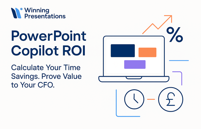
Ready to Calculate Your PowerPoint Copilot ROI?

You’ve seen the calculations. You’ve seen the results. Now it’s decision time.

Remember that COO I mentioned at the start? The one with £47,000 in “wasted” Copilot licenses?

Six months after implementing proper measurement and training, she sent me a one-line email: “The CFO just approved expanding Copilot to all 400 employees. Thanks for teaching us to prove it.”

That’s the difference between “trying Copilot” and “investing in Copilot.” One is a hope. The other is a strategy.

This Black Friday, while everyone else is chasing discounts on things they don’t need, make the investment that pays for itself 60 times over.

Here’s what I know after two years and 200+ professionals: the organisations that succeed with Copilot are the ones that treat it as an investment to measure, not a tool to try.

Choose Your Path

Path 1: DIY Implementation (Individual/Small Team)

  • the Executive Prompt Pack: 25 essential prompts to prove concept in your first week
  • £29 Master Guide: Complete 201-page system with 100+ prompts, CFO presentation template, ROI calculator, and troubleshooting

Path 2: Team Implementation (10+ People)

  • Custom Team Training: Intimate 8-10 person cohorts, hands-on practice with your presentations, team prompt libraries
  • Book a discovery call to discuss your team’s specific needs and calculate projected ROI

Path 3: Master AI-Enhanced Presentations

Stay Updated:

  • The Winning Edge Newsletter: Weekly Friday insights on presentation skills, AI tools, and executive communication. No fluff, no spam—just what works.

All backed by 35 years of presentation expertise and testing on £100M+ deals.

The question isn’t whether Copilot can deliver ROI. The question is whether you’ll measure it.

Start measuring today.


About the Author

Mary Beth Hazeldine is the Owner of Winning Presentations, a presentation training company with 16 years of training expertise helping professionals communicate with impact.

After 24 years in corporate banking at JPMorgan Chase, PwC, Royal Bank of Scotland, and Commerzbank, she combines business credibility with expertise in NLP, hypnotherapy, and persuasion psychology.

Her clients have raised over £250 million in funding and closed billions in deals using her proprietary “3Ps” methodology (Proposition, Presentation, Personality).

She tests every PowerPoint Copilot recommendation on real client work—investment banking pitches, biotech bid defenses, SaaS sales decks—and shares only what actually works in high-stakes situations.

Learn more about presentation training services


Related Articles: