
QUICK ANSWER
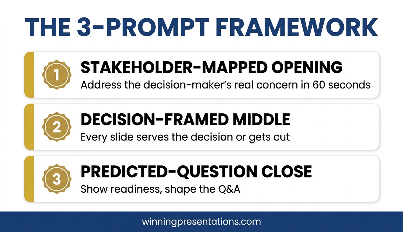
Most senior leaders use Copilot to ask for a complete board presentation. That is why the output reads generic. Three specific prompts, used in the right order, turn Copilot into a genuine board-presentation partner: a stakeholder-mapped opening, a decision-framed middle, and a predicted-question close. Each prompt assumes the strategic work is yours. Copilot drafts the structure so you can spend your time on judgement, not formatting.
If you want the structured approach behind these prompts
The AI-Enhanced Presentation Mastery course from Maven is a self-paced programme covering the prompt and workflow patterns that take Copilot from drafting tool to presentation partner.
JUMP TO
Ngozi, a regional operations director at a biotech company, rebuilt the same board deck four times in one afternoon. She had used Copilot to generate the first draft — a 12-slide update for the quarterly operations review. The output looked polished. The sections were logical. The language was professional. But when she read it back, it could have belonged to any company, in any industry, at any quarter. Her board would read three slides and switch off.
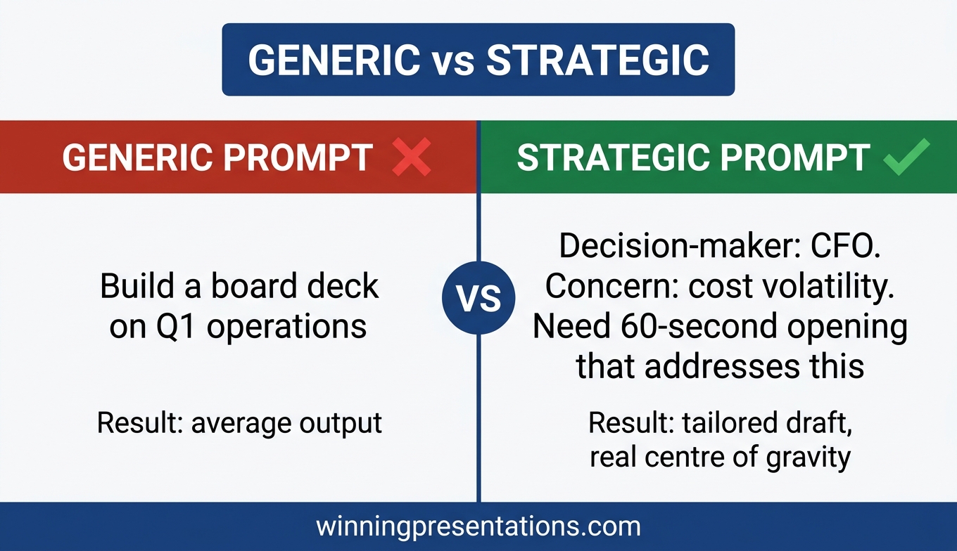
She opened a blank prompt window and tried again. “Build a board deck covering Q1 operations performance.” Same result. Slight variations in headings. Same generic feel. By the third attempt she had realised something that changes how senior leaders should use Copilot for presentations: the AI is not the problem. The prompt is asking the AI to do strategic work that only the presenter can do.
The professionals who get genuinely useful Copilot output for board presentations do something different. They do the strategic thinking first, then use Copilot to draft the structure their thinking requires. Three specific prompts, used in the right order, make this work. Each assumes that the judgement is yours and the drafting is Copilot’s.
Why most Copilot board decks read generic
Copilot is a drafting tool. It is very good at producing coherent text that matches patterns it has seen before. It is not good at knowing which board member will block your proposal, what the finance director is quietly worried about, or why this particular quarter matters differently from the last three. These are strategic inputs only the presenter has.
When senior leaders prompt Copilot with “build a board deck on X” the AI has nothing to work with except pattern-matching. It produces the average of every board deck it has ever seen. Average board decks are unmemorable. They earn polite acknowledgement and no action.
The shift is to stop asking Copilot for decks and start asking Copilot for specific structural work. The three prompts below do that. Each names exactly what structural output is needed. Each supplies the strategic context Copilot cannot guess. Each produces drafts that feel tailored because they are.
WHEN COPILOT HAS TO HOLD UP IN A BOARDROOM
Move beyond basic AI usage to executive-grade output
The AI-Enhanced Presentation Mastery course is a self-paced programme with 8 modules and 83 lessons on using AI (including Copilot) to structure, draft, and refine presentations that hold up at senior levels. 2 optional live coaching sessions with Mary Beth, fully recorded — watch back anytime. Monthly cohort enrolment; lifetime access to materials.
- 8 modules, 83 lessons on AI-assisted executive presentation work
- Prompt and workflow patterns for Copilot and ChatGPT, board-level output
- 2 optional live coaching sessions with Mary Beth (recorded)
- Self-paced, no deadlines, no mandatory live attendance
- Monthly cohort enrolment — enrol any time
£499, lifetime access to all course materials.
Explore AI-Enhanced Presentation Mastery →
Designed for senior professionals who need AI to produce executive-grade output, not generic drafts.
Prompt 1: The stakeholder-mapped opening
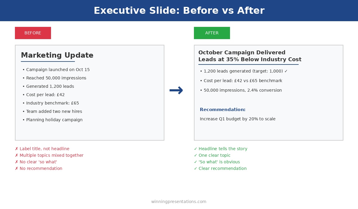
The opening of a board presentation carries more weight than the middle. Board members decide in the first two or three slides whether to lean in or let their attention drift. The opening has to land for the specific people in the room, not for boards in general.
Before you prompt Copilot, write down three facts:
- Which board member matters most on this topic — who will either support or block the decision?
- What that person is quietly worried about before the meeting (risk, cost, reputation, precedent)
- What they need to see in the first two slides for you to have their attention for the rest
Now the prompt:
“I am presenting to a board where the most influential decision-maker on this topic is [role]. Their primary concern before this meeting is [specific worry]. I need a two-slide opening that addresses their concern in the first 60 seconds, without burying the answer. Draft Slide 1 (the one-sentence answer to the implied question they’re bringing into the room) and Slide 2 (three supporting points that map to their concern). No preamble, no company-of-the-future language.”
Copilot produces an opening grounded in a real person’s real concern. That is different from every generic board-opener it would otherwise draft. You will still edit the output. But the draft will have a centre of gravity to edit around.
Prompt 2: The decision-framed middle
The middle of a board deck is where most presentations drift. Slide after slide of context, data, background. By the time the presenter arrives at the ask, the board has spent its attention on material that was the journey, not the answer. Board members rarely say this out loud. They just disengage.
A decision-framed middle does the opposite. Every slide exists because it supports a specific decision the board is about to make. Slides that do not serve that decision get cut or moved to an appendix.
The prompt:
“The decision the board is making is: [specific decision]. Assume they already know [common background you would otherwise over-explain]. Build a 4-slide middle that (1) names the decision in one sentence at the top of Slide 1, (2) shows the two realistic options the board can choose between, (3) gives the supporting evidence for the recommended option, and (4) addresses the strongest argument against. Each slide must directly serve the decision. No context slides, no history, no company-values language.”
The output will be tighter than a generic Copilot draft because the prompt has told Copilot what to leave out, not just what to include. The discipline of naming the decision forces Copilot to cut the padding that would otherwise fill the deck. If you want an overview of where this fits in the broader AI-for-presentations landscape, ChatGPT for PowerPoint presentations covers the parallel approach for non-Microsoft environments.
Prompt 3: The predicted-question close
The close of a board presentation is the slide you land on before the Q&A begins. Most closes are either a generic “Thank you, questions?” slide or a summary of everything already covered. Both waste the moment. The slide the board is looking at when the first question comes is the slide that shapes the first question.
A predicted-question close shows the board the three questions you are ready to answer. That does two things at once. It frames the Q&A around the questions you want. And it signals preparation — the board member about to ask a harder question will often reframe it because your visible preparedness has raised the bar.
The prompt:
“The three hardest questions the board will ask about [specific proposal] are likely to be [Q1], [Q2], [Q3]. Draft a single closing slide that lists all three as bullet points with a one-sentence direct answer under each. Professional tone, no defensive language, no hedging. The purpose of the slide is to show readiness, not to answer in full — each answer should invite a conversation, not close it down.”
The closing slide produced by this prompt does something unusual. It leaves the board with the impression that you have already thought through the hard parts. That is the impression most senior leaders want and rarely manage to create. It also makes the Q&A shorter and more focused, which every board member quietly appreciates.
Want the prompts ready to use?
The Executive Prompt Pack contains 71 ChatGPT and Copilot prompts for PowerPoint presentations — including board-level prompts, stakeholder-mapped openings, and decision-framed middle sections. £19.99, instant download.
How to sequence the prompts
The three prompts are designed to be used in order. Opening first, because the opening sets what the rest of the deck has to support. Middle second, because the middle adapts to the opening you have committed to. Close third, because the close has to match the questions the opening and middle will provoke.
Running them in any other order usually produces a deck that feels stitched together. Running them in order produces a deck that feels coherent, even when each prompt runs in a separate Copilot session. Senior leaders who use this sequence regularly report that the total time from blank deck to editable first draft drops from two or three hours to around 25 minutes — and the draft is actually worth editing.
One more thing. Copilot’s output still needs an editorial pass. The prompts give you a draft with a real centre of gravity. They do not give you a final deck. The best Copilot PowerPoint prompts and the editing workflow that cleans up the output work together. Neither replaces the other.
The three prompts also apply when you are using Copilot to refine an existing deck, not to build from scratch. Run the opening prompt against the first two slides you already have. The gap between the current opening and the stakeholder-mapped version is usually where the board was losing attention. Fix that first.
Frequently asked questions
Do these prompts work with ChatGPT as well as Copilot?
Yes. The structural logic is the same. ChatGPT and Copilot will produce slightly different drafts because their training and defaults differ, but the prompts give both models the strategic context they need. If you are comparing the two tools for executive slide work, Copilot vs ChatGPT for executive slides covers the differences in detail.
How long should it take to prepare the strategic inputs before prompting?
Around 15 to 20 minutes for most board presentations. That feels slow the first time, but it replaces one to two hours of generic output and rework. The strategic inputs are the same work the presenter would have had to do anyway — the prompts just make the thinking explicit up front.
What if I do not know who the most influential board member on the topic is?
Ask one of your peers or your sponsor. Board influence is rarely what the org chart suggests. The influential member on a cost decision is usually not the one who dominates strategy discussions. If the topic is genuinely novel, the most influential person is whoever has asked the sharpest questions at the last two meetings on adjacent topics.
Should I tell the board I used Copilot to draft the deck?
No, and the question itself points to a worry worth examining. Copilot is a drafting tool, the same way Word is a typing tool. The value you bring is the strategic thinking, the editorial judgement, and the delivery. Leading with “I used AI” tends to shift attention from the decision to the tool, which is not what board time is for.
Do these prompts apply to investor presentations as well as board presentations?
Partially. The stakeholder-mapped opening and the predicted-question close translate cleanly. The decision-framed middle needs adapting because investor presentations often have a different centre of gravity — investment thesis rather than operating decision. The structural discipline still helps.
The Winning Edge
Weekly thinking for senior professionals on executive presentation craft — slide structure, Q&A, delivery, AI, and the judgement calls the frameworks do not cover. Thursday mornings, one considered issue.
Not ready for the full programme? Start here instead: download the free Pyramid Principle Template — the structure most board slides fail to use, in a one-page reference.
Next step: pick one upcoming board presentation. Run the stakeholder-mapped opening prompt this week. See whether the draft lands differently from your usual Copilot output. That one change tends to be the one that reveals the rest.
For the parallel comparison between Copilot and ChatGPT on executive slide work, see Copilot vs ChatGPT for executive slides. For what happens when Copilot’s first draft does not hold up under boardroom scrutiny, see why Copilot’s first draft fails boardroom tests.
About the author
Mary Beth Hazeldine is Owner & Managing Director of Winning Presentations Ltd, a UK company founded in 1990. With 24 years of corporate banking experience at JPMorgan Chase, PwC, Royal Bank of Scotland, and Commerzbank, she advises senior professionals across financial services, healthcare, technology, and government on structuring presentations for high-stakes decisions, board approvals, and executive scrutiny.


 Method 2: Reference Existing Documents with Copilot

 At £75/hour (conservative for most professionals needing Copilot), you need to save just 24 minutes monthly to break even.