Quick Answer
Most board presentations are built from context to recommendation. The executives who consistently get approval in a single meeting build their decks in reverse: they write the recommendation first, then construct every other section as evidence for a decision already made. The method produces a structurally different deck — one where nothing exists that doesn’t earn the recommendation a favourable response.
If you are building a board or executive committee presentation and want a structure that earns the recommendation from slide one, the Executive Slide System includes 26 templates and 16 Scenario Playbooks built around decision-first architecture. See the full system →
The Deck at Midnight
In 2008, I was working with a relationship director preparing a large credit renewal presentation. The facility was significant — forty million pounds at the top of the range she was targeting. The committee was scheduled for the following Tuesday, and she had been building the deck since the previous Thursday.
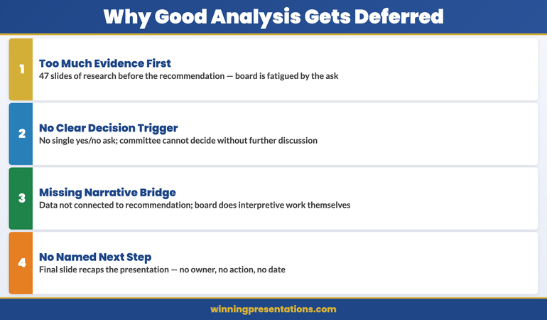
By Sunday evening she had forty-one slides. By Monday afternoon she had rearranged them into a sequence she was not entirely happy with. By Monday evening she was still revising slide thirty-two — a sensitivity analysis she had added at the last minute because she worried the committee would ask about it.
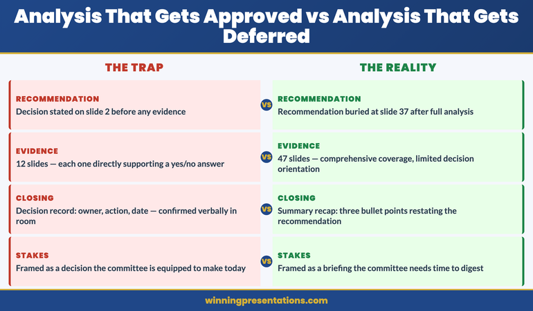
When I sat with her at eleven o’clock that night, the recommendation was on slide twenty-seven. It had not been on slide twenty-seven at the start. It had migrated there over the course of a week of building, as the volume of supporting material had grown around it. The recommendation had been shaped by what she had been able to comfortably defend across forty slides, rather than by what the committee needed to be able to say yes or no to in one meeting.
She presented on Tuesday. The committee asked good questions. They did not decline. They deferred — “pending further clarity on the risk weighting methodology” — and scheduled a second meeting three weeks later.
She had not failed to make a strong case. She had built the wrong deck to make it.
(This article was created with AI assistance; all stories and insights are based on 35 years of real client work.)
Build Board Decks That Earn the Decision Before the Meeting Starts
The Executive Slide System is built around decision-first architecture: templates and playbooks that begin with the recommendation and construct every supporting section from there. The result is a deck where nothing exists that doesn’t earn the recommendation a favourable response.
- 26 executive templates — including board and investment committee structures built around the ask, not the context
- 93 AI prompts for drafting recommendations, testing objections, and refining the case before the meeting
- 16 Scenario Playbooks — structured guidance for capital allocation, risk review, credit approval, and governance presentations
- 7 Checklists — including a decision-first review you can apply to any existing deck in fifteen minutes
The Executive Slide System — £39, instant access
Designed for senior professionals preparing presentations for boards, investment committees, and executive governance bodies where one meeting should be enough to produce a decision.
Why Construction Order Matters
The sequence in which you build a presentation shapes the deck’s internal logic — not in an obvious way, but in a structural way that an experienced board member reads immediately.
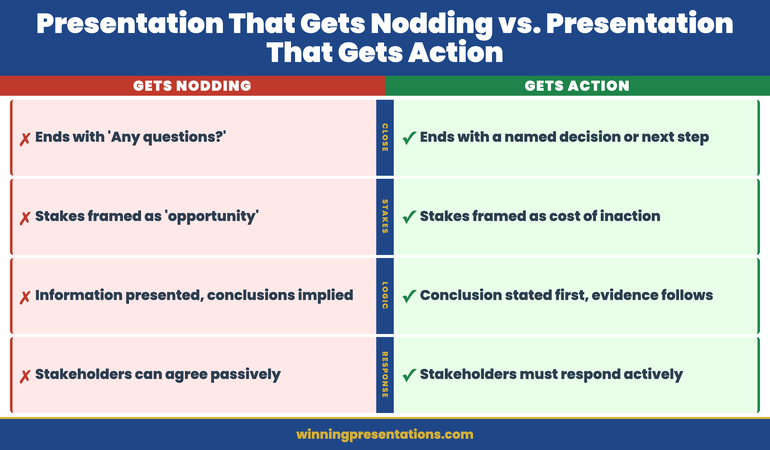
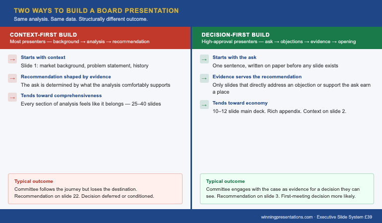
When a presenter builds from context to recommendation, the recommendation is a product of the evidence. What the evidence can comfortably support becomes the ask. This is a logical construction process, and it is the process most presenters follow because it mirrors the order in which they encountered the material: they did the analysis, and the analysis led them to the recommendation. The problem is that this order produces a deck where the recommendation is the end of a journey that the committee has not yet taken — and a board committee that has not yet taken the journey has no reason to trust the destination.
When a presenter builds the recommendation first, the dynamic inverts. The recommendation is not a product of the evidence; the evidence is a selection of everything available that supports the recommendation. Instead of asking “what does the analysis tell me to recommend?” the presenter asks “what would the committee need to see to say yes to this?” The deck becomes a structured answer to that question, rather than a narrative account of the analysis process.
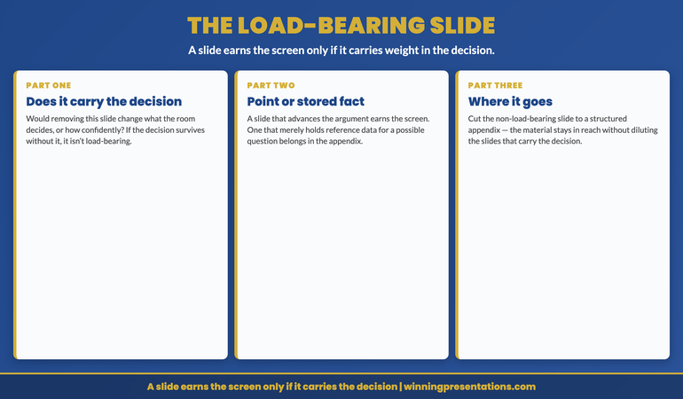
The distinction produces decks that are structurally different at the slide level. A context-first deck has a natural tendency toward comprehensiveness — every section of analysis that went into the recommendation feels like it belongs in the deck, because it did go into the recommendation. A decision-first deck has a natural tendency toward economy — only what earns the recommendation a yes stays in the main slides. Everything else moves to the appendix, where it is available to the committee if they ask, without cluttering the case that needs to land in twenty minutes.
This is why the relationship director’s deck had forty-one slides. It was comprehensive. It was not decision-first. Understanding why excellent analysis produces deferred decisions makes this structural point concrete: the problem was not the quality of the analysis, it was that the deck presented the analysis rather than the decision.
The construction method also affects how the presenter manages uncertainty. When building from context to recommendation, uncertainty about any section of the analysis creates pressure to include more supporting material, which produces a longer deck. When building from recommendation to context, uncertainty about the recommendation is surfaced immediately — before forty slides have been built — and forces the presenter to resolve the uncertainty at the right stage of the process.
The Decision-First Build
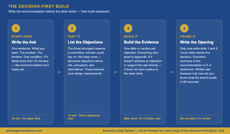
The Decision-First Build is a four-stage construction method. It takes the same amount of time as context-first construction but produces a structurally different deck — one that earns the recommendation from the first slide rather than arriving at it on slide twenty-seven.
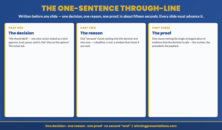
Stage 1: Write the ask. Before you open a presentation template, write one sentence: what you are requesting, in plain language. Include the number, the timeline, and the single most important condition. Do this on paper, not in a slide deck. If the sentence takes more than ten minutes to write, the recommendation is not ready — and the most important thing the Decision-First Build has done is surface that fact before the deck has been constructed around an ambiguous ask.
Stage 2: List the objections. Write down the three strongest reasons a member of the committee could say no. Not the easy ones — the structural objections, the ones about risk weighting methodology and precedent and alternative uses of capital. These are the objections that will appear in the meeting if the deck does not address them. By listing them before building the deck, you convert them from surprises into design requirements.
Stage 3: Build the evidence. For each objection, identify the slide or section that addresses it. These sections form the backbone of the main deck. Anything that does not directly address an objection or directly support the ask goes to the appendix. Slides that exist because the presenter found them interesting, or because they represent work the presenter is proud of, do not survive this filter. The main deck should be, at maximum, twelve slides. Fifteen is the outer limit. Twenty-seven is a deck that did not apply this filter.
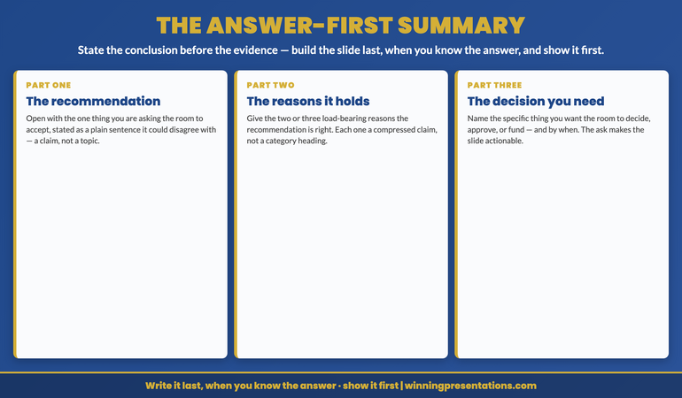
Stage 4: Write the opening. Now write the first two slides — the cover and the executive summary. These slides are written last in the Decision-First Build because only at this point do you know what the committee needs to understand in the first sixty seconds to engage productively with what follows. The cover slide names the decision being requested. The executive summary is the recommendation in three to four sentences, with the key evidence referenced but not presented. Nothing in these two slides is written before the rest of the deck, because writing them first is how most presenters end up with a context-first deck.
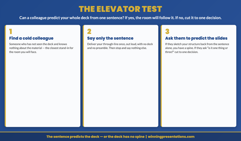
Apply the method to the Slide 3 structure as the final check: once the deck is built, confirm the recommendation is on slide 3 or earlier. The Decision-First Build almost always produces this result naturally — because the recommendation was written before the context, it naturally lands close to the front. The Slide 3 test is a confirmation, not a correction.
The Executive Slide System includes 93 AI prompts specifically designed for the Decision-First Build — including prompts for drafting the ask, identifying objections, and stress-testing evidence before the committee does. Explore the full prompt library →
The Head of Structured Finance
In 2013, I worked with a head of structured finance whose team prepared quarterly investment committee presentations across a range of facilities. His committee presentations were unusually short for the complexity of what he was presenting — typically ten to twelve slides for facilities that would take a context-first presenter thirty slides to cover.
When I asked him about his preparation process, he described something close to the Decision-First Build without having a name for it. He always started with what he called “the ask slide.” He wrote it on Monday morning, before the rest of the deck existed, and pinned it to his screen. Then he asked his team a single question: “Given what’s on this slide, what would the committee need to see to say yes?” The deck was built to answer that question. Nothing else.
The effect was visible in the quality of his appendices. Where most presenters had thin appendices of incidental material, his appendices were rich — they contained the full sensitivity analysis, the detailed risk weighting, the alternative scenarios. He had done the comprehensive work. He had simply decided not to present it in the main deck, because the committee did not need the journey to accept the destination.
He also had a specific process for the moment when the analysis threw up something he had not anticipated — a new risk, a changed assumption, a number that complicated the ask. Where a context-first presenter would add a slide to address the complication, he would revisit the ask slide first. Did the complication change what he was requesting, or did it change what evidence the committee needed to see? If the former, the ask slide was rewritten before the deck was rebuilt. If the latter, the complication moved to the evidence section. The ask slide was always the last thing in the deck to be confirmed as final, not the first — which meant it always reflected what the analysis had actually produced, rather than what the analysis had started from.
His approval rate, across the period I worked with him, was not unusual. What was unusual was the ratio of single-meeting decisions to multi-meeting deferrals. The committee trusted his decks because the decks never wasted the committee’s time — they contained exactly what the committee needed to make a decision and nothing that distracted from that.
Applying the Method Tonight
The Decision-First Build is not a planning methodology that requires a workshop to implement. It requires one discipline: write the ask before you write anything else.
Before your next board or executive committee presentation, spend ten minutes writing the ask on a blank piece of paper. One sentence. What you want. The number. The timeline. One condition if necessary. Do not open a slide template until the sentence exists on paper and you can say it out loud without hesitation.
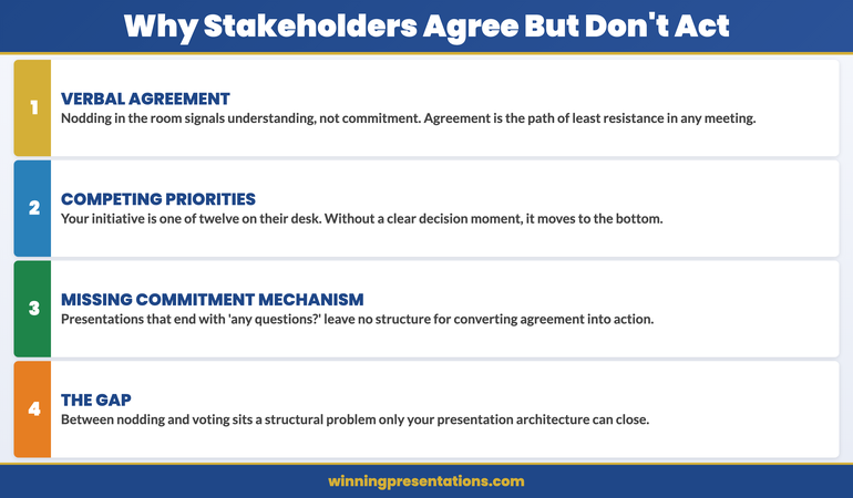
If you cannot write the sentence in ten minutes, do not build the deck. Instead, spend the time resolving what you are actually asking for — because that ambiguity, if it exists in the paper stage, will appear somewhere in the deck. It will appear as a hedge on slide nineteen, or a sensitivity range that seems to undercut the primary scenario, or a risk section that is longer than the recommendation section. Committees notice these ambiguities even when they do not identify them explicitly. They produce questions you were not prepared for and deferrals you did not expect.
Write the sentence. Then write the three strongest objections to it. Then build the deck. The three stages take an hour. They change the structure of everything that follows. And when you walk into the meeting, you will know exactly what slide thirty-four of the appendix says — because you put it there deliberately rather than including it because you were not sure whether to leave it out.
The executive who builds the closing slide first walks into a board meeting with a different relationship to the deck than the executive who builds from context to recommendation. One has built a case for a decision they have already made. The other has built a narrative of a journey they have taken. Boards are not interested in the journey. They are interested in whether the decision is one they can support. The deck that begins with the ask is the deck that makes that question easier to answer yes.
The Slide System Senior Finance and Strategy Leaders Use for Board Presentations
- 26 executive templates built around decision-first structure — recommendation visible before the evidence, not after it
- 16 Scenario Playbooks for the specific committee contexts where construction methodology matters most: credit approval, capital allocation, strategic governance, risk review
Executive Slide System — £39
For presentations that need to produce board or committee approval
If your next board presentation is a high-stakes approval request — capital, change of direction, significant investment — the Maven Executive Buy-In Presentation System provides the complete framework for securing stakeholder alignment before the meeting, structuring the case to address resistance, and presenting in a way that produces a first-meeting decision. Self-paced, 7 modules, optional recorded Q&A sessions.
Frequently Asked Questions
What does it mean to build the closing slide first?
Building the closing slide first means writing the recommendation slide — what you are asking the board to approve, by when, and for how much — before you build any other part of the deck. Once the recommendation exists as a concrete slide, every other section of the deck is constructed to support it. The result is a deck where nothing exists that doesn’t directly earn the recommendation a favourable response. Most presenters build in the opposite direction: they construct the context and analysis first, then write the recommendation at the end. The recommendation ends up shaped by what they found along the way rather than by what the board actually needs to decide.
Is the Decision-First Build the same as putting the recommendation early in the deck?
Related but different. Putting the recommendation early in the deck is about slide order — where the recommendation appears when the board reads it. The Decision-First Build is about construction order — where the recommendation appears in the presenter’s process of building the deck. You can build the closing slide first and still position it at slide 14, which is exactly the wrong slide order. The most effective approach combines both: build the recommendation first, then position it on slide 3 or earlier. The construction method produces a better recommendation; the positioning choice ensures the board encounters it before they scan ahead to find it.
How do I handle the parts of the deck that feel important but don’t directly support the recommendation?
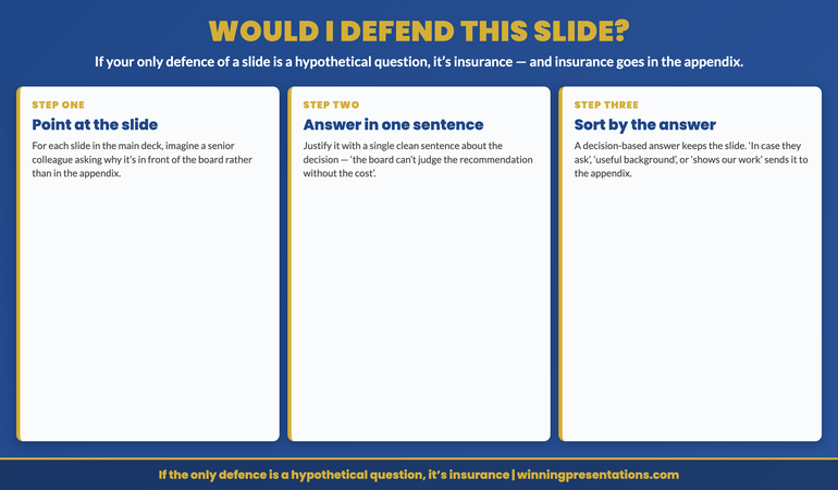
Move them to the appendix. The test is: if the board approves your recommendation without seeing this slide, does the approval hold? If yes, the slide belongs in the appendix, not in the main deck. Most presenters build appendices defensively — they add material because it might be needed. The Decision-First Build inverts this: material earns its place in the main deck by supporting the recommendation, and everything else moves to the appendix by default. The result is typically a shorter main deck and a richer appendix. Boards prefer this — a ten-slide deck with a fifteen-slide appendix is read more carefully than a twenty-five-slide deck. For context on why thorough analysis in the main deck often backfires, the deferral article explains the mechanism.
How long should it take to write the recommendation slide before building the rest of the deck?
If you cannot write the recommendation slide in ten minutes, the recommendation is not ready. The recommendation slide should contain one sentence stating what is being requested, plus the decision variables — the amount, the timeline, and the key condition if one exists. If it takes longer than ten minutes, the problem is not the slide — it is that the recommendation itself has not yet been resolved. In that case, the Decision-First Build has already done its job: it has surfaced the fact that the presenter does not yet have a clear recommendation, before the deck has been built around an ambiguous one.
The Winning Edge — weekly executive communication insights
Join executives across financial services, technology, healthcare, and government who receive The Winning Edge every Thursday — practical frameworks, board presentation strategies, and executive communication techniques you can use immediately.
The Executive Presentation Checklist includes a decision-first review that applies the four stages of the Decision-First Build to any existing deck in under fifteen minutes.
Related: If you are preparing for a board meeting and want to understand how the committee will engage with your deck before you present it, The Board That Asks No Questions Is the Most Dangerous Room to Present In explains what silence during a board presentation signals — and the one question that surfaces what the room is actually thinking.
Mary Beth Hazeldine is Owner & Managing Director of Winning Presentations. With 24 years of corporate banking experience, she advises executives across financial services, healthcare, technology, and government on structuring presentations for high-stakes decisions and board approvals.