Category: Executive Presentations

06 Jul 2026
Businesswoman presenting a slide to a seated group in a modern conference room, with a laptop on the table and a large screen displaying a blue slide behind her.

Why Senior Presenters Build the Summary Slide Last and Open With It

Quick answer: The summary slide is the one slide a senior audience is guaranteed to read, because it is the slide they will use to decide whether to keep listening. Most presenters write it first, before they know what they are actually recommending, so it ends up as a table of contents — a list of what the deck contains rather than what the deck concludes. Build it last instead, once the analysis is done and you finally know the answer, and write it as an answer-first summary: the recommendation in one line, the two or three reasons it holds, and the specific decision you are asking for. Then put that slide first. To check it works, run the thirty-second test — hand the summary slide alone to a colleague, give them half a minute, and ask them to tell you back what you want and why. If they can, the rest of the deck is support. If they cannot, you have not finished the slide.

In 2011 I watched a marketing director present the conclusion of a six-month pricing review to a strategy committee. He had done genuinely good work, and he wanted the committee to see all of it. So he started at the beginning: the market context, the competitor scan, the customer research, the segmentation, the elasticity modelling. Slide after slide of careful build, each one earned. His recommendation — a restructure of the entire pricing tier system — sat on slide twenty-three. The trouble was that the committee chair, a woman who had sat through several hundred of these, opened the printed pack the moment he started speaking, turned to the last few pages looking for the recommendation, did not immediately find it stated plainly, and then spent the next twenty minutes asking questions that the deck would eventually have answered — if she had been willing to wait for slide twenty-three. She was not. By the time he reached it, the committee had formed three separate half-views from fragments, and the meeting had become a negotiation between those fragments rather than a hearing of his actual case. The recommendation was sound. It was deferred anyway, for ‘a clearer version’.

What the chair wanted was on a slide he had not built: a single slide that said, before anything else, what he was recommending, why, and what he needed her committee to decide. He had a summary slide — it was slide two — but it was a contents page. It listed the sections of the deck: ‘Market context. Competitive position. Customer research. Pricing options. Recommendation. Next steps.’ It told the room what was coming. It did not tell the room anything. And it could not have, because he had written it at the start, before the analysis was finished, when he himself did not yet know what the deck would conclude.

(This article was created with AI assistance; all stories and insights are based on 35 years of real client work.)

That is the core mistake, and it is almost universal: the summary is written first, so it summarises the plan rather than the findings. The fix is small to describe and surprisingly hard to do — build the summary slide last, after you know the answer, and write it as an answer-first summary. Then open with it. It is the single highest-leverage change most senior presenters can make to a deck, and it costs nothing but the discipline to write one slide at the end instead of the beginning.

If your recommendation keeps arriving too late in the deck for a busy room to wait for it:

The Executive Slide System ships 26 executive templates built around the way senior audiences actually read — including a recommendation-first opening layout that gives the answer-first summary a slide of its own, with room for the one-line recommendation, the supporting reasons, and the decision being asked for. It also includes 93 AI prompts for compressing a finished analysis down to its load-bearing conclusion, and 16 scenario playbooks covering board approvals, strategy reviews, and investment committees. You stop hoping the room reaches your conclusion in time and start handing it to them on the first slide.

See the slide system →

Why the first-written summary fails

The summary slide written at the start of the process is doomed by its timing, not its author. When you build a deck, the natural order is to assemble the evidence first and let the conclusion emerge from it. That is good analysis. But it means that on day one, when you create the title slide and the summary slide as a frame for the work ahead, you do not yet have a conclusion to summarise. So you summarise the only thing you have: the structure of the work. You write a contents page and call it a summary. And because it sits at the front of the deck and never gets revisited — who goes back to rewrite slide two once the analysis is done? — it ships exactly as it was: a list of sections that tells the room nothing it could act on.

This matters more at senior levels than anywhere else, because of how senior people read. A junior audience reads a deck the way you built it, front to back, willing to follow the argument to its conclusion. A senior audience reads a deck the way it reads a contract: conclusion first, then back to the clauses that matter. The chair in my 2011 meeting was not being rude when she flipped to the back of the pack. She was doing what experienced decision-makers always do — looking for the answer so she could spend her attention testing it, rather than spend it waiting to find out what it was. When she could not find the answer stated plainly, she did not switch to patient mode. She started reconstructing the answer from fragments, out loud, in the form of questions, and the presenter lost control of his own meeting before he reached slide ten.

There is a second cost, subtler and more expensive. A deck that withholds its conclusion reads as a deck that is not sure of its conclusion. When you make a room wait twenty-two slides for the recommendation, the room does not experience suspense; it experiences doubt. It starts to wonder whether you are building toward a strong answer or hoping to assemble enough evidence that some answer becomes defensible. Leading with the recommendation signals the opposite: I know what I think, I am putting it in front of you first, and I am inviting you to test it. That confidence is itself persuasive, and it is the same instinct behind saying the number out loud before you show the chart — you lead with the thing the room most wants, rather than making it wait while you build to it.

Open every deck with a slide that states your answer, so the room spends its attention testing your case instead of reconstructing it.

The Executive Slide System gives you a recommendation-first deck structure as a starting point, not a blank page: an answer-first summary layout, a signposted body where every section tells the room where it is, and a close that restates the ask. It ships 26 executive templates, 93 AI prompts for turning a finished analysis into a one-line recommendation and its supporting reasons, 16 scenario playbooks covering board approval, strategy review, and investment committee, plus 7 checklists. Built for senior presenters who take a real decision to a real room more than once a quarter. £39, instant download, lifetime access.

  • 26 executive templates — including a recommendation-first opening built to carry the whole argument on one slide
  • 93 AI prompts — for compressing a six-month analysis down to its load-bearing conclusion and reasons
  • 16 scenario playbooks — board approval, strategy review, investment committee, finance review
  • 7 checklists — including a pre-flight pass that tests whether your first slide states the answer
Get the Executive Slide System — £39 →

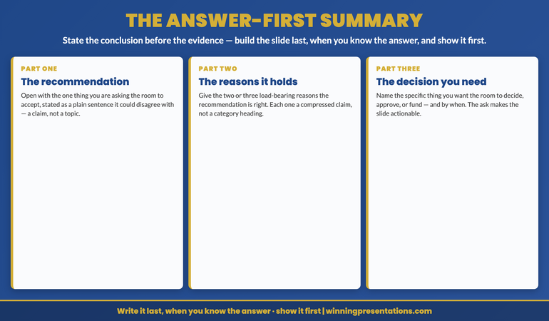
The answer-first summary infographic, showing the three parts of a summary slide that states the conclusion before the evidence. Part one, the recommendation: open with the single thing you are asking the room to accept, stated in one plain sentence, not a topic or a section heading. Part two, the reasons it holds: give the two or three load-bearing reasons the recommendation is right, each one a claim rather than a category. Part three, the decision you need: name the specific thing you want the room to decide, approve, or fund, and by when. The rule beneath the three parts reads write it last, when you know the answer, and show it first.

The answer-first summary

An answer-first summary slide has three parts, and the order is the whole point. First, the recommendation, stated as a single plain sentence. Not a topic — a claim. ‘We should consolidate the three regional pricing tiers into one, taking effect from the next financial year.’ Not ‘Pricing structure options’. The test of this line is whether someone could disagree with it. A topic cannot be disagreed with; only a claim can. If your opening line is something the room could not possibly argue against, it is a heading, not a recommendation, and it is doing no work.

Second, the reasons it holds — two or three, no more. These are the load-bearing supports, the points that, if the room accepted them, would make the recommendation follow almost automatically. ‘Because the current three tiers cost more to administer than they generate in differentiation; because customers consistently misread which tier they are in; and because a single tier lets us move price once a year instead of negotiating three.’ Each reason is itself a claim, compressed. The discipline of choosing only two or three forces you to decide what your case actually rests on, which is exactly the thing a contents-page summary lets you avoid. A presenter who lists six reasons has not done the work of finding the two that matter; he has handed the room the work of sorting them.

Third, the decision you need. This is the part presenters most often leave off the summary slide, and its absence is why so many good presentations end with a room that nods, thanks you, and decides nothing. State the specific thing you are asking for: ‘We are asking the committee to approve the move to a single tier and the £1.2m implementation budget, with a decision today so we can hit the financial-year start.’ The ask makes the slide actionable. Without it, the summary is an interesting position; with it, it is a request the room has to respond to. This is the bridge into the companion discipline of making the decision you want explicit rather than implied — the summary names it, and the close returns to it.

Written this way, the summary slide carries the entire argument in miniature. A reader who saw only that slide would know what you want, why, and what you need from them — which is precisely the position you want a senior reader to be in when they decide whether to keep listening. The rest of the deck does not introduce the argument; it defends it. Every subsequent section is the evidence behind one of the reasons, and the room can choose which reason to interrogate because it can see all three from the start. You have turned a linear deck the room must endure into a structured case the room can navigate. The reason this is hard is not that the structure is complicated. It is that you can only write this slide once the analysis is finished and you genuinely know the answer — which is why it has to be built last.

When the hard part is compressing a mass of analysis down to the one line that carries it:

Turning a finished, sprawling analysis into a single defensible recommendation is exactly the skill AI tools can accelerate — if you know how to direct them. The AI-Enhanced Presentation Mastery course is a self-paced programme of 8 modules and 83 lessons for senior professionals using AI to structure, draft, and pressure-test executive presentations, including the prompt and workflow patterns for distilling a recommendation from a wall of evidence. It runs at your own pace with monthly cohort enrolment and 2 optional live coaching sessions, both fully recorded so you can watch back anytime. Lifetime access to materials. £499.

Explore the programme →

The thirty-second test

A summary slide can look complete and still fail, because the author is the worst possible judge of whether it communicates. You know what you mean, so the slide always reads clearly to you. The only way to find out whether it reads clearly to a stranger is to give it to one. That is the thirty-second test, and it is the diagnostic that separates a summary slide that works from one that merely exists.

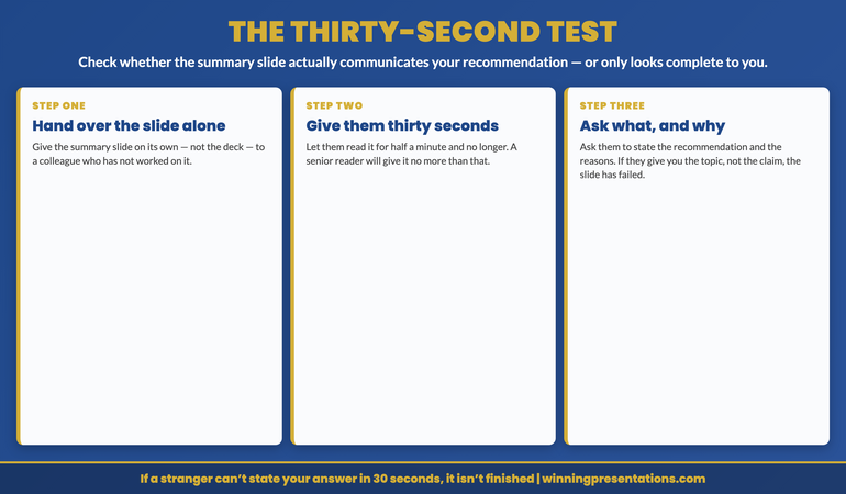
Take the summary slide on its own — not the deck, just the one slide — and hand it to a colleague who has not been involved in the work. Give them thirty seconds to read it. Then take it back and ask them two questions: what am I recommending, and why? If they can tell you, in their own words, the recommendation and the reasons behind it, the slide is doing its job and the rest of the deck is support. If they hesitate, or give you the topic instead of the claim — ‘something about pricing tiers’ — the slide has failed the test, and it would have failed in the room too, except that in the room the person failing it would have been the one deciding your proposal. The thirty seconds matters: a summary slide that needs two minutes of study is not a summary, it is another content slide, and a senior reader will give it thirty seconds at most.

I ran this with a head of operations in 2018 who was preparing to take a supply-chain restructuring to her board. Her summary slide was dense and proud — nine bullet points, three small charts, the entire programme on one page. I asked a colleague to read it for thirty seconds and tell us what she was recommending. He could not. He could see that it was about the supply chain, and that there was a lot of it, but he could not state the recommendation, because the recommendation was the fourth bullet, sandwiched between two findings and a risk. We rebuilt the slide answer-first: one line of recommendation at the top — consolidate from four distribution centres to two — three reasons beneath it, and the ask at the bottom. We deleted the charts; they belonged in the body. The new slide had perhaps a quarter of the content. The same colleague read it and answered both questions in one breath. At the board, the chair read the slide, looked up, and said ‘so this is a four-to-two consolidation question’ — which was exactly the frame she wanted. The board spent its time on the two-versus-three debate that actually mattered, rather than on working out what the proposal was. It approved that afternoon. For the high-stakes decks where the cost of a deferred decision is measured in quarters, the executive presentation coaching work uses the thirty-second test as a standard checkpoint before any deck is considered finished.

Buy the structure once and open every future deck from a layout that already puts the answer first. No subscription, nothing to renew.

The Executive Slide System is a one-time £39 with lifetime access — 26 templates, 93 AI prompts, 16 scenario playbooks, 7 checklists. There is nothing to track and nothing to renew; you buy it once and every future board deck starts from a recommendation-first opening rather than a blank slide that quietly turns into a contents page. Built for the senior presenter who would rather state the answer on slide one than make a busy room wait for slide twenty-three. The pre-flight checklist alone will catch the contents-page summary before it ever reaches the room.
Get lifetime access — £39 →

The thirty-second test infographic, a three-step diagnostic for checking whether a summary slide actually communicates the recommendation. Step one, hand over the slide alone: give the summary slide on its own, not the whole deck, to a colleague who has not worked on it. Step two, give them thirty seconds: let them read it for half a minute and no longer, because a senior reader will give it no more than that. Step three, ask what and why: take the slide back and ask them to tell you the recommendation and the reasons in their own words; if they can, the slide works, and if they give you the topic instead of the claim, it has failed. The rule beneath the three steps reads if a stranger cannot state your answer in thirty seconds, the slide is not finished.

Frequently asked questions

If I give away the recommendation on the first slide, why would the room sit through the rest of the deck?

Because the room is not sitting through the deck to find out the recommendation — it is there to decide whether the recommendation is sound. Stating the answer first does not remove the reason to keep listening; it sharpens it. A senior audience that knows your conclusion from slide one spends the rest of the presentation testing your reasoning, which is exactly the engagement you want, rather than passively waiting to learn what you think. The decks that lose the room are not the ones that reveal the answer early; they are the ones that withhold it, because a room that does not know where you are heading cannot follow you there. Suspense is for thrillers. A decision-maker wants the ending on page one.

Doesn’t building the summary slide last mean I cannot start the deck until everything else is finished?

You can sketch a placeholder summary at the start — that is useful as a working hypothesis to aim at. The rule is not that you never touch the summary until the end; it is that the version you present is written last, after the analysis is done, so it summarises what you found rather than what you planned to look at. In practice this means treating your early summary as a draft to be overwritten, not a slide to be preserved. Most failed summary slides are simply the day-one draft that nobody went back to rewrite once the work changed the answer. Build a rough one to steer by, then replace it entirely when you know what you are actually recommending.

What if the analysis is genuinely complex and cannot be reduced to one recommendation and three reasons?

Complexity is the reason for the discipline, not an exception to it. The more complex the analysis, the more a senior room needs you to tell it where the complexity lands — what, on balance, it should do. If you truly cannot state a single recommendation, that is usually a sign the work is not finished, or that you are presenting a decision that has genuine sub-parts, in which case each sub-part gets its own answer-first treatment. What does not work is offering the room the full complexity and asking it to find the answer inside. That is delegating your job to the audience, and a board will either decline the work and defer, or do it badly and decide on a fragment. Your value is the compression. If the answer were obvious from the evidence, they would not need you to present it.

Does this apply to an informational update, or only to a decision presentation?

It applies to both, with a change of emphasis. A decision presentation leads with the recommendation and the ask. An informational update leads with the headline — the single most important thing the audience needs to take away — and then supports it. The failure mode is identical in each case: opening with a contents page rather than the point. Even an update that asks for no decision should start by telling the room the one thing that has changed and why it matters, not by listing the sections of the briefing. If your update has no single headline, it may not need to be a presentation at all; it may be a document the room can read in its own time.

The Winning Edge — weekly newsletter

The Winning Edge is a weekly newsletter for senior professionals who present at the executive level. One short email a week on the structural moves that separate proposals a room approves from proposals it defers for ‘a clearer version’. Subscribe to The Winning Edge →

For the wider library of presentation assets senior leaders draw on — slide system, storytelling primer, Q&A taxonomy, delivery references — the complete presenter library (£99) bundles seven products plus three bundle-only bonuses, worth over £190, covering slides, storytelling, confidence, and delivery in one place. See the wider board-readiness work on the services page, and the companion article on turning a data dump into a recommendation.

About the author

Mary Beth Hazeldine is Owner & Managing Director of Winning Presentations Ltd. With 24 years of corporate banking experience at JPMorgan Chase, PwC, Royal Bank of Scotland, and Commerzbank, she advises executives across financial services, healthcare, technology, and government on structuring presentations for high-stakes funding rounds, board approvals, and strategic decisions.

The next time you finish a deck, do not ship the summary slide you wrote on day one. Build a new one last, now that you know the answer: the recommendation in a sentence the room could argue with, the two or three reasons it holds, and the decision you need from them. Then hand that slide alone to someone who was not in the room, give them thirty seconds, and ask them what you want and why. When they can tell you back in one breath, put the slide first — and the chair who flips to the back of the pack will find, this time, that the answer was already on the page in front of her. Write the summary last, when you know what you are recommending, and show it first.


05 Jul 2026
A senior professional woman in a navy tailored suit stands at the head of a polished wooden boardroom table, holding a slim folder mid-presentation, while three executives lean forward in attentive engagement around the table.

Executive Presentation Starter Kit: Slides, Openers, Delivery

Quick answer: The Executive Presentation Starter Kit is a £45 bundle that gives senior professionals a complete starting system for high-stakes presentations: a decision-driven slide structure (Executive Slide System), proven opening and closing techniques (Presentation Openers & Closers Swipe File), and one-page delivery references (Public Speaking Cheat Sheets). Instant download. Designed for boardrooms, leadership meetings, and client presentations — not stage performance.

Most senior professionals don’t need another 12-week presentation course. They need three things working together: a slide structure that lands fast, an opening that earns attention, and delivery that holds up under pressure. That’s the gap the Executive Presentation Starter Kit fills.

The problem: tools that don’t talk to each other

Picture the typical executive prep stack: a slide template downloaded from one place, an opener “tip” bookmarked from a LinkedIn post, a YouTube video on managing nerves, and a half-finished framework from a workshop two years ago. By the time you’re an hour from the meeting, none of it adds up to a coherent system. You assemble what you can remember, and the gaps show.

For senior leaders, those gaps cost decisions. A slide that opens with background instead of the recommendation pushes the executive audience to mentally check out before slide three. An opening that explains the agenda instead of the stakes wastes the only minute when the room is fully present. A delivery wobble in the opening line — a cleared throat, an uncertain qualifier — signals that the presenter isn’t sure of their own message. None of these are skill problems. They’re alignment problems. The pieces don’t fit together.

Already know you want a starting system?

If you’d rather skip the explanation and grab the bundle, the Executive Presentation Starter Kit is the fastest way to build a foundation that covers slides, openings, and delivery in one place.

The solution: one bundle, three layers, designed to work together

The Executive Presentation Starter Kit is a £45 download bundle assembled specifically for professionals who present to senior audiences. Rather than teaching presentation theory, it gives you three working components that map to the three layers a senior presentation has to clear: structure, frame, and delivery.

The first component, the Executive Slide System, is a decision-driven slide structure that pushes the message to the front of every slide. You learn how to lead with the recommendation rather than the background, structure slides so executives grasp the point in seconds, and avoid the credibility-killing patterns that stall decisions before slide three.

The second, the Presentation Openers & Closers Swipe File, gives you opening and closing techniques you can adapt instantly for board meetings, client presentations, and high-visibility internal updates. Use them to set expectations fast, establish authority early, and end with clarity and direction rather than “any questions?”

The third, the Public Speaking Cheat Sheets, is a set of one-page references for delivery in real business settings — not stage performance. Body language, vocal pacing, eye contact, room control. Quick references you can review in the five minutes before walking into the meeting.

What you get

  • Executive Slide System — a decision-driven slide structure designed for executive audiences, plus templates and AI prompt cards for building decks at executive standard.
  • Presentation Openers & Closers Swipe File — opening and closing techniques you can adapt for board, client, and senior-stakeholder presentations.
  • Public Speaking Cheat Sheets — one-page references covering body language, vocal pacing, eye contact, and room control.
  • Format: instant download, all components delivered immediately. Single payment of £45. No subscription. Lifetime access to anything you download.
  • Bundle saving: the same three components purchased individually total more than £45.

Build the foundation, not another disconnected tool

The Executive Presentation Starter Kit gives you the three layers of an executive presentation working together — structure, frame, and delivery — in one £45 bundle. Designed for professionals who present to boards, leadership teams, and senior clients.

  • Decision-driven slide structure for executive audiences
  • Opening and closing techniques you can adapt for any senior-stakeholder meeting
  • One-page delivery references for the five minutes before you walk in
  • Instant download, single payment, no subscription

Get the Starter Kit → £45

Designed for board, leadership, and senior-client presentations.

Is this right for you?

The Starter Kit is built for senior professionals who present to boards, leadership teams, and senior clients — people whose content is usually strong but whose message doesn’t always land. If you’ve felt the room tune out before you got to your recommendation, opened with an agenda instead of a stake, or watched a strong analysis fall flat because the delivery wobbled in the first 30 seconds, the bundle is built for that gap.

It’s not the right fit for two groups. First, if you’re looking for a stage-performance, TED-style speaking course, this isn’t it — the kit is for boardroom and leadership-meeting presentations, not keynote performance. Second, if you already own the Executive Slide System, Public Speaking Cheat Sheets, or the Openers & Closers Swipe File individually, you don’t need to re-buy them in the bundle.

Stop assembling your prep stack the night before

If you’re tired of cobbling together templates, openers, and delivery tips from five different sources every time a senior presentation lands on your calendar, the Executive Presentation Starter Kit (£45) gives you all three layers in one place, ready to use.

Frequently asked questions

Is the Executive Presentation Starter Kit worth £45?

The bundle includes three products that cost more than £45 if purchased separately on Gumroad. The price reflects the bundle saving rather than a discount on a single product. Whether it’s worth it for you depends on whether you’re currently assembling slides, openings, and delivery prep from disconnected sources — if you are, the kit consolidates that work into one system.

How is this different from buying just the Executive Slide System?

The Executive Slide System on its own (also £39) covers slide structure for executive audiences. The Starter Kit adds two further layers — opening and closing techniques for senior-stakeholder meetings, and delivery references for the moments before you walk in. If your presentations stall at slide design alone, the standalone Slide System is enough. If you’ve also struggled with how to open a board meeting or how to hold the room when nerves spike, the bundle gives you all three layers working together.

Do I need any prior presentation training to use it?

No. The components are designed for working professionals who already present in their roles — the kit gives you a starting system, not a foundation course. If you’ve been presenting for years but never had a coherent structure for slides, openings, and delivery, this is built for you.

How quickly can I use it?

Everything is delivered instantly on purchase. The Public Speaking Cheat Sheets are one-page references you can review in five minutes before any meeting. The Openers & Closers swipe file gives you adaptable opening lines you can use the same day. The Executive Slide System takes a single sitting to read through and apply to your next deck.

Is there a refund policy?

Gumroad’s standard refund policy applies. Refund details are shown at checkout.

One payment. Lifetime access to all three components.

Single payment of £45, instant download, no subscription. Lifetime access to the Executive Slide System, Presentation Openers & Closers Swipe File, and Public Speaking Cheat Sheets — the same components you can also buy individually.

Get the Starter Kit → £45

Get The Winning Edge

Weekly tactics for executive presenters. One short email every Thursday on slide structure, openings, Q&A, and delivery under pressure.

Subscribe to The Winning Edge →

For deeper reading on the components inside the kit, see the in-depth guides on structuring board presentation slides, opening lines that hold senior attention, and the presentation delivery cheat sheet.

About the author. Mary Beth Hazeldine is Owner & Managing Director of Winning Presentations Ltd. With 24 years of corporate banking experience at JPMorgan Chase, PwC, Royal Bank of Scotland, and Commerzbank, she advises executives across financial services, healthcare, technology, and government on structuring presentations for high-stakes funding rounds and approvals.

04 Jul 2026
Why the Best Presenters Can State Their Whole Deck in One Sentence

Why the Best Presenters Can State Their Whole Deck in One Sentence

Quick answer: Most decks that lose a room do not fail on any single slide; they fail because there is no one sentence the whole deck is serving. The fix is to write that sentence first, before you build anything: a one-sentence through-line in the shape ‘We should do X, because Y, and the evidence is Z’ — one decision, one reason, one proof, said in roughly fifteen seconds. Every slide then earns its place by advancing that sentence; anything that does not advance it is an appendix, not a slide. The test is the elevator test: say your through-line to a colleague who has not seen the deck, then ask them to predict what your slides cover. If they can sketch your structure from the sentence alone, the deck has a spine and the room will follow it. If they cannot — if your sentence has two ‘and’s and three subjects — you do not have a through-line yet, and no amount of slide polish will rescue the deck until you do.

In 2008, I watched a colleague present a strategy proposal to a planning committee that I will never forget — not because it was bad, but because it was so nearly good. He had built forty-one slides over the better part of three weeks. The market analysis was thorough. The competitor teardown was genuinely sharp. The financial model had clearly cost him several late nights. He stood up, said ‘Let me take you through where we are and where I think we should go,’ and began, slide by slide, to take us through exactly that. About eighteen minutes in, the committee chair — who had been quietly turning to the back of the printed pack while he spoke — put her pen down on the table, circled something on the agenda in front of her, and said: ‘I’m sorry, can you just tell me in one line what you’re actually asking us to agree to today?’ There was a pause. He could not. He had forty-one slides and no sentence. The proposal was deferred for ‘a tighter version,’ and the tighter version, when it came back a month later, was nineteen slides and got approved in fifteen minutes.

Over the years since, coaching somewhere around fifty senior leaders through board papers, strategy decks, and investment cases, I have come to believe that the single most reliable predictor of whether a deck will land is not the quality of any individual slide. It is whether the presenter can say, in one breath, the one thing the entire deck exists to do. The presenters who can say it have decks that feel like an argument. The presenters who cannot have decks that feel like a folder — a collection of competent slides arranged in roughly the right order, with no line running through them that a tired committee can hold on to.

(This article was created with AI assistance; all stories and insights are based on 35 years of real client work.)

The discipline that fixes this is not a slide technique. It is a sentence you write before you open the deck-building software at all: the one-sentence through-line. It is the spine the whole deck hangs off, and once you have it, every decision about what to include, what to cut, and what order to use answers itself. Without it, you are arranging slides and hoping a story emerges. It rarely does.

If you are staring at a folder of half-finished slides with no line running through them:

The Executive Slide System ships 26 executive templates built around a single load-bearing idea per deck — a front recommendation layout that forces the through-line onto slide one, plus a signposted body that keeps every following slide tied back to it. It also includes 16 scenario playbooks for board, committee, and strategy decks and 7 checklists, including a structure pass that catches the slides which do not advance your sentence. You build from a spine instead of reverse-engineering one after the fact.

See the deck templates →

Why a deck without a through-line drifts

Think about how most decks actually get built. You start with the material you have — the analysis, the model, the slides someone sent you from last quarter — and you assemble. You put the context up front because context feels like the responsible place to begin. You add the data because the data is the work. You build to a recommendation at the end because that is the shape of a story you half-remember being taught. What you have produced is chronological: here is what we looked at, here is what we found, here is what we therefore propose. It is honest, it is complete, and it is almost impossible for a busy room to follow, because the room does not know where you are taking them until you arrive.

A senior audience does not experience a deck the way you experience building it. You have lived with the material for weeks; the conclusion is obvious to you, so the journey to it feels like a courtesy. They are seeing it cold, often at the end of a long agenda, and what they are doing the entire time is trying to work out one thing: what is this person asking me to believe or decide, and is it safe? If your deck withholds that until slide thirty-eight, you have asked them to hold thirty-seven slides of context in suspension with no frame to file it against. Most people cannot, and will not. They will start guessing at your point, and they will usually guess a smaller, more cautious version than the one you intended.

The through-line solves this because it gives the room the frame first. When a director knows in the opening minute that the whole deck is arguing ‘we should acquire this capability now, because building it ourselves takes two years we do not have, and the evidence is that the buy pays back inside eighteen months,’ every subsequent slide has somewhere to land. The market slide is now obviously about the two years. The financial slide is obviously about the payback. The same slides that drifted past an unframed audience now click into place, because the audience has the sentence to hang them on. This is the same instinct behind stating the conclusion out loud before you show the chart — lead with the point, support it second — applied at the level of the whole deck rather than a single slide.

Build every deck around one load-bearing sentence, from a structure that already does it for you.

The Executive Slide System gives you the through-line discipline as a ready starting point: a front recommendation layout that puts your one sentence on slide one, and a signposted body where every section visibly serves it. It ships 26 executive templates, 93 AI prompts for turning your raw analysis into a single clean argument, 16 scenario playbooks covering board approval, strategy review, and investment cases, plus 7 checklists. Built for senior presenters who take a real decision to a senior room more than once a quarter. £39, instant download, lifetime access.

  • 26 executive templates — recommendation-first layouts with a signposted, re-enterable body
  • 93 AI prompts — for distilling weeks of analysis into one through-line sentence
  • 16 scenario playbooks — board approval, strategy review, investment committee, finance review
  • 7 checklists — including the structure pass that flags slides not advancing your argument

Get the Executive Slide System — £39 →

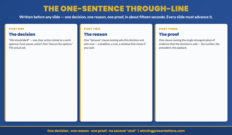
The one-sentence through-line infographic, showing the three components of a presentation through-line written before any slide is built. Component one, the decision: a single clear action the deck is asking for, stated as we should do X. Component two, the reason: one because clause naming why this decision and why now. Component three, the proof: one Z clause naming the single strongest piece of evidence that the decision is safe. Together they form one sentence of roughly fifteen seconds that every slide in the deck must advance, and the rule beneath the three components reads one decision, one reason, one proof, no second and.

The one-sentence through-line

A through-line is not a topic and it is not a title. ‘Our 2027 capital plan’ is a topic; it tells the room what the deck is about but not what you want them to do about it. A through-line is a complete argument compressed into one sentence, and it has exactly three parts. The first is the decision: the single action you are asking the room to take or endorse, stated as a verb — approve, fund, pause, switch, acquire. Not ‘discuss the options’; the actual recommendation. The second is the reason: one ‘because’ clause that names why this decision, and ideally why now. The third is the proof: one clause naming the strongest single piece of evidence that the decision is safe — the number, the precedent, the deadline. Put together: ‘We should X, because Y, and the evidence is Z.’

The discipline is in the word ‘one.’ One decision, not three. One reason, not a list of seven. One proof, not your whole evidence base. The instinct of a thorough person is to resist this — surely the decision rests on more than one reason, surely there is more than one relevant number. Of course there is, and all of it can live in the deck. But the through-line is not the deck; it is the line the deck serves. If your sentence has two ‘and’s joining three different recommendations, you do not have a through-line, you have an agenda, and an agenda is exactly what a tired room cannot follow. When a deck genuinely needs to carry two decisions, it almost always needs to be two decks, or one deck with a clear primary ask and the second held as a follow-on.

I watched this transform a deck for a marketing director I coached in 2017. She came to a session frustrated that her quarterly reviews kept ‘going nowhere’ — lots of nodding, no decisions. I asked her to tell me, without the deck, what her next review was for. She talked for almost two minutes: the campaign performance, the channel shifts, the budget reallocation she was thinking about, the team structure question, the agency contract coming up for renewal. Five things. I asked her to pick the one that, if the room agreed to nothing else, would make the meeting worth having. She chose the budget reallocation. Her through-line became: ‘We should move next quarter’s spend from events to digital, because our last three events cost four times what digital did per qualified lead, and the pipeline is already shifting that way.’ Decision, reason, proof. The other four things became either supporting slides or a separate note. At the next review she opened with that sentence, and for the first time the room actually decided something. The material had always been there. The sentence had not.

Once you have the sentence, the deck almost builds itself, because every slide now faces a simple question: does this advance the through-line, and if so, which part? A slide advancing the ‘because’ goes in the reason section. A slide carrying the proof is your evidence anchor. A slide that does not advance any part of the sentence — the org chart you included out of habit, the history slide that sets context no one needs — is not a bad slide, it is simply not part of this argument, and it belongs in the appendix or the bin. The same logic is what lets you survive a brutal cut to your time, which is its own discipline worth knowing if you ever get told your twenty-minute slot is now eight — the through-line tells you instantly which slides are load-bearing and which are decoration.

If you are using AI to draft decks and it keeps producing five competent points instead of one clear argument:

The AI-Enhanced Presentation Mastery course is a self-paced programme of 8 modules and 83 lessons on using AI — including Copilot — to structure, draft, and refine executive presentations, with the prompt and editorial work that turns generic AI output into a single argued line rather than a balanced summary. There are no deadlines and no mandatory sessions; 2 optional live coaching sessions are fully recorded so you can watch them back anytime, with monthly cohort enrolment and lifetime access to the materials. £499.

Explore the AI programme →

The elevator test

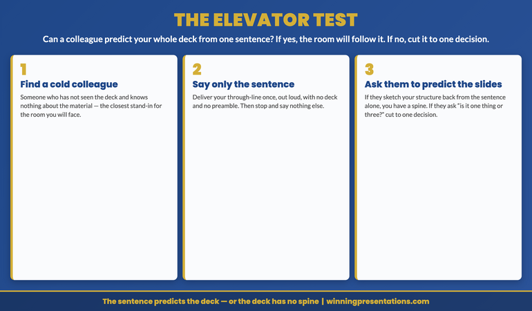
You cannot judge your own through-line, for the same reason you cannot proofread your own writing: you know what you meant, so the sentence reads as clear to you even when it is not. The way to test it is to hand it to someone who knows nothing about the deck and see whether the sentence alone tells them what is coming. That is the elevator test, and it is the diagnostic at the centre of this method. Find a colleague who has not seen your material. Say your through-line once, out loud — just the sentence, no deck, no preamble. Then ask them one question: based on that sentence, what do you think my slides cover?

If your through-line is doing its job, they will sketch your structure back to you with surprising accuracy. ‘Well — you’d show me the cost comparison that proves the four-times claim, something on why the pipeline is already shifting, probably the new budget split, and what you’d stop doing.’ That is the deck. The sentence predicted it, which means the room will be able to follow it, because they will be holding the same frame your colleague just built from one line. If instead they say ‘I’m not totally sure what you’re asking for — is it about the budget or the events or the team thing?’ then your sentence is carrying more than one decision, and the test has caught it before the committee did. The failure is almost always too much, not too little: you have tried to make the through-line carry the whole case instead of the single line the case rests on.

The most useful thing the elevator test does is force the cut while it is still cheap. It is far less painful to discover that your sentence has three competing subjects in a two-minute conversation with a colleague than to discover it eighteen minutes into a committee meeting when the chair puts her pen down. And the fix is always the same: choose. Pick the one decision that, if the room agreed to nothing else, would make the meeting worth having, and make the deck serve that. The rest does not disappear; it becomes supporting material, a follow-on, or an appendix. For the high-stakes rooms where this matters most, the executive coaching work on board and committee presenting uses the elevator test as a standard rehearsal check before anyone builds a slide.

One structure for every deck you will ever build. Pay once, keep it for good.

Instant download, lifetime access to the Executive Slide System — 26 templates, 93 AI prompts, 16 scenario playbooks, 7 checklists. There is no subscription to renew and no licence to track; you pay £39 once and open every future deck from a layout that puts your through-line on slide one and keeps every following slide tied to it. Built for the senior presenter who would rather start from a tested spine than assemble slides and hope a story appears. The structure pass alone will save you the eighteen-minute drift more than once.

Get lifetime access — £39 →

The elevator test infographic, a three-step diagnostic for a presentation through-line. Step one, find a cold colleague: someone who has not seen the deck and knows nothing about the material. Step two, say only the sentence: deliver your through-line once, out loud, with no deck and no preamble, then stop. Step three, ask them to predict the slides: if they can sketch your structure back to you from the sentence alone, the deck has a spine the room will follow, and if they cannot tell whether you are asking for one thing or three, the through-line is carrying too many decisions and must be cut to one before any slide is built.

Frequently asked questions

Isn’t reducing a complex strategy to one sentence dangerously simplistic?

The through-line is not a reduction of the strategy; it is the entry point to it. All the complexity still lives in the deck — the second and third reasons, the full evidence base, the risks and the trade-offs. What the one sentence does is give the room a frame to file that complexity against, so the nuance lands as nuance rather than as noise. A senior audience handles complexity far better when it knows what the complexity is in service of. Withholding the headline in the name of doing justice to the detail almost always backfires: the room cannot tell which details are load-bearing, so it discounts all of them. Lead with the line, then earn it.

What is the most common mistake people make when writing a through-line?

They write a topic instead of an argument. ‘An update on the transformation programme’ feels like a through-line because it is one sentence, but it contains no decision, no reason, and no proof — it tells the room what the deck is about, not what you want them to conclude or do. The fix is to force a verb of decision into the sentence: not ‘an update on’ but ‘we should continue funding’ or ‘we should pause.’ The second most common mistake is the opposite extreme — cramming three decisions into one line joined by ‘and.’ If your sentence has two ‘and’s doing structural work, you have more than one through-line, and you need to choose.

Does every presentation need a through-line, or just decision decks?

Any presentation where you want the room to come away holding a single clear idea benefits from one, which is almost all of them. A pure information update — here is the dashboard, no decision sought — can run on a different logic, but even there a through-line sharpens it: ‘The quarter is on track except for one number that needs watching’ gives a status update a point. The decks that genuinely do not need a through-line are rare. If you find yourself presenting something where you cannot name what you want the room to think or do afterwards, that is usually a sign the presentation does not yet have a reason to exist, not that it is exempt from needing a spine.

I have built the deck already — is it too late to add a through-line?

It is never too late, and retrofitting one is often the fastest way to fix a deck that feels flabby. Do not start from the slides. Put the deck aside, write the through-line from scratch as if the deck did not exist, then run the elevator test on it. Once you have a sentence that passes, go back through the deck and sort every slide into one of three piles: advances the sentence, supports it as backup, or belongs in neither. The first pile is your deck, roughly in the order the sentence implies. The second becomes your appendix. The third you cut. Most people find this halves their slide count and roughly doubles the clarity, which is the same trade my 2008 colleague made between the forty-one-slide version and the nineteen-slide one that got approved.

The Winning Edge — weekly newsletter

The Winning Edge is a weekly newsletter for senior professionals who present at the executive level. One short email a week on the structural moves that separate decisions a room acts on from decks it merely sits through. Subscribe to The Winning Edge →

For the wider library of presentation assets senior leaders draw on — slide system, storytelling primer, Q&A taxonomy, delivery references — the complete presenter library (£99) bundles seven products plus three bundle-only bonuses, worth over £190, covering slides, storytelling, confidence, and delivery in one place. See the wider board-readiness work on the services page, and the companion article on saying the number out loud before you show the chart.

About the author

Mary Beth Hazeldine is Owner & Managing Director of Winning Presentations Ltd. With 24 years of corporate banking experience at JPMorgan Chase, PwC, Royal Bank of Scotland, and Commerzbank, she advises executives across financial services, healthcare, technology, and government on structuring presentations for high-stakes funding rounds, board approvals, and strategic decisions.

The next time you are about to build a deck, do one thing before you open a single slide: write the one sentence the whole thing is for — we should X, because Y, and the evidence is Z — and say it to a colleague who has never seen the work. If they can predict your slides from that one line, you have a spine, and the room will follow it. If they cannot, you have a folder of slides and a chair somewhere who is about to put her pen down and ask you, eighteen minutes in, what exactly you are asking them to agree to. Write the sentence first, and you will never be the person who cannot answer her.

03 Jul 2026
Why the Best Analysts Say the Number Out Loud Before They Show the Chart

Why the Best Analysts Say the Number Out Loud Before They Show the Chart

Quick answer: A chart does not carry a conclusion — it carries data, and the room reads its own conclusion into it unless you supply yours first. So the strongest presenters say the point out loud before the chart appears, and they write the slide title as the conclusion rather than the topic: not ‘Q3 Revenue by Region’ but ‘Three regions grew; the North fell, and that is the decision in front of us.’ That is the assertion title, and it is the spine of a data slide that works on a senior audience. The method has three parts — an assertion title that states the conclusion in a full sentence, a single visual chosen to support that one claim and nothing else, and a provenance line that says where the number came from so a sceptic can trust it. The test is the title-only read: cover every chart in your deck and read only the titles aloud. If the story of the decision comes through from the titles alone, your slides carry the argument. If all you hear is a list of topics, the room is doing your thinking for you — and it will reach its own conclusion, not yours.

In 2008, I watched a talented analyst present a quarterly performance review to a senior leadership group. Her work was meticulous — she had a slide for every region, each with a clean, well-labelled chart and a heading naming what the chart showed: ‘Revenue by Segment’, ‘Margin Trend’, ‘Cost-to-Income’. She talked the room through each chart, describing what it depicted. About six slides in, a managing director who had been quiet put down his pen and said, not unkindly, ‘This is all very thorough. Can you just tell me — are we ahead or behind, and on what?’ She knew the answer cold; she said it in one sentence and the room relaxed. But the question should never have been necessary. She had shown the room a dozen accurate charts and made it do the one thing she was there to do: reach the conclusion. The data was hers. The thinking, she had quietly handed to the audience.

In the years since, coaching senior professionals on presenting numbers to boards and executive committees, I have come to see that moment as the single most common failure in data presentation — and it has almost nothing to do with the quality of the analysis. It is a failure of assertion. The analyst, trained to be objective, presents the evidence and lets it ‘speak for itself.’ But evidence does not speak. A chart titled with its topic is a question, not an answer, and a senior audience does not want to spend the meeting answering questions you could have answered for them.

(This article was created with AI assistance; all stories and insights are based on 35 years of real client work.)

The fix is a discipline I now teach every senior leader who presents numbers: the assertion title. You say the conclusion out loud before the chart loads, and you write the slide’s title as that conclusion in a full sentence — so the point lands in the air and on the screen before the audience starts interpreting the data for themselves. It has three parts: the assertion title, a single supporting visual, and a provenance line. Built this way, your slides make the argument; the charts merely prove it.

If your data slides are accurate but the room keeps asking “so are we ahead or behind?”:

The Executive Slide System ships 26 executive templates built for conclusion-first data slides — assertion-title layouts that put the claim in the headline and the single supporting chart beneath it — with 93 AI prompts that turn your own figures into a sentence-form title, 16 scenario playbooks covering finance review and quarterly business review, and 7 checklists. It gives you the conclusion-first structure as a starting point rather than something you discover after a managing director asks for it.

See the data-slide templates →

Why a topic title hands the room your job

Consider what a slide titled ‘Q3 Revenue by Region’ actually asks of the audience. It presents a set of numbers and a label describing what they are, and then it waits. The viewer has to scan the chart, work out which regions are up and which are down, decide which movements matter, weigh them against expectation, and arrive at a judgement about whether this is good news, bad news, or mixed — all in the few seconds before you move on. A topic title outsources every one of those steps to the room. And a senior audience, doing that work under time pressure across a dozen slides, will frequently arrive somewhere you did not intend — fixating on the one declining region while you wanted them to see the overall growth, or vice versa.

This is the quiet cost of objectivity-as-style. Analysts are trained, rightly, to be rigorous and even-handed with data. But there is a difference between being objective about the evidence and being silent about the conclusion, and presenters routinely confuse the two. Saying ‘three regions grew and the headline is growth’ is not spin; it is the honest read of the data, stated by the person best placed to read it. Withholding it is not neutrality — it is abdication. You leave the most senior people in the room to do the interpretation you were specifically brought in to do, and you lose control of which story they walk away with.

There is a real-time dimension too, which is why the spoken version matters as much as the written one. When you advance to a chart in silence and let it sit while the room reads it, you have a few seconds of dead air in which every viewer is forming their own private conclusion. By the time you start talking, you are arguing against impressions that have already set. Saying the point out loud as the slide appears — ‘What this shows is that we are ahead on revenue but the margin story is the one to watch’ — gets your read in first, while the room is still looking. The same principle governs why the strongest board presenters lead the whole session with the recommendation: the conclusion arrives before the detail, whether you are opening to a board that hasn’t read the pack or putting up a single chart.

Make every data slide state its own conclusion — so the room reads your story, not its own.

The Executive Slide System gives you the assertion-title structure as a ready starting point: headline-as-conclusion layouts, one-visual-per-claim discipline, and a provenance line built into the template. It ships 26 executive templates, 93 AI prompts for converting a raw figure into a sentence-form title and a clean supporting chart, 16 scenario playbooks covering finance review, quarterly business review, and board update, plus 7 checklists. Built for senior presenters who put numbers in front of decision-makers and need the slides to carry the argument. £39, instant download, lifetime access.

  • 26 executive templates — assertion-title data layouts, one claim per slide
  • 93 AI prompts — turn a number into a conclusion-form slide title
  • 16 scenario playbooks — finance review, quarterly business review, board update
  • 7 checklists — including the title-only read as a pre-send check

Get the Executive Slide System — £39 →

The assertion-title method infographic, showing the three parts of a data slide built to carry its own conclusion. Part one, the assertion title: write the slide heading as the conclusion in a full sentence, three regions grew and the North fell, not the topic, Q3 revenue by region. Part two, one supporting visual: choose a single chart that proves that one claim and strip everything that does not, so the eye lands where the title points. Part three, the provenance line: a short note of the source and period so a sceptical director can trust the number without asking where it came from. Together the three parts make the slide argue the point rather than leave the room to interpret the data on its own.

The assertion-title method

The first part is the assertion title: the slide’s heading, written as the conclusion in a full sentence rather than a topic label. ‘Margin Trend’ becomes ‘Margin has fallen for three quarters and the cause is mix, not price.’ ‘Cost-to-Income’ becomes ‘Cost-to-income is back inside target a quarter early.’ The discipline is to make the title a sentence with a verb and a point of view — something that could be true or false, that takes a position. If your title could sit unchanged above any quarter’s chart, it is a topic, not an assertion. The test for the title alone is whether a reader who saw nothing but that line would know what you want them to conclude. The chart then becomes the evidence for the claim the title already made, which is a far easier thing for an audience to follow than a chart asked to generate a claim on its own.

The second part is one visual per claim. Once the title carries the conclusion, the chart has exactly one job: to make that conclusion visible and credible. So you strip everything that does not serve it. If the title says margin fell because of mix, the chart shows the mix shift — not the full income statement with mix buried in row nine. A slide that asserts one thing and shows three is back to handing the room interpretive work, because now the viewer has to find which part of the busy chart supports the headline. One claim, one visual, everything else cut or moved to an appendix. The restraint is what makes the slide land; a single clean chart under a sharp sentence reads in two seconds, where a dense exhibit under a topic label takes the room thirty.

The third part is the provenance line: a short, quiet note of where the number came from and over what period — the source system, the date range, whether it is actual or forecast. Senior audiences, especially in finance, do not trust a number they cannot place, and the fastest way to lose a room is to have a director quietly wondering whether your figure is comparable to the one they have in their head. A one-line provenance note answers the question before it is asked and signals that you know exactly what you are showing. This is also where AI in the workflow earns its place — not in inventing the conclusion, which must be your judgement, but in the heavy lifting of drafting sentence-form titles from a table, checking that each chart matches its claim, and keeping provenance consistent across a deck. Used well, that is the difference between AI as a generic slide-filler and AI as a genuine drafting partner for executive work.

I saw the method change an outcome for a finance manager I coached in 2017. She presented a monthly pack to a divisional board and felt the meetings were slipping — lots of questions, little decided. Her slides were faultless and titled by topic throughout. We rewrote every title as an assertion and cut each chart to the one exhibit that proved it. Nothing in the underlying numbers changed. At the next meeting she told me the board moved through the pack in half the usual time and spent the saved time on the two decisions that actually needed debate. One director said the pack had ‘finally started telling him what she thought.’ She had been thinking it all along; the titles had simply never said it.

For the deeper workflow on using AI to build executive-grade data presentations:

The AI-Enhanced Presentation Mastery course is a self-paced programme of 8 modules and 83 lessons on using AI, including Copilot, to structure, draft, and refine presentations that hold up at senior level — including turning raw tables into assertion-form titles and matching each visual to its claim. There are no deadlines and no mandatory sessions; 2 optional live coaching sessions are fully recorded so you can watch them back anytime, with monthly cohort enrolment and lifetime access to the materials. It is the deeper system behind using AI as a drafting partner rather than a slide-filler. £499.

Explore the AI-enhanced programme →

The title-only read

You cannot judge your own data deck for this fault, because you know what every chart is supposed to say — the conclusion is in your head whether or not it is on the slide. The diagnostic that exposes the gap is the title-only read, and it takes two minutes. Open your deck, cover or ignore every chart, and read only the slide titles aloud, in order, as a continuous sequence. Then ask one question: did I just hear the story of the decision, or did I hear a list of topics?

If the titles read as a narrative — ‘Revenue is ahead of plan; margin is the risk; the risk is mix not price; here is what we are recommending’ — your slides carry the argument, and a director skimming your deck without you in the room would reach the conclusion you intend. If instead you hear ‘Revenue by Region; Margin Trend; Cost Analysis; Recommendations’, your deck is a set of exhibits waiting for a narrator, and the moment you are not standing next to it, the story is gone. The title-only read is also the fastest way to find the one slide where your logic actually breaks: it is usually the title you struggle to write as a sentence, because that is the slide where you have not yet decided what you think.

The most useful thing the title-only read does is stop you hiding behind your charts. A beautiful, complex exhibit feels like substance, and it is tempting to let it stand in for a conclusion you have not committed to. Forcing every title into an assertion makes you take a position on every slide — which is uncomfortable, and exactly the point. The discomfort is the work. Run the read, listen for the slides where the title goes vague, and fix those by deciding what the chart actually shows and saying it. For the wider set of high-stakes decisions this applies to, the executive coaching work on presenting to senior audiences uses the title-only read as a standard pre-meeting pass over any data-heavy deck.

One conclusion-first structure for every data deck. No subscription, no rebuild.

Instant download, lifetime access to the Executive Slide System — 26 templates, 93 AI prompts, 16 scenario playbooks, 7 checklists. You pay £39 once; there is no renewal to track. It is built for the analyst or finance lead who would rather open every pack from a structure that already forces a conclusion into every title and one clean visual under it than discover, mid-meeting, that a managing director has had to ask what the numbers mean. Lead with the point on every slide, and let the charts prove it.

Get lifetime access — £39 →

The title-only read infographic, a three-step test for whether a data deck carries its own argument. Step one, cover the charts: open the deck and ignore every visual, leaving only the slide titles. Step two, read the titles aloud in order: run them as one continuous sequence, as a director skimming without you in the room would. Step three, judge what you heard: if the titles tell the story of the decision the slides carry the argument, but if you hear only a list of topics like revenue by region and margin trend, the deck is a set of exhibits waiting for a narrator and the story disappears the moment you leave. The slide whose title is hardest to write as a sentence is the one where you have not yet decided what you think.

Frequently asked questions

Isn’t putting my conclusion in the title leading the audience rather than letting the data speak?

Data never speaks; it gets interpreted, and the only question is whether you supply the read or leave the room to guess. Stating your conclusion is not leading the witness as long as the chart underneath genuinely supports it and the provenance is honest — you are doing the job you were brought in to do, which is to tell senior people what the numbers mean. The dishonest move is a confident title over a chart that does not back it, or one that hides an inconvenient figure. An assertion title backed by a clean, sourced exhibit is more transparent than a topic label, not less, because it puts your judgement on the record where the room can challenge it.

What is the most common mistake people make with data slides?

Titling the slide with the topic instead of the conclusion, and then showing a chart busy enough to support several different readings. The two faults compound: a topic title tells the room nothing, and a crowded chart lets each viewer find their own story in it. The result is a slide that looks rigorous and decides nothing, and a meeting that fills with clarifying questions. The fix is the pairing at the heart of the method — one assertion in the title, one visual that proves it, everything else cut. A senior audience reads a sharp sentence over a single clean chart in seconds, and spends the time you save on the decisions that actually need their judgement.

How long should an assertion title be?

One line that fits across the top of the slide without wrapping to a third row — usually eight to fourteen words. It needs a subject, a verb, and a point of view, but it is not a sentence of analysis. ‘Margin fell on mix, not price’ is enough; the detail of how you know that belongs in what you say and in the chart, not crammed into the heading. If your title needs a sub-clause and a caveat, the slide is probably trying to make two claims and should be two slides. Read it aloud: if it lands as a clear statement in one breath, it is the right length. If you run out of air, it is doing too much.

Does this work for a live dashboard or a standing metrics pack?

It works, with one adjustment: a standing dashboard often has to show many metrics at once, so the assertion moves from per-chart titles to a single conclusion line at the top of the page. Even a dense dashboard slide for a board presentation benefits from one sentence above the grid that says what this month’s numbers mean overall — ‘On track on three of four targets; the exception is cost, and it is improving.’ The individual tiles stay as reference, but the reader gets your read of the whole before they start scanning cells. The principle is unchanged: supply the conclusion first, then let the detail be available for anyone who wants to verify it.

The Winning Edge — weekly newsletter

The Winning Edge is a weekly newsletter for senior professionals who present at the executive level. One short email a week on the structural moves that turn accurate analysis into decisions a board can actually make. Subscribe to The Winning Edge →

For the wider library of presentation assets senior leaders draw on — slide system, storytelling primer, Q&A taxonomy, delivery references — the complete presenter library (£99) bundles seven products plus three bundle-only bonuses, worth over £190, covering slides, storytelling, confidence, and delivery in one place. See the wider work on the services page, and the companion article on opening to a board that hasn’t read the pack.

About the author

Mary Beth Hazeldine is Owner & Managing Director of Winning Presentations Ltd. With 24 years of corporate banking experience at JPMorgan Chase, PwC, Royal Bank of Scotland, and Commerzbank, she advises executives across financial services, healthcare, technology, and government on structuring presentations for high-stakes funding rounds, board approvals, and strategic decisions.

Before your next data presentation, do two things instead of trusting your charts to speak: rewrite every slide title as a full-sentence conclusion and cut each chart to the one visual that proves it, then cover the charts and read the titles aloud in order to hear whether they tell the story of the decision. The presenter who says the number before the chart loads keeps control of what the room concludes. The presenter who puts up a topic label and lets the data speak hands the most senior people in the room the one job they came to hear done — and lives with whichever conclusion they reach without them.

02 Jul 2026
What Senior Executives Say When They Don't Know the Answer

What Senior Executives Say When They Don’t Know the Answer

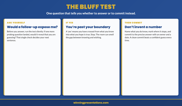
Quick answer: The senior people who survive hard rooms do not have an answer for everything — they have a clean way of saying when they do not. The move is three steps: acknowledge the question without flannel or defensiveness; mark the boundary by stating exactly what you do know and precisely where your knowledge stops; and commit to a specific follow-up with a named owner and a date, not a vague “I’ll look into it.” Counter-intuitively, the boundary step is what reads as authority, because it shows you know the edge of your own knowledge rather than pretending you have none. The thing that actually damages credibility is not the gap — it is the bluff. Use the bluff test to catch yourself: if one more follow-up question would expose that you are guessing, you are past your boundary, and you should commit instead of inventing.

In 2008, during my time in corporate banking, I sat in a credit committee where a relationship director was asked a single, specific question: what was the counterparty’s exposure on a particular line. He did not have the figure to hand. He had a thick file, a sound proposition, and years of relationship history with the client — everything except that one number, in that one moment. What he did next took about four seconds and cost him far longer to repair. Rather than say he would confirm it, he offered a figure, said with the easy confidence of a man who knew his book. It sounded right. The committee moved on. But one member, the kind who checks, went back to the file afterwards and found the number was wrong — not catastrophically, but wrong. Nothing was said in the room, then or later. There was no confrontation, no correction, no awkward email. There was only a quiet, permanent adjustment: his next three proposals were met with a degree of scrutiny his earlier ones had not attracted. The committee had stopped giving him the benefit of the doubt, and they never told him why.

That is how credibility actually erodes at senior level — not in a dramatic exposure, but in a silent downgrade nobody announces. The relationship director was not punished for the gap in his knowledge; everyone in that room had gaps. He was punished for covering one. And the cruelty of it is that he never got to defend himself, because the charge was never filed. He simply noticed, over the following quarter, that the room had become harder to win, and assumed he was having a run of difficult propositions. He was not. He had taught a roomful of decision-makers that his confidence was not a reliable signal of his certainty, and once a committee learns that about you, every confident statement you make afterwards is privately re-rated.

(This article was created with AI assistance; all stories and insights are based on 35 years of real client work.)

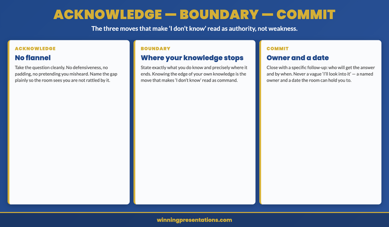
The skill that protects against this is not knowing more. It is knowing how to say you do not know in a way that the room reads as command rather than weakness. There is a structure to it, and the senior people who do it well are running the same three moves whether they have named them or not. I teach it as acknowledge — boundary — commit: the ABC of the honest non-answer. Acknowledge the question cleanly. Mark the boundary of what you know. Commit to closing the gap with a named owner and a date. Done in that order, “I don’t know” stops being an admission of weakness and becomes a demonstration that you can be trusted with the next, harder question.

If the questions are the part of the presentation you quietly dread:

The Executive Q&A Handling System is built for exactly the moment that caught the relationship director out — the tough or hostile question you cannot fully answer. It gives you structured, decision-safe responses you can deliver in around 45 seconds, so you stay in control when you are challenged rather than reaching for a number you do not have. It takes the panic out of the gap. £39, instant download, lifetime access.

Handle the question you dread →

Why the bluff is the real risk — not the not-knowing

Most people preparing for a high-stakes Q&A are afraid of the wrong thing. They are afraid of being asked something they cannot answer, and they pour their preparation into trying to eliminate that possibility — memorising more numbers, anticipating more questions, building a deeper file. But you cannot close every gap, and at senior level the questions are designed to find the edge of your knowledge precisely because that is where the interesting risk lives. A board, a credit committee, an investment committee — their job is partly to test whether you know where your own certainty ends. The gap is not the danger. The gap is expected. What the room is actually watching for is what you do when you reach it.

There are two things you can do at the edge of your knowledge, and they send opposite signals. You can mark the edge — say what you know, name what you do not, and commit to closing it — which tells the room you have a precise grip on your own file and can be trusted to know the difference between fact and guess. Or you can paper over the edge with a confident-sounding answer, which works exactly until someone checks, and at senior level someone always eventually checks. The bluff does not fail in the room. That is what makes it so tempting: it buys you a smooth moment and the bill arrives later, privately, in the form of a credibility downgrade you cannot see happening. The relationship director got his smooth moment. He paid for it across a whole quarter. The discipline of separating what you know from what you are guessing runs through all of how senior leaders are coached for high-stakes rooms, because it is the single behaviour that decides whether a room keeps extending you trust.

It helps to be precise about why the bluff is so costly relative to the honest gap. When you say “I don’t have that to hand,” you spend a small, recoverable amount of credibility — the room notes a gap and moves on, and you close it later. When you bluff and are caught, you do not spend credibility; you devalue the currency. Every confident statement you have ever made and ever will make is now suspect, because the room has learned that your confidence does not track your certainty. That is why the maths never favours the bluff. A known gap costs you one answer. A discovered bluff costs you the reliability of all your answers. No single question is worth that trade, and the senior people who last have internalised it so deeply that bluffing is simply not an option they consider.

Credibility is built in the moments you cannot fully answer — if you have a structure for them.

The Executive Q&A Handling System is a system for handling tough and hostile questions with calm authority. It gives you structured, decision-safe answers you can deliver in around 45 seconds — so when you are challenged, or asked something you cannot fully answer, you stay in control instead of improvising under pressure. It is built for senior people who are judged as much on how they field the questions as on how they make the case. £39, instant download, lifetime access.

Get the Q&A Handling System — £39 →

The acknowledge-boundary-commit infographic showing the three moves of the honest non-answer. Acknowledge means taking the question cleanly with no flannel or defensiveness so the room sees you are not rattled. Boundary means stating exactly what you do know and precisely where your knowledge stops, the move that makes I don't know read as command because it shows you know the edge of your own knowledge. Commit means closing with a specific follow-up naming who will get the answer and by when, never a vague I'll look into it.

The boundary move: where your knowledge stops

The first move, acknowledge, is the easy one to describe and the easy one to get wrong. Acknowledging the question cleanly means taking it head-on, without the tells that signal you have been knocked off balance: no defensive preamble, no “well, that’s a complicated one,” no buying time with a restatement of the question you clearly heard. You simply receive it. The room reads a great deal from these few seconds. A presenter who flinches at a hard question has already conceded something before they say a word; a presenter who takes it cleanly has signalled that the question, however pointed, is one they are willing to stand in front of. But acknowledgement only opens the door. The move that does the real work is the second one.

The boundary is the move almost nobody is taught, and it is the one that converts “I don’t know” from a confession into a credential. Marking your boundary means saying, in one breath, exactly what you do know and exactly where that knowledge stops. “What I can tell you is the direction of travel and the order of magnitude; what I don’t have to hand is the precise figure.” This is the opposite of a vague hedge. It is a precise map of your own certainty, and that precision is what the room hears as authority. Think about what it actually demonstrates: to say exactly where your knowledge ends, you have to know exactly where it ends, which means you have a far firmer grip on your file than the person who claims to know everything and is therefore presumed to know nothing precisely. The boundary turns the absence of one fact into evidence of command over all the others.

I watched this land in 2016, with an executive I was coaching before a board Q&A that everyone expected to be hostile. We drilled the boundary-commit move until it was automatic, because under pressure people revert to instinct and the instinct is to bluff. In the session, a director asked him for a figure he did not have. He did not flinch and he did not invent. He said: “I don’t have that exact number to hand — what I can tell you is the direction of travel, and I’ll have the precise figure to you by end of day.” The chair nodded and moved on. Here is the part that surprised him: his credibility went up, not down. The board did not file his answer as a gap. They filed it as a man who knew the difference between what he knew and what he was guessing — which, on a board, is one of the most reassuring things a presenter can demonstrate, because it tells them every other number he gives them is one he actually stands behind. The same principle of being scrupulous about the line between fact and inference runs through the work on presenting ambiguous data to executives.

The bluff test, and the commit that follows it

In the moment, under the heat of a real question, how do you know whether you are still inside your boundary or have drifted past it into a guess? The pressure to answer is enormous, and it is easy to talk yourself into believing that what is really an educated hope is solid enough to state as fact. The diagnostic I give people is the bluff test, and it is a single silent question you run before you commit to an answer: if one more follow-up question landed on this, would it expose that I am guessing? If the honest answer is yes, you are past your boundary. Stop. Whatever you were about to say is a bluff dressed as an answer, and the bluff test has caught it before the room does.

The test works because it reframes the decision. In the heat of the moment you are not really asking “do I know this?” — you are asking “can I get away with sounding like I know this?”, and the answer to that is often yes, which is exactly the trap. The bluff test changes the question to “what happens on the next question?”, and the next question is always coming in a serious room. Once you picture the follow-up, the guess loses its appeal, because you can see the cliff edge it is walking you towards. The relationship director in 2008 would have been saved by the bluff test in four seconds: a follow-up of “and how does that compare to the limit?” would have exposed him instantly, and had he pictured it he would have committed instead of guessed. The same forward-looking discipline is why senior presenters who use a structured board pre-read strategy get fewer surprise questions in the first place.

When the bluff test stops you, the commit is what you do instead — and a real commit is specific. “I’ll look into it” is not a commit; it is a polite way of hoping the question goes away, and the room knows it. A commit names an owner and a date: “I’ll have the precise figure to you by end of day,” or “my finance lead will confirm the breakdown and circulate it by Thursday.” The specificity does two things. It gives the room something concrete to hold you to, which paradoxically builds trust rather than risk, because a person who invites accountability is signalling they intend to deliver. And it closes the moment cleanly, so the conversation moves on instead of circling the gap. A clean commit lets you concede one fact without conceding control of the room — and control of the room, not omniscience, is what the senior people are actually protecting.

One structure for the hardest questions. No subscription, no renewal.

The Executive Q&A Handling System is a one-off £39 — instant download, lifetime access, no subscription to maintain. It gives you a repeatable way to handle tough and hostile questions with calm authority and to deliver structured, decision-safe answers in around 45 seconds, so the next time you are asked something you cannot fully answer you reach for a method instead of a bluff. Buy it once; use it for every Q&A you ever walk into.

Own it for life — £39 once →

The bluff test infographic showing one diagnostic question for deciding whether to answer or commit. First, ask yourself silently whether one more follow-up question would expose that you are guessing. If the answer is yes, you are past your boundary and have crossed from what you know into what you hope is true, so you should stop. Then commit rather than inventing a number, naming what you do know, marking where it stops, and committing to the precise answer with an owner and a date, because a clean commit beats a confident guess every time.

Frequently asked questions

Won’t saying “I don’t know” make me look unprepared in front of the board?

Not when it is the boundary version rather than the bare phrase. A flat “I don’t know” with nothing around it can read as a gap, but that is rarely what senior people actually say. What they say is what they do know, where it stops, and when they will close it: “what I can tell you is X; what I don’t yet have is Y; I’ll have it to you by Thursday.” A board hears that as precision, not unpreparedness, because it shows you know the exact edge of your own knowledge. What genuinely looks unprepared is a confident answer that unravels on the next question. The boundary protects you from that far more reliably than a bluff ever could.

What’s the most common mistake people make when they don’t know the answer?

Filling the silence with a confident-sounding guess because the pause feels unbearable. The instinct is to treat any gap as a threat to be talked over, so people reach for a number or a claim that is really a hope, and it holds right up until someone checks. The fix is the bluff test: before you answer, ask whether one more follow-up would expose that you are guessing. If it would, you are past your boundary, and the right move is to commit rather than invent. The second most common mistake is the vague commit — “I’ll look into it” — which the room correctly reads as hoping the question disappears.

How do I make a commit specific enough to be credible?

Attach an owner and a date, every time. “I’ll have the precise figure to you by end of day” or “my finance lead will circulate the breakdown by Thursday” gives the room something concrete to hold you to, and inviting accountability is itself a trust signal — people who intend to deliver are comfortable being pinned to a date. Avoid the open-ended forms: “soon,” “shortly,” “I’ll come back to you.” They sound like a soft refusal. A good preparation habit is to draft your commit sentences before the meeting for the questions you most expect, so that under pressure you are recalling a sentence rather than constructing one.

Can I use this if I genuinely should have known the answer?

Yes, and the structure matters even more then. If the gap is one the room expected you to close, the boundary-commit move still beats the bluff, because compounding a preparation gap with a credibility gap is the worst available outcome. Acknowledge cleanly without over-apologising, mark what you do have, and commit tightly with an owner and a date. Resist the urge to manufacture an excuse, which only draws attention to the gap and reads as defensiveness. One missed figure handled with composure is recoverable; the same figure bluffed and later corrected is the version that follows you into the next meeting and the one after that.

The Winning Edge — weekly newsletter

The Winning Edge is a weekly newsletter for senior professionals who present and field questions at the executive level. One short email a week on the moves that separate the presenters a room keeps trusting from the ones it quietly downgrades. Subscribe to The Winning Edge →

About the author

Mary Beth Hazeldine is Owner & Managing Director of Winning Presentations Ltd. With 24 years of corporate banking experience at JPMorgan Chase, PwC, Royal Bank of Scotland, and Commerzbank, she advises executives across financial services, healthcare, technology, and government on structuring presentations for high-stakes funding rounds, board approvals, and strategic decisions.

The next time you are asked something you cannot answer, do three things instead of bluffing: acknowledge the question cleanly, with none of the tells that signal you have been knocked off balance; mark your boundary by saying exactly what you do know and precisely where your knowledge stops, because that is the move the room reads as authority; and commit to closing the gap with a named owner and a date the room can hold you to, never a vague “I’ll look into it.” Run the bluff test before every answer — if one more follow-up would expose that you are guessing, you are past your boundary, so commit rather than invent. The room does not need you to know everything. It needs to know that when you sound certain, you are.

02 Jul 2026
What Directors Actually Do With Your Board Pack the Night Before

What Directors Actually Do With Your Board Pack the Night Before

Quick answer: Most directors do not read your board pack the way you wrote it. They read it late, tired, in the last hour before bed, skimming for two things only — what are you asking them to approve, and what is the single biggest risk in saying yes. By the time you stand up to present, they have already formed a leaning, and you are mostly confirming or fighting a view that hardened the night before. The structure that survives that 11pm skim is the decision-first pre-read: a one-page decision memo at the front carrying the recommendation, the ask, and the one number that says whether it is safe; a structured body ordered the way a director verifies a case rather than the order you built it; and section labels so a director can jump straight to the thing they doubt. The test is the skim test — if a senior colleague cannot tell you the ask and the biggest risk after ninety seconds, the pre-read has failed before the meeting starts.

In 2007, a relationship director at one of the banks where I worked took an annual credit review to committee. He knew the relationship inside out and he was proud of the file. To do it justice he sent the committee a sixty-page pack with no summary at the front — it opened straight into the relationship history, then the financials, then the covenants, then the risk grading, in the order he had worked through them. He assumed the chair would read it the way he had written it, building understanding page by page until the recommendation made itself obvious. When the pack came back to him after the meeting, the only page the committee chair had touched was page one. There were three question marks in the margin and nothing else on the document. The review had been deferred before the meeting reached the numbers at all — the chair wanted a fuller ‘so what’ at the front before the committee would spend its time on the detail. Sixty pages of genuine work, and the file never got read, because the one page the chair actually read did not tell him what he was being asked to decide.

I have since worked with somewhere around fifty senior leaders preparing decisions for boards, credit committees, investment committees, and executive committees. The pattern in that 2007 pack is the one I see most often, and it is almost never a failure of work. It is a failure of order. The relationship director had everything a committee could want; he simply put it in the sequence that made sense to the person who built it, not the person who has to verify it at 11pm with four other papers still to read. Directors do not arrive at your pack fresh and patient. They arrive at it last, tired, and scanning — and what they take from the first page is, more often than not, the view they bring into the room.

(This article was created with AI assistance; all stories and insights are based on 35 years of real client work.)

The fix is not a longer pack or a better-written history. It is a deliberate structure I now teach every senior leader before a board paper goes out: the decision-first pre-read. It has three parts — a one-page decision memo at the very front, a body ordered the way a director verifies a case, and navigation labels that let a tired reader jump to the thing they doubt. Built this way, the pack works on the director the night before, so they walk into the meeting already inclined toward the answer you want rather than forming their first impression while you are still on your opening slide.

If you are staring at a finished pack the night before and dreading the ‘so what’ page:

The Executive Slide System ships 26 executive templates built around the decision-first shape — a front decision page plus structured supporting layouts — with 16 scenario playbooks covering board approval and committee review and 7 checklists, including a pre-meeting sort that puts the ask and the headline number where a director will actually look. It gives you the structure as a starting point rather than something you reverse-engineer from a sixty-page document at midnight.

See the board-paper templates →

What actually happens to your pack the night before

Picture the director you are presenting to. They are not a full-time member of your organisation; they sit on two or three other boards, run something of their own, and receive your pack alongside several others for the same meeting. They open it the night before, often after a full day, with limited time and a finite supply of patience. They are not reading to learn your subject. They already trust that you know it — that is why you have the meeting. They are reading to answer two questions for themselves: what am I being asked to approve, and what is the one thing most likely to go wrong if I do. If the first page does not answer those questions, they do not patiently work through the document to find the answers. They form a provisional judgement from whatever they can extract in the time they have, and that judgement is what walks into the room.

This is the uncomfortable truth a lot of senior presenters resist: the decision is substantially made before you speak. The meeting is not where directors form their view from a blank slate; it is where they pressure-test a view they brought with them. A director who finished your pack thinking ‘clear ask, manageable risk, I am inclined to approve’ comes in looking for reasons to confirm that. A director who finished it thinking ‘I am not even sure what they want’ comes in looking for the gap — and your live presentation is now spent recovering ground you should never have lost. Where the pre-read genuinely earns its keep is the harder cases — the ones built on incomplete or contested numbers, where the way you handle presenting ambiguous data to executives in the body of the pack decides whether a director trusts the recommendation at all.

The practical implication is that the most important audience for your pack is not the boardroom — it is one tired director at a desk lamp the night before. Everything in the decision-first pre-read is designed for that reader: short enough to land in the time they will actually give it, ordered so the answer to their two questions is unmissable, and labelled so that when they want to check the one thing they doubt, they can find it without reading the rest. You are not writing to be read in full. You are writing to be skimmed correctly.

Write packs a tired director skims to the right conclusion — not ones they give up on.

The Executive Slide System gives you the decision-first structure as a ready starting point: a front decision page plus supporting layouts ordered the way a board verifies a case. It ships 26 executive templates, 93 AI prompts for turning your own figures into a clean front page and a sorted body, 16 scenario playbooks covering board approval, credit and investment committee, and finance review, plus 7 checklists. Built for senior presenters who take a decision to a committee more than once a quarter. £39, instant download, lifetime access.

  • 26 executive templates — decision-first front pages plus structured supporting layouts
  • 93 AI prompts — for drafting the one-page decision memo from your own analysis
  • 16 scenario playbooks — board approval, credit committee, investment committee, finance review
  • 7 checklists — including the pre-send skim check for the night-before reader

Get the Executive Slide System — £39 →

The decision-first pre-read infographic, showing three components of a board pack built for the night-before reader. Page one is the decision memo: a single page carrying the recommendation, why now, the specific ask, and the one number that says whether it is safe, written last in under 150 words. The body is ordered to verify: the supporting case is sequenced the way a director checks it rather than the order it was built, with labelled sections holding the proof. Navigation is labelled to skim: section labels let a director reading late jump straight to the number, risk, or assumption they doubt in one move.

The decision-first pre-read

The first component is the cover decision memo: a single page at the front of the pack, before the history, before the context, before anything you built. It carries four things and nothing else — the recommendation in one sentence, why this matters now, the specific approval you are asking the board to give, and the one number that tells a director whether the decision is safe. That number is the figure a director would reach for to sanity-check the whole proposition: the return, the exposure, the payback, the headroom against a limit. Put it on page one in plain sight. A director who reads only this page should be able to close the pack and tell a colleague exactly what is being decided and on what basis. If they cannot, no amount of detail later in the pack will rescue it, because most directors will never reach the detail with a fresh enough mind to weigh it.

The second component is the structured body, and the discipline here is counter-intuitive: order it the way a director verifies the case, not the way you assembled it. You built the case by gathering facts, then analysing them, then reaching a conclusion. A director works in reverse — they start from your conclusion and look for the evidence that would make them doubt it. So the body should be sequenced to answer ‘is this recommendation sound?’ in the order a sceptic checks: the load-bearing numbers first, then the assumptions those numbers rest on, then the main risk and how it is mitigated, then the supporting detail. Each section should be labelled for what it answers. A director who doubts the central number should be able to find the working behind it without wading through the relationship history, and a director who only worries about the downside should be able to go straight to the risk section.

The third component is navigation, and it is the one most packs ignore entirely. A director reading at 11pm with limited time does not read linearly — they jump. They read your decision memo, form a question, and want to verify that one thing immediately. If the only way to find it is to scroll or flick through forty pages, they will either give up and carry the doubt into the room, or worse, conclude the pack is hiding something. Clear section labels — a contents line on the decision page, headed sections in the body, a label on every table that says what it shows — let a director land on the thing they doubt in one move. The skill of pointing a reader straight to the evidence is the same one that underpins knowing how to say ‘I don’t know’ in a presentation — in both cases you are showing command of where the answer lives rather than pretending nothing is uncertain.

The 2015 case that made this concrete for me was a divisional finance lead I coached. Her board paper was solid and dense, and she was convinced the problem was that the board did not read carefully enough. We did not change a single number or rewrite the body. We added one thing: a one-page decision memo at the very front of the otherwise unchanged pack — recommendation, why now, the ask, and the one number. She sent it for the next meeting braced for the usual slow grind. The board approved in roughly eighteen minutes. A director told her afterwards that it was ‘the clearest paper the division had sent.’ Same analysis, same evidence, same person. The only change was that the first page now did the job the first page is for.

For the full method behind building a case that a board reaches yes on:

The Executive Buy-In Presentation System is a self-paced programme of 7 modules covering stakeholder analysis, case construction, and the structures that hold up at board and executive committee level — the same discipline of leading with the decision and ordering the proof the way a director checks it. There are no deadlines and no mandatory sessions; optional live Q&A sessions are fully recorded so you can watch them back anytime, with monthly cohort enrolment and lifetime access to the materials. It is the deeper framework behind the one-page approach in this article. £499.

Explore the buy-in programme →

The skim test: ninety seconds that predict the meeting

You cannot judge your own pack as a director will, because you know what it is supposed to say. The decision memo reads perfectly to you because you wrote the recommendation it is summarising. The only reliable way to know whether your pre-read works is to run it past someone who comes to it as cold as a director will — and to give them no more time than a director will. That is the skim test, and it is the diagnostic at the centre of the decision-first pre-read. Hand the finished pack to a senior colleague who has not been involved, give them ninety seconds, then take it back and ask two questions: what am I asking the board to approve, and what is the single biggest risk in approving it.

If they can answer both, cleanly, in their own words, your pre-read works. A director reading it the night before will extract the same two things and form a leaning in your favour. If they cannot — if they say ‘I think it is something about expanding the programme but I am not sure what you actually need’, or if they name a risk you do not consider the main one — the pre-read has failed, and it has failed in a way you would never have caught by reading it yourself. The failure is almost always on page one. The body may be excellent; the decision memo is not doing its job. The fix is to rewrite the one page, not the pack — which is far less work than the panic of rebuilding everything the night before a deferral.

The most useful thing about the skim test is what it stops you doing. It stops you adding. The instinct when a pack feels uncertain is to put more in — more context, more caveats, more supporting tables — on the theory that completeness protects you. The skim test shows you that completeness is not the problem; clarity of the ask is. A colleague who cannot find the ask in ninety seconds will not find it faster with three more pages of detail. They will find it faster with a sharper first page. Run the test, watch where your reader stumbles, and fix that — usually by cutting and sharpening, almost never by adding. For the wider set of high-stakes situations this applies to, the executive coaching work on board-level rooms uses the same skim test as a standard pre-send check.

One structure for every board paper. No subscription, no rebuild.

Instant download, lifetime access to the Executive Slide System — 26 templates, 93 AI prompts, 16 scenario playbooks, 7 checklists. Pay once at £39; there is no renewal to track and no licence to maintain. It is built for senior presenters who would rather open every board paper from a structure that already puts the decision first and orders the proof the way a director checks it than reverse-engineer a ‘so what’ page from a finished sixty-page pack at midnight.

Get lifetime access — £39 →

The 90-second skim test infographic, a three-step diagnostic for a board pre-read. Step one, hand it over: give the finished pack to a senior colleague who has not seen it and allow ninety seconds, the time a tired director gives it at 11pm. Step two, they tell you: ask what the board is being asked to approve and what the single biggest risk is, and they should answer both without flipping past page one. Step three, if they cannot: the pre-read has failed, the body may be fine but the decision memo is not, so rewrite the one page rather than the whole pack.

Frequently asked questions

Won’t a one-page decision memo make me look like I’ve oversimplified?

It is the reverse, as long as the full case sits behind it. A director reads a sharp one-page memo backed by a structured, labelled body as the work of someone who understands the proposition well enough to say what matters in a sentence — which is harder than writing forty pages, not easier. The risk of looking thin comes from a short summary with nothing behind it, not from a short summary that opens a deep pack. The memo signals judgement: you have decided what the board needs to weigh first. In practice the directors I have watched respond to a decision-first front page with more confidence in the author, because it shows command of the case rather than a hope that volume will be read as rigour.

What is the most common mistake senior leaders make with a board pack?

Ordering it the way they built the case instead of the way a director verifies it, and leaving the recommendation to emerge at the end. The author works forwards — facts, analysis, conclusion — and assumes the reader will follow the same path. A director works backwards from the conclusion, looking for what would make them doubt it, and a tired one never reaches a conclusion buried on page forty. The fix is to lead with the decision on page one and sequence the body around a sceptic’s checks: the load-bearing number, the assumptions under it, the main risk, then the detail. Same content, reordered for the person who has to approve it rather than the person who wrote it.

When should I write the decision memo — first or last?

Last, after the rest of the pack is finished. Writing it first tends to produce a memo that describes what you hope to argue rather than what the evidence actually supports, and you then bend the body to fit it. Build the case first, let the evidence settle the recommendation and the one number that proves it, then write the memo as a faithful one-page distillation of what the pack already says. Keep it under roughly 150 words, and read it aloud the way a tired director would at 11pm. If it sounds clear and decisive read cold and fast, it will work on the page. If you stumble or have to explain it, the body is not yet pointing cleanly enough at a single ask.

What if the board genuinely wants all the detail in the pre-read?

Then give them all of it — behind the decision memo, not instead of it. A board that asks for detail is asking to be able to verify the case in their own time, not to have the recommendation withheld until page forty. The decision-first structure serves both readers at once: the director who wants only the leaning gets it from page one, and the director who wants to check every assumption finds the depth, clearly labelled, in the body. The two are not in tension. A full, structured body with a one-page memo at the front respects the director who wants to dig and the director who only has ninety minutes for five papers, without forcing either to read the way the other prefers.

The Winning Edge — weekly newsletter

The Winning Edge is a weekly newsletter for senior professionals who present at the executive level. One short email a week on the structural moves that separate papers a board approves from papers it merely receives. Subscribe to The Winning Edge →

For the wider library of presentation assets senior leaders draw on — slide system, storytelling primer, Q&A taxonomy, delivery references — the complete presenter library (£99) bundles seven products plus three bundle-only bonuses, worth over £190, covering slides, storytelling, confidence, and delivery in one place. See the wider board-readiness work on the services page, and the companion article on presenting ambiguous data to executives.

About the author

Mary Beth Hazeldine is Owner & Managing Director of Winning Presentations Ltd. With 24 years of corporate banking experience at JPMorgan Chase, PwC, Royal Bank of Scotland, and Commerzbank, she advises executives across financial services, healthcare, technology, and government on structuring presentations for high-stakes funding rounds, board approvals, and strategic decisions.

The next time you build a board pack, do three things instead of trusting the board to read it the way you wrote it: put a one-page decision memo at the very front carrying the recommendation, the ask, and the one number that says whether it is safe; order the body the way a director verifies a case — load-bearing number, assumptions, main risk, then detail — with every section labelled so a tired reader can jump to the thing they doubt; and before it goes out, run the ninety-second skim test on a colleague who has not seen it. The director who reads a decision-first pack at 11pm walks into the room already leaning your way. The director who reads sixty pages with no ‘so what’ on page one walks in with three question marks — and you spend the meeting answering them instead of winning the vote.

02 Jul 2026
What Senior Leaders Say When the Data Doesn't Tell a Clean Story

What Senior Leaders Say When the Data Doesn’t Tell a Clean Story

Quick answer: When the data is ambiguous, a board is not really judging your numbers — it is judging whether you know where your evidence ends and your judgement begins. The move that builds trust is to label every headline claim on a data slide as one of three tiers and to say the label out loud: know, what is verified and you can stand behind; infer, a reasoned judgement drawn from incomplete evidence; bet, your recommendation under genuine uncertainty. This is the three-tier read. The diagnostic is the tier test: for every headline number, decide whether it is know, infer, or bet, and if you cannot decide, you have not yet understood your own figure. Naming the tier does not weaken your case — it lets the board calibrate how much weight to put on each claim and still act. Before your next data review, mark every headline K, I, or B and say the label aloud as you present it.

In 2006, during my time in corporate banking, I sat in an investment committee at one of the institutions I worked for and watched an analyst present a market-sizing. He was good with numbers and he had clearly done the work. The trouble was the slide. It carried a single forecast figure for the size of the opportunity, set in the same confident type as everything else on the page, with no signal anywhere that it rested on a chain of assumptions rather than on observed fact. He talked to it as though it were settled. A director two seats down from the chair, a woman who had sat on that committee for years and rarely said much, put her pen down on the printed pack and asked: “Is that a number or a guess?” The analyst hesitated — just a beat too long — and in that beat the room changed. From that line on the committee stopped trusting not only the forecast but the whole model behind it, and the proposal was sent back for “a clearer view of what is known versus assumed.”

The work had not been the problem. The forecast may well have been the best available read of the market. What undid him was that he had blurred the line between what he could prove and what he was estimating, and a senior room can smell that blur instantly. When the data tells a clean story, presenters get away with this because nothing tests the seam. When the data is ambiguous — which at the executive level it almost always is, because the questions that reach a board are the ones without tidy answers — the seam is exactly where the room pushes. A director who cannot tell your verified figures from your estimates has no way to weigh your recommendation, so the safe move, the one boards default to, is to distrust all of it.

(This article was created with AI assistance; all stories and insights are based on 35 years of real client work.)

The fix is not better data and it is not a more confident delivery. It is a structural honesty about where each claim sits, applied openly enough that the room can see it. The framework I now teach senior leaders for exactly this situation is the three-tier read: before you present any data slide, you sort every headline claim into one of three tiers — know, infer, or bet — and then you name the tier out loud as you present, so the board can see precisely where your evidence ends and your judgement begins. It is not about sounding more certain. It is about being legibly honest, which under genuine uncertainty is the single most credible thing a presenter can be.

If your data slides keep blurring the line between what you know and what you are estimating:

The Executive Slide System ships 26 executive templates and 93 AI prompts built to separate verified figures from judgement on the page itself — data layouts that flag assumptions, sensitivity callouts, and a tier-labelling pattern for headline claims — plus 16 scenario playbooks covering board and investment-committee reviews and 7 checklists. It gives you a slide structure that carries an honest read of uncertainty instead of one you have to talk your way around in the room.

See the data-slide templates →

“Is that a number or a guess?” — the question that sinks an ambiguous slide

The director’s question was not hostile. It was diagnostic. She was not trying to embarrass the analyst; she was trying to do her job, which was to decide how much weight a committee could safely place on a forecast before committing capital against it. To do that she needed to know one thing the slide refused to tell her: was the figure something he had measured, or something he had estimated? A measured figure she could lean on. An estimate she would treat with caution and probe for its assumptions. A figure that could be either — a figure presented as fact but possibly built on a stack of guesses — she could not use at all, because she had no way to size the risk in trusting it. The slide gave her no signal, so she asked for one directly, and the asking exposed that the presenter himself had not drawn the line clearly in his own mind.

This is the trap of presenting uncertain data with uniform confidence. Every claim on the slide looks equally solid, which means the moment one claim turns out to be softer than it appeared, the room has no reason to believe the rest are any firmer. Uniform confidence is not reassuring to senior people; it is a tell. Experienced directors know that real analysis of an ambiguous question produces a mix — some things you can verify, some you can reasonably infer, some you are frankly betting on — and a slide that flattens all of that into one confident surface reads as either naivety or spin. Either way the room’s response is the same: it stops trusting the surface and starts digging, and once a board is digging rather than deciding, you have lost the meeting. The same instinct sits behind why saying “I don’t know” well can strengthen rather than weaken a presenter.

What the director wanted was not certainty. Boards live with uncertainty for a living; they are not expecting you to have eliminated it. What they want is for you to have mapped it — to know exactly which parts of your case are solid and which are exposed, and to tell them, so they can do their own weighing. The presenter who maps the uncertainty out loud hands the board the thing it actually needs to make the decision. The presenter who hides the uncertainty behind a confident slide forces the board to map it for him, in real time, by interrogation — and no one survives that process looking good.

Build data slides that show the board exactly where your evidence ends.

The Executive Slide System gives you the three-tier read as a ready slide structure — data layouts that separate verified figures from inferences and recommendations, assumption callouts, and sensitivity panels you can turn to under questioning. It ships 26 executive templates, 93 AI prompts for turning your own analysis into honestly-labelled slides, 16 scenario playbooks covering board approval, investment committee, and strategy review, plus 7 checklists. Built for senior presenters who take ambiguous numbers into high-stakes rooms. £39, instant download, lifetime access.

  • 26 executive slide templates — data layouts that flag what is verified versus estimated
  • 93 AI prompts — for labelling every headline claim know, infer, or bet from your own figures
  • 16 scenario playbooks — board approval, investment committee, strategy review, finance review
  • 7 checklists — including the pre-meeting tier test for every data slide

Get the Executive Slide System — £39 →

The three-tier read infographic. When the data is ambiguous, a presenter labels every headline claim as one of three tiers and names it out loud so the board can see where evidence ends and judgement begins. Tier one is Know: verified figures the presenter can stand behind, introduced with the phrase what I know is. Tier two is Infer: reasoned judgement drawn from incomplete evidence, introduced with what I infer is. Tier three is Bet: the presenter's recommendation under genuine uncertainty, owned as a call rather than a certainty, introduced with where I'd bet is. Naming the tier lets the board calibrate how much weight to put on each claim and still act.

The three-tier read: know, infer, bet

The three-tier read works because it matches the way senior people already think about evidence. Every director on a board is, consciously or not, sorting your claims into roughly these categories as you speak — deciding which figures to lean on, which to question, and which to discount. All the framework does is bring that sorting onto the slide and into your voice, so you are doing it with them rather than leaving them to do it against you. The first tier is know: the figures that are verified, that you have measured or sourced and can stand behind without hedging. These carry full weight. When you present them you say so plainly — “what I know is” — and the board can build on them as solid ground. The discipline here is honesty in the other direction too: do not promote an estimate into the know tier just because you would like it to be firmer than it is.

The second tier is infer: reasoned judgement drawn from incomplete evidence. This is the largest tier in most ambiguous analyses and the one presenters most often disguise as fact. An inference is not a guess — it is a defensible read built from partial data, analogy, or expertise — but it is not verified either, and the board needs to know which it is. When you say “what I infer is, based on the three quarters we can see and the pattern in the comparable market,” you are telling the room exactly how much weight to give the claim and inviting them to test the reasoning rather than the messenger. The third tier is bet: your recommendation under genuine uncertainty. There is a point in every hard decision where the evidence runs out and a call still has to be made, and pretending otherwise insults the room. The strong move is to own it — “where I’d bet is” — framing your recommendation as a considered wager you are prepared to defend, not a certainty you are smuggling past them.

I watched the full effect of this in 2017, coaching a strategy director preparing for a planning review. Her board contained a non-executive with a reputation for taking forecasts apart line by line; she had been picked over by him before and dreaded it. We went through her deck and re-labelled every headline claim — know, infer, bet — and built the labels into how she would speak to each slide. When she presented, she opened each data point by naming its tier: what she knew, what she was inferring, where she was making a call. The notoriously sceptical non-executive, who normally treated these reviews as cross-examinations, listened through to the end and said it was “the first honest forecast this board has been shown.” The discussion that followed was not about her methodology, which is where it usually died. It was about the decision. By telling the room where her evidence ended, she had moved the conversation from whether to trust her to what to do — which is the only conversation a planning review is actually for. This is the same shift the partner work on the board pre-read strategy is built to create before the meeting even starts.

To build the deeper habit of using AI to construct executive-grade slides that handle data honestly:

AI-Enhanced Presentation Mastery is a self-paced programme — 8 modules, 83 lessons — on using AI to build presentations that hold up at executive level, including how to draft data slides that separate what is verified from what is inferred rather than letting a model flatten everything into confident prose. No deadlines, no mandatory session attendance; two optional live coaching sessions, fully recorded so you can watch them back anytime. Monthly cohort enrolment, lifetime access to materials. £499.

Explore the AI-enhanced programme →

The tier test: label every headline before the board does

The framework is only useful if you can apply it cleanly to your own slides, and that is what the tier test is for. The test is a single discipline run against every headline claim on a data slide: label it know, infer, or bet. Take the claim — the market is worth this much, the cost will land here, the risk is contained — and force yourself to assign it one of the three tiers. Is this something you have verified and can stand behind? Then it is know. Is it a reasoned read from partial evidence? Then it is infer. Is it a call you are making where the evidence genuinely runs out? Then it is bet. The labelling has to be deliberate, claim by claim, not a vague sense that the deck is “mostly solid.” The whole value lies in the precision of forcing each individual headline into a single tier.

The diagnostic power of the test is in what happens when you cannot decide. If you pick up a headline claim and genuinely cannot tell whether it is something you know, something you are inferring, or something you are betting on, that is not a labelling problem — it is a signal that you have not understood your own number. You do not yet know what is holding it up. That is precisely the claim the sharpest person in the room will find, because the uncertainty in your own mind leaks into how you present it, and senior people are exquisitely tuned to that leak. So the test doubles as a preparation tool: every claim you struggle to label is a claim to go back and dismantle until you know exactly what it rests on, before the board does it for you, less kindly. By the time you walk in, every headline should carry a clean K, I, or B in your own notes, and you should be able to say each label aloud without hesitation.

There is a second discipline the test makes obvious, which is that the labelling must be spoken, not just done. Sorting your claims privately into tiers and then presenting them all with the same uniform confidence wastes the entire exercise — the board cannot read your notes. The trust is built in the saying. “What I know is the current run-rate. What I infer, from the comparable launches, is roughly this trajectory. Where I’d bet is that we clear the threshold by year three.” Said aloud, that sentence does in fifteen seconds what no amount of confident delivery can: it tells the room exactly how to weigh you. The work on building data slides that earn this kind of trust is the same work senior leaders bring into coaching for board-level rooms — the figures are usually fine; the labelling is what is missing.

Why naming uncertainty builds trust instead of eroding it

The objection every senior leader raises to this is intuitive and wrong: surely admitting where you are inferring and betting makes the board trust your numbers less? It feels as though confidence is the currency and any concession of uncertainty spends it down. But that gets the psychology of a senior room backwards. A board is not looking for a presenter with no uncertainty — they know the question is hard, which is why it reached them — they are looking for a presenter who has command of their uncertainty. Naming your tiers does not reveal weakness; it reveals that you have done the harder work of mapping exactly where your case is strong and where it is exposed. That is the work that separates someone a board can hand a bigger decision to from someone they cannot, and it is invisible until you make it audible.

What actually erodes trust is the opposite move — the uniform confidence that hides the seams. When a presenter treats every claim as equally settled and then one claim cracks under a question, the board does not just lose that claim; it loses faith in the presenter’s judgement, because they have just learned that this person cannot or will not tell solid from soft. From that point every other figure is suspect. The three-tier read inoculates you against this. When you have already told the room that a figure is a bet, a director probing it is not catching you out — they are doing exactly what you invited, and you are ready, because you flagged it yourself. You have converted the most dangerous moment in an ambiguous presentation, the exposed-assumption moment, into a moment you scripted. The board sees a presenter who anticipated the soft spot rather than one who got caught at it.

There is a final, quieter return. Naming your tiers changes the room’s relationship to the decision. When the board can see what is known, what is inferred, and what is a bet, they can do their own job properly — they can calibrate, put real weight on the solid parts, probe the inferences, and make a clear-eyed collective call on the bets. They become partners in weighing the uncertainty rather than adversaries trying to expose it. That is the deepest reason the strategy director’s sceptic called her forecast honest and then moved straight to the decision: she had given the board the one thing an ambiguous presentation usually withholds, which is an accurate map of its own confidence. A board that trusts the map will act on it, even when the territory is uncertain.

One slide system. Every committee. No subscription, no renewal.

Instant download, lifetime access to the Executive Slide System — 26 templates, 93 AI prompts, 16 scenario playbooks, 7 checklists. A one-off £39, no subscription to maintain and no licence to renew. Built for senior presenters who would rather start every data review from a structure that already separates what they know from what they are inferring and betting, than rebuild that honesty into a deck from scratch the night before.

Get lifetime access — £39 →

The tier test infographic. A three-step diagnostic for presenting ambiguous data. Step one is label every headline claim on a data slide as know, infer, or bet before walking into the room, marking each one K, I, or B. Step two is say it aloud as you present, naming the tier with phrases such as what I know is, what I infer is, and where I'd bet is, because the naming is what earns the board's trust. Step three is the diagnostic: if you cannot decide which tier a claim belongs to, you don't understand the number, and that is the claim to go back and dismantle before the board finds it.

Frequently asked questions

Won’t admitting uncertainty make the board trust my numbers less?

It does the opposite, provided you do it precisely. A board already assumes a hard question carries uncertainty — that is why it reached them. What they are weighing is whether you have command of that uncertainty. Naming which claims are verified, which are inferred, and which are bets shows you have mapped exactly where your case is strong and where it is exposed, which is the work that earns a board’s confidence. What erodes trust is uniform confidence that hides the soft spots, because the moment one claim cracks under a question, the board loses faith in all of them. Labelling your tiers protects you from that by putting the honesty on the table before anyone has to dig for it.

What is the most common mistake senior leaders make when the data is ambiguous?

Presenting every claim with the same confident surface, so the board cannot tell a verified figure from an estimate. It feels safer to project certainty, but to a senior room uniform confidence is a tell rather than a reassurance, because experienced directors know real analysis of a hard question produces a mix of solid and soft. When the surface is flat, the room has no way to calibrate, so it defaults to probing everything — and once a board is digging instead of deciding, the meeting is lost. The fix is the tier test: label each headline know, infer, or bet, and say the label aloud, so the board can weigh each claim accurately instead of distrusting all of them.

How do I actually present a forecast I am genuinely unsure about?

Place it in the bet tier and own it as a considered call rather than a fact. Walk the room through the parts you can stand behind first — “what I know is” for the verified figures, “what I infer is” for the reasoned reads from partial evidence — and then frame the forecast itself with “where I’d bet is,” making clear it is your recommendation under uncertainty and stating what you are basing the call on. This does not weaken the forecast; it tells the board precisely how much weight to give it and invites them to make the call with you. A bet you have named and can defend reads as judgement. A bet you have disguised as certainty reads as the thing that unravels under the first sharp question.

How is this different from just adding a disclaimer slide to my deck?

A disclaimer slide quarantines uncertainty into one place and then lets every other slide carry on as if it were fact, which is the very blur the board is trying to see through. The three-tier read works claim by claim, in the live narrative, where the decision is actually made. You are not adding a caveat at the end; you are labelling each headline number as you present it, so the board can weigh that specific claim in the moment. A disclaimer asks the room to remember a general caution while reading confident slides; the tier read removes the need to remember anything, because the honesty is attached to each number where it sits. One is legal cover. The other is a working map the board can act on.

The Winning Edge — weekly newsletter

The Winning Edge is a weekly newsletter for senior professionals who present at the executive level. One short email a week on the structural moves that separate presentations a board acts on from presentations it merely sits through. Subscribe to The Winning Edge →

For the wider library of presentation assets senior leaders draw on — slide system, storytelling primer, confidence and delivery references — the complete presenter library (£99) collects seven products plus three bundle-only bonuses, worth over £190, in one place — slides, storytelling, confidence, and delivery. See the wider set of board-readiness resources on the services page, and the partner article on the board pre-read strategy.

About the author

Mary Beth Hazeldine is Owner & Managing Director of Winning Presentations Ltd. With 24 years of corporate banking experience at JPMorgan Chase, PwC, Royal Bank of Scotland, and Commerzbank, she advises executives across financial services, healthcare, technology, and government on structuring presentations for high-stakes funding rounds, board approvals, and strategic decisions.

The next time you present a number you are not certain of, do three things instead of dressing it in uniform confidence: run the tier test on every headline claim and mark each one K, I, or B before you walk in; go back and dismantle any claim you cannot cleanly label, because that is the one the sharpest person in the room will find; and say the tier aloud as you present each number — what you know, what you infer, where you’d bet. The board is not asking you to be certain about an uncertain thing. It is asking you to know exactly where your evidence ends and your judgement begins, and to be honest enough to show them the line.

01 Jul 2026
Business meeting in a glass-walled conference room; a man in a blue suit presents a slide while four colleagues review documents.

Why the Strongest Board Decks Hide Half Their Slides in the Appendix

Quick answer: A board presentation appendix is not the place tired or weak slides go to be forgotten. Used well, it is where a senior presenter parks every piece of evidence a director might reach for — the detailed numbers, the sensitivity tables, the methodology, the second-order risks — so the live deck can stay short enough to carry a decision and the presenter can answer almost any challenge by turning to one labelled slide. The structural move is the front-deck/back-deck split: the front deck carries only the recommendation and the few slides that load-bear it, usually eight or fewer; the back deck holds everything that exists to answer “can you show me?” The test for which slide goes where is simple — if a slide makes the case, it is front; if it only defends the case when asked, it is appendix. The presenter who runs this split walks into the room with a deck a board can actually get through and an appendix that makes them close to unshakeable under questioning.

In 2009 I worked with a senior risk officer at one of the banks where I held a corporate banking role, preparing him for a lending proposition he was taking to the credit committee. The proposition was sound and he knew the file better than anyone in the building. To prove it, he had built a forty-four-slide pack — every covenant, every scenario, every counterparty exposure on its own slide, in the order he had analysed them. He walked in confident because he had left nothing out. Nine minutes in, the committee chair, a man in his sixties who had chaired that committee for the better part of a decade, stopped him on slide twelve, put his pen down on the printed pack, and said: “I have read the file. I do not need you to read it back to me. What are you actually asking us to approve, and where is the one number that tells me whether it is safe?” The number was on slide thirty-one. The risk officer flicked forward through nineteen slides to find it while the room waited, and by the time he reached it the chair had already lost confidence — not in the proposition, which was fine, but in the presenter’s grip on his own case.

I have now worked with somewhere around fifty senior leaders preparing decisions for boards, credit committees, investment committees, and executive committees across financial services, professional services, healthcare, and technology. The forty-four-slide pack is the single most common failure I see, and it is almost never a failure of preparation. It is a failure of sorting. The risk officer had done all the right analysis; he simply put all of it in front of the committee in one undifferentiated stream, on the theory that completeness was the same thing as rigour. A board does not experience a complete deck as rigorous. It experiences it as a presenter who has not decided what matters — which is the one impression that sinks an otherwise strong case.

(This article was created with AI assistance; all stories and insights are based on 35 years of real client work.)

The appendix is the tool that solves this, and almost nobody uses it as a tool. Most presenters treat the appendix as a dumping ground — the slides they could not bear to delete, shoved behind the last “thank you” slide where they assume no one will look. Used deliberately, the appendix is the opposite: it is the structural device that lets the front of the deck stay short enough to carry a decision while keeping every piece of supporting evidence one tap away. The framework I now teach every senior leader before a board presentation is a deliberate front-deck/back-deck split: the front deck makes the case in as few slides as the case allows; the back deck holds everything that exists only to answer a question. Get the split right and you walk in with a deck the board can finish and an appendix that makes you very hard to corner.

If you would rather not sort forty-four slides into front and back by hand the night before:

The Executive Slide System ships 26 executive templates built around the front-deck/back-deck shape — a short decision deck plus structured appendix layouts for sensitivities, methodology, and risk — along with 16 scenario playbooks covering board approval and committee review. It gives you the split as a starting structure rather than something you reverse-engineer from a bloated pack at midnight.

See the board-deck templates →

Why board decks bloat — and why the appendix is the cure, not the symptom

The instinct that produces a forty-four-slide pack is not laziness; it is fear, and the fear is specific. A senior leader presenting to a board is afraid of one thing above all others: being asked a question they cannot answer in the room, in front of people whose opinion of them shapes their career. The forty-four-slide pack is an attempt to insure against that fear by putting every possible answer somewhere in the deck. The logic is “if it is all in here, I can never be caught out.” The logic is sound about the evidence and wrong about the format. You do want every answer available. You do not want every answer in the path of the live presentation, because a board reading forty-four slides in sequence never reaches the decision before it runs out of patience, and a presenter walking the board through all of it signals that they could not tell the load-bearing slides from the supporting ones.

The appendix resolves the fear without paying the format cost. Everything the leader was afraid of being asked still lives in the deck — it simply lives in the back, sorted and labelled, ready to be pulled forward in seconds when a director asks for it. The front deck is freed to do the one thing a front deck is for: make the case and ask for the decision. This is why the appendix is the cure rather than the symptom. A long appendix is a sign of a well-prepared presenter. A long front deck is a sign of a presenter who has not finished thinking. The two look similar in a slide count and could not be more different in the room. A board that sees a six-slide front deck backed by a thirty-slide labelled appendix reads a presenter who has done all the work and then made the hard choices about what the meeting actually needs.

There is a second-order benefit that senior leaders consistently underrate until they have felt it. A short front deck changes how the presenter behaves. When you know the case rests on six slides, you rehearse those six slides until they are clean, you know exactly where you are at every moment, and you never lose your place — because there is so little place to lose. The forty-four-slide presenter is managing navigation the entire time, which is cognitive load spent on logistics rather than on reading the room. The split does not just shorten the deck; it frees the presenter’s attention to do the higher-value work of watching how the board is responding and adjusting. The same discipline of leading with the decision and parking the proof sits at the centre of how senior leaders are coached for board-level rooms.

The front-deck/back-deck split

The front deck answers four questions and nothing else: what are you recommending, why now, what is the evidence that it is sound, and what specifically do you need the board to approve. In most cases that is between four and eight slides. The recommendation goes first — not the background, not the context, not the journey you went on to reach it. The board can hold the recommendation in mind and read everything after it as the case for that recommendation, which is far easier than holding twenty slides of context and waiting to find out where it is all heading. The evidence in the front deck is only the evidence that actually carries the decision: the one or two numbers, the single sensitivity that matters most, the one risk that would change the answer. Everything else — and there is always a great deal of everything else — goes to the back.

The back deck is structured, not dumped. This is the part presenters get wrong even when they have understood the principle. An appendix that is forty slides in the order you happened to build them is almost as useless as no appendix, because you cannot find anything in it under pressure. A working appendix is organised by the question it answers and labelled so you can navigate to it instantly: a tab for the detailed financials, a tab for the sensitivity tables, a tab for methodology and assumptions, a tab for the second-order risks and mitigations. When a director asks “what happens if the rate moves two hundred basis points,” you do not flick through nineteen slides. You say “that is in the appendix — here,” and you are on the sensitivity table in one move. The difference between flicking and turning straight to it is the difference between a presenter who looks caught out and one who looks like they anticipated the question.

Stop rebuilding the board deck from a blank page every time the proposition changes.

The Executive Slide System gives you the front-deck/back-deck split as a ready structure: a short decision deck plus appendix layouts for financials, sensitivities, methodology, and risk. It ships 26 executive templates, 93 AI prompts for populating slides from your own figures, 16 scenario playbooks covering board approval, credit and investment committee, and finance review, plus 7 checklists. Built for senior presenters who take a decision to a committee more than once a quarter. £39, instant download, lifetime access.

  • 26 executive slide templates — short decision decks plus structured appendix layouts
  • 93 AI prompts — for turning your raw analysis into a front deck and a sorted back deck
  • 16 scenario playbooks — board approval, credit committee, investment committee, finance review
  • 7 checklists — including the pre-meeting sort that decides which slides go front and which go back

Get the Executive Slide System — £39 →

The front-deck/back-deck split infographic. The front deck answers four questions in four to eight slides: the recommendation first, why now, the load-bearing evidence, and the specific approval requested. The back deck is a structured, labelled appendix organised by the question it answers: detailed financials, sensitivity tables, methodology and assumptions, second-order risks and mitigations. The sorting rule is that a slide that makes the case goes front and a slide that only defends the case when asked goes to the appendix.

The “will they ask?” test for sorting every slide

The split is only as good as the rule you use to sort slides into front and back, and most presenters do not have a rule — they sort by attachment, keeping the slides they worked hardest on regardless of whether the board needs them. The rule that works is a single question asked of every slide: does this slide make the case, or does it only defend the case if someone asks? A slide that makes the case — the recommendation, the headline number, the one risk that could change the decision — is doing active work to move the board toward a yes, and it belongs in the front deck. A slide that only defends the case — the full sensitivity grid, the methodology, the detailed cost breakdown — is doing nothing until a director reaches for it, and it belongs in the appendix. The test is not whether the slide is important. Most appendix slides are important. The test is whether the slide is doing work in the live narrative or waiting to be summoned.

I watched the value of this rule land for a different client, a divisional finance lead, in 2014. She had inherited the forty-slide habit from her predecessor and was sceptical that a board would tolerate a short deck. We ran the “will they ask?” test on her existing pack and it collapsed from thirty-eight slides to seven in front, with thirty-one sorted into a labelled appendix. She presented it to the divisional board the following month braced for them to demand the detail. They did the opposite. The board got through the decision in under twenty minutes, asked four questions, and she answered every one by turning straight to the relevant appendix tab without a single fumble. The chair’s comment afterward was the one every senior presenter wants: “That was the best-prepared pack we have seen from your division.” Same analysis, same numbers, same person. The only thing that had changed was that the evidence was sorted by the job each slide was doing. To take the test from your own deck tomorrow: open it, ask “make or defend?” of every slide, and move every defend-slide to the back. If your front deck still has more than eight slides, you have not finished sorting.

For the deeper framework behind building a board case that holds up under sustained questioning:

The Executive Buy-In Presentation System is a self-paced programme with 7 modules covering stakeholder analysis, case construction, and the presentation structures that hold up at board and executive committee level. Senior leaders use the case-construction and objection-handling modules to decide what carries a board decision and what belongs in reserve. Self-paced with monthly cohort enrolment; optional live Q&A sessions, fully recorded — watch back anytime. Lifetime access to materials. £499.

Explore the buy-in programme →

How a labelled appendix turns Q&A from a threat into a demonstration

The hidden return on the front-deck/back-deck split shows up in Q&A, which is the part of a board presentation most senior leaders quietly dread. When your evidence is sorted and labelled in the back, a hard question stops being a threat and becomes an opportunity to demonstrate command of the file. A director asks for the downside scenario; you turn to the labelled sensitivity tab and walk them through it; the board watches a presenter who anticipated the question and prepared the answer. That is a fundamentally different impression from the presenter flicking forward through nineteen slides hoping the number is where they think it is. The appendix lets you convert every “can you show me” into a small proof of preparation, and across a forty-minute Q&A those small proofs compound into the board’s overall read of whether this is someone they can trust with a bigger decision.

There is a discipline that makes the appendix work as a demonstration rather than a hiding place, and it is worth naming. You have to actually know your appendix. An appendix you built but never rehearsed is no better than no appendix, because you will still hunt for the slide under pressure. The senior leaders who use the split best spend their final preparation not re-reading the front deck — which by then they know cold — but rehearsing the jumps to the appendix tabs, so that “show me the sensitivity” produces an instant, confident move to exactly the right slide. The front deck wins the argument; the appendix wins the cross-examination; and the cross-examination is often where a board’s real decision is made. The same principle of pre-loading the room’s questions runs through the partner article on the dashboard slide that makes a board stop listening, and through the work on how senior presenters open.

One structure. Every committee. No subscription, no rebuild.

Instant download, lifetime access to the Executive Slide System — 26 templates, 93 AI prompts, 16 scenario playbooks, 7 checklists. No renewal, no licence to maintain. £39 once. Built for senior presenters who would rather start every board paper from a structure that already separates the decision deck from the appendix than rebuild the sort from a blank page each time.

Get lifetime access — £39 →

The will-they-ask test for sorting board slides infographic. For every slide, ask whether it makes the case or only defends the case when asked. Make-the-case slides such as the recommendation, the headline number, and the one decision-changing risk go in the front deck. Defend-the-case slides such as the full sensitivity grid, the methodology, and the detailed cost breakdown go in the labelled appendix. The pressure test is that if the front deck still holds more than eight slides, the sort is not finished.

Frequently asked questions

Won’t a board think a short front deck means I haven’t done the work?

It is the opposite, provided the appendix is there to prove it. A board reads a short, sharp front deck backed by a deep, labelled appendix as the clearest possible signal that the presenter has done all the work and then made the hard choices about what the meeting needs. The risk of looking underprepared comes not from a short deck but from a short deck with nothing behind it — a presenter who cannot produce the detail when asked. The split protects you from exactly that, because every piece of detail is one tap away. In practice the boards I have watched respond to the short-front-deep-back structure with more confidence in the presenter, not less, because it demonstrates the judgement to separate what carries the decision from what supports it.

How many slides should actually be in the front deck?

As few as the decision allows, which for most board propositions is between four and eight. The number matters less than the principle: the front deck contains only the slides that actively make the case — the recommendation, why now, the load-bearing evidence, and the specific approval requested. If you are above eight front slides, the usual cause is that defend-the-case slides have crept forward; run the “will they ask?” test again and move them back. Some genuinely complex propositions need ten or twelve front slides, and that is fine if every one is doing active work. What you are guarding against is not a slide count but the bloat of evidence that is only there in case someone asks, which belongs in the appendix regardless of how important it is.

What is the most common mistake senior leaders make with an appendix?

Building it in the order they did the analysis rather than the order the board will reach for it, and then never rehearsing the jumps. An appendix that is a chronological dump of your working is almost useless under pressure because you cannot find anything in it when a director asks. The fix is to organise the back deck by the question it answers — financials, sensitivities, methodology, risks — label each section so you can navigate to it in one move, and spend your final preparation rehearsing the jumps rather than re-reading the front deck. The appendix only becomes a strength in the room when you can turn to the right slide the instant it is requested.

Does this work if the board expects a detailed pre-read?

Yes, and the two reinforce each other. Send the full detail — front deck and appendix together, or a separate detailed pack — as a pre-read twenty-four to forty-eight hours ahead, clearly labelled as the supporting material. Then present the short front deck live. A board that asks for detail is usually asking to be able to check it in their own time, not to have it read aloud in the meeting. The pre-read reassures the directors who want to verify; the short live deck respects the time of the whole room; and the appendix is there in the live session for anyone who wants to go deeper on a specific point. Far from conflicting, the pre-read and the front-deck/back-deck split are the same instinct applied to two different moments.

The Winning Edge — weekly newsletter

The Winning Edge is a weekly newsletter for senior professionals who present at the executive level. One short email a week on the structural moves that separate decks boards approve from decks they merely receive. Subscribe to The Winning Edge →

For the wider library of presentation assets senior leaders draw on — slide system, storytelling primer, Q&A taxonomy, delivery references — the complete presenter library (£99) collects them in one place. See the wider set of board-readiness resources on the services page, and the partner article on the dashboard slide that loses the room.

About the author

Mary Beth Hazeldine is Owner & Managing Director of Winning Presentations Ltd. With 24 years of corporate banking experience at JPMorgan Chase, PwC, Royal Bank of Scotland, and Commerzbank, she advises executives across financial services, healthcare, technology, and government on structuring presentations for high-stakes funding rounds, board approvals, and strategic decisions.

The next time you build a board paper, do three things instead of putting everything you analysed in front of the room: lead the front deck with the recommendation and keep it to the four-to-eight slides that actively make the case; run the “will they ask?” test on every remaining slide and send each defend-the-case slide to a labelled appendix tab; and spend your final rehearsal not on the front deck you already know, but on the jumps to the appendix so any “show me” lands on the right slide in one move. The board does not reward the presenter who left nothing out. It rewards the presenter who knew exactly what to put in front of them and had everything else ready the instant it was asked for.

01 Jul 2026
The Dashboard Slide That Makes a Board Stop Listening

The Dashboard Slide That Makes a Board Stop Listening

Quick answer: A dashboard slide — the twelve-tile grid of metrics that looks impressive on a screen — is the fastest way to lose a board’s attention, because a dashboard reports and a board presentation has to argue. A dashboard shows everything and claims nothing, which leaves every director to work out for themselves what they are supposed to conclude, and a room full of senior people silently reaching different conclusions is a room you have lost. The discipline that fixes it is one chart, one claim: every data slide states a single conclusion in a headline sentence, shows the one visual that proves it, and ends with the “so what” the board needs to act on. The test for whether a slide is an argument or a dashboard is simple — if you cannot say the slide’s claim in one sentence before the chart goes up, it is a dashboard, and it belongs on a screen you monitor, not in a deck you present. The senior leader who replaces the wall of tiles with three one-claim slides gets a decision; the one who projects the dashboard gets questions about what they are looking at.

In 2013 I worked with a senior operations leader at a healthcare organisation who was taking the quarter’s performance to the executive committee. He was proud of the slide at the centre of his deck, and he had reason to be: it was a single screen with twelve tiles, every operational metric the division tracked, colour-coded green and amber and red, refreshed live from the reporting system. It had taken his team a week to build. He put it up, said “so here is where we are across the board,” and waited for the committee to be impressed. What he got instead was silence, then a hand going to a phone, then the chief operating officer leaning forward, squinting at the wall of numbers, and asking the question that ends a thousand data slides: “What am I supposed to be looking at here?” He had built a slide that contained everything and said nothing, and a busy committee handed a slide that says nothing will always fill the vacuum with the least charitable interpretation — in this case, that he did not know which of his twelve metrics actually mattered.

I have now worked with a great many senior leaders across financial services, healthcare, technology, and professional services who present data to boards and committees, and the dashboard slide is the most reliable self-inflicted wound I see. It is reliable because it comes from a good instinct — the desire to be transparent, to show the whole picture, to not be accused of cherry-picking. But a board meeting is not a transparency exercise; it is a decision-making forum, and the data’s job in that forum is to support a conclusion the presenter is asking the room to accept. A dashboard refuses to do that job. It lays out the evidence and leaves the conclusion to the audience, which feels even-handed and is in fact an abdication of the presenter’s most important task: telling the board what the numbers mean.

(This article was created with AI assistance; all stories and insights are based on 35 years of real client work.)

The discipline that turns a dashboard into a decision is one I now teach every senior leader who presents numbers, and it is deliberately strict: one chart, one claim. Every data slide makes exactly one claim, stated as a full sentence in the headline; it shows the single visual that proves that claim and nothing else; and it ends with the implication the board needs to act on. A slide built this way is an argument. The chart is no longer the content of the slide — the claim is the content, and the chart is the evidence for it. This is the difference between a slide that says “revenue by region and channel” with a chart underneath, and a slide that says “our growth is now concentrated in one channel that did not exist a year ago, which is our biggest opportunity and our biggest single point of failure” with the chart that proves exactly that.

If turning a wall of metrics into one-claim slides is the part that eats your evenings:

The Executive Slide System ships 26 executive templates including clean single-claim data layouts, plus 93 AI prompts that help you find the one claim inside a busy dataset and write it as a headline. It is built for senior presenters who have the numbers but not the time to keep rebuilding the chart-to-argument translation by hand.

See the data-slide templates →

Why a dashboard fails the moment it leaves the screen it was built for

A dashboard is an excellent tool. The problem is not the dashboard; it is the assumption that a tool built for one job will work in a completely different one. A dashboard is built for monitoring — for a single owner glancing at it daily to see whether anything needs attention. In that context the twelve tiles are exactly right, because the owner knows what every tile means, knows the baseline, and is scanning for exceptions. None of those conditions hold in a board meeting. The board does not know which tile matters this quarter, does not carry the baselines in their heads, and is not scanning for exceptions — they are waiting to be told what to conclude. Dropping a monitoring tool into a decision-making room asks the board to do, in ninety seconds and cold, the work the owner does over weeks of daily familiarity. They cannot, so they disengage.

The disengagement is not rudeness; it is arithmetic. A board has a fixed and small amount of attention to spend in a meeting, and a dense dashboard demands more of that attention than the payoff justifies. Faced with twelve tiles and no stated conclusion, a director has two options: spend real effort decoding the slide to find the point, or wait for the presenter to tell them the point and let their attention drift until then. Most choose the second, which is why the phones come out. The dashboard has effectively told the board “you work out what matters here,” and a senior person’s reasonable response is “that is your job, not mine.” The slide that was meant to demonstrate command of the numbers instead signals that the presenter has not done the one piece of thinking the board needed — deciding which numbers carry the meaning.

There is a credibility cost as well, and it is the one senior leaders least expect. Projecting a full dashboard can read as hiding in the data. When a presenter shows everything and emphasises nothing, an experienced board sometimes reads it as a presenter who either does not know which metric tells the real story or does not want to commit to a conclusion they might be challenged on. Either reading damages trust. Committing to a single claim per slide is a small act of courage — you are putting your interpretation on the record and inviting challenge — and boards reward that courage with confidence, because it is exactly what they want from someone they might give a larger remit. The instinct to hide in completeness is the same one that produces the bloated board pack, and the cure is the same discipline of deciding what carries the decision, explored in the partner article on the board deck appendix.

One chart, one claim: the data slide that argues

A one-claim slide has three parts and they go in a fixed order. First, the claim, written as a complete sentence across the top of the slide where a headline goes — not a label like “Q2 revenue” but a sentence like “Q2 revenue beat plan, but the beat is concentrated in a single new channel.” The headline is the slide; a director who reads only the headline has the point. Second, the one visual that proves the claim, chosen specifically to make the claim visible — if the claim is about concentration, the chart shows the concentration, with everything that does not bear on concentration stripped out. A chart that supports the headline and nothing else is doing its whole job. Third, the “so what” — one line at the bottom that tells the board what the claim means for the decision in front of them: the opportunity, the risk, the thing to approve.

The reinforcement of this happened with a financial services client in 2016 who had been losing executive committee meetings to exactly the dashboard problem. We took her standard performance deck — built around three dense multi-metric slides — and rebuilt it as a sequence of one-claim slides, each making a single point and ending in a single implication. The first claim established where performance stood against plan; the second isolated the one driver that explained the variance; the third named the decision that driver forced. She presented it the following month and the committee reached the decision in eight minutes, because the deck had done the interpretation for them rather than handing them a grid and hoping. Her comment afterward was telling: the new deck was not less rigorous, it was more — forcing herself to write one claim per slide had made her decide what each number actually meant, which is work the dashboard had let her skip. The chart had been easy; the claim was the hard part, and the claim was the part that mattered.

Build data slides that argue instead of slides that report.

The Executive Slide System ships 26 executive templates including single-claim data layouts with a headline-as-argument structure, plus 93 AI prompts for finding the one claim inside a busy dataset and writing it as a sentence. It includes 16 scenario playbooks covering board review, finance review, and quarterly performance, and 7 checklists. Built for senior presenters who present numbers to a committee on a cycle and want each data slide to carry a conclusion. £39, instant download, lifetime access.

  • 26 executive slide templates — including single-claim data layouts with headline, proof, and “so what”
  • 93 AI prompts — including prompts that surface the one claim inside a dense dataset
  • 16 scenario playbooks — board review, finance review, quarterly performance, executive committee
  • 7 checklists — including the data-slide check that catches a dashboard before it reaches the room

Get the Executive Slide System — £39 →

The one-chart one-claim data slide structure infographic. A data slide that argues has three parts in fixed order: the claim written as a complete sentence in the headline so a director who reads only the headline has the point; the single visual chosen specifically to make that claim visible, with everything irrelevant stripped out; and the so-what line at the bottom that states what the claim means for the decision. This is contrasted with the dashboard slide, a twelve-tile grid that shows everything and claims nothing, leaving every director to reach a different conclusion.

The “say it out loud” test

There is a fast diagnostic for whether any data slide is an argument or a dashboard, and you can run it on your own deck in the time it takes to read it. Before you reveal the chart, try to say the slide’s claim out loud in one sentence. “This slide shows that our growth has become dependent on a single channel.” If you can say that cleanly, the slide is an argument and the chart is its evidence. If the best you can manage is “this slide shows the numbers” or “this is where we are across the board,” the slide is a dashboard and no chart will save it, because there is no claim for the chart to prove. The test works because it forces the question the dashboard lets you avoid: what is this slide actually asserting? A slide that asserts nothing has no business in a deck whose purpose is to move a board toward a decision.

Run the test on your next deck tomorrow and the dashboards will identify themselves immediately — they are the slides where you reach for “this shows” and trail off. For each one, do not start by redesigning the chart. Start by writing the sentence the slide is supposed to prove, and only then choose or cut the visual to prove it. Often a single dense slide turns out to be carrying two or three separate claims jammed together, in which case it should become two or three slides, each with its own headline and its own stripped-down chart. The deck gets longer in slide count and dramatically shorter in the time it takes a board to absorb, because each slide now does one clean piece of work instead of asking the room to disentangle several. The discipline is uncomfortable at first because writing the claim is harder than showing the chart, but the difficulty is the point: the claim is the thinking, and the board came for the thinking.

For the deeper system on using AI to find the claim and build the slide:

AI-Enhanced Presentation Mastery is a self-paced programme — 8 modules, 83 lessons — on using AI to build executive-grade presentations, including drafting the headline claim for a data slide and pressure-testing whether the chart actually proves it. Self-paced with monthly cohort enrolment; 2 optional live coaching sessions, fully recorded — watch back anytime. Lifetime access to materials. £499.

Explore the AI-enhanced programme →

Monitoring data and deciding data are not the same data

The deepest reason the dashboard fails in the boardroom is that it answers a different question from the one the board is asking. A monitoring view answers “is anything off?” — it is built to surface exceptions across a wide field so an owner can act on the one tile that turned red. A board is not asking “is anything off.” It is asking “what should we decide,” and that question needs a narrow, deep, argued view, not a wide, shallow, neutral one. The same underlying numbers serve both questions, but they have to be cut and framed completely differently for each. The mistake is reusing the monitoring cut — the dashboard the team already maintains — in the deciding context, because it is there and it looks thorough. Thoroughness is the monitoring virtue. In the deciding context the virtue is selection: choosing the few numbers that bear on the decision and arguing from them.

This is why the fix is never “make the dashboard prettier” or “use bigger fonts.” A clearer dashboard is still a dashboard; it still reports rather than argues. The fix is to leave the monitoring view where it belongs — available in the appendix or on the screen the team watches between meetings — and to build a separate, purpose-made set of one-claim slides for the decision the board is there to make. Keep the dashboard for the question it was built to answer and build arguments for the question the board is actually asking. The senior leaders who internalise this stop trying to make one artefact serve two incompatible purposes, and their board meetings get both shorter and more decisive as a result. The same instinct — matching what you put in the room to what the room is there to do — runs through how senior presenters open a high-stakes presentation and through the wider executive presentation coaching work.

One template set. Every reporting cycle. Bought once.

Instant download, lifetime access to the Executive Slide System — 26 templates, 93 AI prompts, 16 scenario playbooks, 7 checklists. No subscription, no renewal. £39 once. Built for senior presenters who report numbers to a board every quarter and would rather start each data deck from layouts that already force one claim per slide than rebuild the argument from a dashboard each time.

Get lifetime access — £39 →

Monitoring data versus deciding data infographic. The monitoring view answers is anything off, is built to surface exceptions across a wide shallow field, and belongs to a single owner glancing daily. The deciding view answers what should we decide, needs a narrow deep argued cut of the same numbers, and belongs in the board meeting. The mistake is reusing the monitoring dashboard in the deciding context because it looks thorough; the fix is to keep the dashboard for monitoring and build separate one-claim slides for the decision.

Frequently asked questions

Isn’t showing only one claim per slide a way of cherry-picking the data?

No — selecting the claim is not the same as hiding the data. One chart, one claim governs what each slide argues, not what evidence is available to the board. The full dataset still belongs in the deck; it simply lives in the appendix, where any director who wants to interrogate the wider picture can reach it. What you are removing from the live argument is not evidence but the expectation that the board will derive the conclusion themselves. Cherry-picking is presenting a number out of context to mislead; one-claim slides present the conclusion in full view and invite challenge, with the supporting detail one tap away. If anything, committing to an explicit claim makes you more accountable for your interpretation, not less, because you have put it on the record rather than burying it in a grid.

What if the board specifically asks to see the full dashboard?

Then show it — from the appendix, after you have made your argument. A board that asks for the dashboard is usually asking to verify your claims against the wider picture, which is a reasonable request and one the appendix is built to satisfy. The error is leading with the dashboard rather than holding it in reserve. Make your one-claim case first so the board has your interpretation, then turn to the full view if asked so they can check it. In practice, once the one-claim slides have done the interpretive work, boards rarely spend long on the dashboard, because the questions it would have raised have already been answered. The dashboard reassures; the one-claim slides decide.

How long does it take to see results from switching to one-claim slides?

The first deck you rebuild this way usually lands differently in the very next meeting, because the change is structural rather than gradual — a board responds immediately to a deck that tells them what the numbers mean. What takes longer is the underlying skill of finding the one claim inside a dataset quickly, which is the genuinely hard part and improves over several cycles of doing it. Most senior leaders find the first few decks slower to build than their old dashboards, because writing the claim forces thinking the dashboard let them skip, and then progressively faster as the habit of leading with the conclusion becomes automatic. The payoff in the room is immediate; the gain in your own build time arrives after a few cycles.

Does this apply to operational reviews, or only to board-level decisions?

It applies anywhere the audience is there to decide or act rather than to monitor, which includes most operational reviews with anyone senior in the room. The dividing line is not the seniority of the meeting but its purpose. If the people in the room own the metrics and are scanning for exceptions, a dashboard is the right tool and one-claim slides would be needlessly slow. If the people in the room are being asked to draw a conclusion or approve a course of action, they need the argument made for them, and the dashboard will lose them exactly as it loses a board. When in doubt, ask what the room is there to do; the answer tells you which tool the data needs to become.

The Winning Edge — weekly newsletter

The Winning Edge is a weekly newsletter for senior professionals who present at the executive level. One short email a week on the structural moves that separate decks boards act on from decks they merely receive. Subscribe to The Winning Edge →

For the wider library of presentation assets senior leaders draw on — slide system, storytelling primer, Q&A taxonomy, delivery references — the complete presenter library (£99) collects them in one place. See the wider set of executive coaching resources on the services page, and the partner article on the board deck appendix strategy.

About the author

Mary Beth Hazeldine is Owner & Managing Director of Winning Presentations Ltd. With 24 years of corporate banking experience at JPMorgan Chase, PwC, Royal Bank of Scotland, and Commerzbank, she advises executives across financial services, healthcare, technology, and government on structuring presentations for high-stakes funding rounds, board approvals, and strategic decisions.

The next time you build a data deck, do three things instead of projecting the dashboard your team already maintains: write the one claim each slide is meant to prove as a full sentence across the top, and if you cannot, the slide is a dashboard and needs to become an argument; cut every element from the chart that does not make that one claim visible; and end each slide with the line that tells the board what the claim means for the decision in front of them. The board did not come to read your numbers. It came to find out what your numbers mean, and the presenter who tells them gets a decision while the presenter who shows them the wall of tiles gets asked what they are looking at.

01 Jul 2026
What the Most Senior Presenters Do in the Silence Before They Start

What the Most Senior Presenters Do in the Silence Before They Start

Quick answer: Executive presence in a presentation is won or lost in the opening, before any content appears, and the senior presenters who own a room do something specific in the first few seconds that nervous presenters skip: they stop, stand still, and let a short silence settle the room before they speak. The opening that works has three moves in order — settle, frame, claim. Settle is the deliberate pause: you take the front of the room, hold for a beat or two of silence, and let the room come to you instead of rushing to fill the quiet. Frame is one sentence on why this matters now, which tells the room what is at stake. Claim is the recommendation or the point stated up front, so the room knows where you are taking them. What sinks most openings is the opposite reflex — walking in talking, apologising for the time, fiddling with the clicker, and spending the strongest moment of the whole presentation on throat-clearing. Presence is not personality. It is what you do in the first ninety seconds, and it is learnable.

In 2012 I sat in on an executive meeting where two senior leaders presented back to back, and the contrast taught me more about executive presence than any amount of theory. The first walked to the front already talking — “sorry, give me a second, let me just get this up, I know we’re tight on time so I’ll be quick” — while wrestling the clicker and watching the screen rather than the room. By the time his title slide appeared, half the committee had drifted back to their papers; he had taught them, in fifteen seconds, that this was something to half-listen to. The second leader walked to the same spot, stopped, said nothing, and waited. Two full seconds of silence, which in a meeting room feels much longer. The last conversation died, the last person looked up, and only then did she speak: “In ninety days this division has to choose between two growth bets, and we can only fund one. Here is the one I am recommending and why.” She had the room completely, and she had it before a single content slide.

I have watched some hundreds of senior leaders open presentations across financial services, professional services, healthcare, and technology, and the gap between these two openings is the most consistent divider of executive presence I see. It almost never comes down to confidence as a trait — the rushing presenter is frequently the more naturally outgoing of the two. It comes down to what the presenter does with the opening seconds. The nervous instinct is to get talking as fast as possible to discharge the discomfort of standing in front of people in silence. The senior move is to tolerate that silence deliberately, because the silence is what hands you the room.

(This article was created with AI assistance; all stories and insights are based on 35 years of real client work.)

The opening I now teach every senior leader has three moves, and they go in a fixed order: settle, frame, claim. Each does a distinct job. Settle uses silence to gather the room’s attention before you spend any words. Frame tells the room why this matters now, in one sentence, so they know what is at stake. Claim states your recommendation or main point up front, so the room knows the destination and can follow the rest as the case for it. Three sentences and a pause, and the room is yours before the content begins. Most presenters do none of the three — they open with logistics and apology — which is why the strongest thirty seconds they will get all meeting are so often wasted.

If the opening is the part you always end up improvising in the doorway:

The Executive Slide System ships 26 executive templates including opening-slide structures built around the frame-and-claim move, plus 93 AI prompts for writing a sharp frame sentence and a clear up-front claim for any high-stakes presentation. It gives you the opening as a structure you prepare, rather than something you wing on the walk to the front.

See the opening templates →

Why the first ninety seconds carry so much weight

A room forms its read of a presenter faster than the presenter would like to believe, and the read is sticky. In the opening seconds the audience is deciding, mostly below the level of conscious thought, how much attention this is worth and how much authority the person at the front carries. They are reading posture, pace, and whether the presenter seems to be in control of the moment or chased by it. A presenter who opens rushed and apologetic answers those questions in the worst way — low stakes, low authority, safe to half-ignore — and then spends the rest of the presentation trying to overturn a verdict the room reached in the first fifteen seconds. A presenter who opens settled answers them the other way, and then gets to present to a room that has already decided this is worth their full attention.

The silence does specific work that talking cannot. When you take the front and hold a deliberate pause, you do three things at once: you let the room’s residual chatter die so your first words land in quiet rather than competing with the tail of the last conversation; you demonstrate, without saying it, that you are comfortable being looked at, which reads as authority; and you create a small expectation, because a person who pauses before speaking signals that what follows is worth waiting for. None of this is available to the presenter who starts talking on the walk to the front. They spend their first words covering for their own discomfort, and the room reads the discomfort accurately. The pause is not dead air; it is the most efficient authority move available, and it costs nothing but the nerve to hold it.

The settle-frame-claim opening

Settle is the pause, and it has a physical component most presenters miss. You take your position at the front, you plant — both feet, still, no rocking or drifting toward the screen — and you let your eyes move once across the room before you speak. The stillness is what sells the settle; a presenter who pauses but fidgets has not settled, they have just gone briefly quiet. Two seconds of genuine stillness is plenty. Then frame: one sentence that names why this matters now. “In ninety days we have to choose between two growth bets and we can fund one.” The frame is not background or context — it is the stake, compressed, and it tells the room why they should care before you ask them to follow detail. Then claim: your recommendation, up front. “Here is the one I am recommending and why.” The claim gives the room the destination, which is what lets them follow everything after as evidence rather than waiting to find out where you are going.

I watched the escalation version of this with a client in 2015 who had to open a presentation to a room she knew was hostile to her proposal before she said a word. Her instinct was to open softly — to acknowledge the resistance, to ease in, to spend the opening building rapport. We rebuilt it as settle-frame-claim instead. She took the front, held the pause through the hostility rather than rushing past it, framed the stake in a single sentence both sides agreed on, and stated her recommendation directly. The directness through the pause did what the soft open could not: it signalled that she was not afraid of the room, which changed how the room treated her for the next forty minutes. Opening into resistance with a settled frame and a clear claim is far stronger than opening with an apology for the position you are about to take.

Prepare the opening instead of improvising it on the walk to the front.

The Executive Slide System ships 26 executive templates including opening structures built around the frame-and-claim move, 93 AI prompts for sharpening the frame sentence and the up-front claim, 16 scenario playbooks covering board approval and executive committee openings, and 7 checklists. Built for senior presenters who want the first ninety seconds written and rehearsed rather than left to nerve. £39, instant download, lifetime access.

  • 26 executive slide templates — including opening-slide structures for the frame and the up-front claim
  • 93 AI prompts — including prompts for writing a one-sentence frame and a clear recommendation
  • 16 scenario playbooks — board approval, executive committee, high-stakes pitch openings
  • 7 checklists — including the pre-presentation opening check most senior leaders skip

Get the Executive Slide System — £39 →

The settle-frame-claim opening infographic. Settle is the deliberate pause: take the front, plant both feet still, let your eyes move once across the room, hold two seconds of silence so your first words land in quiet. Frame is one sentence naming why this matters now, the stake compressed, told before you ask the room to follow detail. Claim is your recommendation stated up front so the room knows the destination and can follow the rest as the case for it. Three sentences and a pause, and the room is yours before the content begins.

The “first words” test

There is a quick diagnostic for whether your opening builds presence or spends it, and you can run it on any presentation before you give it. Write down the literal first twenty words you will say. Then read them back and ask what they are doing. If the first words are logistics and apology — “thanks for having me, sorry we’re running a bit behind, let me just get this up, I’ll try to keep it short” — you have planned to spend your strongest moment on throat-clearing, and the room will read it exactly as such. If the first words are a frame and a claim — the stake, then the recommendation — you have planned to use the opening for what it is worth. The test is revealing because almost everyone’s default first words are logistics; the apology and the clicker-fiddling are the involuntary reflex of a nervous moment, and the only way to override a reflex is to have written the alternative in advance.

To take this from the article tomorrow: before your next presentation, write your opening’s first two sentences word for word, cut every apology and every line about time or technology, and make the first sentence a frame and the second a claim. Then rehearse the pause that comes before them — literally practise standing still and silent for two seconds, because the pause is the part that feels unnatural and therefore the part you are most likely to drop under pressure. Most senior leaders find the written opening is the single highest-return preparation they do, because it converts the most influential thirty seconds of the presentation from improvised nerves into a deliberate move. The rest of the deck can be strong, but the rest of the deck is presented to a room whose mind is already half made up about you, and the opening is where that mind is made.

For the deeper programme on commanding a senior room from the opening through the decision:

The Executive Buy-In Presentation System is a self-paced programme with 7 modules covering stakeholder analysis, case construction, and the presentation structures that hold up at board and executive committee level — including how to open into a room that has not yet decided to back you. Self-paced with monthly cohort enrolment; optional live Q&A sessions, fully recorded — watch back anytime. Lifetime access to materials. £499.

Explore the buy-in programme →

Why presence is structural, not a personality trait

The most useful thing to understand about executive presence is that the people who have it are not, for the most part, a different kind of person. They are doing a set of repeatable things, and the opening is the most repeatable of all. The pause is a choice anyone can make; the frame is a sentence anyone can write; the up-front claim is a structural decision, not an act of charisma. This matters because senior leaders who believe presence is innate stop trying to build it — they conclude they either have it or do not — whereas leaders who understand it as a set of moves can practise those moves and watch their presence improve. The quiet, reserved leader who settles, frames, and claims will out-present the naturally outgoing one who rushes in apologising, every time, because presence in a presentation is about command of the moment, and command is a behaviour.

None of this requires becoming someone you are not, which is the relief most reserved senior leaders need to hear. You do not have to be louder, more animated, or more naturally commanding. You have to be still for two seconds, say why it matters, and say what you recommend — and you have to prepare those things rather than improvise them. The same structural view of high-stakes presenting — that the things that look like talent are usually learnable moves — runs through the partner article on the board deck appendix, the work on the one-claim data slide, and the wider executive presentation coaching.

One system. Every high-stakes opening. No renewal.

Instant download, lifetime access to the Executive Slide System — 26 templates, 93 AI prompts, 16 scenario playbooks, 7 checklists. No subscription. £39 once. Built for senior presenters who want a prepared opening structure for every board, committee, and pitch rather than an improvised one each time.

Get lifetime access — £39 →

Presence is structural not innate infographic. The first-words test: write your literal first twenty words. If they are logistics and apology such as thanks for having me, sorry we are running behind, let me get this up, you have planned to spend your strongest moment on throat-clearing. If they are a frame and a claim, you are using the opening for what it is worth. The three learnable moves are the pause anyone can hold, the frame sentence anyone can write, and the up-front claim that is a structural decision rather than charisma.

Frequently asked questions

Won’t pausing in silence at the start just make me look nervous or unprepared?

It is the reverse, provided the pause is still rather than fidgety. A presenter who stands still and holds two seconds of silence reads as someone in control of the moment, because nervous presenters do the opposite — they fill silence immediately to escape it. The audience reads the willingness to tolerate the pause as confidence, not hesitation. What looks unprepared is the rush: the talking-on-the-way-in, the clicker-fiddling, the apology for the time. If you are worried the pause will feel awkward, that feeling is yours, not the room’s — two seconds that feel like ten to you register as a brief, composed beat to them. The stillness is what distinguishes a settle from a stall, so plant your feet and let your eyes move once across the room while you hold it.

What if the meeting is running late and people genuinely are short on time?

Then the settle-frame-claim opening serves you even better, because it respects their time instead of merely apologising for taking it. Do not open with “I know we’re short on time so I’ll be quick” — that spends words on the constraint without doing anything about it. Settle, then frame the stake, then state your claim, and you have given a time-pressed room the point in the first three sentences. A room under time pressure is grateful to a presenter who gets straight to what matters and punished a presenter who spends the scarce minutes on preamble about the scarce minutes. The opening that works when you have an hour works even better when you have ten minutes.

Does this work the same way on video calls as in the room?

The principle holds but the execution adapts. On video you cannot use physical stillness across a room in the same way, so the settle becomes a held beat after you unmute and before you speak, with your eyes to the camera rather than the gallery. The frame and the claim work identically — arguably they matter more on video, where attention is even more fragile and a rushed, apologetic open loses people faster. The one adjustment is that the pause needs to be slightly shorter on video, because a silent gap on a call can read as a technical problem; a beat to let the room land on you is enough. The structure — settle, frame, claim — is the same; only the length of the settle changes.

I am a naturally quiet presenter — can I really build presence this way?

Yes, and quiet presenters often build it faster, because the settle-frame-claim opening plays to composure rather than to volume. Presence in a senior room is not about being the loudest or most animated person; it is about command of the moment, and a still, deliberate opening is pure command. The naturally outgoing presenter frequently undermines their own presence by rushing and over-filling, while the reserved presenter who holds a pause and states a clear claim reads as someone with nothing to prove. You do not need to perform an extroverted version of yourself. You need to prepare the three moves and trust the stillness, both of which suit a quiet temperament well.

The Winning Edge — weekly newsletter

The Winning Edge is a weekly newsletter for senior professionals who present at the executive level. One short email a week on the moves that separate presenters a room backs from presenters it half-listens to. Subscribe to The Winning Edge →

For the wider library of presentation assets senior leaders draw on — slide system, storytelling primer, Q&A taxonomy, delivery references — the complete presenter library (£99) collects them in one place. See the wider set of coaching resources on the services page, and the partner article on the board deck appendix strategy.

About the author

Mary Beth Hazeldine is Owner & Managing Director of Winning Presentations Ltd. With 24 years of corporate banking experience at JPMorgan Chase, PwC, Royal Bank of Scotland, and Commerzbank, she advises executives across financial services, healthcare, technology, and government on structuring presentations for high-stakes funding rounds, board approvals, and strategic decisions.

Walk into your next high-stakes presentation with the first two sentences written and the pause rehearsed. Take the front, plant both feet, and hold two seconds of silence before you say anything — let the room come to you rather than rushing to fill the quiet. Then frame the stake in one sentence and state your recommendation up front, with not a word of apology or logistics in between. The presenter who settles, frames, and claims owns the room before the first content slide. The presenter who walks in talking spends the rest of the meeting trying to win back a room that decided in the first fifteen seconds it was safe to half-listen.