Quick Answer
The more thorough your analysis, the more likely your board decision gets deferred. This is not a paradox — it is a structural problem. Comprehensive analysis presented before the recommendation converts a decision session into an information session. Boards do not defer decisions; they defer information sessions. The fix is to state the decision before the evidence, end with a named owner and date, and ensure the final slide is a decision record, not a summary.
If your board keeps deferring well-researched proposals, the Executive Slide System gives you decision-first templates and 16 Scenario Playbooks built for exactly this situation — including structures that convert information sessions into decision sessions. See what’s included →
The Stack of Reports
It was 2011, and the risk committee was on its third cup of coffee. The head of compliance had been presenting for forty minutes. Her analysis was impeccable: forty-seven slides covering every regulatory gap, every quantified risk, every modelled remediation option. She had done, by any objective measure, exceptional work.
At slide thirty-one — I remember the second cup of coffee being poured at that point — the committee chair looked up and said: “This is excellent work. Let’s come back to it once we’ve had time to digest.”
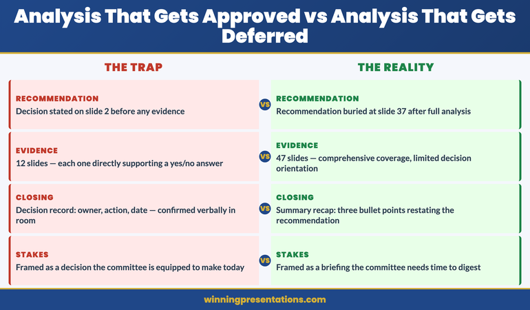
The decision was deferred three months. The same analysis, restructured to a single decision on slide 2 and twelve supporting slides, was approved in the first meeting of the next quarter. Nothing had changed in the research. Everything had changed in the presentation.
I have sat in enough of these meetings to know that the pattern is consistent. The presentations that get deferred are rarely the weakest ones. They are often the strongest ones — thorough, rigorous, comprehensive. They are deferred because thoroughness, in the wrong structure, produces exactly the wrong outcome. A committee that has spent forty minutes processing evidence is not in an optimal state to decide. It is fatigued. It is uncertain about what it has been asked to do. And it is running out of time.
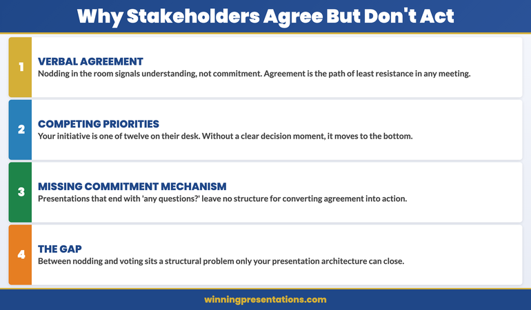
Deferral is the committee’s polite way of saying: we did not know what we were deciding until it was too late to decide it well.
Turn Your Next Board Presentation Into a Decision Session
The Executive Slide System is built around the principle that boards decide when they can see the decision clearly. The templates and playbooks are structured so that every slide is in service of a single, visible ask — not a comprehensive briefing.
- 26 executive presentation templates — including decision-first board structures that state the ask on slide 2
- 93 AI prompts for drafting, refining, and stress-testing your board narrative
- 16 Scenario Playbooks — including risk committee, capital allocation, and compliance approval structures
- 7 Checklists — including a deferral-risk diagnostic you can apply to any existing deck before you present
The Executive Slide System — £39, instant access
Get the decision-first frameworks →
Designed for executives presenting to boards, risk committees, and governance bodies where deferral is the default outcome of an information-first structure.
Why Thorough Analysis Gets Deferred
The paradox is real, but it is not mysterious once you understand what deferred decisions are actually measuring.
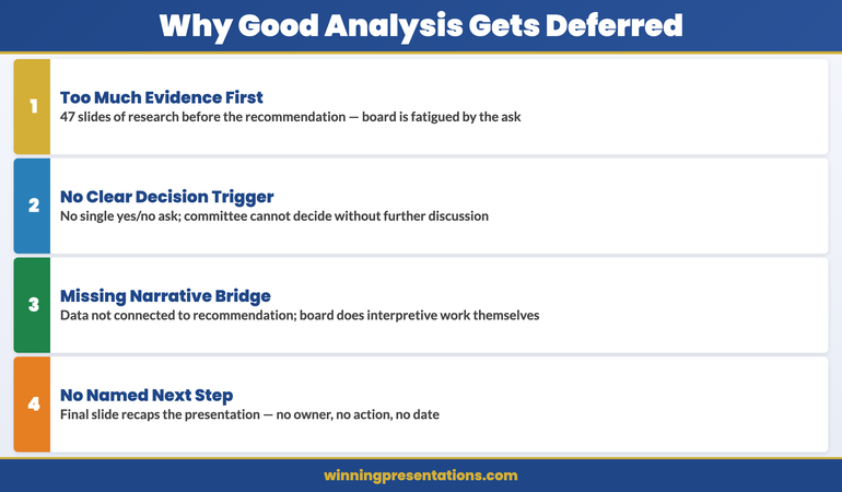
Comprehensive analysis creates an orientation problem. A board member encountering forty-seven slides of evidence is processing information without a frame. They do not yet know what they are being asked to decide, so they cannot evaluate the evidence as decision-relevant material. They evaluate it as information — and information without a decision frame produces uncertainty, not confidence. By the time the recommendation arrives on slide thirty-eight, the room is cognitively overloaded and time-pressed.
The relationship between this and why data slides often fail to convince is direct. Data without a decision frame is data. Data that arrives after the recommendation is evidence. The same numbers produce a completely different response depending on where they sit in the sequence.
Thorough analysis signals that the decision is complex. A forty-seven slide deck tells a committee that this is a complicated matter requiring careful deliberation. That signal is unintentional, but it is powerful. A twelve-slide deck with the decision on slide 2 tells a committee that this is a prepared, structured ask that can be evaluated in the time available. The first presentation creates conditions for deferral. The second does not.
The closing structure almost always fails. The most common closing slide in an executive presentation is a summary: three bullet points recapping the recommendation and supporting rationale. This structure does not produce decisions. It produces a review of what has already been said — and an implicit signal that the meeting’s work is done, the presenter has finished, and the committee can now either decide or defer at their discretion. Most committees, given that choice at the end of a long analytical session, defer.
Understanding how board decisions are shaped before the meeting begins is useful here: the committee’s appetite for a decision is partly determined by how clearly the decision was signalled in advance. A presentation that signals “decision required” from the title slide creates a different committee dynamic than one that signals “analytical briefing.”
The diagnosis is straightforward: a presentation that places evidence before recommendation is an information session. Boards tolerate information sessions. They do not decide in them. Converting an information session into a decision session requires a structural change, not a content change. The evidence you have already prepared is sufficient. What needs to change is the sequence in which you present it.
The Deferral Diagnostic
The Deferral Diagnostic is a three-question test. Apply it to any deck before you present it. If any answer is no, your presentation is currently structured as an information session.
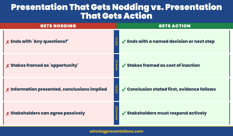
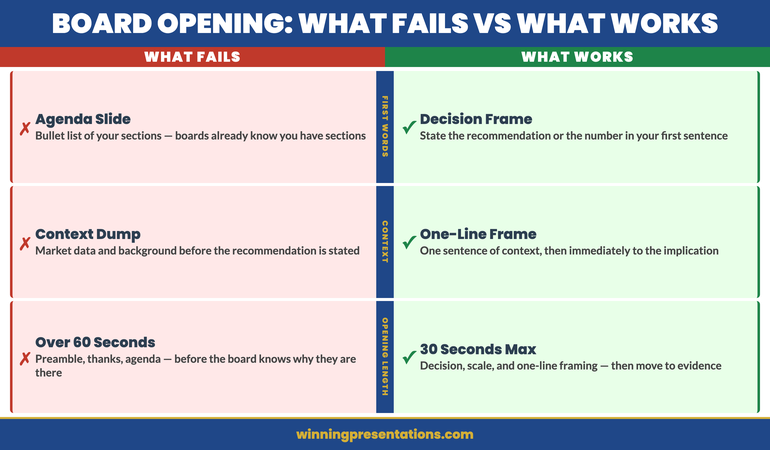
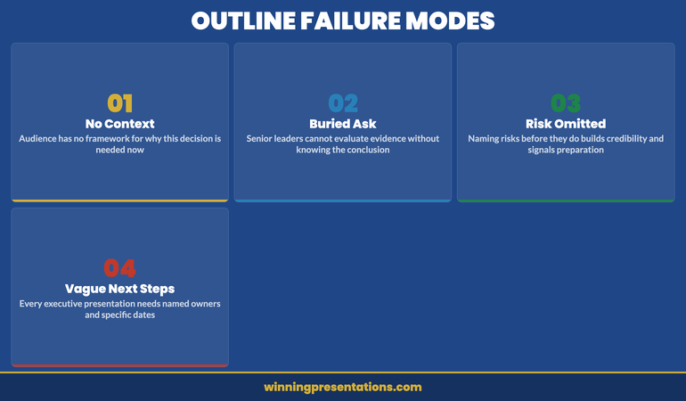
Question 1: Is the decision stated before the evidence? Find slide 2. Read it. Does it state what decision is being requested in one sentence? Or does it provide context, background, or problem framing? If it does the latter, your deck is structured as evidence-first. The committee will encounter the recommendation after they have processed the analysis — which is the wrong order for a governance body operating under time pressure.
Question 2: Is there a concrete ask with a yes or no answer? Read your recommendation. Can a board member say yes or no to it? Or does it require further deliberation, further information, or further discussion before any answer is possible? “We recommend a strategic review of our market positioning” is not a yes/no ask. “We are requesting approval for a £14m investment in the new client onboarding platform, with an implementation start date of 1 October” is. If your ask cannot be answered yes or no in the room, you are presenting information, not requesting a decision.
Question 3: Does the closing slide name an owner and a date? Find your final slide. Does it specify what happens next, who owns it, and by when? Or does it summarise the presentation and thank the committee? The closing slide is where most presentations leave a decision unresolved. A decision record — owner, action, date, confirmed verbally before the room disperses — converts a presentation that ended with agreement into one that ended with commitment.
This diagnostic connects directly to the agreement trap: when a presentation ends without a decision record, the verbal agreement around the table evaporates the moment the room disperses. The Deferral Diagnostic catches this structural failure before you walk in, not after you walk out.
Apply these three questions to your last three board presentations. The pattern you find will tell you whether you have a content problem or a structure problem. In most cases, it is structure.
The Executive Slide System includes 93 AI prompts for drafting decision-ready board presentations — including prompts specifically designed to structure your analysis so that the recommendation precedes the evidence and the closing slide produces a named commitment. See the full prompt library →
The Strategy Director Who Used 11 Slides
In 2015, I observed a market entry decision at a corporate bank. Two presentations were scheduled in the same committee meeting: one from the head of compliance (forty-one slides, evidence-first), and one from the strategy director (eleven slides, decision-first).
The compliance presentation covered the regulatory landscape in meticulous detail before arriving at a recommendation on slide thirty-seven. The committee chair called it “thorough” and deferred it for further consideration. The meeting moved on.
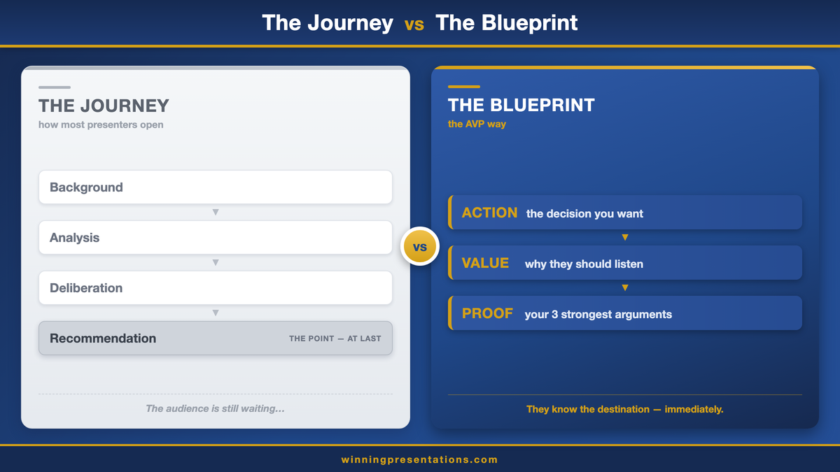
The strategy director presented next. Her eleven slides opened with the market entry decision on slide 2: a single sentence, a stated ask, a yes/no framing. The evidence followed across eight slides, each of which was explicitly in service of the ask. Her final slide was a decision record: two names, two actions, two dates.
The committee approved the market entry with modifications in forty minutes. The strategy director’s analysis was less comprehensive than the compliance presentation. Her market data was thinner. Her regulatory modelling was acknowledged as incomplete. And the committee decided anyway — because the structure of her presentation had equipped them to evaluate what she was asking against what she had provided, rather than to assess the totality of the evidence and determine for themselves what the decision should be.
Boards are not reluctant to decide. They are reluctant to decide when the decision is not clear, the ask is not precise, and the closing structure does not name an owner. The strategy director had addressed all three. The compliance team had addressed none of them — despite producing far more thorough analysis.
The practical implication is counter-intuitive: if you are concerned that your analysis is not comprehensive enough to support the decision, the answer is rarely more slides. It is a tighter decision frame. The so-what ladder gives you the tool for connecting every piece of evidence to the decision, explicitly and without leaving the interpretive work to the committee.
The compliance team’s next presentation to the same committee — restructured using the Deferral Diagnostic — was approved in a single meeting. Nothing had changed in the underlying analysis. The structure had changed entirely.
The Structural Fix
Before your next board presentation, apply the Deferral Diagnostic and make three structural changes if any answer is no.
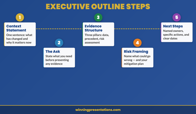
Change 1: Put the decision on slide 2, in one sentence. Write the sentence now: what you are asking the board to approve, fund, authorise, or decide, with a number or date if applicable. If you cannot write this sentence, your ask is not yet decision-ready — and no amount of analysis will compensate for an ask that cannot be stated in one sentence.
Change 2: Change the final slide to a decision record. Replace your summary or recap slide with a table: Action, Owner, Date. Pre-populate it with what you believe the next steps should be and who should own them. Present this slide in the meeting, confirm or adjust with the room, and leave with verbal agreement on each line. Send a confirmation within twenty-four hours. This one change converts a presentation that produced polite attention into one that produced accountability.
Change 3: Remove every slide that does not support a yes or no. Read through your evidence slides and ask one question of each: does this help the committee say yes or no to the decision on slide 2? If the answer is no — if the slide is context, background, or comprehensive coverage that does not bear directly on the ask — move it to an appendix. Most decks can shed thirty to forty percent of their slide count without losing any decision-relevant evidence. What they shed is the material that makes comprehensive analysis feel like an information session rather than a decision request.
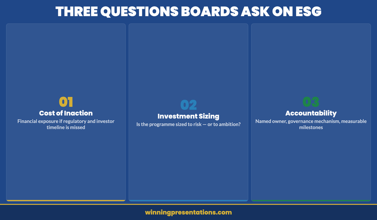
For high-stakes board submissions where the decision has significant consequences and the committee is experienced and thorough, presenting ambiguous data to executives addresses a closely related challenge: how to present evidence that is inherently uncertain without converting a decision session back into an analytical discussion.
The next time your analysis is excellent and the decision is deferred, do three things instead: state the decision first, end with the ask, and confirm the owner before you leave the room. The quality of your analysis is not in question. The architecture of your presentation is.
Stop Presenting to Inform — Start Presenting to Decide
- 7 Checklists — including a deferral-risk diagnostic and decision-close template you can use before every board presentation
- 16 Scenario Playbooks — structured guidance for risk, compliance, capital allocation, and strategic presentations where deferral is the most common outcome
Executive Slide System — £39
For major buy-in and approval presentations
If the decision you are requesting is a significant one — strategic investment, board-level approval, major resource allocation — the Maven Buy-In Presentation System provides a complete framework for structuring the case, managing the committee dynamic, and securing approval in the first meeting rather than the third.
Frequently Asked Questions
Why does thorough analysis often result in a deferred board decision?
Comprehensive analysis creates a problem of orientation. When a board encounters extensive evidence before encountering the recommendation, they spend cognitive resources processing information without yet knowing what they are being asked to decide. By the time the recommendation arrives, the committee is often fatigued, time-pressed, or uncertain whether they have absorbed the right material. The result is deferral — not because the analysis was insufficient, but because the architecture was wrong.
How should a board presentation be structured to get a decision in the first meeting?
The recommendation should precede the evidence. State the decision being requested on slide 2, in one sentence. Follow with the minimum evidence required to evaluate it. End with a decision record — owner, action, date. This structure converts an information session into a decision session. Boards are equipped to say yes or no when they know what they are being asked before they encounter the data. For the specific problem of structuring evidence after a decision-first opening, the so-what ladder is the most reliable technique for keeping every evidence slide decision-relevant.
Is it possible to present too much analysis to a board?
Yes. The threshold at which additional evidence becomes counterproductive varies by committee, but most experienced presenters who have restructured from evidence-first to decision-first find they can reduce slide count by 30–40% without reducing the quality of the decision. The evidence that survives the cut is the evidence that directly supports a yes or no — everything else is background that can go into appendices or pre-reads.
What is the Deferral Diagnostic for executive presentations?
The Deferral Diagnostic is a three-question test you apply to your deck before presenting: Is the decision stated before the evidence? Is there a concrete ask with a yes/no answer? Does the closing slide name an owner and a date? If any answer is no, your presentation is currently structured as an information session. Boards defer information sessions. They decide on decision sessions.
The Winning Edge — weekly executive communication insights
Join executives across financial services, technology, healthcare, and government who receive The Winning Edge every Thursday — practical frameworks for board presentations, decision-forcing structures, and executive communication techniques you can use in your next meeting.
If you want a quick reference before your next board presentation, the Executive Presentation Checklist includes the Deferral Diagnostic as a pre-presentation review you can complete in under three minutes.
Related: If board members are skipping ahead in your deck before you reach your main point, read Why Board Members Look at Slide Three Before You’ve Finished Slide One — the structural problem that makes pre-reading rational, and the fix that makes it unrewarding.
Mary Beth Hazeldine is Owner & Managing Director of Winning Presentations. With 24 years of corporate banking experience, she advises executives across financial services, healthcare, technology, and government on structuring presentations for high-stakes decisions and board approvals.