Quick Answer
A board agenda presentation should open with the decision required, provide the briefest possible context, and lead directly to the recommendation — before any supporting analysis. When the structure mirrors how board directors actually process information, meetings run faster, questions become more focused, and approvals happen at the table rather than being deferred to a follow-up email.
In This Article
Ngozi had been Board Secretariat Director at a major infrastructure company for six years. She had seen every version of a badly presented board agenda — the 58-slide decks that covered everything except what the board actually needed to vote on, the presenters who spent 40 minutes on context before arriving at the recommendation with four minutes left on the clock, and the agenda items that required three follow-up emails because the decision criteria were never made clear in the room.
When she began coaching the executive team on how to present to the board, she started with one rule: the board is not a classroom. Directors arrive having read the papers — or having had them summarised by their assistants. They are not there to receive information. They are there to test it, challenge it, and reach a decision. Any presentation that treats them as an audience receiving new content for the first time has misread the room entirely.
The executives who restructured their agenda presentations to lead with the decision, not the discovery, found that their items consistently ran to time. The ones who persisted with the context-first approach were the ones whose agenda items got bumped, or who received a polite letter asking for more information before a decision could be reached.
Presenting to the board in the next few weeks?
Before you finalise your slides, check whether your agenda presentation structure matches how board directors actually process information. The Executive Slide System includes board-specific slide frameworks designed for the decision-first format. Explore the System →
What a Board Agenda Presentation Must Achieve
A board agenda presentation has one purpose that is different from almost every other type of executive presentation: it must compress weeks or months of work into the time allocation on the agenda and arrive at a clear, recordable decision. This is not a presentation that is trying to educate or persuade in a general sense. It is a presentation with a defined outcome — a vote, an approval, a ratified recommendation — that must happen within a specific window.
Most presenters underestimate how different this purpose is from their regular internal presentations. In an internal meeting, the presenter controls the pace and can extend time if needed. In a board meeting, the agenda is set, the secretary is tracking time, and other agenda items are waiting. Running over is not a minor inconvenience — it compresses every subsequent discussion or forces items to be deferred entirely.
Understanding this changes what the presentation needs to contain. Every slide must serve the decision, not the education. If a slide does not bring the board closer to a clear yes, no, or not yet, it may not belong in the presentation at all. This is a hard test for presenters who have invested significant effort in research and analysis, because it means most of that work does not appear on the slides. It appears in the appendix, available if questioned, but not presented in the room.
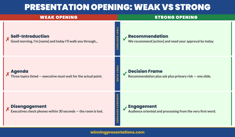
The presentations that achieve their purpose at the board table are the ones that answer three questions before the first substantive slide: What is being decided? Why does it matter now? What is the recommendation? When those three answers are visible within the first two minutes, the rest of the presentation becomes a structured test of that recommendation rather than a journey of discovery.
The Difference Between the Agenda and the Presentation
There is a distinction that many presenters collapse, and it costs them time in the room. The board agenda is the list of items to be covered in the meeting. The board agenda presentation is the structured argument for a specific item on that agenda. Treating them as the same thing leads to presentations that try to be both — covering the agenda format, the context, the process, the data, and the recommendation — instead of focusing exclusively on the decision the board needs to make.
When you are presenting an agenda item, your only job is to make that decision easier. Everything before the meeting — the board paper, the pre-read, the executive summary — is where context, background, and detailed analysis belong. The presentation slot is for the three things directors cannot get from reading alone: the live recommendation, the presenter’s judgement, and the opportunity to interrogate both in real time.
This means the presentation should be considerably shorter than the supporting paper. If your board paper runs to 15 pages and your agenda presentation runs to 20 slides, something has gone wrong. The paper contains the substance. The presentation surfaces the recommendation and provides the structure for a focused discussion.
For guidance on how the paper and the presentation should relate to each other, the analysis in board paper vs board presentation covers the structural differences in detail. The short version: the paper argues the case; the presentation asks for the decision.
Executive Slide System
Build Board Presentations That Get Decisions at the Table
The Executive Slide System is a structured toolkit for executives who present to boards and senior leadership. It includes slide templates for governance and decision meetings, AI prompt cards to build your deck fast, and scenario-specific frameworks for the moments when the standard approach does not work.
- Slide templates designed for board-level decision items
- AI prompt cards to structure your recommendation quickly
- Framework guides for high-stakes governance presentations
- Scenario playbooks for budget, crisis, and performance items
Get the Executive Slide System — £39
Designed for board and executive presentations across regulated industries.
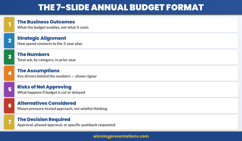
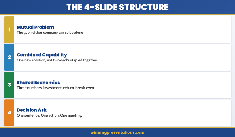
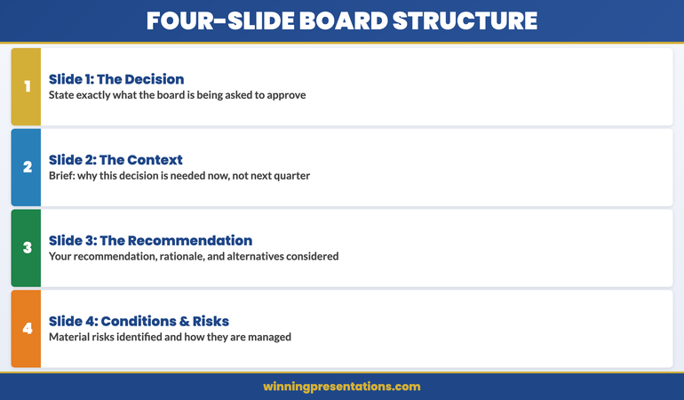
The Four-Slide Structure That Supports Fast Board Decisions
The most effective board agenda presentations — regardless of the subject matter — tend to follow a consistent four-part structure. Not four topics. Not four chapters. Four slides, or four sections, each doing a specific job.
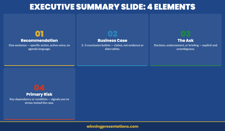
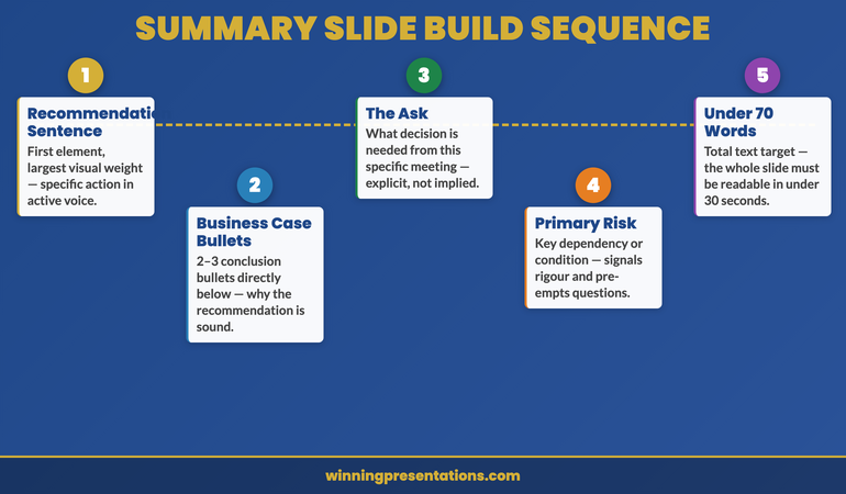
Slide 1: The decision. State what the board is being asked to approve, ratify, or reject. This is not a title slide. It is a statement: “The board is asked to approve the acquisition of [asset] at a maximum consideration of [figure], subject to [conditions].” That sentence belongs on slide one. Everything that follows is in service of it.
Slide 2: The context. This is the briefest possible explanation of why this decision is on the agenda now. Not the full history. Not the market analysis. The one or two facts that explain why this cannot wait for next quarter and why this board, at this meeting, is the appropriate decision-making body. Two minutes of speaking time is enough. If you need more, the context belongs in the paper.
Slide 3: The recommendation. Your recommendation, your rationale, and the criteria you used to arrive at it. This is where your professional judgement is on the table. The board is testing whether your reasoning process is sound, not just whether the conclusion is commercially reasonable. State how you reached the recommendation, what alternatives you considered, and why you discarded them.
Slide 4: The conditions and risks. What conditions must hold for this recommendation to remain valid? What are the two or three risks the board should be aware of, and how are they being managed? This slide completes the picture without burying the recommendation in caveats. The board can ask questions before a vote, but they need to know the material risks have been identified.
Everything else — the detailed financial model, the stakeholder analysis, the regulatory review — goes into the appendix. Present it only if asked. This structure works because it mirrors how experienced board directors read a board paper: recommendation first, rationale second, detail if needed.
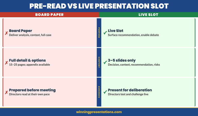
Pre-Read Versus Presenting Live
One of the most common errors in board agenda presentations is treating the live slot as the moment to deliver information that should have been in the pre-read. This typically happens because the presenter is not confident the board has read the paper, and so they attempt to cover it in the presentation just in case.
This is understandable, but it creates two problems. First, for directors who have read the paper, it is a waste of their time — and experienced board members notice when their preparation is being ignored. Second, it compresses the time available for discussion, which is the only thing the live slot can do that the paper cannot.
The discipline required is to trust the pre-read process and design the presentation for board members who have read the paper. If some directors have not read it — which will happen — that is a governance process issue, not a presentation design problem. Redesigning the presentation to accommodate unprepared directors penalises the ones who did prepare.
Where live presentation genuinely adds value is in three areas: demonstrating personal conviction in the recommendation, answering questions that the paper could not anticipate, and providing a structured moment for discussion before the vote. A well-designed agenda presentation creates space for all three without re-presenting the paper.
A common error is treating the follow-up after the meeting as the primary channel for this kind of engagement. The board presentation follow-up protocol outlines what belongs after the meeting — but the live slot is where the recommendation is tested and approved, not merely noted.
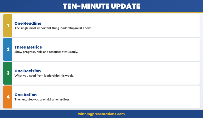
Building Timing Discipline Into the Agenda
Time allocation in a board meeting is not a suggestion. When the agenda assigns 15 minutes to an item, that includes the presentation, discussion, and decision. A presentation that runs to 14 minutes leaves one minute for discussion and forces the chair to cut off debate or extend the meeting at the expense of later items.
The practical rule is that presentation speaking time should not exceed one-third of the allocated agenda time. A 15-minute item allows five minutes of presentation. A 30-minute item allows ten. This feels impossibly short until you have designed a presentation using the four-slide structure — at which point it becomes entirely workable, because the structure removes everything that does not serve the decision.
Build in two explicit pauses. One after the context slide, to invite clarifying questions on the situation before you present the recommendation. One after the recommendation and risks slide, to open structured discussion. These pauses are not weaknesses in the presentation — they are part of the design, and experienced board chairs appreciate presenters who manage the conversation structure as well as their own material.
For the board’s broader governance expectations around presentation structure, the guidance in board presentation best practices covers how to align timing, format, and decision language with what different types of boards expect. The one consistent finding across organisations and sectors is that boards reward brevity more reliably than they reward comprehensiveness.
If you present regularly to boards or governance committees and find that your items are frequently deferred or lead to follow-up requests rather than decisions, the Executive Slide System includes decision-first slide templates specifically designed for board and governance contexts.
Common Mistakes That Stall Board Decisions
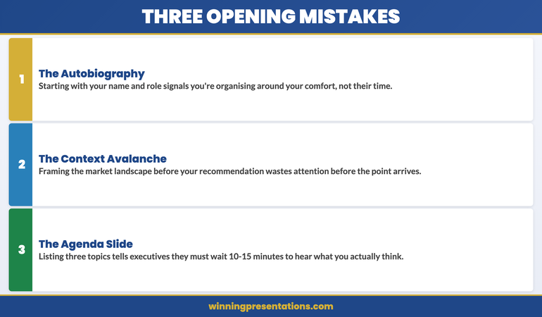
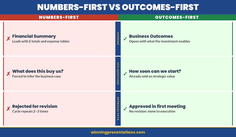
The most consistent reason board decisions are deferred is not lack of information — it is lack of clarity about what is being decided. When the decision itself is ambiguous, board members cannot vote on it. They ask for more information as a proxy for needing more clarity, which triggers a research cycle that could have been avoided if the decision statement had been made precise before the meeting.
The second most common reason for deferral is insufficient visibility of the recommendation before the discussion. If directors do not know what the presenter is recommending until slide 15 of 22, they spend the preceding slides forming their own conclusions from the partial information available. By the time the recommendation appears, some directors have already decided to push back — not because the recommendation is wrong, but because it does not match the conclusion they formed from the incomplete earlier slides. Present the recommendation early, and the subsequent discussion becomes a test of that recommendation rather than a competition of conclusions.
A third pattern worth noting: presentations that address every possible objection in the main slides tend to produce longer discussions, not shorter ones. When a presenter anticipates every conceivable challenge and answers it before it is raised, it signals that they know the recommendation is vulnerable and have tried to pre-empt resistance. This tends to make board members more sceptical, not less. Address the two or three material risks clearly and honestly, and let the board raise other questions in discussion. The confidence to allow questions is itself part of the recommendation.
Executive Slide System
Slide Templates Built for Board-Level Decision Items
Structure your board agenda presentation using decision-first templates designed for governance meetings, approvals, and high-stakes budget items.
Get the Executive Slide System — £39
Designed for board presentations across financial services, infrastructure, and regulated sectors.
Frequently Asked Questions
How many slides should a board agenda presentation have?
For a 15-minute agenda item, three to five slides is typically the right range. The structure is: decision, context, recommendation, risks and conditions — with an appendix available for detailed supporting material. More slides rarely improve the quality of board discussion; they usually extend presentation time at the expense of the debate that leads to a decision. If you find yourself needing more than five slides to make the case, the issue is usually that the recommendation is not clear enough yet.
What is the difference between a board paper and a board agenda presentation?
The board paper is the written document circulated in advance — it contains the full analysis, background, options considered, and recommendation. The board agenda presentation is the live slot: typically much shorter, designed to surface the recommendation and structure the discussion, not to repeat the paper. Experienced presenters treat the paper as the argument and the presentation as the moment to test and ratify that argument in the room. Repeating the paper content in the live slot frustrates directors who have prepared and wastes the only time available for genuine deliberation.
How do you handle board directors who ask questions mid-presentation before you have reached the recommendation?
Take the question seriously, answer it briefly, and signal where in the structure the fuller answer appears. “That is exactly the right question — I will address the financial conditions directly when we reach the recommendation slide, which is next. The short answer is [brief answer].” This acknowledges the director’s point without disrupting the structure. If the question is about something in the paper rather than the presentation, it is appropriate to say so: “That detail is on page four of the supporting paper — I can walk you through it now or we can cover it in the discussion section.”
The Winning Edge — Weekly Newsletter
Each Thursday: one executive presentation insight, one structure, one practical tool. No filler. Read by executives across financial services, healthcare, and technology.
Preparing your first board presentation or refining an existing one? The Executive Presentation Checklist is a free download covering structure, language, and timing for board and senior leadership settings.
About the Author
Mary Beth Hazeldine is Owner and Managing Director of Winning Presentations. With 25 years of corporate banking experience at JPMorgan Chase, PwC, Royal Bank of Scotland, and Commerzbank, she advises executives across financial services, healthcare, technology, and government on structuring presentations for high-stakes funding rounds, board approvals, and governance reviews. View services | Book a discovery call