The CFO looked at slide 38 and said eleven words: “Why should I fund something you can’t explain in one slide?”
Already preparing a CapEx presentation for next week?
If your capital expenditure presentation is treating the CFO as a gatekeeper instead of a strategic partner, the slide structure is working against you. The Executive Slide System includes CapEx-specific templates designed to frame financial approval as a shared investment decision.
Jump to Section
- The CapEx Request That Taught a VP a Costly Lesson
- Reframing CapEx: From Spending Request to Strategic Investment
- The Four-Slide CapEx Structure That CFOs Actually Approve
- Pre-Empting the Three CFO Objections That Kill CapEx Requests
- The Payback Slide That Changes How Finance Sees Your Request
- Why Timing Your CapEx Presentation to Budget Cycles Matters More Than Content
- Frequently Asked Questions
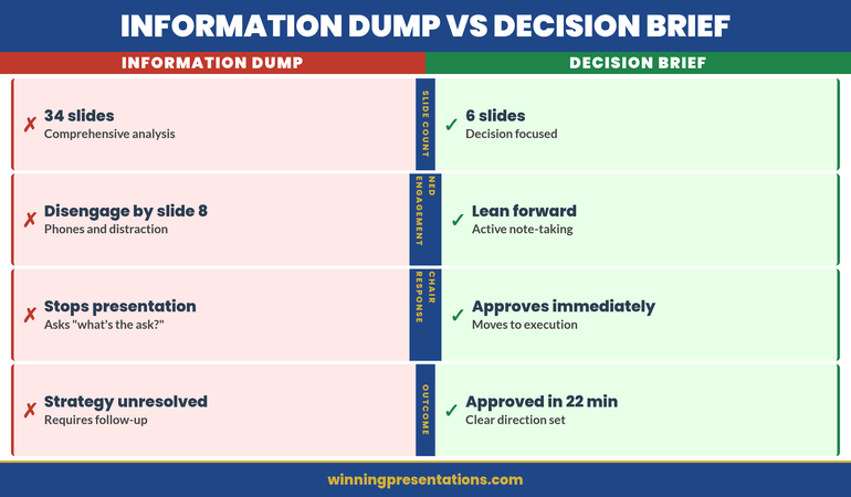
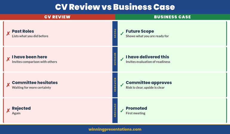
Kenji was the VP of Operations at a mid-sized logistics company. He’d built a solid business case for warehouse automation—a £2.3M investment that would reduce processing time by 40% and cut staffing needs by 18 positions over three years. He’d been careful. Three months of vendor evaluation. Detailed ROI analysis. Risk mitigation plan. He walked into the CFO’s office with a 35-slide presentation, confident the numbers would speak for themselves. The CFO watched him through the first four slides, then stopped him: “You haven’t told me why you’re here. Show me the business outcome first, then come back to the technical detail.” Kenji went back to his desk and restructured the deck. Business problem—first slide. Payback period—slide two. The CFO pre-read the new version, approved it in their next meeting, and told him: “I would have approved this the first time if you’d led with what we were solving, not what we were buying.”
Build the CapEx Presentation That Turns Your CFO Into Your Strongest Advocate
- Deploy slide templates designed specifically for capital expenditure approvals—structured around the financial logic CFOs use to evaluate long-term investments
- Use AI prompt cards that translate technical infrastructure needs into business outcome language Finance teams respond to
- Build payback period slides that show the cost of delay, not just the cost of the investment
- Include the decision-first slide framework that gets CFO alignment before the technical deep-dive
Explore the Executive Slide System →
Built from 24 years presenting capital expenditure cases in banking—where CapEx approvals required sign-off from Finance, Risk, and the board in the same meeting.
Reframing CapEx: From Spending Request to Strategic Investment
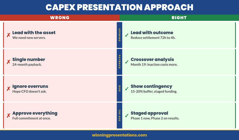
Most capital expenditure presentations open with the asset. “We need new servers.” “We need to upgrade the CRM.” “We need to replace the trading platform.” Every one of those sentences positions the CFO as a gatekeeper. You’re asking permission to spend money.
The reframe that changes the entire dynamic: open with what becomes possible after the investment. Not “we need new servers” but “we can reduce settlement processing from 72 hours to 4 hours, which eliminates the manual reconciliation that costs us £180k annually in labour and exposes us to regulatory risk every quarter.”
Now the CFO is evaluating a business outcome, not a purchase request. The conversation shifts from “can we afford this?” to “can we afford not to do this?”
This is not a language trick. It’s a structural decision about where your presentation starts. When your budget presentation leads with the business outcome, every subsequent slide—technical architecture, vendor selection, implementation timeline—becomes evidence supporting a decision the CFO already wants to make.
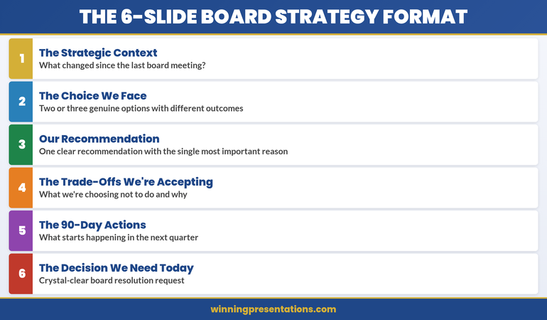
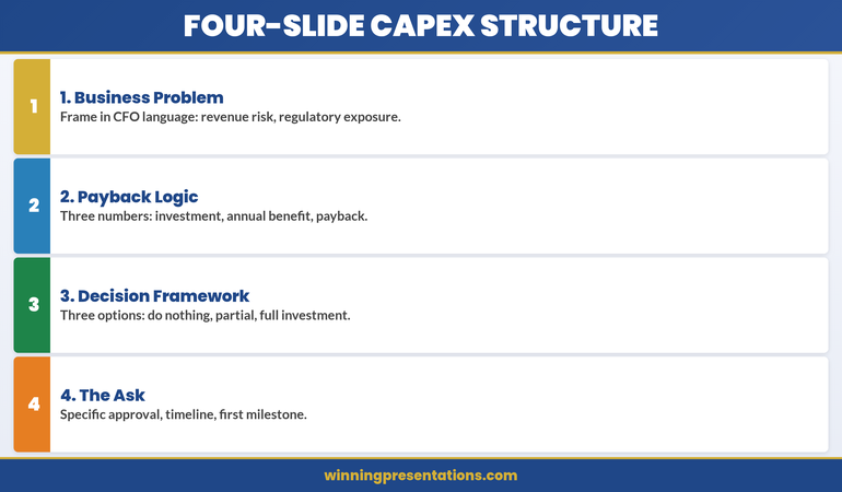
The Four-Slide CapEx Structure That CFOs Actually Approve
After watching capital expenditure presentations succeed and fail across four global financial institutions, I’ve identified a four-slide opening sequence that consistently gets CFO alignment before the technical detail begins.
Slide 1: The Business Problem Statement (Not the Technical Problem)
Frame the problem in language the CFO uses in their own presentations to the board. Revenue at risk. Regulatory exposure. Operational cost that scales with growth. Manual processes that prevent the team from working on higher-value activities. One slide. Two to three sentences. No technical jargon.
Slide 2: The Payback Logic
Not a full financial model—that goes in the appendix. Show three numbers: total investment, annual benefit, payback period. If the payback period is under 18 months, the CFO’s next question is about risk, not cost. If it’s over 24 months, you need a strategic justification on this same slide. Either way, the CFO now has the financial frame before seeing any technical detail.
Slide 3: The Decision Framework
Show the three options you evaluated and why you recommend this one. Not a vendor comparison—a decision comparison. Option A: do nothing (cost of status quo). Option B: partial upgrade (cost and limitations). Option C: full investment (cost and full benefit). The CFO sees that you’ve already done the analysis they would have asked for.
Slide 4: The Ask
State the specific approval you need, the timeline, and the first milestone. “We’re requesting £1.8M in CapEx for Q2 implementation, with first measurable benefit by Q3.” This is the slide where the CFO decides whether to keep listening or start asking questions. If you’ve structured slides one through three correctly, they keep listening.
Pre-Empting the Three CFO Objections That Kill CapEx Requests
Every CFO evaluating a capital expenditure request runs the same mental checklist. If your presentation doesn’t address these three objections before the CFO raises them, you’ve lost control of the conversation.
Objection 1: “What happens if the project overruns?”
CFOs have been burned before. Every CapEx request promises on-time delivery. Few deliver it. Your presentation needs a slide that acknowledges implementation risk honestly. Show your contingency budget (typically 15-20% of total). Show your milestone-based funding structure—if phase one doesn’t deliver the expected benefit, phase two funding is re-evaluated. This tells the CFO you’ve thought like a CFO, not like a project manager.
Objection 2: “Can we lease instead of buy?”
This is the CFO testing whether you understand the difference between CapEx and OpEx. If leasing is genuinely worse for this scenario, show why: higher total cost over the asset life, less control over upgrades, vendor dependency. If leasing is actually viable, acknowledge it—and show why ownership is better for this specific case. The worst answer is ignoring the question entirely.
Objection 3: “Why now? Can this wait until next fiscal year?”
This is the timing objection, and it kills more CapEx requests than budget constraints do. Your answer needs to be specific: what gets more expensive, more complex, or more risky if you delay twelve months? Quantify the cost of waiting. If the vendor’s pricing expires, say so. If a regulatory deadline makes this urgent, show the compliance timeline. If the team will lose capacity to competing projects in Q3, map it out.
If you address these three objections in your slides before the CFO raises them, something powerful happens: the CFO stops evaluating and starts advocating. They’ve seen that you understand their concerns. Now they’re helping you refine the proposal instead of challenging it.
Need to Present CapEx to Your CFO This Quarter?
Explore the slide templates designed to structure capital expenditure requests around the financial logic CFOs use to evaluate investments.
The Payback Slide That Changes How Finance Sees Your Request
Most CapEx presentations show a payback period as a single number. “24-month payback.” The CFO nods, writes it down, and moves to the next proposal that has a shorter one.
The payback slide that actually changes the conversation shows three things simultaneously: the cost of the investment, the cost of not investing, and the crossover point where doing nothing becomes more expensive than doing something.
Here’s what that looks like in practice. Your current system costs £420k per year in maintenance, workarounds, and manual processing. That cost increases by 12% annually as the system ages and the team grows. The new system costs £1.2M to implement and £180k annually to maintain. The crossover point—where cumulative cost of the old system exceeds cumulative cost of the new system—is month 19.
Now the CFO isn’t evaluating whether to spend £1.2M. They’re evaluating whether to keep spending £420k (and rising) per year on a system that’s getting worse. The CapEx request becomes the financially responsible choice, not the expensive one. This is the difference between presenting to a CFO who sees you as a cost centre and a CFO who sees you as a strategic partner.
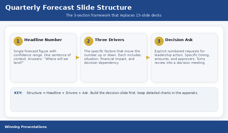
If you’re also presenting quarterly forecasts alongside your CapEx case, the forecast presentation structure that simplifies complex financial data works on the same principle: show the trajectory, not just the snapshot.
Why Timing Your CapEx Presentation to Budget Cycles Matters More Than Content
You can build the perfect capital expenditure presentation and still get rejected if you present it at the wrong point in the budget cycle. CFOs think in cycles: annual planning, quarterly reviews, mid-year reforecasts. Each cycle has a different appetite for new expenditure.
The best window for CapEx approval is during annual planning (typically Q4 for the following year) when the CFO is actively allocating budget. The second-best window is immediately after a strong quarterly result, when there’s confidence in the financial outlook. The worst window is mid-quarter after a miss, when every new expenditure feels like a threat to the reforecast.
If you’re forced to present outside the ideal window, acknowledge it explicitly: “I know we’re mid-cycle, and I wouldn’t bring this outside planning season unless the timing risk justified it.” Then show why waiting for the next planning cycle costs more than approving now.
This is how experienced capital expenditure presenters operate. They don’t just build better slides—they time the conversation to match the CFO’s mental state about spending. The same proposal gets rejected in February and approved in October, not because the numbers changed, but because the context did.
Stop Losing CapEx Approvals to Structure Problems
- Slide templates that lead with business outcomes and payback logic—so the CFO evaluates strategy, not just cost
- AI prompt cards that help you frame capital expenditure in the language Finance teams use to justify investment to the board
Explore the Executive Slide System →
Designed for capital expenditure presentations where the CFO needed to see payback logic before technical detail—and approved the investment in the pre-meeting.
People Also Ask
How many slides should a capital expenditure presentation have?
What’s the difference between a CapEx presentation and a budget presentation?
Should I include vendor details in a capital expenditure presentation?
Is This Approach Right for You?
This is for you if:
- You’re presenting a capital expenditure request to a CFO or finance committee and need approval, not just acknowledgement
- Your previous CapEx requests have been deferred or sent back for “more financial detail”
- You’re a technical leader who needs to translate infrastructure investment into business language
- Your organisation requires formal CapEx approval and you want to get it done in one meeting, not three
This is NOT for you if:
- Your CapEx request is under £10k and follows a simplified approval process
- You’re presenting to a technical committee only, with no Finance stakeholders in the room
- Your organisation doesn’t distinguish between CapEx and OpEx approvals
Frequently Asked Questions
My CFO keeps asking me to “come back with more detail” on CapEx requests. What am I doing wrong?
Should I present CapEx separately or include it in my quarterly review?
How do I handle a CapEx presentation when the CFO has already said no once?
The Winning Edge — Weekly
Advanced presentation strategy and executive communication insights. One email. Every week. No fluff, no sales pitch—just the frameworks that get decisions approved.
Free resource: Executive Presentation Diagnostic Checklist
Read These Next
- Budget Presentation Template: The CFO-Approved Structure
- How to Present to a CFO: The Financial Logic That Gets Yes
- The Quarterly Forecast Presentation Everyone Dreads (Simplified)
- The Body Scan Technique: 90 Seconds to Reset Before Any Presentation
- Post-Q&A Follow-Up: The Email That Converts “We’ll Think About It”
About the Author
Mary Beth Hazeldine is Owner & Managing Director of Winning Presentations. With 24 years of corporate banking experience at JPMorgan Chase, PwC, Royal Bank of Scotland, and Commerzbank, she advises executives across financial services, healthcare, technology, and government on structuring presentations for high-stakes funding rounds and approvals.