The CFO paused halfway through the IR update. Three investors were leaning forward. One had already opened a notebook. The problem wasn’t the numbers — the numbers were fine. The problem was the slide order.
She’d led with detailed pipeline figures before establishing the headline performance narrative. So the first question wasn’t “what’s driving the growth?” It was “why is deal conversion down 4 points from last quarter?” A defensible number, buried in context nobody had been given yet, had become the story. The meeting never recovered its footing.
That’s the hidden cost of the wrong investor relations presentation format: it doesn’t just make meetings uncomfortable — it hands control of the narrative to whoever asks the first question.
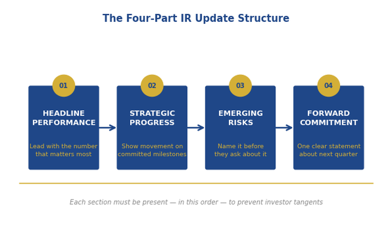
Quick answer: The investor relations presentation format that prevents awkward questions follows a four-part structure: Headline Performance (where you are vs. expectation, one sentence), Strategic Progress (three things moving forward, three metrics), Emerging Risks (flagged proactively, with your mitigation), and the Forward Commitment (what the next 90 days will deliver). Lead with your narrative before they can build their own. Every question that would have caught you off-guard becomes a question you’ve already answered.
📊 Building an investor update this week? The Executive Slide System (£39) includes the IR update template with the exact four-part structure — plus AI prompts to draft each section from your data in under 30 minutes.
Jump to:
I spent 24 years in corporate banking at JPMorgan Chase, PwC, Royal Bank of Scotland, and Commerzbank. In that time I reviewed, prepared for, and sat in on hundreds of investor relations presentations — from routine quarterly updates at listed companies to high-stakes briefings before material announcements.
The pattern that generates awkward questions is almost always the same. The presenter has built the deck in the order they prepared it — data first, narrative second. They’re thinking about what happened. Investors are thinking about what to ask. Those two frameworks collide the moment the first slide appears.
The IR update that prevents awkward questions doesn’t hide information. It leads with the frame that makes every piece of information legible. When you give investors your headline narrative before they’ve had a chance to form their own, most of their questions become clarifying rather than challenging. That’s not spin. It’s structure.
Why IR Updates Trigger the Wrong Questions
Most IR updates fail for a structural reason, not a performance reason. The company may be delivering on every metric that matters. But if the slide deck is ordered by category rather than by argument, investors will fill the narrative gap themselves — usually with their most pressing concern.
There are three slide order mistakes that generate avoidable questions. The first is leading with supporting data before establishing the headline. When the first slides show regional breakdown, pipeline depth, or operational KPIs before the audience knows whether the overall picture is positive or negative, they’re building a judgment while you’re still providing context. Any number that looks anomalous becomes a target.
The second mistake is burying risk disclosure at the back. Investors know risk exists. When they don’t see it flagged early, they assume you’re hiding it — and they’ll surface it themselves, on their terms, in front of the room. Proactive risk disclosure is not weakness. It’s narrative control.
The third mistake is ending without a forward commitment. “We’ll continue to monitor” is not a closing statement. It tells investors there’s nothing concrete to hold you to. The best IR updates close with a specific, time-bound commitment — and it transforms the final question from “what are you going to do about it?” to “we look forward to seeing that.”
The executive presentation structure that works in boardrooms applies to investor updates for the same reason: decision-makers in both contexts need the conclusion before the evidence, not after it.
📈 The IR Update Structure That Keeps Executives in Control of Every Investor Conversation
The Executive Slide System includes the investor relations update template — built around the Headline Performance / Strategic Progress / Emerging Risks / Forward Commitment structure that controls the narrative from slide one:
- The IR update slide order that front-loads your narrative and eliminates ambush questions
- Risk disclosure templates that project confidence, not defensiveness
- Forward Commitment slide format — the closing structure that replaces “we’ll monitor” with a concrete 90-day anchor
- AI prompts to draft each section from your quarterly data in under 30 minutes
- Before/after examples showing how the same data reads completely differently in the wrong vs. right slide order
Get the Executive Slide System → £39
Built from 24 years preparing and reviewing IR presentations at JPMorgan Chase, PwC, and RBS. Used by executives presenting to institutional investors and listed company boards.
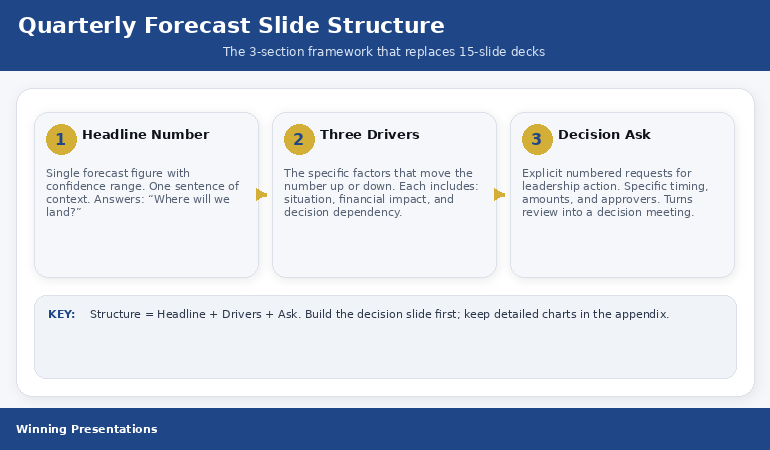
Part 1: Headline Performance — Lead With the Verdict
The first section of your IR update should answer one question in one sentence: are we ahead, on track, or behind — and by how much? Not “revenue was £42.3M against a budget of £41.7M.” The headline is: “We delivered £600k above budget in Q3, driven by enterprise contract timing.”
That single sentence does three things. It establishes the verdict before any supporting data appears. It attributes the result rather than just reporting it. And it signals that you understand your own numbers well enough to summarise them without the slides doing the work for you.
The headline performance section should contain three elements: the headline metric (one number, one comparison), the primary driver (one sentence), and the secondary story (one sentence flagging what’s underneath the headline that you’ll cover in section two). Nothing else. Everything else is supporting data and it belongs in sections two through four or in the appendix.
What this prevents: the opening question that starts with “your revenue was X but your margin was Y — can you explain the delta?” Because you’ve led with the verdict and the driver, investors know the delta is coming. You’ve told them you’re aware of it. The question becomes a clarifier, not a challenge.
Building this IR update structure from scratch? The Executive Slide System (£39) includes the investor update template with pre-built slide layouts for each of the four sections.
Part 2: Strategic Progress — Three Things Moving Forward
After the headline, investors need to see that the business has direction, not just results. The Strategic Progress section gives them three initiatives with three associated metrics — not a comprehensive strategic review, and not a list of everything the management team has been working on.
Three is the ceiling, not the target. Most companies present six, eight, sometimes twelve strategic items. What happens is that investors leave without knowing which three actually matter. They end the meeting uncertain about priorities — and uncertainty generates questions in the next update.
Each strategic item needs one sentence on status and one metric that proves it. “Enterprise pipeline: 23% growth year-on-year, with two contracts in final negotiation.” Not “our enterprise team is working hard on pipeline development.” The metric does the credibility work so you don’t have to.
The frame that makes this work is explicit prioritisation. Not “here are three things we’re working on” — but “these are our three strategic priorities this quarter.” The word ‘priorities’ does significant work. It tells investors these were chosen deliberately, not selected because they showed well.
Part 3: Emerging Risks — Own the Story Before They Ask
This is the section most IR presentations either skip entirely or bury after the strategic highlights. Both choices are mistakes. Investors know every business has risks. When they don’t see risk disclosure, they don’t conclude there are no risks — they conclude the presenter isn’t showing them everything.
Proactive risk disclosure in the third section serves a specific function: it converts potential hostile questions into acknowledged and managed issues. When you present a risk alongside a mitigation, you’ve reframed it. The investor’s question shifts from “are you aware this is a problem?” to “can you tell me more about the mitigation timeline?”
The format is simple. For each risk: one sentence identifying it, one sentence quantifying the potential impact (even qualitatively — “material” vs “manageable”), one sentence on your current mitigation. Maximum three risks. If you have more than three genuine emerging risks, your IR update has a bigger problem than format.
This section also solves the single most common IR meeting failure: the moment late in a Q&A when an investor surfaces a risk the presenter visibly hadn’t planned to discuss. Once you’ve seen that happen from the investor side of the table, you understand immediately why proactive disclosure is protective rather than vulnerable.
⚠️ Stop Losing Control of the Q&A in IR Meetings
When the slide order is wrong, investors control the conversation. The Executive Slide System (£39) includes the investor relations format that front-loads narrative, neutralises ambush questions, and closes with a forward commitment investors can hold you to.
Get the Executive Slide System → £39
Used by finance executives presenting quarterly updates to institutional investors.
Part 4: The Forward Commitment — Replace “Monitor” With a 90-Day Anchor
Most IR updates end with a summary of what happened. The best ones end with a commitment about what comes next. Not “we remain confident in our outlook” — that’s not a commitment, it’s a sentiment. A Forward Commitment names specific outcomes, tied to a timeframe, with a measurable signal.
“By the end of Q4, we expect enterprise deal conversion to return to 18% — up from the current 14% — as the two contracts in final negotiation close. We’ll be in a position to confirm this at the February update.” That’s a commitment. It gives investors something to evaluate you against. It replaces “what are you going to do about it?” with “we’ll hold you to that.”
This closing structure has a secondary benefit that’s underappreciated. When executives commit to a specific, measurable outcome, it forces clarity in their own planning. The act of articulating “we will achieve X by Y” often surfaces unstated assumptions inside the management team that were creating misalignment. The investor relations update becomes a planning discipline, not just a communication exercise.
The high-stakes slide structure uses the same principle: when every slide closes with a decision or commitment, the meeting ends with something actionable rather than something vague.
The Slide Order That Controls the Narrative
Here is the exact slide sequence for an IR update built on the four-part structure:
Slide 1 — Title and date. Nothing else. Not performance highlights, not key metrics. Let the next slide be the first data they see.
Slide 2 — Headline Performance. One metric, one comparison, one driver, one secondary flag. The verdict in four lines.
Slides 3–5 — Strategic Progress. One slide per initiative. Status, metric, what it means for the year. No more than three slides.
Slide 6 — Emerging Risks. All three risks on one slide. Risk, impact, mitigation. Side-by-side columns work well.
Slide 7 — Forward Commitment. One paragraph, one number, one date. The 90-day anchor investors will quote back to you next quarter — and that’s exactly what you want.
Appendix. All supporting data — regional breakdowns, pipeline detail, headcount analysis, scenario modelling. Present everything. Just don’t lead with it.
If you find yourself wanting to add more slides before the appendix, ask which question that slide answers that isn’t already answered by slides 2–7. If the answer is “none,” it belongs in the appendix. The budget presentation structure uses the same logic: every slide in the main deck earns its place by moving the narrative forward, not by adding detail.
Also published today: Investor Q&A: The Follow-Up Questions That Kill Funding (And How to Prepare for Them) — the second-order questions institutional investors ask after the update, and how to prepare answers before you’re in the room.
Common Questions About Investor Relations Presentation Format
How long should an investor relations update presentation be?
The main deck should be seven slides: title, headline performance, three strategic progress slides, risk disclosure, and forward commitment. Anything beyond that belongs in an appendix. Most IR updates are too long because they’re built to be comprehensive rather than decisive. Investors don’t need to see everything on the main deck — they need to understand where the business is and what comes next.
What do investors actually look for in a quarterly update?
Three things: whether the headline is ahead, on track, or behind; whether management understands why; and whether they have a credible plan for what comes next. Everything else — pipeline detail, regional breakdown, headcount analysis — is context. Lead with those three things and the context becomes supporting evidence rather than the main event.
Why do investor presentations generate so many hostile questions?
Usually because the slide order forces investors to build their own narrative before you’ve given them yours. When data appears before context, the first anomaly an investor notices becomes the story. The fix isn’t better data — it’s a slide order that leads with your headline verdict, so investors are responding to your frame rather than constructing their own.
Is This Right For You?
✅ This is for you if:
- You present quarterly or half-year updates to institutional investors, analysts, or a listed company board
- Your IR meetings regularly go off-track when an investor surfaces a number or risk you weren’t planning to lead with
- You want a repeatable format that works every quarter without rebuilding the structure from scratch
❌ This is NOT for you if:
- You’re building a fundraising pitch deck for first-time investors (different structure, different objective)
- Your IR communications are primarily written rather than presented
🏛️ The IR Update Format Built From 24 Years of Watching What Actually Works With Investors
The Executive Slide System contains the investor relations update template, the QBR structure, the budget presentation framework, and nine other executive deck templates — all built around the principle that executives need to control the narrative, not just report the data:
- The four-part IR update structure described in this article — ready to populate with your numbers
- Risk disclosure slide template: the format that projects confidence, not defensiveness
- Forward Commitment language bank — exact phrases that replace “we’ll monitor” with specific, credible anchors
- AI prompts for each section — draft the full update from your data in under 30 minutes
- Appendix structuring guide — how to include all the detail investors need without letting it dominate the narrative
Get the Executive Slide System → £39
Built from 24 years in corporate banking at JPMorgan Chase, PwC, Royal Bank of Scotland, and Commerzbank — including preparing and reviewing IR presentations for listed companies and institutional investors.
Frequently Asked Questions
Can this investor relations format work for private companies updating angel investors or a board?
Yes — the four-part structure (Headline Performance, Strategic Progress, Emerging Risks, Forward Commitment) applies to any recurring investor or board update, whether the company is listed or private. The core principle is identical: lead with your narrative before investors build their own. The specific metrics and risk categories will differ, but the slide order and the logic behind it are format-agnostic.
What if our headline performance is negative — does this format still work?
It works especially well when performance is below expectations, because you’re controlling the framing from the first slide. Lead with the headline honestly — “Q3 revenue came in 8% below plan, driven by two contract delays we’ll address in this update.” Investors will respect the directness. What generates difficult questions is not underperformance, but the appearance of concealing it. The risk disclosure and forward commitment sections are designed precisely for quarters where the headline is difficult.
How do I handle investors who always want more detail than this format provides?
The appendix does that work. The format described here is for the main deck — the narrative that every investor receives, regardless of how deeply they want to drill. Investors who want regional breakdowns, cohort analysis, or pipeline detail get it in a structured appendix that you’ve already organised. The main deck doesn’t become less useful because the appendix exists; it becomes more useful because investors know where everything lives.
Should the format change for a results announcement versus a routine quarterly update?
The four-part structure works for both, with one adjustment: results announcements typically require more space in the Headline Performance section, since analysts need enough detail to update their models. For routine quarterly updates, the headline section can be more compressed. The principle — verdict first, evidence second, risk proactively, commitment to close — remains the same regardless of whether it’s a formal results announcement or a mid-year progress briefing.
The Winning Edge — weekly insight on executive presentations, IR communication, and high-stakes slide strategy. Subscribe free →
Want everything in one place? The Complete Presenter Bundle (£99) includes the Executive Slide System, Conquer Speaking Fear, the Executive Q&A Handling System, and four additional products — all seven tools for executives who present at senior level.
Free resource: Investor Pitch Deck Checklist — the slide-by-slide checklist for investor presentations, free to download.
About the Author
Mary Beth Hazeldine is the Owner & Managing Director of Winning Presentations. With 24 years of corporate banking experience at JPMorgan Chase, PwC, Royal Bank of Scotland, and Commerzbank, she has delivered high-stakes presentations in boardrooms across three continents.
A qualified clinical hypnotherapist and NLP practitioner, Mary Beth combines executive communication expertise with evidence-based techniques for managing presentation anxiety. She has trained thousands of executives and supported high-stakes funding rounds and approvals.