Tag: executive presentations

20 Feb 2026
Why Executives Ask Questions They Already Know the Answer To (And What They're Really Testing)

Why Executives Ask Questions They Already Know the Answer To (And What They’re Really Testing)

Quick answer: When executives ask questions during your presentation, they usually aren’t looking for information — they’re running a trust test. They want to know whether you understand the real issue, whether you’ve thought beyond your slides, and whether you stay composed under pressure. Once you learn to decode what’s actually being tested, handling executive questions becomes a completely different skill.

The Question That Wasn’t Really a Question

The CFO already knew the answer. I could see it on his face.

We were in a quarterly review at Royal Bank of Scotland. I’d just presented the client retention numbers — solid figures, well-structured slide. Then the CFO leaned forward and asked: “What’s driving the 3% attrition in the Northern portfolio?”

I knew the answer. He knew I knew the answer. He already had the regional breakdown on his desk — I’d seen it there when I walked in.

But I panicked. I started over-explaining. I gave him the complete history of the Northern portfolio, the market conditions, the competitive dynamics. By the time I finished, two minutes had passed and the room had glazed over.

A colleague presented after me. The CFO asked her a similar question. She said: “Two factors. The repricing in March caught three mid-tier clients off guard, and our response time on renewals was too slow. We’ve already addressed both — I can share the specifics if useful.”

Twelve seconds. She was done. The CFO nodded and moved on.

That’s when I understood something that took me years to fully appreciate across 24 years in corporate banking: executive questions during presentations are almost never about getting information. They’re about testing whether you understand the information well enough to be trusted with what comes next.

Once I learned to decode what executives are actually testing — rather than just answering what they’re literally asking — handling questions in board presentations and senior leadership meetings became the strongest part of my presentations, not the most feared.

Stop Guessing What Executives Actually Want to Hear

The Executive Q&A Handling System gives you frameworks for decoding questions, structuring 15-second answers, and recovering when you don’t know — without losing credibility.

Get the Q&A Handling System → £39

Built from 24 years of boardroom experience across banking and consulting environments.

Why Executive Questions Are Never Really About the Question

Here’s what most presenters get wrong: they hear a question and immediately try to answer it. They treat executive Q&A like an exam — as if the goal is to prove they know the material.

But executives rarely ask questions to learn basic facts. They have analysts, reports, and dashboards for that. They ask questions to evaluate you. Specifically, they’re evaluating three things: your depth of understanding, your judgement, and your composure. This is why getting executive buy-in depends as much on how you handle questions as on what’s in your slides.

I saw this dynamic play out hundreds of times across my banking career. A managing director at JPMorgan once told me something I never forgot: “I already know 80% of what’s in your presentation before you start. The questions are how I figure out the 20% that matters — and whether you know which 20% that is.”

That single insight changes everything about how you prepare for executive Q&A. You stop memorising facts and start thinking about what the questioner is actually evaluating.

The Trust-Test Framework showing three types of executive questions: Knowledge Test, Alignment Test, and Pressure Test with what each is really evaluating

The Trust-Test Framework: 3 Types of Executive Questions

Every question an executive asks during your presentation falls into one of three categories. Once you can identify which type you’re facing, the correct response becomes obvious.

Type 1: The Knowledge Test. This is the question from my CFO story. They already know the answer — they’re testing whether you do. The trap is over-explaining. When you give a two-minute answer to something that requires ten seconds, you signal insecurity. You’re telling the room: “I’m not confident enough to be brief.”

❌ Wrong response to a Knowledge Test: “Well, there are several factors at play here. If you look at the Northern portfolio historically, we’ve seen a trend since Q3 of last year where the mid-tier segment has been under pressure from competitor repricing, and additionally our internal response times on renewal processing have been impacted by the system migration…”

✅ Right response: “Two factors: competitive repricing in March and slow renewal response times. Both addressed — happy to go into specifics.”

The right response does three things: it proves you know the answer, it shows you can prioritise, and it hands control back to the executive. If they want more detail, they’ll ask. If they don’t, you’ve just demonstrated exactly the kind of judgement they were testing for.

Type 2: The Alignment Test. This is the question that sounds like a challenge but is actually a check on whether you’ve thought about the issue from their perspective. At PwC, I watched a partner ask a senior consultant: “How does this recommendation affect the timeline for the regulatory submission?” The consultant’s recommendation was sound. But the partner wasn’t questioning the recommendation — he was checking whether the consultant had considered the one thing keeping him up at night.

❌ Wrong response to an Alignment Test: “The timeline shouldn’t be affected. Our analysis shows that the current approach is the most efficient option based on the data.”

✅ Right response: “It adds approximately two weeks to the regulatory timeline. I’ve mapped out how to absorb that within the existing buffer — slide 8 has the detail if you’d like to see it.”

The Q&A Handling System teaches you to decode what’s really being asked — and respond in 15 seconds or less, every time.

Get the Q&A Handling System → £39

The wrong response defends your work. The right response acknowledges the executive’s concern, shows you’ve already thought about it, and offers proof. That’s the difference between someone who presents information and someone who demonstrates judgement.

Type 3: The Pressure Test. This is the question designed to see how you react when challenged. It might sound aggressive: “Why should we believe this forecast when the last one was 15% off?” It might sound sceptical: “Isn’t this just what we tried in 2023?” At Commerzbank, I watched a board member deliberately challenge a strong proposal just to see if the presenter would fold or hold.

❌ Wrong response to a Pressure Test: “Well, the circumstances were different then, and I think if you look at the methodology we’ve used this time, you’ll see that we’ve improved our approach significantly, and the margin of error is much lower now…”

✅ Right response: “Fair challenge. The 2023 forecast used a single-scenario model. This one stress-tests three scenarios — worst case still delivers 8% above breakeven. The methodology comparison is on slide 14 if that’s useful.”

Notice what the right response does: it doesn’t get defensive, it doesn’t apologise, and it doesn’t over-explain. It acknowledges the challenge (“Fair challenge”), gives the key differentiator in one sentence, provides proof, and offers more detail only if the executive wants it.

The Wrong vs. Right Pattern That Applies to Every Executive Question

Across all three trust-test types, the pattern is the same. Here’s the formula that works in every executive-level presentation:

❌ Wrong pattern: Hear question → feel threatened → start explaining → add context → add more context → hope the executive stops you → realise you’ve been talking for 90 seconds → trail off weakly.

✅ Right pattern: Hear question → identify the trust test → give the headline answer (one sentence) → offer proof or a slide reference → hand control back.

The entire right pattern takes 10-15 seconds. That’s not a guess — I’ve timed hundreds of executive Q&A sessions across my career. The answers that build the most trust are almost always under 20 seconds. The answers that destroy trust are almost always over 60 seconds.

Here’s one more wrong/right comparison that captures the principle perfectly:

❌ What most people do when a board member asks “What’s the risk here?”: They list every risk they can think of, show they’ve done thorough analysis, and end up making the proposal sound dangerous. Two minutes later, the room is more worried than when the question was asked.

✅ What experienced presenters do: “The primary risk is execution timing — specifically the Q3 integration window. We’ve built in a two-week buffer and a fallback option. The risk register is in the appendix.” Fifteen seconds. The board member nods. The proposal still has momentum.

Wrong versus right response pattern showing the long rambling answer compared to the Trust-Test response of headline answer plus proof plus control handback

Turn Q&A Into the Strongest Part of Your Presentation

The Executive Q&A Handling System includes frameworks for predicting questions, structuring 15-second answers, and handling “I don’t know” moments — all built for boardroom-level conversations.

Get the Q&A Handling System → £39

Built from 24 years in banking and consulting environments. Used in board meetings, steering committees, and investor presentations.

What to Say When You Genuinely Don’t Know the Answer

Not every question is a trust test you can decode and pass. Sometimes you genuinely don’t know the answer. And this is where most presenters make the worst mistake of all: they bluff.

I watched a VP at Commerzbank try to answer a technical question about derivatives exposure that he clearly didn’t have the numbers for. He improvised for about 45 seconds. The CFO let him finish, then said: “That’s not what I asked.” The room went silent. His credibility for the rest of the meeting was gone.

The correct response when you don’t know is the simplest one — and the one that actually builds trust:

❌ Wrong: “That’s a great question. I believe the figure is somewhere around… let me think… I want to say it’s approximately 12%, but I’d need to verify that. The general trend has been…”

✅ Right: “I don’t have that specific figure to hand. I’ll confirm it by end of day and send it through. What I can tell you now is that the overall trend supports the recommendation — the exact number won’t change the direction.”

That response does four things: it’s honest, it commits to a specific follow-up action, it gives the executive something useful right now, and it reframes the gap as non-critical to the decision. Executives respect all four of those things far more than a guess.

If you struggle with the pressure of these high-stakes moments — where your career credibility is on the line — you’re not alone. Many of the executives I work with find that having a reliable presentation structure for career-defining conversations reduces the anxiety of Q&A significantly.

Knowing what to say — and what NOT to say — when you don’t have the answer is one of the most valuable executive communication skills. The Q&A Handling System covers exactly this.

Get the Q&A Handling System → £39

Common Questions About Handling Executive Questions in Presentations

Why do executives ask questions they already know the answer to?

Executives use questions as trust tests — not information requests. They’re evaluating whether you understand the material deeply enough to be brief, whether you’ve considered their priorities, and whether you stay composed under challenge. The question itself is rarely the point. Your response reveals your judgement, your preparation, and your confidence — all of which influence whether the executive trusts you with bigger responsibilities and decisions.

How do you handle tough questions from senior leadership in a presentation?

Identify which type of trust test you’re facing: a Knowledge Test (they know the answer — be brief), an Alignment Test (they want to know you’ve considered their concern — acknowledge and show you’ve planned for it), or a Pressure Test (they’re challenging to see your composure — acknowledge the challenge, give one differentiator, offer proof). In all three cases, keep your answer under 20 seconds and hand control back to the questioner.

What do board members want to hear during presentation Q&A?

Board members want brevity, honesty, and evidence of judgement. They want to hear that you understand the core issue (not just the surface question), that you’ve considered the risks and trade-offs, and that you can distinguish between what matters and what doesn’t. The fastest way to build trust in board Q&A is to answer in one sentence, offer a proof point, and let the board member decide if they want more detail.

The Q&A Is Where Decisions Actually Get Made

Your slides set up the case. The Q&A is where the executive decides whether to trust it. The Executive Q&A Handling System gives you the frameworks to pass every trust test — whether you know the answer or not.

Get the Q&A Handling System → £39

Built from 24 years in banking and consulting. Used in board meetings, steering committees, and investor presentations.

Optional: The Q&A Handling System is also available as part of The Complete Presenter (£99) — seven products covering slides, storytelling, confidence, and delivery.

Frequently Asked Questions

What if the executive question is genuinely hostile — not a trust test?

Genuine hostility is rarer than people think, but it happens. The response is the same: acknowledge, answer briefly, and don’t get defensive. “I hear your concern. Here’s what the data shows…” works in hostile environments because it refuses to escalate. The executive either accepts your response or pushes further — but either way, the room sees you as composed. That composure is itself a trust signal, and it often matters more than the content of your answer.

Can I prepare for trust-test questions in advance?

Yes — and you should. Before any executive presentation, identify the three questions the most senior person in the room is most likely to ask. For each one, prepare a headline answer (one sentence), a proof point, and a slide reference. This takes ten minutes and eliminates 80% of Q&A anxiety. The remaining 20% is unpredictable, but the framework still applies: identify the trust test, give the headline, offer proof, hand back control.

Does this work in virtual presentations where you can’t read body language?

The Trust-Test Framework works regardless of format because it’s about the structure of your answer, not the visual cues you’re reading. In virtual settings, the framework actually matters more because you have fewer signals to work with. The 15-second answer discipline is especially critical on video calls where attention spans are shorter and rambling is more noticeable. One practical adjustment: pause for a beat before answering. On video, this reads as thoughtful rather than slow.

What if my boss is in the room and the executive’s question reveals something my boss didn’t want raised?

This is one of the most politically sensitive Q&A scenarios — and one of the most common. The framework still applies: answer honestly but briefly, and don’t volunteer additional context that expands the issue. “That’s something we’ve identified and are addressing — I can share the plan after this meeting” buys you time without lying, deflecting, or putting your boss in a difficult position. The key is to never throw anyone under the bus and never make up an answer to cover for a gap. Executives can spot both instantly.

📬 Get Weekly Presentation Intelligence

Q&A frameworks, executive communication strategies, and the techniques that work in real boardrooms — delivered every week. No fluff. No spam.

Join the Newsletter

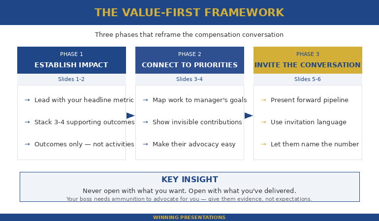
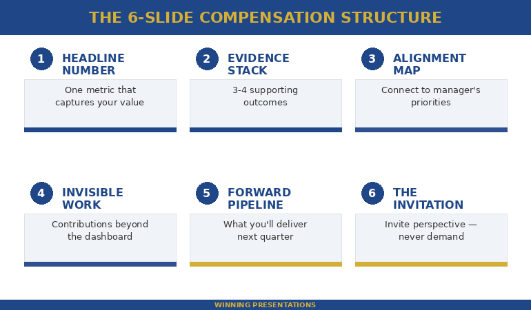
Related: If you’re preparing to present to the person who controls your pay, the Q&A portion is often where the real conversation happens. Read Presenting to the Person Who Will Decide Your Bonus — the 6-slide structure that reframes the entire conversation.

Your next step: Before your next executive presentation, identify the three most likely questions from the most senior person in the room. For each one, write a headline answer in one sentence. That’s it. That ten-minute exercise will change how you experience Q&A — permanently.

Want the complete framework for handling any executive question — including the ones you can’t predict?

Get the Q&A Handling System → £39

About the Author

Mary Beth Hazeldine is the Owner & Managing Director of Winning Presentations. With 24 years of corporate banking experience at JPMorgan Chase, PwC, Royal Bank of Scotland, and Commerzbank, she specialises in executive-level presentation skills and Q&A preparation.

A qualified clinical hypnotherapist and NLP practitioner, Mary Beth combines executive communication expertise with evidence-based techniques for managing presentation anxiety. She has spent 15 years training executives and supporting high-stakes board presentations, steering committee updates, and decision meetings.

Book a discovery call | View services

20 Feb 2026
Professional woman in navy blazer presenting compensation data on laptop screen to senior male executive in glass-walled boardroom

Presenting to the Person Who Will Decide Your Bonus (What Most Professionals Get Wrong)

Quick answer: Presenting to your boss about compensation is not a negotiation — it’s an executive presentation. The professionals who get better outcomes treat it like a boardroom pitch: lead with impact, not with an ask. Structure your slides using a Value-First framework that positions what you’ve delivered before the compensation question even surfaces. Most people do it backwards — they open with what they want instead of what they’ve earned.

The Compensation Conversation I Almost Ruined at JPMorgan

I walked into my manager’s office with a number in my head and nothing on paper.

This was early in my banking career at JPMorgan Chase. I’d delivered three major client presentations that quarter, each one securing significant renewals. I knew I deserved a better bonus. What I didn’t know was how to make that case without sounding like I was complaining.

So I did what most people do: I started talking about what I wanted. My manager listened politely, said he’d “look into it,” and nothing changed.

Six months later, a colleague in the same team got a significantly better outcome. The difference? She’d walked in with three slides. Not a deck — three slides. One showed her client retention numbers. One showed the revenue she’d influenced. The third showed her next-quarter pipeline. She never mentioned money once. Her manager brought it up.

That was the moment I understood: presenting to the person who decides your compensation isn’t a conversation. It’s a presentation. And the structure matters more than the ask.

After 24 years in corporate banking — across JPMorgan, PwC, Royal Bank of Scotland, and Commerzbank — I’ve seen this pattern play out in every team I’ve worked with. The people who present their value well get rewarded. The people who just “have a chat” get told to wait.

The difference isn’t talent or timing. It’s structure. And the professionals who consistently get recognised for their contributions all do the same thing: they present evidence before they present an ask. They make it easy for their manager to fight for them in the room where compensation decisions actually happen — which is rarely the room you’re sitting in. Here’s the framework I now teach to executives preparing for one of the highest-stakes presentations of their career — and one that most people never think to prepare for at all.

Stop Winging Your Most Important Presentation

The Executive Slide System gives you the exact slide structures that position your value before anyone has to ask. Built from 24 years of boardroom experience.

Get the Executive Slide System → £39

Built from 24 years in banking and consulting environments. Used in board updates, steering committees, and decision meetings.

Why Most Compensation Presentations Fail Before Slide 2

The biggest mistake isn’t asking for too much. It’s starting with the ask.

When you open a compensation conversation with “I’d like to discuss my bonus,” you’ve immediately put your manager in a defensive position. They’re now thinking about budget constraints, team equity, and how to manage your expectations — before you’ve given them a single reason to fight for you.

This is the same pattern I saw repeatedly across my years at PwC and Commerzbank. The professionals who struggled with compensation conversations all made the same structural error: they treated the meeting like a negotiation instead of a presentation.

Here’s what that looks like in practice:

❌ Wrong opening: “Thanks for making time. I wanted to discuss my compensation for this year. I’ve been here three years and I feel like my salary doesn’t reflect my contribution.”

✅ Right opening: “Thanks for making time. I put together a brief overview of what I’ve delivered this quarter and where I see the biggest opportunities next quarter. I’d value your perspective.”

The first version puts your manager on the back foot. The second gives them something to work with — and a reason to listen.

Value-First framework for presenting to boss about compensation showing three phases: establish impact, connect to priorities, then invite the conversation

The Value-First Framework for Presenting to Your Boss About Compensation

The framework that consistently works for compensation presentations has three phases — and none of them start with money.

Phase 1: Establish Impact (slides 1-2). Open with what you’ve delivered in the current period. Not activities — outcomes. Not “I worked on the Q3 client review.” Instead: “Q3 client review retained £1.2M in renewals.” If you don’t have revenue numbers, use time saved, problems prevented, or stakeholders influenced. Your boss thinks in these units.

Watch the difference:

❌ Wrong: “I’ve been really busy this quarter. I worked on the client review, the onboarding project, and helped with the team offsite.”

✅ Right: “Three outcomes this quarter: £1.2M in retained client revenue, 40% faster onboarding cycle, and the new team structure that reduced escalations by half.”

The first is a list of activities. The second is a portfolio of results. Your boss can take the second version into their own review meeting. They can’t do anything with the first.

Phase 2: Connect to Their Priorities (slides 3-4). Show how your work maps directly to what your manager is measured on. Every manager has 3-4 things their boss asks them about. If your contributions connect to those things, you’ve just made it easy for your manager to justify your compensation — not to you, but to the person above them.

This is exactly the kind of structure the Executive Slide System helps you build — slide-by-slide frameworks that make your case before anyone has to ask.

Get the Executive Slide System → £39

Phase 3: Invite the Conversation (slides 5-6). You don’t ask for a number. You present your forward-looking value and let the compensation discussion emerge naturally. “Given the pipeline I’m building for Q2, I’d value your perspective on how my contribution is being recognised.” That’s not an ask — that’s an invitation. It works because your boss has just seen the evidence.

The 6-Slide Structure That Reframes the Entire Conversation

Here’s the exact slide-by-slide breakdown I recommend to executives preparing to present to the person who controls their compensation. Each slide has one job. No more.

Slide 1 — The Headline Number. One metric that captures your contribution this period. Not a paragraph. One number with context.

❌ Wrong slide 1 title: “Compensation Review Discussion — Q1 2026”

✅ Right slide 1 title: “£1.2M Retained Revenue From Three Client Renewals I Led”

The wrong version announces what you want. The right version announces what you’ve delivered. Your boss reads the second title and immediately thinks: “This person knows their value.” That’s the frame you want before a single word is spoken. This is your executive summary slide — the one that frames everything after it.

Slide 2 — The Evidence Stack. Three to four supporting outcomes that reinforce the headline. Each one should be a single line: metric + context.

❌ Wrong: A bulleted list of everything you worked on — “Participated in the Q3 client review process. Helped onboard new team members. Contributed to the offsite planning.”

✅ Right: Three lines only — “Client retention: 100% renewal rate (£1.2M). Onboarding: cycle reduced from 6 weeks to 3.5. Escalations: down 52% since new structure implemented.”

No explanations. No qualifiers. Your boss doesn’t need you to explain why retaining a client matters.

Slide 3 — The Alignment Map. Show how your outcomes connect to your manager’s stated priorities. If their boss asked them “what’s your team delivering?” — your slide should be the answer they’d give.

❌ Wrong: “My achievements this quarter” — a self-focused list with no connection to departmental goals.

✅ Right: A two-column slide: left column lists your manager’s stated Q1 priorities, right column shows your direct contributions to each one.

This is what separates professionals who get rewarded from those who get “we’ll revisit this next quarter.”

Slide 4 — The Invisible Work. Every professional does work that doesn’t show up in dashboards. Mentoring. Crisis management. Covering for absent colleagues. Political navigation. One slide acknowledging this work — with specifics — tells your boss you understand your full value, not just the measurable parts.

❌ Wrong: “I also do a lot of things that aren’t captured in my KPIs.”

✅ Right: “Three contributions beyond the dashboard: mentored two junior analysts through their first client presentations. Resolved the supply chain escalation before it reached the exec team. Stepped in to cover the Northern region when James was on leave for six weeks.”

Vague claims get nodded at. Specifics get remembered — and repeated upward.

Slide 5 — The Forward Pipeline. What are you set to deliver in the next quarter? This is the slide that changes the conversation from backwards-looking (“what have you done?”) to investment-oriented (“what will you do next?”). Managers who see a strong pipeline are more willing to invest in retaining you.

Slide 6 — The Invitation. No ask. No demand. Just: “I’d appreciate your perspective on how my contribution is being recognised going forward.”

❌ Wrong: “So based on all of this, I think a 15% increase is fair and I’d like to discuss how we make that happen.”

✅ Right: “I’d value your perspective on how this level of contribution is being reflected. I’m also happy to put together a summary you can share with [skip-level name] if that’s useful.”

The wrong version turns you into a negotiator. The right version turns you into a partner — and gives your boss a tool to advocate for you in the room you’re not in.

Six-slide compensation presentation structure showing Headline Number, Evidence Stack, Alignment Map, Invisible Work, Forward Pipeline, and Invitation slides

Build Your Compensation Presentation Tonight

The Executive Slide System includes ready-to-use frameworks for exactly this scenario — including slide structures for value positioning, stakeholder alignment, and decision presentations.

Get the Executive Slide System → £39

Built from 24 years of corporate banking experience and 15 years training executives for high-stakes conversations.

What to Say When Your Boss Says “The Decision Isn’t Mine”

This is the most common deflection — and the most misunderstood. When your boss says the compensation decision isn’t entirely theirs, they’re usually telling the truth. But they’re also telling you something else: they need ammunition.

The correct response is: “I understand it involves multiple stakeholders. Would it help if I put together a brief summary of my contributions this period that you could share?”

You’ve just offered to make their job easier. You’ve also ensured your value gets presented upward — in your words, not a second-hand summary that loses the impact.

This is the same dynamic I saw at Royal Bank of Scotland when working with directors who needed to justify team compensation to the executive committee. The directors who had structured summaries from their team members could advocate effectively. The ones who had to reconstruct contributions from memory couldn’t.

Having the right structure makes this effortless. The Executive Slide System gives you frameworks designed for presenting to senior decision-makers — including the people who control your pay.

Get the Executive Slide System → £39

One timing note: Present your value 4-6 weeks before the compensation cycle starts — not during it. By the time formal reviews begin, budgets are often already allocated informally. And if you’ve just delivered a visible win, don’t wait. Recency bias is real. Your boss’s memory of your value is at its peak right after a result, not three months later during the “proper” review window.

If the anxiety of these high-pressure conversations is what holds you back, you’re not alone — I spent five years terrified of exactly this kind of meeting before I found techniques that worked. Read more about managing high-stakes meeting nerves.

Common Questions About Presenting Your Value in a Pay Review

How do you present your case for a raise to your boss?

Present your case using a Value-First structure: lead with your measurable impact (revenue, savings, client retention), connect your contributions to your manager’s priorities, then invite the compensation conversation rather than making a direct demand. Three to six focused slides work better than a verbal request. Your boss needs evidence they can present upward — give them that evidence in a format they can use.

What should you include in a compensation presentation?

Include one headline metric that captures your contribution, three to four supporting outcomes with numbers, a slide showing how your work connects to your manager’s priorities, acknowledgement of your invisible contributions, your forward pipeline for next quarter, and a soft close that invites discussion. Avoid listing activities — focus on outcomes. Avoid comparing yourself to colleagues — focus on your own value. And keep it to six slides maximum.

How do you talk to your boss about a bonus without sounding entitled?

The key is structure. When you present documented evidence of your impact and then invite your boss’s perspective — rather than making demands — you position yourself as a professional seeking fair recognition, not someone complaining. The phrase “I’d appreciate your perspective on how my contribution is being recognised” works because it’s collaborative, not confrontational. It also gives your boss room to advocate for you rather than defend a position.

Your Next Compensation Conversation Deserves More Than a Chat

The Executive Slide System gives you proven slide frameworks for career-defining moments — including performance reviews, skip-level meetings, and compensation presentations. Built from 24 years of corporate banking experience.

Get the Executive Slide System → £39

Used in board updates, performance reviews, and compensation conversations across banking, consulting, and corporate teams.

Frequently Asked Questions

Can I use this 6-slide structure for a skip-level meeting?

Yes — and you should. Skip-level meetings are often even more important than direct manager conversations because the senior leader may have more influence over compensation decisions. Adjust the Alignment Map (slide 3) to reflect the skip-level leader’s priorities rather than your direct manager’s. Everything else applies exactly the same way. If anything, the structured approach matters more at skip-level because you have less time and need to make a stronger first impression.

What if I don’t have hard revenue numbers to show?

Revenue isn’t the only language bosses speak. Use time saved (“reduced reporting cycle from 3 days to 4 hours”), problems prevented (“identified the compliance gap before the audit”), stakeholders influenced (“aligned three department heads on the integration plan”), or quality improvements (“reduced client escalations by 60%”). The key is specificity. “I contributed to the project” is worthless. “I led the workstream that delivered the client migration two weeks early” is concrete evidence your boss can use.

What if my boss dismisses the presentation entirely?

This happens — and it usually means one of two things. Either the timing was wrong (present earlier in the cycle next time), or your boss genuinely doesn’t control compensation and hasn’t been transparent about it. In either case, the deck you prepared is not wasted. Ask if you can share it with HR or with the person who does influence the decision. Having a structured document of your contributions is always better than relying on memory — yours or theirs.

Should I include specific salary numbers in my slides?

No. Never put a specific number on a slide. The moment you anchor to a number, you’ve turned a value presentation into a negotiation — and you’ve likely anchored lower than what your boss might have offered. Your six slides are designed to build the case so compellingly that your boss initiates the compensation discussion. Let them name the number first. Your job is to make the case so strong that the number reflects your actual value.

📬 Get Weekly Presentation Intelligence

Slide structures, executive communication strategies, and career presentation techniques — delivered every week. No fluff. No spam. Just the frameworks that work in real boardrooms.

Join the Newsletter

📋 Free: Executive Presentation Checklist

A quick-reference checklist for any high-stakes executive presentation — including compensation conversations, board updates, and stakeholder reviews.

Download the Free Checklist

Related: If the anxiety of a salary or bonus conversation is what’s really holding you back, read How I Learned to Present Under Extreme Pressure — the techniques that helped me stay calm in the conversations that mattered most.

Your next step: Open a blank deck tonight. Create six slides using the structure above. You’ll be surprised how much easier the conversation feels when you have evidence on screen instead of nerves in your head.

Want the proven frameworks that make this effortless? Build your salary review presentation in under an hour.

Get the Executive Slide System → £39

About the Author

Mary Beth Hazeldine is the Owner & Managing Director of Winning Presentations. With 24 years of corporate banking experience at JPMorgan Chase, PwC, Royal Bank of Scotland, and Commerzbank, she has delivered high-stakes presentations in boardrooms across the UK and Europe.

A qualified clinical hypnotherapist and NLP practitioner, Mary Beth combines executive communication expertise with evidence-based techniques for managing presentation anxiety. She has spent 15 years training executives and supporting high-stakes board presentations, steering committee updates, and decision meetings.

Book a discovery call | View services

19 Feb 2026
Executive reviewing presentation data and charts on laptop before high-stakes Q&A session with leadership team

Copilot Agent Mode in PowerPoint: The 25-Minute Executive Deck Workflow

Last Tuesday I rebuilt a client’s 34-slide board deck in 25 minutes. Not because I’m fast — because I stopped fighting Copilot with one-shot prompts and switched to Agent Mode’s conversational workflow.

Quick answer: Copilot Agent Mode in PowerPoint works like a sharp junior colleague — it asks clarifying questions, remembers context across prompts, and makes multi-step improvements without you repeating yourself. The old model (write one detailed prompt, hope for the best, rebuild what it gets wrong) is replaced by a back-and-forth conversation where each prompt builds on the last. The result: executive-quality decks in 25 minutes instead of 3 hours. Below is the exact five-phase workflow I now use with every client deck, plus the prompting shift that makes Agent Mode dramatically more effective than standard Copilot.

The Prompt That Changed Everything

For the first six months after Microsoft launched Copilot in PowerPoint, I wrote elaborate one-shot prompts. Fifty words. A hundred words. Specifying audience, tone, slide count, layout, data points. The output was always the same: a starting point that needed 90 minutes of surgery.

Then Agent Mode rolled out and I tried something different. Instead of giving Copilot everything upfront, I typed: “I need a 10-slide board presentation on our Q4 results. Can you help me build it slide by slide? Start by asking what metrics matter most to my board.”

Copilot asked me four questions. Who’s the audience? What decisions need to happen? What’s the one thing the board needs to walk away knowing? What data do you have ready?

After I answered, it built the deck — and because it understood the context, the slides actually made sense. Not generic. Not stuffed with filler. Structured around the decision I needed. I spent 12 minutes refining instead of 90 minutes rebuilding. That was the moment I stopped writing one-shot prompts for executive decks.

📋 Every Agent Mode Prompt You Need — Organised by Scenario

Updated 27 March 2026 — Revised for the latest Microsoft Copilot and ChatGPT capabilities.

The Executive Prompt Pack gives you copy-paste prompts for building executive decks from scratch (board updates, budget requests, investor pitches, strategy, transformation), rescuing existing decks (audit, condense, rewrite titles, “make it C-suite”), and generating specific slide types (data, comparison, roadmap, closing). Plus the complete 25-minute executive deck workflow and power modifiers that improve any prompt.

Digital download. Copy-paste prompts by scenario. Tested extensively on client decks across banking, biotech, SaaS, and consulting.

Stop Guessing What to Type. Start Building in 25 Minutes.

The Executive Prompt Pack gives you 71 tested prompts for ChatGPT and Copilot — structured by scenario so you know exactly what to type:

  • Build from scratch — scenario prompts for board reviews, budget requests, and investor decks
  • Rescue and rewrite — audit an existing deck, condense it, or fix one slide at a time
  • Industry-specific prompts for financial services, banking, consulting, and executive audiences
  • Power modifiers that transform any prompt into board-ready output
  • The 25-minute deck workflow that replaces 3–4 hours of manual building

Works with ChatGPT, Microsoft Copilot, and Edit with Copilot (formerly Agent Mode). Updated March 2026.

Get the Executive Prompt Pack → £19.99

Standard Copilot vs Agent Mode: The Real Difference

Standard Copilot in PowerPoint works like a vending machine. You insert a prompt, it returns slides. No memory. No follow-up. No context from one prompt to the next. If the output is wrong, you start over with a different prompt.

Agent Mode works like briefing a colleague. You describe what you need, it asks questions, and then it builds — remembering everything you’ve said across multiple prompts. When you say “make slide 3 more visual,” it knows what slide 3 contains, what the deck is about, and who the audience is.

PAA: What’s the difference between Copilot and Agent Mode in PowerPoint?
Standard Copilot requires you to guide each step with separate, context-free prompts — typically 5-10 per deck. Agent Mode works conversationally: it asks clarifying questions, maintains context across prompts, and allows surgical edits (“make slide 3 more visual”) without you rewriting the entire instruction. Agent Mode typically needs 1-3 prompts per deck versus 5-10 for standard mode. Agent Mode availability varies by organisation, tenant, and rollout schedule — if you don’t see it, check your M365 Copilot licence and admin settings.

This matters for executive decks because senior audiences have specific requirements that standard Copilot can’t hold in memory: the decision being requested, the politics in the room, the metrics that matter to this particular CFO. Agent Mode holds all of that context across every prompt in the conversation. For a deeper look at prompt structure fundamentals, see the complete Copilot PowerPoint prompts guide.

The 25-Minute Executive Deck Workflow (5 Phases)

This is the exact workflow I now use for every executive deck. Five phases, 25 minutes, from blank PowerPoint file to boardroom-ready output.

Phase 1: The Conversational Brief (5 minutes)

Open PowerPoint → Copilot Chat → Tools → Agent Mode. Then paste this type of opening prompt: “I need a [slide count]-slide [presentation type] for [audience]. The decision I need from this meeting is [specific outcome]. Start by asking me what you need to know.”

Agent Mode will ask 3-5 clarifying questions. Answer them honestly and specifically. This is where most of the quality comes from — not from the prompts themselves, but from the context you provide when Agent Mode asks.

Phase 2: The Build (5 minutes)

Once Agent Mode has your context, it generates the deck. Review the structure — not the content yet. The order of slides matters more than the words on them at this stage. If the flow is wrong, tell Agent Mode: “Move the financial impact section before the recommendation” or “add a risk slide between the timeline and the ask.”

Phase 3: The Audit (5 minutes)

This is where the playbook earns its money. Paste the deck audit prompt: ask Agent Mode to identify the 3 weakest slides and suggest specific improvements for clarity and impact. Then for each flagged slide, run the rewrite. Agent Mode remembers the original context, so its rewrites are targeted — not generic.

Phase 4: Polish (5 minutes)

Use the 2026 canvas sequence: Auto-Rewrite → Make professional → Condense. This three-step combo tightens language, cleans formatting, and removes the padding that Copilot adds to every slide by default. Then generate speaker notes and run a consistency audit — Agent Mode checks for conflicting numbers, mismatched terminology, and tone shifts across the full deck.

Phase 5: Stress Test (5 minutes)

Ask Agent Mode to generate the three toughest questions your audience will ask — and draft response slides or talking points for each. This is the step most people skip and most people regret. A board member who finds a gap in your logic during Q&A will remember that gap, not your slides. For more on the full Copilot PowerPoint tutorial and latest features, see the complete guide.

Diagram showing the five-phase Agent Mode workflow: conversational brief five minutes, build five minutes, audit five minutes, polish five minutes, and stress test five minutes, totalling 25 minutes from blank file to boardroom-ready deck

For 71 tested prompts covering every scenario — build from scratch, rescue an existing deck, or fix individual slides — the Executive Prompt Pack gives you exactly what to type, updated for the latest Copilot and ChatGPT capabilities.

When You Already Have a Deck (The Rescue Workflow)

Half the time, you’re not building from scratch — you’re inheriting a 40-slide monster from last quarter that needs to be presentable by Thursday. Agent Mode handles this differently from standard Copilot because it can assess the full deck before making changes.

The rescue workflow has four steps. First, run the full deck audit: Agent Mode identifies the three weakest slides and gives you a fix direction for each. Second, condense — paste the “kill the text walls” prompt that targets slides with more than 5 bullet points or more than 30 words per slide. Third, rewrite slide titles: most corporate decks use label titles (“Q3 Revenue”) instead of insight titles (“Q3 Revenue Beat Target by 11% — Here’s What Drove It”). Agent Mode rewrites every title as an insight headline. Fourth, the “make it C-suite” pass: ask Agent Mode to rewrite the entire deck for a time-poor executive using the 8-second scan test — if a slide can’t be understood in 8 seconds, it gets simplified.

If you’ve ever wondered why your Copilot slides look generic, the rescue workflow fixes it — because Agent Mode uses the context of your specific deck, not generic templates.

🔧 Build From Scratch or Rescue What You’ve Got

Digital download (PDF). Copy-paste prompts organised by scenario. Designed for Agent Mode first, also works in standard Copilot.

The 3 Agent Mode Mistakes Everyone Makes First

Mistake 1: Treating it like standard Copilot. If you paste a 100-word one-shot prompt into Agent Mode, you’re wasting its best feature — the ability to ask you questions. Start with a brief context sentence and let Agent Mode pull the detail out of you through its clarifying questions. The prompts it generates from conversation are better than anything you’d write upfront.

Mistake 2: Skipping the audit phase. Agent Mode builds good first drafts. Not perfect first drafts. The audit prompt (“find the 3 weakest slides and suggest specific improvements”) is what turns a good deck into one that survives a boardroom. Most people generate and present. The professionals generate, audit, and then present.

Mistake 3: Ignoring power modifiers. Short phrases appended to any prompt that dramatically change the output: “lead with the headline,” “one key message per slide,” “format for scanning not reading.” These modifiers work because Agent Mode remembers them across subsequent prompts — unlike standard Copilot, which forgets everything after each interaction.

PAA: How do I use Agent Mode in PowerPoint?
Open PowerPoint with a Microsoft 365 Copilot licence. Click the Copilot Chat button in the ribbon, then select Agent Mode from the Tools menu in the prompt box. Start with a brief description of what you need (“I need a 10-slide board presentation on Q4 results”) and let Agent Mode ask clarifying questions before it builds. Agent Mode availability varies by organisation and rollout schedule — check your M365 Copilot licence and admin settings for current feature access.

PAA: Can Copilot build a presentation from scratch?
Yes — and Agent Mode does it significantly better than standard Copilot. With standard Copilot, you write one prompt and get a full draft that usually needs heavy editing. With Agent Mode, you have a conversation first: Copilot asks what the deck is for, who the audience is, what decisions need to happen, and what data you have. The resulting deck is more targeted because Agent Mode understood the context before it started building. Most professionals find that Agent Mode decks need 10-15 minutes of refinement versus 60-90 minutes for standard Copilot output.

⚡ Stop Guessing. Start Pasting.

The Executive Prompt Pack gives you the exact prompts — organised by scenario, not alphabetically. Board deck? Page 3. Budget request? Page 5. Rescuing a 40-slide disaster? Page 12. Every prompt is built around executive decision logic and tested on real client decks across multiple industries. Plus the 25-minute workflow, power modifiers, speaker notes prompts, and Q&A stress test.

Used by executives, consultants, and senior managers who present to time-poor decision makers. Digital download — start using it today.

71 Prompts. Every Scenario Covered.

Build from scratch, rescue an existing deck, or perfect individual slides — the Executive Prompt Pack covers every scenario. Works with ChatGPT, Copilot, and Edit with Copilot. Updated March 2026.

Get the Prompts → £19.99

Frequently Asked Questions

Do I need Copilot Agent Mode to use this playbook?

It’s designed for Agent Mode first — because Agent Mode asks clarifying questions and handles multi-step changes that standard Copilot can’t. But many of the prompts still improve results in standard Copilot, just with less “memory” and fewer multi-step edits. If your organisation hasn’t rolled out Agent Mode yet, you’ll still get better output from these structured prompts than from generic ones.

How is this different from the free prompts on your blog?

The blog posts teach prompt structure and individual techniques. The playbook is organised by scenario — you find your situation (board deck, budget request, deck rescue), paste the prompt, and go. It includes the complete 25-minute workflow, power modifiers, the deck audit and rescue sequence, slide-type prompts, and speaker notes and Q&A generation. It’s designed to sit next to your keyboard, not to teach you theory.

Will this work for my industry?

Yes — because the prompts are structured around executive decision logic (metrics, risks, outcomes, asks), not industry-specific jargon. I’ve tested these prompts on decks across banking, biotech, SaaS, consulting, and public sector. If your audience makes decisions from slides, these prompts are built for you.

Get monthly Copilot updates + presentation strategies

I test every new Copilot feature on real client decks before recommending it. Get what actually works, delivered monthly.

Subscribe to The Winning Edge

Related: Agent Mode can build your slides — but it can’t present them for you. If presentation anxiety is what’s really holding your career back, read Presentation Anxiety Is Ruining My Career — What Actually Fixes It.

About the Author

Mary Beth Hazeldine is the Owner & Managing Director of Winning Presentations. With 24 years across banking and consulting — including JPMorgan Chase, PwC, Royal Bank of Scotland, and Commerzbank — she has supported presentations for high-stakes funding rounds and approvals across 15+ years of executive training.

She tests every Copilot feature on real client decks before recommending it, and has trained professionals on AI-enhanced presentations across banking, biotech, SaaS, and consulting.

Book a discovery call | View services

Your next step: Open PowerPoint, go to Copilot Chat → Tools → Agent Mode, and paste this: “I need a [number]-slide [type] presentation for [audience]. The decision I need from this meeting is [outcome]. Start by asking me what you need to know.” See how different the output is when Copilot understands the context first. Then grab the full playbook to have every scenario prompt ready when the next deck is due.

18 Feb 2026
Executive woman standing and gesturing confidently while answering questions from colleagues seated around a boardroom table, demonstrating composed Q&A handling during a high-stakes presentation

5 Executive Q&A Mistakes I See Every Week — With the 15-Second Fixes

The presentation was fine. The five minutes of Q&A afterwards undid all of it.

Quick answer: After 24 years in corporate banking and consulting — and now coaching executives who present for a living — I see the same five Q&A mistakes every single week. Not from junior staff. From directors, VPs, and partners who present beautifully and then lose the room the moment questions start. Each mistake has a specific fix, and every fix follows the same structure: answer in 15 seconds using Headline → Reason → Proof, then stop talking. Below are the five mistakes, the real scenarios where I see them, and the exact rewrites that work.

At Commerzbank, I once watched a managing director lose a syndication deal during Q&A. Not because he didn’t know his numbers — he knew them cold. Because the lead investor asked a straightforward question about covenant flexibility, and instead of giving a 15-second answer, he gave a four-minute masterclass on covenant structures across European credit markets. By the time he finished, the investor had mentally moved on. The deal went to a competitor who answered the same question in two sentences.

I’ve now seen some version of that moment hundreds of times. Different industries, different stakes, same five patterns. The executives who win in Q&A aren’t smarter or better prepared. They’ve learned to answer the question that was asked — in 15 seconds — and then stop.

Mistake #1: The Knowledge Dump

What it looks like: Someone asks a focused question. The presenter answers the question — and then keeps going. They add context. Then caveats. Then the methodology behind the number. Then the alternative they considered. What started as a clear answer becomes a four-minute monologue that buries the actual point under layers of unnecessary detail.

Where I see it: Budget reviews. Quarterly updates. Any situation where the presenter has spent days preparing and unconsciously wants to demonstrate the depth of their preparation. The more homework you’ve done, the more tempting the knowledge dump becomes — which is why it’s disproportionately a problem for the most diligent presenters.

The real scenario: A VP at a technology firm presented a platform migration proposal. The CTO asked: “What’s the downtime risk during cutover?” The VP answered the question correctly in his first sentence (two hours, with a rollback plan). Then he spent three more minutes explaining the technical architecture of the rollback, the testing protocol, the vendor SLA, and two edge cases they’d modelled. The CTO had his answer in the first ten seconds. The next three minutes made him wonder what the VP was overcompensating for.

The 15-second fix:

Headline: “Maximum two hours, with a full rollback plan.”
Reason: “We’ve tested the rollback three times in staging — average recovery is 40 minutes.”
Proof: “The vendor SLA guarantees four-hour resolution, but our internal testing hasn’t exceeded ninety minutes.”
Then stop.

If the CTO wants the technical architecture, the testing protocol, or the edge cases — he’ll ask. And that follow-up question is a buying signal, not a threat. The knowledge dump kills buying signals because it answers questions nobody asked.

Stop Losing the Room After Slide 12

The Executive Q&A Handling System includes the Headline → Reason → Proof response framework, question mapping templates by stakeholder type, and the preparation system that means you walk into Q&A knowing what they’ll ask and exactly how you’ll answer. Built from real boardroom situations where Q&A decided whether budgets got approved and deals got funded.

Get the Executive Q&A Handling System → £39

Instant download. Question mapping + response frameworks + recovery scripts. Built from 24 years in banking and consulting where Q&A decided most major budgets, deals, and approvals.

Mistake #2: The Defensive Deflection

What it looks like: Someone asks a question that implies a weakness in the proposal. Instead of addressing the weakness, the presenter pivots to a strength. “What about the implementation risk?” gets answered with “Well, the ROI projections are very strong.” The question was about risk. The answer was about return. The panel notices.

Where I see it: Investment committees. Client pitches. Promotion panels. Any situation where the presenter feels their competence is being questioned — which activates a defensive instinct to redirect toward what they’re confident about. I’ve written extensively about this dynamic in the context of handling difficult presentation questions.

The real scenario: A programme director presented a change management initiative to the executive committee. A board member asked: “What’s the fallback if adoption rates don’t hit 60% in the first quarter?” The director answered: “Our stakeholder engagement plan is comprehensive — we’ve mapped every business unit and we have champions in each region.” That’s not a fallback plan. That’s a prevention plan. The board member asked what happens if it fails. The director told him why it won’t. Those are different conversations.

The 15-second fix:

Headline: “If adoption is below 60% at the end of Q1, we move to targeted intervention.”
Reason: “That means intensive support for the three lowest-adoption business units rather than broad engagement.”
Proof: “We used this approach on the last programme — pulled two units from 35% to 70% in six weeks.”
Then stop.

The fix answers the question that was asked (what’s the fallback), names it specifically (targeted intervention), and provides evidence it works (last programme). The board member now knows the presenter has thought about failure — which, paradoxically, increases their confidence in the plan succeeding.

PAA: Why do experienced presenters deflect tough questions?
Because the brain processes tough questions as threats before it processes them as requests for information. The amygdala fires before the prefrontal cortex engages, which means the first instinct is defensive — redirect to safe ground. This happens faster and more intensely the higher the stakes and the more senior the audience. The fix isn’t willpower (you can’t override the amygdala with intention). The fix is preparation: if you’ve already written a 15-second answer for the tough questions, your brain retrieves a structure instead of improvising a defence.


Table showing five executive Q&A mistakes — Knowledge Dump, Defensive Deflection, Premature Concession, Good Question Stall, and Unfinished Answer — with what it sounds like and what the room hears for each

Mistake #3: The Premature Concession

What it looks like: Someone challenges the recommendation, and the presenter immediately folds. “Have you considered doing this in two phases instead of three?” gets answered with “Yes, we could definitely do that. We could also look at a four-phase model. We’re flexible on the approach.” The presenter thinks they’re being collaborative. The panel hears: “I’m not committed to my own recommendation.”

Where I see it: Everywhere. This is the most common mistake among presenters who’ve been told to “read the room” and “be flexible.” They’ve overcorrected from rigid to spineless. The result is that the panel doesn’t know what the presenter actually recommends — and a committee that doesn’t know what you recommend will always defer the decision.

The real scenario: A finance director presented a restructuring proposal to the CEO and COO. The COO asked: “Could we achieve the same cost savings with voluntary redundancies only?” The finance director said: “That’s something we could explore. There are definitely scenarios where voluntary approaches work well.” The correct answer was no — the modelling showed voluntary-only achieved 40% of the target savings. But the finance director didn’t want to disagree with the COO directly. The result: the decision was deferred six weeks while they “explored” an option the finance director already knew wouldn’t work.

The 15-second fix:

Headline: “Voluntary-only achieves roughly 40% of the target savings.”
Reason: “The gap is in the operational restructuring, which requires role changes that voluntary programmes can’t address.”
Proof: “We modelled both scenarios — I can share the comparison if that would be helpful.”
Then stop.

This doesn’t dismiss the COO’s suggestion. It respects it by giving a factual answer with evidence. “I can share the comparison” invites further discussion without surrendering the recommendation. The presenter maintains their professional position while remaining genuinely flexible on the method.

📋 The Q&A Handling System includes question mapping templates that help you predict these challenges before the meeting — so you’ve already written the 15-second answer before the question lands.

Get the Executive Q&A Handling System → £39

Walk Into Q&A Knowing What They’ll Ask

The Executive Q&A Handling System gives you the question mapping method (predict 80% of questions before the meeting), the Headline → Reason → Proof response structure, “I don’t know” recovery scripts, and hostile question deflection techniques. Stop improvising. Start preparing the part that actually decides outcomes.

Get the Executive Q&A Handling System → £39

Instant download. Built from real boardroom, investment committee, and client pitch situations across 24 years in banking and consulting.

Mistake #4: The “Good Question” Stall

What it looks like: “That’s a great question.” Pause. Visible thinking. Then an answer that starts slowly and gains momentum — because the presenter was buying time to formulate a response. Everyone in the room knows it. The “good question” opener is the most widely recognised stall tactic in corporate communication, and using it signals exactly one thing: you weren’t prepared for that question.

Where I see it: Panel interviews. Board Q&A. Client discovery sessions. The more senior the audience, the more they notice it — because they’ve all used it themselves, and they know what it means. It’s the executive equivalent of “um.”

The real scenario: A head of strategy presented the annual plan to the investment committee. The chair asked: “What’s the biggest risk you haven’t addressed in this plan?” The head of strategy said: “That’s a really good question. Let me think about that.” Pause. “I think the biggest unaddressed risk is probably market volatility in Q3.” The answer was fine. The delivery — the stall, the visible improvisation, the “probably” — told the room he hadn’t considered unaddressed risks before being asked. For a head of strategy. That’s a credibility problem.

The 15-second fix:

Headline: “The biggest unaddressed risk is regulatory change in the APAC region.”
Reason: “We’ve modelled market volatility — that’s on slide nine. But the regulatory environment in Southeast Asia is moving faster than our planning cycle.”
Proof: “I’ve flagged this with the risk committee and we’re building a scenario analysis for Q2 review.”
Then stop.

No stall. No “good question.” Straight into the headline. The answer is honest (yes, there’s a risk I haven’t fully addressed), specific (regulatory change in APAC), and shows action (flagged with risk committee, scenario analysis in progress). This is what the committee wanted to hear: not perfection, but awareness.

PAA: What should you say instead of “good question” during Q&A?
Nothing. Just answer. If you need a beat to think, use a silent pause — two seconds of silence is less damaging to your credibility than “good question” followed by visible improvisation. If you genuinely need more time, use a bridging phrase that adds value: “The short answer is [headline]. The longer answer involves [one specific factor] — let me walk you through it.” This buys time while already delivering content, rather than advertising that you’re thinking.

Mistake #5: The Unfinished Answer

What it looks like: The presenter gives 80% of an answer and then trails off, ends with “…so yeah,” or gets interrupted before landing the point. The question was answered in substance but not in structure — so the panel isn’t sure whether the answer is complete, whether there’s more coming, or whether the presenter ran out of things to say. The room fills the silence with their own interpretation, which is rarely favourable.

Where I see it: Town halls. All-hands meetings. Any situation with a large audience where the presenter feels the pressure of silence and either rushes the ending or leaves it hanging. It’s also common in executive Q&A sessions where follow-up questions come fast and the presenter abandons their current answer to address the next one.

The real scenario: A regional director presented expansion plans to the group CEO. The CEO asked: “What happens to margin if the exchange rate moves 5% against us?” The director started strong: “A 5% adverse move impacts margin by approximately 1.2 points. We’ve modelled this and the business case remains positive down to a 7% move…” Then someone’s phone buzzed. The director lost focus, said “…so we’ve got some buffer there,” and stopped. “Some buffer” is not a landing. “Remains positive down to 7%” is a landing — but he didn’t get there cleanly.

The 15-second fix:

Headline: “A 5% adverse move impacts margin by 1.2 points.”
Reason: “The business case stays positive down to a 7% move — so we’ve got meaningful buffer.”
Proof: “We’ve stress-tested three scenarios. The breakeven point is an 8.3% move, which hasn’t happened in this corridor in a decade.”
Landing: “The short version: the exchange rate risk is real but manageable.”

The landing matters. It tells the room: “My answer is complete. I’ve finished. You have what you need.” Without it, the panel is left constructing their own conclusion — and under uncertainty, human brains default to the negative interpretation. A clean landing controls the narrative. A trailing answer surrenders it.


The Headline Reason Proof framework for answering executive Q&A questions in 15 seconds showing three steps with timing and example response for each

📋 The Q&A Handling System includes the complete Headline → Reason → Proof framework with practice templates for every question type.

Plus hostile question deflection and “I don’t know” recovery scripts for the questions you can’t predict.

Get the Executive Q&A Handling System → £39

Why All 5 Mistakes Have the Same Root Cause

The knowledge dump, the defensive deflection, the premature concession, the “good question” stall, and the unfinished answer all come from the same place: the presenter is responding to their emotional state, not to the question.

The knowledge dump is driven by the need to prove competence. The deflection is driven by the instinct to avoid vulnerability. The concession is driven by the desire to avoid conflict. The stall is driven by the fear of looking unprepared. The unfinished answer is driven by the anxiety of silence.

All five emotions are normal. All five are present in every high-stakes Q&A. And all five produce answers that are worse than the answer you’d give if you simply followed a structure: Headline → Reason → Proof → Stop.

The structure doesn’t eliminate the emotion. It gives you something to do instead of following the emotion. When your brain wants to dump knowledge, the structure says: “Headline first.” When your brain wants to deflect, the structure says: “Answer the actual question.” When your brain wants to concede, the structure says: “State your position with evidence.” When your brain wants to stall, the structure says: “Skip the preamble.” When your brain wants to trail off, the structure says: “Land it.”

That’s why the best Q&A performers aren’t necessarily the smartest people in the room. They’re the ones who’ve practised a structure until it’s automatic. I’ve seen this dynamic in every high-stakes Q&A that went wrong — the content was there, the structure wasn’t.

If the anxiety component of Q&A is the bigger problem for you — if the emotional state is so strong that even a good structure gets overwhelmed — the cognitive and physiological techniques in breaking the audience judgment anxiety loop work alongside the structural approach here.

One Structure. Every Question. Every Time.

The Executive Q&A Handling System gives you question mapping by stakeholder type, the Headline → Reason → Proof framework with practice templates, “I don’t know” recovery scripts, defensive-to-directive answer rewrites, and hostile question deflection techniques. One system for every Q&A scenario — budget reviews, board presentations, client pitches, and the questions you didn’t see coming.

Get the Executive Q&A Handling System → £39

Instant download. Built from 24 years in banking and consulting where most major decisions were shaped during Q&A, not during the slides.

Frequently Asked Questions

How many questions should I prepare for before a high-stakes presentation?

Map 8-12 questions across four categories: cost/budget, risk/contingency, timeline/feasibility, and credibility/capability. For each one, write a 15-second answer using Headline → Reason → Proof. This covers roughly 80% of what you’ll actually be asked. The remaining 20% will be variations — and because you’ve practised the structure, you’ll handle variations more cleanly even without specific preparation. The goal isn’t to predict every question. It’s to build a response muscle that fires automatically under pressure.

What do you do when someone asks a question you genuinely don’t know the answer to?

Never bluff and never say just “I’ll get back to you.” The recovery structure is: acknowledge what you do know, name the specific thing you’d need to verify, and commit to a concrete deadline. For example: “The two-phase model is feasible — I know the dependency structure supports it. What I’d need to confirm is the risk impact on the migration timeline. I can have that analysis to you by Thursday.” This shows competence, honesty, and reliability — which is exactly what a senior audience evaluates during Q&A.

Is the Headline → Reason → Proof structure too formulaic for senior audiences?

Senior audiences don’t notice the structure — they notice the clarity. A formulaic-feeling answer is one where the presenter robotically recites a prepared script. A structured answer is one where the presenter gives a clear headline, supports it with a specific reason, and closes with evidence. The difference is delivery, not framework. Practise the structure until it becomes natural rather than mechanical. Most executives find that after 5-10 practice rounds, the structure disappears into their communication style and what remains is simply clearer, more confident Q&A performance.

📬 The Winning Edge Newsletter

Weekly strategies for executive presentations, Q&A preparation, and career-critical communication. No fluff.

Subscribe free →

Related: These five mistakes become even more damaging in transition scenarios where there’s no follow-up meeting to correct the record — see the full before/after breakdown in how exit presentation Q&A damages careers. And if the anxiety itself is driving these patterns, the cognitive intervention in breaking the audience judgment thought loop works alongside the structural approach here.

Five mistakes. One root cause. One structure that fixes all of them. Headline → Reason → Proof → Stop. Practise it for your next five presentations and notice what changes. The questions won’t get easier. Your answers will get shorter, clearer, and more credible — which, in executive Q&A, is the same thing as getting better.

📋 Get the question mapping templates + response frameworks + recovery scripts.

Get the Executive Q&A Handling System → £39

About the Author

Mary Beth Hazeldine is the Owner & Managing Director of Winning Presentations. With a 24-year career in banking and consulting at JPMorgan Chase, PwC, Royal Bank of Scotland, and Commerzbank, she spent most of those years in rooms where Q&A decided outcomes — budget approvals, deal mandates, strategic pivots, career-defining moments.

She now helps executives prepare for the part of their presentation that actually determines results.

Book a discovery call | View services

Optional: Get Q&A, slides, confidence, storytelling, and delivery in one package — The Complete Presenter (£99). Save over 50%.

16 Feb 2026
Your Data Slides Are Killing Your Presentation. Here's How AI Can Fix That.

Your Data Slides Are Killing Your Presentation. Here’s How AI Can Fix That.

The CFO had pasted an entire Excel tab — thirty-seven rows of quarterly figures — onto a single slide. Then he asked the board to “take a moment to absorb the numbers.”

Quick answer: AI data visualisation for presentations can transform unreadable spreadsheet dumps into clear, persuasive visual charts — but only when you tell it what the data means first. The process is not “paste my data and make it pretty.” It’s a three-step human-led workflow: decide the insight (what does this data prove?), choose the visual type (comparison, trend, composition, or distribution), then use AI to generate, label, and refine the chart. AI handles the visual execution. You handle the strategic thinking. The result is data slides that make a point rather than display a table.

At Commerzbank, I sat through a quarterly review where the Head of Risk presented a slide with a forty-two-cell table comparing capital adequacy ratios across eight business lines and four quarters. Every cell was filled. Every number was accurate. Nobody in the room knew what it meant.

After the meeting, the Group Treasurer said to me: “I have no idea whether we’re in trouble or not.” The data was perfect. The communication was useless.

I helped him rebuild that slide. We replaced the table with a single bar chart showing one thing: which business lines were above the threshold and which were below. Three were red. The rest were green. The next board meeting lasted half the time and produced twice the decisions. Same data. Different visual. Completely different outcome.

Why Data Tables Fail in Executive Presentations

Data tables work in reports. They fail in presentations. The reason is cognitive: a table asks the reader to perform analysis, while a chart provides the analysis already completed. When you paste a spreadsheet into a slide, you’re asking your audience to do the work you should have done before the meeting.

Senior executives are processing information from dozens of sources across dozens of meetings. They don’t have the cognitive bandwidth to scan forty-two cells, identify the relevant comparisons, and draw their own conclusions — all while you’re talking over the top of the slide. A data table in a presentation is not information. It’s a homework assignment.

The result is predictable. Executives either tune out (because the table is overwhelming), or they focus on the wrong number (because without visual hierarchy, every number looks equally important). Either way, your data fails to do its job, which is to support a specific point that drives a specific decision.

This is why data-heavy presentations often backfire with executives. The problem isn’t the data. It’s the format. And this is precisely where AI can help — not by thinking for you, but by transforming your thinking into a visual that communicates instantly.

PAA: Why do data-heavy slides fail in presentations?
Data tables require the audience to perform their own analysis — scanning cells, making comparisons, and drawing conclusions — while simultaneously listening to the presenter. Executive audiences don’t have the cognitive bandwidth for this. Charts solve the problem by pre-digesting the analysis: they show the conclusion visually so the audience can absorb the insight in seconds rather than minutes. The presenter’s job is to decide the insight first, then choose a visual format that makes that insight obvious.

Turn Data Into Decisions — Not Decoration

AI-Enhanced Presentation Mastery includes the complete data visualisation workflow: the Insight–Implication–Action framework, AI prompt sequences for chart creation, and the visual decision matrix that tells you which chart type to use for any dataset. Self-study programme — join anytime.

Join AI-Enhanced Presentation Mastery → £249

Self-study programme with live support. Join anytime — all released modules available immediately. Built from 24 years presenting financial data in corporate banking. Check course page for current pricing and session details.

The Insight-First Method (Before You Touch AI)

The biggest mistake people make with AI data visualisation is starting with the data. They paste a spreadsheet into an AI tool and ask it to “make a chart.” The result is a technically correct but strategically useless visualisation — because AI doesn’t know what point you’re trying to make.

Before you touch AI, answer one question: What does this data prove?

Not “what does this data show” — that’s a description. “What does this data prove” forces you to state a conclusion. Examples of the difference:

“This data shows Q3 revenue by region” → a description that leads to a table.
“This data proves that EMEA revenue recovered faster than expected” → an insight that leads to a chart with EMEA highlighted.

“This data shows customer satisfaction scores” → a description that leads to a grid.
“This data proves that satisfaction dropped in the two months after the platform migration” → an insight that leads to a trend line with the drop circled.

Once you have the insight, you can tell AI exactly what to visualise — and more importantly, what to emphasise. “Create a bar chart of Q3 revenue by region. Highlight EMEA in gold. Grey out all other regions. Add a horizontal line showing the forecast.” That prompt produces a useful chart because you’ve done the thinking. AI does the drawing.

This is the Insight–Implication–Action framework we teach in the course: every data slide should state the insight (what the data proves), the implication (what it means for the audience), and the action (what needs to happen next). AI can’t generate any of those three things. But once you’ve defined them, AI can create the visual that communicates them instantly.


(770×450)Insight-First Method showing three steps: decide the insight then choose the visual then use AI to create and refine

📊 Want the complete Insight–Implication–Action framework and AI prompt sequences?

AI-Enhanced Presentation Mastery includes the data storytelling module with before/after transformations and the visual decision matrix.

Join AI-Enhanced Presentation Mastery → £249

How AI Transforms Data Into Visual Clarity

Once you’ve identified the insight, AI becomes genuinely powerful. Here’s the workflow for transforming a data-heavy slide into a clear visual:

Step 1: Give AI the data AND the insight. Don’t just paste your spreadsheet. Tell AI what you want the audience to take away. “Here is our quarterly revenue data. The key insight is that EMEA recovered to 94% of target while APAC stayed at 71%. Create a horizontal bar chart that makes this comparison obvious. Use gold for EMEA and grey for APAC. Include a vertical line at the 100% target.” The more specific your instruction, the more useful the output.

Step 2: Ask AI to simplify, not add. AI’s instinct is to include everything. Your instinct should be to remove everything that doesn’t support the insight. “Remove the gridlines. Remove the exact values from bars under 50%. Make the chart title a complete sentence: ‘EMEA Revenue Recovered to 94% — APAC Still Lagging.'” The best data slides look almost empty. That’s the point — the insight should be impossible to miss.

Step 3: Use AI to generate the headline. Your slide title should state the conclusion, not describe the content. AI is excellent at rewriting “Q3 Revenue by Region” into “EMEA Recovery Outpaced Forecast — APAC Needs Intervention.” Give AI your insight and ask it to write a headline that a time-poor executive would understand without looking at the chart. If the headline alone tells the story, you’ve succeeded.

This three-step process — insight, simplify, headline — takes five minutes per slide and produces results that are dramatically more persuasive than any table, regardless of how much data that table contains.

If you want to go deeper on how to match your AI prompts to executive presentation needs, the key is always the same: tell AI what the data means before asking it to visualise the data.

PAA: How do I use AI to create charts for presentations?
Start by defining the insight your data proves — not just what it shows. Then give AI both the data and the insight in a single prompt, specifying the chart type, what to highlight, and what to remove. Ask AI to write the slide headline as a complete sentence that states the conclusion. The process takes about five minutes per slide and produces charts that communicate instantly rather than requiring the audience to decode a table.

From Spreadsheet Dump to Executive Clarity

Module 6 of AI-Enhanced Presentation Mastery covers data storytelling in depth — including the Insight–Implication–Action framework, the visual decision matrix, AI prompt sequences for chart transformation, and before/after examples from real executive presentations. Study at your own pace.

Join AI-Enhanced Presentation Mastery → £249

Self-study programme with live Q&A calls. Join anytime — all released modules available immediately. Check course page for current pricing and session details.


Before and after comparison showing spreadsheet table transformed into a clear highlighted bar chart with insight headline

The Four Chart Types That Cover 90% of Executive Data

You don’t need twenty chart types. You need four. Almost every data insight an executive needs to communicate falls into one of these categories:

1. Comparison: “How do these things stack up?” Use horizontal bar charts. Revenue by region, performance by team, budget vs actual. AI prompt: “Create a horizontal bar chart comparing [X]. Highlight the top performer in gold and the underperformer in red. Grey out the middle. Title should state who’s winning.”

2. Trend: “What’s changing over time?” Use line charts. Revenue trajectory, customer satisfaction over quarters, headcount growth. AI prompt: “Create a line chart showing [X] over [time period]. Highlight the inflection point where the trend changed. Add a brief annotation explaining what caused the change. Title should state whether the trend is positive or negative.”

3. Composition: “What’s the breakdown?” Use stacked bars or pie charts (but only for 3–5 segments — more than five and the pie becomes useless). Revenue mix, cost allocation, market share. AI prompt: “Create a stacked bar chart showing [X] breakdown. Highlight the largest segment. Title should state what dominates.”

4. Distribution: “Where does the data cluster?” Use scatter plots or histograms. Customer segments by value, project risk ratings, team performance distribution. AI prompt: “Create a scatter plot showing [X] vs [Y]. Circle the outliers. Title should state the pattern — whether it’s clustered, spread, or has notable outliers.”

When you’re unsure which chart type to use, ask yourself: “Am I comparing, tracking, breaking down, or distributing?” The answer picks the chart. Then tell AI which category and let it handle the execution. This is considerably more effective than the approach covered in data storytelling fundamentals, because AI handles the visual execution while you focus entirely on the strategic framing.

📊 The visual decision matrix and AI prompt templates for all four chart types are inside the course.

AI-Enhanced Presentation Mastery includes the complete data visualisation system — frameworks, prompts, and before/after examples.

Join AI-Enhanced Presentation Mastery → £249

What AI Cannot Do With Your Data (The Human Part)

AI is excellent at the mechanical parts of data visualisation — creating charts, formatting them, writing headlines, standardising colours. But there are four things AI cannot do, and they’re the four things that actually matter:

AI cannot decide what’s important. Your dataset might contain fifty data points. Only three of them matter to your audience. Which three? That depends on who’s in the room, what they care about, and what decision you’re asking them to make. This is strategic judgment, not data analysis. AI can’t do it.

AI cannot read the political room. Sometimes the data shows something uncomfortable — a team underperforming, a region in decline, a project over budget. How you visualise that data depends on whether you’re presenting to the team responsible (where diplomacy matters) or to the board (where directness matters). AI doesn’t know the politics. You do.

AI cannot tell you what’s missing. The most dangerous data slide is the one that’s technically accurate but strategically incomplete. If your chart shows revenue growth but doesn’t show margin erosion, it’s misleading. AI won’t flag what you’ve left out. Only someone who understands the full business context can do that.

AI cannot determine the “so what.” Every data slide needs to answer one question: “So what?” Revenue grew 12% — so what? Is that good? Compared to what? What should we do about it? The “so what” is the entire point of the slide, and it requires human judgment about context, expectations, and next steps.

The best data slides are 80% human thinking and 20% AI execution. AI makes the visual. You make the point.


Four things AI cannot do with your data: decide importance, read the room, spot what is missing, determine the so what

PAA: Can AI replace human thinking in data presentations?
No. AI is excellent at the visual execution — creating charts, formatting them, writing headlines — but it cannot determine what’s important, read political dynamics in the room, identify what data is missing, or decide the “so what” that makes a slide actionable. The most effective workflow uses AI for 20% of the work (visual execution) and human judgment for 80% (strategic framing, audience awareness, and insight selection). AI is the pen. You’re the author.

Learn the Complete System for Executive Data Slides That Drive Decisions

AI-Enhanced Presentation Mastery teaches you the human-led, AI-assisted approach to executive presentations — including the Insight–Implication–Action framework, the visual decision matrix, AI prompt sequences, and the data storytelling techniques built from 24 years presenting financial data in corporate banking and 15 years coaching executives through high-stakes decision meetings.

Join AI-Enhanced Presentation Mastery → £249

Self-study programme with live support. Join anytime — all released modules available immediately. Built from 24 years presenting financial data in corporate banking + 15 years coaching executives. Check course page for current pricing and session details.

Frequently Asked Questions

What if my audience expects to see the full data table?

Put the table in the appendix. Present the chart in the main deck. If someone asks “where are the detailed numbers?” you say “slide 22 in the appendix” and continue with your insight. This gives you the best of both worlds: visual clarity in the presentation and full data availability on request. In twenty-four years of corporate banking, I’ve found that the executives who request the detailed table almost never actually read it — they just want to know it’s there.

Which AI tools are best for data visualisation?

Any AI tool that can process text prompts and generate charts works — ChatGPT, Claude, Copilot in PowerPoint. The tool matters less than the prompt. A specific prompt (“Create a horizontal bar chart comparing Q3 revenue by region, highlight EMEA in gold”) produces dramatically better results than a vague prompt (“Make a chart from this data”) regardless of which tool you use. The Insight-First Method works with any AI platform.

How do I handle sensitive financial data with AI tools?

If your data is confidential, use anonymised or rounded figures for the AI-generated chart, then manually replace them with the real numbers in your final slide. AI needs the structure and proportions to create the right visual — it doesn’t need the exact numbers. Alternatively, use AI only for the chart template and formatting, then input your data directly. Many organisations have approved AI tools with enterprise-grade data protection for this purpose.

Does this work for non-financial data?

The Insight-First Method works for any data type: project timelines, customer satisfaction scores, employee engagement metrics, operational KPIs, marketing funnels. The principle is the same — decide the insight before you create the visual, tell AI what to emphasise, and write a headline that states the conclusion. The four chart types (comparison, trend, composition, distribution) cover 90% of any data you’ll present in a corporate setting.

📬 The Winning Edge Newsletter

Weekly strategies for executive presentations, AI-enhanced workflows, and career-critical stakeholder communication. No fluff.

Subscribe free →

🎯 Free: 10 Essential AI Prompts for Executive Presentations

Includes the data visualisation prompts for all four chart types, plus headline rewriters and the slide clarity check sequence.

Download free →

Related: Data slides are one piece of the puzzle. If you’ve been thrown into a last minute presentation and need to build a complete deck fast, the 5-slide emergency framework helps you decide which data to include and which to cut — before you start visualising anything.

Stop pasting spreadsheets into slides. Decide the insight first. Choose the right visual. Let AI handle the execution. Your audience will thank you — and your data will finally do its job.

🎯 Learn the human-led, AI-assisted approach to executive presentations.

Join AI-Enhanced Presentation Mastery → £249

About the Author

Mary Beth Hazeldine is the Owner & Managing Director of Winning Presentations. With 24 years of corporate banking experience at JPMorgan Chase, PwC, Royal Bank of Scotland, and Commerzbank, she spent two decades watching executives paste spreadsheets into slides — and helping them transform that data into visuals that actually drove decisions.

A qualified clinical hypnotherapist and NLP practitioner, Mary Beth combines executive communication expertise with modern AI-enhanced workflows to help leaders present data with clarity and conviction.

Book a discovery call | View services

15 Feb 2026
Professional presenting pilot programme results at a whiteboard in a modern office, navy blazer, warm lighting, engaged and confident

The Pilot Worked. Now You Need the Slides to Prove It.

Quick answer: Most pilot programs that deliver strong results still fail to get full rollout approval — because the presentation focuses on what happened instead of what should happen next. The winning pilot results presentation follows an 8-slide structure: context, hypothesis, results, what surprised us, risk if we don’t scale, rollout recommendation, resource ask, and decision question. Lead with the recommendation. Prove it with the pilot. Make the decision easy.

My client’s pilot saved £1.2 million in twelve weeks.

The data was clean. The operations team loved it. The finance team had validated the numbers independently. By any rational measure, full rollout was the obvious next step.

She walked into the executive committee meeting with 34 slides. Fourteen of them were methodology. Eight were charts showing week-by-week performance. Four were appendix slides about the control group. She buried the recommendation on slide 29.

The CFO interrupted on slide 11. “What are you asking us to do?”

She stumbled. Started explaining the statistical model again. The CEO checked his phone. The meeting ran out of time before she reached the ask. They scheduled a follow-up — which took six weeks to land in diaries. By then, the pilot momentum was gone. A competitor launched a similar initiative. The rollout was approved eventually, but at half the budget she’d originally needed.

I’ve watched this pattern destroy pilot programs at JPMorgan Chase, Royal Bank of Scotland, and Commerzbank. The pilot works. The presentation doesn’t. Not because the data is weak — but because the structure treats executives like scientists instead of decision-makers.

Why Most Pilot Results Presentations Fail

The problem is structural, not intellectual. People who run successful pilots are usually rigorous thinkers. They’ve spent weeks or months collecting data, managing variables, documenting outcomes. When it’s time to present, they default to the format that feels most comfortable: the research report.

Executives don’t want a research report. They want three things answered in the first 90 seconds: What did you find? What do you recommend? What do you need from me?

The most common mistakes I see in pilot results presentations:

Leading with methodology. You spent months on the pilot design. Nobody in the room cares about your control group methodology unless they specifically ask. Start with what happened, not how you measured it.

Drowning in data. Every data point you collected feels important to you. Executives need three to five proof points, not thirty. The question isn’t “how much data do I have?” but “what’s the minimum evidence required for this decision?”

Burying the recommendation. If your recommendation appears after slide 15, you’ve already lost. The decision-maker is silently asking “where is this going?” from the moment you start speaking. Tell them immediately. Then prove it.

Ignoring the “what if we don’t” question. Every approval decision involves two risks: the risk of scaling and the risk of not scaling. Most presenters only address the first. The second is often more powerful — because executives are more motivated by what they might lose than what they might gain.

PAA: How do you present pilot results to executives?
Lead with your recommendation, not your data. Use the 8-slide structure: context (why we piloted), hypothesis (what we expected), results (what happened), surprises (what we didn’t expect), risk of inaction (what happens if we don’t scale), recommendation (what to do next), resource ask (what you need), and decision question (the specific yes/no). Keep methodology in the appendix for anyone who asks.

Your Pilot Delivered Results. Your Slides Need to Deliver a Decision.

The Executive Slide System gives you the exact slide structures, sequencing, and layouts that senior leaders expect — including decision decks, recommendation frameworks, and executive summary formats. Stop rebuilding from scratch every time you need approval.

Get the Executive Slide System → £39

Built from 24 years in corporate banking + 15 years training executives. Includes decision deck templates, slide-by-slide guidance, and the recommendation-first structure used in board updates, steering committees, and approval decks.

The 8-Slide Pilot-to-Rollout Structure

After helping executives present pilot results across banking, consulting, and corporate strategy for 24 years, this is the structure that consistently gets decisions — not just compliments.

Slide 1: The Decision Context. One sentence: why this pilot exists and what decision it was designed to inform. “We piloted [X] to determine whether [Y] should be rolled out across [Z].” This isn’t background. It’s a frame. You’re telling the room: you will make a decision today.

Slide 2: The Hypothesis. What you expected to happen. This matters because it shows intellectual honesty. If the results matched your hypothesis, it builds confidence. If they didn’t, it shows you’re presenting truth, not advocacy. Either way, it signals rigour without forcing anyone to sit through your methodology.

Slide 3: The Results (Headline Format). Three to five key metrics, each with a single headline: “Customer processing time: reduced 41% (target was 25%)”“Error rate: down 67%”“Team adoption: 94% within 3 weeks.” No charts yet. Headlines first. Let executives absorb the story before you prove it.

Slide 4: What Surprised Us. This is the slide that builds the most trust. Every pilot produces unexpected findings — things that went better than expected, things that were harder than anticipated, edge cases you hadn’t considered. Presenting them demonstrates that you’re not selling — you’re reporting honestly. Executives fund people they trust, not people who only share good news.

Slide 5: The Risk of Not Scaling. This is the slide most people forget — and it’s often the most persuasive. What happens if the pilot stays a pilot? Competitor implications, cost of delay, team morale impact, missed market window. Frame it as: “If we don’t move to full rollout, here’s what we’re accepting.”

Slide 6: The Rollout Recommendation. Clear, specific, actionable. Not “we recommend scaling” but “we recommend Phase 1 rollout to the Northern region by Q3, followed by full deployment by Q1 next year.” Include the phasing — executives are far more likely to approve a staged rollout than an all-at-once launch.

Slide 7: The Resource Ask. What you need: budget, headcount, timeline, executive sponsorship. Be specific. “£340K over 18 months, 4 additional FTE, and a named executive sponsor from Operations.” Vague asks get vague responses. Specific asks get decisions.

Slide 8: The Decision Question. One question, on one slide, in one sentence. “Do we approve Phase 1 rollout to the Northern region at a cost of £340K, with a go/no-go review at month 6?” This is the slide that forces the room to decide rather than discuss. Without it, you’ll get “let us think about it” — which, in most organisations, means “we’ll forget about this.”


8-slide pilot-to-rollout decision deck structure showing the framework from context through recommendation to decision question

📊 Need the decision deck structure? The Executive Slide System (£39) includes the recommendation-first sequencing and slide-by-slide templates you can adapt to any pilot, any industry.

The Data Executives Actually Need (Not What You Collected)

Here’s a rule I teach every executive I work with: the data that ran the pilot is not the data that sells the rollout.

During the pilot, you tracked everything — daily metrics, edge cases, process variations, team feedback, system performance. That’s operational data. It’s essential for running the pilot. It’s terrible for presenting the results.

Executives need decision data. Decision data answers one question: is the evidence strong enough to commit resources?

The translation works like this:

Operational data: “We processed 1,247 transactions across 14 business days with a 3.2% exception rate, down from 8.7% in the control period, representing a…”
Decision data: “Error rate dropped 63%. At full scale, that’s £2.1M in annual savings.”

Operational data: “User adoption followed a standard S-curve with early adopter engagement at day 3, majority adoption by day 11…”
Decision data: “94% team adoption in 3 weeks. No additional training budget required.”

The operational data goes in your appendix — available if anyone asks. The decision data goes on your slides. If you’re presenting data to non-technical executives, this translation is the single most important skill you can develop.

PAA: What data should you include in a pilot results presentation?
Focus on three to five headline metrics that directly support the scale/kill/pivot decision. Each metric should include: the result, the target (so executives can see if you exceeded or missed), and the business impact at full scale. Keep raw data, methodology, and detailed analysis in appendix slides — available on request but not cluttering the decision narrative.

Stop Translating Data Into Slides From Scratch

The Executive Slide System includes decision deck templates with pre-built layouts for results slides, recommendation slides, and resource ask slides — the exact formats that get pilot programs funded for full rollout.

Get the Executive Slide System → £39

Built from 24 years in corporate banking at JPMorgan Chase, PwC, RBS, and Commerzbank. The same frameworks used in board-level funding presentations and executive approval decks.

How to Present Scale, Kill, or Pivot Honestly

Not every pilot succeeds. And even successful pilots sometimes reveal that the original plan needs adjusting. The best pilot results presentations are honest about all three outcomes — scale, kill, or pivot — because intellectual honesty is what makes executives trust you with larger budgets.

If the recommendation is Scale: Lead with it. Don’t hedge. “The pilot exceeded targets on all three primary metrics. We recommend full rollout.” Then prove it with the data. Hedging a clear success makes executives question whether you’re confident in your own results.

If the recommendation is Kill: This is the presentation that builds the most career credibility, and most people avoid it. Saying “the pilot didn’t work, and here’s why, and here’s what we learned” demonstrates the kind of judgment that gets you trusted with bigger initiatives. Frame it as: “The pilot answered the question it was designed to answer. The answer is no — and here’s what that saves us.” Include the cost avoided by not scaling something that wouldn’t have worked.

If the recommendation is Pivot: This is the most common real-world outcome — and the hardest to present. The pilot partially worked, or it worked differently than expected, or it revealed a better opportunity than the original hypothesis. Structure it as: “The pilot validated [X] but revealed that [Y] is the higher-value opportunity. We recommend pivoting the rollout to focus on [Y], using the pilot learnings as the foundation.”

Whatever the recommendation, the 3-slide decision framework gives executives what they need: a clear recommendation, the evidence behind it, and a specific ask.

📊 Scale, kill, or pivot? The Executive Slide System (£39) includes the recommendation-first slide order for all three scenarios — so you never figure out the structure from scratch.

The Slide Nobody Includes: What Happens If We Don’t Scale

In 24 years of watching executive decisions, the single most persuasive slide I’ve seen in pilot results presentations is the one that answers: what do we lose by doing nothing?

Executives are loss-averse. Behavioural economics research consistently shows that the fear of losing something is approximately twice as motivating as the prospect of gaining something equivalent. This is why “we could save £2M” is less compelling than “we’re currently losing £2M per year by not scaling this.”

Your “risk of inaction” slide should include:

Competitive exposure. If you’ve piloted something that works, how long before competitors figure it out? “Three competitors are piloting similar approaches. First-mover advantage has a 6-month window.”

Cost of delay. Every month you don’t scale is a month of unrealised savings or revenue. Quantify it. “Each quarter of delay costs £520K in continued manual processing.”

Team momentum. Pilot teams lose energy when decisions stall. “The pilot team has been waiting 8 weeks for a decision. Two key team members have been approached by competitors.”

Sunk cost clarity. Not in the psychological fallacy sense — in the practical sense. “We’ve invested £180K in this pilot. Without rollout approval, that investment generates zero ongoing return.”

This isn’t manipulation. It’s giving executives the complete picture. They’re weighing two risks — the risk of acting and the risk of not acting. Most presenters only address the first. The complete picture, honestly presented, is what the approval packet method is designed to deliver.

PAA: How do you convince executives to scale a successful pilot?
Don’t try to convince — present the complete decision picture. Show the pilot results (headline metrics, not raw data), the risk of not scaling (competitor exposure, cost of delay, team attrition), the specific rollout recommendation (phased, with milestones), and the resource ask. Executives fund clarity, not enthusiasm. The strongest persuasion is a well-structured decision deck that makes saying yes easier than saying “let me think about it.”

The Pilot Worked. Don’t Let the Presentation Kill the Rollout.

The Executive Slide System gives you decision deck structures, recommendation-first sequencing, and executive summary formats — designed for the moments when your slides need to secure budget, headcount, and go-ahead. Built from real boardroom experience across banking, consulting, and corporate strategy.

Get the Executive Slide System → £39

Built from 24 years in corporate banking + 15 years training executives. Instant access to slide templates, sequencing guides, and the structures used in board updates, steering committees, and approval decks.

Frequently Asked Questions

How many slides should a pilot results presentation be?

Eight to twelve slides for the main deck, with appendix slides for methodology and detailed data. The 8-slide structure (context, hypothesis, results, surprises, risk of inaction, recommendation, resource ask, decision question) covers everything executives need. If someone wants the detail behind a number, that’s what appendix slides are for — available on request, not forced on everyone.

What if my pilot results are mixed — some metrics hit target and some didn’t?

Present honestly. Mixed results are the most common real-world outcome and executives respect transparency. Structure it as: “The pilot met or exceeded targets on [X, Y] and fell short on [Z]. Our recommendation accounts for this — we’re proposing a modified rollout that focuses on the validated elements while addressing [Z] through [specific adjustment].” Trying to spin mixed results as a clean win destroys credibility faster than the data itself.

Should I present pilot results differently to different audiences?

Yes — but the structure stays the same. For a CFO, lead with the financial metrics and ROI projection. For an operations executive, lead with efficiency and team impact. For a CEO, lead with strategic alignment and competitive positioning. The 8-slide structure accommodates this by adjusting which metrics you headline on Slide 3 and which risk you emphasise on Slide 5. The recommendation and ask stay identical regardless of audience.

How do I handle the “let’s extend the pilot” response?

“Let’s extend the pilot” is usually code for “I’m not confident enough to decide.” Address this directly: “I understand the instinct to gather more data. The risk is that extending the pilot for another quarter costs us [£X] in delayed savings and [competitive risk]. The data we have answers the question the pilot was designed to answer. If there’s a specific metric that would change the decision, I’d like to understand what that is so we can target it.” This reframes extension as a decision — not a default.

📬 The Winning Edge Newsletter

Weekly executive presentation strategies, decision deck frameworks, and career-critical communication insights. No fluff.

Subscribe free →

🎯 Free: Executive Presentation Checklist

The pre-presentation checklist I give every executive before a high-stakes meeting. Covers structure, messaging, audience preparation, and the decision deck essentials.

Download free →

Related: If presenting your pilot results triggers nerves — especially when the stakes are this high — read about why introverted executives often present better than extroverts. The calm, evidence-led delivery style that suits pilot presentations is exactly where introverts have the edge.

Your pilot did the hard work. The data exists. The results speak for themselves — if your slides let them. Use the 8-slide structure. Lead with the recommendation. Include the risk of not scaling. Make the decision question unavoidable.

And if you want the slide templates that make this structure effortless, the Executive Slide System (£39) has you covered.

About the Author

Mary Beth Hazeldine is the Owner & Managing Director of Winning Presentations. With 24 years of corporate banking experience at JPMorgan Chase, PwC, Royal Bank of Scotland, and Commerzbank, she has helped executives present pilot results, business cases, and funding requests in boardrooms across three continents.

A qualified clinical hypnotherapist and NLP practitioner, Mary Beth combines executive communication expertise with evidence-based techniques for managing high-stakes presentations. She has spent 15 years training executives in decision deck structure, stakeholder communication, and confident delivery.

Book a discovery call | View services

14 Feb 2026
Executive mapping stakeholder names and influence dynamics on whiteboard before high-stakes presentation

The Political Landscape Map: Who Blocks, Who Enables, Who Decides

The Political Landscape Map: Who Blocks, Who Enables, Who Decides

Quick answer: Most presentations fail because of politics, not content. Before you build a single slide, you need to map three things: who has the power to say yes, who will quietly block you, and who can champion your recommendation when you’re not in the room. This article gives you the framework to identify all three — and a system for navigating each.

The best deck I ever helped a client build got rejected in seven minutes.

It wasn’t the content. The data was solid. The recommendation was clear. The slides were tight — twelve of them, structured exactly right. My client, a Head of Strategy at a mid-cap bank, had rehearsed until the delivery was calm and confident.

The problem was a person he’d never spoken to. A Group Risk Director sitting three chairs from the decision-maker. She had concerns about implementation timelines that nobody had surfaced before the meeting. When the CFO looked at her for a reaction, she shook her head. Meeting over.

Afterwards, my client said: “I prepared for every question. I just didn’t prepare for every person.”

That sentence changed how I teach presentation strategy. In 24 years of corporate banking at JPMorgan Chase, PwC, Royal Bank of Scotland, and Commerzbank, I watched this pattern repeat hundreds of times: brilliant content, devastating political blindspot. The people who consistently got approvals weren’t the best presenters. They were the ones who mapped the room before they entered it.

That mapping process is what I now call the Political Landscape Map.

Why Politics Kills More Presentations Than Bad Slides

Here’s something most presentation training ignores entirely: the decision about your recommendation is rarely made during your presentation.

It’s made before, in conversations you weren’t part of. In hallway exchanges between stakeholders. In the silent risk calculations happening while you’re still on slide two. In the relationship dynamics between people who have history you know nothing about.

When executives decide, they silently ask three questions: What happens if I say yes and it goes wrong? What happens if I say no and miss out? Can I defend this decision to my peers? Your slides can answer the first two. Only political preparation can answer the third.

The uncomfortable truth is that most professionals prepare exclusively for the content challenge — clearer data, better structure, tighter delivery. But in rooms where decisions involve multiple stakeholders, political dynamics determine outcomes more often than presentation quality.

This doesn’t mean content doesn’t matter. It means content is necessary but not sufficient. You need both the right slides and the right relationships with the people evaluating them.

PAA: Why do good presentations still get rejected?
Good presentations get rejected when the presenter addresses the content but not the politics. If a key stakeholder has concerns that weren’t surfaced before the meeting, or if someone in the room feels bypassed or threatened by the recommendation, no amount of data will overcome that resistance. Mapping the political landscape before you present is as important as building the deck itself.

The System for Getting Decisions — Not Just Delivering Presentations

The Executive Buy-In Presentation System teaches you how decisions actually get made in senior rooms — and how to position yourself on the right side of that decision before you open your mouth. 7 modules covering decision psychology, stakeholder mapping, proof strategy, and pressure response.

Includes: Decision Definition Canvas • Stakeholder Landscape Map template • Proof Selector Matrix • Executive Buy-In Blueprint • Pressure Response Playbook with scripts

Get the Executive Buy-In System → £199

Self-study programme with modules released over 4 weeks + live Q&A calls. Currently £199 — price rises to £499 (self-study) / £850 (live cohort) on March 1st.

The Three Roles in Every Decision Room

Every room where a significant decision gets made contains three types of people. Your job is to identify all of them before you present — not during.

I call this framework the Decider / Blocker / Enabler model — a political landscape map that categorises every stakeholder by their role in the decision, not their title on the org chart. It’s the same approach used in change management and consulting, adapted specifically for high-stakes executive presentations where the politics of the room matter as much as the quality of the slides.

The Decider. This is the person whose “yes” actually matters. In some rooms, it’s obvious — the CEO, the CFO, the Board Chair. In others, it’s not. I once watched a VP present to a room of eight people, addressing his entire pitch to the most senior person present. The actual decision-maker was a Commercial Director two levels below, who controlled the budget line. The VP never made eye contact with her. The proposal died.

The Decider isn’t always the most senior person. They’re the person who owns the budget, the risk, or the political capital required to move forward. Ask yourself: Who actually signs off on this? Whose approval is non-negotiable?

The Blocker. This is the person who can prevent your recommendation from being approved — even if they can’t approve it themselves. Blockers don’t always announce themselves. They ask careful questions. They raise “concerns for consideration.” They request “further analysis.” My client’s Group Risk Director was a classic blocker: she didn’t reject the proposal directly. She simply signalled doubt, and the room followed.

Blockers are motivated by different fears. Some worry about career risk — what if this makes me look bad? Some worry about territorial loss — does this reduce my influence? Some have legitimate technical concerns that haven’t been addressed. The key is understanding which fear is driving the resistance, because each requires a different response.

The Enabler. This is the person who will champion your recommendation when you’re not in the room. Enablers are the most underutilised asset in executive presentations. They’re the colleague who says “I’ve seen the analysis, it’s solid” in the pre-meeting conversation. They’re the board member who turns to the Decider and says “I think this addresses my concern from last quarter.”

You can’t create enablers in the presentation itself. You create them before it — through pre-meeting alignment conversations that give them the information and confidence to support you publicly.

Do this in 60 seconds before your next deck:

Write down the names of everyone in the room. Label each person: D (Decider), B (Blocker), or E (Enabler).

If you can’t label them, you’re not ready to present yet.

Fix it fast: The Executive Buy-In Presentation System (£199 — rises March 1st) includes a ready-to-use Political Landscape Map template + the Decision Definition Canvas so you can do this properly in under 10 minutes.


Executive mapping stakeholder names and influence dynamics on whiteboard before high-stakes presentation

The Executive Buy-In Presentation System includes the Decision Definition Canvas and the Proof Selector Matrix — tools specifically designed to map stakeholder dynamics and match your approach to each person’s concerns. Learn more about the Executive Buy-In System (£199).

Building Your Political Landscape Map

The map itself takes 15 minutes. The intelligence it reveals can save you months of stalled decisions.

For every significant presentation, before you build a single slide, write down every person who will be in the room (or who influences people in the room). Then answer four questions about each:

1. What is their role in this decision? Decider, Blocker, or Enabler. Some people are genuinely neutral — they’ll follow whoever has the strongest signal. Mark them too. They matter because they’re the audience your Enablers are trying to influence.

2. What is their primary fear? Career risk, financial risk, reputation risk, or timing risk. This isn’t about what they’ll say — it’s about what they’re silently calculating. A CFO who asks “What’s the ROI?” is usually asking “What happens to me if this loses money?” Those are different questions requiring different answers.

3. What is their relationship to your recommendation? Does this increase or decrease their influence? Does it create work for their team? Does it solve a problem they’ve been publicly advocating for — or does it contradict something they’ve championed before? People don’t evaluate recommendations in isolation. They evaluate them through the lens of their own position.

4. What would make them feel safe saying yes? This is the critical question. Not “what evidence would convince them?” but “what would reduce their perceived risk enough to support this?” For some, it’s precedent. For others, it’s a guarantee of reversibility. For others, it’s simply being consulted before the meeting so they don’t feel ambushed.

PAA: How do you identify stakeholder dynamics before a presentation?
Start by listing everyone in the room and categorising them as Decider, Blocker, Enabler, or Neutral. Then identify each person’s primary concern — career risk, financial risk, reputation risk, or timing risk. Finally, have one-on-one conversations before the meeting to surface objections and build support. The goal is to know the room’s dynamics before you enter it.

Decisions Happen Before the Meeting. Your Preparation Should Too.

Module 1 of the Executive Buy-In System includes the Decision Definition Canvas — a diagnostic that maps the decision, the decision-maker, the perceived risk, and the success criteria in under 10 minutes. Module 4 teaches you how to match proof to each stakeholder’s specific fear type.

Get the Executive Buy-In System → £199

Study at your own pace with live Q&A calls for support. 7 modules, 36 lessons, built from real boardroom experience where political preparation consistently separated approved proposals from stalled ones.

Presenting this week? Do this in 15 minutes:

1. List every attendee + two influencers who won’t be in the room but shape opinions.
2. Label each: D (Decider) / B (Blocker) / E (Enabler) / N (Neutral).
3. Write each person’s likely fear: career risk, financial risk, reputation risk, or timing risk.
4. Schedule one 10-minute conversation with the most likely Blocker.
5. Add one slide that directly addresses the Blocker’s concern.
6. Confirm the decision question with the Decider’s office.

How to Work the Map Before You Present

The map is useless if you build it and then present as though you haven’t. Here’s how to act on it.

For Deciders: Confirm the decision frame. Before the meeting, have a brief conversation with the Decider (or their gatekeeper) to confirm what decision they’re actually expecting. “I want to make sure I’m structuring this around the right question — is the decision whether to proceed, or which option to proceed with?” This single question has saved my clients more time than any slide redesign. It also signals competence — you’re thinking about their decision, not your content.

For Blockers: Surface the objection privately. This is the most important step, and the one most people skip. Meet the Blocker before the presentation. Not to persuade them — to listen. “I’m presenting the X recommendation next week. I’d value your perspective before I finalise the approach.” Most Blockers don’t want to destroy your proposal. They want their concern acknowledged. When they feel heard in private, they’re far less likely to ambush you in public.

If you discover a concern you can address, build it into your presentation explicitly: “Sarah in Risk flagged the implementation timeline, and I’ve adjusted the phasing to reflect that.” This does two things: it neutralises the objection and it publicly credits the Blocker, which converts them from opponent to contributor.

For Enablers: Arm them with your anchor proof. Your Enabler can only champion your recommendation if they can articulate why it’s the right call — in one sentence, from memory, to sceptics. Give them that sentence. “The anchor proof is [X]. If anyone pushes back on [concern], the response is [Y].” When your champion can defend your recommendation as confidently as you can, the decision doesn’t depend solely on your performance in the room.

For Neutrals: Make the default easy. Neutral stakeholders will follow the strongest signal. If your Enabler speaks first and confidently, Neutrals tend to follow. Structure your presentation so the ask is clear and the next step is simple. People default to “yes” when saying yes is easier than asking more questions.

If you’re interested in the broader stakeholder mapping process for your executive presentations, I’ve written a detailed tactical guide.

The Executive Buy-In System covers this entire process in depth — from the Decision Definition Canvas (Module 1) through pressure response scripts for when Blockers challenge you in the room (Module 6). See the full Executive Buy-In System syllabus (£199).

What to Do When the Politics Are Against You

Sometimes you map the landscape and the picture isn’t good. The Blocker is powerful. Your Enabler is junior. The Decider is risk-averse. What then?

Don’t present until the ground is prepared. The biggest mistake I see is professionals walking into rooms they haven’t prepared politically because “the meeting is already scheduled.” Postponing a meeting to do proper alignment work is almost always a better outcome than presenting into a hostile or uncertain room. You lose a week. You gain a decision.

Reframe the ask to reduce perceived risk. If the political landscape suggests a full “yes” is unlikely, consider presenting a smaller ask: a pilot, a phased approach, a “proceed to next stage” rather than “approve the full programme.” This isn’t weakness — it’s reading the room accurately and adapting. Executives trust people who propose manageable risks over those who push for everything at once.

Use the Blocker’s language in your framing. If you’ve had a pre-meeting conversation with the Blocker, use their exact words in your presentation. “As [Name] rightly pointed out in our earlier conversation, the implementation timeline needs careful sequencing.” This isn’t manipulation — it’s demonstrating that you’ve listened. It’s remarkably difficult for someone to oppose a recommendation that explicitly incorporates their concern.

PAA: What do you do when executives resist your presentation recommendation?
First, diagnose the type of resistance. Is it a content objection (they need more evidence), a risk concern (they need reassurance), a political dynamic (they have competing interests), or a trust issue (they don’t yet believe you can deliver)? Each requires a different response. The psychology of executive buy-in is about addressing the real concern, not just the stated one.

Stop Presenting Into Rooms You Haven’t Read

The Executive Buy-In Presentation System teaches you how senior people actually decide — and how to structure your approach around their psychology, their politics, and their risk calculations. 7 modules: decision clarity, buy-in structure, credibility, proof strategy, AI execution, pressure response, and your personal executive playbook.

Get the Executive Buy-In System → £199

⏰ Launch pricing ends March 1st. The price rises to £499 (self-study) / £850 (live cohort). Lock in £199 before it changes.

Self-study modules + live Q&A calls. Built from 24 years in corporate banking where political preparation consistently separated approved proposals from stalled ones.

Frequently Asked Questions

How far in advance should I map the political landscape?

For high-stakes presentations (board approvals, budget requests, major client pitches), start mapping at least two weeks before. You need time for one-on-one conversations with Blockers and Enablers. For routine updates, a quick mental map the day before is usually sufficient — but even five minutes of stakeholder thinking prevents most political blindspots.

What if I can’t get access to the Blocker before the meeting?

If direct access isn’t possible, find someone who has it. Ask a mutual colleague: “What’s [Name]’s main concern about this area right now?” Even indirect intelligence is better than walking in blind. If you truly can’t get any information, acknowledge the gap in your presentation: build in a slide that explicitly addresses the most likely objection from that person’s position. Showing you’ve anticipated their concern — even without a conversation — signals respect for their perspective.

Is this approach manipulative?

Stakeholder mapping is standard practice in change management, consulting, and programme leadership. It’s not about manipulating anyone — it’s about understanding what different people need in order to feel confident making a decision. The pre-meeting conversations are about listening, not persuading. The goal is to build a presentation that genuinely addresses everyone’s legitimate concerns, not to circumvent them.

How do I handle a situation where two stakeholders have conflicting interests?

This is more common than most people realise. When stakeholders conflict, your job is to name the tension rather than pretend it doesn’t exist. “I’m aware that this recommendation creates different priorities for Operations and Finance, and I’ve tried to structure a phased approach that addresses both.” Naming the conflict demonstrates political awareness. Ignoring it guarantees that one side will surface it — on their terms, not yours.

📬 The Winning Edge Newsletter

Weekly executive presentation strategies, stakeholder navigation techniques, and career-critical communication insights. No fluff.

Subscribe free →

🎯 Free: Executive Presentation Checklist

The pre-presentation checklist I give every executive before a high-stakes meeting. Covers structure, messaging, and audience preparation — including a stakeholder mapping section.

Download free →

Related: If you’ve recently been promoted and you’re presenting to a room where you don’t yet know the political dynamics, read The Presentation You Give After Getting Promoted (Most Get It Wrong) — the listening-led approach is your fastest path to mapping a new political landscape. And if the politics of presenting trigger anxiety, introverted executives often have an advantage in these situations because they observe dynamics rather than performing over them.

The best presentation in the world fails when it’s delivered into a room you haven’t read. Map the Deciders, the Blockers, and the Enablers. Have the conversations before the meeting. Build your slides around their concerns, not just your content.

Start with the Executive Buy-In Presentation System (£199 — launch pricing ends March 1st) — and learn the decision psychology that turns political awareness into consistent approvals.

About the Author

Mary Beth Hazeldine is the Owner & Managing Director of Winning Presentations. With 24 years of corporate banking experience at JPMorgan Chase, PwC, Royal Bank of Scotland, and Commerzbank, she spent over a decade navigating the political dynamics of boardroom decisions before teaching others to do the same.

A qualified clinical hypnotherapist and NLP practitioner, Mary Beth combines executive communication expertise with decision psychology and stakeholder strategy. She has trained thousands of professionals and helps leaders turn political complexity into consistent buy-in.

Book a discovery call | View services

14 Feb 2026
Executive presenting to engaged boardroom audience during first leadership presentation after promotion

The Presentation You Give After Getting Promoted (Most Get It Wrong)

Quick answer: Your first presentation after a promotion isn’t about proving you deserve the role — it’s about showing your team you understand what they need. The leaders who earn trust fastest open with listening, not credentials. Structure your first deck around three things: what you’ve heard, what you’ll prioritise, and what you need from them.

Three weeks after getting promoted to Managing Director at a global bank, a client of mine — let’s call him David — stood up in front of his new team and delivered what he thought was the perfect first presentation.

Forty-two slides. Every restructuring initiative mapped. Every metric benchmarked. Every strategic pillar colour-coded. He’d worked on it for three weekends straight.

The room was silent when he finished. Not impressed-silent. Uncomfortable-silent.

Afterwards, a trusted colleague pulled him aside: “David, nobody in that room wanted your strategic vision. They wanted to know if you’re going to fire them.”

He’d answered questions nobody was asking, and ignored the only question that mattered: What does this change mean for me?

I’ve watched this pattern repeat across dozens of newly promoted executives. The instinct after a promotion is to prove you belong. But your audience already knows you got the role. What they don’t know is whether you’ll listen, whether you understand their reality, and whether working for you will be better or worse than what came before.

That’s what your first presentation needs to answer.

Your First Deck Sets the Tone for Everything That Follows

The Executive Slide System gives you the exact structure, slide order, and decision frameworks that earn trust in your first presentation — not your fifteenth.

Get the Executive Slide System → £39

Built from 24 years in corporate banking + executive training work — designed for senior-stakeholder audiences.

The Mistake Almost Every New Leader Makes

The promotion presentation trap works like this: you’ve just been told you’re good enough. Your brain immediately begins building a case to confirm that judgment. So your first instinct is to demonstrate competence.

That instinct creates presentations that:

Lead with your strategic vision (before anyone’s asked for it). Showcase deep analysis (proving you’ve done your homework). Reference your previous successes (establishing credentials). Cover everything (because you don’t know what matters yet).

The problem isn’t that any of this is wrong. It’s that it’s premature.

PAA: What should I present in my first meeting as a new leader?
Your first presentation should focus on three things: what you’ve heard from the team so far, what you plan to prioritise in the short term, and what you need from them to succeed together. Save strategy for later — trust comes first.

Your new team isn’t evaluating your intellect. They already know you’re capable — the promotion proved that. They’re evaluating your character. Specifically: do you listen? Do you understand what it’s actually like in the trenches? Will you protect them or throw them under the bus when things go wrong?

A 42-slide strategic masterpiece answers none of those questions. A 10-slide trust-building presentation answers all of them.


Before and after comparison showing common first presentation after promotion mistakes versus trust-building approach

If you’re preparing your first presentation in a new role, the Executive Slide System (£39) includes the exact slide frameworks that establish credibility without the 40-slide trap.

The Trust-First Presentation Structure

In 24 years of corporate banking — across JPMorgan Chase, PwC, Royal Bank of Scotland, and Commerzbank — I’ve observed that the leaders who earn trust fastest after a promotion share one trait: they present what they’ve learned, not what they already know.

The trust-first structure flips the typical presentation on its head:

Traditional post-promotion deck: Here’s my vision → Here’s my plan → Here’s what I need from you → Questions?

Trust-first deck: Here’s what I’ve heard from you → Here’s what I think matters most → Here’s what I need help understanding → What am I missing?

The shift is subtle but powerful. The traditional structure positions you as the expert arriving with answers. The listening-led structure positions you as a leader who arrived with questions — and actually listened to the answers.

PAA: How do I make a good first impression after being promoted?
The strongest first impression comes from demonstrating that you’ve spent your first days listening, not planning. Reference specific things team members told you. Acknowledge the challenges they face. Show that your priorities reflect their reality, not just your ambitions.

David — the MD from my opening story — rebuilt his presentation using this structure. The second version was 10 slides. He opened with direct quotes from one-on-one meetings he’d had with every team member in his first two weeks. The energy in the room was completely different. People leaned forward. They felt seen.

Stop Building Decks That Impress. Start Building Decks That Earn Trust.

The Executive Slide System includes the Leadership Transition Trust Deck (10 slides), recommendation-first formats, and decision frameworks designed for high-scrutiny senior audiences. Customise in 30 minutes.

Get the Executive Slide System → £39

Designed for senior stakeholders in high-scrutiny environments where clarity earns trust.

The 10-Slide Order That Works

Here’s the slide structure I recommend to every newly promoted executive. Notice what’s not here: no org chart, no biographical slide, no “About Me” section.

Slide 1 — The Listening Slide: “In my first [X] days, I’ve had conversations with [number] of you. Here’s what I heard.” Three to five direct themes, paraphrased from actual conversations. This slide alone earns more trust than 20 slides of strategy.

Slide 2 — The Acknowledgement: Name the elephant. If there was a difficult departure, restructuring, or period of uncertainty before your arrival — acknowledge it. Don’t paper over it. Your team will respect the honesty.

Slide 3 — The Three Priorities: Not twelve priorities. Not seven strategic pillars. Three things you’ll focus on in the next 90 days. Fewer priorities signal confidence. More priorities signal anxiety.

Slides 4-6 — One Slide Per Priority: Each slide answers: What’s the problem? What’s the first step? Who’s involved? Keep these tight. You’re not presenting solutions — you’re presenting direction.

Slide 7 — What I Won’t Change: This is the slide most new leaders forget. Your team is terrified you’ll break what’s working. Tell them explicitly what stays the same. It costs you nothing and earns enormous goodwill.

Slide 8 — What I Need From You: Specific, concrete asks. Not “I need your best effort.” More like: “I need honest feedback in our one-on-ones, even when it’s uncomfortable.”

Slide 9 — How to Reach Me: Your actual communication preferences. When to email, when to walk in, when to escalate. This practical slide signals you’re approachable, not just saying you are.

Slide 10 — The Question Slide: Not “Any questions?” but a specific prompt: “What’s the one thing I should know that nobody will tell me unprompted?” Then be quiet. Let the silence work.

The entire thing should take 15 minutes to deliver — maximum. The remaining 45 minutes should be conversation. That ratio — 25% presenting, 75% listening — is exactly what a team-first leader looks like.

Want this exact 10-slide deck as a ready-to-customise template? It’s inside the Executive Slide System (£39) — look for the Leadership Transition Trust Deck.

What to Say in Your Opening (3 Scripts You Can Use Today)

The number-one search behind “first presentation after promotion” is simply: what do I actually say? Here are three opening scripts I’ve used with clients, each suited to a different situation.

Script 1 — The Listening-Led Opening (best for most situations):
“Over the past [two weeks / ten days], I’ve had one-on-one conversations with [number] of you. I asked everyone the same question: what’s the one thing that frustrates you most about how things work right now? Three themes came up consistently. I want to walk through all three today — and I want your honest reaction to what I’m proposing we do about them.”

Script 2 — The Steady Confidence Opening (best when the team needs reassurance):
“I know transitions create uncertainty, so let me be direct about three things: what’s not changing, what I’m planning to look at first, and how I want us to work together. I’ll take about 15 minutes to walk through that, and then I want the rest of this hour to be your questions — the harder, the better.”

Script 3 — The Reset Opening (best when you were promoted over internal candidates):
“Before I get into any slides, I want to acknowledge something. I know this transition isn’t straightforward for everyone in this room, and I respect the contributions that got this team to where it is. I’m not here to overhaul what’s working. I’m here to build on it — and I need your help to do that well. Here’s what I’ve heard so far.”

The Best Closing Question (Pick One)

How you close matters almost as much as how you open. Don’t end with “Any questions?” — it invites silence. Try one of these instead:

Option A: “What’s the one thing I should know about this team that nobody will tell me unprompted?”

Option B: “If you could change one thing about how we operate — starting tomorrow — what would it be?”

Option C: “What am I missing? What haven’t I asked about yet?”

Then be quiet. Count to ten in your head if you have to. The silence is where the real answers live.

What to Cut (Even If It Feels Important)

The hardest part of your first presentation after promotion isn’t what to include — it’s what to leave out. Everything you cut will feel important. Cut it anyway.

Cut your background slide. They already know your CV. They read the announcement email. If you spend three minutes on your career history, you’ve just told the room that your credentials matter more than their concerns.

Cut the 90-day plan. I know this feels counterintuitive. But a detailed 90-day plan in week two tells people you’ve already decided what matters — before you’ve listened long enough to know. Share priorities, not plans. The plan can come at day 30.

Cut the vision statement. “Our vision is to become the premier…” Stop. Nobody remembers vision statements. They remember whether you asked about their workload and whether you followed through.

Cut the benchmarking data. Your team doesn’t care how your new division compares to your old one. Comparisons feel like judgment.

PAA: How many slides should my first presentation as a new manager have?
Aim for 10 slides maximum, delivered in 15 minutes or less. Your first presentation should prioritise listening over presenting. The shorter your deck, the more time for the conversation that actually builds trust.

If you’re struggling to cut, ask yourself this: “Am I including this because my team needs to hear it, or because I need to say it?” That question eliminates half the slides in every post-promotion deck I’ve ever reviewed.

The First Five Minutes That Set Your Tenure

How you open your first presentation becomes the story people tell about you. Not what you said on slide 7. Not the Q&A. The first five minutes.

One client of mine — newly promoted VP at a tech company — opened with: “I’ve spent the last two weeks asking every person in this room what frustrates them most. Three themes kept coming up. I want to talk about all three today.”

That single opening accomplished more than any strategy presentation could: it demonstrated humility, preparation, and commitment to action.

Compare that with the typical opening: “I’m thrilled to be in this role. Let me share my background and then walk you through my strategic vision for the next twelve months.”

The first opening says: I’m here for you. The second opening says: I’m here for me.

Your team will decide in those first five minutes whether you’re a leader who listens or a leader who lectures. Every promotion presentation I’ve helped executives build starts with what they heard, not what they think.

If you’re also managing the anxiety that comes with presenting in a new role — especially at a higher level where the scrutiny feels sharper — you’re not alone. I’ve written about why introverted executives often present more effectively than their extroverted peers, and the reasons might surprise you.

Your Promotion Was the Hard Part. Don’t Let Your First Deck Undo It.

The Executive Slide System includes the Leadership Transition Trust Deck, decision frameworks, and the exact slide order covered in this article. Built from 24 years in corporate banking — designed for high-scrutiny audiences where trust is the currency.

Get the Executive Slide System → £39

Includes the 10-slide trust deck template. Customise and present in under an hour.

Frequently Asked Questions

Should I present my strategic vision in my first week?

No. Presenting a strategic vision before you’ve spent meaningful time listening signals that you’ve already made up your mind. The most effective newly promoted leaders present priorities (not plans) in the first two weeks, then share a more developed strategy at the 30-day mark after genuine consultation.

What if my boss expects a detailed strategic presentation right away?

Have a direct conversation with your manager about timing. Most senior leaders will respect the argument that a well-informed 30-day strategy will outperform a rushed week-two vision. If they insist, deliver the strategic overview but frame it explicitly as preliminary and subject to revision after team consultation.

How do I handle the team if I was promoted over internal candidates?

Acknowledge the situation directly in your opening remarks. Something like: “I know this transition isn’t easy for everyone, and I respect the contributions every person in this room has made.” Then prove through your presentation structure — by featuring what you’ve heard from the team, not what you’ve planned alone — that you’re not here to override, but to build on what exists.

What’s the biggest mistake in a post-promotion presentation?

Talking about yourself. The moment you spend more than 60 seconds on your background, experience, or credentials, you’ve made the presentation about validation rather than trust. Your team already knows you were chosen. What they need to hear is that you understand their reality and that your priorities reflect what they care about.

📬 The Winning Edge Newsletter

Weekly executive presentation strategies, slide structures, and career-critical communication insights. No fluff.

Subscribe free →

🎯 Free: Executive Presentation Checklist

The pre-presentation checklist I give every executive before a high-stakes meeting. Covers structure, messaging, and audience preparation.

Download free →

Related: If the promotion has made presenting feel more high-stakes than ever, read Why Introverted Executives Present Better Than Extroverts — the research on this is counterintuitive and worth understanding before your next big moment.

Your first presentation after a promotion isn’t a performance. It’s a conversation with a few slides. Keep it short. Keep it human. Keep it about them. The strategic brilliance can come later. Right now, trust is the only currency that matters.

The Executive Slide System (£39) gives you the exact structure to make that first deck your strongest.

About the Author

Mary Beth Hazeldine is the Owner & Managing Director of Winning Presentations. With 24 years of corporate banking experience at JPMorgan Chase, PwC, Royal Bank of Scotland, and Commerzbank, she spent over a decade delivering high-stakes presentations before training others to do the same.

A qualified clinical hypnotherapist and NLP practitioner, Mary Beth combines executive communication expertise with evidence-based techniques for managing presentation anxiety. She has trained thousands of professionals and helps leaders structure decision-focused decks that earn trust quickly.

Book a discovery call | View services

13 Feb 2026
Executive reviewing printed presentation slides with pen while comparing to AI-generated deck on screen

Your AI Presentation Has Structure. It Doesn’t Have Persuasion. Here’s the Missing Layer.

Quick answer: AI tools are excellent at organising information into clear, logical structures. What they consistently fail to produce is persuasion — the layer that makes executives act, not just nod. The S.E.E. formula (Story-Evidence-Emotion) is the human review layer that transforms AI-structured content into presentations that drive decisions. Below: exactly how it works, why AI can’t do it for you, and how to apply it to any AI-generated deck in under 20 minutes.

⚡ Presenting this week? Do this on your next deck in 7 minutes:

  • Story: Add one specific client or internal example to each major section (2 min)
  • Evidence: Add a benchmark or consequence to every data point (3 min)
  • Emotion: On your recommendation slide, answer: “What do I need them to feel?” (2 min)

Want the full system with templates for each step? Get the S.E.E. Templates + Workflow →

The Board Said “So What?” After a Deck That Took 6 Hours to Build.

A client — head of strategy at a mid-sized financial services firm — came to me after what she described as “the most embarrassing board meeting of my career.” She’d used AI to build a 22-slide strategic review. The structure was immaculate. Clear sections. Logical flow. Data on every slide. The AI had done exactly what she’d asked: organise the quarterly results into a coherent deck.

She presented for eighteen minutes. The board listened politely. Then the chairman said five words that made her stomach drop: “What do you want us to do?”

She had the data. She had the structure. She had the logic. What she didn’t have was a reason for anyone in that room to care — or act. The deck was informative. It wasn’t persuasive. And in a boardroom, informative without persuasive is just a well-organised waste of everyone’s time.

When we audited the deck together, the problem was obvious. Every slide followed the same pattern: here’s what happened, here are the numbers, here’s the next slide. No context for why the numbers mattered. No connection to what the board actually cared about. No emotional stakes. The AI had produced a report disguised as a presentation.

This is the gap that nearly every AI-generated presentation falls into. Not a structure problem. A persuasion problem. And it’s a gap that AI can’t close on its own — because making AI slides persuasive requires something AI doesn’t have: knowledge of what your specific audience fears, wants, and needs to hear before they’ll say yes.

🎯 Learn the Complete S.E.E. Framework Inside the Course

AI-Enhanced Presentation Mastery teaches you the full S.E.E. formula (Story-Evidence-Emotion) alongside AVP structure, the 132 Rule, and the Insight-Implication-Action framework for data — the complete system for turning AI output into presentations that drive executive decisions. Self-study modules releasing through April 2026, plus live Q&A sessions. Join anytime — you get all released modules immediately.

Get the S.E.E. Templates + Full Workflow →

Presale pricing: £249 — moves to £299 early bird, then £499 full price. 60-seat cap.

The Structure-Persuasion Gap: Why AI Output Feels Flat

AI is remarkably good at one thing: organising information logically. Give it data, a topic, and a prompt, and it will produce sections, headings, bullet points, and a sequence that makes rational sense. This is genuinely useful — it handles the tedious structural work that used to take hours.

But structure and persuasion are different skills. Structure answers “What information goes where?” Persuasion answers “Why should anyone care?” A well-structured deck can be completely unpersuasive. An unstructured but emotionally compelling argument can move a room. The ideal presentation has both — and AI consistently delivers only the first.

Here’s why. Persuasion requires three things AI doesn’t have access to: the specific context your audience is operating in, the emotional stakes attached to the decision, and the proof points that this particular group of people will find credible. AI can’t know that the CFO is worried about Q3 cash flow, that the board rejected a similar proposal six months ago, or that the CEO responds to client stories but switches off during spreadsheet reviews. These are human-intelligence inputs, and they’re exactly what transforms a structured deck into a persuasive one.

The reason most AI presentations fail isn’t that the AI is bad. It’s that the human skips the layer that makes AI slides persuasive, assuming structure is enough.

The S.E.E. Formula: Story, Evidence, Emotion

The S.E.E. formula is the persuasion layer you apply after AI has handled the structure. It stands for Story, Evidence, Emotion — three elements that, when woven into an AI-structured deck, transform it from a report into an argument that moves people to act.

Think of it this way: AI builds the skeleton. S.E.E. adds the muscle, the nervous system, and the heartbeat.

Each element serves a different persuasion function. Story provides context and makes your point memorable. Evidence provides credibility and makes your case defensible. Emotion creates urgency and makes your audience care enough to decide. A presentation that has all three is extremely difficult to dismiss. A presentation missing any one of them has a predictable failure mode.


Side by side comparison of AI output before and after applying the S.E.E. formula showing transformation from facts to persuasion

Layer 1: Story — The Context AI Doesn’t Know

Story in a business presentation doesn’t mean “once upon a time.” It means context — the specific situation that makes your recommendation relevant, urgent, and grounded in reality.

AI output typically starts with the general: “Market conditions have shifted.” “Customer satisfaction has declined.” “Revenue targets are at risk.” These statements are accurate but they don’t anchor to anything your audience can feel. They’re abstract. And abstract doesn’t persuade.

The S.E.E. Story layer asks you to add one specific, concrete example to each major section of your deck. Not fiction — a real situation from your organisation that illustrates the point.

For example, instead of AI’s “Customer churn has increased 12% year-over-year,” the Story layer adds: “When I spoke with three of our enterprise clients last month, two mentioned they’re evaluating competitors for the first time in four years. One said — and I’m quoting directly — ‘Your platform used to be ahead. Now it’s keeping pace.’ That’s the shift the 12% represents.”

Now the board isn’t processing a number. They’re processing a threat. The data hasn’t changed. But the context makes it matter.

This is something AI fundamentally cannot generate — because it doesn’t know which clients you spoke to, what they said, or which anecdote will land with this particular audience. It’s human intelligence applied to AI structure.

📋 The S.E.E. formula is one of six frameworks inside the course.

AI-Enhanced Presentation Mastery includes the complete system: AVP structure, 132 Rule, S.E.E. formula, data storytelling frameworks, plus AI prompt templates for each. Study at your own pace — modules releasing through April 2026.

Get All 6 Frameworks + AI Prompt Packs →

Layer 2: Evidence — Turning Data Into Proof

AI is very good at including data. It’s surprisingly bad at turning data into proof. There’s a crucial difference.

Data is a number. Proof is a number plus its implication. AI will give you “NPS declined from 72 to 61.” That’s data. Proof sounds like: “NPS declined from 72 to 61 — a drop below the threshold where enterprise clients typically begin vendor reviews, based on our last three contract cycles.”

The Evidence layer in S.E.E. asks you to do three things with every data point AI generates:

First, contextualise it. What does this number mean relative to a benchmark your audience recognises? Industry average, last quarter, a target they set, a competitor’s performance. Data without context is just a number. Data with context is a signal.

Second, source it credibly. AI often presents data without attribution. Executives discount unsourced numbers. Add where the data came from — even “based on our Q3 finance review” adds credibility. If it’s external data, name the source. If it’s your own analysis, say so.

Third, connect it to consequence. What happens if this number continues? What happens if it reverses? The consequence is what transforms data from interesting to actionable. The Insight-Implication-Action framework from the course formalises this — every data point needs an insight (what it means), an implication (why it matters), and an action (what to do about it).

This evidence layer is where AI-enhanced presentations diverge from AI-generated ones. The AI handles the organisation. You handle the meaning.

Layer 3: Emotion — The Decision Trigger

This is the layer most professionals skip, and it’s the one that matters most for executive decisions.

Executives don’t make decisions based on logic alone. Research in decision science consistently shows that emotion drives action — logic justifies it afterward. A presentation that’s logically perfect but emotionally flat produces “let me think about it.” A presentation that creates the right emotional response — urgency, opportunity, risk — produces “let’s move on this.”

The Emotion layer isn’t about manipulation. It’s about connecting your recommendation to something your audience genuinely cares about. Every executive in every meeting has emotional stakes: protecting their team, delivering on promises they’ve made, avoiding the embarrassment of backing the wrong initiative, capitalising on an opportunity before a competitor does.

AI can’t identify these emotional stakes because they’re not in any dataset. They’re in the politics, relationships, and pressures of your specific organisation. Only you know that the VP of Operations is under pressure to show efficiency gains. Only you know that the CEO mentioned supply chain risk at the last all-hands meeting. Only you know that this proposal’s biggest blocker lost a similar bet two years ago and is risk-averse as a result.

The Emotion layer asks one question for each key slide: “What does my audience feel about this — and what do I need them to feel instead?” If the current state is complacency, you need urgency. If the current state is fear, you need confidence. If the current state is scepticism, you need proof that reduces perceived risk.

This is the layer that took my client’s deck from “so what?” to a follow-up meeting where the board asked her to accelerate the initiative. Same data. Same structure. Different emotional framing.

📊 The Full Persuasion System — Not Just One Formula

AI-Enhanced Presentation Mastery teaches S.E.E. alongside five other frameworks that work together: AVP for slide structure, 132 Rule for information sequencing, Insight-Implication-Action for data storytelling, plus customised AI prompt templates that make each framework faster to apply. 8 self-study modules + 2 live Q&A sessions.

Turn AI Slides Into Executive Decisions →

Presale pricing: £249 — moves to £499 full price soon. Join anytime — get all released modules immediately.

Applying S.E.E. to Any AI Deck in 20 Minutes

Here’s the practical workflow. You’ve used AI to build your deck — structure is solid, data is in place, flow makes sense. Now apply S.E.E. in three passes:

Pass 1: Story scan (5 minutes). Review each major section. For each one, ask: “Is there a specific, concrete example from our organisation that illustrates this point?” Write one sentence per section — a client conversation, an internal metric, a project outcome, a competitor move. You’re adding the anchor that makes abstract data feel real. If you can’t find a story, the section may be filler.

Your AI workflow handled the structure. This pass handles the meaning.

Pass 2: Evidence upgrade (5–10 minutes). Review every data point. For each one, add: context (vs what benchmark?), source (where did this come from?), and consequence (what happens if this continues?). Delete any data that doesn’t have a clear implication. More data with no context is worse than less data with clear meaning. Senior leaders don’t need all the information — they need the right information, framed so the conclusion is obvious.

Pass 3: Emotion check (5 minutes). For each key decision slide — recommendations, proposals, asks — answer: “What does my audience currently feel about this topic? What do I need them to feel? What one change to this slide creates that emotional shift?” Sometimes it’s reframing the opening line. Sometimes it’s adding a consequence slide. Sometimes it’s removing a defensive caveat that signals your own uncertainty.

Total time: roughly 20 minutes on top of whatever the AI took to generate the deck. That 20 minutes is the difference between “good presentation” and “approved.”

🔍 Want the complete workflow — AI structure + S.E.E. persuasion + templates?

The course includes before/after deck transformations, S.E.E. wording templates, and AI prompt packs designed to make each pass faster. Study at your own pace.

Get the Complete AI → Executive Workflow →

How do I make AI presentations more persuasive?

Apply the S.E.E. formula after AI handles structure: add Story (specific examples from your organisation), upgrade Evidence (contextualise every data point with benchmarks and consequences), and layer in Emotion (connect your recommendation to what your audience cares about). This 20-minute review transforms AI output from informative to actionable.

Why do AI-generated presentations feel flat?

AI excels at logical organisation but lacks access to three persuasion inputs: the specific context your audience operates in, the emotional stakes attached to the decision, and the proof points this particular group will find credible. Without these, AI produces structured reports rather than persuasive arguments.

What is the S.E.E. formula for presentations?

S.E.E. stands for Story-Evidence-Emotion. Story provides concrete, real-world context that makes abstract data feel tangible. Evidence transforms raw numbers into proof by adding benchmarks, sources, and consequences. Emotion connects your recommendation to what your audience fears, wants, or needs — the trigger that turns understanding into action.

🏆 AI-Enhanced Presentation Mastery: The Complete System

S.E.E. is one framework inside a complete course that transforms how you build presentations with AI. What’s included:

  • AVP framework — Action-Value-Proof slide structure
  • 132 Rule — information sequencing for how brains process
  • S.E.E. formula — Story-Evidence-Emotion persuasion layer
  • Insight-Implication-Action — data storytelling framework
  • AI prompt templates — customised for each framework
  • Before/after deck transformations — real examples
  • 8 self-study modules — releasing through April 2026
  • 2 live Q&A sessions — April 2026
  • Lifetime access — all recordings, templates, and future updates

Designed for busy professionals who create presentations regularly and want to save hours while dramatically improving impact.

Get the Complete AI Presentation System →

Presale pricing: £249 — moves to £499 full price soon. 60-seat cap. Join anytime — get all released modules immediately.

Frequently Asked Questions

Can I use the S.E.E. formula with any AI tool?

Yes. S.E.E. is a human review layer applied after AI generates the initial structure. It works with ChatGPT, Copilot, Claude, Gemini, or any other AI tool. The formula is tool-agnostic — it addresses the persuasion gap that all AI tools share.

How is S.E.E. different from general storytelling advice?

General storytelling advice tells you to “add stories” without specifying where, what kind, or how they interact with data and emotional framing. S.E.E. is a systematic three-pass review designed specifically for AI-generated business presentations, with each layer serving a distinct persuasion function.

Do I need presentation design skills for this?

No. S.E.E. operates at the messaging and content level, not the design level. You’re changing what the slides say and how the argument is framed — not formatting or layout. The AI handles structure and design; you handle persuasion.

How long does the full AI-Enhanced Presentation Mastery course take?

The course is 8 self-study modules released between January and April 2026, designed for busy professionals. Each module takes 60–90 minutes. You study at your own pace, with 2 live Q&A sessions in April for questions and feedback. Lifetime access means you can revisit any material whenever needed.

📬 The Winning Edge Newsletter

Weekly strategies for AI-enhanced presentations, executive communication, and confident delivery. No filler.

Subscribe Free →

📥 Free: Executive Presentation Checklist

A quick-reference checklist for reviewing any executive presentation before delivery — including a simplified S.E.E. review prompt.

Download Free Checklist →

Related reading: The presentation was perfect — the Q&A lost the deal — once your deck has the persuasion layer, prepare for the decision-making conversation that follows.

Your next step: Take the last AI-generated deck you built. Run the three S.E.E. passes: Story scan (add one concrete example per section), Evidence upgrade (contextualise every data point), Emotion check (connect each recommendation to what your audience cares about). Twenty minutes. And if you want the complete system — S.E.E. plus AVP, 132 Rule, data storytelling, and AI prompt templates for each — AI-Enhanced Presentation Mastery (£249) gives you everything in one self-study programme.

About the Author

Mary Beth Hazeldine is the Owner & Managing Director of Winning Presentations. With 24 years of corporate banking experience at JPMorgan Chase, PwC, Royal Bank of Scotland, and Commerzbank, she has delivered high-stakes presentations in boardrooms across three continents.

A certified hypnotherapist and NLP practitioner, Mary Beth combines executive communication expertise with practical techniques for managing presentation nerves. She has trained senior professionals and executive audiences over many years.

Book a discovery call | View services

13 Feb 2026
Executive facing boardroom questions after presentation with confident composed posture

The Presentation Was Perfect. The Q&A Lost the Deal.

Quick answer: Senior executives rarely make decisions during your slides. They use the presentation to gather context, then use Q&A to test your thinking, probe your assumptions, and decide whether they trust your judgement. Most presenters spend 90% of preparation on slides and 10% on Q&A. The ratio should be closer to 50/50. Below: the strategic Q&A preparation system that turns the most dangerous part of your presentation into the most persuasive.

47 Slides. Standing Ovation. Zero Approval.

A client of mine — a senior director at a financial services firm — spent three weeks building what he called the best presentation of his career. A £3.2M technology investment. Beautiful slides. Compelling narrative. Clear ROI. The kind of deck that makes you think, “This is going to be easy.”

He delivered it flawlessly. Twenty-two minutes, no stumbles, perfect pacing. The CFO nodded throughout. The CTO leaned forward twice. When he finished, there was a pause — the good kind, the kind that feels like the room is absorbing what you’ve said.

Then the CFO asked one question: “What happens to the existing vendor contract if we approve this in Q2 instead of Q1?”

He didn’t know. Not because the answer was complicated — it was a straightforward penalty clause he hadn’t reviewed. He said, “I’ll need to come back to you on that.” The CTO followed with, “And what’s the migration risk if we run both systems in parallel?” He wasn’t sure about that either.

Two questions. Two “I’ll come back to you” answers. The CFO said, “Let’s reconvene when you have the full picture.” The project was delayed four months. By the time he got back in the room, the budget had been reallocated.

His slides were perfect. His Q&A preparation was almost zero. And that’s where the deal died.

In 25 years of banking across JPMorgan Chase, PwC, RBS, and Commerzbank, I’ve watched this pattern repeat in boardroom after boardroom. The presentation goes well. The Q&A collapses. And the presenter walks away confused because they thought the hard part was the slides.

Looking for a structured way to prepare? The Executive Q&A Handling System walks through the question mapping, response architecture, and recovery scripts covered in this article — useful if you’d rather work from a system than build one from scratch.

🎯 Stop Losing Deals in Q&A

The Executive Q&A Handling System gives you the complete preparation framework for the part of your presentation that actually decides outcomes. Question mapping templates, the 3-part executive response structure, “I don’t know” recovery scripts, and hostile question deflection techniques — built from real boardroom situations across banking and consulting.

Designed for senior professionals preparing for board reviews, funding requests, and major proposals where Q&A decides the outcome.

Get the Executive Q&A Handling System → £39

Instant download — use it for your next Q&A this week.

Why Executives Actually Decide During Q&A (Not During Your Slides)

Here’s something most presenters don’t understand about senior audiences: they don’t use your presentation to make a decision. They use it to build a mental model of your proposal. The decision-making happens during Q&A.

There’s a reason for this. Senior executives sit through presentations all day. They’ve learned that slides represent the presenter’s best case — the version where everything works, the risks are manageable, and the ROI is compelling. Of course it looks good. You built it to look good.

What they can’t see in your slides is how you think under pressure. Whether you’ve considered the second-order consequences. Whether you understand the risks you didn’t put on the slide. Whether your confidence comes from deep understanding or surface preparation.

Q&A reveals all of this in minutes.

When a CFO asks “what happens if the timeline slips by six months?” she’s not looking for a perfect answer. She’s looking at how you respond. Do you have the number? Do you have a framework for thinking about it? Do you panic, deflect, or engage? That response tells her more about the viability of your proposal than your entire slide deck.

This is why the same presentation can succeed or fail depending entirely on what happens after “Any questions?” The slides get you to the table. The Q&A decides whether you leave with approval.

The 90/10 Preparation Mistake (And What the Ratio Should Be)

Most presenters spend roughly 90% of their preparation time on slides — designing, refining, rehearsing the narrative — and leave maybe 10% for thinking about questions. Often that 10% happens the night before, when you lie in bed imagining worst-case scenarios without actually preparing responses.

The problem isn’t that slides don’t matter. They do. A poor executive presentation structure will lose your audience before you reach Q&A. But once your slides are solid — clear structure, clear recommendation, clear ask — additional slide refinement produces diminishing returns. The marginal value of your twentieth revision of slide 14 is close to zero.

The marginal value of preparing for the CFO’s top three questions? Enormous.


Diagram showing presentation preparation ratio versus where executive decisions actually happen during Q&A

Here’s the preparation ratio I recommend to my clients: once your slides are structurally sound, split your remaining preparation time 50/50 between rehearsing the presentation and preparing for Q&A. For a high-stakes presentation — a board approval, a funding request, a major proposal — I’d go further: 40% slides, 60% Q&A preparation.

That feels counterintuitive. It felt counterintuitive to the senior director who lost the £3.2M deal too. But after working with hundreds of executives through high-stakes presentations, I can tell you: nobody ever lost a deal because slide 17 wasn’t polished enough. Plenty have lost deals because they couldn’t answer question two.

Don’t want to build the question map from scratch?

The Executive Q&A Handling System gives you the question mapping templates, response structures, and recovery scripts ready to run before any high-stakes presentation. £39, instant download — keep them for every future Q&A.

Get the Q&A Handling System →

The Question Map: Predicting What They’ll Ask

The biggest myth about Q&A is that questions are unpredictable. They’re not. In my experience, you can predict the majority of the questions you’ll receive — if you prepare systematically rather than hoping for the best.

I teach my clients a technique called Question Mapping. Before any high-stakes presentation, you build a map of likely questions organised by stakeholder and by category. Here’s how it works:

Step 1: List every person in the room and their primary concern.

The CFO cares about cost, risk, and return. The CTO cares about technical feasibility and integration. The COO cares about operational disruption. The CEO cares about strategic alignment and timing. Each person will ask questions through their lens. Knowing the lens tells you the question before it’s asked.

Step 2: For each person, write the three questions they’re most likely to ask.

Not the questions you’d like them to ask — the questions they’ll actually ask based on their role, their concerns, and any history you have with them. If the CFO challenged your timeline last time, she’ll challenge your timeline again. Prepare for that specific challenge.

Step 3: For each question, prepare your answer AND your evidence.

The answer is what you’ll say. The evidence is what you’ll show — a backup slide, a data point, a reference to a comparable situation. This is where appendix slides become essential. They’re not afterthoughts; they’re your Q&A arsenal.

Step 4: Identify the two or three questions you can’t answer yet — and prepare honest responses for those too.

Knowing what you don’t know is just as important as knowing what you do. We’ll cover how to handle these in a moment.

When my client lost the £3.2M deal, I asked him afterwards: “Did you do a question map?” He looked at me blankly. He’d spent three weeks on slides and zero minutes mapping the questions his audience was guaranteed to ask. The CFO’s question about the vendor contract penalty wasn’t obscure — it was the most obvious financial question in the room. Ten minutes of question mapping would have caught it.

Answer Architecture: The 3-Part Executive Response

Knowing what they’ll ask is half the battle. The other half is structuring your answer so it lands with a senior audience. Most people answer executive questions the way they’d answer in conversation — they think out loud, circle around the point, add context, and eventually arrive at the answer. For a peer, this is fine. For a CFO with six more meetings after yours, it’s fatal.

I teach a three-part response structure that works for virtually any executive question:

Part 1: Direct Answer (first sentence)

Start with the answer. Not the context, not the caveat, not the background. The answer. “The migration risk is moderate — we estimate two weeks of parallel running with a 15% contingency built in.” The executive now has what they need. Everything after this is supporting detail.

Part 2: One Supporting Point (second sentence)

Give one piece of evidence or reasoning that strengthens your answer. “We’ve based that on the migration timeline from the Singapore rollout last year, which had similar complexity.” One point. Not three. Not a data dump. One credible reference that shows your answer isn’t a guess.

Part 3: The Bridge (optional third sentence)

If it’s useful, connect back to a point from your presentation or redirect to a related strength. “That’s actually why we’ve built the phased approach I showed on slide 8 — it gives us an exit ramp at each stage.” This turns a defensive moment (answering a question) into an offensive one (reinforcing your proposal).

Three sentences. Sometimes two. Never seven. The discipline of brevity in Q&A communicates the same thing it communicates in your slides: you know what matters and you’re not afraid to be direct about it.

📊 Question Maps + Response Frameworks + Recovery Scripts

The Executive Q&A Handling System gives you the complete toolkit: question mapping templates for every stakeholder type, the 3-part response structure with worked examples, “I don’t know” recovery scripts, hostile question techniques, and preparation checklists you can run before any high-stakes presentation.

Get the Executive Q&A Handling System → £39

Instant download. Built from 25 years of real boardroom Q&A across JPMorgan Chase, PwC, RBS, and Commerzbank.

The Most Powerful Answer: “I Don’t Know, But…”

Here’s something that surprises most of my clients: the executives I’ve worked with over 25 years don’t expect you to know everything. What they can’t tolerate is pretending you do when you don’t.

When you bluff in Q&A, senior people can tell. They’ve sat through thousands of presentations. They know the difference between someone who’s genuinely confident in their answer and someone who’s constructing one in real time. Bluffing doesn’t just fail to convince them — it actively undermines every other answer you’ve given, including the ones you were right about.

“I don’t know” — when it’s honest — is a trust-building statement. But it needs a second half.

The formula: “I don’t have that figure yet. Here’s what I do know: [related fact]. I’ll have the specific answer to you by [date].”

Three elements: honest admission, related context that shows you understand the territory, and a specific commitment to follow up. The admission shows integrity. The related context shows competence. The commitment shows accountability. Together, they communicate something more valuable than the actual answer: that you’re someone who can be trusted with a £3.2M decision.

My client who lost the deal said “I’ll need to come back to you on that” — which is close but missing the middle element. He didn’t demonstrate that he understood the territory around the question. Compare that with: “I don’t have the exact penalty clause figure, but I know the contract has a 90-day notice period and we’d be within that window for a Q2 start. I’ll confirm the specific financial impact by Friday.”

Same honesty. Completely different impression. The first version says “I didn’t prepare for this.” The second says “I understand the landscape even though I’m missing one data point.”

For a deeper dive into handling the really difficult questions — the hostile ones, the ambush questions, the ones designed to put you on the spot — this guide covers specific techniques for those situations.

How do you prepare for Q&A after an executive presentation?

Use a Question Map: list every person in the room and their primary concern, write the three most likely questions each will ask, prepare direct answers with supporting evidence, and identify the questions you can’t answer yet. Aim to spend at least 50% of your remaining preparation time on Q&A once your slides are structurally sound.

Why do good presentations still fail to get approval?

Because executives don’t decide during slides — they decide during Q&A. Your slides present your best case. Q&A reveals how deeply you’ve thought about risks, alternatives, and second-order consequences. Two unanswered questions can undo twenty-two minutes of perfect delivery.

What’s the best way to answer questions from senior executives?

Use the 3-part structure: direct answer first (one sentence), one supporting point (evidence or reasoning), then an optional bridge back to your presentation. Keep responses under three sentences. Brevity in Q&A signals confidence and clarity — rambling signals uncertainty.

🎓 25 Years of Boardroom Q&A. One System.

The Executive Q&A Handling System is built from 25 years of corporate banking and 16 years coaching senior professionals across financial services, healthcare, technology, and government. Every framework — the question map, the 3-part response, the “I don’t know” recovery script — comes from real boardroom situations where Q&A decided whether the room said yes.

Designed for senior professionals who present to boards, investment committees, and executive sponsors where Q&A is the deciding moment.

Get the Executive Q&A Handling System → £39

Instant download — lifetime access to every framework and template.

Frequently Asked Questions

How long should I spend preparing for Q&A versus preparing slides?

Once your slide structure is solid, split remaining preparation time at least 50/50 between presentation rehearsal and Q&A preparation. For board-level or funding presentations, consider 40/60 in favour of Q&A. No executive ever rejected a proposal because slide 17 wasn’t polished — but many have rejected proposals because the presenter couldn’t answer question two.

What if I’m asked a question I genuinely haven’t thought of?

Use the “I don’t know, but…” formula: honest admission, one related fact that shows you understand the territory, and a specific commitment to follow up with the answer by a named date. This builds more trust than a bluffed answer that unravels under follow-up questioning.

Should I invite questions during the presentation or only at the end?

For senior audiences, invite questions throughout. Executives don’t wait well — if they have a question on slide 4, they won’t be listening to slides 5 through 20. Saying “I welcome questions at any point” also signals confidence. If the question is answered on a later slide, say so: “Great question — I cover that in two slides. Shall I jump ahead or continue?”

How do I handle it when the Q&A goes completely off-topic?

Acknowledge the question’s value, then redirect: “That’s an important point, and it deserves proper attention. Can I take that offline with you after this meeting so we can give it the time it needs? I want to make sure we cover [the decision you need] in the time we have left.” This respects the questioner while protecting your agenda.

📬 The Winning Edge Newsletter

Weekly executive presentation strategies — Q&A preparation, slide structures, and boardroom techniques that actually work. No filler.

Subscribe Free →

Related reading: The breathing technique that stopped my pre-presentation vomiting — managing the physical side of high-stakes presentations, including Q&A anxiety.

Your next step: Before your next presentation, take fifteen minutes and build a Question Map. List every person in the room, their primary concern, and the three questions they’re most likely to ask. Prepare a direct answer for each one. That fifteen minutes will do more for your outcome than another three hours of slide refinement. And if you want the complete Q&A preparation system — question maps, response frameworks, recovery scripts, and hostile question techniques — the Executive Q&A Handling System (£39) gives you everything you need to turn the most dangerous part of your presentation into the most persuasive.

About the Author

Mary Beth Hazeldine is the Owner & Managing Director of Winning Presentations. With 25 years of corporate banking experience at JPMorgan Chase, PwC, Royal Bank of Scotland, and Commerzbank, she has delivered high-stakes presentations in boardrooms across three continents.

A qualified clinical hypnotherapist and NLP practitioner, Mary Beth combines executive communication expertise with evidence-based techniques for managing presentation anxiety. She has trained senior professionals and executive audiences over many years and supported high-stakes funding and approval presentations throughout her career.

Book a discovery call | View services