The project was dead before I walked into the room.
Five executives. Five hidden agendas. And a significant infrastructure project that several stakeholders had already decided to reject—I just didn’t know it yet.
Quick answer: A stakeholder map is a strategic document that identifies who influences your presentation’s outcome, what each person actually cares about, and how to engage them before you present. The executives who consistently win approval don’t have better slides—they have better stakeholder intelligence. This article shows the mapping approach developed across 25 years in banking and 16 years coaching senior professionals.
Presenting for approval this week? Start with a stakeholder map.
- Who actually decides? It’s rarely the most senior person in the room.
- What does each person need to say yes? Public criteria and private concerns are different.
- Who can kill this before it reaches the room? Name them — then meet them first.
For the complete mapping framework and pre-meeting conversation structure, see the Executive Buy-In Presentation System.
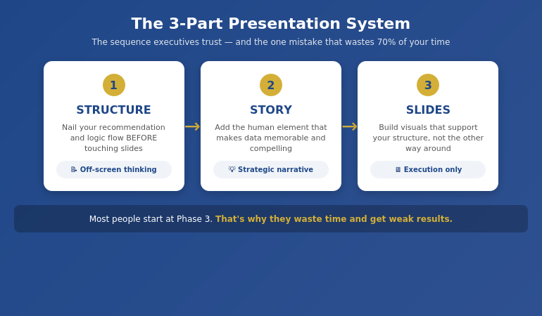
What Is Stakeholder Mapping (And Why Slides Won’t Save You)
Most professionals prepare for presentations backwards. They spend 80% of their time on slides and 20% on understanding the room. The executives who consistently win approval do the opposite.
Stakeholder mapping is the process of identifying every person who influences your presentation’s outcome—not just who’s in the room, but who whispers in the decision-maker’s ear before and after. It answers three questions most presenters never ask:
- Who actually decides? (Hint: it’s rarely the most senior person)
- What does each person need to hear to say yes? (Their public criteria and private concerns are different)
- Who can kill this before it reaches the room? (The blocker you don’t see coming)
I learned this the hard way at JPMorgan Chase. Beautiful deck. Compelling ROI. Standing ovation from the team. The steering committee rejected it in four minutes because I’d missed the one person whose support I actually needed—the operations director who’d been burned by a similar project two years earlier.
The CFO told me afterwards: “Your slides were fine. Your stakeholder work was invisible.”
That conversation changed how I approach every high-stakes presentation. If you’re presenting to senior leadership and fear of being judged is holding you back, know this: judgment often comes from misreading the room, not from your delivery.
The Meeting That Changed Everything
Three years later, I faced the same situation—but with very different preparation.
The project: a significant infrastructure upgrade that would disrupt operations for six months. The room: five regional directors, each protecting their own territory. The politics: two of them had competing projects that would lose funding if mine was approved.
The old me would have built a brilliant deck proving ROI. The new me spent three weeks building a stakeholder map instead.
What I discovered changed everything:
- The “decision-maker” (the CFO) actually deferred to the operations director on anything that touched day-to-day workflows
- The loudest opponent wasn’t against the project—he was against being surprised by it
- The quiet supporter in the corner had tried to push a similar initiative three years ago and been shut down. She had data I needed.
- Two directors had a private rivalry that had nothing to do with my project but would influence how they voted
Armed with this map, I didn’t walk into the presentation hoping for approval. I walked in knowing I had it.
How? Because I’d had five separate conversations before the meeting. Each stakeholder felt heard. Each concern had been addressed. The presentation wasn’t where I won approval—it was where I confirmed it.
The 4-Quadrant Stakeholder Framework
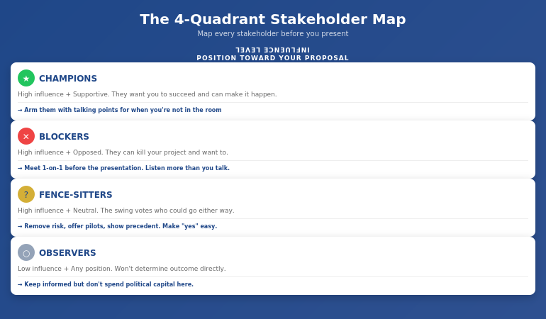
After using stakeholder mapping across projects of varying scale and stakes, I’ve refined it into a simple framework anyone can use. Every stakeholder falls into one of four quadrants based on two factors: their influence over the decision and their current position toward your proposal.
Quadrant 1: Champions (High Influence + Supportive)
These stakeholders want your project to succeed and have the power to make it happen. Your job: arm them with ammunition. Give them the talking points they’ll use when you’re not in the room. Ask them: “What objections will come up, and how should I address them?”
Quadrant 2: Blockers (High Influence + Opposed)
The most dangerous quadrant. These stakeholders can kill your project, and they want to. Your job: understand their real concern (it’s rarely what they say publicly). Often, blockers aren’t against your idea—they’re against not being consulted, or they’re protecting something you haven’t considered. Meet them one-on-one before the presentation. Listen more than you talk.
Quadrant 3: Fence-Sitters (High Influence + Neutral)
These stakeholders could go either way. They’re often the swing votes. Your job: make it easy to say yes. Remove risk, offer pilot options, show precedent. They don’t want to champion your project—they want to not look foolish for approving it.
Quadrant 4: Observers (Low Influence + Any Position)
These stakeholders won’t determine the outcome, but they might influence someone who does. Your job: don’t ignore them completely—a frustrated observer can become a vocal critic. Keep them informed, but don’t spend your political capital here.
For each person in your stakeholder map, document: their quadrant, their public position, their private concern, who influences them, and what they need to hear from you.
⭐ Walk into your next approval meeting prepared
The Executive Buy-In Presentation System gives you 7 self-paced modules covering stakeholder analysis, case construction, and the presentation structures that hold up to scrutiny. Monthly cohort enrolment — £499, lifetime access to materials.
What’s covered:
- Stakeholder mapping frameworks for high-stakes decisions
- Pre-meeting conversation approaches that surface hidden objections
- The enrollment versus alignment distinction for creating champions
- Bonus Q&A calls (optional, fully recorded — watch back anytime)
Explore the Buy-In System on Maven →
Self-paced with monthly cohort enrolment.
The Pre-Meeting Conversations That Win Votes
The stakeholder map tells you who to talk to. But what do you actually say?
Most professionals make one of two mistakes: they either skip pre-meeting conversations entirely (hoping their slides will speak for themselves), or they pitch their idea to everyone they meet (creating resistance before the formal presentation).
The executives who consistently win approval do something different. They have discovery conversations—structured dialogues designed to surface concerns, build relationships, and create ownership.
Here’s the framework I use:
No deadlines, no mandatory attendance. Executive Buy-In Presentation System — 7 self-paced modules, £499, lifetime access to materials.
The 3-Part Pre-Meeting Conversation:
Part 1: Understand Their World (70% of the conversation)
“I’m presenting on [topic] next week. Before I finalize anything, I wanted to understand your perspective. What would you need to see for something like this to work for your team?”
Notice: you’re not pitching. You’re learning. Most stakeholders have never been asked what they actually need. This question alone creates goodwill.
Part 2: Surface Hidden Concerns (20% of the conversation)
“What concerns would you have? What’s worked—or not worked—when similar initiatives have been tried before?”
This is where blockers reveal their real objections. Often, they’ll tell you things they’d never say in a group setting. A operations director once told me: “I don’t care about the ROI. I care about not being blamed when something goes wrong during the transition.” That concern never appeared in the official feedback—but it was the only thing that mattered.
Part 3: Create Ownership (10% of the conversation)
“Based on what you’ve shared, here’s how I’m thinking about addressing [their concern]. Does that make sense to you?”
When a stakeholder helps shape your proposal, they become invested in its success. They’re no longer evaluating your idea—they’re defending their own input.
How to Uncover Hidden Agendas
Every executive room has hidden agendas. The question isn’t whether they exist—it’s whether you know what they are before you present.
Across 25 years at JPMorgan Chase, PwC, Royal Bank of Scotland, and Commerzbank, I watched technically superior proposals lose to politically savvy ones. Not because politics is more important than substance—but because ignoring politics is a form of arrogance that executives punish.
Here’s how to uncover what’s really driving the decision:
Ask the Executive Assistant
The EA often knows more about what’s really happening than anyone in the room. A simple question—”Is there anything I should be aware of before this meeting?”—can reveal landmines you’d never see coming.
Follow the Budget Trail
Who else is competing for the same resources? What got funded last quarter—and what got cut? Your proposal doesn’t exist in isolation. It exists in a portfolio of competing priorities.
Map the Relationships
Who mentored whom? Who’s been passed over for promotion? Who has a track record of opposing this type of initiative? Understanding how to present to a board of directors means understanding that board dynamics are rarely about the agenda item in front of them.
Look for the “Real Decision-Maker”
The person with the highest title isn’t always the person who decides. In the infrastructure project above, the CFO had final authority—but he would never approve anything the operations director opposed. The real decision was made in a hallway conversation I wasn’t part of. My stakeholder map told me that. My pre-meeting work made sure that conversation went in my favour.
⭐ Stop guessing what your stakeholders need to say yes
The Executive Buy-In Presentation System is the self-paced framework for decoding stakeholder resistance and building the case that addresses it — 7 modules, monthly cohort enrolment, optional recorded Q&A. £499, lifetime access.
Explore the Buy-In System on Maven →
Self-paced with monthly cohort enrolment.
3 Stakeholder Mapping Mistakes That Kill Projects
After years coaching senior professionals through high-stakes presentations, I see the same mistakes repeatedly. Each one is easy to make and expensive to fix.
Mistake #1: Mapping Titles Instead of Influence
Your stakeholder map lists “CFO, COO, VP Operations” because those are the names on the meeting invite. But influence doesn’t follow org charts. The CFO might defer to their trusted advisor on technical matters. The COO might be checked out on this topic entirely. The VP Operations might have the CEO’s ear because they golf together.
The fix: For each stakeholder, ask: “Who do they listen to? Who influences their thinking on this topic specifically?” Map the shadow org chart, not the official one.
Mistake #2: Assuming Silence Means Support
You present your proposal. Three executives nod. Two stay quiet. You assume the quiet ones are fine with it.
They’re not. They’re waiting. They’ll voice their objections later—in the hallway, in a follow-up email, in a private conversation with the decision-maker. By then, your proposal is dead and you don’t know why.
The fix: Silence is a warning sign, not a green light. If someone hasn’t expressed a position, you don’t have their support—you have their tolerance. Find out what they’re really thinking before the meeting, not after.
Mistake #3: Treating All Stakeholders Equally
You have a week to prepare. You spend equal time with every stakeholder. The result: you know a little about everyone and not enough about anyone.
The fix: Your stakeholder map should be prioritized ruthlessly. Spend 80% of your pre-meeting time on the 20% of stakeholders who will actually determine the outcome. A deep relationship with two key influencers beats shallow relationships with ten observers.
Understanding what it takes to get executive buy-in means accepting that some stakeholders matter more than others—and acting accordingly.
What is stakeholder mapping in presentations?
Stakeholder mapping is the process of identifying every person who influences your presentation’s outcome, understanding their position, and strategically engaging them before you present. It answers three questions: Who actually decides? What does each person need to hear? Who can kill this quietly? The goal is to secure approval through pre-meeting work, so the presentation confirms what’s already been agreed—not where you hope to persuade.
How do you identify key stakeholders for a presentation?
Start with the meeting invite, then expand. Ask: Who influences the decision-maker? Who has veto power? Who’s been burned by similar proposals? Who has competing priorities? Map both formal authority (titles) and informal influence (relationships, expertise, history). The most important stakeholders often aren’t in the room—they’re the people the decision-maker calls after the meeting.
How do you present to multiple stakeholders with different agendas?
You don’t try to address every agenda in the room—you address each agenda before the room. Use your stakeholder map to have individual conversations where you surface each person’s real concerns and incorporate their input into your proposal. When you present, acknowledge the different perspectives: “I know some of you are focused on risk, others on timeline, others on budget. Let me show you how this addresses each.” The preparation makes the presentation feel effortless.
⭐ Built on 25 years in corporate banking
The Executive Buy-In Presentation System is the structured framework developed across 25 years in corporate banking and 16 years coaching senior professionals across financial services, insurance, consulting, and technology. £499, lifetime access to materials.
What you get:
- 7 self-paced modules on stakeholder analysis, structure, and delivery
- Pre-meeting conversation frameworks with exact language
- Approaches for identifying real decision-makers and influencers
- Bonus Q&A calls (optional, fully recorded — watch back anytime)
- Lifetime access to all materials
Explore the Buy-In System on Maven →
Self-paced with monthly cohort enrolment — new cohort opens every month.
Frequently Asked Questions
Isn’t this just office politics?
Stakeholder mapping isn’t manipulation—it’s respect. You’re taking the time to understand what each person actually needs, rather than assuming your brilliant slides will convince everyone. The executives who dismiss this as “politics” are often the ones who get blindsided by rejections they didn’t see coming. Understanding organizational dynamics is a professional skill, not a character flaw.
What if I don’t know the stakeholders well enough?
Start with what you know, then expand. Ask your sponsor or champion: “Who should I talk to before this meeting?” Ask trusted colleagues: “What should I know about the people in this room?” Even thirty minutes of stakeholder research is better than none. The goal isn’t perfect intelligence—it’s better intelligence than you had before.
How much time does stakeholder mapping actually take?
For a typical steering committee or board presentation, plan for 3-5 hours of stakeholder work spread across 1-2 weeks. That includes creating the initial map (1 hour), having pre-meeting conversations (2-3 hours total), and refining your approach based on what you learn. This time investment pays for itself many times over—a rejected proposal wastes far more than 5 hours.
What if the stakeholder landscape changes at the last minute?
It will. Someone gets pulled into another meeting. A new executive joins. Priorities shift overnight. Your stakeholder map isn’t a static document—it’s a living framework. Update it as you learn new information. The executives who handle last-minute changes well are the ones who’ve done enough stakeholder work to understand the underlying dynamics, not just the surface positions.
📧 The Winning Edge Newsletter
Weekly insights on executive presentations, stakeholder strategy, and high-stakes communication. No fluff—just what works.
📋 Free: Executive Presentation Checklist
The pre-presentation checklist I use before every high-stakes meeting. Covers stakeholder prep, slide structure, and room setup.
Your Next Step
The stakeholder map for that infrastructure project took three hours to create. The conversations it enabled took another six hours spread across two weeks. The approval that followed took about four minutes once I walked into the room.
If you’re preparing for a high-stakes presentation—budget approval, project sign-off, board update, client pitch—start your stakeholder map today. Identify the four quadrants. Find your champions and your blockers. Have the pre-meeting conversations that turn a stressful presentation into a predictable formality.
And if you want the complete system—templates, scripts, frameworks, and live feedback on your actual presentations—join the Executive Buy-In Presentation System on Maven.
The decision isn’t made in the meeting. It’s made before. Your stakeholder map makes sure you’re part of those conversations.
Related: If presentation anxiety is part of what’s holding you back from stakeholder conversations, read how to handle the fear of being judged when speaking.
About Mary Beth Hazeldine
Owner & Managing Director of Winning Presentations. 25 years in corporate banking at JPMorgan Chase, PwC, Royal Bank of Scotland, and Commerzbank taught me that the best proposals fail without stakeholder work. The pre-meeting map is the step separating presentations that get approved from presentations that get “tabled for further review.”