
Data Presentation Tips: Turn Spreadsheets Into Stories in 5 Steps
A quick framework for transforming raw data into slides that actually get decisions
You have a spreadsheet full of numbers. You need a presentation by tomorrow. How do you turn rows and columns into something that actually moves people to action?
Here are 5 data presentation tips that transform raw data into compelling slides — without losing the rigour your audience expects.
🎁 Free Download: Executive Presentation Checklist — includes the data slide framework.
5 Data Presentation Tips That Transform Numbers Into Narratives
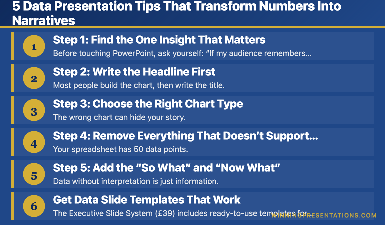
Step 1: Find the One Insight That Matters
Before touching PowerPoint, ask yourself: “If my audience remembers only one thing from this data, what should it be?”
That’s your headline. Everything else supports it.
Look for:
- The biggest change (up or down)
- The surprising finding
- The number that triggers a decision
- The trend that demands action
Example: A spreadsheet shows 12 months of regional sales. The insight isn’t “here’s our sales data.” It’s “EMEA grew 34% while Americas flatlined — we need to shift Q1 focus.”
Step 2: Write the Headline First
Most people build the chart, then write the title. Flip it.
Write your insight as a headline before you create any visualisation. This forces clarity. If you can’t write a clear headline, you haven’t found your story yet.
Weak headline: “Q3 Revenue by Region”
Strong headline: “EMEA Drives 70% of Q3 Growth”
The weak version labels the data. The strong version tells the audience what to think.
Related: Data Storytelling: How to Make Numbers Compelling (Not Boring)
Step 3: Choose the Right Chart Type
The wrong chart can hide your story. Match the visualisation to what you’re showing:
- Trends over time → Line chart
- Comparing categories → Bar chart (horizontal for many items)
- Part of a whole → Pie chart (max 5 segments) or stacked bar
- Showing correlation → Scatter plot
- Single important number → Big number with context
When in doubt, use a bar chart. They’re the easiest to read quickly.
Step 4: Remove Everything That Doesn’t Support the Insight
Your spreadsheet has 50 data points. Your slide needs 5.
Delete ruthlessly:
- Gridlines (usually unnecessary)
- Data labels on every point (highlight key ones only)
- Legends that duplicate axis labels
- 3D effects (they distort perception)
- Decimal places beyond what matters
Every element on your slide should earn its place. If it doesn’t support the insight, it’s noise.
Related: The Executive Summary Slide: How to Write the Only Slide That Matters
Step 5: Add the “So What” and “Now What”
Data without interpretation is just information. Add two things:
The “So What”: Why does this data matter? What does it mean for the business?
The “Now What”: What action should the audience take based on this data?
These can be a single line of text below your chart, or your verbal narrative as you present. Either way, never leave your audience to interpret the implications themselves.
Related: Team Dashboards That Tell a Story (Not Just Show Numbers)
Get Data Slide Templates That Work
The Executive Slide System (£39) includes ready-to-use templates for data presentations — with the insight-first structure already built in.
What’s included:
- Data slide templates with headline frameworks
- Dashboard layouts that tell stories
- Before/after examples
Quick Data Presentation Checklist
Before you present any data slide, run through this:
- ☐ Is there ONE clear insight? (Not three competing points)
- ☐ Does the headline state the insight? (Not just label the data)
- ☐ Is the chart type appropriate for the story?
- ☐ Have I removed unnecessary clutter?
- ☐ Is the “so what” clear?
- ☐ Do I know what action I want from the audience?
If you can check all six, your data slide is ready.
Your Next Step
Take your next data-heavy slide and apply step 2 first: write the headline as an insight, not a label. That single change transforms how your audience receives the information.
📖 Go deeper: Data Storytelling: How to Make Numbers Compelling — the complete guide with 5 techniques, common mistakes, and real examples.
🎁 Get the checklist: Executive Presentation Checklist — free, includes data slide framework.
📘 Get the templates: Executive Slide System (£39) — data slide templates with insight-first structure.
Mary Beth Hazeldine spent 24 years presenting data to boards and credit committees in corporate banking. She now helps professionals turn spreadsheets into stories that drive decisions.