
How I Use AI to Create Data Slides in 10 Minutes (Instead of 2 Hours)
The prompts and workflow that transformed how I build data presentations
I used to spend hours on data slides. Exporting from Excel. Formatting charts. Tweaking layouts. Rewriting headlines until they made sense.
Now I do it in 10 minutes.
The difference isn’t working faster. It’s working with AI as a thinking partner — using it for the parts it’s good at while I focus on what it can’t do: the insight.
Here’s my actual workflow.
The AI Data Slide Workflow
Most people use AI wrong for data presentations. They dump numbers into ChatGPT and ask it to “create a presentation.” The result is generic, insight-free, and usually wrong.
The trick is breaking the process into steps — using AI for some, doing others yourself.
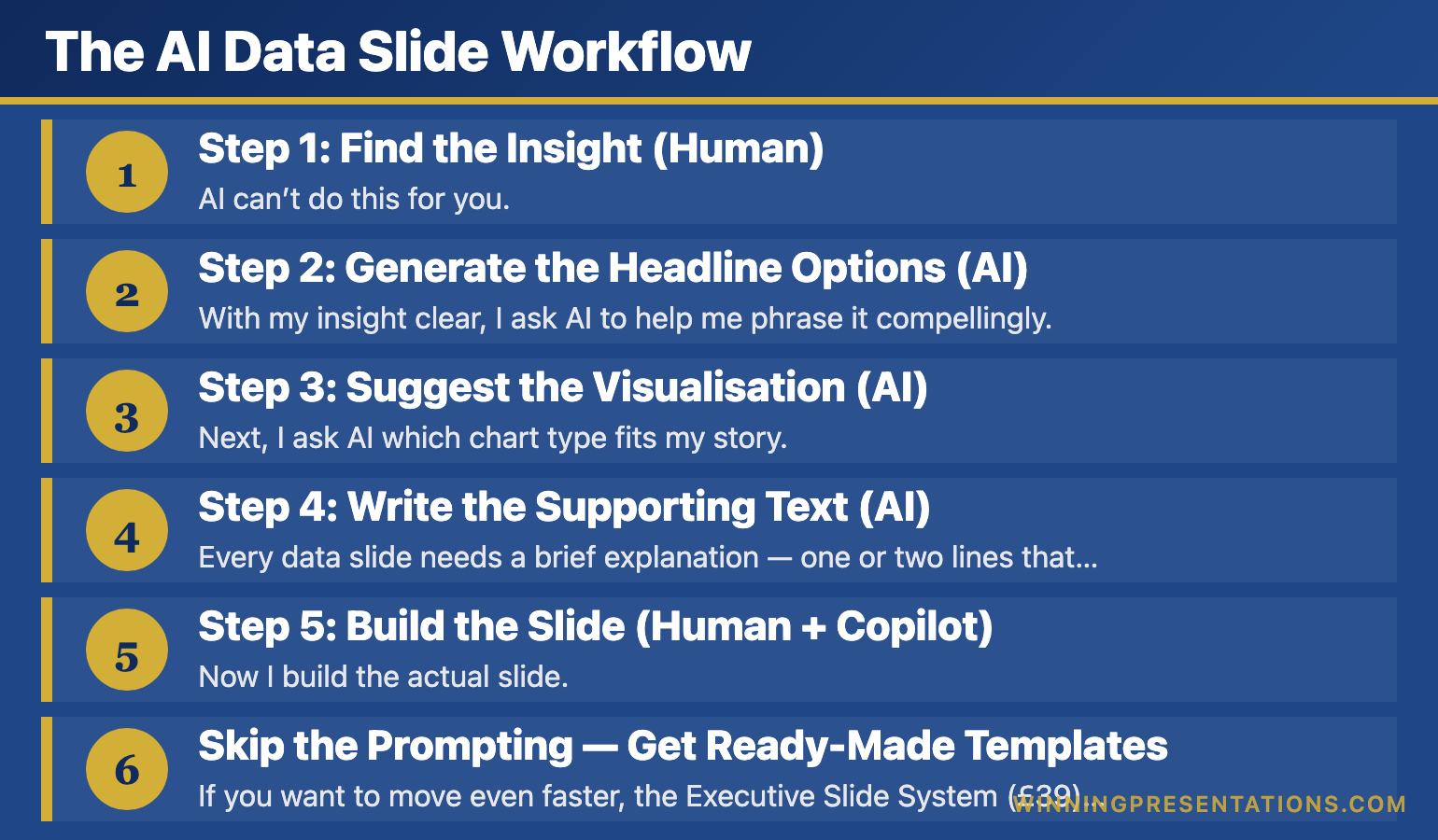
Step 1: Find the Insight (Human)
AI can’t do this for you. Before touching any tool, I look at my data and ask: “What’s the one thing that matters here?”
This takes 5 minutes of thinking. It’s the most important part.
Once I have my insight — “EMEA is growing 3x faster than Americas” or “Churn dropped 40% after the intervention” — everything else becomes easier.
Step 2: Generate the Headline Options (AI)
With my insight clear, I ask AI to help me phrase it compellingly.
My prompt:
AI gives me 5 options. I pick the best one or combine elements from multiple.
This takes 1 minute instead of 15 minutes staring at a blank slide.
Step 3: Suggest the Visualisation (AI)
Next, I ask AI which chart type fits my story.
My prompt:
AI doesn’t just give me an answer — it explains the logic. “A line chart works because you’re showing change over time, and the inflection point in March is your story.”
Sometimes I disagree with its recommendation. That’s fine. The value is in the reasoning, not the answer.
Related: Data Storytelling: How to Make Numbers Compelling (Not Boring)
Step 4: Write the Supporting Text (AI)
Every data slide needs a brief explanation — one or two lines that reinforce the insight. AI drafts this fast.
My prompt:
I usually edit what it gives me — cutting words, adding specifics — but it’s faster than writing from scratch.
Step 5: Build the Slide (Human + Copilot)
Now I build the actual slide. If you have Copilot in PowerPoint, you can prompt it directly:
My Copilot prompt:
Copilot gets me 70% of the way there. I spend another 2-3 minutes adjusting formatting, colours, and emphasis.
Total time: 10 minutes for a data slide that used to take 2 hours.
Related: Best PowerPoint Copilot Prompts That Actually Work
Skip the Prompting — Get Ready-Made Templates
If you want to move even faster, the Executive Slide System (£39) includes data slide templates with the insight-first structure already built in.
What’s included:
- Data slide templates you can populate directly
- Dashboard layouts designed for executive audiences
- The headline framework built into every slide
- Before/after examples showing transformations
The Prompts I Use Most Often
Here are three more prompts from my data presentation workflow:
For simplifying complex data:
For anticipating questions:
For creating the narrative:
These prompts save me hours every week. Not because AI is doing my thinking — but because it’s accelerating the parts that used to be slow.
Related: AI Presentation Workflow: How I Cut Creation Time from 6 Hours to 90 Minutes
📬 Get More AI + Presentation Tips
Every week, I share prompts, workflows, and techniques for better presentations. No fluff.
What AI Can’t Do (And Shouldn’t Try)
AI accelerates data presentations. It doesn’t replace your judgment.
AI can’t find your insight. It can summarise data, but it doesn’t know what matters to your specific audience. That’s your job.
AI can’t know your politics. It doesn’t know that your CEO hates pie charts or that the board has seen this data before. Context is human.
AI can’t guarantee accuracy. Always verify numbers. I’ve seen AI confidently miscalculate percentages. Trust but verify.
Use AI for speed. Use your brain for strategy.
Learn the Complete AI Presentation System
This article shows one workflow. AI-Enhanced Presentation Mastery teaches the complete system — from data storytelling to AI-assisted delivery prep.
What you’ll learn:
- AI prompts for every presentation type (not just data slides)
- The 90-minute deck creation workflow
- How to use AI for Q&A preparation
- Data storytelling and the insight-first framework
- Delivery techniques that technology can’t replace
8 self-paced modules (January–April 2026) plus 2 live coaching sessions.
Presale price: £249 (increases to £499)
Try This Today
Next time you have data to present, try Step 2 from my workflow:
Write down your insight in one sentence. Then ask AI: “Give me 5 headline options for this insight. Punchy, clear, no jargon.”
See how much faster it makes you.
📖 Learn the framework: Data Storytelling: How to Make Numbers Compelling — the complete insight-first system.
📘 Get the templates (£39): Executive Slide System — data slide templates ready to use.
🎓 Master the AI workflow (£249): AI-Enhanced Presentation Mastery — prompts, workflows, and systems for every presentation type.
Mary Beth Hazeldine combines 24 years of corporate banking experience with expertise in AI-enhanced workflows. She helps professionals create better presentations in less time.