Quick answer: The most experienced presenters are often the ones who quietly stopped improving years ago, and the cause is structural rather than a lack of effort or talent. As a presenter becomes more senior, the honest feedback they need to keep improving dries up through three droughts: the deference drought, where junior colleagues will not correct a senior person; the politeness drought, where peers will not risk the working relationship to deliver candour; and the outcome drought, where the senior presenter wins the decision anyway on the strength of their authority, so the room’s tolerance masks the gaps in their actual presenting. The combined effect is that the senior presenter is surrounded by silence and mistakes the silence of deference for the silence of competence. The blindspot is the widening gap between how good they think they are and how good they are, which no one in their environment is incentivised to close. Underneath the structural droughts sits an emotional one: seeking honest feedback at senior level means risking the discovery that you are not as good as your position implies, and that risk feels threatening enough that many senior presenters quietly avoid it. The presenters who keep improving into their sixties are the ones who manufacture the feedback their seniority took away rather than waiting for it to arrive on its own.
JUMP TO:
In 2013 I was observing at a leadership offsite for a large organisation, and I watched a senior executive give a presentation that was, by any reasonable standard, polished. He was fluent, he was comfortable, he had clearly given a thousand presentations, and the room received him with the easy respect that senior people command. Afterwards, the chief executive, who had known him for fifteen years, said something to me quietly that I have never forgotten. He said the executive had been giving essentially the same presentation, at the same level, for the entire fifteen years he had known him — not the same content, but the same habits, the same structural tics, the same two or three weaknesses, none of which had improved at all in fifteen years of constant presenting. The executive himself believed he was an excellent presenter, and in a narrow sense he was not wrong; he was well above average. But he had plateaued completely around a decade earlier and had no idea, because nothing in his environment had told him. The room deferred to him. His peers were polite. And he won often enough, on the strength of his position, that the wins confirmed his self-assessment. He was the most experienced presenter in the building and the one who had improved the least in the longest time, and the two facts were connected.
I have seen this pattern often enough now to regard it as one of the defining hazards of a senior career, and the cruel part is that it disguises itself as success. The senior presenter who has stopped improving does not feel like someone who has stopped improving. They feel competent, comfortable, respected — all the things they were told to aim for — and the comfort itself is the symptom. Improvement requires the friction of honest feedback, and seniority systematically removes that friction. The presenter is left in a smooth, frictionless environment that feels like mastery and is actually stagnation. The better they get at commanding a room, the less anyone in the room is willing to tell them the truth about how they are doing, and the truth is the only thing that would let them keep getting better.
(This article was created with AI assistance; all stories and insights are based on 35 years of real client work.)
This article is about why the feedback dries up, why the drying-up is invisible to the person it happens to, and what the senior presenters who keep improving do differently. The core problem is not that senior presenters are complacent — many are highly conscientious — it is that they are operating inside an environment structurally designed to stop telling them the truth, and they have not noticed because the silence sounds exactly like approval. The fix is not to try harder inside that environment. It is to deliberately reconstruct the honest feedback that the environment has removed, which is uncomfortable in a specific way that most senior presenters quietly avoid.
If the real barrier to seeking feedback is the discomfort of what you might hear:
Conquer Your Fear of Public Speaking is a self-study course for senior professionals whose relationship with presenting is more complicated than their outward polish suggests — including the quiet anxiety that makes seeking honest feedback feel threatening at senior level. It works through the psychology that keeps capable presenters from doing the uncomfortable things that would make them better. Built for executives who present competently and know, privately, that something has stalled.
The paradox: more experience, less improvement
The intuitive model of skill is that it accumulates with practice: the more presentations you give, the better you get, indefinitely. This is true for the first several years of a presenting career and then it stops being true, and the point at which it stops is roughly the point at which the presenter becomes senior enough that people stop correcting them. Up to that point, improvement is fed by a steady stream of correction — a manager who tells you the slide was unclear, a mentor who tells you that you lost the room, a peer who is junior enough to your shared boss that candour between you carries no risk. That stream is what converts practice into improvement. Practice without feedback is not improvement; it is repetition, and repetition entrenches whatever habits you already have, good and bad alike.
What happens at senior level is that the practice continues — often increases — while the feedback stops, and practice without feedback entrenches rather than improves. The senior presenter giving a hundred presentations a year is not getting a hundred presentations better; they are getting a hundred presentations more entrenched in exactly the habits they had when the feedback dried up. This is why the plateau so often dates to the moment of a significant promotion. The executive I described had plateaued around the time he reached the level at which no one beneath him would correct him and no one beside him would risk it. His presenting froze at the standard it had reached at that moment, and a decade of heavy practice afterwards did not move it, because there was nothing in the practice to move it — just repetition of the frozen pattern.
The reason the plateau is invisible is that it does not feel like a plateau from the inside. The senior presenter is getting more comfortable, more fluent, more at ease in front of rooms, and they experience that growing ease as continued improvement. But ease is not skill. A presenter can become enormously comfortable delivering a structurally weak presentation; the comfort grows while the structural weakness stays exactly where it was. From the inside, the increasing comfort feels like getting better. From the outside — from the perspective of the chief executive who had watched fifteen years of it — the comfort is just the sound of a weakness getting more settled. The presenter mistakes fluency for progress, and fluency is precisely what heavy practice produces even in the total absence of improvement. A real method for improving at presentations has to break the equation between comfort and skill, because at senior level the two come apart completely.
The three feedback droughts that hit senior presenters
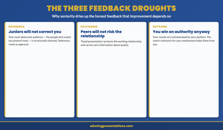
The first drought is the deference drought. The people most likely to notice a senior presenter’s habits in fine detail are the junior colleagues who watch them present repeatedly — and those are exactly the people least able to say anything. A junior colleague who tells a senior executive that their data slides are consistently overloaded is taking a real career risk for an uncertain reward, and almost no one takes that trade. So the most observant audience the senior presenter has is structurally silenced. The senior presenter experiences this as juniors being uniformly impressed, when in fact the juniors may be noticing the same flaw the chief executive noticed and simply have no safe way to mention it. Deference reads, from the receiving end, as approval. It is not approval. It is the absence of permission to be candid.
The second drought is the politeness drought. Peers — people at the senior presenter’s own level — could in principle give candid feedback without career risk, but they face a different barrier: the working relationship. Telling a peer that their presentation had a recurring weakness strains a relationship that both parties need to keep functional across many other interactions, and most peers conclude, reasonably, that the candour is not worth the cost to the relationship. So peers default to the bland positive — “good presentation” — which costs nothing and protects the relationship, and which carries zero information. The senior presenter is surrounded by peers who say “good presentation” and means by it only “I am maintaining our relationship”, and mistakes the relationship-maintenance for an assessment of quality.
The third drought is the outcome drought, and it is the most insidious because it corrupts the one feedback source that should be objective: the result. A junior presenter learns from results — the pitch that failed teaches a hard, honest lesson. A senior presenter’s results are contaminated by their authority. They win approvals partly on the merits of the presentation and partly on the weight of their position, and they cannot tell how much of the win was which. A structurally weak presentation that wins because the presenter is the respected divisional head teaches the presenter that the presentation was good, when in fact the position carried the weak presentation across the line. The room’s tolerance for a senior person’s weaknesses masks the weaknesses from the senior person themselves. They conclude, from a string of wins, that their presenting is excellent, when some of those wins were their authority compensating for presenting that had quietly stopped improving. Staying composed under pressure gets easier with seniority for the same reason the feedback gets scarcer — the room hands authority a smoother ride, and the smoother ride hides as much as it helps.
Work through the psychology that keeps capable presenters from getting better.
Conquer Your Fear of Public Speaking is a self-study course for senior professionals whose outward competence hides a more complicated relationship with presenting — including the quiet avoidance of the honest feedback that improvement depends on. Instant access, work at your own pace, lifetime access to materials. £39.
- Addresses the self-protective avoidance that keeps senior presenters from seeking candid feedback
- Structural rather than purely motivational framework for high-stakes scenarios
- Designed for senior professionals, not entry-level presenters
- Self-study format, no live commitments, work at your own pace
The emotional drought underneath the structural ones
Beneath the three structural droughts sits a fourth, emotional one that the senior presenter contributes themselves, and it is the hardest to name because it does not feel like avoidance from the inside. Seeking honest feedback at senior level means deliberately exposing yourself to the possibility of discovering that you are not as good as your position implies you should be — and for many senior presenters that possibility is threatening in a way they do not fully admit. The threat is not to their job; it is to a self-image they have built over decades, the self-image of someone who is good at this. A junior presenter seeking feedback risks finding out they have things to learn, which is expected and unthreatening. A senior presenter seeking feedback risks finding out they have been worse than they thought for years while everyone was too polite to say, and that is a genuinely painful thing to invite, so most of them quietly do not invite it.
This is where the topic connects to anxiety rather than to logistics, and why the fix is not simply “ask for more feedback”. The reason senior presenters do not manufacture the feedback their environment stopped providing is rarely that it is hard to arrange — it is easy to arrange. It is that arranging it means volunteering for a specific discomfort, the discomfort of hearing that the thing you believe you are good at has flaws you have been carrying for years. The senior presenter avoids this the way anyone avoids a threat to something they value, by not quite getting around to it, by telling themselves their presenting is fine, by interpreting the surrounding silence as confirmation. The avoidance is protective and it is largely unconscious, which is what makes it so effective and so durable. The presenter is not lazy; they are protecting a self-image, and the protection costs them the improvement.
Naming this honestly is the first move, because an unconscious avoidance cannot be addressed and a conscious one can. The senior presenter who recognises “I have not sought real feedback in years, and the reason is that I am afraid of what I might hear” has converted an invisible avoidance into a visible choice, and a visible choice can be made differently. The discomfort does not go away — hearing that your data slides have been overloaded for a decade is genuinely uncomfortable — but it becomes a discomfort the presenter can choose to walk toward rather than one that silently steers them away. The presenters who keep improving are not the ones who feel no threat in seeking feedback. They are the ones who feel the threat, recognise it for what it is, and seek the feedback anyway, because they have decided that improving matters more than protecting the self-image. Working through the psychology of presenting under self-image threat is the part of this that is genuinely emotional work rather than logistical work.
For the wider toolkit across confidence, structure, and delivery:
The Complete Presenter bundle gathers the confidence frameworks, the slide system, the storytelling primer, the Q&A taxonomy, and the delivery references into one library at a bundle price. Senior presenters working to reopen their own improvement use it to cover the structural side — the slides, the question handling, the delivery — alongside the confidence work, rather than buying each piece separately. £99, instant download, lifetime access.
Manufacturing the feedback seniority took away
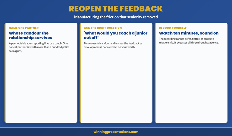
The fix is to deliberately reconstruct the honest feedback that the environment has stopped supplying, and the most reliable way to do it is to name one feedback partner: a single person whose judgement you trust and whose relationship with you can survive candour. This is usually a peer outside your immediate reporting line, sometimes someone in another organisation entirely, occasionally a professional coach — the defining requirement is that the relationship is robust enough to absorb honesty without either party managing the other’s feelings. One such partner is worth more than a hundred polite colleagues, because the one partner is the only person in your world structurally free to tell you the truth. The senior presenter who has even one genuine feedback partner has solved most of the blindspot, because the partner reintroduces the friction that seniority removed.
The partnership only works if you ask the right question, because a senior person asking “how was that?” will get the polite answer even from a candid partner — the question gives them permission to be bland. The question that forces useful candour is specific and lowers the social cost of honesty: “What did I do in that presentation that you would coach a more junior person out of?” That phrasing does the work. It signals that you genuinely want the critical answer, it frames the feedback as developmental rather than as a verdict on your worth, and it points the partner at exactly the habitual weaknesses the three droughts have been hiding. The answer to that question, asked of a real feedback partner after a real presentation, is usually the first honest assessment of their presenting a senior person has had in years, and it is frequently uncomfortable and almost always useful.
The second mechanism is to remove the human politeness barrier entirely by recording yourself and watching it back, which most senior presenters have never actually done. A recording does not defer, does not protect the relationship, and does not let your authority paper over a weak slide. Watching ten minutes of yourself presenting, with the sound on, is one of the most honest feedback experiences available to a senior person, precisely because the recording has no incentive to be kind. The overloaded data slide that no one would mention is undeniable on the recording. The verbal tic that everyone has politely ignored for a decade is impossible to miss. The recording bypasses all three structural droughts and the emotional one too, because there is no person on the other end to fear disappointing — just the evidence. Pairing the recording with the feedback partner gives the senior presenter both the objective evidence and the trusted interpretation, which together reconstruct the full feedback environment that seniority dismantled.
Built on 24 years in corporate banking and 16 years coaching senior professionals.
Conquer Your Fear of Public Speaking — the self-study course for senior professionals whose competence hides a more complicated relationship with presenting, including the avoidance of the candid feedback that improvement depends on. £39, lifetime access, no subscription.
The executive I described at the start — the polished plateau the chief executive had watched for fifteen years — did eventually reopen his own feedback, though it took a difficult conversation to start it. The chief executive, who had finally decided the silence was doing his colleague a disservice, told him directly what he had been observing for years. It landed hard; the executive had genuinely believed he was excellent, and being told he had been static for a decade was a blow to a self-image he had held for most of his career. But to his credit he did not retreat into defending it. He found a feedback partner outside the organisation, he started recording himself, and he asked the coaching-out-of question after his presentations. Within a year his presenting had moved further than it had in the previous ten, not because he suddenly had more talent but because he had reintroduced the friction his seniority had removed. The plateau had never been a ceiling on his ability. It had been a ceiling on his feedback, and the moment the feedback reopened, the improvement resumed.
Frequently asked questions
How do I know whether I have actually plateaued or am genuinely good?
You cannot know from the inside, which is the whole point of the blindspot — the plateau and genuine excellence feel identical from within, because both feel comfortable and both are surrounded by polite approval. The only way to find out is to introduce a feedback source that is not subject to the three droughts: a candid partner outside your reporting line, or a recording of yourself, or both. If you genuinely cannot remember the last time someone gave you specific, critical, developmental feedback on your presenting — not “good presentation” but an actual named weakness — then you are operating without the friction that improvement requires, and you should assume you have plateaued until evidence proves otherwise. The absence of critical feedback is not evidence of excellence; it is evidence of seniority, and the two are easy to confuse precisely because seniority removes the feedback that would tell them apart.
Isn’t a senior presenter who has been successful for years entitled to assume they are good?
Successful and good are not the same thing at senior level, which is exactly what the outcome drought obscures. A senior presenter can be successful — winning approvals, advancing their initiatives — while presenting at a standard that has not improved in a decade, because their authority carries presentations that their skill alone would not. The success is real but it is not clean evidence of presenting quality, because it is contaminated by position. This is not a reason to feel insecure; it is a reason to be curious. The senior presenter who assumes their success proves their skill stops improving. The one who treats their success as genuine but separates it from the question of whether their presenting is still getting better keeps a door open that most of their peers have quietly closed. Entitlement to assume you are good is precisely the assumption that ends the improvement.
What if I ask for honest feedback and the person still won’t give it?
Then you have the wrong person or the wrong question. The right person is someone whose relationship with you does not depend on managing your feelings — which is why a peer in another organisation or a paid coach often works better than anyone inside your own. The right question is specific and gives explicit permission for criticism, like asking what they would coach a junior person out of, rather than the open “how was that?” which invites politeness. If you have the right person and the right question and still get nothing, the recording route bypasses the human problem entirely — watch yourself present for ten minutes and the feedback delivers itself, because the recording has no relationship to protect. Most senior presenters who claim they cannot get honest feedback have not tried the recording, which is the one source that cannot be polite.
Does reopening feedback risk damaging the confidence that makes me effective in the room?
It is the most common fear and it is usually misplaced, because the confidence that survives honest feedback is sturdier than the confidence that depends on never hearing any. A senior presenter whose composure rests on the absence of criticism has a fragile composure that a single candid comment could disturb; a senior presenter who has heard their real weaknesses and worked on them has a composure grounded in actual competence, which is far harder to shake. The short-term discomfort of hearing a weakness is real, but the medium-term effect of addressing it is increased rather than decreased confidence, because the presenter is no longer unconsciously protecting a self-image they suspect might not hold up. Confidence built on tested skill is more durable in the room than confidence built on untested self-image, and the testing is what reopening feedback provides.
The Winning Edge — weekly newsletter
The Winning Edge is a weekly newsletter for senior professionals who present at the executive level. One short email a week on the habits that keep senior presenters improving rather than plateauing behind a wall of polite approval. Subscribe to The Winning Edge →
For the wider library of senior-presenter assets — confidence frameworks, slide system, storytelling primer, Q&A taxonomy, delivery references — the seven-product Complete Presenter library (£99) collects them in one place.
About the author
Mary Beth Hazeldine is Owner & Managing Director of Winning Presentations Ltd. With 24 years of corporate banking experience at JPMorgan Chase, PwC, Royal Bank of Scotland, and Commerzbank, she advises executives across financial services, healthcare, technology, and government on structuring presentations for high-stakes funding rounds, board approvals, and strategic decisions.
Name one person whose judgement you trust and whose relationship with you can survive candour, and after your next presentation ask them one specific question: what did I do that you would coach a more junior person out of? Then record yourself and watch ten minutes of it with the sound on. The presenter who manufactures the feedback that seniority took away keeps improving into their sixties. The presenter who mistakes the silence of deference for the silence of competence stops improving the day the honest feedback dried up — and, because no one is left who will tell them, never finds out why.