Quick answer: “Is that your final number?” in an H1 review is not a request for the number; the committee already has the number on the slide. It is a test of whether you will hold a figure under pressure or fold the moment someone leans on it. There are three things the question is checking at once: whether the number is genuinely yours or one you inherited and cannot defend, whether you understand the conditions the number depends on, and whether you can be moved off it by tone alone. The presenter who answers with a flat “yes” passes the third test but fails the first two, because an unqualified yes signals either false certainty or no awareness of what the number rests on. The presenter who immediately revises the number downward fails all three. The response that holds the room confirms the number, states the one or two conditions it depends on, and names what would have to change for the number to move — which tells the committee the number is real, owned, and conditional in the way every honest forecast is. The question is about you, not the figure.
JUMP TO:
I coached a senior leader in 2016 — a commercial director preparing for the H1 review at a mid-cap business — who lost a forecast he was actually right about, on this exact question, in front of the executive committee. He had presented a second-half revenue forecast that was slightly below where the committee wanted it to be. A committee member, not unkindly, looked up and asked, “Is that your final number?” My client heard the disappointment under the question, wanted to be seen as responsive, and said, “Well — we could probably push it a little higher with some stretch on the new accounts.” The committee member wrote something down. By the end of the meeting the forecast on the record was two points higher than the one my client believed in, and he spent the entire second half chasing a number he had invented in the room to relieve eight seconds of social pressure. When we debriefed, he could see exactly what had happened. The committee had not asked him to raise the number. They had asked whether he would hold it. He had answered the question they did not ask and failed the one they did.
I have now worked with a large number of senior presenters on exactly this category of question, and the “is that your final number?” pattern is one of the most reliable in any review meeting because it is so cheap for the committee to ask and so revealing in the answer. It costs the questioner five words and a slightly raised eyebrow. It tells them, in the presenter’s response, whether the number is owned or inherited, understood or merely stated, and defensible or movable by tone. A second client, a finance lead at a different review the following year, faced the identical question on a forecast and answered it in a way that ended the line of questioning in one move: “Yes — it’s built on the two renewals closing in Q3, which are both at contract stage. If either slips, it comes down by about a point; if both close early, there’s modest upside. So it’s my number, and these are the two things that would move it.” The committee member nodded and went to the next slide. Same question, opposite outcome, and the difference was entirely in understanding what the question was testing.
(This article was created with AI assistance; all stories and insights are based on 35 years of real client work.)
The framework I want to lay out is what I now teach for the whole family of pressure-on-a-number questions — “is that your final number,” “are you sure about that,” “is that the best you can do.” They are all the same question structurally, and they all run the same three tests: is the number yours, do you understand what it depends on, and can you be moved off it by tone alone. The response that holds the room passes all three at once by confirming the number, stating its conditions, and naming what would move it. It is a single, learnable shape, and once a senior presenter has it, this category of question stops being a threat and becomes one of the easier moments in a review to handle well.
If holding a number under pressure is the part of reviews you dread:
The Executive Q&A Handling System is built for exactly these moments — tough questions, calm authority, decision-safe answers in around forty-five seconds. It gives you the response shapes for the pressure-on-a-number family and the wider taxonomy of questions a committee uses to test a presenter, so you walk into a review with the answers already rehearsed rather than improvised in the room.
What the question is actually asking
The first thing to understand is that the committee already has the number. It is on the slide in front of them. So “is that your final number?” cannot be a request for information they already possess. The question is doing something else entirely: it is probing the relationship between the presenter and the figure. A number on a slide is just a number until someone leans on it; the lean is how the committee finds out whether there is a person standing behind it. The question is the lightest possible lean — five words, no aggression — and it is calibrated precisely to reveal the presenter’s relationship to the number without the cost of a real challenge. If the presenter holds, the committee learns the number is owned. If the presenter wobbles, the committee learns it is not, and now they know to discount every other number in the deck.
This is why the worst thing a presenter can do is treat the question as a negotiation about the figure. The commercial director in 2016 heard “is that your final number?” as “we’d like a higher number, can you give us one,” and responded as if the meeting were a negotiation. It was not. The committee was not bargaining; they were testing. By treating a test as a negotiation, he gave ground that was never being asked for and revealed that the number was movable by social pressure alone — the single most damaging thing a forecast presenter can reveal, because a forecast that moves under mild pressure is not a forecast, it is a wish. The reframe that fixes this is to hear every pressure-on-a-number question as “show me your relationship to this figure,” not “give me a different figure.” The wider taxonomy of these testing questions is the substance of the hostile question handling course.
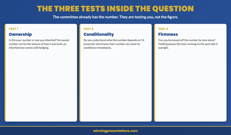
The three tests inside the question
The first test is ownership: is this your number or one you inherited? A presenter who built the forecast from their own pipeline answers differently from one who was handed a target and is presenting it upward. The committee can hear the difference instantly. An owned number comes with the texture of how it was built; an inherited number comes with hedging, because the presenter cannot fully defend something they did not construct. The question surfaces this. If you are presenting a number you inherited and do not believe, the “final number” question is the moment that becomes visible, and the honest move — rather than faking ownership — is to be explicit about the basis: “this is the target we’ve been set; here is my read on the probability of hitting it.” That is a defensible position. Faking conviction over an inherited number you privately doubt is not, because the committee will find the doubt in the follow-up.
The second test is conditionality: do you understand what the number depends on? Every honest forecast rests on a small number of conditions — deals that have to close, costs that have to hold, a market that has to behave. A presenter who understands their number can name those conditions immediately; a presenter who is merely reciting a number cannot. The question tests for this understanding, and the strong response volunteers the conditions before being asked. The third test is firmness: can you be moved off the number by tone alone? This is the test the flat “yes” passes and the immediate revision fails. Holding the number — confirming it stands — passes the firmness test. But firmness without conditionality reads as stubbornness or false certainty, which is why the holding response has to combine the two: firm on the number, transparent about its conditions. The three tests are not separate questions; they are three things the committee reads simultaneously from a single answer, which is why the response has to satisfy all three at once.
Rehearse the answers before the review, not in it.
The Executive Q&A Handling System gives you decision-safe response shapes for the questions committees actually use to test senior presenters — the pressure-on-a-number family, the “why should we believe this” family, the “whose fault is this” family — so you answer in around forty-five seconds with calm authority instead of improvising under pressure. £39, instant download, lifetime access.
- Response shapes for tough questions — confirm, condition, and name what would move it, in around 45 seconds
- A taxonomy of the question families a committee uses to test a presenter’s relationship to their material
- The structural difference between a test and a negotiation — so you stop conceding ground no one asked for
- Practice prompts to rehearse the pressure questions before the review rather than meeting them cold
The response shape that holds the room
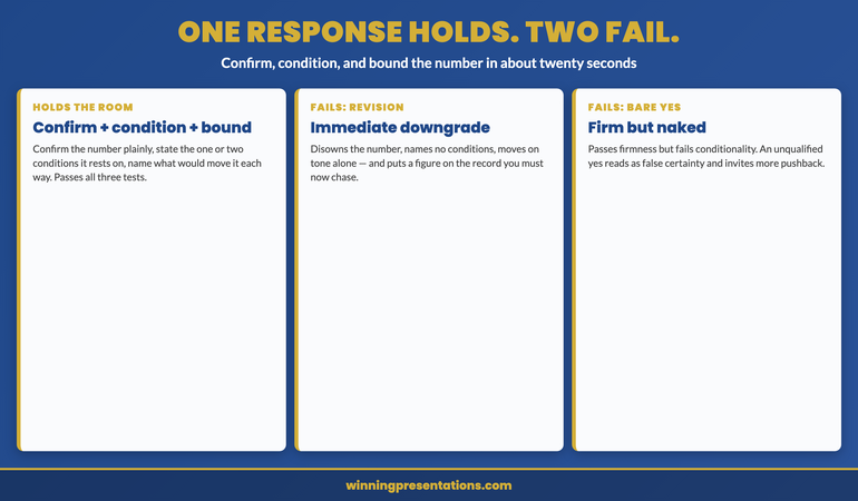
The response that passes all three tests has three parts, in order, and takes around twenty seconds to deliver. First, confirm the number plainly: “Yes, that’s my number.” The plain confirmation passes the firmness test and signals ownership before anything else. Second, state the one or two conditions the number rests on: “It’s built on the two renewals closing in Q3, both at contract stage.” This passes the conditionality test and demonstrates that the number is understood, not merely recited. Third, name what would move it, in both directions if honest: “If either renewal slips, it comes down about a point; if both close early, there’s modest upside.” This completes the picture and, crucially, shows that the conditionality is real rather than defensive — you are not hiding the downside, you are bounding it. The whole response confirms, conditions, and bounds the number, which is everything the committee was testing for.
What makes this shape powerful is that it ends the line of questioning rather than inviting more. A flat “yes” invites the follow-up “are you sure?” because it left the conditions unstated, and now the committee has to dig for them. The confirm-condition-bound response volunteers the conditions, so there is nothing left to dig for — the committee has the number, its basis, and its sensitivities in one answer, and the rational next move is to accept it and move on. The senior leader who delivers this shape consistently finds that pressure-on-a-number questions get shorter over time, because the committee learns that this presenter’s numbers come pre-stress-tested and there is little to gain from leaning on them. The full repertoire of these confirm-and-bound shapes for different question types is what the work on handling tough questions is built to develop.
The two answers that fail
The first failing answer is the immediate revision — the commercial director’s “we could probably push it higher.” It fails all three tests simultaneously: it disowns the number by treating it as provisional, it reveals no understanding of conditions because it offers a change without naming what changed, and it fails the firmness test outright by moving on tone alone. It also creates a concrete operational problem, because the revised number goes on the record and now has to be delivered. The presenter trades eight seconds of social discomfort for two quarters of chasing a figure they invented. The discomfort the revision was meant to relieve was the entire point of the question; relieving it by folding is precisely the failure the committee was probing for.
The second failing answer is the bare, unconditional “yes” with nothing after it. This one is more tempting because it feels strong — it holds the number, it does not fold. But an unqualified yes fails the conditionality test, because it presents the number as if it has no dependencies, which either signals false certainty or signals that the presenter has not thought about what the number rests on. A committee that hears a bare yes on a forecast tends to push, not because they want a different number but because they want to find out whether there is understanding behind the firmness. The bare yes invites exactly the follow-up the full response forecloses. Firmness alone is not enough; the committee is testing for firmness plus understanding, and only the confirm-condition-bound shape delivers both. The discipline is to never let a held number stand naked — always pair the hold with the conditions, every time, so the firmness reads as informed conviction rather than stubbornness.
Walk into the H1 review with the pressure answers already in muscle memory.
The Executive Q&A Handling System is a one-off £39, instant download, lifetime access — no subscription, no renewal. Built for senior presenters who would rather rehearse the confirm-condition-bound shape on their own time than discover, in front of the committee, that they fold under a five-word question.
Frequently asked questions
What if the committee genuinely does want a higher number, not just a test?
Then they will say so explicitly after you hold — “we need this to be higher, what would it take?” — and that is a different, legitimate conversation you can have on the front foot. The point of holding first is that it separates the test from the genuine ask. If you fold pre-emptively, you never find out which one it was, and you concede on a test that was never a request. If you hold and it was a test, the line of questioning ends. If you hold and they genuinely want more, they will ask directly, and now you can answer the real question — what conditions would have to change to support a higher number — with conditions attached rather than conceding a figure on the spot. Holding does not prevent the negotiation; it ensures you only have the negotiation that is actually being requested.
Isn’t naming the downside risky — doesn’t it hand the committee ammunition?
It does the opposite. A presenter who names the downside controls how it is framed and bounds its size; a presenter who hides it leaves the committee to imagine a downside that is usually larger than the real one. “If the renewal slips it comes down about a point” is a contained, quantified risk that reads as command of the number. Silence on the downside reads as either ignorance of it or concealment, both of which invite the committee to probe harder. The counterintuitive truth in pressure Q&A is that volunteering the bounded downside is the move that ends the questioning, because it demonstrates exactly the understanding the committee was testing for. You are not handing them ammunition; you are showing them there is no ammunition they could find that you have not already accounted for.
Does this work the same way for cost and headcount numbers, not just revenue forecasts?
Yes — the structure is identical for any figure the committee can lean on. A cost target, a headcount plan, a delivery date, a margin assumption: each rests on conditions, and each can be tested with a “is that your final number?” lean. The confirm-condition-bound response works for all of them. Confirm the figure, name the one or two things it depends on, and bound how it would move if those things change. The only adjustment is the content of the conditions: a cost number depends on different things than a revenue number, but the response shape that holds the room is the same across the board. Once you have the shape, it transfers to every figure you ever have to defend.
How do I hold a number I privately think is wrong because it was set above my forecast?
You do not fake ownership of a number you do not believe; you are transparent about its basis instead. The honest holding response for an inherited stretch target is: “This is the target we’ve been set. My own forecast sits about two points below it. The gap closes if the new-account pipeline converts at the upper end of its range, which is possible but not my base case.” That answer holds the line on the committed target while being straight about your own read, which is more defensible than either faking conviction or openly disowning the number. The committee respects a presenter who can carry a stretch target and be honest about the probability of hitting it far more than one who pretends to believe a number their follow-up answers will betray.
The Winning Edge — weekly newsletter
The Winning Edge is a weekly newsletter for senior professionals who present at the executive level. One short email a week on the question patterns committees use to test presenters — and the response shapes that hold the room. Subscribe to The Winning Edge →
For more on defending figures under pressure, see the partner article on the “why should we believe your numbers” question, and the wider Q&A resources on the services page.
About the author
Mary Beth Hazeldine is Owner & Managing Director of Winning Presentations Ltd. With 24 years of corporate banking experience at JPMorgan Chase, PwC, Royal Bank of Scotland, and Commerzbank, she advises executives across financial services, healthcare, technology, and government on handling the questions that decide high-stakes reviews, funding rounds, and board approvals.
The next time someone in an H1 review asks “is that your final number?”, do three things instead of either folding or barking a bare yes: confirm the number plainly, so you pass the firmness test the question is really running; state the one or two conditions the number rests on, so you show the understanding behind the conviction; and name what would move it in each direction, so the committee sees a figure that is owned, understood, and honestly bounded. The presenter who confirms, conditions, and bounds ends the line of questioning in twenty seconds. The presenter who revises on the spot spends two quarters chasing a number they invented to relieve eight seconds of pressure.