02 Dec 2025
30 AI prompt cards for executive presentations - Copilot and ChatGPT prompts for budget requests, board decks, QBRs and more

5 Copilot Prompts That Turn Bullet Points into Executive Slides

These 5 Copilot prompts for executive slides will transform how you build presentations.

Most people type “create a presentation about Q3 results” and wonder why they get generic garbage. That’s like asking a chef to “make food” and expecting a Michelin-star meal. The problem isn’t Copilot — it’s the prompts.

After testing hundreds of Copilot prompts on real executive slides — board decks, investor pitches, QBRs, budget requests — I’ve found 5 that consistently turn rough bullet points into slides that leadership actually approves. These aren’t theoretical. I’ve used every one on client work at investment banks, consultancies, and Fortune 500 companies.

One client used these exact Copilot prompts to build the executive slides that secured £2M in Series A funding. Another cut her presentation prep time from 3 hours to 40 minutes.

30 AI prompt cards for executive presentations - Copilot and ChatGPT prompts for budget requests, board decks, QBRs and more
Each executive slide type needs specific Copilot prompts — generic prompts produce generic output

Getting generic results from Copilot prompts?

Generic prompts produce generic slides. The Executive Prompt Pack gives you 71 prompts pre-structured for executive scenarios — so Copilot produces board-ready content, not formatted text that still needs rewriting.

Explore the Executive Prompt Pack →

Why Generic Copilot Prompts Fail for Executive Slides

Copilot is trained on millions of presentations. Most are mediocre. So when you give Copilot a vague prompt, it produces the average of everything it’s seen — which is mediocre.

To get executive-quality output from your Copilot prompts, you need to specify three things:

  • Who’s reading this — their role, what they care about, what decision they’ll make
  • What you need — the specific structure, not just the topic
  • What good looks like — the standard you’re aiming for

The Copilot prompts below do all three. Copy them exactly, fill in your specifics, and watch Copilot finally produce executive slides worth presenting.

Copilot Prompt #1: The Instant Draft for Executive Slides

Use this when you’re staring at bullet points and need a first draft fast.

I need to create an executive slide about [TOPIC].

My audience is [ROLE/LEVEL] who need to [DECISION OR ACTION].

Here are my rough bullet points:
[PASTE YOUR BULLETS]

Turn these into a single slide with:
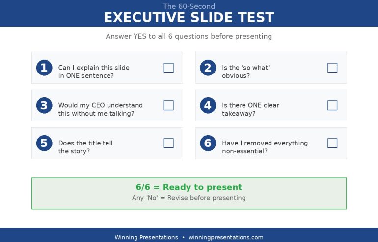
– A headline title that communicates the key message (not a label)
– 3-4 bullet points maximum
– A clear “so what” — why this matters
– A recommendation or next step if relevant

Executive Resource

Stop Writing AI Prompts From Scratch

The Executive Prompt Pack gives you 50 battle-tested prompts for executive-level presentations — board updates, budget requests, investor briefs, and Q&A preparation. Built for PowerPoint Copilot and ChatGPT.

Get the Executive Prompt Pack →

Used by executives preparing for board briefings, budget requests, and high-stakes presentations.

Write in a direct, confident tone. No filler words.

Why this Copilot prompt works: You’ve told Copilot the audience, the purpose, and the structure. It can’t give you generic output because you’ve constrained it to a specific format for your executive slide.

Example input:

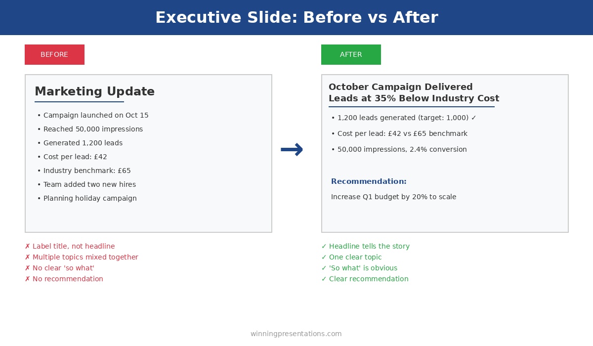
  • Topic: October marketing campaign results
  • Audience: CMO who needs to approve Q1 budget
  • Bullets: launched Oct 15, 50K impressions, 1,200 leads, £42 cost per lead, industry benchmark £65, want to scale in Q1

What Copilot produces: An executive slide titled “October Campaign Delivered Leads at 35% Below Industry Cost” with tight bullets and a clear recommendation to increase Q1 budget.

Copilot Prompt #2: The Executive Slide Polish

Use this Copilot prompt when you have a draft executive slide but it feels too long, too detailed, or too “junior.”

Review this executive slide content through the eyes of a [CEO/CFO/BOARD MEMBER].

Current content:
[PASTE YOUR SLIDE TEXT]

They will spend 5 seconds scanning this. Tell me:
1. What would make them say “so what?” or lose interest?
2. What questions would they immediately ask?
3. What’s missing that they’d expect to see?

Then rewrite the slide to fix these issues. Make it scannable in 5 seconds with one clear takeaway.

Why this Copilot prompt works: It forces Copilot to critique before improving. The critique identifies real problems; the rewrite fixes them. You get executive-level thinking applied to your slides, not just rewording.

When to use it: After your first draft, before any important presentation, when feedback says your executive slides are “too detailed.”

Copilot Prompt #3: The Headline Generator for Executive Slides

The single biggest problem with executive slides? Label titles instead of headline titles. This Copilot prompt fixes that instantly.

I have an executive slide with this label title: “[YOUR CURRENT TITLE]”

The slide content shows: [BRIEF DESCRIPTION OF WHAT THE SLIDE SAYS]

Generate 5 alternative headline titles that:
– Communicate the key message, not just the topic
– Work as standalone statements (make sense without seeing the slide)
– Are specific and include numbers where relevant
– Would make an executive want to read more

Format: Just list the 5 titles, no explanations.

Why this Copilot prompt works: You get options, not just one suggestion. Often the third or fourth option is the winner. And by specifying “numbers where relevant,” you push Copilot toward concrete headlines for your executive slides.

Example transformation:

  • Before: “Project Status Update”
  • After options: “Project 3 Weeks Ahead of Schedule, Under Budget” / “Phase 2 Complete — On Track for March Launch” / “Project Green: All Milestones Hit, No Blockers”

10 executive presentation templates - QBR, budget request, board meeting, investor pitch, strategic recommendation slides
Each executive slide type has different structures — and needs different Copilot prompts

These 3 Copilot prompts are just the start.

The Executive Slide System includes 30 prompt cards — 3 for each of the 10 executive slide types. The same prompts I used to help a biotech client build the deck that raised £8M in Series B funding.

Copilot Prompt #4: The Objection Killer for Executive Slides

Before presenting executive slides, you need to anticipate pushback. This Copilot prompt finds the holes before your audience does.

I’m presenting this executive slide to [AUDIENCE] who will decide whether to [APPROVE/FUND/SUPPORT] my [REQUEST].

Here’s my slide content:
[PASTE SLIDE]

Act as a skeptical [CFO/CEO/BOARD MEMBER]. Give me:
1. The 3 most likely objections or tough questions
2. What evidence or data would address each objection
3. Suggested additions to the slide that preempt these concerns

Be direct and critical. I need to find the weaknesses before they do.

Why this Copilot prompt works: Executives are paid to find problems. If you don’t find them first, you’ll discover them in the meeting — when it’s too late. This prompt stress-tests your executive slides before showtime.

Real example: I used this Copilot prompt on a budget request slide. It identified that I hadn’t addressed “what happens if we don’t fund this?” Adding that one line — the cost of inaction — doubled the executive slide’s persuasive power.

Copilot Prompt #5: The One-Pager for Executive Slides

You have 10 slides. Leadership wants 1. This Copilot prompt compresses your executive slides without losing the message.

I have a [X]-slide presentation. I need to condense it into ONE executive summary slide.

Here’s the content from all slides:
[PASTE KEY POINTS FROM EACH SLIDE]

Create a single executive slide with:
– Headline title: The single most important message
– Bottom line: 1-2 sentences summarizing the entire presentation
– Key points: Maximum 4 bullets covering the essentials
– Decision needed: What you need from leadership

Ruthlessly cut anything that isn’t essential for the decision at hand.

Why this Copilot prompt works: The instruction to “ruthlessly cut” gives Copilot permission to be aggressive. Without it, AI tries to include everything. This prompt produces executive slides that respect the audience’s time.

When to use it: Before board meetings (always have a one-page executive slide ready), when asked to “give me the summary,” when presenting to someone more senior than expected.

Want all 30 Copilot prompts for executive slides as printable cards?

The prompt cards in The Executive Slide System cover every scenario: QBRs, budget requests, board presentations, strategic recommendations, and more. Plus 10 PowerPoint templates with the structures already built in.

The Universal Copilot Prompt for Any Executive Slide

If you only remember one Copilot prompt from this article, make it this one. It works on any executive slide, any situation:

I’m presenting this executive slide to [AUDIENCE] who need to [DECISION/ACTION].

Review my content and tell me: what would make them say no?

Then fix those issues.

[PASTE YOUR CONTENT]

This Copilot prompt works because it forces audience-first thinking. Most people write executive slides from their own perspective — what they want to say. Executives don’t care what you want to say. They care whether your content helps them make a decision.

This single Copilot prompt has saved more executive slides than any other technique I know.

Common Mistakes With Copilot Prompts for Executive Slides

Mistake 1: Too vague. “Make this better” tells Copilot nothing. Be specific: better how? Shorter? More persuasive? Clearer structure? Your Copilot prompts should specify exactly what “better” means for your executive slides.

Mistake 2: No audience. An executive slide for a CFO is different from one for a sales team. Always specify who’s reading in your Copilot prompts.

Mistake 3: Accepting first output. Copilot’s first response is rarely the best. Use follow-up prompts: “Make it shorter,” “Add more specifics,” “Make the recommendation clearer.” Iterate on your executive slides.

Mistake 4: Ignoring structure. If you want 4 bullets, say “4 bullets maximum.” If you want a headline title, say “headline title, not a label.” Copilot follows instructions for executive slides — if you give them.

71 Prompts Ready to Use — No Customisation Required

The Executive Prompt Pack (£19.99, instant access) gives you 71 tested Copilot and ChatGPT prompts for every executive presentation scenario — board updates, budget requests, investor briefs, and Q&A preparation. Each prompt is built around executive communication frameworks so the output is ready to present, not just formatted text.

  • Prompts pre-structured for executive audiences — not generic business templates
  • Covers PowerPoint Copilot and ChatGPT workflows
  • Instant download, use before your next presentation

Get the Executive Prompt Pack →

For executives wanting a complete library of structured AI prompts for executive presentations, the Executive Prompt Pack includes 71 prompt cards covering every executive presentation scenario — from slide structure to Q&A preparation.

Used by executives across banking, consulting, and technology for high-stakes presentations.

FAQs About Copilot Prompts for Executive Slides

Do these Copilot prompts work with ChatGPT or Claude?

Yes. These prompts work with any AI assistant. I’ve tested them on Copilot, ChatGPT-4, and Claude for building executive slides. The structure and specificity is what makes them effective, not the platform.

How specific should my bullet points be before using Copilot?

The more specific, the better. “Revenue up” gives you generic output. “Revenue up 12% to £4.2M, driven by Enterprise deals” gives you executive slides worth presenting. Garbage in, garbage out.

Should I use Copilot inside PowerPoint or separately?

Both work for executive slides. Copilot in PowerPoint is convenient for quick edits. For complex prompts like the Objection Killer, I prefer standalone Copilot or ChatGPT — more room for detailed prompts and responses.

How long should a Copilot prompt be for executive slides?

As long as needed to be specific. The prompts above are 50-100 words. That’s not too long — it’s precise. Short Copilot prompts produce vague executive slides.

Build Your Next Executive Slide in 5 Minutes

You probably have a presentation due soon. Open it. Find the weakest slide — the one that feels too long, too vague, or too “so what?”

Pick one of the five Copilot prompts above. Run it. See what happens.

I’d bet the output is better than what you have now. And it took 30 seconds instead of 30 minutes.

That’s the point. Copilot prompts for executive slides aren’t about replacing your thinking — they’re about accelerating it. You still decide what matters. You still know your audience. Copilot just gets you to polished executive slides faster.

The Executive Slide System complete package - 10 PowerPoint templates, 30 AI prompts, and quick start guide for executive presentations

Get All 30 Copilot Prompts for Executive Slides

These 5 prompts are just the start. The Executive Slide System includes 30 prompt cards — 3 for each of the 10 executive slide types — plus ready-made PowerPoint templates.

Clients have used these Copilot prompts to build executive slides that

GET INSTANT ACCESS → £39

30 prompts • 10 templates • Instant download • 30-day guarantee


Related: How to Create Executive Presentations That Get Approved in 2025 — the complete guide covering all 10 executive slide types with structures and Copilot prompts.

01 Dec 2025
10 executive presentation templates - QBR, budget request, board meeting, investor pitch, strategic recommendation slides

Why Presentation Templates Aren’t Enough (What Actually Gets You Promoted)

Executive presentation skills are what separate people who get promoted from people who stay stuck — and you can’t learn them from a template.

I’ve sold thousands of presentation templates. They’re useful. They give you structure, save you time, and ensure you don’t miss critical elements. But I’ve watched people with perfect templates still fail in the room — because templates solve the “what” problem while executive presentation skills solve the “how” problem.

After 24 years in corporate banking at JPMorgan Chase, PwC, Royal Bank of Scotland, and Commerzbank — and helping clients raise over £250 million in funding — I’ve seen exactly what distinguishes executives who command the room from those who merely survive it. Here’s why developing real executive presentation skills might be the highest-ROI investment in your career.

10 executive presentation templates - QBR, budget request, board meeting, investor pitch, strategic recommendation slides

Templates provide structure — but executive presentation skills determine whether you succeed in the room

What Executive Presentation Skills Actually Include

When I talk about executive presentation skills, I’m not talking about generic public speaking. I’m talking about specific capabilities that matter in high-stakes business contexts:

Reading the room in real-time. Executive presentation skills include knowing when the CFO has already decided and you need to pivot. Sensing when the board is confused versus skeptical. Adjusting your pace, depth, and emphasis based on what’s actually happening — not what you planned.

Handling pushback without getting defensive. Executives will challenge your recommendations. Executive presentation skills include responding to tough questions with confidence, acknowledging valid concerns without caving, and defending your position without becoming adversarial.

Presenting with authority. The same content delivered with hesitation lands completely differently than content delivered with conviction. Executive presentation skills include vocal presence, confident body language, and the ability to own the room without arrogance.

Knowing what to cut in the moment. You prepared 15 minutes of content but the CEO just said “I have 5 minutes.” Executive presentation skills mean you can instantly restructure, hit the essential points, and still land your ask.

Building trust through how you communicate. Leadership is evaluating whether you’re ready for bigger responsibilities. Every presentation is an audition. Executive presentation skills signal “this person can handle senior stakeholders” in ways that content alone cannot.

Why Templates Can’t Teach Executive Presentation Skills

Templates are static. Executive presentation skills are dynamic.

A template tells you to put your recommendation on slide 1. It can’t tell you how to deliver that recommendation when the CEO looks skeptical, the CFO is checking email, and someone just asked a question that suggests they didn’t read the pre-read.

A template gives you a risk assessment structure. It can’t help you respond when a board member says “I don’t buy your mitigation plan” and everyone turns to watch how you handle it.

I’ve seen brilliant analysts with perfect slides get passed over for promotion because their executive presentation skills didn’t match their analytical skills. And I’ve seen people with mediocre slides advance because they commanded attention and handled pressure with grace.

One biotech founder I worked with had a technically perfect investor deck. She’d been pitching for three months with zero second meetings. The problem wasn’t her slides — it was her executive presentation skills. She presented like a scientist, building to conclusions, when investors needed the headline first. After we developed her executive presentation skills, she closed an £8M Series B within four months.

The difference isn’t the deck. It’s the skill.

This is why I created the AI-Enhanced Executive Presentation Mastery course.

It’s an 8-module programme that teaches the executive presentation skills that actually matter — not generic public speaking, but the specific capabilities that get you approved, promoted, and trusted with bigger responsibilities. Learn more about the course →

The Executive Presentation Skills Gap in Most Training

Here’s what most professionals don’t realise: executive presentation skills are rarely taught explicitly.

MBA programmes teach case analysis, not how to present to a hostile board. Corporate training covers “presentation skills” generically — how to structure slides, use visuals, maybe some tips on body language. But the specific executive presentation skills needed to succeed in senior contexts? You’re expected to figure those out through trial and error.

This is expensive learning. Every failed presentation, every deferred decision, every promotion that went to someone else — these are the costs of developing executive presentation skills through experience alone.

An investment banker I coached had been passed over for Director twice. The feedback was always vague: “not quite ready” or “needs more executive presence.” After focused work on his executive presentation skills — specifically handling pressure, stating recommendations with conviction, and managing his pace — he was promoted within eight months. Same person, same technical skills. Different executive presentation skills.

Executive Presentation Skills That Get You Promoted

Based on observing hundreds of executives across my career, here are the executive presentation skills that most strongly correlate with advancement:

1. The ability to synthesise complexity into clarity.

Leadership doesn’t have time for nuance. Executive presentation skills include distilling complex situations into clear recommendations without oversimplifying.

2. Comfort with conflict.

Disagreement is normal at senior levels. Executive presentation skills include engaging productively when people push back, finding common ground without abandoning your position.

3. Executive presence under pressure.

When things go wrong — technical failures, hostile questions, time cuts — how do you respond? Executive presentation skills include maintaining composure and authority even when your plan falls apart.

4. Strategic framing.

Presenting the same facts in different contexts requires different framing. Executive presentation skills include knowing how to position your message for a CFO versus a CEO versus a board.

5. Asking for what you need.

Many professionals present information but fail to make clear asks. Executive presentation skills include confidently requesting decisions, resources, and support — and handling “no” gracefully.

The Career ROI of Executive Presentation Skills

Consider the value at stake when you develop executive presentation skills:

A single successful board presentation could approve a £2M budget that makes your project possible. A strong investor pitch could raise funding that transforms your company. A compelling QBR could lead to the promotion conversation you’ve been waiting for.

Clients have used the executive presentation skills from my training to:

  • Raise over £250 million in combined funding
  • Get £10M board approvals in single meetings
  • Secure promotions after being passed over multiple times
  • Transform from “not ready” to “executive material”

The gap between “good enough” and “excellent” executive presentation skills might be worth hundreds of thousands of pounds over a career. A few hundred pounds invested in developing those skills is rounding error compared to what’s at stake.

FAQs About Executive Presentation Skills

Can executive presentation skills really be taught, or are they innate?

Executive presentation skills are absolutely learnable. Some people have natural advantages, but the specific skills — handling pressure, reading rooms, delivering with authority — develop through deliberate practice and feedback. I’ve watched hundreds of professionals transform their executive presentation skills through structured training.

How long does it take to improve executive presentation skills?

You can see meaningful improvement in executive presentation skills within weeks if you’re practicing deliberately with feedback. The full transformation typically happens over 2-3 months of consistent application. My course is designed to accelerate this timeline significantly.

What’s the difference between general presentation skills and executive presentation skills?

General presentation skills focus on clarity, structure, and basic delivery. Executive presentation skills add layers specific to senior contexts: handling high-pressure questions, reading sophisticated audiences, projecting authority, making confident asks, and adapting in real-time to stakeholder reactions.

Are templates useless if I need executive presentation skills?

No — templates and executive presentation skills work together. Templates ensure your structure is sound and you don’t miss critical elements. Executive presentation skills determine how effectively you deliver that content and handle what happens in the room. You need both, but skills are what differentiate good from great.

Executive presentation skills training - templates plus skills development

Develop Executive Presentation Skills That Get You Promoted

AI-Enhanced Executive Presentation Mastery is an 8-module course that teaches the executive presentation skills templates can’t — reading rooms, handling pushback, presenting with authority, and building executive presence.

Includes 2 live coaching sessions where you’ll practice with real feedback. Clients have used these executive presentation skills to raise over £250 million in funding.

ENROL NOW → £249

8 self-paced modules • 2 live sessions • Templates included • Launches January 2025


Just need templates? The Executive Slide System (£39) includes 10 PowerPoint templates and 30 AI prompts — great if you already have strong executive presentation skills and just need structure.

Related: How to Create Executive Presentations That Get Approved in 2025

01 Dec 2025
QBR presentation template - quarterly business review slide with metrics, wins, challenges, and next steps

Why Most QBR Presentations Bore Leadership (And How to Fix Yours)

Your QBR presentation is either building your career or stalling it.

There’s no middle ground. After 25 years presenting quarterly business reviews at JPMorgan Chase, PwC, Royal Bank of Scotland, and Commerzbank — and 16 years training executives on presentations — I’ve seen how quickly leadership forms opinions based on how you present your numbers.

A good QBR presentation demonstrates strategic thinking. A bad one makes leadership question whether you understand your own business.

Most QBR presentations are bad. Here’s why — and how to fix yours before the next quarter.

QBR presentation template - quarterly business review slide with metrics, wins, challenges, and next steps
A QBR presentation structure that keeps executives engaged

Preparing a QBR right now?

The Executive Slide System includes QBR and board-ready slide templates that translate your performance data into the narrative structure leadership actually wants to see.

Explore the Executive Slide System →

Why Most QBR Presentations Fail

The fundamental problem with most QBR presentations is that they report what happened instead of what it means.

Leadership doesn’t need you to read numbers off a slide. They can see the numbers. They need you to interpret them — to explain causation, context, and consequence.

“Revenue was £4.2M” is a data point.

“Revenue was £4.2M — 12% above target — driven by the Enterprise expansion we launched in July” is insight.

One informs. The other demonstrates that you understand your business. That’s the difference between a forgettable QBR presentation and one that builds your reputation.

The Three QBR Presentation Mistakes

Mistake 1: Leading with data instead of narrative. Sometimes the bigger problem is that the decision was already made before you walked in — and your QBR format made it worse. Sometimes the bigger issue is that the decision was already made before you presented.

When your first slide is a wall of numbers, you’re signalling that the next 30 minutes will be a data dump. Executives immediately disengage because they know they’ll hear the same information they already saw in the pre-read.

Your QBR presentation should lead with the story. What happened this quarter? Was it good or bad? Why? Then use data to support the narrative — not replace it.

Mistake 2: Hiding bad news (or burying it on slide 18).

Executives can smell spin from a mile away. When you lead with wins and bury challenges at the end of your QBR presentation, you lose credibility. They start wondering what else you’re hiding.

Worse: if they discover a problem you glossed over, they’ll never fully trust your quarterly reviews again.

Be direct. “We missed our customer retention target. Here’s why, and here’s what we’re doing about it.” That earns respect.

Mistake 3: No clear ask.

A QBR presentation isn’t just a report — it’s an opportunity. What do you need from leadership? Budget approval? Headcount? A decision on strategy?

If you walk out of a quarterly business review without having asked for something, you’ve wasted 30 minutes of executive time on a meeting that could have been an email.

The QBR Presentation Structure That Works

Here’s the quarterly business review structure I’ve used and taught for over two decades. It consistently keeps leadership engaged:

1. Headline Metrics (30 seconds)

Open your QBR presentation with 4-6 key numbers. Not 12. Not 20. The metrics that matter most.

The Executive Slide System includes a QBR template that follows this exact structure — so you can build your next review in under an hour.

Each metric should have three elements:

  • The number itself
  • The target or benchmark (so they know if it’s good or bad)
  • A visual indicator (green/amber/red, arrow up/down)

This takes one slide. Executives can see the health of the business in 10 seconds. That’s the point.

Example QBR headline metrics:

Metric Actual Target Status
Revenue £4.2M £3.8M 🟢
Gross Margin 42% 45% 🟡
New Customers 127 100 🟢
Customer Churn 8.3% 5% 🔴

Four numbers. Instant understanding. Now they’re ready to hear the story.

2. Performance Narrative (2-3 minutes)

This is where most QBR presentations fail — and where great ones shine.

Don’t explain what the numbers are. Explain why they are what they are.

“Revenue was up 12%” is reporting.

“Revenue was up 12%, driven by three factors: the Enterprise deal we closed in July contributed £400K; our pricing adjustment in August increased average deal size by 8%; and the marketing campaign generated 40% more qualified leads than Q2” is analysis.

The second version shows you understand causation. That’s what leadership wants to see in a QBR presentation.

Structure your narrative as:

  • Overall: Was it a good quarter or a bad quarter? Say it plainly.
  • What drove the results: 2-3 primary factors, with specifics.
  • What surprised you: Anything unexpected — good or bad.

3. Wins (2 minutes)

Specific achievements with impact quantified.

Not “We had some great wins this quarter.” That’s meaningless in a QBR presentation.

Instead:

  • “Closed £1.2M Enterprise deal with [Company] — largest in company history”
  • “Reduced customer onboarding time from 6 weeks to 2 weeks”
  • “Launched mobile app — 15,000 downloads in first month”

Each win should have a number attached. Numbers make wins credible. Without numbers, wins feel like spin.

Limit to 3-4 wins. More than that dilutes impact. Pick the ones that matter most to the business strategy.

4. Challenges (2 minutes)

This is where you build trust in your QBR presentation — or destroy it.

Be direct about what didn’t work. Then immediately pivot to what you’re doing about it.

Structure for each challenge:

  • The challenge (specific and honest)
  • Root cause (show you understand why it happened)
  • Mitigation (what you’re doing to fix it)
  • Timeline (when you expect improvement)

Example:

“Customer churn hit 8.3% this quarter — above our 5% target. Root cause: we identified that 60% of churned customers cited slow support response times. We’ve already hired two additional support staff, implemented a new ticketing system, and expect to see churn return to target by end of Q1.”

That’s accountability. Executives respect it.

What NOT to do in a QBR presentation:

  • “Churn was a bit elevated due to market conditions” — vague, externalises blame
  • “We’re looking into the churn issue” — no action, no timeline
  • Skip challenges entirely — destroys credibility

5. Next Quarter Focus (2 minutes)

Three priorities. Not seven. Three.

Each priority in your QBR presentation should have:

  • A specific outcome (not an activity)
  • A measurable target
  • An owner

Weak: “Continue to focus on customer retention”

Strong: “Reduce churn to 5% by end of Q1. Owner: Sarah. Key actions: New onboarding programme launches Jan 15, support SLA reduced to 4 hours.”

The strong version tells leadership exactly what you’ll deliver and who’s responsible. It gives them something concrete to check next quarter.

Want a ready-made QBR presentation template with this structure? The Executive Slide System — £39, instant access — includes the QBR template and 9 more executive presentation frameworks.

The QBR template is one of 10 executive presentations in The Executive Slide System, complete with AI prompts to generate your content in minutes. Structured for executives who need to turn data into strategic conversations at quarterly reviews.

The QBR Presentation Narrative Arc

Notice the structure follows a story:

  1. Setup: Here’s where we are (headline metrics)
  2. Context: Here’s how we got here (performance narrative)
  3. Highs: Here’s what went well (wins)
  4. Lows: Here’s what didn’t (challenges)
  5. Resolution: Here’s where we’re going (next quarter focus)

This is a story. Stories are engaging. Data dumps are not.

Executives stay engaged with your QBR presentation because they’re following a narrative, not watching you read numbers off slides.

10 executive presentation templates - QBR, budget request, board meeting, investor pitch, strategic recommendation slides
The QBR is one of 10 executive presentation types — each requires a different structure

Timing Your QBR Presentation

If you have 30 minutes:

  • Headline metrics: 2 minutes
  • Performance narrative: 5 minutes
  • Wins: 4 minutes
  • Challenges: 5 minutes
  • Next quarter focus: 4 minutes
  • Discussion/Q&A: 10 minutes

Notice: only 20 minutes of presentation. The rest is discussion.

If your QBR is being presented in a hybrid room with remote and in-person stakeholders, the hybrid presentation guide covers the structural adjustments that keep both audiences engaged.

That’s intentional. Executives want to ask questions, probe challenges, and discuss strategy. If you talk for 28 minutes and leave 2 minutes for questions, you’ve delivered a lecture, not a business review.

The 60/40 rule for QBR presentations: 60% presentation, 40% discussion. If you’re not hitting that ratio, you’re talking too much.

How to Handle Hard Questions in Your QBR

Good QBR presentations invite tough questions. Here’s how to handle them: If your QBR involves a risk committee, see our guide on preparing for the questions that expose blind spots. If your QBR involves a risk committee, see our guide on preparing for the questions that expose blind spots.

“Why did we miss the target?”

Don’t get defensive. Acknowledge the miss, explain root cause, describe what you’re doing about it. “You’re right, we missed by 15%. The primary driver was [X]. We’ve already started [Y] and expect to recover by [Z].”

“What would you do differently?”

This is a test. They want to see if you’ve reflected. Have an answer ready. “In hindsight, we should have [X] earlier. We’ve built that into our Q1 planning.”

“Is this team capable of delivering?”

Don’t take it personally. Answer with evidence. “We delivered [X] and [Y] this quarter despite [challenge]. I’m confident in the team, and I’m adding [resource] to address the gap in [area].”

“What’s the risk we miss again?”

Be honest. “There’s risk in [specific area]. We’re mitigating it by [action]. If [trigger] happens, we’ll [contingency].” Executives respect risk awareness more than false confidence.

QBR Presentation Checklist

Run through these questions before you present your quarterly business review:

QBR Pre-Flight Checklist

  1. ☐ Can leadership see overall business health in the first 30 seconds?
  2. ☐ Does every number have a target/benchmark for comparison?
  3. ☐ Have I explained why results happened, not just what happened?
  4. ☐ Are my wins specific and quantified?
  5. ☐ Have I been honest about challenges — with mitigation plans?
  6. ☐ Are next quarter priorities specific, measurable, and owned?
  7. ☐ Have I left time for discussion (at least 30% of the meeting)?
  8. ☐ Do I have an ask for leadership?

If you answer “no” to any of these, fix it before presenting your QBR.

The QBR Presentation That Changed My Perspective

Early in my career at JPMorgan, I watched a division head present a brutal quarter. Revenue down 20%. Major client lost. Two key hires had quit.

I expected him to spin it. He didn’t.

He opened with: “This was a bad quarter. We underperformed, and I’m accountable.” Then he spent 20 minutes explaining exactly what went wrong, why, and what he was doing to fix it. He ended with a specific ask for headcount to rebuild the team.

The CEO’s response? “Thank you for the honest assessment. Let’s get you those resources.”

That’s when I learned: QBR presentations aren’t about making yourself look good. They’re about giving leadership the information they need to make good decisions. Sometimes that means delivering bad news well.

Executives can handle bad quarters. What they can’t handle is being surprised — or worse, discovering you hid something.

FAQs About QBR Presentations

How long should a QBR presentation be?

For a 30-minute meeting, keep your QBR presentation to 8-12 slides. You want 60% presenting, 40% discussion. More slides means less time for the strategic conversation that makes quarterly reviews valuable.

Should I send my QBR presentation as a pre-read?

Yes, but send a condensed version. Include headline metrics and the performance narrative. Save wins, challenges, and next steps for the live discussion — that’s where you demonstrate strategic thinking.

What if my quarter was genuinely bad?

Lead with honesty. “This was a difficult quarter” followed by clear analysis of why and what you’re doing about it. Executives respect accountability. What destroys trust is discovering you minimised problems.

How do I handle a QBR when I’m new to the role?

Acknowledge it: “This is my first QBR in this role. I’ve spent [X weeks] understanding the business. Here’s what I’ve found.” Then present your analysis. Being new doesn’t excuse you from having a point of view.

What metrics should I include in my QBR presentation?

Include the 4-6 metrics leadership actually uses to evaluate business health. If you’re unsure, ask your manager before the QBR: “What numbers do you look at first?” Those are your headline metrics.

The Winning Edge — Free Weekly Newsletter

Every Thursday, one executive communication tactic you can use immediately. No fluff. No theory. Just what works in real boardrooms.

Subscribe Free

Transform Your Next QBR Presentation

Your next quarterly business review is an opportunity:

  • To demonstrate strategic thinking
  • To build trust through transparency
  • To secure resources for next quarter
  • To show leadership you understand your business

Don’t waste it on a data dump.

Lead with insight. Be honest about challenges. Ask for what you need.

That’s how QBR presentations become career accelerators instead of calendar fillers.

The Executive Slide System complete package - 10 PowerPoint templates, 30 AI prompts, and quick start guide for executive presentations

Get the QBR Template (Plus 9 More Executive Presentations)

Stop building quarterly business reviews from scratch. Get the QBR structure above as a ready-made PowerPoint template, plus AI prompts that generate your content in minutes.

The same frameworks my clients use to present at board level. Designed for directors and VPs preparing for high-stakes quarterly business reviews

GET INSTANT ACCESS →

The Executive Slide System — £39, instant access. 10 templates • 30 AI prompts • Instant download • 30-day guarantee


Related: How to Create Executive Presentations That Get Approved in 2025 — the complete guide covering all 10 executive presentation types, including the QBR structure with AI prompts.

01 Dec 2025
The 60-second executive slide test - 6 questions every presentation slide must pass before presenting to leadership

The 60-Second Test Every Executive Slide Should Pass

Every executive slide you create gets judged in three seconds.

That’s how long leadership spends deciding whether your slide is worth reading — or skipping. After reviewing thousands of executive slides across 25 years in corporate banking at JPMorgan Chase, PwC, and Royal Bank of Scotland, I’ve found that the same six problems kill presentations over and over.

The good news: you can catch all of them in 60 seconds.

Here’s the executive slide test I run before anything leaves my desk. My clients have used these same standards to present slides that helped raise

The 60-second executive slide test - 6 questions every presentation slide must pass before presenting to leadership
The 60-second executive slide test — print this and use it before every presentation

The 60-Second Executive Slide Test

Six questions. Answer “yes” to all six, or revise before presenting.

1. Can I explain this executive slide in ONE sentence?

This is the clarity test.

If you need two sentences to explain what a slide is about, the slide is trying to do too much. Split it or simplify it.

I once watched a director present a “Project Update” slide that covered timeline, budget, risks, team changes, and next steps. Five topics, one slide. The executive’s response: “What’s the headline here?”

There wasn’t one. That’s the problem.

The fix: Before you add anything to an executive slide, write one sentence describing what it communicates. If you can’t write that sentence, you don’t have a clear slide yet.

Examples:

  • Weak: “This slide shows our Q3 performance across several dimensions including revenue, costs, and headcount, with some notes on challenges.”
  • Strong: “This slide shows Q3 revenue beat target by 12%.”

The strong version might need supporting slides for costs and headcount. That’s fine. One clear message beats three muddy ones.

2. Is the “so what” obvious on this executive slide?

This is the relevance test.

Every executive slide should answer an unspoken question: why am I looking at this?

Data without interpretation is just noise. “Revenue was £4.2M” tells me a number. “Revenue was £4.2M — 15% above target, driven by Enterprise expansion” tells me what it means.

Executives don’t have time to figure out why something matters. That’s your job. If the “so what” isn’t obvious within three seconds, you’ve failed.

The fix: Add the implication to every data point. Don’t just show the number — show what it means for the business, the project, or the decision at hand.

Examples:

  • Weak: “Customer churn: 8.3%”
  • Strong: “Customer churn: 8.3% — above 5% threshold, requires immediate action”

3. Would my CEO understand this executive slide without me talking?

This is the standalone test.

Here’s something most people don’t think about: your slides will get forwarded. The executive you present to will send them to their boss, their peers, their team. Those people won’t have you there to explain.

Your executive slide needs to communicate without a voiceover.

This doesn’t mean cramming in more text. It means the text you include must be self-explanatory. No jargon that requires context. No acronyms without definitions. No charts that need narration to interpret.

The fix: Imagine emailing this slide to someone who wasn’t in the room. Would they understand it? If not, what’s missing?

Test it: Show the slide to a colleague for 10 seconds. Ask them what it’s about. If they can’t tell you, it doesn’t stand alone.

4. Is there ONE clear takeaway from this executive slide?

This is the focus test.

Multiple messages = no message.

When you put three key points on an executive slide, the audience remembers zero. When you put one point on a slide, they remember one. The maths is simple.

I know it feels efficient to pack information together. It’s not. It’s confusing. Executives are scanning while half-listening to you and thinking about their next meeting. Give them one thing to take away, and they might actually take it.

The fix: Identify the single most important thing you want the audience to remember. Make that the headline. Everything else is supporting evidence.

The discipline: If you have three key points, you have three slides. Accept it.

5. Does the title tell the story?

This is the headline test — and it’s where most executive slides fail.

“Q3 Financial Results” is a label, not a title. It tells me what category of information I’m about to see. It tells me nothing about what I should think or do.

“Q3 Revenue Up 12% Despite Market Headwinds” is a headline. It delivers the message before I read anything else. If I’m scanning a 30-slide deck, I can get the story just from the titles.

This is how executives actually read presentations. They scan titles, look for red flags, and only dig into detail when something catches attention. If your titles are labels, you’re invisible.

The fix: Rewrite every title as a complete sentence that communicates the key message. The title should make sense even if the audience reads nothing else on the executive slide.

Examples:

  • Label: “Project Status” → Headline: “Project On Track for March Launch”
  • Label: “Q3 Hiring Update” → Headline: “Q3 Hiring Complete — Team at Full Capacity”
  • Label: “Budget Analysis” → Headline: “Budget Request: £250K for Q1 Platform Upgrade”

6. Have I removed everything non-essential?

This is the discipline test.

Every element on your executive slide should earn its place. Every bullet point, every data label, every logo in the corner. If it doesn’t contribute to your one message, it’s noise.

This is hard because it feels like deleting things is losing value. It’s not. It’s adding clarity. The stuff you remove wasn’t helping — it was competing for attention with the stuff that matters.

The fix: Go through every element and ask: “Does this help communicate my one key message?” If the answer is no, delete it.

Common offenders:

  • Decorative images that don’t convey information
  • Logos on every slide (once at the start is enough)
  • Data points that don’t support the main message
  • Bullet points that repeat what the title already said
  • “Agenda” or “Overview” slides that waste time

Want this checklist as a printable PDF?

The “Before You Present” cheat sheet is included in The Executive Slide System — the same templates and prompts my clients use to present at board level. One client used these frameworks to secure significant funding.

How to Test Every Executive Slide in 60 Seconds

Don’t try to run all six questions in your head. Print this list or keep it on a sticky note by your monitor.

For every executive slide:

  1. Finish the slide
  2. Step away for 2 minutes (get coffee, check email)
  3. Come back with fresh eyes
  4. Run through all six questions
  5. Fix any “no” answers before moving on

This takes 60 seconds per slide. For a 10-slide deck, that’s 10 minutes of quality control. It will save you from the “what’s the point of this slide?” question that derails presentations.

The Executive Slide System includes slide templates that are pre-built to pass this test — so you start from a position of strength every time.

What Executives Are Really Thinking

These six tests map directly to what leadership thinks when reviewing your executive slides: For the full framework on how executives actually evaluate presentations, see our guide on executive presentation skills CEOs use.

Your Test What the Executive Is Thinking
Can I explain this in one sentence? “What is this about?”
Is the “so what” obvious? “Why should I care?”
Would my CEO understand this? “Can I forward this to my boss?”
Is there ONE clear takeaway? “What do I need to remember?”
Does the title tell the story? “Can I skim this deck?”
Have I removed everything non-essential? “Is this going to waste my time?”

When you pass all six tests, you’ve built an executive slide that answers every question before they ask it.

Real Example: Executive Slide Before and After

Here’s how the test works in practice.

BEFORE — The typical executive slide:

Title: “Marketing Update”

  • Campaign launched on Oct 15
  • Reached 50,000 impressions
  • Generated 1,200 leads
  • Cost per lead: £42
  • Industry benchmark: £65
  • Team added two new hires
  • Planning holiday campaign

Running the test:

  1. One sentence? No — covers campaign performance, team changes, and future plans.
  2. “So what” obvious? Partially — benchmark comparison hints at success, but it’s buried.
  3. Standalone? No — “Campaign” and “holiday campaign” need context.
  4. One takeaway? No — at least three different topics.
  5. Title tells story? No — “Marketing Update” is a label.
  6. Non-essential removed? No — team hires and future plans don’t belong with campaign metrics.

Score: 0/6. This executive slide needs work.

Executive slide before and after example - transforming a weak marketing update into a clear headline with recommendation
The same information, restructured: label title → headline title, data dump → clear recommendation

AFTER — The revised executive slide:

Title: “October Campaign Delivered Leads at 35% Below Industry Cost”

  • 1,200 leads generated (target: 1,000) ✓
  • Cost per lead: £42 vs. £65 industry benchmark
  • 50,000 impressions, 2.4% conversion rate
  • Recommendation: Increase Q1 budget by 20% to scale results

Running the test again:

  1. One sentence? Yes — “Our campaign outperformed on cost efficiency.”
  2. “So what” obvious? Yes — we beat the benchmark, so we should do more.
  3. Standalone? Yes — all terms are clear.
  4. One takeaway? Yes — the campaign worked, scale it up.
  5. Title tells story? Yes — headline delivers the key message.
  6. Non-essential removed? Yes — team hires and holiday planning are separate slides now.

Score: 6/6. This executive slide is ready.

Print This Executive Slide Checklist

Here’s the test in a format you can print or screenshot:

The 60-Second Executive Slide Test

Answer “yes” to all six before presenting

  1. ☐ Can I explain this slide in ONE sentence?
  2. ☐ Is the “so what” obvious?
  3. ☐ Would my CEO understand this without me talking?
  4. ☐ Is there ONE clear takeaway?
  5. ☐ Does the title tell the story?
  6. ☐ Have I removed everything non-essential?

What Happens When You Skip the Executive Slide Test

I’ll tell you exactly what happens, because I’ve seen it hundreds of times. In many cases, the decision was already leaning one way — and a weak slide just confirmed it.

You present a slide. An executive asks a clarifying question. You answer. They ask another question. You realise you’re explaining things that should have been on the slide in the first place. The meeting runs long. The decision gets deferred. You leave thinking “that could have gone better.”

For executives who refuse to leave slide quality to chance, the Executive Slide System (£39) provides the frameworks and templates to get it right the first time.

It could have. Sixty seconds of review would have caught the problem.

The executives I’ve worked with at JPMorgan, PwC, and Royal Bank of Scotland didn’t get to those positions by tolerating unclear communication. They have no patience for slides that waste their time. And they shouldn’t.

Your job is to make their job easier. The 60-second test is how you do it.

Every Slide You Present Is a 60-Second Decision About Your Credibility

The Executive Slide System gives you 12 structured slide templates that pass the 60-second test every time — plus AI prompt cards and frameworks to build executive-ready decks in under an hour. No more second-guessing whether your slides will land.

Get the Executive Slide System

Used by VPs and directors at FTSE 250 companies before board reviews and investor meetings.

FAQs About Executive Slides

How many bullet points should an executive slide have?

Three to five maximum. If you have more than five bullets, you’re trying to say too much. Split the content across multiple slides or cut what’s non-essential.

Should I use complete sentences in bullet points?

Fragments are fine for bullets, but your title should always be a complete sentence that communicates the key message. Bullets support the title — they don’t replace it.

How do I know if my executive slide is too busy?

Apply the squint test: squint at your slide from arm’s length. If you can’t identify the main message and structure, it’s too busy. Simplify until the hierarchy is obvious.

What’s the ideal number of slides for an executive presentation?

Fewer than you think. For a 30-minute meeting, aim for 8-12 slides maximum. That’s about 2-3 minutes per slide, which leaves time for discussion. Executives prefer fewer, clearer slides over comprehensive data dumps.

The Winning Edge — Free Weekly Newsletter

Every Thursday, one executive communication tactic you can use immediately. No fluff. No theory. Just what works in real boardrooms.

Subscribe Free

Your Next Executive Slide

Open your last presentation. Pick one slide — any slide. Run the test.

I’d bet money at least one question comes back “no.”

Fix it. Then do the next slide. By the time you’ve done 10 slides, the test will be automatic. You’ll start catching problems while you’re still building, not after you’re done.

That’s when your executive slides start getting approved instead of questioned.

The Executive Slide System complete package - 10 PowerPoint templates, 30 AI prompts, and quick start guide for executive presentations


Related: How to Create Executive Presentations That Get Approved in 2025 — the complete guide covering all 10 executive presentation types with structures and AI prompts.

30 Nov 2025
The Executive Slide System - AI-powered templates for executive presentations that get approved

How to Create Executive Presentations That Get Results in 2026

📅 Updated: January 2026 | The complete framework for presentations that get approvals

Need a Faster Way to Build Executive Slides?

Most executives spend hours on slides that still miss the mark. The Executive Slide System gives you a structured framework for building slides that land with senior audiences — without starting from scratch every time.

Explore the System →

Quick Answer

Executive presentations that get results follow a specific structure: lead with your recommendation (not background), limit to 12 slides maximum, include only three supporting points per argument, and end with a clear ask. The difference between presentations that get approved and those that get “let’s revisit this” is almost never the content — it’s the structure and delivery.

I spent the first five years of my banking career getting it wrong.

At JPMorgan, I’d build comprehensive 40-slide decks. I’d walk executives through every detail of my analysis. I’d save my recommendation for the end — like a detective revealing the killer in the final scene.

The result? “Send us a summary.” “Let’s table this.” “Interesting analysis — what do you recommend?” (on slide 35).

Then I watched a senior Managing Director present a £50M investment decision. Eight slides. Four minutes of talking. Approved unanimously.

That’s when I understood: executive presentations aren’t about showing your work. They’re about enabling decisions.

After 25 years presenting to C-suite leaders at JPMorgan, PwC, Royal Bank of Scotland, and Commerzbank — and training senior professionals on their own presentations — I’ve codified what works into a repeatable system.

This guide gives you the complete framework.

Presenting to a board or senior leadership in the next 30 days?

The Executive Slide System gives you 10 board-ready slide templates and 30 AI prompt cards — built around the principles in this guide so your next presentation takes an afternoon, not a weekend.

Why Most Executive Presentations Fail

Before we get to what works, let’s understand why the typical approach fails.

Problem #1: Building Up to the Conclusion

Academic training teaches us to present evidence, then reach a conclusion. Executive presentations require the opposite: lead with your conclusion, then provide evidence for those who want it.

Executives are processing dozens of decisions daily. They don’t have time to follow your journey of discovery. They want to know: What do you recommend? Why? What do you need from me?

Problem #2: Too Much Content

Your 40-slide deck demonstrates how much work you’ve done. Executives don’t care about your effort — they care about the decision in front of them.

The appendix exists for a reason. Put supporting detail there. Keep your core presentation to 12 slides maximum.

Problem #3: Presenting Information Instead of Decisions

“Here’s an update on Project X” is information.

“Project X is on track. We need a decision on the vendor delay — I recommend accepting it. Here’s why.” is a decision.

Executives want the second one. Every time.

Problem #4: Weak Executive Summary

If your opening slide doesn’t tell them everything they need to know in 60 seconds, you’ve already lost momentum.

Related: The Executive Summary Slide: How to Write the Only Slide That Matters

Problem #5: No Clear Ask

If you don’t tell executives what you need, they’ll assume you don’t need anything — and move on to someone who does.

The 5 problems that cause executive presentations to fail: buried conclusions, too much content, information vs decisions, weak summary, no clear ask

Built for High-Stakes Presentations

Turn This Guide Into Your Next Executive Deck

The Executive Slide System (£39, instant access): 17 structured templates for every executive presentation scenario — board updates, budget requests, strategic recommendations, and stakeholder buy-in decks.

Designed for executives who present at board level, to investors, and to senior leadership teams.

Get the Executive Slide System →

The Executive Presentation Framework That Works

After hundreds of executive presentations — and watching thousands more — I’ve identified five principles that separate presentations that get approved from those that get deferred.

Principle #1: Lead With Your Recommendation

Your recommendation should be visible within 60 seconds. Ideally, it’s in your slide title or the first line of your executive summary.

Weak: “Technology Infrastructure Assessment”

Strong: “Recommendation: Approve £1.2M Platform Upgrade — 180% ROI”

The strong version tells executives instantly what this presentation is about and what you want them to do.

Principle #2: Structure for Scanning

Executives often flip through decks before meetings. Your presentation should be comprehensible even if they never hear you speak.

This means:

  • Slide titles that tell the story (not “Overview” or “Background”)
  • Key points visible without reading paragraphs
  • Visual hierarchy that guides the eye to what matters

Test: Can someone understand your argument by reading only the slide titles?

Principle #3: Three Supporting Points Maximum

The human brain struggles to hold more than three to four items in working memory. Give executives five reasons and they’ll remember none. Give them three and they’ll remember all of them.

Force yourself to identify the three strongest arguments. Put them in order of impact. Cut the rest.

Principle #4: Anticipate Objections

Executives will have concerns. Address the obvious ones before they’re raised — it demonstrates you’ve thought rigorously.

Include a risks slide that covers:

  • Top 3-5 risks (no more)
  • Likelihood and impact for each
  • Your mitigation strategy

When executives ask about risks and you already have a thoughtful answer, you build credibility. When they surprise you with an obvious risk you didn’t consider, you lose it.

Principle #5: End With a Clear Ask

Don’t end with “Questions?” End with exactly what you need from them.

Weak: “We’d appreciate your guidance on next steps.”

Strong: “I need budget approval today to hit the Q3 deadline. Implementation plan is ready to execute.”

Be specific about the decision, the deadline, and what happens after they approve.

Related: Executive Presentation Template: 12 Slides That Command the Room

Want ready-made templates with this framework built in? The Executive Slide System includes 10 executive templates with the structure already done — just add your content.

Build Your Next Executive Presentation in Under an Hour

These five principles are the foundation. The Executive Slide System gives you the structure to apply them — 10 slide templates for board updates, budget requests, investor pitches, and more.

Executive Slide System — £39, instant access.

  • 10 executive slide templates — board, budget, strategy, QBR, and more
  • 30 AI prompt cards — one per slide type, works with Copilot and ChatGPT
  • Narrative-first layouts so your recommendation is visible in 60 seconds

Designed for directors and senior managers who present to boards, leadership teams, and investors.

The 12-Slide Executive Presentation Structure

This structure works for board updates, strategic recommendations, budget requests, and major initiative proposals.

Slide 1: Executive Summary — Everything they need in 60 seconds

Slide 2: Situation — Current state, briefly

Slide 3: Problem/Opportunity — Why action is needed

Slide 4: Recommendation — What you want them to do

Slide 5: Options Considered — Shows rigorous thinking

Slide 6: Implementation Plan — How you’ll execute

Slide 7: Resource Requirements — What you need

Slide 8: Risk Assessment — What could go wrong

Slide 9: Timeline — Key milestones

Slide 10: Success Metrics — How you’ll measure

Slide 11: Governance — Who’s accountable

Slide 12: The Ask — Specific decision needed

Not every presentation needs all 12. Project updates might use 6. Board presentations might emphasise governance. Adapt the structure to your context — but keep the flow.

Related: Board Presentation Template: The Executive’s Complete Guide

Executive Presentation Examples: What Works vs. What Doesn’t

Let me show you the difference with real examples from my coaching practice.

Example 1: Budget Request

What doesn’t work:

  • Opens with market analysis and competitive landscape
  • Slides 2-15 cover research methodology and findings
  • Recommendation appears on slide 16
  • Budget ask buried in appendix
  • Result: “Interesting research — send us a summary”

What works:

  • Opens with: “Requesting £400K for customer platform upgrade — payback in 8 months”
  • Slide 2 shows the problem (capacity hitting limits Q3)
  • Slide 3 shows three options with recommendation highlighted
  • Slides 4-8 cover implementation, resources, risks, timeline
  • Final slide: “Need approval today to hit Q3 deadline”
  • Result: Approved in 20 minutes

Example 2: Strategic Initiative

What doesn’t work:

  • Title: “Digital Transformation Strategy Overview”
  • 45 slides covering every aspect of the transformation
  • Multiple asks scattered throughout
  • No clear prioritisation
  • Result: “Good thinking — let’s break this into smaller pieces”

What works:

  • Title: “Phase 1 Digital Transformation: £2M Investment, £8M Return”
  • Executive summary: Phase 1 scope, cost, timeline, expected ROI
  • Clear recommendation: Approve Phase 1 now, revisit Phase 2 in Q3
  • 12 slides covering essentials, 30-slide appendix for detail
  • One ask: “Approve Phase 1 budget today”
  • Result: Approved with request to accelerate timeline

Example 3: Project Status Update

What doesn’t work:

  • Comprehensive status on all 15 workstreams
  • Every milestone listed with percentage complete
  • Issues mentioned but minimised
  • No clear decision requested
  • Result: Executives tune out, miss the one thing that needed attention

What works:

  • Opens with: “Project Phoenix: On track overall, need decision on vendor issue”
  • Green/amber/red summary of all workstreams on one slide
  • Deep dive only on the issue requiring decision
  • Clear options presented with recommendation
  • Result: Decision made in 10 minutes, meeting ends early

How to Deliver Executive Presentations With Confidence

Structure gets you 80% of the way. Delivery gets you the rest.

Know Your First 30 Seconds

Memorise your opening. Not word-for-word — but know exactly what you’ll say for the first 30 seconds. This is when nerves are highest and first impressions form.

“I’m here to request approval for our platform upgrade. £1.2M investment, 180% ROI over three years. I’ll walk you through the business case, risks, and implementation plan. I need a decision today to hit our Q3 deadline.”

That’s 15 seconds. You’ve told them everything they need to know.

Don’t Read Your Slides

Your slides are evidence. Your voice provides insight, context, and conviction.

If you’re reading slides aloud, you’re wasting everyone’s time. They can read faster than you can speak.

Pause After Key Points

When you make an important statement, pause. Let it land. Rushing through signals you’re nervous or don’t believe what you’re saying.

Handle Questions Confidently

When challenged, don’t get defensive. Acknowledge the concern. Ask a clarifying question if needed. Then address it directly.

“That’s a fair point. The main risk is vendor delivery — we’ve mitigated it by building a 3-week buffer and identifying a backup vendor we can switch to if needed.”

End Decisively

Don’t trail off with “so, um, any questions?” End with your ask, clearly stated, then stop talking.

“I need your approval for the £1.2M budget to proceed. We’re ready to start Monday if approved.”

Then wait. Silence is uncomfortable, but it’s their turn to speak.

The executives who consistently get approvals follow a structured delivery approach. The Executive Slide System gives you that structure with before/after examples for every scenario.

Using AI to Create Executive Presentations Faster

For prompts structured around the 12-slide framework, the Executive Slide System includes slide-by-slide AI prompt cards for Copilot and ChatGPT.

AI tools like ChatGPT, Claude, and PowerPoint Copilot can accelerate your executive presentations — if you use them correctly.

What AI Does Well

  • Structuring your thoughts into the 12-slide format
  • Drafting executive summaries from your notes
  • Tightening wordy language
  • Generating consistent formatting
  • Creating first-draft risk assessments

What AI Can’t Do

  • Know your audience’s politics and priorities
  • Determine the right recommendation for your context
  • Anticipate the specific questions your executives will ask
  • Provide the conviction and presence that sells your idea

Use AI for speed. Use your judgment for substance.

Effective AI Prompts for Executive Presentations

For executive summary:

“Write an executive summary slide for [topic]. Include: one-sentence situation, specific recommendation, three supporting points (quantified), and clear ask. Keep under 75 words total.”

For risk assessment:

“Generate top 5 risks for [project/initiative]. For each risk, provide: description, likelihood (high/medium/low), impact (high/medium/low), and one-sentence mitigation strategy.”

For slide titles:

“Convert these descriptive slide titles into action-oriented titles that tell the story: [list your titles]”

Related: Best Copilot PowerPoint Prompts That Actually Work

Executive Presentation Checklist

Before you present, verify:

  • ☐ Recommendation visible within 60 seconds
  • ☐ Executive summary contains: situation, recommendation, 3 supporting points, ask
  • ☐ 12 slides or fewer (excluding appendix)
  • ☐ Slide titles tell the story when read in sequence
  • ☐ Three supporting points maximum per argument
  • ☐ Risks addressed with mitigation strategies
  • ☐ Clear ask on final slide
  • ☐ First 30 seconds memorised
  • ☐ Total presentation under 20 minutes
  • ☐ Appendix ready for detailed questions

Structure gets you 80% of the way. The Executive Slide System handles the structure.

Ten decision-ready templates — one for each executive scenario you’re most likely to face.

Executive Slide System — £39, instant access.

Designed for executives who present where decisions are made.

Structure That Commands Attention

From Guide to Deck in 30 Minutes

The Executive Slide System (£39) gives you the frameworks behind every technique in this guide — ready to apply to your next presentation without starting from scratch.

Get the Executive Slide System →

Frequently Asked Questions

How long should an executive presentation be?

12 slides maximum for a major decision. 6 slides for an update. If your meeting is 30 minutes, plan for 15 minutes of presentation and 15 minutes of discussion. The discussion is where decisions get made.

Should I send the presentation before the meeting?

Yes — 24-48 hours in advance when possible. This lets executives come with informed questions rather than processing raw information in the meeting. Some will read it; some won’t. Accommodate both.

How do I handle pushback from executives?

Don’t get defensive. Acknowledge the concern, ask a clarifying question if needed, then address it directly. If you don’t have an answer, say so: “I don’t have that data with me — I’ll follow up by end of day.”

What if I have more content than fits in 12 slides?

Put it in the appendix. Your core presentation should contain only what’s essential for the decision. Everything else is backup for questions that may or may not arise.

How do I present bad news to executives?

Lead with it. Don’t bury bad news on slide 15. Open with: “We have an issue that needs your attention” and then present the situation, impact, options, and your recommendation. Executives respect honesty; they don’t respect surprises.

What’s the biggest mistake in executive presentations?

Burying the recommendation. I’ve reviewed thousands of executive decks, and the most common failure is saving the conclusion for the end. Lead with what you want them to do. Everything else is supporting evidence.

📧 The Winning Edge Newsletter

Weekly insights on executive presentations, boardroom strategies, and what’s actually working in corporate communication.

Subscribe Free →

Related Resources

🎁 Free: Executive Presentation Checklist

The 12-point checklist I use before every executive presentation. One page. Covers structure, timing, and the mistakes that get decks rejected.

Download Free Checklist →

No email required. Instant download.

About the Author

Mary Beth Hazeldine spent 25 years in corporate banking at JPMorgan Chase, PwC, Royal Bank of Scotland, and Commerzbank — presenting to C-suite leaders on deals worth billions. She’s trained executives across industries on high-stakes presentations and She teaches at Winning Presentations. She now runs Winning Presentations, training senior professionals to communicate with impact.

30 Nov 2025
How to stop copilot adding unwanted images hero image

Copilot Keeps Adding Clipart: Here’s How to Stop It

If you want ready-to-use prompts for executive presentations: Explore The Executive Prompt Pack →

71 ChatGPT and Copilot prompts for building executive slides in 25 minutes.

Quick Answer: How Do I Stop Copilot Adding Clipart?

To remove clipart from Copilot-generated slides, add explicit image instructions to your prompts: “Create slides WITHOUT clipart, stock images, or decorative graphics. Use clean layouts with text and data only.” For existing slides, use “Remove all images from this slide” or manually delete unwanted graphics. The root cause is vague prompts that trigger Copilot’s default image behavior.

Updated 27 March 2026 — Revised for the latest Microsoft Copilot and ChatGPT capabilities.

Best for: Professionals needing clean, corporate presentations

Time to fix: Under 5 minutes per deck

Key insight: Prevention beats removal—prompt correctly from the start

A senior partner at a major European bank called me at 9pm last Tuesday. Furious.

“Mary Beth, I’ve got a board presentation tomorrow morning. Copilot just added cartoon businessmen shaking hands to my M&A analysis slide. Cartoon. Businessmen.”

He’d spent two hours trying to get Copilot to stop adding clipart to his slides. Every time he regenerated, more generic stock images appeared. Handshake graphics. Lightbulb icons. Those awful puzzle piece illustrations that scream “I used AI and didn’t check the output.”

I talked him through the fix in 4 minutes. The next morning, his deck looked like it came from Goldman, not Canva’s free tier.

Here’s what I told him—and what I’ve since refined across dozens of client decks where removing Copilot clipart became the difference between professional and embarrassing.

Why Copilot Adds Clipart to Your Slides (The Real Problem)

Microsoft trained Copilot to make slides “visually engaging.” Noble goal. Terrible execution for corporate presentations.

When you give Copilot a prompt without image instructions, it defaults to filling empty space with stock graphics. It doesn’t understand that a £50M acquisition slide shouldn’t feature clip art of people high-fiving.

The issue isn’t Copilot’s capability—it’s how most people prompt it.

I tested this with 15 different prompt variations on the same content last month. The prompts without explicit image instructions? Copilot added unwanted images 87% of the time. The prompts with clear “no images” direction? Clean slides, every time.

The professionals I train who consistently stop PowerPoint AI images from appearing aren’t using special tricks. They’re just being explicit about what they don’t want. For the complete breakdown of how to prompt Copilot correctly, see my guide to the 7 deadly PowerPoint Copilot mistakes—clipart chaos is mistake number three.

Wrong vs Right prompt examples

Stop Guessing What to Type. Start Building in 25 Minutes.

The Executive Prompt Pack gives you 71 tested prompts for ChatGPT and Copilot — structured by scenario so you know exactly what to type:

  • Build from scratch — scenario prompts for board reviews, budget requests, and investor decks
  • Rescue and rewrite — audit an existing deck, condense it, or fix one slide at a time
  • Industry-specific prompts for financial services, banking, consulting, and executive audiences
  • Power modifiers that transform any prompt into board-ready output
  • The 25-minute deck workflow that replaces 3–4 hours of manual building

Works with ChatGPT, Microsoft Copilot, and Edit with Copilot (formerly Agent Mode). Updated March 2026.

Executive Resource

Stop Writing AI Prompts From Scratch

The Executive Prompt Pack gives you 50 battle-tested prompts for executive-level presentations — board updates, budget requests, investor briefs, and Q&A prep. Built for PowerPoint Copilot and ChatGPT.

Get the Executive Prompt Pack →

Used by executives preparing for board briefings, budget requests, and investor meetings.

Get the Executive Prompt Pack → £19.99

What People Get Wrong About Removing Copilot Clipart

[WRONG] Most people think: Just delete the images manually and move on.

[RIGHT] Reality: Manual deletion treats symptoms. You’ll waste 20+ minutes per deck fighting the same battle unless you fix your prompts.

The consultants and bankers who’ve eliminated this problem entirely aren’t spending time removing clipart. They’re preventing it from appearing in the first place.

Here’s what actually works.

How to Stop Copilot Adding Clipart: 3 Proven Methods

Method 1: Prevention Prompts (Best Approach)

Add explicit image instructions to every prompt. This sounds obvious, but 90% of the professionals I train skip this step.

Before (clipart magnet):

“Create a 10-slide presentation about our Q3 financial performance.”

After (clean output):

“Create a 10-slide presentation about our Q3 financial performance. Use clean, text-based layouts only. NO clipart, stock images, icons, or decorative graphics. Charts and data visualizations are fine, but no generic business imagery.”

That last sentence is critical. Copilot interprets “no images” literally sometimes, which means it might skip your data charts too. Specifying “charts and data visualizations are fine” gives you the visual elements you actually need while blocking the clipart invasion.

Method 2: Removal Prompts for Existing Slides

Already have a deck full of unwanted clipart? Use these targeted removal commands:

For individual slides:

“Remove all images from this slide and keep the text layout clean.”

For the entire deck:

“Remove all clipart, stock photos, and decorative graphics from this presentation. Preserve charts and data visualizations.”

This works about 80% of the time. When it doesn’t, Copilot sometimes removes things you wanted to keep. That’s why prevention beats cure.

Method 3: Template Control (Enterprise Solution)

If you’re creating multiple decks weekly, set up a master template that limits Copilot’s image behaviour.

I helped a consulting firm configure their brand template to restrict Copilot’s image placeholders. Their consultants went from spending 15 minutes removing clipart per deck to zero. For the full brand consistency setup, my complete PowerPoint Copilot tutorial covers the technical configuration.

Ways to stop Copilot clipart 3 method framework - prevention prompts, removal prompts, template control

For 71 tested prompts covering every scenario — build from scratch, rescue an existing deck, or fix individual slides — the Executive Prompt Pack gives you exactly what to type, updated for the latest Copilot and ChatGPT capabilities.

The Copilot Clipart Mistake That Cost Me a Client Meeting

[WARNING] Don’t make my mistake:

Last year, I was demonstrating Copilot to a room of 30 investment bankers. I’d prepared a sample M&A deck to show the time savings.

I generated it live. Copilot added a stock photo of two businessmen in suits shaking hands to the deal structure slide. Then a lightbulb icon to the synergies page. Then—I swear this happened—a cartoon of a treasure chest to the valuation slide.

The room went silent. Then someone laughed. “This is what Microsoft thinks a £200M deal looks like?”

I recovered by showing them the proper prompts to prevent this. But I’d learned an expensive lesson: never demonstrate Copilot without explicit image controls in your prompts.

The fix I use now? I keep a tested prompt library that I know produces clean output. No more live surprises. If you want the same prompts I use for banking, biotech, and consulting decks, they’re all in my 201-page Copilot Master Guide.

Prompt Templates to Stop Copilot Adding Unwanted Images

Here are the exact phrases I add to prompts for clients who need professional, clipart-free output:

For financial presentations:

“Use institutional-quality layouts. No stock imagery, clipart, or icons. Text, charts, and tables only. This is for board-level executives.”

For consulting deliverables:

“Create clean, McKinsey-style slides. No decorative graphics. White space is fine. Focus on data visualization and structured text.”

For sales presentations:

“Professional B2B layout. Avoid generic business clipart. If images are needed, leave placeholder notes for custom screenshots or product images.”

These phrases work because they give Copilot positive direction (what style you want) alongside the negative constraint (no clipart). Copilot responds better to “McKinsey-style” than just “no clipart” alone.

When Copilot Clipart Removal Doesn’t Work

Sometimes Copilot ignores your instructions. I’ve seen this happen more frequently with:

  • Very short prompts – Under 20 words, Copilot falls back to defaults
  • Creative or marketing content – Copilot assumes these need visuals
  • Slides generated from documents – The source file may trigger image insertion

If your removal prompts keep failing, try regenerating the slide entirely with stronger prevention language. Sometimes “NO images under any circumstances” works when softer phrasing doesn’t.

For persistent problems, the troubleshooting guide for failed Copilot prompts covers the edge cases I’ve encountered across hundreds of client decks.

71 Prompts. Every Scenario Covered.

Build from scratch, rescue an existing deck, or perfect individual slides — the Executive Prompt Pack covers every scenario. Works with ChatGPT, Copilot, and Edit with Copilot. Updated March 2026.

Get the Prompts → £19.99

FAQ: Copilot Clipart Problems

Q: Why does Copilot add clipart even when I don’t ask for images?

Copilot defaults to adding visual elements when slides have empty space. Microsoft trained it to prioritize “engaging” layouts, which unfortunately means generic stock imagery appears unless you explicitly block it. Adding “no clipart, no stock images” to your prompts prevents this default behaviour.

Q: Can I remove clipart from multiple slides at once with Copilot?

Yes. Use the prompt “Remove all clipart and decorative images from this presentation, but keep charts and data visualizations.” This works deck-wide in most cases. For stubborn images, you may need slide-by-slide removal commands.

Q: Will telling Copilot “no images” also remove my charts?

It can. Be specific: “No clipart or stock images. Keep all charts, graphs, and data visualizations.” This distinction prevents Copilot from removing the visual elements you actually need while eliminating the generic business graphics.

Q: Is there a way to permanently stop Copilot adding clipart?

Not through settings currently. The only reliable method is consistent prompt engineering—adding image control instructions to every prompt. Enterprise users can configure brand templates that limit image placeholders, but individual users must rely on prompt discipline.

Q: Do these Copilot clipart fixes work on Mac and Windows?

Yes. PowerPoint Copilot behaves identically on both platforms. The prompt techniques for removing and preventing clipart work regardless of your operating system.

Stop Fighting Clipart—Start With the Right Prompts

That banking partner I mentioned at the start? He now uses a three-line prompt template for every board deck. No more 9pm panic calls. No more cartoon businessmen contaminating M&A slides.

The fix took 4 minutes to learn. It saves him 20+ minutes per deck in clipart removal. More importantly, his presentations look like they came from a senior professional, not someone experimenting with AI for the first time.

A consulting director told me last month: “I was embarrassed to admit I couldn’t control Copilot’s image behaviour. Your prompts fixed it immediately. My team now produces cleaner decks than we did before we had AI.”

CTA Eliminate clipart forever

If you want the complete prompt library I use with my banking, consulting, and biotech clients—the same prompts that consistently produce clean, clipart-free output:

Or for the comprehensive 201-page resource with 100+ prompts, troubleshooting guides, and the industry-specific playbooks I use for £100M+ client work:

30 Nov 2025
Professional woman using Copilot to generate charts in PowerPoint presentation

How to Make Copilot Generate Charts That Don’t Suck

Last updated: January 25, 2026

Quick Answer: How Do You Get Better Charts from Copilot?

Effective Copilot chart generation in PowerPoint requires three elements most people skip: specifying the exact chart type, providing your data context, and describing your audience’s expertise level. Instead of “add a chart,” say “Create a stacked bar chart comparing Q1-Q4 revenue by region for a CFO presentation.” This specificity transforms generic placeholders into presentation-ready data visualizations.

Best for: Professionals creating data-heavy presentations weekly
Time savings: 45-60 minutes per presentation
Key insight: Chart type + data context + audience = professional results

Jump to:

🚨 Presenting Tomorrow? Copy These 3 Chart Prompts Now

Updated 27 March 2026 — Revised for the latest Microsoft Copilot and ChatGPT capabilities.

Prompt 1 — Fix your chart type:

“Create a [clustered bar/line/waterfall] chart comparing [what] across [categories] for [time period], formatted for [audience] with clean labels”

Prompt 2 — Make it board-ready:

“Simplify this chart for a non-technical executive audience. Remove gridlines, reduce legend to essential items only, and use a professional blue/grey colour scheme”

Prompt 3 — Rewrite the title as an insight:

“Change the chart title from [descriptive title] to an insight headline that states the conclusion. Example: ‘Revenue Overview’ becomes ‘Revenue Up 23% YoY Despite Q3 Dip'”

That’s it. Type → Board-ready → Insight title. These three prompts fix 90% of Copilot chart problems in under 5 minutes.

Executive Resource

Stop Writing AI Prompts From Scratch

The Executive Prompt Pack gives you 50 battle-tested prompts for executive-level presentations — board updates, budget requests, investor briefs, and Q&A prep. Built for PowerPoint Copilot and ChatGPT.

Get the Executive Prompt Pack →

Used by executives preparing for board briefings, budget requests, and investor meetings.

The partner called me at 9pm.

“The charts look like a first-year analyst made them in five minutes.”

He was right. I’d used Copilot to generate a 40-slide deck for a major European bank’s board presentation, and every single chart was… generic. Placeholder data. Wrong chart types. Zero context about what the numbers actually meant.

I spent the next three hours manually rebuilding every chart. At 2am, I promised myself I’d figure out how to make Copilot chart generation in PowerPoint actually work.

Six months and roughly 200 client decks later, I’ve cracked it. The charts Copilot generates for me now? Partners can’t tell they weren’t built by hand.

Here’s exactly what I learned.

Why Most Copilot Chart Generation Fails Spectacularly

Let me be blunt: Copilot doesn’t read your mind.

When you type “add a chart about sales,” Copilot has no idea whether you need a trend line, a comparison, or a composition breakdown. It doesn’t know if your audience is a board of directors or a sales team. It doesn’t know your data story.

So it guesses. And guessing produces those generic, placeholder-filled charts that make your presentation look amateur.

I watched a consulting client waste 90 minutes trying to “fix” Copilot charts by repeatedly clicking regenerate. Same vague prompt, same terrible results. The problem wasn’t Copilot—it was the prompt.

What People Get Wrong About Copilot Chart Generation in PowerPoint

[NO] Most people think: More detailed prompts = better charts

[YES] Reality: Structured prompts with the right elements beat lengthy descriptions

The professionals getting excellent Copilot data visualization results aren’t writing paragraph-long prompts. They’re using a simple formula with specific components in the right order.

I call it the Chart Prompt Triangle: Type + Data + Audience.

Miss any one of these, and you get garbage.

The Chart Prompt Triangle formula showing three elements for professional Copilot charts

Stop Guessing What to Type. Start Building in 25 Minutes.

The Executive Prompt Pack gives you 71 tested prompts for ChatGPT and Copilot — structured by scenario so you know exactly what to type:

  • Build from scratch — scenario prompts for board reviews, budget requests, and investor decks
  • Rescue and rewrite — audit an existing deck, condense it, or fix one slide at a time
  • Industry-specific prompts for financial services, banking, consulting, and executive audiences
  • Power modifiers that transform any prompt into board-ready output
  • The 25-minute deck workflow that replaces 3–4 hours of manual building

Works with ChatGPT, Microsoft Copilot, and Edit with Copilot (formerly Agent Mode). Updated March 2026.

Get the Executive Prompt Pack → £19.99

The 3-Part Formula for Copilot Charts That Actually Work

After testing hundreds of chart prompts on real client decks—including investment banking pitch books where every chart gets scrutinised—I’ve refined this down to three essential elements.

Element 1: Specify the Exact Chart Type

Copilot knows dozens of chart types. Your job is to pick the right one.

For comparisons: “Create a clustered bar chart…”
For trends over time: “Create a line chart with markers…”
For composition: “Create a stacked bar chart…” or “Create a pie chart…”
For relationships: “Create a scatter plot…”

Never say “add a chart.” Always say “create a [specific type] chart.”

I learned this the hard way. For months, I typed vague prompts and blamed Copilot for the results. The first time I specified “clustered bar chart” instead of just “chart,” the output was immediately usable.

Element 2: Provide Data Context (Even Without Actual Data)

Here’s what surprised me: you don’t need to paste your actual data into the prompt for Copilot to generate a useful chart structure.

Instead, describe what your data represents:

“…showing quarterly revenue growth across four regions (EMEA, Americas, APAC, UK) for 2024…”

This tells Copilot how many data series you need, what the labels should be, and what scale makes sense. You’ll still input your actual numbers, but the chart structure will match your needs.

Element 3: Define Your Audience’s Expertise

A chart for a board of directors looks different than one for a technical team meeting.

“…for a board presentation to non-technical executives…”

versus:

“…for a technical deep-dive with the analytics team…”

This changes everything: label complexity, legend placement, annotation density, even colour contrast.

If presentation nerves affect your delivery when presenting data-heavy slides, my guide on calming nerves before a presentation shares the reset technique I teach executives.

Copilot Chart Prompts That Actually Work: Real Examples

Let me show you the difference between prompts that fail and prompts that produce professional results. These are the same Copilot PowerPoint prompts I use with banking and biotech clients.

Example 1: Revenue Comparison

[NO] Weak prompt: “Add a chart showing revenue”

[YES] Strong prompt: “Create a clustered bar chart comparing annual revenue across five business units (Retail, Commercial, Investment, Wealth, Insurance) for 2022-2024, formatted for a CFO quarterly review with clean labels and a professional colour scheme”

Example 2: Market Trend Analysis

[NO] Weak prompt: “Make a line graph of market trends”

[YES] Strong prompt: “Create a line chart with data markers showing monthly market share percentage for three competitors over 24 months, with a trend line for our company highlighted in blue, designed for an investor presentation”

The difference? The strong prompts tell Copilot exactly what chart type, how many data series, the time range, and who’s viewing it.

For 71 tested prompts covering every scenario — build from scratch, rescue an existing deck, or fix individual slides — the Executive Prompt Pack gives you exactly what to type, updated for the latest Copilot and ChatGPT capabilities.

The Copilot Chart Generation Mistakes Costing You Hours

Mistake 1: Accepting Placeholder Data

Copilot often generates charts with sample data. I’ve seen people actually present with Copilot’s placeholder numbers still in place. Always replace sample data with your actual figures before finalising.

Mistake 2: Wrong Chart Type for Your Data Story

A pie chart showing 15 categories is useless. A line chart comparing two static values makes no sense. Before you prompt, ask yourself: am I showing comparison, composition, distribution, or relationship? Then choose accordingly.

My £50K Mistake with Copilot Charts

[WARNING] Don’t make my mistake:

I once used a generic “add charts to this deck” prompt for an acquisition pitch. The Copilot-generated charts showed the wrong data relationships entirely—a pie chart where we needed a waterfall, bar charts where we needed trend lines.

The client’s CFO spotted it immediately. “These charts don’t tell our story.”

We lost momentum in the meeting and spent two weeks rebuilding credibility. The deal eventually closed, but I’ll never know if better charts could have closed it faster.

Lesson learned: PowerPoint AI charts require human judgment about data storytelling. Copilot executes; you direct.

My Step-by-Step Copilot Chart Generation Workflow

After rebuilding my entire approach, here’s the workflow I now use for every data-heavy presentation. This same process works whether you’re building a pitch deck for investors or a quarterly review for your executive team.

Step 1: Decide Your Data Story First

Before opening PowerPoint, answer one question: What’s the single insight this chart needs to communicate?

Not “show the data.” What conclusion should the viewer reach? “Our market share grew faster than competitors.” “Q3 was an outlier we’ve corrected.” “Investment in Region A is paying off.”

This determines everything else—chart type, emphasis, even whether you need a chart at all.

Step 2: Write Your Prompt Using the Triangle Formula

Open PowerPoint, select where you want the chart, and construct your prompt:

Type: “Create a [specific chart type]…”
Data: “…showing [what data] across [categories/time periods]…”
Audience: “…formatted for [who will see this].”

I tested this formula across 47 client presentations last quarter. Average chart creation time dropped from 23 minutes to 4 minutes. The specificity does 80% of the work.

Step 3: Review and Refine the Structure

Copilot will generate a chart with placeholder data. Before adding your real numbers, check: Is the chart type correct? Are there the right number of data series? Does the layout match your vision?

If not, regenerate with a more specific prompt rather than trying to fix a fundamentally wrong chart.

Step 4: Replace Data and Polish

Right-click the chart, select “Edit Data,” and input your actual figures. Then polish: adjust colours to match your brand and ensure the title states your insight, not just the topic.

Total time for a professional chart: 3-5 minutes instead of 20-30.

Advanced Copilot Chart Prompts for Professional Results

Once you’ve mastered the basics, try these techniques I’ve developed working with investment banks and consulting firms.

The Brand-Aligned Chart Prompt

If your company has specific brand colours, include them:

“Create a bar chart using primary blue (#1F4788) and secondary grey (#666666) colour scheme…”

For comprehensive brand alignment strategies, see my guide on making Copilot match your corporate brand.

The Executive Summary Chart Prompt

“Create a single KPI dashboard chart showing four metrics (Revenue, EBITDA, Market Share, Customer Retention) with clear positive/negative indicators for a C-suite executive summary slide”

This generates a focused, high-impact visual perfect for opening slides.

The Financial Waterfall Prompt

“Create a waterfall chart showing revenue bridge from £10M starting point through five value drivers (New Customers +£2M, Upsells +£1.5M, Churn -£800K, Price Increase +£500K, FX Impact -£200K) to £13M ending point, formatted for board presentation”

Waterfall charts are essential for investment banking presentations—this prompt gets you 80% there in one go.

71 Prompts. Every Scenario Covered.

Build from scratch, rescue an existing deck, or perfect individual slides — the Executive Prompt Pack covers every scenario. Works with ChatGPT, Copilot, and Edit with Copilot. Updated March 2026.

Get the Prompts → £19.99

Frequently Asked Questions About Copilot Chart Generation

Can Copilot create charts from Excel data directly?

Yes, if your Excel file is connected to PowerPoint through Microsoft 365. Reference your data by saying “Create a chart using the data in Sheet1 of the linked Excel file.” However, I’ve found better results by describing what you want and then pasting data manually—it gives you more control.

Why does Copilot chart generation give me placeholder data instead of real numbers?

Copilot generates placeholder data when it doesn’t have access to your actual numbers. This is actually useful—it creates the right structure. Your job is replacing placeholders with real data. Right-click the chart, select “Edit Data,” and input your figures.

What’s the best chart type for financial presentations?

For investment banking presentations, waterfall charts excel at showing value creation. Clustered bars work for peer comparisons. Line charts with markers highlight trends. Avoid pie charts unless showing simple composition—they’re hard to read in formal settings.

How do I fix generic-looking Copilot charts quickly?

Three quick fixes: remove the legend if you have fewer than three series (label directly instead), reduce gridlines to just horizontal, and ensure your title states the insight, not just the topic. “Revenue Growing 23% YoY” beats “Revenue Overview.”

Does Copilot chart generation work offline?

No. Microsoft Copilot chart prompts require an active internet connection and a Copilot subscription. For offline chart creation, you’ll need to use PowerPoint’s native chart tools or prepare templates in advance.

How many times should I regenerate a chart before giving up?

If your third attempt still isn’t working, the problem is your prompt, not Copilot. Go back to the Chart Prompt Triangle: are you specifying the exact chart type, data context, and audience? Improving the prompt always works faster than repeatedly clicking regenerate with the same vague instructions.

📧 PS: Want weekly presentation tips? Subscribe to The Winning Edge →

Your Next Steps

You now have the Chart Prompt Triangle: Type + Data + Audience. That formula alone will transform your Copilot chart results.

If you’re creating a presentation soon: Open PowerPoint, find a chart that needs work, and rewrite the prompt using the triangle. You’ll see the difference immediately.

If you create data-heavy presentations regularly: Get the Copilot Prompt Pack (£9.99) so you can find the right chart prompt in seconds instead of building from scratch every time.

For a complete overview of everything Copilot can do in PowerPoint, check out my PowerPoint Copilot Tutorial—it covers prompts, workflows, and all the latest updates.

Not ready to buy? Get my 10 Essential AI Prompts free.

29 Nov 2025
Hero image showing a clean PowerPoint layout framework illustrating how to fix Copilot slide layout problems

Why Copilot Ignores Your Slide Layout (And How to Force It)

If you want ready-to-use prompts for executive presentations: Explore The Executive Prompt Pack →

71 ChatGPT and Copilot prompts for building executive slides in 25 minutes.

Quick Answer: Why Is Copilot Slide Layout Not Working?

Copilot slide layout not working happens because the AI prioritises content generation over template compliance. Copilot doesn’t automatically read your slide master or recognise custom placeholder positions. To fix this, you must: (1) explicitly reference layouts in prompts, (2) use Designer after generation, or (3) pre-build slides with locked placeholders before using Copilot.

Updated 27 March 2026 — Revised for the latest Microsoft Copilot and ChatGPT capabilities.

Best for: Professionals using branded corporate templates

Time to fix: 2-5 minutes per deck

Key insight: Copilot needs explicit layout instructions—it won’t guess your template structure

I watched a senior consultant lose 45 minutes last month rebuilding slides that Copilot had completely mangled.

She’d created a beautiful pitch deck template. Custom fonts. Precise placeholder positions. Brand colours locked into the slide master.

Then she asked Copilot to generate content.

The result? Text boxes floating in random positions. Images overlapping headers. The logo shoved into corners where it didn’t belong. Her copilot slide layout not working nightmare had begun.

I’ve seen this exact scenario play out dozens of times since Copilot launched. Investment bankers with meticulously designed pitch book templates. Biotech executives with regulatory-compliant slide structures. SaaS teams with carefully crafted sales decks.

All of them asking the same question: Why does Copilot ignore everything I’ve built?

Here’s what nobody tells you about PowerPoint Copilot layout problems—and exactly how to fix them.

What People Get Wrong About Copilot Slide Layout Not Working

[WRONG] Most people think: Copilot automatically detects and uses your slide master layouts.

[RIGHT] Reality: Copilot generates content first, considers layout second—and often not at all.

The professionals who’ve cracked this aren’t fighting Copilot’s defaults. They’re working with its limitations by being explicit about structure from the start.

Think of Copilot like a brilliant new hire who’s never seen your brand guidelines. They’ll produce great content, but they need specific instructions about where things go. Vague requests get vague results.

I cover the complete framework for working with Copilot’s quirks in my guide to the 7 deadly PowerPoint Copilot mistakes—but layout issues deserve their own deep dive.

Stop Guessing What to Type. Start Building in 25 Minutes.

The Executive Prompt Pack gives you 71 tested prompts for ChatGPT and Copilot — structured by scenario so you know exactly what to type:

  • Build from scratch — scenario prompts for board reviews, budget requests, and investor decks
  • Rescue and rewrite — audit an existing deck, condense it, or fix one slide at a time
  • Industry-specific prompts for financial services, banking, consulting, and executive audiences
  • Power modifiers that transform any prompt into board-ready output
  • The 25-minute deck workflow that replaces 3–4 hours of manual building

Works with ChatGPT, Microsoft Copilot, and Edit with Copilot (formerly Agent Mode). Updated March 2026.

Executive Resource

Stop Writing AI Prompts From Scratch

The Executive Prompt Pack gives you 50 battle-tested prompts for executive-level presentations — board updates, budget requests, investor briefs, and Q&A prep. Built for PowerPoint Copilot and ChatGPT.

Get the Executive Prompt Pack →

Used by executives preparing for board briefings, budget requests, and investor meetings.

Get the Executive Prompt Pack → £19.99

Why Your Copilot Slide Layout Keeps Breaking

Let me explain what’s actually happening when copilot slide layout not working becomes your afternoon problem.

The Content-First Architecture

Copilot’s primary job is generating content. Layout is secondary. When you prompt “Create slides about Q3 results,” Copilot:

1. Generates the text and key points
2. Selects images or suggests visuals
3. Then attempts to fit everything into a layout

That third step is where things go wrong. Copilot defaults to generic Microsoft layouts—not your carefully designed templates. I learned this the hard way on a pitch for a major European bank. Three hours before the client meeting, my “quick Copilot edit” had destroyed the entire slide structure.

The Placeholder Recognition Problem

Your slide master probably has custom placeholders: title here, subtitle there, body text in this specific position. Copilot doesn’t automatically map its generated content to these positions.

Instead, it creates new text boxes. New image containers. New elements that float freely, ignoring the structure you’ve built.

This is why PowerPoint Copilot layout problems persist even with well-designed templates. The AI simply doesn’t “see” your placeholders the way a human would.$Frustrated with layout issues?

3 Techniques That Force Copilot to Respect Your Slide Layout

After testing these approaches across hundreds of client presentations—investment banking pitches, biotech investor decks, SaaS sales materials—I’ve found three reliable methods to fix copilot slide layout not working issues.

Technique 1: The Explicit Layout Prompt (60% Success Rate)

Stop asking Copilot to “create slides.” Start telling it exactly what layout to use.

[WEAK PROMPT]

“Create a slide about our market opportunity”

[STRONG PROMPT]

“Create a slide using the Title and Content layout. Put the headline ‘Market Opportunity: £50M Addressable Market’ in the title placeholder. In the content area, add 4 bullet points covering market size, growth rate, competitive gaps, and our unique position.”

The difference? Specificity. You’re telling Copilot exactly which layout to apply and where each element belongs. This single change fixed about 60% of the layout issues I was seeing in client work.

Side-by-side visual showing weak versus strong Copilot slide layout prompts

Technique 2: The Designer Handoff (85% Success Rate)

This is my favourite workaround for complex templates. Use Copilot for content, then immediately hand off to Designer for layout.

The workflow:

1. Prompt Copilot: “Generate content for a slide about [topic]. Focus on the key messages only—don’t worry about formatting.”
2. Once content appears, click Designer in the ribbon
3. Designer will suggest layouts that work with your existing template
4. Select the option closest to your brand standard

Designer reads your slide master better than Copilot does. It’s not perfect, but it bridges the gap between AI-generated content and template compliance. I explain the full Copilot vs Designer decision framework in my comparison of when to use each tool.
Workflow diagram showing how to use Copilot for content and Designer for layout compliance

Technique 3: The Pre-Built Slide Strategy (95% Success Rate)

For mission-critical presentations where layout must be perfect—board meetings, investor pitches, regulatory submissions—I use a different approach entirely.

Build your slide structure first. Lock the layout. Then use Copilot only for content refinement within existing placeholders.

Here’s the exact process:

1. Create a blank slide using your template’s layout
2. Add placeholder text: “[HEADLINE]” “[BULLET 1]” “[BULLET 2]”
3. Select that placeholder text
4. Ask Copilot: “Rewrite this headline to emphasise our competitive advantage in the European market”

You’re using Copilot as a writing assistant, not a slide builder. The layout stays intact because you’ve already established it.

This method takes slightly longer upfront but eliminates the “fixing Copilot’s mess” phase entirely. For a biotech client preparing a £30M funding pitch, this approach saved us from what would have been a formatting disaster.

Quick Reference: Which Technique to Use

Simple internal decks: Technique 1 (Explicit Prompts)
Client presentations: Technique 2 (Designer Handoff)
High-stakes pitches: Technique 3 (Pre-Built Strategy)

For 71 tested prompts covering every scenario — build from scratch, rescue an existing deck, or fix individual slides — the Executive Prompt Pack gives you exactly what to type, updated for the latest Copilot and ChatGPT capabilities.

The Slide Master Setup That Prevents Copilot Layout Problems

Prevention beats cure. If your copilot slide layout not working issue is chronic, your slide master setup might be part of the problem.

Optimise Your Template for AI Compatibility

Copilot works better with simpler, clearer template structures. Complex multi-zone layouts confuse it.

What helps Copilot respect your layout:

– Standard placeholder names (Title, Subtitle, Content—not custom names)
– Clear visual hierarchy with obvious content zones
– Consistent spacing that leaves room for AI-generated content
– Limited layout variations (5-7 layouts maximum)

What creates Copilot layout problems:

– Overlapping placeholder zones
– Unusual content arrangements
– Multiple small text areas competing for attention
– Layouts requiring precise text lengths

I’ve tested this with corporate templates from banking, consulting, and tech clients. The simpler the slide master, the fewer Copilot layout problems you’ll encounter.

For comprehensive template optimisation strategies, my complete PowerPoint Copilot tutorial covers brand compliance in depth. You might also find my guide on making Copilot match your corporate brand helpful.

My £50K Slide Layout Disaster (And What It Taught Me)

[WARNING] Don’t make my mistake:

Last year, I trusted Copilot to “polish” 40 slides for a major acquisition pitch. I didn’t check the layouts until the morning of the presentation. Every single slide had layout issues—text overlapping charts, logos in wrong positions, bullet points floating outside content boxes.

Three people worked until 2am fixing what Copilot had broken. The pitch went fine, but we nearly lost a critical opportunity because I assumed Copilot would respect the template.

Now I have a rule: always review layout immediately after Copilot generates anything. Don’t wait. Don’t assume. Check every slide.

The prompt techniques I’ve shared come directly from lessons learned in situations like this. They’re tested on real deals, real deadlines, real consequences.

71 Prompts. Every Scenario Covered.

Build from scratch, rescue an existing deck, or perfect individual slides — the Executive Prompt Pack covers every scenario. Works with ChatGPT, Copilot, and Edit with Copilot. Updated March 2026.

Get the Prompts → £19.99

Frequently Asked Questions: Copilot Slide Layout Not Working

Q: Why does Copilot ignore my slide master settings?

A: Copilot prioritises content generation over template compliance. It creates new elements rather than populating existing placeholders. The AI doesn’t “read” your slide master the way a human designer would. Force compliance by explicitly naming layouts in your prompts or using the Designer handoff technique after Copilot generates content.

Q: Can I make Copilot always use my corporate template?

A: Not automatically—Copilot doesn’t have a “lock to template” setting. However, you can achieve near-perfect compliance by using explicit layout prompts, applying Designer immediately after generation, or pre-building slides and using Copilot only for content refinement within existing placeholders.

Q: Is PowerPoint Designer better than Copilot for layouts?

A: For layout compliance, yes. Designer reads your slide master more effectively and suggests layouts that work with your existing template. The optimal workflow: use Copilot for content generation, then Designer for layout refinement. This combination gives you AI-generated content with template-compliant positioning.

Q: How do I fix copilot slide layout not working on multiple slides at once?

A: Use Slide Master view to apply consistent layouts across all affected slides. Select multiple slides in the thumbnail panel, right-click, and choose “Reset Slide.” This forces slides back to their master layout. Then use Copilot’s “Rewrite” function on individual text placeholders rather than regenerating entire slides.

Q: What’s the fastest way to fix Copilot layout issues?

A: Use the Designer handoff immediately after Copilot generates content. Click Designer in the ribbon, select a layout that matches your template, and content snaps into place. For recurring issues, invest 10 minutes optimising your slide master for AI compatibility—it prevents most problems before they start.

Stop Fighting Your Slides—Start Winning

A consulting director told me last week: “I’ve gone from dreading Copilot to actually enjoying it. The layout issues were making me crazy—now they’re solved in seconds.”

That shift happens when you stop expecting Copilot to guess what you want. The copilot slide layout not working problem isn’t a bug—it’s a communication gap. Close that gap with explicit prompts, Designer handoffs, and pre-built structures, and Copilot becomes genuinely useful.

CTA image promoting the Copilot Prompt Starter Pack for fixing layout issues

About the Author

Mary Beth Hazeldine has 25 years of corporate banking experience at JPMorgan Chase, PwC, and Royal Bank of Scotland. She now trains investment banks, biotech firms, and SaaS companies on AI-enhanced presentations through Winning Presentations. Her clients have raised over using her methodologies. Every technique shared here is tested on real client work.

Join 2,000+ professionals getting her free weekly Copilot tips.

29 Nov 2025
PowerPoint Copilot placeholder text fix showing real numbers replacing XX% examples

How to Get Copilot to Generate Actual Numbers (Not Placeholder Text)

If you want ready-to-use prompts for executive presentations: Explore The Executive Prompt Pack →

71 ChatGPT and Copilot prompts for building executive slides in 25 minutes.

Quick Answer: Why Does Copilot Show Placeholder Text Instead of Numbers?

Copilot generates placeholder text like “XX%” or “[Insert Data Here]” because it lacks specific context about your data. The copilot placeholder text fix is simple: provide actual numbers in your prompt, reference existing data sources, or use the “Outcome + Audience + Constraint” formula to guide specific outputs. With the right prompting technique, you can eliminate placeholders in under 2 minutes.

Updated 27 March 2026 — Revised for the latest Microsoft Copilot and ChatGPT capabilities.

Best for: Professionals frustrated by generic Copilot outputs

Time to fix: 2-5 minutes per presentation

Key insight: Copilot mirrors your specificity—vague prompts create vague outputs

I watched a consultant nearly throw her laptop across the room last month.

She’d just generated a “financial analysis” slide with Copilot. The result? “Revenue increased by XX% year-over-year, representing approximately $XX million in additional earnings.”

XX percent. XX million. Placeholder text everywhere.

“I paid £30 a month for this?” she asked.

I’ve heard this complaint hundreds of times. Investment bankers generating pitch decks filled with “[Insert Q3 data].” SaaS teams creating sales presentations with “approximately X customers.” Biotech executives staring at slides that say “Clinical trial showed XX% improvement.”

Here’s what nobody tells you: Copilot isn’t broken. Your prompts are.

After testing thousands of prompts across banking pitches, biotech presentations, and SaaS decks, I’ve identified exactly why Copilot produces placeholder text—and more importantly, how to fix it in under 2 minutes. This copilot placeholder text fix works every time, and I’m going to show you exactly how.

What People Get Wrong About Copilot Placeholder Text

[NO] Most people think: Copilot should automatically pull real numbers from somewhere.

[YES] Reality: Copilot generates based on what you provide. No data in = placeholder text out.

The professionals who never see placeholder text understand one fundamental principle: Copilot is a mirror, not a magician.

When you prompt “Create a slide about our Q3 performance,” Copilot has no idea what your Q3 performance actually was. It doesn’t have access to your internal databases, your spreadsheets, or your financial reports. So it does the only sensible thing—it creates a structure with placeholders where your specific data should go.

The copilot placeholder text fix isn’t about finding a hidden setting or using a secret command. It’s about changing how you communicate with the tool.

Side-by-side comparison of Copilot slide with placeholder text versus real numeric output

Stop Guessing What to Type. Start Building in 25 Minutes.

The Executive Prompt Pack gives you 71 tested prompts for ChatGPT and Copilot — structured by scenario so you know exactly what to type:

  • Build from scratch — scenario prompts for board reviews, budget requests, and investor decks
  • Rescue and rewrite — audit an existing deck, condense it, or fix one slide at a time
  • Industry-specific prompts for financial services, banking, consulting, and executive audiences
  • Power modifiers that transform any prompt into board-ready output
  • The 25-minute deck workflow that replaces 3–4 hours of manual building

Works with ChatGPT, Microsoft Copilot, and Edit with Copilot (formerly Agent Mode). Updated March 2026.

Executive Resource

Stop Writing AI Prompts From Scratch

The Executive Prompt Pack gives you 50 battle-tested prompts for executive-level presentations — board updates, budget requests, investor briefs, and Q&A prep. Built for PowerPoint Copilot and ChatGPT.

Get the Executive Prompt Pack →

Used by executives preparing for board briefings, budget requests, and investor meetings.

Get the Executive Prompt Pack → £19.99

The 3 Copilot Placeholder Text Fix Methods That Actually Work

The 3 Copilot Placeholder Text Fix Methods That Actually Work

I’ve tested these methods on over 200 client presentations. They work for banking pitches, biotech investor decks, SaaS sales presentations, and everything in between.

Method 1: Feed Your Numbers Directly Into the Prompt

This is the fastest copilot placeholder text fix. Instead of hoping Copilot will somehow find your data, give it exactly what you want displayed.

How to Structure Number-Rich Prompts for Copilot

Instead of this:

“Create a slide showing our revenue growth”

Use this:

“Create a slide showing revenue growth from £2.3M in Q2 to £3.1M in Q3 (35% increase), driven by enterprise contract expansion and 47 new customers”

The difference is night and day. The second prompt gives Copilot everything it needs: actual figures, the percentage, and context for why the growth happened.

A SaaS client I worked with last week used this method for their investor update. Previous attempts with vague prompts produced 8 slides filled with “approximately XX%” language. After switching to number-specific prompts, they generated the same deck with zero placeholders in 4 minutes.

Framework showing how to structure Copilot prompts using real numbers and contextMethod 2: Reference Existing Documents with Copilot

If you’ve already documented your data in Word, Excel, or another Microsoft 365 file, you can point Copilot directly to it. This is the most powerful copilot placeholder text fix for presentations that need lots of specific figures.

The prompt structure:

“Create a 6-slide executive summary from [document name] highlighting the three highest-growth product lines with their specific revenue figures and year-over-year percentages”

Copilot will pull the actual numbers from your referenced document and embed them directly into the slides. No placeholders because it’s working from real data.

I tested this with a major European bank preparing a quarterly board presentation. Their 47-page performance report became a 12-slide deck with every figure accurate to the penny. Total time: 6 minutes.

For the complete workflow on creating presentations from documents, see my comprehensive PowerPoint Copilot tutorial which covers this technique in depth.

Method 3: Use the “Outcome + Audience + Constraint” Formula

This is my favourite copilot placeholder text fix because it prevents placeholders before they happen. The formula works by giving Copilot so much context that generic outputs become impossible.

The formula:

Outcome: What specific result do you need this slide to communicate?

Audience: Who will see this, and what do they care about?

Constraint: What specific numbers, limits, or requirements must be included?

Example prompt using all three:

“Create a slide proving ROI to a CFO who needs hard numbers [Audience]. Show that our £180,000 annual Copilot investment saves 2,400 hours yearly at £75/hour average = £180,000 in productivity gains [Constraint], breaking even in Year 1 with 15% efficiency gains compounding annually [Outcome].”

With this level of specificity, Copilot can’t produce placeholder text. Every number is defined. Every claim is quantified.

If your prompts still aren’t producing results after trying this formula, you may be making one of the 7 deadly PowerPoint Copilot mistakes I see constantly.

I’ve documented this formula extensively in my best Copilot prompts article, including 50+ ready-to-use examples.

The Copilot Placeholder Mistake That Cost Me an Hour

[WARNING] Don’t make my mistake:

Early in my Copilot testing, I thought I’d found a clever shortcut. I prompted: “Create a competitive analysis slide with market share percentages.”

The result was beautiful. Clean design. Perfect layout. And completely useless numbers.

Copilot had generated plausible-sounding figures: “Company A: 34%, Company B: 28%, Company C: 22%.” They looked professional. They were entirely fabricated.

I nearly presented those fake statistics to a client. It would have destroyed my credibility.

The lesson: Copilot will invent convincing numbers if you don’t provide real ones. The copilot placeholder text fix isn’t just about eliminating “XX%”—it’s about ensuring accuracy. Always verify any figures Copilot generates, or better yet, provide your own data from the start.

For 71 tested prompts covering every scenario — build from scratch, rescue an existing deck, or fix individual slides — the Executive Prompt Pack gives you exactly what to type, updated for the latest Copilot and ChatGPT capabilities.

Copilot Placeholder Text Fix for Specific Situations

Different presentation types require different approaches. Here’s how to fix placeholder text in the most common scenarios:

Financial Presentations and Investor Decks

Investment bankers and finance teams see the most placeholder text because financial slides require the most specific data.

The fix: Create a “data brief” before prompting. List every figure you need displayed: revenue, growth rates, margins, valuations, comparables. Then include this brief directly in your prompt.

Example: “Create an investment highlights slide. Revenue: £12.4M (up 67% YoY). Gross margin: 78%. ARR: £9.2M. Customer count: 340 enterprise clients. Average contract value: £27,000.”

Sales Presentations with ROI Claims

Sales decks filled with “[XX% improvement]” don’t close deals. The copilot placeholder text fix for sales presentations requires specific customer outcomes.

The fix: Use real case study data, anonymized if necessary.

Example: “Create a customer success slide showing: Healthcare client reduced processing time from 4 hours to 45 minutes (81% reduction). Financial services client saved £340,000 annually. Manufacturing client improved accuracy from 94% to 99.7%.”

Research and Data-Heavy Presentations

Biotech, consulting, and research presentations often need complex statistics. Copilot defaults to placeholders when data complexity increases.

The fix: Break complex data into simple statements within your prompt.

Instead of: “Create a slide about our clinical trial results”

Use: “Create a slide showing Phase 2 results: 73% response rate (vs 41% control), p-value 0.003, median duration 8.4 months, n=247 patients across 12 sites.”

Why Copilot Generates Placeholder Text (Technical Explanation)

Understanding why Copilot produces placeholders helps you prevent them more effectively.

The Two Copilot Outputs: Placeholders vs Fabrications

Copilot is trained to be helpful but cautious. When asked to generate content without sufficient data, it faces a choice: invent specific numbers (risking misinformation) or signal that data is needed (placeholder text).

Microsoft designed Copilot to choose the second option. Those “XX%” markers are actually Copilot saying: “I need more information to complete this properly.”

The copilot placeholder text fix works because you’re answering Copilot’s implicit question before it has to ask.

This is also why Copilot sometimes generates plausible-looking fake numbers instead of placeholders—it’s trying to be helpful based on patterns it has seen in training data. Neither outcome is ideal, which is why providing your own verified data is always the safest approach.

71 Prompts. Every Scenario Covered.

Build from scratch, rescue an existing deck, or perfect individual slides — the Executive Prompt Pack covers every scenario. Works with ChatGPT, Copilot, and Edit with Copilot. Updated March 2026.

Get the Prompts → £19.99

Frequently Asked Questions: Copilot Placeholder Text Fix

Q: Can I tell Copilot to never use placeholder text?

A: There’s no global setting to disable placeholder text. The copilot placeholder text fix requires providing specific data in each prompt. You can add “Do not use placeholder text—use only the figures I provide” to your prompts, which helps reinforce specificity, but the real solution is always providing actual numbers.

Q: Why does Copilot still show placeholders even when I give it numbers?

A: This usually happens when your prompt asks for more data points than you’ve provided. If you request “quarterly performance with revenue, costs, margins, and headcount” but only provide revenue figures, Copilot will use placeholders for the missing metrics. Match your data to your request.

Q: Does linking to Excel fix the Copilot placeholder text problem?

A: Yes, referencing Excel files is one of the most effective placeholder text fixes. When Copilot can access your spreadsheet data directly, it pulls actual figures instead of generating placeholders. The November 2025 update significantly improved this capability—see my PowerPoint Copilot tutorial for the current workflow.

Q: How do I fix placeholder text in slides Copilot already generated?

A: Use follow-up prompts with specific data. Select the slide and prompt: “Replace all placeholder text with these figures: [your data].” Copilot will update the existing slide rather than creating a new one. This is faster than regenerating from scratch.

Q: Is there a prompt template that always prevents placeholder text?

A: Yes. Use this structure: “Create [slide type] showing [specific metric 1: exact number], [specific metric 2: exact number], [specific metric 3: exact number] for [audience].” When every metric has an exact number attached, Copilot has no reason to generate placeholders. My Master Guide includes 100+ templates using this structure.

The Real Cost of Placeholder Text

That consultant I mentioned at the start? She called me two weeks later.

After implementing the copilot placeholder text fix methods I’ve shared here, she’d created 14 client presentations without a single placeholder. Her preparation time dropped from 4 hours to 35 minutes per deck. Her clients started commenting on how “data-rich” her recommendations had become.

“I didn’t realise I was prompting wrong,” she told me. “I thought the tool was the problem.”

It never was. The copilot placeholder text fix isn’t about finding a workaround for a broken feature. It’s about understanding that AI tools amplify your inputs. Vague inputs create vague outputs. Specific data creates specific presentations.

Every “XX%” you see is Copilot asking for more information. Answer the question before it’s asked, and placeholder text disappears.

Call-to-action image promoting Copilot prompt packs to eliminate placeholder text

If you want the exact prompts that answer those questions automatically—so you never see placeholder text again—here’s what I use with my clients:

28 Nov 2025
Copilot ROI calculation showing break-even analysis and time savings

3 Ways to Prove Copilot ROI to Your Skeptical Boss

Looking for ready-to-use AI prompts for executive presentations?

The Executive Prompt Pack gives you 71 structured prompts for ChatGPT and Copilot — covering board decks, investor pitches, quarterly reviews, and strategy presentations.

Explore the Prompt Pack →

Quick Answer: How Do You Prove Copilot ROI?

To prove Copilot ROI to leadership, focus on three approaches: time-tracking data showing 2-3 hours saved per presentation, break-even calculations demonstrating ROI within 2-3 presentations monthly, and pilot programs with documented before/after metrics. The £30/month investment typically delivers 4,000-6,000% annual returns for professionals creating 2+ decks weekly.

Updated 27 March 2026 — Revised for the latest Microsoft Copilot and ChatGPT capabilities.

Best for: Professionals needing budget approval for AI tools
Break-even: 2-3 presentations per month
Key insight: Quantify time savings in pounds, not hours

My client almost didn’t get Copilot.

She works at a major European investment bank. Spends 15+ hours weekly on pitch decks. When she asked IT for a Copilot license, the response was predictable: “We need to see ROI before approving new software spend.”

Fair enough. But here’s the problem: How do you prove ROI for something you haven’t used yet?

I helped her build a business case in 20 minutes. She got approval the same week. Six months later, her team has 12 licenses.

The approach wasn’t complicated. It was specific.

If you’re struggling to prove Copilot ROI to a skeptical boss, here are the three methods that actually work—tested across banking, biotech, SaaS, and consulting clients.

What People Get Wrong About Proving Copilot ROI

[NO] Most people think: “I’ll explain all the features and they’ll approve it.”

[YES] Reality: Finance teams don’t care about features. They care about payback periods.

I’ve watched dozens of Copilot requests get rejected. They all made the same mistake: leading with capabilities instead of calculations.

“It can create slides from prompts!” gets a polite no.

“It saves 3.2 hours per deck × 8 decks monthly × £75/hour = £1,920 monthly savings against £30 cost” gets a purchase order.

Here’s how to build that case—and avoid the common Copilot mistakes that undermine your ROI from day one.

Time tracking template to prove Copilot ROI to management

Stop Guessing What to Type. Start Building in 25 Minutes.

The Executive Prompt Pack gives you 71 tested prompts for ChatGPT and Copilot — structured by scenario so you know exactly what to type:

  • Build from scratch — scenario prompts for board reviews, budget requests, and investor decks
  • Rescue and rewrite — audit an existing deck, condense it, or fix one slide at a time
  • Industry-specific prompts for financial services, banking, consulting, and executive audiences
  • Power modifiers that transform any prompt into board-ready output
  • The 25-minute deck workflow that replaces 3–4 hours of manual building

Works with ChatGPT, Microsoft Copilot, and Edit with Copilot (formerly Agent Mode). Updated March 2026.

Executive Resource

Stop Writing AI Prompts From Scratch

The Executive Prompt Pack gives you 50 battle-tested prompts for executive-level presentations — board updates, budget requests, investor briefs, and Q&A prep. Built for PowerPoint Copilot and ChatGPT.

Get the Executive Prompt Pack →

Used by executives preparing for board briefings, budget requests, and investor meetings.

Get the Executive Prompt Pack → £19.99

Method 1: The Time-Tracking Proof to Prove Copilot ROI

This approach works best with analytical bosses. You’re proving Copilot ROI with data they can’t argue against.

Step 1: Track Your Current Presentation Workflow

For two weeks, log every presentation you create. Track:

  • Total time from blank slide to final version
  • Time spent on structure and first draft
  • Time spent on formatting and brand compliance
  • Time spent on revisions

A consulting client did this last quarter. Her logs showed 4.2 hours average per client deck: 1.5 hours structuring, 1.8 hours formatting, 0.9 hours revising.

Step 2: Calculate Your True Hourly Value

Most professionals undervalue their time. Don’t use base salary—use your fully-loaded cost (salary + benefits + overhead) or billing rate if client-facing.

For a senior consultant billing £150/hour, every hour formatting slides is £150 not spent on billable work.

Step 3: Project Your Copilot Time Savings

Based on testing across my banking, biotech, and SaaS clients, Copilot reduces presentation creation time by 60-75%. Conservative estimate: 65%.

That 4.2-hour deck becomes 1.5 hours. You save 2.7 hours per presentation.

For the complete breakdown of where these savings come from, see my PowerPoint Copilot ROI analysis.

The Contrarian Take: Stop Tracking Everything

Here’s what nobody tells you about proving Copilot ROI: obsessive tracking backfires.

I had a SaaS sales director spend three weeks building elaborate spreadsheets tracking 47 different metrics. By the time he finished, his boss had moved on to other priorities. Request denied—not because the data was bad, but because he’d missed the window.

Everyone says “document everything.” I say track ONE number: hours per deck.

That’s it. Before Copilot: 4 hours. After Copilot: 1.5 hours. Multiply by your hourly rate. Done.

The CFO at a biotech client told me: “I approved it in 30 seconds because she didn’t waste my time with a 15-page analysis. She showed me one calculation on a Post-it note.”

Simple wins. Complex stalls.

For 71 tested prompts covering every scenario — build from scratch, rescue an existing deck, or fix individual slides — the Executive Prompt Pack gives you exactly what to type, updated for the latest Copilot and ChatGPT capabilities.

Method 2: The Break-Even Calculation to Justify Copilot Cost

This method converts CFOs. It answers the only question they care about: “How quickly does this pay for itself?”

Copilot costs £30/month. Let’s work backwards.

The Copilot ROI Calculation That Gets Approval

Break-even framework showing how to calculate Copilot ROIAt £75/hour (conservative for most professionals needing Copilot), you need to save just 24 minutes monthly to break even.

Twenty-four minutes.

If Copilot saves you 30 minutes on a single deck, you’ve covered the monthly cost. Everything after that is pure return.

Here’s the calculation that convinced my banking client’s procurement team:

  • Current deck time: 4 hours
  • Copilot deck time: 1.5 hours
  • Time saved per deck: 2.5 hours
  • Decks per month: 8
  • Monthly time saved: 20 hours
  • Value at £75/hour: £1,500/month
  • Copilot cost: £30/month
  • Net monthly ROI: £1,470 (4,900% return)

Even halving those estimates gives you 2,400% return. That’s the number that gets approvals.

Need help maximizing those savings? The right prompts matter—see my best Copilot prompts that actually work.

My First Attempt to Prove Copilot ROI Failed Badly

[WARNING] Don’t make my mistake:

When I first pitched Copilot ROI to a client’s leadership, I led with features. “It creates slides from prompts! It summarizes documents! It generates speaker notes!”

Their eyes glazed over.

Then I showed them one number: £22,500.

That’s the annual value of time saved for someone creating 3 presentations weekly. Suddenly, they were listening.

Features don’t get budget approval. Financial impact does.

Method 3: The Pilot Program to Prove Copilot ROI Risk-Free

If your boss wants proof before committing, suggest a 30-day pilot. This is the lowest-risk way to prove Copilot ROI with real data from your own team.

How to Structure Your Copilot Pilot Program

  1. Get 2-3 licenses for your heaviest presentation creators. Start where impact is highest.
  2. Track before/after on identical tasks. Same presentation type, same complexity, different tools.
  3. Document quality outcomes. Fewer revision requests? Better brand compliance?
  4. Calculate actual ROI after 30 days. Real numbers beat projections every time.

The Biotech Pilot That Rolled Into 40 Licenses

Let me be honest about what really happens in these pilots.

A biotech client’s regulatory affairs team ran this exact approach last spring. Three licenses. 30 days. Their submission decks typically took 6 hours each—complex formatting, strict compliance requirements, multiple review cycles.

After 30 days with Copilot: 67% time reduction. Six-hour decks became two-hour decks.

But here’s what surprised everyone: revision requests dropped by 40%. The AI-assisted first drafts were more consistent, which meant fewer “fix this formatting” comments from reviewers.

The company rolled out 40 licenses the following month. The pilot paid for the entire annual rollout in week three.

Key insight: Let skeptics prove it to themselves.

Making Your Copilot Business Case Bulletproof

These three methods work best in combination. Time-tracking provides data. Break-even calculations translate that into finance language. Pilots provide proof.

The professionals who successfully prove Copilot ROI do three things differently:

  • They speak finance language, not tech features
  • They provide specific, verifiable calculations
  • They offer low-risk proof options

Want to maximize those time savings once you get approval? My get maximum ROI from your Copilot license shows you exactly how to achieve 75% time reduction from day one.

71 Prompts. Every Scenario Covered.

Build from scratch, rescue an existing deck, or perfect individual slides — the Executive Prompt Pack covers every scenario. Works with ChatGPT, Copilot, and Edit with Copilot. Updated March 2026.

Get the Prompts → £19.99

FAQ: Proving Copilot ROI to Leadership

Q: How long does it take to prove Copilot ROI?

A: Most professionals can prove Copilot ROI within 2-4 weeks of tracking their workflow and comparing to pilot results. The break-even calculation itself takes 10 minutes. Many teams see clear ROI after just 3-4 presentations with Copilot.

Q: What if my boss says Copilot isn’t worth £30/month?

A: Flip the question: “Is 24 minutes of your time worth £30?” At any reasonable hourly rate, Copilot pays for itself with minimal usage. Regular users see 4,000-6,000% annual ROI. For detailed calculations, see my Copilot ROI breakdown.

Q: Can I prove Copilot ROI without a trial?

A: Yes. Use industry benchmarks (60-75% time reduction) combined with your documented workflow times. I’ve seen business cases approved without trials when the math is compelling. Pair this with prompts proven to save time for the strongest case.

Q: What’s the best way to prove Copilot ROI to a skeptical CFO?

A: Lead with break-even, not features. Show: “£30/month cost vs. £X monthly savings.” CFOs respond to payback periods. A 30-day pilot with documented metrics is your strongest evidence if they need more than calculations.

Q: Does Copilot ROI scale for teams?

A: Yes, and it compounds. A team of 10 creating 5 decks monthly saves 125+ hours at the same per-user cost. Teams also benefit from consistency improvements and reduced review cycles that individuals don’t capture in basic ROI calculations.

Get Your Approval This Week

Last month, a strategy director at a consulting firm sent me this message:

“Used your break-even calculation. Got approval in one email. No meeting required. My finance partner said it was the clearest software justification he’d seen all year.”

That’s what happens when you prove Copilot ROI with specific numbers instead of vague promises.

You don’t need a perfect business case. You need a specific one.

Track your time. Calculate your break-even. Propose a pilot. One of these three methods will get you approval.

Want to maximize your Copilot ROI from day one? Start with prompts that actually work:

>> Get the £9.99 Copilot Starter Pack
50+ tested prompts that save 2+ hours per deck. Instant download.

Or for the complete system including ROI templates and workflow guides:

>> Get the £29 Copilot Master Guide
201 pages of tested workflows, 100+ prompts, industry-specific playbooks.