
Team Performance Review Presentation
Quick Answer
A team performance review presentation works best when it separates what is observed (data and specific behaviour) from what is interpreted (judgement and evaluation), and presents both clearly and in that order. The structure that protects trust in difficult conversations is: fact, pattern, impact, path forward. Judgement that arrives before evidence destroys the conversation before it starts.
Priya had been managing a regional team for six years when her director asked her to present the team’s performance to the executive committee. She’d had the difficult conversations internally. She knew what the numbers showed and what was driving them.
She built a presentation. Clear data. Trend lines. Year-on-year comparisons. Twelve slides.
When she presented, two things happened. Her most senior team member, who was in the room as a guest, felt publicly exposed by the way the data was displayed. And the executive committee, seeing the performance clearly, asked why she hadn’t addressed the issue six months earlier.
Both reactions were fair. But both were caused by the presentation, not the underlying situation. The data was accurate. The structure created the damage.
Team performance review presentations are a specific genre with specific risks that general business presentations don’t carry. Understanding those risks changes how you build the deck.
Need a clear structure for difficult executive presentations?
The Executive Slide System includes frameworks for presenting complex, sensitive information at executive level — the structures that maintain credibility and trust when the subject matter is difficult.
Why most performance review presentations fail
There are three common structural failures in team performance review presentations. None of them is about the data. All of them are about how the data is ordered and contextualised.
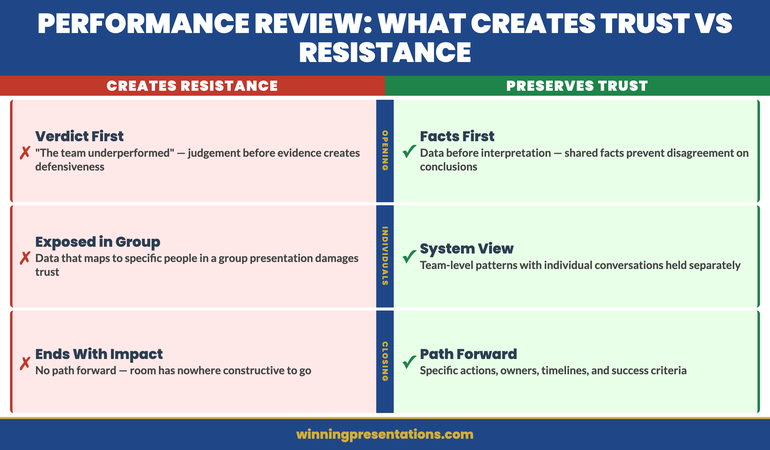
Failure 1: Leading with the verdict. “The team underperformed in Q1.” This opens the conversation with a judgement rather than the evidence that supports it. People hearing a judgement immediately become defensive. Once defensive, they’re evaluating whether they agree with the verdict rather than engaging with the information. You’ve lost the conversation before you’ve presented a single data point.
Failure 2: Individualising in a group presentation. When performance data is presented in a group setting — either to the team itself or to senior leadership about the team — information that maps easily to specific individuals creates a dynamic that isn’t what the presentation is designed to achieve. Team members feel exposed. Senior leaders start asking about individuals when the discussion should be about the team system.
Failure 3: Presenting data without the narrative that makes it meaningful. A chart showing declining output over six months is data. A chart showing declining output against a background of two departures, a system migration, and a restructure is context. Without the narrative, data invites wrong conclusions. With the narrative, data invites the right questions.
Each of these failures has the same root: the presenter has organised the presentation the way the data exists, rather than the way the conversation needs to unfold. These are different organising principles. The data exists as measurements and comparisons. The conversation needs to unfold as understanding, then evaluation, then action.
The four-part structure that preserves trust
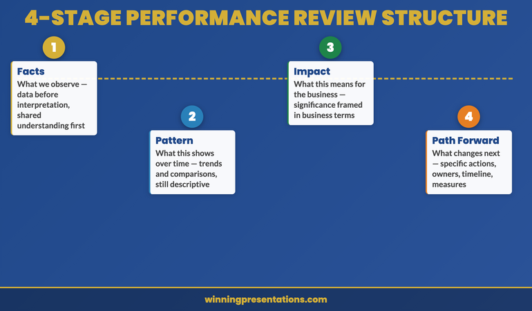
The structure that works for difficult performance conversations — whether delivered to the team directly or to senior leadership about the team — follows four stages. Each stage has a specific job, and the order is deliberate.
Stage 1 — The facts (what we observe). Present the data before any interpretation. Revenue by quarter, output by team, error rates by period — whatever metric is relevant. The goal of this section is to establish shared understanding of what happened, not why. Shared facts create a foundation for the rest of the conversation. If people disagree with the data, they’ll say so now — and that’s better than disagreeing with your interpretation of it.
Stage 2 — The pattern (what this shows over time). Once the facts are established, you can make observations about patterns — trends, directions, comparisons against targets or prior periods. This is still descriptive, not evaluative. “Output has declined in each of the last three quarters” is a pattern. “The team is underperforming” is an evaluation. The distinction matters: patterns are observable; evaluations are arguable.
Stage 3 — The impact (what this means for the business). This is where you move from description to significance. What does this pattern mean for the team, the function, and the business? Framing impact in business terms — not personal terms — keeps the conversation focused on the situation rather than the people. “This pattern means we carry risk on three Q2 deliverables” is a business impact. It’s also actionable in a way that “the team hasn’t met expectations” is not.
Stage 4 — The path forward (what changes next). This is the only part of the presentation that looks forward, and it should occupy at least a quarter of your total time. A performance review presentation that ends with impact but no path forward leaves the room with nowhere constructive to go. The path forward section should be specific: what actions, what support, what timeline, and how progress will be measured.
This structure applies whether you’re presenting to the team or presenting about the team. The subject matter and level of specificity will differ, but the four-part logic holds in both directions.
Present Difficult Information With Clarity That Earns Respect Rather Than Resistance
The Executive Slide System — £39, instant access — includes the presentation structures used for complex, high-stakes executive conversations. The frameworks that let you present difficult information clearly, maintain trust under scrutiny, and lead the room to the right decision.
- Slide structure templates for performance, approval, and update presentations
- AI prompt cards to build clear narrative flows from complex data
- Frameworks for organising sensitive information without creating defensiveness
- Executive presentation structures for internal and upward communications
Get the Executive Slide System →
Designed for executive presentations across complex and sensitive topics.
How to design the slides for this conversation
A team performance review presentation typically requires fewer slides than most people build. The instinct to be thorough — to show every metric, every quarter, every comparison — produces a deck that overwhelms rather than communicates.
The slides that work in this context have a specific character. They are:
Anchors, not documents. Each slide should anchor one idea — one metric, one pattern, one insight. If a slide contains three charts and a table, it’s trying to do too much. An audience that is receiving difficult information needs to process one thing at a time. Give them that space in the visual design.
Trend-focused rather than point-in-time. A single month’s data is almost never meaningful on its own. A chart showing the trend over six months, with a clearly marked target line, communicates the situation more honestly and more usefully than a snapshot. Snapshots invite cherry-picking — by the presenter and by the audience. Trends are harder to dispute and more actionable.
Annotated at the inflection points. When a trend changes direction — up or down — there is almost always a specific reason. Annotating the chart at the point of change (“March: system migration”) puts the data in context and demonstrates that you understand the drivers, not just the numbers. An unannotated negative trend suggests either ignorance or evasion. An annotated one suggests leadership.
Forward-looking in the final section. The final section of the deck should look entirely different from the analytical sections. Where the earlier slides are charts and data, the path forward slides should contain action items, owners, timelines, and clear success criteria. The visual shift reinforces the shift from evaluation to commitment.
What not to put on slides in a performance review
Some information belongs in the conversation, not on the slide. The distinction is not about sensitivity — it’s about what slides do well versus what conversation does well.
Named individuals with individual metrics. In a presentation to senior leadership about team performance, individual-level attribution belongs in a separate conversation, not on a projected slide. If the executive committee needs to understand that specific individuals are driving a performance issue, that conversation happens directly — not through a chart visible to everyone in the room. Exception: if the data you’re presenting is aggregate and genuinely anonymised, it can be represented visually. But the moment a data point maps to a specific person in any audience member’s mind, you’re in difficult territory.
Qualitative assessments without supporting data. “The team shows a lack of urgency” on a slide is an evaluation without evidence. It creates a statement the audience may either accept uncritically or reject defensively — neither of which advances the conversation. If you have the data to support the observation, lead with the data. The evaluation can follow from the evidence.
Historical data that precedes your tenure. It’s tempting to include data that contextualises the current situation by showing what it looked like before. But extended historical data — especially if it shows better performance under a previous structure or leader — tends to shift the conversation backwards rather than forwards. Unless you have a specific reason to include pre-tenure data (such as demonstrating a correlation with an external factor), start the chart at the point where you have genuine ownership of the results.
The parallel challenge of presenting difficult news to senior leadership — rather than about your team — is covered in the article on presenting bad news to senior leadership. And for the related skill of anticipating and preparing for the difficult questions that performance data typically generates, see the article on anticipating executive objections.
When you’re presenting team performance upwards
Presenting team performance to your own senior leadership is a different context from presenting to the team, and it requires a different emphasis.
When presenting upwards, your audience is evaluating two things simultaneously: the performance situation you’re describing, and your own leadership capability in responding to it. This dual evaluation means the path forward section carries even more weight than it does when you’re presenting to the team directly. Senior leaders don’t primarily want to understand the problem — they want to assess whether you have it under control.
This changes the balance of your presentation. The data and pattern sections can be compressed — senior leaders are capable of processing performance data quickly. What they want to see expanded is your analysis of the causes, your ownership of the response, and your confidence in the path forward.
“Here’s what happened, here’s why, here’s what I’m doing about it, and here’s how I’ll know it’s working” is more valuable to a senior leader than a detailed retrospective of everything that went wrong. The retrospective is useful internally for your own team. Upward, it reads as justification rather than leadership.
Framing your path forward as specific actions with named owners and measurable milestones — not aspirational intentions — signals the difference between a manager who understands their situation and one who has a plan to change it.
For the foundational structure that applies across all executive presentations, including those presenting complex organisational data, see the guide to executive presentation structure.
For a complete system of executive presentation frameworks — including those designed for difficult and sensitive conversations — the Executive Slide System gives you the structures, templates, and AI prompts to build any executive presentation with confidence.
Stop Guessing at Difficult Presentation Structures — Use Ones That Work
The Executive Slide System — £39, instant access — includes frameworks built for the presentations executives actually struggle with: performance reviews, bad news, crisis communication, and budget defence. Templates, AI prompt cards, and structure guides for every high-stakes format.
Get the Executive Slide System →
Designed for executive-level presentations across complex and sensitive topics.
Frequently Asked Questions
Should a team performance review presentation be delivered to the team first or to senior leadership first?
It depends on the purpose. If the goal is to align on a path forward with your team, present to the team first — the conversation should happen before the summary reaches senior leadership. If the goal is to brief senior leadership on a situation that requires their awareness or decision, present upwards first and manage the team conversation as a separate meeting. Presenting to senior leadership about a performance issue before the team is aware of it is generally damaging to trust if they find out — and they usually do.
How do I handle it when someone in the room disagrees with the performance data?
Treat the disagreement as useful information rather than resistance. “I’d like to understand what’s different from your view of the data” is a constructive response. If the disagreement is about the data itself (different sources, different time periods), that’s worth resolving before continuing. If the disagreement is about the interpretation of the data, acknowledge it, note it as a different perspective, and continue — the data stands regardless of whether everyone agrees on what it means.
What’s the right length for a team performance review presentation?
In most contexts, 20 to 30 minutes of structured presentation plus time for questions is appropriate. This is enough to move through the four stages without rushing, while leaving sufficient time for the discussion that is usually more valuable than the presentation itself. A two-hour performance review deck typically produces a conversation that could have been achieved in 30 minutes with better preparation.
The Winning Edge
Executive presentation strategies that work in the real world. Every Thursday.
Not ready for the full system? Start here instead: download the free Executive Presentation Checklist — a practical reference for structuring any high-stakes executive presentation clearly and confidently.
The related skill of transferring knowledge and expertise through a presentation — in mentorship or leadership development contexts — is covered in the guide on mentorship presentations.
Difficult conversations become harder when the structure works against them. Build your performance review presentation around the four-stage structure — fact, pattern, impact, path forward — and you’ll find that the conversation that follows is more productive, less defensive, and more likely to move in the direction you need.
About the Author
Mary Beth Hazeldine is Owner & Managing Director of Winning Presentations. With 24 years of corporate banking experience at JPMorgan Chase, PwC, Royal Bank of Scotland, and Commerzbank, she advises executives across financial services, healthcare, technology, and government on structuring presentations for high-stakes funding rounds and approvals. She is a qualified clinical hypnotherapist and NLP practitioner.