Category: Executive Presentations

24 Jan 2026
Professional woman evaluating her presentation slides and realizing what they signal about her competence to executives

What Your Slides Say About You (And It’s Not What You Think)

A CFO once told me why she rejected a £2 million budget request before the presenter finished slide three: “His slides told me everything I needed to know about his thinking. It was scattered.”

Quick answer: Executive slide design perception is how decision-makers read your competence, preparation, and thinking quality through your slides—before you speak a single word. Executives form judgments within 5 seconds of seeing your first slide. Cluttered slides signal cluttered thinking. Buried conclusions signal uncertainty. Wall-of-text slides signal you haven’t done the synthesis work.

In practice, the visual signals your slides send often matter more than the words on them. Executives aren’t reading your slides—they’re reading YOU through your slides.

When your slides send the right signals:

  • Executives lean in instead of checking email
  • Your recommendations get faster approvals
  • You’re seen as someone who “gets it”

Written by Mary Beth Hazeldine — executive presentation coach, 24 years corporate banking at JPMorgan Chase, PwC, RBS, and Commerzbank. I’ve sat in the room when slides killed careers and when they made them. Last updated: January 2026.

🚨 Presenting THIS WEEK? Check your slides for these 3 signals:

  1. Slide 1: Does your conclusion appear in the first 10 words? (If not, you’re burying the lead)
  2. Any slide: Can someone grasp the point in 3 seconds? (If not, it’s too cluttered)
  3. Titles: Do they make claims or just label topics? (“Revenue grew 23%” beats “Revenue Overview”)

Fix these three and you’ll send different signals immediately.

→ If your slide 1 doesn’t contain your decision ask, executives assume you don’t have one. Get the templates that fix this in 60 seconds →

📅 Have 7 days to transform your deck?

The slide signal system in this article takes one focused session to implement. Most professionals see the difference in how executives respond within their very next presentation.

I learned this lesson the hard way. Early in my banking career, I spent 40 hours building what I thought was a comprehensive deck. Fifty-seven slides. Every data point. Complete background on every issue.

The Managing Director stopped me on slide four.

“I can see you worked hard on this,” she said. “But I still don’t know what you want me to do.”

Forty hours of work. Four slides in. And my slides had already told her I didn’t understand what mattered. Not because of the content—but because of the signals the design sent about my thinking.

That moment changed how I approach every deck. And after 24 years of watching executives react to presentations, I now know exactly what signals matter—and which ones kill your credibility before you’ve finished your opening sentence.

What Executives Actually See (In the First 5 Seconds)

When an executive sees your slide, they’re not reading it. They’re scanning it for signals about YOU.

Research on cognitive load shows people form impressions within milliseconds of seeing a visual. Your audience has judged your slide—and by extension, your thinking—before you’ve finished your opening sentence.

Here’s what they’re actually processing:

Signal 1: Hierarchy (Do you know what matters?)

The first thing executives notice is whether there’s a clear visual hierarchy. Is there one dominant element? Or is everything competing for attention?

A slide with five equally-weighted bullet points tells the executive: “I couldn’t decide what was important, so I’m making you do it.”

A slide with one clear headline supported by three subordinate points tells them: “I’ve done the thinking. Here’s what matters.”

Signal 2: Density (Do you respect my time?)

Wall-of-text slides send an unmistakable message: “I haven’t distilled this enough to present it clearly, so I’m going to read to you.”

One senior partner at a consulting firm told me: “When I see a dense slide, I immediately wonder if the presenter understands the material well enough to simplify it. Usually they don’t.”

Signal 3: Structure (Can you think clearly?)

Executives are pattern-matchers. They’ve seen thousands of presentations. They immediately notice whether your deck follows a logical structure or feels random.

A deck that jumps from problem to solution to background to data to recommendation signals scattered thinking. A deck that flows—situation, complication, resolution—signals someone who can construct a coherent argument.

For more on title mistakes, see why “Overview” is the worst slide title.

Diagram showing what executives see in the first 5 seconds of viewing a slide: hierarchy, density, and structure signals

The Hidden Messages Your Slides Are Sending

Beyond the conscious signals, your slides send subconscious messages that executives process without even realising it.

“I’m not confident in my recommendation”

When you bury your conclusion on slide 15 instead of leading with it, executives interpret this as hedging. You’re building up to something because you’re not sure they’ll accept it.

A VP of product once told me: “When someone buries the ask, I assume they know it’s weak. If they believed in their recommendation, they’d lead with it.”

“I don’t understand my audience”

Technical details that belong in an appendix. Jargon that assumes expertise they don’t have. Context they already know being explained at length.

All of these signal the same thing: you haven’t thought about who’s in the room and what they need.

“I’m trying to impress rather than inform”

Over-designed slides with animations, complex charts, and visual flourishes often backfire. Executives see through them immediately.

A managing director at an investment bank put it bluntly: “Fancy slides usually mean the content is weak. The best presenters I know use the simplest slides.”

“I haven’t done the hard work”

It takes more effort to create a simple, clear slide than a complex one. As the saying goes: “If you can’t explain it simply, you don’t understand it well enough.”

Executives know this. When they see complex slides, they question whether you’ve done the synthesis work—or whether you’re just dumping information and hoping they’ll sort it out.

⭐ Slides That Signal “This Person Gets It”

The Executive Slide System gives you the exact structures that send the right signals—hierarchy, clarity, and confidence—from slide one.

What’s inside:

  • 12 executive-tested slide templates (board updates, budget requests, project proposals)
  • The “Headline Test” that ensures every title makes a claim
  • Before/after examples showing signal transformation

Get the Executive Slide System → £39

Built from 24 years in corporate banking + executive training work with senior stakeholders.

5 Slide Signals That Kill Your Credibility

These are the specific executive slide design perception mistakes that damage how you’re seen:

1. The “Agenda” Opening Slide

Starting with “Agenda” or “Overview” tells executives nothing. It’s a missed opportunity to signal that you understand what matters.

What it signals: “I’m going to walk you through this linearly because I haven’t identified what you actually need to know.”

The fix: Open with your conclusion or recommendation. “We should approve the £2M investment because it will generate £8M in returns within 18 months.”

2. The Wall of Bullets

Five or more bullet points of equal weight, each a complete sentence, filling the slide.

What it signals: “I couldn’t synthesise this information, so I’m presenting my notes instead of my thinking.”

The fix: One headline that makes a claim. Three supporting points maximum. If you need more, you need more slides.

3. The Chart Without a Story

A complex chart with no annotation, no highlight, no indication of what the viewer should notice.

What it signals: “I’m showing you data but I haven’t interpreted it. You figure out what it means.”

The fix: Every chart needs a headline that states the insight. “Revenue grew 23% despite market contraction” not “Revenue Chart Q3.”

4. The “Let Me Give You Context” Deck

Slides 1-10 are background. The recommendation doesn’t appear until slide 15.

What it signals: “I’m afraid you’ll reject my recommendation, so I’m delaying it as long as possible.”

The fix: Recommendation on slide 1. Context only when asked for or as appendix.

5. The Design-Over-Substance Slide

Beautiful gradients, custom icons, animations—but the content is thin or unclear.

What it signals: “I spent time on how this looks because I didn’t have confidence in what it says.”

The fix: Simple, clean, content-focused. Let the message carry the weight.

For more on executive summary best practices, see how to write the only slide that matters.

Want slide templates that send the right signals? The Executive Slide System (£39) includes 12 proven structures used by executives at top firms.

5 Slide Signals That Build Authority

These are the signals that make executives think “this person knows what they’re doing”:

1. Conclusion-First Structure

Your recommendation or key message appears in the first 10 seconds. No buildup. No suspense.

What it signals: “I’m confident in my position. I’ve done the analysis. Here’s what we should do.”

2. Headline-Driven Slides

Every slide title makes a claim, not a label. “Market share increased 15%” not “Market Share Update.”

What it signals: “I’ve interpreted the data. I’m not making you do my job.”

3. Strategic White Space

Slides that breathe. One idea per slide. Room for the eye to rest.

What it signals: “I’ve distilled this to what matters. I respect your cognitive load.”

4. Annotated Visuals

Charts with callouts. Diagrams with explanatory text. Visual elements that guide rather than overwhelm.

What it signals: “I’ve thought about what you need to see and made it easy to find.”

5. The “So What?” Test

Every slide answers “so what?” explicitly. No slide exists just to show information—each one drives toward the conclusion.

What it signals: “Everything here has a purpose. I’m not wasting your time.”

Comparison of credibility-killing slide signals versus authority-building slide signals that executives notice

⭐ If Your Slides Aren’t Getting the Response You Want

It’s probably not your content—it’s the signals your slides are sending. The Executive Slide System rewires how your deck communicates before you even speak.

You’ll get:

  • The “Signal Audit” checklist (run before every important presentation)
  • 12 slide templates that pass the executive perception test
  • Real before/after transformations from actual client decks

Get the Executive Slide System → £39

The same structures I used for 24 years in banking—now available as templates.

Before and After: Real Slide Transformations

Here’s what changing your slide signals looks like in practice:

Transformation 1: The Opening Slide

Before: “Q3 Performance Review — Agenda: 1. Background, 2. Market Overview, 3. Results, 4. Challenges, 5. Next Steps”

What it signalled: “Buckle up for a linear data dump. I’ll get to the point eventually.”

After: “Recommendation: Approve £500K additional investment in Product X. Q3 results exceeded targets by 23%, validating our strategy.”

What it signals now: “I know what you need to decide. Here it is.”

Transformation 2: The Data Slide

Before: Title: “Revenue Data” — Complex chart with 8 data series, no annotations, legend in small text.

What it signalled: “Here’s all the data. Good luck finding the insight.”

After: Title: “Revenue grew 23% while competitors declined” — Same data, but one trend highlighted, callout pointing to key inflection, competitors greyed out.

What it signals now: “I’ve analysed this. Here’s what matters.”

Transformation 3: The Recommendation Slide

Before: Bullet list of 7 recommendations, all equal weight, no prioritisation.

What it signalled: “I generated a list but couldn’t prioritise it for you.”

After: One primary recommendation in large text. Three supporting actions in smaller text. Clear next step with owner and deadline.

What it signals now: “I know what matters most. I’ve made the decision easy for you.”

For proven executive presentation structures, see the 12-slide template that commands the room.

Ready to transform your slides? The Executive Slide System (£39) includes the exact before/after templates you can apply immediately.

Frequently Asked Questions

How quickly do executives form impressions from slides?

Research suggests visual impressions form within milliseconds—faster than conscious thought. By the time you’ve said your first sentence, they’ve already judged your slide. This is why executive slide design perception matters so much: the signals happen before your content has a chance to land.

Does slide design really matter more than content?

No—but poor slide design can prevent good content from being heard. If your slides signal scattered thinking, executives will be skeptical of your content regardless of its quality. The design IS the first impression of your content.

What’s the biggest slide mistake executives notice?

Burying the lead. When your conclusion or recommendation doesn’t appear until deep in the deck, executives interpret this as either lack of confidence or lack of synthesis. Lead with your point. Support it with evidence.

Should I use professional design templates?

Clean, simple templates are fine. Over-designed templates can actually hurt you—they signal that you’re compensating for weak content. The goal is invisible design: formatting that helps the content communicate, not formatting that draws attention to itself.

How do I know if my slides are sending the wrong signals?

Apply the “3-second test”: show someone your slide for 3 seconds, then hide it. Ask them what the main point was. If they can’t tell you, your hierarchy is wrong. If they mention something other than your main point, your emphasis is wrong. If they say “it was really busy,” your density is wrong.

Can I fix bad slide signals quickly before a presentation?

Yes. Focus on three things: (1) Move your conclusion to slide 1, (2) Make every title a claim instead of a label, (3) Remove any slide that doesn’t directly support your conclusion. This won’t make your deck perfect, but it will send dramatically better signals.

Why do executives care about slides if they’re listening to me?

Executives are overwhelmed with information. Slides act as a filter—a quick way to assess whether this presentation is worth their full attention. Clean, well-structured slides signal that you’ve done the hard work of synthesis. That earns their attention. Cluttered slides signal the opposite.

Is This Right For You?

✓ This is for you if:

  • You present to executives, boards, or senior stakeholders
  • You’ve noticed your slides aren’t getting the response you want
  • You want templates that signal competence immediately
  • You’re willing to restructure how you build decks

✗ This is NOT for you if:

  • You only present to internal teams (lower stakes)
  • You want design software training, not structure help
  • Your main issue is delivery, not deck construction
  • You’re not willing to change how you organise information

⭐ The MD Who Stopped Me on Slide Four Taught Me Everything

That 57-slide deck that died on slide four? I rebuilt it using the structures now in the Executive Slide System. Same content. Different signals. The same MD approved it two weeks later—and asked for the template.

What you’ll get:

  • 12 executive-tested slide templates
  • The Signal Audit checklist
  • Before/after transformation examples

Get the Executive Slide System → £39

Built from structures that work in global banking and consulting-style environments.

📧 Optional: Get weekly slide strategies in The Winning Edge newsletter (free).

Your Next Step

Your slides are sending signals whether you intend them to or not. The question is whether those signals build your credibility or undermine it.

Run the 3-second test on your next deck. Check whether your conclusion appears in the first 10 seconds. Make sure every title makes a claim instead of labelling a topic.

Those three changes alone will transform your executive slide design perception—how executives read you through your slides.

For the complete system with templates and checklists, get the Executive Slide System (£39).

P.S. If presentation anxiety is affecting your delivery regardless of how strong your slides are, see what to do if you have a panic attack before presenting.

About the Author

Mary Beth Hazeldine is the Owner & Managing Director of Winning Presentations. The MD story that opened this article is real—and that rejected deck became the foundation for how she now teaches slide structure.

With 24 years at JPMorgan Chase, PwC, Royal Bank of Scotland, and Commerzbank—where one presentation could change funding, strategy, or careers—she’s seen thousands of executive presentations. The patterns of what works became the Executive Slide System.

Book a discovery call | View services

23 Jan 2026
Executive presenting with composed confidence after a project failure, demonstrating the ownership and forward-focus that rebuilds credibility

Presenting After Failure? The 3 Words That Saved a VP’s Career

The £2.1 million product launch had flopped. Now Marcus had to present to the same executives who’d approved the budget.

Quick answer: Presenting after failure requires a fundamentally different approach than normal presentations. The instinct is to defend, explain, or minimise—all of which destroy credibility further. The 3 words that work: “Here’s what’s next.” This reframe shifts the room from judgement mode to problem-solving mode, and it only works when paired with a specific slide structure that demonstrates you’ve already done the hard thinking.

In practice, presenting after failure means leading with accountability, pivoting quickly to forward action, and providing a concrete recovery framework—so executives see a leader taking ownership, not someone making excuses.

Last updated: January 2026 — Updated for 2026 with executive recovery slide examples + decision scripts that rebuild credibility fast.

📅 Presenting about a failure in the next 7 days? Do this now:

  1. Open with ownership (15 seconds max on what went wrong—no excuses)
  2. State “Here’s what’s next” before slide 2
  3. Present your recovery framework with specific actions and timelines
  4. Close with the decision you need—don’t leave it open-ended

This structure works because it demonstrates leadership, not defensiveness. Executives respect ownership + action far more than perfect outcomes.

I’ve coached executives through dozens of these moments—the failed product launches, the missed targets, the projects that went sideways. The ones who recovered their credibility all did something counterintuitive.

They stopped trying to explain what happened. And they started showing what happens next.

If you’re facing a presentation where you have to own a failure, this article gives you the exact structure that rebuilds trust instead of destroying it.

Why Your Instincts Are Wrong After a Failure

When a project fails, your brain goes into threat-response mode. You want to explain. Justify. Provide context. Show that it wasn’t entirely your fault.

Every one of these instincts will make things worse.

I see this pattern constantly: executives walk into failure presentations with 15 slides of explanation—market conditions, vendor issues, timeline pressures, resource constraints. They think they’re providing context. The room sees someone who can’t take ownership.

Marcus—the VP with the £2.1 million flop—made this mistake in his first attempt. His presentation opened with three slides explaining why the launch failed: competitor timing, supply chain issues, marketing budget cuts.

The CFO stopped him on slide four. “I don’t need a post-mortem. I need to know what you’re going to do about it.”

That’s when Marcus called me. And that’s when we rebuilt his presentation from scratch.

The problem wasn’t that his explanations were wrong. The problem was that presenting after failure requires a completely different psychological contract with your audience.

Executives don’t want to understand why something failed. They want to know you’ve already figured out the path forward.

The 3 Words That Change Everything

Here’s what we put on Marcus’s second slide, right after a single sentence acknowledging the failure:

“Here’s what’s next.”

Three words. That’s it.

These words work because they accomplish three things simultaneously:

  1. They signal ownership. You’re not asking permission to move forward. You’re already there.
  2. They shift the room’s mindset. Executives go from judgement mode to evaluation mode—assessing your plan rather than your past.
  3. They demonstrate leadership. Leaders don’t dwell. They act.

A product director named Jennifer used this exact phrase after a feature launch that alienated key customers. “The moment I said ‘here’s what’s next,’ I could feel the room relax,” she told me. “They weren’t there to punish me. They were there to solve a problem. I just had to show them I was already solving it.”

But these three words only work if what comes next is actually compelling. That’s where the slide structure matters.

Diagram showing why fighting the sweat response makes it worse - the sympathetic vs parasympathetic nervous system during presentations

⭐ The Slide Structure That Rebuilds Credibility

Executive Slide System includes the exact frameworks for high-stakes presentations—including recovery presentations after failures, setbacks, and missed targets.

What’s inside:

  • 5-slide recovery structure (ownership → action → decision)
  • Executive-tested slide templates
  • Before/after examples from real presentations

Get the Executive Slide System → £39

Built from 24 years in corporate banking + 15 years coaching executives through high-stakes boardroom moments.

Instant download • Use it today • Keep forever

📦 What You Get (Specifically):

  • 12 executive slide frameworks — including recovery presentations, bad news delivery, and credibility rebuilding
  • Before/after transformations — see exactly how to restructure failing presentations
  • The 60-second slide test — know instantly if your slides will land or bomb
  • Headline formulas — turn forgettable slide titles into executive attention-grabbers
  • Decision slide templates — get faster approvals with the right structure

The 5-Slide Structure for Recovery Presentations

After working with Marcus and dozens of other executives in similar situations, I’ve refined the structure that works for presenting after failure:

Slide 1: The Ownership Slide (30 seconds max)

One sentence stating what happened. No explanations. No context. No defensive qualifiers.

Marcus’s slide read: “The Q3 product launch missed revenue targets by 67%. I own that outcome.”

That’s it. Sixteen words. The instinct is to add more—but more words signal defensiveness, not leadership.

Slide 2: “Here’s What’s Next” (The Pivot)

Immediately pivot to forward action. This slide should contain your recovery thesis in one sentence, followed by the 3 words: “Here’s what’s next.”

Marcus wrote: “We’ve identified the three fixable issues and built a 90-day recovery plan. Here’s what’s next.”

Slide 3: The Recovery Framework

Show your thinking, not just your conclusions. Executives want to see that you’ve done the analysis. Use a simple framework—I recommend three columns: Issue, Root Cause, 30-Day Action.

This slide proves you’ve moved past blame and into solutions.

Slide 4: Timeline + Milestones

Specific dates. Specific metrics. Specific accountability.

Vague timelines (“over the coming months”) destroy credibility. Specific timelines (“Phase 1 complete by February 15, measured by X metric”) rebuild it.

Slide 5: The Decision Slide

End with what you need from them. Don’t leave it open. “I need approval to reallocate £400K from Q4 budget to fund the recovery plan. Can I have that today?”

This structure works because it demonstrates exactly what executives want to see: ownership, forward thinking, concrete planning, and decisive action.

For more on structuring executive-level presentations, see the executive presentation structure that gets buy-in.

Need the complete recovery presentation framework? Executive Slide System includes the full 5-slide structure plus templates for every high-stakes scenario. Get the Framework → £39

Instant download • Use it today • Keep forever

What NOT to Do (I’ve Seen Careers End This Way)

Before we go further, let me tell you about Sarah—a director who did everything wrong.

Her project had gone 40% over budget. Instead of the ownership + action structure, she opened with seven slides of explanation: scope creep, vendor delays, team turnover, unclear requirements from stakeholders.

Each slide was technically accurate. And each slide made things worse.

By slide five, the CEO interrupted: “Sarah, I’m hearing a lot of reasons why this isn’t your fault. What I’m not hearing is what you’re going to do about it.”

She didn’t have a good answer. She’d spent all her preparation time building the defence case instead of the recovery case.

She was moved to a different role within three months.

Here’s what to avoid when presenting after failure:

  • Don’t open with explanations. Even accurate ones signal defensiveness.
  • Don’t distribute blame. “The vendor failed to deliver” might be true—but it’s not leadership.
  • Don’t minimise. “It wasn’t as bad as it looks” insults your audience’s intelligence.
  • Don’t ask for sympathy. “It’s been a really difficult quarter” is irrelevant to executives.
  • Don’t leave the path forward vague. “We’re working on solutions” means you haven’t done the work yet.

The common thread: every one of these mistakes focuses on the past or on yourself. Recovery presentations must focus on the future and on the business.

Related: See the complete guide to presenting bad news without destroying your credibility.

The pre-presentation protocol timeline showing when to do each nervous system technique before presenting

⭐ Turn Your Next Difficult Presentation Into a Career Win

The executives who recover from failures aren’t luckier—they have better frameworks. Executive Slide System gives you the structures that transform difficult moments into leadership demonstrations.

Frameworks included:

  • Recovery presentation structure (5 slides)
  • Bad news delivery framework
  • Budget request structure (even after overruns)

Get the Executive Slide System → £39

Same frameworks I used with Marcus. His recovery presentation got the budget approved—and a promotion six months later.

Instant download • Use it today • Keep forever

How to Rebuild Credibility Over Time

The presentation is just the first step. Rebuilding credibility after a failure is a multi-month process that requires consistent follow-through.

Here’s what I coach executives to do in the 90 days after a recovery presentation:

Week 1-2: Over-communicate on Progress

Send brief weekly updates to the key stakeholders who were in that room. One paragraph, three bullet points: what you said you’d do, what you did, what’s next.

This seems excessive. It’s not. After a failure, silence breeds doubt. Proactive communication rebuilds trust.

Month 1: Hit Your First Milestone Publicly

Whatever you committed to in that recovery presentation, deliver the first milestone early if possible. Then make sure the right people know about it.

A VP of operations named James told me this was the turning point in his recovery: “I said I’d have the vendor situation resolved in 30 days. I got it done in 21 and sent a one-line email to the CEO. He replied with two words: ‘Well done.’ That was the moment I knew I was back.”

Month 2-3: Reference the Learning

In subsequent presentations, briefly reference what you learned from the failure. Not defensively—as a demonstration of growth.

“After Q3, we rebuilt our vendor assessment process. Here’s how that’s improved our Q4 planning…” shows you’ve extracted value from the setback.

If you’re nervous about these follow-up presentations, the physical symptoms are real. See how to stay composed when presenting under pressure—today’s partner article on managing the physical side of high-stakes moments.

Want every executive presentation framework in one place? Executive Slide System covers recovery presentations, board updates, budget requests, and more—all using the same psychology-backed structure. See All Frameworks → £39

Instant download • Use it today • Keep forever

Presenting After Failure: Common Questions

How do you present after a project failure?

Presenting after failure requires leading with brief ownership (one sentence, no excuses), pivoting immediately to “here’s what’s next,” presenting a concrete recovery framework with timelines and accountability, and closing with a specific decision request. The structure that works: Slide 1 (ownership), Slide 2 (pivot), Slide 3 (recovery framework), Slide 4 (timeline), Slide 5 (decision). Avoid explanations, blame distribution, and vague forward plans.

What do you say after a failed presentation or project?

The three words that work: “Here’s what’s next.” This phrase signals ownership, shifts the room from judgement to problem-solving, and demonstrates leadership. Follow immediately with your concrete recovery plan. Avoid phrases like “it wasn’t as bad as it looks,” “the circumstances were difficult,” or anything that distributes blame to others.

How do you rebuild credibility after a failure at work?

Rebuilding credibility after failure is a 90-day process: deliver your recovery presentation with the ownership + action structure, over-communicate progress weekly for the first month, hit your first milestone early and publicly, then reference the learning in future presentations. Consistency matters more than any single moment—executives watch whether you follow through on what you committed to.

Is This Framework Right For You?

✓ This is for you if:

  • You’re facing a presentation about a failed project, missed target, or setback
  • You need to rebuild credibility with executives or stakeholders
  • You want a proven structure (not generic advice)
  • You’re willing to lead with ownership, not explanations

✗ This is NOT for you if:

  • You want templates for routine presentations (this is for high-stakes moments)
  • You’re looking for ways to avoid accountability
  • You need legal or HR advice about a workplace situation
  • The failure involves ethical violations (different playbook required)

⭐ The Framework Marcus Used to Save His Career

After his £2.1M launch flopped, Marcus used the Executive Slide System to rebuild his recovery presentation. He got the budget approved—and was promoted six months later. The same frameworks are inside.

What you’ll use immediately:

  • 5-slide recovery structure
  • Ownership slide template
  • Recovery framework format

Get the Executive Slide System → £39

Built from 24 years in corporate banking. Tested across 200+ executive recovery presentations.

Instant download • Use it today • Keep forever

FAQ

Should I apologise when presenting after a failure?

Brief ownership is essential; extended apology is counterproductive. “I own that outcome” works. “I’m so sorry this happened and I want to apologise to everyone affected” takes too long and puts the focus on emotion rather than action. Executives want to see you’ve moved past the failure mentally—prolonged apology suggests you haven’t.

How long should I spend explaining what went wrong?

30 seconds maximum. One slide, one sentence stating what happened. The explanation instinct is strong, but every minute spent on the past is a minute not spent on the future. If executives want more context, they’ll ask—and then you can provide it. But most won’t. They care about the path forward.

What if the failure wasn’t entirely my fault?

It doesn’t matter for the presentation. Distributing blame—even accurately—makes you look weak. Take ownership of the outcome regardless of contributing factors. You can address process improvements (including vendor management or cross-functional coordination) in your recovery framework without pointing fingers. Leaders own outcomes; managers explain circumstances.

Can this structure work for team failures, not just individual ones?

Yes—and it’s even more important. When presenting on behalf of a team, you must own the outcome personally. “We failed” is weaker than “I led a team that didn’t deliver, and I’m accountable for that.” Then pivot to “here’s what’s next” and show the team’s recovery plan. Your willingness to take personal ownership for a team outcome is exactly what executives want to see from leaders.

📧 The Winning Edge Newsletter

Weekly frameworks for executive presentations, high-stakes communication, and the psychology of leadership presence. For senior professionals who present to boards, executives, and stakeholders.

Subscribe Free →

Your Next Step

If you’re presenting after failure, you’re facing one of the highest-stakes moments in your career. The good news: it’s also an opportunity.

The executives who handle these moments well—with ownership, forward focus, and concrete action plans—often emerge with more credibility than they had before. Failure handled well demonstrates leadership more clearly than success that came easily.

Remember: ownership (one slide), “here’s what’s next” (the pivot), recovery framework (show your thinking), timeline (specific dates), decision (what you need).

For the complete framework with templates and examples, get the Executive Slide System → £39.

About the Author

Mary Beth Hazeldine is the founder of Winning Presentations and creator of the Executive Slide System. She’s coached 200+ executives through recovery presentations after project failures, budget overruns, and missed targets—including Marcus, whose story opened this article.

With 24 years of corporate experience at JPMorgan Chase, PwC, Royal Bank of Scotland, and Commerzbank, she’s seen firsthand how the right presentation structure can rebuild—or destroy—executive credibility.

Book a discovery call | View services

22 Jan 2026
Executive presenting to leadership team in boardroom meeting.

I Watched a £4M Proposal Get Rejected in 90 Seconds. The Mistake Was on Slide 38.

She had 47 slides of flawless analysis. The board rejected her proposal in 90 seconds.

Quick answer: The most costly executive slide mistake isn’t poor formatting or too much text—it’s burying the recommendation. The slide where you actually ask for the decision is where most presentations fail. Executives don’t want to discover your conclusion at the end. They want to evaluate it from the start. Lead with the ask, then provide the evidence to support it.

Last updated: January 2026 — with the latest executive slide patterns I’m seeing right now.

I’ve reviewed hundreds of executive presentations over 24 years in banking. The same mistake appears in nearly every rejected deck: the recommendation slide comes too late, says too little, or hides the ask inside paragraphs of context.

If your presentations get polite nods but no decisions, this is almost certainly why.

The 47-Slide Rejection

A few years ago, I sat in on a budget presentation that still haunts me.

The presenter—a senior director at a financial services firm—had done everything right. Thorough market analysis. Detailed competitive landscape. Beautiful charts showing ROI projections over five years.

Forty-seven slides of preparation.

The CFO interrupted on slide 3: “What are you actually asking for?”

The presenter started scrolling. “I’m getting to that—it’s on slide 41.”

“Just tell me now.”

“We’re requesting £2.3 million for a platform upgrade that will—”

“Why didn’t you lead with that?”

The meeting ended 12 minutes later. Request denied. Not because the analysis was wrong, but because the ask was buried so deep that the CFO had already made up his mind by the time he found it.

The irony? Her recommendation slide was actually well-written. It just came 40 slides too late.

That’s the most costly executive slide mistake. Not the formatting. Not the fonts. The placement and prominence of the ask itself.

⭐ Get the Recommendation Slide Right Every Time

Stop burying your ask. The Executive Slide System gives you the exact structure for recommendation slides that get approved—not politely ignored.

Includes:

  • The 3-part recommendation slide template
  • 12 executive slide frameworks (including decision slides)
  • Before/after examples from real approvals

Get the Executive Slide System →

Used by executives at financial services, tech, and consulting firms. Built from 24 years of high-stakes presentations.

Why the Recommendation Slide Fails

Most presentation advice tells you to build your case, then deliver the conclusion.

That works for essays. It fails for executive decisions.

Here’s why: executives aren’t reading your presentation to discover your conclusion. They’re evaluating whether to agree with a conclusion they expect you to have already reached.

When you bury the recommendation, you force them to sit through your entire thought process before they even know what you’re asking. By slide 15, they’re mentally checking out. By slide 30, they’ve already decided—usually “no,” because you haven’t given them anything to decide “yes” to.

I see this mistake weekly: the recommendation buried somewhere between slide 28 and slide 42, hidden in a wall of text that no one will read.

The three ways the recommendation slide typically fails:

  1. It comes too late. Buried after all the analysis, when attention is already gone.
  2. It’s too vague. “We recommend moving forward with the proposed initiative” tells them nothing.
  3. It’s buried in context. Three paragraphs of background, then the ask hidden in the fourth sentence.

Each of these is a different symptom of the same underlying problem: treating the recommendation as a conclusion rather than an opening.

⏱️ Before you scroll further, do this 10-second test: Open your last executive deck. Look at slide 2. Does it clearly state what you’re asking for, how much it costs, and when you need a decision? If not, you’ve found your problem.

I saw a perfect example of the “too vague” problem last year. A VP at a logistics company presented to her board with a recommendation slide that said: “We recommend proceeding with the digital transformation initiative pending further analysis.”

The board chair leaned back. “What does ‘proceeding’ mean? How much? When do you need an answer?”

She didn’t have those answers on the slide. They were buried in an appendix. The board moved on to the next item. Six months of preparation, dismissed in under two minutes—not because the strategy was wrong, but because the ask was invisible.

For more on slide titles that actually communicate, see why most slide titles fail.

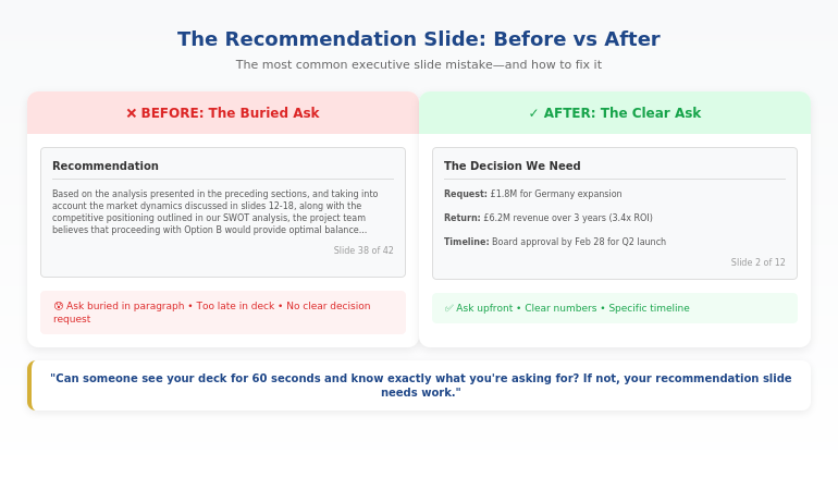
Before and after recommendation slide showing how executives bury the ask versus leading with the decision

How to Fix It (The 3-Part Structure)

The fix is simple but counterintuitive: put your recommendation on slide 2.

Not slide 41. Not “after the context.” Slide 2—right after your title slide.

Here’s the structure that works:

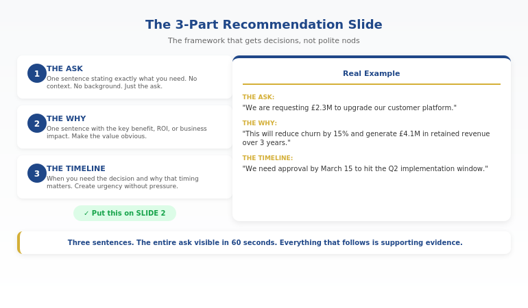
The 3-Part Recommendation Slide:

Part 1: The Ask (one sentence)
“We are requesting £2.3M to upgrade our customer platform.”

Part 2: The Why (one sentence)
“This will reduce churn by 15% and generate £4.1M in retained revenue over 3 years.”

Part 3: The Decision Needed (one sentence)
“We need approval by March 15 to hit the Q2 implementation window.”

That’s it. Three sentences. The entire ask on one slide, visible in the first 60 seconds.

Then you provide the supporting evidence. But now the executive knows what they’re evaluating. Every chart, every data point, every slide that follows is answering the question: “Should I approve this?”

A client of mine used this exact structure for a £4.2 million technology investment. The CEO approved it in a single meeting—not because the data was different, but because she didn’t have to wait until slide 35 to understand what she was deciding.

Want the exact template? The Executive Slide System includes the 3-part recommendation slide plus 11 other executive frameworks. Get Instant Access →

Before and After Examples

Let me show you what this looks like in practice.

BEFORE (The Buried Ask):

❌ Slide 38 of 42: “Recommendation”

“Based on the analysis presented in the preceding sections, and taking into account the market dynamics discussed in slides 12-18, along with the competitive positioning outlined in our SWOT analysis, the project team believes that proceeding with Option B would provide the optimal balance of risk mitigation and growth potential, subject to the caveats noted in Appendix C.”

This tells the executive nothing. What’s Option B? How much does it cost? What do you need them to do? By slide 38, they’ve already stopped reading.

AFTER (The Clear Ask):

✓ Slide 2: “The Decision We Need”

Request: £1.8M for market expansion into Germany.
Return: Projected £6.2M revenue over 3 years (3.4x ROI).
Timeline: Board approval needed by Feb 28 to secure Q2 launch.

Same information. Completely different impact. The executive knows exactly what’s being asked in the first 30 seconds.

The “after” example above is based on a real client—a head of strategy at a manufacturing company who’d had three consecutive proposals deferred by the board. When I reviewed his decks, every single one buried the ask after 30+ slides of market analysis.

We restructured his Germany expansion proposal with the ask on slide 2. Same data, same analysis, same appendices—just a different sequence. The board approved it unanimously. Afterward, the chairman told him: “This is the first time I’ve actually understood what you were asking for.”

Three proposals deferred. One structural change. Immediate approval.

For more on executive decision frameworks, see the 3-slide system that gets faster decisions.

The recommendation slide framework showing lead with the ask then support with evidence

⭐ Stop Making the Most Common Executive Slide Mistake

Your recommendation slide is either getting you approvals or getting you ignored. Get the exact framework that works.

The Executive Slide System includes:

  • Recommendation slide template (the 3-part structure)
  • Executive summary slide framework
  • Decision slide sequences that drive action

Get the Framework →

Instant download. Use it for your next presentation.

The Deeper Problem: Confusing the Summary with the Ask

One pattern I see constantly: executives confuse the executive summary slide with the recommendation slide.

They’re not the same thing.

I learned this the hard way during my banking years. I once spent two weeks preparing a presentation for a credit committee—beautiful executive summary, detailed analysis, comprehensive risk assessment. The committee chair stopped me five minutes in: “Mary Beth, this is all very thorough, but what do you actually need us to approve?”

I had a summary. I didn’t have a clear ask. The presentation was deferred, and I had to come back the following month with a proper recommendation slide. That experience taught me a lesson I’ve since taught hundreds of others: a summary tells them what they’re about to see; a recommendation tells them what you need them to do.

The executive summary slide tells the audience what they’re about to see. It’s a roadmap.

The recommendation slide tells them what you need from them. It’s an ask.

Many presentations have a decent executive summary but no clear recommendation slide at all. The ask gets scattered across three different slides, or buried in a “next steps” slide at the end that everyone skips.

If you’re not sure whether your presentation has this problem, try this test: Can someone look at your deck for 60 seconds and tell you exactly what you’re asking for, how much it costs, and when you need a decision?

If the answer is no, your recommendation slide needs work.

Want both frameworks? The Executive Slide System includes the executive summary AND recommendation slide templates, plus 10 other frameworks for high-stakes presentations. See What’s Included →

Related: If the thought of presenting your recommendation to senior leaders makes your heart race, you’re not alone. See what to do when your face turns red while presenting—it’s more common than you think, and there are specific techniques that help.

Executive Slide Mistakes: Common Questions

What is the most common slide mistake?

The most costly executive slide mistake is burying the recommendation. Instead of leading with the ask—what they need, how much it costs, when they need a decision—they build up to it through 30+ slides of analysis. By the time they reach the ask, the audience has already checked out. The fix: put your recommendation on slide 2, then provide the supporting evidence.

What makes executive slides different from regular presentations?

Executive slides need to enable decisions, not just convey information. Regular presentations can build to a conclusion; executive presentations must lead with one. Executives don’t have time to discover your thinking—they need to evaluate your recommendation quickly. This means clearer asks, less context, and recommendation slides that appear in the first 60 seconds.

How do you write a recommendation slide?

Use the 3-part structure: (1) The Ask—one sentence stating exactly what you need; (2) The Why—one sentence with the key benefit or ROI; (3) The Timeline—when you need the decision and why. Put this on slide 2, not slide 40. Every slide that follows should support this ask with evidence.

⭐ Get Decisions, Not Just Polite Nods

The Executive Slide System gives you the exact frameworks for recommendation slides, executive summaries, and decision sequences that actually get approved.

What’s inside:

  • 12 executive slide templates (recommendation, summary, decision)
  • Before/after examples from approved presentations
  • The 60-second test for every deck

Get the Executive Slide System (£39) →

One approved budget request pays for this 100x over. Built from 24 years of executive presentations in banking and finance.

FAQ

Isn’t the executive summary the most important slide?

The executive summary tells people what they’re about to see. The recommendation slide tells them what you need from them. Both matter, but if you have to choose, the recommendation slide is more important—it’s the slide that actually gets you a decision. Many presentations have a decent summary but no clear recommendation, which is why they end with “let’s discuss offline” instead of approval.

How do I know if my recommendation slide is wrong?

Apply the 60-second test: Show your deck to someone unfamiliar with it. After 60 seconds, ask them: What am I requesting? How much does it cost? When do I need a decision? If they can’t answer all three, your recommendation slide needs work. It should appear on slide 2 and answer all three questions in three sentences or less.

What if my boss wants all the data first?

This is common, and it’s usually based on a misunderstanding of how executives read presentations. Try this: put the recommendation on slide 2, then say “the supporting analysis follows.” Most executives will appreciate the clarity. If your boss insists on data-first, include a clear recommendation slide anyway—just earlier than slide 40. The goal is ensuring the ask is impossible to miss.

How long should a recommendation slide be?

Three sentences maximum. One for the ask, one for the primary benefit or ROI, one for the timeline and decision needed. If you need more space, you’re including context that belongs on supporting slides. The recommendation slide is for the ask—nothing else.

📧 The Winning Edge Newsletter

Weekly insights on executive presentation mistakes, frameworks that get approvals, and the small changes that make the biggest difference. Practical advice from 24 years in corporate banking.

Subscribe Free →

Your Next Step

Open your most recent executive presentation. Find the slide where you make your actual ask.

Is it on slide 2—or slide 35?

If it’s buried, you now know the most costly executive slide mistake—and exactly how to fix it. Move your recommendation to slide 2. Use the 3-part structure: Ask, Why, Timeline.

One change. Dramatically better results.

For the complete framework plus 11 other executive slide templates, get the Executive Slide System.

About the Author

Mary Beth Hazeldine is the Owner & Managing Director of Winning Presentations and a former corporate banker with 24 years of experience at JPMorgan Chase, PwC, Royal Bank of Scotland, and Commerzbank. She has trained thousands of executives on high-stakes presentation skills and helped clients secure more than £250 million in funding and budget approvals.

The “47-slide rejection” story in this article is based on a real presentation Mary Beth observed during her banking career. The presenter later used the recommendation-first approach and got her next budget request approved in a single meeting.

Book a discovery call | View services

20 Jan 2026
Executive presentation opening line - the formula that makes executives put down their phones and pay attention

Executive Presentation Opening Line That Makes Executives Put Down Their Phones

Quick answer: The best executive presentation opening line signals relevance and decision-readiness in the first 10 words. Instead of “Thank you for your time” or an agenda slide, open with the stake: “We’re leaving £2M on the table quarterly—here’s how we fix it.” This tells executives immediately: this matters, there’s a recommendation coming, and their time won’t be wasted.

Copy/paste the sentence structure below, then fill in your numbers. This stops the “half-listening while checking email” behaviour that kills most presentations before slide two.

⚡ Presenting to executives soon? Use this opening formula:

Formula: [Stake] + [Recommendation preview] + [Timeframe]

Example: “We’re losing 23% of customers at renewal. I’m recommending we invest £150K in the onboarding fix—and I’ll show you why it pays back in 6 months.”

This works because executives now know: (1) why this matters, (2) that you have a position, and (3) how long this will take.

The CFO Who Looked Up After 11 Words

I was coaching a director who’d been struggling to get budget approvals. His presentations were thorough—40+ slides of analysis, context, and methodology.

The problem: by slide three, his CFO was answering emails.

We changed one thing. His opening line.

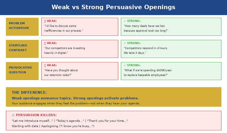
Instead of: “Thanks for making time. I’ll walk you through our Q3 analysis and some recommendations.”

He said: “We’re hemorrhaging £340K monthly on a system nobody uses. I need 12 minutes and a decision.”

Eleven words in, the CFO closed his laptop.

The same data. The same recommendation. Different result. He got his budget approved that afternoon—after months of delays.

The content didn’t change. The opening line did.

⭐ Open Every Executive Presentation With Confidence

Get the exact slide structure, opening scripts, and frameworks that command attention from the first word.

Inside the Executive Slide System:

  • Decision-first opening templates (copy/paste ready)
  • The 5-slide structure executives actually want
  • Scripts for budget requests, updates, and recommendations
  • Before/after examples from real boardroom presentations

Get the Executive Slide System → £39

Built from 24 years in corporate banking. The same frameworks used in FTSE 100 boardrooms, steering committees, and C-suite budget meetings.

Why Executives Check Phones During Your Opening

Here’s what happens in the first 10 seconds of most presentations to senior leaders:

You say: “Good morning, thank you for making time. I’m going to take you through our quarterly review and share some thoughts on next steps.”

They hear: “This is going to be a standard update. I can half-listen and catch up on email.”

Phones stay up. Laptops stay open. You’ve lost them before you’ve started.

This isn’t rudeness. It’s triage. Executives sit through 8-12 presentations weekly. They’ve learned to filter ruthlessly. If your opening doesn’t signal “this requires my full attention and a decision,” they allocate partial attention.

The three signals that keep phones up:

  • “Thank you” openers — Signal politeness, not urgency
  • Agenda slides — Signal “I’m going to walk through things methodically” (translation: slowly)
  • Context-building — Signal “the point is coming eventually” (translation: I can tune out now)

The three signals that put phones down:

  • A stake — Something at risk that matters to them
  • A position — You have a recommendation (not just information)
  • A timeframe — This will be brief and decision-focused

Your executive presentation opening line needs all three. In the first sentence.


The Decision-First Opening Formula showing three components: stake, recommendation, and timeframe

The Decision-First Opening Formula

Every effective executive opening follows the same structure. Once you see it, you can’t unsee it:

[STAKE] + [RECOMMENDATION PREVIEW] + [TIMEFRAME]

Let’s break it down:

1. The Stake (Why This Matters)

Start with what’s at risk, what’s being lost, or what opportunity exists. Use numbers when possible. Make it concrete.

  • “We’re losing £2.3M annually to a process that takes 4 clicks to fix.”
  • “Three of our top 10 clients have mentioned switching providers.”
  • “The compliance deadline is 90 days out and we’re 60% ready.”

2. The Recommendation Preview (You Have a Position)

Signal that you’re not just presenting data—you’ve done the thinking and have a clear recommendation. You’ll defend it, but they know it’s coming.

  • “I’m recommending we invest £150K now to avoid £800K in penalties.”
  • “I’m proposing we sunset Product X and redirect resources to Product Y.”
  • “My recommendation is we delay launch by 6 weeks—and I’ll show you why that saves money.”

3. The Timeframe (Respect Their Time)

Tell them how long this will take. Executives relax when they know there’s a defined endpoint.

  • “I need 12 minutes and one decision.”
  • “This is a 10-minute presentation with 5 minutes for questions.”
  • “I’ll be brief—8 slides, then I need your input on two options.”

When you combine all three, you get opening lines like:

“We’re leaving £400K on the table every quarter because of a pricing gap our competitors have already closed. I’m recommending a 15% adjustment to our enterprise tier—and I’ll walk you through the analysis in 10 minutes.”

That’s 45 words. Phones are down. Laptops are closed. You have their attention.

This is the same structure I teach in the executive presentation structure framework—opening lines are just the first application of decision-first thinking.

Want opening scripts you can copy and customise? The Executive Slide System includes decision-first opening templates for budget requests, project updates, strategic recommendations, and more. See what’s included →

5 Opening Lines That Work (With Scripts)

Here are five executive presentation opening lines for different scenarios. Each follows the stake + recommendation + timeframe formula:

1. Budget Request

“Our current system is costing us 340 hours monthly in manual workarounds—that’s £180K annually in productivity loss. I’m requesting £75K for an automation upgrade that pays back in 5 months. I need 10 minutes and your approval to proceed.”

2. Quarterly Business Review

“Q3 revenue is up 12%, but customer acquisition cost increased 23%—if that trend continues, we’ll miss our annual margin target by £2M. I have three recommendations to reverse this. Let me walk you through them in 15 minutes.”

3. Project Status Update

“Project Atlas is 2 weeks behind schedule due to the vendor delay I flagged last month. I’m recommending we bring in a second vendor for the integration phase—it adds £30K but gets us back on timeline. I need 8 minutes and a decision on the budget adjustment.”

4. Strategic Recommendation

“We’re fourth in market share and losing ground every quarter. I’m proposing we acquire CompetitorX before they get snapped up—the window is 90 days. This presentation makes the case in 12 minutes, then I need your input on whether to proceed with due diligence.”

5. Risk/Compliance Alert

“The new GDPR requirements take effect in 60 days. We’re currently 40% compliant. I’m recommending an emergency workstream with dedicated resources—total investment £95K to avoid fines up to £4M. I’ll explain the gaps and the fix in 10 minutes.”

Notice what these all have in common: no “thank you,” no agenda, no context-building. They go straight to what matters.


Before and after comparison of weak versus strong executive presentation opening lines

⭐ Never Lose an Executive in Your First 10 Seconds Again

Get proven opening scripts, slide structures, and frameworks that command attention from word one.

What’s inside:

  • The Decision-First Opening Formula (with fill-in-the-blank scripts)
  • 5-slide executive structure that keeps attention throughout
  • Templates for budget requests, updates, and recommendations
  • Before/after examples from real presentations

Get Instant Access → £39

Instant download. Start applying these frameworks to your next presentation today.

What to Say Instead of “Thank You For Your Time”

Let’s be specific about what to replace:

Instead of: “Thank you all for making time today.”

Say: Nothing. Jump straight to the stake. You can thank them at the end if you want.

Instead of: “I’m going to walk you through our Q3 results.”

Say: “Q3 results show a problem we need to address today—and I have a recommendation.”

Instead of: “Before I get into the details, let me give you some context.”

Say: “Here’s what’s at stake: [stake]. Here’s what I recommend: [position]. Let me show you why.”

Instead of: “As you know, we’ve been working on this project for six months.”

Say: “Six months in, we’ve hit a decision point that affects the next 18 months. I need your input.”

The pattern: delete throat-clearing. Start with why they should care.

If you’re nervous about skipping pleasantries, remember: executives don’t experience your directness as rude. They experience it as respect for their time. The psychology of presentation hooks confirms this—decision-makers respond to relevance, not politeness.

If the nervousness itself is the issue, that’s a separate challenge. Here’s what senior leaders actually do to manage high-stakes presentation nerves.

Struggling with what to put on your first slide? The Executive Slide System includes the exact first-slide template that complements a decision-first opening line. Download now →

Common Questions About Executive Presentation Openings

How do you start an executive presentation?

Start with the stake—what’s at risk, what opportunity exists, or what decision is needed. Follow immediately with your recommendation preview (so they know you have a position), then state your timeframe. Skip “thank you,” skip the agenda slide, skip context-building. Executives decide in the first 10 seconds whether to give you full attention. Lead with relevance.

What is the best opening line for a presentation?

The best executive presentation opening line combines three elements: a stake (why this matters), a recommendation preview (you have a position), and a timeframe (how long this takes). Example: “We’re losing £200K quarterly to a fixable process gap. I’m recommending a £50K investment that pays back in 4 months. I need 10 minutes and a decision.” This signals relevance immediately and earns full attention.

How do you grab attention in a business presentation?

Use numbers and specifics, not generalities. “We have a customer retention challenge” loses to “We lost 47 enterprise customers last quarter—£3.2M in annual recurring revenue.” Specificity signals preparation and importance. Combine it with a clear recommendation (“Here’s how we fix it”) and executives will put down their phones. Learn more about first slides that grab attention here.

⭐ Command the Room From Your First Word

Stop losing executives in the first 10 seconds. Get the complete system for presentations that earn full attention and drive decisions.

The Executive Slide System includes:

  • Decision-first opening scripts (copy/paste ready)
  • The 5-slide structure that keeps attention throughout
  • First-slide template that complements your opening line
  • Before/after transformations from real presentations

Get the Executive Slide System → £39

Built from 24 years in corporate banking and tested in boardroom environments. Instant download.

FAQ

Should I start with “thank you for your time”?

No. “Thank you for your time” signals politeness but wastes the most valuable real estate in your presentation—the first 10 seconds when executives decide whether to give you full attention. If you want to express gratitude, do it at the end: “Thank you—I’ll take questions.” Opening with thanks tells them nothing about why this presentation matters.

What if my presentation is just an update, not a decision?

Reframe it. Every update has implications. “Q3 revenue is up 12%” becomes “Q3 revenue is up 12%, which puts us on track for the expansion budget we discussed—I want to confirm we’re still aligned on timing.” Even status updates can signal relevance. If there’s genuinely nothing at stake, question whether the meeting is necessary.

Does this work for virtual presentations?

It’s even more important virtually. In a conference room, social pressure keeps phones somewhat hidden. On Zoom, executives are checking email in another window constantly. A strong opening line is your only tool to pull their attention back to your screen. Start with the stake immediately—before they’ve had time to open their inbox.

How do I open if I’m presenting bad news?

The same formula applies—perhaps more importantly. “We missed our Q3 target by 15%. I have a recovery plan that gets us back on track by Q1, and I need your approval on one resource decision.” Bad news with a recommendation is far better received than bad news followed by rambling context. Executives respect presenters who diagnose problems and propose solutions.

📧 The Winning Edge Newsletter

Weekly techniques for executive presentations, confident speaking, and career communication. Practical frameworks from 24 years in corporate banking—no generic tips, just what actually works in boardrooms.

Subscribe Free →

Your Next Step

Your next executive presentation will be judged in the first 10 seconds. The opening line you choose determines whether you get full attention or half-listening.

Use the formula: [Stake] + [Recommendation preview] + [Timeframe].

Delete the “thank you.” Delete the agenda. Start with why they should care.

For the complete system—opening scripts, slide structure, and decision-first frameworks—get the Executive Slide System.

📋 Free Resource: Presentation Openers & Closers Swipe File

A collection of proven opening and closing lines you can adapt for your next presentation. Includes executive, client, and team meeting variations.

Download Free Swipe File →

About the Author

Mary Beth Hazeldine is the Owner & Managing Director of Winning Presentations and a former corporate banker with 24 years of experience at JPMorgan Chase, PwC, Royal Bank of Scotland, and Commerzbank. She has trained thousands of executives on high-stakes presentation skills and helped clients secure more than £250 million in funding and budget approvals.

Mary Beth is also a qualified clinical hypnotherapist and NLP practitioner, specialising in helping professionals overcome presentation anxiety and communicate with executive presence. She developed the Decision-First Opening Formula after watching hundreds of presentations fail in the first 10 seconds—and discovering that the fix was simpler than most people think.

Book a discovery call | View services

19 Jan 2026
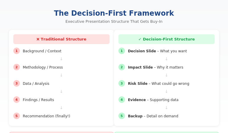
Executive presentation structure diagram showing the Decision-First Framework for C-suite buy-in

Executive Presentation Structure: The Format That Gets Instant Buy-In

Quick answer: The best executive presentation structure leads with the decision, not the data. Put your recommendation on slide one, follow with business impact and risk, then provide supporting detail only if asked. This “decision-first” structure matches how executives actually process information—and it’s why some presenters get instant buy-in while others get “let’s circle back.”

⚡ Presenting to executives in the next 48 hours? Here’s your structure:

Slide 1: Decision — what you want + expected outcome

Slide 2: Impact — why it matters (revenue, cost, risk)

Slide 3: Risk — what could go wrong + mitigation

Slides 4–6: Evidence — only data that supports your ask

Backup: Detail on demand (methodology, deep analysis)

The 11-Word Slide That Rescued a £4M Budget Request

The right executive presentation structure can change everything. I learned this watching a client named Sarah lose—then win—the same £4 million budget request.

The first time, Sarah presented 47 slides. Background, methodology, analysis, findings, recommendations. Textbook structure. The CFO flipped through seven slides, said “I don’t see what you’re asking for,” and moved to the next agenda item. Fourteen hours of preparation, dismissed in 60 seconds.

Six weeks later, Sarah presented again. Same request. Same CFO. But this time, her opening slide contained exactly 11 words: “Request: £4M to reduce customer churn by 23% within 18 months.”

The CFO leaned forward. “Now we’re talking. Walk me through the numbers.”

She got her budget approved in that meeting.

The data hadn’t changed. The structure had. After 24 years in corporate banking at JPMorgan Chase, PwC, and Commerzbank, I’ve seen this pattern hundreds of times. The executives who get buy-in aren’t better at analysis. They’re better at structure.

⭐ Maven Flagship — Executive Buy-In

Build the case your stakeholders can’t dismiss

The Executive Buy-In Presentation System is a self-paced framework — 7 modules walking you through the structure, psychology, and delivery that get senior approval. Monthly cohort enrolment, optional recorded Q&A calls.

£499, lifetime access.

Enrol in the Executive Buy-In System →

Why the Structure You Learned Is Wrong for Executives

Most professionals structure presentations the way they were taught: background → methodology → analysis → findings → recommendation. This is logical. It’s how you think through problems. And it’s exactly why executives stop listening by slide three.

Here’s the disconnect: you build presentations chronologically, but executives don’t consume them that way.

When a CFO opens your deck, they’re not thinking “I can’t wait to understand your methodology.” They’re thinking: “What do you need? Why should I care? Can I say yes and move on?”

If those questions aren’t answered immediately, you’ve lost them. Not because they’re impatient—because they’re triaging. A typical C-suite executive makes 35+ decisions per day. Every slide that doesn’t answer “so what?” gets mentally filed under “I’ll review later.” (They won’t.)

The executives who command attention flip the traditional structure entirely. They lead with the end. They put the decision first and the supporting detail last.

The Decision-First Structure Executives Actually Want

The most effective executive presentation structure follows what I call the Decision-First Framework. It’s the opposite of how most presentations are built—and that’s exactly why it works.

Traditional structure (what you learned):

Background → Process → Data → Analysis → Recommendation

Decision-first structure (what executives want):

Recommendation → Impact → Risk → Supporting Data (if needed)

This structure works because it matches how executives actually think. They don’t need to understand your journey to make a decision. They need to understand the decision itself, what happens if they say yes, and what could go wrong.

When you lead with your recommendation, something remarkable happens: executives engage differently. Instead of waiting to find out what you want, they’re immediately evaluating whether to approve it. You’ve shifted from “presenter explaining things” to “advisor proposing solutions.”

This is exactly how top-tier consulting firms structure client presentations. It’s how I structured every pitch at JPMorgan Chase. And it’s how my clients consistently get faster decisions than their peers.

Want the complete framework with templates for different scenarios? The Executive Slide System includes everything you need to restructure your next presentation. Get instant access →

The Exact Slide Order for Executive Presentations

Here’s the executive presentation structure I teach to banking professionals and FTSE 100 leaders. This works for budget requests, strategic recommendations, project updates, and board presentations:

Slide 1: The Decision Slide

State exactly what you’re asking for and the expected outcome. No background. No preamble. Example: “Recommendation: Approve £2.1M for CRM upgrade. Expected ROI: 340% over 3 years.”

Slide 2: The Impact Slide

Show what happens if they say yes. Revenue impact, cost savings, risk reduction—whatever matters most to this audience. Make the benefit concrete and quantified.

Slide 3: The Risk Slide

Address what could go wrong and how you’ll mitigate it. Executives always think about downside. If you don’t address it, they’ll ask—and you’ll look unprepared.

Slides 4-6: Supporting Evidence

Only include data that directly supports your recommendation. If a slide doesn’t help them say yes, cut it.

Backup Slides: Detail on Demand

Put methodology, detailed analysis, and additional data in backup. You’ll rarely need it—but when an executive asks, you look thorough, not disorganised.

This structure typically reduces a 30-slide presentation to 8-12 slides. More importantly, it reduces decision time from “let’s reconvene” to “approved.”


Decision slide, Impact slide, Risk slide, Supporting evidence, then Backup slides

⭐ Stop Building Slides That Get Ignored

Get the complete Decision-First Framework with plug-and-play templates for every executive scenario.

Includes:

  • The exact slide order for budget requests, board updates, and strategic recommendations
  • Action-title formulas that eliminate “Overview” and “Background” slides
  • Before/after transformations from real presentations

Transform Your Presentation Structure → £39

Instant download. Apply to your next presentation immediately.

How to Apply This Structure to Your Next Presentation

You don’t need to rebuild your entire deck. Start with these three changes:

1. Rewrite your first slide as a decision.

Take whatever’s on your current slide 1 and replace it with: “[Action verb]: [What you want] to [achieve outcome].” If your current first slide says “Q3 Project Update,” change it to “Recommendation: Extend Q3 timeline by 2 weeks to protect £400K deliverable.”

2. Move your recommendation forward.

Find wherever your current recommendation lives (usually slide 15 or later). Move it to slide 1. Yes, it feels uncomfortable. Do it anyway. The supporting detail still exists—it’s just in the right place now.

3. Apply the “so what?” test to every slide.

For each slide, ask: “Does this directly support my recommendation?” If the answer is no, move it to backup. Most presentations lose 30-40% of their slides this way—and become dramatically more effective.

This is exactly how successful CFO presentations are structured. The content isn’t simpler—it’s organised for how finance leaders actually make decisions.

Want a step-by-step system for restructuring your slides? The Executive Slide System walks you through the entire process with templates and real examples. See what’s included →

Related: Great structure is only half the equation. If nerves undermine your delivery, read How to Stop Saying “Um” (Without Sounding Robotic).

Common Questions About Executive Presentation Structure

What is the best structure for an executive presentation?

The best executive presentation structure leads with your recommendation, followed by business impact, risks, and supporting evidence. This “decision-first” approach matches how executives process information. They want to know what you’re asking for before they evaluate whether to approve it. Traditional structures that build to a conclusion waste executive attention.

How do you structure a presentation for senior leadership?

Structure presentations for senior leadership around decisions, not information. Open with your recommendation and expected outcome. Follow with the business case (why it matters), risk assessment (what could go wrong), and supporting data. Keep the main presentation to 8-12 slides and put additional detail in backup slides for reference.

How many slides should an executive presentation have?

Most effective executive presentations have 8-12 slides, plus backup. The goal isn’t a specific number—it’s ensuring every slide directly supports your recommendation. If a slide doesn’t help executives make a decision, it belongs in backup or should be cut entirely. Your executive summary slide alone should convey the core message.

⭐ Present Like Someone Who Understands Executives

Get the complete system for structuring presentations that get immediate buy-in—not polite nods and forgotten follow-ups.

What’s included:

  • The Decision-First Framework with exact slide order
  • 12 executive slide templates (budget, board, strategy, updates)
  • Before/after examples from real presentations
  • Action-title formulas that eliminate weak slide titles

Get Instant Access → £39

The same framework used in FTSE 100 boardrooms, investment banking pitches, and C-suite budget approvals.

FAQ

How long does it take to restructure my existing slides?

Most people can restructure a 20-slide presentation in 60-90 minutes once they understand the Decision-First Framework. The first time takes longest because you’re learning the approach. After that, you’ll naturally build presentations this way from the start—which actually saves time because you’re not second-guessing your structure.

What if my executive actually prefers detailed presentations?

Executives who “prefer detail” actually prefer having detail available when they want it. Lead with your recommendation and keep supporting detail in backup slides. When they ask for more information, you’ll look prepared. In my experience, once executives see a well-structured presentation, they rarely ask for the backup—but they appreciate knowing it exists.

Does this structure work for technical presentations?

Especially for technical presentations. Technical experts often bury their conclusions under methodology because that’s how they solve problems. But executives don’t need to understand your process—they need to understand your conclusion and its business implications. The Decision-First structure forces you to separate “what I did” from “what it means.”

Should I use the same structure for board meetings?

Yes, with one adjustment: boards have even less time and need even clearer decisions. For board presentations, I recommend putting your recommendation AND the expected vote on slide one. Example: “Recommendation: Approve acquisition of XYZ Corp for £12M. Board action requested: Approval vote.” This immediately frames the entire discussion.

📧 The Winning Edge Newsletter

Weekly insights on executive communication, presentation structure, and career-building skills. No fluff—just actionable frameworks from 24 years in corporate banking.

Subscribe Free →

Your Next Step

The right executive presentation structure isn’t about simplifying your message—it’s about sequencing it for how leaders actually make decisions. Lead with the decision. Follow with impact and risk. Put supporting detail where it belongs: available but not in the way.

Try this with your next presentation: write your recommendation as slide one before you create anything else. Build the rest of your deck to support that single slide. You’ll be surprised how much easier the whole process becomes—and how differently executives respond.

If you want the complete framework with templates, examples, and step-by-step guidance, get the Executive Slide System.

📋 Free Resource: Executive Presentation Checklist

Not ready for the full system? Start with this free checklist covering the 10 structural elements every executive presentation needs.

Download Free Checklist →

About the Author

Mary Beth Hazeldine is the Owner & Managing Director of Winning Presentations and a former corporate banker with 24 years of experience at JPMorgan Chase, PwC, Royal Bank of Scotland, and Commerzbank. She has trained over 5,000 executives on high-stakes presentation skills and helped clients secure more than £250 million in funding and budget approvals.

Mary Beth is also a qualified clinical hypnotherapist and NLP practitioner, specialising in helping professionals overcome presentation anxiety. After spending five years battling her own fear of presenting at JPMorgan, she developed the techniques she now teaches to executives worldwide.

Book a discovery call | View services

18 Jan 2026
Presentation workflow efficiency - from 6 hours to 90 minutes using the framework-first approach

Presentation Workflow Efficiency: From 6 Hours to 90 Minutes — The Workflow That Changed Everything

The fastest path to presentation workflow efficiency isn’t better tools—it’s a framework-first approach. Most professionals spend 6+ hours on presentations because they start with slides instead of structure. The workflow that cuts creation time by 75% has four phases: Clarify the Decision, Build the Narrative Spine, Draft Content Blocks, then Polish and Refine. This is the system I’ve taught to senior leaders who don’t have 6 hours to spare.

⚡ Presentation due tomorrow? Here’s your 90-minute shortcut:

  1. Write the decision you need in one sentence (5 min)
  2. Draft 5-7 slide headlines as assertions, not topics (15 min)
  3. Add one proof point per slide — data, example, or visual (40 min)
  4. Polish formatting and flow (20 min)

Want the full system with templates, AI integration, and expert feedback? Enroll in AI-Enhanced Presentation Mastery →

If you want to master this workflow with guided practice and expert feedback, AI-Enhanced Presentation Mastery teaches the complete framework—plus how to use AI tools to accelerate each phase without sacrificing quality.

Early in my banking career, I spent an entire Sunday building a Monday presentation. Fourteen hours across the weekend. Forty-seven slides. The CFO flipped through it in 3 minutes and asked, “What’s the recommendation?”

I didn’t have a clear one. I’d spent so long on slides that I’d lost the thread of what I was actually trying to say.

That was the moment I realised my workflow was backwards. I was building presentations from the outside in—starting with slides, then trying to figure out the story. No wonder it took forever.

Over the next 24 years in corporate banking—at JPMorgan Chase, PwC, RBS, and Commerzbank—I rebuilt my approach from scratch. The workflow I developed now takes 90 minutes for presentations that used to take 6 hours. And the presentations are better, because the thinking happens first.

Here’s the system.

⭐ Master the Framework That Cuts Presentation Time by 75%

Stop spending weekends on Monday presentations. Learn the workflow senior leaders use to create executive-ready decks in 90 minutes.

AI-Enhanced Presentation Mastery includes:

  • The Decision Clarifier worksheet (Phase 1)
  • Narrative Spine builder template with worked examples
  • Headline-first slide writing method + before/after samples
  • AI prompt library for each phase (Clarify, Structure, Draft, Polish)

If you build 4 presentations/month, saving 4 hours each gives you 16 hours back — every month.

Enroll in AI-Enhanced Presentation Mastery →

A Maven course built from 24 years of executive presentations. 70% framework mastery, 30% AI enhancement.

Why Presentations Take So Long (The Real Problem)

Most professionals approach presentations like this:

  1. Open PowerPoint
  2. Create a title slide
  3. Start adding content to slides
  4. Reorganise slides repeatedly
  5. Realise the story doesn’t flow
  6. Rebuild large sections
  7. Run out of time and ship something mediocre

This is the outside-in approach, and it’s why presentations take 6+ hours. You’re making design decisions before you’ve made thinking decisions. You’re arranging slides before you know what story they need to tell.

The result: endless reorganisation, late-night edits, and presentations that look polished but don’t land.

The fix isn’t working faster. It’s working in the right order.

Framework-first means you complete the thinking before you touch the slides. By the time you open PowerPoint, you know exactly what goes where. There’s nothing to reorganise because the structure is already solid.

This is the same principle behind effective presentation structure—get the architecture right first, and everything else falls into place.

The Framework-First Approach: Why It Works

Framework-first presentation workflow efficiency comes from a simple insight: clarity before creation.

When you know these three things before you start building, presentations come together fast:

1. The Decision You Need

Every executive presentation should drive a decision. What do you need from the room? Approval? Resources? Awareness? Direction? If you can’t articulate this in one sentence, you’re not ready to build slides.

2. The Narrative Spine

What’s the logical flow that leads to your decision? For most executive presentations, this follows a pattern: Situation → Complication → Resolution → Ask. The spine is 4-7 points that, spoken aloud, tell a complete story without any slides.

3. The Evidence That Matters

What data, examples, or proof points does your audience need to reach the decision you want? Not everything you know—just what they need. Most presentations fail because they include too much evidence, not too little.

When these three elements are clear, building slides is almost mechanical. You’re not creating—you’re translating.

Whether you’re building a quarterly OKR update or a board-level strategic recommendation, the framework stays the same. Only the content changes.

Want to master framework-first thinking?

AI-Enhanced Presentation Mastery teaches you to clarify the decision, build the narrative spine, and identify evidence that matters—with guided practice on real presentations.

Learn the Complete Framework →


The 90-minute presentation workflow showing the four-phase framework-first approach

The 90-Minute Presentation Workflow

Here’s the exact workflow I use and teach. It assumes a standard executive presentation of 7-15 slides.

Phase 1: Clarify (15 minutes)

Before anything else, answer these questions in writing:

  • What decision do I need from this presentation?
  • Who is my audience, and what do they already know?
  • What’s the ONE thing they must remember?
  • What would make them say no, and how do I address it?

This phase feels slow but saves hours later. Most presentation problems trace back to unclear thinking at the start.

Phase 2: Structure (20 minutes)

Build your narrative spine—no slides yet, just an outline:

  • Opening: Hook + context + preview
  • Body: 3-5 main points in logical sequence
  • Close: Summary + specific ask + next steps

Write this as bullet points you could speak aloud. If the flow doesn’t make sense when spoken, it won’t make sense on slides.

Phase 3: Draft (40 minutes)

Now—and only now—open PowerPoint:

  • Create slides for each point in your structure
  • Focus on headlines first (the slide title should state the point, not describe the topic)
  • Add supporting content: one key visual or 3-4 bullets per slide
  • Don’t format yet—just get content in place

This phase is fast because you’re not thinking—you’re executing a plan that’s already clear.

Phase 4: Polish (15 minutes)

With content in place, refine:

  • Strengthen headlines (make them assertion-led, not topic-led)
  • Cut anything that doesn’t directly support the decision
  • Apply consistent formatting
  • Review the flow: does each slide lead naturally to the next?

Total: 90 minutes.

This workflow assumes you know the framework. The first few times, it takes longer as you build the habit. By the fifth or sixth presentation, 90 minutes becomes realistic for most executive decks.

⭐ Stop Trading Weekends for Monday Presentations

Learn the workflow that senior leaders use to create executive-ready presentations in a fraction of the time—without sacrificing quality.

AI-Enhanced Presentation Mastery includes:

  • The 4-phase workflow with timing guides for each phase
  • Framework templates for board updates, budget requests, and strategy decks
  • AI integration playbook: which tools, which prompts, which phases

Methodology + templates + AI techniques + expert feedback — all in one course.

Enroll Now →

For executives and senior professionals who are done spending 6 hours on presentations that should take 90 minutes.

Where AI Fits (And Where It Doesn’t)

AI tools like ChatGPT, Claude, and Copilot can dramatically accelerate presentation creation—but only if you use them correctly.

Where AI Helps

  • Phase 1 (Clarify): AI can help you articulate your decision and identify potential objections through structured questioning
  • Phase 2 (Structure): AI can suggest narrative frameworks and help sequence your points logically
  • Phase 3 (Draft): AI can generate first-draft content for each slide, which you then refine
  • Phase 4 (Polish): AI can strengthen headlines, cut filler, and check for consistency

Where AI Fails

  • Strategic judgment: AI doesn’t know what decision you actually need or what your audience cares about
  • Organisational context: AI can’t account for internal politics, history, or relationships
  • Original thinking: If you rely on AI to do the thinking, you get generic presentations that don’t land

The key insight: AI accelerates execution, but framework does the thinking.

This is why I teach 70% framework mastery, 30% AI enhancement. Without the framework, AI just helps you build bad presentations faster. With the framework, AI becomes a powerful accelerator.

For a deeper dive into AI presentation workflows, the principles are the same: framework first, AI second.

Ready to integrate AI the right way?

AI-Enhanced Presentation Mastery teaches you exactly where to use AI in each phase—and where human judgment is irreplaceable.

Learn the Framework + AI System →

People Also Ask

How long should it take to create a presentation?

A standard executive presentation (7-15 slides) should take 60-90 minutes using a framework-first workflow. If you’re regularly spending 4+ hours, the issue is usually workflow—starting with slides before the thinking is clear. Investing 15 minutes in clarifying your decision and structure saves hours of reorganisation later.

What’s the fastest way to create a presentation?

The fastest sustainable approach is framework-first: clarify the decision, build the narrative spine, then draft content. This feels slower at the start but eliminates the reorganisation cycles that consume most presentation time. Combined with AI tools for execution, this workflow can cut creation time by 75%.

How do executives create presentations so quickly?

Experienced executives use mental frameworks they’ve internalised over years—they automatically know the structure, evidence requirements, and decision points for different presentation types. They’re not faster at building slides; they’re faster at thinking. Framework-first training accelerates this process.

3 Workflow Mistakes That Double Your Time

Mistake 1: Starting in PowerPoint

Opening PowerPoint before your thinking is clear guarantees hours of reorganisation. The slide canvas encourages decoration before direction. Start in a blank document or even on paper. Move to slides only when you can articulate your narrative spine aloud.

Mistake 2: Perfecting as You Go

Formatting slides while you draft them creates constant context-switching that destroys efficiency. Draft all content first (ugly is fine), then polish everything in one pass. This single change can save 30+ minutes per presentation.

Mistake 3: Including Everything You Know

More content doesn’t mean better presentations—it means longer creation time and audiences who can’t find the point. Ruthlessly cut anything that doesn’t directly support the decision you need. If in doubt, leave it out. You can always add if asked.

These mistakes are why the executive presentations guide emphasises structure and clarity over comprehensiveness.

⭐ Reclaim Your Weekends. Master the Workflow.

Join senior leaders who’ve transformed how they create presentations—from dreaded time-sink to efficient, high-impact process.

What you get inside:

  • Decision Clarifier + Narrative Spine templates
  • Headline-first slide writing with before/after examples
  • Phase-by-phase AI prompts that enhance your thinking
  • Live practice sessions with expert feedback

4 presentations/month × 4 hours saved = 16 hours back. Every month. That’s 2 full working days.

Enroll in AI-Enhanced Presentation Mastery →

Built from 24 years of executive presentations in banking. For professionals who value their time and their impact.

Frequently Asked Questions

Does this workflow work for complex, data-heavy presentations?

Yes, and it’s especially valuable for complex presentations. The framework-first approach forces you to identify which data actually matters before you start building charts. Most data-heavy presentations fail because they include too much data, not too little. Clarifying the decision first helps you curate rather than dump.

What if I don’t know what decision I need?

That’s a signal you’re not ready to build a presentation. Spend more time in Phase 1. Ask: “If this presentation goes perfectly, what happens next?” If you can’t answer that, schedule a conversation with your stakeholder to clarify expectations before you start building.

Can I use this workflow with my existing templates?

Absolutely. The workflow is template-agnostic. Your corporate template handles the visual layer; the framework handles the thinking layer. In fact, having a consistent template makes Phase 3 (Draft) even faster because you’re not making design decisions.

How long does it take to get to 90 minutes consistently?

Most professionals see significant improvement within 3-5 presentations if they follow the phases strictly. The temptation is to skip Phase 1 (Clarify) because it feels unproductive. Resist that. The time investment in clarity pays back 3x in Phases 2-4.

Get Weekly Presentation Efficiency Insights

Join executives who receive one actionable technique every week for creating better presentations in less time.

Subscribe to The Winning Edge →

Your Next Step

Presentation workflow efficiency isn’t about working faster—it’s about working in the right order. Framework first, slides second.

The 90-minute workflow: Clarify (15 min) → Structure (20 min) → Draft (40 min) → Polish (15 min).

Try it on your next presentation. Resist the urge to open PowerPoint until Phase 3. Notice how much easier the build becomes when the thinking is already done.

And if you want to master this workflow with guided practice and expert feedback—to truly transform how you create presentations—AI-Enhanced Presentation Mastery gives you the complete system.

Your weekends are worth more than Monday presentations. It’s time to reclaim them.

18 Jan 2026
OKR update presentation template showing the 7-slide executive format for quarterly reviews

OKR Update Presentation Template: Get Leadership Decisions in 10 Minutes

The best OKR update presentation template uses exactly 7 slides: Executive Summary, OKR Scorecard, Top 3 Wins, Top 3 Risks, Resource Needs, Next Quarter Preview, and Decision Request. This structure takes leadership from “where are we?” to “here’s what I need from you” in under 10 minutes. Most OKR (Objectives and Key Results) updates fail because they report data instead of driving decisions. The template below fixes that.

If you want this as a ready-to-use slide deck you can reuse every quarter, the Executive Slide System includes these layouts—just add your content and present.

Three years ago, I watched a Head of Product at a fintech company present their Q3 OKR update to the executive committee. She had 34 slides. Every objective. Every key result. Every percentage point of progress.

The CFO checked his phone at slide 6. The CEO interrupted at slide 11 to ask, “What do you actually need from us?”

She didn’t have an answer ready.

After the meeting, she asked me to help rebuild her OKR update presentation template from scratch. We stripped it down to 7 slides. The next quarter, she got her headcount request approved in 8 minutes. The CEO said it was “the clearest update I’ve seen all year.”

That’s not because she had less to say. It’s because she structured what she said around what leadership needed to decide—not what she needed to report.

Here’s the exact OKR update presentation template I’ve refined across hundreds of executive updates.

⭐ Build Your Next OKR Deck in 20 Minutes (Not 3 Hours)

Stop rebuilding slides from scratch every quarter. Get exec-ready templates you can fill in and present today.

The Executive Slide System includes:

  • Executive summary, status update, and decision request layouts
  • RAG dashboards and scorecard formats
  • Risk and mitigation slide structures

Get the Executive Slide System — £39 →

Built from 24 years of executive presentations in banking. Used in QBRs, steering committees, and board meetings.

Why Most OKR Updates Waste Leadership’s Time

The typical OKR update treats executives like a tracking system. Here’s every objective. Here’s the percentage. Here’s the colour code.

But executives aren’t tracking systems. They’re decision-makers with 47 other things competing for their attention.

When you present OKRs as data, you force leadership to do the mental work of figuring out what matters. Most won’t. They’ll nod, check their phones, and forget everything by the next meeting.

The shift that changes everything: present OKRs as decisions, not data.

Every slide should answer one of three questions:

  • What do you need leadership to know?
  • What do you need leadership to decide?
  • What do you need leadership to do?

If a slide doesn’t answer one of those questions, cut it.

This is the same principle behind effective QBR presentations—the format changes, but the executive expectation stays the same: tell me what matters and what you need.

The 7-Slide OKR Update Structure

Here’s the exact slide order for an OKR update presentation template that executives actually want to see:

Slide Purpose Time
1. Executive Summary Overall status + the one thing they must know 60 sec
2. OKR Scorecard RAG status for all objectives (one view) 90 sec
3. Top 3 Wins What’s working + why it matters 90 sec
4. Top 3 Risks What’s at risk + your mitigation plan 2 min
5. Resource Needs What you need to stay on track 90 sec
6. Next Quarter Preview Where you’re heading + key milestones 60 sec
7. Decision Request The specific ask with clear options 60 sec

Total: 7 slides. Under 10 minutes. Room for questions.

Notice what’s missing: no deep dives into individual key results, no historical trend charts, no appendix slides you “probably won’t need.” If leadership wants detail, they’ll ask. Your job is to give them the clearest possible view of status and decisions.

Want these slides ready to fill in?

The Executive Slide System includes executive summary, scorecard, and decision request layouts—formatted and ready to customise.

Get the Templates — £39 →


7-slide OKR update presentation structure showing the executive-ready flow from summary to decision request

Slide-by-Slide Breakdown: What Goes Where

Slide 1: Executive Summary

This is the only slide that matters if leadership has 60 seconds. Structure it as:

  • Headline: One sentence status (e.g., “Q4 OKRs: On Track with One Risk Requiring Decision”)
  • Overall RAG: Green, Amber, or Red with one-line explanation
  • The One Thing: The single most important item leadership must know or decide today

The executive summary slide format I teach follows the same principle: lead with the answer, not the journey.

Slide 2: OKR Scorecard

One slide. All objectives. RAG status visible at a glance.

  • Objective name (short)
  • Progress percentage or status indicator
  • RAG colour (Green/Amber/Red)
  • One-word trend arrow (↑ improving, → stable, ↓ declining)

Do not explain every item. Let leadership scan and ask about what concerns them.

Slide 3: Top 3 Wins

Three accomplishments. Each one gets:

  • What happened (one sentence)
  • Why it matters to the business (one sentence)
  • Who contributed (optional, builds team credibility)

Wins aren’t bragging—they’re proof that your team delivers. Executives need this context when allocating resources.

Slide 4: Top 3 Risks

This is where credibility lives. Executives distrust updates that are all green.

  • Risk: What might go wrong
  • Impact: What happens if it does
  • Mitigation: What you’re doing about it
  • Ask: What you need from leadership (if anything)

If you’re presenting OKR updates and feeling nervous about surfacing risks, that anxiety is worth addressing. The strategies for managing presentation anxiety before big meetings can help you show up with confidence—even when delivering difficult news.

⭐ Get Leadership Saying “Yes” Faster

The exact slide layouts that make your updates clear, credible, and impossible to ignore.

The Executive Slide System includes:

  • Executive summary templates that open with impact
  • RAG scorecard and dashboard layouts
  • Risk, mitigation, and decision request structures

Get the Slide Templates — £39 →

Join leaders who present updates that get decisions, not blank stares.

Slide 5: Resource Needs

Be specific. “We need more support” means nothing. Instead:

  • “We need 1 additional engineer for 6 weeks to hit the Q1 launch”
  • “We need £15K additional budget for the customer research study”
  • “We need a decision on vendor selection by February 1”

Tie every resource ask to a specific OKR outcome. Executives approve resources when they see clear ROI.

Slide 6: Next Quarter Preview

Show leadership you’re thinking ahead:

  • Top 3 priorities for next quarter
  • Key milestones and dates
  • Dependencies on other teams or decisions

Keep this forward-looking, not defensive. You’re demonstrating strategic thinking.

Slide 7: Decision Request

End with clarity. What specific decision do you need?

  • State the decision in one sentence
  • Provide 2-3 options if relevant
  • Include your recommendation
  • Specify the deadline for the decision

If you don’t need a decision this quarter, say so: “No decisions required—update only.” That clarity is equally valuable.

Skip the formatting guesswork

The Executive Slide System includes decision request layouts with the exact structure that gets approvals faster.

Get the Templates — £39 →

Writing the OKR Executive Summary That Hooks Leadership

The executive summary slide determines whether leadership pays attention or mentally checks out.

Here’s the formula I’ve refined across hundreds of OKR updates:

Headline: [Quarter] OKRs: [Overall Status] + [One Key Insight]

  • “Q4 OKRs: On Track, Revenue Objective Exceeding Target by 12%”
  • “Q4 OKRs: Amber Status, Engineering Capacity Risk Requires Decision”
  • “Q4 OKRs: Strong Progress with One Dependency Escalation”

The headline tells leadership exactly what to expect. No suspense. No “let me walk you through this.” Answer first, context second.

Below the headline, include:

  • Overall RAG with explanation: “Amber: 4 of 5 objectives on track, 1 at risk due to vendor delay”
  • Key number: One metric that captures progress (e.g., “78% of key results on track vs 65% last quarter”)
  • The ask: What you need from this meeting (decision, awareness, or support)

Executives should be able to read this slide, understand your status, and know what’s coming—all in under 30 seconds.

For a deeper dive into structuring executive updates beyond OKRs, see the complete executive presentations guide.

People Also Ask

How long should an OKR update presentation be?

Keep OKR update presentations to 7-10 slides and under 15 minutes including questions. Executives have limited time and attention. A focused 10-minute update that drives a decision is more valuable than a 45-minute data review that gets forgotten.

What should I include in an OKR executive summary?

Include three elements: overall RAG status with a one-line explanation, the single most important insight or risk, and what you need from leadership (decision, awareness, or resources). The executive summary should answer “how are we doing and what do you need to know” in 30 seconds.

How do I present OKRs that are off track?

Lead with transparency—executives respect honesty over spin. State the status clearly, explain the root cause in one sentence, present your mitigation plan, and specify what support you need. Hiding bad news destroys credibility; owning it and showing a path forward builds trust.

3 Mistakes That Kill OKR Credibility

Mistake 1: Presenting Data Without Decisions

An OKR update that’s all status and no asks wastes everyone’s time. Even if you don’t need approval for anything, tell leadership what you need them to know and why it matters for upcoming decisions.

Mistake 2: Hiding Bad News in Appendix Slides

Executives notice when risks are buried. Surface problems early, own them, and show your plan. The leaders I’ve worked with at JPMorgan, PwC, and Commerzbank all said the same thing: they trust people who bring them problems with solutions, not people who pretend problems don’t exist.

Mistake 3: Using OKR Software Screenshots as Slides

Screenshots from Lattice, Culture Amp, or Asana look lazy. They’re designed for tracking, not presenting. Rebuild key information into clean slides with consistent formatting. It takes 20 minutes and signals that you respect leadership’s time.

⭐ Stop Rebuilding OKR Decks From Scratch Every Quarter

Get the templates that make you look prepared, credible, and strategic—every time you present to leadership.

The Executive Slide System includes:

  • Executive update and status report layouts
  • Scorecard and dashboard formats that communicate at a glance
  • Decision request templates that get approvals

Get the Executive Slide System — £39 →

Built from 24 years of executive presentations. Ready to customise and present in minutes.

Frequently Asked Questions

Can I use this template for monthly OKR check-ins, not just quarterly?

Yes. For monthly updates, compress slides 3-4 (wins and risks) into a single “Highlights and Risks” slide. Monthly updates should be even shorter—5 slides maximum. The structure stays the same: status, what’s working, what’s at risk, what you need.

What if my organisation uses a specific OKR format I have to follow?

Use this 7-slide structure as your presentation layer on top of whatever tracking format your organisation requires. The tracking system captures the data; your presentation translates that data into decisions. You can reference the official OKR system in an appendix if leadership wants to drill down.

How do I handle OKR updates when different objectives are owned by different people?

One presenter should own the deck and narrative, even if content comes from multiple contributors. Collect inputs in advance, synthesise into the 7-slide structure, and present as a unified story. Multiple presenters for a single OKR update creates confusion and wastes time.

Should I send the deck in advance or present it live first?

Send it 24 hours before if your organisation’s culture expects pre-reads. This lets leadership arrive with questions ready instead of processing information in real time. If presenting live first, still share the deck immediately after so leadership has a reference for follow-up decisions.

Get Weekly Executive Presentation Insights

Join leaders who receive one actionable tip every week for presenting to executives with confidence and clarity.

Subscribe to The Winning Edge →

Your Next Step

You now have the exact OKR update presentation template that executives want: 7 slides, under 10 minutes, focused on decisions instead of data.

The structure is simple. Executive Summary → Scorecard → Wins → Risks → Resources → Next Quarter → Decision Request.

Your next OKR update doesn’t have to be another data dump that gets forgotten. Make it the one that gets decisions.

Not ready to buy today? Start with this free resource:

Download the Executive Presentation Checklist to ensure your next OKR update meets leadership expectations—before you walk into the room.

Download Free Checklist →

16 Jan 2026
Steering committee presentation template showing 10-slide decision format

Steering Committee Presentation Template: The 10-Slide Decision Format That Gets Approvals

Quick Answer: An effective steering committee presentation template follows a decision-first 10-slide format:
Executive Summary → Decision Required → Current Status → Key Metrics → Issues & Risks → Options Analysis → Recommendation → Resource Ask → Timeline → Next Steps.
Lead with the decision, not the background—so the committee can approve in 15 minutes or less.

The programme director had prepared 47 slides for a 30-minute steering committee meeting.

I watched from the back of the room at Commerzbank as six executives grew visibly impatient. By slide 12—still on “project background”—the CFO interrupted: “What do you need from us?”

The presenter froze. The decision was buried on slide 38. The meeting ended without approval—not because the programme wasn’t solid, but because the deck structure was backwards: background first, decision last.

After 25 years in corporate banking (JPMorgan, PwC, RBS, Commerzbank) and 16+ years training senior leaders, I’ve learned one truth: steering committees don’t want comprehensive—they want decisive. Here’s the 10-slide format that consistently gets “yes.”

This is for you if:

  • You present to steering committees monthly/quarterly
  • Decisions keep getting deferred (“Let’s revisit next meeting”)
  • You need a deck that looks executive-ready without rebuilding from scratch


Steering committee on Tuesday — and the deck is still 47 slides long?

Executive Slide System gives you Strategic Recommendation, Risk Assessment, and Project Status templates plus a “Re-presenting After a Non-Decision” playbook for the second time round. £39, instant download.

Get the Slide System →

Why Most Steering Committee Presentations Fail

Steering committees are governance bodies. Their job is to make decisions—approve budgets, resolve escalations, unblock resources, and course-correct programmes.

Yet most presenters treat them like status update meetings. They walk through every workstream, every milestone, every percentage complete. By the time they reach the decision, the committee has mentally moved on to their next meeting.

The #1 mistake is leading with context instead of leading with the ask.

Executives on steering committees often oversee multiple programmes. They don’t need the full picture—they need the decision picture: what’s working, what’s not, and what you need from them.

Quick self-check: The 60-Second Test Every Executive Slide Should Pass.

What should be in a steering committee presentation?
A steering committee deck should include the decision required, current status, decision-level metrics, the top risks needing executive input, and a clear recommendation.
If the committee cannot approve in 15 minutes, the deck is too detailed.
How many slides should a steering committee deck have?
8–12 slides is ideal. Ten slides works well because it covers the decision, supporting evidence, and next steps without forcing executives to wade through delivery detail.
How do you get approvals faster in a steering committee meeting?
Lead with the decision, show “yes vs no” impact, and make trade-offs visible (time, cost, risk). Executives decide faster when the recommendation is explicit and quantified.

“Win the room. Every time.” — weekly tactics on executive presentations, Copilot for PowerPoint, and the psychology of persuasion. Free, from Mary Beth Hazeldine.

Send me the free newsletter →

The 10-Slide Steering Committee Framework

10-slide steering committee presentation framework showing decision-first structure

This steering committee presentation template works because it respects how steering committees actually operate: they scan, they decide, they move on.

Slide 1: Executive Summary (The Only Slide That Matters)

If the committee only sees one slide, this is it. Include:

  • Programme health (RAG status with one-line explanation)
  • The decision or approval you’re seeking
  • Your recommendation in one sentence
  • Key risk if no action is taken

Rule: everything else in your deck supports this slide. If your executive summary doesn’t communicate the essential message, the rest won’t save you.

Slide 2: Decision Required (Say it out loud)

State explicitly what you need the committee to decide. Not “for discussion”—for decision.

“Approve an additional £180K for Phase 2 infrastructure to maintain Q3 delivery.”

Be precise. Vague asks get deferred.

Slide 3: Current Status (10-second scan)

  • Overall RAG with brief explanation
  • Budget: spent vs remaining
  • Timeline: on track / at risk / delayed
  • One milestone achieved since last meeting

Resist workstream-level detail here. Put it in an appendix or backup slides.

If you want the ready-made slide layouts for these first three slides (executive summary + decision + status), they’re included in
The Executive Slide System.

Slide 4: Key Metrics (Decision metrics only)

Use 3–4 metrics that matter to this committee. Not vanity metrics—decision metrics.

Examples: adoption rate, defect density, benefits realisation, change readiness, stakeholder engagement.

Show trend (up/down) and target comparison, so executives instantly see “improving or deteriorating.”

Slide 5: Issues & Risks (Only what needs executive input)

Don’t list every risk in your register. Surface the ones that require steering committee attention.

Format each issue as: Issue → Impact → Mitigation → Ask

If a risk doesn’t require steering committee input, it doesn’t belong on this slide.

Related reading: How to Present Bad News Without Killing Your Career.

Walk in with a deck the committee can decide on

26 executive templates including Strategic Recommendation and Risk Assessment. Built for senior committees who want the decision, not the journey. £39.

Get the System →

Slide 6: Options Analysis (Make trade-offs visible)

If you’re asking for a decision between alternatives, present the trade-offs clearly.

Option Pros Cons Cost / Time
Option A Lower cost 6-week delay £120K / Q3
Option B (Recommended) Maintains timeline Higher investment £180K / Q2

Always indicate your recommendation. Steering committees reward clarity.

Slide 7: Recommendation (Three bullets max)

State your recommendation clearly, then support it with the three best reasons.

  • Maintains committed delivery date
  • Avoids a measurable downside (penalty, risk exposure, rework cost)
  • Aligns with an existing leadership priority

Slide 8: Resource Ask (Make “yes” easy)

  • What you need (exact amount / headcount)
  • Where it comes from (reallocation vs new investment)
  • What happens if not approved (consequence)

Need the budget/resource ask slide that reads like a CFO-approved business case? It’s inside

Slide 9: Timeline (Show both scenarios)

Show the path forward visually—key milestones only, not a full project plan.

If your decision affects timeline, show both scenarios: with approval vs without approval.

Slide 10: Next Steps & Actions (Who does what by when)

Close with clarity:

  • Finance to release funds by [date]
  • PMO to onboard resources by [date]
  • Next steering committee update: [date]

Name names. Assign dates. Leave no ambiguity about what happens after the approval.

What “No Decision” Is Costing You (And Why This Template Fixes It)

Steering committee deferrals feel harmless—until you calculate the real impact:

  • One more meeting cycle = lost momentum + delayed benefits
  • More stakeholder churn = more rework + more misalignment
  • More uncertainty = higher delivery risk and cost creep

The fastest way to stop deferrals is simple: make the decision unavoidable. When Slide 1–2 clearly shows
the ask and the “yes vs no” consequence, executives can approve immediately.

Presenting to Your Steering Committee (So the Decision Happens)

The template is half the battle. Delivery is the other half.

  • Start with the decision. Your first sentence should include the ask: “Today I’m asking the committee to approve…”
  • Assume they’ve read nothing. Even if you sent a pre-read, present as if they’re seeing it fresh.
  • Watch the sponsor. Their body language tells you when to pause, clarify, or move to the recommendation.
  • Time-box ruthlessly. In a 30-minute slot, plan to present for 12 and use the rest for discussion.

If nerves cause you to speed up under pressure, this is a common executive-room pattern:
How to Stop Talking Too Fast When Nervous.

Frequently Asked Questions

Can I download a steering committee PowerPoint template?

Yes—most teams use a standard steering committee PowerPoint template with a consistent slide order. The fastest way to improve approvals is to use a decision-first structure (Executive Summary → Decision → Status → Risks → Recommendation) so leadership can approve quickly.

How long should a steering committee presentation be?

Plan for 10–15 minutes of presenting within a 30-minute slot. The rest should be discussion. If time is short, cut to 5–7 slides: Executive Summary, Decision Required, Status, Risks, Recommendation, Next Steps.

Should I send the deck before the meeting?

Yes—send it 24–48 hours ahead as a pre-read. But present as if no one has seen it. A pre-read helps people arrive with questions, but many will skim at best.

What if the committee disagrees with my recommendation?

That’s their job. Present your recommendation with conviction, but be ready with Option A. The worst outcome isn’t disagreement—it’s deferral. Aim for a decision, even if it’s not your preferred one.

How do I handle steering committees with too many attendees?

Focus on decision-makers, not observers. Identify the 2–3 people with real authority before the meeting. Direct key points to them and keep the discussion anchored on the decision required.

Want the complete toolkit?

Slide structure is one piece of running a high-stakes steering committee. The Complete Presenter Bundle pulls all seven products together — slides, Q&A, anxiety, storytelling, delivery, openers, cheat sheets — for £99 (save £91.97 vs buying separately). Lifetime access.

Get the Complete Presenter Bundle — £99 →

📧 Get sharper executive messaging every week.
Subscribe to The Winning Edge →

📋 Free Download: Executive Presentation Checklist

Before your next steering committee, run through this checklist covering structure, executive summary essentials, and decision framing.

Download the Free Checklist →

Related: Presenting to senior leaders and worried you’ll speed up? Read:
How to Stop Talking Too Fast When Nervous

Related Resources


About the Author

Mary Beth Hazeldine spent 25 years at JPMorgan, PwC, RBS, and Commerzbank, and now leads Winning Presentations—helping executives communicate clearly when decisions matter.

14 Jan 2026
Professional woman in a dark blazer speaks and uses hand gestures in a business meeting.

Persuasive Presentation Opening: The First 10 Seconds That Determine Everything

Quick Answer: Your audience decides in the first 10 seconds whether to engage or resist. Most presenters waste this window on introductions and agendas. Persuasive openings activate a problem the audience already feels—creating psychological readiness for your solution before resistance forms.

Two presentations. Same recommendation. Same data. Completely different outcomes.

The first opened with: “Today I’ll walk you through our Q3 marketing analysis and recommendations for budget reallocation.”

The board checked their phones within 30 seconds.

The second opened with: “We’re leaving £2.3 million on the table every quarter. I’m going to show you exactly where it’s going and how to capture it.”

The board leaned forward.

Same presenter. Same room. Same data. The only difference was the first 10 seconds.

After watching hundreds of pitches succeed and fail at JPMorgan, I became obsessed with what separates openings that persuade from openings that lose the room before you’ve even started.

The difference isn’t charisma. It’s psychology.

⭐ Want a Structured Framework Instead?

If you want ready-made slide structures that guide your delivery — so you spend less time rehearsing and more time connecting — the Executive Slide System gives you exactly that.

Explore the Executive Slide System →

⭐ Slides That Persuade From Slide One

The Executive Slide System includes opening slide frameworks designed to capture attention and prime agreement—not just inform. Your first slide sets the psychological frame for everything that follows.

Get the Executive Slide System → £39

Why the First 10 Seconds Determine Everything

Your audience isn’t a blank slate. They arrive with competing priorities, natural skepticism, and limited attention. In the first 10 seconds, they’re unconsciously answering one question:

“Is this worth my attention?”

Open with your agenda, and the answer is “probably not.” Open with something that activates a problem they already feel, and the answer is “tell me more.”

This isn’t manipulation. It’s recognising that persuasion has a sequence. You can’t convince someone of your solution until they’re engaged with the problem. And you can’t engage them with the problem by talking about yourself.

The first 10 seconds set the frame. Everything after either reinforces that frame or fights against it.

For the complete psychology of influence in presentations, see our guide to persuasive presentations.

Comparison of weak vs strong persuasive presentation openings - what loses the room vs what captures attention

Three Persuasive Opening Techniques

1. The Problem Activation

Start with a problem your audience already feels—not one you need to convince them exists.

Weak: “I’d like to discuss some inefficiencies in our approval process.”

Strong: “How many deals have we lost because approval took too long?”

The weak version announces a topic. The strong version activates a frustration they’ve already experienced. Now they want to hear your solution.

2. The Startling Contrast

Juxtapose where they are with where they could be.

Weak: “Our competitors are investing heavily in digital transformation.”

Strong: “Our competitors respond to customer inquiries in 4 hours. We take 3 days. That gap is costing us market share every week.”

The contrast creates urgency. The specificity makes it real.

3. The Provocative Question

Ask something they can’t ignore.

Weak: “Have you thought about our retention rates?”

Strong: “What if I told you we’re spending £400,000 a year to replace employees we could have kept?”

The question engages their mind. The specific number demands attention.

These techniques are part of a broader framework for persuasive presentations that work at every level.

What to Avoid in Persuasive Openings

The most common persuasion-killers I’ve seen in 25 years:

  • “Let me introduce myself…” — They don’t care about you yet. Make them care about the problem first.
  • “Today’s agenda covers…” — Agendas are administrative, not persuasive. Save them for after you’ve hooked attention.
  • “Thank you for your time…” — Gratitude is fine, but it signals you’re about to take, not give.
  • Starting with data — Numbers without context invite analysis, not agreement. Establish why the numbers matter first.
  • Apologising — “I know you’re busy” or “This might be boring” primes them to disengage.

Every one of these openings puts the focus on you or on neutral information. Persuasive openings put the focus on a problem the audience cares about solving.

🏆 Master Executive Persuasion

The Executive Buy-In Presentation System teaches the complete psychology of persuading senior leadership—from opening frames to closing techniques that get yes.

Learn More → £199

📧 Join 2,000+ professionals getting weekly presentation insights. Subscribe to The Winning Edge →

Frequently Asked Questions

Why are the first 10 seconds so important for persuasion?

Your audience decides in the first 10 seconds whether to engage or resist. Open with data, and they’re already forming counterarguments. Open by activating a problem they feel, and they’re primed to hear your solution. You’re not just starting—you’re setting the psychological frame for everything that follows. More techniques in our persuasive presentations guide.

What’s the best way to open a persuasive presentation?

Start with a problem your audience already feels, not with your solution. “What would it mean if you could cut approval time in half?” activates desire before resistance. Then your recommendation becomes the answer to their question, not an idea they need to evaluate.

Should I start a persuasive presentation with data or story?

Neither—start with a question or statement that activates a felt problem. Data invites analysis; stories take time to land. A sharp question that hits an existing pain point creates immediate engagement. Save data and stories for after you’ve captured attention. See our full persuasive presentations framework for sequencing.

📥 Free Download: 7 Presentation Frameworks

Get structured structures for persuasive presentations—including opening frameworks that capture attention and prime agreement.

Download Free →

Related: Persuasive Presentations: How to Change Minds Without Manipulation


Mary Beth Hazeldine spent 25 years at JPMorgan, PwC, RBS, and Commerzbank. She’s a clinical hypnotherapist and MD of Winning Presentations.

08 Jan 2026
Businesswoman in a navy blazer typing on a laptop at a glass desk by a city window.

One Page Executive Summary: Why Length Fails (And the Format CEOs Actually Read)

Quick Answer: A one page executive summary works because CEOs don’t have time to hunt for your point. Lead with your recommendation in the first sentence, support it with three points maximum, and end with a clear ask. If you’re shrinking fonts to fit more content, you’ve already failed—the goal isn’t to compress information, it’s to eliminate everything that doesn’t drive a decision.

“I don’t have time to read this.”

The CFO slid the document back across the table. It was technically a one page executive summary—if you counted 9-point font, 0.5-inch margins, and text crammed into every available pixel.

The VP who’d prepared it had spent three days on it. He’d included everything: market analysis, competitive landscape, financial projections, risk factors, implementation timeline, team bios.

All on one page. Technically.

But “one page” isn’t about paper—it’s about cognitive load. That document required 15 minutes of focused reading. The CFO had 3 minutes between meetings.

I helped him rebuild it that afternoon. Same information hierarchy, different execution. The new version: 312 words, three bullet points, one chart, recommendation in the first sentence.

The CFO approved the £2.3M budget request the next morning.

Here’s what most people get wrong about the one page executive summary—and how to fix it.

🏆 FLAGSHIP PROGRAMME

The Executive Buy-In Presentation System

Master the one page executive summary and every other format executives expect. This comprehensive system teaches you exactly how to structure documents and presentations that get approved—every time.

What transforms: How you summarize, how you structure, and how you get decisions made faster.

Master Executive Communication →

Why “One Page” Isn’t About Length

A managing director at RBS once told me: “I can tell if I’ll read something in the first two seconds. Before I read a word, I’ve already decided.”

He wasn’t talking about content. He was talking about visual density.

When executives see a wall of text—even a one-page wall—their brain categorizes it as “work.” Something to be dealt with later. Something that requires energy they don’t have between meetings.

When they see white space, clear hierarchy, and a bold recommendation at the top, their brain categorizes it as “quick win.” Something they can process now. Something that respects their time.

The best one page executive summary isn’t the one with the most information. It’s the one that gets read.

The One Page Executive Summary Format That Gets Read

After 24 years creating executive documents at JPMorgan, PwC, RBS, and Commerzbank, here’s the format that consistently works:

Line 1: The Recommendation

Not context. Not background. The recommendation. “I recommend we invest £2.3M in platform migration, achieving 23% cost reduction within 18 months.”

A senior partner at PwC taught me this: “If I have to search for your point, I’ve already decided against it.”

Lines 2-4: Three Supporting Points

Not five. Not seven. Three. The brain processes three points as a complete argument. More than three feels like a list to wade through.

Each point: one sentence. Evidence, not explanation.

One Visual (If It Adds Clarity)

A chart that shows the trend. A table that compares options. A timeline that shows milestones.

If your visual requires explanation, it’s the wrong visual. The best executive charts are understood in under 5 seconds.

Final Line: The Ask

What do you need them to do? Approve? Decide between options? Provide input?

“Request: Approval to proceed by Friday COB.”

No ask, no action. Make it explicit.

One page executive summary format - the structure CEOs expect and read

The CEO Time Economics Nobody Considers

A client once pushed back: “But they need all this context to make an informed decision.”

I asked her to calculate her CEO’s hourly rate. At £1.5M annual compensation, it worked out to roughly £750 per hour.

“Your 10-page briefing document takes 30 minutes to read,” I said. “You’re asking for £375 of his time before he even knows what you want.”

She rebuilt it as a true one page executive summary. Three minutes to read. Clear recommendation. The CEO approved it in the elevator between floors.

Brevity isn’t about dumbing down. It’s about respecting the economics of executive attention.

For the complete framework on executive summary slides, see my in-depth guide: The Executive Summary Slide: How to Write the Only Slide That Matters.

FAQ: One Page Executive Summary

How long should a one page executive summary actually be?

One page means one page—ideally under 500 words with significant white space. If you’re using 8-point font and half-inch margins to fit everything, you’ve missed the point. CEOs judge documents by visual density before reading a single word. If it looks exhausting, it won’t get read.

What’s the best format for a one page executive summary?

Lead with your recommendation in the first sentence. Follow with three supporting points maximum. Include one visual if it adds clarity. End with a clear ask or next step. Everything else is context they can request if needed.

Why do CEOs prefer one page executive summaries?

Time economics. A CEO making £2M annually values their time at roughly £1,000 per hour. A 10-page document that takes 30 minutes to read costs them £500 in opportunity cost. A one-page summary that takes 3 minutes respects that reality—and signals you understand executive priorities.

📧 Join 2,000+ professionals getting weekly insights on executive communication. Subscribe to The Winning Edge →

📋 Free Download: Executive Presentation Checklist

Use this checklist before creating your next one page executive summary. Covers the format CEOs expect and the mistakes that get documents ignored.

Get Your Free Checklist →


About the Author

Mary Beth Hazeldine spent 24 years at JPMorgan, PwC, RBS, and Commerzbank. She’s a clinical hypnotherapist and MD of Winning Presentations.