09 Jun 2026
Founder reviewing an investor pitch deck on a laptop in a glass-walled meeting room, navy and gold editorial photography

Investor Pitch Deck Review Service: A Self-Review Framework

If you are searching for an investor pitch deck review service, the most useful version of that work is structural, not stylistic — does the deck open with a clear recommendation, does it size the market defensibly, does the traction frame survive a question. The Executive Slide System is a structured set of 26 templates, 93 AI prompts, and 16 scenario playbooks designed for senior decision-makers. It gives you the same review framework against which an experienced reader pressure-tests an investor deck — applied to your own. £39, instant download, single payment.

This page explains what a structural review actually checks, what the System contains, and how to apply it to your deck before a partner meeting. If you are deciding whether to pay for an outside review or run a structured self-review, the detail below is written to help you decide.


Founder reviewing an investor pitch deck on a laptop in a glass-walled meeting room, navy and gold editorial photography

Short on time? If you would rather skip the analysis and see the review framework directly, view The Executive Slide System on Gumroad — instant download, single payment, designed for senior decision-makers including investors and the founders presenting to them. The remainder of this page is for founders who want context first.

What an Investor Pitch Deck Review Actually Checks

Most pitch deck review services advertise themselves on visual polish — alignment, font choice, the cover slide. That is the easy part. A useful review starts somewhere else: within the first ten seconds, the partner is checking whether they understand what is being asked, why now, and what the founder believes. Visual polish does not rescue a deck whose recommendation is buried on slide twelve.

A structural review checks whether the deck is built around how a senior reader takes in information: recommendation first, evidence second, implications third. It tests whether the market sizing is defensible under a follow-up, whether the traction frame leads with conversion logic rather than vanity numbers, whether the team slide signals execution credibility, and whether the financial slide names the use of funds in a way that survives diligence. These are the questions an experienced reviewer applies — and the same questions a founder can apply to their own work, given the framework.


Five structural checks an investor pitch deck review applies: recommendation clarity, market defensibility, traction logic, team credibility, and use of funds — infographic in navy and gold

A Self-Review System That Mirrors Investor Logic

The Executive Slide System is structured around how senior decision-makers — investors among them — read a deck: recommendation and ask first, supporting evidence second, implications and decision frame third. The 16 scenario playbooks adapt that core architecture to specific situations including investor pitches, capital requests, and board approvals. Where a paid review service gives you a one-time mark-up of one deck, the System gives you the framework to apply across every fund conversation, every refinement cycle, and every adjacent senior audience.

It was built by Mary Beth Hazeldine, who spent 24 years in corporate banking at JPMorgan Chase, PwC, Royal Bank of Scotland, and Commerzbank before taking over Winning Presentations in 2023. The slide structures draw on the presentations she designed and advised on for capital allocators, investment committees, and senior executives — the same audiences who read founder decks for a living. The deliverables are practical: editable slide files, scenario walkthroughs, and AI prompts for ChatGPT and Microsoft Copilot to populate templates and stress-test your existing deck. The executive slide templates overview shows how the System covers other senior scenarios.

What the Review Framework Includes

  • 26 slide templates — covering recommendation slides, market and evidence frames, traction summaries, financial slides, risk slides, and decision-asks designed for senior audiences including investors
  • 93 AI prompts — for ChatGPT and Microsoft Copilot, mapped to each template and scenario; several prompts are written specifically to pressure-test an existing deck against the structural questions investors ask
  • 16 scenario playbooks — including investor pitches, capital requests, and board approvals, so you can compare your existing deck against the architecture each scenario calls for
  • Master checklist — pre-meeting review of structure, evidence, and Q&A readiness before you walk into the partner meeting
  • Framework reference — the underlying structure principle behind the templates, so you can adapt the review when an unusual investor situation does not fit a playbook exactly
  • Three-file delivery — instant download, no subscription, no recurring charge

Price: £39 — instant download, single payment.

Review Your Own Deck the Way an Experienced Reader Would

The Executive Slide System gives you the senior-level structure, the scenario playbooks, the master checklist, and the AI prompts to pressure-test your investor pitch against the same structural questions an experienced reviewer asks — without paying for a one-off mark-up that ages the moment you change a slide.

  • 26 templates and 16 scenario playbooks for investor pitches, capital requests, and senior reviews
  • 93 AI prompts for ChatGPT and Microsoft Copilot, mapped to each template and review task
  • Master checklist covering recommendation, market, traction, team, and Q&A readiness
  • £39, instant download, single payment, no subscription

Get The Executive Slide System → £39

Designed for senior professionals, including founders presenting to investment committees and partners

Why a Structural Self-Review Outlasts a One-Off Mark-Up

A paid review of one deck is fixed in time. The reviewer reads version twelve and sends comments. Two weeks later the narrative has shifted, a new fund has signalled with different priorities, the market frame has been challenged in a partner meeting, and the deck has been reworked. The mark-up no longer matches the current version. A structural framework is the same instrument applied repeatedly: every time the deck changes, the founder runs the checklist, applies the AI prompts to the new draft, and refines. The skill compounds inside the team rather than living in someone else’s inbox.

Founders raising across multiple rounds eventually make this trade explicitly: they want the framework, not a perpetual review subscription. The architecture of a strong investor deck does not change between seed and Series B — what changes is the substance and the depth of evidence on each slide. The pitch deck template for startups overview walks through the same architecture from a download-and-build angle.

Stop paying for a one-off review every time the deck changes.

The Executive Slide System gives you the templates, scenario playbooks, master checklist, and AI prompts to pressure-test your deck yourself — every iteration, every fund, every refinement. £39, instant download, yours to keep.

See The Executive Slide System → £39

Is This the Right Approach for You?

The Executive Slide System is designed for you if:

  • You are preparing for seed, Series A, or growth-round investor meetings and want a structural framework you can apply repeatedly
  • You want a self-review system that adapts across investor conversations, not a one-time mark-up that ages quickly
  • You face multiple senior audiences — investors, your own board, strategic partners — and need the same review architecture across them
  • You use ChatGPT or Microsoft Copilot and want AI prompts mapped to specific review tasks

It is probably not the right fit if:

  • You want a bespoke 1:1 review with line-by-line written comments — that is a different service offering
  • You need pre-designed brand graphics rather than a structural review framework
  • Your primary need is delivery confidence or anxiety management rather than slide structure

If the fit looks right and you want context on how the templates work in a related senior scenario, the board presentation course overview walks through one of the playbook scenarios in more detail.

One payment, instant download, yours to keep.

No subscription, no recurring charge, no expiry. Download today, run the master checklist against your current deck, and use the same review framework across every iteration. The Executive Slide System — 26 templates, 93 AI prompts, 16 scenario playbooks. £39, single payment.

Download The Executive Slide System → £39

Frequently Asked Questions

Is this an investor pitch deck review service or a self-review framework?

It is a self-review framework, delivered as a structured set of templates, scenario playbooks, AI prompts, and a master checklist. You apply the same questions to your own deck that an experienced reviewer would. There is no 1:1 written mark-up of a specific deck included in the £39 single payment. The advantage of the framework is that it works across every iteration and every fund conversation, not only the version a reviewer reads once.

What does the master checklist actually check?

The master checklist works through the structural questions a senior reader asks: does the recommendation slide name the round and the ask in one line, is the market sizing defensible under follow-up, does the traction slide lead with conversion logic, does the team slide signal execution credibility, does the financial slide name the use of funds defensibly, and is the deck Q&A-ready. The checklist mirrors the architecture of the templates so you are running the same instrument across review and rebuild.

How are the AI prompts used to review an existing deck?

There are 93 AI prompts for ChatGPT and Microsoft Copilot, mapped to specific templates and scenarios. Several are designed to pressure-test an existing deck — drafting follow-up questions a partner might ask on your market slide, stress-testing the conversion logic on your traction frame, or generating a Q&A bank against your current narrative. You paste the prompt into your AI tool, add context from your deck, and use the output to refine. Instructions assume no prior AI experience.

Can I use it for board approvals as well as investor pitches?

Yes. The 16 scenario playbooks cover investor pitches, capital requests, board approvals, and other senior situations. The structural architecture is consistent across these audiences — recommendation first, evidence second, implications third — and the playbooks adjust the specifics. A founder who learns the framework once can apply the same review across every senior conversation, including internal board reviews and quarterly stakeholder updates.

Will the templates work in PowerPoint, Keynote, and Google Slides?

Yes. The templates are delivered in editable formats designed to work with PowerPoint and equivalent slide software including Keynote and Google Slides. Structure carries the System, not visual styling — so if your startup has a brand design, the templates give you the architecture and you dress it in your own visual language.

The Winning Edge — weekly newsletter for senior professionals

Short, practical essays on executive slides, investor and boardroom communication, and AI-assisted preparation. One email a week.

Subscribe to The Winning Edge →

About the Author

Mary Beth Hazeldine is the Owner & Managing Director of Winning Presentations. With 24 years of corporate banking experience at JPMorgan Chase, PwC, Royal Bank of Scotland, and Commerzbank, she advises senior professionals across financial services, healthcare, technology, and government on structuring presentations for investor meetings, board approvals, executive committees, and capital requests.

09 Jun 2026
"How Did You Arrive at That Valuation?" The Honest Answer That Holds Up to Investors

“How Did You Arrive at That Valuation?” The Honest Answer That Holds Up to Investors

Quick answer: The honest answer to “how did you arrive at that valuation?” is a three-part structure that names the market-comparable benchmark, the company-specific premium or discount to that benchmark, and the round-mechanics reason the number landed where it did. The answer does not start with a discounted cash flow model and it does not start with a defence of the number. It starts with the comparable: “The series-A round in our sector is currently pricing between six and nine times forward revenue. We are pricing at seven and a half times, which is the median for our sub-segment.” Then the company-specific premium: “We are slightly above the median because the net revenue retention is one hundred and twenty-two percent and the gross margin is sixty-three percent — both above the segment average.” Then the round-mechanics: “The lead-investor process produced a term sheet at this level, and the existing investors have all signed on at the same price.” The structure is honest because it names what the partner already knows, names what the company adds to it, and names the process that closed the price. The instinct to defend the number is the instinct that loses the round.

Kenji, a founder of a Tokyo-headquartered enterprise-AI company, was pitching a New York growth fund’s investment committee for a series-B round at a sixty-five million dollar pre-money valuation. Thirty-two minutes into the meeting, the lead partner — a senior partner who had led the fund’s three previous AI investments — asked the question every founder dreads: “How did you arrive at that valuation?” Kenji had prepared for the question. He had a twelve-slide appendix on the discounted cash flow model behind the number, a peer-comparable analysis using ten public-market and private-market comparables, and a memorised three-paragraph justification of the premium to the comparables. He started with the discounted cash flow model. The partner interrupted at the second slide of the appendix: “Stop. I am not asking for the model. I am asking you what you actually think the number means.”

The partner was telling Kenji something specific. The discounted cash flow model is not what senior growth investors use to evaluate series-B valuations. They use comparable transactions in the same sub-segment, adjusted for the specific company. The cash flow model is a defence; the comparable-plus-premium answer is a conversation. The partner had asked the conversational question and Kenji had answered the defensive question, and the gap between the two had read to the partner as either inexperience or evasion. Kenji recovered the meeting by pausing, re-starting the answer with the comparable benchmark, and then walking the premium and the round-mechanics — but the recovery cost him five minutes and the lead partner’s quiet attention shifted to the second partner for the rest of the meeting. The fund passed two weeks later.

The valuation question is the single most consistently mishandled question in series-A through series-C investor pitches, and it is mishandled almost always in the same way: the founder defends the number rather than situating it. The defence triggers the partner’s pattern-match for inexperience; the situation triggers the partner’s pattern-match for a senior founder who has done the homework. This piece walks through why the question is asked, what the partner is actually testing, the four wrong answers that lose the round, the three-part honest answer that holds up, the follow-up questions to expect, the harder case of when the partner thinks the number is too high, and the structural homework that has to happen before the pitch.

Before the next investor pitch, a one-page reference of the questions senior partners ask is worth keeping close.

The 10 Questions Every CFO Asks reference walks through the ten objection-class questions senior finance audiences raise in pitches and board meetings — the valuation question, the unit-economics challenge, the runway question, the customer-concentration question — with the structural answer pattern for each. Free download, no email gate.

Download the 10 CFO Questions reference →

Why the question is asked, and what the partner is testing

The partner who asks “how did you arrive at that valuation?” is usually not asking because they want to negotiate the price down. The price-negotiation conversation happens later, in the term-sheet discussion, and it is handled by the partner’s investment-committee colleagues and the fund’s general counsel rather than in the pitch meeting. The pitch-meeting question is a different question. The partner is testing three things at once: whether the founder knows the market comparable, whether the founder can articulate the premium or discount to the comparable, and whether the founder has been through a real round-mechanics process or has set the number aspirationally without market validation.

The first test — whether the founder knows the comparable — is the most basic. A founder who cannot name the range that series-A or series-B rounds are currently pricing at in their sub-segment, within twenty percent, is signalling that they have not done the homework. The partner has done the homework: their internal data team produces sub-segment comparable analyses every quarter, and the partner reads the latest one before the pitch. The founder who walks into the room without the same data is at a structural disadvantage from the first question. The founder who names the comparable in the first sentence of their answer is signalling that they have done the same work the partner has done.

The second test — whether the founder can articulate the premium or discount — is the harder test. Every company prices either above or below the comparable median, and the reasons for the deviation are what the partner is most interested in. A founder who says “we are at the median” is rarely accurate; the partner knows the comparable median and knows whether the company sits above or below it. A founder who claims median when the deal is twenty percent above the median is signalling either ignorance of the data or unwillingness to engage with it. A founder who names the premium honestly — “we are pricing at fifteen percent above the median, and the reason is the net revenue retention” — is signalling the kind of structural honesty that senior partners value above almost any other founder attribute.

The third test — whether the round-mechanics produced the number — is the test that matters most to the investment committee in the post-meeting conversation. A valuation that came out of a real lead-investor process, with a term sheet from a credible lead and existing-investor support at the same price, is a valuation the committee can join at. A valuation that the founder set aspirationally and is now shopping to find a lead at is a valuation the committee will discount. The phrasing matters: “the lead-investor process produced a term sheet at this level” is a structural signal that the price is real; “we are targeting this valuation” is a structural signal that the price is not yet real.

Four wrong answers and why each one loses the round

The first wrong answer is the discounted cash flow defence. The founder opens the answer with the cash flow model behind the valuation, walks the assumptions slide by slide, and arrives at the valuation as the output of the model. The partner reads this answer as inexperience. Discounted cash flow models are not what growth-stage investors price rounds on; they are what late-stage acquirers and public-market analysts use to model the company’s eventual exit value. A series-A or series-B valuation is priced on comparables, not on the founder’s discounted cash flow model. The founder who leads with the model is signalling that they have learned valuation theory from a textbook rather than from the market they are pitching into.

The second wrong answer is the previous-round-plus-multiplier answer. The founder says “we last raised at thirty million pre-money two years ago, and we have grown three times since, so sixty-five million is the right number.” The arithmetic is wrong about the market. Series-A-to-series-B markups are not a function of internal company growth alone; they are a function of where the comparable market is pricing rounds at the time of the new raise. A company that grew three times in a market where comparable multiples have compressed by half is priced at the new lower comparable, not at the previous-round price plus a growth multiplier. The founder who uses the markup framing is signalling that they have not absorbed the market move since their last round.

Four wrong valuation answers infographic showing 1 The discounted cash flow defence reads as inexperience 2 The previous round plus markup answer ignores market re-pricing 3 The aspirational future state answer signals weak market validation 4 The defensive emotional answer reads as anxiety — with the structural alternative of the three-part comparable plus premium plus round-mechanics honest answer.

The third wrong answer is the aspirational future-state answer. The founder says “we are pricing at sixty-five million today because in three years we will be a four-hundred-million-dollar revenue company at a four-to-five-times revenue multiple, which is two billion, and a twelve-and-a-half percent dilution today gets you to two-fifty million on exit.” The future-state arithmetic is irrelevant to the present-round price. Growth investors price the present round on present-state comparables, with a structured premium for the trajectory if the trajectory is exceptional. A founder who anchors the present-round answer in the future-state arithmetic is signalling that they do not understand the difference between valuation (the present-round price) and projected return (the partner’s exit math). The partner is doing the projected-return math on their own; the founder’s job in the meeting is to ground the present-round price in the present-state comparables.

The fourth wrong answer is the defensive emotional answer. The founder says “look, we know this is a premium price, but we have done a lot of work to earn it, and this is the number we believe is right for the company.” The emotional framing reads as anxiety about the price. A senior partner does not need the founder’s belief in the price; the partner needs the structural argument for the price. The defensive answer signals that the founder is bracing for a no, which makes the no easier for the committee to give. The structurally confident answer — the comparable, the premium, the round-mechanics — signals that the founder is operating from market data rather than from belief, and the committee finds it harder to argue with market data than with founder conviction.

The three-part honest answer, in order

The first part is the comparable benchmark. The founder opens the answer with a single sentence naming the range that comparable rounds are currently pricing at in the company’s sub-segment. “The series-B round in our sub-segment — enterprise vertical SaaS in financial services — is currently pricing between six and nine times forward revenue, with the median at seven and a half.” The sentence does three things at once: it signals that the founder has done the comparable analysis, it gives the partner a shared market frame to anchor the rest of the answer, and it concedes the market reality before the partner has to remind the founder of it. The concession is the move. A founder who concedes the market frame in the first sentence has structural authority for the rest of the answer; a founder who waits for the partner to introduce the market frame has structural disadvantage.

The second part is the company-specific premium or discount, with the reason. “We are pricing at seven and a half times forward revenue, which is the median. The reason we are not above the median, despite the net revenue retention being one hundred and twenty-two percent (above the segment median of one hundred and fifteen), is that the gross margin at sixty-three percent is slightly below the segment median of sixty-six. The two effects roughly cancel, which lands us at the median.” The honesty about both the favourable factor and the unfavourable factor is the structural signal. A founder who names only the favourable factor — “we are above the median because of the net revenue retention” — is signalling cherry-picking, and the partner will mentally adjust the valuation downward for the unnamed factor. A founder who names both factors and lets the partner see the trade-off is signalling honesty, and the partner accepts the trade-off as fair.

The third part is the round-mechanics. “The lead-investor process produced a term sheet at this level eight days ago. The lead is [named fund]. Two of the three existing investors have signed on at the same price; the third is still in committee but has indicated support at the partner level.” The round-mechanics naming is the part that converts the valuation from a number the founder is asking for into a number the market has validated. A partner who is hearing the comparable-plus-premium answer is partway to a yes; a partner who is then hearing that a credible lead has already signed at the price is most of the way there. The structural pattern is to give the committee a number that another credible committee has already accepted, with a clear path for them to join at the same price.

The valuation question is one of roughly ten objection-class questions senior partners ask in every pitch. The structural answer for each one is learnable.

The Executive Q&A Handling System is the slide-and-script library senior pitch presenters use to prepare for the objection-class questions that decide investor meetings — the valuation question, the unit-economics challenge, the runway question, the customer-concentration risk, the competitive-differentiation question. Each question has a pre-built three-part answer structure and a practice script. Lifetime access, instant download. £39.

  • A library of structured answer patterns — one per objection-class question — for the ten to fifteen questions that senior partners and committees ask in every pitch
  • Practice scripts — the exact phrasing that converts a defensive answer into a structurally honest one, drilled in low-stakes practice runs
  • The bridge-statement library — the short verbal moves that buy thinking time, redirect the question, and recover when the question lands harder than expected
  • The red-lines guide — the questions the presenter should not answer in the room and the structural moves to defer them to follow-up materials
  • Instant download — usable in tomorrow’s pitch
  • Lifetime access, lifetime updates — £39

Get the Executive Q&A Handling System (£39) →

The follow-up questions to expect, and how to answer each

The honest three-part answer typically triggers one of three follow-up questions, and the founder should have a prepared structural answer for each. The first follow-up is the comparable challenge: “How are you defining your sub-segment for the comparable?” The partner is asking because the comparable median moves significantly depending on how narrowly the sub-segment is defined. A founder who has defined the sub-segment narrowly to land on a higher median is signalling cherry-picking. The structurally honest answer names the definition explicitly and offers the wider comparable as a sense-check: “Our primary comparable set is vertical SaaS in financial services with more than ten million in ARR. If you widen the set to all enterprise vertical SaaS, the median drops from seven and a half to six and a half — we land slightly above the wider median, which is consistent with the financial-services sub-segment premium our investor research shows.”

The second follow-up is the metric challenge: “Where are you getting the net revenue retention number?” The partner is asking because some companies report net revenue retention on a basis that flatters the number — including only the customers who renewed, for example, rather than including the churned customers in the denominator. The structurally honest answer names the methodology explicitly: “We report net revenue retention as the trailing-twelve-month revenue from the customer cohort that existed at the start of the period, including churned customers in the denominator, as a percentage of the same cohort’s revenue at the start of the period. The number is one hundred and twenty-two percent on that basis. The looser version of the metric — including only retained customers — would be one hundred and thirty-one percent. I am giving you the tighter version because that is the version the comparable analysis uses.” The methodology disclosure is the structural signal.

The third follow-up is the lead-investor probe: “Who is the lead, and have they signed?” The partner is asking because the credibility of the lead matters as much as the existence of the lead. A term sheet from a credible growth investor at the company’s stage is a strong signal; a term sheet from a fund that does not normally invest at this stage or sector is a weaker signal. The structurally honest answer names the lead, names the stage and sector fit, and offers the lead partner’s contact for direct reference: “The lead is [named fund]. [Named partner] is leading the round for them; he has invested in three other companies in our sub-segment in the past four years. I am happy to share his contact with you for a direct conversation; he has indicated he is available for committee questions from co-investors. The term sheet was signed eight days ago.” The willingness to make the lead partner available is the strongest possible signal that the round-mechanics are real.

When the partner thinks the valuation is too high

The harder version of the question is the one the partner asks when they think the valuation is too high relative to the comparable they have in mind. The signals are the same as the room going cold — the note-taking stopping, the cross-partner eye contact, the senior partner falling silent — but in this case the trigger is the specific number rather than the broader pitch. The partner’s internal frame is “the comparable median in our sub-segment is six times forward revenue, and the founder is pitching at seven and a half. The premium is not justified by what I am hearing about the company.” The founder’s structural challenge is to either find new information that justifies the premium, or to signal openness to a price discussion without dropping the price in the room.

The wrong response is to drop the price in the meeting. A founder who hears the partner’s discomfort and offers “we could come down to seven times” is signalling that the price was not real, and the committee will discount the price further in their post-meeting conversation. The structurally honest response is to name the discomfort, ask what specifically is driving it, and offer to follow up with the additional information that addresses it: “I can see the price is sitting higher than where you are calibrating. Can you tell me which comparable you are anchoring to and which company-specific factor is not coming through in the deck? I will send a follow-up note tomorrow with the specific data on whichever factor matters most to you, and we can re-discuss the price after you have had time to read it.” The response defers the price conversation to a structured follow-up rather than letting it become an in-meeting negotiation.

The partner’s response to the deferral will usually tell the founder whether the round is recoverable. A partner who engages with the question — who names the comparable and the company-specific factor that is bothering them — is a partner who is still in the deal and who can be moved by the follow-up information. A partner who deflects the question — “we will discuss internally and come back to you” — is a partner who has effectively decided to pass and is using the price as the reason. Both responses are useful to the founder. The engaged partner is worth the follow-up work; the deflecting partner is a signal to move attention to other parts of the round and to invest the recovery time in the next investor on the list. For the broader frame on how to read the room when the partner is shifting, see when you can see investors losing interest in real time.

Preparation: the homework that has to happen before the pitch

The structural answer to the valuation question depends on three pieces of homework, and the homework has to be done before the pitch starts. The first piece is the comparable analysis. The founder needs to know the median, the range, and the spread of comparable rounds in the relevant sub-segment over the trailing twelve to eighteen months. The data is available from several sources: the fund’s own published research where the fund publishes (some growth funds publish quarterly comparable reports), the major venture databases (Pitchbook, Crunchbase, CB Insights), the industry-specific reports from sector banks and analysts, and the founder’s network of recent fundraisers in adjacent companies. The analysis takes one focused day and is updated quarterly.

The second piece is the company-specific premium analysis. For each of the three to five metrics that drive valuation in the sub-segment — net revenue retention, gross margin, customer-acquisition cost payback, gross dollar retention, ARR growth rate — the founder needs to know where the company sits relative to the segment median, and have a one-sentence explanation for the position. The analysis is not a defence of the position; it is a structural understanding of the position, including the metrics where the company is below the median. The founder who understands both the favourable and unfavourable metrics, and has a coherent explanation for the overall position, can give the structurally honest answer in the meeting without rehearsing.

The third piece is the round-mechanics work. The founder needs to have actually run a lead-investor process, with a credible lead-investor candidate evaluating the deal and ideally signing a term sheet, before walking into the meetings with the co-investors who will follow the lead. The order matters. A founder who walks into the co-investor meetings without a signed lead is asking the co-investors to act as the lead, which most growth-stage co-investors will not do. A founder who walks in with a signed lead term sheet is offering the co-investors a price that another credible committee has already accepted, which is the easiest possible decision for the co-investors to make. The lead-investor process typically takes six to ten weeks; the co-investor process typically takes two to four weeks once the lead is signed. The founder who collapses the two processes into one is structurally disadvantaged in both. For the framing of the broader investor relationship once the round closes, see the investor update presentation format.

Frequently asked questions

What if we have not run a lead-investor process yet and we are pitching co-investors first?

The honest answer to the question changes. The founder cannot claim a lead-investor process that has not happened, and the attempt to do so will be detected by experienced partners who know the lead-investor landscape. The honest structural answer is to name the round-mechanics state truthfully and to frame the pitch as exploring the lead role rather than co-investor placement: “We are at the stage of identifying the lead. The pre-money we are anchoring the conversation on is sixty-five million, which lands at the median for the sub-segment. We are pitching three or four funds for the lead role; if your fund is interested in leading, the price is open to the lead’s diligence. If your fund is more naturally a co-investor at this stage, I want to flag that the price will be set by whichever lead signs the term sheet, and I would value your indication of co-investor interest at the median range.” The honesty about the round state is the structural signal; the attempt to bluff the round state is the structural failure.

What if we genuinely do not know what the comparable median is in our sub-segment?

The pitch is not ready yet. A founder who walks into a series-B pitch without knowing the comparable median is the structural equivalent of a sales presenter walking into a pitch without knowing the buyer’s industry. The diligence partners will detect the gap in the first five minutes. The structural response is to defer the meeting by two or three weeks, do the comparable analysis, and come back when the data is in hand. A short delay to do the homework is far less costly than a meeting that goes badly because the homework was not done. The partners will respect the delay; they will not respect the unprepared meeting.

How specific should the comparable analysis be in the deck itself, versus saved for the question?

One slide in the appendix is the right level of detail. The slide shows the comparable set (named companies or named transactions where the data is public, anonymised where it is not), the median, the range, and the company’s position. The slide is not walked in the main deck walk — it sits in the appendix and is navigated to when the question is asked. Walking the comparable slide pre-emptively in the main deck signals defensiveness about the valuation. Holding the slide in the appendix and navigating to it when the question is asked signals preparedness without pre-emption. The structural pattern is to have the slide ready but not to volunteer it; let the partner ask, then walk the slide as the answer to their question.

What if the partner challenges the comparable median itself — says our median is wrong?

This is one of the most useful questions a partner can ask, because it tells the founder exactly where the partner’s frame differs from the founder’s. The structural response is to ask the partner what comparable set they are using, and to be willing to revise the founder’s analysis based on what the partner says. “Can you tell me which comparable set you are anchoring to? Our analysis is based on [named set]; if you are working from a different set, I would value understanding it so I can reconcile the difference for the follow-up conversation.” The partner who answers the question is giving the founder the gold of the meeting: the specific data set the partner is using to evaluate the deal. The founder who absorbs that data set, reconciles it against their own, and comes back in the follow-up with a structured reconciliation is the founder who often closes a deal that initially looked like it would not close. The defensive response — “no, our comparable set is right” — is the response that ends the conversation.

The Winning Edge — weekly newsletter

The Winning Edge is a weekly (Thursday) newsletter for senior professionals who present at the executive level. One short email a week, focused on the structural answers that hold up to senior committee scrutiny. Subscribe to The Winning Edge →

For the broader picture across slides, storytelling, confidence, and delivery, the Complete Presenter bundle is the seven-product set most senior fundraisers find useful as a single library — £99 for everything, lifetime access.

About the author

Mary Beth Hazeldine is Owner & Managing Director of Winning Presentations Ltd. With 24 years of corporate banking experience at JPMorgan Chase, PwC, Royal Bank of Scotland, and Commerzbank, she advises executives across financial services, healthcare, technology, and government on structuring presentations for high-stakes funding rounds, board approvals, and strategic decisions.

09 Jun 2026
When You Can See Investors Losing Interest in Real Time: The Pivot Move That Recovers the Room

When You Can See Investors Losing Interest in Real Time: The Pivot Move That Recovers the Room

Quick answer: When you see investors losing interest in real time — the eye drifting to the phone, the lead partner stopping the note-taking, the second-chair partner exchanging a look with the third — the move that recovers the room is to stop the deck walk for a specific question rather than to speed up the deck. The four-step recovery sequence is: (1) name the shift out loud in a neutral, non-defensive sentence, (2) stop the slide and ask one specific question that the partners cannot answer with a nod, (3) listen for fifteen to twenty seconds without interrupting and write down a single phrase from what they said, (4) re-enter the deck on a different page than the one you were on, anchored to what they just told you. The structural mistake under pressure is to accelerate. The structural recovery is to slow down and to put the next minute of the meeting into the partners’ hands rather than into your own.

Rafaela, a chief executive of a Lisbon-headquartered fintech raising her series-B, was sixteen minutes into a forty-minute pitch to a London growth fund’s investment committee when she felt the room go cold. The lead partner had been taking notes for the first fifteen minutes. Now he had stopped. The second partner had been making eye contact with her on every key slide. Now the second partner was looking at the third partner, and the third partner was looking at the table. The fourth partner had picked up the phone and was holding it face-down, the screen visible only to her. The fifth partner, the senior partner who chaired the committee, was still listening but his shoulders had moved back an inch in the chair. Rafaela had ten minutes of slides left to walk and twelve minutes scheduled for questions after that. She felt her chest tighten and her voice speed up, and she watched the lead partner make a small, almost invisible nod — the kind of nod that means “we have heard enough.”

Rafaela did the wrong thing first. She accelerated. She compressed the next four slides into two minutes instead of six, racing through the unit economics and the team page to get to what she thought was the strongest material at the end. The committee thanked her at the end. Three days later the partner came back with a polite decline. The post-meeting partner conversation, the lead partner told her in a kind follow-up call, had spent its first twenty minutes arguing about the part of the deck Rafaela had compressed. The committee had needed exactly the material she had skipped past, and the acceleration had been read as an unwillingness to engage with the part of the story that mattered most.

Reading the room in real time is the senior presenter’s hardest skill, and recovering the room when the read goes against you is harder still. Both skills can be learned. This piece walks through what investors losing interest actually looks like in a live meeting, why the instinct to speed up is the trap that costs the room, the four-step recovery sequence that puts the next minute of the meeting back into the partners’ hands, the structural preparation that prevents most of these moments from happening in the first place, and the inner work of composure that all of it depends on.

Before the next high-stakes pitch, a one-page framework reference is worth keeping close to hand.

The 7 Presentation Frameworks Reference Card walks through the seven structural shapes senior presenters use to land a recommendation in front of senior audiences — the Pyramid Principle for boards, SCQA for change proposals, the situation-recommendation pattern for pitches. Free download, no email gate.

Download the Frameworks Reference Card →

The signals: what investors losing interest actually looks like

The signals are physical and they appear in a recognisable order. The first signal is the note-taking stopping. The partner who has been writing throughout the first ten or twelve minutes lays down the pen. The note-taking does not resume even on a slide where the partner would normally have written something down. The shift is small enough that the presenter often misses it in the moment and notices only on the recording afterwards, but it is the earliest and most reliable indicator that one specific partner has moved from engaged listening into something closer to evaluation.

The second signal is the cross-partner eye contact. The second partner glances at the third, the third returns the glance, and the two of them share a half-second look that the presenter is not part of. The look usually happens during a transition between slides, when the partners are most likely to be unguarded. The presenter who catches the look in their peripheral vision often misreads it as approval; it is almost never approval. It is two partners checking with each other on a shared reservation that neither has voiced yet.

The third signal is the phone. The partner who pulls out the phone face-down on the table, screen hidden from the presenter, is signalling that the phone is now competing with the deck for their attention. The phone may be silenced and they may genuinely not look at it, but the fact that the phone has appeared on the table is itself a signal. The fourth signal is the shoulders moving back. The partner who has been leaning forward in the chair, engaged in the deck, shifts back one or two inches. The shift is often unconscious. It is the body preparing to listen rather than to engage.

The fifth signal is the senior partner’s silence. The senior partner who has been asking small clarifying questions throughout the first fifteen minutes — the questions that signal active engagement — stops asking. The silence is not hostile. It is the senior partner shifting into the watching mode that precedes the committee’s post-meeting conversation. When the senior partner stops asking, the meeting has effectively transitioned from a pitch into an evaluation, and the presenter has roughly two to four minutes to recover before the evaluation hardens into a decision.

Why the instinct to speed up is the trap

The brain’s response to perceived audience disengagement is the same neurological pattern as the response to any social threat: the sympathetic nervous system activates, the heart rate rises, the breath shortens, and the cognitive system prioritises speed of execution over depth of engagement. The presenter feels the impulse as “I am losing them, so I need to deliver the rest of the material faster.” The impulse is wrong about both the diagnosis and the prescription.

The diagnosis is wrong because the partners have not lost interest in the material; they have lost interest in the way the material is being delivered. The partners came into the meeting wanting the deal to work. The lead partner who scheduled the meeting has been advocating for the deal internally for two or three weeks. The fund’s associate has spent twenty hours of diligence on the company. The reservation that has surfaced at minute sixteen is not “we are bored”; it is “something specific in the deck has triggered a concern, and we are now waiting to see whether the presenter notices the concern or just keeps walking past it.”

The prescription is wrong because acceleration confirms the concern. A presenter who speeds up in response to disengagement is signalling that they are aware of the disengagement and that their response to it is to push the rest of the material out faster — which reads to the committee as “the presenter does not want to engage with whatever the issue is.” The committee’s post-meeting conversation then becomes a conversation about the issue the presenter was unwilling to engage with, and the issue grows in the conversation because the presenter is no longer in the room to address it. The structural recovery is the opposite of the impulse: slow down, stop the deck, and put the meeting into the partners’ hands long enough for them to surface what the concern actually is.

The four-step recovery sequence, in order

The first step is naming the shift out loud, in a neutral, non-defensive sentence. The sentence is short and contains no apology. “I am going to pause here for a moment — I want to check we are still on the page you most want me to be on.” The phrasing matters. A presenter who says “I am sorry, I can see I am losing you” sounds anxious and confirms the concern; a presenter who says “I want to check we are still on the right page” sounds attentive and converts the disengagement into a structural opportunity. The pause itself is the move; the sentence is the framing that makes the pause feel composed rather than panicked.

The second step is stopping the slide and asking one specific question. The question is specific and is not a question the partners can answer with a nod or a smile. “What is the part of the model you would most want me to walk through in more depth?” is specific; “Are there any questions?” is not. “Which of the risks on the previous page is the one you would most want to test?” is specific; “Is this making sense?” is not. The specific question forces the partners to engage with the deck rather than to perform engagement, and the answer they give will tell the presenter exactly what to do with the next ten minutes.

The four-step investor pitch recovery sequence infographic showing 1 Name the shift in a neutral sentence 2 Stop the slide and ask one specific question 3 Listen for 15 to 20 seconds without interrupting 4 Re-enter the deck on a different page anchored to what was said — with the principle that slowing down recovers attention while accelerating destroys it.

The third step is listening for fifteen to twenty seconds without interrupting, and writing down a single phrase from what the partners say. The fifteen to twenty seconds is the hard part. The presenter’s instinct under pressure is to start responding the moment the partner has finished the first sentence; the discipline is to wait through the silence that follows the first sentence to see whether a second sentence is coming. Most senior partners will say a first sentence, then pause, then add a second sentence that is more useful than the first. The presenter who interrupts after the first sentence loses the second sentence and the actual signal it carried.

Writing down a single phrase is the second-order discipline. The phrase becomes the structural anchor for the rest of the meeting. If the partner says “I would want to understand more about how you are thinking about the regulatory exposure in the German market,” the phrase to write down is “German regulatory exposure.” That phrase will be referenced two or three times in the next ten minutes — on the relevant slide, in the closing summary, and in the post-meeting follow-up email — and the repetition will signal to the committee that the presenter heard the actual concern rather than the surface form of the question.

The fourth step is re-entering the deck on a different page than the one you were on, anchored to what the partners just told you. The presenter who returns to the page they were on before the pause signals that the pause was a procedural break rather than a substantive shift. The presenter who jumps to the page that addresses the partner’s specific concern — the regulatory analysis page, the unit-economics breakdown page, the risk-and-mitigation page — signals that the deck is responsive to the committee rather than scripted past them. The skip may leave one or two intermediate pages unwalked; that is fine. The intermediate pages can be referenced briefly in the closing summary, or addressed in the follow-up materials sent after the meeting. The room recovery is more important than the deck completeness.

The pivot is a structural skill. The composure underneath it is a separate skill.

Conquer Your Fear of Public Speaking is the self-paced course built around the inner work that senior presenters do to hold composure when the room turns — the breathing patterns, the cognitive reframes, and the in-the-moment recovery techniques that make the four-step pivot above feel natural rather than performed. £39, instant access, lifetime access to materials.

  • Pre-pitch composure routines — the structured fifteen-minute pre-meeting sequence that brings the nervous system into the meeting rather than dragging it into the meeting
  • In-the-moment recovery techniques — specific breathing patterns and cognitive reframes for use during the meeting itself, without the audience noticing
  • Reframes for senior presenters — the cognitive patterns that separate experienced senior presenters from junior ones under pressure
  • Post-pitch recovery — the structured wind-down that prevents the next pitch from carrying the emotional load of this one
  • Instant download — usable in tomorrow’s high-stakes meeting
  • Lifetime access, lifetime updates — £39

Get Conquer Your Fear of Public Speaking (£39) →

After the recovery: how to walk the rest of the deck

The recovery sequence buys the presenter the next five to seven minutes of the committee’s attention. The question is what to do with that attention. The instinct is to over-correct — to spend the rest of the meeting addressing the concern the partner surfaced, at the expense of the other material the deck was meant to cover. The discipline is the opposite: address the surfaced concern fully, then return to the planned arc of the deck with one or two adjustments based on what the partner said.

The most useful structural move after the recovery is to ask, at the end of the pivoted section, whether there are other concerns the committee would want to surface before the deck moves on. “Now that we have walked through the German regulatory exposure, is there anything else from the first half of the deck you would want me to go deeper on before I move into the next section?” The question gives the other partners a chance to surface their concerns explicitly rather than carrying them silently into the post-meeting conversation. The partners will sometimes say no, in which case the deck moves on. They will sometimes surface a second concern, in which case the recovery sequence repeats. They will sometimes ask one of the other partners to surface their own concern, which is the most useful outcome of all because it tells the presenter who in the room is the swing vote.

The closing of the deck after a recovery is a different closing than the planned one. The planned closing ends with the named ask and the calendar slide. The post-recovery closing adds a one-minute summary in front of the named ask that explicitly references the concerns surfaced in the pivot. “Before I land on the ask, I want to recap the two concerns that came up in the middle of our conversation — the German regulatory exposure and the customer-concentration risk — and the two follow-up materials I will send tomorrow that go deeper on each. That puts both of those questions on the table for your post-meeting discussion.” The summary takes ninety seconds and is worth a great deal in the post-meeting conversation that follows.

Preventing the drop in the first place

Most of the moments when the room goes cold can be prevented by structural preparation. The first structural prevention is to research the partners before the meeting. The lead partner’s recent published writing — on the fund’s blog, on LinkedIn, in industry publications — tells the presenter what the partner is currently thinking about. The associate’s diligence brief (which the presenter rarely sees but can sometimes infer from the questions the associate has been asking in the lead-up) tells the presenter where the early reservations are forming. The presenter who walks into the room knowing what the partners are likely to worry about can structure the deck to address those worries before they become reservations.

The second structural prevention is to build pause moments into the deck. A deck that asks for one or two structured pauses — “before I move into the second half, is there anything from the first half you want me to revisit?” — is a deck that gives the committee structured invitations to surface concerns in real time rather than saving them for the post-meeting conversation. The pause moments feel slow to the presenter (because the impulse is to keep moving) but they feel respectful to the committee. The pitches that go well are almost always the pitches that built the pauses in before the meeting started.

The third structural prevention is to write the closing summary in advance. A presenter who has written the closing summary before the meeting starts has a place to land at the end no matter how the middle goes. The closing summary is two or three sentences that hold the deck’s structural argument together — the headline, the named ask, the named next step — and it can be delivered in ninety seconds regardless of how the question section has gone. The presenter who has the closing summary memorised can recover from almost any mid-meeting drop, because there is always a clean landing point waiting at the end.

Composure under pressure: the inner work the recovery depends on

The four-step recovery sequence is a structural skill. The composure that allows the presenter to execute the sequence in the moment is a separate skill, and it is the harder of the two to develop. A presenter who knows the four steps but cannot hold composure under pressure will accelerate anyway, because the sympathetic nervous-system response will override the cognitive plan. The inner work that prevents that override is the work of the years between pitches, not the work of the ten minutes before the meeting.

The first piece of the inner work is the breath. A presenter who has practised slow, structured breathing in non-pressured contexts — daily, for short periods, over months — has access to the same breathing pattern under pressure. A presenter who has not done the practice will reach for the breath in the meeting and find the breathing pattern unavailable. The relevant practice is not a one-off “do five deep breaths before the meeting”; it is a daily practice of a few minutes that lays down the neurological pathway the presenter draws on in the room.

The second piece is the cognitive reframe. The presenter who has practised the reframe “the room going cold is data, not failure” in non-pressured contexts can apply the reframe in the moment. The presenter who has not practised it will experience the cold room as failure and will respond with the acceleration trap. The reframe is a sentence the presenter rehearses in low-stakes moments — in the practice runs of the deck, in the conversations with the team about the upcoming meeting, in the morning of the day of the pitch — until the sentence is available when the cold-room moment actually arrives.

The third piece is the rehearsal of the recovery itself. A presenter who has run the four-step sequence in a low-stakes context — in a practice pitch with a trusted advisor, in a video recording reviewed afterwards — has the muscle memory to execute the sequence in the real meeting. The presenter who has only read about the sequence will know what to do in principle and will freeze in the moment when the principle has to become action. The rehearsal does not have to be elaborate; ten minutes a week in the months before a high-stakes pitch is enough to make the recovery sequence feel ordinary when the pressure arrives. For the broader frame of structuring an investor update once the fundraise has closed, see the investor update presentation format.

Frequently asked questions

What if I notice the signals but I am too far through the deck to pause?

The pause is always worth it, even with three minutes of slides left. A presenter who races through the last three minutes to finish on time but loses the room loses the pitch; a presenter who pauses with three minutes to go, recovers the room, and ends with two minutes left on the clock keeps the room and runs over by perhaps thirty seconds on the meeting schedule. The meeting will not be remembered for the thirty seconds; it will be remembered for whether the room felt heard. The exception is when the pause would push the pitch over a hard time limit imposed by the next meeting on the committee’s calendar — in that case the pause is replaced with a compressed acknowledgement in the closing summary: “I want to acknowledge that I saw the room shift around the German regulatory section, and the first follow-up material I will send tomorrow goes deeper on that.”

What if the partners do not respond to the specific question I ask in step two?

The silence after the question is itself a signal, and the response is to wait through it. Senior partners often take ten to fifteen seconds to formulate a substantive answer, particularly when the question has caught them off guard. The presenter’s instinct is to fill the silence with a follow-up clarification — “I mean, for example, the regulatory section on the previous page, or anywhere else” — and the clarification almost always closes the answer the partner was about to give. The discipline is to ask the question, then count slowly to ten in your head without speaking, and to let the silence sit until one of the partners breaks it. If no partner breaks the silence by the count of ten, then a soft prompt is fair: “Take your time — I would rather hear the actual concern than the polite version.” The soft prompt almost always produces the actual concern.

How do I tell the difference between a partner who is bored and a partner who is thinking?

The two look almost identical on the outside and are often confused. The reliable distinguisher is the body. A partner who is thinking will hold a still posture — the body settles, the eyes go middle-distance, the hands often rest open on the table. The thinking pause is usually short, fifteen to thirty seconds, and the partner returns to active engagement with a substantive question. A partner who is bored or disengaging has a different posture — the body shifts more frequently in the chair, the eyes glance at the phone or the door or the other partners, the hands move to the face or the hair. The boredom signals are smaller in duration but more frequent, and they cluster across multiple partners in the room rather than appearing in a single thoughtful partner.

Is the recovery sequence different in a virtual pitch versus an in-person one?

The structural sequence is the same; the signals are different and weaker in a virtual context. The note-taking signal is largely invisible on video. The cross-partner eye contact is invisible. The phone signal is impossible to read because the phone is not on the table. What remains visible is the shoulders moving back, the face dropping into the listening mode rather than the engagement mode, and the verbal signals — the partners stopping the clarifying questions, the chat box going quiet, the senior partner asking the presenter to wrap. The recovery sequence in a virtual pitch starts later than in an in-person pitch because the signals arrive later, and the recovery itself is more verbally explicit because the presenter cannot rely on shared physical cues. The structural moves are the same; the timing and the texture are different.

The Winning Edge — weekly newsletter

The Winning Edge is a weekly (Thursday) newsletter for senior professionals who present at the executive level. One short email a week, focused on the structural moves that separate decks committees stay with from decks they tune out of. Subscribe to The Winning Edge →

For the broader picture across slides, storytelling, confidence, and delivery, the Complete Presenter bundle is the seven-product set most senior presenters find useful as a single library — £99 for everything, lifetime access.

About the author

Mary Beth Hazeldine is Owner & Managing Director of Winning Presentations Ltd. With 24 years of corporate banking experience at JPMorgan Chase, PwC, Royal Bank of Scotland, and Commerzbank, she advises executives across financial services, healthcare, technology, and government on structuring presentations for high-stakes funding rounds, board approvals, and strategic decisions.

09 Jun 2026
Fundraising Pitch for Impact Investors: How to Blend Mission and Returns Without Losing Credibility

Fundraising Pitch for Impact Investors: How to Blend Mission and Returns Without Losing Credibility

Quick answer: The fundraising pitch for impact investors that holds up in 2026 is a structurally honest pitch that names the financial return target on the same page as the impact thesis — not in a separate appendix and not on a slide the founder hopes the committee skips. The deck has eight pages, in order: the impact-and-returns headline, the problem framed in both impact and commercial terms, the solution, the impact thesis with named outputs and measurement methodology, the commercial model with the unit economics and the return target, the team and the impact-economics fit, the risks specific to blended-return investments, and the named ask. The structural discipline is to keep both sides of the blended-return equation visible on every page where one of them appears, so the investment committee never has to choose between the impact story and the financial story.

Ngozi, the founder of a Nairobi-headquartered agricultural-finance company, pitched a London-based impact fund for a series-A round of seven and a half million pounds. The deck was twenty-six pages long. The first nine pages were the impact story: the smallholder farmers being served, the climate-adaptation outcomes, the gender-distribution data, the alignment with the fund’s stated impact theses. The next twelve pages were the commercial story: the unit economics, the loan-portfolio performance, the cost of capital, the path to profitability. The final five pages were the ask, the team, and the appendix. The pitch lasted ninety minutes. The investment committee thanked Ngozi at the end and said they would discuss internally. Three weeks later the partner came back with a soft no: the committee could not reconcile the impact story with the commercial story because the two stories had been told in separate halves of the deck and the committee had spent the post-meeting conversation arguing about which half to believe.

The diagnosis is not that the impact story was weak or the commercial story was weak. Both were strong. The problem is that the deck had structurally separated them, and the committee — a five-person group with two partners weighted toward impact and three partners weighted toward returns — had no integrated artefact to reach consensus around. The impact partners read the first nine pages and were ready to say yes; the returns partners read the next twelve pages and were ready to say no; the deck did not give either group a page that resolved the tension between them. In the absent-investor conversation that followed the meeting, the committee’s natural cognitive split became a structural disagreement, and the disagreement defaulted to no.

This piece walks through the fundraising pitch for impact investors that has been working for founders in 2026 across agricultural finance, climate technology, healthcare access, education technology, and financial-inclusion companies raising from blended-return funds — the funds that target both a measurable impact outcome and a market-rate or near-market-rate financial return. The piece covers what each of the eight pages has to carry, why the impact thesis and the commercial model have to share every page where one of them appears, how the investment committee actually decides in funds with mixed impact and returns mandates, and the small structural moves that prevent the committee from splitting into two camps that talk past each other.

Before the next blended-return pitch, a structural check on how the deck argues its case is worth a look.

The Pyramid Principle template is the one-page structure-first framework most senior pitch builders use to keep the recommendation and the supporting evidence in the same visible logical chain — the discipline that prevents an impact pitch from splitting into two parallel stories. Free download, no email gate.

Download the Pyramid Principle template →

Why the blended pitch is harder than either side alone

A pure venture pitch and a pure philanthropic pitch are both structurally easier than a blended-return pitch. The venture pitch is built around a single optimisation function: the return on invested capital. Every page either serves that argument or it does not belong. The philanthropic pitch is built around a different single function: the impact outcome per pound spent. Every page either serves that argument or it does not belong. In both cases the deck has one master variable and every other variable is in service to it.

A blended-return pitch has two master variables and they sometimes pull in different directions. A loan-portfolio company serving smallholder farmers in East Africa, for example, can deepen its impact by lending smaller amounts to more farmers (more reach, more depth), but the same move increases the operational cost per loan and depresses the net financial return. The impact partner on the investment committee reads the smaller-loan strategy as a strong impact signal; the returns partner reads the same strategy as a margin risk. Both are right. The deck has to give the committee a way to hold both readings simultaneously, rather than forcing them to choose between the two.

The structural mistake is to present the impact case and the commercial case sequentially — impact in the front of the deck, commercial in the back — and to leave the integration work to the committee’s post-meeting conversation. The committee will not do the integration work the founder did not do. The committee will either default to no (the safe outcome when two partners disagree) or it will let one partner’s view dominate (the politically unstable outcome that often falls apart when the partnership re-discusses the deal at the next meeting). The deck that holds is the deck that does the integration work on every page where either variable appears: every impact claim shows up next to its commercial implication, and every commercial claim shows up next to its impact implication.

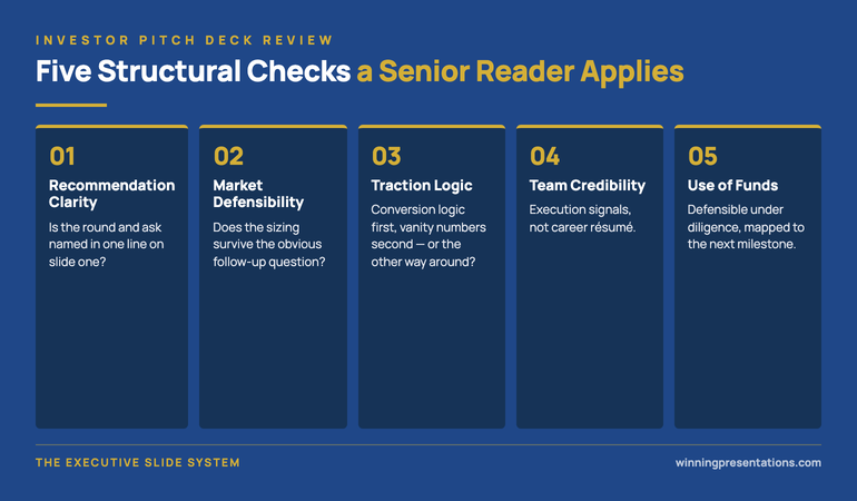
The eight pages, in order

The first page is the impact-and-returns headline. A single line near the top of the page stating, in the same sentence, the impact target and the financial return target. An example: “We are raising seven and a half million pounds to extend agricultural credit to one hundred and twenty thousand additional smallholder farmers in East Africa over four years, while delivering a twelve to fourteen percent net IRR to investors at fund close.” The headline page contains nothing else of substance. Its job is to put both variables in the committee’s mind in the first thirty seconds, so that every page that follows is read with both variables in view. The pitch that opens with a story about a single farmer — an emotional opening designed to win the impact partner’s heart — loses the returns partner before page two. The headline-with-both-numbers opens for both readers at once.

The second page is the problem. Two columns or two stacked sections. On one side, the problem stated as an impact problem: the unmet need, the population affected, the structural reasons the need has gone unmet by either pure-market or pure-philanthropic actors. On the other side, the same problem stated as a commercial opportunity: the size of the addressable market, the price elasticity of the population’s willingness to pay, the unit economics of the solution at scale. The two framings reinforce each other rather than competing. The page makes clear that the impact problem and the commercial opportunity are the same underlying market failure, not two separate pitches.

The third page is the solution. One page. What the company does, who it serves, how it is structured operationally. The page names the operating model in plain language and includes the one or two structural details that distinguish this company from adjacent solutions — the proprietary credit-scoring methodology that allows lending to under-documented farmers, for example, or the satellite-data integration that allows climate-resilience pricing. The solution page is short because the impact thesis and commercial model pages will go deeper; the solution page sets up the depth that follows.

The eight-page fundraising pitch for impact investors infographic showing 1 Impact and returns headline 2 Problem (impact + commercial) 3 Solution 4 Impact thesis with measurement 5 Commercial model with unit economics 6 Team and impact-economics fit 7 Blended-return-specific risks 8 Named ask — with the principle that every page that argues one side of the blended return must show the implications for the other side.

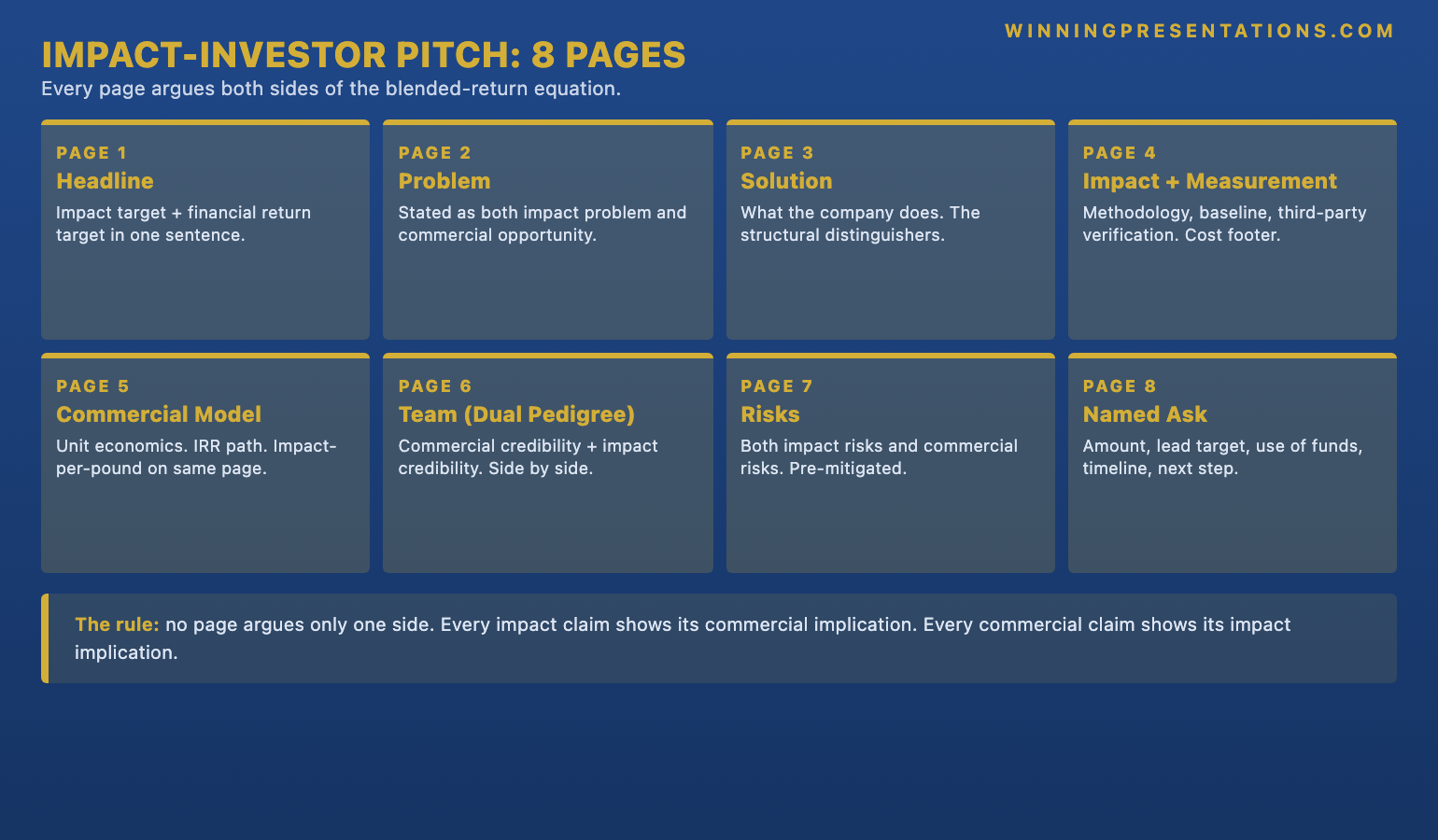
The fourth page is the impact thesis with measurement methodology. This is the page where blended-return pitches most often fail. The page names the three to five impact outcomes the company will measure, the methodology by which it will measure them, the baseline against which it will measure them, and the third-party verification framework it will use to report them. The page also names, in a footer or sidebar, the commercial cost of the measurement work itself — the staff cost, the verification fee, the data infrastructure cost — so the returns partner can see that the measurement work is funded within the commercial model rather than being a separate ask. The impact partner reads the measurement methodology as the seriousness of the impact commitment; the returns partner reads the cost footer as the seriousness of the commercial discipline.

The fifth page is the commercial model with unit economics. This is the page where pure-venture pitches usually live, and it is the page that has to do the most translation work in a blended-return pitch. The page shows the unit economics — revenue per unit, cost per unit, gross margin, customer-acquisition cost, lifetime value — and a path to the targeted net IRR over the fund’s expected holding period. The page also includes, in the same view, the impact-per-unit-of-capital alongside the financial return. The two metrics share the page rather than living in separate sections. A returns partner can read the financial path and a impact partner can read the impact-per-pound, and both partners are reading the same page rather than separate sections that have to be reconciled later.

The sixth page is the team and the impact-economics fit. The standard team page in a venture deck shows the founders’ commercial pedigree — the previous companies, the previous exits, the relevant operating experience. The team page in an impact pitch adds the impact pedigree: the previous community work, the sector-specific impact experience, the cultural credibility in the markets the company serves. The two pedigrees sit side by side on the same page, with a short structural argument explaining why the combination is the right one for the blended-return work. The page closes any latent partner question about whether the founders are credible on both sides; the partner whose question is left unanswered will become the partner who blocks the deal.

The seventh page is the risks specific to blended-return investments. Two columns. On the left, the three or four risks the committee is most likely to raise privately after the meeting — impact-financial trade-off risk, measurement gaming risk, mission drift under commercial pressure, regulatory ambiguity in the markets served. On the right, the company’s specific mitigation for each. The risks page is the structural equivalent of the risk slide in a sales pitch, and it is more important in a blended-return pitch than in either pure venture or pure philanthropic pitches because the committee’s risk vocabulary is doubled: the committee will name both impact risks and commercial risks. Naming both in the deck pre-empts the committee’s instinct to raise them as objections. For the broader picture on how to structure quarterly board reporting once the fundraise is closed, see the investor update presentation format.

The eighth page is the named ask. Three or four lines. The specific amount being raised, the specific use of funds broken down by category, the named lead investor the company is targeting, the timeline for closing the round, and the named next step in the process. The ask page closes the deck the same way it closes a sales pitch: with a specific, dated, named request rather than a soft thank-you. The committee that has worked through seven dense pages is ready to make a decision; the named ask gives them a structured way to commit or push back.

An eight-page blended-return pitch holds because each page does its integration work — not because the pitch is shorter.

The Executive Slide System is the slide library senior fundraisers are using to build the impact-and-returns headline, the integrated unit-economics page, the impact-thesis page with measurement methodology, and the two-column risks page this pitch format depends on — without rebuilding them from scratch every fundraise. 26 templates, 93 AI prompts, 16 scenario playbooks. Lifetime access, instant download. £39.

  • 26 executive slide templates — headline pages, problem-as-opportunity layouts, integrated unit-economics structures, impact-with-measurement pages, dual-pedigree team layouts, two-column risk pages, named-ask closes
  • 93 AI prompts — for drafting, sharpening, and stress-testing each page before the investment committee pitch in 30 minutes rather than three hours per page
  • 16 scenario playbooks — fundraising pitch, investor update, board approval, transformation update, capital request, and other high-stakes senior meetings
  • Instant download — usable in tomorrow’s pitch
  • Lifetime access, lifetime updates — £39

Get the Executive Slide System (£39) →

The measurement methodology page

The impact-thesis page is the page where senior impact investors test whether the founder takes the impact commitment seriously. The test is not whether the impact story is moving — almost every impact story is moving when told well — but whether the measurement methodology is rigorous enough to hold up under independent scrutiny when the fund reports to its own limited partners. Limited partners in impact funds have become structurally more demanding about impact measurement since 2024, partly driven by the European Sustainable Finance Disclosure Regulation, partly by the Operating Principles for Impact Management framework that most major impact funds now signal alignment with, and partly by the post-2022 reputational damage that loose impact claims caused across the sector. The fund’s own measurement standards are now an institutional commitment, and a pitch that does not meet those standards cannot clear the committee.

The measurement methodology page names the framework explicitly — IRIS+, the SDG indicator set, GIIRS, or the company’s own published methodology with a third-party verification partner — and shows three to five outcome indicators with the baseline, the target, and the measurement cadence. The page does not claim attribution beyond what the methodology supports. A loan-portfolio company can claim attribution for credit access; it cannot claim attribution for the subsequent change in farmer income unless it has the longitudinal study to back the claim. The discipline of naming the limits of attribution is itself a credibility signal to the impact partner, who has seen too many decks claiming impact outcomes the methodology does not support.

The commercial side of the measurement methodology page — the footer or sidebar showing the cost of measurement — is the page where the returns partner forms their view of the founder’s commercial discipline. A founder who has not thought about the cost of the measurement work, or who treats measurement as an external philanthropic add-on rather than a funded line in the operating model, signals to the returns partner that the impact commitments will erode the financial return. A founder who shows measurement as a fully funded operating cost, with the cost-per-outcome calculated and the trade-off understood, signals that the blended-return architecture is internally coherent.

The investment committee: how blended-return funds actually decide

A blended-return fund’s investment committee typically has five members: two partners weighted toward impact (the impact-side partners), three partners weighted toward returns (the returns-side partners), and the chief executive of the fund who chairs the meeting. The exact ratio varies — some funds run three-impact-and-two-returns, others run four-returns-and-one-impact — but the structural tension between the two camps is consistent. The decision is rarely made unanimously. Most blended-return investment decisions are made by a four-to-one or three-to-two vote, with the chief executive’s swing vote breaking ties when needed. The pitch has to be persuasive to enough partners on both sides to clear the voting threshold, not just to win the partners on one side.

The committee meeting itself typically runs for an hour, with the founder presenting for twenty to twenty-five minutes and the remaining time given to committee questions. The post-meeting conversation — where the actual decision is formed — runs longer, usually thirty to forty-five minutes with the founder no longer in the room. The deck has to survive that absent-founder conversation more than it has to survive the live meeting. Every page is being read twice: once with the founder present and once two days later when the deck is the only artefact in the conversation. The impact partners and the returns partners argue from the same pages, and the pages either hold the argument together or they do not.

The pages that most consistently hold are the integrated pages: the impact-and-returns headline, the impact-thesis page with the cost footer, the commercial model page with the impact-per-unit alongside the financial return, the two-column risks page that names both impact risks and commercial risks. The pages that most consistently fail are the sequential pages: the impact-only section in the front of the deck, the commercial-only section in the back, the team page that shows only one side of the dual pedigree. The structural rule is that no page in a blended-return pitch can argue only one side of the blended-return equation; every page has to do the integration work that the committee will otherwise refuse to do for the founder.

When the investment committee is going to take the deal away to a partner meeting before deciding, the deck only does half the work.

The Maven Executive Buy-In Presentation System is the self-paced programme senior founders use to walk a pitch deck through the absent-founder conversation — the structured method for mapping the committee, pre-handling the partner-by-partner objections, and designing the post-meeting tempo so the committee says yes when they meet without you. 7 modules, self-paced with monthly cohort enrolment, optional recorded Q&A calls. £499, lifetime access to materials.

Explore the programme →

Three common mistakes that lose the room

The first common mistake is leading with the emotional story. A founder opens with a single farmer’s story, told over two pages with photographs and a quote. The impact partners are moved. The returns partners read the opening as the founder signalling that the pitch is going to be impact-heavy and returns-light, and they form their reservation before the deck reaches the commercial model on page eight. The fix is to lead with the integrated headline page and to use the single-farmer story later, as a one-paragraph anchor inside the impact-thesis page, with the commercial cost-per-outcome footer visible on the same page. The story still does its emotional work, but it does it inside an integrated frame rather than as a stand-alone hook that splits the room.

The second common mistake is treating the impact thesis as a separate add-on rather than an integrated part of the commercial model. A founder presents a fully formed commercial model on pages five and six, then adds the impact section on pages seven and eight as if the impact work were a bonus the company would do alongside the commercial work. The impact partners read the structure as a signal that the impact commitments are commercially expendable; the returns partners are reassured but mildly insulted that they are being treated as the audience that does not care about impact. The fix is structural integration on every page, not a separate impact section that can be skipped or expanded depending on the audience.

The third common mistake is over-promising on impact attribution. A founder claims direct attribution for downstream outcomes the company has not measured and could not measure without a longitudinal study the company is not running — “our credit will increase smallholder farmer incomes by twenty-three percent over five years” when the company has measured credit access but not income change. The over-promise is detected immediately by the impact partner, who has read enough decks to know what attribution is supportable and what is not, and the over-promise destroys the credibility of the rest of the impact thesis. The fix is to claim only what the measurement methodology supports, to name the limits of attribution explicitly, and to commit to the longitudinal study as a planned investment in measurement infrastructure that the next funding round will pay for. The honest claim is more persuasive than the over-claim, especially to the impact partner who is the most attentive reader on the page.

Sector-specific calibration: climate, health, education, financial inclusion

The eight-page format works across most blended-return sectors, but each sector calibrates two of the pages differently. Climate-technology pitches typically need a deeper version of the impact-thesis page, because climate impact measurement has the most rigorous external standards (the carbon-accounting protocols, the science-based targets framework, the Sustainable Aviation Buyers Alliance methodology for the aviation-fuel subset) and the impact partners read climate pitches against those standards. The eighth page — the named ask — can be shorter, because climate funds typically have well-defined ticket sizes and decision processes.

Health-access pitches typically need a deeper version of the risks page, because health interventions carry regulatory, clinical, and ethical risks that the committee will probe more aggressively than in other sectors. The team page also has to do more work to establish clinical credibility — named clinical advisors, named regulatory expertise, named ethical-review processes — alongside the operating-commercial credibility that the standard team page covers.

Education-technology pitches face a particular structural problem: the impact-and-returns headline page is hardest in education, because educational outcomes are slow-attribution (the lifetime-earnings impact of a better primary-school year takes a decade to measure) and the commercial model often depends on government or institutional purchasing cycles that are themselves slow. The headline page in an education pitch typically uses a leading-indicator outcome (attendance, completion, attainment-test scores) rather than a long-term outcome, and the impact thesis page commits to the longitudinal-study infrastructure that will eventually let the company report on the deeper outcomes.

Financial-inclusion pitches — the agricultural-finance example used throughout this piece — have the most developed measurement standards (the financial-inclusion sector has been measuring the same things for fifteen years), but they have the most challenging commercial-impact trade-offs because the cost of serving the lowest-income segments often makes the unit economics tighter than mainstream lending. The commercial model page in a financial-inclusion pitch typically does more work than in other sectors to show how the impact-aligned segmentation strategy (smaller loans, longer repayment terms, broader rural distribution) is commercially defensible at scale rather than only commercially defensible with subsidy.

Frequently asked questions

Is eight pages enough for a series-A or series-B blended-return pitch?

It is, when the eight pages do their integration work and an appendix carries the deeper supporting material. The mistake is to read “eight pages” as a length constraint and assume the deck has to be thin. The eight pages each carry as much information as three or four pages in a traditional sequential deck — the headline page is the entire blended-return thesis in one sentence, the problem page is the integrated impact-and-commercial framing, the impact-thesis page is the measurement methodology with the cost footer, the commercial model page is the integrated unit economics with the impact-per-pound alongside the financial return, the team page is the dual pedigree, the risks page is the pre-handled objection map for both impact and commercial risks, and the ask is the named close. The appendix carries the longer-form impact measurement methodology, the detailed financial model, the regulatory analysis for the markets served, the team biographies, and the impact-measurement infrastructure plan. The deck is dense; the appendix is deep. The eight-page format keeps the deck cognitively manageable for the hour-long committee meeting; the appendix gives the diligence partners somewhere to go in the weeks of work that follow a positive committee vote.

What if our fund is a pure-impact fund or a pure-returns fund and not blended?

The eight-page format is calibrated for blended-return committees, but the structural principles transfer with adjustment. A pure-impact fund (a philanthropic foundation, a development finance institution making grant-equivalent investments) cares about the impact thesis and the measurement methodology above the commercial model. The eight pages stay, but the commercial model page is replaced with a sustainability page — the long-term operating viability of the company without continued philanthropic capital. A pure-returns fund (a mainstream venture fund with no impact mandate) does not need the integration work on every page, and the eight-page format can be compressed back to a more standard six- or seven-slide pitch with the impact dimension carried more lightly. The blended-return architecture matters specifically when the committee is structurally mixed; for either pure case, the standard sector-specific pitch format is the right starting point.

How long should the investment committee meeting itself be planned for?

Sixty minutes is the typical schedule, with twenty to twenty-five minutes for the founder’s deck walk and the remaining time for committee questions. The deck walk should aim to land at minute twenty-two so there are twenty-five to thirty-five minutes for committee discussion. The discipline is to walk the deck at three minutes per page on the headline, problem, and solution pages, two and a half minutes per page on the impact thesis and commercial model pages (the depth pages), two minutes on the team and risks pages, and one minute on the named ask. The named ask deserves the shortest time because the committee can read it instantly; the page exists to give the meeting a clean closing point and to give the chief executive a structured way to ask the committee what the next step is.

How is this different from a B-Corp pitch or a social-enterprise pitch?

B-Corp certification is a corporate-form classification, not a fundraising structure. A B-Corp company raising from a pure-venture fund pitches as a standard venture pitch with B-Corp status noted in the team or company-context section. A B-Corp company raising from a blended-return fund uses the eight-page format with the B-Corp certification referenced in the impact-thesis page as a supporting credibility signal. Social-enterprise pitches typically address either a pure-impact funder (where the philanthropic-pitch structure applies) or a blended-return funder (where the eight-page format applies). What this format adds beyond the standard sector frameworks is the structural integration discipline — the requirement that every page argue both sides of the blended-return equation rather than leaving the integration work to the committee’s post-meeting conversation. The corporate form (B-Corp, social enterprise, conventional company) is a separate question from the deck structure; the deck structure depends on the audience’s mandate.

What is the right financial return target to put on the headline page?

The right target is whatever the fund’s own mandate names — blended-return funds publish their target return range in their fund prospectus and the founder should pitch within that range rather than against it. A fund targeting eight to ten percent net IRR will not invest in a deal pitched at sixteen percent (it sounds aggressive and triggers diligence on whether the impact thesis is being sacrificed for return), and a fund targeting fifteen to eighteen percent will not invest in a deal pitched at six percent (it sounds insufficient and triggers diligence on whether the founder understands the asset class). The pitch’s job is to argue that the company can deliver inside the fund’s stated range; the discipline is to know the fund’s range before writing the headline page. The standard pre-pitch homework is to read the fund’s most recent annual impact report and most recent fundraising prospectus, both of which name the target return range explicitly.

The Winning Edge — weekly newsletter

The Winning Edge is a weekly (Thursday) newsletter for senior professionals who present at the executive level. One short email a week, focused on the structural moves that separate pitches investment committees back from pitches they defer. Subscribe to The Winning Edge →

For the broader picture across slides, storytelling, confidence, and delivery, the Complete Presenter bundle is the seven-product set most senior founders find useful as a single library — £99 for everything, lifetime access.

About the author

Mary Beth Hazeldine is Owner & Managing Director of Winning Presentations Ltd. With 24 years of corporate banking experience at JPMorgan Chase, PwC, Royal Bank of Scotland, and Commerzbank, she advises executives across financial services, healthcare, technology, and government on structuring presentations for high-stakes funding rounds, board approvals, and strategic decisions.

09 Jun 2026
Investor Update Presentation Format: The Quarterly Deck Top Founders Send to Boards

Investor Update Presentation Format: The Quarterly Deck Top Founders Send to Boards

Quick answer: The investor update presentation format that holds board attention in 2026 is a seven-section quarterly deck designed for a board that has already seen the numbers before the meeting starts. The seven sections, in order, are: a one-sentence headline of the quarter, the three to five operating metrics the board has signed up to watch, the variance to plan stated as a decision rather than a defence, the strategic narrative connecting this quarter to the next, the two or three asks of the board for the period ahead, the risks the board would otherwise raise themselves, and the calendar for the months between this meeting and the next. The deck is dense, short, and consciously written for an absent audience — the board members who will re-read it three days later when they have to brief their own partners and committees.

Astrid, a founder and chief executive of a Berlin-headquartered climate-tech series-B company, sent her board the Q1 2026 update deck on a Sunday afternoon, three days before the quarterly board meeting. The deck was thirty-eight pages long. It opened with a six-page company-context section, moved into a fourteen-page operating-metrics walk-through, then closed with a twelve-page strategic-narrative block and a final six-page asks-and-risks summary. The lead investor — a partner at a London growth fund — replied on Monday morning with a single line: “Could you send a one-page summary by tonight? I will not have read this before Wednesday.” Astrid spent Monday rebuilding the deck into a seven-page format. The board meeting on Wednesday ran fifty-five minutes instead of the scheduled ninety. The lead investor opened the meeting with a sharp, specific question about the customer-acquisition-cost trend on page three of the new deck; the rest of the board followed his lead. The meeting was the most useful Astrid had run all year.

The diagnosis is not that the long deck was bad. The metrics were correct, the strategic narrative was thoughtful, the asks were specific. The problem is that the board — five partners with full portfolios, parallel commitments to other companies’ boards, and a two-hour window to read whatever Astrid sent before walking into the meeting — was not in the room to be educated. They were there to make decisions about the next quarter. The thirty-eight-page format asked them to do reading first and deciding second; the seven-page format asked them to do the opposite. By the time the long deck got to the asks on page thirty-two, the board had already absorbed thirty-one pages of context; the short deck arrived at the asks on page five, with the board’s attention still intact.

This piece walks through the investor update presentation format that has been working for senior founders in 2026 across climate-tech, deep-tech, financial-services SaaS, and consumer-health series-A through series-C companies, what each of the seven sections has to carry, why the board has already done most of the reading before the meeting, how the deck has to survive the absent-reader test that the long format does not, and the small structural moves that hold board attention together when the numbers underneath the deck are mixed.

Before the next quarterly board update, a one-page structural check is worth a look.

The Investor Pitch Deck Checklist walks through the structure that holds up in front of senior boards — the headline section, the variance page, the asks section, and the risks-the-board-would-otherwise-raise page. Free download, no email gate.

Download the Investor Pitch Deck Checklist →

Why seven sections and what changed

The seven-section number is not arbitrary. It is roughly the number of distinct decision-relevant pages a senior investor can hold in working memory across a sixty- to ninety-minute board meeting while also asking questions, comparing the company against other portfolio companies, and processing whatever the chief executive said in the pre-read circulated three days earlier. Push the count above twelve and the board’s mental model of the company starts to fragment; below five and the deck starts to feel like it is hiding something. Seven is the structural sweet spot, with the proviso that each section is built to carry a discrete piece of the conversation, not to demonstrate effort or rehearse what the board already knows.

What has changed since 2024, and changed sharply since the start of 2026, is the amount of preparation the board brings into the meeting. A growth-fund partner with five active board seats will routinely have used a portfolio dashboard, a notes-to-self summary written by their associate, and a sector benchmark from their internal data team to read the company’s metrics before opening the chief executive’s deck. The associate has often produced a one-page brief on what changed since the last quarter; the partner reads the brief, scans the headline numbers in the deck, and arrives at the meeting with two or three specific questions already prepared. The first fifteen minutes of a 2024 board update — context, market overview, team changes, headline-number narration — is now mostly redundant. The board already knows. The deck that recognises this and skips the redundant material reads as senior; the deck that re-walks ground the board has already covered reads as junior, regardless of the founder’s tenure.

The seven-section template is built around that change. The company-context section has been compressed into the one-sentence headline. The headline-number walk-through has been replaced with a single page of three to five operating metrics — the ones the board signed up to watch — and a variance comment underneath each. The strategic-narrative block has been compressed from twelve pages into one. What used to take twenty pages now takes three or four. The space that opens up is given to the sections the board cannot pre-produce from the dashboard: the asks for the period ahead, the risks the board would otherwise raise themselves, and the calendar for the months between this meeting and the next. Those three sections are where the seven-section deck earns its time in the meeting.

The seven sections, in order

The first section is the headline. A single sentence at the top of an otherwise nearly empty page, stating in plain English the most important thing the board needs to remember about the quarter. Not the topic, not the agenda, not the company name — the headline. An example: “Q1 2026 was the first quarter we held gross margin above sixty-two percent at scale, paid for by reducing the sales team by eleven percent.” The headline section is in the deck for one reason: it removes ambiguity about what the meeting is for. Senior boards waste a disproportionate amount of their attention in the first ten minutes trying to work out what the chief executive thinks happened; the headline gives them the answer in three seconds and frees the rest of the meeting to do the work.

The second section is the operating metrics page. Three to five metrics, the ones the board signed up to watch at the last fundraise — the customer-acquisition cost, the net revenue retention, the gross margin, the cash runway, and one company-specific metric that the chief executive watches as the leading indicator. Each metric is shown with the current quarter’s number, the plan number, the variance, and a one-line comment underneath explaining what drove the variance. The page does not include every metric the company tracks internally; it includes the metrics the board has agreed are the operating signal. The discipline is to keep the list short and to keep the comments honest — “missed the plan by twelve percent because the December enterprise renewal slipped into Q1” is more useful than “tracking broadly in line with plan.”

The third section is the variance to plan, stated as a decision rather than a defence. Two or three sentences. “We will hold the plan for FY26 in customer-acquisition cost. We will revise the headline gross-margin target down from sixty-five to sixty-two percent for the next two quarters, then re-test in Q4.” The variance section goes third, not last, for a specific reason: the board is reading the rest of the deck through the lens of whatever the chief executive thinks should change. If the variance is held back until page twenty, the board spends the first nineteen pages guessing what the chief executive’s read is, and arrives at page twenty either ahead of the founder or behind. Stating the variance as a decision collapses that gap and turns the rest of the deck into evidence rather than build-up. For the conversation that surrounds variance reporting when the board reaction is going to be hostile, see how to present to a board of directors.

The seven-section investor update presentation format infographic showing 1 Headline 2 Operating metrics 3 Variance to plan 4 Strategic narrative 5 Asks of the board 6 Risks the board would raise 7 Calendar to next meeting — with the principle that sections 1 to 3 set the read and sections 5 to 7 capture the work for the next quarter.

The fourth section is the strategic narrative. One page. Three or four short paragraphs, or a clean three-block structure, connecting this quarter to the next two. The narrative is not the long-form thinking the founding team has been doing all quarter; it is the version of that thinking compressed to the point that the board can re-read it in ninety seconds and brief their own partners from it. The board’s partners — the people who did not attend the meeting but who will hear about it in the partner meeting on Monday — will form their entire view of the company’s direction from this single page. Writing for them, not for the meeting, is the discipline.

The fifth section is the asks of the board. Two or three specific requests for the period between this meeting and the next. Each ask is named: the specific introduction the chief executive wants the board to make, the specific commercial decision the board needs to ratify before the next quarter, the specific senior hire the board needs to weigh in on. The asks section is the single most under-used section in 2026 investor update decks and the one that most consistently separates a productive board relationship from a passive one. The board will offer help whether the asks section is in the deck or not. Putting the asks in the deck — specific, named, dated — transfers the help from a vague offer to a tracked commitment.

The sixth section is the risks the board would otherwise raise. Two columns. On the left, the three or four risks the chief executive expects the board to ask about — competitive threat, key-person dependency, customer concentration, a regulatory shift — surfaced explicitly. On the right, the chief executive’s specific mitigation for each. The risks page is the structural equivalent of the risk slide in a sales pitch: the board will discuss the risks whether the page is in the deck or not, and putting them in the deck transfers control of the risk conversation from the board to the chief executive. A risks page that lists only competitor noise and generic execution risk reads as box-ticking and the board discounts the entire page; a risks page that names the customer concentration concern the lead investor has been worrying about for two quarters reads as senior.

The seventh section is the calendar. Three or four lines. What specifically happens in the period between this meeting and the next — the planned fundraise milestones, the named senior hire interviews the board needs to be available for, the board sub-committee meetings, the off-cycle calls the chief executive plans to schedule. The calendar section is the section most often missing from quarterly decks, and it is the one that most consistently shapes whether the board feels managed or merely reported to. The chief executive who closes the deck with a calendar of what happens next is the chief executive who sets the tempo of the board relationship; the chief executive who closes with a thank-you slide is the chief executive who lets the board set it.

A seven-section investor update holds together because the underlying slides are built right — not because the deck is shorter.

The Executive Slide System is the slide library senior founders are using to build the headline slide, the operating-metrics page, the variance-as-decision page, and the asks-and-risks structure this quarterly format depends on — without rebuilding them from scratch every quarter. 26 templates, 93 AI prompts, 16 scenario playbooks. Lifetime access, instant download. £39.

  • 26 executive slide templates — headline slides, operating-metrics layouts, variance-as-decision pages, three-block strategic narratives, asks-of-the-board structures, two-column risk-and-mitigation pages, calendar closes
  • 93 AI prompts — for drafting, sharpening, and stress-testing each section in 30 minutes rather than three hours per board meeting
  • 16 scenario playbooks — quarterly investor update, board approval, capital request, fundraising pitch, transformation update, and other high-stakes senior meetings
  • Instant download — usable in the next quarterly cycle
  • Lifetime access, lifetime updates — £39

Get the Executive Slide System (£39) →

The absent-reader test: what each section has to survive

A senior board update in 2026 is almost never read only by the people who attend the meeting. The five partners in the room are typically the lead investor (the partner who led the most recent round), one or two earlier-stage investors who stayed on the board, an independent non-executive director, and the company chair. Each of those five will brief at least one other person — an associate on the lead investor’s team, the earlier-stage fund’s monitoring analyst, the chair’s executive assistant who manages portfolio reporting — and the deck is the artefact those briefings are built from. The deck has to survive the absent-reader test. Every page is being read twice: once with the chief executive in the room, and once two or three days later by someone the chief executive will never meet.

The headline section has to survive the question “what was the most important thing about this quarter?” A single sentence at the top of an empty page makes that question easy to answer in the absent-reader briefing. The operating-metrics page has to survive the question “did the company hit plan?” Three to five metrics with a variance comment underneath each give the absent reader the answer without needing the chief executive’s narration. The variance page has to survive the question “what is the chief executive doing about it?” Stated as a decision in two or three sentences, the answer is unambiguous; left as a soft observation, it dissolves in the absent-reader brief.

The strategic-narrative page has to survive the question “where is this company heading and is the chief executive right about it?” A compressed three-block structure holds; a twelve-page narrative blur dissolves in absent-reader recall. The asks page has to survive the question “what does the chief executive want from us?” If the asks are named and dated, the partner can act on them between meetings; if they are vague, they evaporate. The risks page has to survive the question “what are the things that could go wrong, and is the chief executive thinking about them?” If the page is in the deck, the partner can point at it in the partner meeting on Monday; if it is not, the partner has to raise the risks themselves and the conversation goes against the chief executive. The calendar has to survive the question “when is the next thing we need to be ready for?” If the calendar is in the deck, the board has a structured way to commit time; if it is not, the next thing arrives unannounced.

What to cut from the old quarterly deck

The company-context section — the four-to-six page block that re-introduces the market opportunity, the product, the team structure, and the funding history at the start of every quarterly deck — is the single biggest casualty of the modern board-reporting environment. The board partner’s pre-read brief has covered all of it. Walking that material in 2026 is the structural equivalent of opening a board meeting in 2018 by reading the company’s mission statement aloud — it tells the room nothing new and it costs the chief executive eight to twelve minutes of the available attention. The context material has not gone away; it lives in the company’s data room and in the partner’s notes, and it is referenced where it adds evidence. The standalone context section has not survived.

The headline-number walk-through is the second casualty. In 2024 it was useful for the chief executive to walk the board through ARR growth, customer count, headcount, and cash burn slide by slide. In 2026 the partner has either read those numbers in the dashboard before the meeting or, more often, has the variance summary in the associate’s brief alongside the company’s deck, and the time spent walking the numbers reads as the chief executive filling time rather than making the case. The numbers belong on the operating-metrics page — three to five lines, with the variance comment, in one page total.

The thank-you slide and the team-photo slide are the third casualty. The five-slide closing block that thanks the board, summarises the company values, and shows the team off-site photo is now compressed into a one-line closing inside the calendar section: “Next board meeting: 18 September. Off-cycle leadership update call: 12 August.” The board appreciation is implicit in the chief executive’s continued investment in the relationship; the team photo, if needed for portfolio marketing, lives in the company’s quarterly newsletter rather than in the board update. Closing the deck with a calendar rather than a thank-you signals the chief executive is running the relationship as work, not as performance.

When the quarterly update is the moment the board makes a real decision — a follow-on, a senior hire ratification, a strategic pivot — the deck only does half the work.

The Maven Executive Buy-In Presentation System is the self-paced programme senior founders use to walk a board through the absent-reader conversation — the structured method for pre-handling the partner meeting on Monday, mapping the investment committee, and designing the post-meeting tempo so the board signs off when they meet without you. 7 modules, self-paced with monthly cohort enrolment, optional recorded Q&A calls. £499, lifetime access to materials.

Explore the programme →

Reporting a bad quarter without padding it

The seven-section format is at its most useful when the quarter has gone badly. The instinct of an inexperienced chief executive in a bad quarter is to write a longer deck. More context to explain the miss, more narrative to soften it, more strategic ambition for the next quarter to compensate. The board reads the longer deck as anxiety, and the anxiety is more damaging to the board relationship than the miss itself. The seven-section format does the opposite: a bad quarter compresses to a shorter, sharper deck, because the strategic narrative section has more to say in fewer words and the asks section is more specific.

The discipline in a bad quarter is in the headline section and the variance section. The headline names the bad number on the first page — “Q1 2026 missed the revenue plan by sixteen percent” — rather than burying it on page twelve where the board will find it anyway and resent the burial. The variance section states what the chief executive will do about it as a decision, not as a hope — “we will pause the planned September European launch and reallocate the budget into pipeline-acceleration with existing accounts for the next two quarters” — rather than describing the miss as a learning moment. The strategic narrative section then connects the decision to the longer plan, the asks section names the specific board support needed to execute the decision, and the risks page names the second-order risks the decision creates. The whole deck is three to five pages longer than a good-quarter deck, because the decisions and risks need more space; the headline section, operating-metrics page, and calendar section are unchanged.

The board’s read of a bad-quarter seven-section deck is consistently more favourable than the read of a long, defensive deck reporting the same numbers. The board has worked with chief executives who hit and missed plans across many quarters and many companies; the chief executives whose long-term board relationships hold are the ones who report bad quarters with the same structural discipline as good quarters, not the ones who pad the bad quarters with extra context.

Cadence: how the quarterly update sits next to the monthly

The seven-section quarterly deck does not replace the monthly investor update. The two artefacts do different work. The monthly update is a written email or short Notion document — three to five paragraphs, sent on a fixed day each month, covering the operating metrics, one short narrative point, and the asks for the month ahead. The monthly update keeps the board in the operating rhythm and removes the need for the quarterly deck to re-narrate basic operating context. The quarterly deck is the longer, structured artefact that drives a sixty- to ninety-minute board meeting and sets the tempo for the next three months. The chief executive who writes a strong monthly update can write a shorter quarterly deck; the chief executive who skips the monthly update has to do twice the work in the quarterly meeting to bring the board back up to speed.

The investor update cadence map infographic showing monthly written updates (3 to 5 paragraphs by email or Notion) feeding into quarterly seven-section board decks (60 to 90 minute meetings) feeding into annual strategic offsites — with monthly updates handling operating rhythm and quarterly decks handling strategic decisions.

The annual strategic offsite is the third artefact in the cadence. Once a year, the board sits with the chief executive for half a day to a full day to work through the strategic plan for the year ahead. The quarterly deck for the meeting before the offsite includes a one-page preview of the offsite agenda in the calendar section; the deck for the meeting after the offsite includes a one-page reference to the offsite decisions in the strategic-narrative section. The three artefacts — monthly written update, quarterly seven-section deck, annual offsite — together cover the whole work of board reporting without overloading any one of them. The chief executive who treats each artefact as having a distinct job, and does not try to make any one of them do the work of the other two, runs the board relationship that holds across the four-to-six-year arc of a typical venture-backed company.

Frequently asked questions

Is seven sections really enough for a series-B-plus board with five investors and an independent chair?

It is, when the seven sections are built to carry the decisions rather than to demonstrate effort. The mistake is to read “seven sections” as a length constraint and assume the deck has to be thin. The seven sections in this format each carry as much information as three or four pages in a traditional long-form board deck — the headline is a one-sentence read of the quarter, the operating-metrics page compresses what used to be a five-to-eight slide walk-through, the variance section is a board-ready decision, the strategic narrative compresses what used to be a twelve-page narrative block into one tight page, the asks page is a named-and-dated commitment register, the risks page is a pre-handled objection map, and the calendar is a tempo plan. The deck is dense, not thin. The seven-section count keeps it cognitively manageable for a sixty- to ninety-minute board meeting; the depth inside each section is what makes it sufficient.

What if the lead investor asks for the long-form thinking behind the strategic narrative section?

It lives in an appendix the chief executive does not walk by default. The appendix typically contains the longer-form strategy document, the detailed competitive analysis, the customer cohort breakdown, the senior team’s operating plan, and the model build with all underlying assumptions. When a board member asks “can you show us more on the rationale for the European launch pause?”, the chief executive navigates to the relevant appendix section, walks the page, then returns to the main deck. The appendix is the chief executive’s safety net; it is not a path through the meeting. The discipline is to keep the appendix in the file but never to volunteer it. The board members who want to read the long-form thinking will ask for it, and the appendix gives them somewhere to go without forcing the rest of the board to sit through it.

Does the seven-section format work for an early-stage seed company with two angels and no formal board?

Not in the same shape, but the structural principles transfer. A seed-stage company with informal investor reporting does not need a seven-section quarterly deck; it needs a strong monthly written update and an annual half-day strategic conversation. The seven-section format becomes useful when the board has three or more investors with formal governance rights, when the meetings are scheduled and minuted, and when the chief executive is presenting to people who did not sit in the day-to-day operating conversation in the weeks leading up to the meeting. For seed-stage chief executives, the discipline to learn now is the headline-first habit and the variance-as-decision habit; the seven-section format becomes the natural shape once the board grows past three formal investors.

How is this different from the standard YC update template or the SaaStr quarterly format?

It is a board-meeting deck rather than an email or written update format, and it is compatible with both. The YC update template’s “asks, lowlights, highlights, key metrics” structure can sit inside the monthly written update that feeds this quarterly deck; the SaaStr quarterly metrics breakdown can be the source data for the operating-metrics page in section two. What this format adds, and what most named templates have not yet adjusted to, is the compression of the headline-number walk-through that the dashboard-prepared board now makes redundant, the elevation of the variance-as-decision page from a closing summary to a structural third section, and the elevation of the asks-and-risks pages from afterthoughts to the structural fifth and sixth sections. The template underneath the deck is the chief executive’s choice; the structural shape has to fit the way 2026 boards actually read and decide.

What happens when the board disagrees with the variance-as-decision section?

The disagreement happens in the meeting, which is the right place for it. The board challenges the variance decision, the chief executive walks the reasoning, the board pushes back on one or two elements, and the meeting reaches one of three outcomes: the board accepts the decision, the board modifies it together with the chief executive, or the board parks it for a follow-up sub-committee call. All three outcomes are productive. The structural alternative — burying the variance in a soft narrative and hoping the board does not notice — is what produces the bad board relationship over time. Boards remember the chief executives who brought variance decisions into the room as decisions; they remember the chief executives who hid variance even more clearly, and the memory shapes the next funding decision.

The Winning Edge — weekly newsletter

The Winning Edge is a weekly (Thursday) newsletter for senior professionals who present at the executive level. One short email a week, focused on the structural moves that separate decks boards back from decks they defer. Subscribe to The Winning Edge →

For the broader picture across slides, storytelling, confidence, and delivery, the Complete Presenter bundle is the seven-product set most senior founders find useful as a single library — £99 for everything, lifetime access.

About the author

Mary Beth Hazeldine is Owner & Managing Director of Winning Presentations Ltd. With 24 years of corporate banking experience at JPMorgan Chase, PwC, Royal Bank of Scotland, and Commerzbank, she advises executives across financial services, healthcare, technology, and government on structuring presentations for high-stakes funding rounds, board approvals, and strategic decisions.

07 Jun 2026
Virtual Presentation Skills Training Online: What to Look For in a Senior-Level Course

Virtual Presentation Skills Training Online: What to Look For in a Senior-Level Course

Quick answer: Most virtual presentation skills training online is calibrated for junior-level audiences and teaches Zoom platform mechanics — camera angles, microphone tips, slide-share shortcuts. Senior professionals need something different: stakeholder structure for virtual decision meetings, AI-assisted preparation, in-meeting recovery from technical disruption, and post-meeting follow-up architecture. Evaluate any course against five criteria: self-paced format with optional live calls (not mandatory attendance), recorded materials with lifetime access (not real-time-only), structural curriculum covering preparation through follow-up (not platform tips), verifiable instructor credibility at senior level, and downloadable retention materials (not just video). Any course that fails one of these criteria is built for a different audience. Any course that does not cover AI-assisted preparation is now twelve months behind the work senior leaders are actually doing.

Ngozi is a divisional managing director at a UK-headquartered insurance group. She runs a team of three hundred across two countries and has not stood at a physical lectern in two years. Every meeting she now considers high-stakes — quarterly results, strategic reviews, board updates, regulatory briefings — happens through a webcam. Last quarter she asked her L&D partner the question senior leaders are increasingly asking. Was there a course she could take that would sharpen the virtual presentation work to the standard she needed it to be at? She was sent four options. Three were calibrated for early-career professionals being introduced to Zoom. One was a thirty-hour live cohort programme she could not attend. None were calibrated for the work she actually had to do, which was carry an executive committee through a contested strategic recommendation without the structural cues she had spent twenty-five years building inside conference rooms.

This is the position most senior leaders evaluating virtual presentation skills training online find themselves in. The market is large, the courses are abundant, and the calibration is almost universally wrong. Most courses on the market were built between 2020 and 2022 for a workforce learning to use video conferencing for the first time. They teach the platform, not the presentation — the mechanics of being on camera, not the structural discipline of carrying a senior audience through a high-stakes decision via a webcam. They were the right courses for the right audience in 2020. They are now twelve to eighteen months behind what senior professionals actually need.

This piece is a buying guide for senior professionals evaluating virtual presentation training. It walks through what such a course should actually cover at senior level, the five evaluation criteria that distinguish a senior-level programme from a Zoom-mechanics one, why most courses fail senior professionals, the AI-integration question that has emerged as the new dividing line, the red flags to spot before paying, and a worked example of evaluating a course against the criteria. The framework is designed to hold up whether you choose our programme, a competitor’s, or none at all.

Before evaluating any course, run the pre-meeting basics for your next virtual presentation.

The Virtual Presentation Quick-Start Checklist is the free pre-meeting checklist — the camera, lighting, audio, and structural checks to run before a high-stakes virtual presentation. Free download.

Download the Virtual Presentation Quick-Start Checklist →

What virtual presentation training needs to cover at senior level

The work a senior leader is actually doing in a virtual presentation is structurally different from the work a junior professional is doing. A senior leader is not delivering information; they are carrying a room through a decision. The mechanics of being on camera matter only as much as they support the structural work. A course calibrated for senior professionals has to start from this distinction. Most do not. Most start from the assumption that the limiting factor is comfort with the platform, which it has not been for senior professionals for at least three years.

The four content areas a senior-level course must cover. First, stakeholder structure for virtual decision meetings — who is in the room, who is the actual decision-maker, how the chat function changes the politics of dissent, how the pre-meeting one-to-one conversations sequence into the formal meeting, and how the decision gets confirmed or deferred in the post-meeting follow-up. None of this is platform-specific. All of it has to be learned afresh for virtual settings because the cues that supported it in person — body language, side conversations at the coffee break, the chair’s micro-expressions when something lands hard — have largely disappeared.

Second, AI-assisted preparation. The senior leaders doing the best virtual presentation work in 2026 are using AI (Copilot, ChatGPT, Claude, Gemini) as a preparation partner — for stakeholder mapping, objection pre-emption, slide structure critique, and hostile-question rehearsal. A course that does not cover this is teaching a discipline that has already moved on. Third, in-meeting recovery from technical and structural disruption — what to do when the screen-share fails halfway through, when a hostile question lands before the recommendation is fully on the table, when the committee chair derails the agenda. Fourth, post-meeting follow-up architecture — the written artefacts, the one-to-one calls, the timing of the confirmation note. The work continues for forty-eight hours after the meeting ends, and most courses stop at the meeting itself.

The five evaluation criteria for a senior-level course

Five criteria distinguish a senior-level course from a Zoom-mechanics one. Apply them in order; if a course fails any one of them, it is built for a different audience.

One. Self-paced format with optional live calls — not mandatory attendance. Senior calendars are not predictable enough for a live cohort that requires attendance at six fixed sessions over four weeks. The drop-off rate among the people most likely to benefit from the course is meaningful. A senior-level course respects the senior calendar by being self-paced as the primary format, with live coaching sessions as optional add-ons (and fully recorded so missing one carries no cost). Any course whose primary delivery is live cohort with mandatory attendance has been calibrated for a different audience — typically mid-career professionals on a development programme.

Two. Recorded materials with lifetime access — not real-time-only delivery. Senior professionals re-use training material against specific situations as those situations arise. A board presentation in three months will not benefit from a course consumed once eighteen months ago and not retrievable. Lifetime access to recorded modules is the difference between a course that is a one-time event and a course that becomes a working reference. Any programme that withdraws access after a fixed period has been built for an audience that consumes once and does not return.

Three. Structural curriculum covering preparation through delivery and follow-up — not platform tips. This is the most important criterion and the one most often failed. The curriculum should be organised around the work a senior leader is actually doing, which is preparing for, delivering, and following up on high-stakes virtual presentations. It should not be organised around the platform — “How to use Zoom”, “How to use Teams”, “How to set up your camera”. The platform-tip courses are not wrong; they are calibrated for a different audience. For the structural counterpart to the criteria above, see our piece on the virtual board meeting presentation structure, which covers the architecture this kind of course should be teaching.

The five evaluation criteria for senior virtual presentation training infographic showing 1 Self-paced with optional live calls not mandatory attendance 2 Recorded materials with lifetime access not real-time-only delivery 3 Structural curriculum covering preparation delivery and follow-up not platform tips 4 Instructor credibility verifiable senior-level experience 5 Materials retention downloadable templates and scripts not just video — with the principle that the format determines the outcome more than the content.

Four. Verifiable instructor credibility at senior level. The instructor should have direct experience of the rooms the course is preparing you for. A trainer whose career has been entirely inside training organisations can teach the frameworks but may not have presented to an actual executive committee under pressure. The verifiable signal is a public corporate background — operational roles, consulting at senior level, investment banking, executive coaching with named senior clients — that can be checked. A course whose instructor’s credentials are vague or whose biography reads as a list of certifications rather than corporate experience has been built for an audience that does not check.

Five. Materials retention — downloadable templates, scripts, and checklists, not just video. The most useful material from any course is the kind that can be opened and applied in the forty-five minutes before the next senior meeting. Templates for stakeholder maps. Scripts for hostile-question handling. Pre-meeting checklists. Post-meeting follow-up note templates. A course that delivers only video, with no downloadable artefacts, is asking the learner to remember everything. Senior professionals do not have the spare attention to remember everything. The course needs to leave something behind that gets used.

Why most Zoom training courses fail senior professionals

The structural reason most virtual presentation training fails senior professionals is that it was designed for a different problem. In 2020 and 2021, the limiting factor on virtual presentation quality was platform unfamiliarity. People did not know where the mute button was, did not understand how screen-share worked, were anxious about being on camera. The courses built in that period solved that problem — they taught the platform, the camera-and-lighting basics, the etiquette of muting and unmuting. They were calibrated correctly for the time.

The limiting factor has moved. By 2024 most senior professionals had thousands of hours of webcam experience. The platform mechanics were no longer the bottleneck. What had emerged as the new bottleneck was structural: how to carry a senior committee through a decision without the in-person cues, how to manage the chat function during a hostile moment, how to pace a forty-five-minute virtual presentation when the audience’s attention span has compressed, how to integrate AI-assisted preparation into the work without losing the executive voice. Most courses did not update. They are still teaching the 2020 problem to an audience that solved it three years ago.

The secondary reason is audience calibration. Most virtual presentation courses are priced and marketed to corporate L&D budgets that buy in bulk for early-career professionals. A senior leader feels the mismatch immediately — the examples are about team status updates rather than executive committee meetings, the language is about “audience engagement” rather than “earning approval from a board that defaults to no”, the curriculum spends two hours on slide design basics that a senior leader mastered fifteen years ago. The course is not bad. It is calibrated for a different reader. The remedy is not to find a more advanced version of the same course; it is to find a course built specifically for senior audiences from the ground up.

If the course you are evaluating does not cover AI-assisted preparation, you are twelve months behind.

The AI-Enhanced Presentation Mastery course is a self-paced programme for senior professionals using AI (including Copilot) to build executive-grade virtual presentations. 8 modules, 83 lessons covering the prompt and workflow framework that turns AI from a drafting tool into a presentation partner. 2 optional live coaching sessions with Mary Beth — both fully recorded so you can watch back anytime. Monthly cohort enrolment — enrol whenever suits you. The programme is built around the AI integration that most generic Zoom-skills courses do not yet teach.

  • 8 modules, 83 lessons — self-paced, work through at your own pace
  • Prompt and workflow framework for AI-assisted senior presentation preparation
  • Stakeholder analysis, slide structure, and objection pre-emption with AI integration
  • 2 optional live coaching sessions with Mary Beth — fully recorded
  • Monthly cohort enrolment — enrol whenever suits you, no fixed start date
  • £499, lifetime access to materials

Explore the AI-Enhanced Presentation Mastery course (£499) →

Self-paced. Lifetime access to materials.

The AI-integration question and why it matters now

The AI-integration question has become the new dividing line in virtual presentation training, and most courses on the market have not yet crossed it. The senior leaders doing the best work in 2026 are using AI tools — Copilot embedded in Microsoft 365, ChatGPT, Claude, Gemini — across the whole preparation arc. For stakeholder mapping. For first-draft slide structure, which the leader then edits down to executive-grade. For objection pre-emption — running the recommendation through an adversarial prompt to surface every hostile angle before the committee does. For hostile-question rehearsal against an AI that pushes back with realistic senior committee dynamics.

None of this work delegates the judgement to AI. The judgement remains with the senior leader; that is the part AI cannot do. What AI does is collapse the preparation time for the structural work — the parts that previously took fifteen hours of solo thinking now take three hours of guided thinking with the AI partner. The senior leader’s experience is what calibrates the AI’s outputs and produces the final presentation. Without that experience, the outputs are not useful. With it, they accelerate the work meaningfully.

Yana, a chief financial officer at a Berlin-headquartered industrial group, started using Copilot for board preparation eighteen months ago. Her board cycle is six-weekly. Her preparation time has dropped from forty hours per cycle to around eighteen, with the savings concentrated in stakeholder analysis and objection pre-emption — exactly the structural parts that are hardest to do well solo. Her approval rates have not changed; what has changed is the load on her calendar in the two weeks before each board. A course that teaches the framework Yana arrived at by trial and error is, in 2026, more valuable to a senior leader than a course that teaches camera angles.

For the pre-meeting basics that should be run before any virtual presentation:

The Virtual Presentation Quick-Start Checklist is the free pre-meeting checklist — the camera, lighting, audio, and structural checks to run before a high-stakes virtual presentation. Free download.

Download the Virtual Presentation Quick-Start Checklist →

The five red flags to avoid in course selection

The five red flags below are the most common signals that a course has been calibrated for a different audience or is structurally weaker than its landing page suggests. None of them on its own is a deal-breaker; two or more together almost always are.

Red flag one. Mandatory live attendance with no recordings. A course whose value depends on attending fixed sessions has been calibrated for a population whose calendars are predictable enough to commit. Senior calendars rarely are. Boards get rescheduled at thirty-six hours’ notice, executive committees are moved to accommodate the CEO’s travel, regulatory enquiries colonise an entire week with no warning. A course that punishes a missed session by withholding the content has built a barrier that the most senior potential customers will hit first. Recordings are not a nice-to-have; they are the load-bearing element of senior accessibility. The closely related discipline behind the broader executive-presence work is covered in our piece on executive presence for senior leaders.

Red flag two. Generic Zoom platform tips rather than senior structure. The give-away is the curriculum table of contents. If the modules read as “Setting up your camera”, “Using the chat function”, “Sharing your screen effectively” — the course is calibrated for someone learning the platform for the first time. Senior leaders solved that problem in 2020. The modules of a senior-level course should read as “Stakeholder structure for virtual decision meetings”, “AI-assisted preparation”, “Hostile-question handling in committee settings”, “Post-meeting follow-up architecture”. The lexicon of the curriculum tells you the audience.

Red flag three. No AI integration coverage. A 2026 virtual presentation course that does not address AI-assisted preparation is teaching a discipline that has moved on without it. This is not a future-proofing issue; it is a current-state issue. Senior leaders are already using AI across the preparation arc. A course that ignores this is leaving the most valuable productivity gain of the last three years out of its scope. Red flag four. No downloadable materials, only video. A course that asks the senior leader to remember everything has not respected what senior calendars actually have spare attention for. Templates, scripts, and checklists are what get re-used; video does not.

The five red flags in virtual presentation training infographic showing 1 Mandatory live attendance no recordings 2 Generic Zoom platform tips not senior structure 3 No AI integration coverage 4 No downloadable materials only video 5 Unverifiable instructor credentials no senior corporate experience — with the principle that a course that fails any one of these is built for a different audience.

Red flag five. Unverifiable instructor credentials or no senior corporate experience. The instructor’s biography should be checkable — named former employers at senior level, specific client engagements that can be triangulated against LinkedIn or public coverage, a history of teaching senior audiences specifically rather than “leaders at all levels”. When the credentials read as a list of certifications and personal-development qualifications rather than corporate operational experience, the course is being taught by someone who has learned the frameworks but may not have applied them under the kind of pressure the course is supposed to prepare you for. The frameworks themselves may still be good; the calibration to senior pressure usually is not. For the energy-and-stamina dimension that supports the structural work, see our piece on virtual presentation energy.

A worked example: evaluating a course against the five criteria

Imagine you are evaluating a virtual presentation course found via a LinkedIn ad. The landing page describes it as “Executive Virtual Presentation Mastery”, priced at £750, delivered as a four-week live cohort with weekly two-hour sessions on Tuesdays at 4pm. The instructor’s bio describes her as “an internationally recognised presentation coach with twenty years of training experience”. The curriculum lists modules on camera presence, audience engagement on Zoom, slide design fundamentals, and Q&A handling. The page has testimonials but no specific outcomes.

Apply the five criteria. Criterion one (self-paced with optional live calls): fails — it is a mandatory live cohort with fixed Tuesday sessions. Criterion two (recorded materials with lifetime access): the page does not say explicitly, but the language (“the cohort experience”, “interactive sessions”) suggests live-attendance-primary; the absence of an explicit lifetime-access commitment is itself a yellow flag. Criterion three (structural curriculum): fails. The modules read as platform mechanics and slide-design basics, not the senior structural work. Criterion four (verifiable instructor credibility at senior level): cannot be confirmed from the bio. “Internationally recognised” and “twenty years of training” tell you the trainer is established, but not whether she has presented under senior corporate pressure. Triangulate against LinkedIn before paying. Criterion five (materials retention): no mention of downloadable templates or scripts. Possibly there are some; possibly not.

Net assessment: not a bad course, but calibrated for mid-career professionals on a development programme, not for senior leaders. The £750 price tier is the band where senior-specific material starts to appear but where calibration still varies widely. The smart move is to look for a course that names its audience as director-and-above, is self-paced as the primary format, includes AI integration coverage, and has a publicly triangulable instructor background. The five-criteria framework applied honestly will save you that mistake more often than not.

Frequently asked questions

How long should a senior-level virtual presentation course be?

Most senior-level self-paced programmes deliver eight to fifteen hours of core content, broken into short modules of fifteen to thirty minutes each. The reason for short modules is the senior calendar — the typical consumption pattern is a thirty-minute block on a Tuesday morning or a Sunday evening, not a multi-hour deep dive. A course structured as four ninety-minute sessions is calibrated for a different consumption pattern and will sit unused for senior buyers. Look for granular modules and the ability to dip in for a specific topic — “stakeholder mapping for virtual board meetings”, say, or “hostile-question recovery on camera” — without having to consume the whole course linearly.

Is self-paced or live cohort better for a senior professional?

Self-paced is structurally better for most senior professionals, with optional live coaching as a useful add-on if it is genuinely optional and recorded. The reason is calendar predictability. A live cohort that requires attendance at six fixed sessions over four weeks has a meaningful drop-off rate among senior buyers — boards get rescheduled, regulatory matters consume entire weeks, executive committees move to accommodate CEO travel. The peer-learning dimension is real but does not justify the calendar tax for most senior professionals. Any course whose primary delivery is mandatory-live with no recordings has been calibrated for a different audience.

Do these courses qualify for L&D budget reimbursement?

Most senior-level virtual presentation training in the £200–£800 range qualifies comfortably for L&D budget under normal corporate policy. The case is usually easier when the course is positioned against a specific business outcome — an upcoming board presentation, a strategic review, a major recommendation requiring committee approval — rather than as general professional development. Many senior professionals have L&D allowances they have not fully used; courses in this band typically fit inside annual personal-development budgets without special approval. For courses above £1,500, the case is usually made by linking the course to a named upcoming high-stakes situation and showing the cost-benefit against the business outcome at stake.

What is the difference between virtual presentation training and general public speaking training?

Public speaking training is calibrated for in-person delivery — the lectern, the audience in the room, the body language and stage movement that work when you can see everyone. Virtual presentation training is calibrated for the camera — the structural work that has to substitute for the in-person cues, the pacing differences that webcam attention spans demand, the architecture of meetings that happen across video conferencing rather than around a table. They overlap in the underlying discipline but differ meaningfully in the techniques. A senior professional who already presents well in person still has work to do for virtual; the cues and pacing that worked at the lectern do not transfer cleanly to the webcam. The two disciplines are siblings, not the same skill.

The Winning Edge — weekly newsletter

The Winning Edge is a weekly newsletter for senior professionals who present at the executive level. One short email a week on the structural moves that separate decks committees back from decks they defer. Subscribe to The Winning Edge →

Not ready for the full programme? Start here instead: download the free Virtual Presentation Quick-Start Checklist — the one-page pre-meeting checklist to run before any high-stakes virtual presentation.

About the author

Mary Beth Hazeldine is Owner & Managing Director of Winning Presentations Ltd. With 25 years of corporate banking experience at JPMorgan Chase, PwC, Royal Bank of Scotland, and Commerzbank, she advises executives across financial services, healthcare, technology, and government on structuring presentations for high-stakes funding rounds, board approvals, and strategic decisions.

07 Jun 2026
Camera Anxiety That Didn't Exist Before COVID: Why Virtual Presentations Still Trigger New Fear

Camera Anxiety That Didn’t Exist Before COVID: Why Virtual Presentations Still Trigger New Fear

Quick answer: Camera anxiety is a genuinely new flavour of presentation anxiety that has emerged since 2020 — distinct from in-person stage fright in its triggers and its physiology. It affects senior professionals who never struggled in person, because the technology stack creates conditions the human nervous system did not evolve for: a live mirror of one’s own face mid-sentence, audience tiles that read the speaker more sharply than the speaker can read them, muted silence that removes the social feedback the speaker is unconsciously calibrating against, and packet lag that registers as awkward pauses the speaker did not produce. The structural fixes are specific: hide self-view, scripted first sentence, pre-camera physiological routine, post-meeting decompression to prevent accumulation. The work is technology-specific, not character-specific.

Henrik, a finance director at a Stockholm-headquartered industrials group, presented to in-person boards and investor groups for twenty-two years without anything more than ordinary pre-meeting nerves. Two years after his organisation moved its quarterly executive reviews to a permanently virtual format, he found himself developing a physical sense of dread the evening before each session. His heart rate climbed an hour before camera-on. During the meeting his hand shook holding the mouse — something he had never experienced in a physical room. Afterwards, he felt unable to do email or sustained thinking for the remainder of the working day. His clinical health was unchanged and his preparation was the same as ever. Something else was producing the reaction.

What Henrik is describing is a recognisable pattern in senior professionals since approximately 2021: an anxiety that attaches specifically to camera-based presentation and does not appear in any other professional context. It is not a recurrence of an older fear of public speaking, which Henrik never had. It is a technology-specific anxiety produced by a combination of conditions — live self-view, asymmetric audience reading, muted-tile silence, packet-lag pauses, home-environment intrusion — that did not coexist in any presentation format before 2020. The nervous system did not evolve for the configuration; it is now being asked to do executive-level work under conditions it has never been trained on.

This piece walks through why this anxiety is genuinely new, the self-mirror feedback loop that produces the most reliable trigger, the structural fixes that reduce the physiological spike, the in-meeting recovery moves for when the spike hits mid-presentation, when camera anxiety is masking an older anxiety that needs different work, and the threshold at which self-management stops being enough. The aim is not to make camera anxiety disappear; it is to give senior professionals a structural understanding of what is happening and a small number of specific moves that reduce the cost.

Before the next on-camera meeting, a one-page structural check is worth a look.

The Virtual Presentation Quick-Start Checklist is a free one-page structural audit of the moves that reduce camera-anxiety triggers — designed to be run through in the fifteen minutes before camera-on. Free download.

Download the Virtual Presentation Quick-Start Checklist →

Why this anxiety is genuinely new — and physiological

The common dismissal of camera anxiety is that it is “just” public-speaking anxiety in a new costume. The pattern in senior professionals who developed it after 2020 contradicts that reading. Many of these professionals presented comfortably in person for decades; they developed the anxiety in their forties and fifties, after the format changed. When the same people return to in-person rooms, the anxiety often does not transfer. That asymmetry — anxious on camera, calm in person — is the signature of a technology-specific stress response rather than a general fear.

The physiology supports the same reading. The autonomic nervous system is calibrated to read social feedback during speech: nods, posture shifts, eye contact, micro-expressions, the audible breath of a room. In an in-person setting the speaker’s nervous system is continuously receiving these signals at the resolution it evolved to process. In a gallery-view video call, the same speaker is receiving feedback at far lower resolution — tiles the size of a postcard, half of them muted, several with cameras off, all of them at a refresh rate and lag that disrupts the micro-timing the nervous system uses for calibration. The speaker is presenting into a feedback environment the nervous system has no template for, and the result is heightened sympathetic activation: elevated heart rate, shallow breath, narrowing of attention, the small physical signals (shaking hand, dry mouth, throat tightness) that Henrik noticed.

The exhaustion afterwards is the other diagnostic signal. In-person presentation produces tiredness; on-camera presentation, for people with camera anxiety, produces depletion that lasts hours. The nervous system has been working overtime to extract feedback from a low-resolution channel, and the cognitive cost compounds across a full day of back-to-back virtual meetings. For the closely connected piece on how to structure on-camera energy and pacing so the depletion does not compound, see our companion article on virtual presentation energy for executives.

The self-mirror feedback loop: the trigger that didn’t exist before

Of the five triggers shown in the infographic below, the most reliable producer of camera anxiety in senior professionals is the first: the self-view tile. Pre-2020, no presentation format placed a live, high-resolution mirror of the speaker’s own face in their field of view while they were speaking. Television presenters had teleprompters and floor monitors but did not see themselves; conference speakers had nothing of the kind. The virtual meeting is the first format in human history where the speaker is required to address an audience while simultaneously watching their own face do the speaking. The nervous system did not evolve for the configuration, and for many senior professionals the configuration becomes the single biggest source of the anxiety spike.

The self-mirror feedback loop runs like this. The speaker begins a sentence. They glance at their own tile — almost involuntarily, because the human eye is drawn to faces and the brain treats one’s own face as a high-priority signal. They notice a micro-expression they do not like: a slight tension around the mouth, the eyes looking down at notes, a brow furrow during a hard sentence. The noticing triggers a small spike of self-consciousness. The self-consciousness disrupts the sentence in progress. The disrupted sentence produces a real expression of awkwardness, which they then see in the self-view tile, which produces another spike. Within twenty seconds the loop has compounded from a small initial wobble to a noticeable presentation cost. The speaker did not have the loop before 2020 because the configuration that produces it did not exist.

Aisha, a managing director at a Dubai-based asset manager, described the experience in almost exactly these terms. She said she could feel her face “going wrong” during the opening minute of investor calls, that she could see it happening in her own tile, and that the seeing of it accelerated whatever was producing it. Aisha had presented to two-hundred-person conferences in person for fifteen years without difficulty. The trigger was specifically the tile, and the structural fix that worked was the removal of the tile from her view. Hiding self-view is not avoidance; it is removal of the configuration the nervous system cannot process. The audience continues to see the speaker unchanged.

The five virtual-specific anxiety triggers infographic showing 1 Self-view feedback loop seeing own face mid-presentation 2 Asymmetric reading audience sees speaker more clearly than speaker sees audience 3 Muted-tile silence cannot read engagement 4 Time-lag anxiety packet delay creating false silence pauses 5 Home environment intrusion fear domestic visibility on camera — with the principle that these are technology-specific not character-specific.

The structural fixes: hide self-view, scripted opening, pre-camera routine

The first structural fix is the hardest to accept and the most effective. In Zoom, the option is “Hide Self View” in the right-click menu on the speaker’s own tile. In Microsoft Teams, it is “Hide for me” under the three-dot menu on the user’s own video. In Google Meet, the self-view can be minimised and moved to a corner; it cannot be fully hidden in every layout, so the workaround is to drag it to the edge of the screen and resize it to its smallest available state. The audience continues to see the speaker unchanged. The speaker stops seeing themselves and the self-mirror feedback loop is broken at the configuration level. Many senior professionals report that this single move, made permanent across every meeting, reduces baseline camera anxiety by a noticeable margin within a fortnight.

The second structural fix is a deliberately scripted first sentence. The opening sixty seconds of an on-camera meeting are where the anxiety spike is highest and where the unscripted pause is most costly. The structural alternative is a fully written-out first sentence — not a bullet, a complete sentence — that the speaker has rehearsed three times before camera-on. The sentence does not need to be memorised; it can sit on a sticky note attached to the bezel of the monitor, immediately above the camera. The function of the sentence is to give the nervous system a confident starting move that does not require improvisation in the most exposed sixty seconds. After the first sentence the speaker is in the flow of the meeting and the spike is past.

The third structural fix is a pre-camera routine. Ninety seconds, no longer, and run identically before every on-camera meeting. Step one: stand up and move for sixty seconds (any movement — a corridor walk, a window-to-desk pace, a stretch). Step two: four slow breaths with a four-second exhale (the longer exhale activates the parasympathetic nervous system in a way the inhale alone does not). Step three: sip room-temperature water (cold water tightens the throat; hot water can disturb voice) and check the scripted first sentence one final time. The routine takes ninety seconds and works because it is the same every time — the consistency is what produces the calming signal, not the specifics of the moves. Improvising the routine each meeting defeats the purpose; standardising it is the work.

The structured course for senior professionals whose presentation anxiety has outlasted the seniority that was supposed to dissolve it.

Conquer Your Fear of Public Speaking is a structured course for senior professionals navigating speaking anxiety that has persisted into their senior years. Mary Beth built this course from her own five-year recovery from severe speaking fear during 25 years in corporate banking — credit committees, client meetings, internal pitches where her voice would tremble despite the substance being right. The course covers the cognitive structure, the physiological reset patterns, and the in-meeting recovery moves that rebuild credibility under pressure. Camera anxiety is one expression of a deeper pattern — the structural work behind it transfers to all presentation contexts.

  • The cognitive structure — naming the spike, identifying the triggers, reframing the physiology
  • The physiological reset patterns — breath, body, voice, focus
  • The in-meeting recovery moves — the structural pause, the verbal reset, the return to flow
  • The longer-term rebuild — what to practise between meetings to lower baseline anxiety over weeks
  • £39, instant download, lifetime access

Explore Conquer Your Fear of Public Speaking (£39) →

In-meeting recovery: the moves when anxiety spikes mid-presentation

The structural fixes above reduce the probability of a spike; they do not eliminate it. Most senior professionals with camera anxiety will still experience the occasional mid-meeting moment when the heart rate climbs, the hand shakes, the breath becomes shallow, and the next sentence becomes harder to construct. The work in this moment is not to suppress the physiology — the physiology is doing what the nervous system is wired to do — but to apply a small structural sequence that buys back composure inside thirty seconds. The sequence has three moves, and they run in order.

Move one: a deliberate pause. Two seconds, three at most. The pause feels much longer to the speaker than to the audience because the speaker’s time perception is distorted by the spike. To the audience, two seconds reads as deliberate thinking. The pause has two functions: it interrupts the cognitive escalation that compounds the anxiety, and it gives the speaker a moment to do move two. Move two: one slow exhale, longer than the inhale that preceded it. The longer exhale activates the parasympathetic response in real time; the heart rate drops measurably within five to ten seconds. The exhale is silent and invisible to the audience; it is the speaker’s private reset. Move three: a structural verbal sentence that returns the speaker to the recommendation at the level of structure rather than detail — “Let me step back to the point the meeting is being asked to consider.” The structural sentence rebuilds the speaker’s authority over the flow of the meeting in a single line.

The other in-meeting move worth knowing is the post-question recovery, which is where many camera-anxious senior professionals lose ground. A hard question lands. The speaker feels the spike. The instinct is to start answering immediately to demonstrate that the spike has not happened. The instinct is wrong. The structural move is the same two-second pause, the same single exhale, and a re-framing sentence: “Let me take that in two parts — first the figure you asked about, then the underlying assumption.” The sentence buys composure and signals preparation simultaneously. The audience reads it as an answer being structured rather than as anxiety being managed.

If the in-meeting reset moves above are the work that resonates:

Calm Under Pressure is the focused workbook covering the immediate physiological reset techniques — breath patterns, body resets, voice steadying — for the sixty seconds before a high-stakes meeting begins and the thirty seconds during one when the spike hits. Designed to live on the desk, not on a shelf. £19.99, instant download.

Explore Calm Under Pressure (£19.99) →

When camera anxiety masks older underlying anxiety

For some senior professionals, what presents as camera anxiety is genuinely new — an honest response to a new configuration, and the structural fixes above are sufficient. For others, the camera is exposing an underlying anxiety that was present all along but that the in-person format had been quietly managing. The senior leader who could rely on physical room presence, on early eye contact with a friendly face, on the breath-rhythm of a room they had calibrated against for thirty years, finds those calibrators absent on camera. The underlying anxiety, which had always been there but had been compensated for, surfaces with no compensation available. The camera does not cause the anxiety; it removes the support that was concealing it.

The diagnostic question is whether the anxiety existed in any form pre-2020. If a senior professional had occasional pre-meeting nerves but never anything more, and the camera anxiety arrived as a genuinely new sensation in 2021 or 2022, the work is technology-specific: the structural fixes above, applied consistently for six to twelve weeks, will usually bring baseline anxiety back down to a manageable level. If, by contrast, the senior professional had a quiet but persistent anxiety throughout their career — early-morning dread before big meetings, voice-tightness on important sentences, the sense that they were “getting away with it” each time — and the camera removed the compensations and surfaced the underlying pattern, the work is different. The structural fixes will help, but the underlying anxiety needs its own attention. For the deeper structural piece on rebuilding confidence in senior professionals whose anxiety has persisted into their senior years, see our companion article on conquering the fear of public speaking for senior professionals.

Lorenzo, a chief commercial officer at a Milan-based consumer goods business, told me he had assumed he was “just bad on Zoom” until a coach pointed out that the anxiety he was describing during virtual meetings had also been present, in much milder form, during the largest in-person meetings of his earlier career — he had simply attributed it to the stakes and moved on. The camera had made the pattern visible because it removed the structural supports — the room, the physical presence, the audience he could read — that had been quietly carrying him for twenty years. The work he ended up doing was the deeper structural work the camera had surfaced. The post-meeting decompression structure below was the move that contained the cost while the deeper work was happening.

The post-meeting decompression structure infographic showing the four-step recovery 1 Camera off pause five minutes no phone no email 2 Physical movement walk or stand stretch the held tension 3 Decompression writing two sentences what worked one sentence what to adjust 4 Boundary the meeting is over signal to the nervous system — with the principle that decompression prevents accumulation across the working week.

When to escalate beyond self-management

Self-management — the structural fixes, the pre-camera routine, the in-meeting recovery moves, the post-meeting decompression — is sufficient for most senior professionals with camera anxiety. There is, however, a threshold beyond which self-management stops being enough and a structured external intervention becomes the right move. The threshold is not a moral failing; it is a recognition that the configuration of the anxiety has moved past what individual moves can hold. The signals that the threshold has been crossed are reasonably consistent across the senior professionals who have eventually escalated. Recognising them early is itself a structural move.

The first signal is anticipatory anxiety extending beyond the day of the meeting. Ordinary pre-meeting nerves arrive the morning of or the night before. Camera anxiety that has crossed into a clinical range tends to start two to three days ahead, disrupts sleep on the preceding nights, and produces somatic symptoms (chest tightness, gastrointestinal disturbance) independent of the meeting. The second signal is anxiety that does not lift after the meeting ends — when the meeting “stays in the body” for a day or longer despite decompression. The third signal is avoidance: declining meetings, deferring presentations to colleagues, or starting to plan a career move primarily to escape the virtual format. Avoidance is the clearest signal that self-management is no longer holding the cost.

The escalation options, in increasing order of intensity, are: a structured programme for senior presentation anxiety (which addresses the cognitive and physiological work without medicalising the experience); a course of cognitive behavioural therapy with a practitioner experienced in performance anxiety (typically six to twelve sessions, often available through corporate employee assistance programmes); short-term medication such as beta-blockers (which act on the physiological symptoms rather than the underlying anxiety, prescribed by a GP, often used as a bridge during the highest-stakes period rather than long-term); and, in cases of severe and persisting anxiety, a longer therapeutic engagement. Treating escalation as a structural option rather than as a personal failure is itself part of the work.

Frequently asked questions

Why do I have camera anxiety now when I was fine presenting in person for years?

Because the on-camera meeting is a genuinely new presentation format with configuration elements — live self-view, low-resolution audience feedback, muted tiles, packet lag, home-environment intrusion — that did not coexist in any pre-2020 format. The nervous system that handled in-person meetings comfortably is now being asked to operate without the social-feedback signals it was calibrated against. The anxiety is not a recurrence of an older fear; it is an honest response to a configuration the system has not been trained on. Many senior professionals who have been in person for thirty years experience the same pattern, and the structural fixes — hide self-view, scripted first sentence, pre-camera routine, post-meeting decompression — reduce the cost within six to twelve weeks of consistent use. The work is technology-specific, not character-specific.

Will hiding self-view actually help, or is that just avoiding the issue?

It helps, and it is not avoidance. The self-view tile is not part of the meeting; the audience does not see whether the speaker has it open or hidden. Hiding it removes one specific configuration element — the live mirror of the speaker’s face during speech — that the human nervous system did not evolve to handle and that produces the self-mirror feedback loop described above. The audience continues to see the speaker at the same resolution; only the speaker stops seeing themselves. The senior professionals who hide self-view permanently across every meeting tend to report a noticeable reduction in baseline anxiety within a fortnight. There is no presentational benefit to keeping self-view on for most speakers; the rare exception is for very deliberate framing or lighting checks at the start of a meeting, after which the self-view can be hidden again.

How long does it take for camera anxiety to ease with practice?

For most senior professionals applying the structural fixes consistently — hide self-view permanently, scripted first sentence for every meeting, the ninety-second pre-camera routine, the post-meeting decompression — baseline anxiety usually starts to ease within two to three weeks and reaches a stable, manageable level within six to twelve weeks. The trajectory is not linear; there will be meetings that go worse than the trend would suggest, and the post-meeting decompression matters most on those days because it prevents a single hard meeting from re-priming the system for the next one. If, after twelve weeks of consistent application, the baseline anxiety has not noticeably shifted, that is a signal to consider the escalation options in the previous section — particularly the structured-programme option or a course of CBT — rather than continuing the same self-management for longer.

When should I consider professional support rather than self-management?

Three signals indicate that the threshold has been crossed. First, anticipatory anxiety that starts two or more days before the meeting, disrupts sleep on the preceding nights, and produces somatic symptoms (chest tightness, gastrointestinal disturbance) independent of the meeting itself. Second, anxiety that does not lift in the hours after the meeting ends — when the meeting “stays in the body” for a day or longer despite decompression. Third, avoidance behaviours: declining meetings, deferring presentations to colleagues, scheduling around camera-on time, or contemplating career moves primarily to escape the format. Any one of these signals warrants a conversation with a GP or a performance-anxiety specialist; two or three together warrant a structured intervention. The options range from a structured programme to a short course of CBT to short-term beta-blocker support for the highest-stakes meetings. Escalation is a structural option, not a personal failure.

The Winning Edge — weekly newsletter

The Winning Edge is a weekly newsletter for senior professionals who present at the executive level. One short email a week, focused on the structural moves that separate decks committees back from decks they defer. Subscribe to The Winning Edge →

Not ready for the full course? Start here instead: download the free Virtual Presentation Quick-Start Checklist — the one-page structural audit to run before any on-camera meeting.

About the author

Mary Beth Hazeldine is Owner & Managing Director of Winning Presentations Ltd. With 25 years of corporate banking experience at JPMorgan Chase, PwC, Royal Bank of Scotland, and Commerzbank, and 16 years training senior professionals on high-stakes presentation, she advises executives across financial services, healthcare, technology, and government on structuring presentations for board approvals, investor briefings, and executive-sponsor decisions. Her work on presentation anxiety draws on her own structural recovery from severe speaking fear during her banking career.

07 Jun 2026
Virtual Presentation Pacing: Why You Should Speak 20% Slower on Zoom (and the Pacing Protocol)

Virtual Presentation Pacing: Why You Should Speak 20% Slower on Zoom (and the Pacing Protocol)

Quick answer: On Zoom, Teams, Webex and Google Meet, the audience absorbs information at a noticeably slower rate than in person — directionally around 20 per cent slower — because audio compression and packet variance add micro-delays, peripheral body-language cues that aid in-room comprehension are absent, the cognitive cost of decoding multiple stacked tiles is real, and fixed sitting compounds visual fatigue. The fix is a four-part pacing protocol: slow the opening so there is roughly one beat between sentences in the first minute; hold deliberate three-second pauses at slide transitions rather than the in-room one-second pause; insert a micro-check every four to five minutes — “I will pause here for any quick reactions”; and compress the content so that around 70 per cent of the in-person material is covered in the same time slot, with the optional examples and warm-up anecdotes dropped. The protocol is structural, not stylistic; it transfers across platforms and seniority levels.

Anika, a director of strategy at a Munich-headquartered industrial group, was running her third virtual steering committee of the quarter — twelve members across four time zones, a single forty-minute slot to take the committee through a procurement reorganisation. She had prepared the same way she always prepared. The deck was clean, the recommendation was sharp, and the timing was rehearsed. She came out of the meeting frustrated. The chair had asked her to “slow down a bit” twice; a member in Singapore had asked her to repeat the variance number; and the final ten minutes felt rushed, with two of the assumption questions still on the table when the slot closed. Her in-person delivery of the same material six months earlier had finished a minute early with no clarification requests.

The diagnosis is not that the deck was wrong, the rehearsal was insufficient, or the speaker was unclear. The diagnosis is that virtual time is denser than physical time. The audience on a video call is doing more work per minute to take in the same content — decoding compressed audio, parsing multiple tiles, processing without the peripheral body-language cues that help interpretation in person — and the speaker who paces for the in-person room overruns the audience’s capacity to absorb. The shortfall is not a few percentage points; the practical working figure is around 20 per cent slower, and the gap shows up most painfully in the moments the speaker cannot afford to lose: the recommendation, the assumption slide, the close.

This piece walks through why Zoom slows audience processing, the four-part pacing protocol that addresses the gap, the three-second slide-transition discipline, the micro-check rhythm that earns attention back, the content-compression decisions that protect the load-bearing argument, and the dynamic adjustment work that responds to attention drop in real time. The aim is not to make virtual delivery feel sluggish; it is to give senior presenters a structured pacing protocol that matches the medium they are actually working in, rather than imposing in-person timing on a fundamentally different audio-visual channel.

Before the next virtual senior meeting, the structural setup check is worth a look.

The Virtual Presentation Quick-Start Checklist is the free setup, delivery, and rescue checklist for high-stakes virtual presentations — the camera, lighting, audio, and pacing checks to run before a senior meeting. Free download.

Download the Virtual Presentation Quick-Start Checklist →

Why Zoom slows the audience’s processing

The first reason is audio. The codecs that Zoom, Teams, Webex and Google Meet use compress speech aggressively to keep the call stable across variable bandwidth, and the compression introduces micro-artefacts the listener’s brain has to compensate for. On a quiet, low-jitter connection the cost is small. On a typical corporate call — with background processing on the listener’s machine, occasional packet variance, and an averagely-tuned headset — the cost is enough that the listener is doing perceptible additional work to decode each sentence. The work is not large; it is just consistent, and it accumulates across a forty-minute meeting in a way that an in-person listener does not experience. The audience does not feel “I am struggling to understand”. The audience feels, by minute eighteen, “I am a bit tired”, and they ask the speaker to slow down or repeat.

The second reason is the missing peripheral cues. In a physical room the listener is reading the speaker’s full body — stance, the small hand gestures that mark out structure, the orientation of the shoulders, the head tilt that signals “this is the important sentence”. The listener is doing this without conscious effort; the cues compress the cognitive load of following the argument. On a Zoom tile the listener is seeing a head-and-shoulders rectangle, often slightly out of natural framing, often at a resolution and frame rate that strips the small gestures out. The peripheral comprehension scaffolding is gone, and the listener has to do that work explicitly — by paying closer attention to the words themselves. This is real cognitive cost, and it shows up as slower absorption.

The third reason is the tile-decoding tax. On a call with eight to twelve participants, the listener’s eye is moving across multiple stacked tiles to read reactions and gauge the room. Each glance is a small interruption in attention to the speaker. The speaker who paces for a single-focal-point audience — the in-person room, where every eye is more or less on them — is pacing for an attention pattern the virtual audience cannot deliver. The compounding effect of three or four hours of this in a typical executive day is what virtual-meeting research has been calling “Zoom fatigue” for several years. The speaker cannot fix the medium; the speaker can pace for it.

The four-part pacing protocol

The protocol has four parts and they work together. The first is the slow opening. The first minute of a virtual presentation is where the audience is still calibrating — to the speaker’s voice through the codec, to the visual framing, to the cadence. A senior speaker who opens at in-person pace loses the audience’s calibration window and arrives at the recommendation before the audience is fully tuned in. The opening discipline is roughly one beat between sentences in the first minute, where one beat is the duration of a slow, silent “one” count. The pause feels long to the speaker; it does not feel long to the listener, because the listener is using the pause to settle into the channel.

The second is the deliberate slide-transition pause, covered in its own section below. The third is the micro-check, also covered separately. The fourth is content compression. The arithmetic is simple: if the audience absorbs around 20 per cent slower, the speaker who tries to cover 100 per cent of the in-person material in the same time slot will either overrun or arrive at the close with the audience two slides behind. The structural fix is to cover roughly 70 per cent of the in-person material, leaving slack for the slower pacing without rushing the load-bearing sentences. For the closely connected work on the energy register that holds attention through a long virtual meeting — and on why the same material that lands at a measured pace in person can feel flat on a video tile if the speaker does not adjust delivery accordingly — see our companion piece on virtual presentation energy.

The four parts are not negotiable separately. A speaker who slows the opening but does not compress content will overrun. A speaker who compresses content but does not slow the opening will lose the calibration window. A speaker who does both but skips the micro-checks will lose the audience’s attention by minute twenty. The protocol is a system; the parts compound. Mihail, a managing director at a Bucharest-headquartered software group, ran the protocol on his quarterly board call for the first time after coaching. He shaved twelve slides off the deck, paced the opening at one beat between sentences, and inserted a micro-check at minute six and minute eleven. The call finished two minutes early with no clarification requests. He told his coach the call had felt slower in delivery but more in control.

The four-part virtual pacing protocol infographic showing 1 Slow opening one beat between sentences in first minute 2 Deliberate transitions three seconds at slide changes 3 Frequent micro-checks one every four to five minutes 4 Content compression seventy percent of in-person material in same time — with the principle that virtual time is denser than physical time.

Slide transitions: the three-second discipline

In a physical room the speaker can move to the next slide and start talking almost immediately. The audience’s eye has registered the new slide before the first sentence lands, partly because the screen is larger and partly because the audience’s peripheral vision has already started parsing the layout. On a video call the new slide arrives in a smaller window, often after a fraction of a second of share-screen lag, and the audience needs a moment to register what is on the slide before the speaker’s commentary can be parsed against it. The in-person one-second pause is structurally too short for the virtual channel.

The discipline is a three-second pause at every slide transition. The speaker advances the slide, pauses silently for three seconds, then begins the commentary. To the speaker this feels uncomfortably long. To the audience it feels like the speaker is letting them catch up — which is what is actually happening. The three seconds is not arbitrary; it is roughly the time it takes a virtual audience to register the slide title, scan the structure, and orient to where the speaker is about to take the argument. Under that interval, the speaker’s first sentence lands on an audience that is still parsing the slide, and the sentence is half-absorbed at best.

The discipline is hardest on the slides where the speaker is most engaged with the material — the recommendation slide, the variance slide, the risk-and-mitigation slide. The temptation is to fill the silence, because the speaker knows what is on the slide and the pause feels redundant from their side of the screen. The audience does not know what is on the slide yet, and the redundancy is exactly the point. A useful internal discipline is to count three silent beats before the first sentence on any slide that carries a load-bearing argument — opening, recommendation, ask, close. The lower-stakes slides can run faster; the load-bearing ones cannot.

The at-a-glance pacing-and-delivery reference cards for senior virtual and in-person meetings.

Public Speaking Cheat Sheets is a structured set of at-a-glance reference cards covering pacing, pauses, vocal variety, opening protocols, and the high-stakes delivery rules — designed to be reviewed in the ten minutes before a senior virtual or in-person meeting. The cards distil the structural delivery rules into a format that is readable on a phone screen or a single sheet of A4, so the moves are accessible in the moment they are needed rather than buried in a longer programme.

  • Delivery cheat sheets covering pacing, pauses, vocal variety, and the high-stakes opening protocols
  • Designed for last-ten-minutes review before a senior meeting
  • Includes the virtual pacing protocol and the in-person delivery rules side by side
  • Phone-readable and print-friendly formats
  • £14.99, instant download, lifetime updates

Explore the Public Speaking Cheat Sheets (£14.99) →

The micro-check rhythm and why it earns attention back

The micro-check is a brief, deliberate pause in the flow of the presentation where the speaker offers the audience a structured opportunity to react. The phrasing matters: “I will pause here for any quick reactions” is the working version. The “quick” signals to the audience that the pause is short and that the speaker is still in control of the time. The “reactions” rather than “questions” invites a wider range of input — a clarifying check, a flag of disagreement, or a request for a moment to absorb — without forcing every contribution to be framed as a formal question.

The cadence is every four to five minutes in a virtual presentation. That is roughly three times more frequent than the equivalent in-room pause, which is appropriate to the medium. The virtual audience cannot signal a need for a pause through body language as easily as an in-room audience can; the speaker has to build the pause into the structure. The micro-check at four-to-five minutes does several things at once: it lets the audience surface a question before it accumulates into frustration; it gives the audience members in different time zones a chance to ask the small clarifying questions they would not interrupt for; and it earns the speaker the audience’s attention back, because the audience now knows the next micro-check is only a few minutes away.

The discipline that breaks the micro-check is the speaker who asks “any questions?” and moves on after two seconds of silence. The audience on a video call needs a longer silence to unmute and contribute, partly because of the cognitive cost of unmuting, partly because the audience is reading the other tiles to see whether anyone else is going first. The working interval is five to seven seconds of silence before moving on. The silence feels long to the speaker; the audience uses it. For the related discipline on whether to require cameras on during virtual meetings and how the answer interacts with audience engagement and the success of the micro-check rhythm, see our piece on camera on or off in virtual presentations.

If the structural setup and pacing work above is the pattern that resonates:

The Virtual Presentation Quick-Start Checklist is the free setup, delivery, and rescue checklist for high-stakes virtual presentations — the camera, lighting, audio, and pacing checks to run before a senior meeting. Free download.

Download the Virtual Presentation Quick-Start Checklist →

Content compression: what to keep and what to drop

Content compression is the part of the protocol most senior speakers resist, because the instinct is to cover more material in less time rather than less material at the same pace. The instinct is wrong for the medium. Covering more material faster runs into the absorption gap and produces an audience that is two slides behind the speaker by the end of the meeting. Covering less material at a calibrated pace produces an audience that is with the speaker at the close. The decision is what to keep and what to drop, and the rule is structural rather than topical.

The keep list is short. Keep the structural argument — the opening that frames the decision the meeting is being asked to take, the recommendation, the one or two assumption slides that carry the analytical load, the risk-and-mitigation, and the close. Keep the load-bearing data — the two or three numbers the recommendation rests on, presented at the level of detail the audience needs to evaluate the argument rather than at the level of detail the team needed to produce it. Keep the contingency for one or two anticipated questions, prepared as slides that can be jumped to rather than walked through in sequence. Anything that supports the argument structurally stays in.

The drop list is longer and harder. Drop the warm-up anecdote unless it carries a structural function — most do not. Drop the second illustrative example where one is sufficient. Drop the slides that show working rather than conclusion — most senior audiences want the answer, not the working. Drop the optional context slides that set up the problem the audience already understands. Convert pairs of in-person slides into single virtual slides, with the key point bolded and the supporting detail removed or moved to a post-meeting follow-up document. The drop list is structural; the speaker who tries to compress by trimming sentences within each slide rather than by removing slides outright usually fails. For the closely connected discipline on board-level virtual meetings, where the compression decisions are sharper still because the audience is more senior and the slot is shorter, see our piece on virtual board meeting presentations.

The drop-or-keep content decision infographic showing for a thirty-minute virtual meeting 1 Keep the structural argument and the load-bearing data 2 Drop the optional examples and the warm-up anecdote 3 Convert two in-person slides into one virtual slide with the key point bolded 4 Move the deeper detail into a post-meeting follow-up document — with the principle that virtual content compression is a structural choice not a corner-cut.

Reading the room: in-meeting dynamic adjustment

The pacing protocol is the baseline; the dynamic adjustment is the work the speaker does in real time when the baseline turns out to need recalibration for this specific audience on this specific day. The signal to watch is attention drop, and on a video call attention drop has a specific signature. Tiles start drifting out of frame as members lean back. The chat goes quiet — there are no acknowledgement reactions, no small messages confirming a point. The speaker can see, in the gallery view, eyes moving off-camera to a second screen. The audience has not left the meeting, but the meeting has lost their primary attention.

The dynamic-adjustment move at that point is not to speak faster to finish on time. Speaking faster compounds the absorption gap and confirms to the audience that the meeting is no longer worth their primary attention. The move is to slow down further and to insert an unscheduled micro-check: “I will pause here. We are about halfway through, and I want to make sure the recommendation framing has landed before I go into the risk slide.” The unscheduled micro-check accomplishes three things: it forces the audience back into primary attention, because they are now being addressed directly; it surfaces whether the framing has actually landed, which is the question that matters; and it signals to the audience that the speaker is paying attention to them, not just to the deck.

Bartlomiej, a chief financial officer at a Warsaw-headquartered manufacturing group, used this move on a virtual board call last year when he saw two of his five non-executive directors visibly lose attention around minute fifteen. He paused, ran an unscheduled micro-check, and discovered that the variance number on slide six had landed differently than he had expected — one of the directors had been silently re-running the calculation against a different baseline for ten minutes and had stopped paying attention to the rest of the presentation. The five-minute conversation that followed resolved the misalignment and the rest of the call landed cleanly. Without the dynamic adjustment, the variance question would have surfaced at the end, when there was no time left to resolve it.

Frequently asked questions

Is the 20 per cent slower rule literal or directional?

Directional. The figure is a working approximation for the absorption gap between in-person and virtual audiences on a typical corporate call. The exact gap varies with connection quality, audience size, time of day, the seniority and fatigue of the audience, and the complexity of the material. A small, well-rested audience on a low-jitter connection at ten in the morning may sit closer to a 10 to 15 per cent gap; a tired audience at the end of a day of back-to-back calls, with several members on patchy connections, may be at 25 to 30 per cent. The point of the rule is not to hit a specific number; it is to give senior speakers a structured starting point that is closer to the right pace than in-person timing would be. Adjust upward from there based on how the specific audience is responding.

Won’t I lose half my content if I slow down that much?

You will lose some content; you will not lose half. The arithmetic is roughly that pacing for a 20 per cent absorption gap requires covering around 70 per cent of the in-person material in the same time slot — so you are dropping around 30 per cent of the volume, not 50 per cent. The 30 per cent is structured: the optional examples, the warm-up anecdote, the slides that show working, the second illustrative case. The load-bearing argument — the recommendation, the assumption slide, the risk and mitigation, the close — stays intact and is delivered at a pace the audience can actually absorb. The trade is favourable for senior meetings, where the audience would rather have 70 per cent of the material absorbed cleanly than 100 per cent of the material rushed past them.

Should I tell the meeting up front that I’m going to pause frequently?

Yes, briefly. A single sentence at the start of the meeting — “I will pause every few minutes for any quick reactions, so please do not save up the small clarifications” — sets the audience’s expectation and removes the awkwardness of the first micro-check. Without the sentence, the audience may read the first pause as a hesitation or a lost-place moment rather than as a structural choice. With the sentence, the pause reads as deliberate from the first instance, and the audience is more likely to use the micro-check rather than wait to be invited. The sentence belongs in the opening, before the first content slide, and should not be longer than one breath.

Does this apply equally to Teams, Webex, and Google Meet, or just Zoom?

The protocol applies equally across the four major platforms. The underlying mechanisms — audio compression, missing peripheral cues, tile-decoding tax, fixed-seat visual fatigue — are present in all of them, with small variations in codec behaviour and interface design that do not materially change the absorption gap. The three-second slide-transition pause holds for share-screen on Teams, for present-mode on Google Meet, and for content-share on Webex just as it does for screen-share on Zoom. The four-to-five minute micro-check rhythm is platform-independent. The dynamic-adjustment signals — tiles drifting, quiet chat, eyes off-camera — read the same way regardless of which interface the audience is looking at. Use Zoom as the worked example in the protocol; apply it without modification on the others.

The Winning Edge — weekly newsletter

The Winning Edge is a weekly newsletter for senior professionals who present at the executive level. One short email a week, focused on the structural moves that separate decks committees back from decks they defer. Subscribe to The Winning Edge →

Not ready for the cheat sheets? Start here instead: download the free Virtual Presentation Quick-Start Checklist — the setup, delivery, and pacing checklist to run before any senior virtual meeting.

About the author

Mary Beth Hazeldine is Owner & Managing Director of Winning Presentations Ltd. With 25 years of corporate banking experience at JPMorgan Chase, PwC, Royal Bank of Scotland, and Commerzbank, she advises executives across financial services, healthcare, technology, and government on structuring presentations for high-stakes funding rounds, board approvals, and strategic decisions.

07 Jun 2026
Remote Presentation Lighting for Executives: The 3-Point Setup That Doesn't Require a Studio

Remote Presentation Lighting for Executives: The 3-Point Setup That Doesn’t Require a Studio

Quick answer: The lighting setup that reads as senior on camera is not a studio rig — it is a three-point structure that any executive can build from a window, a small LED panel, and a tall lamp behind the speaker. The key light sits at 45 degrees off the face at eye level or slightly above; the fill light sits at the opposite 45 degrees and is softer; the backlight, or rim, sits behind the speaker on one side and lifts them off the background. The single biggest mistake is reaching for a brighter ring light. Brightness is not what reads as senior. Depth is. The other recurring errors are overhead office lighting that produces raccoon shadows, mixed colour temperatures that shift skin tone mid-meeting, and a 5500K cool-blue tint that reads as clinical rather than authoritative. The fix is structural positioning at 4000 to 5000 Kelvin, not better equipment.

Idris, a divisional finance director at a Midlands-based industrials group, joined a virtual capital-allocation review last quarter from his home study. The deck was strong and the £24m reinvestment recommendation was supported by every number on the page. The committee approved it, but the chair pulled him aside afterwards on a follow-up call. The feedback was not about the numbers. It was that Idris had looked, in the chair’s words, “a bit washed out, a bit tired” on the call, and that two committee members had remarked privately that he had seemed less assured than they remembered from in-person sessions. The cause was a single ring light angled straight at his face from below.

The diagnosis is not that Idris needed a studio. It is that the lighting setup most senior leaders are still running — a single front-facing ring light, an overhead office ceiling fitting, or a window directly behind the speaker — actively works against the impression they are trying to create. The camera does not see what the human eye sees. It compresses depth, flattens contour, and amplifies whatever colour cast is in the room. A face that looks fine across the kitchen table can look exhausted on the other end of a Zoom call. The audience does not articulate this as a lighting problem. They register it as “something is off about him today” and adjust their reading of the content accordingly.

This piece walks through why lighting is the silent credibility signal on every senior video call, the three-point structural framework that produces depth rather than flat brightness, the colour-temperature rule that separates professional from clinical, the overhead and ring-light mistakes still costing executives credibility, the practical cheap setups that work without a studio, and the mid-meeting recovery check for long calls. The aim is not to make every executive look like a broadcast anchor. It is to remove the lighting signals that quietly undercut authority and replace them with a setup that reads as deliberate and senior.

Before the next high-stakes virtual meeting, run the one-page setup check.

The Virtual Presentation Quick-Start Checklist is the free setup, delivery, and rescue checklist for high-stakes virtual presentations — the camera, lighting, audio, and backdrop checks to run before a senior meeting. Free download.

Download the Virtual Presentation Quick-Start Checklist →

Why lighting is the silent credibility signal on every senior video call

The audience on a senior video call is making a reading of the speaker within the first three or four seconds of the camera turning on, and that reading is largely visual rather than verbal. Before a single sentence has been delivered, the committee is registering an impression: this person looks prepared, or this person looks rushed; this person looks senior, or this person looks like they joined from a spare room. Lighting is the largest single contributor to that first reading because lighting determines whether the face on the screen has depth, contour, and presence, or whether it looks flat and one-dimensional.

The technical reason is straightforward. The human eye operates with a dynamic range of roughly fourteen stops of light; a webcam operates with closer to seven. The camera compresses everything outside that narrow band into either pure shadow or blown-out highlight. A face that looks fully dimensional to the eye can read on camera as either an overexposed pancake — if the front light is too bright and frontal — or as a half-shadowed silhouette — if the dominant light is from behind or above. The viewer’s brain does not parse this consciously. It registers an unsettled impression, attributes it to the speaker rather than the equipment, and adjusts the credibility reading down.

The reading is more severe at senior levels because the audience is bringing higher expectations. A graduate analyst presenting from a bedroom with poor lighting is read as a graduate analyst presenting from a bedroom. A managing director presenting with the same setup is read as a managing director who has not bothered to prepare the room. The lighting signal at senior level is not “this person looks good on camera”. It is “this person took the meeting seriously enough to set up the room”. The opposite signal is read as a small but real failure of preparation, and on a high-stakes call, preparation signals matter disproportionately.

The three-point structural framework — key, fill, backlight

The framework that broadcast and film production has used for ninety years is called three-point lighting, and the reason it has not been replaced is that it does the single thing webcams need help with — it produces depth. The first point is the key light, the dominant source illuminating the speaker’s face. It sits at approximately 45 degrees off the centre line of the face, at eye level or slightly above, and it is the brightest of the three. Its job is to define the shape of the face — to put light on one side and let shadow fall naturally on the other so the camera reads contour rather than a flat plane. A window with a sheer curtain, an LED panel with a diffusion cover, or a desk lamp pointed through tracing paper all work as key lights. What does not work is a light placed directly in front of the face, which is what a ring light does and which is why ring lights flatten executives.

The second point is the fill light. The fill sits at the opposite 45 degrees from the key — so if the key is on the speaker’s left, the fill is on the right — and it is softer and less bright. Its job is to lift the shadow on the side of the face the key is not lighting, so the shadow becomes informative rather than aggressive. A fill light does not need to be a dedicated piece of equipment. In many home offices, the ambient light from a window opposite the key source, or the bounce from a pale wall, is enough. If the shadow side reads as a half-mask, the fill is too low and needs lifting, either by adding a small light or moving the speaker closer to a reflective surface. For the broader discipline behind structured virtual presentations to senior committees, see our piece on virtual board meeting presentations.

The third point is the backlight, sometimes called the rim or separation light. The backlight sits behind the speaker, off to one side and slightly above, and its job is to put a thin line of light along the speaker’s hair and shoulder on one side. The effect is subtle but transformative — it lifts the speaker visually away from the wall behind them, creating an impression of depth that webcams otherwise compress out of the frame. The most common cheap backlight is a tall floor lamp placed behind the desk on one side of the room; a small LED panel clipped to a bookshelf works equally well. The brightness of the backlight is low — well below the key, and slightly below the fill — but its structural contribution is large. Without it, the speaker looks pasted onto the background; with it, the speaker reads as in the room.

The three-point executive lighting setup infographic showing 1 Key light at 45 degrees soft source eye level 2 Fill light at opposite 45 degrees softer to lift shadows 3 Back light or rim small separation light behind speaker — with the principle that depth not brightness is what reads as senior on camera.

Colour temperature: why 4000 to 5000K reads as professional

Colour temperature is measured in Kelvin and describes whether a light source is warm — toward orange, like an incandescent bulb at around 2700K — or cool — toward blue, like an office fluorescent at around 6500K. The temperature that reads as professional on camera sits in a narrow band between 4000K and 5000K, described in the lighting industry as “neutral” or “cool white”. Below 4000K the warmth tips into a yellow-orange cast the audience reads as informal. Above 5000K the coolness tips into a clinical blue cast that strips warmth from the skin and reads as harsh or sterile.

The mistake hardest to spot in advance is the mixed-temperature room. A speaker with a warm 2700K desk lamp on one side, a 5000K LED panel on the other, and an overhead fluorescent in the ceiling is being lit by three sources at three different temperatures simultaneously. The camera cannot white-balance to all three. It picks one as its reference and renders the others as colour casts on the face — typically a yellow cheek on one side and a blue forehead on the other. The audience does not consciously notice the cast; they register that the speaker looks “a bit off colour” and assume tiredness or illness. The fix is to ensure every light source in the camera’s view is at the same colour temperature. Bulbs can be replaced with matched daylight bulbs for under twenty pounds; LED panels typically have a temperature dial.

Mariusz, a regional managing director at a Warsaw-headquartered technology services firm, ran a board update last spring from his home office and was puzzled when a non-executive director emailed him afterwards asking, gently, whether everything was alright at home. The board had read him as drained. The cause turned out to be a 2700K table lamp on the desk lighting his face from below, while a 5500K LED panel sat behind the laptop confusing the white balance. The remedy took an afternoon: he removed the warm lamp, replaced it with a 4500K LED panel at the right 45 degrees, and moved the cool panel behind him as a rim light. The next board call drew no comment, which was the result he wanted. Lighting that works disappears; lighting that does not work is the only thing the audience remembers.

Lighting is the visible layer. The underlying preparation is what carries a senior virtual presentation.

The Executive Buy-In Presentation System is the self-paced programme behind senior virtual presentations that need approval — 7 modules covering stakeholder analysis, case construction, presentation structure, objection pre-emption, in-room delivery, post-meeting follow-up, and the political work that happens between meetings. The lighting on the call is what the audience sees; the structural preparation is what wins the room.

  • 7 self-paced modules — stakeholder analysis, case construction, presentation structure, objection pre-emption, in-room delivery, post-meeting follow-up, calendar and political work
  • Monthly cohort enrolment — enrol whenever suits you, work through at your own pace
  • Optional Q&A calls — fully recorded so you can watch back anytime
  • No deadlines, no mandatory session attendance
  • Lifetime access to materials — £499

Explore the Executive Buy-In Presentation System (£499) →

The overhead and ring-light mistakes most executives make

Overhead office lighting is the most common single source of bad executive video, and the reason is anatomical. A ceiling light directly above the speaker lights the top of the forehead, the bridge of the nose, and the upper cheekbones, and leaves the eye sockets, the underside of the nose, and the area beneath the lower lip in deep shadow. The result is the look broadcast lighting directors call “raccoon eyes”: two dark patches where the audience expects to see the speaker’s gaze. The audience reads raccoon eyes as fatigue, illness, or evasion. None of those readings are useful on a senior call. The fix is not a brighter overhead. It is to turn the overhead off and replace it with a key light at 45 degrees and eye level.

The ring light is the second most common mistake, and the hardest to surrender because it feels like the obvious answer. Ring lights produce flat, even, frontal illumination. They were designed originally for close-up beauty work where the goal was to erase contour and minimise shadow. That is the opposite of what an executive on a video call needs. A face lit by a ring light has no shadow side, which means it has no contour, which means the camera reads it as a flat plane. The flat plane reads as flat presence — low energy, low dimensionality, and on long calls, a slightly drained appearance. The ring light reflection in the speaker’s glasses, which most executives have not noticed, also reads as informal — a tell that the speaker is on a recreational setup rather than a considered one.

The selfie-from-below problem is the third recurring error. A laptop on a desk, with the speaker seated above the keyboard, means the webcam is below the speaker’s eye line. The light from the screen is therefore lighting the face from below, the angle broadcast directors call “monster lighting” because it is used in horror films to make characters look threatening. The audience does not consciously read the speaker as a horror character, but the angle registers as off — an inversion of the top-down lighting humans expect. The fix is to raise the laptop on a stand until the webcam is at eye level, and to ensure the dominant light source is above the camera rather than below it. Webcam positioning also influences the broader question of when to use camera on or off — for the decision logic, see our piece on camera on or off for virtual presentations.

A one-page setup audit for the night before the next virtual meeting:

The Virtual Presentation Quick-Start Checklist covers the camera, lighting, audio, and backdrop checks to run before a senior virtual meeting — the structural setup audit that catches the issues this article describes before the meeting starts rather than after. Free download.

Download the Virtual Presentation Quick-Start Checklist (free) →

Practical cheap setups that work — window, lamp, panel

The cheapest three-point setup uses three things most home offices already have: a window with a sheer curtain or blind, a small LED panel of the sort that costs around fifty to seventy pounds, and a tall floor lamp. The window acts as the key — north-facing windows are ideal because the light is diffuse and stable through the day; south-facing windows work but need the sheer curtain to soften the direct sun. The LED panel acts as the fill, positioned at the opposite 45 degrees and dialled down to around half the window’s brightness. The floor lamp acts as the backlight, positioned behind the desk on the side opposite the key, with a daylight-balanced bulb at 4500K. Total cost: under a hundred pounds if the lamp is already in the room; under a hundred and fifty if it is not.

The setup that works when the room has no usable window is two LED panels and a small clip-on light. The first panel is the key, positioned at 45 degrees at eye level, set to between 4000 and 5000K, and turned up to a comfortable working brightness. The second panel is the fill, positioned at the opposite 45 degrees, at the same colour temperature, and dialled down to roughly half the key’s brightness. The clip-on light is the backlight, attached to a bookshelf or the back of a chair behind the speaker. Total spend is typically between a hundred and twenty and two hundred pounds. It outperforms a thousand-pound studio rig that is positioned wrongly, because positioning is what matters and the equipment is doing comparatively little of the work.

Sebastien, a managing partner at a Brussels-based advisory firm, replaced a six-hundred-pound ring-and-softbox kit with a sixty-pound LED panel placed at the correct 45 degrees and a tall lamp behind him with a daylight bulb. The expensive kit had been producing a flat, slightly clinical frame in which Sebastien looked competent but generic. The cheap kit, positioned correctly, produced a frame with depth and warmth in which he looked like someone whose office one had been invited into. The clients on the next pitch did not comment on the lighting; they commented on the call. Lighting that works is invisible. Lighting that does not work is the only thing the meeting remembers.

The four common lighting mistakes that read as junior on camera infographic showing 1 Overhead-only light producing raccoon eye shadows 2 Single ring light flattening the face 3 Mixed colour temperatures producing skin tone shift 4 Backlight from window producing silhouette — with the principle that the fix is structural positioning not brighter equipment.

Long-meeting drift and the mid-meeting recovery check

Long meetings introduce a problem short calls do not, which is that natural light shifts as the sun moves. A setup beautifully balanced at 9 a.m., with a north-facing window providing soft key light, can be wildly out of balance by 12 p.m., when the sun has moved round and either flooded the window with direct light or moved past it entirely and left the speaker under-lit. The audience on a three-hour board meeting does not realise the cause, but they do register that the speaker looks more washed-out at noon than they did at nine. The drift compounds with meeting-fatigue to produce a perception that the speaker is flagging when in fact only the lighting is.

The recovery check is straightforward and takes thirty seconds. Once an hour during a long call, look at the self-view and ask three questions. Are the shadow patterns on the face still informative, or has one side gone fully dark or fully bright? Has the colour cast shifted toward yellow or toward blue compared with the start of the meeting? Is the backlight still producing a rim of separation, or has the changing daylight overwhelmed it? If any of the three has drifted, the LED panels can be adjusted, the blind can be lowered, or the speaker can shift their seating position by a few inches to recover the geometry. The audience does not see the adjustment; they see only the recovered frame.

The deeper discipline on long virtual calls is that lighting is part of the energy budget the speaker is managing, not just a visual setup. A well-lit face registers as engaged; a poorly lit face registers as drained even when the speaker’s actual energy is unchanged. Managing the lighting through a long meeting is therefore part of managing the audience’s perception of the speaker’s presence — and an hourly lighting check is, in effect, an hourly check on the credibility signal the audience is receiving. For the broader discipline of sustaining presence and energy across long virtual sessions, see our companion piece on virtual presentation energy.

Frequently asked questions

Do I need expensive lighting equipment for executive video calls?

No. The single most reliable upgrade to a senior video call is not equipment; it is correct positioning of the lighting already in the room. A window at 45 degrees, a desk lamp with a daylight-balanced bulb on the opposite side, and a tall lamp behind the speaker as a rim light will outperform a thousand-pound studio rig positioned directly in front of or overhead the speaker. The total spend on a setup that reads as professionally lit is typically under a hundred and fifty pounds, and many home offices have most of the components already. The discipline is structural — the 45-degree placement, the matched colour temperatures, the deliberate backlight — rather than expensive.

What’s the right colour temperature for executive video lighting?

Between 4000 and 5000 Kelvin, which the lighting industry describes as “neutral” or “cool white”. Below 4000K the light tips warm — into the yellow-orange of an incandescent bulb — and reads on camera as informal, like the speaker is on a call from a hotel lounge. Above 5000K it tips cool — into the blue of an office fluorescent — and reads as clinical or sterile, stripping warmth from the skin tone. The other discipline is to match every light source in the frame to roughly the same temperature. Mixed temperatures produce a colour cast that shifts across the face and reads as the speaker looking tired or unwell, even when the cause is a white-balance problem the camera cannot resolve.

My only option is overhead office lighting — what should I do?

Turn the overhead off if possible, and use a desk lamp or LED panel positioned at 45 degrees from the face at eye level as the dominant light. Overhead lighting produces deep shadows in the eye sockets — the “raccoon eyes” effect — and the audience reads those shadows as fatigue, illness, or evasion. If the overhead cannot be turned off, place a brighter front-and-side light at the correct 45-degree angle so the overhead becomes a minor contributor rather than the dominant source. The camera will white-balance to the brighter source, and the overhead becomes ambient fill rather than the lead light. The signal cost falls substantially even if the overhead cannot be eliminated.

Does the lighting really matter if my content is strong?

The content carries the meeting; the lighting determines what reading the audience attaches to the speaker delivering it. Strong content delivered by a speaker who looks washed-out or unevenly lit is read as strong content from a speaker who seems off-form today. The audience does not separate the two cleanly. The lighting reading happens at the same moment as the content reading, and it colours the credibility the audience extends to the substance. The reverse is also true — well-lit delivery cannot rescue weak content. The relationship is multiplicative, not additive. Lighting is one of the smallest interventions an executive can make for the largest single shift in how the room reads them.

The Winning Edge — weekly newsletter

The Winning Edge is a weekly newsletter for senior professionals who present at the executive level. One short email a week, focused on the structural moves that separate decks committees back from decks they defer. Subscribe to The Winning Edge →

Not ready for the full programme? Start here instead: download the free Virtual Presentation Quick-Start Checklist — the one-page setup, delivery, and rescue checklist to run before any senior virtual meeting.

About the author

Mary Beth Hazeldine is Owner & Managing Director of Winning Presentations Ltd. With 25 years of corporate banking experience at JPMorgan Chase, PwC, Royal Bank of Scotland, and Commerzbank, she advises executives across financial services, healthcare, technology, and government on structuring presentations for high-stakes funding rounds, board approvals, and strategic decisions.

07 Jun 2026
Virtual Board Meeting Backdrop: The Camera Frame and Background That Signals Seniority

Virtual Board Meeting Backdrop: The Camera Frame and Background That Signals Seniority

Quick answer: For senior virtual presentations, the backdrop is a structural signal, not a decorative one, and three specific moves carry most of the load: the camera placed at eye level rather than above or below the speaker; a real room visible behind the speaker with some depth and one or two vertical lines such as a panelled wall or a bookshelf; and a head-and-shoulders frame with breathing room above the head and the lower edge ending mid-chest. Virtual backgrounds and aggressive blurs usually reduce authority rather than enhance it. The setup does not require a studio — a corner of a home office, a hotel desk, or a quiet meeting room can be made to read as senior with three or four structural adjustments made in the five minutes before the meeting starts.

Saskia, a chief financial officer at a Geneva-headquartered private bank, sat down for a virtual board meeting last spring with the camera tilted slightly upward from her laptop on the desk, a softly blurred background hiding the room behind her, and her face filling roughly seventy per cent of the frame. The deck was strong, the numbers defensible, and the recommendation — a £180m capital reallocation — had been pre-walked with the chair. Forty minutes in, a non-executive director, a former chief executive of a Swiss insurer, asked her bluntly whether she had taken the meeting from her bedroom. She had not. She had taken it from a quiet corner of her home office. But the camera angle, the blur, and the tight frame had together produced a reading the room had not been able to shake: this is not a person speaking from the seat of authority.

The diagnosis is not that any single element of Saskia’s setup was technically wrong. The laptop camera was a good one; the room had decent natural light; the blur removed visual noise. The problem is that the setup, taken together, produced a sequence of small signals that read against her — the upward camera angle making her appear to look up at the room rather than across it; the blur that removed the contextual depth a senior audience uses to read confidence; the tight frame compressing her into a head-only presence. None of these signals was loud. Together, they were enough to plant a question about whether the speaker was operating from authority or improvisation.

This piece walks through why the backdrop and camera frame matter disproportionately at senior level for virtual presentations, the three structural rules — camera height, background depth, framing — that carry most of the signal load, when virtual backgrounds actively destroy authority, how lighting interacts with backdrop choice, practical setups for the rooms most senior leaders actually work from, and the five-minute pre-meeting check that catches the failures most likely to read against the speaker. The aim is not a studio build. It is a structural correction that takes ten minutes the first time and thirty seconds every time after.

Before the next senior virtual meeting, a one-page setup check is worth a look.

The Virtual Presentation Quick-Start Checklist is the free setup, delivery, and rescue checklist for high-stakes virtual presentations — including the camera, lighting, and backdrop checks that matter before a senior meeting. Free download.

Download the Virtual Presentation Quick-Start Checklist →

Why the backdrop matters at senior level

A virtual board meeting strips out most of the contextual signals an in-person meeting provides. The audience cannot read the speaker’s full body language, cannot register the room they are walking into, cannot pick up the small cues — handshake, eye-contact pattern, where the speaker chooses to sit — that they would normally use to calibrate seniority within the first two minutes. What remains is a rectangle on a screen, perhaps fifteen centimetres wide on the average laptop, containing the speaker’s face, a slice of their upper body, and whatever the camera happens to pick up behind them. That rectangle has to carry the entire load of the speaker’s presence.

At junior or mid-level the reading is forgiving. The same setup from a divisional managing director presenting to a group board reads differently. The audience is matching the picture against a mental template — what does a person at this seniority, presenting on this topic, with this level of authority usually look like — and a casually framed rectangle with no contextual depth breaks the template. The break is small. It does not get articulated. But it sits underneath the meeting as a faint question about whether the speaker is operating from authority.

The asymmetry is not about wealth or studio production values. Some of the most credible virtual presenters I have worked with have been senior leaders calling in from a corner of a spare room, with a single bookshelf behind them and a desk lamp angled correctly. What they have done — usually after one or two meetings that did not go as well as they should have — is treat the rectangle the audience sees as a piece of the presentation itself, designed deliberately rather than left to whatever the laptop happens to show. The deliberateness is the signal. The studio is not.

The three structural rules: camera, depth, frame

The first rule is camera height. The laptop sat on the desk puts the camera roughly twenty centimetres below the speaker’s eye level, which produces an upward tilt the audience reads as the speaker looking up at the room. The reading is consistent across cultures and sectors: an upward angle reduces perceived authority. The opposite — the camera placed too high, looking down at the speaker — reads as either physical discomfort or as a slumped posture. The structural fix is to raise the laptop or external camera until the lens sits at the same height as the speaker’s eyes in their normal working posture. A stack of three or four hardback books under a laptop is usually enough; an external webcam at the top of an external monitor is the permanent solution. The check is that the speaker is looking across at the camera, not down at it. For the broader companion piece on running the meeting itself, see our work on running a virtual board meeting presentation.

The second rule is background depth. A real room visible behind the speaker — with some depth between the speaker and the back wall, and ideally one or two vertical lines such as the edge of a bookshelf, a panelled wall, or a door frame — signals more authority than either a blurred background or a virtual one. Depth gives the audience a contextual frame. They can read that the speaker is in a real space, that the space has a deliberate composition behind them, and that the speaker has chosen where to sit within it. A blurred background removes that contextual information and replaces it with visual ambiguity, which the audience reads as either improvised or hidden. The vertical lines matter because the brain reads vertical lines behind a person as structural support for the figure in front of them.

The third rule is framing. The senior virtual frame is head-and-shoulders, with breathing space above the head — roughly half the speaker’s forehead — and the lower edge cutting across mid-chest rather than at the chin or waist. A tight frame that fills the rectangle with face reads as confrontational and compressed; the audience cannot see the shoulders or gesturing arms, which removes most of the body-language signal. A frame too wide — full upper body or further — reads as informal or not yet set up; the audience feels they are looking at the speaker from across a room rather than across a table. The mid-chest cut with a thumb’s-width of breathing space above the head is the frame the audience reads as a senior person presenting from their seat at the table.

The three backdrop signals that read as seniority infographic showing 1 Camera height eye-level not above 2 Background depth real room not blur 3 Framing head-and-shoulders with proper breathing room — with the principle that backdrop choice is structural not stylistic.

Virtual backgrounds: when they destroy authority

The virtual background — the digitally inserted image that replaces the speaker’s real room — is the most over-used setting in senior virtual meetings, and in the majority of cases it costs the speaker more authority than it adds. The technology is still imperfect. The edges of the speaker’s head flicker as they move; ears and hair occasionally dissolve into the background; arms gesturing forward pass briefly behind the inserted image. The audience does not consciously catalogue these glitches, but they read them. The reading is consistent: this is a person who has put a digital wall in front of their actual room. The question that follows — what is being hidden? — is one the speaker has not given themselves a way to answer.

There are narrow conditions under which a virtual background works. A static, professionally produced corporate background, used consistently by everyone in an organisation as a standard, reads as policy rather than concealment; the audience registers it as a uniform and looks past it. A neutral, low-contrast image works better than a bright or busy one. And a virtual background used in a meeting where the speaker has no control over their surroundings — calling in from a hotel lobby with people walking behind them — reads as the reasonable choice. The condition is that the alternative is worse, and the speaker has communicated, by their composure and the rest of the setup, that the virtual background is a managed choice rather than a default.

The aggressive blur sits in roughly the same category, with one difference: it is read less suspiciously, because most audiences know that blur is what the platform does to a real room at one click. The cost is that the blur still removes the contextual depth the audience uses to read confidence, and it produces a subtle softness around the speaker’s edges that registers as low-resolution. A light blur is usually preferable to a heavy blur or a virtual background. But the strongest move at senior level is a real room, framed and lit deliberately, with no digital intervention at all. For the related discipline of when to keep the camera on and when to switch it off, see our piece on camera on or off in virtual presentations.

The deck on screen matters more than the room behind you — make sure both signal seniority.

The Executive Slide System is a structured library of 26 executive templates, 93 AI prompts, and 16 scenario playbooks for building board-ready slides in 30 minutes — including the decision-first opening structures, executive summary patterns, and risk-and-mitigation slides that carry most of the load in a senior virtual presentation. Lifetime access, instant download, lifetime updates.

  • 26 executive slide templates — decision-first openings, executive summaries, recommendation slides, risk-and-mitigation, assumption pages, financial summaries, milestone plans
  • 93 AI prompts — for generating, sharpening, and stress-testing slide content in 30 minutes rather than three hours
  • 16 scenario playbooks — board approval, capital request, strategic review, transformation update, and other high-stakes meetings
  • Instant download — work with it tonight, use it in tomorrow’s meeting
  • Lifetime access, lifetime updates — £39

Explore the Executive Slide System (£39) →

The lighting-backdrop interaction

Lighting and backdrop are usually treated as separate setup questions, but they are read by the audience as a single composition. A well-lit speaker in front of a poorly chosen backdrop reads as a person trying too hard with the wrong materials; a poorly lit speaker in front of a strong backdrop reads as a person who has not thought through the basics. The two have to be solved together. The structural rule is that the light should fall on the speaker’s face from in front and slightly above — a window at one o’clock or eleven o’clock, or a desk lamp pointed at the speaker rather than the camera, with a soft shade to diffuse the beam. The backdrop should be lit less brightly than the speaker, so the audience’s eye settles on the face rather than competing with the room.

The common failure is the backlit speaker — light coming from a window or lamp behind them, putting the speaker’s face in shadow and the backdrop in full brightness. The audience reads this as the speaker disappearing into silhouette while their bookshelf or wall takes centre stage. The fix is to close the curtain behind the speaker and add a front-facing light, or to turn the desk around so the window is in front rather than behind. A second common failure is the overhead-only light — a ceiling fixture directly above the speaker, which casts heavy shadows in the eye sockets and under the chin and produces a reading the audience tends to label vaguely as “tired” or “stressed”. A small front-facing light solves this in roughly thirty seconds.

The lighting decision interacts with the backdrop in one specific way: a darker backdrop tolerates lower front-light levels, while a lighter backdrop demands stronger front-light to keep the speaker from looking dim by comparison. A speaker in front of a dark wood bookshelf or navy panelled wall can get away with a single soft desk lamp; the same speaker in front of a white wall needs a brighter front-light source to avoid being washed into the wall. The simplest rule is to choose the backdrop first, then match the light level to it.

If the camera and backdrop work above is useful, the five-minute pre-meeting check is the next step.

The Virtual Presentation Quick-Start Checklist is the free setup, delivery, and rescue checklist for high-stakes virtual presentations — including the camera, lighting, and backdrop checks that matter before a senior meeting. One page, printable, designed to be run in the five minutes before the call starts. Free download.

Download the Virtual Presentation Quick-Start Checklist (free) →

Practical setups for home, hotel, and shared spaces

Senior leaders most often present from one of four physical contexts: a dedicated home office, a shared home space, a hotel room on the road, or a borrowed office in someone else’s building. The structural rules above are the same in all four; what changes is how they are applied. In a dedicated home office, the work is one-time: choose the wall that will sit behind the camera, ensure it has at least one vertical line, add a bookshelf or piece of panelling if needed, set the camera at eye level on a fixed mount, and standardise the lighting with a front-facing soft light. After that setup, every meeting takes thirty seconds of checking rather than ten minutes of arranging.

In a shared home space the work is per-meeting. The structural moves are the same — camera at eye level, real-room depth, head-and-shoulders frame, light from the front — but the speaker has to make them work in a space that is also being used for life. The practical answer is to choose a corner of the room with a relatively uncluttered wall and at least one vertical line, position the laptop or external camera at a fixed point so the angle stays consistent across meetings, and accept that some pre-meeting work — moving a chair, closing a door, clearing a worktop in shot — will be needed every time. The discipline is to do it before the meeting starts, not in the first thirty seconds while other participants are arriving. Carlos, a divisional managing director at a Manchester-based industrial group, took to setting a fifteen-minute earlier reminder for senior virtual meetings on days he was presenting from the kitchen table; the discipline made the difference between an improvised setup and a deliberate one.

In a hotel room or temporary space, the structural rules narrow. The speaker rarely has a bookshelf or panelled wall to work with; the lighting is usually wrong; the desk is often the wrong height. Find any wall in the room with a single vertical line — the edge of a wardrobe, a door frame, the side of a curtain — and position the camera to include it. Raise the laptop on a stack of hardbacks or the room safe to bring the camera to eye level, and use a single hotel desk lamp as a front-facing light by angling it toward the face rather than the ceiling. Avoid the generic hotel headboard backdrop, which reads to senior audiences as exactly what it is. The borrowed-office case is similar: single vertical line, camera raised, front-light managed, busy parts of the room kept out of frame. For the deeper work on the slide content the meeting will run on — which sits underneath the backdrop work and matters more — see our executive slide system piece.

The senior virtual backdrop decision tree infographic showing the framework for choosing a backdrop: 1 Dedicated room available — use real room with vertical lines 2 Shared room available — use real room with controlled angle 3 Hotel or temporary — use vertical lines neutral wall or single bookshelf 4 No control over space — use static professional virtual background never blur — with the principle that the backdrop should never compete with the speaker for attention.

The in-meeting test: what to check five minutes before

The five-minute pre-meeting check is the most under-used discipline in senior virtual presentation, and the one that catches roughly nine out of ten of the backdrop and camera failures that read against the speaker. Open the platform, join a test call with the camera on, and look at the rectangle the audience will see. Run it against five questions. Is the camera at eye level — or am I looking down at it? Is there at least one vertical line behind me? Is the lower edge of the frame cutting across mid-chest, with breathing room above the head? Is the light falling on my face from in front, or am I in shadow? Is anything in the visible room going to distract — a pile of laundry, an open cupboard, a child’s drawing taped to the wall behind me?

The check takes ninety seconds the first time it is run on a known setup and thirty seconds every time after. It is the difference between walking into a senior meeting having seen what the audience will see and walking into one having assumed it. The most useful refinement is to take a screenshot of the camera view during the check and look at it for two seconds as a still image rather than a live feed. The audience is reading the speaker as a near-still image for most of the meeting; checking it as a still is closer to what they will actually be looking at, and it catches framing and shadow problems the live feed disguises.

The second discipline in the five-minute window is the audio check, which interacts with the camera setup in one specific way: an external microphone on a boom sometimes intrudes into the upper edge of the camera frame, which the audience reads as a podcast-style setup that does not suit a senior business meeting. The fix is to drop the boom below the lower edge of the frame, switch to a lapel microphone, or rely on a good-quality desk microphone placed in front of the laptop where it does not appear in shot. The structural rule is that the camera frame contains the speaker and the room — and nothing else. Anything in frame that is not contributing to the read of seniority is, by definition, costing it.

Frequently asked questions

Does the backdrop really matter or is this overthinking it?

It matters more in virtual senior meetings than in any other format, because the rectangle on the screen is carrying the entire load of the speaker’s presence. In person the audience has dozens of contextual signals — the room, the seating, the handshake — that they use to calibrate seniority. In a virtual meeting they have the rectangle and almost nothing else. A camera angle that reads as deferent, a backdrop that reads as improvised, or a frame that reads as compressed will not by itself sink a recommendation. But each one shaves a small amount off the speaker’s perceived authority, and the shaved amount accumulates across a forty-minute meeting in a way that affects the room’s appetite for the decision. The work is not vanity; it is structural.

Are virtual backgrounds ever appropriate for senior presentations?

In narrow cases, yes. A static, professionally produced corporate background used as an organisational standard reads as policy rather than concealment. A neutral, low-contrast image used where the speaker has no control over their surroundings (hotel lobby, airport lounge, shared workspace with traffic behind them) is usually preferable to the alternative. The conditions are: the alternative real room is worse, the chosen virtual image is static and low-contrast, and the speaker’s overall composure reads as deliberate rather than as hiding. Outside those conditions, the virtual background almost always costs more authority than it adds. The default for a senior leader presenting from a place they can control is a real room.

What if I work from a small flat or shared space with no dedicated room?

The structural rules still apply; the implementation narrows. Find any wall in the space with at least one vertical line — door frame, edge of a wardrobe, bookshelf if you have one — and treat that wall as the backdrop. Position the laptop or external camera at a fixed point in front of that wall so the angle stays consistent across meetings. Raise the camera to eye level with whatever is to hand and use a single front-facing light source — a desk lamp pointed toward the face rather than the ceiling — to manage the lighting. Move clutter out of frame before the meeting starts. The setup will not look like a studio. It will look like a deliberately composed working space, which is the signal the audience is actually reading for.

Why does camera height matter so much — surely the content is what counts?

The content matters most, but the camera height affects how the audience reads the content. A camera below the speaker’s eye line produces an upward angle that the audience consistently reads as deference — the speaker appears to be looking up at the room rather than across at it. The reading is not conscious; the audience does not think “the camera angle is making her look junior”. They register a vague sense that the speaker is not operating from the seat of authority, and that sense gets attached to whatever the speaker is saying. A camera at eye level removes the variable. The fix is mechanical — raise the laptop, mount the webcam at eye height — and it takes five minutes once.

The Winning Edge — weekly newsletter

The Winning Edge is a weekly newsletter for senior professionals who present at the executive level. One short email a week, focused on the structural moves that separate decks committees back from decks they defer. Subscribe to The Winning Edge →

Not ready for the full system? Start here instead: download the free Virtual Presentation Quick-Start Checklist — the one-page setup, delivery, and rescue checklist to run in the five minutes before any senior virtual meeting.

About the author

Mary Beth Hazeldine is Owner & Managing Director of Winning Presentations Ltd. With 25 years of corporate banking experience at JPMorgan Chase, PwC, Royal Bank of Scotland, and Commerzbank, she advises executives across financial services, healthcare, technology, and government on structuring presentations for high-stakes funding rounds, board approvals, and strategic decisions.