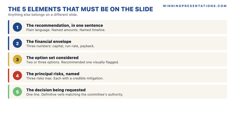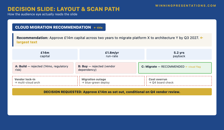
Quick answer: Copilot Design Ideas is genuinely useful for some slide categories and actively damaging for senior committee decks. It does well on title-slide symmetry, consistent image cropping, and simple data-card layouts. It does poorly on accent ribbons, photographic backgrounds behind data, multi-colour headline treatments, and infographic-style icons that read as marketing collateral. The three-question filter for any suggestion: does it serve hierarchy, does it survive print and black-and-white, does it match the firm’s executive precedent decks. The structural test is the one senior reader: does the slide read as a serious recommendation, or as a pitch.
JUMP TO:
- What Design Ideas does well for executive slides
- What Design Ideas does poorly for senior committee decks
- The three-question filter for accepting any Design Idea
- The Design Ideas suggestions to always reject for committee work
- The senior-reader test: serious recommendation or marketing pitch
- Frequently asked questions
Anneliese, a director at a European asset manager, opened her board deck the night before the meeting and clicked through to PowerPoint’s Design Ideas pane out of habit. The deck was structurally sound — twelve slides covering a recommendation on a fund-platform consolidation, drafted in the firm’s quieter house style. Design Ideas suggested a redesign on slide one. Cleaner. Better hierarchy. She accepted it. Then it suggested one for slide three. And five. And eight. By eleven that evening every slide had been “polished” and the deck looked, to her eye, more sophisticated than the version she had drafted at five.
The next morning, halfway through her recommendation, the chair of the investment committee asked a question that stayed with her for two weeks. “Anneliese, this looks more like an investor pitch than a board paper. Is this a recommendation, or are we being sold to?” The question was quiet. The room went quieter. Her recommendation, on its merits, was sound. The deck was no longer letting it land that way. The committee asked for more analysis and deferred the decision. Two of the directors who would have voted with her told her afterwards that the deck made them uncertain — not the case, but the deck.
Two weeks later she re-presented. Design Ideas turned off in settings. Every slide reverted to the firm’s house style: navy and stone, single accent rule, no accent ribbons, no photographic backgrounds. The recommendation was identical. It was approved without debate. The lesson she took out of the room was not that the deck had been ugly the first time. It had been beautiful. The lesson was that beautiful and serious are different goals, and Design Ideas — like most AI design tooling — optimises for the first while she had been hired for the second.
If you want a slide system designed for senior committee decks rather than for visual sophistication:
The Executive Slide System contains 26 templates, 93 AI prompts, and 16 scenario playbooks built for the kind of restraint that senior committees read as serious — not the polish AI design tools default to.
What Design Ideas does well for executive slides
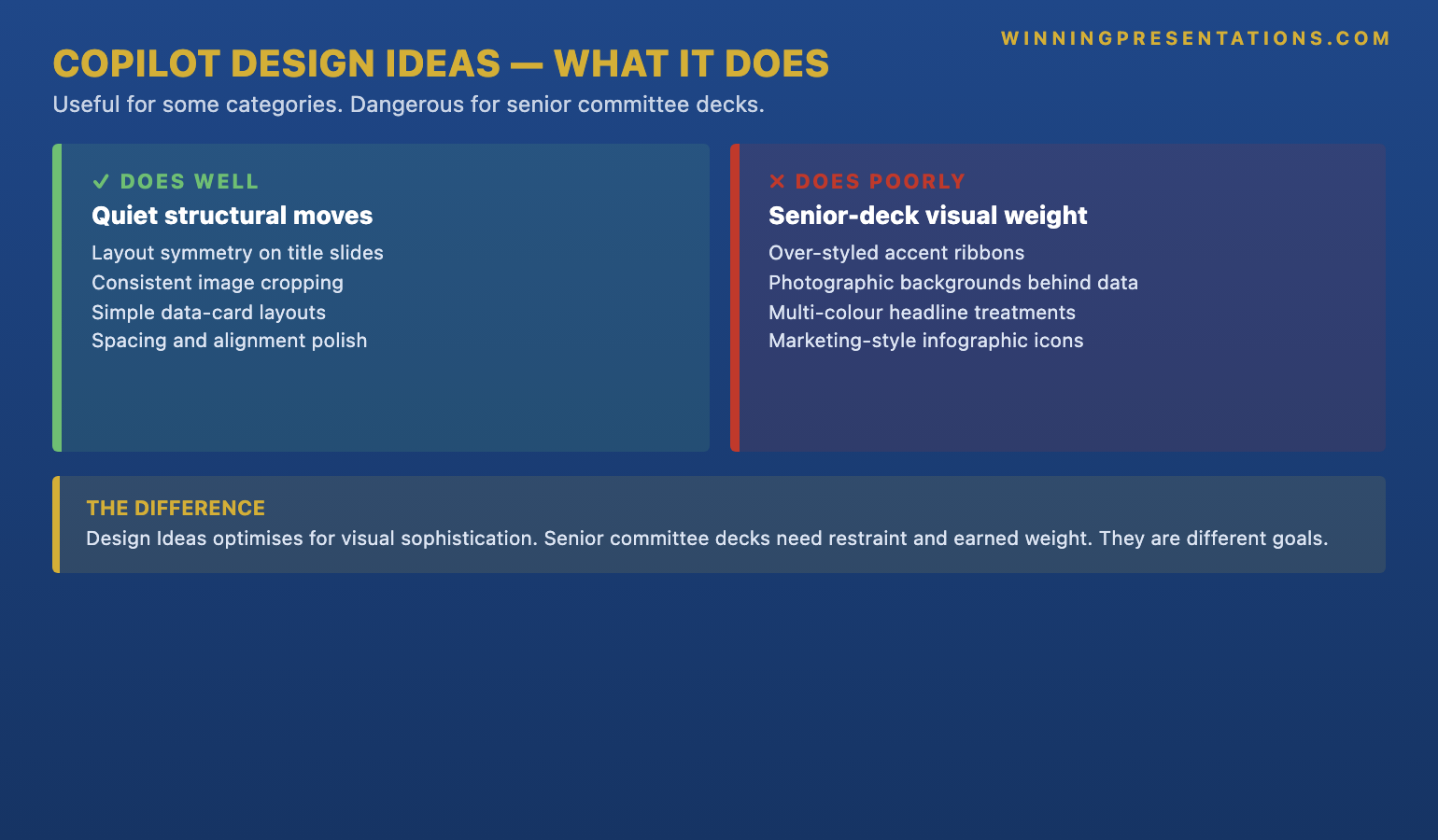
Design Ideas is not without genuine value for executive work. There are three categories of slide where the feature reliably improves the output, and all three share a common property: the slide’s job is structural, not argumentative. On title slides, Design Ideas tends to produce better symmetry, cleaner typographic hierarchy, and more consistent margin treatment than most senior leaders would arrive at by hand. The title slide’s job is to set tone and signal the document’s seriousness; Design Ideas, when given a clean firm logo and a single date, generally lands within the firm’s house style without flourish.
The second category is consistent image cropping across a series of slides. When a deck includes a sequence of partner photos, product images, or comparable case studies, Design Ideas applies a uniform crop, alignment, and aspect ratio that hand-formatting rarely achieves. The visual cost of mismatched image treatments is high — committees notice, and the impression is sloppy. Design Ideas handles this category well because the work is mechanical and rule-based, not interpretive. There is one right answer and the feature finds it.
The third category is simple data-card layouts where the content is already structured: three or four headline numbers with brief labels, the kind of summary slide that lives near the front of a board paper. Design Ideas converts a vertical list of metrics into an aligned card grid with sensible spacing and tight typography. It reads as crisp without being decorated. For these three categories — title slides, image-heavy series, and small numerical summaries — accepting the suggestion is usually a net improvement over hand-formatting. The feature earns its keep on structural work.
What Design Ideas does poorly for senior committee decks
The trouble starts when Design Ideas is asked to redesign a slide that is doing argumentative work. The feature optimises for visual sophistication: more colour, more layered backgrounds, more decorative elements, more visual interest per square inch. Senior committee decks optimise for the opposite. Restraint signals confidence. A slide that uses a single accent rule and one type weight reads as a mature recommendation; a slide that uses a navy-to-purple gradient ribbon, a faded photographic background, and a coloured icon set reads as a marketing presentation. Design Ideas tends to suggest the second when the first is what the room expects.
The recurring patterns to watch are specific. Design Ideas produces over-styled accent ribbons across the top of slides — the kind of swooping graphic element that brand teams put on consumer-facing collateral and that committees read as “trying too hard”. It places photographic backgrounds behind data tables, where the photo competes with the numbers and the slide loses both. It introduces multi-colour headline treatments — the title in two colours, a third colour for the subtitle — when the firm’s house style is single-colour, single-weight. It substitutes infographic-style icons for plain bullet points on what should be a serious analytical slide, and the icons read as junior. None of these are individually fatal. Stacked across a deck, they are.
The reason this happens is that Design Ideas is trained on a broad corpus of slides — including, heavily, marketing decks, sales pitches, conference talks, and consumer-facing presentations. Those decks earn their living by being visually arresting; an executive committee paper earns its living by being analytically credible and quiet enough to read. The training distribution skews toward the first. The feature produces what its data has rewarded, not what the specific committee expects. A senior leader using Design Ideas without a filter is silently importing the design choices of a different document genre into a board paper, and the genre mismatch is what the chair felt when Anneliese’s deck “looked like an investor pitch”. For a deeper treatment of where AI helps versus where it hurts on senior decks, see our companion piece on AI-enhanced versus AI-generated presentations.
Build slides that read as serious — with templates designed for senior committee decks, not marketing collateral.
The Executive Slide System is the structured template library for senior professionals who present at board, committee, and investment-decision level. Restraint-led design, the kind committees register as credible — built around the conventions Design Ideas tends to override.
- 26 executive templates covering recommendations, board updates, capital cases, and strategic reviews
- 93 AI prompts for ChatGPT and Microsoft Copilot — written for senior-deck scenarios, not generic productivity
- 16 scenario playbooks for the high-stakes decks senior leaders actually present
- Instant download on purchase, no subscription, lifetime access to updates
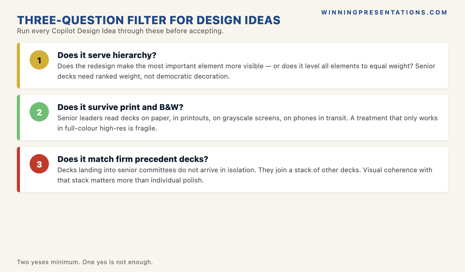
The three-question filter for accepting any Design Idea
The senior leaders who use Design Ideas well do not turn the feature off. They run every suggestion through three questions before they accept it, and most suggestions fail at least one of the three. The first question is whether the redesign serves the slide’s hierarchy. If the original slide had a clear primary point, a secondary point, and a tertiary point, does the suggestion preserve that ordering — or does it flatten the hierarchy by giving every element similar visual weight? Design Ideas tends to flatten. It treats elements as a layout puzzle to be balanced; a senior reader needs them to be a sentence with a subject, verb, and object.
The second question is whether the redesign survives print and black-and-white reproduction. This is a harder test than it sounds. Many senior committees still print board papers; many distribute them to non-attendees as PDFs that may be read on a phone in a corridor or photocopied for a sub-committee. A suggestion that depends on a colour gradient, a photographic background, or a colour-coded icon set will collapse in either of those contexts. The slide that survives is the one that uses type weight, line, and spacing to do its work — colour as accent, not as carrier. Design Ideas favours the colour-carrier version. The print-and-mono test is what makes that visible before the meeting rather than after.
The third question is whether the redesign matches the firm’s executive precedent decks. Every senior team has a small canon of decks that landed well — the capital case from two quarters ago that was approved without debate, the strategy review that the chair quoted from in the next meeting. Those decks are the implicit house style, and they are usually quieter than the firm’s brand guidelines technically permit. A Design Idea that matches the brand book but diverges from the precedent decks will read as off — even if the leader cannot articulate why. The check is to open one or two of those precedent decks side-by-side with the suggested slide. If the suggestion looks like it came from a different document, reject it. For more on the writing and structuring discipline that surrounds AI design choices, see our companion guide on Copilot versus ChatGPT for executive slides.
The Design Ideas suggestions to always reject for committee work
Some Design Ideas suggestions fail all three filter questions reliably enough that senior leaders save themselves the time and reject them on sight. The first category is anything with a photographic background behind text or data. Photo backgrounds are a recurring Design Ideas suggestion because the feature has been trained heavily on marketing decks where photo backgrounds are a stylistic norm. In a committee context they are almost always wrong: contrast is unreliable, print quality is unpredictable, and the photo introduces a tonal register that does not belong in a recommendation paper. Reject without further consideration.
The second category is multi-colour or gradient headline treatments. Design Ideas frequently suggests redesigning a single-colour title into two-colour or three-colour typography, sometimes with gradient fills. The treatment is visually interesting at full screen and disappears entirely in print. More importantly, it shifts the deck’s register from “analytical document” to “marketing communication”. A board chair reading a recommendation does not need the title to be visually interesting; they need it to signal that the document takes itself seriously. Single colour, single weight, single point size for the headline. The third category is icon sets used in place of bullet points, especially the small, decorative icon sets that Design Ideas pulls from its built-in library. Icons can work on dashboard summaries and on certain types of process slides; they almost never work on the analytical slides that carry the deck’s argument. Replace with plain text bullets and recover the slide’s seriousness.
The fourth category is the layered visual element category — the swooping accent ribbon along the top of the slide, the angled colour band behind the title, the partial graphic that bleeds off the right edge. These are pure decoration. They communicate nothing and they cost the slide its quiet authority. Their presence in the Design Ideas suggestion set is the clearest signal that the feature is optimising for visual interest rather than for executive register. The senior leaders who use Design Ideas well learn to recognise these patterns at a glance and dismiss them before the suggestion fully renders. The pattern recognition takes about two weeks of disciplined use; once it is in place, Design Ideas becomes a useful tool that surfaces the small subset of suggestions worth keeping while the leader filters out the rest.
If you want the structured programme behind this — for senior leaders building presentations with AI:
The AI-Enhanced Presentation Mastery course is a self-paced Maven programme — 8 modules, 83 lessons covering the editorial judgement that turns AI design tooling into a partner rather than an autopilot. Monthly cohort enrolment, 2 optional recorded coaching sessions. £499, lifetime access to materials.
The senior-reader test: serious recommendation or marketing pitch
The structural test that anchors all of this is a single question the leader asks themselves before they walk into the room. If the firm’s most senior reader — the chair, the lead director, the senior partner — picks this deck up cold, will they read it as a serious recommendation or as marketing material? The two registers are not on a spectrum; they are different documents. A serious recommendation reads as quiet, restrained, and confident enough not to perform. Marketing material reads as designed to persuade. The committee can tell the difference within the first two slides, and the difference shapes how they receive everything that follows.
Design Ideas, used without a filter, drifts the deck toward marketing register. Used with the three-question filter and the always-reject patterns, it can be held in serious-recommendation register while still saving the leader time on the structural slides where it adds genuine value. The discipline is not to turn the feature off. The discipline is to know which suggestions belong on which kind of slide. A committee chair will rarely tell a presenter that their deck “looked like a pitch”; the comment Anneliese received was unusually candid. More often the deck simply softens the recommendation, and the committee defers, and the leader does not learn why. The filter is what closes that gap.
The leaders who present successfully at senior committee level over many years tend to share one pattern: their decks look slightly under-designed by the standards of the broader presentation world. Type-led, restrained, single accent, generous white space. Design Ideas will not produce that aesthetic from defaults; it has to be steered toward it. The steering is the work, and the work is small per slide and large in aggregate over a career. For more on the broader workflow that connects Copilot use to senior-deck production, see our companion guide on Copilot for PowerPoint board presentations.
Frequently asked questions
Should I use Design Ideas for board decks at all?
Yes, selectively. Design Ideas adds genuine value on title slides, on series of slides with consistent imagery, and on simple data-card summaries — the structural categories. It tends to drift the deck toward marketing register on the analytical slides that carry the argument. The pattern most senior leaders settle into is to scan suggestions, accept the ones that pass the three-question filter, and reject the rest. Turning the feature off entirely is over-correction; using it without a filter is under-correction.
What about Design Ideas for internal team decks versus external committee decks?
The register difference matters less for internal team decks. A weekly project review or an internal status update can carry more visual variety without losing credibility, because the audience already trusts the presenter and is reading for information rather than judging the document. For external committee decks — board papers, investment-committee recommendations, regulatory submissions, capital cases — the register is much tighter, and Design Ideas suggestions need the full filter. The default for committee decks is restraint; the default for internal team decks is functional clarity.
Does the AI-Enhanced course cover when to override Copilot’s design suggestions?
Yes — the editorial-judgement module is one of the eight in the AI-Enhanced Presentation Mastery course, covering when AI suggestions help senior decks and when they degrade them. The course is self-paced across 83 lessons, with monthly cohort enrolment and 2 optional recorded coaching sessions. The framing throughout is that AI design tooling is a partner, not an autopilot — and the discipline is in knowing which suggestions to take and which to override.
Can I customise Design Ideas to respect a firm’s house style?
Partially. Loading the firm’s master template into PowerPoint and saving it as the active theme will narrow the range of suggestions Design Ideas produces — the feature will tend to use the template’s colour palette and font choices rather than its defaults. It will not, however, suppress the structural patterns the feature favours: photographic backgrounds, accent ribbons, multi-colour headline treatments. Those patterns persist regardless of theme. The filter still has to be applied by the leader; the template constrains the palette but not the design grammar.
The Winning Edge — weekly newsletter
The Winning Edge is a weekly newsletter for senior professionals who present at the executive level. One short email a week, focused on the structural moves that separate decks committees back from decks they defer. Subscribe to The Winning Edge →
Not ready for the full Executive Slide System? Start here instead: download the free Executive Presentation Checklist — the one-page reference senior leaders run before every committee deck.
About the author
Mary Beth Hazeldine is Owner & Managing Director of Winning Presentations Ltd. With 24 years of corporate banking experience at JPMorgan Chase, PwC, Royal Bank of Scotland, and Commerzbank, she advises executives across financial services, healthcare, technology, and government on structuring presentations for high-stakes funding rounds, board approvals, and strategic decisions.