
A department update presentation typically runs ten to fifteen minutes—which means every slide, every stat, and every moment counts. You cannot afford to waste airtime on preamble or scattered information architecture. What separates a forgettable department update from one that lands with your executive audience is structure: knowing which information goes first, which visuals support trust, and which commitments or risks you surface before questions arise.
Jump to:
- How to structure a ten-minute update
- Opening with context, not housekeeping
- Displaying key metrics without overload
- Surfacing risks and dependencies early
- Moving to action before time expires
Kenji was mid-update slide deck when his executive sponsor interrupted: “What’s the story here?” Twenty minutes in, and Kenji realised he’d spent nine slides on process and context, leaving only three for results and what mattered. His team’s work was solid; his framing wasn’t. The following quarter, Kenji restructured his department update from the finish line backwards: outcome first, then the three metrics that proved he’d reached it, then the one risk that needed escalation. His sponsor asked fewer clarifying questions and approved his team’s next funding tranche within days. The difference wasn’t more data or better charts. It was arrangement.
Structuring a department update presentation means knowing which information slides first to set context, which evidence follows, and which risks you flag before you’re asked. This article walks you through the exact architecture executives expect—so your ten minutes land with clarity instead of confusion.
How to structure a ten-minute update
Ten minutes is roughly 800 words at a natural speaking pace—and you cannot afford filler. Your audience is senior; they are time-constrained; they expect you to have done the synthesis work before you stood up. A typical department update presentation follows this shape:
- Context slide (30 seconds): Where your department sits in the quarter’s priority landscape.
- Outcome slide (60 seconds): The headline result—revenue, cost, risk mitigation, capability built.
- Evidence slides (3–4 minutes): Three to four key metrics that support your outcome claim.
- Dependencies or risks (2 minutes): What needs flagging, what you need from others, what could derail next quarter.
- Close (60 seconds): One clear ask—approval, escalation, resources, or visibility—and the next gate.
This is the rhythm executives follow when they’re listening for decision points. Anything longer than this in any section will lose their focus; anything shorter risks sounding thin. The art is fitting meaningful evidence into those three to four minutes without compression artefacts.
Most executives see five or six department updates per month. What separates the ones they remember from the ones they skim is precision in your slide deck. Every element—from how you label a metric to where you place the risk flag—signals whether you’ve thought this through or are hoping for clarity in the room.
The Executive Slide System (£39) gives you the exact template logic for a department update presentation: which metrics go above the fold, how to layer context so it’s never assumed, and how to flag dependency without seeming defensive. You get slide architecture, narrative sequencing, and three worked examples—so you’re not guessing at what “clear” looks like.
Opening with context, not housekeeping
Your first slide should never be a title slide. Your first slide should never be a mission statement. Your first slide answers one question for the person in the room who is scanning their email halfway through: Why am I listening to this, right now?
A context slide for a department update does three things:
- Names the business priority or initiative your department supports
- States the time period under review (quarter, month, fiscal year)
- Flags the decision or approval you’re seeking at the end
Example: “We run the digital platform team. This update covers Q1 performance against our customer onboarding priority. By the end of this session, we need approval to move the payment integration release to early Q2.”
That opening does not waste words. It doesn’t introduce who you are, it doesn’t recap what digital does, and it doesn’t ask for a show of hands. It simply sets up the commercial thread that ties every slide to come. Your audience can now listen with a purpose.
Displaying key metrics without overload
This is where department updates often trip up. You have solid data—system uptime, release velocity, cost per transaction, customer satisfaction scores—and you’re tempted to show all of it because it all matters. But in a ten-minute window, four or five headline metrics will do far more work than a dashboard cram.
Choose your metrics using this filter: Does this metric prove I achieved my stated outcome, or does it prove I’m tracking against a known risk? If neither, cut it.
For a department update on digital platform delivery, that might be: completion rate against roadmap, defect density in production, and time-to-fix for critical issues. Those three numbers tell a story of what shipped, whether it’s stable, and whether your team responds quickly to trouble. A fourth metric—team capacity utilisation—might sit in your risk section if hiring freeze is a concern. A fifth—quarterly cost variance—gets one line in your close if budget is your next ask.
Each metric needs a single visual: a line chart for trend, a gauge or traffic light for status against target, or a before/after comparison. No stacked bar charts, no dual-axis complexity, no footnote disclaimers. If you need a footnote to explain your metric, your metric isn’t clear enough.
The visual design here matters more than you might think. Executives scan a metric slide in under five seconds; if the visual doesn’t make the story obvious, you’ll spend your remaining slide time explaining it instead of moving forward.
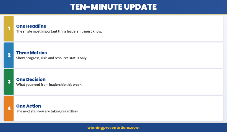
The four-part architecture of a ten-minute department update: one headline, three metrics, one decision, one action.
The infographic above distils the ten-minute update into four non-negotiable elements. One Headline is the single most important thing leadership must know—not a summary of everything, but the one piece of information that, if they retained nothing else, would still make the update worthwhile. This forces discipline: if you cannot articulate your department’s status in a single sentence, you haven’t done the synthesis work.
Three Metrics covers progress, risk, and resource status only. Not five metrics, not eight, not a dashboard export. Three. Progress tells them whether you’re on track. Risk tells them what could derail you. Resource status tells them whether you have what you need. If a metric doesn’t fit one of those three categories, it belongs in an appendix slide, not in your ten-minute window.
One Decision is what you need from leadership this week. Not three decisions, not a wish list, not “any thoughts?” One decision, clearly framed, with the evidence you’ve already presented supporting the case. If you cannot name the decision you need, you’re presenting for visibility, not for impact—and visibility alone rarely justifies ten minutes of executive time.
One Action is the next step you’re taking regardless of what leadership decides. This signals forward momentum and demonstrates that your department isn’t waiting for permission to move. It also gives the audience a clear picture of what happens after the meeting ends, which is what experienced executives are always listening for.
Surfacing risks and dependencies early
If you wait until the Q&A to surface a risk or a blocking dependency, you’ve already lost credibility. Executives expect you to know what can go wrong—and they expect you to tell them before they have to ask. This is not negativity; this is professionalism.
A typical department update flags two to three risks or dependencies in the third quarter of your time:
- A known constraint: “We’re currently resource-constrained in testing. The next release will take two weeks longer than originally planned.”
- An external dependency: “Finance’s budget cycle delay means we can’t start contractor onboarding until mid-April. That pushes our infrastructure refresh to Q2.”
- A strategic risk: “Three of our five senior engineers have expressed interest in external opportunities. We’re moving quickly on retention, but we wanted you aware.”
Notice the shape of each: Situation → Impact → Your response. You’re not asking permission to have the problem; you’re demonstrating that you’ve already thought it through. That distinction shifts the conversation from “What are you going to do?” to “Here’s what we’re doing; let me know if you’d approach this differently.”
Never bury a risk in a note at the bottom of a metrics slide. Give it its own real estate, name it, and then move on. You’ll command far more respect than if you hide it and hope no one notices.
Moving to action before time expires
Your close is not a summary. A summary of a ten-minute update is what kills momentum. Your close is a single, clear action: approval for your next phase, escalation of a decision that sits above your pay grade, a request for resource, or a commitment to a next meeting.
State it in one sentence. Then tell them when you’ll come back. Then stop talking.
Example close: “We need CFO approval to bring on two contract infrastructure engineers for Q2—that’s £240k, and it compresses our roadmap risk by eight weeks. Can we have a decision by end of week?” Then pause. Don’t fill silence with extra context. Let the room respond.
If you’ve structured your department update correctly—context, outcome, evidence, risks, ask—the silence will be brief. Questions will cluster around the risks you’ve already named or the metrics that didn’t land as clearly as you hoped. What you won’t get are foundational questions about why you’re standing there or what your department actually does. That efficiency is the whole point.
Your slides are the difference between a conversation that moves and one that stalls. When your metric visuals are clear, your risks are surfaced without drama, and your ask is unmistakable, even a ten-minute slot becomes enough. Get the template logic and slide architecture that executives expect—and stop guessing at what clarity looks like.

The contrast between department updates that waste time and those that drive action.
The comparison above crystallises the difference between department updates that waste executive time and those that drive action. In the first row, “Everything is Fine” — the generic positive spin with no specifics — is replaced by “One Key Issue”: leading with the thing leadership must act on. Executives don’t need reassurance; they need signal. If everything genuinely is fine, say so in one sentence and move to the decision you need. If something isn’t fine, surface it before someone else does.
In the second row, “All the Numbers” — every metric from every system available — gives way to “Three Signals”: progress, risk, and resource, nothing else. The temptation to show all your data is understandable; it feels like proof of diligence. But executives scanning twelve charts in three minutes don’t see diligence. They see a presenter who hasn’t filtered, and filtering is the job. Three signals, clearly labelled, with a one-line interpretation beside each, tells the story faster and more credibly than a dashboard dump.
In the third row, “Questions?” — the passive handoff with no direction — becomes “Decision Needed”: one specific ask with a deadline. “Questions?” invites the room to wander; “I need approval for two contract hires by Friday” invites a decision. The difference isn’t assertiveness for its own sake; it’s structural clarity. When you name the decision, you give the audience a reason to have listened. When you don’t, you leave them wondering why they were in the room.
Want the exact slide templates for each of these elements? The Executive Slide System gives you the headline slide, the three-metric layout, and the decision-close format — so you’re building from proven architecture, not guessing.
Frequently asked
How many slides should a ten-minute department update have?
Six to eight slides is the typical range. That’s roughly one minute per slide plus one for questions. If you’re building slide decks with twelve or more slides in a ten-minute slot, you’re either trying to show too much or your narratives are too thin to fill the time naturally.
Should I include historical comparison or just this quarter’s performance?
Include one or two quarters of historical data if it shows meaningful trend—for example, whether you’re improving on a known weakness or maintaining a strength. But don’t layer in five quarters of context unless a specific pattern (like seasonal volatility) matters to the decision at hand. Executives care about now and next; they don’t need your full archive.
What do I do if I’m running over time?
Cut from the middle, never from the opening or the close. Your context and your ask are non-negotiable. If time is tight, tighten your evidence section: choose three metrics instead of four, or move a secondary point into the Q&A. Never rush your close—that’s where approval lives.
Keep sharp: The Winning Edge
Every week, The Winning Edge delivers one executive presentation insight you can use in your next meeting. Ideas on structure, narrative technique, and slide logic—distilled so they land in under five minutes. Join hundreds of leaders who use it to sharpen their delivery.
Grab the Executive Presentation Checklist — a framework for vetting any presentation before you stand up.
Read next: The Succession Planning Presentation: Framing Leadership Continuity
—
Mary Beth Hazeldine is Owner & Managing Director of Winning Presentations. With 24 years of corporate banking experience at JPMorgan Chase, PwC, Royal Bank of Scotland, and Commerzbank, she advises executives across financial services, healthcare, technology, and government on structuring presentations for high-stakes funding rounds and approvals.