
The CFO had pasted an entire Excel tab — thirty-seven rows of quarterly figures — onto a single slide. Then he asked the board to “take a moment to absorb the numbers.”
Quick answer: AI data visualisation for presentations can transform unreadable spreadsheet dumps into clear, persuasive visual charts — but only when you tell it what the data means first. The process is not “paste my data and make it pretty.” It’s a three-step human-led workflow: decide the insight (what does this data prove?), choose the visual type (comparison, trend, composition, or distribution), then use AI to generate, label, and refine the chart. AI handles the visual execution. You handle the strategic thinking. The result is data slides that make a point rather than display a table.
Jump to:
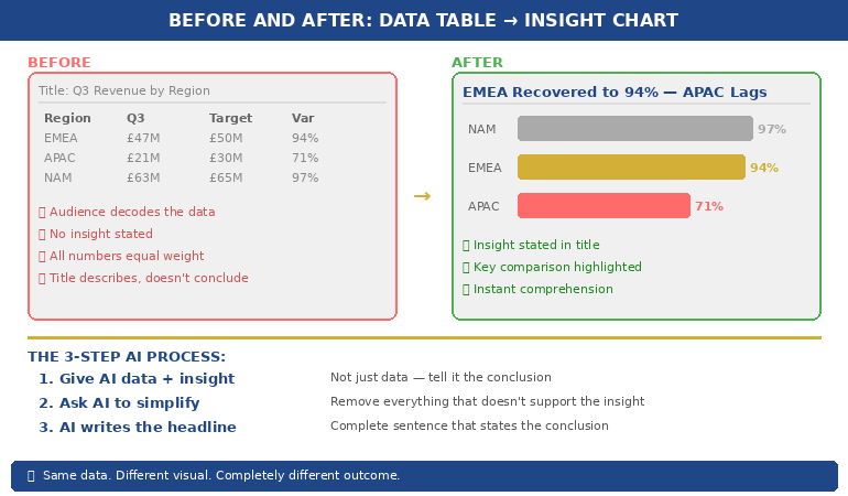
At Commerzbank, I sat through a quarterly review where the Head of Risk presented a slide with a forty-two-cell table comparing capital adequacy ratios across eight business lines and four quarters. Every cell was filled. Every number was accurate. Nobody in the room knew what it meant.
After the meeting, the Group Treasurer said to me: “I have no idea whether we’re in trouble or not.” The data was perfect. The communication was useless.
I helped him rebuild that slide. We replaced the table with a single bar chart showing one thing: which business lines were above the threshold and which were below. Three were red. The rest were green. The next board meeting lasted half the time and produced twice the decisions. Same data. Different visual. Completely different outcome.
Why Data Tables Fail in Executive Presentations
Data tables work in reports. They fail in presentations. The reason is cognitive: a table asks the reader to perform analysis, while a chart provides the analysis already completed. When you paste a spreadsheet into a slide, you’re asking your audience to do the work you should have done before the meeting.
Senior executives are processing information from dozens of sources across dozens of meetings. They don’t have the cognitive bandwidth to scan forty-two cells, identify the relevant comparisons, and draw their own conclusions — all while you’re talking over the top of the slide. A data table in a presentation is not information. It’s a homework assignment.
The result is predictable. Executives either tune out (because the table is overwhelming), or they focus on the wrong number (because without visual hierarchy, every number looks equally important). Either way, your data fails to do its job, which is to support a specific point that drives a specific decision.
This is why data-heavy presentations often backfire with executives. The problem isn’t the data. It’s the format. And this is precisely where AI can help — not by thinking for you, but by transforming your thinking into a visual that communicates instantly.
PAA: Why do data-heavy slides fail in presentations?
Data tables require the audience to perform their own analysis — scanning cells, making comparisons, and drawing conclusions — while simultaneously listening to the presenter. Executive audiences don’t have the cognitive bandwidth for this. Charts solve the problem by pre-digesting the analysis: they show the conclusion visually so the audience can absorb the insight in seconds rather than minutes. The presenter’s job is to decide the insight first, then choose a visual format that makes that insight obvious.
Turn Data Into Decisions — Not Decoration
AI-Enhanced Presentation Mastery includes the complete data visualisation workflow: the Insight–Implication–Action framework, AI prompt sequences for chart creation, and the visual decision matrix that tells you which chart type to use for any dataset. Self-study programme — join anytime.
Join AI-Enhanced Presentation Mastery → £249
Self-study programme with live support. Join anytime — all released modules available immediately. Built from 24 years presenting financial data in corporate banking. Check course page for current pricing and session details.
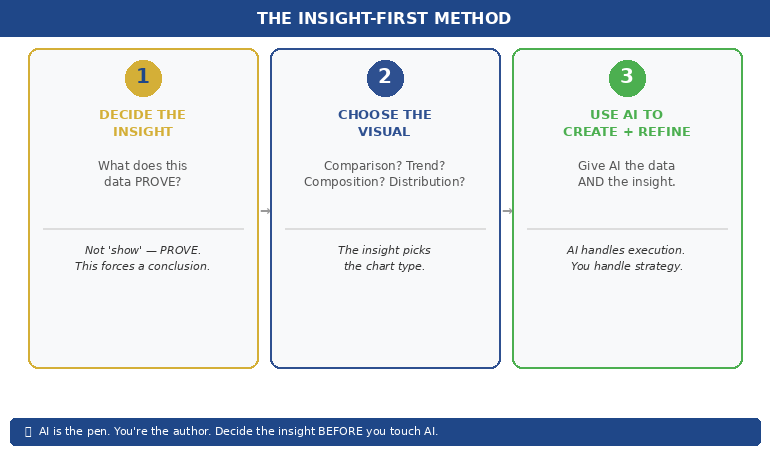
The Insight-First Method (Before You Touch AI)
The biggest mistake people make with AI data visualisation is starting with the data. They paste a spreadsheet into an AI tool and ask it to “make a chart.” The result is a technically correct but strategically useless visualisation — because AI doesn’t know what point you’re trying to make.
Before you touch AI, answer one question: What does this data prove?
Not “what does this data show” — that’s a description. “What does this data prove” forces you to state a conclusion. Examples of the difference:
“This data shows Q3 revenue by region” → a description that leads to a table.
“This data proves that EMEA revenue recovered faster than expected” → an insight that leads to a chart with EMEA highlighted.
“This data shows customer satisfaction scores” → a description that leads to a grid.
“This data proves that satisfaction dropped in the two months after the platform migration” → an insight that leads to a trend line with the drop circled.
Once you have the insight, you can tell AI exactly what to visualise — and more importantly, what to emphasise. “Create a bar chart of Q3 revenue by region. Highlight EMEA in gold. Grey out all other regions. Add a horizontal line showing the forecast.” That prompt produces a useful chart because you’ve done the thinking. AI does the drawing.
This is the Insight–Implication–Action framework we teach in the course: every data slide should state the insight (what the data proves), the implication (what it means for the audience), and the action (what needs to happen next). AI can’t generate any of those three things. But once you’ve defined them, AI can create the visual that communicates them instantly.
📊 Want the complete Insight–Implication–Action framework and AI prompt sequences?
AI-Enhanced Presentation Mastery includes the data storytelling module with before/after transformations and the visual decision matrix.
How AI Transforms Data Into Visual Clarity
Once you’ve identified the insight, AI becomes genuinely powerful. Here’s the workflow for transforming a data-heavy slide into a clear visual:
Step 1: Give AI the data AND the insight. Don’t just paste your spreadsheet. Tell AI what you want the audience to take away. “Here is our quarterly revenue data. The key insight is that EMEA recovered to 94% of target while APAC stayed at 71%. Create a horizontal bar chart that makes this comparison obvious. Use gold for EMEA and grey for APAC. Include a vertical line at the 100% target.” The more specific your instruction, the more useful the output.
Step 2: Ask AI to simplify, not add. AI’s instinct is to include everything. Your instinct should be to remove everything that doesn’t support the insight. “Remove the gridlines. Remove the exact values from bars under 50%. Make the chart title a complete sentence: ‘EMEA Revenue Recovered to 94% — APAC Still Lagging.'” The best data slides look almost empty. That’s the point — the insight should be impossible to miss.
Step 3: Use AI to generate the headline. Your slide title should state the conclusion, not describe the content. AI is excellent at rewriting “Q3 Revenue by Region” into “EMEA Recovery Outpaced Forecast — APAC Needs Intervention.” Give AI your insight and ask it to write a headline that a time-poor executive would understand without looking at the chart. If the headline alone tells the story, you’ve succeeded.
This three-step process — insight, simplify, headline — takes five minutes per slide and produces results that are dramatically more persuasive than any table, regardless of how much data that table contains.
If you want to go deeper on how to match your AI prompts to executive presentation needs, the key is always the same: tell AI what the data means before asking it to visualise the data.
PAA: How do I use AI to create charts for presentations?
Start by defining the insight your data proves — not just what it shows. Then give AI both the data and the insight in a single prompt, specifying the chart type, what to highlight, and what to remove. Ask AI to write the slide headline as a complete sentence that states the conclusion. The process takes about five minutes per slide and produces charts that communicate instantly rather than requiring the audience to decode a table.
From Spreadsheet Dump to Executive Clarity
Module 6 of AI-Enhanced Presentation Mastery covers data storytelling in depth — including the Insight–Implication–Action framework, the visual decision matrix, AI prompt sequences for chart transformation, and before/after examples from real executive presentations. Study at your own pace.
Join AI-Enhanced Presentation Mastery → £249
Self-study programme with live Q&A calls. Join anytime — all released modules available immediately. Check course page for current pricing and session details.
The Four Chart Types That Cover 90% of Executive Data
You don’t need twenty chart types. You need four. Almost every data insight an executive needs to communicate falls into one of these categories:
1. Comparison: “How do these things stack up?” Use horizontal bar charts. Revenue by region, performance by team, budget vs actual. AI prompt: “Create a horizontal bar chart comparing [X]. Highlight the top performer in gold and the underperformer in red. Grey out the middle. Title should state who’s winning.”
2. Trend: “What’s changing over time?” Use line charts. Revenue trajectory, customer satisfaction over quarters, headcount growth. AI prompt: “Create a line chart showing [X] over [time period]. Highlight the inflection point where the trend changed. Add a brief annotation explaining what caused the change. Title should state whether the trend is positive or negative.”
3. Composition: “What’s the breakdown?” Use stacked bars or pie charts (but only for 3–5 segments — more than five and the pie becomes useless). Revenue mix, cost allocation, market share. AI prompt: “Create a stacked bar chart showing [X] breakdown. Highlight the largest segment. Title should state what dominates.”
4. Distribution: “Where does the data cluster?” Use scatter plots or histograms. Customer segments by value, project risk ratings, team performance distribution. AI prompt: “Create a scatter plot showing [X] vs [Y]. Circle the outliers. Title should state the pattern — whether it’s clustered, spread, or has notable outliers.”
When you’re unsure which chart type to use, ask yourself: “Am I comparing, tracking, breaking down, or distributing?” The answer picks the chart. Then tell AI which category and let it handle the execution. This is considerably more effective than the approach covered in data storytelling fundamentals, because AI handles the visual execution while you focus entirely on the strategic framing.
📊 The visual decision matrix and AI prompt templates for all four chart types are inside the course.
AI-Enhanced Presentation Mastery includes the complete data visualisation system — frameworks, prompts, and before/after examples.
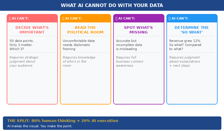
What AI Cannot Do With Your Data (The Human Part)
AI is excellent at the mechanical parts of data visualisation — creating charts, formatting them, writing headlines, standardising colours. But there are four things AI cannot do, and they’re the four things that actually matter:
AI cannot decide what’s important. Your dataset might contain fifty data points. Only three of them matter to your audience. Which three? That depends on who’s in the room, what they care about, and what decision you’re asking them to make. This is strategic judgment, not data analysis. AI can’t do it.
AI cannot read the political room. Sometimes the data shows something uncomfortable — a team underperforming, a region in decline, a project over budget. How you visualise that data depends on whether you’re presenting to the team responsible (where diplomacy matters) or to the board (where directness matters). AI doesn’t know the politics. You do.
AI cannot tell you what’s missing. The most dangerous data slide is the one that’s technically accurate but strategically incomplete. If your chart shows revenue growth but doesn’t show margin erosion, it’s misleading. AI won’t flag what you’ve left out. Only someone who understands the full business context can do that.
AI cannot determine the “so what.” Every data slide needs to answer one question: “So what?” Revenue grew 12% — so what? Is that good? Compared to what? What should we do about it? The “so what” is the entire point of the slide, and it requires human judgment about context, expectations, and next steps.
The best data slides are 80% human thinking and 20% AI execution. AI makes the visual. You make the point.
PAA: Can AI replace human thinking in data presentations?
No. AI is excellent at the visual execution — creating charts, formatting them, writing headlines — but it cannot determine what’s important, read political dynamics in the room, identify what data is missing, or decide the “so what” that makes a slide actionable. The most effective workflow uses AI for 20% of the work (visual execution) and human judgment for 80% (strategic framing, audience awareness, and insight selection). AI is the pen. You’re the author.
Learn the Complete System for Executive Data Slides That Drive Decisions
AI-Enhanced Presentation Mastery teaches you the human-led, AI-assisted approach to executive presentations — including the Insight–Implication–Action framework, the visual decision matrix, AI prompt sequences, and the data storytelling techniques built from 24 years presenting financial data in corporate banking and 15 years coaching executives through high-stakes decision meetings.
Join AI-Enhanced Presentation Mastery → £249
Self-study programme with live support. Join anytime — all released modules available immediately. Built from 24 years presenting financial data in corporate banking + 15 years coaching executives. Check course page for current pricing and session details.
Frequently Asked Questions
What if my audience expects to see the full data table?
Put the table in the appendix. Present the chart in the main deck. If someone asks “where are the detailed numbers?” you say “slide 22 in the appendix” and continue with your insight. This gives you the best of both worlds: visual clarity in the presentation and full data availability on request. In twenty-four years of corporate banking, I’ve found that the executives who request the detailed table almost never actually read it — they just want to know it’s there.
Which AI tools are best for data visualisation?
Any AI tool that can process text prompts and generate charts works — ChatGPT, Claude, Copilot in PowerPoint. The tool matters less than the prompt. A specific prompt (“Create a horizontal bar chart comparing Q3 revenue by region, highlight EMEA in gold”) produces dramatically better results than a vague prompt (“Make a chart from this data”) regardless of which tool you use. The Insight-First Method works with any AI platform.
How do I handle sensitive financial data with AI tools?
If your data is confidential, use anonymised or rounded figures for the AI-generated chart, then manually replace them with the real numbers in your final slide. AI needs the structure and proportions to create the right visual — it doesn’t need the exact numbers. Alternatively, use AI only for the chart template and formatting, then input your data directly. Many organisations have approved AI tools with enterprise-grade data protection for this purpose.
Does this work for non-financial data?
The Insight-First Method works for any data type: project timelines, customer satisfaction scores, employee engagement metrics, operational KPIs, marketing funnels. The principle is the same — decide the insight before you create the visual, tell AI what to emphasise, and write a headline that states the conclusion. The four chart types (comparison, trend, composition, distribution) cover 90% of any data you’ll present in a corporate setting.
📬 The Winning Edge Newsletter
Weekly strategies for executive presentations, AI-enhanced workflows, and career-critical stakeholder communication. No fluff.
🎯 Free: 10 Essential AI Prompts for Executive Presentations
Includes the data visualisation prompts for all four chart types, plus headline rewriters and the slide clarity check sequence.
Related: Data slides are one piece of the puzzle. If you’ve been thrown into a last minute presentation and need to build a complete deck fast, the 5-slide emergency framework helps you decide which data to include and which to cut — before you start visualising anything.
Stop pasting spreadsheets into slides. Decide the insight first. Choose the right visual. Let AI handle the execution. Your audience will thank you — and your data will finally do its job.
🎯 Learn the human-led, AI-assisted approach to executive presentations.
About the Author
Mary Beth Hazeldine is the Owner & Managing Director of Winning Presentations. With 24 years of corporate banking experience at JPMorgan Chase, PwC, Royal Bank of Scotland, and Commerzbank, she spent two decades watching executives paste spreadsheets into slides — and helping them transform that data into visuals that actually drove decisions.
A qualified clinical hypnotherapist and NLP practitioner, Mary Beth combines executive communication expertise with modern AI-enhanced workflows to help leaders present data with clarity and conviction.