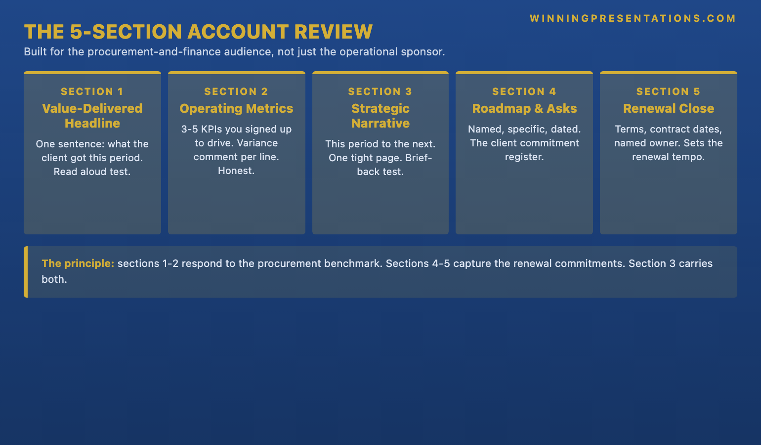
Quick answer: The account review presentation key clients respond to in 2026 is a five-section format built to drive a renewal decision in the room, not a status update the client reads politely and forgets. The five sections, in order, are: (1) the value-delivered headline — one sentence stating what the client received this period in plain commercial terms; (2) the operating-metrics page — the three to five KPIs your contract committed to drive, with variance and a one-line comment under each; (3) the strategic narrative — the page connecting this period’s outcomes to the next twelve to eighteen months of the relationship; (4) the roadmap-and-asks page — the two or three specific requests of the client by name and date; (5) the renewal-and-next-steps close — the commercial terms, contract window, and named owner who will sign. The format is dense, short, and built for a procurement director and a sponsor who will both sit in the room with very different agendas.
JUMP TO:
- Why five sections, and what this format replaces
- Section one: the value-delivered headline
- Section two: the operating-metrics page
- Section three: the strategic narrative
- Section four: roadmap and named asks
- Section five: the renewal-and-next-steps close
- Running the format when the room is difficult
- Frequently asked questions
In 2019, the senior account director on a mid-cap professional-services contract walked into the Q3 quarterly business review with a procurement director at a London-headquartered FTSE 100 retailer. The contract was eight figures, three years in, with a renewal decision due ten weeks later. The account director’s deck was forty-one pages: a six-page recap of the engagement history, a fourteen-page activity log of everything the team had delivered that quarter, a nine-page strategic narrative, and a twelve-page appendix of case studies from other clients in the same sector. The procurement director sat at the head of the table with a navy binder open in front of her. Three items inside the binder were circled in red ink: the previous year’s invoiced fees, a single line from the contract about service-level performance, and a printed email from her own finance director asking whether the contract was being benchmarked against the market. Six pages into the deck, the procurement director closed her binder, said “I have a hard stop in twenty minutes, can you tell me in two sentences what we got for the fees this quarter and what changes for the renewal,” and the account director had no answer ready. The contract went to tender the following month. It was won back, eventually, but at a fifteen percent fee reduction and on a one-year rather than three-year term. The deck did not lose the renewal on its own — the contract had real performance issues underneath — but the deck failed to give the procurement director anything to defend the renewal with internally, and that is the gap a strong account review deck has to close.
(This article was created with AI assistance; all stories and insights are based on 35 years of real client work.)
This piece walks through the five-section account review format that senior account directors, key account managers, and partners managing major renewals are using in 2026, what each section has to carry, how the deck has to land for the two very different audiences who sit in the room (the operational sponsor who lives with your team daily, and the procurement or finance owner who only meets you at the review), and the structural moves that keep the renewal conversation on track even when the underlying numbers are mixed. The format will not save a contract that has genuinely under-delivered, but it will give a fair contract a fair hearing, and that is the most an account review deck can ever do.
Before the next QBR, a one-page structural check is worth a look.
The Executive Presentation Checklist walks through the structure account directors are using to hold the renewal conversation together — the headline slide, the variance-as-decision page, the asks section, and the renewal close. Free download, no email gate.
Why five sections, and what this format replaces
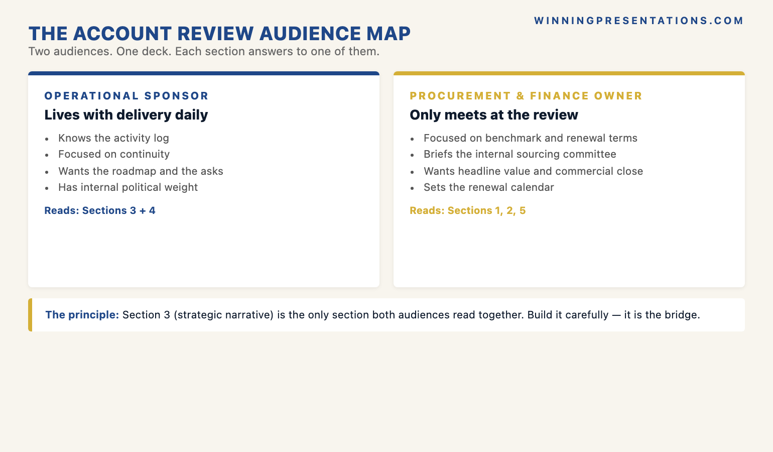
The five-section number is structural, not arbitrary. A key-client review meeting in 2026 typically runs sixty to ninety minutes, with two distinct audiences in the room and a third audience reading the deck afterwards. The operational sponsor — the executive who lives with your delivery team daily — has already absorbed most of the activity-level detail through the quarter. The procurement or finance owner is in the meeting precisely because they have NOT absorbed that detail and will not absorb it now. The deck cannot do two jobs at once. Five sections is the count at which the deck stays cognitively manageable for the procurement owner and detailed enough for the operational sponsor to nod through the parts they already know. Push past seven sections and the procurement owner closes the binder, as in the FTSE retailer story. Drop below four and the operational sponsor starts asking whether the team did any work at all.
What this format replaces is the activity-log review — the deck shape that dominated key-account meetings through the 2010s and that a surprising number of senior account teams still default to. The activity log is the fourteen-page section at the centre of the old deck that lists every workstream, every milestone hit, every deliverable shipped, every meeting held. It made sense in an era when the operational sponsor wrote the renewal cheque and the activity log was the evidence of work performed. In 2026, the activity log is the wrong artefact for the wrong audience. Procurement does not buy activity; procurement buys outcomes, benchmarks, and risk reduction. Finance does not buy hours; finance buys variance-against-plan and forward-looking commitments. The five-section format is built to give those two audiences what they actually have to take back to their internal committees, and to do it inside the sixty-minute window the procurement diary will tolerate.
The format also recognises a shift that is harder to see from the account team’s side of the table. Procurement teams at large enterprise clients have, since roughly 2022, started routinely benchmarking professional-services contracts against a market panel before each renewal. The procurement director who walked into the FTSE retailer review with a market benchmark in her binder is now closer to the norm than the exception. The account review deck that does not acknowledge this — that does not give the procurement owner a defensible answer to “are we paying market” — is the deck that loses the contract to tender, even when the underlying delivery has been strong. The five-section format puts the value-delivered headline and the operating-metrics page first because those are the two pages that respond to the benchmark conversation. The strategic narrative and the renewal close come later because they only land if the first two pages have already given the procurement owner cover to stay in the room.
Section one: the value-delivered headline
The headline is one sentence on an otherwise nearly empty page, naming in plain commercial terms what the client received this period. Not the activity, not the topic of the meeting, not the company name across the top — the headline. An example, written in the form that has been working: “In Q3 we reduced the client’s post-implementation defect rate from 4.2 percent to 2.1 percent, against a contracted target of 2.5 percent, while holding the agreed fee profile flat.” A second example: “In H1 the engagement delivered the migration of fourteen of the seventeen retail-banking platforms agreed in the scope, on the original timeline, with a measured customer-incident rate that came in below the contracted ceiling.” The headline names the outcome in the client’s commercial vocabulary — defect rate, customer-incident rate, migration count — not in the account team’s internal vocabulary — workstreams, sprints, milestones.
The diagnostic for the headline section is brutal and worth applying before the deck leaves the team’s hands. Write the headline sentence and read it aloud to a colleague who has not been on the account. If they cannot, in one sitting, repeat back what the client got this period — in their own words, without referring to the slide — the headline is too long, too vague, or too internal. The colleague is standing in for the procurement director who will read the headline once on the meeting morning, mention it to her finance director on the corridor afterwards, and then have to repeat it to her sourcing committee three weeks later when the renewal goes to internal review. If the headline does not survive that chain of retelling, the rest of the deck cannot rescue it.
The mistake the activity-log generation of account decks makes here is to open with a recap of the engagement scope. The recap is internal-team thinking dressed up as client-facing content. The procurement owner already knows the scope — her team negotiated it. The operational sponsor already knows the scope — he runs against it weekly. The recap is in the deck because it is comforting to write, not because it does any work in the meeting. Cut it. Open with the headline.
Section two: the operating-metrics page
The operating-metrics page is three to five lines, each one a KPI the contract committed to drive at the last renewal or signature, shown with the current-period number, the target number, the variance, and a one-line comment underneath. The KPIs are not the metrics the account team finds easy to report; they are the metrics the contract names. If the contract committed to drive the client’s net promoter score from 32 to 40, the NPS line is on the page even if the result is uncomfortable. If the contract committed to a service-level target of 99.5 percent availability, the availability line is on the page even if the conversation will be awkward. Omitting a contracted KPI from the operating-metrics page reads, to the procurement owner, as either a tell or an oversight, and both readings damage the renewal more than the bad number would.
The variance comment is the part of the page that distinguishes a senior account director’s deck from a junior one. A junior comment reads “tracking broadly in line with plan, minor variance driven by Q3 seasonality, expected to recover in Q4.” A senior comment reads “missed the contracted NPS target by three points, driven by a known onboarding-friction issue that the joint team scoped a fix for in August, with the fix shipping in October and the expected NPS recovery to the contracted level by end of Q1 next year.” The junior comment defends; the senior comment decides. The procurement owner reads both versions and forms an immediate, and often permanent, view of whether the account director is running the relationship or whether the account director is being run by it. The QBR template structure covers the variance-as-decision pattern in more depth and is worth a read before the next operating-metrics page goes out.
The page also has to do one thing that is uncomfortable but structural: it has to show the metrics the client cares about, not the metrics the account team finds easiest to win on. A senior account director I worked alongside in a 2017 review at a mid-cap retail-banking client made the call to put a missed customer-onboarding metric at the top of the operating-metrics page, ahead of two strongly-performing metrics underneath. The operational sponsor, who had been bracing for the conversation since the metric missed in month two, visibly relaxed when he saw it on the page. The procurement owner, who had been expecting the account team to bury it, took out a pen and made a note. The renewal closed on terms three months later, on the original three-year cycle, partly because the account director’s willingness to surface the miss first established that the rest of the deck could be trusted. The deck that hides the miss never recovers that trust in the same meeting, no matter what the rest of the pages say.
Section three: the strategic narrative
The strategic narrative is one page, three or four short paragraphs, connecting what the engagement delivered this period to what the next twelve to eighteen months of the client relationship are going to look like. The narrative is not the longer strategic thinking the senior account team has been doing all year; it is the version of that thinking compressed to the point that the procurement owner can re-read it in ninety seconds on the train home and brief her sourcing committee from it the following week. The procurement owner will form her whole view of where the relationship is going from this single page. If the page reads as a generic restatement of capability — “we will continue to bring our deep sector expertise and our market-leading methodology to bear” — the procurement owner concludes the relationship has no forward strategy and starts thinking about the tender alternatives. If the page reads as a specific, dated, client-context narrative — “next year the joint focus moves from migration delivery to operational-stability work, against the backdrop of the client’s announced cost-reduction programme” — the procurement owner concludes the account team understands what the client is actually doing and has positioned the engagement against it.
The diagnostic for the strategic narrative is whether the procurement owner could brief the page back to a colleague who has never met the account team. If she can, the page is doing its work; the engagement has been positioned inside the client’s own strategy. If she cannot — if the page reads as something that could have been written for any client in the sector — the page is failing the absent-reader test. The fix is almost always to cut the capability language and replace it with a sentence that names what the client is doing in the period ahead, then a sentence that names what the engagement does inside that period, then a sentence that names what changes about the joint working model to deliver it. The page becomes shorter and sharper and the procurement owner can carry it.
An account review deck holds up to procurement scrutiny because the underlying slides are built right — not because the conversation is comfortable.
The Executive Slide System is the slide library senior account directors are using to build the value-delivered headline, the operating-metrics page with variance-as-decision, the strategic-narrative page, and the renewal close that this five-section format depends on — without rebuilding them from scratch every quarter. 26 templates, 93 AI prompts, 16 scenario playbooks. Lifetime access, instant download. £39.
- 26 executive slide templates — value-delivered headlines, operating-metrics layouts with variance commentary, three-block strategic narratives, two-column roadmap-and-asks pages, renewal-close templates, and the QBR deep-dive structure
- 93 AI prompts — for drafting the headline, sharpening the variance comments, and stress-testing the strategic narrative in 30 minutes instead of three hours per review
- 16 scenario playbooks — quarterly business review, account renewal, capital request, board approval, transformation update, and other senior-stakeholder meetings
- Instant download — usable in the next QBR cycle
- Lifetime access, lifetime updates — £39
Section four: roadmap and named asks
The roadmap-and-asks page is the section that most consistently separates the account decks that drive a renewal in the meeting from the account decks that produce a polite “we will think about it” and a follow-up call six weeks later. The page is structured in two halves. The top half is the roadmap — three to five rows, each row a workstream for the next twelve months, each row showing the planned outcome and the joint owner. The bottom half is the asks — two or three specific requests of the client, each one named and dated. A specific introduction the account team needs from the operational sponsor to a counterpart in another business unit. A specific commercial decision the procurement owner needs to ratify before the next quarter to keep the timeline. A specific senior interview the client needs to make available for the methodology team to refine the next phase of work.
The asks section is the page that most senior account directors instinctively want to soften, and softening it is the most common single failure mode in account decks. The instinct is to phrase the asks as collaborative aspirations — “we look forward to working with the client on the introductions and decisions that will support the next phase of delivery” — rather than as specific commitments. The aspirational phrasing reads as polite. It is also useless. The procurement owner cannot act on it, the operational sponsor cannot commit against it, and the asks evaporate the moment the meeting ends. The specific phrasing — “we are asking for the introduction to the head of European operations by 15 July, the procurement sign-off on the Phase 3 commercial terms by 22 July, and four senior-team interviews scheduled across August” — is uncomfortable to deliver and exactly what makes the renewal conversation tractable. The procurement owner has a list of items to take to her committee. The operational sponsor has a list of items to chase internally. The relationship has a tempo.
A second story is worth telling here, as a contrast to the FTSE retailer scene. In 2021, a senior partner I worked alongside ran a six-monthly review for a publicly-listed industrials manufacturer where the engagement had been quietly underperforming for nine months. The partner went into the review knowing the conversation would be hard. He used the five-section format. The value-delivered headline acknowledged a missed milestone directly. The operating-metrics page surfaced two missed KPIs with variance comments that named what the engagement team would do to recover them. The strategic narrative connected the recovery work to the client’s own announced cost programme. The roadmap-and-asks page named three specific asks of the client, including a request to defer a piece of scope by one quarter to enable the recovery. The client’s chief operating officer, who had been bracing for a defensive deck, said in the meeting: “I came in expecting to put this contract on watch. I am not going to. Tell me what you need from me to make the asks land.” The contract renewed on a three-year cycle six weeks later. The deck did not save a strong contract; it gave a struggling contract a fair hearing, which is the most an account review deck can ever do.
Section five: the renewal-and-next-steps close
The renewal-and-next-steps close is three or four lines on the final page, naming the commercial terms on the table, the contract window, and the named owner who will sign. The page is uncomfortable to put in the deck the first time an account team uses this format. It feels presumptuous, as though the team is asking for the renewal too directly. The discomfort is the signal that the page is doing its work. The procurement owner is in the room precisely because the renewal is on the agenda. The operational sponsor is in the room precisely because his judgement of the engagement is the input the renewal decision will turn on. Closing the deck without naming the renewal explicitly is the structural equivalent of an investor pitch that ends without an ask — everyone in the room knows what the meeting was for, and refusing to name it produces awkwardness rather than restraint.
The named-owner element of the close is the part that earns the renewal cycle. The page does not just say “the renewal terms are on the table”; it says “the renewal terms are on the table, the proposed signature window is 1 to 15 September, and the named owner for the client-side signature is [the procurement director’s title].” The procurement director either confirms or names a different owner in the meeting, and the conversation moves to the specifics of the timeline. The deck that does not name the owner produces a six-week handover loop where the account team chases the procurement director’s office for a signatory and the procurement director’s office chases the account team for amended commercial terms, and the renewal slides past the original deadline. The named owner is the structural artefact that holds the renewal cycle to its calendar.
When the account review is the moment the renewal hinges on a senior decision — a multi-year extension, a fee restructure, an expanded scope — the deck only does half the work.
The Executive Buy-In Presentation System is the self-paced programme senior account teams use to walk a client through the renewal conversation that has to land beyond the room — the structured method for pre-handling the procurement committee, mapping the finance director’s objections, and designing the post-meeting tempo so the renewal signs on the original timeline. 7 modules, self-paced with monthly cohort enrolment, optional recorded Q&A sessions available. £499, lifetime access to materials.
Running the format when the room is difficult
The five-section format is at its most useful when the room is difficult — when the procurement director has come in with a benchmark in her binder, when the finance director has joined the meeting unannounced, when the operational sponsor and the procurement owner disagree about whether the engagement has delivered, when a competitor has been quietly pitching the same client for six months and the account team knows it but has not been told it explicitly. The instinct of an account team in a difficult room is to lengthen the deck — more context to explain the delivery, more case studies to demonstrate capability, more strategic narrative to compensate for the metric that missed. The client reads the longer deck as defensiveness, and the defensiveness damages the renewal conversation more than the underlying problem does. The five-section format compresses to a sharper, shorter deck in a difficult room, because the value-delivered headline names the issue directly, the operating-metrics page surfaces the variance with a decision, and the roadmap-and-asks page gives the client something specific to act on.
A second discipline for difficult rooms is to put the procurement owner’s likely benchmark question on the deck before she asks it. If the account team knows that the procurement panel has been benchmarking professional-services contracts in this sector and that the average comparable fee profile is twelve percent below the current contract, the value-delivered headline names the contracted-outcome metrics in terms that justify the fee delta, the operating-metrics page surfaces the metrics where the engagement is over-delivering against contract, and the strategic narrative names the work the engagement is doing that a market-average vendor would not. The procurement owner does not need to ask the benchmark question because the deck has already responded to it. The conversation moves to the renewal terms, not to a defensive justification of the existing fees. The deck that does not pre-handle the benchmark forces the account director to do it live, and live benchmark conversations almost always end with a fee concession the account director did not need to make.
A third discipline is to read the room for the second-order audience before the meeting starts. The procurement owner is in the room. Her sourcing committee is not. The finance director may be in the room or may not. His CFO is not. The deck has to land in the room and survive the corridor conversation that the procurement owner will have with her committee three days later. The diagnostic, again, is the absent-reader test. Each page in the deck has to answer the question the absent reader will ask. The value-delivered headline answers “what did the contract get us this period.” The operating-metrics page answers “did they hit what they committed to.” The strategic narrative answers “is this engagement positioned for the next eighteen months.” The roadmap-and-asks page answers “what do we need to do to keep it on track.” The renewal close answers “when does the next decision need to be made and by whom.” A deck that survives all five absent-reader questions is a deck that survives the corridor.
One thing to do before the next QBR
Before your next QBR, write the headline slide last. One sentence. Read it aloud. If it does not name what the client got this period in plain commercial English, in vocabulary the procurement director would use rather than vocabulary the delivery team would use, the rest of the deck will not hold. Write the rest of the deck only after the headline survives the read-aloud test. The discipline is uncomfortable the first time and gets sharper every cycle, and the difference shows up in the renewal calendar — the contracts that close on the original cycle, on the original terms, with the original signatory.
Frequently asked questions
Is five sections really enough for a major eight-figure account where the renewal cycle is multi-stage?
It is, when the five sections are built to carry the decisions rather than to demonstrate the work. The mistake is to read “five sections” as a constraint on depth and assume the deck has to be thin. Each of the five sections in this format carries as much information as four or five pages of a traditional activity-log review — the headline is the renewal-defensible read of the period, the operating-metrics page compresses what used to be a multi-page KPI walk-through, the strategic narrative compresses what used to be a twelve-page capability section into one page positioned inside the client’s own strategy, the roadmap-and-asks page is a dated commitment register, and the renewal close is a named-owner tempo plan. The deck is dense, not thin. The five-section count keeps it cognitively manageable for the procurement owner in a sixty- to ninety-minute meeting; the depth inside each section is what makes it sufficient for the operational sponsor and the absent-reader audiences afterwards.
What goes in the appendix, and when does the account director walk it?
The appendix carries the detailed activity log, the case-study material, the detailed methodology references, and the model build with all underlying assumptions. The account director does not walk the appendix by default. When a client question lands — “can you show me more on the rationale for the deferred Phase 3 scope?” — the account director navigates to the relevant appendix page, walks the page, and returns to the main deck. The appendix is the safety net; it is not the path through the meeting. The discipline is to keep it in the file and never to volunteer it. The clients who want the long-form detail will ask for it, and the appendix gives them somewhere to go without forcing the procurement owner to sit through it.
How does this format work when the operational sponsor disagrees with the procurement owner about whether the engagement has delivered?
The five-section format does not paper over the disagreement; it surfaces it cleanly and gives the room a structured way to talk about it. The value-delivered headline names the outcome the contract committed to and the result. The operating-metrics page surfaces the variance with a decision attached to it. If the operational sponsor and the procurement owner are reading the same metric differently, the metric is on the page, the variance comment names the gap, and the conversation can move to the substance instead of arguing about which party’s version of the period is correct. The deck that buries the variance forces the disagreement to play out without a shared reference point, and the disagreement gets worse, not better. The deck that surfaces the variance gives both sides something to anchor on, and the renewal conversation can proceed.
Does the five-section format work for a smaller account where there is no procurement function and the renewal is a one-stakeholder decision?
It works, with a slight shape adjustment. When the renewal decision sits with a single sponsor who lives with the engagement daily, the operating-metrics page can be compressed further — the sponsor already knows the metrics — and the strategic narrative becomes the centre of gravity of the deck. The roadmap-and-asks page is unchanged; specific named asks of a single sponsor are as important as specific named asks of a procurement committee. The renewal close is unchanged; the named owner is the sponsor, the timeline is the renewal window, and naming both explicitly turns a renewal conversation into a renewal commitment. The format scales down to single-stakeholder accounts more cleanly than it scales up to multi-stakeholder enterprise accounts; the discipline to learn first on smaller accounts and then carry into the larger ones is the headline-first habit and the variance-as-decision habit.
What happens when the client uses the meeting to put the contract on watch rather than renew it?
The five-section format is the format that gives the contract its best chance, and the format that lets the account director hear the watch decision early enough to act on it. The roadmap-and-asks page produces a specific list of items the client has either committed to or declined. If the client declines the asks, or hedges them, the signal is in the room rather than in a follow-up email six weeks later. The renewal close produces a named-owner conversation. If the client cannot name the owner, or names an owner the account team has never engaged with, the signal is again in the room. Both signals give the account director a window to escalate, to re-engage the operational sponsor’s executive, or to widen the conversation inside the client. The longer deck, by contrast, lets the watch decision land in the follow-up email, by which time the window to act has narrowed sharply. The format does not save every contract; it surfaces the trouble while the account director can still do something about it.
The Winning Edge — weekly newsletter
The Winning Edge is a weekly (Thursday) newsletter for senior professionals who present at the executive level. One short email a week, focused on the structural moves that separate decks clients renew on from decks they put on watch. Subscribe to The Winning Edge →
For the broader picture across slides, storytelling, confidence, and delivery, the Complete Presenter bundle is the seven-product set most senior account directors find useful as a single library — £99 for everything, lifetime access.
About the author
Mary Beth Hazeldine is Owner & Managing Director of Winning Presentations Ltd. With 24 years of corporate banking experience at JPMorgan Chase, PwC, Royal Bank of Scotland, and Commerzbank, she advises executives across financial services, healthcare, technology, and government on structuring presentations for high-stakes client renewals, board approvals, and strategic decisions.