Tag: Series A pitch deck

04 May 2026
Investor Pitch Deck Slide Order: The Sequence VCs Read Top-Down — featured image

Investor Pitch Deck Slide Order: The Sequence VCs Read Top-Down

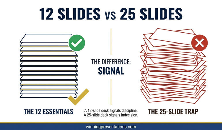
Quick Answer: Investor pitch deck slide order matters because venture capital partners rarely read a deck in the order you built it. They flip ahead, jump to financials, and scan the team slide before they reach the problem. The sequence that survives this pattern puts a single-line company description first, problem and market second, product and traction in the middle, and team, ask and financials as a closing block. Each slide must hold up when read out of order.

Priya had rehearsed her Series A pitch eleven times. Twenty-three minutes, thirteen slides, a clean story arc from customer pain through to unit economics. The VC partner on the other side of the table opened the PDF, looked at slide one for three seconds, then clicked straight to slide seven — the financials. Then slide eleven, the team. Then back to slide four. Priya was still talking about the problem.

She watched the partner read her revenue projections before he knew what her company did. He read the team slide before the product. By the time he worked his way back to the problem slide, his questions were already framed by numbers he had half-interpreted without context. The narrative she had built, carefully, linearly, collapsed inside ninety seconds because the deck had not been designed to be read out of order.

The feedback afterwards was polite and fatal. “Interesting space, not sure we’ve got conviction on the wedge.” Priya rebuilt the deck the following week around a single structural premise: every slide has to make sense on its own, and the order has to survive a partner who reads it top-down and sideways at the same time. The next three pitches landed differently. The fourth became a term sheet.

If your next investor pitch is in the diary

The Executive Slide System includes a scenario playbook for investor pitch decks built around top-down reading patterns — so each slide holds up whether the partner reads the deck front-to-back or jumps straight to the ask.

Explore the System →

Why VCs read pitch decks top-down, not slide-by-slide

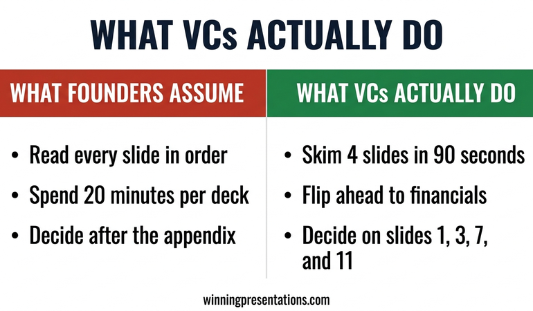
The assumption behind most investor decks is that the partner will read from slide one to the end, in the order you built it. That is not how most venture capital partners consume a deck, especially at first pass. A partner with twelve decks in their inbox on a Monday morning will open yours, scan the first slide, and then make a rapid decision about where to look next. Some will flip straight to the team slide. Some will go directly to traction. Some will scroll through all thirteen slides in under a minute, reading only the titles and headline numbers, and form a view before any detailed reading happens at all.

This behaviour is not disrespectful. It is the only way a working VC can triage dealflow. The implication for your investor pitch deck slide order is significant: the deck is not a presentation script. It is a document that will be read non-linearly by someone whose default mental model is “find the reasons to say no quickly.” Every slide has to answer a question on its own, and the sequence has to hold up when the partner flips ahead and circles back.

This matters even more in a live meeting. A partner who has already read the deck before the meeting will skip ahead while you talk. If slide seven surprises them before you have set up slide four, the narrative you rehearsed collapses. The sequence has to be robust to being read out of order, because it will be.

The founders who learn this structural rule early stop writing decks as linear stories and start writing them as indexed documents. Each slide is self-contained. The title earns its place. The headline number at the top answers the question the slide raises. The order still matters, because a VC who does read front-to-back should experience a coherent story. But no slide relies on the previous slide having been read first.

THE EXECUTIVE SLIDE SYSTEM — £39

Build a pitch deck that reads cleanly in any order a VC opens it

The Executive Slide System is 26 presentation templates, 93 AI prompts, 16 scenario playbooks, a master checklist and a framework reference. The investor pitch playbook is built around the non-linear reading patterns venture partners actually use — question-led titles, headline-first financial slides and a team slide that works whether it is read second or last. £39, instant access.

Get the Executive Slide System →

Designed for founders raising seed through Series B rounds in UK and European markets.

The slide order most founders default to (and why it fails)

The default pitch deck sequence most founders end up with looks roughly like this: title slide, team, problem, solution, how it works, market size, traction, business model, competition, financials, ask. It is a sequence assembled from fragments of advice across accelerator programmes, YC templates from 2011, and the decks of whichever founder the speaker happened to reference most recently.

Three structural weaknesses show up again and again.

Team too early. Opening with team implies the team is the core investment case. For most early-stage rounds, the team matters — but it matters in the context of the problem they are uniquely positioned to solve. Leading with team without first framing the wedge asks the partner to evaluate the founders in a vacuum. The better move is to earn the team slide by establishing the problem and the insight first.

For a deeper look at the specific mistakes founders make in deck structure, the investor pitch deck mistakes guide covers the recurring structural errors that show up across hundreds of decks.

Solution before market. Showing the product before establishing the market size means the partner is evaluating the product without a frame for how big the opportunity is. A clever product in a small market reads differently from a clever product in a £40bn market. The market size slide has to anchor the partner’s reading of everything downstream.

Financials and ask at the very end, as an afterthought. The ask is often the slide a partner most wants to see — how much, what valuation range, what runway it buys, what the next set of milestones looks like. Burying it behind competition and team slides means a partner who flips ahead finds it without any of the build-up that would make it land. The financials and ask need to be tight, headline-first, and capable of standing alone.

Side-by-side infographic comparing the default founder pitch deck order with team and ask in the wrong positions against the recommended sequence with company line first, problem and market second, and financials as a closing block

The failure pattern is consistent. The deck is built as a linear story, the VC reads it non-linearly, and the slides do not hold their weight individually. The fix is to rebuild the order around what survives a partner who reads the deck out of sequence.

The sequence that survives a 90-second deck flip

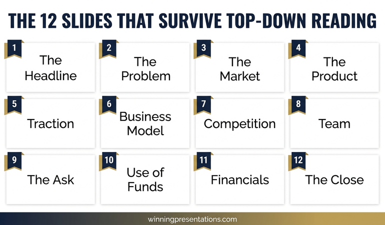
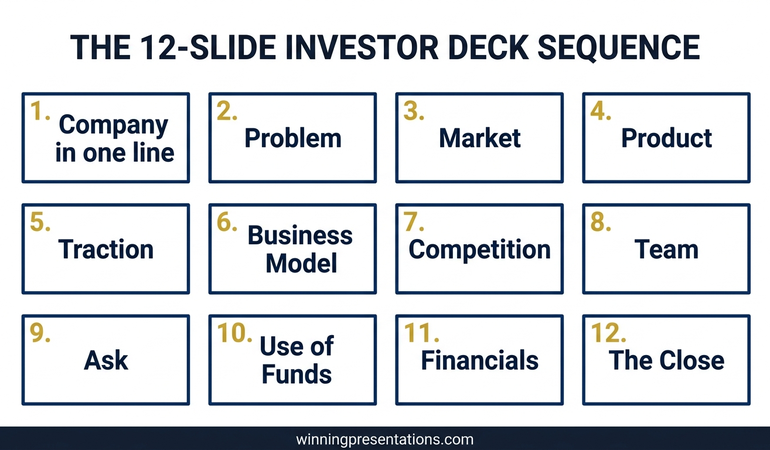
A working sequence for a seed-to-Series-B investor deck runs twelve to thirteen slides in the following order: company in one line, problem, market, product, how it works, traction, business model, competition, team, ask, financials, use of funds, closing milestones. The exact slide count varies, and some founders fold product and how-it-works into a single slide or split financials across two. The order is the load-bearing element.

The sequence is designed so that a partner who reads only the first three slides has a defensible first impression. A partner who skips to slide nine sees the team with context. A partner who jumps to the ask finds financials immediately before or after, so the numbers around the ask are never a separate hunt. Each of these reading paths produces a coherent picture.

The second discipline is that every slide has a question-led or claim-led title, with the answer as the headline beneath. “What problem are we solving?” with a one-sentence answer. “How big is the market?” with the number. “What traction have we built?” with the headline metric. A partner reading only the titles and the headlines should be able to form an investment thesis in ninety seconds.

For the related discipline of how much detail each slide can carry without losing the partner, the partner article on Series A pitch deck length covers the specific word and density limits that hold attention across a live reading.

If you would rather start from a ready-built template that already encodes this sequence, the Executive Slide System includes the investor pitch playbook with the full 12-slide sequence and editable templates for each position.

Slide 1: The company in one line, not the team intro

Slide one is not the place for the team. It is not the place for a mission statement. It is not the place for a logo parade of press coverage or partner institutions. Slide one has a single job: tell the partner what the company does in one line, clearly enough that a partner who reads only this slide knows whether this is in their investment thesis.

The working format is a single sentence with three components: who the customer is, what the product does, and the wedge. “We sell automated compliance monitoring to mid-market UK banks who cannot justify the headcount of a full risk team.” That is a sentence a partner can evaluate in three seconds. It frames everything that follows.

The common failure modes are predictable. A vague aspirational statement (“we are building the future of financial services”). A product description without the customer (“AI-powered compliance monitoring”). A customer description without the product (“we serve mid-market banks”). Each of these leaves the partner doing work the slide should have done.

Under the one-line description, slide one can carry the round stage, the amount being raised, and the headline traction number — one metric, not a dashboard. That is enough to frame the rest of the deck without overloading the opening.

Slides 2 to 3: Problem and market, in that exact order

Problem comes before market, and both come before solution. The sequence matters. Problem first establishes that the issue is real and painful. Market second establishes that solving it is worth capital. Only then does the solution slide carry weight.

The problem slide does its job when it describes a specific, named pain experienced by a specific, named customer segment, ideally with a dimension of cost or frequency that makes the pain quantifiable. “Mid-market UK banks spend an average of £1.8m per year on manual compliance review because existing tooling is built for tier-one institutions.” That is a problem a partner can evaluate. Generic pain statements (“compliance is complex and expensive”) leave the partner unable to judge whether the problem is worth a round.

The market slide is about size and shape, not total addressable market theatre. A partner has seen the “$50bn TAM” slide a thousand times and discounts it heavily. What they want is a bottom-up view: the number of target customers in the primary segment, the average contract value, and the implied serviceable market. A bottom-up £400m SAM reads as more credible than a top-down £50bn TAM.

The order matters because a partner who flips to the market slide before reading the problem slide interprets the market number without knowing what customer segment it covers. Putting problem first forces the partner’s attention through the pain before the numbers, which changes how the numbers read.

Slides 4 to 8: Story, traction, model

The middle block of the deck — product, how it works, traction, business model, competition — is where most decks either demonstrate that the company is working or fail to. The structural discipline is that each of these slides stands alone, and the traction slide in particular has to earn its position.

Vertical card layout infographic showing the five middle slides of an investor pitch deck: product, how it works, traction with a single headline metric, business model with unit economics and competition with a wedge positioning

Product slide. A single screenshot or diagram that shows the core product surface. Not a list of features. Not a roadmap. The partner needs to see what the customer actually uses. If the product is not yet visual, use a two-line description of the primary workflow.

How-it-works slide. Three steps, maximum. This is the slide that converts the product into a workflow a partner can picture a customer completing. Overloading this slide with technical architecture is the most common failure mode.

Traction slide. One headline metric at the top of the slide, large font, impossible to miss. Revenue run rate, number of paying customers, growth rate — whichever number is strongest. Underneath, two or three supporting metrics. A partner who reads only the headline number should be able to judge whether the traction is material for the stage. This is the slide most often read out of order, so it has to stand alone.

Business model slide. Contract size, contract length, gross margin, CAC and LTV if you have them. Partners want to see unit economics that make sense at scale. Vague business model descriptions without numbers read as red flags at Series A and beyond.

Competition slide. Not a two-by-two matrix with your company in the top-right quadrant. That structure is tired and partners discount it. A better format is a short list of named competitors with a one-line description of why your wedge is different, honestly. Claiming no competition is worse than naming three and explaining the gap.

Slides 9 to 12: Team, ask, financials — closing strong

The closing block is where decks either convert interest into a meeting or drift into polite rejection. Team, ask, financials and use of funds need to be the strongest slides in the deck, not the afterthought they often are.

Team slide. Three to five people, maximum. Each person gets a name, a role, and one line that establishes the specific relevance to this problem. Not the full CV. Not every prior company. The relevance to this specific wedge is what the partner needs. A founder who spent eight years inside a bank building compliance tooling is the right person for this round. Say that in one line, not a paragraph.

Ask slide. Amount, valuation range if you are willing to share it, runway the round buys, and the set of milestones the round delivers. The ask is a slide the partner will flip straight to. It should read cleanly on its own. A vague ask (“we are raising a Series A”) without specifics signals a founder who has not thought through the round carefully.

For board-level context on how the structure and close of a strategic presentation land with senior stakeholders, the board presentation skills guide covers the related discipline that carries over into investor meetings.

Financials slide. Three years of projected revenue, gross profit and operating cash flow, with current-year actuals where available. Headline numbers at the top, supporting detail below. This is the slide a partner will scrutinise most. Overly optimistic hockey-stick projections signal founders who do not understand their own market. Conservative, defensible numbers signal founders who have done the work.

Use of funds and milestones. Where the money goes, what it buys, and what the business looks like at the next round. This is the slide that translates the ask into an investment story. A partner who reads the ask slide and the use-of-funds slide should understand exactly what the next eighteen months deliver and what the follow-on round looks like.

Priya rebuilt her deck using this closing block structure. The team slide was ranked second in her rehearsed sequence, but third or fourth in the positions she could not control. The ask slide held up whether read before or after the financials. The use-of-funds slide answered the question the partner asked every time. The term sheet came four weeks after the rebuild.

FOR THE NEXT INVESTOR PITCH ON YOUR CALENDAR

The complete scenario library for high-stakes investor meetings

The Executive Slide System gives you 26 templates, 93 AI prompts and 16 scenario playbooks — including the investor pitch playbook with the 12-slide sequence, question-led title patterns and the closing block structure referenced above. £39, instant access, no subscription.

Get the System →

If you are starting from a blank canvas and want a worked example of this sequence applied end to end, the investor pitch deck template walks through each slide position with a sample company applied.

Frequently Asked Questions

How long should an investor pitch deck be?

For a seed to Series B round, twelve to thirteen slides is the working range. Fewer than ten starts to feel under-developed. More than fifteen signals a founder who has not yet decided what matters. The length discipline is the same as the sequence discipline: each slide has to earn its place, and anything that would not survive a partner reading only the title and the headline should be in an appendix, not the main deck.

Should financials come early or late in the deck?

Late — but not at the very end. The working position is slide ten or eleven, after team and ask, before use of funds. A partner who flips ahead to the financials should find them adjacent to the ask, so the two read together as a single investment case. Putting financials first, before the problem and market, leaves the partner interpreting projections without the context to judge whether they are credible.

Why do VCs flip ahead in a deck instead of reading linearly?

Partners triage twenty to fifty decks per week at the top of the funnel. Non-linear reading is the only way to process that volume. A partner will typically scan the first slide, jump to team or traction, and then decide whether to read the rest. This is not disrespectful — it is the workflow of a busy investor. The response is not to ask partners to read your deck differently. It is to build a deck that holds up under their actual reading pattern.

What about the appendix — where does that sit?

The appendix sits after the main 12-slide sequence and exists for one reason: to answer the three or four questions a partner reliably asks in the meeting itself. Cohort analysis, sensitivity scenarios, detailed competitive breakdowns, technical architecture. Label each appendix slide clearly (A1, A2, A3) so you can jump to it on request without scrolling through thirty backup slides while the partner watches. An appendix that takes more than three seconds to navigate to is an appendix that never gets used.

Presentation playbooks, delivered Thursdays

The Winning Edge newsletter covers the structures real executives use for high-stakes meetings — investor pitches, board approvals and stakeholder buy-in. One issue per week, typically read in four minutes.

Subscribe to The Winning Edge →

Not ready for the full system? Start here instead: download the free Executive Presentation Checklist — a one-page structural review to run over any pitch deck before it goes into a VC inbox.

Partner post: Once the slide order is right, the next structural decision is how much to put on each slide. The Series A pitch deck length guide covers the density rules that decide whether a partner reads through or skims out.

Your next step: Before you send your pitch deck to the next VC, open it in preview mode and read only the slide titles and the headline numbers at the top of each slide. If that reading on its own does not tell an investment story, the deck is not yet ready. Fix the titles and the headlines before you fix anything else.

About the Author

Mary Beth Hazeldine is Owner & Managing Director of Winning Presentations Ltd. With 24 years of corporate banking experience at JPMorgan Chase, PwC, Royal Bank of Scotland, and Commerzbank, she advises executives across financial services, healthcare, technology, and government on structuring presentations for high-stakes funding rounds and approvals.

04 May 2026
Series A Pitch Deck Length: Why 12 Slides Beats 25 Every Time — featured image

Series A Pitch Deck Length: Why 12 Slides Beats 25 Every Time

Quick Answer: The right series A pitch deck length is 12 slides, not 25. A Series A lead partner will skim your deck in under four minutes on the first pass, read four slides closely, and decide whether to take the meeting. A 25-slide deck dilutes the four slides that matter. A 12-slide deck forces you to choose them. Put everything else in a clearly structured appendix.

Priya was three days out from her first Series A partner meeting when she sent me the deck. Twenty-seven slides. Her seed deck had been fourteen, and she had doubled the weight because “there is so much more to show now — traction, cohorts, pipeline, expansion logic, the moat.” All true. None of it was on a single slide she could point to and say: this is the headline.

We ran the rehearsal on the Sunday. I asked her to open the deck, pick the slide her lead investor candidate would stop on, and tell me why that slide made the round. She paused. She clicked forwards. She clicked back. Around slide nine, the lead partner — who in rehearsal I was playing — leaned back and asked: “what’s the headline here?” She could not answer. Not because she did not know the business. Because the deck had no centre of gravity.

That meeting moved from a partner call to a recorded async review. Narrower path, lower chance of conversion. Three weeks later we rebuilt the deck around twelve slides. Not because twelve is magic — because twelve forces you to pick the four slides the partner will actually read, and protect them.

If you are cutting a Series A deck down to its real shape

The Executive Slide System includes scenario playbooks for investor pitches, partner meetings and fundraising reviews — structural templates designed for audiences who decide on four slides.

Explore the System →

Why series A pitch deck length is a signal, not a constraint

Most founders treat deck length as a packaging problem — how much content can I fit without losing the reader. That framing misses what the deck does. The deck is a signal of how the founder thinks. A 25-slide deck signals that the founder cannot prioritise, or has not yet earned the right to because the narrative is not tight enough.

A 12-slide deck signals the opposite. The founder has made the hard editorial calls. The four numbers that matter are on the slides, and the rest is supporting detail. Investors do not read this as a gap. They read it as maturity.

When a founder cannot cut from 25 to 12, it is almost never because the extra 13 slides are essential. The founder is using the deck to hedge — adding slides in case a partner asks a specific question, in case the market framing is weak, in case traction alone will not carry it. Each hedge is a tell. For the related question of slide order rather than count, the partner article on investor pitch deck slide order covers the sequence that holds up under a partner read.

What VCs actually do with a 25-slide deck

Most founders assume the partner will read linearly, absorbing the argument. That is almost never what happens. A partner has 45 to 90 seconds to form an initial judgement, and four to six minutes if the first pass is positive. Inside that window, they do three things.

First, they go to the slide that signals stage. For Series A, that is traction — revenue shape, retention or cohort data, and the curve. If that slide is on page 3 they find it in three seconds. If it is on page 17 inside “our journey so far,” they skim past and decide the deck is not stage-appropriate.

Second, they go to the slide that signals defensibility. Not the product slide — the moat slide. Whatever makes this business hard to replicate by a better-funded incumbent eighteen months from now. Product advantage at Series A is rarely the defensibility.

Third, they read the ask and use of proceeds. How much, against what milestones, over what runway. A £12m raise against vague milestones reads worse than a £6m raise against crisp ones.

Those are the four slides — traction, defensibility, ask, and the narrative setup that connects them. Everything else in a 25-slide deck is noise the partner filters through. A 12-slide deck makes the filter unnecessary.

Infographic comparing a 25-slide Series A pitch deck that dilutes the four decision slides against a 12-slide deck that protects traction, defensibility, ask and narrative setup

THE EXECUTIVE SLIDE SYSTEM — £39

Stop shipping a 25-slide deck that hides the four slides the partner actually reads

The Executive Slide System is 26 presentation templates, 93 AI prompts, 16 scenario playbooks, a master checklist and a framework reference. The investor pitch playbook is built for decision-stage audiences who skim before they read — with the 12-slide structure, title architecture and appendix navigation pattern this article describes. £39, instant access.

Get the Executive Slide System →

Designed for founders preparing Series A, Series B and growth-stage investor presentations.

The 12 slides that survive top-down reading

The twelve-slide structure is not arbitrary. It is the minimum coherent set that answers the questions a Series A partner asks on the first read. Each slide earns its place by being the shortest honest answer to one question the partner cannot skip. The twelve questions, in order:

  • What problem is being solved, and for whom?
  • How big is this market, and why is it ready now?
  • What is the product, in one screen?
  • What traction does that product already have?
  • How does the business make money, and what are the unit economics?
  • Who is the team, and why this team?
  • What is being asked for, and what does it buy?
  • What do the financials project, and against what assumptions?
  • What are the plausible exits, and what shape do they take?
  • Why is this defensible against well-funded incumbents?
  • What is the go-to-market motion that gets you to Series B?
  • What is the close — the one sentence the partner takes to the partnership meeting?

Each is one slide. Not a section. Not a sub-deck. When a founder tells me a topic needs two slides to do justice, the founder has not yet found the sentence that collapses it. That sentence exists. It is the editorial work.

For the complete structural reference including title architecture and layout patterns, the investor pitch deck template walks through the slide-level design.

Slide-by-slide: the 12 you need

1. Problem. Framing from the customer’s perspective, with one quantified cost of the status quo. Not “enterprises struggle with X.” A specific operational cost a specific buyer already pays.

2. Market. Bottom-up sizing. Target buyers, average contract value, addressable revenue. Top-down “it’s a $42bn market” numbers read as lazy at Series A.

3. Product. One screenshot that communicates what the product actually does. Not three. Not a feature grid. The screen the user spends 80% of their time on.

4. Traction. The single most important slide. Revenue curve, retention or cohort shape, and one signal of velocity. This is where the round is won or lost.

5. Business model. How you charge, the contract shape, gross margin and one unit economic ratio (LTV/CAC, payback period, contribution margin). If the economics are not yet clean, say so openly and show the trajectory.

6. Team. Three to five faces maximum. For each, one line: the relevant experience that matters for this company. Investors hire the team that can execute this specific plan.

7. The ask. Round size, valuation range (optional), use of proceeds in three buckets (product, GTM, team), and the runway this buys in months. Specific milestones, not categories.

8. Financials. Three years of projected revenue, gross margin and burn. Flagged as model, not forecast. Include the two or three assumptions the model is most sensitive to.

9. Exit. Plausible acquirers or comparable outcomes, with a rough scale. Not a promise — a demonstration that the founder has thought about what a 10x outcome looks like.

10. Defensibility. The moat. Data network effects, switching costs, regulatory position, distribution lock-in, proprietary data asset — whichever applies. If none apply, the founder needs to know that before the meeting.

11. GTM. The go-to-market motion that gets you from this round to the next. Sales-led, product-led, partnership-led or hybrid — and the specific next hires and channels that make it real.

12. The close. One sentence the partner takes into the Monday partnership meeting. Usually a reframing of the opportunity in the language of the fund’s thesis. Written last, because it is the whole deck compressed into a line.

For founders still shaping the narrative before slide-level choices, the pitch deck storyline guide covers how to sequence the twelve questions into a single argument.

Slides to never include in the 12 (and where they go instead)

Stacked cards infographic showing four types of slide that belong in the Series A appendix rather than the main 12: competitor matrix, roadmap, detailed org chart and press coverage

The slides founders most often over-include are competitive landscape, detailed roadmap, press and logos, and the history-of-the-company slide. Each has a place. None belong in the twelve.

Competitive landscape. A 2×2 matrix with your logo in the top right is almost always weaker than one sentence inside the defensibility slide that names the two real competitors and what you do differently. The matrix goes in the appendix.

Detailed roadmap. A quarter-by-quarter roadmap is either aspirational theatre or premature specificity. The GTM slide covers strategic direction. Detailed roadmap belongs in a data room, not a first-read deck.

Press and logo walls. Customer logos can earn a small line on the traction slide. A full page of press hits reads as marketing, not evidence.

Company history. The founding story, the pivots, the previous names — none of it answers a partner question. If the founding story is strong, it comes out verbally. A slide for it signals the founder has run out of harder material.

The appendix is where these slides live — labelled A1 through A6, navigable in under two seconds. When a partner asks about the competitive set, the roadmap or the regulatory position, you jump straight there. The main twelve stay clean. This is how investor pitch deck mistakes most often get corrected at the structural level.

The discipline of cutting from 25 to 12

The cut from 25 to 12 is not a compression exercise. It is a decision exercise. Print every slide as a thumbnail, lay them on a table, and for each ask two questions — which of the twelve partner questions does this slide answer, and is it the single strongest answer I have?

Any slide that does not answer one of the twelve comes out. Any slide that does but is not the strongest version comes out. The remaining slides are merged, rewritten and reordered until each of the twelve positions has exactly one slide in it.

The work that feels like cutting is actually clarifying. A founder with 25 slides will usually find that two product slides collapse into one better slide, three go-to-market slides compress into one clearer structure, and five team slides become one with the people who matter.

Priya cut her 27-slide deck to 12 in three working days. The round moved from a deferred partner call to a live partner meeting inside two weeks. The meeting opened with the lead asking her to walk him through slide 4 — the traction slide. The slide was already there, already clean, already the strongest version of the answer. The deck had a centre of gravity for the first time.

FOR FOUNDERS PREPARING A SERIES A DECK

The full structural library for investor presentations

The Executive Slide System gives you 26 templates, 93 AI prompts and 16 scenario playbooks — including the Series A investor playbook with the 12-slide structure, question-led titles and the appendix navigation pattern. £39, instant access, no subscription.

Get the System →

Frequently Asked Questions

Is 12 slides too short for Series A?

No. Decks shorter than ten often feel under-argued at Series A; decks longer than fifteen dilute the four slides that matter. The range that reliably holds a partner’s attention is 12 to 15, with 12 as the cleaner target.

Where do unit economics go if they deserve more than one slide?

They do not, in the main twelve. The business model slide carries the headline ratio and contract structure. Cohort analysis, payback curves and sensitivity tables go in the appendix. If the unit economics need three slides to tell the story, the headline number is not yet strong enough — a product or pricing problem, not a slide problem.

Should I have a separate appendix deck or keep it in the same file?

Same file, clearly divided. A separator slide between slide 12 and A1 signals the end of the main argument. Appendix slides are numbered A1 to A6 or A8, with a short index on the separator so founder and partner can navigate instantly. A separate file fragments the meeting.

What about visual density per slide?

One idea per slide, expressed in one headline sentence at the top, with supporting evidence below. Dense slides with six charts read as research dumps. Sparse slides with one chart and one sentence read as conclusions. Partners respond to conclusions.

Presentation playbooks, delivered Thursdays

The Winning Edge newsletter covers the structures real executives and founders use for high-stakes meetings — investor, board and senior stakeholder. One issue per week, typically read in four minutes.

Subscribe to The Winning Edge →

Not ready for the full system? Start here instead: download the free Executive Presentation Checklist — a one-page structural review to run over any deck before you send it to a partner.

Partner post: Once you have the twelve slides chosen, the order you put them in changes how the deck reads. The investor pitch deck slide order guide covers the sequence that holds up under a partner read.

Related reading: If the deck has already gone out and come back with a no, the pitch rejection recovery guide for founders covers the next move. For the partner meeting itself, steel-manning hostile investor questions covers how to handle the pushback that follows a strong deck.

Your next step: Print every slide in your current deck as a thumbnail and lay them on a table. For each slide, write on a sticky note which of the twelve questions it answers. Any slide without a sticky note comes out. Any question without a slide needs one.

About the Author

Mary Beth Hazeldine, Owner & Managing Director of Winning Presentations, advises executives across financial services, healthcare, technology and government on structuring presentations for high-stakes funding rounds, board approvals and stakeholder buy-in. With 24 years of corporate banking experience at JPMorgan Chase, PwC, Royal Bank of Scotland and Commerzbank, she works at the intersection of finance, language and decision psychology.

14 Dec 2025
Pitch deck examples - 7 real decks from Airbnb, Canva, Loom and more that raised millions

Pitch Deck Examples: 7 Real Decks That Got Yes (Not Praise)

📅 Updated: January 2026 | Real decks, real funding rounds

Quick Answer

The best pitch deck examples share common patterns: they lead with a compelling problem, quantify the market opportunity, and make the ask crystal clear. Below are 7 real decks from companies like Airbnb, Canva, and Loom — with analysis of what worked and what you can apply to your own pitch.

Studying examples is smart. Using proven frameworks is smarter.

These decks raised millions because of their structure, not their design. The Executive Slide System gives you those exact frameworks — so your pitch gets meetings, not rejections.

From 24 years presenting to boards and investors: the slide structures that actually get yes.


Get the Executive Slide System → £39


Learning from funded decks is one of the fastest ways to improve your own pitch. But most “pitch deck examples” online are either too polished to be useful or from companies so famous that the lessons don’t apply.

These seven examples are different. They’re from real early-stage rounds — companies that weren’t yet household names, pitching investors who needed convincing.

I’ve helped build over 50 pitch decks in my career, including 12 that raised over £50M combined. The patterns I see in these famous decks are the same ones that work for my clients today.

Let’s break down what worked.

1. Airbnb (2009) — $600K Seed

What they raised: $600K from Sequoia Capital

Slides: 14

What worked:

  • Problem slide was visceral: “Price is an important concern for customers booking travel online” — backed by data showing hotels are 2-3x more expensive than alternatives
  • Market sizing was specific: Didn’t just say “travel is big.” Showed: 1.9B trips, $532B spent on travel, and their target slice
  • Traction was honest: Early numbers weren’t huge, but they showed growth trajectory

What you can steal: Make the problem feel expensive. Airbnb didn’t just say hotels are pricey — they quantified the gap and showed who was feeling the pain.

2. Buffer (2011) — $500K Seed

What they raised: $500K

Slides: 13

What worked:

  • Radical transparency: Shared exact revenue numbers, growth rates, and even their open salary formula
  • Simple product explanation: One sentence: “Buffer is the easiest way to schedule tweets and posts to Facebook”
  • Focus on retention: Showed that users who stayed past week 1 stayed forever

What you can steal: If you have good retention, lead with it. Investors know that acquisition can be bought — retention can’t.

3. Front (2016) — $10M Series A

What they raised: $10M from Social Capital

Slides: 12

What worked:

  • Problem slide named the villain: “Email was designed for individuals, not teams” — immediately relatable for anyone who’s struggled with shared inboxes
  • Competitive positioning was clever: Showed why Slack, Zendesk, and Gmail each missed the mark
  • Team slide was specific: Not just names and titles — showed relevant experience at Google, Dropbox, and why this team understood the problem

What you can steal: Name a villain everyone knows. Email, spreadsheets, meetings — if your product fixes a universal frustration, make that the centrepiece.

📄
Build Your Own Investor-Ready Deck

Get the 10-slide framework these successful decks follow — with what investors look for on each slide.

Download Free Checklist →

4. Intercom (2012) — $1M Seed

What they raised: $1M

Slides: 10

What worked:

  • Vision was bold but grounded: “The first customer communication platform built for the internet era”
  • Demo was prominent: Multiple slides showed the actual product — investors could see it worked
  • Timing narrative was strong: Explained why SaaS companies were ready for better customer communication now

What you can steal: Show the product early. If your product is genuinely good, screenshots do more than slides of text ever will.

5. Mixpanel (2012) — $10M Series A

What they raised: $10M from Andreessen Horowitz

Slides: 15

What worked:

  • Positioned against a giant: “Google Analytics shows you what happened. We show you why.” — instantly clear differentiation
  • Customer logos mattered: Uber, Airbnb, and other hot startups were already using them
  • Metrics were specific: Not just “growing fast” — exact percentages, retention curves, usage data

What you can steal: If you’re competing with a known player, make the contrast sharp. One sentence that shows what you do that they can’t.

6. Canva (2012) — $3M Seed

What they raised: $3M

Slides: 18

What worked:

  • Massive market, narrow entry: Showed the $130B design market, but focused on the underserved: non-designers who need to create
  • Before/after was powerful: Showed what design looked like before Canva (complicated, expensive) and after (simple, free)
  • Founder story added credibility: Melanie Perkins had already built and sold a similar product for school yearbooks

What you can steal: Before/after comparisons work. Show the painful “before” state and the transformed “after” — investors feel the value gap.

7. Loom (2016) — $2M Seed

What they raised: $2M

Slides: 11

What worked:

  • Problem was immediately relatable: “Explaining anything complex over text is painful” — every investor has felt this
  • Product demo was the pitch: They recorded the pitch using Loom — meta, but effective
  • Viral mechanics built-in: Showed that every video shared brings new users to the platform

What you can steal: If your product can demonstrate itself, let it. Loom’s meta approach proved the product while pitching it.

Related: Investor Pitch Deck Template: The Sequoia Format That Raised Billions

5 patterns across all funded pitch decks - problem first, specific metrics, traction, team, clear ask

The Patterns Across All 7 Decks

Every successful deck followed these principles:

1. Problem before solution

Not one of these decks started with the product. They all started with a problem the investor could feel.

2. Specific beats impressive

“£2.3M ARR growing 15% MoM” beats “we’re growing fast.” Every deck that worked used exact numbers.

3. Traction trumps projections

Investors have seen too many hockey-stick forecasts. Real customers, real revenue, real engagement — that’s what moved the needle.

4. Team slide earned its place

Every deck showed why this specific team was uniquely positioned to win. Not generic bios — specific, relevant experience.

5. The ask was clear

No deck ended with “we’re exploring options.” They said exactly how much, what it would fund, and what milestones it would achieve.

Related: 15 Killer Pitch Deck Templates That Raised £500M+

From Examples to Execution

Studying successful decks is useful. But when you sit down to build your own, you’re starting from a blank slide.

That’s where templates and frameworks help. Instead of guessing what goes where, you have a structure that works — proven by the decks that actually raised money.

⭐ RECOMMENDED

The Executive Slide System (£39)

Ready-to-use templates including the Sequoia 10-slide investor pitch deck format — plus 9 more executive presentation templates.

  • Investor pitch deck template — The exact structure these funded decks follow
  • Before/after examples — See how to transform weak slides
  • 30 AI prompts — Customise any template in minutes
  • 10 templates total — Board, budget, strategy, and more

Get the Executive Slide System — £39 →

Instant download. Use for unlimited presentations.

🏆 FOR FOUNDERS & EXECUTIVES

Need More Than Templates? Get the Complete System.

The Executive Buy-In Presentation System includes everything you need to present with confidence and close deals — from first pitch to final approval.

  • Frameworks that have helped clients raise £250M+
  • How to read the room and adapt in real-time
  • Scripts for handling investor objections
  • Personal review of your pitch deck


Learn More About the Executive Buy-In System → £199

Quick Reference: What to Steal From Each Deck

Company Raised Key Lesson
Airbnb $600K Make the problem feel expensive
Buffer $500K Lead with retention metrics
Front $10M Name a villain everyone knows
Intercom $1M Show the product early
Mixpanel $10M Sharp contrast with competitors
Canva $3M Before/after comparisons
Loom $2M Let product demonstrate itself

Frequently Asked Questions

Where can I find these pitch decks?

Most are publicly available. Search “[Company name] pitch deck PDF” — many founders have shared their original decks after raising. Sites like Slidebean, Pitch Deck Hunt, and the company blogs often host them.

How many slides should my pitch deck have?

10-15 slides maximum. The decks above ranged from 10 (Intercom) to 18 (Canva), but the average was 13. Every slide beyond 15 weakens your pitch.

Should I copy these decks exactly?

No. Use them for structure and principles, not design or content. Your story is different. The patterns — problem-first, specific metrics, clear ask — are what matter.

What if I don’t have traction like these companies?

Show other signals: waitlist size, LOIs, pilot agreements, engagement metrics. Buffer’s early deck had modest numbers but showed trajectory. Momentum matters more than magnitude.

Related Resources

About the Author

Mary Beth Hazeldine has helped clients raise over £250 million in funding over 35 years — including 12 pitch decks that raised over £50M combined. She teaches at Winning Presentations.

14 Dec 2025
Investor pitch deck template - The Sequoia format that raised billions

Investor Pitch Deck Template: The Sequoia Format (With What They Cut)


📅 Updated: December 2025 | Based on 50+ funded pitch decks


The best investor pitch deck template follows the Sequoia format: 10 slides covering Company Purpose, Problem, Solution, Why Now, Market Size, Competition, Product, Business Model, Traction, and Team — closing with The Ask. Lead with your strongest story. Keep it under 15 slides. Make every slide answer one question: “Why should I invest?”

🎁 FREE DOWNLOAD

Investor Pitch Deck Checklist

10-slide framework + what investors look for on each slide. One page. Print before your pitch.

Download Free Checklist →

No spam. Unsubscribe anytime.


In 2019, I worked with a biotech founder developing a rare disease treatment who’d been rejected by 23 investors.

Her science was solid. Her market was massive. Her team had three PhDs. But she couldn’t get past the first meeting.

The problem wasn’t her company. It was her deck.

She’d built a 47-slide presentation that started with the molecular structure of her compound. By slide 8, investors’ eyes were glazed. She never got to the market opportunity.

We rebuilt her deck using the Sequoia format — 10 slides, story-first, problem-solution structure. She raised £3.2M in her next round.

The template I’m sharing today is the same structure we used. It’s based on the format Sequoia Capital recommends to their portfolio companies, refined through 50+ pitch decks I’ve helped create — including 12 that raised over £50M combined.

Why the Sequoia Format Works

Sequoia Capital has backed Apple, Google, Airbnb, Stripe, and WhatsApp. They’ve seen more pitch decks than almost anyone in venture capital.

Their recommended format isn’t arbitrary. It’s designed around how investors actually evaluate opportunities:

  1. Can I understand this in 3 minutes? — If your deck requires explanation, you’ve lost
  2. Is this a big market? — VCs need billion-dollar outcomes
  3. Why will this team win? — Ideas are cheap; execution is everything
  4. Why now? — Timing kills more startups than bad ideas

The 10-slide structure answers each of these questions in a logical sequence. Miss one, and the investor has a reason to say no.

The Sequoia 10-slide pitch deck structure from company purpose to financials

The 10-Slide Investor Pitch Deck Template

Slide 1: Company Purpose

The question it answers: What do you do in one sentence?

This slide should take 10 seconds to read and understand. If an investor can’t explain your company to their partner after seeing this slide, you’ve failed.

Include:

  • Company name and logo
  • One-line description (what you do, not how you do it)
  • Tagline if you have one that’s genuinely memorable

Example: “Stripe: Payments infrastructure for the internet”

Common mistake: Describing features instead of purpose. “AI-powered B2B SaaS platform leveraging machine learning” tells investors nothing. “We help retailers predict what customers will buy next” tells them everything.

Slide 2: Problem

The question it answers: What painful problem exists?

Make the investor feel the problem. Quantify it. Show that real people or companies are suffering right now — and willing to pay for a solution.

Include:

  • Clear problem statement
  • Who has this problem (be specific)
  • How big the problem is (quantified)
  • What they’re doing today (and why it’s not good enough)

Example: “UK retailers lose £2.3B annually to stockouts. Current forecasting tools are 60% accurate. Buyers spend 15 hours/week manually adjusting orders.”

Slide 3: Solution

The question it answers: How do you solve this?

Don’t describe every feature. Show the core insight — the thing you do differently that makes the problem go away.

Include:

  • Your solution in one sentence
  • How it works (high level)
  • The key insight that makes you different
  • Screenshot or visual if it helps understanding

Example: “Our AI predicts retail demand with 94% accuracy by analysing real-time signals competitors can’t access — social media, weather, local events.”

📄
Get the Complete Checklist

All 10 slides with what investors look for on each. One-page PDF you can reference while building your deck.

Download Free Checklist →

Slide 4: Why Now

The question it answers: Why is this the right moment?

This is the slide most founders skip — and it’s often the most important. Investors have seen similar ideas before. Why will yours work now when others failed?

Include:

  • Market shift (regulation, technology, behaviour change)
  • Why previous attempts failed and what’s different
  • Urgency — what happens if you wait?

Example: “Three things changed in 2024: (1) Real-time social data became accessible via API, (2) Retailers finally have clean POS data, (3) Post-pandemic, demand volatility is 3x higher than 2019.”

I worked with a fintech founder who had a brilliant product but kept getting “interesting, but not right now” responses. His Why Now slide said: “The market is growing.”

We rewrote it to: “Open Banking regulation just forced banks to share data. In 18 months, every bank will need what we’ve already built.”

He closed his round in 6 weeks.

Slide 5: Market Size

The question it answers: Is this big enough to matter?

VCs need billion-dollar outcomes. Your market needs to be large enough that capturing even a small share creates a significant company.

Include:

  • TAM (Total Addressable Market) — the entire market
  • SAM (Serviceable Addressable Market) — the part you could realistically reach
  • SOM (Serviceable Obtainable Market) — your target in the next 2-3 years
  • Source your numbers — “McKinsey estimates” beats “we think”

Common mistake: Absurd TAM claims. “The global retail market is £20 trillion” tells investors nothing. “UK mid-market retailers spend £400M annually on demand forecasting tools” is specific and credible.

Slide 6: Competition

The question it answers: Who else is solving this, and why will you win?

“We have no competition” is a red flag. Every company has competition — even if it’s the status quo of doing nothing.

Include:

  • Competitive landscape (2×2 matrix works well)
  • Key competitors and their approach
  • Your differentiation — what you do that they can’t easily copy
  • Why customers choose you over alternatives

Example positioning: “SAP and Oracle serve enterprise. Inventory Planner serves SMB. We’re the only solution built specifically for mid-market retailers (£10M-£500M revenue) with the accuracy they need at a price they can afford.”

Slide 7: Product

The question it answers: What have you actually built?

Show, don’t tell. Screenshots, demos, or visually striking representations of your product. This is where investors see if you can execute.

Include:

  • Product screenshots or demo
  • Key features (3-4 maximum)
  • What makes it delightful to use
  • Stage of development (MVP, beta, production)

Tip: If your product isn’t visual (APIs, backend infrastructure), show the customer-facing output or dashboard. Investors want to see what users experience.

Slide 8: Business Model

The question it answers: How do you make money?

Be specific. “SaaS subscription” isn’t enough. Show pricing, customer segments, and the unit economics that make this a good business.

Include:

  • Revenue model (subscription, transaction, marketplace, etc.)
  • Pricing and customer segments
  • Key metrics: CAC, LTV, payback period (if you have them)
  • Path to profitability

Example: “£2,000/month per retailer. Average contract: 24 months. Current CAC: £8,000. LTV:CAC ratio: 6:1. Payback: 4 months.”

Slide 9: Traction

The question it answers: Is this actually working?

Show momentum. Investors want to see that something is happening — customers, revenue, usage, partnerships. Even early traction is better than projections.

Include:

  • Key metrics (revenue, customers, users, growth rate)
  • Notable customers or logos
  • Month-over-month growth
  • Key milestones achieved

If you’re pre-revenue: Show other signals — waitlist size, LOIs, pilot agreements, engagement metrics. Anything that proves demand exists.

Slide 10: Team

The question it answers: Why will this team win?

At early stages, investors bet on teams as much as ideas. Show why your specific combination of people is uniquely positioned to solve this problem.

Include:

  • Founders with photos and titles
  • Relevant experience (keep it to 1-2 lines each)
  • Why this team for this problem
  • Key hires or advisors (if they add credibility)

Example: “CEO: 10 years at Tesco leading demand planning. CTO: Built recommendation engine at Amazon. Together: We’ve seen this problem from both sides.”

Slide 11: The Ask

The question it answers: What do you want from me?

Be specific about how much you’re raising, what you’ll use it for, and what milestones you’ll hit.

Include:

  • Amount raising
  • Use of funds (broad categories)
  • Milestones this gets you to
  • Timeline

Example: “Raising £2M Seed. 18-month runway. Milestones: 50 customers, £2M ARR, Series A ready.”

Related: 15 Killer Pitch Deck Templates That Raised £500M+
Before and after pitch deck transformation - from cluttered to clear investor-ready slides

Common Pitch Deck Mistakes

After helping build 50+ funded pitch decks, I see the same mistakes repeatedly:

Mistake 1: Starting with the solution

Your technology is not the story. The problem is the story. If investors don’t feel the pain, they won’t care about your cure.

Mistake 2: Claiming no competition

This tells investors you either don’t understand your market or you’re not being honest. Both are disqualifying.

Mistake 3: Financial hockey sticks with no basis

“We’ll hit £50M revenue in year 3” means nothing without showing how you’ll get there. Bottom-up projections beat top-down fantasies.

Mistake 4: Too many slides

If you can’t tell your story in 10-15 slides, you don’t understand your story well enough. Every slide that doesn’t strengthen the case weakens it.

Mistake 5: Reading your slides

Your deck is a visual aid, not a script. If everything you say is on the slide, why are you there?

Related: Why Your Investor Pitch Deck Isn’t Getting Meetings

Using AI to Build Your Pitch Deck

Tools like PowerPoint Copilot can accelerate pitch deck creation — but use them strategically.

What AI helps with:

  • First-draft structure and flow
  • Consistent formatting and design
  • Generating slide variations quickly
  • Refining language and clarity

What AI can’t do:

  • Know what makes your story compelling
  • Determine the right emphasis for your audience
  • Replace founder authenticity
  • Answer investor questions in the room

Use AI to save time on mechanics. Spend that saved time on what matters: refining your story and practising your delivery.

Related: Best Copilot PowerPoint Prompts That Actually Work

Beyond the Template

A template gives you structure. But structure alone doesn’t raise funding.

The founders who close rounds consistently have more than good slides. They have:

  • A compelling narrative — Every slide connects to one story
  • Confident delivery — They know their deck cold
  • Prepared Q&A — They’ve anticipated every hard question
  • Investor homework — They know who they’re pitching and why

The template is the foundation. Preparation is what builds on it.

⭐ RECOMMENDED

The Executive Slide System (£39)

Ready-to-use templates for investor pitches, board presentations, and executive updates — with the structures that get decisions.

  • Investor pitch deck template — Sequoia 10-slide format, ready to customise
  • 9 more executive templates — Board presentation, strategy deck, budget request, and more
  • Sequoia format built-in — 10-slide structure pre-designed
  • Before/after examples — See exactly how to transform weak slides
  • 30 AI prompts — Customise any template in minutes

Get the Executive Slide System — £39 →

Instant download. Use for unlimited presentations.

Free Checklist vs. Executive Slide System

What You Get Free Checklist Executive Slide System (£39)
10-slide Sequoia framework
Ready-to-use pitch deck template ✓ Fully designed
Before/after transformation examples ✓ Real examples
AI prompts for customisation ✓ 30 prompts
10 additional executive templates ✓ Full library
Outcome Know the structure Build your deck in hours

Start With the Free Checklist

The 10-slide framework with what investors look for on each. Print it before you start building.

Download Free Checklist →

Frequently Asked Questions

How many slides should an investor pitch deck have?

10-15 slides maximum. The Sequoia format uses 10 core slides plus an appendix for detailed financials, technical details, or additional team information. Every slide beyond 15 weakens your pitch.

Should I send the deck before or after the meeting?

It depends on the investor. Some prefer to see decks in advance; others want to hear you pitch live. Ask when you book the meeting. If in doubt, offer a teaser (3-5 slides) before and the full deck after.

What’s the most important slide in a pitch deck?

The Problem slide. If investors don’t believe the problem is real, painful, and large, nothing else matters. Spend 30% of your preparation time on this slide.

How do I present market size without looking unrealistic?

Use bottom-up analysis, not top-down. Instead of “1% of a £50B market,” show: “There are 5,000 potential customers × £20K average contract = £100M SAM.” Source your numbers from reputable research.

What if I don’t have traction yet?

Show other signals of demand: waitlist size, LOIs from potential customers, pilot agreements, advisor commitments, or early user engagement metrics. Something is better than projections.

📧
The Winning Edge Newsletter

Weekly insights on pitch decks, investor presentations, and what’s working in fundraising right now.

Subscribe Free →

Related Resources

About the Author

Mary Beth Hazeldine has helped clients raise over £250 million in funding over 35 years. With 24 years of corporate banking experience at JPMorgan Chase, PwC, Royal Bank of Scotland, and Commerzbank, she understands what investors look for from both sides of the table. She teaches at Winning Presentations.