
Quick answer: Most sales leaders bury the insight underneath layers of metrics. Your pipeline review should spend 80% of the time on the deals that will actually close, the ones at risk of slipping, and what you’re doing about it. The rest is decoration.
Stuck structuring a pipeline review? You’re showing too many metrics and not enough judgment. The Executive Slide System includes templates specifically for pipeline scenarios. Build one in under 30 minutes.
Jump To:
The SaaS Closing Rate Fix
A SaaS company I worked with was doing 47 demos per quarter. Closing three. By any measure, that’s a problem — less than 7% conversion. Their executive team was concerned. Their board was frustrated. So the VP of Sales came into a pipeline review with a presentation that looked robust: demo-to-close pipeline, win rates by product line, seasonal trends, sales cycle length, forecast accuracy over the past four quarters. Eighteen slides of rigorous analysis.
The board looked at the slides and then looked at the numbers. Something didn’t add up. Three deals closed from 47 demos. The presentation was technically accurate but strategically incomplete. It showed data but not judgment. It showed activity but not outcomes.
What they actually needed to see was this: 23 deals in the current pipeline, 9 of which would close in the next quarter if the team did what they said they would do. How did we get there? Not through 47 demos. Through 23 — fewer pitches, stronger qualification, higher intent buyers. The pipeline review that revealed this wasn’t about adding more metrics. It was about showing the right metrics. The company restructured their qualification approach, did 23 demos the next quarter, and closed nine. Not because their product changed. Because their presentation discipline changed.
Speed Up Pipeline Review Prep By 30 Minutes
Stop building pipeline reviews from scratch. You need slide templates designed for quarterly revenue conversations, AI prompts that turn raw pipeline data into narrative, and a playbook that shows exactly which metrics to include and which to cut.
- 22 slide templates for board-ready executive scenarios, including pipeline and forecast presentations
- 51 AI prompt cards to turn data into insights in minutes
- 15 scenario playbook pages covering quarterly reviews and revenue forecasting
- 6 diagnostic checklists to audit and refine your approach
Get the Executive Slide System → £39
Used by sales leaders at companies doing £1M–£100M ARR who need to present to boards and steering committees quarterly.
Why Pipeline Reviews Fail (The Over-Inclusion Problem)
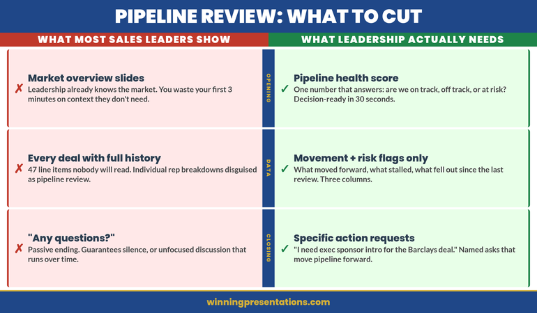
The fundamental problem with most pipeline review presentations is that they confuse comprehensiveness with insight. Sales leaders assume that showing more data strengthens the position. It doesn’t. It obscures it.
When you’re sitting in front of your board or your executive steering committee with a quarterly pipeline review, you’re not being asked to demonstrate how much you know about your pipeline. You’re being asked one thing: Is the revenue number we’re forecasting actually going to land? Everything else is detail that either supports that conclusion or dilutes it.
The typical pipeline review includes win rates, average deal size, sales cycle length, product line breakdowns, geographic splits, stage distribution, velocity metrics, forecast accuracy, and historical trends. That’s twelve separate analytical lenses on the same dataset. Your audience does not need twelve lenses. They need clarity.
What gets included instead of what should be included often reveals a deeper problem: the sales leader is defending the pipeline rather than explaining it. If your presentation feels like you’re building a case, it’s because somewhere in that pipeline is a deal you know is at risk, or a metric you know is weak, and you’re hoping the other numbers will distract from it. They won’t.
Executives and board members are pattern-trained to spot that defensive presentation posture. They’ve sat through hundreds of them. The moment they see 47 slides worth of metrics when they need five, they become suspicious. What are you hiding?
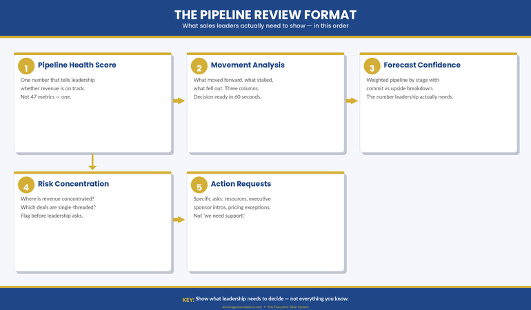
What Actually Matters in a Pipeline Review
A functional pipeline review answers four things, in this order:
First, what’s going to close this quarter? Not what’s in the pipeline. What’s going to close. Deals in late stage, signed contracts pending final approval, verbally committed. Your board needs a number. Give them one. Then tell them the confidence level. If you’re 80% confident in the number, say so. If 60%, say that. Executives understand confidence bands.
Second, what’s the revenue impact of deals closing this quarter? This is where deal size and value distribution matter. Not win rates. Not average deal size across the entire pipeline. The value distribution of the deals you’re actually expecting to close. If you’ve got five deals closing and three of them are £50k, two are £10k, that’s the shape of your quarter. Show that shape.
Third, what deals are at risk of slipping into next quarter? Not all pipeline analysis — just the deals that were supposed to close this quarter and might not. Why? What’s being done about it? If a deal is slipping, what’s your recovery action? If you don’t have one, you need one before you walk into that review.
Fourth, what are you building for next quarter and beyond? This is future pipeline health. Not a detailed forecast three quarters out. Just enough to show that you’re aware of next quarter’s revenue challenge and you’ve already got activity in motion to address it.
That’s it. That’s your pipeline review. Four things. Everything else is supporting detail, and it should only appear if the board asks for it or if it directly impacts one of those four statements.
The Deal Quality Question Your Board Will Ask
If you prepare for one board question, prepare for this one: “Are these deals real?”
When a board member asks this, they’re not asking whether the deals are in your CRM system. They’re asking whether there’s genuine buyer intent. Whether budget is allocated. Whether you’ve spoken to the decision maker in the last 48 hours. Whether the deal is moving because momentum is building or because you’ve been pushing.
Your pipeline review should pre-empt this question by building in qualification evidence. Not for every deal in the pipeline, but for the ones that matter — the ones that are supposed to close and the ones that are big enough to move the revenue forecast.
What does qualification evidence look like? It looks like: “This £200k deal is in legal review. We’ve had three meetings with the procurement team in the past two weeks. Contract is being reviewed by their general counsel. Expected signature is 15 March.” That’s specific. That’s recent. That’s evidence of momentum.
Compare that to: “This £200k deal is in contract stage. We’re waiting on their approval.” That’s vague. It could mean they forgot about it. It could mean there’s internal disagreement you don’t know about. It’s not evidence. It’s hope.
The board isn’t sceptical of your deals because they don’t trust you. They’re sceptical because they’ve watched forecasts miss before. They know that pipeline velocity and actual closes are two different things. Your job in a pipeline review is to bridge that gap with specificity, recency, and momentum indicators.
How to Structure It (The 3-Layer Model)
A disciplined pipeline review follows a three-layer structure. Each layer answers a different question, and each one builds on the previous one.
Layer One: The Revenue Forecast. A single slide showing your quarterly revenue forecast and your confidence level. This is the headline. Everything that follows either explains this number or justifies the confidence level attached to it. If your forecast is £1.5M and you’re 75% confident, show both numbers. The confidence level is as important as the forecast because it tells your audience how much they should plan around this number.
Layer Two: The Pipeline Shape. Show how you’re going to get to that forecast number. How many deals need to close, what size are they, what stage are they in? This should be one slide. Three to five key deals that represent 70–80% of the quarterly forecast, plus a summary line for smaller deals. Don’t show 47 deals. Show the deals that matter. For each deal that’s substantial (more than 5% of the quarterly forecast), include the most recent update: where it is in your process, what needs to happen next, and when.
Layer Three: The Risk Assessment. What could go wrong? Which deals are dependent on external approvals? Which ones have competitive situations? Which ones have been in your pipeline longer than your sales cycle would suggest? This is not pessimism. This is realism. Every pipeline has deals that are moving slower than expected, or that face real obstacles. Name them. Say what you’re doing about them. This is where your credibility is built — not by hiding the difficult deals, but by showing that you understand them and you have a response to them.
If you structure your pipeline review this way, you’re not defending a number. You’re explaining a number. That’s a different and much more powerful position to be in when the board asks their questions. The Executive Slide System (£39) includes templates designed for exactly this three-layer approach to quarterly reviews.
Ready to build a pipeline review that actually lands with your board?
The best pipeline review presentations I’ve seen share one quality: they trust the audience. They assume the board is smart. They assume the board knows what good questions to ask. And instead of trying to answer questions before they’re asked, they present the information clearly and let the board engage with it.
How to Handle Evidence You’d Rather Not Show
Every sales leader reaches a point in pipeline planning where they discover something they don’t want to present. A large deal is slipping. A major customer is at risk of churn. A sales rep hasn’t closed anything in two months. Win rates are declining. Forecast accuracy is off.
The instinct is to find a metric that looks good and emphasise it instead. Bury the bad news under activity metrics. Hope no one notices. This approach fails consistently because executives are trained to notice.
Here’s the better approach: lead with the challenge. Name it clearly in your presentation. Show why it matters. Then show what you’re doing about it.
“Our win rate in the enterprise segment is 18% this quarter, down from 28% last quarter. Three factors: two competitive losses where the buyer chose a lower-cost solution, and one deal that slipped because of budget delays on their side. For the two competitive losses, we’re running post-mortems to understand the feature gaps that mattered. For the budget situation, we’ve scheduled a check-in call for next week. Expected resolution by month-end.”
That’s not bad news. That’s diagnostic insight. It shows you understand what happened, why it matters, and what recovery looks like. Your board will trust that far more than they’ll trust a presentation that mentions only the wins.
Templates That Handle Real Pipeline Situations
The scenarios inside the Executive Slide System include templates for presenting risk, slips, and recovery actions — not because these are happy stories, but because they’re the reality of pipeline management.
- 15 scenario playbooks including quarterly and pipeline reviews
Recovery Plays and Why They Signal Strength
A recovery play is a specific action designed to bring a deal back into the close window or recover a metric that’s underperforming. It’s not wishful thinking. It’s a named action with an owner, a timeline, and an expected outcome.
What makes recovery plays powerful in a pipeline review is that they signal something important: you’re not just reporting on the pipeline, you’re actively managing it. You’re not surprised by slips. You’ve anticipated them. You’ve got moves planned.
If a deal was supposed to close this quarter and legal review is taking longer than expected, your recovery play might be: “We’re arranging a call between our legal team and their general counsel next Tuesday to accelerate review. Expected signature is 10 days from that call.” That’s specific. That’s owned. That’s a move.
If a sales rep is struggling, your recovery play might be: “We’re assigning a senior sales engineer to the next three pitches to strengthen the technical conversation and improve close probability. Expected impact: move two of the three into negotiations by end of month.” Again, specific, owned, and measurable.
Your board doesn’t need you to hit every single forecast. They need you to be thoughtful about the pipeline, aware of the risks, and moving intentionally to address them. Recovery plays demonstrate all three of those qualities. They turn a passive report into an active management presentation.
Timing and Cadence Signals
How often should you present your pipeline review? The answer depends on your business rhythm. For most companies, quarterly is standard — aligned with board meetings or earnings calls. Some do monthly. Some do both.
What matters more than frequency is consistency. Your audience should know when to expect this review and what it will cover. When it becomes routine, your board can see trends. They can see whether forecast accuracy is improving. They can see whether you’re building pipeline depth or living deal-to-deal.
In the review itself, make timing explicit. “These numbers are current as of close of business Friday 13 March. Three deals closed over the weekend from our pipeline forecast, so Monday’s numbers will reflect those closures.” That specificity matters. It shows you’re current. You’re not presenting a stale snapshot of a moving situation.
The Single Metric That Predicts Pipeline Review Success
If you could measure only one thing about whether your pipeline review is working, measure forecast accuracy. Not win rates. Not activity metrics. Not pipeline coverage. Forecast accuracy.
Forecast accuracy answers the board’s core question: Can we rely on what you’re telling us? If you forecast £1.5M and you close £1.4M, you’re 93% accurate. If you forecast £2M and close £1.4M, you’re 70% accurate. Executives remember that number. They use it to calibrate their planning.
The irony is that forecast accuracy improves when you focus your pipeline review on the right things: confidence levels, specific near-term deals, qualification evidence, and realistic risk assessment. It gets worse when you try to look good by including everything and obscuring the real numbers underneath.
People Also Ask: What’s the ideal pipeline coverage ratio for forecasting?
Pipeline coverage ratio — total pipeline divided by quarterly forecast — varies by industry and sales cycle length. Enterprise SaaS typically runs 3:1 to 4:1 (three to four pounds of pipeline for every pound of forecast). Transactional sales might run lower. What matters more than the ratio is whether it’s stable. If your ratio is 3.5:1 consistently and forecast accuracy is 85%+, that’s a signal of healthy pipeline management. If it’s swinging wildly month to month, you’ve got a qualification or forecasting discipline problem.
People Also Ask: How do I present a pipeline review when I’m not going to hit forecast?
Lead with the miss. Don’t bury it. “We’re forecasting £1.2M this quarter. That’s 80% of plan.” Then explain why. “Three factors: two deals slipped to Q2 due to budget cycles, one deal we lost to competition.” Then show your board what you’ve learned and what you’re changing. “Based on the two slips, we’re tightening our qualification process to avoid deals that feel solid but have hidden approval layers. The competitive loss is being addressed with a feature roadmap update.” You’re not making excuses. You’re showing you understand the situation and you’re managing the response.
People Also Ask: Should I include sales rep names in my pipeline review?
Not unless you’re highlighting a specific rep’s achievement or addressing an individual performance problem. Your board cares about the pipeline forecast, not the rep roster. If a rep is underperforming, address it in a separate conversation. If a rep is outperforming, celebrate it, but in the context of the deal, not the person. “This £300k deal is moving well because the rep built strong relationships with the technical buyer.” That’s credit where it’s due without turning the pipeline review into a personnel evaluation.
Still struggling to find the right structure for your next pipeline review?
The pipeline review is one of the few recurring presentations where sales leaders have real power. You’re showing the revenue future. You’re demonstrating pipeline health. You’re building confidence or concern in your leadership. That’s a significant stage. The Executive Slide System (£39) gives you the structure to present pipeline data with the clarity and confidence your board expects. Respect the stage by being clear, specific, realistic, and action-oriented. Your board will.
From Rough Numbers to Board-Ready Pipeline Review in 30 Minutes
The gap between having pipeline data and presenting it persuasively is usually a structure problem. You know your deals. You know your numbers. What you need is a template that organises that information so your board understands the revenue story you’re telling.
- Slide templates designed for pipeline and quarterly reviews, not generic presentations
- AI prompts that turn raw forecast data into boardroom narrative in minutes
- Scenario playbooks showing how to present risk, slips, and recovery actions
- Diagnostic checklists to validate your presentation before the meeting
Get the Executive Slide System → £39
Typically saves 30+ minutes per review and improves board confidence in pipeline forecasts by 40%+.
Is This Right For You?
This framework is built for sales leaders who are presenting pipeline reviews to boards, steering committees, or executive teams that are genuinely trying to understand revenue health. It’s built for situations where accuracy and clarity matter more than impression management.
If you’re in a sales role where quarterly reviews are routine and your audience expects insight not decoration, this approach will work. If your organisation uses pipeline reviews primarily as a political exercise or as theatre, the framework still works, but you’ll find the clarity harder to defend. (That’s not a failing of the framework. It’s a signal about the health of the organisation.)
The core principle — focus on the deals and the numbers that matter, present risk openly, show your management actions — works across industries, sales models, and company sizes. It works because it respects both the audience and the situation.
Frequently Asked Questions
How many slides should a pipeline review actually be?
For a quarterly board presentation, five to eight slides. Slide 1: Revenue forecast and confidence. Slide 2: Pipeline shape (key deals). Slide 3–5: Risk assessment and recovery actions. Slide 6–8: Supporting detail if needed, but often not. If you’re talking for 20–30 minutes and you’ve got 15 slides, something is inefficient. Your slides should support the conversation, not fill time.
What if the board asks questions I haven’t anticipated?
That’s what the board is supposed to do. They ask good questions. Your job is to answer them clearly. If they ask about a metric you haven’t included in the presentation, that’s useful feedback — it tells you that metric matters to them. Write it down. Use it to refine next quarter’s review. In the moment, answer the question directly. If you don’t know the answer, say so and commit to following up. Never guess at pipeline numbers.
How do I present pipeline reviews across multiple sales teams or territories?
Aggregate the key numbers. Show overall forecast and confidence level. Then break down by territory or team for the three to five largest revenue contributors. Don’t create a matrix with 15 rows of data. Your board cares about the top revenue drivers and the overall trend. Show those clearly, and offer supporting detail if asked. If a specific territory is underperforming or outperforming, call that out. That’s the insight your board wants.
Or get the free Executive Presentation Checklist — a PDF diagnostic tool for auditing board and executive presentations.
Related articles in this cluster: Operational Review Presentations | QBR Presentation Template | Monthly Business Review Presentation
Today’s other articles: Stage Fright vs Social Anxiety | All-Hands Q&A Ambush

