Tag: professional presentations

11 May 2026
Featured image for Copilot Presentation Tips for Professionals: A Practical Workflow

Copilot Presentation Tips for Professionals: A Practical Workflow

Quick answer: Most Copilot presentation tips for professionals stop at “give it more context” — which is true but not specific enough to use. The eight tips below are the workflow-level shifts that change output quality the most: configure custom instructions once, write context-stacked prompts, draft in passes rather than one mega-prompt, ask for statement headlines, never let Copilot write your numbers, audit verbs in cleanup, treat Copilot output as a first draft not a finished slide, and verify everything before any senior reader sees it.

Rafaela manages investor relations at a Spanish biotech and has been using Copilot for eighteen months. By her own assessment, she went through three distinct phases. Phase one (the first three months): excitement at how fast it could draft. Phase two (the next six months): disillusionment as she realised every draft needed substantial rewriting. Phase three (the last nine months): a quiet rebuild of her workflow that has compressed her presentation drafting time by roughly 60% — and produced output her CEO has not flagged once for AI-generated voice.

The shift from phase two to phase three came from eight specific workflow changes — not a different tool, not a different model, not a different prompt template. The same Copilot. The same paid Microsoft 365 licence. Different habits.

This article is the workflow she now uses, written for professionals who have already tried Copilot, found the output disappointing, and are looking for the practical shifts that move it from “useful sometimes” to “an actual time-saver every week.” It assumes you have access to Copilot in Microsoft 365 or Copilot for the web. It does not assume you are technical.

If you want a structured starting point

The Executive Prompt Pack contains 71 ChatGPT and Copilot prompts written specifically for senior-level presentation work — the prompts behind every workflow tip in this article are pre-built and ready to paste.

Explore the Executive Prompt Pack →

Why most “Copilot tips” articles do not change your output

Most published Copilot tips fall into one of two categories. The first is feature lists — “did you know Copilot can do X?” — which tell you what the tool can do but not how to use it well. The second is generic advice — “be specific in your prompts” — which is true but does not give you anything to actually do differently tomorrow morning.

The tips below are workflow-level. Each one is something you can change about how you use Copilot on Monday that will measurably improve the output by Friday. They are sequenced from highest leverage (configure once, benefit always) to most surgical (verify before sending). Read them once. Apply two or three on your next deck.

Tip 1 — configure custom instructions once, benefit forever

Custom instructions are the standing notes Copilot reads silently before responding to every prompt. They sit in the personalisation panel of Copilot for the web and (in most current configurations) propagate to the Copilot panel inside PowerPoint and other Microsoft 365 surfaces.

The four fields that move output quality the most are role, audience, tone constraints, and forbidden phrases. Tell Copilot what you do, who you typically present to, what voice you write in, and which words you never want to see. This single configuration step is the highest-leverage Copilot setting most professionals never touch. Spend fifteen minutes on it tonight; benefit on every prompt you write afterwards.

Tip 2 — context-stack every meaningful prompt

For any prompt that matters — a real deck, a real email, a real briefing — write the prompt with five context layers in mind: audience, decision being made, what already exists, what to avoid, and the format you want back. You can write them as separate paragraphs or compressed into one paragraph; either works. What does not work is leaving any of the five blank, because Copilot will fill the gap with the safe-default language that produces what one client called “corporate mush.”

The minimum useful context-stacked prompt is around 80 words; the maximum useful one is around 400. Below the minimum, Copilot is guessing; above the maximum, you are writing the deck yourself.

Tip 3 — draft in passes, never in one mega-prompt

Asking for a full deck in one prompt collapses three different decisions — what to cover, how to assert each point, how to write the body — into a single guess. Copilot has to make all three at once with no opportunity for you to redirect when one is going wrong.

Better: four passes. Pass 1 — outline only. Pass 2 — slide headlines. Pass 3 — slide body, one slide at a time. Pass 4 — editorial cleanup. Each pass uses Copilot to amplify your judgement on one decision. You correct course at every step. The total time is shorter than iterating on one mega-draft, and the output quality is dramatically higher.

The Eight Workflow-Level Copilot Tips for Professionals: Custom Instructions, Context Stacking, Draft in Passes, Statement Headlines, Never Let AI Write Your Numbers, Verb Audit, Refine in Same Conversation, Verify Before Sending — each shown as a numbered card with the action to take.

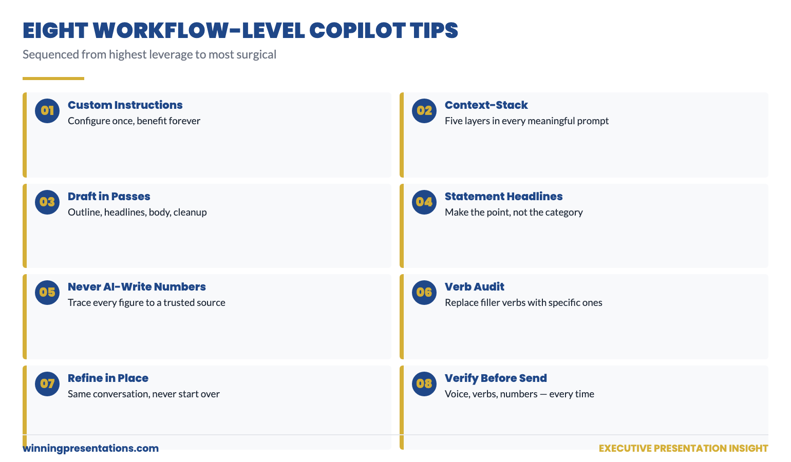
Tip 4 — ask for statement headlines, not category headlines

A category headline is “Q3 Performance.” A statement headline is “Q3 EBIT delivered £42m, ahead of guidance by £4m on lower raw-material costs.” The first tells the reader what the slide is about; the second tells them what the slide says. Senior readers prefer the second by a wide margin — they read top to bottom, scanning for the answer, and statement headlines deliver the answer first.

Copilot defaults to category headlines because they are the safer guess for an unspecified audience. Override the default explicitly: “Headlines must be complete declarative statements, not categories. Each headline should make the point of the slide. Maximum 15 words.” Add this constraint to every headline-generation prompt.

Tip 5 — never let Copilot write your numbers

Copilot does not maliciously invent numbers. It does sometimes round inconsistently, paraphrase imprecisely, or transpose digits between draft and final output. For a marketing post, the cost of an inaccurate number is low. For a board pre-read, the cost is the deck.

The discipline is simple: every number that appears in the final deck must be traceable to a source you trust — usually a spreadsheet you built or a data extract you ran. Paste the numbers into your prompts; do not ask Copilot to look them up. After the cleanup pass, run your eye down every figure on every slide and confirm it against the source. The 10 minutes this takes is the cheapest insurance you will buy on the deck.

Tip 6 — audit verbs in the cleanup pass

The single most reliable signal that Copilot wrote a slide is the verbs. Filler verbs — leverage, drive, unlock, enable, facilitate, optimise — appear three to five times per page in default output. Each one signals “AI default voice” to a reader who has been exposed to enough AI-generated content to recognise the pattern.

The verb audit is mechanical. Search the deck for the filler verb list. Replace each one with the specific verb that describes what is actually happening. “Leverage AI for productivity” becomes “use Copilot to draft proposals in 25 minutes.” “Drive growth” becomes “grow revenue 12% in H2.” “Unlock value” becomes “release £4m of working capital.” Specific verbs sound human; filler verbs sound like a chatbot.

71 prompts that already incorporate every tip in this article

Building these prompts from scratch every time is slow. The Executive Prompt Pack contains 71 ChatGPT and Copilot prompts already structured around context-stacking, statement headlines, pass-by-pass workflow, and the cleanup constraints — for board updates, capital cases, change proposals, Q&A prep, and pitch decks.

  • 71 prompts spanning the most common professional presentation scenarios
  • Custom instructions template included — paste it into Copilot’s settings tonight
  • Pass-by-pass prompts that chain together for outline, headlines, body, cleanup
  • Forbidden-phrase lists ready to add to your standing instructions
  • Instant download, lifetime access, £19.99

Get the Executive Prompt Pack — £19.99 →

Designed for professionals across financial services, technology, consulting, healthcare, and government.

Tip 7 — refine in the same conversation, do not start over

When the output is not quite right, almost every professional’s instinct is to start a new chat and re-prompt. This loses all the context Copilot has built up across your previous prompts — and forces you to rebuild the briefing every time.

The faster move is to refine in place. “Slide 4 reads as defensive — rewrite it as a confident assertion of why the risk is acceptable. Same content, different posture.” “Move the financial impact from slide 5 to slide 2.” “Give me three alternative versions of the headline on slide 1.” Copilot will adjust without losing the underlying context. Same conversation. Tighter output. Less re-briefing.

The exception is when the original brief was wrong — wrong audience, wrong decision, wrong format. In that case, start a new conversation with a corrected context-stacked prompt. But “the output is not quite right” is almost never that situation; it is almost always a refinement situation.

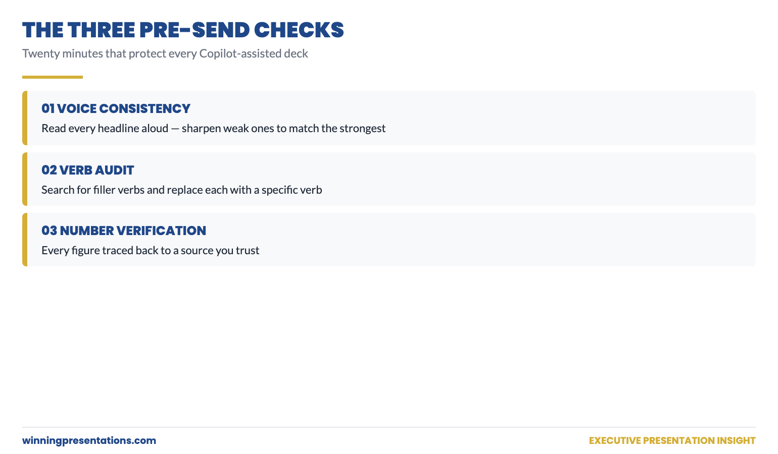
Tip 8 — verify everything before any senior reader sees it

The cleanup pass exists for a reason. Three checks in the final pass save you from the small but career-affecting moments where a senior reader spots something the AI got wrong and you missed.

Check 1 — voice consistency. Read every headline aloud, top to bottom. Do they sound like the same person wrote them? Sharpen the weakest two or three to match the strongest.

Check 2 — verb audit. Search for filler verbs and replace them with specific ones (see tip 6).

Check 3 — number verification. Every figure on every slide traced to your trusted source.

This is the discipline that separates AI-assisted work that holds up under senior reading from AI-assisted work that gets quietly downgraded. Twenty minutes. Every time.

The Three Verification Checks Before Senior Reading: Voice Consistency Check, Verb Audit Replace Filler with Specific, Number Verification Against Trusted Source — each check shown with example before-and-after content for an executive deck.

Putting it together: a 90-minute Copilot deck workflow

For a typical professional deck of 9–10 slides, the workflow above produces a final deck in roughly 90 minutes, broken down approximately as: 5 minutes (custom instructions confirm), 5 minutes (context-stacked outline prompt), 10 minutes (review and edit outline), 10 minutes (headlines pass), 10 minutes (review and sharpen headlines), 25 minutes (body pass — slide by slide), 20 minutes (editorial cleanup including all three verification checks), 5 minutes (final read-through aloud). The total Copilot interaction is about 35 minutes; the rest is your editorial judgement applied to its output.

This is dramatically faster than building the same deck from scratch — but it is also dramatically faster than the typical pattern of asking for a full deck in one prompt and then rewriting four times. The discipline is what produces the time saving.

For more practical depth on the prompt-side fix described in tip 2 — context-stacking — see the partner article on how to write Copilot prompts that produce executive-grade output. For the broader structural conventions that hold any executive deck together, AI-assisted or not, see the board presentation template guide.

Skip the prompt-building step entirely

71 ready-to-use ChatGPT and Copilot prompts already incorporating every tip in this article. £19.99, instant download, lifetime access.

Get the Executive Prompt Pack →

Built for professionals across financial services, technology, consulting, healthcare, and government.

Ready for the deeper, structured programme?

For senior professionals using AI more seriously across their presentation work, AI-Enhanced Presentation Mastery is the self-paced Maven programme — 8 modules, 83 lessons, 2 optional recorded coaching sessions. Monthly cohort enrolment, work at your own pace.

Maven AI-Enhanced Presentation Mastery — £499 →

FAQ

Do these Copilot tips work for ChatGPT or Gemini as well?

Yes. The workflow-level discipline — custom instructions, context-stacking, drafting in passes, statement headlines, verb audits, in-conversation refinement — applies to any conversational AI that holds context across a session. The Executive Prompt Pack is written for both ChatGPT and Copilot for this reason.

How long does it take to set up custom instructions properly?

For a first pass, fifteen minutes. For a refined version that genuinely matches your role, audience, and voice, plan to revisit and edit the instructions over the first two or three weeks of using them. The right test is the prompt described in tip 1 of this article: ask Copilot “in one sentence, who am I and what do I write about?” If the answer surprises you, the instructions need work.

What if my organisation blocks custom instructions or restricts Copilot configuration?

Some enterprise Microsoft 365 deployments lock down personalisation. The workaround is to paste a shortened version of your instructions at the top of every important prompt as a manual prefix. It is more work each time, but the underlying logic — telling Copilot who you are, who you write for, and what voice to use — is the same. Speak to IT about whether instructions can be re-enabled for senior users.

Should I tell colleagues I use Copilot to draft, or keep it private?

Most professional environments now treat AI-assisted drafting the way they treat assistant-built drafts — assumed, not concealed, but rarely the headline. The relevant question for any deck is whether the analysis, the recommendation, and the editorial judgement are yours. If they are, the drafting tool is a means to that end. Be honest if asked; do not over-volunteer.

How do I know if my Copilot output is genuinely good or just looks finished?

Read it as if you are the senior reader, not the writer. Two specific tests: (1) Does the deck make me agree, disagree, or hesitate? Generic AI output produces “fine but unmemorable” — strong output produces a clear directional response. (2) Could a senior colleague tell this was AI-drafted? If you are not sure, run the verb audit and voice consistency check one more time.

Get The Winning Edge — weekly

One sharp, story-led idea every Thursday on executive presentation craft, AI workflows, and the small habits that change how senior audiences receive you. Read by senior professionals across financial services, technology, and consulting.

Subscribe to The Winning Edge →

Not ready for the full prompt pack? Start here instead: download the free Executive Presentation Checklist — a one-page reference covering the structural moves that hold any presentation together, AI-assisted or not.

Pick two of the eight tips. Apply them to your next Copilot session. Notice the difference in the output. Then add a third the week after. The compounding effect of small workflow improvements is the difference between AI as a curiosity and AI as a quiet force multiplier in your week.


About the author. Mary Beth Hazeldine is Owner & Managing Director of Winning Presentations Ltd, founded 1990. With 24 years of corporate banking experience at JPMorgan Chase, PwC, Royal Bank of Scotland, and Commerzbank, she advises executives across financial services, healthcare, technology, and government on structuring presentations for high-stakes funding rounds and approvals.

23 Apr 2026
Professional preparing a polished board presentation on a laptop in a modern office, focused and confident, editorial photography style

How to Improve Presentation Skills for Work: The Structured Approach That Actually Works

Quick Answer

To improve presentation skills for work you need three things working in parallel: a reliable structure so you stop rebuilding every deck from scratch, a system for managing delivery under pressure, and deliberate practice in conditions that match the real stakes of the presentations you need to give. Courses that only address one of these three typically produce temporary improvement. This guide covers all three.

Kwame had been told to “work on his presentation skills” three times in four years.

Once by a line manager after a client pitch that didn’t land. Once in a 360-degree feedback report after a town hall that received mixed responses. And once — most directly — by the head of his division, who told him in a performance review that he was “technically exceptional but needed to develop his executive presence in front of senior stakeholders.”

Each time, Kwame tried to act on the feedback. He watched YouTube videos. He read books. He took a one-day communication course his company funded. He rehearsed more. None of it moved the dial in the ways that mattered. He still rebuilt every presentation from scratch. He still felt exposed in Q&A. His delivery still tightened when the room was senior enough to matter.

The problem wasn’t effort. It was that the advice he was following addressed surface symptoms — delivery tips, confidence mantras, filler-word elimination — without addressing the underlying structural deficits that were producing them. When your presentations don’t have a reliable skeleton, you will always be improvising. And improvisation under pressure produces exactly the symptoms he was trying to fix.

Told to improve your presentation skills but not sure where to start?

The Executive Slide System gives you the structural foundation that removes the rebuilding problem — so you walk into every presentation with a proven framework rather than starting from a blank slide.

Explore the Executive Slide System →

Why Most Presentation Tips Don’t Stick

The internet contains thousands of presentation tips. Most of them are accurate. Almost none of them produce lasting change when applied in isolation, because they address individual behaviours without building the system those behaviours need to operate within.

“Make eye contact” is a useful tip. But if you’re using working memory to track your place in a poorly structured deck, your attention is on the slides — not your audience. The eye contact tip won’t help until the structural problem is resolved.

“Speak more slowly” is a useful tip. But if you’re anxious because you don’t know how to handle the Q&A that’s coming, you’ll speed up again as soon as a challenging question arrives. The delivery tip won’t help until the Q&A preparation problem is resolved.

“Use pauses instead of filler words” is a useful tip. But if your nervous system hasn’t been recalibrated to tolerate the silence, the pause will feel unbearable and you’ll default to “um” within seconds. The filler word tip won’t help until the nervous system regulation problem is resolved.

This is why presentation improvement initiatives that focus on tips — however accurate — tend to produce temporary results. You leave the workshop feeling equipped. You apply the tips in the next few presentations. Then the high-stakes presentation arrives, and you revert to baseline. Because tips are not a system. Presentation skills training that actually sticks has to address the underlying components, not just the surface behaviours.

The Three Components of Lasting Improvement

To improve presentation skills for work in a way that holds under pressure, you need to work on three components simultaneously. Each one reinforces the others. Fixing only one or two will produce partial improvement at best.

Component 1: Structure — a repeatable framework for building presentations that you don’t have to reinvent for every new context. Most professionals spend the majority of their preparation time trying to figure out what to put on each slide and in what order. A reliable structure eliminates this problem. You know the architecture; the work becomes filling it with the specific content for this presentation.

Component 2: Delivery under pressure — the ability to maintain composure, clarity, and authority when the stakes are high, the room is difficult, or the Q&A goes somewhere unexpected. This is a nervous system and rehearsal challenge, not a knowledge challenge. You can know your material completely and still feel exposed when a senior executive asks a question you hadn’t anticipated.

Component 3: Deliberate practice — a method of building skill that goes beyond simply giving more presentations and hoping improvement happens. Most people’s presentation skills plateau because they keep practising the same behaviours in the same conditions. Deliberate practice targets the specific gaps that matter and creates conditions that are challenging enough to produce genuine improvement.

The Structural Foundation Every Executive Presenter Needs

If you are rebuilding every presentation from scratch, you are solving the wrong problem before every meeting. The Executive Slide System — £39, instant access — gives you the structural framework that removes that problem permanently:

  • 22 PowerPoint templates covering the executive scenarios you actually encounter
  • 51 AI prompt cards to build content into any template fast
  • Scenario playbooks for board presentations, budget cases, client pitches, and more
  • Checklists that catch the structural errors that lose rooms before Q&A begins

Get the Executive Slide System →

Designed for professionals who need to present with confidence at executive and board level.

Structure: The Fastest Lever to Pull

Of the three components, structure produces the fastest visible improvement because it addresses the most common root cause of weak presentations: the absence of a clear decision logic.

Most professionals build presentations by gathering all the relevant information and then arranging it in a logical sequence. The problem with this approach is that “logical sequence” usually means chronological — how the situation developed, how the analysis was done, what was found, and then what is recommended. This is the right order for a research paper. It is the wrong order for an executive presentation.

Executive audiences want to know the recommendation first, the supporting evidence second, and the analysis third — if at all. This is the pyramid principle applied to presentations, and it runs counter to how most professionals were trained to present information at school and university. The result is that competent, well-prepared professionals produce presentations that bury the point, overwhelm the audience with context before the recommendation, and leave senior stakeholders frustrated even when the underlying thinking is excellent.

The executive presentation structure that works consistently follows this pattern: start with the conclusion, support it with three to four reasons or evidence points, and provide the detail as supporting material rather than the main event. This structure is learnable and replicable. Once you have internalised it, every presentation becomes easier to build — because you always know what goes where.

The templates in the Executive Slide System are built around this structure — so you don’t have to reinvent the architecture for each new presentation, you just load your content into a proven framework.

Delivery: What Changes When the Stakes Are Real

Good delivery in a low-stakes environment does not automatically transfer to good delivery in a high-stakes one. This surprises many professionals who feel confident in informal presentations but notice their delivery deteriorating when the room is more senior or the decision more significant.

What changes under pressure is the availability of cognitive resources. When the stakes feel high, part of your working memory is occupied by threat-monitoring — tracking how the room is responding, anticipating questions, managing any anxiety symptoms. This leaves less resource available for fluency, word retrieval, and the deliberate choices that constitute good delivery: eye contact, pacing, pausing.

Improving delivery under pressure therefore requires two parallel approaches. First, reduce the cognitive load of the presentation itself — a reliable structure and well-rehearsed content means less working memory is needed for the material, leaving more available for delivery choices. Second, reduce the baseline activation level of the threat response — through preparation, rehearsal in conditions that mimic the real stakes, and where necessary, nervous system regulation techniques that bring down arousal before you begin.

The specific presentation skills development work that addresses delivery under pressure includes: practising in front of people whose opinion you care about (not just in front of a mirror), recording yourself in full-dress rehearsals and watching it back, and simulating the most challenging Q&A scenarios you are likely to face. Each of these creates the conditions for genuine improvement rather than improvement in controlled practice environments that don’t translate.

Deliberate Practice: How to Improve Without More Presentations

Most professionals improve their presentation skills by giving presentations and hoping the experience produces improvement. This works to a point — you do get more comfortable with the mechanics of presenting — but it stops working once your skills plateau, because you are practising the same strengths in the same conditions.

Deliberate practice is different. It targets the specific gap, creates challenge that is slightly beyond your current capability, and builds in feedback so you can see whether you improved. Here is what deliberate practice looks like for the three most common development areas.

For structure: Take a presentation you have already given and rebuild it using a different structural logic — starting with the conclusion rather than the context, or organising by stakeholder concern rather than analytical sequence. Compare the two versions and assess which one a senior audience would find easier to act on. Repeat with three to five different past presentations until the new structure becomes your default approach.

For delivery under pressure: Ask a trusted colleague or manager to play the role of a challenging committee member during a rehearsal — specifically tasked with asking questions you won’t have prepared for, expressing scepticism, or cutting across your slides mid-sentence. This is uncomfortable. It is also the only way to build the skills you need for those conditions. Rehearsal against a supportive audience does not prepare you for a difficult one.

For verbal habits and fluency: Record two minutes of yourself explaining your current project — without notes — and watch it back with the sound off, then again with sound only. The visual and audio separation often reveals habits that are invisible when you’re watching both together. Identify the single most distracting habit and target it explicitly in the following week’s practice sessions, rather than trying to fix everything at once.

See today’s related articles: the specific verbal habits that damage executive credibility, how to present a pilot as a commercial case, and how to take a technology roadmap to the board.

Stop Rebuilding Presentations From Scratch

The Executive Slide System — £39, instant access — gives you the structural foundation, templates, and AI prompt cards that remove the biggest time drain in presentation preparation. Build better presentations faster, and walk in with a structure you trust.

Get the Executive Slide System →

Designed for professionals who need to present with confidence at executive and board level.

Frequently Asked Questions

What is the fastest way to improve presentation skills for work?

Fix your structure first. Most presentation problems — unclear delivery, loss of confidence in Q&A, audiences that seem disengaged — trace back to a structural problem: the presentation doesn’t make the recommendation early enough, or doesn’t organise information in the way a senior audience expects to receive it. Once the structure is reliable, delivery and confidence tend to follow because you’re spending less cognitive resource on figuring out where you are in the deck and more on connecting with the room.

Is it worth taking a presentation skills course for work?

It depends entirely on what the course addresses. A one-day communication workshop that covers tips and techniques without addressing structure, Q&A handling, or delivery under pressure will produce limited lasting improvement. Look for resources that provide a replicable structural framework — one you can use in your actual work presentations rather than a course-specific exercise — and that address the specific challenges you face: whether that is senior audience management, anxiety, Q&A, or deck construction. The most effective development work is targeted, not generic.

How do I improve presentation skills when I don’t present very often?

Treat every meeting where you speak as a presentation opportunity. The informal explanation you give in a team meeting, the project update you provide on a call, the recommendation you make in a one-to-one — these are all opportunities to practise structuring your thinking, leading with the conclusion, and managing the question that follows. Frequency of formal presentations is less important than the quality of practice. Deliberate work on structure and delivery in everyday professional communication builds the same capabilities you need in formal presentations.

Why do my presentation skills seem to get worse when I’m presenting to senior people?

Because senior audiences activate a stronger threat response, which takes cognitive resource away from fluency and delivery. This is a normal neurological pattern, not a sign of inadequate preparation. The mitigation is twofold: reduce the cognitive load of the presentation itself through structure and rehearsal, and reduce your baseline arousal level before you present through preparation rituals and, where needed, nervous system regulation techniques. Most professionals find that the combination of better structure and targeted rehearsal in high-stakes conditions produces measurable improvement within four to six presentations.

The Winning Edge — Weekly Presentation Intelligence

Every Thursday, one framework or technique for high-stakes presenting at work — drawn from 25 years of boardroom experience and 16 years training executives. Join The Winning Edge →

Not ready for the full system? Start here: download the free Executive Presentation Checklist — a one-page reference covering the structure and slides every work presentation needs before it goes to a senior audience.

About the Author

Mary Beth Hazeldine is the Owner & Managing Director of Winning Presentations. With 25 years of corporate banking experience at JPMorgan Chase, PwC, Royal Bank of Scotland, and Commerzbank, she advises executives across financial services, healthcare, technology, and government on structuring presentations for high-stakes funding rounds and approvals.

Book a discovery call | View services

24 Jan 2026
Professional woman evaluating her presentation slides and realizing what they signal about her competence to executives

What Your Slides Say About You (And It’s Not What You Think)

A CFO once told me why she rejected a £2 million budget request before the presenter finished slide three: “His slides told me everything I needed to know about his thinking. It was scattered.”

Quick answer: Executive slide design perception is how decision-makers read your competence, preparation, and thinking quality through your slides—before you speak a single word. Executives form judgments within 5 seconds of seeing your first slide. Cluttered slides signal cluttered thinking. Buried conclusions signal uncertainty. Wall-of-text slides signal you haven’t done the synthesis work.

In practice, the visual signals your slides send often matter more than the words on them. Executives aren’t reading your slides—they’re reading YOU through your slides.

When your slides send the right signals:

  • Executives lean in instead of checking email
  • Your recommendations get faster approvals
  • You’re seen as someone who “gets it”

Written by Mary Beth Hazeldine — executive presentation coach, 24 years corporate banking at JPMorgan Chase, PwC, RBS, and Commerzbank. I’ve sat in the room when slides killed careers and when they made them. Last updated: January 2026.

🚨 Presenting THIS WEEK? Check your slides for these 3 signals:

  1. Slide 1: Does your conclusion appear in the first 10 words? (If not, you’re burying the lead)
  2. Any slide: Can someone grasp the point in 3 seconds? (If not, it’s too cluttered)
  3. Titles: Do they make claims or just label topics? (“Revenue grew 23%” beats “Revenue Overview”)

Fix these three and you’ll send different signals immediately.

→ If your slide 1 doesn’t contain your decision ask, executives assume you don’t have one. Get the templates that fix this in 60 seconds →

📅 Have 7 days to transform your deck?

The slide signal system in this article takes one focused session to implement. Most professionals see the difference in how executives respond within their very next presentation.

I learned this lesson the hard way. Early in my banking career, I spent 40 hours building what I thought was a comprehensive deck. Fifty-seven slides. Every data point. Complete background on every issue.

The Managing Director stopped me on slide four.

“I can see you worked hard on this,” she said. “But I still don’t know what you want me to do.”

Forty hours of work. Four slides in. And my slides had already told her I didn’t understand what mattered. Not because of the content—but because of the signals the design sent about my thinking.

That moment changed how I approach every deck. And after 24 years of watching executives react to presentations, I now know exactly what signals matter—and which ones kill your credibility before you’ve finished your opening sentence.

What Executives Actually See (In the First 5 Seconds)

When an executive sees your slide, they’re not reading it. They’re scanning it for signals about YOU.

Research on cognitive load shows people form impressions within milliseconds of seeing a visual. Your audience has judged your slide—and by extension, your thinking—before you’ve finished your opening sentence.

Here’s what they’re actually processing:

Signal 1: Hierarchy (Do you know what matters?)

The first thing executives notice is whether there’s a clear visual hierarchy. Is there one dominant element? Or is everything competing for attention?

A slide with five equally-weighted bullet points tells the executive: “I couldn’t decide what was important, so I’m making you do it.”

A slide with one clear headline supported by three subordinate points tells them: “I’ve done the thinking. Here’s what matters.”

Signal 2: Density (Do you respect my time?)

Wall-of-text slides send an unmistakable message: “I haven’t distilled this enough to present it clearly, so I’m going to read to you.”

One senior partner at a consulting firm told me: “When I see a dense slide, I immediately wonder if the presenter understands the material well enough to simplify it. Usually they don’t.”

Signal 3: Structure (Can you think clearly?)

Executives are pattern-matchers. They’ve seen thousands of presentations. They immediately notice whether your deck follows a logical structure or feels random.

A deck that jumps from problem to solution to background to data to recommendation signals scattered thinking. A deck that flows—situation, complication, resolution—signals someone who can construct a coherent argument.

For more on title mistakes, see why “Overview” is the worst slide title.

Diagram showing what executives see in the first 5 seconds of viewing a slide: hierarchy, density, and structure signals

The Hidden Messages Your Slides Are Sending

Beyond the conscious signals, your slides send subconscious messages that executives process without even realising it.

“I’m not confident in my recommendation”

When you bury your conclusion on slide 15 instead of leading with it, executives interpret this as hedging. You’re building up to something because you’re not sure they’ll accept it.

A VP of product once told me: “When someone buries the ask, I assume they know it’s weak. If they believed in their recommendation, they’d lead with it.”

“I don’t understand my audience”

Technical details that belong in an appendix. Jargon that assumes expertise they don’t have. Context they already know being explained at length.

All of these signal the same thing: you haven’t thought about who’s in the room and what they need.

“I’m trying to impress rather than inform”

Over-designed slides with animations, complex charts, and visual flourishes often backfire. Executives see through them immediately.

A managing director at an investment bank put it bluntly: “Fancy slides usually mean the content is weak. The best presenters I know use the simplest slides.”

“I haven’t done the hard work”

It takes more effort to create a simple, clear slide than a complex one. As the saying goes: “If you can’t explain it simply, you don’t understand it well enough.”

Executives know this. When they see complex slides, they question whether you’ve done the synthesis work—or whether you’re just dumping information and hoping they’ll sort it out.

⭐ Slides That Signal “This Person Gets It”

The Executive Slide System gives you the exact structures that send the right signals—hierarchy, clarity, and confidence—from slide one.

What’s inside:

  • 12 executive-tested slide templates (board updates, budget requests, project proposals)
  • The “Headline Test” that ensures every title makes a claim
  • Before/after examples showing signal transformation

Get the Executive Slide System → £39

Built from 24 years in corporate banking + executive training work with senior stakeholders.

5 Slide Signals That Kill Your Credibility

These are the specific executive slide design perception mistakes that damage how you’re seen:

1. The “Agenda” Opening Slide

Starting with “Agenda” or “Overview” tells executives nothing. It’s a missed opportunity to signal that you understand what matters.

What it signals: “I’m going to walk you through this linearly because I haven’t identified what you actually need to know.”

The fix: Open with your conclusion or recommendation. “We should approve the £2M investment because it will generate £8M in returns within 18 months.”

2. The Wall of Bullets

Five or more bullet points of equal weight, each a complete sentence, filling the slide.

What it signals: “I couldn’t synthesise this information, so I’m presenting my notes instead of my thinking.”

The fix: One headline that makes a claim. Three supporting points maximum. If you need more, you need more slides.

3. The Chart Without a Story

A complex chart with no annotation, no highlight, no indication of what the viewer should notice.

What it signals: “I’m showing you data but I haven’t interpreted it. You figure out what it means.”

The fix: Every chart needs a headline that states the insight. “Revenue grew 23% despite market contraction” not “Revenue Chart Q3.”

4. The “Let Me Give You Context” Deck

Slides 1-10 are background. The recommendation doesn’t appear until slide 15.

What it signals: “I’m afraid you’ll reject my recommendation, so I’m delaying it as long as possible.”

The fix: Recommendation on slide 1. Context only when asked for or as appendix.

5. The Design-Over-Substance Slide

Beautiful gradients, custom icons, animations—but the content is thin or unclear.

What it signals: “I spent time on how this looks because I didn’t have confidence in what it says.”

The fix: Simple, clean, content-focused. Let the message carry the weight.

For more on executive summary best practices, see how to write the only slide that matters.

Want slide templates that send the right signals? The Executive Slide System (£39) includes 12 proven structures used by executives at top firms.

5 Slide Signals That Build Authority

These are the signals that make executives think “this person knows what they’re doing”:

1. Conclusion-First Structure

Your recommendation or key message appears in the first 10 seconds. No buildup. No suspense.

What it signals: “I’m confident in my position. I’ve done the analysis. Here’s what we should do.”

2. Headline-Driven Slides

Every slide title makes a claim, not a label. “Market share increased 15%” not “Market Share Update.”

What it signals: “I’ve interpreted the data. I’m not making you do my job.”

3. Strategic White Space

Slides that breathe. One idea per slide. Room for the eye to rest.

What it signals: “I’ve distilled this to what matters. I respect your cognitive load.”

4. Annotated Visuals

Charts with callouts. Diagrams with explanatory text. Visual elements that guide rather than overwhelm.

What it signals: “I’ve thought about what you need to see and made it easy to find.”

5. The “So What?” Test

Every slide answers “so what?” explicitly. No slide exists just to show information—each one drives toward the conclusion.

What it signals: “Everything here has a purpose. I’m not wasting your time.”

Comparison of credibility-killing slide signals versus authority-building slide signals that executives notice

⭐ If Your Slides Aren’t Getting the Response You Want

It’s probably not your content—it’s the signals your slides are sending. The Executive Slide System rewires how your deck communicates before you even speak.

You’ll get:

  • The “Signal Audit” checklist (run before every important presentation)
  • 12 slide templates that pass the executive perception test
  • Real before/after transformations from actual client decks

Get the Executive Slide System → £39

The same structures I used for 24 years in banking—now available as templates.

Before and After: Real Slide Transformations

Here’s what changing your slide signals looks like in practice:

Transformation 1: The Opening Slide

Before: “Q3 Performance Review — Agenda: 1. Background, 2. Market Overview, 3. Results, 4. Challenges, 5. Next Steps”

What it signalled: “Buckle up for a linear data dump. I’ll get to the point eventually.”

After: “Recommendation: Approve £500K additional investment in Product X. Q3 results exceeded targets by 23%, validating our strategy.”

What it signals now: “I know what you need to decide. Here it is.”

Transformation 2: The Data Slide

Before: Title: “Revenue Data” — Complex chart with 8 data series, no annotations, legend in small text.

What it signalled: “Here’s all the data. Good luck finding the insight.”

After: Title: “Revenue grew 23% while competitors declined” — Same data, but one trend highlighted, callout pointing to key inflection, competitors greyed out.

What it signals now: “I’ve analysed this. Here’s what matters.”

Transformation 3: The Recommendation Slide

Before: Bullet list of 7 recommendations, all equal weight, no prioritisation.

What it signalled: “I generated a list but couldn’t prioritise it for you.”

After: One primary recommendation in large text. Three supporting actions in smaller text. Clear next step with owner and deadline.

What it signals now: “I know what matters most. I’ve made the decision easy for you.”

For proven executive presentation structures, see the 12-slide template that commands the room.

Ready to transform your slides? The Executive Slide System (£39) includes the exact before/after templates you can apply immediately.

Frequently Asked Questions

How quickly do executives form impressions from slides?

Research suggests visual impressions form within milliseconds—faster than conscious thought. By the time you’ve said your first sentence, they’ve already judged your slide. This is why executive slide design perception matters so much: the signals happen before your content has a chance to land.

Does slide design really matter more than content?

No—but poor slide design can prevent good content from being heard. If your slides signal scattered thinking, executives will be skeptical of your content regardless of its quality. The design IS the first impression of your content.

What’s the biggest slide mistake executives notice?

Burying the lead. When your conclusion or recommendation doesn’t appear until deep in the deck, executives interpret this as either lack of confidence or lack of synthesis. Lead with your point. Support it with evidence.

Should I use professional design templates?

Clean, simple templates are fine. Over-designed templates can actually hurt you—they signal that you’re compensating for weak content. The goal is invisible design: formatting that helps the content communicate, not formatting that draws attention to itself.

How do I know if my slides are sending the wrong signals?

Apply the “3-second test”: show someone your slide for 3 seconds, then hide it. Ask them what the main point was. If they can’t tell you, your hierarchy is wrong. If they mention something other than your main point, your emphasis is wrong. If they say “it was really busy,” your density is wrong.

Can I fix bad slide signals quickly before a presentation?

Yes. Focus on three things: (1) Move your conclusion to slide 1, (2) Make every title a claim instead of a label, (3) Remove any slide that doesn’t directly support your conclusion. This won’t make your deck perfect, but it will send dramatically better signals.

Why do executives care about slides if they’re listening to me?

Executives are overwhelmed with information. Slides act as a filter—a quick way to assess whether this presentation is worth their full attention. Clean, well-structured slides signal that you’ve done the hard work of synthesis. That earns their attention. Cluttered slides signal the opposite.

Is This Right For You?

✓ This is for you if:

  • You present to executives, boards, or senior stakeholders
  • You’ve noticed your slides aren’t getting the response you want
  • You want templates that signal competence immediately
  • You’re willing to restructure how you build decks

✗ This is NOT for you if:

  • You only present to internal teams (lower stakes)
  • You want design software training, not structure help
  • Your main issue is delivery, not deck construction
  • You’re not willing to change how you organise information

⭐ The MD Who Stopped Me on Slide Four Taught Me Everything

That 57-slide deck that died on slide four? I rebuilt it using the structures now in the Executive Slide System. Same content. Different signals. The same MD approved it two weeks later—and asked for the template.

What you’ll get:

  • 12 executive-tested slide templates
  • The Signal Audit checklist
  • Before/after transformation examples

Get the Executive Slide System → £39

Built from structures that work in global banking and consulting-style environments.

📧 Optional: Get weekly slide strategies in The Winning Edge newsletter (free).

Your Next Step

Your slides are sending signals whether you intend them to or not. The question is whether those signals build your credibility or undermine it.

Run the 3-second test on your next deck. Check whether your conclusion appears in the first 10 seconds. Make sure every title makes a claim instead of labelling a topic.

Those three changes alone will transform your executive slide design perception—how executives read you through your slides.

For the complete system with templates and checklists, get the Executive Slide System (£39).

P.S. If presentation anxiety is affecting your delivery regardless of how strong your slides are, see what to do if you have a panic attack before presenting.

About the Author

Mary Beth Hazeldine is the Owner & Managing Director of Winning Presentations. The MD story that opened this article is real—and that rejected deck became the foundation for how she now teaches slide structure.

With 24 years at JPMorgan Chase, PwC, Royal Bank of Scotland, and Commerzbank—where one presentation could change funding, strategy, or careers—she’s seen thousands of executive presentations. The patterns of what works became the Executive Slide System.

Book a discovery call | View services