Tag: presenting data to executives

03 Jul 2026
Why the Best Analysts Say the Number Out Loud Before They Show the Chart

Why the Best Analysts Say the Number Out Loud Before They Show the Chart

Quick answer: A chart does not carry a conclusion — it carries data, and the room reads its own conclusion into it unless you supply yours first. So the strongest presenters say the point out loud before the chart appears, and they write the slide title as the conclusion rather than the topic: not ‘Q3 Revenue by Region’ but ‘Three regions grew; the North fell, and that is the decision in front of us.’ That is the assertion title, and it is the spine of a data slide that works on a senior audience. The method has three parts — an assertion title that states the conclusion in a full sentence, a single visual chosen to support that one claim and nothing else, and a provenance line that says where the number came from so a sceptic can trust it. The test is the title-only read: cover every chart in your deck and read only the titles aloud. If the story of the decision comes through from the titles alone, your slides carry the argument. If all you hear is a list of topics, the room is doing your thinking for you — and it will reach its own conclusion, not yours.

In 2008, I watched a talented analyst present a quarterly performance review to a senior leadership group. Her work was meticulous — she had a slide for every region, each with a clean, well-labelled chart and a heading naming what the chart showed: ‘Revenue by Segment’, ‘Margin Trend’, ‘Cost-to-Income’. She talked the room through each chart, describing what it depicted. About six slides in, a managing director who had been quiet put down his pen and said, not unkindly, ‘This is all very thorough. Can you just tell me — are we ahead or behind, and on what?’ She knew the answer cold; she said it in one sentence and the room relaxed. But the question should never have been necessary. She had shown the room a dozen accurate charts and made it do the one thing she was there to do: reach the conclusion. The data was hers. The thinking, she had quietly handed to the audience.

In the years since, coaching senior professionals on presenting numbers to boards and executive committees, I have come to see that moment as the single most common failure in data presentation — and it has almost nothing to do with the quality of the analysis. It is a failure of assertion. The analyst, trained to be objective, presents the evidence and lets it ‘speak for itself.’ But evidence does not speak. A chart titled with its topic is a question, not an answer, and a senior audience does not want to spend the meeting answering questions you could have answered for them.

(This article was created with AI assistance; all stories and insights are based on 35 years of real client work.)

The fix is a discipline I now teach every senior leader who presents numbers: the assertion title. You say the conclusion out loud before the chart loads, and you write the slide’s title as that conclusion in a full sentence — so the point lands in the air and on the screen before the audience starts interpreting the data for themselves. It has three parts: the assertion title, a single supporting visual, and a provenance line. Built this way, your slides make the argument; the charts merely prove it.

If your data slides are accurate but the room keeps asking “so are we ahead or behind?”:

The Executive Slide System ships 26 executive templates built for conclusion-first data slides — assertion-title layouts that put the claim in the headline and the single supporting chart beneath it — with 93 AI prompts that turn your own figures into a sentence-form title, 16 scenario playbooks covering finance review and quarterly business review, and 7 checklists. It gives you the conclusion-first structure as a starting point rather than something you discover after a managing director asks for it.

See the data-slide templates →

Why a topic title hands the room your job

Consider what a slide titled ‘Q3 Revenue by Region’ actually asks of the audience. It presents a set of numbers and a label describing what they are, and then it waits. The viewer has to scan the chart, work out which regions are up and which are down, decide which movements matter, weigh them against expectation, and arrive at a judgement about whether this is good news, bad news, or mixed — all in the few seconds before you move on. A topic title outsources every one of those steps to the room. And a senior audience, doing that work under time pressure across a dozen slides, will frequently arrive somewhere you did not intend — fixating on the one declining region while you wanted them to see the overall growth, or vice versa.

This is the quiet cost of objectivity-as-style. Analysts are trained, rightly, to be rigorous and even-handed with data. But there is a difference between being objective about the evidence and being silent about the conclusion, and presenters routinely confuse the two. Saying ‘three regions grew and the headline is growth’ is not spin; it is the honest read of the data, stated by the person best placed to read it. Withholding it is not neutrality — it is abdication. You leave the most senior people in the room to do the interpretation you were specifically brought in to do, and you lose control of which story they walk away with.

There is a real-time dimension too, which is why the spoken version matters as much as the written one. When you advance to a chart in silence and let it sit while the room reads it, you have a few seconds of dead air in which every viewer is forming their own private conclusion. By the time you start talking, you are arguing against impressions that have already set. Saying the point out loud as the slide appears — ‘What this shows is that we are ahead on revenue but the margin story is the one to watch’ — gets your read in first, while the room is still looking. The same principle governs why the strongest board presenters lead the whole session with the recommendation: the conclusion arrives before the detail, whether you are opening to a board that hasn’t read the pack or putting up a single chart.

Make every data slide state its own conclusion — so the room reads your story, not its own.

The Executive Slide System gives you the assertion-title structure as a ready starting point: headline-as-conclusion layouts, one-visual-per-claim discipline, and a provenance line built into the template. It ships 26 executive templates, 93 AI prompts for converting a raw figure into a sentence-form title and a clean supporting chart, 16 scenario playbooks covering finance review, quarterly business review, and board update, plus 7 checklists. Built for senior presenters who put numbers in front of decision-makers and need the slides to carry the argument. £39, instant download, lifetime access.

  • 26 executive templates — assertion-title data layouts, one claim per slide
  • 93 AI prompts — turn a number into a conclusion-form slide title
  • 16 scenario playbooks — finance review, quarterly business review, board update
  • 7 checklists — including the title-only read as a pre-send check

Get the Executive Slide System — £39 →

The assertion-title method infographic, showing the three parts of a data slide built to carry its own conclusion. Part one, the assertion title: write the slide heading as the conclusion in a full sentence, three regions grew and the North fell, not the topic, Q3 revenue by region. Part two, one supporting visual: choose a single chart that proves that one claim and strip everything that does not, so the eye lands where the title points. Part three, the provenance line: a short note of the source and period so a sceptical director can trust the number without asking where it came from. Together the three parts make the slide argue the point rather than leave the room to interpret the data on its own.

The assertion-title method

The first part is the assertion title: the slide’s heading, written as the conclusion in a full sentence rather than a topic label. ‘Margin Trend’ becomes ‘Margin has fallen for three quarters and the cause is mix, not price.’ ‘Cost-to-Income’ becomes ‘Cost-to-income is back inside target a quarter early.’ The discipline is to make the title a sentence with a verb and a point of view — something that could be true or false, that takes a position. If your title could sit unchanged above any quarter’s chart, it is a topic, not an assertion. The test for the title alone is whether a reader who saw nothing but that line would know what you want them to conclude. The chart then becomes the evidence for the claim the title already made, which is a far easier thing for an audience to follow than a chart asked to generate a claim on its own.

The second part is one visual per claim. Once the title carries the conclusion, the chart has exactly one job: to make that conclusion visible and credible. So you strip everything that does not serve it. If the title says margin fell because of mix, the chart shows the mix shift — not the full income statement with mix buried in row nine. A slide that asserts one thing and shows three is back to handing the room interpretive work, because now the viewer has to find which part of the busy chart supports the headline. One claim, one visual, everything else cut or moved to an appendix. The restraint is what makes the slide land; a single clean chart under a sharp sentence reads in two seconds, where a dense exhibit under a topic label takes the room thirty.

The third part is the provenance line: a short, quiet note of where the number came from and over what period — the source system, the date range, whether it is actual or forecast. Senior audiences, especially in finance, do not trust a number they cannot place, and the fastest way to lose a room is to have a director quietly wondering whether your figure is comparable to the one they have in their head. A one-line provenance note answers the question before it is asked and signals that you know exactly what you are showing. This is also where AI in the workflow earns its place — not in inventing the conclusion, which must be your judgement, but in the heavy lifting of drafting sentence-form titles from a table, checking that each chart matches its claim, and keeping provenance consistent across a deck. Used well, that is the difference between AI as a generic slide-filler and AI as a genuine drafting partner for executive work.

I saw the method change an outcome for a finance manager I coached in 2017. She presented a monthly pack to a divisional board and felt the meetings were slipping — lots of questions, little decided. Her slides were faultless and titled by topic throughout. We rewrote every title as an assertion and cut each chart to the one exhibit that proved it. Nothing in the underlying numbers changed. At the next meeting she told me the board moved through the pack in half the usual time and spent the saved time on the two decisions that actually needed debate. One director said the pack had ‘finally started telling him what she thought.’ She had been thinking it all along; the titles had simply never said it.

For the deeper workflow on using AI to build executive-grade data presentations:

The AI-Enhanced Presentation Mastery course is a self-paced programme of 8 modules and 83 lessons on using AI, including Copilot, to structure, draft, and refine presentations that hold up at senior level — including turning raw tables into assertion-form titles and matching each visual to its claim. There are no deadlines and no mandatory sessions; 2 optional live coaching sessions are fully recorded so you can watch them back anytime, with monthly cohort enrolment and lifetime access to the materials. It is the deeper system behind using AI as a drafting partner rather than a slide-filler. £499.

Explore the AI-enhanced programme →

The title-only read

You cannot judge your own data deck for this fault, because you know what every chart is supposed to say — the conclusion is in your head whether or not it is on the slide. The diagnostic that exposes the gap is the title-only read, and it takes two minutes. Open your deck, cover or ignore every chart, and read only the slide titles aloud, in order, as a continuous sequence. Then ask one question: did I just hear the story of the decision, or did I hear a list of topics?

If the titles read as a narrative — ‘Revenue is ahead of plan; margin is the risk; the risk is mix not price; here is what we are recommending’ — your slides carry the argument, and a director skimming your deck without you in the room would reach the conclusion you intend. If instead you hear ‘Revenue by Region; Margin Trend; Cost Analysis; Recommendations’, your deck is a set of exhibits waiting for a narrator, and the moment you are not standing next to it, the story is gone. The title-only read is also the fastest way to find the one slide where your logic actually breaks: it is usually the title you struggle to write as a sentence, because that is the slide where you have not yet decided what you think.

The most useful thing the title-only read does is stop you hiding behind your charts. A beautiful, complex exhibit feels like substance, and it is tempting to let it stand in for a conclusion you have not committed to. Forcing every title into an assertion makes you take a position on every slide — which is uncomfortable, and exactly the point. The discomfort is the work. Run the read, listen for the slides where the title goes vague, and fix those by deciding what the chart actually shows and saying it. For the wider set of high-stakes decisions this applies to, the executive coaching work on presenting to senior audiences uses the title-only read as a standard pre-meeting pass over any data-heavy deck.

One conclusion-first structure for every data deck. No subscription, no rebuild.

Instant download, lifetime access to the Executive Slide System — 26 templates, 93 AI prompts, 16 scenario playbooks, 7 checklists. You pay £39 once; there is no renewal to track. It is built for the analyst or finance lead who would rather open every pack from a structure that already forces a conclusion into every title and one clean visual under it than discover, mid-meeting, that a managing director has had to ask what the numbers mean. Lead with the point on every slide, and let the charts prove it.

Get lifetime access — £39 →

The title-only read infographic, a three-step test for whether a data deck carries its own argument. Step one, cover the charts: open the deck and ignore every visual, leaving only the slide titles. Step two, read the titles aloud in order: run them as one continuous sequence, as a director skimming without you in the room would. Step three, judge what you heard: if the titles tell the story of the decision the slides carry the argument, but if you hear only a list of topics like revenue by region and margin trend, the deck is a set of exhibits waiting for a narrator and the story disappears the moment you leave. The slide whose title is hardest to write as a sentence is the one where you have not yet decided what you think.

Frequently asked questions

Isn’t putting my conclusion in the title leading the audience rather than letting the data speak?

Data never speaks; it gets interpreted, and the only question is whether you supply the read or leave the room to guess. Stating your conclusion is not leading the witness as long as the chart underneath genuinely supports it and the provenance is honest — you are doing the job you were brought in to do, which is to tell senior people what the numbers mean. The dishonest move is a confident title over a chart that does not back it, or one that hides an inconvenient figure. An assertion title backed by a clean, sourced exhibit is more transparent than a topic label, not less, because it puts your judgement on the record where the room can challenge it.

What is the most common mistake people make with data slides?

Titling the slide with the topic instead of the conclusion, and then showing a chart busy enough to support several different readings. The two faults compound: a topic title tells the room nothing, and a crowded chart lets each viewer find their own story in it. The result is a slide that looks rigorous and decides nothing, and a meeting that fills with clarifying questions. The fix is the pairing at the heart of the method — one assertion in the title, one visual that proves it, everything else cut. A senior audience reads a sharp sentence over a single clean chart in seconds, and spends the time you save on the decisions that actually need their judgement.

How long should an assertion title be?

One line that fits across the top of the slide without wrapping to a third row — usually eight to fourteen words. It needs a subject, a verb, and a point of view, but it is not a sentence of analysis. ‘Margin fell on mix, not price’ is enough; the detail of how you know that belongs in what you say and in the chart, not crammed into the heading. If your title needs a sub-clause and a caveat, the slide is probably trying to make two claims and should be two slides. Read it aloud: if it lands as a clear statement in one breath, it is the right length. If you run out of air, it is doing too much.

Does this work for a live dashboard or a standing metrics pack?

It works, with one adjustment: a standing dashboard often has to show many metrics at once, so the assertion moves from per-chart titles to a single conclusion line at the top of the page. Even a dense dashboard slide for a board presentation benefits from one sentence above the grid that says what this month’s numbers mean overall — ‘On track on three of four targets; the exception is cost, and it is improving.’ The individual tiles stay as reference, but the reader gets your read of the whole before they start scanning cells. The principle is unchanged: supply the conclusion first, then let the detail be available for anyone who wants to verify it.

The Winning Edge — weekly newsletter

The Winning Edge is a weekly newsletter for senior professionals who present at the executive level. One short email a week on the structural moves that turn accurate analysis into decisions a board can actually make. Subscribe to The Winning Edge →

For the wider library of presentation assets senior leaders draw on — slide system, storytelling primer, Q&A taxonomy, delivery references — the complete presenter library (£99) bundles seven products plus three bundle-only bonuses, worth over £190, covering slides, storytelling, confidence, and delivery in one place. See the wider work on the services page, and the companion article on opening to a board that hasn’t read the pack.

About the author

Mary Beth Hazeldine is Owner & Managing Director of Winning Presentations Ltd. With 24 years of corporate banking experience at JPMorgan Chase, PwC, Royal Bank of Scotland, and Commerzbank, she advises executives across financial services, healthcare, technology, and government on structuring presentations for high-stakes funding rounds, board approvals, and strategic decisions.

Before your next data presentation, do two things instead of trusting your charts to speak: rewrite every slide title as a full-sentence conclusion and cut each chart to the one visual that proves it, then cover the charts and read the titles aloud in order to hear whether they tell the story of the decision. The presenter who says the number before the chart loads keeps control of what the room concludes. The presenter who puts up a topic label and lets the data speak hands the most senior people in the room the one job they came to hear done — and lives with whichever conclusion they reach without them.

01 Jul 2026
The Dashboard Slide That Makes a Board Stop Listening

The Dashboard Slide That Makes a Board Stop Listening

Quick answer: A dashboard slide — the twelve-tile grid of metrics that looks impressive on a screen — is the fastest way to lose a board’s attention, because a dashboard reports and a board presentation has to argue. A dashboard shows everything and claims nothing, which leaves every director to work out for themselves what they are supposed to conclude, and a room full of senior people silently reaching different conclusions is a room you have lost. The discipline that fixes it is one chart, one claim: every data slide states a single conclusion in a headline sentence, shows the one visual that proves it, and ends with the “so what” the board needs to act on. The test for whether a slide is an argument or a dashboard is simple — if you cannot say the slide’s claim in one sentence before the chart goes up, it is a dashboard, and it belongs on a screen you monitor, not in a deck you present. The senior leader who replaces the wall of tiles with three one-claim slides gets a decision; the one who projects the dashboard gets questions about what they are looking at.

In 2013 I worked with a senior operations leader at a healthcare organisation who was taking the quarter’s performance to the executive committee. He was proud of the slide at the centre of his deck, and he had reason to be: it was a single screen with twelve tiles, every operational metric the division tracked, colour-coded green and amber and red, refreshed live from the reporting system. It had taken his team a week to build. He put it up, said “so here is where we are across the board,” and waited for the committee to be impressed. What he got instead was silence, then a hand going to a phone, then the chief operating officer leaning forward, squinting at the wall of numbers, and asking the question that ends a thousand data slides: “What am I supposed to be looking at here?” He had built a slide that contained everything and said nothing, and a busy committee handed a slide that says nothing will always fill the vacuum with the least charitable interpretation — in this case, that he did not know which of his twelve metrics actually mattered.

I have now worked with a great many senior leaders across financial services, healthcare, technology, and professional services who present data to boards and committees, and the dashboard slide is the most reliable self-inflicted wound I see. It is reliable because it comes from a good instinct — the desire to be transparent, to show the whole picture, to not be accused of cherry-picking. But a board meeting is not a transparency exercise; it is a decision-making forum, and the data’s job in that forum is to support a conclusion the presenter is asking the room to accept. A dashboard refuses to do that job. It lays out the evidence and leaves the conclusion to the audience, which feels even-handed and is in fact an abdication of the presenter’s most important task: telling the board what the numbers mean.

(This article was created with AI assistance; all stories and insights are based on 35 years of real client work.)

The discipline that turns a dashboard into a decision is one I now teach every senior leader who presents numbers, and it is deliberately strict: one chart, one claim. Every data slide makes exactly one claim, stated as a full sentence in the headline; it shows the single visual that proves that claim and nothing else; and it ends with the implication the board needs to act on. A slide built this way is an argument. The chart is no longer the content of the slide — the claim is the content, and the chart is the evidence for it. This is the difference between a slide that says “revenue by region and channel” with a chart underneath, and a slide that says “our growth is now concentrated in one channel that did not exist a year ago, which is our biggest opportunity and our biggest single point of failure” with the chart that proves exactly that.

If turning a wall of metrics into one-claim slides is the part that eats your evenings:

The Executive Slide System ships 26 executive templates including clean single-claim data layouts, plus 93 AI prompts that help you find the one claim inside a busy dataset and write it as a headline. It is built for senior presenters who have the numbers but not the time to keep rebuilding the chart-to-argument translation by hand.

See the data-slide templates →

Why a dashboard fails the moment it leaves the screen it was built for

A dashboard is an excellent tool. The problem is not the dashboard; it is the assumption that a tool built for one job will work in a completely different one. A dashboard is built for monitoring — for a single owner glancing at it daily to see whether anything needs attention. In that context the twelve tiles are exactly right, because the owner knows what every tile means, knows the baseline, and is scanning for exceptions. None of those conditions hold in a board meeting. The board does not know which tile matters this quarter, does not carry the baselines in their heads, and is not scanning for exceptions — they are waiting to be told what to conclude. Dropping a monitoring tool into a decision-making room asks the board to do, in ninety seconds and cold, the work the owner does over weeks of daily familiarity. They cannot, so they disengage.

The disengagement is not rudeness; it is arithmetic. A board has a fixed and small amount of attention to spend in a meeting, and a dense dashboard demands more of that attention than the payoff justifies. Faced with twelve tiles and no stated conclusion, a director has two options: spend real effort decoding the slide to find the point, or wait for the presenter to tell them the point and let their attention drift until then. Most choose the second, which is why the phones come out. The dashboard has effectively told the board “you work out what matters here,” and a senior person’s reasonable response is “that is your job, not mine.” The slide that was meant to demonstrate command of the numbers instead signals that the presenter has not done the one piece of thinking the board needed — deciding which numbers carry the meaning.

There is a credibility cost as well, and it is the one senior leaders least expect. Projecting a full dashboard can read as hiding in the data. When a presenter shows everything and emphasises nothing, an experienced board sometimes reads it as a presenter who either does not know which metric tells the real story or does not want to commit to a conclusion they might be challenged on. Either reading damages trust. Committing to a single claim per slide is a small act of courage — you are putting your interpretation on the record and inviting challenge — and boards reward that courage with confidence, because it is exactly what they want from someone they might give a larger remit. The instinct to hide in completeness is the same one that produces the bloated board pack, and the cure is the same discipline of deciding what carries the decision, explored in the partner article on the board deck appendix.

One chart, one claim: the data slide that argues

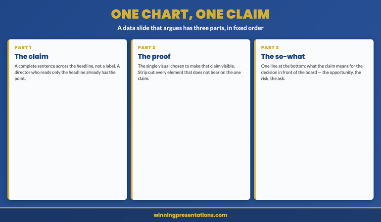
A one-claim slide has three parts and they go in a fixed order. First, the claim, written as a complete sentence across the top of the slide where a headline goes — not a label like “Q2 revenue” but a sentence like “Q2 revenue beat plan, but the beat is concentrated in a single new channel.” The headline is the slide; a director who reads only the headline has the point. Second, the one visual that proves the claim, chosen specifically to make the claim visible — if the claim is about concentration, the chart shows the concentration, with everything that does not bear on concentration stripped out. A chart that supports the headline and nothing else is doing its whole job. Third, the “so what” — one line at the bottom that tells the board what the claim means for the decision in front of them: the opportunity, the risk, the thing to approve.

The reinforcement of this happened with a financial services client in 2016 who had been losing executive committee meetings to exactly the dashboard problem. We took her standard performance deck — built around three dense multi-metric slides — and rebuilt it as a sequence of one-claim slides, each making a single point and ending in a single implication. The first claim established where performance stood against plan; the second isolated the one driver that explained the variance; the third named the decision that driver forced. She presented it the following month and the committee reached the decision in eight minutes, because the deck had done the interpretation for them rather than handing them a grid and hoping. Her comment afterward was telling: the new deck was not less rigorous, it was more — forcing herself to write one claim per slide had made her decide what each number actually meant, which is work the dashboard had let her skip. The chart had been easy; the claim was the hard part, and the claim was the part that mattered.

Build data slides that argue instead of slides that report.

The Executive Slide System ships 26 executive templates including single-claim data layouts with a headline-as-argument structure, plus 93 AI prompts for finding the one claim inside a busy dataset and writing it as a sentence. It includes 16 scenario playbooks covering board review, finance review, and quarterly performance, and 7 checklists. Built for senior presenters who present numbers to a committee on a cycle and want each data slide to carry a conclusion. £39, instant download, lifetime access.

  • 26 executive slide templates — including single-claim data layouts with headline, proof, and “so what”
  • 93 AI prompts — including prompts that surface the one claim inside a dense dataset
  • 16 scenario playbooks — board review, finance review, quarterly performance, executive committee
  • 7 checklists — including the data-slide check that catches a dashboard before it reaches the room

Get the Executive Slide System — £39 →

The one-chart one-claim data slide structure infographic. A data slide that argues has three parts in fixed order: the claim written as a complete sentence in the headline so a director who reads only the headline has the point; the single visual chosen specifically to make that claim visible, with everything irrelevant stripped out; and the so-what line at the bottom that states what the claim means for the decision. This is contrasted with the dashboard slide, a twelve-tile grid that shows everything and claims nothing, leaving every director to reach a different conclusion.

The “say it out loud” test

There is a fast diagnostic for whether any data slide is an argument or a dashboard, and you can run it on your own deck in the time it takes to read it. Before you reveal the chart, try to say the slide’s claim out loud in one sentence. “This slide shows that our growth has become dependent on a single channel.” If you can say that cleanly, the slide is an argument and the chart is its evidence. If the best you can manage is “this slide shows the numbers” or “this is where we are across the board,” the slide is a dashboard and no chart will save it, because there is no claim for the chart to prove. The test works because it forces the question the dashboard lets you avoid: what is this slide actually asserting? A slide that asserts nothing has no business in a deck whose purpose is to move a board toward a decision.

Run the test on your next deck tomorrow and the dashboards will identify themselves immediately — they are the slides where you reach for “this shows” and trail off. For each one, do not start by redesigning the chart. Start by writing the sentence the slide is supposed to prove, and only then choose or cut the visual to prove it. Often a single dense slide turns out to be carrying two or three separate claims jammed together, in which case it should become two or three slides, each with its own headline and its own stripped-down chart. The deck gets longer in slide count and dramatically shorter in the time it takes a board to absorb, because each slide now does one clean piece of work instead of asking the room to disentangle several. The discipline is uncomfortable at first because writing the claim is harder than showing the chart, but the difficulty is the point: the claim is the thinking, and the board came for the thinking.

For the deeper system on using AI to find the claim and build the slide:

AI-Enhanced Presentation Mastery is a self-paced programme — 8 modules, 83 lessons — on using AI to build executive-grade presentations, including drafting the headline claim for a data slide and pressure-testing whether the chart actually proves it. Self-paced with monthly cohort enrolment; 2 optional live coaching sessions, fully recorded — watch back anytime. Lifetime access to materials. £499.

Explore the AI-enhanced programme →

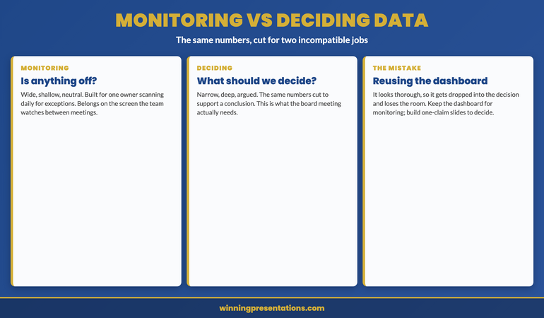
Monitoring data and deciding data are not the same data

The deepest reason the dashboard fails in the boardroom is that it answers a different question from the one the board is asking. A monitoring view answers “is anything off?” — it is built to surface exceptions across a wide field so an owner can act on the one tile that turned red. A board is not asking “is anything off.” It is asking “what should we decide,” and that question needs a narrow, deep, argued view, not a wide, shallow, neutral one. The same underlying numbers serve both questions, but they have to be cut and framed completely differently for each. The mistake is reusing the monitoring cut — the dashboard the team already maintains — in the deciding context, because it is there and it looks thorough. Thoroughness is the monitoring virtue. In the deciding context the virtue is selection: choosing the few numbers that bear on the decision and arguing from them.

This is why the fix is never “make the dashboard prettier” or “use bigger fonts.” A clearer dashboard is still a dashboard; it still reports rather than argues. The fix is to leave the monitoring view where it belongs — available in the appendix or on the screen the team watches between meetings — and to build a separate, purpose-made set of one-claim slides for the decision the board is there to make. Keep the dashboard for the question it was built to answer and build arguments for the question the board is actually asking. The senior leaders who internalise this stop trying to make one artefact serve two incompatible purposes, and their board meetings get both shorter and more decisive as a result. The same instinct — matching what you put in the room to what the room is there to do — runs through how senior presenters open a high-stakes presentation and through the wider executive presentation coaching work.

One template set. Every reporting cycle. Bought once.

Instant download, lifetime access to the Executive Slide System — 26 templates, 93 AI prompts, 16 scenario playbooks, 7 checklists. No subscription, no renewal. £39 once. Built for senior presenters who report numbers to a board every quarter and would rather start each data deck from layouts that already force one claim per slide than rebuild the argument from a dashboard each time.

Get lifetime access — £39 →

Monitoring data versus deciding data infographic. The monitoring view answers is anything off, is built to surface exceptions across a wide shallow field, and belongs to a single owner glancing daily. The deciding view answers what should we decide, needs a narrow deep argued cut of the same numbers, and belongs in the board meeting. The mistake is reusing the monitoring dashboard in the deciding context because it looks thorough; the fix is to keep the dashboard for monitoring and build separate one-claim slides for the decision.

Frequently asked questions

Isn’t showing only one claim per slide a way of cherry-picking the data?

No — selecting the claim is not the same as hiding the data. One chart, one claim governs what each slide argues, not what evidence is available to the board. The full dataset still belongs in the deck; it simply lives in the appendix, where any director who wants to interrogate the wider picture can reach it. What you are removing from the live argument is not evidence but the expectation that the board will derive the conclusion themselves. Cherry-picking is presenting a number out of context to mislead; one-claim slides present the conclusion in full view and invite challenge, with the supporting detail one tap away. If anything, committing to an explicit claim makes you more accountable for your interpretation, not less, because you have put it on the record rather than burying it in a grid.

What if the board specifically asks to see the full dashboard?

Then show it — from the appendix, after you have made your argument. A board that asks for the dashboard is usually asking to verify your claims against the wider picture, which is a reasonable request and one the appendix is built to satisfy. The error is leading with the dashboard rather than holding it in reserve. Make your one-claim case first so the board has your interpretation, then turn to the full view if asked so they can check it. In practice, once the one-claim slides have done the interpretive work, boards rarely spend long on the dashboard, because the questions it would have raised have already been answered. The dashboard reassures; the one-claim slides decide.

How long does it take to see results from switching to one-claim slides?

The first deck you rebuild this way usually lands differently in the very next meeting, because the change is structural rather than gradual — a board responds immediately to a deck that tells them what the numbers mean. What takes longer is the underlying skill of finding the one claim inside a dataset quickly, which is the genuinely hard part and improves over several cycles of doing it. Most senior leaders find the first few decks slower to build than their old dashboards, because writing the claim forces thinking the dashboard let them skip, and then progressively faster as the habit of leading with the conclusion becomes automatic. The payoff in the room is immediate; the gain in your own build time arrives after a few cycles.

Does this apply to operational reviews, or only to board-level decisions?

It applies anywhere the audience is there to decide or act rather than to monitor, which includes most operational reviews with anyone senior in the room. The dividing line is not the seniority of the meeting but its purpose. If the people in the room own the metrics and are scanning for exceptions, a dashboard is the right tool and one-claim slides would be needlessly slow. If the people in the room are being asked to draw a conclusion or approve a course of action, they need the argument made for them, and the dashboard will lose them exactly as it loses a board. When in doubt, ask what the room is there to do; the answer tells you which tool the data needs to become.

The Winning Edge — weekly newsletter

The Winning Edge is a weekly newsletter for senior professionals who present at the executive level. One short email a week on the structural moves that separate decks boards act on from decks they merely receive. Subscribe to The Winning Edge →

For the wider library of presentation assets senior leaders draw on — slide system, storytelling primer, Q&A taxonomy, delivery references — the complete presenter library (£99) collects them in one place. See the wider set of executive coaching resources on the services page, and the partner article on the board deck appendix strategy.

About the author

Mary Beth Hazeldine is Owner & Managing Director of Winning Presentations Ltd. With 24 years of corporate banking experience at JPMorgan Chase, PwC, Royal Bank of Scotland, and Commerzbank, she advises executives across financial services, healthcare, technology, and government on structuring presentations for high-stakes funding rounds, board approvals, and strategic decisions.

The next time you build a data deck, do three things instead of projecting the dashboard your team already maintains: write the one claim each slide is meant to prove as a full sentence across the top, and if you cannot, the slide is a dashboard and needs to become an argument; cut every element from the chart that does not make that one claim visible; and end each slide with the line that tells the board what the claim means for the decision in front of them. The board did not come to read your numbers. It came to find out what your numbers mean, and the presenter who tells them gets a decision while the presenter who shows them the wall of tiles gets asked what they are looking at.

18 Jun 2026
Businesswoman presents a line graph on a large screen to colleagues around a conference table in a modern office setting.

The More Data You Show a Non-Technical Board, the Less They Decide

Quick answer: A data presentation to a non-technical board gets weaker, not stronger, as you add more numbers. Non-technical directors do not read the analyst’s working — they read for the decision the numbers point to. When you show eleven charts, you are asking them to do the interpretation you were supposed to do for them, and a board that has to interpret your data is a board that defers. The fix is the Decision-First Data Slide: one chart, one conclusion headline that states the so-what rather than the topic, the decisive number annotated directly on the chart, the comparison built in, and the source on one line at the bottom. Test every data slide with the eight-second glance test — hand it to someone outside your function, give them eight seconds, and ask which way the number points and what they are being asked to decide. If they cannot answer in one sentence, the slide is built for an analyst, not for a board.

In 2003 I sat on a credit committee at one of the banks where I was working. The committee was seven people, only two of whom could read a cash-flow model without help; the rest were senior commercial people who decided with judgement, not with spreadsheets. A relationship director came in to present a lending proposal he believed was a formality. He had eleven data slides — leverage ratios, sector comparables, a sensitivity table with nine scenarios, a debt-service waterfall, and a covenant-headroom chart with three overlaid lines. He talked us through all eleven. At minute fourteen the chair stopped him, flipped back through the printed pack, circled three numbers in red pen on three different slides, and said: “Come back when you can tell us, on one page, what these mean and what you want us to approve.” The proposal was sound. The data was sound. It was deferred for two weeks anyway, because the committee had been handed a dataset and asked to find the decision inside it themselves.

(This article was created with AI assistance; all stories and insights are based on 35 years of real client work.)

That deferral taught me the rule I have spent the years since teaching to senior professionals who present data to boards: a non-technical board does not get more confident as you give it more data. It gets less confident, because every additional chart is one more piece of interpretation you have pushed onto people who are not equipped — or paid — to do it in the room. This piece walks through the structural method that reverses the effect: the Decision-First Data Slide, the eight-second glance test that tells you whether a slide is board-ready or analyst-ready, and where the eleven charts you cut actually belong. The method is named, testable, and works whether your board is a credit committee, a main board, a charity trustee meeting, or an investment committee.

A board reads for the answer first, then the evidence. The Pyramid Principle is the structure that puts the answer on top.

The free Pyramid Principle Template gives you the one-page structure non-technical boards expect — conclusion first, three supporting reasons, evidence underneath — so your data lands as a decision rather than a dataset. Free download, no email gate.

Download the Pyramid Principle Template →

Why more data makes a non-technical board decide less

The instinct that drives the eleven-slide deck is reasonable and almost always wrong. The presenter reasons: this is an important decision, the board should see the rigour behind it, so I will show the analysis. The flaw is in the word “show.” A non-technical director cannot absorb a sensitivity table with nine scenarios in the forty seconds the slide is on screen. What the director actually does is glance at it, register that it looks thorough, fail to extract a conclusion, and feel a small flicker of unease — because they have just been shown something important that they could not read. That unease does not register as “I do not understand this chart.” It registers as “I am not sure about this proposal.” The presenter has converted analytical rigour into decision hesitancy, which is the exact opposite of the intention.

This is the mechanism behind the paradox. Every chart that a non-technical audience cannot interpret in the moment adds cognitive load without adding confidence, and cognitive load that does not resolve into a conclusion is experienced as risk. The board is not thinking “the leverage ratio is concerning.” It is thinking “there is a lot here I am being asked to take on trust, and I do not yet know what I am being asked to approve.” A board that does not know what it is being asked to approve does the safest available thing, which is to ask for more work and defer. The eleven slides did not fail because they were wrong. They failed because they asked the wrong people to do the interpretation. The broader principles of presenting data to executive audiences all reduce to this single idea: the interpreting is the presenter’s job, and a data slide that outsources it back to the board has failed before anyone speaks.

The reframe that fixes it is uncomfortable for people who built their careers on analytical depth. You are not presenting your analysis. You are presenting the decision your analysis produced, supported by the minimum evidence a non-technical person needs to trust it. The depth still exists — it lives in the appendix, in the model, in the answers you give when challenged — but it is not the spine of the presentation. The spine is the conclusion and the one chart that makes the conclusion visible. Everything else is available on request, not on screen by default.

The Decision-First Data Slide: five parts

The Decision-First Data Slide is a single slide built to five rules. It is not a style preference; each rule removes one of the ways a data slide pushes interpretation back onto the board. A slide that follows all five carries one decision and makes the supporting number visible in a single glance. A slide that breaks any of them starts to read as an analyst’s working paper rather than a board input.

The five parts are these. One, the headline states the conclusion, not the topic. “Revenue is on track to miss the full-year plan by nine percent unless we act on pricing this quarter” is a conclusion. “Q3 Revenue Performance” is a topic, and a topic headline forces the board to read the chart to find out what they are meant to feel about it. Two, one chart carries the slide — not a dashboard, not four panels, one chart that the conclusion depends on. Three, the decisive number is annotated directly on the chart, so the eye lands on it without searching: a callout arrow, a bold data label, a shaded gap between the actual line and the plan line. Four, the comparison is built in. A number with nothing to compare it to is not decision information; the board needs to see the actual against the plan, the target, or the prior period, on the same chart. Five, the source sits on one line at the bottom — quietly, in small type — so the provenance question is pre-answered without cluttering the decision.

What makes the five parts work together is that they each protect the board from a specific failure. The conclusion headline removes the interpreting. The single chart removes the searching. The annotation removes the hunting for the relevant number. The built-in comparison removes the “is that good or bad?” gap. The source line removes the provenance doubt before it is voiced. None of them is about making the slide prettier. Each is about removing a task the board would otherwise have to do in the room, and the cumulative effect of removing those five tasks is a slide a non-technical director can act on in seconds rather than puzzle over for a minute.

Build board-ready data slides without rebuilding the structure from scratch every quarter.

The Executive Slide System is the template library senior professionals use to turn dense analysis into slides a non-technical board can decide on — conclusion-headline layouts, single-chart decision slides, and the structure that keeps the rigour in the appendix where it belongs.

  • 26 executive templates, including decision-slide and single-chart layouts built for non-technical audiences
  • 93 AI prompts for turning a model output into a conclusion headline and a one-chart story
  • 16 scenario playbooks — board update, budget ask, performance review — with the slide order each one needs
  • An 8-slide QBR Deep Dive template plus 8 QBR-specific AI prompts for the quarterly data review
  • Instant download, lifetime access, usable across every reporting cycle — £39

Get the Executive Slide System →

The Decision-First Data Slide infographic showing the five parts that make a data slide board-ready: (1) Headline states the conclusion not the topic; (2) One chart carries the slide, not a dashboard; (3) The decisive number is annotated directly on the chart; (4) The comparison is built in against plan, target, or prior period; (5) The source sits on one line at the bottom. Each part removes one task the board would otherwise have to do in the room.

The eight-second glance test

The Decision-First Data Slide needs a test that tells you, before the meeting, whether a slide is board-ready or analyst-ready. The test is mechanical and it is the single most useful thing in this article. Take the slide. Hand it to a colleague who does not work in your function — someone from HR, operations, legal, anyone who was not in the analysis. Give them eight seconds with it, then take it away. Ask two questions: which way is the number pointing, and what are we being asked to decide? If they can answer both in one sentence, the slide is board-ready. If they hesitate, hunt back over the slide in their memory, or say “well, it depends what you mean,” the slide is analyst-ready and the board will do exactly what your colleague just did — except the board will not tell you, it will simply defer.

Eight seconds is not arbitrary. It is roughly the attention a non-technical director gives a data slide before they either lock onto its conclusion or start half-listening to your voice while their eyes drift. If the slide has not delivered its conclusion in that window, you have lost the slide; the rest of your forty seconds of talking is spent against a director who is now reading the chart instead of listening to you. The eight-second test simulates the real conditions of the room. It is deliberately unfair, because the room is unfair: nobody on a board studies your slide the way you studied your model.

The test also diagnoses which of the five parts has failed. If your colleague cannot tell which way the number points, the annotation or the comparison is missing. If they can read the number but cannot say what is being decided, the headline is a topic, not a conclusion. If their eyes visibly dart around the slide, you have more than one chart competing for the decisive glance. The test does not just tell you the slide is wrong; it tells you which rule to fix. Run it on every data slide in your next board pack and you will cut the pack down before the board ever sees it. The visualisation choices that survive an executive glance are the ones engineered to pass this test, not the ones that look most impressive on a wide monitor in your own office.

The conclusion headline that does the interpreting

Of the five parts, the conclusion headline does the most work and is the one presenters resist most. A conclusion headline commits you. “Q3 Revenue Performance” commits to nothing; if the board reacts badly you can retreat into “well, I was just showing the data.” “Revenue will miss the full-year plan by nine percent without a pricing decision this quarter” commits you to a position the board can challenge. That exposure is precisely why it works. A board engages with a position. It cannot engage with a topic, because a topic gives it nothing to agree or disagree with, so it falls back on the only response a topic allows: more questions, more requests, more delay.

The discipline of writing the headline is the discipline of finishing your own thinking before the meeting. If you cannot write the conclusion in one sentence, you have not actually concluded — you have assembled evidence and hoped the board would conclude for you. Writing the headline forces the analytical work to finish at your desk, where it is cheap to be wrong, rather than in the boardroom, where it is expensive. The headline is also the line the board will quote back when they brief the people who were not there. If you do not write it, someone else will write a worse one for you, in the corridor afterwards, with your name attached.

There is a craft to making the headline land without overclaiming. It states the conclusion as a process finding, not a guaranteed outcome: “on current trajectory, revenue misses plan by nine percent” rather than “revenue will collapse.” It carries the decision implication: “without a pricing decision this quarter.” And it stays in the board’s language, not the analyst’s — “miss the plan” rather than “negative variance to budget at the EBITDA line.” A headline a director can repeat verbatim to another director is a headline that has done its job, because the decision now travels without you in the room. Turning a dataset into a narrative the board can carry is the same skill applied across the whole deck rather than a single slide.

The hardest part is turning the number into a sentence a non-technical board feels something about.

The Business Storytelling Mini-Course is built for exactly this: structuring narrative around data so the numbers move an executive decision, without tipping into TED-talk theatrics. It is the companion skill to the slide layout — the layout makes the conclusion visible, the narrative makes the board care about it. £29, instant access.

See the storytelling method →

One chart, not a dashboard, on a decision slide

In 2019 I ran a preparation session with a finance director rehearsing a board paper on a pricing decision. Her draft opened with a slide carrying four charts — volume, margin, competitor pricing, and customer churn — arranged in a two-by-two grid she was proud of, because each chart was relevant and she had built them all herself. I asked her the eight-second question. She could not, in eight seconds, tell me which chart the decision turned on. We rebuilt the slide to carry one chart: the margin trend, with the actual line and the plan line and the shaded gap between them, the gap annotated with the nine-percent figure, and a headline that stated the conclusion. The other three charts went to the appendix. She presented it the following week. The board approved the pricing change in under twenty minutes, and one director told her afterwards it was “the clearest board paper we’ve had this year.” Same analysis. One chart on the decision slide instead of four.

The reason one chart beats four is not aesthetic. A decision slide has exactly one job: make the conclusion’s supporting evidence visible in a glance. Four charts force the board to choose which one to look at, and while they choose, they are not deciding. The other three charts are not wrong — volume, competitor pricing, and churn all mattered to the analysis — but they are answers to questions the board has not yet asked. Putting them on the decision slide is answering questions out of order, and out-of-order answers read as clutter. They belong where they can be reached the instant a director asks the question they answer, which is the appendix, not the spine.

The test for whether a chart belongs on the decision slide is simple: does the conclusion in the headline depend on this specific chart? If the headline is about a nine-percent margin miss, the margin chart stays and everything else goes. If a director asks “what about churn?” you turn to the churn slide in the appendix, which makes you look prepared rather than cluttered. The discipline of one chart per decision is the discipline of trusting the board to ask for the second chart when they want it — and they will, which is exactly why it should be ready and not on screen.

The Eight-Second Glance Test infographic showing the diagnostic procedure: hand the data slide to a colleague outside your function, give them eight seconds, then ask two questions — which way is the number pointing, and what are we being asked to decide. If they answer both in one sentence the slide is board-ready; if they hesitate it is analyst-ready. The infographic also maps each failure to its cause: can't tell direction means annotation or comparison missing; can read number but not the decision means the headline is a topic not a conclusion; eyes dart around means more than one chart competing.

Where the other ten charts belong

The fear that stops people stripping a deck down is that the depth will look missing — that a one-chart decision slide will read as thin, as though the presenter has not done the work. The opposite is true, but only if the depth is visibly available rather than absent. The eleven charts from the 2003 credit committee were not the problem; their position was. As the spine of the presentation they caused a deferral. As a tabbed appendix, reached the moment a committee member asks a question, they would have signalled exactly the rigour the presenter wanted to convey — without forcing the committee to wade through it to find the decision.

A board paper for a non-technical board therefore has a clear two-tier shape. The front is decision-first: conclusion, the one chart that supports it, the recommendation, the ask. The back is analyst-grade: the sensitivity tables, the comparables, the model assumptions, the scenario range, the methodology. The front is what you present. The back is what you reach for when challenged, and reaching for it confidently is what builds the board’s trust that the front is sound. A presenter who can answer “what happens if rates rise two hundred basis points?” by turning straight to the scenario in the appendix has demonstrated more rigour than a presenter who put all nine scenarios on the front slide and let the board drown in them.

This two-tier shape also solves the political problem that makes people over-show data in the first place: the fear of looking unprepared in front of the one technical person on the board. There is often a finance director, an audit-committee chair, or an ex-banker who can read the model. The instinct is to build the whole deck for that one person. Do not. Build the front for the non-technical majority who hold the decision, and build the appendix for the one technical reader who will go looking for the detail. The appendix satisfies the specialist without sacrificing the decision-makers, and the specialist, far from feeling short-changed, usually appreciates being able to find the detail in a structured back section rather than scattered across the main slides.

Why this matters more for senior presenters than for analysts

An analyst presenting to other analysts can lead with the working, because the audience reads working fluently and judges the analyst on the rigour of the method. A senior professional presenting to a non-technical board is judged on something different: whether they can take a complex analysis and extract from it a decision the board can act on. That extraction is the senior skill. A board does not promote the person who can build the most detailed sensitivity table; it trusts the person who can stand up, state what the table means in one sentence, and stand behind it. The Decision-First Data Slide is the visible form of that skill. It says, before you have spoken a word: I have done the interpreting, here is the decision, the evidence is one glance away, and the depth is in the back if you want it.

The cost of getting this wrong compounds across a career in a way that is easy to miss. A senior leader who repeatedly hands boards analyst-grade decks earns a quiet reputation as someone whose work needs translating before it can be used — capable, but not yet board-level. A senior leader who repeatedly hands boards decision-first slides earns the opposite reputation: the person whose papers can be acted on as presented. Over a dozen board cycles, those two reputations diverge sharply, and they diverge on a skill that has almost nothing to do with the quality of the underlying analysis and almost everything to do with who is made to do the interpreting in the room.

One thing to do before your next board deck

Take the data slide you are most proud of in your next board pack — the one with the most analysis on it. Write its conclusion in one sentence at the top: what the number means and what the board should do about it. Strip the slide to the single chart that conclusion depends on, annotate the decisive number directly on the chart, and build in the comparison so the board can see whether the number is good or bad without being told. Move every other chart to a clearly tabbed appendix. Then hand the slide to someone who was not in the analysis, give them eight seconds, and ask which way the number points and what is being decided. If they answer in one sentence, you are ready. If they hesitate, you have just found the slide your board would have deferred — with two weeks left to fix it instead of finding out in the room.

Frequently asked questions

Won’t a non-technical board think I’m oversimplifying or hiding something if I only show one chart?

This is the fear that keeps the eleven-slide deck alive, and the two-tier structure is what resolves it. You are not hiding the depth; you are positioning it. The decision slide carries the conclusion and the one chart it depends on, and a clearly tabbed appendix carries the full analysis — the sensitivity tables, the comparables, the model assumptions. When a director asks for more, you turn straight to it, which demonstrates rigour rather than concealing it. Boards do not read “one chart” as hiding; they read it as a presenter who has done the interpreting and knows which evidence the decision actually rests on. The presenters who get accused of oversimplifying are the ones who strip the depth out entirely. Keep all of it — just move ten charts to the back and leave the one the decision turns on at the front.

What if my board genuinely is technical — mostly finance people who want the detail?

Then your “eight-second colleague” should be drawn from that population, and the conclusion headline still applies even when the audience can read the working. A technical board reads charts faster, but it still decides on conclusions, and it still defers when it cannot tell what it is being asked to approve. The difference is where you set the line between front and appendix: a technical board may want two or three charts on the decision slide rather than one, and a richer set of comparables on the front. But the conclusion headline, the built-in comparison, and the annotated decisive number are not concessions to non-technical audiences — they are how any board, technical or not, locks onto a decision quickly. Run the glance test with a technical colleague and calibrate to what they can extract in the time you actually have.

How long does it take to rebuild a deck this way, and is it worth it under time pressure?

Rebuilding an existing deck to the Decision-First structure usually takes a couple of hours the first time and far less once the pattern is familiar, because most of the work is moving charts to an appendix and writing conclusion headlines you should have written anyway. Under genuine time pressure, the single highest-return move is the headline: spend ten minutes writing a one-sentence conclusion at the top of each data slide, even if you change nothing else. That alone shifts the board from interpreting to deciding. The full rebuild is worth it for any high-stakes board paper where a deferral costs you weeks; for a routine update, the headline pass is often enough. The point is that the structural work is cheap relative to the cost of a deferral, and the headline is the cheapest, highest-leverage part of it.

What’s the most common mistake senior presenters make with board data slides?

Leading with the topic instead of the conclusion. The topic headline — “Q3 Performance,” “Market Overview,” “Pricing Analysis” — feels safe because it does not commit, but the lack of commitment is exactly what makes the board work to find the point. The second most common mistake is the dashboard reflex: putting four or six charts on a slide because each one is relevant, without noticing that relevance is not the test. The test is whether the conclusion depends on the chart. A relevant chart that the conclusion does not depend on belongs in the appendix. Fix those two habits — conclusion headlines and one chart per decision slide — and most of the board-data problem disappears, because together they move the interpreting from the board back to where it belongs, which is with you, before the meeting.

The Winning Edge — weekly newsletter

The Winning Edge is a weekly (Thursday) newsletter for senior professionals who present to boards and executive committees. One short email a week on the structural moves that separate the data decks boards act on from the ones they defer. Subscribe to The Winning Edge →

For the full set of skills behind a board-ready data presentation — slides, storytelling, confidence, and delivery — the seven-product Complete Presenter bundle brings them together as a single resource — £99 for everything, lifetime access.

About the author

Mary Beth Hazeldine is Owner & Managing Director of Winning Presentations Ltd. With 24 years of corporate banking experience at JPMorgan Chase, PwC, Royal Bank of Scotland, and Commerzbank, she advises senior professionals across financial services, insurance, consulting, and technology on the structural moves that turn dense analysis into decisions boards can act on.

26 Jan 2026
Executive woman presenting data to leadership in boardroom with dashboard charts on screen behind her

Why “Data-Driven” Presentations Often Backfire With Executives

The CFO cut him off on slide three: “What do you want me to do?”

The analyst didn’t have an answer. Not because he hadn’t done the work—he’d spent three weeks building the most thorough financial analysis I’d ever seen. Twelve slides of charts, trend lines, and statistical significance. Every number sourced. Every projection defensible.

His £4M budget request was dead before he reached slide four.

I’ve watched this scene repeat hundreds of times across JPMorgan Chase, PwC, Royal Bank of Scotland, and Commerzbank. Brilliant people with impeccable data losing executive support—not because their analysis was wrong, but because their structure was backwards.

Quick answer: Data presentations fail with executives because they’re structured for analysis, not decision. Executives don’t want to re-walk your analytical journey—they want to know what you recommend and whether they should act on it. Leading with data signals you don’t understand how senior leaders make decisions. The fix: recommendation first, supporting evidence second, detailed analysis in the appendix.

Written by Mary Beth Hazeldine, Owner & Managing Director of Winning Presentations. 24 years corporate banking at JPMorgan Chase, PwC, RBS, and Commerzbank. I’ve sat in hundreds of executive meetings watching data-heavy presentations succeed or fail—the patterns are unmistakable. Last updated: January 2026.

Why Data-Heavy Presentations Fail With Executives

Here’s the uncomfortable truth: your data isn’t as persuasive as you think it is.

When you build analysis, you start with data and work toward a conclusion. That’s the right process for analysis. But it’s the wrong structure for presentation.

Executives have already delegated the analysis to you. They don’t want to re-do your work—they want to know what you concluded and whether they should act on it.

The Attention Economics Problem

A typical executive has 8-12 meetings per day. Your presentation is one of many competing for their mental bandwidth. They’re making a rapid assessment within the first 60 seconds: “Is this worth my full attention, or can I skim while checking email?”

Data-heavy openings signal: “This person is going to walk me through their entire process.”

That’s when you lose them.

📚 Research note: Studies on executive attention (Kahneman’s work on cognitive load, Davenport’s research on the attention economy) consistently show senior leaders use heuristics and pattern recognition rather than systematic data analysis. They’re scanning for “does this person know what they’re talking about?” and “what do they want me to do?”—not evaluating your methodology.

The Credibility Paradox

Here’s what’s counterintuitive: leading with data often reduces your credibility with executives.

Why? Because it signals you don’t understand your audience. Executives interpret data-heavy openings as:

  • “This person doesn’t know what’s important”
  • “They’re hiding behind numbers because they’re not confident”
  • “They don’t understand how decisions get made at this level”

That analyst with impeccable data? He lost credibility precisely because his structure was wrong. He knew the numbers—but he didn’t know his audience.

Diagram showing why data presentations fail with executives: the credibility paradox and attention economics

How Executives Actually Process Information

Understanding how executives think changes how you structure everything.

The Pyramid Principle (Inverted)

Barbara Minto’s Pyramid Principle—developed at McKinsey—captures this perfectly: start with the answer, then provide supporting evidence only as needed.

Most presenters do the opposite. They build to their conclusion like a mystery novel. But executives aren’t reading for suspense—they’re reading for decision.

What executives are thinking in the first 60 seconds:

  1. “What does this person want?”
  2. “Why should I care?”
  3. “What do they need from me?”

If you haven’t answered these questions by slide two, you’ve likely lost their full attention.

The “So What?” Filter

Every piece of data passes through an automatic filter in the executive mind: “So what?”

Revenue increased 12% → So what?
Customer acquisition cost dropped → So what?
Market share grew in Q3 → So what?

If you’re not explicitly answering “so what?” for every data point, executives are doing it themselves—and they might reach different conclusions than you intended.

For more on structuring executive communication, see how to write the executive summary slide.

⭐ Stop Building Presentations Executives Ignore

The Executive Slide System gives you the recommendation-first structure that senior leaders respond to. No more data dumps that get “taken offline.” No more brilliant analysis that dies on slide three.

What’s included:

  • The 6-slide executive structure (recommendation-first)
  • Data slide templates with built-in “so what?”
  • Appendix strategy for supporting evidence
  • Before/after examples from budget and strategy presentations

Get the Executive Slide System → £39

Used by senior professionals presenting budgets, forecasts, and business cases to CFOs and executive committees.

The Recommendation-First Structure That Works

The key insight: lead with the destination, not the journey.

Slide 1: The Recommendation

State your conclusion immediately. Not “today I’ll walk you through…” but “I recommend we do X because Y.”

This feels uncomfortable if you’re used to building up to your point. Do it anyway. Executives will respect you more, not less.

Slide 2: The Stakes

Why does this matter? What’s the cost of inaction? What’s the opportunity if we act?

This is where you earn continued attention. If the stakes aren’t clear, executives will mentally downgrade your priority.

Slides 3-5: Supporting Evidence (Curated)

Not all your data—the 3-4 data points that most directly support your recommendation. Each one with an explicit “so what.”

Critical: If a data point doesn’t directly support your recommendation, it goes in the appendix. Period.

Slide 6: The Ask

What specific decision or action do you need? “Approve the budget,” “Greenlight phase 2,” “Allocate resources to X.”

Vague asks get vague responses. Specific asks get decisions.

Appendix: Everything Else

All that additional data? It goes here. Available if executives want to drill down, but not blocking your core message.

→ Want templates for this exact structure? The Executive Slide System includes recommendation-first templates, data slide frameworks, and real before/after examples.

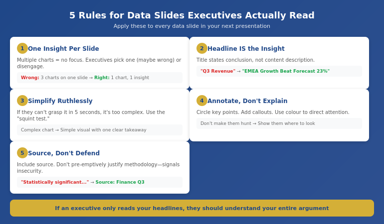
5 Rules for Data Slides Executives Will Actually Read

When you do include data slides, these rules prevent the common failures:

Rule 1: One Insight Per Slide

If a slide contains multiple charts or data points, executives don’t know where to look. They’ll either pick one (maybe not the one you wanted) or disengage entirely.

One slide. One insight. One “so what.”

Rule 2: The Headline IS the Insight

Your slide title should state the conclusion, not describe the content.

Wrong: “Q3 Revenue by Region”
Right: “EMEA Revenue Growth Outpaced Forecast by 23%”

If an executive only reads your headlines, they should understand your entire argument.

Rule 3: Simplify Ruthlessly

That complex chart that took you hours to build? It probably needs to be simpler. If executives can’t grasp the insight in 5 seconds, the chart is too complicated.

Use the “squint test”—if you squint at the slide, can you still see the main point?

Rule 4: Annotate, Don’t Explain

Don’t make executives hunt for the important part. Annotate directly on the chart:

  • Circle the key data point
  • Add a callout with the insight
  • Use colour to direct attention

Rule 5: Source, Don’t Defend

Include your data source, but don’t pre-emptively defend your methodology. If executives question it, you can explain. But leading with “this data is statistically significant because…” signals insecurity.

For more on making numbers compelling, see data storytelling techniques.

The 5 rules for data slides that work with executives: one insight, headline is insight, simplify, annotate, source don't defend

⭐ Transform How Executives Respond to Your Presentations

The Executive Slide System contains the exact structure that gets data-heavy presentations approved instead of ignored. Stop building decks that die on slide three.

Inside:

  • The recommendation-first framework
  • Data slide templates with “so what?” built in
  • “One insight per slide” layouts
  • Appendix strategy for supporting evidence

Get the Executive Slide System → £39

Move from “taken offline” to approved in the meeting.

Before and After: A 47-Slide Transformation

Let me show you what this looks like in practice.

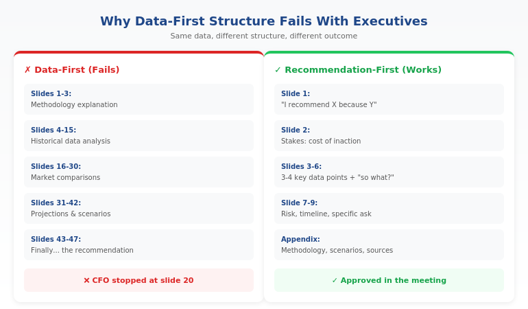
Before: The 47-Slide Data Dump

A finance director came to me with a budget presentation that had been rejected twice. Here’s what it looked like:

  • Slides 1-3: Methodology explanation
  • Slides 4-15: Historical data analysis
  • Slides 16-30: Market comparisons
  • Slides 31-42: Projections with multiple scenarios
  • Slides 43-47: Finally, the recommendation and ask

The CFO had never made it past slide 20. Twice.

After: The 12-Slide Decision Deck

We restructured completely:

  • Slide 1: “I recommend a £2.3M budget increase for Q3. Here’s why it will deliver £8M in returns.”
  • Slide 2: The cost of inaction (lost market opportunity)
  • Slides 3-6: Four supporting data points, each with explicit “so what”
  • Slide 7: Risk mitigation
  • Slide 8: Implementation timeline
  • Slide 9: The specific ask
  • Slides 10-12: Appendix (methodology, detailed scenarios, sources)

Result: Approved in the meeting. The CFO asked two questions, both answered from the appendix.

Same data. Same analyst. Different structure. Different outcome.

→ Ready to restructure your next data presentation? The Executive Slide System gives you the templates and framework to transform any data-heavy presentation for executive audiences.

🎯 Transform Your Next Data Presentation in 30 Minutes:

  1. Write your recommendation in one sentence — this becomes slide 1
  2. Identify the 3-4 data points that most directly support it — these become slides 3-5
  3. Move everything else to an appendix — available but not blocking
  4. Write “so what?” under each chart — make the insight explicit

Is This Right For You?

✓ This is for you if:

  • You present budgets, forecasts, or business cases to executives
  • Your data-heavy presentations keep getting “taken offline”
  • You want frameworks that get faster decisions
  • You’re willing to restructure how you present data

✗ This is NOT for you if:

  • Your audience is analysts who need to verify your methodology
  • You’re presenting research findings, not recommendations
  • Your presentations are primarily educational, not decisional
  • You’re not the one making recommendations

⭐ That £4M Rejection Taught Me What Actually Works

Watching brilliant analysts lose executive support because of structure—not substance—changed how I think about every presentation. The Executive Slide System contains exactly what I learned: the framework that gets data presentations approved instead of ignored.

What you’ll get:

  • The recommendation-first framework
  • Data slide templates with “so what?” built in
  • Executive summary structures that work
  • Appendix strategy for supporting evidence
  • Before/after examples from real presentations

Get the Executive Slide System → £39

Transform how executives respond to your data presentations.

Frequently Asked Questions

Won’t executives think I’m hiding something if I don’t show all the data?

No—they’ll think you understand what’s important. The appendix shows you’ve done thorough analysis. Leading with conclusions shows you can synthesise that analysis into actionable insight. That’s the skill executives want to see.

What if my executive is very data-oriented and wants to see the numbers?

Even data-oriented executives appreciate recommendation-first structure. They can always ask for more detail (that’s what the appendix is for). But starting with data when they want to start with conclusions wastes everyone’s time. Structure for decision-making, then support with data as requested.

How do I know which data points to keep vs. move to appendix?

Ask: “Does this directly support my recommendation?” If yes, it stays. If it’s interesting-but-tangential or supporting-but-not-essential, it goes to appendix. When in doubt, appendix it. Less is more with executive audiences.

What if I don’t have a clear recommendation yet?

Then you’re not ready to present. A presentation without a recommendation is a status update—and status updates rarely get decisions. Clarify your recommendation before you build the deck.

📧 Optional: Get weekly executive presentation strategies in The Winning Edge newsletter (free).

Your Next Step

Your data is probably excellent. Your analysis is probably thorough. What’s likely missing is structure that matches how executives actually make decisions.

The gap between “comprehensive analysis” and “approved budget” is often just presentation structure.

Start by restructuring your next data presentation using the framework in this article. Move your recommendation to slide one. Cut your data slides in half. Add “so what?” to every chart.

For the complete system—including templates, examples, and the full executive slide framework—get the Executive Slide System (£39).

P.S. If the problem isn’t your slides but your nerves when presenting them, see how to stop hands shaking during presentations—a quick nervous system reset that works in the moment.

About the Author

Mary Beth Hazeldine is the Owner & Managing Director of Winning Presentations. That £4M rejection that opens this article? She watched it happen—and it changed how she thinks about every data presentation since.

With 24 years at JPMorgan Chase, PwC, Royal Bank of Scotland, and Commerzbank, she’s sat in hundreds of executive meetings where data-heavy presentations succeeded or failed. The patterns are clear—and teachable.

Book a discovery call | View services