
Quick Answer: The right series A pitch deck length is 12 slides, not 25. A Series A lead partner will skim your deck in under four minutes on the first pass, read four slides closely, and decide whether to take the meeting. A 25-slide deck dilutes the four slides that matter. A 12-slide deck forces you to choose them. Put everything else in a clearly structured appendix.
JUMP TO:
Priya was three days out from her first Series A partner meeting when she sent me the deck. Twenty-seven slides. Her seed deck had been fourteen, and she had doubled the weight because “there is so much more to show now — traction, cohorts, pipeline, expansion logic, the moat.” All true. None of it was on a single slide she could point to and say: this is the headline.
We ran the rehearsal on the Sunday. I asked her to open the deck, pick the slide her lead investor candidate would stop on, and tell me why that slide made the round. She paused. She clicked forwards. She clicked back. Around slide nine, the lead partner — who in rehearsal I was playing — leaned back and asked: “what’s the headline here?” She could not answer. Not because she did not know the business. Because the deck had no centre of gravity.
That meeting moved from a partner call to a recorded async review. Narrower path, lower chance of conversion. Three weeks later we rebuilt the deck around twelve slides. Not because twelve is magic — because twelve forces you to pick the four slides the partner will actually read, and protect them.
If you are cutting a Series A deck down to its real shape
The Executive Slide System includes scenario playbooks for investor pitches, partner meetings and fundraising reviews — structural templates designed for audiences who decide on four slides.
Why series A pitch deck length is a signal, not a constraint
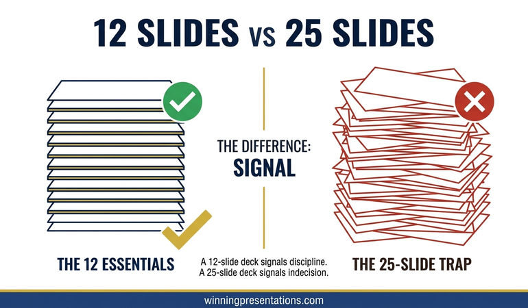
Most founders treat deck length as a packaging problem — how much content can I fit without losing the reader. That framing misses what the deck does. The deck is a signal of how the founder thinks. A 25-slide deck signals that the founder cannot prioritise, or has not yet earned the right to because the narrative is not tight enough.
A 12-slide deck signals the opposite. The founder has made the hard editorial calls. The four numbers that matter are on the slides, and the rest is supporting detail. Investors do not read this as a gap. They read it as maturity.
When a founder cannot cut from 25 to 12, it is almost never because the extra 13 slides are essential. The founder is using the deck to hedge — adding slides in case a partner asks a specific question, in case the market framing is weak, in case traction alone will not carry it. Each hedge is a tell. For the related question of slide order rather than count, the partner article on investor pitch deck slide order covers the sequence that holds up under a partner read.
What VCs actually do with a 25-slide deck
Most founders assume the partner will read linearly, absorbing the argument. That is almost never what happens. A partner has 45 to 90 seconds to form an initial judgement, and four to six minutes if the first pass is positive. Inside that window, they do three things.
First, they go to the slide that signals stage. For Series A, that is traction — revenue shape, retention or cohort data, and the curve. If that slide is on page 3 they find it in three seconds. If it is on page 17 inside “our journey so far,” they skim past and decide the deck is not stage-appropriate.
Second, they go to the slide that signals defensibility. Not the product slide — the moat slide. Whatever makes this business hard to replicate by a better-funded incumbent eighteen months from now. Product advantage at Series A is rarely the defensibility.
Third, they read the ask and use of proceeds. How much, against what milestones, over what runway. A £12m raise against vague milestones reads worse than a £6m raise against crisp ones.
Those are the four slides — traction, defensibility, ask, and the narrative setup that connects them. Everything else in a 25-slide deck is noise the partner filters through. A 12-slide deck makes the filter unnecessary.
THE EXECUTIVE SLIDE SYSTEM — £39
Stop shipping a 25-slide deck that hides the four slides the partner actually reads
The Executive Slide System is 26 presentation templates, 93 AI prompts, 16 scenario playbooks, a master checklist and a framework reference. The investor pitch playbook is built for decision-stage audiences who skim before they read — with the 12-slide structure, title architecture and appendix navigation pattern this article describes. £39, instant access.
Get the Executive Slide System →
Designed for founders preparing Series A, Series B and growth-stage investor presentations.
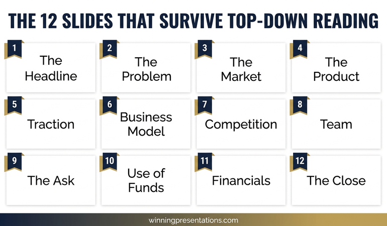
The 12 slides that survive top-down reading
The twelve-slide structure is not arbitrary. It is the minimum coherent set that answers the questions a Series A partner asks on the first read. Each slide earns its place by being the shortest honest answer to one question the partner cannot skip. The twelve questions, in order:
- What problem is being solved, and for whom?
- How big is this market, and why is it ready now?
- What is the product, in one screen?
- What traction does that product already have?
- How does the business make money, and what are the unit economics?
- Who is the team, and why this team?
- What is being asked for, and what does it buy?
- What do the financials project, and against what assumptions?
- What are the plausible exits, and what shape do they take?
- Why is this defensible against well-funded incumbents?
- What is the go-to-market motion that gets you to Series B?
- What is the close — the one sentence the partner takes to the partnership meeting?
Each is one slide. Not a section. Not a sub-deck. When a founder tells me a topic needs two slides to do justice, the founder has not yet found the sentence that collapses it. That sentence exists. It is the editorial work.
For the complete structural reference including title architecture and layout patterns, the investor pitch deck template walks through the slide-level design.
Slide-by-slide: the 12 you need
1. Problem. Framing from the customer’s perspective, with one quantified cost of the status quo. Not “enterprises struggle with X.” A specific operational cost a specific buyer already pays.
2. Market. Bottom-up sizing. Target buyers, average contract value, addressable revenue. Top-down “it’s a $42bn market” numbers read as lazy at Series A.
3. Product. One screenshot that communicates what the product actually does. Not three. Not a feature grid. The screen the user spends 80% of their time on.
4. Traction. The single most important slide. Revenue curve, retention or cohort shape, and one signal of velocity. This is where the round is won or lost.
5. Business model. How you charge, the contract shape, gross margin and one unit economic ratio (LTV/CAC, payback period, contribution margin). If the economics are not yet clean, say so openly and show the trajectory.
6. Team. Three to five faces maximum. For each, one line: the relevant experience that matters for this company. Investors hire the team that can execute this specific plan.
7. The ask. Round size, valuation range (optional), use of proceeds in three buckets (product, GTM, team), and the runway this buys in months. Specific milestones, not categories.
8. Financials. Three years of projected revenue, gross margin and burn. Flagged as model, not forecast. Include the two or three assumptions the model is most sensitive to.
9. Exit. Plausible acquirers or comparable outcomes, with a rough scale. Not a promise — a demonstration that the founder has thought about what a 10x outcome looks like.
10. Defensibility. The moat. Data network effects, switching costs, regulatory position, distribution lock-in, proprietary data asset — whichever applies. If none apply, the founder needs to know that before the meeting.
11. GTM. The go-to-market motion that gets you from this round to the next. Sales-led, product-led, partnership-led or hybrid — and the specific next hires and channels that make it real.
12. The close. One sentence the partner takes into the Monday partnership meeting. Usually a reframing of the opportunity in the language of the fund’s thesis. Written last, because it is the whole deck compressed into a line.
For founders still shaping the narrative before slide-level choices, the pitch deck storyline guide covers how to sequence the twelve questions into a single argument.
Slides to never include in the 12 (and where they go instead)
The slides founders most often over-include are competitive landscape, detailed roadmap, press and logos, and the history-of-the-company slide. Each has a place. None belong in the twelve.
Competitive landscape. A 2×2 matrix with your logo in the top right is almost always weaker than one sentence inside the defensibility slide that names the two real competitors and what you do differently. The matrix goes in the appendix.
Detailed roadmap. A quarter-by-quarter roadmap is either aspirational theatre or premature specificity. The GTM slide covers strategic direction. Detailed roadmap belongs in a data room, not a first-read deck.
Press and logo walls. Customer logos can earn a small line on the traction slide. A full page of press hits reads as marketing, not evidence.
Company history. The founding story, the pivots, the previous names — none of it answers a partner question. If the founding story is strong, it comes out verbally. A slide for it signals the founder has run out of harder material.
The appendix is where these slides live — labelled A1 through A6, navigable in under two seconds. When a partner asks about the competitive set, the roadmap or the regulatory position, you jump straight there. The main twelve stay clean. This is how investor pitch deck mistakes most often get corrected at the structural level.
The discipline of cutting from 25 to 12
The cut from 25 to 12 is not a compression exercise. It is a decision exercise. Print every slide as a thumbnail, lay them on a table, and for each ask two questions — which of the twelve partner questions does this slide answer, and is it the single strongest answer I have?
Any slide that does not answer one of the twelve comes out. Any slide that does but is not the strongest version comes out. The remaining slides are merged, rewritten and reordered until each of the twelve positions has exactly one slide in it.
The work that feels like cutting is actually clarifying. A founder with 25 slides will usually find that two product slides collapse into one better slide, three go-to-market slides compress into one clearer structure, and five team slides become one with the people who matter.
Priya cut her 27-slide deck to 12 in three working days. The round moved from a deferred partner call to a live partner meeting inside two weeks. The meeting opened with the lead asking her to walk him through slide 4 — the traction slide. The slide was already there, already clean, already the strongest version of the answer. The deck had a centre of gravity for the first time.
FOR FOUNDERS PREPARING A SERIES A DECK
The full structural library for investor presentations
The Executive Slide System gives you 26 templates, 93 AI prompts and 16 scenario playbooks — including the Series A investor playbook with the 12-slide structure, question-led titles and the appendix navigation pattern. £39, instant access, no subscription.
Frequently Asked Questions
Is 12 slides too short for Series A?
No. Decks shorter than ten often feel under-argued at Series A; decks longer than fifteen dilute the four slides that matter. The range that reliably holds a partner’s attention is 12 to 15, with 12 as the cleaner target.
Where do unit economics go if they deserve more than one slide?
They do not, in the main twelve. The business model slide carries the headline ratio and contract structure. Cohort analysis, payback curves and sensitivity tables go in the appendix. If the unit economics need three slides to tell the story, the headline number is not yet strong enough — a product or pricing problem, not a slide problem.
Should I have a separate appendix deck or keep it in the same file?
Same file, clearly divided. A separator slide between slide 12 and A1 signals the end of the main argument. Appendix slides are numbered A1 to A6 or A8, with a short index on the separator so founder and partner can navigate instantly. A separate file fragments the meeting.
What about visual density per slide?
One idea per slide, expressed in one headline sentence at the top, with supporting evidence below. Dense slides with six charts read as research dumps. Sparse slides with one chart and one sentence read as conclusions. Partners respond to conclusions.
Presentation playbooks, delivered Thursdays
The Winning Edge newsletter covers the structures real executives and founders use for high-stakes meetings — investor, board and senior stakeholder. One issue per week, typically read in four minutes.
Not ready for the full system? Start here instead: download the free Executive Presentation Checklist — a one-page structural review to run over any deck before you send it to a partner.
Partner post: Once you have the twelve slides chosen, the order you put them in changes how the deck reads. The investor pitch deck slide order guide covers the sequence that holds up under a partner read.
Related reading: If the deck has already gone out and come back with a no, the pitch rejection recovery guide for founders covers the next move. For the partner meeting itself, steel-manning hostile investor questions covers how to handle the pushback that follows a strong deck.
Your next step: Print every slide in your current deck as a thumbnail and lay them on a table. For each slide, write on a sticky note which of the twelve questions it answers. Any slide without a sticky note comes out. Any question without a slide needs one.
About the Author
Mary Beth Hazeldine, Owner & Managing Director of Winning Presentations, advises executives across financial services, healthcare, technology and government on structuring presentations for high-stakes funding rounds, board approvals and stakeholder buy-in. With 24 years of corporate banking experience at JPMorgan Chase, PwC, Royal Bank of Scotland and Commerzbank, she works at the intersection of finance, language and decision psychology.