Tag: data presentations

16 Apr 2026
Male finance director presenting a live dashboard to senior executive team in a corporate boardroom, data screens visible behind him, navy and gold tones

Dashboard Presentation: How Executives Structure Live Data Reviews

Quick answer: A dashboard presentation is not simply a data walkthrough — it is a structured briefing designed to help senior decision-makers interpret numbers in context, draw the right conclusions, and agree on a clear next step. The most effective format opens with a concise framing slide before the data, uses a consistent annotation structure to guide interpretation, and closes with a decision prompt rather than a summary. The data itself rarely does the persuading. The framing around it does.

Henrik had run finance review meetings every quarter for three years. Each time, the pattern was the same: he opened the dashboard, walked the senior team through each metric in sequence, answered the questions that came up, and then the meeting ended with no clear resolution. Whether the numbers were good or bad, the outcome was similar — a polite discussion, a few action items, and a vague sense that nothing had really been decided.

After a particularly inconclusive Q2 review, the CFO pulled him aside. The data was fine, she said. The structure was the problem. Senior leaders were being asked to process numbers without a frame. They were drawing their own conclusions, independently, and arriving at different interpretations of the same dashboard. The meeting was not producing alignment — it was producing confusion dressed as agreement.

Henrik redesigned the next review entirely. He opened with a single slide that established the three things the room needed to decide — before any data appeared. He annotated each chart with a directional headline rather than a neutral label. He ended with an explicit options slide rather than an open-ended “any questions?” The Q3 review ran twelve minutes shorter. It ended with three decisions documented. That had never happened before.

If you are structuring data presentations for senior decision-makers and want a sharper framework for framing, annotating, and closing with clarity, the Executive Slide System contains slide templates and AI prompt cards for exactly these scenarios.

Explore the System →

Why a Dashboard Presentation Is Not a Report Meeting

The most common error in dashboard presentations is treating them like reporting sessions. A report session transfers data from one party to another. A dashboard presentation is a structured decision-making meeting with data as evidence. The difference in purpose requires a fundamentally different structure.

In a reporting session, the presenter owns the data and the audience receives it. Questions emerge from curiosity or confusion, and the session ends when the data has been presented in full. There is no inherent decision requirement. The meeting is complete when the numbers have been shared.

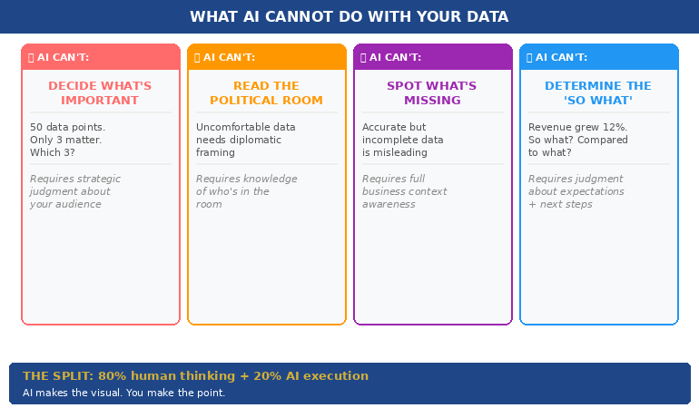
A dashboard presentation is different in structure, purpose, and outcome. The audience is not there to receive data — they are there to interpret it, align on what it means, and make a decision about what happens next. This requires the presenter to do the interpretive work before the meeting, not during it. If you walk into a dashboard presentation and expect the room to draw its own conclusions from charts, you have misunderstood your job.

Senior decision-makers do not have the time, nor in many cases the context, to interpret raw metrics on the spot. They rely on the presenter to have already done that work — to have identified which numbers matter, why they have moved, and what the business should do about it. When that framing is absent, the room does the interpretation independently. And different people in the same room will reach different conclusions from the same data.

The practical implication is this: your role in a dashboard presentation is not to show the data. Your role is to make the data legible and to guide the room to a decision. Every structural choice — what you put on slide one, how you annotate charts, where you place your recommendation — should serve that goal. The dashboard is your evidence. The presentation is your argument.

Executive Slide System — £39, instant access

Structure Data Presentations That Drive Decisions — Not Just Discussion

The Executive Slide System gives you professionally structured slide templates built around the scenarios finance leaders and board presenters face most. It includes dashboard and data review formats, AI prompt cards to help you frame metrics and annotate charts, and scenario playbooks for finance and governance contexts.

  • Slide templates for data reviews, board updates, and finance briefings
  • AI prompt cards to build directional headlines and frame complex metrics
  • Framework guides for structuring decisions in live review meetings
  • Scenario playbooks for quarterly, mid-year, and exception-based reviews

Get the Executive Slide System →

Designed for finance directors, CFOs, and executives presenting data to boards and senior leadership teams.

The Three-Slide Framing Sequence Before Your First Chart

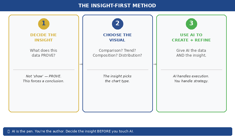
The most reliable structural improvement to a dashboard presentation costs you no additional data analysis — it simply changes what happens before the first chart appears. Senior audiences who arrive in a data meeting without a shared frame tend to interpret metrics through their own individual priorities. The result is discussion rather than alignment.

A three-slide framing sequence before the dashboard data establishes the shared interpretive frame the room needs. The first slide states the decisions the meeting is designed to reach — not questions to explore, but specific choices the room needs to make before it finishes. This gives senior attendees a mental structure for evaluating everything that follows. They are no longer processing data in abstract; they are processing it in relation to a decision they know they need to make.

The second slide provides the performance context: what the targets were, what the comparison period was, and what external conditions are relevant. This slide does the audience’s contextualising work for them. Without it, different people in the room will apply different baselines — last quarter, last year, the original plan, the revised forecast — and arrive at different assessments of the same number.

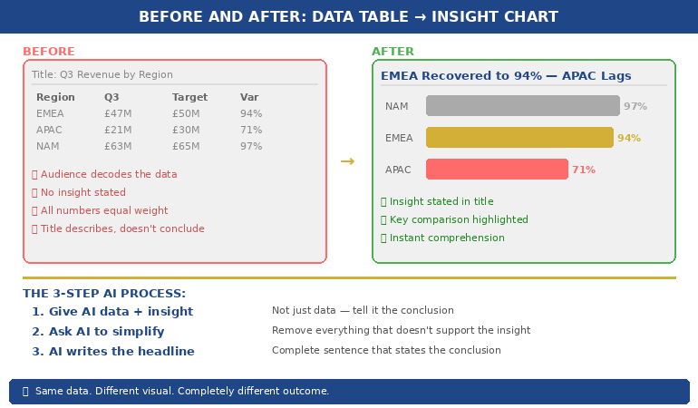
The third slide is your headline summary: two or three interpretive statements about where the business stands, written as conclusions rather than observations. Not “revenue is up 4%” but “revenue growth is on track and the margin contraction warrants a response this quarter.” This third slide is the slide most presenters omit. It is also the slide that does the most work. It means the room does not need to draw their own interpretive conclusion from each chart — you have already provided it. The charts become confirmation of your interpretation rather than a puzzle the room must solve.

For executives building a clearer structure across all board-facing slides, the principles of a strong executive summary slide apply equally to dashboard framing: lead with the conclusion, support with evidence, and leave no interpretive work for the audience to do independently.


The three-slide framing sequence for dashboard presentations showing: decisions needed, performance context, and headline interpretive summary before the data

How to Present Data That Has Moved Against You

The hardest moment in a dashboard presentation is not when the data is good. It is when the data has moved in the wrong direction since the last review — and you are the person who has to present it to a senior room that expected better results.

The most common response to adverse data is to bury it — to sequence the dashboard so that stronger metrics come first, and the problematic numbers appear later when the room is already in a more positive frame. This approach is understandable and almost always counterproductive. Senior audiences notice when data has been sequenced to soften a finding. The act of sequencing itself communicates that the presenter is uncertain about the data or unwilling to address it directly. Both perceptions are worse than the underlying numbers.

A more effective approach is to introduce adverse data directly and immediately — but to introduce it with your interpretation already attached. The difference between “cost overruns increased 18% this quarter” and “cost overruns increased 18% this quarter, driven by two project-specific items we have already addressed” is the interpretive sentence. The first invites the room to speculate about cause. The second forecloses the most damaging speculative paths before they open.

For each adverse metric in your dashboard, prepare the following in advance: the cause (specific and verifiable), the action already taken or planned, and the expected impact on future performance. These three elements — cause, response, trajectory — give the room something to engage with constructively rather than a problem to diagnose in real time. You remain in control of the interpretive frame even when the numbers are unfavourable.

Annotating your charts matters here too. A dashboard chart presented without annotation is an open question. One annotated with directional language — “margins stabilising following supply chain correction” or “cost variance narrowing from Q1 peak” — provides an interpretive anchor. Even if someone in the room disagrees with your annotation, you have shaped the starting point for that conversation. An unannotated chart starts from nowhere.

For related reading on structuring data and financial evidence for governance meetings, see the companion article on audit committee presentation frameworks — the same principles of direct disclosure and interpretive pre-framing apply in compliance contexts where adverse findings carry regulatory weight.

Managing Live Questions on Data You Cannot Fully Explain

Every dashboard presentation contains at least one data point the presenter cannot fully explain in real time. Perhaps a metric has moved in a direction that the modelling did not predict. Perhaps there is a discrepancy between two figures that was not visible before the meeting. Perhaps a senior leader has access to external data that conflicts with the numbers on screen.

The instinct when this happens is to speculate — to offer a plausible cause on the spot rather than admit uncertainty. For data-confident presenters, this usually means offering three possible explanations and letting the room choose between them. This approach tends to generate more discussion than resolution, and it transfers interpretive authority from the presenter to the room.

A stronger response to live unexplained data is a clear structure: acknowledge the question directly, state what you know and what you do not, name the earliest point at which you can confirm the explanation, and move the meeting forward. This response pattern — acknowledge, scope, commit, continue — keeps you in control without requiring you to speculate or deflect. Senior audiences respond well to a presenter who knows the limits of their current data and can state them plainly.

The most important discipline here is maintaining the forward momentum of the meeting. Dashboard presentations that stall on a single unexplained data point often fail to reach their decision objective. When a question cannot be resolved in the room, parking it formally — noting it as a post-meeting follow-up, assigning it clearly — preserves the meeting’s purpose without dismissing the concern.

If you are building the executive slide system to cover data-heavy scenarios, the Executive Slide System includes AI prompt cards for annotating metrics and framing difficult data points before high-stakes finance meetings.

Ending With a Clear Decision Request

The most common structural failure in a dashboard presentation is the ending. Most data meetings end with a summary of what was covered and an open invitation for questions. Neither produces a decision. What ends a dashboard presentation effectively is an explicit decision slide: a structured choice frame that presents the options the room must choose between, the relevant considerations for each, and a prompt for the meeting to reach a conclusion before it closes.

The decision slide is not the same as a recommendation slide. A recommendation slide tells the room what you think they should do. A decision slide structures the choice and makes the act of deciding explicit. In some contexts — particularly where the room contains decision-makers with different views on the options — a decision frame is more effective than a recommendation, because it invites the room into the process rather than asking them to endorse your conclusion.

A well-structured decision slide for a dashboard presentation typically presents two or three options, names the decision owner for each, and states a clear timeline. It should not require further data analysis to evaluate — if the room needs more numbers before they can choose, the presentation has not done its preparatory work. The decision slide is the point at which everything that preceded it — the framing sequence, the data, the annotations, the adverse metric handling — either pays off or reveals a gap.

Connecting your dashboard presentation to the board’s formal agenda structure is also important. For guidance on how board agenda presentations build the context that makes finance review decisions easier for senior committees, the principles of sequence and pre-alignment apply directly.


Dashboard presentation structure showing the closing decision frame: options presented, decision owner, timeline, and criteria for each path forward

The Pre-Session Preparation That Changes Everything

The quality of a dashboard presentation is determined largely before the presenter enters the room. What happens during the meeting is shaped by the preparation that precedes it — specifically, the conversations you have with key stakeholders in the 24 to 48 hours before the session.

Pre-briefing the most senior decision-maker in the room is standard practice in effective executive communication — but it is often skipped for data reviews because the data is assumed to speak for itself. It does not. A brief conversation with the CFO, committee chair, or most influential attendee before the dashboard meeting serves three functions: it surfaces any concerns that might otherwise emerge disruptively in the meeting, it aligns on what decisions the meeting is expected to reach, and it allows you to calibrate your framing for the room’s current priorities.

It is also worth preparing for the questions that are statistically most likely to emerge. For finance review meetings, these tend to cluster around trend questions (“is this a one-time variance or a structural shift?”), comparison questions (“how does this compare to the same period last year or to the sector?”), and action questions (“what are we doing about this?”). If your dashboard presentation is structured to address these three question types within the main deck, rather than waiting for them in Q&A, the meeting runs faster and reaches its decision objective more reliably.

The preparation that matters most is not building better charts. It is knowing, before you enter the room, which decisions the meeting needs to reach, which data points are most likely to generate resistance, and what the interpretive answers are to the most predictable questions. For more on structuring the opening of a data or strategy presentation, see the framework for how to start a presentation with a frame that orients senior audiences before the main content begins.

The pre-session conversation is also your best opportunity to learn whether the agenda has shifted — whether a new concern has emerged in the business that changes how the room will interpret the data. Dashboard presentations that feel misaligned with the room’s current priorities almost always suffered from the same preparation gap: the presenter built the deck for the problem they expected, not the one the room is currently focused on.

Executive Slide System — £39, instant access

Build Finance and Data Presentations That Move Senior Rooms to a Decision

The Executive Slide System includes slide templates, AI prompt cards, and framework guides designed for finance directors and data presenters who need to brief senior audiences, committees, and boards.

Get the Executive Slide System →

Designed for finance leaders, board presenters, and executives managing high-stakes data review meetings.

Frequently Asked Questions

What is the most important structural difference between a dashboard presentation and a report?

A report transfers data. A dashboard presentation is structured to produce a decision. The key structural difference is the closing section: a report ends when the data has been covered; a dashboard presentation ends when the room has agreed on a clear next step. If your meeting ends with “let’s continue this discussion,” it has not functioned as a decision meeting. Adding an explicit decision slide — with options, decision owners, and a timeline — is the single most impactful structural change most finance presenters can make.

How should I handle a dashboard metric I cannot fully explain in the room?

Use a four-part structure: acknowledge the question directly, state what you currently know, state clearly what you do not yet know and when you will be able to confirm it, and then move the meeting forward. Avoid speculating in the room — offering possible explanations you are not confident in shifts interpretive authority to the audience and often generates more questions than it resolves. “I want to get you a confirmed answer on that by Thursday” is more authoritative than three speculative hypotheses.

When is the right moment to introduce your recommendation in a dashboard presentation?

Your recommendation or decision prompt should come at the end of the presentation, after the data has been presented in full and the room has had the opportunity to absorb the key findings. In hostile or resistant rooms, a recommendation that comes before the data is often dismissed before it has been heard. In aligned rooms, placing your recommendation early can accelerate agreement — but for dashboard presentations with mixed or uncertain stakeholder views, the end is the safer and more reliable position.

The Winning Edge — Weekly Newsletter

One Insight Per Week on Executive Communication

Each week, The Winning Edge delivers one focused insight on executive communication — structure, delivery, influence, and the mechanics of getting senior audiences to yes. Straightforward, applicable, and written for people who present under pressure.

Subscribe to The Winning Edge →

Free download: The Executive Presentation Checklist — a structured pre-presentation review covering structure, evidence sequencing, and delivery preparation.

About the Author

Mary Beth Hazeldine — Owner & Managing Director, Winning Presentations

With 25 years of corporate banking experience at JPMorgan Chase, PwC, Royal Bank of Scotland, and Commerzbank, Mary Beth now advises executives across financial services, healthcare, technology, and government on structuring presentations for high-stakes funding rounds, board approvals, and finance reviews. Winning Presentations is her specialist advisory practice.

16 Feb 2026
Your Data Slides Are Killing Your Presentation. Here's How AI Can Fix That.

Your Data Slides Are Killing Your Presentation. Here’s How AI Can Fix That.

The CFO had pasted an entire Excel tab — thirty-seven rows of quarterly figures — onto a single slide. Then he asked the board to “take a moment to absorb the numbers.”

Quick answer: AI data visualisation for presentations can transform unreadable spreadsheet dumps into clear, persuasive visual charts — but only when you tell it what the data means first. The process is not “paste my data and make it pretty.” It’s a three-step human-led workflow: decide the insight (what does this data prove?), choose the visual type (comparison, trend, composition, or distribution), then use AI to generate, label, and refine the chart. AI handles the visual execution. You handle the strategic thinking. The result is data slides that make a point rather than display a table.

At Commerzbank, I sat through a quarterly review where the Head of Risk presented a slide with a forty-two-cell table comparing capital adequacy ratios across eight business lines and four quarters. Every cell was filled. Every number was accurate. Nobody in the room knew what it meant.

After the meeting, the Group Treasurer said to me: “I have no idea whether we’re in trouble or not.” The data was perfect. The communication was useless.

I helped him rebuild that slide. We replaced the table with a single bar chart showing one thing: which business lines were above the threshold and which were below. Three were red. The rest were green. The next board meeting lasted half the time and produced twice the decisions. Same data. Different visual. Completely different outcome.

Why Data Tables Fail in Executive Presentations

Data tables work in reports. They fail in presentations. The reason is cognitive: a table asks the reader to perform analysis, while a chart provides the analysis already completed. When you paste a spreadsheet into a slide, you’re asking your audience to do the work you should have done before the meeting.

Senior executives are processing information from dozens of sources across dozens of meetings. They don’t have the cognitive bandwidth to scan forty-two cells, identify the relevant comparisons, and draw their own conclusions — all while you’re talking over the top of the slide. A data table in a presentation is not information. It’s a homework assignment.

The result is predictable. Executives either tune out (because the table is overwhelming), or they focus on the wrong number (because without visual hierarchy, every number looks equally important). Either way, your data fails to do its job, which is to support a specific point that drives a specific decision.

This is why data-heavy presentations often backfire with executives. The problem isn’t the data. It’s the format. And this is precisely where AI can help — not by thinking for you, but by transforming your thinking into a visual that communicates instantly.

PAA: Why do data-heavy slides fail in presentations?
Data tables require the audience to perform their own analysis — scanning cells, making comparisons, and drawing conclusions — while simultaneously listening to the presenter. Executive audiences don’t have the cognitive bandwidth for this. Charts solve the problem by pre-digesting the analysis: they show the conclusion visually so the audience can absorb the insight in seconds rather than minutes. The presenter’s job is to decide the insight first, then choose a visual format that makes that insight obvious.

Turn Data Into Decisions — Not Decoration

AI-Enhanced Presentation Mastery includes the complete data visualisation workflow: the Insight–Implication–Action framework, AI prompt sequences for chart creation, and the visual decision matrix that tells you which chart type to use for any dataset. Self-study programme — join anytime.

Join AI-Enhanced Presentation Mastery → £249

Self-study programme with live support. Join anytime — all released modules available immediately. Built from 24 years presenting financial data in corporate banking. Check course page for current pricing and session details.

The Insight-First Method (Before You Touch AI)

The biggest mistake people make with AI data visualisation is starting with the data. They paste a spreadsheet into an AI tool and ask it to “make a chart.” The result is a technically correct but strategically useless visualisation — because AI doesn’t know what point you’re trying to make.

Before you touch AI, answer one question: What does this data prove?

Not “what does this data show” — that’s a description. “What does this data prove” forces you to state a conclusion. Examples of the difference:

“This data shows Q3 revenue by region” → a description that leads to a table.
“This data proves that EMEA revenue recovered faster than expected” → an insight that leads to a chart with EMEA highlighted.

“This data shows customer satisfaction scores” → a description that leads to a grid.
“This data proves that satisfaction dropped in the two months after the platform migration” → an insight that leads to a trend line with the drop circled.

Once you have the insight, you can tell AI exactly what to visualise — and more importantly, what to emphasise. “Create a bar chart of Q3 revenue by region. Highlight EMEA in gold. Grey out all other regions. Add a horizontal line showing the forecast.” That prompt produces a useful chart because you’ve done the thinking. AI does the drawing.

This is the Insight–Implication–Action framework we teach in the course: every data slide should state the insight (what the data proves), the implication (what it means for the audience), and the action (what needs to happen next). AI can’t generate any of those three things. But once you’ve defined them, AI can create the visual that communicates them instantly.


(770×450)Insight-First Method showing three steps: decide the insight then choose the visual then use AI to create and refine

📊 Want the complete Insight–Implication–Action framework and AI prompt sequences?

AI-Enhanced Presentation Mastery includes the data storytelling module with before/after transformations and the visual decision matrix.

Join AI-Enhanced Presentation Mastery → £249

How AI Transforms Data Into Visual Clarity

Once you’ve identified the insight, AI becomes genuinely powerful. Here’s the workflow for transforming a data-heavy slide into a clear visual:

Step 1: Give AI the data AND the insight. Don’t just paste your spreadsheet. Tell AI what you want the audience to take away. “Here is our quarterly revenue data. The key insight is that EMEA recovered to 94% of target while APAC stayed at 71%. Create a horizontal bar chart that makes this comparison obvious. Use gold for EMEA and grey for APAC. Include a vertical line at the 100% target.” The more specific your instruction, the more useful the output.

Step 2: Ask AI to simplify, not add. AI’s instinct is to include everything. Your instinct should be to remove everything that doesn’t support the insight. “Remove the gridlines. Remove the exact values from bars under 50%. Make the chart title a complete sentence: ‘EMEA Revenue Recovered to 94% — APAC Still Lagging.'” The best data slides look almost empty. That’s the point — the insight should be impossible to miss.

Step 3: Use AI to generate the headline. Your slide title should state the conclusion, not describe the content. AI is excellent at rewriting “Q3 Revenue by Region” into “EMEA Recovery Outpaced Forecast — APAC Needs Intervention.” Give AI your insight and ask it to write a headline that a time-poor executive would understand without looking at the chart. If the headline alone tells the story, you’ve succeeded.

This three-step process — insight, simplify, headline — takes five minutes per slide and produces results that are dramatically more persuasive than any table, regardless of how much data that table contains.

If you want to go deeper on how to match your AI prompts to executive presentation needs, the key is always the same: tell AI what the data means before asking it to visualise the data.

PAA: How do I use AI to create charts for presentations?
Start by defining the insight your data proves — not just what it shows. Then give AI both the data and the insight in a single prompt, specifying the chart type, what to highlight, and what to remove. Ask AI to write the slide headline as a complete sentence that states the conclusion. The process takes about five minutes per slide and produces charts that communicate instantly rather than requiring the audience to decode a table.

From Spreadsheet Dump to Executive Clarity

Module 6 of AI-Enhanced Presentation Mastery covers data storytelling in depth — including the Insight–Implication–Action framework, the visual decision matrix, AI prompt sequences for chart transformation, and before/after examples from real executive presentations. Study at your own pace.

Join AI-Enhanced Presentation Mastery → £249

Self-study programme with live Q&A calls. Join anytime — all released modules available immediately. Check course page for current pricing and session details.


Before and after comparison showing spreadsheet table transformed into a clear highlighted bar chart with insight headline

The Four Chart Types That Cover 90% of Executive Data

You don’t need twenty chart types. You need four. Almost every data insight an executive needs to communicate falls into one of these categories:

1. Comparison: “How do these things stack up?” Use horizontal bar charts. Revenue by region, performance by team, budget vs actual. AI prompt: “Create a horizontal bar chart comparing [X]. Highlight the top performer in gold and the underperformer in red. Grey out the middle. Title should state who’s winning.”

2. Trend: “What’s changing over time?” Use line charts. Revenue trajectory, customer satisfaction over quarters, headcount growth. AI prompt: “Create a line chart showing [X] over [time period]. Highlight the inflection point where the trend changed. Add a brief annotation explaining what caused the change. Title should state whether the trend is positive or negative.”

3. Composition: “What’s the breakdown?” Use stacked bars or pie charts (but only for 3–5 segments — more than five and the pie becomes useless). Revenue mix, cost allocation, market share. AI prompt: “Create a stacked bar chart showing [X] breakdown. Highlight the largest segment. Title should state what dominates.”

4. Distribution: “Where does the data cluster?” Use scatter plots or histograms. Customer segments by value, project risk ratings, team performance distribution. AI prompt: “Create a scatter plot showing [X] vs [Y]. Circle the outliers. Title should state the pattern — whether it’s clustered, spread, or has notable outliers.”

When you’re unsure which chart type to use, ask yourself: “Am I comparing, tracking, breaking down, or distributing?” The answer picks the chart. Then tell AI which category and let it handle the execution. This is considerably more effective than the approach covered in data storytelling fundamentals, because AI handles the visual execution while you focus entirely on the strategic framing.

📊 The visual decision matrix and AI prompt templates for all four chart types are inside the course.

AI-Enhanced Presentation Mastery includes the complete data visualisation system — frameworks, prompts, and before/after examples.

Join AI-Enhanced Presentation Mastery → £249

What AI Cannot Do With Your Data (The Human Part)

AI is excellent at the mechanical parts of data visualisation — creating charts, formatting them, writing headlines, standardising colours. But there are four things AI cannot do, and they’re the four things that actually matter:

AI cannot decide what’s important. Your dataset might contain fifty data points. Only three of them matter to your audience. Which three? That depends on who’s in the room, what they care about, and what decision you’re asking them to make. This is strategic judgment, not data analysis. AI can’t do it.

AI cannot read the political room. Sometimes the data shows something uncomfortable — a team underperforming, a region in decline, a project over budget. How you visualise that data depends on whether you’re presenting to the team responsible (where diplomacy matters) or to the board (where directness matters). AI doesn’t know the politics. You do.

AI cannot tell you what’s missing. The most dangerous data slide is the one that’s technically accurate but strategically incomplete. If your chart shows revenue growth but doesn’t show margin erosion, it’s misleading. AI won’t flag what you’ve left out. Only someone who understands the full business context can do that.

AI cannot determine the “so what.” Every data slide needs to answer one question: “So what?” Revenue grew 12% — so what? Is that good? Compared to what? What should we do about it? The “so what” is the entire point of the slide, and it requires human judgment about context, expectations, and next steps.

The best data slides are 80% human thinking and 20% AI execution. AI makes the visual. You make the point.


Four things AI cannot do with your data: decide importance, read the room, spot what is missing, determine the so what

PAA: Can AI replace human thinking in data presentations?
No. AI is excellent at the visual execution — creating charts, formatting them, writing headlines — but it cannot determine what’s important, read political dynamics in the room, identify what data is missing, or decide the “so what” that makes a slide actionable. The most effective workflow uses AI for 20% of the work (visual execution) and human judgment for 80% (strategic framing, audience awareness, and insight selection). AI is the pen. You’re the author.

Learn the Complete System for Executive Data Slides That Drive Decisions

AI-Enhanced Presentation Mastery teaches you the human-led, AI-assisted approach to executive presentations — including the Insight–Implication–Action framework, the visual decision matrix, AI prompt sequences, and the data storytelling techniques built from 24 years presenting financial data in corporate banking and 15 years coaching executives through high-stakes decision meetings.

Join AI-Enhanced Presentation Mastery → £249

Self-study programme with live support. Join anytime — all released modules available immediately. Built from 24 years presenting financial data in corporate banking + 15 years coaching executives. Check course page for current pricing and session details.

Frequently Asked Questions

What if my audience expects to see the full data table?

Put the table in the appendix. Present the chart in the main deck. If someone asks “where are the detailed numbers?” you say “slide 22 in the appendix” and continue with your insight. This gives you the best of both worlds: visual clarity in the presentation and full data availability on request. In twenty-four years of corporate banking, I’ve found that the executives who request the detailed table almost never actually read it — they just want to know it’s there.

Which AI tools are best for data visualisation?

Any AI tool that can process text prompts and generate charts works — ChatGPT, Claude, Copilot in PowerPoint. The tool matters less than the prompt. A specific prompt (“Create a horizontal bar chart comparing Q3 revenue by region, highlight EMEA in gold”) produces dramatically better results than a vague prompt (“Make a chart from this data”) regardless of which tool you use. The Insight-First Method works with any AI platform.

How do I handle sensitive financial data with AI tools?

If your data is confidential, use anonymised or rounded figures for the AI-generated chart, then manually replace them with the real numbers in your final slide. AI needs the structure and proportions to create the right visual — it doesn’t need the exact numbers. Alternatively, use AI only for the chart template and formatting, then input your data directly. Many organisations have approved AI tools with enterprise-grade data protection for this purpose.

Does this work for non-financial data?

The Insight-First Method works for any data type: project timelines, customer satisfaction scores, employee engagement metrics, operational KPIs, marketing funnels. The principle is the same — decide the insight before you create the visual, tell AI what to emphasise, and write a headline that states the conclusion. The four chart types (comparison, trend, composition, distribution) cover 90% of any data you’ll present in a corporate setting.

📬 The Winning Edge Newsletter

Weekly strategies for executive presentations, AI-enhanced workflows, and career-critical stakeholder communication. No fluff.

Subscribe free →

🎯 Free: 10 Essential AI Prompts for Executive Presentations

Includes the data visualisation prompts for all four chart types, plus headline rewriters and the slide clarity check sequence.

Download free →

Related: Data slides are one piece of the puzzle. If you’ve been thrown into a last minute presentation and need to build a complete deck fast, the 5-slide emergency framework helps you decide which data to include and which to cut — before you start visualising anything.

Stop pasting spreadsheets into slides. Decide the insight first. Choose the right visual. Let AI handle the execution. Your audience will thank you — and your data will finally do its job.

🎯 Learn the human-led, AI-assisted approach to executive presentations.

Join AI-Enhanced Presentation Mastery → £249

About the Author

Mary Beth Hazeldine is the Owner & Managing Director of Winning Presentations. With 24 years of corporate banking experience at JPMorgan Chase, PwC, Royal Bank of Scotland, and Commerzbank, she spent two decades watching executives paste spreadsheets into slides — and helping them transform that data into visuals that actually drove decisions.

A qualified clinical hypnotherapist and NLP practitioner, Mary Beth combines executive communication expertise with modern AI-enhanced workflows to help leaders present data with clarity and conviction.

Book a discovery call | View services