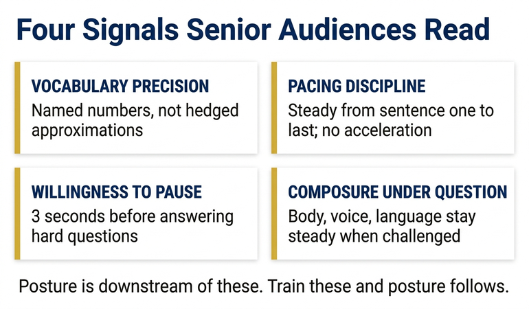
Quick answer: Microsoft Copilot can pull live numbers from SharePoint, OneDrive, Power BI, and Dataverse straight into PowerPoint slides — but the technology is only half the story. The setup has three steps: permission the connection so Copilot can see the source, structure the source data so Copilot can pull it cleanly, and call the source by name in the prompt so Copilot does not guess. The dangerous failure mode is a slide that looks correct but quietly references a draft tab, a stale snapshot, or the wrong file. Live data integration solves the wrong problem if the leader is not in control of which data source is being pulled. The discipline is editorial, not technical.
JUMP TO:
Helena, Head of FP&A at a mid-sized infrastructure group, had been waiting for this feature for two years. Her finance team produces the monthly forecasting pack on a single Excel workbook stored in SharePoint, refreshed every Friday afternoon. For Tuesday-morning forecasting committee, she had been copying the latest figures into PowerPoint by hand — three or four updates between Friday and Monday evening, every cycle. When her tenant rolled out Copilot’s connected-data integration, she set it up in twenty minutes. Three slides regenerated themselves directly from the SharePoint workbook on a single prompt. It looked, on the dry run, like the end of a chore that had eaten an hour every week.
The Tuesday meeting started cleanly. Slide four — the rolling six-month revenue projection — read out exactly as she had rehearsed it. Slide five, the cash-position commentary, looked right. Halfway through slide six, the Group Finance Director paused her. The capital-expenditure figure on the right-hand chart was £4.2m higher than the number he had signed off on Monday afternoon. Helena recognised the figure. It was the draft tab — the one her analyst had been working through Monday evening, not the finalised tab the Friday process always uses. Copilot had pulled from the workbook by name; it had not known which tab was the source of record.
The credibility damage was mostly recoverable. Helena flagged the discrepancy on the spot, talked the committee through the correct number, and re-presented slide six on a screen-share two days later. But the lesson was structural, not technical. The integration worked exactly as Microsoft documented it. The workflow around it did not. Two weeks later Helena had the same setup running with one change: a single, locked, named-range tab called “Final” was the only Copilot-accessible source on the workbook. Draft tabs were marked as such and excluded from the connected-data scope. The same three slides regenerated cleanly. The technology had been solid all along; the discipline around the source had not.
If you want a structured prompt library for executive Copilot work, including data-handling and source-discipline prompts:
The Executive Prompt Pack contains 71 ChatGPT and Copilot prompts for executive PowerPoint work — including the prompts senior leaders use to call data sources by name, lock the scope of a Copilot pull, and verify the figure before it lands in a slide.
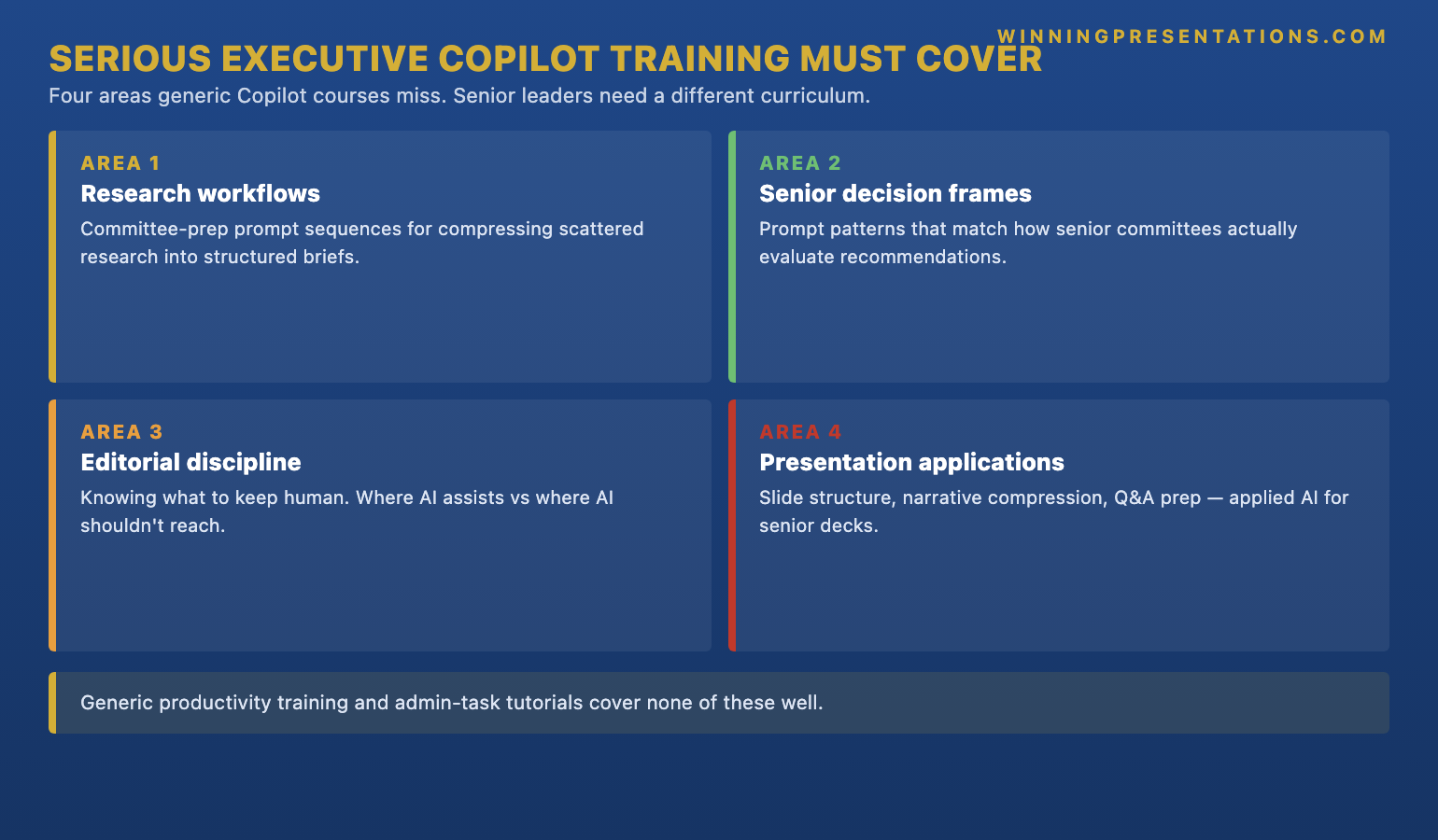
What live data integration actually means in M365
“Live data integration” is one of those phrases that sounds like a single feature and is actually a family of connections. Inside the Microsoft 365 environment, Copilot can reach four kinds of data source when it builds or updates a slide. The first is structured SharePoint lists — the columned, governed data that lives in SharePoint as a list rather than as a free-form file. The second is Excel workbooks stored on SharePoint or OneDrive — which Copilot can read tab by tab, range by range, when permissioned to do so. The third is Power BI semantic models — the published datasets that already underlie the firm’s dashboards and that Copilot can query through the same governance layer. The fourth, in tenants that have it enabled, is Dataverse — the structured business-data layer that sits behind Power Platform and Dynamics 365.
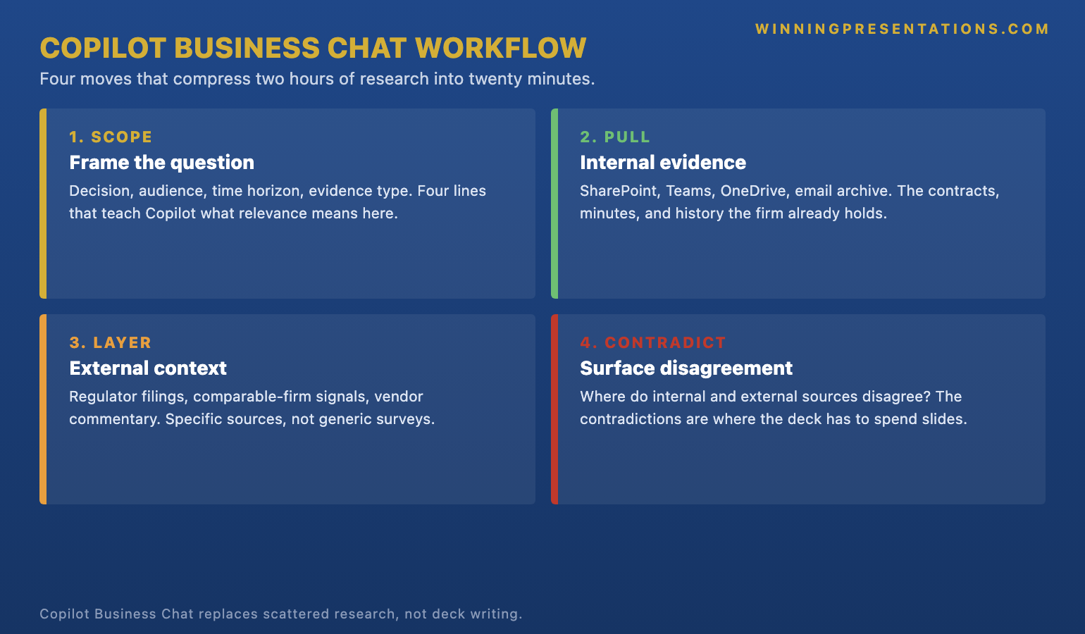
What unifies these four is that Copilot does not duplicate the data into PowerPoint. It references the source. When the leader prompts Copilot to “build a slide on rolling six-month revenue using the Q2 forecast workbook on the FP&A SharePoint”, Copilot reads the live source at the moment of generation. If the source updates between draft and final delivery, the slide reflects the updated number. That is the upside the feature is sold on — and it is real. The downside is the same property running in reverse: if the source is wrong, draft, or pointed at the wrong tab, the slide is wrong with it. There is no copy-paste step in which the leader’s eye crosses the figure before it lands on the canvas.
The leader’s mental model has to shift. With the old workflow, the data point landed in the slide because the leader put it there. With the integrated workflow, the data point lands in the slide because the leader pointed Copilot at the source — and the source then has its own life. Anyone who can edit the source can edit the slide, often without realising they have. That is not a defect of the technology. It is the new shape of the responsibility. For a related treatment of how senior leaders structure data inside their decks once the connections are working, see our companion guide on AI-assisted data visualisation for executive presentations.
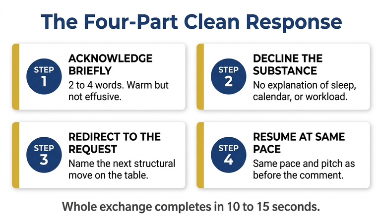
The three-step setup for clean Copilot pulls
The setup that produces consistently correct slides has three steps and runs in strict order. Step one is permissioning the connection. Step two is structuring the source so Copilot can pull cleanly. Step three is calling the source by name in the prompt. Skip any of the three and the integration becomes the failure mode in the opening story rather than the time-saver it should be. The three steps take about twenty minutes the first time and about three minutes per source after that — and they are the difference between a leader who trusts the live pull and a leader who has been quietly burnt by it.
Step one — permission the connection. Copilot can only read what the user’s M365 identity has access to. For SharePoint sources, that means the workbook or list must already be in a site or library the leader can open in their browser without an extra password prompt. For Power BI semantic models, the leader needs Build or Read access on the dataset, granted in the Power BI service. For Dataverse tables, the leader needs the relevant security role in Power Platform. Permissioning at this level is governance work, not a Copilot setting — and it is best done with the data owner in the room, not retrofitted later.
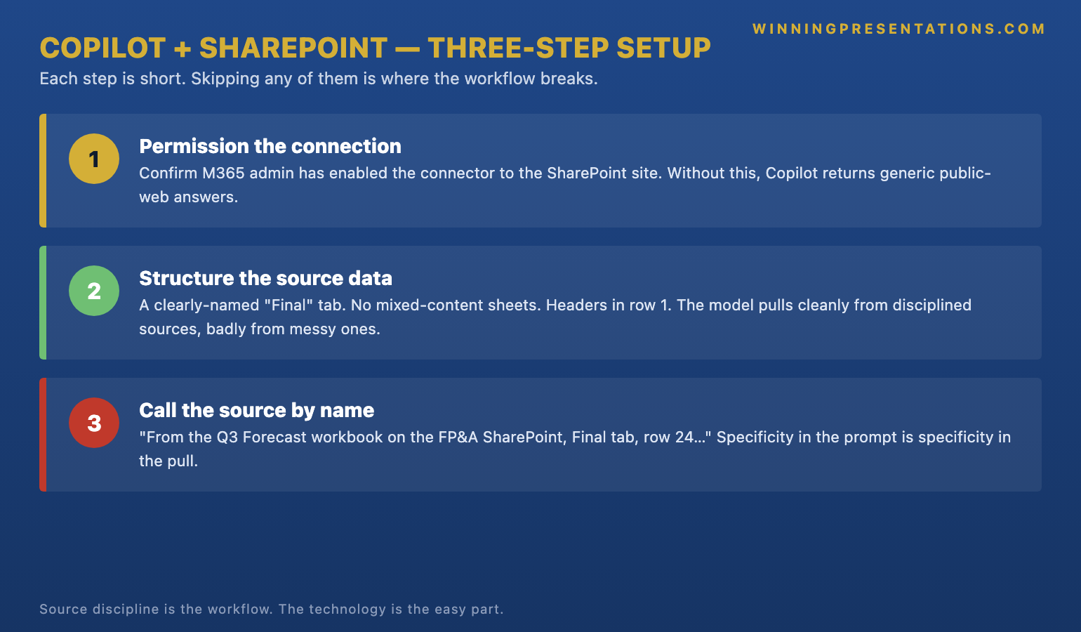
Step two — structure the source so Copilot can pull cleanly. The single highest-leverage move is to separate finalised data from in-flight data inside the source itself. For an Excel workbook, that means a single, named tab — “Final” or “Source_of_Record” — that holds the figures Copilot is allowed to reference, with draft and working tabs visibly labelled and ideally locked from Copilot’s scope. Named ranges sit a tier above tab-level pulls in reliability: a named range called “Q2_Revenue_Forecast” is a much sharper target than “Sheet3, columns B to E”. For SharePoint lists, the equivalent move is a curated view that exposes only the columns and rows that are committee-ready. The discipline is the same in both cases: shrink the surface Copilot can hit so the model cannot pick the wrong thing by accident.
Step three — call the source by name in the prompt. A vague prompt — “build a slide showing our latest revenue forecast” — invites Copilot to guess which workbook, which tab, which range. A precise prompt — “build a slide using the Q2_Revenue_Forecast named range from the FP&A_Forecast_Pack workbook on the FP&A SharePoint site, six-month rolling view, with the source line at the bottom of the slide” — leaves no room for the model to drift. Naming the source is what closes the loop between the leader’s intention and Copilot’s action. For the prompt-engineering discipline that makes this consistent across a leader’s team, our Copilot prompts for executive presentations guide walks through the prompt patterns that translate source-naming into reproducible deck production.
Stop hand-copying figures into Tuesday-morning slides. Pull cleanly from SharePoint with prompts that name the source.
The Executive Prompt Pack is a practical library of 71 ChatGPT and Copilot prompts for executive PowerPoint presentations — including the data-handling, source-discipline, and verification prompts senior leaders run when Copilot is pulling live numbers from SharePoint, OneDrive, and Power BI into slides that go in front of a committee.
- 71 prompts covering executive research, structure, refinement, and live-data handling
- Designed for ChatGPT and Microsoft Copilot — not platform-specific syntax
- Written for senior-deck scenarios: forecasting committees, board prep, capital cases, strategic recommendations
- Instant download on purchase, no subscription, lifetime access to updates
The dangerous failure mode — and how to test for it
The failure mode is not a slide that looks broken. A broken slide is a small problem; the leader sees it before the committee does and fixes it. The failure mode is a slide that looks correct, reads correct, and is wrong. Helena’s slide six was correct in every visible respect — the formatting, the chart type, the labels, the trend line — but the underlying figure had been pulled from a draft tab the analyst had not yet finalised. Nothing about the rendered output flagged the issue. The committee caught it because one member happened to remember the previous Monday’s signed-off number and the new number did not match.
The test that catches this before the meeting is short and disciplined. After Copilot generates a slide that pulls live data, the leader opens the source itself — the SharePoint workbook, the Power BI dataset, the Dataverse table — and confirms three things. First, the source the slide is referencing is the source the leader intended (workbook name, tab name, range name). Second, the figure on the slide matches the figure in the source as of right now (the live read does what it claims). Third, the source is in a state the leader is comfortable presenting from (finalised, signed off, no draft markers). The test takes ninety seconds per pulled figure. It is the equivalent of the manual verification step that copy-paste used to provide automatically.
The second test is to do the same check the morning of the meeting, not just the night before. The whole point of live integration is that the slide reflects the source at the moment of presentation. That is also the point at which an unrelated edit can change the slide between rehearsal and committee. Senior leaders running live-data slides build a habit: a final source-check thirty minutes before the meeting, with the slide open and the source open, side by side. Anyone who has been bitten by an overnight edit only does it once. For the broader workflow context — including how live-data slides fit into the executive deck production sequence — see our companion guide on Copilot Agent Mode and the executive deck workflow.
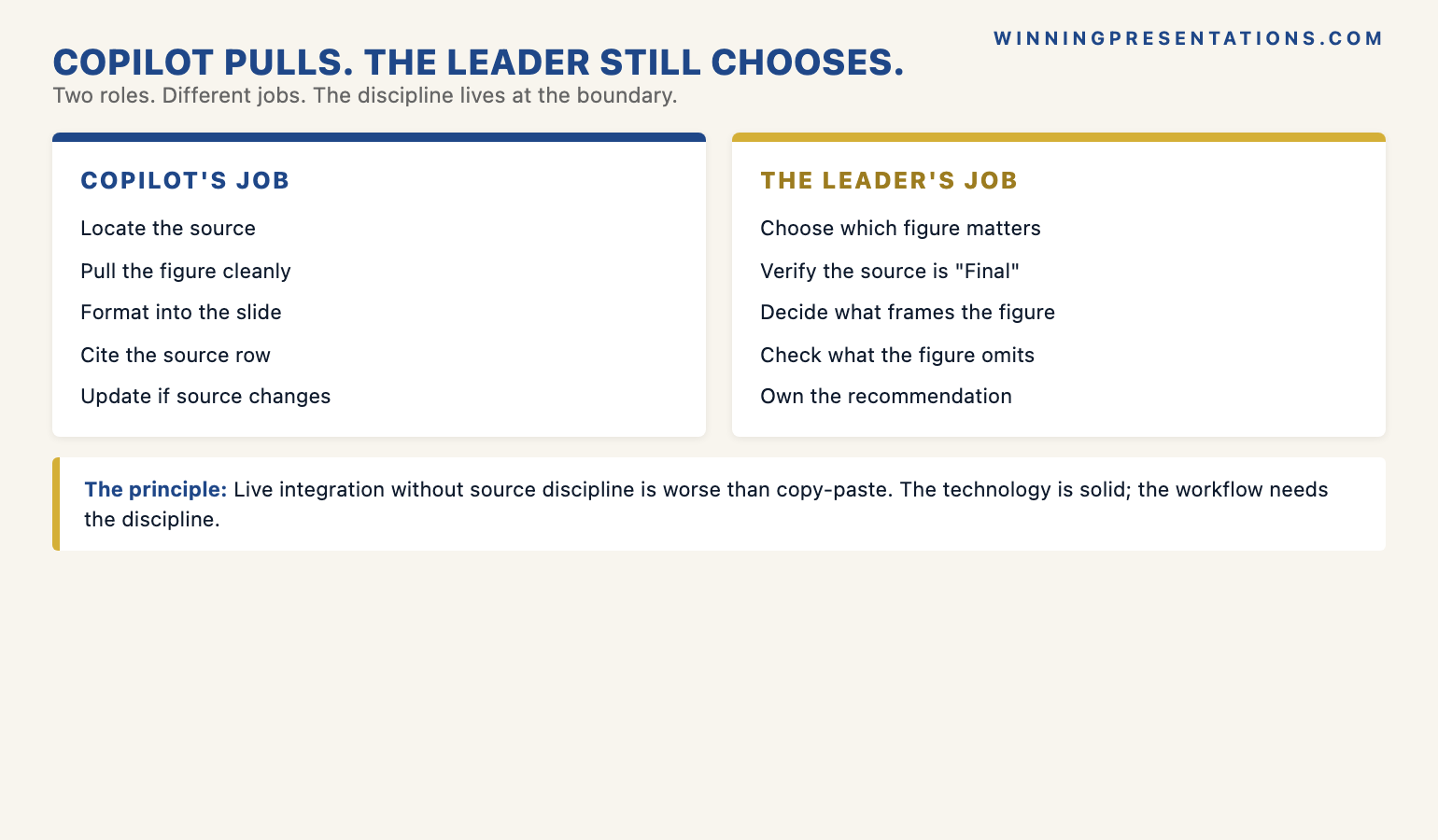
Copilot pulls; the leader still chooses
The editorial principle that holds the whole workflow together is this: Copilot pulls; the leader still chooses. The model can pull every relevant figure from every connected source the firm holds. It cannot decide which figures belong on the slide, which figures the committee will press on, or which figures should be deliberately omitted because they would invite a question the deck is not yet ready to answer. Those decisions sit on the leader’s side of the line and they always will. A leader who hands over the editorial choice along with the data pull is producing slides Copilot has effectively authored — and committee members can usually feel the difference, even when they cannot articulate why the deck reads as generic.
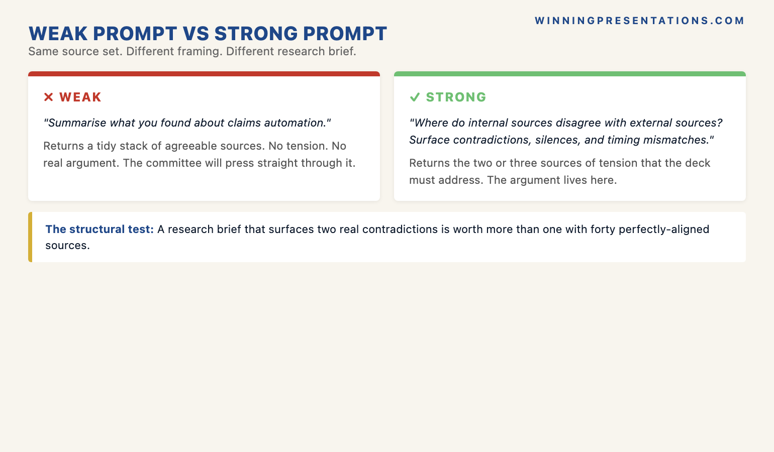
The practical version of “the leader still chooses” is that the prompt names what is wanted, not just what to pull. Compare two prompts. The weak prompt: “Use the Q2_Revenue_Forecast named range to build a slide on revenue.” The strong prompt: “Use the Q2_Revenue_Forecast named range to build a slide showing the rolling six-month revenue projection, with the prior-year comparable as a faint backdrop line, the variance versus plan called out in a single-line callout box, and no commentary on FX impact — that goes on a separate slide.” The strong prompt does the editorial work in the prompt itself. The slide that comes back is the slide the leader chose to brief, not the slide Copilot guessed at.
The second part of “the leader still chooses” is the post-pull edit. Even with a tightly scoped prompt, the slide Copilot produces is a draft. The leader still reads it as if a colleague had drafted it: does the headline make the right point, is the chart the right format for the audience, is the source line correctly attributed, is anything technically true but rhetorically misleading. The integration removes the typing time. It does not remove the editorial time, and the leaders who treat it as if it does end up presenting decks that are accurate but inert. The technology is a force-multiplier on the leader’s editorial standards, not a replacement for them.
If you want the structured programme behind this — the AI-assisted workflow for senior-deck production:
The AI-Enhanced Presentation Mastery course is a self-paced Maven programme — 8 modules, 83 lessons covering AI workflows for executive-grade presentation work, with monthly cohort enrolment. 2 optional live coaching sessions, fully recorded. £499, lifetime access to materials.
Why source discipline outranks the technology
The shorter version of everything above is one principle: live data integration solves the wrong problem if the leader is not in control of which data source is being pulled. The technology is solid. Microsoft has spent considerable engineering effort making the connections reliable, the permissions clean, and the live read accurate. None of that effort matters if the leader has pointed Copilot at a workbook with three tabs of unfinalised data sitting alongside the one tab that should be the source of record. The integration will faithfully read whatever it is pointed at — including, faithfully, the wrong thing.
The senior leaders who get the most value from connected data sources are not the ones who set up the most connections. They are the ones who treat the source itself as the deliverable. They invest in the workbook structure, the named ranges, the curated SharePoint views, the locked tabs, and the version-control conventions before they prompt Copilot for a single slide. By the time they call the source by name in a prompt, the source has already been engineered to be safe to call. That up-front investment looks slow on the first cycle and pays back every Tuesday morning thereafter.
The mistake to avoid is treating live data integration as a technology rollout. It is a workflow rollout — and the workflow lives at the boundary between data governance and presentation discipline. The data team owns the source. The leader owns the slide. The connection is where those responsibilities meet, and the connection only works if both sides have done their part. Leaders who set up the connection before the source is engineered will get burnt. Leaders who engineer the source before they set up the connection will not. For more on the production discipline that turns these connections into reliable executive output, see our companion guide on Copilot for board-level PowerPoint presentations.
Frequently asked questions
What permissions does Copilot need to pull data from SharePoint?
Copilot pulls under the user’s own M365 identity, which means the leader running the prompt must already have access to the SharePoint site, library, or list being referenced. There is no separate “Copilot permission” — if the leader can open the file in their browser without an extra prompt, Copilot can typically read it. For Power BI semantic models, the leader needs Build or Read access on the dataset; for Dataverse, the relevant Power Platform security role. The cleanest setup is to confirm permissions with the data owner before the first prompt, rather than retrofit when a pull fails.
How do I prevent Copilot from pulling stale or draft data?
Two moves matter. The first is to engineer the source itself: use a single, named tab or named range as the source of record, lock or visibly label everything else as draft, and curate SharePoint list views so only committee-ready data is exposed. The second is to call the source by name in the prompt — the named range, the specific tab, the specific list view — so Copilot cannot guess. The combination of a tightly scoped source and an explicitly named prompt is what stops the failure mode where the slide looks correct but quietly references the wrong tab.
Does this work with Power BI or only Excel?
It works with Power BI, Excel on SharePoint or OneDrive, structured SharePoint lists, and Dataverse — though tenant configuration determines which of these are enabled. Power BI semantic models are often the cleanest source for live integration because they already carry governance, refresh schedules, and version control by design. Excel workbooks are the most flexible but the most error-prone, because their internal structure is whatever the workbook owner has built. If the firm has a Power BI semantic model that holds the figure, prefer it over the Excel source upstream of it.
Should I disclose to the audience when slides are auto-pulling live data?
For most committee settings, a footnote on the slide that names the source and the date of the live read is sufficient — and is good practice regardless of whether the data was pulled by Copilot or copy-pasted by hand. For high-stakes settings such as board approvals, regulatory filings, or external audit-relevant material, the leader should also disclose verbally that the figure is being read live from a connected source, and confirm that the source has been signed off. The transparency is editorial discipline, not a Copilot-specific obligation, but the live-pull case makes it more important to be explicit about the source.
The Winning Edge — weekly newsletter
The Winning Edge is a weekly newsletter for senior professionals who present at the executive level. One short email a week, focused on the structural moves that separate decks committees back from decks they defer. Subscribe to The Winning Edge →
Not ready for the full Executive Prompt Pack? Start here instead: download the free 10 Essential Copilot PowerPoint Prompts cheat sheet — a one-page reference for the prompts senior leaders run before every executive deck.
About the author
Mary Beth Hazeldine is Owner & Managing Director of Winning Presentations Ltd. With 24 years of corporate banking experience at JPMorgan Chase, PwC, Royal Bank of Scotland, and Commerzbank, she advises executives across financial services, healthcare, technology, and government on structuring presentations for high-stakes funding rounds, board approvals, and strategic decisions.