Tag: presentation design

25 Apr 2026
Executive Slide Design: What Board-Level Presentations Actually Look Like — featured image

Executive Slide Design: What Board-Level Presentations Actually Look Like

Quick Answer

Executive slide design follows three principles that most corporate presentations ignore: recommendation-first structure, visual hierarchy that guides the eye to the decision, and restraint that treats empty space as a signal of confidence rather than missing content. Board-level slides look different from working-level slides because they serve a different purpose — they exist to support a decision, not to document research.

Henrik had spent two weeks building a fifty-two-slide deck for his division’s strategy presentation to the CEO. Every slide was dense with analysis. Charts, tables, footnotes, appendices — the kind of thorough documentation that had earned him promotions throughout his career as an analyst.

The CEO stopped him on slide four.

“What are you recommending?” she asked. Henrik explained that the recommendation was on slide thirty-eight, after the market analysis, competitive landscape, financial modelling, and risk assessment. The CEO looked at the COO. “Can someone send me a one-pager?” The meeting ended twelve minutes early.

Henrik’s analysis was excellent. His slide design was wrong for the audience. He had built a research document and presented it as a decision tool. At the executive level, these are fundamentally different artefacts — and the design principles that make one effective actively undermine the other.

Designing slides for a board or C-suite presentation?

Before you add another chart or bullet list, check whether your slides are designed for the audience in the room. Quick pressure test:

  • Can a decision-maker grasp each slide’s point in under eight seconds?
  • Does your recommendation appear in the first three slides, not the last three?
  • Is there enough white space that each slide looks intentional, not overcrowded?

Explore the Executive Slide System →

Why Most Executive Slides Look Wrong for the Room They Are In

The default approach to executive slide design is to compress a working-level presentation into fewer slides. Take the forty-slide analyst deck, consolidate the content into fifteen slides, increase the font size slightly, and call it “board-ready.” This approach produces slides that are neither thorough enough for analysts nor clean enough for executives. They sit in an awkward middle ground that satisfies nobody.

The problem is conceptual, not aesthetic. Working-level slides are designed to document analysis — they show the work, justify the methodology, and present data in granular detail. Executive slides are designed to support decisions — they present recommendations, evidence, and trade-offs in a format that enables a room of senior people to say yes, no, or ask one clarifying question.

These are different design jobs. A working-level slide might contain a detailed waterfall chart showing quarterly revenue by product line, region, and customer segment. An executive slide covering the same topic would show total revenue against target with a single sentence explaining the variance. The analyst’s slide answers “what happened in detail?” The executive’s slide answers “are we on track, and if not, what should we do about it?”

When you design executive slides using working-level principles — more data, more detail, more backup — you force decision-makers to do analytical work they neither have time for nor expect to do. The slide becomes a reading exercise rather than a decision-support tool. And in a boardroom, reading exercises lose the room within minutes.

For a comprehensive look at how to structure an executive-level deck from start to finish, see our guide to executive presentation templates.

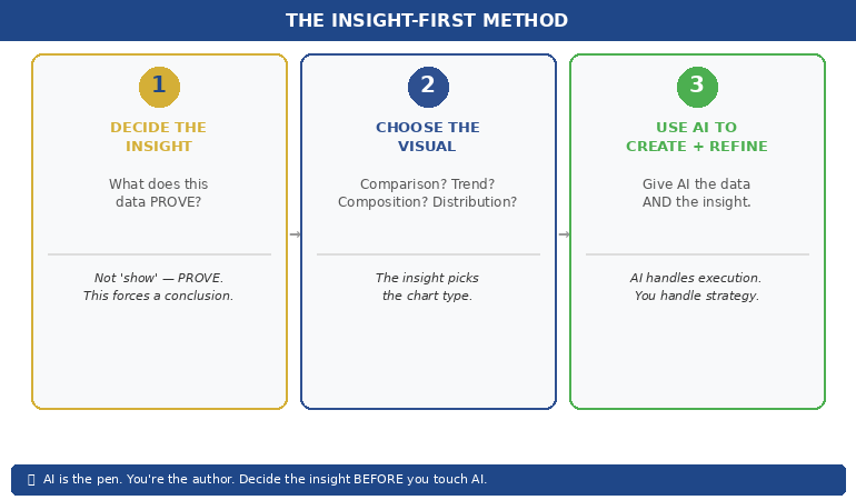
Recommendation-First Design: Putting the Answer Before the Evidence

The most important design principle for executive presentations is structural: the recommendation comes first, not last. This contradicts the logical progression most presenters learned in school and reinforced throughout their careers — build the case, present the evidence, arrive at the conclusion. At the executive level, that sequence is inverted.

Decision-makers want to know your recommendation within the first two minutes of the presentation. Not because they do not value the analysis, but because knowing the recommendation changes how they process everything that follows. If they know you are recommending Option B, they listen to your analysis through the lens of “does this evidence support that recommendation?” If they do not know the recommendation, they listen to your analysis through the lens of “where is this going?” — which is cognitively exhausting and emotionally frustrating.

In practical slide design terms, recommendation-first means your second or third slide states your recommendation in plain language. “We recommend expanding into the APAC market in Q3, with an initial investment of £2.4 million, targeting breakeven within eighteen months.” One slide. One sentence. One clear ask.

Everything after that slide is evidence, context, and risk analysis that supports the recommendation. The audience is no longer guessing where you are heading — they are evaluating whether your evidence is strong enough to justify your conclusion. That is a much more productive use of everyone’s time.

This structure also changes the Q&A dynamic. When the recommendation is visible early, questions during the presentation become more focused and more useful. Instead of “what’s your recommendation?” at slide thirty-eight, you get “how confident are you in the eighteen-month breakeven timeline?” at slide five. The second question is more valuable for everyone in the room.

Need Board-Ready Slides, Not Another Template Gallery?

Most slide templates give you layouts. The Executive Slide System — £39, instant access — gives you the decision-support frameworks that make executive presentations work:

  • Slide templates structured for recommendation-first executive communication
  • AI prompt cards to convert analyst-level data into board-level visual hierarchy
  • Scenario playbooks for board meetings, steering committees, and C-suite briefings
  • Executive summary frameworks designed for eight-second comprehension

Get the Executive Slide System → £39

Designed for executives and their teams who present to boards, steering committees, and C-suite leaders.

Visual Hierarchy for Decision-Makers Who Read Slides in 8 Seconds

Research on executive attention suggests that senior decision-makers spend approximately eight seconds on a slide before deciding whether it warrants further attention. In that eight seconds, they scan for three things: the point of the slide, the evidence that supports it, and whether they need to ask a question. Your visual hierarchy must deliver all three in that window.

The practical framework for executive visual hierarchy uses three tiers:

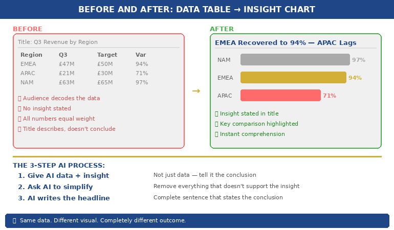
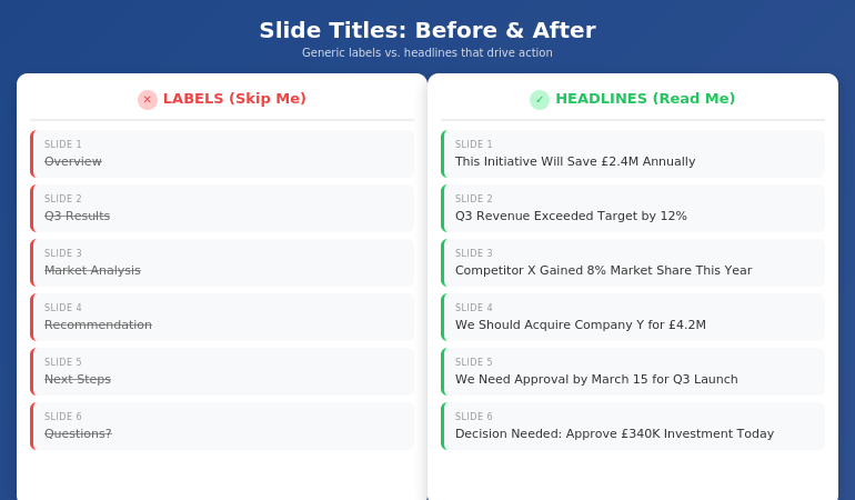
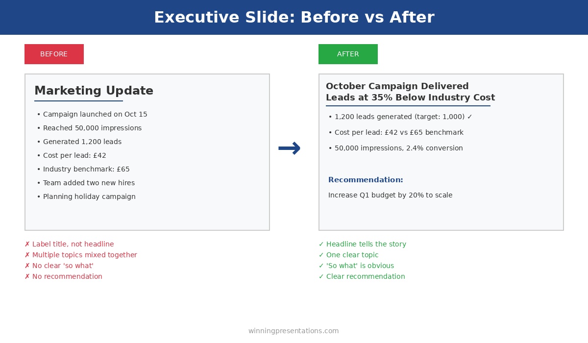
Tier 1: The headline (read in 1-2 seconds). Every slide should have a single-sentence headline that states the point of the slide — not a label, but a conclusion. “European Revenue Exceeded Target by 12%” is a conclusion. “European Revenue Q1 2026” is a label. Conclusions tell the decision-maker what to think about. Labels ask them to figure it out themselves. Use a large, bold font (minimum 24-point in a standard 16:9 slide) in a colour that contrasts clearly with the background.

Tier 2: The evidence (absorbed in 3-4 seconds). One chart, one data visualisation, or one three-to-four-bullet summary that supports the headline. Not two charts. Not a chart and a table. One piece of evidence, designed to be absorbed in a glance. If your evidence requires reading, it belongs in a pre-read document, not on a projected slide. Choose the visualisation type that communicates the point most quickly: bar charts for comparison, line charts for trends, tables only when exact numbers matter more than patterns.

Tier 3: The annotation (noticed in 1-2 seconds). A single line of context that answers the most likely question the audience will have after reading the headline and evidence. “Driven primarily by the Deutsche Bank contract signed in February” or “Represents a 3% improvement on the same period last year.” This annotation pre-empts the obvious question and saves time in discussion.

If you are designing slides for executives who make decisions quickly, the Executive Slide System (£39) provides the visual hierarchy frameworks and templates designed for exactly this three-tier approach.

The Restraint Principle: Why Less Content Signals More Authority

The instinct to fill every slide with content comes from a reasonable fear: that empty space looks like missing information. At the working level, this fear is sometimes justified — a sparse slide might genuinely indicate incomplete analysis. At the executive level, the opposite is true. A sparse slide signals that you have done the analytical work, made the judgement calls, and distilled the complexity down to what matters.

White space on an executive slide communicates three things: confidence in the recommendation, respect for the audience’s time, and mastery of the subject matter. When you leave space around a single chart and a clear headline, you are implicitly saying, “I know this topic well enough to tell you only what you need.” When you fill the slide with caveats, footnotes, and secondary data, you are saying, “I’m not sure what matters here, so I’m showing you everything.”

Practical restraint in board-level slide design means following a set of constraints:

One point per slide. If you cannot state the slide’s contribution to the argument in a single sentence, the slide is doing too many things. Split it or cut it. A twelve-slide deck where each slide makes one clear point is more effective than a six-slide deck where each slide makes three muddled ones.

Maximum three bullet points. If you have more than three supporting points, you have not prioritised ruthlessly enough. Rank them and present the top three. Move the rest to an appendix for anyone who wants the detail.

No decorative elements. Clip art, stock photography, gradient backgrounds, and animated transitions do not help executives make decisions. They add visual noise that competes with the content for attention. A clean, flat design with consistent typography and a restrained colour palette looks more authoritative than a “professionally designed” template with graphic embellishments.

Consistent typography. Use two fonts maximum — one for headlines, one for body text. Keep sizes consistent across slides. Inconsistent typography creates a subconscious sense of disorder that undermines the audience’s confidence in the presenter. If your slides look disorganised, the assumption is that your thinking is disorganised.

For detailed slide structure guidance tailored to board-level presentations, see our comprehensive framework for board presentation structure.

Five Slide Design Mistakes That Damage Executive Credibility

These five errors appear repeatedly in presentations delivered to boards, steering committees, and C-suite leaders. Each one is avoidable, and each one carries a credibility cost that exceeds the effort required to fix it.

1. Conclusion on the last slide. Saving the recommendation for the end works in academic presentations and courtroom dramas. In executive settings, it frustrates the audience and often means the recommendation never gets discussed — the meeting runs out of time because forty minutes were spent on background that should have been a pre-read. Move the recommendation to slide two or three.

2. Reading the slide aloud. If your speaking notes are identical to the text on the slide, the slide is a script, not a visual aid. Executives can read faster than you can speak. The moment they finish reading your slide — which takes about five seconds — they are waiting for you to add something the slide does not say. If you add nothing, the slide is redundant and so are you. Design slides that complement your narration, not duplicate it.

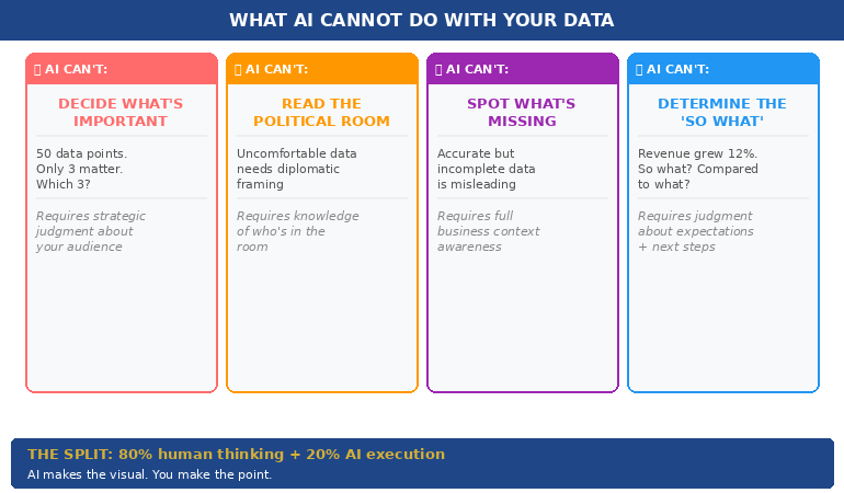
3. Charts without interpretation. A chart without a headline is an assignment, not a communication. It says to the audience: “Here is some data. Please analyse it and draw your own conclusions.” Executives do not want assignments. They want your interpretation. Every chart should have a headline that states what the chart means, not what the chart shows.

4. Inconsistent formatting across slides. Mixed fonts, varying alignment, different colour usage across slides, and inconsistent spacing signal a deck assembled from multiple sources without editorial oversight. Even if the content is strong, formatting inconsistency creates a perception of carelessness. Use a single master template and enforce it across every slide.

5. Appendix as a safety net. Including twenty appendix slides “just in case” is a sign that you have not decided what matters. A good appendix contains three to five slides that address the most likely technical questions. A bad appendix contains everything you cut from the main deck because you were not confident enough to leave it out entirely. If you would not present a slide under any circumstances, do not include it.

Stop Designing Slides That Get Interrupted on Page Four

The Executive Slide System — £39, instant access — gives you the board-ready templates and visual hierarchy frameworks that make designing executive presentations straightforward. Build recommendation-first decks that decision-makers can act on in one meeting.

Get the Executive Slide System → £39

Designed for professionals who present to boards, steering committees, and C-suite executives.

Frequently Asked Questions

How many slides should an executive presentation have?

Most effective executive presentations use ten to fifteen slides for a thirty-minute meeting, including one or two appendix slides for anticipated questions. The number matters less than the discipline: one point per slide, recommendation in the first three slides, and no slide that exists solely to demonstrate how much work went into the analysis. If your deck exceeds fifteen slides, ask whether every slide supports the decision the audience needs to make. Remove anything that serves your need to show thoroughness rather than their need to make a judgement.

What font and colour scheme works best for executive slides?

Use two fonts — one sans-serif for headlines (such as Calibri, Helvetica, or Inter) and one for body text (the same font at a smaller size works well). Avoid decorative or script fonts entirely. For colours, limit yourself to three: a dark primary colour for text and backgrounds, a contrasting accent colour for key data points and highlights, and white for negative space. Navy and gold is a classic executive palette. The goal is consistency and readability, not visual interest — the content provides the interest.

Should I use animations and transitions in executive presentations?

No. Animations and slide transitions add presentation time without adding decision value. They also create technical risk — transitions that work on your laptop may render differently on a boardroom projector, and animation timing often breaks when someone interrupts to ask a question mid-build. Use simple appear/disappear builds only when you need to reveal information sequentially to control the narrative. Otherwise, static slides are faster, more reliable, and look more professional to a senior audience.

How do I convert an analyst deck into an executive presentation?

Do not try to compress the analyst deck — build the executive deck separately, from scratch. Start with the recommendation, then identify the three to four pieces of evidence that most strongly support it. Each piece of evidence becomes one slide with a conclusion headline, one data visualisation, and one annotation line. Move the remaining analytical detail into a pre-read document or a short appendix. The executive deck and the analyst deck serve different purposes and should be designed independently, not derived from each other.

The Winning Edge — Weekly Presentation Intelligence

Every Thursday, I share one framework, one real-world example, and one practical technique drawn from 24 years of presenting in boardrooms across three continents. Join The Winning Edge newsletter →

Not ready for the full system? Start here instead: download the free Executive Presentation Checklist — a one-page reference covering the structure, visual hierarchy, and critical design elements every board-level presentation needs.

Great slides only work if you can deliver them with composure. See our guide to the presentation warm-up routine that calms your nervous system before you walk into the boardroom.

About the Author

Mary Beth Hazeldine is the Owner & Managing Director of Winning Presentations. With 24 years of corporate banking experience at JPMorgan Chase, PwC, Royal Bank of Scotland, and Commerzbank, she advises executives across financial services, healthcare, technology, and government on structuring presentations for high-stakes funding rounds and approvals.

Book a discovery call | View services

16 Feb 2026
Your Data Slides Are Killing Your Presentation. Here's How AI Can Fix That.

Your Data Slides Are Killing Your Presentation. Here’s How AI Can Fix That.

The CFO had pasted an entire Excel tab — thirty-seven rows of quarterly figures — onto a single slide. Then he asked the board to “take a moment to absorb the numbers.”

Quick answer: AI data visualisation for presentations can transform unreadable spreadsheet dumps into clear, persuasive visual charts — but only when you tell it what the data means first. The process is not “paste my data and make it pretty.” It’s a three-step human-led workflow: decide the insight (what does this data prove?), choose the visual type (comparison, trend, composition, or distribution), then use AI to generate, label, and refine the chart. AI handles the visual execution. You handle the strategic thinking. The result is data slides that make a point rather than display a table.

At Commerzbank, I sat through a quarterly review where the Head of Risk presented a slide with a forty-two-cell table comparing capital adequacy ratios across eight business lines and four quarters. Every cell was filled. Every number was accurate. Nobody in the room knew what it meant.

After the meeting, the Group Treasurer said to me: “I have no idea whether we’re in trouble or not.” The data was perfect. The communication was useless.

I helped him rebuild that slide. We replaced the table with a single bar chart showing one thing: which business lines were above the threshold and which were below. Three were red. The rest were green. The next board meeting lasted half the time and produced twice the decisions. Same data. Different visual. Completely different outcome.

Why Data Tables Fail in Executive Presentations

Data tables work in reports. They fail in presentations. The reason is cognitive: a table asks the reader to perform analysis, while a chart provides the analysis already completed. When you paste a spreadsheet into a slide, you’re asking your audience to do the work you should have done before the meeting.

Senior executives are processing information from dozens of sources across dozens of meetings. They don’t have the cognitive bandwidth to scan forty-two cells, identify the relevant comparisons, and draw their own conclusions — all while you’re talking over the top of the slide. A data table in a presentation is not information. It’s a homework assignment.

The result is predictable. Executives either tune out (because the table is overwhelming), or they focus on the wrong number (because without visual hierarchy, every number looks equally important). Either way, your data fails to do its job, which is to support a specific point that drives a specific decision.

This is why data-heavy presentations often backfire with executives. The problem isn’t the data. It’s the format. And this is precisely where AI can help — not by thinking for you, but by transforming your thinking into a visual that communicates instantly.

PAA: Why do data-heavy slides fail in presentations?
Data tables require the audience to perform their own analysis — scanning cells, making comparisons, and drawing conclusions — while simultaneously listening to the presenter. Executive audiences don’t have the cognitive bandwidth for this. Charts solve the problem by pre-digesting the analysis: they show the conclusion visually so the audience can absorb the insight in seconds rather than minutes. The presenter’s job is to decide the insight first, then choose a visual format that makes that insight obvious.

Turn Data Into Decisions — Not Decoration

AI-Enhanced Presentation Mastery includes the complete data visualisation workflow: the Insight–Implication–Action framework, AI prompt sequences for chart creation, and the visual decision matrix that tells you which chart type to use for any dataset. Self-study programme — join anytime.

Join AI-Enhanced Presentation Mastery → £249

Self-study programme with live support. Join anytime — all released modules available immediately. Built from 24 years presenting financial data in corporate banking. Check course page for current pricing and session details.

The Insight-First Method (Before You Touch AI)

The biggest mistake people make with AI data visualisation is starting with the data. They paste a spreadsheet into an AI tool and ask it to “make a chart.” The result is a technically correct but strategically useless visualisation — because AI doesn’t know what point you’re trying to make.

Before you touch AI, answer one question: What does this data prove?

Not “what does this data show” — that’s a description. “What does this data prove” forces you to state a conclusion. Examples of the difference:

“This data shows Q3 revenue by region” → a description that leads to a table.
“This data proves that EMEA revenue recovered faster than expected” → an insight that leads to a chart with EMEA highlighted.

“This data shows customer satisfaction scores” → a description that leads to a grid.
“This data proves that satisfaction dropped in the two months after the platform migration” → an insight that leads to a trend line with the drop circled.

Once you have the insight, you can tell AI exactly what to visualise — and more importantly, what to emphasise. “Create a bar chart of Q3 revenue by region. Highlight EMEA in gold. Grey out all other regions. Add a horizontal line showing the forecast.” That prompt produces a useful chart because you’ve done the thinking. AI does the drawing.

This is the Insight–Implication–Action framework we teach in the course: every data slide should state the insight (what the data proves), the implication (what it means for the audience), and the action (what needs to happen next). AI can’t generate any of those three things. But once you’ve defined them, AI can create the visual that communicates them instantly.


(770×450)Insight-First Method showing three steps: decide the insight then choose the visual then use AI to create and refine

📊 Want the complete Insight–Implication–Action framework and AI prompt sequences?

AI-Enhanced Presentation Mastery includes the data storytelling module with before/after transformations and the visual decision matrix.

Join AI-Enhanced Presentation Mastery → £249

How AI Transforms Data Into Visual Clarity

Once you’ve identified the insight, AI becomes genuinely powerful. Here’s the workflow for transforming a data-heavy slide into a clear visual:

Step 1: Give AI the data AND the insight. Don’t just paste your spreadsheet. Tell AI what you want the audience to take away. “Here is our quarterly revenue data. The key insight is that EMEA recovered to 94% of target while APAC stayed at 71%. Create a horizontal bar chart that makes this comparison obvious. Use gold for EMEA and grey for APAC. Include a vertical line at the 100% target.” The more specific your instruction, the more useful the output.

Step 2: Ask AI to simplify, not add. AI’s instinct is to include everything. Your instinct should be to remove everything that doesn’t support the insight. “Remove the gridlines. Remove the exact values from bars under 50%. Make the chart title a complete sentence: ‘EMEA Revenue Recovered to 94% — APAC Still Lagging.'” The best data slides look almost empty. That’s the point — the insight should be impossible to miss.

Step 3: Use AI to generate the headline. Your slide title should state the conclusion, not describe the content. AI is excellent at rewriting “Q3 Revenue by Region” into “EMEA Recovery Outpaced Forecast — APAC Needs Intervention.” Give AI your insight and ask it to write a headline that a time-poor executive would understand without looking at the chart. If the headline alone tells the story, you’ve succeeded.

This three-step process — insight, simplify, headline — takes five minutes per slide and produces results that are dramatically more persuasive than any table, regardless of how much data that table contains.

If you want to go deeper on how to match your AI prompts to executive presentation needs, the key is always the same: tell AI what the data means before asking it to visualise the data.

PAA: How do I use AI to create charts for presentations?
Start by defining the insight your data proves — not just what it shows. Then give AI both the data and the insight in a single prompt, specifying the chart type, what to highlight, and what to remove. Ask AI to write the slide headline as a complete sentence that states the conclusion. The process takes about five minutes per slide and produces charts that communicate instantly rather than requiring the audience to decode a table.

From Spreadsheet Dump to Executive Clarity

Module 6 of AI-Enhanced Presentation Mastery covers data storytelling in depth — including the Insight–Implication–Action framework, the visual decision matrix, AI prompt sequences for chart transformation, and before/after examples from real executive presentations. Study at your own pace.

Join AI-Enhanced Presentation Mastery → £249

Self-study programme with live Q&A calls. Join anytime — all released modules available immediately. Check course page for current pricing and session details.


Before and after comparison showing spreadsheet table transformed into a clear highlighted bar chart with insight headline

The Four Chart Types That Cover 90% of Executive Data

You don’t need twenty chart types. You need four. Almost every data insight an executive needs to communicate falls into one of these categories:

1. Comparison: “How do these things stack up?” Use horizontal bar charts. Revenue by region, performance by team, budget vs actual. AI prompt: “Create a horizontal bar chart comparing [X]. Highlight the top performer in gold and the underperformer in red. Grey out the middle. Title should state who’s winning.”

2. Trend: “What’s changing over time?” Use line charts. Revenue trajectory, customer satisfaction over quarters, headcount growth. AI prompt: “Create a line chart showing [X] over [time period]. Highlight the inflection point where the trend changed. Add a brief annotation explaining what caused the change. Title should state whether the trend is positive or negative.”

3. Composition: “What’s the breakdown?” Use stacked bars or pie charts (but only for 3–5 segments — more than five and the pie becomes useless). Revenue mix, cost allocation, market share. AI prompt: “Create a stacked bar chart showing [X] breakdown. Highlight the largest segment. Title should state what dominates.”

4. Distribution: “Where does the data cluster?” Use scatter plots or histograms. Customer segments by value, project risk ratings, team performance distribution. AI prompt: “Create a scatter plot showing [X] vs [Y]. Circle the outliers. Title should state the pattern — whether it’s clustered, spread, or has notable outliers.”

When you’re unsure which chart type to use, ask yourself: “Am I comparing, tracking, breaking down, or distributing?” The answer picks the chart. Then tell AI which category and let it handle the execution. This is considerably more effective than the approach covered in data storytelling fundamentals, because AI handles the visual execution while you focus entirely on the strategic framing.

📊 The visual decision matrix and AI prompt templates for all four chart types are inside the course.

AI-Enhanced Presentation Mastery includes the complete data visualisation system — frameworks, prompts, and before/after examples.

Join AI-Enhanced Presentation Mastery → £249

What AI Cannot Do With Your Data (The Human Part)

AI is excellent at the mechanical parts of data visualisation — creating charts, formatting them, writing headlines, standardising colours. But there are four things AI cannot do, and they’re the four things that actually matter:

AI cannot decide what’s important. Your dataset might contain fifty data points. Only three of them matter to your audience. Which three? That depends on who’s in the room, what they care about, and what decision you’re asking them to make. This is strategic judgment, not data analysis. AI can’t do it.

AI cannot read the political room. Sometimes the data shows something uncomfortable — a team underperforming, a region in decline, a project over budget. How you visualise that data depends on whether you’re presenting to the team responsible (where diplomacy matters) or to the board (where directness matters). AI doesn’t know the politics. You do.

AI cannot tell you what’s missing. The most dangerous data slide is the one that’s technically accurate but strategically incomplete. If your chart shows revenue growth but doesn’t show margin erosion, it’s misleading. AI won’t flag what you’ve left out. Only someone who understands the full business context can do that.

AI cannot determine the “so what.” Every data slide needs to answer one question: “So what?” Revenue grew 12% — so what? Is that good? Compared to what? What should we do about it? The “so what” is the entire point of the slide, and it requires human judgment about context, expectations, and next steps.

The best data slides are 80% human thinking and 20% AI execution. AI makes the visual. You make the point.


Four things AI cannot do with your data: decide importance, read the room, spot what is missing, determine the so what

PAA: Can AI replace human thinking in data presentations?
No. AI is excellent at the visual execution — creating charts, formatting them, writing headlines — but it cannot determine what’s important, read political dynamics in the room, identify what data is missing, or decide the “so what” that makes a slide actionable. The most effective workflow uses AI for 20% of the work (visual execution) and human judgment for 80% (strategic framing, audience awareness, and insight selection). AI is the pen. You’re the author.

Learn the Complete System for Executive Data Slides That Drive Decisions

AI-Enhanced Presentation Mastery teaches you the human-led, AI-assisted approach to executive presentations — including the Insight–Implication–Action framework, the visual decision matrix, AI prompt sequences, and the data storytelling techniques built from 24 years presenting financial data in corporate banking and 15 years coaching executives through high-stakes decision meetings.

Join AI-Enhanced Presentation Mastery → £249

Self-study programme with live support. Join anytime — all released modules available immediately. Built from 24 years presenting financial data in corporate banking + 15 years coaching executives. Check course page for current pricing and session details.

Frequently Asked Questions

What if my audience expects to see the full data table?

Put the table in the appendix. Present the chart in the main deck. If someone asks “where are the detailed numbers?” you say “slide 22 in the appendix” and continue with your insight. This gives you the best of both worlds: visual clarity in the presentation and full data availability on request. In twenty-four years of corporate banking, I’ve found that the executives who request the detailed table almost never actually read it — they just want to know it’s there.

Which AI tools are best for data visualisation?

Any AI tool that can process text prompts and generate charts works — ChatGPT, Claude, Copilot in PowerPoint. The tool matters less than the prompt. A specific prompt (“Create a horizontal bar chart comparing Q3 revenue by region, highlight EMEA in gold”) produces dramatically better results than a vague prompt (“Make a chart from this data”) regardless of which tool you use. The Insight-First Method works with any AI platform.

How do I handle sensitive financial data with AI tools?

If your data is confidential, use anonymised or rounded figures for the AI-generated chart, then manually replace them with the real numbers in your final slide. AI needs the structure and proportions to create the right visual — it doesn’t need the exact numbers. Alternatively, use AI only for the chart template and formatting, then input your data directly. Many organisations have approved AI tools with enterprise-grade data protection for this purpose.

Does this work for non-financial data?

The Insight-First Method works for any data type: project timelines, customer satisfaction scores, employee engagement metrics, operational KPIs, marketing funnels. The principle is the same — decide the insight before you create the visual, tell AI what to emphasise, and write a headline that states the conclusion. The four chart types (comparison, trend, composition, distribution) cover 90% of any data you’ll present in a corporate setting.

📬 The Winning Edge Newsletter

Weekly strategies for executive presentations, AI-enhanced workflows, and career-critical stakeholder communication. No fluff.

Subscribe free →

🎯 Free: 10 Essential AI Prompts for Executive Presentations

Includes the data visualisation prompts for all four chart types, plus headline rewriters and the slide clarity check sequence.

Download free →

Related: Data slides are one piece of the puzzle. If you’ve been thrown into a last minute presentation and need to build a complete deck fast, the 5-slide emergency framework helps you decide which data to include and which to cut — before you start visualising anything.

Stop pasting spreadsheets into slides. Decide the insight first. Choose the right visual. Let AI handle the execution. Your audience will thank you — and your data will finally do its job.

🎯 Learn the human-led, AI-assisted approach to executive presentations.

Join AI-Enhanced Presentation Mastery → £249

About the Author

Mary Beth Hazeldine is the Owner & Managing Director of Winning Presentations. With 24 years of corporate banking experience at JPMorgan Chase, PwC, Royal Bank of Scotland, and Commerzbank, she spent two decades watching executives paste spreadsheets into slides — and helping them transform that data into visuals that actually drove decisions.

A qualified clinical hypnotherapist and NLP practitioner, Mary Beth combines executive communication expertise with modern AI-enhanced workflows to help leaders present data with clarity and conviction.

Book a discovery call | View services

30 Jan 2026
Executive woman with glasses looking frustrated at laptop screen while reviewing presentation slides

Why “Overview” Is the Worst Slide Title (And What to Write Instead)

The CFO glanced at slide 1, saw “Overview,” and started checking his phone.

By slide 3, he wasn’t even pretending to pay attention. The presenter—a talented VP with a genuinely good proposal—had lost the room before she’d said a word. Her slide titles told the CFO exactly what to expect: nothing worth his full attention.

Quick answer: Generic slide titles like “Overview,” “Summary,” “Background,” and “Next Steps” are attention killers. They tell executives nothing and signal that you haven’t thought hard about your message. The fix is simple: every slide title should be a complete sentence that delivers the point of that slide. Instead of “Q3 Results,” write “Q3 Revenue Exceeded Target by 12%.” Instead of “Overview,” write “This Initiative Will Save £2.4M Annually.” Slide title best practices start with one rule: if your title could appear on anyone’s deck, it’s not doing its job.

Why “Overview” Fails Every Time

I spent 24 years in corporate banking—JPMorgan Chase, PwC, Royal Bank of Scotland, Commerzbank. I’ve sat through thousands of presentations and delivered hundreds more. And I can tell you exactly what happens when an executive sees “Overview” as a slide title: nothing.

That’s the problem. “Overview” creates zero anticipation. It makes zero promises. It gives the reader zero reason to pay attention to what comes next.

Think about it from the executive’s perspective. They’re in back-to-back meetings. They have 47 unread emails. They’re thinking about three other problems while you’re presenting. When they see “Overview,” their brain registers: I don’t need to focus yet. This is just setup.

But here’s what most presenters miss: executives don’t read slides sequentially like a novel. They scan. They jump ahead. They look for the slides that matter and skip the ones that don’t. Your slide title is the only thing that tells them whether to pay attention or check out.

“Overview” says: Skip me.

The same is true for every generic title: “Background,” “Context,” “Agenda,” “Summary,” “Next Steps,” “Recommendations.” These words have appeared on so many thousands of slides that they’ve become invisible. They’re wallpaper.

If your slide titles could be swapped into any presentation in your company without anyone noticing, they’re not doing their job.

The Psychology of Executive Reading

Here’s something I learned watching senior leaders consume information: they don’t read presentations—they interrogate them.

An executive looking at your deck is asking one question on every slide: What’s the point? They want the answer immediately. If they have to read three paragraphs of body text to find it, you’ve already lost them.

This is why slide title best practices always come back to one principle: the title IS the point.

Before and after comparison showing generic slide title labels versus actionable headline titles

When I trained executives at UniCredit, I used to run an exercise. I’d show them a deck with all the body content removed—just the titles. Then I’d ask: “Can you understand the argument from titles alone?”

If the answer was no, the deck failed.

The best executive presentations tell a complete story through titles. You should be able to flip through the slides, read only the headlines, and understand exactly what the presenter is recommending and why. The body text, charts, and graphics are supporting evidence—not the main event.

This is why “Overview” is so damaging. It breaks the narrative. It’s a placeholder where a point should be. When an executive is scanning your deck (and they will scan), “Overview” tells them nothing. It’s a gap in your story.

And if you’re also struggling with how to stop rambling when you present, unclear slide titles are often the root cause—you haven’t clarified your point before you started speaking.

The Headline Formula That Works

The fix for generic slide titles is simple: write headlines, not labels.

A label describes what’s on the slide: “Q3 Results,” “Market Analysis,” “Team Structure.”

A headline delivers the insight: “Q3 Revenue Beat Target by 12%,” “Market Share Is Vulnerable in APAC,” “We Need Three Additional Engineers.”

Here’s the formula I teach:

Every slide title should be a complete sentence that a busy executive could read and understand without seeing the rest of the slide.

This forces you to do something most presenters avoid: commit to a point. When you write “Overview,” you’re not committing to anything. When you write “This Initiative Will Reduce Customer Churn by 23%,” you’ve made a claim. You’ve given the executive something to engage with, challenge, or approve.

The test: Read your slide title out loud. If it sounds like something you’d actually say in conversation—”We’re recommending Option B because it’s 40% cheaper”—it’s a good title. If it sounds like a filing cabinet label—”Recommendation”—rewrite it.

Some presenters worry this makes titles too long. But look at any newspaper. Headlines are complete thoughts, often 8-12 words. That’s not too long—that’s exactly right for conveying meaning at a glance.

Before and After: 10 Slide Title Transformations

Let me show you how this works in practice. I’ve taken 10 common generic titles and transformed them into headlines that actually work. For more examples, see my detailed guide on writing better slide titles with before and after examples.

1. Overview → This Proposal Will Save £2.4M Annually

The original says nothing. The revision states the entire value proposition. An executive knows immediately whether to keep reading.

2. Background → We’ve Lost 3 Key Accounts in 6 Months

Context slides often feel like wasted time. Make them urgent by leading with the problem.

3. Agenda → Three Decisions We Need Today

Agendas are almost always skipped. Tell them what’s at stake instead.

4. Q3 Results → Q3 Revenue Exceeded Target by 12%

Don’t make them hunt for the number. Put the headline in the headline.

5. Market Analysis → Competitor X Has Gained 8% Market Share This Year

Analysis is boring. Insight is interesting. Lead with the “so what.”

6. Recommendation → We Should Acquire Company Y for £4.2M

Don’t hide your recommendation behind a label. State it clearly so decision-makers can react.

7. Timeline → Full Implementation Takes 14 Months

Timeline slides usually show a Gantt chart nobody reads. Put the key number in the title.

8. Budget → This Requires £340K Investment Over 3 Years

Finance people scan for numbers. Make them impossible to miss.

9. Risks → The Main Risk Is Regulatory Delay (40% Probability)

Generic risk slides get ignored. Specific risk titles get discussed.

10. Next Steps → We Need Approval by March 15 to Hit Q3 Launch

Create urgency. Tell them exactly what you need and when you need it.

⭐ Transform Every Slide Title in Your Next Deck

The Executive Slide System gives you the headline formulas, templates, and before/after examples to make every slide command attention.

What’s included:

  • The complete headline formula for executive slides
  • 12 slide templates with pre-written title structures
  • Before/after transformations for every common slide type
  • The “title-first” workflow that saves hours

Get the Executive Slide System → £39

Built from 24 years creating executive presentations in corporate banking

The 7 Worst Slide Titles (And What to Write Instead)

Based on 24 years of reviewing executive presentations, these are the seven most common title mistakes—and how to fix each one.

1. “Overview”

The emptiest word in presentations. Replace with your core message: “This Investment Will Generate 3x ROI in 18 Months.”

2. “Summary”

At the end of a deck, executives know it’s a summary. Tell them what to remember instead: “Three Things to Approve Today.”

3. “Discussion”

This signals you don’t have a point. Replace with the question you actually want answered: “Should We Expand to Germany in Q2?”

4. “Update”

Updates are boring by definition. Lead with what changed: “Project Is Now 2 Weeks Behind Schedule.”

5. “Analysis”

Nobody wants analysis. They want insight. Write the insight: “Pricing Is Our Biggest Competitive Weakness.”

6. “Appendix”

If it’s worth including, it’s worth labeling properly: “Detailed Financial Model” or “Competitor Comparison Data.”

7. “Questions?”

The laziest closing slide. Replace with your call to action: “We Need Budget Approval by Friday” or “Next Step: Schedule Pilot with Team A.”

For a complete system on structuring your executive summary slide, including title formulas and placement strategies, see my detailed guide.

⭐ Never Write a Generic Slide Title Again

The Executive Slide System includes fill-in-the-blank headline templates for every executive slide type—from opening to recommendation to closing.

You’ll get:

  • Headline templates for 12 common executive slide types
  • The “assertion-evidence” structure used in consulting and boardrooms
  • Word-for-word title formulas you can copy and adapt
  • Examples from real executive presentations

Get the Executive Slide System → £39

Built from 24 years in corporate banking and executive presentation coaching

When to Break the Rules

Not every slide needs a sentence-headline title. Here are the exceptions:

Title slides: Your presentation title and your name. That’s it. Don’t add “Overview of Q3 Performance”—just write “Q3 Performance: On Track for Record Year.”

Section dividers: If you’re using divider slides to signal transitions in a long presentation, simple labels like “Phase 2: Implementation” work fine. But limit these to one or two in any deck.

Data-heavy slides: When showing a complex chart or table, sometimes a short label title works better than a long headline. But add a subtitle or callout that delivers the insight: “Revenue by Region” with a callout that says “APAC growth is masking European decline.”

Backup slides: Slides you don’t plan to present but include for Q&A can use simpler labels. But if you’re presenting a slide, it needs a headline.

The rule of thumb: if you’re going to say words while this slide is on screen, the title should do heavy lifting. If the slide is just a reference or transition, you have more flexibility.

What makes a good slide title for executives?

A good slide title for executives is a complete sentence that delivers the point of the slide without requiring them to read the body content. It should be specific, actionable, and impossible to swap into another presentation. Instead of “Market Analysis,” write “We’re Losing Market Share in Three Key Segments.” The test: can an executive understand your argument by reading only the slide titles? If yes, your titles are working.

How long should a slide title be?

Slide titles should be as long as necessary to convey the complete point—usually 8-15 words. Newspaper headlines routinely hit this length and remain scannable. “Q3 Revenue Exceeded Target by 12% Despite Supply Chain Disruption” is 10 words and delivers far more value than “Q3 Results.” Don’t sacrifice clarity for brevity. A specific 12-word title beats a vague 2-word label every time.

Should every slide have a different title format?

No—consistency helps executives scan faster. Use the same title structure throughout your deck: complete sentences that state the point. What should vary is the content and specificity, not the format. If your titles alternate between labels (“Overview”) and headlines (“Revenue Is Up 12%”), the deck feels disjointed. Pick headline-style titles and stick with them.

⭐ Make Every Slide Title Count

The Executive Slide System gives you everything you need to write slide titles that command attention and drive decisions.

Inside the system:

  • The headline formula for executive slides
  • 12 templates with pre-written title structures
  • Before/after examples for every slide type
  • The “title-first” method that cuts creation time in half

Get the Executive Slide System → £39

Instant download. Start using these formulas in your next presentation.

Frequently Asked Questions

What if my company has a template with short title fields?

Most corporate templates have title placeholders that look small, but they can hold more text than you think. Test it—you can usually fit 12-15 words before needing to reduce font size. If the template truly restricts you to 3-4 words, add a subtitle line below with the full headline. The point should be visible at the top of the slide, even if it takes two lines.

Won’t long titles make my slides look cluttered?

No—they make your slides look intentional. A specific headline like “We Recommend Investing £2.4M to Capture the APAC Market” fills the title space with meaning rather than leaving it occupied by a generic label. Clutter comes from too much body text, not from titles that actually say something. In fact, strong titles often let you reduce body content because the point is already clear.

How do I write good titles for data slides?

Lead with the insight, not the data type. Instead of “Revenue Chart” or “Q3 Financials,” write what the data shows: “Revenue Growth Accelerated in Q3” or “Margin Pressure Continues Despite Volume Gains.” The chart is evidence for the claim in your title. If you can’t summarize the data in a headline, you may be showing too much data on one slide.

Should I write titles first or last?

First. Write all your slide titles before you create any content. This forces you to clarify your argument upfront and ensures every slide has a clear purpose. It also makes the rest of the deck easier to build—once you know the point of each slide, the supporting content almost writes itself. The executive presentation template in my system uses this “title-first” workflow.

📧 The Winning Edge Newsletter

Weekly insights on executive presentations, slide design, and high-stakes communication. No fluff—just what works.

Subscribe Free →

📋 Free: Executive Presentation Checklist

The pre-presentation checklist I use before every high-stakes meeting. Includes a slide title audit section.

Download Free Checklist →

Your Next Step

Open your last presentation. Read only the slide titles. Ask yourself: could a busy executive understand my argument without reading anything else?

If the answer is no—if you see “Overview,” “Summary,” “Background,” or any other generic labels—you have work to do. Replace each label with a headline that states the point. Make every title a complete sentence that delivers value on its own.

The CFO who checked his phone during “Overview” would have paid attention to “This Initiative Will Save £2.4M Annually.” Same content. Different title. Completely different outcome.

Your slides are only as good as the attention they earn. And attention starts with the title.

Related: If unclear thinking is leading to rambling when you present, see how to stop rambling when nervous—the solution often starts with clearer slide structure.

24 Jan 2026
Professional woman evaluating her presentation slides and realizing what they signal about her competence to executives

What Your Slides Say About You (And It’s Not What You Think)

A CFO once told me why she rejected a £2 million budget request before the presenter finished slide three: “His slides told me everything I needed to know about his thinking. It was scattered.”

Quick answer: Executive slide design perception is how decision-makers read your competence, preparation, and thinking quality through your slides—before you speak a single word. Executives form judgments within 5 seconds of seeing your first slide. Cluttered slides signal cluttered thinking. Buried conclusions signal uncertainty. Wall-of-text slides signal you haven’t done the synthesis work.

In practice, the visual signals your slides send often matter more than the words on them. Executives aren’t reading your slides—they’re reading YOU through your slides.

When your slides send the right signals:

  • Executives lean in instead of checking email
  • Your recommendations get faster approvals
  • You’re seen as someone who “gets it”

Written by Mary Beth Hazeldine — executive presentation coach, 24 years corporate banking at JPMorgan Chase, PwC, RBS, and Commerzbank. I’ve sat in the room when slides killed careers and when they made them. Last updated: January 2026.

🚨 Presenting THIS WEEK? Check your slides for these 3 signals:

  1. Slide 1: Does your conclusion appear in the first 10 words? (If not, you’re burying the lead)
  2. Any slide: Can someone grasp the point in 3 seconds? (If not, it’s too cluttered)
  3. Titles: Do they make claims or just label topics? (“Revenue grew 23%” beats “Revenue Overview”)

Fix these three and you’ll send different signals immediately.

→ If your slide 1 doesn’t contain your decision ask, executives assume you don’t have one. Get the templates that fix this in 60 seconds →

📅 Have 7 days to transform your deck?

The slide signal system in this article takes one focused session to implement. Most professionals see the difference in how executives respond within their very next presentation.

I learned this lesson the hard way. Early in my banking career, I spent 40 hours building what I thought was a comprehensive deck. Fifty-seven slides. Every data point. Complete background on every issue.

The Managing Director stopped me on slide four.

“I can see you worked hard on this,” she said. “But I still don’t know what you want me to do.”

Forty hours of work. Four slides in. And my slides had already told her I didn’t understand what mattered. Not because of the content—but because of the signals the design sent about my thinking.

That moment changed how I approach every deck. And after 24 years of watching executives react to presentations, I now know exactly what signals matter—and which ones kill your credibility before you’ve finished your opening sentence.

What Executives Actually See (In the First 5 Seconds)

When an executive sees your slide, they’re not reading it. They’re scanning it for signals about YOU.

Research on cognitive load shows people form impressions within milliseconds of seeing a visual. Your audience has judged your slide—and by extension, your thinking—before you’ve finished your opening sentence.

Here’s what they’re actually processing:

Signal 1: Hierarchy (Do you know what matters?)

The first thing executives notice is whether there’s a clear visual hierarchy. Is there one dominant element? Or is everything competing for attention?

A slide with five equally-weighted bullet points tells the executive: “I couldn’t decide what was important, so I’m making you do it.”

A slide with one clear headline supported by three subordinate points tells them: “I’ve done the thinking. Here’s what matters.”

Signal 2: Density (Do you respect my time?)

Wall-of-text slides send an unmistakable message: “I haven’t distilled this enough to present it clearly, so I’m going to read to you.”

One senior partner at a consulting firm told me: “When I see a dense slide, I immediately wonder if the presenter understands the material well enough to simplify it. Usually they don’t.”

Signal 3: Structure (Can you think clearly?)

Executives are pattern-matchers. They’ve seen thousands of presentations. They immediately notice whether your deck follows a logical structure or feels random.

A deck that jumps from problem to solution to background to data to recommendation signals scattered thinking. A deck that flows—situation, complication, resolution—signals someone who can construct a coherent argument.

For more on title mistakes, see why “Overview” is the worst slide title.

Diagram showing what executives see in the first 5 seconds of viewing a slide: hierarchy, density, and structure signals

The Hidden Messages Your Slides Are Sending

Beyond the conscious signals, your slides send subconscious messages that executives process without even realising it.

“I’m not confident in my recommendation”

When you bury your conclusion on slide 15 instead of leading with it, executives interpret this as hedging. You’re building up to something because you’re not sure they’ll accept it.

A VP of product once told me: “When someone buries the ask, I assume they know it’s weak. If they believed in their recommendation, they’d lead with it.”

“I don’t understand my audience”

Technical details that belong in an appendix. Jargon that assumes expertise they don’t have. Context they already know being explained at length.

All of these signal the same thing: you haven’t thought about who’s in the room and what they need.

“I’m trying to impress rather than inform”

Over-designed slides with animations, complex charts, and visual flourishes often backfire. Executives see through them immediately.

A managing director at an investment bank put it bluntly: “Fancy slides usually mean the content is weak. The best presenters I know use the simplest slides.”

“I haven’t done the hard work”

It takes more effort to create a simple, clear slide than a complex one. As the saying goes: “If you can’t explain it simply, you don’t understand it well enough.”

Executives know this. When they see complex slides, they question whether you’ve done the synthesis work—or whether you’re just dumping information and hoping they’ll sort it out.

⭐ Slides That Signal “This Person Gets It”

The Executive Slide System gives you the exact structures that send the right signals—hierarchy, clarity, and confidence—from slide one.

What’s inside:

  • 12 executive-tested slide templates (board updates, budget requests, project proposals)
  • The “Headline Test” that ensures every title makes a claim
  • Before/after examples showing signal transformation

Get the Executive Slide System → £39

Built from 24 years in corporate banking + executive training work with senior stakeholders.

5 Slide Signals That Kill Your Credibility

These are the specific executive slide design perception mistakes that damage how you’re seen:

1. The “Agenda” Opening Slide

Starting with “Agenda” or “Overview” tells executives nothing. It’s a missed opportunity to signal that you understand what matters.

What it signals: “I’m going to walk you through this linearly because I haven’t identified what you actually need to know.”

The fix: Open with your conclusion or recommendation. “We should approve the £2M investment because it will generate £8M in returns within 18 months.”

2. The Wall of Bullets

Five or more bullet points of equal weight, each a complete sentence, filling the slide.

What it signals: “I couldn’t synthesise this information, so I’m presenting my notes instead of my thinking.”

The fix: One headline that makes a claim. Three supporting points maximum. If you need more, you need more slides.

3. The Chart Without a Story

A complex chart with no annotation, no highlight, no indication of what the viewer should notice.

What it signals: “I’m showing you data but I haven’t interpreted it. You figure out what it means.”

The fix: Every chart needs a headline that states the insight. “Revenue grew 23% despite market contraction” not “Revenue Chart Q3.”

4. The “Let Me Give You Context” Deck

Slides 1-10 are background. The recommendation doesn’t appear until slide 15.

What it signals: “I’m afraid you’ll reject my recommendation, so I’m delaying it as long as possible.”

The fix: Recommendation on slide 1. Context only when asked for or as appendix.

5. The Design-Over-Substance Slide

Beautiful gradients, custom icons, animations—but the content is thin or unclear.

What it signals: “I spent time on how this looks because I didn’t have confidence in what it says.”

The fix: Simple, clean, content-focused. Let the message carry the weight.

For more on executive summary best practices, see how to write the only slide that matters.

Want slide templates that send the right signals? The Executive Slide System (£39) includes 12 proven structures used by executives at top firms.

5 Slide Signals That Build Authority

These are the signals that make executives think “this person knows what they’re doing”:

1. Conclusion-First Structure

Your recommendation or key message appears in the first 10 seconds. No buildup. No suspense.

What it signals: “I’m confident in my position. I’ve done the analysis. Here’s what we should do.”

2. Headline-Driven Slides

Every slide title makes a claim, not a label. “Market share increased 15%” not “Market Share Update.”

What it signals: “I’ve interpreted the data. I’m not making you do my job.”

3. Strategic White Space

Slides that breathe. One idea per slide. Room for the eye to rest.

What it signals: “I’ve distilled this to what matters. I respect your cognitive load.”

4. Annotated Visuals

Charts with callouts. Diagrams with explanatory text. Visual elements that guide rather than overwhelm.

What it signals: “I’ve thought about what you need to see and made it easy to find.”

5. The “So What?” Test

Every slide answers “so what?” explicitly. No slide exists just to show information—each one drives toward the conclusion.

What it signals: “Everything here has a purpose. I’m not wasting your time.”

Comparison of credibility-killing slide signals versus authority-building slide signals that executives notice

⭐ If Your Slides Aren’t Getting the Response You Want

It’s probably not your content—it’s the signals your slides are sending. The Executive Slide System rewires how your deck communicates before you even speak.

You’ll get:

  • The “Signal Audit” checklist (run before every important presentation)
  • 12 slide templates that pass the executive perception test
  • Real before/after transformations from actual client decks

Get the Executive Slide System → £39

The same structures I used for 24 years in banking—now available as templates.

Before and After: Real Slide Transformations

Here’s what changing your slide signals looks like in practice:

Transformation 1: The Opening Slide

Before: “Q3 Performance Review — Agenda: 1. Background, 2. Market Overview, 3. Results, 4. Challenges, 5. Next Steps”

What it signalled: “Buckle up for a linear data dump. I’ll get to the point eventually.”

After: “Recommendation: Approve £500K additional investment in Product X. Q3 results exceeded targets by 23%, validating our strategy.”

What it signals now: “I know what you need to decide. Here it is.”

Transformation 2: The Data Slide

Before: Title: “Revenue Data” — Complex chart with 8 data series, no annotations, legend in small text.

What it signalled: “Here’s all the data. Good luck finding the insight.”

After: Title: “Revenue grew 23% while competitors declined” — Same data, but one trend highlighted, callout pointing to key inflection, competitors greyed out.

What it signals now: “I’ve analysed this. Here’s what matters.”

Transformation 3: The Recommendation Slide

Before: Bullet list of 7 recommendations, all equal weight, no prioritisation.

What it signalled: “I generated a list but couldn’t prioritise it for you.”

After: One primary recommendation in large text. Three supporting actions in smaller text. Clear next step with owner and deadline.

What it signals now: “I know what matters most. I’ve made the decision easy for you.”

For proven executive presentation structures, see the 12-slide template that commands the room.

Ready to transform your slides? The Executive Slide System (£39) includes the exact before/after templates you can apply immediately.

Frequently Asked Questions

How quickly do executives form impressions from slides?

Research suggests visual impressions form within milliseconds—faster than conscious thought. By the time you’ve said your first sentence, they’ve already judged your slide. This is why executive slide design perception matters so much: the signals happen before your content has a chance to land.

Does slide design really matter more than content?

No—but poor slide design can prevent good content from being heard. If your slides signal scattered thinking, executives will be skeptical of your content regardless of its quality. The design IS the first impression of your content.

What’s the biggest slide mistake executives notice?

Burying the lead. When your conclusion or recommendation doesn’t appear until deep in the deck, executives interpret this as either lack of confidence or lack of synthesis. Lead with your point. Support it with evidence.

Should I use professional design templates?

Clean, simple templates are fine. Over-designed templates can actually hurt you—they signal that you’re compensating for weak content. The goal is invisible design: formatting that helps the content communicate, not formatting that draws attention to itself.

How do I know if my slides are sending the wrong signals?

Apply the “3-second test”: show someone your slide for 3 seconds, then hide it. Ask them what the main point was. If they can’t tell you, your hierarchy is wrong. If they mention something other than your main point, your emphasis is wrong. If they say “it was really busy,” your density is wrong.

Can I fix bad slide signals quickly before a presentation?

Yes. Focus on three things: (1) Move your conclusion to slide 1, (2) Make every title a claim instead of a label, (3) Remove any slide that doesn’t directly support your conclusion. This won’t make your deck perfect, but it will send dramatically better signals.

Why do executives care about slides if they’re listening to me?

Executives are overwhelmed with information. Slides act as a filter—a quick way to assess whether this presentation is worth their full attention. Clean, well-structured slides signal that you’ve done the hard work of synthesis. That earns their attention. Cluttered slides signal the opposite.

Is This Right For You?

✓ This is for you if:

  • You present to executives, boards, or senior stakeholders
  • You’ve noticed your slides aren’t getting the response you want
  • You want templates that signal competence immediately
  • You’re willing to restructure how you build decks

✗ This is NOT for you if:

  • You only present to internal teams (lower stakes)
  • You want design software training, not structure help
  • Your main issue is delivery, not deck construction
  • You’re not willing to change how you organise information

⭐ The MD Who Stopped Me on Slide Four Taught Me Everything

That 57-slide deck that died on slide four? I rebuilt it using the structures now in the Executive Slide System. Same content. Different signals. The same MD approved it two weeks later—and asked for the template.

What you’ll get:

  • 12 executive-tested slide templates
  • The Signal Audit checklist
  • Before/after transformation examples

Get the Executive Slide System → £39

Built from structures that work in global banking and consulting-style environments.

📧 Optional: Get weekly slide strategies in The Winning Edge newsletter (free).

Your Next Step

Your slides are sending signals whether you intend them to or not. The question is whether those signals build your credibility or undermine it.

Run the 3-second test on your next deck. Check whether your conclusion appears in the first 10 seconds. Make sure every title makes a claim instead of labelling a topic.

Those three changes alone will transform your executive slide design perception—how executives read you through your slides.

For the complete system with templates and checklists, get the Executive Slide System (£39).

P.S. If presentation anxiety is affecting your delivery regardless of how strong your slides are, see what to do if you have a panic attack before presenting.

About the Author

Mary Beth Hazeldine is the Owner & Managing Director of Winning Presentations. The MD story that opened this article is real—and that rejected deck became the foundation for how she now teaches slide structure.

With 24 years at JPMorgan Chase, PwC, Royal Bank of Scotland, and Commerzbank—where one presentation could change funding, strategy, or careers—she’s seen thousands of executive presentations. The patterns of what works became the Executive Slide System.

Book a discovery call | View services

02 Jan 2026
How to make a presentation - 5-step process from purpose to delivery

How to Make a Presentation: The Complete Guide to Creating Slides That Work [2026]

Learning how to make a presentation doesn’t have to take hours. Whether you’re creating your first PowerPoint for school, preparing a business pitch, or building slides for a conference talk — the fundamentals are the same.I’ve spent 24 years making presentations at JPMorgan Chase, PwC, Royal Bank of Scotland, and Commerzbank. I’ve created hundreds of decks — from quick team updates to £50 million investment pitches. And I’ve watched talented people fail because they didn’t understand one thing:

A presentation isn’t about slides. It’s about moving people from where they are to where you need them to be.

The slides are just the vehicle.

In this guide, I’ll show you exactly how to make a presentation that works — step by step. You’ll learn the process I use for every presentation, whether it takes 30 minutes or 3 hours to create.

By the end, you’ll know how to make a presentation for any situation: work, school, conferences, or pitches.

How to make a presentation - 5-step process from purpose to delivery

The 5-step process for making presentations that work — regardless of which software you use

🎁 Free Download: Grab my 7 Presentation Frameworks Cheat Sheet — the structures I use for every presentation I create. Works with any software.

How to Make a Presentation: The 5-Step Process

Every great presentation follows the same basic process — regardless of whether you’re using PowerPoint, Google Slides, Canva, Keynote, or AI tools.

Here’s the framework for how to make a presentation that actually lands:

  1. Define your purpose — What do you want your audience to do?
  2. Know your audience — Who are they and what do they care about?
  3. Build your structure — What’s the logical flow?
  4. Create your slides — What visuals support your message?
  5. Refine and practise — What needs polishing?

Most people jump straight to step 4 — opening PowerPoint and staring at a blank slide. That’s why they struggle.

Let me walk you through each step.

Step 1: Define Your Purpose (Before You Touch Any Software)

Before you learn how to make a presentation in any tool, you need to answer one question:

“What do I want my audience to think, feel, or do after this presentation?”

This isn’t your topic. It’s your destination.

Weak purpose: “I’m presenting our Q3 results.”

Strong purpose: “I need the board to approve increased marketing spend for Q4.”

The weak version describes what you’ll talk about. The strong version describes what you need to achieve.

Write your purpose in one sentence. Everything else flows from this.

Examples of strong presentation purposes:

  • “Convince my professor I understand the key themes of this novel”
  • “Get my team excited about the new project direction”
  • “Persuade investors to schedule a follow-up meeting”
  • “Help new hires understand our company culture”
  • “Get my manager to approve this budget request”

If you can’t state your purpose clearly, you’re not ready to make a presentation yet.

Step 2: Know Your Audience

The second step in how to make a presentation is understanding who you’re presenting to.

A presentation to your CEO looks different from a presentation to new graduates. Not just in content — in structure, depth, and tone.

Ask yourself these five questions before you start building slides:

Answer these 5 questions BEFORE you open PowerPoint or Google Slides

A common mistake when learning how to make a presentation: creating the same slides for every audience. Don’t do this. A technical audience wants data. Executives want recommendations. Students want relatable examples.

Adapt your presentation to your audience — every single time.

Step 3: Build Your Structure

Now you’re ready to plan your presentation’s structure — still without opening any software.

This step separates people who know how to make a presentation from people who just make slides.

Your structure is the logical flow that takes your audience from where they are now to your desired outcome (your purpose from Step 1).

Three Structures That Work for 90% of Presentations

Choose ONE of these structures before you start building slides

Structure 1: Problem → Solution → Action

Best for: Pitches, proposals, requesting approval

  1. Here’s the problem we’re facing
  2. Here’s the solution I recommend
  3. Here’s what I need you to do/approve

Structure 2: What → So What → Now What

Best for: Updates, reports, presenting data

  1. Here’s what happened / what the data shows
  2. Here’s why it matters / what it means
  3. Here’s what we should do next

Structure 3: Context → Options → Recommendation

Best for: Complex decisions, strategy presentations

  1. Here’s the situation and constraints
  2. Here are the options we considered
  3. Here’s what I recommend (and why)

Choose a structure. Write out your main points as bullet points — one per slide. This is your presentation skeleton.

For a typical 15-minute presentation, you need 5-8 main points. For 30 minutes, 10-15.

Don’t write full sentences yet. Just capture the flow:

  • Opening: The problem with our current process
  • Point 1: What’s causing the delays
  • Point 2: The cost of doing nothing
  • Point 3: My proposed solution
  • Point 4: How it works in practice
  • Point 5: Investment required
  • Point 6: Expected results
  • Closing: What I need from you today

That’s a complete presentation structure — before you’ve created a single slide.

📋 Need Help With Structure?

The Presentation Openers & Closers Swipe File (£9.99) includes 50+ tested scripts for starting strong and ending memorably — plus templates for each structure above.

Step 4: How to Make a Presentation — Creating Your Slides

Now you’re ready to open your presentation software and start making slides.

Here’s how to make a presentation that looks professional — regardless of which tool you use.

Choosing Your Presentation Software

The best tool depends on your situation:

Choose your presentation software based on your situation — not trends

If you’re making a business presentation, PowerPoint or Google Slides are usually your best options. Most organisations expect these formats.

If you’re learning how to make a presentation for the first time, start with Google Slides — it’s free and simpler than PowerPoint.

The One-Slide-One-Point Rule

The most important principle when making slides: each slide should make exactly one point.

If you have two points, make two slides. Slides are free.

This rule alone will make your presentations clearer than 80% of what your audience usually sees.

How to Design Slides That Don’t Overwhelm

When you’re learning how to make a presentation, less is always more.

Apply these 4 rules to every slide you create

Text:

  • Maximum 6 bullet points per slide
  • Maximum 6 words per bullet point
  • Never write full sentences (that’s what you say, not what they read)

Fonts:

  • Stick to one or two fonts
  • Minimum 24pt for body text, 32pt+ for titles
  • Sans-serif fonts (Arial, Calibri, Helvetica) are easier to read on screen

Colours:

  • Use 2-3 colours maximum
  • Ensure high contrast between text and background
  • If in doubt, dark text on light background works best

Images:

  • Use high-quality images (no pixelated photos)
  • One image per slide maximum
  • Images should support your point, not decorate

The Squint Test

After making each slide, squint at it from arm’s length.

Can you tell what the slide is about?

If not, simplify. Remove elements until the main point is unmistakable.

Step 5: Refine and Practise

The final step in how to make a presentation: polish your work and prepare to deliver it.

The Refinement Checklist

Go through your presentation and check each section:

Complete this checklist before you present — catches 90% of common issues

Opening (Slide 1-2):

  • Does it grab attention?
  • Is your purpose clear within the first 30 seconds?

Flow (All slides):

  • Does each slide lead naturally to the next?
  • Are there any jumps that might confuse people?

Closing (Final slide):

  • Is there a clear call to action?
  • Will your audience know exactly what to do next?

Technical:

  • Have you spell-checked everything?
  • Do all images display correctly?
  • Is the file saved in the right format?

Practise Out Loud

Knowing how to make a presentation is only half the battle. You also need to deliver it well.

Practise your presentation out loud at least twice before you deliver it for real. This helps you:

  • Find awkward transitions
  • Check your timing
  • Build confidence
  • Discover slides that don’t work

If possible, practise in front of someone else and ask for honest feedback.

How to Make a Presentation Quickly (When You’re Short on Time)

Sometimes you don’t have hours to prepare. Here’s how to make a presentation when time is tight:

60 minutes available:

  • 10 minutes on purpose and structure
  • 40 minutes creating slides
  • 10 minutes refining

30 minutes available:

  • 5 minutes on purpose and structure
  • 20 minutes creating slides
  • 5 minutes quick review

15 minutes available:

  • Write 5 headlines on paper
  • Create 5 simple slides with just headlines
  • Let your speaking do the work

The key insight: never skip the purpose and structure steps, even when rushed. A clear 5-slide presentation beats a confusing 20-slide one.

For a detailed breakdown of making presentations quickly using AI, see my guide: How to Make a Presentation With AI: The 90-Minute Method.

How to Make a Presentation Using AI Tools

AI tools like Microsoft Copilot, ChatGPT, and Canva AI can dramatically speed up how you make a presentation.

Here’s when they’re useful:

  • Generating first drafts — AI can create a starting structure
  • Writing content — AI can help with bullet points and speaker notes
  • Design suggestions — AI can recommend layouts and formats
  • Editing — AI can help simplify and clarify your text

But AI tools have limitations. They don’t know your specific audience, your company context, or the politics in your boardroom. You still need to apply Steps 1-3 yourself.

Think of AI as a fast assistant, not a replacement for thinking.

For a complete guide to using AI effectively, see: How to Make a Presentation With AI: The Complete Guide.

Common Mistakes When Learning How to Make a Presentation

After reviewing thousands of presentations, these are the most common mistakes I see:

Mistake 1: Starting with slides instead of structure. Plan first, design second. Always.

Mistake 2: Too much text on slides. Your slides are prompts, not scripts. Say more, show less.

Mistake 3: No clear purpose. If you don’t know what you want from your audience, neither will they.

Mistake 4: No call to action. Every presentation should end with “Here’s what I need from you.”

Mistake 5: Reading slides aloud. If you’re just reading what’s on screen, why does your audience need you?

Mistake 6: Too many slides. A 30-minute presentation needs 10-15 slides, not 40. Quality over quantity.

How to Make a Presentation: Frequently Asked Questions

How many slides should a presentation have?

A useful rule: one slide per 2-3 minutes of speaking. For a 15-minute presentation, aim for 5-8 slides. For 30 minutes, 10-15 slides. For an hour, 20-30 slides maximum. But quality matters more than quantity — 5 clear slides beat 20 cluttered ones.

What’s the best presentation software for beginners?

Google Slides is free, simple, and works in any browser. It’s the easiest way to learn how to make a presentation. Once you’re comfortable, you can move to PowerPoint for more advanced features.

How long does it take to make a presentation?

A simple 10-slide presentation takes most people 2-4 hours. With practice and templates, you can reduce this to 1-2 hours. Experienced presenters using AI tools can create solid presentations in under an hour.

Should I use animations in my presentation?

Use animations sparingly. Simple fade-ins can help reveal information gradually. But flying text and bouncing graphics distract from your message. When in doubt, skip the animations.

How do I make a presentation for school vs work?

The process is the same. The difference is audience expectations. School presentations often require more explanation of methodology. Work presentations focus more on outcomes and recommendations. Always adapt your depth and language to your audience.

What if I don’t have design skills?

Use templates. Every presentation tool includes professional templates that handle the design for you. Canva has particularly good free options. You don’t need design skills to make a presentation that looks professional.

Your Complete Presentation Toolkit

Now you know how to make a presentation from scratch. But having the right resources makes it faster and easier.

Here’s what I recommend based on where you are:

🎁 FREE: 7 Presentation Frameworks Download
The same structures I use for every presentation — works with any software.


📋 QUICK WINS:


🎯 BEST VALUE — The Presentation Confidence Bundle (£29.99)

Get all three resources together and save 33%:

  • Public Speaking Cheat Sheets (£14.99 value)
  • Presentation Openers & Closers (£9.99 value)
  • Calm Under Pressure Guide (£19.99 value)

Total value: £44.97 → Bundle price: £29.99


🏆 COMPLETE SYSTEM: The Executive Slide System (£39)
17 templates + 51 AI prompts + video training. The framework clients have used to secure approvals totalling over £250 million.

🎓 Want to Master High-Stakes Presentations?

If you present to executives, boards, or investors, knowing how to make a presentation is just the start. The Executive Buy-In Presentation System teaches you how to structure for approval, handle tough questions, and deliver with confidence.

  • 7 modules of video training
  • The Decision Definition Canvas
  • Executive-ready templates
  • AI prompt sequences that work
  • Live Q&A sessions

Learn More About the Course →


Related Articles:

📧 Get The Winning Edge

Weekly presentation tips, templates, and insights from 24 years in corporate boardrooms. No fluff. No spam.

Subscribe Free →


Mary Beth Hazeldine spent 24 years in corporate banking at JPMorgan Chase, PwC, Royal Bank of Scotland, and Commerzbank. She now trains professionals on high-stakes presentations through Winning Presentations. Her clients have raised over £250 million using her frameworks.

03 Dec 2025
Executive slide before and after example - transforming a weak marketing update into a clear headline with recommendation

Stop Writing Slide Titles Like This (Before and After Examples)

Your slide titles are probably costing you approvals, buy-in, and promotions.

After reviewing thousands of presentations across 24 years in corporate banking and 16 years of training executives, I can tell you the single biggest mistake I see: label slide titles instead of headline slide titles.

“Q3 Financial Results” is a label. It tells me what category of information I’m about to see.

“Q3 Revenue Up 12% Despite Market Headwinds” is a headline. It tells me what I need to know — even if I never read the rest of the slide.

This distinction in slide titles sounds small. It’s not. It’s the difference between presentations that get skimmed and ignored versus presentations that drive decisions.

Here are 10 before-and-after examples to transform your slide titles today.

Executive slide before and after example - transforming a weak marketing update into a clear headline with recommendation
The same slide, transformed: label slide titles become headlines that communicate the key message

Why Slide Titles Matter More Than You Think

Executives don’t read presentations. They scan them.

They flip through slide titles looking for red flags, key decisions, and anything that requires their attention. If your slide titles are labels, you’re invisible. They’re scanning past your slide titles without absorbing anything.

But when your slide titles are headlines — complete messages that communicate the “so what” — executives can get your story just from the slide titles. They know what you’re saying before they read a single bullet point.

This changes everything about how your presentation lands.

The Slide Titles Test That Reveals Weak Presentations

Here’s how to know if your slide titles are working:

Read only the slide titles of your presentation, in order. Do they tell a coherent story? Does someone scanning just the slide titles understand your key message and recommendation?

If yes, you have headline slide titles. If no — if the slide titles are just labels that require reading the slide content — you have work to do.

Let’s fix your slide titles.

10 Slide Titles Transformations: Before and After

Slide Titles Example 1: Financial Results

❌ Before: “Q3 Financial Results” ✅ After: “Q3 Revenue Up 12%, Margins Stable at 42%”

Why this slide title is better: The executive knows exactly how the quarter went without reading anything else. The before slide title requires them to dig into the content to understand if Q3 was good or bad.

Slide Titles Example 2: Project Status

❌ Before: “Project Status Update” ✅ After: “Project Green: 3 Weeks Ahead, 10% Under Budget”

Why this slide title is better: The slide title communicates health, timeline, and budget in one line. An executive scanning these slide titles knows immediately this project doesn’t need attention.

Slide Titles Example 3: Market Analysis

❌ Before: “Competitive Landscape” ✅ After: “We Lead in 3 of 5 Categories; Gap in Enterprise”

Why this slide title is better: The slide title tells the strategic story — mostly winning, but with one clear weakness. The executive knows exactly where to focus the discussion from the slide title alone.

Slide Titles Example 4: Budget Request

❌ Before: “Budget Proposal” ✅ After: “Requesting £500K for Platform Upgrade — 6-Month Payback”

Why this slide title is better: The slide title states the ask and the return. The executive is already doing the mental math before seeing the details.

Want slide titles already written for you?

Every template in The Executive Slide System has headline-style slide titles built in — just fill in your numbers. No more staring at blank slide titles wondering what to write.

Slide Titles Example 5: Team Update

❌ Before: “Team Performance” ✅ After: “Team at Full Capacity — All KPIs Green for Q3”

Why this slide title is better: The slide title answers the question leadership actually has: is this team performing? Instead of making them hunt for the answer, your slide title delivers it immediately.

Slide Titles Example 6: Risk Assessment

❌ Before: “Risk Register” ✅ After: “2 High Risks Require Board Attention — Mitigations in Place”

Why this slide title is better: The slide title tells leadership exactly what they need to know: how many risks, severity level, and current status. They know immediately if this slide needs discussion from the slide title.

Slide Titles Example 7: Customer Metrics

❌ Before: “Customer Satisfaction” ✅ After: “NPS Up 15 Points to 72 — Highest in Company History”

Why this slide title is better: The slide title celebrates a win with specifics. The executive knows from the slide title this is good news worth acknowledging — maybe even sharing with the board.

The 60-second executive slide test - 6 questions every presentation slide must pass before presenting to leadership
Testing your slide titles is #5 on the 60-second check: “Does the title tell the story?”

Slide Titles Example 8: Strategic Recommendation

❌ Before: “Strategic Options” ✅ After: “Recommend Option B: Fastest Time-to-Market at Moderate Risk”

Why this slide title is better: The slide title leads with the recommendation. The executive knows your position before reviewing the options — which focuses the discussion on your reasoning rather than re-evaluating everything from scratch.

Struggling to write strong slide titles?

The Executive Slide System includes 30 AI prompts — one specifically generates 5 headline slide title options for any slide. The same prompts I’ve used to help clients secure over £250 million in funding.

Slide Titles Example 9: Challenges

❌ Before: “Current Challenges” ✅ After: “Churn at 8% — Above Target; Mitigation Plan in Progress”

Why this slide title is better: The slide title is honest about the problem but also shows you’re addressing it. It demonstrates accountability in the slide title rather than hiding bad news behind a vague label.

Slide Titles Example 10: Next Steps

❌ Before: “Next Steps” ✅ After: “Decision Needed by Friday to Meet Q1 Launch Date”

Why this slide title is better: The slide title creates urgency and specifies exactly what you need. “Next Steps” could mean anything; this slide title tells leadership precisely what action you’re requesting.

The Slide Titles Formula That Always Works

Every strong slide title follows this pattern:

The Headline Slide Titles Formula

[Subject] + [Key Message] + [Number or Context]

Slide titles examples:

  • • “Revenue + Up 12% + Despite Market Headwinds”
  • • “Project + On Track + 3 Weeks Ahead of Schedule”
  • • “Churn + Above Target + Mitigation in Progress”

Numbers are particularly powerful in slide titles. “Performance Improved” is vague. “Performance Up 23%” is specific and credible. Wherever possible, include a number in your slide titles.

Common Slide Titles Mistakes to Avoid

Mistake 1: Single-word slide titles. “Overview,” “Summary,” “Appendix” — these slide titles tell the reader nothing. Every slide should have a message, and the slide title should communicate it.

Mistake 2: Questions as slide titles. “What Did We Learn in Q3?” forces the reader to dig for the answer. “Q3 Taught Us Enterprise Is Our Growth Engine” delivers the answer in the slide title.

Mistake 3: Slide titles that need the slide to make sense. If your slide title only makes sense after reading the content, it’s backwards. The slide title should make sense first, then the content provides supporting detail.

Mistake 4: Slide titles that are too long. Slide titles should be scannable — ideally under 12 words. If you can’t communicate your message in 12 words, your slide might be trying to say too much.

FAQs About Slide Titles

Should every slide have a headline slide title?

Yes, with rare exceptions. Even “Agenda” can become “Today: 3 Decisions Required.” The only slides that might keep label slide titles are section dividers in long presentations — and even those slide titles can often be improved.

What about title slides with just the presentation name?

Title slides are the one exception for slide titles. “Q3 Business Review” is fine as a presentation title. But slide 2 onwards should all have headline slide titles, not labels.

Won’t headline slide titles give away my conclusions too early?

That’s the point. Executives want to know your conclusions immediately. Leading with conclusions in your slide titles shows confidence and respects their time. Building suspense is for movies, not presentations.

How do I write headline slide titles for complex topics?

Focus on the “so what” for your slide titles. Even complex analysis has a key takeaway. “Analysis Results” tells me nothing. “Analysis Shows Market Entry Viable in Q2” tells me the conclusion. Start with the takeaway and work backwards to write your slide title.

Transform Your Slide Titles Today

Open your most recent presentation. Look at the slide titles only — don’t read the content.

Ask yourself: if an executive only read these slide titles, would they understand my message?

For any slide title where the answer is no, apply the formula: Subject + Key Message + Number or Context.

This takes 10 minutes. It will transform how your presentation lands.

I’ve seen careers change because of slide titles. A VP at one of my client companies told me she started getting invited to board meetings after she fixed her slide titles. The content hadn’t changed — just the slide titles. But suddenly, executives could actually see her strategic thinking instead of having to dig for it.

Your slide titles are the first thing leadership reads. Make them count.

The Executive Slide System complete package - 10 PowerPoint templates, 30 AI prompts, and quick start guide for executive presentations

Get Templates With Headline Slide Titles Built In

Stop staring at blank slides. The Executive Slide System includes 10 PowerPoint templates with headline-style slide titles already written — just fill in your numbers and present.

Plus 30 AI prompts including one that generates 5 headline slide title options for any slide.

GET INSTANT ACCESS → £39

10 templates • 30 AI prompts • Instant download • 30-day guarantee


Related: How to Create Executive Presentations That Get Approved in 2025 — the complete guide covering all 10 executive presentation types with headline slide titles and structures.