

Quick answer: A high-stakes decision slide for a £10M-or-equivalent recommendation needs five elements: the recommendation in one sentence, the financial envelope, the option set considered, the principal risks named, and the explicit decision being requested. It needs to omit: build-up narrative, methodology paragraphs, multiple competing recommendations, and any chart that requires more than five seconds to read. The slide is the audience’s reference point throughout discussion — not a place to argue your case.
JUMP TO:
Astrid was presenting a £14m capital request to the executive committee of a UK insurance group. The deck was 23 slides. The recommendation slide — the one the committee would actually look at while voting — was slide 19. It had the recommendation, three options, four risk categories, two charts, a benefits summary, and a footnote about a regulatory deadline. Twelve distinct things competing for attention. The committee chair stopped her on slide 6 and asked: “Astrid, can you put up the recommendation slide?” She clicked through. The chair looked at it for eleven seconds, said “I cannot tell what you are asking us to approve from this slide”, and the meeting moved on without a decision.
This is the most expensive slide-design failure in senior-level presenting. Not because the underlying analysis was weak — Astrid’s was excellent. But because the slide that the committee was using to anchor the decision was unreadable in the time it had to be read. A board does not study slides. It glances. The recommendation slide either lands in five seconds or it does not land at all.
What follows is the structural template senior boards consistently respond to, drawn from decks that have earned approval at C-suite and board level across financial services, insurance, and consulting. It is deliberately spartan. The point is not aesthetic minimalism. The point is that the audience must be able to look at one slide and understand exactly what is being asked of them.
If you want a structured slide framework, not a checklist:
The Executive Slide System gives you 26 templates including the recommendation slide structure used at board level — the one designed to be readable in five seconds.
Why the decision lives on one slide
Senior decision-makers do not read your deck the way you wrote it. They scan the appendix during pre-read, focus on three or four key slides during the meeting, and use one specific slide as their reference point when the discussion turns to the actual vote. That slide is the recommendation slide. It is the only slide they will look at twice. It is the slide they will photograph on their phone as they leave the room.
If the recommendation slide is busy, multi-layered, or requires explanation, three things happen. The discussion drifts to peripheral details because no one is sure what the central decision is. Senior members defer to whoever speaks loudest because they cannot anchor on the document. And the decision either stalls — “let us take this offline” — or gets approved with caveats that effectively rewrite your recommendation in the room.
The single-slide constraint is not a stylistic choice. It is a recognition that senior audiences have ten or twenty other decisions in the same meeting, that they have read the pre-read in the back of a car or between calls, and that the recommendation slide is the one piece of your work that has to stand alone. Treat it accordingly.
The five elements that must be on it
The five elements below are non-negotiable. They are also exhaustive — anything beyond them belongs on a different slide.
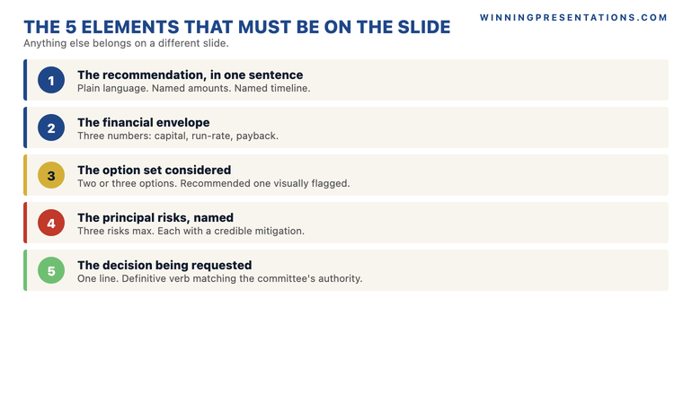
1. The recommendation, in one sentence. Not a paragraph, not bullets, one sentence. “We recommend the committee approves £14m of capital expenditure across two years to migrate platform X to cloud architecture Y, completing by Q3 2027.” Plain language, named amounts, named timeline. The sentence has to be readable as a sentence — not as a fragment that requires the slide title to make sense.
2. The financial envelope. Three numbers on a single line: total capital request, annual run-rate impact, payback or break-even point. If the recommendation is non-financial in nature, replace these with the equivalent magnitude metrics — headcount, customer impact, regulatory deadline. The point is to size the decision instantly.
3. The option set considered. Two or three options in a single horizontal row, with the recommended option visually flagged. Each option gets one line. “Option A: Build (rejected — 14-month build, regulatory risk). Option B: Buy (rejected — vendor dependency). Option C: Migrate (recommended — proven architecture, 9-month delivery).” The point is to show the committee that alternatives were considered seriously, not to argue the case for them again.
4. The principal risks, named. Three risks maximum, each in five to seven words, with the mitigation in five to seven more. Senior committees never approve recommendations that pretend there are no risks. They approve recommendations where the risks are named honestly and the mitigations are credible. Hiding the risks — or burying them in slide 22 — signals that the presenter is selling rather than recommending.
5. The explicit decision requested. One line at the bottom of the slide, in language matching the committee’s actual decision authority. “Approve £14m capital allocation as set out, conditional on Q4 2026 board review of vendor selection.” Not “consider”, not “discuss”, not “endorse”. The decision verb has to match the action you need them to take. Vague asks generate vague responses.
What must be off the slide
Equally important — and harder for most presenters to accept — is what does not belong on the recommendation slide. The instinct is to add. The discipline is to subtract.
Stop rebuilding decision slides from scratch every time.
The Executive Slide System gives you 26 templates, 93 AI prompts, and 16 scenario playbooks for board, investment committee, and executive decision presentations. Includes the recommendation slide template used in real C-suite decks. £39, instant access.
- 26 executive slide templates including the recommendation, options, and risk slides
- 93 AI prompts to draft slide content quickly without sounding generic
- 16 scenario playbooks covering board, CFO, investor, and quarterly review formats
- 7 checklists covering pre-presentation review, slide audit, and Q&A preparation
- 8-slide QBR Deep Dive template with 8 dedicated AI prompts
Get the Executive Slide System — £39 →
Designed for senior professionals presenting decisions at board and committee level.
Build-up narrative. The story of how you arrived at the recommendation belongs on slides one through eighteen. The recommendation slide is not a recap. If your slide title is “In summary…” or “Bringing it together…” you have written a closing slide, not a decision slide. Replace it.
Methodology paragraphs. “Following extensive analysis across four workstreams, including consultation with…” — this is signal that the slide is performing rigour rather than enabling decision. The committee assumes you have done the work. They do not need to see the workings on the recommendation slide. Methodology lives in the appendix.
Multiple competing recommendations. If you offer the committee three different recommendations, you have not made a recommendation. You have asked them to do your job. Senior committees almost never split decisions like this — they will pick the one that looks most defensible, or they will defer the decision entirely. Pick one. Defend it. Acknowledge the alternatives in the option set.
Charts that require more than five seconds. If the recommendation slide contains a chart, the chart must communicate one specific point — not be a data visualisation that the audience studies. A waterfall showing the build-up of the £14m? Maybe, if it is large and clean. A scatter plot, a multi-axis line graph, or anything requiring a legend? No. Move it to a supporting slide.
The 8-slide CFO presentation template covers the broader question of how the recommendation slide fits into a tightly structured deck. The principle is the same: the recommendation slide carries the decision; the surrounding slides carry the evidence.
A layout that works
Layout matters because the eye reads in predictable patterns. Senior audiences scan slides in roughly this order: title, top-left, centre, bottom-right. The recommendation slide should be designed for that scan path.
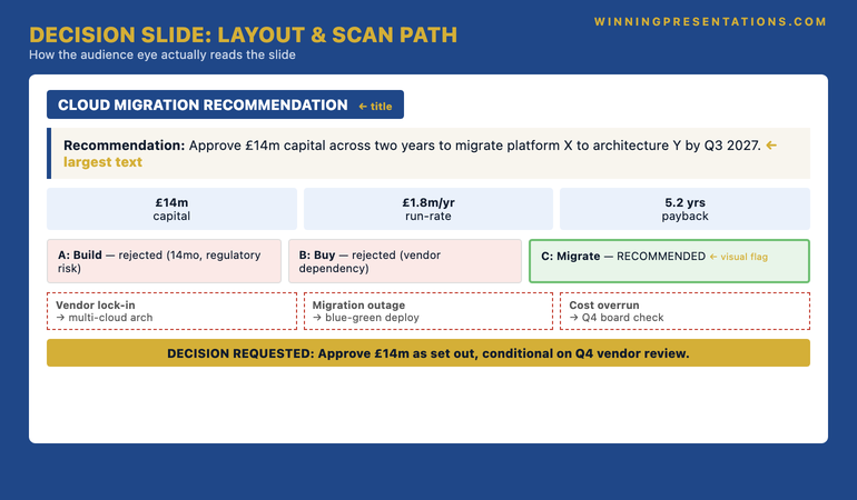
Title block: Use the slide title to name what is being decided, not to describe what the slide contains. “Cloud Migration Recommendation” works. “Capital Request Summary” does not.
The recommendation sentence: Position it directly under the title in the largest text on the slide — at least 24-28 point. This is the first thing the audience reads after the title. It has to be readable from the back of a board room.
The financial envelope: Three boxed numbers in a horizontal strip below the recommendation. Equal weight. Equal sizing. The eye should register all three in a single glance.
The option set: Three columns or three rows, with the recommended option visually distinguished — typically a thicker border, a colour fill, or a clear “RECOMMENDED” tag. Do not bury the recommendation by giving all three options equal visual weight.
The risks: Three rows directly below the options. Two columns: risk on the left, mitigation on the right. Same length per row. Same alignment. Visual rhythm matters here — a messy risk block reads as messy thinking.
The decision-requested line: A single line at the bottom of the slide, set off visually — boxed, or with a coloured background strip. This is what the committee chair will read aloud when calling for the vote. Make it readable as a complete sentence.
For the broader vocabulary that goes around all of this — the words senior leaders use to signal authority on slides and in the room — see the executive vocabulary that signals seniority.
Common failure patterns
Three patterns appear repeatedly in decision slides that fail to land at senior level.
The “comprehensive” slide. The presenter has tried to put everything on the slide so they “do not have to flip back and forth”. The result is a slide with twelve elements, no visual hierarchy, and no obvious place for the eye to land first. The committee cannot find the recommendation. They ask the presenter to summarise it verbally — which is the moment the slide has failed.
The hidden ask. The presenter has built towards the recommendation across the deck, but the recommendation slide itself uses soft language. “We propose to consider…” or “Subject to further discussion, the team’s view is…”. This is the language of someone hedging. Senior committees read it as such. They will either push back (“if you are not sure, why are we voting?”) or quietly defer the decision. Use definitive language. “We recommend” — not “we propose to consider”.
The single-option presentation. The presenter shows only the recommended option, having decided that alternatives are a distraction. This signals weak analysis. Senior decision-makers expect to see that the team considered other options seriously — not because they want to debate them, but because the existence of the option set demonstrates rigour. A recommendation slide with no options shown is a recommendation slide that looks like advocacy rather than analysis.
For more on the protocol that surrounds the deck itself — including how to compress and rehearse before a high-stakes meeting — see the partner article on the 72-hour protocol senior leaders use.
Frequently asked questions
Does the £10M figure matter, or does this apply to smaller decisions?
The figure is a marker for “high-stakes single-decision presentation” — the principle applies at any value where the audience needs to anchor a single approval on a single slide. Whether the request is £500k or £40m, a board or executive committee needs the same five elements presented the same way. The discipline becomes more important at higher values, not different.
What if the committee wants more detail than five elements allow?
The recommendation slide is not the only slide. Detailed analysis, sensitivity tables, build-up calculations, and risk deep-dives all live on supporting slides or in the appendix. The recommendation slide carries the decision; the other slides carry the evidence. If a committee member wants more, they will ask for the supporting slide — and you will navigate to it without it cluttering the recommendation slide itself.
Should the recommendation slide be the first slide or the last?
It usually appears twice — early in the deck (slide 2 or 3, after the title) as a preview, and again as the closing slide before Q&A. Senior audiences appreciate seeing the recommendation up front so they can read the rest of the deck through that lens. Closing on the same slide reinforces the ask before the discussion starts.
Can the recommendation slide use bullet points?
Yes — but sparingly. Bullets work for the option set and the risk row. They do not work for the recommendation sentence itself, which should read as a single, complete sentence — not a fragmented bullet list. The recommendation is the only sentence on the slide that has to read as written prose.
For the psychology behind senior approval, not just the slide:
The Executive Buy-In Presentation System covers the framework for securing approval at board level — 7 self-paced modules on stakeholder analysis, case construction, and the structures that hold up under scrutiny. £499, lifetime access.
Build the recommendation slide once. Reuse the structure forever.
The Executive Slide System — 26 templates designed for board, committee, and executive decision presentations. £39, instant access. Designed for senior professionals across financial services, healthcare, technology, and government.
Get The Winning Edge newsletter
A weekly note from Mary Beth on the structure, psychology, and preparation that earns senior approval. One idea, one application, one specific scenario — every Thursday morning.
Not ready for the full system? Start here instead: download the free Executive Presentation Checklist — a single-page reference covering the structural elements every senior decision presentation needs.
Next step: Open your next high-stakes deck. Find your recommendation slide. Apply the five-element test. If anything is missing, add it. If anything else is on the slide, move it.
About the author
Mary Beth Hazeldine is Owner & Managing Director of Winning Presentations Ltd, founded in London in 1990. With 24 years of corporate banking experience at JPMorgan Chase, PwC, Royal Bank of Scotland, and Commerzbank, she advises executives across financial services, healthcare, technology, and government on structuring presentations for high-stakes funding rounds and board approvals.