Quick answer: A chart does not carry a conclusion — it carries data, and the room reads its own conclusion into it unless you supply yours first. So the strongest presenters say the point out loud before the chart appears, and they write the slide title as the conclusion rather than the topic: not ‘Q3 Revenue by Region’ but ‘Three regions grew; the North fell, and that is the decision in front of us.’ That is the assertion title, and it is the spine of a data slide that works on a senior audience. The method has three parts — an assertion title that states the conclusion in a full sentence, a single visual chosen to support that one claim and nothing else, and a provenance line that says where the number came from so a sceptic can trust it. The test is the title-only read: cover every chart in your deck and read only the titles aloud. If the story of the decision comes through from the titles alone, your slides carry the argument. If all you hear is a list of topics, the room is doing your thinking for you — and it will reach its own conclusion, not yours.
JUMP TO:
In 2008, I watched a talented analyst present a quarterly performance review to a senior leadership group. Her work was meticulous — she had a slide for every region, each with a clean, well-labelled chart and a heading naming what the chart showed: ‘Revenue by Segment’, ‘Margin Trend’, ‘Cost-to-Income’. She talked the room through each chart, describing what it depicted. About six slides in, a managing director who had been quiet put down his pen and said, not unkindly, ‘This is all very thorough. Can you just tell me — are we ahead or behind, and on what?’ She knew the answer cold; she said it in one sentence and the room relaxed. But the question should never have been necessary. She had shown the room a dozen accurate charts and made it do the one thing she was there to do: reach the conclusion. The data was hers. The thinking, she had quietly handed to the audience.
In the years since, coaching senior professionals on presenting numbers to boards and executive committees, I have come to see that moment as the single most common failure in data presentation — and it has almost nothing to do with the quality of the analysis. It is a failure of assertion. The analyst, trained to be objective, presents the evidence and lets it ‘speak for itself.’ But evidence does not speak. A chart titled with its topic is a question, not an answer, and a senior audience does not want to spend the meeting answering questions you could have answered for them.
(This article was created with AI assistance; all stories and insights are based on 35 years of real client work.)
The fix is a discipline I now teach every senior leader who presents numbers: the assertion title. You say the conclusion out loud before the chart loads, and you write the slide’s title as that conclusion in a full sentence — so the point lands in the air and on the screen before the audience starts interpreting the data for themselves. It has three parts: the assertion title, a single supporting visual, and a provenance line. Built this way, your slides make the argument; the charts merely prove it.
If your data slides are accurate but the room keeps asking “so are we ahead or behind?”:
The Executive Slide System ships 26 executive templates built for conclusion-first data slides — assertion-title layouts that put the claim in the headline and the single supporting chart beneath it — with 93 AI prompts that turn your own figures into a sentence-form title, 16 scenario playbooks covering finance review and quarterly business review, and 7 checklists. It gives you the conclusion-first structure as a starting point rather than something you discover after a managing director asks for it.
Why a topic title hands the room your job
Consider what a slide titled ‘Q3 Revenue by Region’ actually asks of the audience. It presents a set of numbers and a label describing what they are, and then it waits. The viewer has to scan the chart, work out which regions are up and which are down, decide which movements matter, weigh them against expectation, and arrive at a judgement about whether this is good news, bad news, or mixed — all in the few seconds before you move on. A topic title outsources every one of those steps to the room. And a senior audience, doing that work under time pressure across a dozen slides, will frequently arrive somewhere you did not intend — fixating on the one declining region while you wanted them to see the overall growth, or vice versa.
This is the quiet cost of objectivity-as-style. Analysts are trained, rightly, to be rigorous and even-handed with data. But there is a difference between being objective about the evidence and being silent about the conclusion, and presenters routinely confuse the two. Saying ‘three regions grew and the headline is growth’ is not spin; it is the honest read of the data, stated by the person best placed to read it. Withholding it is not neutrality — it is abdication. You leave the most senior people in the room to do the interpretation you were specifically brought in to do, and you lose control of which story they walk away with.
There is a real-time dimension too, which is why the spoken version matters as much as the written one. When you advance to a chart in silence and let it sit while the room reads it, you have a few seconds of dead air in which every viewer is forming their own private conclusion. By the time you start talking, you are arguing against impressions that have already set. Saying the point out loud as the slide appears — ‘What this shows is that we are ahead on revenue but the margin story is the one to watch’ — gets your read in first, while the room is still looking. The same principle governs why the strongest board presenters lead the whole session with the recommendation: the conclusion arrives before the detail, whether you are opening to a board that hasn’t read the pack or putting up a single chart.
Make every data slide state its own conclusion — so the room reads your story, not its own.
The Executive Slide System gives you the assertion-title structure as a ready starting point: headline-as-conclusion layouts, one-visual-per-claim discipline, and a provenance line built into the template. It ships 26 executive templates, 93 AI prompts for converting a raw figure into a sentence-form title and a clean supporting chart, 16 scenario playbooks covering finance review, quarterly business review, and board update, plus 7 checklists. Built for senior presenters who put numbers in front of decision-makers and need the slides to carry the argument. £39, instant download, lifetime access.
- 26 executive templates — assertion-title data layouts, one claim per slide
- 93 AI prompts — turn a number into a conclusion-form slide title
- 16 scenario playbooks — finance review, quarterly business review, board update
- 7 checklists — including the title-only read as a pre-send check

The assertion-title method
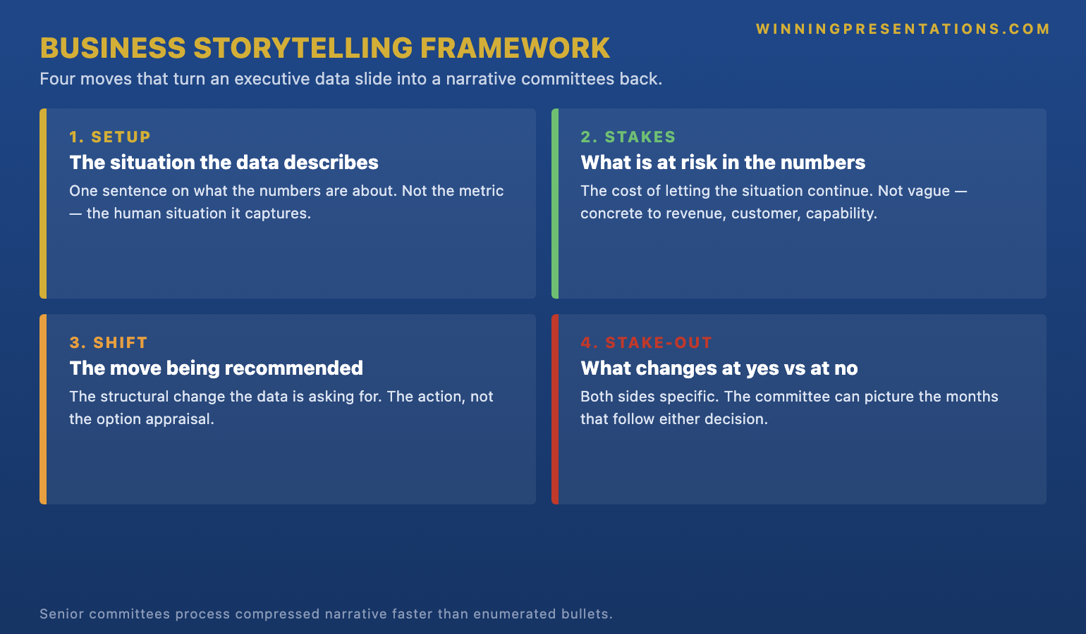
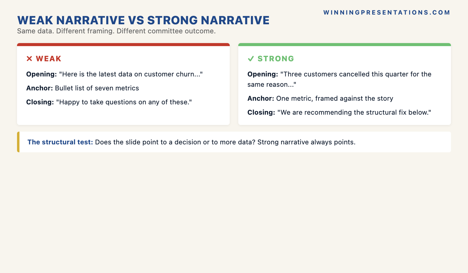
The first part is the assertion title: the slide’s heading, written as the conclusion in a full sentence rather than a topic label. ‘Margin Trend’ becomes ‘Margin has fallen for three quarters and the cause is mix, not price.’ ‘Cost-to-Income’ becomes ‘Cost-to-income is back inside target a quarter early.’ The discipline is to make the title a sentence with a verb and a point of view — something that could be true or false, that takes a position. If your title could sit unchanged above any quarter’s chart, it is a topic, not an assertion. The test for the title alone is whether a reader who saw nothing but that line would know what you want them to conclude. The chart then becomes the evidence for the claim the title already made, which is a far easier thing for an audience to follow than a chart asked to generate a claim on its own.
The second part is one visual per claim. Once the title carries the conclusion, the chart has exactly one job: to make that conclusion visible and credible. So you strip everything that does not serve it. If the title says margin fell because of mix, the chart shows the mix shift — not the full income statement with mix buried in row nine. A slide that asserts one thing and shows three is back to handing the room interpretive work, because now the viewer has to find which part of the busy chart supports the headline. One claim, one visual, everything else cut or moved to an appendix. The restraint is what makes the slide land; a single clean chart under a sharp sentence reads in two seconds, where a dense exhibit under a topic label takes the room thirty.
The third part is the provenance line: a short, quiet note of where the number came from and over what period — the source system, the date range, whether it is actual or forecast. Senior audiences, especially in finance, do not trust a number they cannot place, and the fastest way to lose a room is to have a director quietly wondering whether your figure is comparable to the one they have in their head. A one-line provenance note answers the question before it is asked and signals that you know exactly what you are showing. This is also where AI in the workflow earns its place — not in inventing the conclusion, which must be your judgement, but in the heavy lifting of drafting sentence-form titles from a table, checking that each chart matches its claim, and keeping provenance consistent across a deck. Used well, that is the difference between AI as a generic slide-filler and AI as a genuine drafting partner for executive work.
I saw the method change an outcome for a finance manager I coached in 2017. She presented a monthly pack to a divisional board and felt the meetings were slipping — lots of questions, little decided. Her slides were faultless and titled by topic throughout. We rewrote every title as an assertion and cut each chart to the one exhibit that proved it. Nothing in the underlying numbers changed. At the next meeting she told me the board moved through the pack in half the usual time and spent the saved time on the two decisions that actually needed debate. One director said the pack had ‘finally started telling him what she thought.’ She had been thinking it all along; the titles had simply never said it.
For the deeper workflow on using AI to build executive-grade data presentations:
The AI-Enhanced Presentation Mastery course is a self-paced programme of 8 modules and 83 lessons on using AI, including Copilot, to structure, draft, and refine presentations that hold up at senior level — including turning raw tables into assertion-form titles and matching each visual to its claim. There are no deadlines and no mandatory sessions; 2 optional live coaching sessions are fully recorded so you can watch them back anytime, with monthly cohort enrolment and lifetime access to the materials. It is the deeper system behind using AI as a drafting partner rather than a slide-filler. £499.
The title-only read
You cannot judge your own data deck for this fault, because you know what every chart is supposed to say — the conclusion is in your head whether or not it is on the slide. The diagnostic that exposes the gap is the title-only read, and it takes two minutes. Open your deck, cover or ignore every chart, and read only the slide titles aloud, in order, as a continuous sequence. Then ask one question: did I just hear the story of the decision, or did I hear a list of topics?
If the titles read as a narrative — ‘Revenue is ahead of plan; margin is the risk; the risk is mix not price; here is what we are recommending’ — your slides carry the argument, and a director skimming your deck without you in the room would reach the conclusion you intend. If instead you hear ‘Revenue by Region; Margin Trend; Cost Analysis; Recommendations’, your deck is a set of exhibits waiting for a narrator, and the moment you are not standing next to it, the story is gone. The title-only read is also the fastest way to find the one slide where your logic actually breaks: it is usually the title you struggle to write as a sentence, because that is the slide where you have not yet decided what you think.
The most useful thing the title-only read does is stop you hiding behind your charts. A beautiful, complex exhibit feels like substance, and it is tempting to let it stand in for a conclusion you have not committed to. Forcing every title into an assertion makes you take a position on every slide — which is uncomfortable, and exactly the point. The discomfort is the work. Run the read, listen for the slides where the title goes vague, and fix those by deciding what the chart actually shows and saying it. For the wider set of high-stakes decisions this applies to, the executive coaching work on presenting to senior audiences uses the title-only read as a standard pre-meeting pass over any data-heavy deck.
One conclusion-first structure for every data deck. No subscription, no rebuild.
Instant download, lifetime access to the Executive Slide System — 26 templates, 93 AI prompts, 16 scenario playbooks, 7 checklists. You pay £39 once; there is no renewal to track. It is built for the analyst or finance lead who would rather open every pack from a structure that already forces a conclusion into every title and one clean visual under it than discover, mid-meeting, that a managing director has had to ask what the numbers mean. Lead with the point on every slide, and let the charts prove it.

Frequently asked questions
Isn’t putting my conclusion in the title leading the audience rather than letting the data speak?
Data never speaks; it gets interpreted, and the only question is whether you supply the read or leave the room to guess. Stating your conclusion is not leading the witness as long as the chart underneath genuinely supports it and the provenance is honest — you are doing the job you were brought in to do, which is to tell senior people what the numbers mean. The dishonest move is a confident title over a chart that does not back it, or one that hides an inconvenient figure. An assertion title backed by a clean, sourced exhibit is more transparent than a topic label, not less, because it puts your judgement on the record where the room can challenge it.
What is the most common mistake people make with data slides?
Titling the slide with the topic instead of the conclusion, and then showing a chart busy enough to support several different readings. The two faults compound: a topic title tells the room nothing, and a crowded chart lets each viewer find their own story in it. The result is a slide that looks rigorous and decides nothing, and a meeting that fills with clarifying questions. The fix is the pairing at the heart of the method — one assertion in the title, one visual that proves it, everything else cut. A senior audience reads a sharp sentence over a single clean chart in seconds, and spends the time you save on the decisions that actually need their judgement.
How long should an assertion title be?
One line that fits across the top of the slide without wrapping to a third row — usually eight to fourteen words. It needs a subject, a verb, and a point of view, but it is not a sentence of analysis. ‘Margin fell on mix, not price’ is enough; the detail of how you know that belongs in what you say and in the chart, not crammed into the heading. If your title needs a sub-clause and a caveat, the slide is probably trying to make two claims and should be two slides. Read it aloud: if it lands as a clear statement in one breath, it is the right length. If you run out of air, it is doing too much.
Does this work for a live dashboard or a standing metrics pack?
It works, with one adjustment: a standing dashboard often has to show many metrics at once, so the assertion moves from per-chart titles to a single conclusion line at the top of the page. Even a dense dashboard slide for a board presentation benefits from one sentence above the grid that says what this month’s numbers mean overall — ‘On track on three of four targets; the exception is cost, and it is improving.’ The individual tiles stay as reference, but the reader gets your read of the whole before they start scanning cells. The principle is unchanged: supply the conclusion first, then let the detail be available for anyone who wants to verify it.
The Winning Edge — weekly newsletter
The Winning Edge is a weekly newsletter for senior professionals who present at the executive level. One short email a week on the structural moves that turn accurate analysis into decisions a board can actually make. Subscribe to The Winning Edge →
For the wider library of presentation assets senior leaders draw on — slide system, storytelling primer, Q&A taxonomy, delivery references — the complete presenter library (£99) bundles seven products plus three bundle-only bonuses, worth over £190, covering slides, storytelling, confidence, and delivery in one place. See the wider work on the services page, and the companion article on opening to a board that hasn’t read the pack.
About the author
Mary Beth Hazeldine is Owner & Managing Director of Winning Presentations Ltd. With 24 years of corporate banking experience at JPMorgan Chase, PwC, Royal Bank of Scotland, and Commerzbank, she advises executives across financial services, healthcare, technology, and government on structuring presentations for high-stakes funding rounds, board approvals, and strategic decisions.
Before your next data presentation, do two things instead of trusting your charts to speak: rewrite every slide title as a full-sentence conclusion and cut each chart to the one visual that proves it, then cover the charts and read the titles aloud in order to hear whether they tell the story of the decision. The presenter who says the number before the chart loads keeps control of what the room concludes. The presenter who puts up a topic label and lets the data speak hands the most senior people in the room the one job they came to hear done — and lives with whichever conclusion they reach without them.