
Quick answer: A dashboard slide — the twelve-tile grid of metrics that looks impressive on a screen — is the fastest way to lose a board’s attention, because a dashboard reports and a board presentation has to argue. A dashboard shows everything and claims nothing, which leaves every director to work out for themselves what they are supposed to conclude, and a room full of senior people silently reaching different conclusions is a room you have lost. The discipline that fixes it is one chart, one claim: every data slide states a single conclusion in a headline sentence, shows the one visual that proves it, and ends with the “so what” the board needs to act on. The test for whether a slide is an argument or a dashboard is simple — if you cannot say the slide’s claim in one sentence before the chart goes up, it is a dashboard, and it belongs on a screen you monitor, not in a deck you present. The senior leader who replaces the wall of tiles with three one-claim slides gets a decision; the one who projects the dashboard gets questions about what they are looking at.
JUMP TO:
In 2013 I worked with a senior operations leader at a healthcare organisation who was taking the quarter’s performance to the executive committee. He was proud of the slide at the centre of his deck, and he had reason to be: it was a single screen with twelve tiles, every operational metric the division tracked, colour-coded green and amber and red, refreshed live from the reporting system. It had taken his team a week to build. He put it up, said “so here is where we are across the board,” and waited for the committee to be impressed. What he got instead was silence, then a hand going to a phone, then the chief operating officer leaning forward, squinting at the wall of numbers, and asking the question that ends a thousand data slides: “What am I supposed to be looking at here?” He had built a slide that contained everything and said nothing, and a busy committee handed a slide that says nothing will always fill the vacuum with the least charitable interpretation — in this case, that he did not know which of his twelve metrics actually mattered.
I have now worked with a great many senior leaders across financial services, healthcare, technology, and professional services who present data to boards and committees, and the dashboard slide is the most reliable self-inflicted wound I see. It is reliable because it comes from a good instinct — the desire to be transparent, to show the whole picture, to not be accused of cherry-picking. But a board meeting is not a transparency exercise; it is a decision-making forum, and the data’s job in that forum is to support a conclusion the presenter is asking the room to accept. A dashboard refuses to do that job. It lays out the evidence and leaves the conclusion to the audience, which feels even-handed and is in fact an abdication of the presenter’s most important task: telling the board what the numbers mean.
(This article was created with AI assistance; all stories and insights are based on 35 years of real client work.)
The discipline that turns a dashboard into a decision is one I now teach every senior leader who presents numbers, and it is deliberately strict: one chart, one claim. Every data slide makes exactly one claim, stated as a full sentence in the headline; it shows the single visual that proves that claim and nothing else; and it ends with the implication the board needs to act on. A slide built this way is an argument. The chart is no longer the content of the slide — the claim is the content, and the chart is the evidence for it. This is the difference between a slide that says “revenue by region and channel” with a chart underneath, and a slide that says “our growth is now concentrated in one channel that did not exist a year ago, which is our biggest opportunity and our biggest single point of failure” with the chart that proves exactly that.
If turning a wall of metrics into one-claim slides is the part that eats your evenings:
The Executive Slide System ships 26 executive templates including clean single-claim data layouts, plus 93 AI prompts that help you find the one claim inside a busy dataset and write it as a headline. It is built for senior presenters who have the numbers but not the time to keep rebuilding the chart-to-argument translation by hand.
Why a dashboard fails the moment it leaves the screen it was built for
A dashboard is an excellent tool. The problem is not the dashboard; it is the assumption that a tool built for one job will work in a completely different one. A dashboard is built for monitoring — for a single owner glancing at it daily to see whether anything needs attention. In that context the twelve tiles are exactly right, because the owner knows what every tile means, knows the baseline, and is scanning for exceptions. None of those conditions hold in a board meeting. The board does not know which tile matters this quarter, does not carry the baselines in their heads, and is not scanning for exceptions — they are waiting to be told what to conclude. Dropping a monitoring tool into a decision-making room asks the board to do, in ninety seconds and cold, the work the owner does over weeks of daily familiarity. They cannot, so they disengage.
The disengagement is not rudeness; it is arithmetic. A board has a fixed and small amount of attention to spend in a meeting, and a dense dashboard demands more of that attention than the payoff justifies. Faced with twelve tiles and no stated conclusion, a director has two options: spend real effort decoding the slide to find the point, or wait for the presenter to tell them the point and let their attention drift until then. Most choose the second, which is why the phones come out. The dashboard has effectively told the board “you work out what matters here,” and a senior person’s reasonable response is “that is your job, not mine.” The slide that was meant to demonstrate command of the numbers instead signals that the presenter has not done the one piece of thinking the board needed — deciding which numbers carry the meaning.
There is a credibility cost as well, and it is the one senior leaders least expect. Projecting a full dashboard can read as hiding in the data. When a presenter shows everything and emphasises nothing, an experienced board sometimes reads it as a presenter who either does not know which metric tells the real story or does not want to commit to a conclusion they might be challenged on. Either reading damages trust. Committing to a single claim per slide is a small act of courage — you are putting your interpretation on the record and inviting challenge — and boards reward that courage with confidence, because it is exactly what they want from someone they might give a larger remit. The instinct to hide in completeness is the same one that produces the bloated board pack, and the cure is the same discipline of deciding what carries the decision, explored in the partner article on the board deck appendix.
One chart, one claim: the data slide that argues
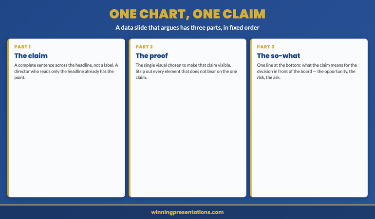
A one-claim slide has three parts and they go in a fixed order. First, the claim, written as a complete sentence across the top of the slide where a headline goes — not a label like “Q2 revenue” but a sentence like “Q2 revenue beat plan, but the beat is concentrated in a single new channel.” The headline is the slide; a director who reads only the headline has the point. Second, the one visual that proves the claim, chosen specifically to make the claim visible — if the claim is about concentration, the chart shows the concentration, with everything that does not bear on concentration stripped out. A chart that supports the headline and nothing else is doing its whole job. Third, the “so what” — one line at the bottom that tells the board what the claim means for the decision in front of them: the opportunity, the risk, the thing to approve.
The reinforcement of this happened with a financial services client in 2016 who had been losing executive committee meetings to exactly the dashboard problem. We took her standard performance deck — built around three dense multi-metric slides — and rebuilt it as a sequence of one-claim slides, each making a single point and ending in a single implication. The first claim established where performance stood against plan; the second isolated the one driver that explained the variance; the third named the decision that driver forced. She presented it the following month and the committee reached the decision in eight minutes, because the deck had done the interpretation for them rather than handing them a grid and hoping. Her comment afterward was telling: the new deck was not less rigorous, it was more — forcing herself to write one claim per slide had made her decide what each number actually meant, which is work the dashboard had let her skip. The chart had been easy; the claim was the hard part, and the claim was the part that mattered.
Build data slides that argue instead of slides that report.
The Executive Slide System ships 26 executive templates including single-claim data layouts with a headline-as-argument structure, plus 93 AI prompts for finding the one claim inside a busy dataset and writing it as a sentence. It includes 16 scenario playbooks covering board review, finance review, and quarterly performance, and 7 checklists. Built for senior presenters who present numbers to a committee on a cycle and want each data slide to carry a conclusion. £39, instant download, lifetime access.
- 26 executive slide templates — including single-claim data layouts with headline, proof, and “so what”
- 93 AI prompts — including prompts that surface the one claim inside a dense dataset
- 16 scenario playbooks — board review, finance review, quarterly performance, executive committee
- 7 checklists — including the data-slide check that catches a dashboard before it reaches the room
The “say it out loud” test
There is a fast diagnostic for whether any data slide is an argument or a dashboard, and you can run it on your own deck in the time it takes to read it. Before you reveal the chart, try to say the slide’s claim out loud in one sentence. “This slide shows that our growth has become dependent on a single channel.” If you can say that cleanly, the slide is an argument and the chart is its evidence. If the best you can manage is “this slide shows the numbers” or “this is where we are across the board,” the slide is a dashboard and no chart will save it, because there is no claim for the chart to prove. The test works because it forces the question the dashboard lets you avoid: what is this slide actually asserting? A slide that asserts nothing has no business in a deck whose purpose is to move a board toward a decision.
Run the test on your next deck tomorrow and the dashboards will identify themselves immediately — they are the slides where you reach for “this shows” and trail off. For each one, do not start by redesigning the chart. Start by writing the sentence the slide is supposed to prove, and only then choose or cut the visual to prove it. Often a single dense slide turns out to be carrying two or three separate claims jammed together, in which case it should become two or three slides, each with its own headline and its own stripped-down chart. The deck gets longer in slide count and dramatically shorter in the time it takes a board to absorb, because each slide now does one clean piece of work instead of asking the room to disentangle several. The discipline is uncomfortable at first because writing the claim is harder than showing the chart, but the difficulty is the point: the claim is the thinking, and the board came for the thinking.
For the deeper system on using AI to find the claim and build the slide:
AI-Enhanced Presentation Mastery is a self-paced programme — 8 modules, 83 lessons — on using AI to build executive-grade presentations, including drafting the headline claim for a data slide and pressure-testing whether the chart actually proves it. Self-paced with monthly cohort enrolment; 2 optional live coaching sessions, fully recorded — watch back anytime. Lifetime access to materials. £499.
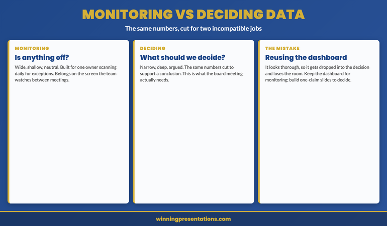
Monitoring data and deciding data are not the same data
The deepest reason the dashboard fails in the boardroom is that it answers a different question from the one the board is asking. A monitoring view answers “is anything off?” — it is built to surface exceptions across a wide field so an owner can act on the one tile that turned red. A board is not asking “is anything off.” It is asking “what should we decide,” and that question needs a narrow, deep, argued view, not a wide, shallow, neutral one. The same underlying numbers serve both questions, but they have to be cut and framed completely differently for each. The mistake is reusing the monitoring cut — the dashboard the team already maintains — in the deciding context, because it is there and it looks thorough. Thoroughness is the monitoring virtue. In the deciding context the virtue is selection: choosing the few numbers that bear on the decision and arguing from them.
This is why the fix is never “make the dashboard prettier” or “use bigger fonts.” A clearer dashboard is still a dashboard; it still reports rather than argues. The fix is to leave the monitoring view where it belongs — available in the appendix or on the screen the team watches between meetings — and to build a separate, purpose-made set of one-claim slides for the decision the board is there to make. Keep the dashboard for the question it was built to answer and build arguments for the question the board is actually asking. The senior leaders who internalise this stop trying to make one artefact serve two incompatible purposes, and their board meetings get both shorter and more decisive as a result. The same instinct — matching what you put in the room to what the room is there to do — runs through how senior presenters open a high-stakes presentation and through the wider executive presentation coaching work.
One template set. Every reporting cycle. Bought once.
Instant download, lifetime access to the Executive Slide System — 26 templates, 93 AI prompts, 16 scenario playbooks, 7 checklists. No subscription, no renewal. £39 once. Built for senior presenters who report numbers to a board every quarter and would rather start each data deck from layouts that already force one claim per slide than rebuild the argument from a dashboard each time.
Frequently asked questions
Isn’t showing only one claim per slide a way of cherry-picking the data?
No — selecting the claim is not the same as hiding the data. One chart, one claim governs what each slide argues, not what evidence is available to the board. The full dataset still belongs in the deck; it simply lives in the appendix, where any director who wants to interrogate the wider picture can reach it. What you are removing from the live argument is not evidence but the expectation that the board will derive the conclusion themselves. Cherry-picking is presenting a number out of context to mislead; one-claim slides present the conclusion in full view and invite challenge, with the supporting detail one tap away. If anything, committing to an explicit claim makes you more accountable for your interpretation, not less, because you have put it on the record rather than burying it in a grid.
What if the board specifically asks to see the full dashboard?
Then show it — from the appendix, after you have made your argument. A board that asks for the dashboard is usually asking to verify your claims against the wider picture, which is a reasonable request and one the appendix is built to satisfy. The error is leading with the dashboard rather than holding it in reserve. Make your one-claim case first so the board has your interpretation, then turn to the full view if asked so they can check it. In practice, once the one-claim slides have done the interpretive work, boards rarely spend long on the dashboard, because the questions it would have raised have already been answered. The dashboard reassures; the one-claim slides decide.
How long does it take to see results from switching to one-claim slides?
The first deck you rebuild this way usually lands differently in the very next meeting, because the change is structural rather than gradual — a board responds immediately to a deck that tells them what the numbers mean. What takes longer is the underlying skill of finding the one claim inside a dataset quickly, which is the genuinely hard part and improves over several cycles of doing it. Most senior leaders find the first few decks slower to build than their old dashboards, because writing the claim forces thinking the dashboard let them skip, and then progressively faster as the habit of leading with the conclusion becomes automatic. The payoff in the room is immediate; the gain in your own build time arrives after a few cycles.
Does this apply to operational reviews, or only to board-level decisions?
It applies anywhere the audience is there to decide or act rather than to monitor, which includes most operational reviews with anyone senior in the room. The dividing line is not the seniority of the meeting but its purpose. If the people in the room own the metrics and are scanning for exceptions, a dashboard is the right tool and one-claim slides would be needlessly slow. If the people in the room are being asked to draw a conclusion or approve a course of action, they need the argument made for them, and the dashboard will lose them exactly as it loses a board. When in doubt, ask what the room is there to do; the answer tells you which tool the data needs to become.
The Winning Edge — weekly newsletter
The Winning Edge is a weekly newsletter for senior professionals who present at the executive level. One short email a week on the structural moves that separate decks boards act on from decks they merely receive. Subscribe to The Winning Edge →
For the wider library of presentation assets senior leaders draw on — slide system, storytelling primer, Q&A taxonomy, delivery references — the complete presenter library (£99) collects them in one place. See the wider set of executive coaching resources on the services page, and the partner article on the board deck appendix strategy.
About the author
Mary Beth Hazeldine is Owner & Managing Director of Winning Presentations Ltd. With 24 years of corporate banking experience at JPMorgan Chase, PwC, Royal Bank of Scotland, and Commerzbank, she advises executives across financial services, healthcare, technology, and government on structuring presentations for high-stakes funding rounds, board approvals, and strategic decisions.
The next time you build a data deck, do three things instead of projecting the dashboard your team already maintains: write the one claim each slide is meant to prove as a full sentence across the top, and if you cannot, the slide is a dashboard and needs to become an argument; cut every element from the chart that does not make that one claim visible; and end each slide with the line that tells the board what the claim means for the decision in front of them. The board did not come to read your numbers. It came to find out what your numbers mean, and the presenter who tells them gets a decision while the presenter who shows them the wall of tiles gets asked what they are looking at.