Tag: storytelling

13 Feb 2026
Executive reviewing printed presentation slides with pen while comparing to AI-generated deck on screen

Your AI Presentation Has Structure. It Doesn’t Have Persuasion. Here’s the Missing Layer.

Quick answer: AI tools are excellent at organising information into clear, logical structures. What they consistently fail to produce is persuasion — the layer that makes executives act, not just nod. The S.E.E. formula (Story-Evidence-Emotion) is the human review layer that transforms AI-structured content into presentations that drive decisions. Below: exactly how it works, why AI can’t do it for you, and how to apply it to any AI-generated deck in under 20 minutes.

⚡ Presenting this week? Do this on your next deck in 7 minutes:

  • Story: Add one specific client or internal example to each major section (2 min)
  • Evidence: Add a benchmark or consequence to every data point (3 min)
  • Emotion: On your recommendation slide, answer: “What do I need them to feel?” (2 min)

Want the full system with templates for each step? Get the S.E.E. Templates + Workflow →

The Board Said “So What?” After a Deck That Took 6 Hours to Build.

A client — head of strategy at a mid-sized financial services firm — came to me after what she described as “the most embarrassing board meeting of my career.” She’d used AI to build a 22-slide strategic review. The structure was immaculate. Clear sections. Logical flow. Data on every slide. The AI had done exactly what she’d asked: organise the quarterly results into a coherent deck.

She presented for eighteen minutes. The board listened politely. Then the chairman said five words that made her stomach drop: “What do you want us to do?”

She had the data. She had the structure. She had the logic. What she didn’t have was a reason for anyone in that room to care — or act. The deck was informative. It wasn’t persuasive. And in a boardroom, informative without persuasive is just a well-organised waste of everyone’s time.

When we audited the deck together, the problem was obvious. Every slide followed the same pattern: here’s what happened, here are the numbers, here’s the next slide. No context for why the numbers mattered. No connection to what the board actually cared about. No emotional stakes. The AI had produced a report disguised as a presentation.

This is the gap that nearly every AI-generated presentation falls into. Not a structure problem. A persuasion problem. And it’s a gap that AI can’t close on its own — because making AI slides persuasive requires something AI doesn’t have: knowledge of what your specific audience fears, wants, and needs to hear before they’ll say yes.

🎯 Learn the Complete S.E.E. Framework Inside the Course

AI-Enhanced Presentation Mastery teaches you the full S.E.E. formula (Story-Evidence-Emotion) alongside AVP structure, the 132 Rule, and the Insight-Implication-Action framework for data — the complete system for turning AI output into presentations that drive executive decisions. Self-study modules releasing through April 2026, plus live Q&A sessions. Join anytime — you get all released modules immediately.

Get the S.E.E. Templates + Full Workflow →

Presale pricing: £249 — moves to £299 early bird, then £499 full price. 60-seat cap.

The Structure-Persuasion Gap: Why AI Output Feels Flat

AI is remarkably good at one thing: organising information logically. Give it data, a topic, and a prompt, and it will produce sections, headings, bullet points, and a sequence that makes rational sense. This is genuinely useful — it handles the tedious structural work that used to take hours.

But structure and persuasion are different skills. Structure answers “What information goes where?” Persuasion answers “Why should anyone care?” A well-structured deck can be completely unpersuasive. An unstructured but emotionally compelling argument can move a room. The ideal presentation has both — and AI consistently delivers only the first.

Here’s why. Persuasion requires three things AI doesn’t have access to: the specific context your audience is operating in, the emotional stakes attached to the decision, and the proof points that this particular group of people will find credible. AI can’t know that the CFO is worried about Q3 cash flow, that the board rejected a similar proposal six months ago, or that the CEO responds to client stories but switches off during spreadsheet reviews. These are human-intelligence inputs, and they’re exactly what transforms a structured deck into a persuasive one.

The reason most AI presentations fail isn’t that the AI is bad. It’s that the human skips the layer that makes AI slides persuasive, assuming structure is enough.

The S.E.E. Formula: Story, Evidence, Emotion

The S.E.E. formula is the persuasion layer you apply after AI has handled the structure. It stands for Story, Evidence, Emotion — three elements that, when woven into an AI-structured deck, transform it from a report into an argument that moves people to act.

Think of it this way: AI builds the skeleton. S.E.E. adds the muscle, the nervous system, and the heartbeat.

Each element serves a different persuasion function. Story provides context and makes your point memorable. Evidence provides credibility and makes your case defensible. Emotion creates urgency and makes your audience care enough to decide. A presentation that has all three is extremely difficult to dismiss. A presentation missing any one of them has a predictable failure mode.


Side by side comparison of AI output before and after applying the S.E.E. formula showing transformation from facts to persuasion

Layer 1: Story — The Context AI Doesn’t Know

Story in a business presentation doesn’t mean “once upon a time.” It means context — the specific situation that makes your recommendation relevant, urgent, and grounded in reality.

AI output typically starts with the general: “Market conditions have shifted.” “Customer satisfaction has declined.” “Revenue targets are at risk.” These statements are accurate but they don’t anchor to anything your audience can feel. They’re abstract. And abstract doesn’t persuade.

The S.E.E. Story layer asks you to add one specific, concrete example to each major section of your deck. Not fiction — a real situation from your organisation that illustrates the point.

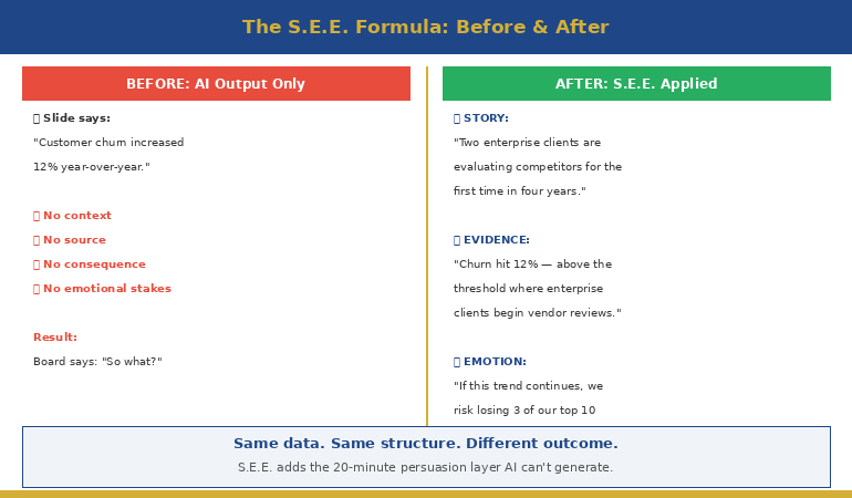
For example, instead of AI’s “Customer churn has increased 12% year-over-year,” the Story layer adds: “When I spoke with three of our enterprise clients last month, two mentioned they’re evaluating competitors for the first time in four years. One said — and I’m quoting directly — ‘Your platform used to be ahead. Now it’s keeping pace.’ That’s the shift the 12% represents.”

Now the board isn’t processing a number. They’re processing a threat. The data hasn’t changed. But the context makes it matter.

This is something AI fundamentally cannot generate — because it doesn’t know which clients you spoke to, what they said, or which anecdote will land with this particular audience. It’s human intelligence applied to AI structure.

📋 The S.E.E. formula is one of six frameworks inside the course.

AI-Enhanced Presentation Mastery includes the complete system: AVP structure, 132 Rule, S.E.E. formula, data storytelling frameworks, plus AI prompt templates for each. Study at your own pace — modules releasing through April 2026.

Get All 6 Frameworks + AI Prompt Packs →

Layer 2: Evidence — Turning Data Into Proof

AI is very good at including data. It’s surprisingly bad at turning data into proof. There’s a crucial difference.

Data is a number. Proof is a number plus its implication. AI will give you “NPS declined from 72 to 61.” That’s data. Proof sounds like: “NPS declined from 72 to 61 — a drop below the threshold where enterprise clients typically begin vendor reviews, based on our last three contract cycles.”

The Evidence layer in S.E.E. asks you to do three things with every data point AI generates:

First, contextualise it. What does this number mean relative to a benchmark your audience recognises? Industry average, last quarter, a target they set, a competitor’s performance. Data without context is just a number. Data with context is a signal.

Second, source it credibly. AI often presents data without attribution. Executives discount unsourced numbers. Add where the data came from — even “based on our Q3 finance review” adds credibility. If it’s external data, name the source. If it’s your own analysis, say so.

Third, connect it to consequence. What happens if this number continues? What happens if it reverses? The consequence is what transforms data from interesting to actionable. The Insight-Implication-Action framework from the course formalises this — every data point needs an insight (what it means), an implication (why it matters), and an action (what to do about it).

This evidence layer is where AI-enhanced presentations diverge from AI-generated ones. The AI handles the organisation. You handle the meaning.

Layer 3: Emotion — The Decision Trigger

This is the layer most professionals skip, and it’s the one that matters most for executive decisions.

Executives don’t make decisions based on logic alone. Research in decision science consistently shows that emotion drives action — logic justifies it afterward. A presentation that’s logically perfect but emotionally flat produces “let me think about it.” A presentation that creates the right emotional response — urgency, opportunity, risk — produces “let’s move on this.”

The Emotion layer isn’t about manipulation. It’s about connecting your recommendation to something your audience genuinely cares about. Every executive in every meeting has emotional stakes: protecting their team, delivering on promises they’ve made, avoiding the embarrassment of backing the wrong initiative, capitalising on an opportunity before a competitor does.

AI can’t identify these emotional stakes because they’re not in any dataset. They’re in the politics, relationships, and pressures of your specific organisation. Only you know that the VP of Operations is under pressure to show efficiency gains. Only you know that the CEO mentioned supply chain risk at the last all-hands meeting. Only you know that this proposal’s biggest blocker lost a similar bet two years ago and is risk-averse as a result.

The Emotion layer asks one question for each key slide: “What does my audience feel about this — and what do I need them to feel instead?” If the current state is complacency, you need urgency. If the current state is fear, you need confidence. If the current state is scepticism, you need proof that reduces perceived risk.

This is the layer that took my client’s deck from “so what?” to a follow-up meeting where the board asked her to accelerate the initiative. Same data. Same structure. Different emotional framing.

📊 The Full Persuasion System — Not Just One Formula

AI-Enhanced Presentation Mastery teaches S.E.E. alongside five other frameworks that work together: AVP for slide structure, 132 Rule for information sequencing, Insight-Implication-Action for data storytelling, plus customised AI prompt templates that make each framework faster to apply. 8 self-study modules + 2 live Q&A sessions.

Turn AI Slides Into Executive Decisions →

Presale pricing: £249 — moves to £499 full price soon. Join anytime — get all released modules immediately.

Applying S.E.E. to Any AI Deck in 20 Minutes

Here’s the practical workflow. You’ve used AI to build your deck — structure is solid, data is in place, flow makes sense. Now apply S.E.E. in three passes:

Pass 1: Story scan (5 minutes). Review each major section. For each one, ask: “Is there a specific, concrete example from our organisation that illustrates this point?” Write one sentence per section — a client conversation, an internal metric, a project outcome, a competitor move. You’re adding the anchor that makes abstract data feel real. If you can’t find a story, the section may be filler.

Your AI workflow handled the structure. This pass handles the meaning.

Pass 2: Evidence upgrade (5–10 minutes). Review every data point. For each one, add: context (vs what benchmark?), source (where did this come from?), and consequence (what happens if this continues?). Delete any data that doesn’t have a clear implication. More data with no context is worse than less data with clear meaning. Senior leaders don’t need all the information — they need the right information, framed so the conclusion is obvious.

Pass 3: Emotion check (5 minutes). For each key decision slide — recommendations, proposals, asks — answer: “What does my audience currently feel about this topic? What do I need them to feel? What one change to this slide creates that emotional shift?” Sometimes it’s reframing the opening line. Sometimes it’s adding a consequence slide. Sometimes it’s removing a defensive caveat that signals your own uncertainty.

Total time: roughly 20 minutes on top of whatever the AI took to generate the deck. That 20 minutes is the difference between “good presentation” and “approved.”

🔍 Want the complete workflow — AI structure + S.E.E. persuasion + templates?

The course includes before/after deck transformations, S.E.E. wording templates, and AI prompt packs designed to make each pass faster. Study at your own pace.

Get the Complete AI → Executive Workflow →

How do I make AI presentations more persuasive?

Apply the S.E.E. formula after AI handles structure: add Story (specific examples from your organisation), upgrade Evidence (contextualise every data point with benchmarks and consequences), and layer in Emotion (connect your recommendation to what your audience cares about). This 20-minute review transforms AI output from informative to actionable.

Why do AI-generated presentations feel flat?

AI excels at logical organisation but lacks access to three persuasion inputs: the specific context your audience operates in, the emotional stakes attached to the decision, and the proof points this particular group will find credible. Without these, AI produces structured reports rather than persuasive arguments.

What is the S.E.E. formula for presentations?

S.E.E. stands for Story-Evidence-Emotion. Story provides concrete, real-world context that makes abstract data feel tangible. Evidence transforms raw numbers into proof by adding benchmarks, sources, and consequences. Emotion connects your recommendation to what your audience fears, wants, or needs — the trigger that turns understanding into action.

🏆 AI-Enhanced Presentation Mastery: The Complete System

S.E.E. is one framework inside a complete course that transforms how you build presentations with AI. What’s included:

  • AVP framework — Action-Value-Proof slide structure
  • 132 Rule — information sequencing for how brains process
  • S.E.E. formula — Story-Evidence-Emotion persuasion layer
  • Insight-Implication-Action — data storytelling framework
  • AI prompt templates — customised for each framework
  • Before/after deck transformations — real examples
  • 8 self-study modules — releasing through April 2026
  • 2 live Q&A sessions — April 2026
  • Lifetime access — all recordings, templates, and future updates

Designed for busy professionals who create presentations regularly and want to save hours while dramatically improving impact.

Get the Complete AI Presentation System →

Presale pricing: £249 — moves to £499 full price soon. 60-seat cap. Join anytime — get all released modules immediately.

Frequently Asked Questions

Can I use the S.E.E. formula with any AI tool?

Yes. S.E.E. is a human review layer applied after AI generates the initial structure. It works with ChatGPT, Copilot, Claude, Gemini, or any other AI tool. The formula is tool-agnostic — it addresses the persuasion gap that all AI tools share.

How is S.E.E. different from general storytelling advice?

General storytelling advice tells you to “add stories” without specifying where, what kind, or how they interact with data and emotional framing. S.E.E. is a systematic three-pass review designed specifically for AI-generated business presentations, with each layer serving a distinct persuasion function.

Do I need presentation design skills for this?

No. S.E.E. operates at the messaging and content level, not the design level. You’re changing what the slides say and how the argument is framed — not formatting or layout. The AI handles structure and design; you handle persuasion.

How long does the full AI-Enhanced Presentation Mastery course take?

The course is 8 self-study modules released between January and April 2026, designed for busy professionals. Each module takes 60–90 minutes. You study at your own pace, with 2 live Q&A sessions in April for questions and feedback. Lifetime access means you can revisit any material whenever needed.

📬 The Winning Edge Newsletter

Weekly strategies for AI-enhanced presentations, executive communication, and confident delivery. No filler.

Subscribe Free →

📥 Free: Executive Presentation Checklist

A quick-reference checklist for reviewing any executive presentation before delivery — including a simplified S.E.E. review prompt.

Download Free Checklist →

Related reading: The presentation was perfect — the Q&A lost the deal — once your deck has the persuasion layer, prepare for the decision-making conversation that follows.

Your next step: Take the last AI-generated deck you built. Run the three S.E.E. passes: Story scan (add one concrete example per section), Evidence upgrade (contextualise every data point), Emotion check (connect each recommendation to what your audience cares about). Twenty minutes. And if you want the complete system — S.E.E. plus AVP, 132 Rule, data storytelling, and AI prompt templates for each — AI-Enhanced Presentation Mastery (£249) gives you everything in one self-study programme.

About the Author

Mary Beth Hazeldine is the Owner & Managing Director of Winning Presentations. With 24 years of corporate banking experience at JPMorgan Chase, PwC, Royal Bank of Scotland, and Commerzbank, she has delivered high-stakes presentations in boardrooms across three continents.

A certified hypnotherapist and NLP practitioner, Mary Beth combines executive communication expertise with practical techniques for managing presentation nerves. She has trained senior professionals and executive audiences over many years.

Book a discovery call | View services

26 Dec 2025
Data storytelling - how to make numbers compelling and drive decisions

Data Storytelling: How to Make Numbers Compelling (Not Boring)

Turn spreadsheets into stories that drive decisions — techniques from 24 years of presenting to boards, credit committees, and investors

I once watched a colleague present 47 slides of flawless analysis to a credit committee. Every number was accurate. Every chart was properly labelled. The recommendation was sound.

They said no.

The problem wasn’t the data. It was the delivery. He presented numbers. He should have told a story with numbers. That’s the difference between data presentation and data storytelling — and it’s the difference between getting polite nods and getting decisions.

After 24 years in banking — presenting to boards at JPMorgan, credit committees at RBS, investors at Commerzbank — I’ve learned that the analysts who get promoted aren’t the ones with the best spreadsheets. They’re the ones who make data mean something.

🎁 Free Download: Executive Presentation Checklist — includes the data slide framework from this article. Print-ready PDF.

What Is Data Storytelling (And Why It Matters)

Data storytelling is the practice of building a narrative around data to help your audience understand and act on insights. It combines three elements: the data itself, the visualisation, and the narrative that connects them.

Here’s why it matters:

Data alone doesn’t persuade. Stanford research found that statistics presented with stories are 22 times more memorable than statistics alone. Numbers tell people what. Stories tell people why it matters.

Decisions are made emotionally. Neuroscientist Antonio Damasio’s research shows that people with damage to emotional brain centres can’t make decisions — even with perfect logic. Your CFO may think they’re purely analytical, but they’re not. Nobody is.

Attention is limited. The average executive spends 2-4 minutes reviewing a slide before moving on. If your data doesn’t land immediately, it doesn’t land at all.

Data storytelling isn’t about dumbing down your analysis. It’s about making your analysis accessible to people who don’t have time to interpret it themselves.

Related: How to Present to a CFO: The Finance-First Framework

The Data Storytelling Framework: Lead With Insight

Most presenters structure data slides like this:

Here’s the data → Here’s what it shows → Here’s what we should do

That’s backwards. By the time you reach your point, you’ve lost them.

Effective data storytelling reverses the order:

Here’s the insight → Here’s the data that proves it → Here’s what we should do

This is the “lead with the headline” approach. Your audience knows immediately what they’re looking at and why it matters. The data becomes evidence, not a puzzle to solve.

Example: Before and After

Before (Data-First):

“Q3 revenue was £4.2M. Q2 was £3.8M. Q1 was £3.5M. Year-over-year we’re up 12%. The EMEA region grew 18% while Americas grew 6%…”

The audience is doing mental maths, trying to figure out the point.

After (Insight-First):

“EMEA is now our growth engine — up 18% while Americas stalls at 6%. If we shift Q4 marketing budget accordingly, we can capture another £400K.”

Same data. Completely different impact.

Related: The Executive Summary Slide: How to Write the Only Slide That Matters

Data storytelling framework - lead with insight, support with data, end with action

5 Data Storytelling Techniques That Work in Business

These are the techniques I use with clients — from biotech fundraising decks to banking board presentations.

1. The Comparison Anchor

Numbers mean nothing without context. “£2.3 million” is abstract. “£2.3 million — that’s 3x what we spent last year for half the results” creates meaning.

Always anchor your data to something your audience already understands:

  • Compare to last year / last quarter
  • Compare to competitors or industry benchmarks
  • Compare to targets or forecasts
  • Compare to a familiar reference point

Example: “Our customer acquisition cost is £47. The industry average is £62. We’re 24% more efficient — and here’s why that matters for our Q1 targets…”

2. The Single Number Focus

When everything is important, nothing is important. Pick the one number that matters most and build your slide around it.

I learned this the hard way. Early in my career, I’d cram every relevant metric onto a slide. The result? Decision-makers couldn’t see the forest for the trees.

Now I ask: “If they remember only one number from this slide, what should it be?” That number gets visual prominence. Everything else supports it.

3. The Trend Line Story

A single data point is a fact. Multiple data points are a trend. Trends tell stories.

Weak: “Churn rate is 4.2%”

Strong: “Churn has dropped from 6.1% to 4.2% over eight months — the interventions are working”

When presenting trends, always explain the inflection points. What happened in March that changed the trajectory? That’s where the story lives.

4. The “So What” Test

For every data point, ask yourself: “So what?”

“Revenue grew 12%” — So what?
“Revenue grew 12%, which means we’ve hit our trigger for the expansion budget” — Now I understand why this matters.

If you can’t answer “so what” for a piece of data, it probably doesn’t belong in your presentation.

5. The Contrast Frame

Show what the data could have been — or what it will be if nothing changes.

Example: “At current trajectory, we’ll miss target by £800K. With this intervention, we close the gap entirely.”

Contrast creates stakes. Stakes create attention.

Related: Team Dashboards That Tell a Story (Not Just Show Numbers)

Turn Your Data Into Stories That Drive Decisions

The Executive Slide System (£39) includes templates specifically designed for data-heavy presentations.

What’s included:

  • The “Insight-First” data slide template
  • Before/after examples from real executive presentations
  • The single-number-focus framework
  • Dashboard templates that tell stories

Get the Executive Slide System →

Common Data Storytelling Mistakes (And How to Avoid Them)

After reviewing hundreds of data presentations, I see the same mistakes repeatedly.

Mistake 1: Showing all the data. Your analysis might require 50 data points. Your presentation needs 5. The rest belongs in the appendix. Include only what’s necessary to support your narrative.

Mistake 2: Letting the chart speak for itself. No chart is self-explanatory to a busy executive. Always add a headline that states the insight, not just a label that states the topic. “Q3 Revenue by Region” is a label. “EMEA Drives 70% of Q3 Growth” is an insight.

Mistake 3: Choosing the wrong chart type. Pie charts for trends. Bar charts for composition. Line charts for 15 data points. Match the visualisation to the story you’re telling:

  • Trends over time → Line chart
  • Comparison between categories → Bar chart
  • Part-to-whole relationships → Pie or stacked bar (with few segments)
  • Correlation → Scatter plot

Mistake 4: Burying the lead. The most important insight should be visible within 3 seconds. If your audience has to hunt for the point, they won’t.

Mistake 5: No clear action. Data without a recommendation is just information. Always end data slides with what you want the audience to do with this information.

Data Storytelling in Practice: A Real Example

A biotech client came to me with a fundraising deck. Their data slide looked like this:

Title: “Clinical Trial Results”
Content: A table with 12 rows of efficacy data, p-values, confidence intervals, and patient subgroup breakdowns.

Scientifically rigorous. Completely ineffective for investors who see 20 decks a week.

We restructured it:

Title: “87% Response Rate — 2x the Standard of Care”
Content: One large number (87%), one comparison bar showing vs. standard of care (43%), and a single line of supporting text about statistical significance.

The detailed data moved to the appendix. The story stayed on the slide.

They raised £18 million.

Related: Storytelling in Presentations: The NLP Techniques That Captivate Any Audience

📬 Get Weekly Presentation Tips

Every week, I share one actionable tip for presenting data, handling tough audiences, and getting decisions. No fluff, no spam — just techniques that work.

Subscribe to The Winning Edge →

Frequently Asked Questions About Data Storytelling

How do I tell a story with data without oversimplifying?

Simplifying isn’t dumbing down — it’s respecting your audience’s time. Keep the full analysis available (in appendix or backup slides) but lead with the insight. If someone wants to drill into methodology, they’ll ask. Most won’t.

What if my audience wants to see all the numbers?

Some audiences do — especially technical or financial reviewers. In these cases, structure your presentation in layers: executive summary with key insights first, then supporting detail, then full data appendix. Let them choose their depth.

How do I present data that tells a negative story?

Lead with the insight anyway — but frame it constructively. “We’re 15% behind target” is a problem. “We’re 15% behind target, and here’s the recovery plan that closes the gap by Q4” is a story with a path forward. Never hide bad data; contextualise it.

How many data points should one slide have?

As few as possible to make your point. For most business presentations, that’s 1-3 key metrics per slide. If you need more, ask yourself if you’re actually making multiple points that deserve multiple slides.

Should I use AI tools for data visualisation?

AI can help generate initial visualisations, but always review and refine. Tools like Copilot are good at creating charts quickly but often miss the storytelling elements — the headlines, the annotations, the “so what.” Use AI for speed, then add the human insight layer.


Master Data Storytelling + Persuasion + AI Tools

AI-Enhanced Presentation Mastery includes a dedicated module on data storytelling — how to structure data slides, choose visualisations, and build narratives that drive decisions.

8 self-paced modules (January–April 2026):

  • Module 4: Data Storytelling — turn numbers into narratives
  • The S.E.E. Formula for persuasive messaging
  • The 132 Rule for executive presentations
  • AI workflows for faster deck creation
  • Handling tough Q&A and hostile audiences

Plus: 2 live coaching sessions (April 2026) with personalised feedback.

Presale price: £249 (increases to £299, then £499)

60 seats total. Lifetime access.

See the full curriculum →

Your Next Step: Apply the Insight-First Framework

Data storytelling isn’t a talent — it’s a technique. Start with one change: on your next data slide, write the insight as your headline, not the topic.

Instead of “Q3 Sales Performance,” write “Q3 Sales Exceeded Target by 12% — Here’s What Drove It.”

That single shift transforms how your audience receives the information.

🎁 START FREE: Download the Executive Presentation Checklist — includes the data slide framework from this article.

📘 GET THE TEMPLATES (£39): The Executive Slide System gives you ready-to-use data slide templates with the insight-first structure built in.

🎓 MASTER IT ALL (£249): AI-Enhanced Presentation Mastery — includes a full data storytelling module plus 7 more modules on structure, persuasion, and delivery. January–April 2026.


Mary Beth Hazeldine spent 24 years in corporate banking at JPMorgan, PwC, Royal Bank of Scotland, and Commerzbank — where she learned that the analysts who get promoted aren’t the ones with the best spreadsheets, but the ones who make data mean something.

23 Dec 2025
Storytelling for business presentations - why facts don't persuade and stories do

Why Facts Don’t Persuade (And Stories Do): The Neuroscience of Business Storytelling

The science behind why your data-heavy presentations aren’t landing — and what to do instead

I once watched a brilliant analyst present flawless data to a credit committee. Every number was right. Every chart was clear. The recommendation was sound.

They said no.

The next week, a colleague presented the same recommendation with weaker data — but wrapped it in a story about a client relationship at risk. Same ask, different frame.

They said yes.

For years, I thought storytelling for business presentations was a “nice to have.” Something for TED talks and keynotes, not boardrooms. Then I learned the neuroscience — and realised I’d been handicapping myself for a decade.

Why Facts Fail: The Neuroscience of Storytelling for Business Presentations

When you present facts, you activate two brain regions: Broca’s area (language processing) and Wernicke’s area (comprehension). That’s it. The analytical brain processes your data — and immediately starts looking for holes.

When you tell a story, something different happens.

The listener’s brain activates the motor cortex (if you describe action), the sensory cortex (if you describe sights, sounds, smells), and the frontal cortex (if you trigger emotion). Their brain literally synchronises with yours — a phenomenon researchers call “neural coupling.”

Here’s why that matters for business:

  • Stories bypass the critical filter. When someone is absorbed in a narrative, they’re less likely to mentally object. This is called “narrative transport.”
  • Stories are 22x more memorable. Stanford research found that statistics embedded in stories are retained far longer than statistics alone.
  • Decisions are made emotionally. Neuroscientist Antonio Damasio’s research shows that people with damage to emotional brain centres can’t make decisions — even with perfect logic. Emotion isn’t the enemy of reason; it’s the engine.

This explains why your CFO approves budgets wrapped in client stories but rejects the same numbers in a spreadsheet. The information hasn’t changed. The delivery has.

Related: Storytelling in Presentations: The NLP Techniques That Captivate Any Audience

The Business Storytelling Gap

Most professionals know they should tell more stories. So why don’t they?

1. They don’t have a system. Knowing “tell stories” doesn’t help when you’re staring at a blank slide. Without frameworks, stories feel like something you either have or you don’t.

2. They haven’t mined their experience. Everyone has stories — they just haven’t learned to recognise them. The moment a project almost failed. The client who taught you something. The mistake that changed your approach.

3. They confuse data and persuasion. Data informs. Stories persuade. You need both, but most presentations are 90% data and 10% narrative. The ratio should be closer to 50/50.

I spent five years in banking presenting data-heavy slides before I learned this. Once I started wrapping my numbers in stories — client situations, competitive threats, past lessons — my approval rates changed dramatically.

Related: Business Presentation Skills: What Actually Matters in Corporate Environments

Start With the Storytelling System

The Business Storytelling Mini-Course (£29) gives you the frameworks and exercises to find, structure, and deliver stories that persuade.

What’s included:

  • 5 story structures designed for business contexts
  • The S.E.E. Formula (Story-Evidence-Emotion)
  • Story-mining exercises to uncover your best material
  • NLP delivery techniques

Get the Storytelling Mini-Course →

What Effective Business Storytelling Looks Like

Storytelling for business presentations isn’t about long anecdotes or personal confessions. It’s about strategic narrative — using story structures to make your data land.

The S.E.E. Formula: Story → Evidence → Emotion

Start with a specific example (one client, one project, one moment). Back it with data that proves this isn’t an outlier. Then land the emotional implication — what this means for the listener.

Example:

“Last quarter, a biotech client came to us with a 60-slide investor deck. Three months of work, zero meetings booked. [STORY] When we analysed 50 successful biotech raises, we found that decks over 20 slides had a 40% lower response rate. [EVIDENCE] If your deck is sitting in inboxes unopened, the problem might not be your science — it might be your slide count. [EMOTION]”

That’s 45 seconds. It does more persuasive work than 10 slides of analysis.

Related: How to Create Executive Presentations That Get Results

Master Business Storytelling + AI + Persuasion

The Business Storytelling Mini-Course gives you the foundations. If you want the complete system — storytelling, structure, AI tools, and delivery — AI-Enhanced Presentation Mastery covers it all.

8 self-paced modules (January–April 2026):

  • Module 1: The S.E.E. Formula — Story-Evidence-Emotion for persuasive messaging
  • Module 2: The AVP Framework — Action-Value-Proof structure for any presentation
  • Module 3: AI prompts that help you mine stories from your experience
  • Module 4: Data storytelling — turn numbers into narratives
  • Module 5: The 132 Rule — structure that executives prefer
  • Module 6: Delivery techniques from NLP and hypnotherapy
  • Module 7: Q&A handling — frameworks for tough questions
  • Module 8: AI workflow — build presentations in 90 minutes

Plus: 2 live coaching sessions (April 2026) with personalised feedback on your presentations.

Presale price: £249 (increases to £299 early bird, then £499 full price)

60 seats total. Lifetime access to all materials.

See the full curriculum and reserve your seat →

The Shift That Changes Everything

Most presentations fail not because the data is wrong, but because the frame is wrong.

Data answers “what.” Stories answer “so what.”

When you learn to wrap your numbers in narrative — client situations, competitive context, lessons from experience — you stop presenting information and start creating momentum.

The neuroscience is clear: if you want decisions, you need emotion. And the most reliable way to create emotion in a business context is through story.


Your Next Step

📖 Read the complete guide: Storytelling in Presentations: The NLP Techniques That Captivate Any Audience — 5 structures, delivery techniques, and how to find your stories.

📘 Get the system (£29): Business Storytelling Mini-Course — templates, exercises, and NLP techniques for stories that persuade.

🎓 Master it all (£249): AI-Enhanced Presentation Mastery — 8 modules covering storytelling, structure, AI tools, and delivery. January–April 2026, 60 seats.


Mary Beth Hazeldine is a qualified NLP practitioner and clinical hypnotherapist who spent 24 years in corporate banking at JPMorgan, PwC, Royal Bank of Scotland, and Commerzbank. She now trains executives in the storytelling and persuasion techniques that drive decisions.

23 Dec 2025
How to tell a story in a presentation - the 60-second delivery framework

How to Tell a Story in a Presentation: The 60-Second Delivery Framework

Structure is only half the equation — here’s how to deliver stories that actually land

You know the story structures. You’ve found a good anecdote. But when you tell it, something falls flat.

The problem usually isn’t the story. It’s the delivery. Knowing how to tell a story in a presentation means mastering timing, transitions, and the small techniques that separate rambling from riveting.

Here’s the framework I use — and teach to executives who need stories that persuade.

🎁 Free Download: 7 Presentation Frameworks — includes story structure templates to use with this delivery framework.

How to Tell a Story in a Presentation: The 60-Second Rule

Business stories should be 60-90 seconds. Longer, and you lose the room. Shorter, and you haven’t created enough emotional investment.

Here’s how to hit that window:

10 seconds: Setup. Who, where, and what’s at stake. No backstory. No scene-setting. Start as close to the tension as possible.

30 seconds: Tension. The problem, challenge, or moment of uncertainty. This is where the audience leans in.

15 seconds: Resolution. What happened? Keep it tight.

5 seconds: The lesson. Why you told this story. Make it explicit — don’t make the audience guess.

If your story runs longer than 90 seconds, you’re including details that don’t serve the point. Cut them.

Related: Storytelling in Presentations: The NLP Techniques That Captivate Any Audience

How to Tell a Story in a Presentation: Delivery Techniques

Slow down at emotional moments. Speed signals unimportance. When you hit the tension or the insight, drop your pace by 30%. The contrast signals “this matters.”

Use present tense for the climax. “And then he says to me…” pulls the audience into the scene. Past tense creates distance; present tense creates immersion.

Pause before the lesson. Two full seconds of silence before your key insight. The pause creates anticipation and signals that what comes next is important.

Make eye contact during the lesson. Tell the story to the room generally, but deliver the insight to specific individuals. This creates personal connection with your conclusion.

Related: Presentation Structure: 7 Frameworks That Actually Work

Want the Complete System?

The Business Storytelling Mini-Course (£29) covers structures, delivery techniques, and exercises for finding your best stories.

What’s included:

  • All 5 story structures with fill-in templates
  • The 60-second delivery framework
  • NLP techniques for emotional impact

Get the Storytelling Mini-Course →

How to Transition Into and Out of Stories

Clunky transitions kill momentum. Here’s what works:

Into a story:

  • “Let me give you an example…” (simple, direct)
  • “This reminds me of…” (conversational)
  • “I saw this play out last quarter…” (establishes relevance)

Out of a story:

  • “That’s why [lesson]. And it’s the reason I’m recommending [next point].”
  • “The lesson? [Lesson]. Which brings us to [next slide].”

The story should feel like setup for what comes next, not a detour.

Related: Business Presentation Skills: What Actually Matters in Corporate Environments


Your Next Step

Knowing how to tell a story in a presentation is a skill that improves with practice. Start with the 60-second framework, then refine your delivery.

📖 Go deeper: Storytelling in Presentations: The NLP Techniques That Captivate Any Audience — the complete guide with 5 story structures, neuroscience, and finding stories.

🎁 Get the frameworks: 7 Presentation Frameworks — free, includes story structure templates.

📘 Master it: Business Storytelling Mini-Course — £29, complete system with NLP delivery techniques.


Mary Beth Hazeldine is a qualified NLP practitioner who spent 24 years in corporate banking. She now trains executives in the storytelling techniques that drive decisions.